Analyzing Complex Seasonal Patterns

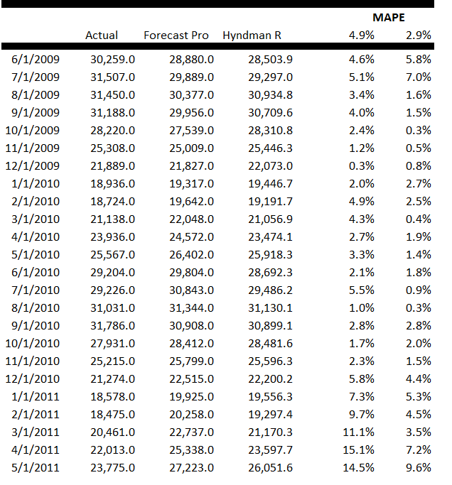
When time series data are available in frequencies higher than quarterly or monthly, many forecasting programs hit a wall in analyzing seasonal effects.

Researchers from the Australian Monash University published an interesting paper in the Journal of the American Statistical Association (JASA), along with an R program, to handle this situation – what can be called “complex seasonality.”

I’ve updated and modified one of their computations – using weekly, instead of daily, data on US conventional gasoline prices – and find the whole thing pretty intriguing.

tbatschart

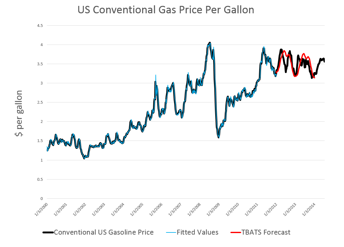
If you look at the color codes in the legend below the chart, it’s a little easier to read and understand.

Here’s what I did.

I grabbed the conventional weekly US gasoline prices from FRED. These prices are for “regular” – the plain vanilla choice at the pump. I established a start date of the first week in 2000, after looking the earlier data over. Then, I used tbats(.) in the Hyndman R Forecast package which readers familiar with this site know can be downloaded for use in the open source matrix programming language R.

Then, I established an end date for a time series I call newGP of the first week in 2012, forecasting ahead with the results of applying tbats(.) to the historic data from 2000:1 to 2012:1 where the second number refers to weeks which run from 1 to 52. Note that some data scrubbing is needed to shoehorn the gas price data into 52 weeks on a consistent basis. I averaged “week 53” with the nearest acceptable week (either 52 or 1 in the next year), and then got rid of the week 53’s.

The forecast for 104 weeks is shown by the solid red line in the chart above.

This actually looks promising, as if it might encode some useful information for, say, US transportation agencies.

A draft of the JASA paper is available as a PDF download. It’s called Forecasting time series with complex seasonal patterns using exponential smoothing and in addition to daily US gas prices, analyzes daily electricity demand in Turkey and bank call center data.

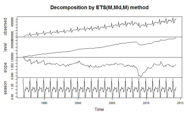
I’m only going part of the way to analyzing the gas price data, since I have not taken on daily data yet. But the seasonal pattern identified by tbats(.) from the weekly data is interesting and is shown below.

tbatsgasprice

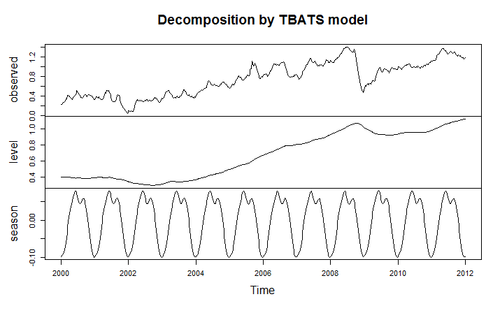
The weekly frequency may enable us to “get inside” a mid-year wobble in the pattern with some precision. Judging from the out-of-sample performance of the model, this “wobble” can in some cases be accentuated and be quite significant.

Trignometric series fit to the higher frequency data extract the seasonal patterns in tbats(.), which also features other advanced features, such as a capability for estimating ARMA (autoregressive moving average) models for the residuals.

I’m not fully optimizing the estimation, but these results are sufficiently strong to encourage exploring the toggles and switches on the routine.

Another routine which works at this level of aggregation is the stlf(.) routine. This is uses STL decomposition described in some detail in Chapter 36 Patterns Discovery Based on Time-Series Decomposition in a collection of essays on data mining.

Thoughts

Good forecasting software elicits sort of addictive behavior, when initial applications of routines seem promising. How much better can the out-of-sample forecasts be made with optimization of the features of the routine? How well does the routine do when you look at several past periods? There is even the possibility of extracting further information from the residuals through bootstrapping or bagging at some point. I think there is no other way than exhaustive exploration.

The payoff to the forecaster is the amazement of his or her managers, when features of a forecast turn out to be spot-on, prescient, or what have you – and this does happen with good software. An alternative, for example, to the Hyndman R Forecast package is the program STAMP I also am exploring. STAMP has been around for many years with a version running – get this – on DOS, which appears to have had more features than the current Windows incarnation. In any case, I remember getting a “gee whiz” reaction from the executive of a regional bus district once, relating to ridership forecasts. So it’s fun to wring every possible pattern from the data.

Seasonal Sales Patterns – Stylized Facts

Seasonal sales patterns in the United States are more or less synchronized with Europe, Japan, China, and, to a lesser extent, the rest of the world.

Here are some stylized facts:

  1. Sales tend to peak at the end of the calendar year. This is the well-known “Christmas effect,” and is a strong enough factor to “cannibalize” demand, to an extent, at the first of the following year.
  2. Sales of final goods tend to be lower – in terms of growth rates and, in some cases, absolutely, in the first calendar quarter of the year.
  3. Supply chain effects, related to pulses of sales of final goods, can be identified for various lines of production depending on production lead times. Semiconductor orders, for example, tend to peak earlier than sales of consumer electronics, which are sharply influenced by the Christmas season.

To validate this picture, let me offer some evidence.

First, consider retail and food service sales data for the US, a benchmark of consumer activity – the recently discussed data downloaded from FRED.

Applying the automatic model selection of the Hyndman R Forecast package, we get a decomposition of this time series into level, trend, and seasonals, as shown in the following diagram.

Rplotrs

The optimal exponential smoothing forecast model is a model with a damped trend and multiplicative seasonals.

If we look at the lower part of this diagram, we see that the seasonal factor for December – which is shown by the major peaks in the curve – is a multiple of more than 1.15. On the other hand, the immediately following month – January – shows a multiple of 0.9. These factors are multiplied into the product of the level and trend to get the sales for December and January. In other words, you can suppose that, roughly speaking, December retail sales will be 15 percent above trend, while January sales will be 90 percent of trend.

And, if you inspect this diagram in the lower panel carefully, you can detect the lull in late summer and fall in retail sales.

With “just-in-time” inventories and lean production models, actual production activity closely tracks these patterns in final demand – although it does take some lead time to produce stuff.

These stylized facts have not changed in their outlines since the ground-breaking research of Jeffrey Miron in the the late 1980’s. Miron refers to a worldwide seasonal cycle in aggregate economic activity whose major features are a fourth quarter boom in output.., a third quarter trough in manufacturing production, and a first quarter trough in all economic activity.

The Effects of Different Calendars – the Chinese New Year and Ramadan

The Gregorian calendar has achieved worldwide authority, and almost every country follows on the conventions of counting the year (currently 2014).

The Chinese calendar, however, is still important for determining the timing of festivals for Chinese communities around the world, and, especially, in China.

GRAPHICS TEMPLATE 2006

Similarly, the Islamic calendar governs the timing of important ritual periods and religious festivals – such as the month of Ramadan, which falls in June and July in 2014.

Because these festival periods overlap with multiple Gregorian months, there can be significant localized impacts on estimates of seasonal variation of economic activity.

Taiwanese researchers looking at this issue find significant holiday effects, related the fact that,

The three most important Chinese holidays, Chinese New Year, the Dragon-boat Festival, and Mid-Autumn Holiday have dates determined by a lunar calendar and move between two solar months. Consumption, production, and other economic behavior in countries with large Chinese population including Taiwan are strongly affected by these holidays. For example, production accelerates before lunar new year, almost completely stops during the holidays and gradually rises to an average level after the holidays.

Similarly, researchers in Pakistan consider the impacts of the Islamic festivals on standard macroeconomic and financial time series.

Seasonal Variation

Evaluating and predicting seasonal variation is a core competence of forecasting, dating back to the 1920’s or earlier. It’s essential to effective business decisions. For example, as the fiscal year unfolds, the question is “how are we doing?” Will budget forecasts come in on target, or will more (or fewer) resources be required? Should added resources be allocated to Division X and taken away from Division Y? To answer such questions, you need a within-year forecast model, which in most organizations involves quarterly or monthly seasonal components or factors.

Seasonal adjustment, on the other hand, is more mysterious. The purpose is more interpretive. Thus, when the Bureau of Labor Statistics (BLS) or Bureau of Economic Analysis (BEA) announce employment or other macroeconomic numbers, they usually try to take out special effects (the “Christmas effect”) that purportedly might mislead readers of the Press Release. Thus, the series we hear about typically are “seasonally adjusted.”

You can probably sense my bias. I almost always prefer data that is not seasonally adjusted in developing forecasting models. I just don’t know what magic some agency statistician has performed on a series – whether artifacts have been introduced, and so forth.

On the other hand, I take the methods of identifying seasonal variation quite seriously. These range from Buys-Ballot tables and seasonal dummy variables to methods based on moving averages, trigonometric series (Fourier analysis), and maximum likelihood estimation.

Identifying seasonal variation can be fairly involved mathematically.

But there are some simple reality tests.

Take this US retail and food service sales series, for example.

retailfs

Here you see the highly regular seasonal movement around a trend which, at times, is almost straight-line.

Are these additive or multiplicative seasonal effects? If we separate out the trend and the seasonal effects, do we add them or are the seasonal effects “factors” which multiply into the level for a month?

Well, for starters, we can re-arrange this time series into a kind of Buys-Ballot table. Here I only show the last two years.

BBTab

The point is that we look at the differences between the monthly values in a year and the average for that year. Also, we calculate the ratios of each month to the annual total.

The issue is which of these numbers is most stable over the data period, which extends back to 1992 (click to enlarge).

additive

mult

Now here Series N relates to the Nth month, e.g. Series 12 = December.

It seems pretty clear that the multiplicative factors are more stable than the additive components in two senses. First, some additive components have a more pronounced trend; secondly, the variability of the additive components around this trend is greater.

This gives you a taste of some quick methods to evaluate aspects of seasonality.

Of course, there can be added complexities. What if you have daily data, or suppose there are other recurrent relationships. Then, trig series may be your best bet.

What if you only have two, three, or four years of data? Well, this interesting problem is frequently encountered in practical applications.

I’m trying to sort this material into posts for this coming week, along with stuff on controversies that swirl around the seasonal adjustment of macro time series, such as employment and real GDP.

Stay tuned.

Top image from http://www.livescience.com/25202-seasons.html

Video Friday – Quantum Computing

I’m instituting Video Friday. It’s the end of the work week, and videos introduce novelty and pleasant change in communications.

And we can keep focusing on matters related to forecasting applications and data analytics, or more generally on algorithmic guides to action.

Today I’m focusing on D-Wave and quantum computing. This could well could take up several Friday’s, with cool videos on underlying principles and panel discussions with analysts from D-Wave, Google and NASA. We’ll see. Probably, I will treat it as a theme, returning to it from time to time.

A couple of introductory comments.

First of all, David Wineland won a Nobel Prize in physics in 2012 for his work with quantum computing. I’ve heard him speak, and know members of his family. Wineland did his work at the NIST Laboratories in Boulder, the location for Eric Cornell’s work which was awarded a Nobel Prize in 2001.

I mention this because understanding quantum computing is more or less like trying to understand quantum physics, and, there, I think engineering has a role to play.

The basic concept is to exploit quantum superimposition, or perhaps quantum entanglement, as a kind of parallel processor. The qubit, or quantum bit, is unlike the bit of classical computing. A qubit can be both 0 and 1 simultaneously, until it’s quantum wave equation is collapsed or dispersed by measurement. Accordingly, the argument goes, qubits scale as powers of 2, and a mere 500 qubits could more than encode all atoms in the universe. Thus, quantum computers may really shine at problems where you have to search through all different combinations of things.

But while I can write the quantum wave equation of Schrodinger, I don’t really understand it in any basic sense. It refers to a probability wave, whatever that is.

Feynman, whose lectures (and tapes or CD’s) on physics I proudly own, says it is pointless to try to “understand” quantum weirdness. You have to be content with being able to predict outcomes of quantum experiments with the apparatus of the theory. The theory is highly predictive and quite successful, in that regard.

So I think D-Wave is really onto something. They are approaching the problem of developing a quantum computer technologically.

Here is a piece of fluff Google and others put together about their purchase of a D-Wave computer and what’s involved with quantum computing.

OK, so now here is Eric Ladizinsky in a talk from April of this year on Evolving Scalable Quantum Computers. I can see why Eric gets support from DARPA and Bezos, a range indeed. You really get the “ah ha” effect listening to him. For example, I have never before heard a coherent explanation of how the quantum weirdness typical for small particles gets dispersed with macroscopic scale objects, like us. But this explanation, which is mathematically based on the wave equation, is essential to the D-Wave technology.

It takes more than an hour to listen to this video, but, maybe bookmark it if you pass on from a full viewing, since I assure you that this is probably the most substantive discussion I have yet found on this topic.

But is D-Wave’s machine a quantum computer?

Well, they keep raising money.

D-Wave Systems raises $30M to keep commercializing its quantum computer

But this infuriates some in the academic community, I suspect, who distrust the announcement of scientific discovery by the Press Release.

There is a brilliant article recently in Wired on D-Wave, which touches on a recent challenge to its computational prowess (See Is D-Wave’s quantum computer actually a quantum computer?)

The Wired article gives Geordie Rose, a D-Wave founder, space to rebut at which point these excellent comments can be found:

Rose’s response to the new tests: “It’s total bullshit.”

D-Wave, he says, is a scrappy startup pushing a radical new computer, crafted from nothing by a handful of folks in Canada. From this point of view, Troyer had the edge. Sure, he was using standard Intel machines and classical software, but those benefited from decades’ and trillions of dollars’ worth of investment. The D-Wave acquitted itself admirably just by keeping pace. Troyer “had the best algorithm ever developed by a team of the top scientists in the world, finely tuned to compete on what this processor does, running on the fastest processors that humans have ever been able to build,” Rose says. And the D-Wave “is now competitive with those things, which is a remarkable step.”

But what about the speed issues? “Calibration errors,” he says. Programming a problem into the D-Wave is a manual process, tuning each qubit to the right level on the problem-solving landscape. If you don’t set those dials precisely right, “you might be specifying the wrong problem on the chip,” Rose says. As for noise, he admits it’s still an issue, but the next chip—the 1,000-qubit version codenamed Washington, coming out this fall—will reduce noise yet more. His team plans to replace the niobium loops with aluminum to reduce oxide buildup….

Or here’s another way to look at it…. Maybe the real problem with people trying to assess D-Wave is that they’re asking the wrong questions. Maybe his machine needs harder problems.

On its face, this sounds crazy. If plain old Intels are beating the D-Wave, why would the D-Wave win if the problems got tougher? Because the tests Troyer threw at the machine were random. On a tiny subset of those problems, the D-Wave system did better. Rose thinks the key will be zooming in on those success stories and figuring out what sets them apart—what advantage D-Wave had in those cases over the classical machine…. Helmut Katzgraber, a quantum scientist at Texas A&M, cowrote a paper in April bolstering Rose’s point of view. Katzgraber argued that the optimization problems everyone was tossing at the D-Wave were, indeed, too simple. The Intel machines could easily keep pace..

In one sense, this sounds like a classic case of moving the goalposts…. But D-Wave’s customers believe this is, in fact, what they need to do. They’re testing and retesting the machine to figure out what it’s good at. At Lockheed Martin, Greg Tallant has found that some problems run faster on the D-Wave and some don’t. At Google, Neven has run over 500,000 problems on his D-Wave and finds the same....

..it may be that quantum computing arrives in a slower, sideways fashion: as a set of devices used rarely, in the odd places where the problems we have are spoken in their curious language. Quantum computing won’t run on your phone—but maybe some quantum process of Google’s will be key in training the phone to recognize your vocal quirks and make voice recognition better. Maybe it’ll finally teach computers to recognize faces or luggage. Or maybe, like the integrated circuit before it, no one will figure out the best-use cases until they have hardware that works reliably. It’s a more modest way to look at this long-heralded thunderbolt of a technology. But this may be how the quantum era begins: not with a bang, but a glimmer.

Links – July 10, 2014

Did China Just Crush The US Housing Market? Zero Hedge has established that Chinese money is a major player in the US luxury housing market with charts like these.

pieNAR

NASbarchart

Then, looking within China, it’s apparent that the source of this money could be shut off – a possibility which evokes some really florid language from Zero Hedge –

Because without the Chinese bid in a market in which the Chinese are the biggest marginal buyer scooping up real estate across the land, sight unseen, and paid for in laundered cash (which the NAR blissfully does not need to know about due to its AML exemptions), watch as suddenly the 4th dead cat bounce in US housing since the Lehman failure rediscovers just how painful gravity really is.

IPO market achieves liftoff More IPO’s coming to market now.

IPO

The Mouse That Wouldn’t Die: How a Lack of Public Funding Holds Back a Promising Cancer Treatment Fascinating. Dr. Zheng Cui has gone from identifying, then breeding cancer resistant mice, to discovering the genetics and mechanism of this resistance, focusing on a certain type of white blood cell. Then, moving on to human research, Dr. Cui has identified similar genetics in humans, and successfully treated advanced metastatic cancer in trials. But somehow – maybe since transfusions are involved and Big pharma can’t make money on it – the research is losing support.

Scientists Create ‘Dictionary’ of Chimp Gestures to Decode Secret Meanings

Some of those discovered meanings include the following:

•When a chimpanzee taps another chimp, it means “Stop that”

•When a chimpanzee slaps an object or flings its hand, it means “Move away” or “Go away”

•When a chimpanzee raises its arm, it means “I want that”

Chimp-Gestures

Medicine w/o antibiotics

The Hillary Clinton Juggernaut Courts Wall Street and Neocons Describes Hillary as the “uber-establishment candidate.”

US-AFGHANISTAN-WOMEN-RIGHTS-CLINTON

Wrap on Exponential Smoothing

Here are some notes on essential features of exponential smoothing.

  1. Name. Exponential smoothing (ES) algorithms create exponentially weighted sums of past values to produce the next (and subsequent period) forecasts. So, in simple exponential smoothing, the recursion formula is Lt=αXt+(1-α)Lt-1 where α is the smoothing constant constrained to be within the interval [0,1], Xt is the value of the time series to be forecast in period t, and Lt is the (unobserved) level of the series at period t. Substituting the similar expression for Lt-1 we get Lt=αXt+(1-α) (αXt-1+(1-α)Lt-2)= αXt+α(1-α)Xt-1+(1-α)2Lt-2, and so forth back to L1. This means that more recent values of the time series X are weighted more heavily than values at more distant times in the past. Incidentally, the initial level L1 is not strongly determined, but is established by one ad hoc means or another – often by keying off of the initial values of the X series in some manner or another. In state space formulations, the initial values of the level, trend, and seasonal effects can be included in the list of parameters to be established by maximum likelihood estimation.
  2. Types of Exponential Smoothing Models. ES pivots on a decomposition of time series into level, trend, and seasonal effects. Altogether, there are fifteen ES methods. Each model incorporates a level with the differences coming as to whether the trend and seasonal components or effects exist and whether they are additive or multiplicative; also whether they are damped. In addition to simple exponential smoothing, Holt or two parameter exponential smoothing is another commonly applied model. There are two recursion equations, one for the level Lt and another for the trend Tt, as in the additive formulation, Lt=αXt+(1-α)(Lt-1+Tt-1) and Tt=β(Lt– Lt-1)+(1-β)Tt-1 Here, there are now two smoothing parameters, α and β, each constrained to be in the closed interval [0,1]. Winters or three parameter exponential smoothing, which incorporates seasonal effects, is another popular ES model.
  3. Estimation of the Smoothing Parameters. The original method of estimating the smoothing parameters was to guess their values, following guidelines like “if the smoothing parameter is near 1, past values will be discounted further” and so forth. Thus, if the time series to be forecast was very erratic or variable, a value of the smoothing parameter which was closer to zero might be selected, to achieve a longer period average. The next step is to set up a sum of the squared differences of the within sample predictions and minimize these. Note that the predicted value of Xt+1 in the Holt or two parameter additive case is Lt+Tt, so this involves minimizing the expression Sqerroreq Currently, the most advanced method of estimating the value of the smoothing parameters is to express the model equations in state space form and utilize maximum likelihood estimation. It’s interesting, in this regard, that the error correction version of ES recursion equations are a bridge to this approach, since the error correction formulation is found at the very beginnings of the technique. Advantages of using the state space formulation and maximum likelihood estimation include (a) the ability to estimate confidence intervals for point forecasts, and (b) the capability of extending ES methods to nonlinear models.
  4. Comparison with Box-Jenkins or ARIMA models. ES began as a purely applied method developed for the US Navy, and for a long time was considered an ad hoc procedure. It produced forecasts, but no confidence intervals. In fact, statistical considerations did not enter into the estimation of the smoothing parameters at all, it seemed. That perspective has now changed, and the question is not whether ES has statistical foundations – state space models seem to have solved that. Instead, the tricky issue is to delineate the overlap and differences between ES and ARIMA models. For example, Gardner makes the statement that all linear exponential smoothing methods have equivalent ARIMA models. Hyndman points out that the state space formulation of ES models opens the way for expressing nonlinear time series – a step that goes beyond what is possible in ARIMA modeling.
  5. The Importance of Random Walks. The random walk is a forecasting benchmark. In an early paper, Muth showed that a simple exponential smoothing model provided optimal forecasts for a random walk. The optimal forecast for a simple random walk is the current period value. Things get more complicated when there is an error associated with the latent variable (the level). In that case, the smoothing parameter determines how much of the recent past is allowed to affect the forecast for the next period value.
  6. Random Walks With Drift. A random walk with drift, for which a two parameter ES model can be optimal, is an important form insofar as many business and economic time series appear to be random walks with drift. Thus, first differencing removes the trend, leaving ideally white noise. A huge amount of ink has been spilled in econometric investigations of “unit roots” – essentially exploring whether random walks and random walks with drift are pretty much the whole story when it comes to major economic and business time series.
  7. Advantages of ES. ES is relatively robust, compared with ARIMA models, which are sensitive to mis-specification. Another advantage of ES is that ES forecasts can be up and running with only a few historic observations. This comment applied to estimation of the level and possibly trend, but does not apply in the same degree to the seasonal effects, which usually require more data to establish. There are a number of references which establish the competitive advantage in terms of the accuracy of ES forecasts in a variety of contexts.
  8. Advanced Applications.The most advanced application of ES I have seen is the research paper by Hyndman et al relating to bagging exponential smoothing forecasts.

The bottom line is that anybody interested in and representing competency in business forecasting should spend some time studying the various types of exponential smoothing and the various means to arrive at estimates of their parameters.

For some reason, exponential smoothing reaches deep into actual process in data generation and consistently produces valuable insights into outcomes.

More Blackbox Analysis – ARIMA Modeling in R

Automatic forecasting programs are seductive. They streamline analysis, especially with ARIMA (autoregressive integrated moving average) models. You have to know some basics – such as what the notation ARIMA(2,1,1) or ARIMA(p,d,q) means. But you can more or less sidestep the elaborate algebra – the higher reaches of equations written in backward shift operators – in favor of looking at results. Does the automatic ARIMA model selection predict out-of-sample, for example?

I have been exploring the Hyndman R Forecast package – and other contributors, such as George Athanasopoulos, Slava Razbash, Drew Schmidt, Zhenyu Zhou, Yousaf Khan, Christoph Bergmeir, and Earo Wang, should be mentioned.

A 76 page document lists the routines in Forecast, which you can download as a PDF file.

This post is about the routine auto.arima(.) in the Forecast package. This makes volatility modeling – a place where Box Jenkins or ARIMA modeling is relatively unchallenged – easier. The auto.arima(.) routine also encourages experimentation, and highlights the sharp limitations of volatility modeling in a way that, to my way of thinking, is not at all apparent from the extensive and highly mathematical literature on this topic.

Daily Gold Prices

I grabbed some data from FRED – the Gold Fixing Price set at 10:30 A.M (London time) in London Bullion Market, based in U.S. Dollars.

GOLDAMGBD228NLBM

Now the price series shown in the graph above is a random walk, according to auto.arima(.).

In other words, the routine indicates that the optimal model is ARIMA(0,1,0), which is to say that after differencing the price series once, the program suggests the series reduces to a series of independent random values. The automatic exponential smoothing routine in Forecast is ets(.). Running this confirms that simple exponential smoothing, with a smoothing parameter close to 1, is the optimal model – again, consistent with a random walk.

Here’s a graph of these first differences.

1stdiffgold

But wait, there is a clustering of volatility of these first differences, which can be accentuated if we square these values, producing the following graph.

volatilityGP

Now in a more or less textbook example, auto.arima(.) develops the following ARIMA model for this series

model

Thus, this estimate of the volatility of the first differences of gold price is modeled as a first order autoregressive process with two moving average terms.

Here is the plot of the fitted values.

Rplot1

Nice.

But of course, we are interested in forecasting, and the results here are somewhat more disappointing.

Basically, this type of model makes a horizontal line prediction at a certain level, which is higher when the past values have been higher.

This is what people in quantitative finance call “persistence” but of course sometimes new things happen, and then these types of models do not do well.

From my research on the volatility literature, it seems that short period forecasts are better than longer period forecasts. Ideally, you update your volatility model daily or at even higher frequencies, and it’s likely your one or two period ahead (minutes, hours, a day) will be more accurate.

Incidentally, exponential smoothing in this context appears to be a total fail, again suggesting this series is a simple random walk.

Recapitulation

There is more here than meets the eye.

First, the auto.arima(.) routines in the Hyndman R Forecast package do a competent job of modeling the clustering of higher first differences of the gold price series here. But, at the same time, they highlight a methodological point. The gold price series really has nonlinear aspects that are not adequately commanded by a purely linear model. So, as in many approximations, the assumption of linearity gets us some part of the way, but deeper analysis indicates the existence of nonlinearities. Kind of interesting.

Of course, I have not told you about the notation ARIMA(p,d,q). Well, p stands for the order of the autoregressive terms in the equation, q stands for the moving average terms, and d indicates the times the series is differenced to reduce it to a stationary time series. Take a look at Forecasting: principles and practice – the free forecasting text of Hyndman and Athanasopoulos – in the chapter on ARIMA modeling for more details.

Incidentally, I think it is great that Hyndman and some of his collaborators are providing an open source, indeed free, forecasting package with automatic forecasting capabilities, along with a high quality and, again, free textbook on forecasting to back it up. Eventually, some of these techniques might get dispersed into the general social environment, potentially raising the level of some discussions and thinking about our common future.

And I guess also I have to say that, ultimately, you need to learn the underlying theory and struggle with the algebra some. It can improve one’s ability to model these series.

Exponential Smoothing – Black Box Examples

The reason why most people would be interested in and concerned with exponential smoothing (ES) is that it is an effective forecasting technique.

So, with that in mind, I want to discuss two automatic forecasting programs – Forecast Pro and Hyndman’s Forecast program for R – applied to a monthly time series for public construction spending in the US. I do this more or less “black box” in that I am not spending a lot of time on the underlying theory – which is basically a state space model framework – but focus on the process of getting the forecasts and their comparison.

I am testing these programs with a backcasting exercise. Thus, the data for this time series, available from FRED begin January 1993 and extend through May 2014. However, I only use data up to May 2010 to develop forecasting models with these programs. Then, I can compare the forecasts from the models with actual values. So instead of forecasting, you might say I am backcasting. Sometimes this is also called retrodiction, in contrast to prediction.

FREDCS

My plan is to feed both programs data up to and including May 2010, in order to forecast values for the next 24 months.

Forecast Pro

Data input is the first step, and this can be accomplished with Forecast Pro by means of an Excel spreadsheet. There are requirements for how you lay out the data. Basically, the first column, below the first six rows, can contain dates. The first time series is placed in the second column, after noting its name and description, the starting year, starting period (month, quarter, etc), periods per year, and any information on cycles. Then, of course, you store the spreadsheet in a directory where the program can pick it up – but all that is covered in the Forecast Pro manual.

Here’s what the program panel looks like, after you trigger the automatic forecasting procedure (click to enlarge).

FPro

So basically you see a graph of the historic data you are feeding into the program. If you look down to Model Details you will see that expert selection picked a multiplicative Winters linear trend, multiplicative seasonality model. The estimated parameters are then given.

Above this, under Expert Analysis, the screen tells you that it looked at both Box-Jenkins (ARIMA) and ES models, picking the ES model based on out-of-sample tests.

Further down on this screen (not shown), the program lists the forecasts, which are graphed with confidence intervals above (shown).

I’ll discuss these forecasts, but first let me say a few words about the Hyndman R Forecast package analysis.

The Hyndman R Forecast Package

R is very big in some of the enterprise IT outfits. I have friends, for example, who view it as essential, and who have helped me recently come up to speed, to an extent, in using it.

After some fumbling around, I settled on running my R programs in R Studio. There is something called the Comprehensive R Archive Network (CRAN) with important open source R programs. Hyndman et al have their Forecast program listed there, and it pops up in R Studio, which is hugely convenient.

Again, there is an issue of data input. In this case, correctly positioning a csv spreadsheet file works well.

The R code I used to generate ES forecasts is as follows:

R

Note I screw up the spelling of ExponentialSmooth in naming the subdirectory. Oh well.

So after you import the csv file with the read command, you convert it to a time series format. Then, you can apply the operation ets(.) to the time series file, producing the parameters of the optimal ES model, based on comparisons of Akaike information criteria from the maximum likelihood estimations used to calculate the parameters of all the models.

Forecast selects ETS(M,Ad,M) as the optimal model. This indicates an additive trend is used, but is damped, and that the seasonal effects are multiplicative – more or less as in the Forecast Pro analysis.

The Forecasts

I called for 24 months of forecasts from both programs.

Here is a table comparing the forecasts from both packages with the actual values of this public construction time series.

TableFPH

The Hyndman et al R Forecast package produces significantly lower Mean Absolute Percentage Error (MAPE) than Forecast Pro in these forecasts – 2.9% compared with 4.9%.

Here is a chart comparing the absolute percent error by month over the forecast horizon.

compRFP

Conclusions

This particular example is a case of random selection. I really have not run other forecasts with this data and these two models, except for actual future projections. So it’s interesting that an explicitly damped linear trend applied to these data generates a superior forecast to whatever it is that Forecast Pro does.

But readers should be aware that, in many instances, Forecast Pro can slightly outperform the R Forecast program, as Hyndman and coauthors document in a critical paper on this automatic forecasting setup in R.

However, the performance of the two programs is very similar.

In general, I would suggest that non-mathematical users, or folks not used to developing computer programs, stick with Forecast Pro, probably getting the company or organization you work for to pony up several hundred to several thousand dollars to get what you need for the scale of the forecasting problem at hand. Incidentally, I should be getting commissions for boosting this program, as often as I do, but I have no connection with the company.

For more mathematically sophisticated users, I strongly recommend getting up to speed on the R Forecast package and other R packages.

Both would be nice to use together. The R programs can support an interesting research effort, doing all sorts of clever things like fitting splines to the data, boosting, and bagging. Forecast Pro on the other hand is great if you have to produce a large number of forecasts and do not have time to dwell too much on the details of each series.

Exponential Smoothing – I

As I wrote recently, most business forecasting assignments are relatively simple. You collect the data (often the most challenging part), and plug this data into an automatic forecasting program. The program probably applies some type of exponential smoothing (ES) to produce forecasts for a horizon of a few periods ahead, and, bam, there you have it. The rest is presentation, developing the “story” and so forth.

So what about this exponential smoothing? What’s basically involved? What are the differences between exponential smoothing and the other primary univariate forecasting technique – ARIMA or Box-Jenkins modeling? What are these automatic forecasting programs, and which ones are best?

All good questions, and, if you are interested or involved in forecasting, the answers are good to rehearse from time to time.

Level, Trend, Seasonality – Components of Time Series

Exponential smoothing originated with the work of Brown and Holt for the US Navy (see the discussion in Gardiner). The perspective was not theoretical, but applied.

Nevertheless, there is an intuitive aspect to exponential smoothing (ES). That has to do with the decomposition of time series into components – such as level, trend, and seasonal effects.

So, applying the algorithms of ES to some time series Xt t=1,2,…,n, we extract estimates of the level Lt, trend Tt, and seasonal component, St, so that at any time t, we can express Xt as

Xt = Lt + Tt + St

This would be an additive model.

It’s also possible that the time series Xt could be multiplicative, as in

Xt = LtTtSt

By way of example, consider the following time series for public construction spending in the US, obtained from FRED (Federal Reserve Economic Data).

PCS

Now if you look closely, it’s clear there are strongly delineated seasonal effects. Furthermore, these seasonal variations appear to fluctuate more or less in proportion to the annual levels of the series. Thus, the variation is considerably more over a year, when spending is at a $25 billion level, than it does at a $10 billion level.

And the fact that these levels are different, and the series does not simply oscillate around a single level, indicates that there is probably a meaningful trend component to this time series.

Automatic Forecasting Programs

These are the considerations that you take into account in building an exponential smoothing model.

Now it is possible to create ES models within the framework of a spreadsheet. Thus, ES models have smoothing parameters which can be set by minimizing a squared sum of forecast errors over historic data. In Microsoft’s Excel, you can use Solver to do this, once you set up the recursion equations for level, trend, and seasonal components or effects.

In coming posts, I want to show how this can be done for a simple example.

But really, setting up spreadsheets to estimate exponential smoothing models can be laborious, since you need a separate set of computations for every possible model. In addition to the additive and purely multiplicative models shown above, for example, there can be hybrid cases – multiplicative seasonality but additive trend, and so forth.

So it’s a good idea to equip yourself with one of the several, good automatic forecasting programs out there to speed model identification and evaluation.

I will have reference to two such automatic forecasting programs in coming posts – Forecast Pro and Rob Hyndman’s Forecast package in R. I’ll make comparisons between these programs. A demo version of Forecast Pro is available for download for free, but it is a commercial package with various options at various price steps. Hyndman’s R forecasting package, on the other hand, is open source software and free, as is the R platform. While this sounds like an unbeatable advantage, there always are questions of bugs and performance – which in this case seem to be to be resolved for reasons we can discuss.

What’s The Big Deal?

Finally, the reason why ES forecasting is so widely applied is that, in many cases, it produces forecasts which are of comparable or superior accuracy to other univariate forecasting approaches.

ES has performed well, for example, in international forecasting competitions, including the widely-publicized M-competitions.

There also is a link between exponential smoothing and the Kalman filter. So ES is in a sense an adaptive forecasting approach. For example, ES weights more recent observations more heavily than observations more distant in the past, unlike a regression trend model.

Finally, recent research has provided statistical pedigree to exponential smoothing, rescuing it in a sense from consignment to “a purely ad hoc” approach. Thus, there is a direct link between time series that embody a random walk or random walk with drift and exponential smoothing.

Mid-Year Economic Projections and Some Fireworks

Greetings and Happy Fourth of July! Always one of my favorite holidays.

Practically every American kid loves the Fourth, because there are fireworks. Of course, back in the day, we had cherry bombs and really big firecrackers. Lots of thumbs and fingers were blown off. But it’s still fun for kids, and safer no doubt.

Before that, here are two mid-year forecasts from Goldman Sachs’ Chief Economist Jan Hatzius and an equity outlook from Wells Fargo Bank.

Jan Hatzius Goldman Sachs – mid-year forecast (June 12) 

And Wells Fargo (June 23rd). 

Both these, unfortunately, did not have the information about the additional write-down of the 1st quarter real GDP that came out June 25, so we will be looking for futher updates.

Meanwhile, some fireworks.

First, Happy Fourth from the US Navy. 

And some ordinary fireworks from the National Mall, US Capitol, 2012.