Something is Happening in Europe

Something is going on in Europe.

Take a look at this chart of the euro/dollar exchange rate, and how some event triggered a step down mid week of last week (from xe.com).

euroexchange

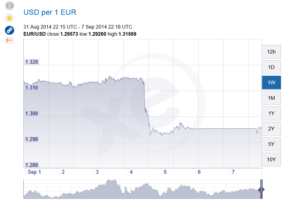
The event in question was a press conference by Mario Draghi (See the Wall Street Journal real time blog on this event at Mario Draghi Delivers Fresh ECB Plan — Recap).

The European Central Bank under Draghi is moving into exotic territory – trying negative interest rates on bank deposits and toying with variants of Quantitative Easing (QE) involving ABS – asset backed securities.

All because the basic numbers for major European economies, including notably Germany and France (as well as long-time problem countries such as Spain), are not good. Growth has stalled or is reversing, bank lending is falling, and deflation stalks the European markets.

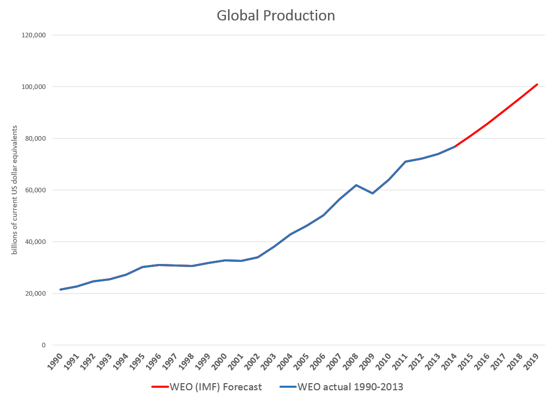
Europe – which, of course, is sectored into the countries inside and outside the currency union, countries in the common market, and countries in none of the above – accounts for several hundred million persons and maybe 20-30 percent of global production.

So what happens there is significant.

Then there is the Ukraine crisis.

Zerohedge ran this graphic recently showing the dependence of European countries on gas from Russia.

eurdependence

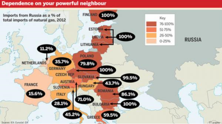
The US-led program of imposing sanctions on Russia – key individuals, companies, banks perhaps – flies in the face of the physical dependence of Germany, for example, on Russian gas.

On the other hand, there is lots of history here on all sides, including, notably, the countries formerly in the USSR in eastern Europe, who no doubt fear the increasingly nationalistic or militant stance shown by Russia currently in, for example, re-acquiring Crimea.

As Chancellor Merkel has stressed, this is an area for diplomacy and negotiation – although there are other voices and forces ready to rush more weapons and even troops to the region of conflict.

Finally, as I have been stressing from time to time, there is an emerging demographic reality which many European nations have to confront.

Edward Hugh has several salient posts on possibly overlooked impacts of aging on the various macroeconomies involved.

There also is the vote on Scotland coming up in the United Kingdom (what we may, if the “yes” votes carry, need to start calling “the British Isles.”)

I’d like to keep current with the signals coming from Europe in a few blogs upcoming – to see, for example, whether swing events in the next six months to a year could originate there.

CO2 Concentrations Spiral Up, Global Temperature Stabilizes – Was Gibst?

Predicting global temperature is challenging. This is not only because climate and weather are complex, but because carbon dioxide (CO2) concentrations continue to skyrocket, while global temperature has stabilized since around 2000.

Changes in Global Mean Temperature

The NASA Goddard Institute for Space Studies maintains extensive and updated charts on global temperature.

globalmeantempdelta

The chart for changes annual mean global temperature is compiled from weather stations from around the planet.

There is also hermispheric variation, with the northern hemisphere showing more increases than the southern hemisphere.

hemi

At the same time, observations of the annual change in mean temperature have stabilized since around 2000, as the five year moving averages show.

Atmospheric Carbon Dioxide Concentrations

The National Oceanic and Atmospheric Administration (NOAA) maintains measurements of atmospheric carbon dioxide taken in Hawaii at Mauna Loa. These show continual increase since the measurements were first initiated in the late 1950’s.

Here’s a chart showing recent monthly measurements, highlighting the consistent seasonal pattern and strong positive trend since 2010.

Maunaloa1

Here’s all the data. The black line in both charts represents the seasonally corrected trend.

Maunaloa2

A Forecasting Problem

This is a big problem for anyone interested in predicting the future trajectory of climate.

So, according to these measurements on Mauna Loa, carbon dioxide concentrations in the atmosphere have been increasing monotonically (with seasonal variation) since 1958, when measurements first began. Yet global temperatures have not increased on a clear trend since around 2000.

I want to comment in detail sometime on the forecasting controversies that have swirled around these types of measurements and their interpretation, but here let me just suggest the outlines of the problem.

So, it’s clear that the relationship between atmospheric CO2 concentrations and global temperature is not linear, or that there are major intervening variables. Cloud cover may increase with higher temperatures, due to more evaporation. The oceans are still warming, so maybe they are absorbing the additional heat. Perhaps there are other complex feedback processes involved.

However, if my reading of the IPCC literature is correct, these suggestions are still anecdotal, since the big systems models seem quite unable to account for this trajectory of temperature – or at least, recent data appear as outliers.

So there you have it. As noted in earlier posts here, global population is forecast to increase by perhaps one billion by 2030. Global output, even given uncertain impacts of coming recessions, may grow to $150 trillion dollars by 2030. Emissions of greenhouse gases, including but not limited to CO2 also will increase – especially given the paralyzing impacts of the current “pause in global warming” on coordinated policy responses. Deforestation is certainly a problem in this context, although we have not here reviewed the prospects.

One thing to note, however, is that the first two charts presented above trace out changes in global mean temperature by year. The actual level of global mean temperature surged through the 1990’s and remains high. That mean that ice caps are melting, and various processes related to higher temperatures are currently underway.

Climate Change by 2030

Is climate change real? Is it predictable? How much warming can we expect by 2020 and then by 2030 in a business as usual scenario? How bad can it get? What about mitigation? Is there any credibility to the loud protestations of the climate change deniers? What about the so-called hockey stick and the exchange of sinister emails?

The Fifth Assessment Report of the Intergovernmental Panel on Climate Change (IPCC) addresses some of these questions. Its section The Physical Science Basis, which collates contributions of 250 scientists, contains this interesting graphic (click to enlarge) showing the upward trend in global temperature and the importance of the anthropogenic component, along with contributions from fluctuations in solar intensity and volcanic activity.

IPCCtemp

The Hockey Stick

Paleoclimate studies, also documented in this report, are the basis for the famous (notorious) hockey stick chart of long term global temperatures.

I was surprised to read, in catching up on this controversy, that the climate scientist Michael Mann who originated this chart has been totally vindicated (See The Hockey Stick: The Most Controversial Chart in Science, Explained).

Currently, scientific evidence suggests,

… present-day (2011) concentrations of the atmospheric greenhouse gases (GHGs) carbon dioxide (CO2), methane (CH4) and nitrous oxide (N2O) exceed the range of concentrations recorded in ice cores during the past 800,000 years. Past changes in atmospheric GHG concentrations can be determined with very high confidence1 from polar ice cores. Since AR4 these records have been extended from 650,000 years to 800,000 years ago.

The Drumbeat

In preparation for a September 23 summit, the UN has commissioned videos of weather forecasters supposedly announcing dire droughts, floods, and other weather catastrophes in 2050.

The IPCC also has videos. I include two – one on the physical science basis and the second on mitigation.

IPCC video 2013 –The Physical Science Basis

Climate summit 2014 – Mitigation

I personally am persuaded by the basic physics involved. As global GDP rises, so will energy consumption (although the details of this need to be examined carefully – conservation and change of technology can make big differences). In any case, more carbon dioxide and other similar gases will increase the greenhouse effect, raising global temperatures. It’s a good idea to call this climate change, rather than global warming, however, since volatility of weather patterns is a main result. There will be more climatic extremes, more droughts, but also more precipitation and flooding. Additionally, there could be changes in regional weather and climate patterns which could wreak havoc with the current distribution of population over geographic space. More rapid desertification is likely, and, of course, melting of glacial and polar ice will result in increases in sea level. And, as IPCC reports document, a lot of this is already happening.

There are, however, several problems that offer intellectual grounds for stalling the type of economic sacrifice that probably will be necessary to slow or reduce emissions.

First, there is the complexity of the evidence and argument, an issue flagged by Nate Silver recently. Secondly, there is the problem that, despite increases in greenhouse gas emissions after the turn of the century, there has been some leveling of global temperature increase, according to some metrics. Finally, there is the related problem of whether current climate models predict the recent past, whether they “retrodict.”

I’d like to address these issues or problems in a future post, along with my take on these projections or forecasts for 2020 and 2030.

US Surge in 2nd Quarter GDP

Statistica put together this graphic showing quarter-over-quarter growth in US real GDP from 2009 to the 2nd quarter of 2014.

QoQRGDPGr

The last bar in the chart, showing 4.2 percent growth, is the 2nd quarter 2014 estimate, released by The Bureau of Economic Analysis (BEA) August 28. This represents a slight upward revision from the 4.0 percent “advance estimate” released in July.

Notice these are quarter-over-quarter growth rates, and, as the Statistica chart shows, are fairly volatile.

Thus, a 4.1 percent real or inflation-adjusted growth rate for the April through June 2014 period does not mean 2014 growth will roll in at this rate.

In fact, as the Forbes item on this release highlights,

Dan North, chief economist at Euler Hermes North America… warns GDP watchers should not get too excited…since the economy contracted 2.1% in the first quarter of this year the large jump is payback and in the first half of 2014 the economy gained just 1%. North expects third and fourth quarter GDP to gain around 3% which would round out to an uninspiring roughly 2% growth for the year.

The BEA presents the following detail on the growth estimate (click to enlarge).

BEAtab

Personal consumption expenditures are the largest component in the real GDP series, and bounced back to 2.5 percent growth in the 2nd quarter. Gross private domestic investment surged 17.5 percent for Q2 over Q1, and included healthy 10.7 Q-over-Q growth in investment in equipment. Exports also showed solid Q-over-Q growth.

Europe and Japan

Europe and Japan numbers for the 2nd Quarter are more pessimistic.

Here’s a comparison with European Q-over-Q real growth rates from Eurostat .

eurostat

The EA 18 is the Euro Area, which includes Belgium, Germany, Estonia, Ireland, Greece, Spain, France, Italy, Cyprus, Latvia, Luxembourg, Malta, the Netherlands, Austria, Portugal, Slovenia, Slovakia and Finland.

Germany and Italy report -0.2 percent declines Q-over-Q growth in the 2nd quarter.

Trading Economics compiles the following chart of Japanese Q-over-Q real GDP growth, which tanked the 2nd quarter.

Japan

From this data, I think it is safe to say the recovery from 2008-2009 is still under-performing.

Whether these data will be followed on by year-over-year declines in future quarters remains to be seen.

Recession and Economic Projections

I’ve been studying the April 2014 World Economic Outlook (WEO) of the International Monetary Fund (IMF) with an eye to its longer term projections of GDP.

Downloading the WEO database and summing the historic and projected GDP’s suggests this chart.

GlobalGDP

The WEO forecasts go to 2019, almost to our first benchmark date of 2020. Global production is projected to increase from around $76.7 trillion in current US dollar equivalents to just above $100 trillion. An update in July marked the estimated 2014 GDP growth down from 3.7 to 3.4 percent, leaving the 2015 growth estimate at a robust 4 percent.

The WEO database is interesting, because it’s country detail allows development of charts, such as this.

gbobalproout

So, based on this country detail on GDP and projections thereof, the BRIC’s (Brazil, Russia, India, and China) will surpass US output, measured in current dollar equivalents, in a couple of years.

In purchasing power parity (PPP) terms, China is currently or will soon pass the US GDP, incidentally. Thus, according to the Big Mac index, a hamburger is 41 percent undervalued in China, compared to the US. So boosting Chinese production 41 percent puts its value greater than US output. However, the global totals would change if you take this approach, and it’s not clear the Chinese proportion would outrank the US yet.

The Impacts of Recession

The method of caging together GDP forecasts to the year 2030, the second benchmark we want to consider in this series of posts, might be based on some type of average GDP growth rate.

However, there is a fundamental issue with this, one I think which may play significantly into the actual numbers we will see in coming years.

Notice, for example, the major “wobble” in the global GDP curve historically around 2008-2009. The Great Recession, in fact, was globally synchronized, although it only caused a slight inflection in Chinese and BRIC growth. Europe and Japan, however, took a major hit, bringing global totals down for those years.

Looking at 2015-2020 and, certainly, 2015-2030, it would be nothing short of miraculous if there were not another globally synchronized recession. Currently, for example, as noted in an earlier post here, the Eurozone, including Germany, moved into zero to negative growth last quarter, and there has been a huge drop in Japanese production. Also, Chinese economic growth is ratcheting down from it atmospheric levels of recent years, facing a massive real estate bubble and debt overhang.

But how to include a potential future recession in economic projections?

One guide might be to look at how past projections have related to these types of events. Here, for example, is a comparison of the 2008 and 2014 US GDP projections in the WEO’s.

WEOUS

So, according to the IMF, the Great Recession resulted in a continuing loss of US production through until the present.

This corresponds with the concept that, indeed, the GDP time series is, to a large extent, a random walk with drift, as Nelson and Plosser suggested decades ago (triggering a huge controversy over unit roots).

And this chart highlights a meaning for potential GDP. Thus, the capability to produce things did not somehow mysteriously vanish in 2008-2009. Rather, there was no point in throwing up new housing developments in a market that was already massively saturated, Not only that, but the financial sector was unable to perform its usual duties because it was insolvent – holding billions of dollars of apparently worthless collateralized mortgage securities and other financial innovations.

There is a view, however, that over a long period of time some type of mean reversion crops up.

This is exemplified in the 2014 Congressional Budget Office (CBO) projections, as shown in this chart from the underlying detail.

CBOpotentialGDP

This convergence on potential GDP, which somehow is shown in the diagram with a weaker growth rate just after 2008, is based on the following forecasts of underlying drivers, incidentally.

CBOdrivers

So again, despite the choppy historical detail for US real GDP growth in the chart on the upper left, the forecast adopted by the CBO blithely assumes no recession through 2024 as well as increase in US interest rates back to historic levels by 2019.

I think this clearly suggests the Congressional Budget Office is somewhere in la-la land.

But the underlying question still remains.

How would one incorporate the impacts of an event – a recession – which is probably almost a certainty by the end of these forecast horizons, but whose timing is uncertain?

Of course, there are always scenarios, and I think, particularly for budget discussions, it would be good to display one or two of these.

I’m interested in reader suggestions on this.