Category Archives: data science

Partial Least Squares and Principal Components

I’ve run across outstanding summaries of “partial least squares” (PLS) research recently – for example Rosipal and Kramer’s Overview and Recent Advances in Partial Least Squares and the 2010 Handbook of Partial Least Squares.

Partial least squares (PLS) evolved somewhat independently from related statistical techniques, owing to what you might call family connections. The technique was first developed by Swedish statistician Herman Wold and his son, Svante Wold, who applied the method in particular to chemometrics. Rosipal and Kramer suggest that the success of PLS in chemometrics resulted in a lot of applications in other scientific areas including bioinformatics, food research, medicine, [and] pharmacology..

Someday, I want to look into “path modeling” with PLS, but for now, let’s focus on the comparison between PLS regression and principal component (PC) regression. This post develops a comparison with Matlab code and macroeconomics data from Mark Watson’s website at Princeton.

The Basic Idea Behind PC and PLS Regression

Principal component and partial least squares regression share a couple of features.

Both, for example, offer an approach or solution to the problem of “many predictors” and multicollinearity. Also, with both methods, computation is not transparent, in contrast to ordinary least squares (OLS). Both PC and PLS regression are based on iterative or looping algorithms to extract either the principal components or underlying PLS factors and factor loadings.

PC Regression

The first step in PC regression is to calculate the principal components of the data matrix X. This is a set of orthogonal (which is to say completely uncorrelated) vectors which are weighted sums of the predictor variables in X.

This is an iterative process involving transformation of the variance-covariance or correlation matrix to extract the eigenvalues and eigenvectors.

Then, the data matrix X is multiplied by the eigenvectors to obtain the new basis for the data – an orthogonal basis. Typically, the first few (the largest) eigenvalues – which explain the largest proportion of variance in X – and their associated eigenvectors are used to produce one or more principal components which are regressed onto Y. This involves a dimensionality reduction, as well as elimination of potential problems of multicollinearity.

PLS Regression

The basic idea behind PLS regression, on the other hand, is to identify latent factors which explain the variation in both Y and X, then use these factors, which typically are substantially fewer in number than k, to predict Y values.

Clearly, just as in PC regression, the acid test of the model is how it performs on out-of-sample data.

The reason why PLS regression often outperforms PC regression, thus, is that factors which explain the most variation in the data matrix may not, at the same time, explain the most variation in Y. It’s as simple as that.

Matlab example

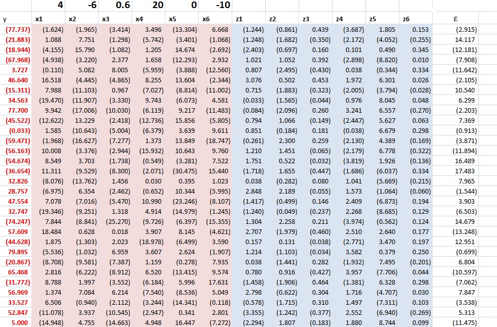
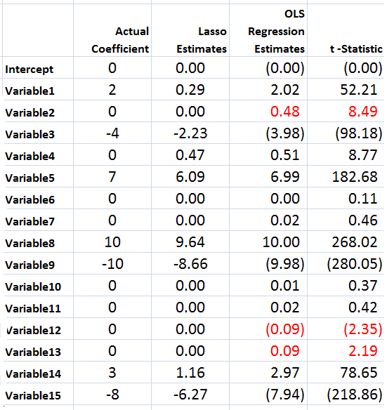
I grabbed some data from Mark Watson’s website at Princeton — from the links to a recent paper called Generalized Shrinkage Methods for Forecasting Using Many Predictors (with James H. Stock), Journal of Business and Economic Statistics, 30:4 (2012), 481-493.Download Paper (.pdf). Download Supplement (.pdf), Download Data and Replication Files (.zip). The data include the following variables, all expressed as year-over-year (yoy) growth rates: The first variable – real GDP – is taken as the forecasting target. The time periods of all other variables are lagged one period (1 quarter) behind the quarterly values of this target variable.

macrolist

Matlab makes calculation of both principal component and partial least squares regressions easy.

The command to extract principal components is

[coeff, score, latent]=princomp(X)

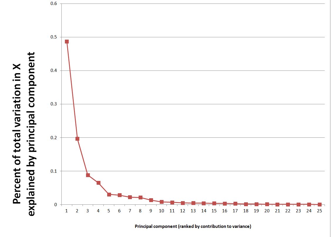
Here X the data matrix, and the entities in the square brackets are vectors or matrices produced by the algorithm. It’s possible to compute a principal components regression with the contents of the matrix score. Generally, the first several principal components are selected for the regression, based on the importance of a component or its associated eigenvalue in latent. The following scree chart illustrates the contribution of the first few principal components to explaining the variance in X.

Screechart

The relevant command for regression in Matlab is

b=regress(Y,score(:,1:6))

where b is the column vector of estimated coefficients and the first six principal components are used in place of the X predictor variables.

The Matlab command for a partial least square regresssion is

[XL,YL,XS,YS,beta] = plsregress(X,Y,ncomp)

where ncomp is the number of latent variables of components to be utilized in the regression. There are issues of interpreting the matrices and vectors in the square brackets, but I used this code –

data=xlsread(‘stock.xls’); X=data(1:47,2:79); y = data(2:48,1);

[XL,yl,XS,YS,beta] = plsregress(X,y,10); yfit = [ones(size(X,1),1) X]*beta;

lookPLS=[y yfit]; ZZ=data(48:50,2:79);newy=data(49:51,1);

new=[ones(3,1) ZZ]*beta; out=[newy new];

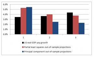
The bottom line is to test the estimates of the response coefficients on out-of-sample data.

The following chart shows that PLS outperforms PC, although the predictions of both are not spectacularly accurate.

plspccomp

Commentary

There are nuances to what I have done which help explain the dominance of PLS in this situation, as well as the weakly predictive capabilities of both approaches.

First, the target variable is quarterly year-over-year growth of real US GDP. The predictor set X contains 78 other macroeconomic variables, all expressed in terms of yoy (year-over-year) percent changes.

Again, note that the time period of all the variables or observations in X are lagged one quarter from the values in Y, or the values or yoy quarterly percent growth of real US GDP.

This means that we are looking for a real, live leading indicator. Furthermore, there are plausibly common factors in the Y series shared with at least some of the X variables. For example, the percent changes of a block of variables contained in real GDP are included in X, and by inspection move very similarly with the target variable.

Other Example Applications

There are at least a couple of interesting applied papers in the Handbook of Partial Least Squares – a downloadable book in the Springer Handbooks of Computational Statistics. See –

Chapter 20 A PLS Model to Study Brand Preference: An Application to the Mobile Phone Market

Chapter 22 Modeling the Impact of Corporate Reputation on Customer Satisfaction and Loyalty Using Partial Least Squares

Another macroeconomics application from the New York Fed –

“Revisiting Useful Approaches to Data-Rich Macroeconomic Forecasting”

http://www.newyorkfed.org/research/staff_reports/sr327.pdf

Finally, the software company XLStat has a nice, short video on partial least squares regression applied to a marketing example.

Links – March 7, 2014

Stuff is bursting out all over, more or less in anticipation of the spring season – or World War III, however you might like to look at it. So I offer an assortment of links to topics which are central and interesting below.

Human Longevity Inc. (HLI) Launched to Promote Healthy Aging Using Advances in Genomics and Stem Cell Therapies Craig Venter – who launched a competing private and successful effort to map the human genome – is involved with this. Could be important.

MAA Celebrates Women’s History Month In celebration of Women’s History Month, the MAA has collected photographs and brief bios of notable female mathematicians from its Women of Mathematics poster. Emma Noether shown below – “mother” of Noetherian rings and other wonderous mathematical objects.

EmmaNoether

Three Business Benefits of Cloud Computing – price, access, and security

Welcome to the Big Data Economy This is the first chapter of a new eBook that details the 4 ways the future of data is cleaner, leaner, and smarter than its storied past. Download the entire eBook, Big Data Economy, for free here

Financial Sector Ignores Ukraine, Pushing Stocks Higher From March 6, video on how the Ukraine crisis has been absorbed by the market.

Employment-Population ratio Can the Fed reverse this trend?

EmpPopRatio

How to Predict the Next Revolution

…few people noticed an April 2013 blog post by British academic Richard Heeks, who is director of the University of Manchester’s Center for Development Informatics. In that post, Heeks predicted the Ukrainian revolution.

A e-government expert, Heeks devised his “Revolution 2.0” index as a toy or a learning tool. The index combines three elements: Freedom House’s Freedom on the Net scores, the International Telecommunication Union’s information and communication technology development index, and the Economist’s Democracy Index (reversed into an “Outrage Index” so that higher scores mean more plutocracy). The first component measures the degree of Internet freedom in a country, the second shows how widely Internet technology is used, and the third supplies the level of oppression.

“There are significant national differences in both the drivers to mass political protest and the ability of such protest movements to freely organize themselves online,” Heeks wrote. “Both of these combine to give us some sense of how likely ‘mass protest movements of the internet age’ are to form in any given country.”

Simply put, that means countries with little real-world democracy and a lot of online freedom stand the biggest chance of a Revolution 2.0. In April 2013, Ukraine topped Heeks’s list, closely followed by Argentina and Georgia. The Philippines, Brazil, Russia, Kenya, Nigeria, Azerbaijan and Jordan filled out the top 10.

Proletarian Robots Getting Cheaper to Exploit Good report on a Russian robot conference recently.

The Top Venture Capital Investors By Exit Activity – Which Firms See the Highest Share of IPOs?

Venture

Complete Subset Regressions

A couple of years or so ago, I analyzed a software customer satisfaction survey, focusing on larger corporate users. I had firmagraphics – specifying customer features (size, market segment) – and customer evaluation of product features and support, as well as technical training. Altogether, there were 200 questions that translated into metrics or variables, along with measures of customer satisfaction. Altogether, the survey elicited responses from about 5000 companies.

Now this is really sort of an Ur-problem for me. How do you discover relationships in this sort of data space? How do you pick out the most important variables?

Since researching this blog, I’ve learned a lot about this problem. And one of the more fascinating approaches is the recent development named complete subset regressions.

And before describing some Monte Carlo exploring this approach here, I’m pleased Elliot, Gargano, and Timmerman (EGT) validate an intuition I had with this “Ur-problem.” In the survey I mentioned above, I calculated a whole bunch of univariate regressions with customer satisfaction as the dependent variable and each questionnaire variable as the explanatory variable – sort of one step beyond calculating simple correlations. Then, it occurred to me that I might combine all these 200 simple regressions into a predictive relationship. To my surprise, EGT’s research indicates that might have worked, but not be as effective as complete subset regression.

Complete Subset Regression (CSR) Procedure

As I understand it, the idea behind CSR is you run regressions with all possible combinations of some number r less than the total number n of candidate or possible predictors. The final prediction is developed as a simple average of the forecasts from these regressions with r predictors. While some of these regressions may exhibit bias due to specification error and covariance between included and omitted variables, these biases tend to average out, when the right number r < n is selected.

So, maybe you have a database with m observations or cases on some target variable and n predictors.

And you are in the dark as to which of these n predictors or potential explanatory variables really do relate to the target variable.

That is, in a regression y = β01 x1 +…+βn xn some of the beta coefficients may in fact be zero, since there may be zero influence between the associated xi and the target variable y.

Of course, calling all the n variables xi i=1,…n “predictor variables” presupposes more than we know initially. Some of the xi could in fact be “irrelevant variables” with no influence on y.

In a nutshell, the CSR procedure involves taking all possible combinations of some subset r of the n total number of potential predictor variables in the database, and mapping or regressing all these possible combinations onto the dependent variable y. Then, for prediction, an average of the forecasts of all these regressions is often a better predictor than can be generated by other methods – such as the LASSO or bagging.

EGT offer a time series example as an empirical application. based on stock returns, quarterly from 1947-2010 and twelve (12) predictors. The authors determine that the best results are obtained with a small subset of the twelve predictors, and compare these results with ridge regression, bagging, Lasso and Bayesian Model Averaging.

The article in The Journal of Econometrics is well-worth purchasing, if you are not a subscriber. Otherwise, there is a draft in PDF format from 2012.

The combination of n things taken r at a time is n!/[(n-r)!(r!)] and increases faster than exponentially, as n increases. For large n, accordingly, it is necessary to sample from the possible set of combinations – a procedure which still can generate improvements in forecast accuracy over a “kitchen sink” regression (under circumstances further delineated below). Otherwise, you need a quantum computer to process very fat databases.

When CSR Works Best – Professor Elloitt

I had email correspondence with Professor Graham Elliott, one of the co-authors of the above-cited paper in the Journal of Econometrics.

His recommendation is that CSR works best with when there are “weak predictors” sort of buried among a superset of candidate variables,

If a few (say 3) of the variables have large coefficients such as that they result in a relatively large R-square for the prediction regression when they are all included, then CSR is not likely to be the best approach. In this case model selection has a high chance of finding a decent model, the kitchen sink model is not all that much worse (about 3/T times the variance of the residual where T is the sample size) and CSR is likely to be not that great… When there is clear evidence that a predictor should be included then it should be always included…, rather than sometimes as in our method. You will notice that in section 2.3 of the paper that we construct properties where beta is local to zero – what this math says in reality is that we mean the situation where there is very little clear evidence that any predictor is useful but we believe that some or all have some minor predictive ability (the stock market example is a clear case of this). This is the situation where we expect the method to work well. ..But at the end of the day, there is no perfect method for all situations.

I have been toying with “hidden variables” and, then, measurement error in the predictor variables in simulations that further validate Graham Elliot’s perspective that CSR works best with “weak predictors.”

Monte Carlo Simulation

Here’s the spreadsheet for a relevant simulation (click to enlarge).

CSRTable

It is pretty easy to understand this spreadsheet, but it may take a few seconds. It is a case of latent variables, or underlying variables disguised by measurement error.

The z values determine the y value. The z values are multiplied by the bold face numbers in the top row, added together, and then the epsilon error ε value is added to this sum of terms to get each y value. You have to associate the first bold face coefficient with the first z variable, and so forth.

At the same time, an observer only has the x values at his or her disposal to estimate a predictive relationship.

These x variables are generated by adding a Gaussian error to the corresponding value of the z variables.

Note that z5 is an irrelevant variable, since its coefficient loading is zero.

This is a measurement error situation (see the lecture notes on “measurement error in X variables” ).

The relationship with all six regressors – the so-called “kitchen-sink” regression – clearly shows a situation of “weak predictors.”

I consider all possible combinations of these 6 variables, taken 3 at a time, or 20 possible distinct combinations of regressors and resulting regressions.

In terms of the mechanics of doing this, it’s helpful to set up the following type of listing of the combinations.

Combos

Each digit in the above numbers indicates a variable to include. So 123 indicates a regression with y and x1, x2, and x3. Note that writing the combinations in this way so they look like numbers in order of increasing size can be done by a simple algorithm for any r and n.

And I can generate thousands of cases by allowing the epsilon ε values and other random errors to vary.

In the specific run above, the CSR average soundly beats the mean square error (MSE) of this full specification in forecasts over ten out-of-sample values. The MSE of the kitchen sink regression, thus, is 2,440 while the MSE of the regression specifying all six regressors is 2653. It’s also true that picking the lowest within-sample MSE among the 20 possible combinations for k = 3 does not produce a lower MSE in the out-of-sample run.

This is characteristics of results in other draws of the random elements. I hesitate to characterize the totality without further studying the requirements for the number of runs, given the variances, and so forth.

I think CSR is exciting research, and hope to learn more about these procedures and report in future posts.

Variable Selection Procedures – The LASSO

The LASSO (Least Absolute Shrinkage and Selection Operator) is a method of automatic variable selection which can be used to select predictors X* of a target variable Y from a larger set of potential or candidate predictors X.

Developed in 1996 by Tibshirani, the LASSO formulates curve fitting as a quadratic programming problem, where the objective function penalizes the absolute size of the regression coefficients, based on the value of a tuning parameter λ. In doing so, the LASSO can drive the coefficients of irrelevant variables to zero, thus performing automatic variable selection.

This post features a toy example illustrating tactics in variable selection with the lasso. The post also dicusses the issue of consistency – how we know from a large sample perspective that we are honing in on the true set of predictors when we apply the LASSO.

My take is a two-step approach is often best. The first step is to use the LASSO to identify a subset of potential predictors which are likely to include the best predictors. Then, implement stepwise regression or other standard variable selection procedures to select the final specification, since there is a presumption that the LASSO “over-selects” (Suggested at the end of On Model Selection Consistency of Lasso).

Toy Example

The LASSO penalizes the absolute size of the regression coefficients, based on the value of a tuning parameter λ. When there are many possible predictors, many of which actually exert zero to little influence on a target variable, the lasso can be especially useful in variable selection.

For example, generate a batch of random variables in a 100 by 15 array – representing 100 observations on 15 potential explanatory variables. Mean-center each column. Then, determine coefficient values for these 15 explanatory variables, allowing several to have zero contribution to the dependent variable. Calculate the value of the dependent variable y for each of these 100 cases, adding in a normally distributed error term.

The following Table illustrates something of the power of the lasso.

LassoSS

Using the Matlab lasso procedure and a lambda value of 0.3, seven of the eight zero coefficients are correctly identified. The OLS regression estimate, on the other hand, indicates that three of the zero coefficients are nonzero at a level of 95 percent statistical significance or more (magnitude of the t-statistic > 2).

Of course, the lasso also shrinks the value of the nonzero coefficients. Like ridge regression, then, the lasso introduces bias to parameter estimates, and, indeed, for large enough values of lambda drives all coefficient to zero.

Note OLS can become impossible, when the number of predictors in X* is greater than the number of observations in Y and X. The LASSO, however, has no problem dealing with many predictors.

Real World Examples

For a recent application of the lasso, see the Dallas Federal Reserve occasional paper Hedge Fund Dynamic Market Stability. Note that the lasso is used to identify the key drivers, and other estimation techniques are employed to hone in on the parameter estimates.

For an application of the LASSO to logistic regression in genetics and molecular biology, see Lasso Logistic Regression, GSoft and the Cyclic Coordinate Descent Algorithm, Application to Gene Expression Data. As the title suggests, this illustrates the use of the lasso in logistic regression, frequently utilized in biomedical applications.

Formal Statement of the Problem Solved by the LASSO

The objective function in the lasso involves minimizing the residual sum of squares, the same entity figuring in ordinary least squares (OLS) regression, subject to a bound on the sum of the absolute value of the coefficients. The following clarifies this in notation, spelling out the objective function.

LassoDerivation

LassoDerivation2

The computation of the lasso solutions is a quadratic programming problem, tackled by standard numerical analysis algorithms. For an analytical discussion of the lasso and other regression shrinkage methods, see the outstanding free textbook The Elements of Statistical Learning by Hastie, Tibshirani, and Friedman.

The Issue of Consistency

The consistency of an estimator or procedure concerns its large sample characteristics. We know the LASSO produces biased parameter estimates, so the relevant consistency is whether the LASSO correctly predicts which variables from a larger set are in fact the predictors.

In other words, when can the LASSO select the “true model?”

Now in the past, this literature is extraordinarily opaque, involving something called the Irrepresentable Condition, which can be glossed as –

almost necessary and sufficient for Lasso to select the true model both in the classical fixed p setting and in the large p setting as the sample size n gets large…This Irrepresentable Condition, which depends mainly on the covariance of the predictor variables, states that Lasso selects the true model consistently if and (almost) only if the predictors that are not in the true model are “irrepresentable” (in a sense to be clarified) by predictors that are in the true model.

Fortunately a ray of light has burst through with Assumptionless Consistency of the Lasso by Chatterjee. Apparently, the LASSO selects the true model almost always – with minimal side assumptions – providing we are satisfied with the prediction error criterion – the mean square prediction error – employed in Tibshirani’s original paper.

Finally, cross-validation is typically used to select the tuning parameter λ, and is another example of this procedure highlighted by Varian’s recent paper.

Kernel Ridge Regression – A Toy Example

Kernel ridge regression (KRR) is a promising technique in forecasting and other applications, when there are “fat” databases. It’s intrinsically “Big Data” and can accommodate nonlinearity, in addition to many predictors.

Kernel ridge regression, however, is shrouded in mathematical complexity. While this is certainly not window-dressing, it can obscure the fact that the method is no different from ordinary ridge regression on transformations of regressors, except for an algebraic trick to improve computational efficiency.

This post develops a spreadsheet example illustrating this key point – kernel ridge regression is no different from ordinary ridge regression…except for an algebraic trick.

Background

Most applications of KRR have been in the area of machine learning, especially optical character recognition.

To date, the primary forecasting application involves a well-known “fat” macroeconomic database. Using this data, researchers from the Tinbergen Institute and Erasmus University develop KRR models which outperform principal component regressions in out-of-sample forecasts of variables, such as real industrial production and employment.

You might want to tab and review several white papers on applying KRR to business/economic forecasting, including,

Nonlinear Forecasting with Many Predictors using Kernel Ridge Regression

Modelling Issues in Kernel Ridge Regression

Model Selection in Kernel Ridge Regression

This research holds out great promise for KRR, concluding, in one of these selections that,

The empirical application to forecasting four key U.S. macroeconomic variables — production, income, sales, and employment — shows that kernel-based methods are often preferable to, and always competitive with, well-established autoregressive and principal-components-based methods. Kernel techniques also outperform previously proposed extensions of the standard PC-based approach to accommodate nonlinearity.

Calculating a Ridge Regression (and Kernel Ridge Regression)

Recall the formula for ridge regression,

aridgeregmatformula                       

Here, X is the data matrix, XT is the transpose of X, λ is the conditioning factor, I is the identify matrix, and y is a vector of values of the dependent or target variable. The “beta-hats” are estimated β’s or coefficient values in the conventional linear regression equation,

y = β1x1+ β2x2+… βNxN

The conditioning factor λ is determined by cross-validation or holdout samples (see Hal Varian’s discussion of this in his recent paper).

Just for the record, ridge regression is a data regularization method which works wonders when there are glitches – such as multicollinearity – which explode the variance of estimated coefficients.

Ridge regression, and kernel ridge regression, also can handle the situation where there are more predictors or explanatory variables than cases or observations.

A Specialized Dataset

Now let us consider ridge regression with the following specialized dataset.

KRRssEx1

By construction, the equation,

y = 2x1 + 5x2+0.25x1x2+0.5x12+1.5x22+0.5x1x22+0.4x12x2+0.2x13+0.3x23

generates the six values of y from the sums of ten terms in x1 and x2, their powers, and cross-products.

Although we really only have two explanatory variables, x1 and x2, the equation, as a sum of 10 terms, can be considered to be constructed out of ten, rather than two, variables.

However, adopting this convenience, it means we have more explanatory variables (10) than observations on the dependent variable (6).

Thus, it will be impossible to estimate the beta’s by OLS.

Of course, we can develop estimates of the values of the coefficients of the true relationship between y and the data on the explanatory variables with ridge regression.

Then, we will find that we can map all ten of these apparent variables in the equation onto a kernel of two variables, simplifying the matrix computations in a fundamental way, using this so-called algebraic trick.

The ordinary ridge regression data matrix X is 6 rows by 10 columns, since there are six observations or cases and ten explanatory variables. Thus, the transpose XT is a 10 by 6 matrix. Accordingly, the product XTX is a 10 by 10 matrix, resulting in a 10 by 10 inverse matrix after the conditioning factor and identity matrix is added in to XTX.

In fact, the matrix equation for ridge regression can be calculated within a spreadsheet using the Excel functions mmult(.,) and minverse() and the transpose operation from Copy. The conditioning factor λ can be determined by trial and error, or by writing a Visual Basic algorithm to explore the mean square error of parameter values associated with different values λ.

The ridge regression formula above, therefore, gives us estimates for ten beta-hats, as indicated in the following chart, using a λ or conditioning coefficient of .005.

krrbarchart

The red bars indicate the true coefficient values, and the blue bars are the beta-hats estimated by the ridge regression formula.

As you can see, ridge regression “gets in the ballpark” in terms of the true values of the coefficients of this linear expression. However, with only 6 observations, the estimate is highly approximate.

The Kernel Trick

Now with suitable pre- and post-multiplications and resorting, it is possible to switch things around to another matrix formula,

KRRMatformula

Exterkate et al show the matrix algebra in a section of their “Nonlinear..” white paper using somewhat different symbolism.

Key point – the matrix formula listed just above involves inverting a smaller matrix, than the original formula – in our example, a 6 by 6, rather than a 10 by 10 matrix.

The following Table shows the beta-hats estimated by these two formulas are similar and compares them with the “true” values of the coefficients.

krrcomp

Differences in the estimates by these formally identical formulas relate strictly to issues at the level of numerical analysis and computation.

Kernels

Notice that the ten variables could correspond to a Taylor expansion which might be used to estimate the value of a nonlinear function. This is a key fact and illustrates the concept of a “kernel”.

Thus, designating K = XXT,we find that the elements of K can be obtained without going through the indicated multiplication of these two matrices. This is because K is a polynomial kernel.

There is a great deal more that can be said about this example and the technique in general. Two big areas are (a) arriving at the estimate of the conditioning factor λ and (b) discussing the range of possible kernels that can be used, what makes a kernel a kernel, how to generate kernels from existing kernels, where Hilbert spaces come into the picture, and so forth.

But hopefully this simple example can point the way.

For additional insight and the source for the headline Homer Simpson graphic, see The Kernel Trick.

Links – February 28

Data Science and Predictive Analytics

Data Scientists Predict Oscar® Winners Again; Social Media May Love Leo, But Data Says “No”

..the data shows that Matthew McConaughey will win best actor for his role in the movie Dallas Buyers Guide; Alfonso Cuaron will win best director for the movie Gravity; and 12 Months a Slave will win the coveted prize for best picture – which is the closest among all the races. The awards will not be a clean sweep for any particular picture, although the other award winners are expected to be Jared Leto for best supporting actor in Dallas Buyers Club; Cate Blanchet for best actress in Blue Jasmine; and Lupita Nyong’o for best supporting actress in 12 Years a Slave.

10 Most Influential Analytics Leaders in India

Pankaj Kulshreshtha – Business Leader, Analytics & Research at Genpact

Rohit Tandon – Vice President, Strategy WW Head of HP Global Analytics

Sameer Dhanrajani – Business Leader, Cognizant Analytics

Srikanth Velamakanni – Co founder and Chief Executive Officer at Fractal Analytics

Pankaj Rai – Director, Global Analytics at Dell

Amit Khanna – Partner at KPMG

Ashish Singru – Director eBay India Analytics Center

Arnab Chakraborty – Managing Director, Analytics at Accenture Consulting

Anil Kaul – CEO and Co-founder at Absolutdata

Dr. N.R.Srinivasa Raghavan, Senior Vice President & Head of Analytics at Reliance Industries Limited

Interview with Jörg Kienitz, co-author with Daniel Wetterau of Financial Modelling: Theory, Implementation and Practice with MATLAB Source

JB: Why MATLAB? Was there a reason for choosing it in this context?

JK: Our attitude was that it was a nice environment for developing models because you do not have to concentrate on the side issues. For instance, if you want to calibrate a model you can really concentrate on implementing the model without having to think about the algorithms doing the optimisation for example. MATLAB offers a lot of optimisation routines which are really reliable and which are fast, which are tested and used by thousands of people in the industry. We thought it was a good idea to use standardised mathematical software, a programming language where all the mathematical functions like optimisation, like Fourier transform, random number generator and so on, are very reliable and robust. That way we could concentrate on the algorithms which are necessary to implement models, and not have to worry about a programming a random number generator or such stuff. That was the main idea, to work on a strong ground and build our house on a really nice foundation. So that was the idea of choosing MATLAB.

Knowledge-based programming: Wolfram releases first demo of new language, 30 years in the making


Economy

Credit Card Debt Threatens Turkey’s Economy – kind of like the subprime mortgage scene in the US before 2008.

..Standard & Poor’s warned in a report last week that the boom in consumer credit had become a serious risk for Turkish lenders. Slowing economic growth, political turmoil and increasing reluctance by foreign investors to provide financing “are prompting a deterioration in the operating environment for Turkish banks,”

A shadow banking map from the New York Fed. Go here and zoom in for detail.

China Sees Expansion Outweighing Yuan, Shadow Bank Risk

China’s Finance Minister Lou Jiwei played down yuan declines and the risks from shadow banking as central bank Governor Zhou Xiaochuan signaled that the nation’s economy can sustain growth of between 7 percent and 8 percent.

Outer Space

715 New Planets Found (You Read That Number Right)

Speaks for itself. That’s a lot of new planets. One of the older discoveries – Tau Boötis b – has been shown to have water vapor in its atmosphere.

Hillary, ‘The Family,’ and Uganda’s Anti-Gay Christian Mafia

GayBashers

I heard about this at the SunDance film gathering in 2013. Apparently, there are links between US and Ugandan groups in promulgating this horrific law.

An Astronaut’s View of the North Korean Electricity Black Hole

NorthKorea

Predicting the Hurricane Season

I’ve been focusing recently on climate change and extreme weather events, such as hurricanes and tornados. This focus is interesting in its own right, offering significant challenges to data analysis and predictive analytics, and I also see strong parallels to economic forecasting.

The Florida State University Center for Ocean-Atmospheric Prediction Studies (COAPS) garnered good press 2009-2012, for its accurate calls on the number of hurricanes and named tropical storms in the North Atlantic. Last year was another story, however, and it’s interesting to explore why 2013 was so unusual – there being only two (2) hurricanes and no major hurricanes over the whole season.

Here’s the track record for COAPS, since it launched its new service.

Hurricaneforecastaccuracy

The forecast for 2013 was a major embarrassment, inasmuch as the Press Release at the beginning of June 2013 predicted an “above-average season.”

Tim LaRow, associate research scientist at COAPS, and his colleagues released their fifth annual Atlantic hurricane season forecast today. Hurricane season begins June 1 and runs through Nov. 30.

This year’s forecast calls for a 70 percent probability of 12 to 17 named storms with five to 10 of the storms developing into hurricanes. The mean forecast is 15 named storms, eight of them hurricanes, and an average accumulated cyclone energy (a measure of the strength and duration of storms accumulated during the season) of 135.

“The forecast mean numbers are identical to the observed 1995 to 2010 average named storms and hurricanes and reflect the ongoing period of heightened tropical activity in the North Atlantic,” LaRow said.

The COAPS forecast is slightly less than the official National Oceanic and Atmospheric Administration (NOAA) forecast that predicts a 70 percent probability of 13 to 20 named storms with seven to 11 of those developing into hurricanes this season…

What Happened?

Hurricane forecaster Gary Bell is quoted as saying,

“A combination of conditions acted to offset several climate patterns that historically have produced active hurricane seasons,” said Gerry Bell, Ph.D., lead seasonal hurricane forecaster at NOAA’s Climate Prediction Center, a division of the National Weather Service. “As a result, we did not see the large numbers of hurricanes that typically accompany these climate patterns.”

More informatively,

Forecasters say that three main features loom large for the inactivity: large areas of sinking air, frequent plumes of dry, dusty air coming off the Sahara Desert, and above-average wind shear. None of those features were part of their initial calculations in making seasonal projections. Researchers are now looking into whether they can be predicted in advance like other variables, such as El Niño and La Niña events.

I think it’s interesting NOAA stuck to its “above-normal season” forecast as late as August 2013, narrowing the numbers only a little. At the same time, neutral conditions with respect to la Nina and el Nino in the Pacific were acknowledged as influencing the forecasts. The upshot – the 2013 hurricane season in the North Atlantic was the 7th quietest in 70 years.

Risk Behaviors and Extreme Events

Apparently, it’s been more than 8 years since a category 3 hurricane hit the mainland of the US. This is chilling, inasmuch as Sandy, which caused near-record damage on the East Coast, was only a category 1 when it made landfall in New Jersey in 2012.

Many studies highlight a “ratchet pattern” in risk behaviors following extreme weather, such as a flood or hurricane. Initially, after the devastation, people engage in lots of protective, pre-emptive behavior. Typically, flood insurance coverage shoots up, only to gradually fall off, when further flooding has not been seen for a decade or more.

Similarly, after a volcanic eruption, in Indonesia, for example, and destruction of fields and villages by lava flows or ash – people take some time before they re-claim those areas. After long enough, these events can give rise to rich soils, supporting high crop yields. So since the volcano has not erupted for, say, decades or a century, people move back and build even more intensively than before.

This suggests parallels with economic crisis and its impacts, and measures taken to make sure “it never happens again.”

I also see parallels between weather and economic forecasting.

Maybe there is a chaotic element in economic dynamics, just as there almost assuredly is in weather phenomena.

Certainly, the curse of dimension in forecasting models translates well from weather to economic forecasting. Indeed, a major review of macroeconomic forecasting, especially of its ability to predict recessions, concludes that economic models are always “fighting the last war,” in the sense that new factors seem to emerge and take control during every major economic crises. Things do not repeat themselves exactly. So, if the “true” recession forecasting model has legitimately 100 drivers or explanatory variables, it takes a long historic record to sort out the separate influences of these – and the underlying technological basis of the economy is changing all the time.

Tornado Frequency Distribution

Data analysis, data science, and advanced statistics have an important role to play in climate science.

James Elsner’s blog Hurricane & Tornado Climate offers salient examples, in this regard.

Yesterday’s post was motivated by an Elsner suggestion that the time trend in maximum wind speeds of larger or more powerful hurricanes is strongly positive since weather satellite observations provide better measurement (post-1977).

Here’s a powerful, short video illustrating the importance of proper data segmentation and statistical characterization for tornado data – especially for years of tremendous devastation, such as 2011.

Events that year have a more than academic interest for me, incidentally, since my city of birth – Joplin, Missouri – suffered the effects of a immense supercell which touched down and destroyed everything in its path, including my childhood home. The path of this monster was, at points, nearly a mile wide, and it gouged out a track several miles through this medium size city.

Here is Elsner’s video integrating data analysis with matters of high human import.

There is a sort of extension, in my mind, of the rational expectations issue to impacts of climate change and extreme weather. The question is not exactly one people living in areas subject to these events might welcome. But it is highly relevant to data analysis and statistics.

The question simply is whether US property and other insurance companies are up-to-speed on the type of data segmentation and analysis that is needed to adequately capture the probable future impacts of some of these extreme weather events.

This may be where the rubber hits the road with respect to Bayesian techniques – popular with at least some prominent climate researchers, because they allow inclusion of earlier, less-well documented historical observations.

Possibilities for Abrupt Climate Change

The National Research Council (NRC) published ABRUPT IMPACTS OF CLIMATE CHANGE recently, downloadable from the National Academies Press website.

It’s the third NRC report to focus on abrupt climate change, the first being published in 2002. NRC members are drawn from the councils of the National Academy of Sciences, the National Academy of Engineering, and the Institute of Medicine.

The climate change issue is a profound problem in causal discovery and forecasting, to say the very least.

Before I highlight graphic and pictoral resources of the recent NRC report, let me note that Menzie Chin at Econbrowser posted recently on Economic Implications of Anthropogenic Climate Change and Extreme Weather. Chin focuses on the scientific consensus, presenting graphics illustrating the more or less relentless upward march of global average temperatures and estimates (by James Stock no less) of the man-made (anthropogenic) component.

The Econbrowser Comments section is usually interesting and revealing, and this time is no exception. Comments range from “climate change is a left-wing conspiracy” and arguments that “warmer would be better” to the more defensible thought that coming to grips with global climate change would probably mean restructuring our economic setup, its incentives, and so forth.

But I do think the main aspects of the climate change problem – is it real, what are its impacts, what can be done – are amenable to causal analysis at fairly deep levels.

To dispel ideological nonsense, current trends in energy use – growing globally at about 2 percent per annum over a long period – lead to the Earth becoming a small star within two thousand years, or less – generating the amount of energy radiated by the Sun. Of course, changes in energy use trends can be expected before then, when for example the average ambient temperature reaches the boiling point of water, and so forth. These types of calculations also can be made realistically about the proliferation of the automobile culture globally with respect to air pollution and, again, contributions to average temperature. Or one might simply consider the increase in the use of materials and energy for a global population of ten billion, up from today’s number of about 7 billion.

Highlights of the Recent NRC Report

It’s worth quoting the opening paragraph of the report summary –

Levels of carbon dioxide and other greenhouse gases in Earth’s atmosphere are exceeding levels recorded in the past millions of years, and thus climate is being forced beyond the range of the recent geological era. Lacking concerted action by the world’s nations, it is clear that the future climate will be warmer, sea levels will rise, global rainfall patterns will change, and ecosystems will be altered.

So because of growing CO2 (and other greenhouse gases), climate change is underway.

The question considered in ABRUPT IMPACTS OF CLIMATE CHANGE (AICH), however, is whether various thresholds will be crossed, whereby rapid, relatively discontinuous climate change occurs. Such abrupt changes – with radical shifts occurring over decades, rather than centuries – before. AICH thus cites,

..the end of the Younger Dryas, a period of cold climatic conditions and drought in the north that occurred about 12,000 years ago. Following a millennium-long cold period, the Younger Dryas abruptly terminated in a few decades or less and is associated with the extinction of 72 percent of the large-bodied mammals in North America.

The main abrupt climate change noted in AICH is rapid decline of the Artic sea ice. AICH puts up a chart which is one of the clearest examples of a trend you can pull from environmental science, I would think.

ArticSeaIce

AICH also puts species extinction front and center as a near-term and certain discontinuous effect of current trends.

Apart from melting of the Artic sea ice and species extinction, AICH lists destabilization of the Antarctic ice sheet as a nearer term possibility with dramatic consequences. Because a lot of this ice in the Antarctic is underwater, apparently, it is more at risk than, say, the Greenland ice sheet. Melting of either one (or both) of these ice sheets would raise sea levels tens of meters – an estimated 60 meters with melting of both.

Two other possibilities mentioned in previous NRC reports on abrupt climate change are discussed and evaluated as low probability developments until after 2100. These are stopping of the ocean currents that circulate water in the Atlantic, warming northern Europe, and release of methane from permafrost or deep ocean deposits.

The AMOC is the ocean circulation pattern that involves the northward flow of warm near-surface waters into the northern North Atlantic and Nordic Seas, and the south- ward flow at depth of the cold dense waters formed in those high latitude regions. This circulation pattern plays a critical role in the global transport of oceanic heat, salt, and carbon. Paleoclimate evidence of temperature and other changes recorded in North Atlantic Ocean sediments, Greenland ice cores and other archives suggest that the AMOC abruptly shut down and restarted in the past—possibly triggered by large pulses of glacial meltwater or gradual meltwater supplies crossing a threshold—raising questions about the potential for abrupt change in the future.

Despite these concerns, recent climate and Earth system model simulations indicate that the AMOC is currently stable in the face of likely perturbations, and that an abrupt change will not occur in this century. This is a robust result across many different models, and one that eases some of the concerns about future climate change.

With respect to the methane deposits in Siberia and elsewhere,

Large amounts of carbon are stored at high latitudes in potentially labile reservoirs such as permafrost soils and methane-containing ices called methane hydrate or clathrate, especially offshore in ocean marginal sediments. Owing to their sheer size, these carbon stocks have the potential to massively affect Earth’s climate should they somehow be released to the atmosphere. An abrupt release of methane is particularly worrisome because methane is many times more potent than carbon dioxide as a greenhouse gas over short time scales. Furthermore, methane is oxidized to carbon dioxide in the atmosphere, representing another carbon dioxide pathway from the biosphere to the atmosphere.

According to current scientific understanding, Arctic carbon stores are poised to play a significant amplifying role in the century-scale buildup of carbon dioxide and methane in the atmosphere, but are unlikely to do so abruptly, i.e., on a timescale of one or a few decades. Although comforting, this conclusion is based on immature science and sparse monitoring capabilities. Basic research is required to assess the long-term stability of currently frozen Arctic and sub-Arctic soil stocks, and of the possibility of increasing the release of methane gas bubbles from currently frozen marine and terrestrial sediments, as temperatures rise.

So some bad news and, I suppose, good news – more time to address what would certainly be completely catastrophic to the global economy and world population.

AICH has some neat graphics and pictoral exhibits.

For example, Miami Florida will be largely underwater within a few decades, according to many standard forecasts of increases in sea level (click to enlarge).

Florida

But perhaps most chilling of all (actually not a good metaphor here but you know what I mean) is a graphic I have not seen before, but which dovetails with my initial comments and observations of physicists.

This chart toward the end of the AICH report projects increase in global temperature beyond any past historic level (or prehistoric, for that matter) by the end of the century.

TempRise

So, for sure, there will be species extinction in the near term, hopefully not including the human species just yet.

Economic Impacts

In closing, I do think the primary obstacle to a sober evaluation of climate change involves social and economic implications. The climate change deniers may be right – acknowledging and adequately planning for responses to climate change would involve significant changes in social control and probably economic organization.

Of course, the AICH adopts a more moderate perspective – let’s be sure and set up monitoring of all this, so we can be prepared.

Hopefully, that will happen to some degree.

But adopting a more pro-active stance seems unlikely, at least in the near term. There is a wholesale rush to bringing one to several trillion persons who are basically living in huts with dirt floors into “the modern world.” Their children are traveling to cities, where they will earn much higher incomes, probably, and send money back home. The urge to have a family is almost universal, almost a concomitant of healthy love of a man and a woman. Tradeoffs between economic growth and environmental quality are a tough sell, when there are millions of new consumers and workers to be incorporated into the global supply chain. The developed nations – where energy and pollution output ratios are much better – are not persuasive when they suggest a developing giant like India or China should tow the line, limit energy consumption, throttle back economic growth in order to have a cooler future for the planet. You already got yours Jack, and now you want to cut back? What about mine? As standards of living degrade in the developed world with slower growth there, and as the wealthy grab more power in the situation, garnering even more relative wealth, the political dialogue gets stuck, when it comes to making changes for the good of all.

I could continue, and probably will sometime, but it seems to me that from a longer term forecasting perspective darker scenarios could well be considered. I’m sure we will see quite a few of these. One of the primary ones would be a kind of devolution of the global economy – the sort of thing one might expect if air travel were less possible because of, say, a major uptick in volcanism, or huge droughts took hold in parts of Asia.

Again and again, I come back to the personal thought of local self-reliance. There has been a growth with global supply chains and various centralizations, mergers, and so forth toward de-skilling populations, pushing them into meaningless service sector jobs (fast food), and losing old knowledge about, say, canning fruits and vegetables, or simply growing your own food. This sort of thing has always been a sort of quirky alternative to life in the fast lane. But inasmuch as life in the fast lane involves too much energy use for too many people to pursue, I think decentralized alternatives for lifestyle deserve a serious second look.

Polar bear on ice flow at top from http://metro.co.uk/2010/03/03/polar-bears-cling-to-iceberg-as-climate-change-ruins-their-day-141656/

Granger Causality

After review, I have come to the conclusion that from a predictive and operational standpoint, causal explanations translate to directed graphs, such as the following:

causegraph

And I think it is interesting the machine learning community focuses on causal explanations for “manipulation” to guide reactive and interactive machines, and that directed graphs (or perhaps a Bayesian networks) are a paramount concept.

Keep that thought, and consider “Granger causality.”

This time series concept is well explicated in C.W.J. Grangers’ 2003 Nobel Prize lecture – which motivates its discovery and links with cointegration.

An earlier concept that I was concerned with was that of causality. As a postdoctoral student in Princeton in 1959–1960, working with Professors John Tukey and Oskar Morgenstern, I was involved with studying something called the “cross-spectrum,” which I will not attempt to explain. Essentially one has a pair of inter-related time series and one would like to know if there are a pair of simple relations, first from the variable X explaining Y and then from the variable Y explaining X. I was having difficulty seeing how to approach this question when I met Dennis Gabor who later won the Nobel Prize in Physics in 1971. He told me to read a paper by the eminent mathematician Norbert Wiener which contained a definition that I might want to consider. It was essentially this definition, somewhat refined and rounded out, that I discussed, together with proposed tests in the mid 1960’s.

The statement about causality has just two components: 1. The cause occurs before the effect; and 2. The cause contains information about the effect that that is unique, and is in no other variable.

A consequence of these statements is that the causal variable can help forecast the effect variable after other data has first been used. Unfortunately, many users concentrated on this forecasting implication rather than on the original definition. At that time, I had little idea that so many people had very fixed ideas about causation, but they did agree that my definition was not “true causation” in their eyes, it was only “Granger causation.” I would ask for a definition of true causation, but no one would reply. However, my definition was pragmatic and any applied researcher with two or more time series could apply it, so I got plenty of citations. Of course, many ridiculous papers appeared.

When the idea of cointegration was developed, over a decade later, it became clear immediately that if a pair of series was cointegrated then at least one of them must cause the other. There seems to be no special reason why there two quite different concepts should be related; it is just the way that the mathematics turned out

In the two-variable case, suppose we have time series Y={y1,y2,…,yt} and X = {x1,..,xt}. Then, there are, at the outset, two cases, depending on whether Y and X are stationary or nonstationary. The classic case is where we have an autoregressive relationship for yt,

yt = a0+a1yt-1+..+akyt-k

and this relationship can be shown to be a weaker predictor than


yt = a0+a1yt-1+..+akyt-k + b0+b1xt-1+..+bmxt-m

In this case, we say that X exhibits Granger causality with respect to Y.

Of course, if Y and X are nonstationary time series, autoregressive predictive equations make no sense, and instead we have the case of cointegration of time series, where in the two-variable case,

yt=φxt-1+ut

and the series of residuals ut are reduced to a white noise process.

So these cases follow what good old Wikipedia says,

A time series X is said to Granger-cause Y if it can be shown, usually through a series of t-tests and F-tests on lagged values of X (and with lagged values of Y also included), that those X values provide statistically significant information about future values of Y.

There are a number of really interesting extensions of this linear case, discussed in a recent survey paper.

Stern points out that the main enemies or barriers to establishing causal relations are endogeneity and omitted variables.

So I find that margin loans and the level of the S&P 500 appear to be mutually interrelated. Thus, it is forecasts of the S&P 500 can be improved with lagged values of margin loans, and you can improve forecasts of the monthly total of margin loans with lagged values of the S&P 500 – at least over broad ranges of time and in the period since 2008. The predictions of the S&P 500 with lagged values of margin loans, however, are marginally more powerful or accurate predictions.

Stern gives a colorful example where an explanatory variable is clearly exogenous and appears to have a significant effect on the dependent variable and yet theory suggests that the relationship is spurious and due to omitted variables that happen to be correlated with the explanatory variable in question.

Westling (2011) regresses national economic growth rates on average reported penis lengths and other variables and finds that there is an inverted U shape relationship between economic growth and penis length from 1960 to 1985. The growth maximizing length was 13.5cm, whereas the global average was 14.5cm. Penis length would seem to be exogenous but the nature of this relationship would have changed over time as the fastest growing region has changed from Europe and its Western Offshoots to Asia. So, it seems that the result is likely due to omitted variables bias.

Here Stern notes that Westling’s data indicates penis length is lowest in Asia and greatest in Africa with Europe and its Western Offshoots having intermediate lengths.

There’s a paper which shows stock prices exhibit Granger causality with respect to economic growth in the US, but vice versa does not obtain. This is a good illustration of the careful ste-by-step in conducting this type of analysis, and how it is in fact fraught with issues of getting the number of lags exactly right and avoiding big specification problems.

Just at the moment when it looks as if the applications of Granger causality are petering out in economics, neuroscience rides to the rescue. I offer you a recent article from a journal in computation biology in this regard – Measuring Granger Causality between Cortical Regions from Voxelwise fMRI BOLD Signals with LASSO.

Here’s the Abstract:

Functional brain network studies using the Blood Oxygen-Level Dependent (BOLD) signal from functional Magnetic Resonance Imaging (fMRI) are becoming increasingly prevalent in research on the neural basis of human cognition. An important problem in functional brain network analysis is to understand directed functional interactions between brain regions during cognitive performance. This problem has important implications for understanding top-down influences from frontal and parietal control regions to visual occipital cortex in visuospatial attention, the goal motivating the present study. A common approach to measuring directed functional interactions between two brain regions is to first create nodal signals by averaging the BOLD signals of all the voxels in each region, and to then measure directed functional interactions between the nodal signals. Another approach, that avoids averaging, is to measure directed functional interactions between all pairwise combinations of voxels in the two regions. Here we employ an alternative approach that avoids the drawbacks of both averaging and pairwise voxel measures. In this approach, we first use the Least Absolute Shrinkage Selection Operator (LASSO) to pre-select voxels for analysis, then compute a Multivariate Vector AutoRegressive (MVAR) model from the time series of the selected voxels, and finally compute summary Granger Causality (GC) statistics from the model to represent directed interregional interactions. We demonstrate the effectiveness of this approach on both simulated and empirical fMRI data. We also show that averaging regional BOLD activity to create a nodal signal may lead to biased GC estimation of directed interregional interactions. The approach presented here makes it feasible to compute GC between brain regions without the need for averaging. Our results suggest that in the analysis of functional brain networks, careful consideration must be given to the way that network nodes and edges are defined because those definitions may have important implications for the validity of the analysis.

So Granger causality is still a vital concept, despite its probably diminishing use in econometrics per se.

Let me close with this thought and promise a future post on the Kaggle and machine learning competitions on identifying the direction of causality in pairs of variables without context.

Correlation does not imply causality—you’ve heard it a thousand times. But causality does imply correlation.