Category Archives: financial forecasting

Interest Rates – 3

Can interest rates be nonstationary?

This seems like a strange question, since interest rates are bounded, except in circumstances, perhaps, of total economic collapse.

“Standard” nonstationary processes, by contrast, can increase or decrease without limit, as can conventional random walks.

But, be careful. It’s mathematically possible to define and study random walks with reflecting barriers –which, when they reach a maximum or minimum, “bounce” back from the barrier.

This is more than esoteric, since the 30 year fixed mortgage rate monthly averages series discussed in the previous post has a curious property. It can be differenced many times, and yet display first order autocorrelation of the resulting series.

This contrasts with the 10 year fixed maturity Treasury bond rates (also monthly averages). After first differencing this Treasury bond series, the resulting residuals do not show statistically significant first order autocorrelation.

Here a stationary stochastic process is one in which the probability distribution of the outcomes does not shift with time, so the conditional mean and conditional variance are, in the strict case, constant. A classic example is white noise, where each element can be viewed as an independent draw from a Gaussian distribution with zero mean and constant variance.

30 Year Fixed Mortgage Monthly Averages – a Nonstationary Time Series?

Here are some autocorrelation functions (ACF’s) and partial autocorrelation functions (PACF’s) of the 30 year fixed mortgage monthly averages from April 1971 to January 2014, first differences of this series, and second differences of this series – altogether six charts produced by MATLAB’s plot routines.

Data for this and the following series are downloaded from the St. Louis Fed FRED site.

MLmort0

Here the PACF appears to cut off after 4 periods, but maybe not quite, since there are values for lags which touch the statistical significance boundary further out.

MLmort1

This seems more satisfactory, since there is only one major spike in the ACF and 2-3 initial spikes in the PACF. Again, however, values for lags far out on the horizontal axis appear to touch the boundary of statistical significance.

MLmort2

Here are the ACF and PACF’s of the “difference of the first difference” or the second difference, if you like. This spike at period 2 for the ACF and PACF is intriguing, and, for me, difficult to interpret.

The data series includes 514 values, so we are not dealing with a small sample in conventional terms.

I also checked for seasonal variation – either additive or multiplicative seasonal components or factors. After taking steps to remove this type of variation, if it exists, the same pattern of repeated significance of autocorrelations of differences and higher order differences persists.

Forecast Pro, a good business workhorse for automatic forecasting, selects ARIMA(0,1,1) as the optimal forecast model for this 30 year fixed interest mortgage monthly averages. In other words, Forecast Pro glosses over the fact that the residuals from an ARIMA(0,1,1) setup still contain significant autocorrelation.

Here is a sample of the output (click to enlarge)

FP30yr

10 Year Treasury Bonds Constant Maturity

The situation is quite different for 10 year Treasury Bonds monthly averages, where the downloaded series starts April 1953 and, again, ends January 2014.

Here is the ordinary least squares (OLS) regression of the first order autocorrelation.

10yrTreasregHere the R2 or coefficient of determination is much lower than for the 30 year fixed mortgage monthly averages, but the first order lagged rate is highly significant statistically.

On the other hand, the residuals of this regression do not exhibit a high degree of first order autocorrelation, falling below the 80 percent significance level.

What Does This Mean?

The closest I have come to formulating an explanation for this weird difference between these two “interest rates” is the discussion in a paper from 2002 –

On Mean Reversion in Real Interest Rates: An Application of Threshold Cointegration

The authors of this research paper from the Institute for Advanced Studies in Vienna acknowledge findings that some interests rates may be nonstationary, at least over some periods of time. Their solution is a nonlinear time series approach, but they highlight several of the more exotic statistical features of interest rates in passing – such as evidence of non-normal distributions, excess kurtosis, conditional heteroskedasticity, and long memory.

In any case, I wonder whether the 30 year fixed mortgage monthly averages might be suitable for some type of boosting model working on residuals and residuals of residuals.

I’m going to try that later on this Spring.

Interest Rates – 2

I’ve been looking at forecasting interest rates, the accuracy of interest rate forecasts, and teasing out predictive information from the yield curve.

This literature can be intensely theoretical and statistically demanding. But it might be quickly summarized by saying that, for horizons of more than a few months, most forecasts (such as from the Wall Street Journal’s Panel of Economists) do not beat a random walk forecast.

At the same time, there are hints that improvements on a random walk forecast might be possible under special circumstances, or for periods of time.

For example, suppose we attempt to forecast the 30 year fixed mortgage rate monthly averages, picking a six month forecast horizon.

The following chart compares a random walk forecast with an autoregressive (AR) model.

30yrfixed2

Let’s dwell for a moment on some of the underlying details of the data and forecast models.

The thick red line is the 30 year fixed mortgage rate for the prediction period which extends from 2007 to the most recent monthly average in 2014 in January 2014. These mortgage rates are downloaded from the St. Louis Fed data site FRED.

This is, incidentally, an out-of-sample period, as the autoregressive model is estimated over data beginning in April 1971 and ending September 2007. The autoregressive model is simple, employing a single explanatory variable, which is the 30 year fixed rate at a lag of six months. It has the following form,

rt = k + βrt-6

where the constant term k and the coefficient β of the lagged rate rt-6 are estimated by ordinary least squares (OLS).

The random walk model forecast, as always, is the most current value projected ahead however many periods there are in the forecast horizon. This works out to using the value of the 30 year fixed mortgage in any month as the best forecast of the rate that will obtain six months in the future.

Finally, the errors for the random walk and autoregressive models are calculated as the forecast minus the actual value.

When an Autoregressive Model Beats a Random Walk Forecast

The random walk errors are smaller in absolute value than the autoregressive model errors over most of this out-of-sample period, but there are times when this is not true, as shown in the graph below.

30yrfixedARbetter

This chart itself suggests that further work could be done on optimizing the autoregressive model, perhaps by adding further corrections from the residuals, which themselves are autocorrelated.

However, just taking this at face value, it’s clear the AR model beats the random walk forecast when the direction of interest rates changes from a downward movement.

Does this mean that going forward, an AR model, probably considerably more sophisticated than developed for this exercise, could beat a random walk forecast over six month forecast horizons?

That’s an interesting and bankable question. It of course depends on the rate at which the Fed “withdraws the punch bowl” but it’s also clear the Fed is no longer in complete control in this situation. The markets themselves will develop a dynamic based on expectations and so forth.

In closing, for reference, I include a longer picture of the 30 year fixed mortgage rates, which as can be seen, resemble the whole spectrum of rates in having a peak in the early 1980’s and showing what amounts to trends before and after that.

30yrfixedFRED

Interest Rates – 1

Let’s focus on forecasting interest rates.

The first question, of course, is “which interest rate”?

So, there is a range of interest rates from short term rates to rates on longer term loans and bonds. The St. Louis Fed data service FRED lists 719 series under “interest rates.”

Interest rates, however, tend to move together over time, as this chart on the bank prime rate of interest and the federal funds rate shows.

IratesFRED1

There’s a lot in this chart.

There is the surge in interest rates at the beginning of the 1980’s. The prime rate rocketed to more than 20 percent, or, in the words of the German Chancellor at the time higher “than any year since the time of Jesus Christ.” This ramp-up in interest rates followed actions of the US Federal Reserve Bank under Paul Volcker – extreme and successful tactics to break the back of inflation running at a faster and faster pace in the 1970’s.

Recessions are indicated on this graph with shaded areas.

Also, almost every recession in this more than fifty year period is preceded by a spike in the federal funds rate – the rate under the control of or targeted by the central bank.

Another feature of this chart is the federal funds rate is almost always less than the prime rate, often by several percentages.

This makes sense because the federal funds rate is a very short term interest rate – on overnight loans by depository institutions in surplus at the Federal Reserve to banks in deficit at the end of the business day – surplus and deficit with respect to the reserve requirement.

The interest rate the borrowing bank pays the lending bank is negotiated, and the weighted average across all such transactions is the federal funds effective rate. This “effective rate” is subject to targets set by the Federal Reserve Open Market Committee. Fed open market operations influence the supply of money to bring the federal funds effective rate in line with the federal funds target rate.

The prime rate, on the other hand, is the underlying index for most credit cards, home equity loans and lines of credit, auto loans, and personal loans. Many small business loans are also indexed to the prime rate. The term of these loans is typically longer than “overnight,” i.e. the prime rate applies to longer term loans.

The Yield Curve

The relationship between interest rates on shorter term and longer term loans and bonds is a kind of predictive relationship. It is summarized in the yield curve.

The US Treasury maintains a page Daily Treasury Yield Curve Rates which documents the yield on a security to its time to maturity .. based on the closing market bid yields on actively traded Treasury securities in the over-the-counter market.

The current yield curve is shown by the blue line in the chart below, and can be contrasted with a yield curve seven years previously, prior to the financial crisis of 2008-09 shown by the red line.

YieldCurve

Treasury notes on this curve report that –

These market yields are calculated from composites of quotations obtained by the Federal Reserve Bank of New York. The yield values are read from the yield curve at fixed maturities, currently 1, 3 and 6 months and 1, 2, 3, 5, 7, 10, 20, and 30 years. This method provides a yield for a 10 year maturity, for example, even if no outstanding security has exactly 10 years remaining to maturity.

Short term yields are typically less than longer term yields because there is an opportunity cost in tying up money for longer periods.

However, on occasion, there is an inversion of the yield curve, as shown for March 21, 2007 in the chart.

Inversion of the yield curve is often a sign of oncoming recession – although even the Fed authorities, who had some hand in causing the increase in the short term rates at the time, appeared clueless about what was coming in Spring 2007.

Current Prospects for Interest Rates

Globally, we have experienced an extraordinary period of low interest rates with short term rates hovering just at the zero bound. Clearly, this cannot go on forever, so the longer term outlook is for interest rates of all sorts to rise.

The Survey of Professional Forecasters develops consensus forecasts of key macroeconomic indicators, such as interest rates.

The latest survey, from the first quarter of 2014, includes the following consensus projections for the 3-month Treasury bill and the 10-year Treasury bond rates.

SPFforecast

Bankrate.com has short articles predicting mortgage rates, car loans, credit card rates, and bonds over the next year or two. Mortgage rates might rise to 5 percent by the end of 2014, but that is predicated on a strong recovery in the economy, according to this site.

As anyone participating in modern civilization knows, a great deal depends on the actions of the US Federal Reserve bank. Currently, the Fed influences both short and longer term interest rates. Short term rates are keyed closely to the federal funds rate. Longer term rates are influenced by Fed Quantitative Easing (QE) programs of bond-buying. The Fed’s bond buying is scheduled to be cut back step-by-step (“tapering”) about $10 billion per month.

Actions of the Bank of Japan and the European central bank in Frankfurt also bear on global prospects and impacts of higher interest rates.

Interest rates, however, are not wholly controlled by central banks. Capital markets have a dynamic all their own, which makes forecasting interest rates an increasingly relevant topic.

Forecasting the Price of Gold – 1

I’m planning posts on forecasting the price of gold this week. This is an introductory post.

The Question of Price

What is the “price” of gold, or, rather, is there a single, integrated global gold market?

This is partly an anthropological question. Clearly in some locales, perhaps in rural India, people bring their gold jewelry to some local merchant or craftsman, and get widely varying prices. Presumably, though this merchant negotiates with a broker in a larger city of India, and trades at prices which converge to some global average. Very similar considerations apply to interest rates, which are significantly higher at pawnbrokers and so forth.

The World Gold Council uses the London PM fix, which at the time of this writing was $1,379 per troy ounce.

The Wikipedia article on gold fixing recounts the history of this twice daily price setting, dating back, with breaks for wars, to 1919.

One thing is clear, however. The “price of gold” varies with the currency unit in which it is stated. The World Gold Council, for example, supplies extensive historical data upon registering with them. Here is a chart of the monthly gold prices based on the PM or afternoon fix, dating back to 1970.

Goldprices

Another insight from this chart is that the price of gold may be correlated with the price of oil, which also ramped up at the end of the 1970’s and again in 2007, recovering quickly from the Great Recession in 2008-09 to surge up again by 2010-11.

But that gets ahead of our story.

The Supply and Demand for Gold

Here are two valuable tables on gold supply and demand fundamentals, based on World Gold Council sources, via an  An overview of global gold market and gold price forecasting. I’ve more to say about the forecasting model in that article, but the descriptive material is helpful (click to enlarge).

Tab1and2These tables give an idea of the main components of gold supply and demand over a several years recently.

Gold is an unusual commodity in that one of its primary demand components – jewelry – can contribute to the supply-side. Thus, gold is in some sense renewable and recyclable.

Table 1 above shows the annual supplies in this period in the last decade ran on the order of three to four thousand tonnes, where a tonne is 2,240 pounds and equal conveniently to 1000 kilograms.

Demand for jewelry is a good proportion of this annual supply, with demands by ETF’s or exchange traded funds rising rapidly in this period. The industrial and dental demand is an order of magnitude lower and steady.

One of the basic distinctions is between the monetary versus nonmonetary uses or demands for gold.

In total, central banks held about 30,000 tonnes of gold as reserves in 2008.

Another estimated 30,000 tonnes was held in inventory for industrial uses, with a whopping 100,000 tonnes being held as jewelry.

India and China constitute the largest single countries in terms of consumer holdings of gold, where it clearly functions as a store of value and hedge against uncertainty.

Gold Market Activity

In addition to actual purchases of gold, there are gold futures. The CME Group hosts a website with gold future listings. The site states,

Gold futures are hedging tools for commercial producers and users of gold. They also provide global gold price discovery and opportunities for portfolio diversification. In addition, they: Offer ongoing trading opportunities, since gold prices respond quickly to political and economic events, Serve as an alternative to investing in gold bullion, coins, and mining stocks

Some of these contracts are recorded at exchanges, but it seems the bulk of them are over-the-counter.

A study by the London Bullion Market Association estimates that 10.9bn ounces of gold, worth $15,200bn, changed hands in the first quarter of 2011 just in London’s markets. That’s 125 times the annual output of the world’s gold mines – and twice the quantity of gold that has ever been mined.

The Forecasting Problem

The forecasting problem for gold prices, accordingly, is complex. Extant series for gold prices do exist and underpin a lot of the market activity at central exchanges, but the total volume of contracts and gold exchanging hands is many times the actual physical quantity of the product. And there is a definite political dimension to gold pricing, because of the monetary uses of gold and the actions of central banks increasing and decreasing their reserves.

But the standard approaches to the forecasting problem are the same as can be witnessed in any number of other markets. These include the usual time series methods, focused around arima or autoregressive moving average models and multivariate regression models. More up-to-date tactics revolve around tests of cointegration of time series and VAR models. And, of course, one of the fundamental questions is whether gold prices in their many incarnations are best considered to be a random walk.

Three Pass Regression Filter – New Data Reduction Method

Malcolm Gladwell’s 10,000 hour rule (for cognitive mastery) is sort of an inspiration for me. I picked forecasting as my field for “cognitive mastery,” as dubious as that might be. When I am directly engaged in an assignment, at some point or other, I feel the need for immersion in the data and in estimations of all types. This blog, on the other hand, represents an effort to survey and, to some extent, get control of new “tools” – at least in a first pass. Then, when I have problems at hand, I can try some of these new techniques.

Ok, so these remarks preface what you might call the humility of my approach to new methods currently being innovated. I am not putting myself on a level with the innovators, for example. At the same time, it’s important to retain perspective and not drop a critical stance.

The Working Paper and Article in the Journal of Finance

Probably one of the most widely-cited recent working papers is Kelly and Pruitt’s three pass regression filter (3PRF). The authors, shown above, are with the University of Chicago, Booth School of Business and the Federal Reserve Board of Governors, respectively, and judging from the extensive revisions to the 2011 version, they had a bit of trouble getting this one out of the skunk works.

Recently, however, Kelly and Pruit published an important article in the prestigious Journal of Finance called Market Expectations in the Cross-Section of Present Values. This article applies a version of the three pass regression filter to show that returns and cash flow growth for the aggregate U.S. stock market are highly and robustly predictable.

I learned of a published application of the 3PRF from Francis X. Dieblod’s blog, No Hesitations, where Diebold – one of the most published authorities on forecasting – writes

Recent interesting work, moreover, extends PLS in powerful ways, as with the Kelly-Pruitt three-pass regression filter and its amazing apparent success in predicting aggregate equity returns.

What is the 3PRF?

The working paper from the Booth School of Business cited at a couple of points above describes what might be cast as a generalization of partial least squares (PLS). Certainly, the focus in the 3PRF and PLS is on using latent variables to predict some target.

I’m not sure, though, whether 3PRF is, in fact, more of a heuristic, rather than an algorithm.

What I mean is that the three pass regression filter involves a procedure, described below.

(click to enlarge).

3PRFprocedure

Here’s the basic idea –

Suppose you have a large number of potential regressors xi ε X, i=1,..,N. In fact, it may be impossible to calculate an OLS regression, since N > T the number of observations or time periods.

Furthermore, you have proxies zj ε  Z, I = 1,..,L – where L is significantly less than the number of observations T. These proxies could be the first several principal components of the data matrix, or underlying drivers which theory proposes for the situation. The authors even suggest an automatic procedure for generating proxies in the paper.

And, finally, there is the target variable yt which is a column vector with T observations.

Latent factors in a matrix F drive both the proxies in Z and the predictors in X. Based on macroeconomic research into dynamic factors, there might be only a few of these latent factors – just as typically only a few principal components account for the bulk of variation in a data matrix.

Now here is a key point – as Kelly and Pruitt present the 3PRF, it is a leading indicator approach when applied to forecasting macroeconomic variables such as GDP, inflation, or the like. Thus, the time index for yt ranges from 2,3,…T+1, while the time indices of all X and Z variables and the factors range from 1,2,..T. This means really that all the x and z variables are potentially leading indicators, since they map conditions from an earlier time onto values of a target variable at a subsequent time.

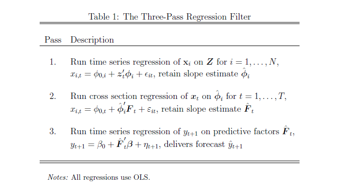
What Table 1 above tells us to do is –

  1. Run an ordinary least square (OLS) regression of the xi      in X onto the zj in X, where T ranges from 1 to T and there are      N variables in X and L << T variables in Z. So, in the example      discussed below, we concoct a spreadsheet example with 3 variables in Z,      or three proxies, and 10 predictor variables xi in X (I could      have used 50, but I wanted to see whether the method worked with lower      dimensionality). The example assumes 40 periods, so t = 1,…,40. There will      be 40 different sets of coefficients of the zj as a result of      estimating these regressions with 40 matched constant terms.
  2. OK, then we take this stack of estimates of      coefficients of the zj and their associated constants and map      them onto the cross sectional slices of X for t = 1,..,T. This means that,      at each period t, the values of the cross-section. xi,t, are      taken as the dependent variable, and the independent variables are the 40      sets of coefficients (plus constant) estimated in the previous step for      period t become the predictors.
  3. Finally, we extract the estimate of the factor loadings      which results, and use these in a regression with target variable as the      dependent variable.

This is tricky, and I have questions about the symbolism in Kelly and Pruitt’s papers, but the procedure they describe does work. There is some Matlab code here alongside the reference to this paper in Professor Kelly’s research.

At the same time, all this can be short-circuited (if you have adequate data without a lot of missing values, apparently) by a single humungous formula –

3PRFformula

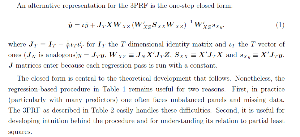
Here, the source is the 2012 paper.

Spreadsheet Implementation

Spreadsheets help me understand the structure of the underlying data and the order of calculation, even if, for the most part, I work with toy examples.

So recently, I’ve been working through the 3PRF with a small spreadsheet.

Generating the factors:I generated the factors as two columns of random variables (=rand()) in Excel. I gave the factors different magnitudes by multiplying by different constants.

Generating the proxies Z and predictors X. Kelly and Pruitt call for the predictors to be variance standardized, so I generated 40 observations on ten sets of xi by selecting ten different coefficients to multiply into the two factors, and in each case I added a normal error term with mean zero and standard deviation 1. In Excel, this is the formula =norminv(rand(),0,1).

Basically, I did the same drill for the three zj — I created 40 observations for z1, z2, and z3 by multiplying three different sets of coefficients into the two factors and added a normal error term with zero mean and variance equal to 1.

Then, finally, I created yt by multiplying randomly selected coefficients times the factors.

After generating the data, the first pass regression is easy. You just develop a regression with each predictor xi as the dependent variable and the three proxies as the independent variables, case-by-case, across the time series for each. This gives you a bunch of regression coefficients which, in turn, become the explanatory variables in the cross-sectional regressions of the second step.

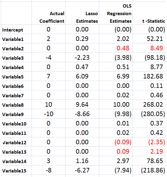
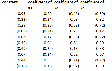
The regression coefficients I calculated for the three proxies, including a constant term, were as follows – where the 1st row indicates the regression for x1 and so forth.

coeff

This second step is a little tricky, but you just take all the values of the predictor variables for a particular period and designate these as the dependent variables, with the constant and coefficients estimated in the previous step as the independent variables. Note, the number of predictors pairs up exactly with the number of rows in the above coefficient matrix.

This then gives you the factor loadings for the third step, where you can actually predict yt (really yt+1 in the 3PRF setup). The only wrinkle is you don’t use the constant terms estimated in the second step, on the grounds that these reflect “idiosyncratic” effects, according to the 2011 revision of the paper.

Note the authors describe this as a time series approach, but do not indicate how to get around some of the classic pitfalls of regression in a time series context. Obviously, first differencing might be necessary for nonstationary time series like GDP, and other data massaging might be in order.

Bottom line – this worked well in my first implementation.

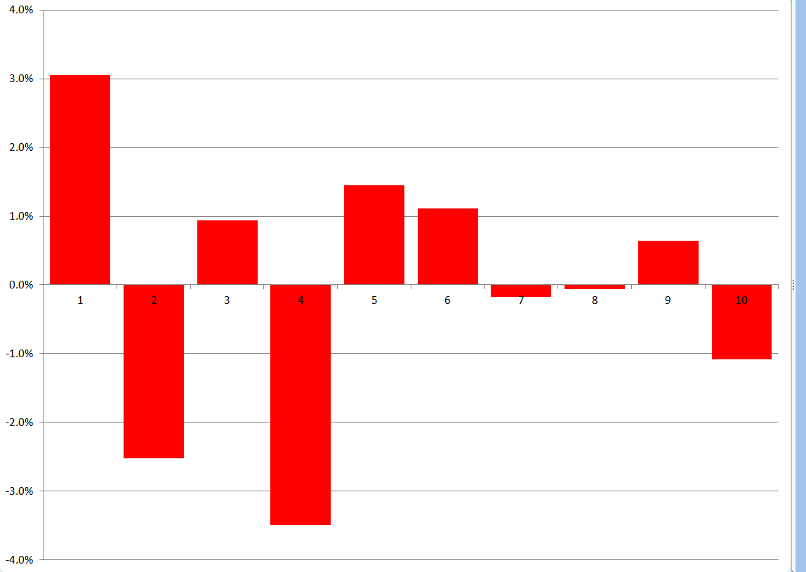
To forecast, I just used the last regression for yt+1 and then added ten more cases, calculating new values for the target variable with the new values of the factors. I used the new values of the predictors to update the second step estimate of factor loadings, and applied the last third pass regression to these values.

Here are the forecast errors for these ten out-of-sample cases.

3PRFforecasterror

Not bad for a first implementation.

 Why Is Three Pass Regression Important?

3PRF is a fairly “clean” solution to an important problem, relating to the issue of “many predictors” in macroeconomics and other business research.

Noting that if the predictors number near or more than the number of observations, the standard ordinary least squares (OLS) forecaster is known to be poorly behaved or nonexistent, the authors write,

How, then, does one effectively use vast predictive information? A solution well known in the economics literature views the data as generated from a model in which latent factors drive the systematic variation of both the forecast target, y, and the matrix of predictors, X. In this setting, the best prediction of y is infeasible since the factors are unobserved. As a result, a factor estimation step is required. The literature’s benchmark method extracts factors that are significant drivers of variation in X and then uses these to forecast y. Our procedure springs from the idea that the factors that are relevant to y may be a strict subset of all the factors driving X. Our method, called the three-pass regression filter (3PRF), selectively identifies only the subset of factors that influence the forecast target while discarding factors that are irrelevant for the target but that may be pervasive among predictors. The 3PRF has the advantage of being expressed in closed form and virtually instantaneous to compute.

So, there are several advantages, such as (1) the solution can be expressed in closed form (in fact as one complicated but easily computable matrix expression), and (2) there is no need to employ maximum likelihood estimation.

Furthermore, 3PRF may outperform other approaches, such as principal components regression or partial least squares.

The paper illustrates the forecasting performance of 3PRF with real-world examples (as well as simulations). The first relates to forecasts of macroeconomic variables using data such as from the Mark Watson database mentioned previously in this blog. The second application relates to predicting asset prices, based on a factor model that ties individual assets’ price-dividend ratios to aggregate stock market fluctuations in order to uncover investors’ discount rates and dividend growth expectations.
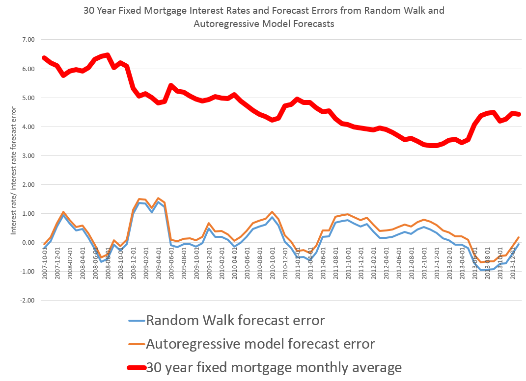
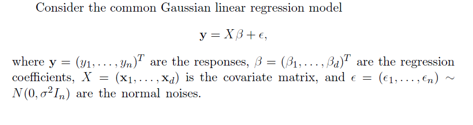
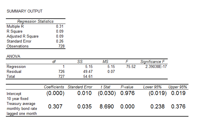
Variable Selection Procedures – The LASSO

The LASSO (Least Absolute Shrinkage and Selection Operator) is a method of automatic variable selection which can be used to select predictors X* of a target variable Y from a larger set of potential or candidate predictors X.

Developed in 1996 by Tibshirani, the LASSO formulates curve fitting as a quadratic programming problem, where the objective function penalizes the absolute size of the regression coefficients, based on the value of a tuning parameter λ. In doing so, the LASSO can drive the coefficients of irrelevant variables to zero, thus performing automatic variable selection.

This post features a toy example illustrating tactics in variable selection with the lasso. The post also dicusses the issue of consistency – how we know from a large sample perspective that we are honing in on the true set of predictors when we apply the LASSO.

My take is a two-step approach is often best. The first step is to use the LASSO to identify a subset of potential predictors which are likely to include the best predictors. Then, implement stepwise regression or other standard variable selection procedures to select the final specification, since there is a presumption that the LASSO “over-selects” (Suggested at the end of On Model Selection Consistency of Lasso).

Toy Example

The LASSO penalizes the absolute size of the regression coefficients, based on the value of a tuning parameter λ. When there are many possible predictors, many of which actually exert zero to little influence on a target variable, the lasso can be especially useful in variable selection.

For example, generate a batch of random variables in a 100 by 15 array – representing 100 observations on 15 potential explanatory variables. Mean-center each column. Then, determine coefficient values for these 15 explanatory variables, allowing several to have zero contribution to the dependent variable. Calculate the value of the dependent variable y for each of these 100 cases, adding in a normally distributed error term.

The following Table illustrates something of the power of the lasso.

LassoSS

Using the Matlab lasso procedure and a lambda value of 0.3, seven of the eight zero coefficients are correctly identified. The OLS regression estimate, on the other hand, indicates that three of the zero coefficients are nonzero at a level of 95 percent statistical significance or more (magnitude of the t-statistic > 2).

Of course, the lasso also shrinks the value of the nonzero coefficients. Like ridge regression, then, the lasso introduces bias to parameter estimates, and, indeed, for large enough values of lambda drives all coefficient to zero.

Note OLS can become impossible, when the number of predictors in X* is greater than the number of observations in Y and X. The LASSO, however, has no problem dealing with many predictors.

Real World Examples

For a recent application of the lasso, see the Dallas Federal Reserve occasional paper Hedge Fund Dynamic Market Stability. Note that the lasso is used to identify the key drivers, and other estimation techniques are employed to hone in on the parameter estimates.

For an application of the LASSO to logistic regression in genetics and molecular biology, see Lasso Logistic Regression, GSoft and the Cyclic Coordinate Descent Algorithm, Application to Gene Expression Data. As the title suggests, this illustrates the use of the lasso in logistic regression, frequently utilized in biomedical applications.

Formal Statement of the Problem Solved by the LASSO

The objective function in the lasso involves minimizing the residual sum of squares, the same entity figuring in ordinary least squares (OLS) regression, subject to a bound on the sum of the absolute value of the coefficients. The following clarifies this in notation, spelling out the objective function.

LassoDerivation

LassoDerivation2

The computation of the lasso solutions is a quadratic programming problem, tackled by standard numerical analysis algorithms. For an analytical discussion of the lasso and other regression shrinkage methods, see the outstanding free textbook The Elements of Statistical Learning by Hastie, Tibshirani, and Friedman.

The Issue of Consistency

The consistency of an estimator or procedure concerns its large sample characteristics. We know the LASSO produces biased parameter estimates, so the relevant consistency is whether the LASSO correctly predicts which variables from a larger set are in fact the predictors.

In other words, when can the LASSO select the “true model?”

Now in the past, this literature is extraordinarily opaque, involving something called the Irrepresentable Condition, which can be glossed as –

almost necessary and sufficient for Lasso to select the true model both in the classical fixed p setting and in the large p setting as the sample size n gets large…This Irrepresentable Condition, which depends mainly on the covariance of the predictor variables, states that Lasso selects the true model consistently if and (almost) only if the predictors that are not in the true model are “irrepresentable” (in a sense to be clarified) by predictors that are in the true model.

Fortunately a ray of light has burst through with Assumptionless Consistency of the Lasso by Chatterjee. Apparently, the LASSO selects the true model almost always – with minimal side assumptions – providing we are satisfied with the prediction error criterion – the mean square prediction error – employed in Tibshirani’s original paper.

Finally, cross-validation is typically used to select the tuning parameter λ, and is another example of this procedure highlighted by Varian’s recent paper.

Simulating the SPDR SPY Index

Here is a simulation of the SPDR SPY exchange traded fund index, using an autoregressive model estimated with maximum likehood methods, assuming the underlying distribution is not normal, but is instead a Student t distribution.

SimulatedSPY

The underlying model is of the form

SPYRRt=a0+a1SPYRRt-1…a30SPYRRt-30

Where SPYRR is the daily return (trading day to trading day) of the SPY, based on closing prices.

This is a linear model, and an earlier post lists its exact parameters or, in other words, the coefficients attached to each of the lagged terms, as well as the value of the constant term.

This model is estimated on a training sample of daily returns from 1993 to 2008, and, is applied to out-of-sample data from 2008 to the present. It predicts about 53 percent of the signs of the next-day-returns correctly. The model generates more profits in the 2008 to the present period than a Buy & Hold strategy.

The simulation listed above uses the model equation and parameters, generating a series of 4000 values recursively, adding in randomized error terms from the fit of the equation to the training or estimation data.

This is work-in-progress. Currently, I am thinking about how to properly incorporate volatility. Obviously, any number of realizations are possible. The chart shows one of them, which has an uncanny resemblance to the actual historical series, due to the fact that volatility is created over certain parts of the simulation, in this case by chance.

To review, I set in motion the following process:

  1. Predict a xt = f(xt-1,..,xt-30) based on the 30 coefficients and a constant term from the autoregressive model, applied to 30 preceding values of xt generated by this process (The estimation is initialized with the first 30 actual values of the test data).
  2. Randomly select a residual for this xt based on the empirical distribution of errors from the fit of the predictive relationship to the training set.
  3. Iterate.

The error distribution looks like this.

MLresidualsSPY

This is obviously not a normal distribution, since “too many” predictive errors are concentrated around the zero error line.

For puzzles and problems, this is a fertile area for research, and you can make money. But obviously, be careful.

In any case, I think this research, in an ultimate analysis, converges to the work being done by Didier Sornette and his co-researchers and co-authors. Sornette et al develop an approach through differential equations, focusing on critical points where a phase shift occurs in trading with a rapid collapse of an asset bubble. 

This approach comes at similar, semi-periodic, logarithmically increasing values through linear autoregressive equations, which, as is well known, have complex dynamics when analyzed as difference equations.

The prejudice in economics and econometrics that “you can’t predict the stock market” is an impediment to integrating these methods. 

While my research on modeling stock prices is a by-product of my general interest in forecasting and quantitative techniques, I may have an advantage because I will try stuff that more seasoned financial analysts may avoid, because they have been told it does not work.

So I maintain it is possible, at least in the era of quantitative easing (QE), to profit from autoregressive models of daily returns on a major index like the SPY. The models are, admittedly, weak predictors, but they interact with the weird error structure of SPY daily returns in interesting ways. And, furthermore, it is possible for anyone to verify my claims simply by calculating the predictions for the test period from 2008 to the present and then looking at what a Buy & Hold Strategy would have done over the same period.

In this post, I reverse the process. I take one of my autoregressive models and generate, by simulation, time series that look like historical SPY daily values.

On Sornette, about which I think we will be hearing more, since currently the US stock market seems to be in correction model, see – Turbulent times ahead: Q&A with economist Didier Sornette. Also check http://www.er.ethz.ch/presentations/index.

Predicting the Stock Market, Making Profits in the Stock Market

Often, working with software and electronics engineers, a question comes up – “if you are so good at forecasting (company sales, new product introductions), why don’t you forecast the stock market?” This might seem to be a variant of “if you are so smart, why aren’t you rich?” but I think it usually is asked more out of curiosity, than malice.

In any case, my standard reply has been that basically you could not forecast the stock market; that the stock market was probably more or less a random walk. If it were possible to forecast the stock market, someone would have done it. And the effect of successful forecasts would be to nullify further possibility of forecasting. I own an early edition of Burton Malkiel’s Random Walk Down Wall Street.

Today, I am in the amazing position of earnestly attempting to bring attention to the fact that, at least since 2008, a major measure of the stock market – the SPY ETF which tracks the S&P 500 Index, in fact, can be forecast. Or, more precisely, a forecasting model for daily returns of the SPY can lead to sustainable, increasing returns over the past several years, despite the fact the forecasting model, is, by many criteria, a weak predictor.

I think this has to do with special features of this stock market time series which have not, heretofore, received much attention in econometric modeling.

So here are the returns from applying this SPY from early 2008 to early 2014 (click to enlarge).

SPYTradingProgramcompBH

I begin with a $1000 investment 1/22/2008 and trade potentially every day, based on either the Trading Program or a Buy & Hold strategy.

Now there are several remarkable things about this Trading Program and the underlying regression model.

First, the regression model is a most unlikely candidate for making money in the stock market. The R2 or coefficient of determination is 0.0238, implying that the 60 regressors predict only 2.38 percent of the variation in the SPY rates of return. And it’s possible to go on in this vein – for example, the F-statistic indicating whether there is a relation between the regressors and the dependent variable is 1.42, just marginally above the 1 percent significance level, according to my reading of the Tables.

And the regression with 60 regressors correctly predicts the correct sign of the next days’ SPY rates of return only 50.1 percent of the time.

This, of course, is a key fact, since the Trading Program (see below) is triggered by positive predictions of the next day’s rate of return. When the next day rate of return is predicted to be positive and above a certain minimum value, the Trading Program buys SPY with the money on hand from previous sales – or, if the investor is already holding SPY because the previous day’s prediction also was positive, the investor stands pat.

The Conventional Wisdom

Professor Jim Hamilton, one of the principals (with Menzie Chin) in Econbrowser had a post recently On R-squared and economic prediction which makes the sensible point that R2 or the coefficient of determination in a regression is not a great guide to predictive performance. The post shows, among other things, that first differences of the daily S&P 500 index values regressed against lagged values of these first differences have low R2 – almost zero.

Hamilton writes,

Actually, there’s a well-known theory of stock prices that claims that an R-squared near zero is exactly what you should find. Specifically, the claim is that everything anybody could have known last month should already have been reflected in the value of pt -1. If you knew last month, when pt-1 was 1800, that this month it was headed to 1900, you should have bought last month. But if enough savvy investors tried to do that, their buy orders would have driven pt-1 up closer to 1900. The stock price should respond the instant somebody gets the news, not wait around a month before changing.

That’s not a bad empirical description of stock prices– nobody can really predict them. If you want a little fancier model, modern finance theory is characterized by the more general view that the product of today’s stock return with some other characteristics of today’s economy (referred to as the “pricing kernel”) should have been impossible to predict based on anything you could have known last month. In this formulation, the theory is confirmed– our understanding of what’s going on is exactly correct– only if when regressing that product on anything known at t – 1 we always obtain an R-squared near zero.

Well, I’m in the position here of seeking to correct one of my intellectual mentors. Although Professor Hamilton and I have never met nor communicated directly, I did work my way through Hamilton’s seminal book on time series analysis – and was duly impressed.

I am coming to the opinion that the success of this fairly low-power regression model on the SPY must have to do with special characteristics of the underlying distribution of rates of return.

For example, it’s interesting that the correlations between the (61) regressors and the daily returns are higher, when the absolute values of the dependent variable rates of return are greater. There is, in fact, a lot of meaningless buzz at very low positive and negative rates of return. This seems consistent with the odd shape of the residuals of the regression, shown below.

RegResidualsSPY

I’ve made this point before, most recently in a post-2014 post Predicting the S&P 500 or the SPY Exchange-Traded Fund, where I actually provide coefficients for a autoregressive model estimated by Matlab’s arima procedure. That estimation, incidentally, takes more account of the non-normal characteristics of the distribution of the rates of return, employing a t-distribution in maximum likelihood estimates of the parameters. It also only uses lagged values of SPY daily returns, and does not include any contribution from the VIX.

I guess in the remote possibility Jim Hamilton glances at either of these posts, it might seem comparable to reading claims of a perpetual motion machine, a method to square the circle, or something similar- quackery or wrong-headedness and error.

A colleague with a Harvard Ph.D in applied math, incidentally, has taken the trouble to go over my data and numbers, checking and verifying I am computing what I say I am computing.

Further details follow on this simple ordinary least squares (OLS) regression model I am presenting here.

Data and the Model

The focus of this modeling effort is on the daily returns of the SPDR S&P 500 (SPY), calculated with daily closing prices, as -1+(today’s closing price/the previous trading day’s closing price). The data matrix includes 30 lagged values of the daily returns of the SPY (SPYRR) along with 30 lagged values of the daily returns of the VIX volatility index (VIXRR). The data span from 11/26/1993 to 1/16/2014 – a total of 5,072 daily returns.

There is enough data to create separate training and test samples, which is good, since in-sample performance can be a very poor guide to out-of-sample predictive capabilities. The training sample extends from 11/26/1993 to 1/18/2008, for a total of 3563 observations. The test sample is the complement of this, extending from 1/22/2008 to 1/16/2014, including 1509 cases.

So the basic equation I estimate is of the form

SPYRRt=a0+a1SPYRRt-1…a30SPYRRt-30+b1VIXRRt-1+..+b30VIXRRt-30

Thus, the equation has 61 parameters – 60 coefficients multiplying into the lagged returns for the SPY and VIX indices and a constant term.

Estimation Technique

To make this simple, I estimate the above equation with the above data by ordinary least squares, implementing the standard matrix equation b = (XTX)-1XTY, where T indicates ‘transpose.’ I add a leading column of ‘1’s’ to the data matrix X to allow for a constant term a0. I do not mean center or standardize the observations on daily rates of return.

Rule for Trading Program and Summing UP

The Trading Program is the same one I described in earlier blog posts on this topic. Basically, I update forecasts every day and react to the forecast of the next day’s daily return. If it is positive, and now above a certain minimum, I either buy or hold. If it is not, I sell or do not enter the market. Oh yeah, I start out with $1000 in all these simulations and only trade with proceeds from this initial investment.

The only element of unrealism is that I have to predict the closing price of the SPY some short period before the close of the market to be able to enter my trade. I have not looked closely at this, but I am assuming volatility in the last few seconds is bounded, except perhaps in very unusual circumstances.

I take the trouble to present the results of an OLS regression to highlight the fact that what looks like a weak model in this context can work to achieve profits. I don’t think that point has ever been made. There are, of course, all sorts of possibilities for further optimizing this model.

I also suspect that monetary policy has some role in the success of this Trading Program over this period – so it would be interesting to look at similar models at other times and perhaps in other markets.

Mergers and Acquisitions

Are we on the threshold of a rise in corporate mergers and acqusitions (M&A)?

According to the KPMA Mergers & Acquisitions Predictor, the answer is ‘yes.’

The world’s largest corporates are expected to show a greater appetite for deals in 2014 compared to 12 months ago, according to analyst predictions. Predicted forward P/E ratios (our measure of corporate appetite) in December 2013 were 16 percent higher than in December 2012. This reflects the last half of the year, which saw a 17 percent increase in forward P/E between June and December 2013. This was compared to a 1 percent fall in the previous 6 months, after concerns over the anticipated mid-year tapering of quantitative easing in the US. The increase in appetite is matched by an anticipated increase of capacity of 12 percent over the next year.

This prediction is based on

..tracking and projecting important indicators 12 months forward. The rise or fall of forward P/E (price/earnings) ratios offers a good guide to the overall market confidence, while net debt to EBITDA (earnings before interest, tax, depreciation and amortization) ratios helps gauge the capacity of companies to fund future acquisitions.

KPMGM&A

Similarly, JPMorgan forecasts 30% rebound in mergers and acquisitions in Asia for 2014.

Waves and Patterns in M&A Activity

Mergers and acquisitions tend to occur in waves, or clusters.

GlobalM&A

Source: Waves
of International Mergers and Acquisitions

It’s not exactly clear what the underlying drivers of M&A waves are, although there is a rich literature on this.

Riding the wave, for example – an Economist article – highlights four phases of merger activity, based on a recent book Masterminding the Deal: Breakthroughs in M&A Strategy and Analysis,

In the first phase, usually when the economy is in poor shape, just a handful of deals are struck, often desperation sales at bargain prices in a buyer’s market. In the second, an improving economy means that finance is more readily available and so the volume of M&A rises—but not fast, as most deals are regarded as risky, scaring away all but the most confident buyers. It is in the third phase that activity accelerates sharply, because the “merger boom is legitimised; chief executives feel it is safe to do a deal, that no one is going to criticise them for it,” says Mr Clark.

This is when the premiums that acquirers are willing to pay over the target’s pre-bid share price start to rise rapidly. In the merger waves since 1980, bid premiums in phase one have averaged just 10-18%, rising in phase two to 20-35%. In phase three, they surge past 50%, setting the stage for the catastrophically frothy fourth and final phase. This is when premiums rise above 100%, as bosses do deals so bad they are the stuff of legend. Thus, the 1980s merger wave ended soon after the disastrous debt-fuelled hostile bid for RJR Nabisco by KKR, a private-equity fund. A bestselling book branded the acquirers “Barbarians at the Gate”. The turn-of-the-century boom ended soon after Time Warner’s near-suicidal (at least for its shareholders) embrace of AOL.

This typology comes from Clark And Mills book’ ‘Masterminding The Deal’, which suggests that two-thirds of mergers fail.

In their attempt to assess why some mergers succeed while most fail, the authors offer a ranking scheme by merger type. The most successful deals are made by bottom trawlers (87%-92%). Then, in decreasing order of success, come bolt-ons, line extension equivalents, consolidation mature, multiple core related complementary, consolidation-emerging, single core related complementary, lynchpin strategic, and speculative strategic (15%-20%). Speculative strategic deals, which prompt “a collective financial market response of ‘Is this a joke?’ have included the NatWest/Gleacher deal, Coca-Cola’s purchase of film producer Columbia Pictures, AOL/Time Warner, eBay/Skype, and nearly every deal attempted by former Vivendi Universal chief executive officer Jean-Marie Messier.” (pp. 159-60)

More simply put, acquisitions fail for three key reasons. The acquirer could have selected the wrong target (Conseco/Green Tree, Quaker Oats/Snapple), paid too much for it (RBS Fortis/ABN Amro, AOL/Huffington Press), or poorly integrated it (AT&T/NCR, Terra Firma/EMI, Unum/Provident).

Be all this as it may, the signs point to a significant uptick in M&A activity in 2014. Thus, Dealogic reports that Global Technology M&A volume totals $22.4bn in 2014 YTD, up from $6.4bn in 2013 YTD and the highest YTD volume since 2006 ($34.8bn).

Asset Bubbles

It seems only yesterday when “rational expectations” ruled serious discussions of financial economics. Value was determined by the CAPM – capital asset pricing model. Markets reflected the operation of rational agents who bought or sold assets, based largely on fundamentals. Although imprudent, stupid investors were acknowledged to exist, it was impossible for a market in general to be seized by medium- to longer term speculative movements or “bubbles.”

This view of financial and economic dynamics is at the same time complacent and intellectually aggressive. Thus, proponents of the efficient market hypothesis contest the accuracy of earlier discussions of the Dutch tulip mania.

Now, however, there seems no doubt that bubbles in asset markets are both real and intractable to regulation and management, despite their catastrophic impacts.

But asset bubbles are so huge now that Larry Summers suggests, before the International Monetary Fund (IMF) recently, that the US is in a secular stagnation, and that the true, “market-clearing” interest rate is negative. Thus, given the unreality of implementing a negative interest rate, we face a long future of the zero bound – essentially zero interest rates.

Furthermore, as Paul Krugman highlights in a follow-on blog post – Summers says the economy needs bubbles to generate growth.

We now know that the economic expansion of 2003-2007 was driven by a bubble. You can say the same about the latter part of the 90s expansion; and you can in fact say the same about the later years of the Reagan expansion, which was driven at that point by runaway thrift institutions and a large bubble in commercial real estate.

So you might be tempted to say that monetary policy has consistently been too loose. After all, haven’t low interest rates been encouraging repeated bubbles?

But as Larry emphasizes, there’s a big problem with the claim that monetary policy has been too loose: where’s the inflation? Where has the overheated economy been visible?

So how can you reconcile repeated bubbles with an economy showing no sign of inflationary pressures? Summers’s answer is that we may be an economy that needs bubbles just to achieve something near full employment – that in the absence of bubbles the economy has a negative natural rate of interest. And this hasn’t just been true since the 2008 financial crisis; it has arguably been true, although perhaps with increasing severity, since the 1980s.

Re-enter the redoubtable “liquidity trap” stage left.

Summers and Krugman move at a fairly abstract and theoretical level, regarding asset bubbles and the current manifestation.

But more and more, the global financial press points the finger at the US Federal Reserve and its Quantitative Easing (QE) as the cause of emerging bubbles around the world.

One of the latest to chime in is the Chinese financial magazine Caixin with Heading Toward a Cliff.

The Fed’s QE policy has caused a gigantic liquidity bubble in the global economy, especially in emerging economies and asset markets. The improvement in the global economy since 2008 is a bubble phenomenon, centering around the demand from bubble goods or wealth effect. Hence, real Fed tightening would prick the bubble and trigger another recession. This is why some talk of the Fed tightening could trigger the global economy to trend down…

The odds are that the world is experiencing a bigger bubble than the one that unleashed the 2008 Global Financial Crisis. The United States’ household net wealth is much higher than at the peak in the last bubble. China’s property rental yields are similar to what Japan experienced at the peak of its property bubble. The biggest part of today’s bubble is in government bonds valued at about 100 percent of global GDP. Such a vast amount of assets is priced at a negative real yield. Its low yield also benefits other borrowers. My guesstimate is that this bubble subsidizes debtors to the tune of 10 percent of GDP or US$ 7 trillion dollars per annum. The transfer of income from savers to debtors has never happened on such a vast scale, not even close. This is the reason that so many bubbles are forming around the world, because speculation is viewed as an escape route for savers.The property market in emerging economies is the second-largest bubble. It is probably 100 percent overvalued. My guesstimate is that it is US$ 50 trillion overvalued.Stocks, especially in the United States, are significantly overvalued too. The overvaluation could be one-third or about US$ 20 trillion.There are other bubbles too. Credit risk, for example, is underpriced. The art market is bubbly again. These bubbles are not significant compared to the big three above.

The Caixin author – Andy Xie – goes on to predict inflation as the eventual outcome – a prediction I find far-fetched given the coming reaction to Fed tapering.

And the reach of the Chinese real estate bubble is highlighted by a CBS 60 Minutes video filmed some months ago.

Anatomy of a Bubble

The Great Recession of 2008-2009 alerted us – what goes up, can come down. But are there common patterns in asset bubbles? Can the identification of these patterns help predict the peak and subsequent point of rapid decline?

Macrotrends is an interesting resource in this regard. The following is a screenshot of a Macrotrends chart which, in the original, has interactive features.

Macrotrends.org_The_Four_Biggest_US_Bubbles              

Scaling the NASDAQ, gold, and oil prices in terms of percentage changes from points several years preceding price peaks suggests bubbles share the same cadence, in some sense.

These curves highlight that asset bubbles can occur over significant periods – several years to a decade. This is the part of the seduction. At first, when commentators cry “bubble,” prudent investors stand aside to let prices peak and crash. Yet prices may continue to rise for years, leaving investors increasingly feeling they are “being left behind.”

Here are data from three asset bubbles – the Hong Kong Hang Seng Index, oil prices to refiners (combined), and the NASDAQ 100 Index. Click to enlarge.

BubbleAnatomy

I arrange these time series so their peak prices – the peak of the bubble – coincide, despite the fact that these peaks occurred at different historical times (October 2007, August 2008, March 2000, respectively).

I include approximately 5 years of prior values of each time series, and scale the vertical dimensions so the peaks equal 100 percent.

This produces a chart which suggests three distinct phases to an asset bubble.

Phase 1 is a ramp-up. In this initial phase, prices surge for 2-3 years, then experience a relatively minor drop.

Phase 2 is the beginning of a sustained period of faster-than-exponential growth, culminating in the market peak, followed immediately by the market collapse. Within a few months of the peak, the rates of growth of prices in all three series are quite similar, indeed almost identical. These rates of price growth are associated with “an accelerating acceleration” of growth, in fact – as a study of first and second differences of the rates of growth show.

The critical time point, at which peak price occurs, looks like the point at which traders can see the vertical asymptote just a month or two in front of them, given the underlying dynamics.

Phase 3 is the market collapse. Prices drop maybe 80 percent of the value they rose from the initial point, and rapidly – in the course of 1-2 years. This is sometimes modeled as a “negative bubble.” It is commonly considered that the correction overshoots, and then adjusts back.

There also seems to be a Phase 4, when prices can recover some or perhaps almost all of their lost glory, but where volatility can be substantial.

Predictability

It seems reasonable that the critical point, or peak price, should be more or less predictable, a few months into Phase 2.

The extent of the drop from the peak in Phase 3 seems more or less predictable, also.

The question really is whether the dynamics of Phase 1 are truly informative. Is there something going on in Phase 1 that is different than in immediately preceding periods? Phase 1 seems to “set the stage.”

But there is no question the lure of quick riches involved in the advanced stages of an asset bubble can dazzle the most intelligent among us – and as a case in point, I give you Sir Isaac Newton, co-inventor with Liebnitz of the calculus, discoverer of the law of gravitation, and exponent of a vast new science, in his time, of mathematical physics.

SirIsaacNewton

A post on Business Insider highlights his unhappy case with the South Seas stock bubble. Newton was in this scam early, and then got out. But the Bubble kept levitating, so he entered the market again near the top – in Didier Sornette’s terminology, near the critical point of the process, only to lose what in his time was vast fortune of worth $2.4 million dollars in today’s money.