Category Archives: macroeconomic forecasting

Top Forecasters of the US Economy, 2013-2014

Once again, Christophe Barraud, a French economist based in Paris, is ranked as the “best forecaster of the US economy” by Bloomberg (see here).

This is quite an accomplishment, considering that it is based on forecasts for 14 key monthly indicators including CPI, Durable Goods Orders, Existing Home Sales, Housing Starts, IP, ISM Manufacturing, ISM Nonmanufacturing, New Home Sales, Nonfarm Payrolls, Personal Income, Personal Spending, Retail Sales, Unemployment and GDP.

For this round, Bloomberg considered two years of data ending ended November 2014.

Barraud was #1 in the rankings for 2011-2012 also.

In case you wanted to take the measure of such talent, here is a recent interview with Barraud conducted by Figaro (in French).

The #2 slot in the Bloomberg rankings of best forecasters of the US economy went to Jim O’Sullivan of High Frequency Economics.

Here just an excerpt from an interview by subscription with O’Sullivan – again to take the measure of the man.

While I have been absorbed in analyzing a statistical/econometric problem, a lot has transpired – in Switzerland, in Greece and the Ukraine, and in various global regions. While I am optimistic in outlook presently, I suspect 2015 may prove to be a year of surprises.

The Gift of Low Oil Prices

Oil May Drop top $20 a Barrel

At the end of last week, Anatole Kaletsky wrote an insightful piece for Reuters – The reason oil could drop as low as $20 per barrel.

Kaletsky writes,

There are several reasons to expect a new trading range as low as $20 to $50, as in the period from 1986 to 2004. Technological and environmental pressures are reducing long-term oil demand and threatening to turn much of the high-cost oil outside the Middle East into a “stranded asset” similar to the earth’s vast unwanted coal reserves. Additional pressures for low oil prices in the long term include the possible lifting of sanctions on Iran and Russia and the ending of civil wars in Iraq and Libya, which between them would release additional oil reserves bigger than Saudi Arabia’s on to the world markets.

The U.S. shale revolution is perhaps the strongest argument for a return to competitive pricing instead of the OPEC-dominated monopoly regimes of 1974-85 and 2005-14. Although shale oil is relatively costly, production can be turned on and off much more easily – and cheaply – than from conventional oilfields. This means that shale prospectors should now be the “swing producers” in global oil markets instead of the Saudis. In a truly competitive market, the Saudis and other low-cost producers would always be pumping at maximum output, while shale shuts off when demand is weak and ramps up when demand is strong. This competitive logic suggests that marginal costs of U.S. shale oil, generally estimated at $40 to $50, should in the future be a ceiling for global oil prices, not a floor.

As if in validation of this perspective, Sheik Ali al-Naimi, the Saudi Oil Minister, is quoted in an interview at the beginning of this week

“It is not in the interest of Opec producers to cut their production, whatever the price is … Whether it goes down to $20, $40, $50, $60, it is irrelevant.”

Also, Mr Naimi said that if Saudi Arabia reduced its production, “the price will go up and the Russians, the Brazilians, US shale oil producers will take my share”.

Higher Cost Oil Producers Impacted

Estimates of the cost to the Saudi’s for extracting their oil out of the ground seem to be plummeting, along with the spot price of a barrel of crude. The above interview cited by the Financial Times also asserts that Saudi and other Gulf States can extract at $4-$5 a barrel.

That is an order of magnitude less than the production costs of oil from many US shale plays, much of the North Sea oil supplying revenues to Norway and the UK, as well as Russian and Iranian oil.

Here is a chart from the Wall Street Journal from late October of this year, estimating production costs in US shale oil plays (click to enlarge).

USSalePC

The rig count has been dropping, but many expect US shale oil production to continue increasing, as companies optimize existing wells and drill as long as already secured futures contracts cover output.

Given the low growth to deflationary profile in the global economy, this probably means a glut of petroleum on world markets for 2015 and, possibly, 2016.

Implications of a Period of Significantly Lower Oil Prices

The price of gasoline at the pump in the US is plummeting.

regulargasprice

First-order effects for the American consumer probably more than balance the short-run negative impacts of cutbacks in the oil or shale patch. The typical household gets on the order of $100 extra in their pocket monthly, as long as the low prices continue. This is discretionary money that would have in all likelihood be spent anyway. So other products will benefit, plus people will drive more. It’s as simple as that.

China may be a major beneficiary, since its production is relatively energy-intensive and it is a net importer of petroleum products.

Japan should also benefit significantly.

In Japan, which imports energy (all at prices based on crude oil) worth roughly 6% of GDP, the recent sharp price drop could lift real GDP growth by 1.5%–2%! This would largely offset the 3% hike in VAT imposed last year – or justify the second round 2% hike that was just cancelled. The drop in oil prices may save Abe short term, but it will also put at risk both the 3% inflation goal and the need to turn nuclear facilities back on.

Going Out on a Limb – Business Forecast Blog Prediction

OK, so I’m going out on a limb here and make the following prediction.

As long as there is no banking collapse, as a result of oil companies turning the junk bonds that financed their land purchases into true junk, or the Russian economy collapsing, dragging down the European banking system – all bets are off for a recession in 2015 and probably 2016.

These low oil prices are like a gift to many of the world’s economies, as well as many families reliant on the internal combustion engine to get them to and from work. Low oil prices also should help keep the cost of agricultural products down, again benefitting consumers.

My intuition is that this is a real game changer.

Top graphic from Wall Street Daily

Economic Outlook 2015 – I

Well, it’s that time – end of one calendar year and, soon, the beginning of another, and that means major banks and financial institutions are releasing their big picture “economic outlooks” for 2015.

Here are two well worth watching.

Jan Hatzius of Goldman Sachs provides an interesting, short discussion of the US economic outlook for 2015.

Huw Pills, also of Goldman Sachs, gives a nuanced discussion of Europe’s more vulnerable economic position for 2015.

For other regions, see Outlook 2015.

Barron’s Outlook 2015: Stick With the Bull focuses on stocks and is based on a survey of investment advisors; its outlook is decidedly upbeat.

Born in March 2009, today’s bull market is the fourth longest in history—and it isn’t about to end, despite last week’s shellacking. That’s the word from Wall Street’s top strategists, who expect the Standard & Poor’s 500 stock index to rise 10% in 2015. A gain of that magnitude surely would merit applause, coming atop an 8% rally year to date, not to mention 2013’s 30% advance. Almost six years in, the old bull still seems sprightly….

U.S. stocks are neither cheap nor expensive, based on the market’s current price/earnings ratio of 15.8 times future four-quarter earnings. Few strategists expect the multiple to expand much in the coming year.

“In isolation, U.S. stocks are on the expensive side,” says Jeffrey Knight, head of global asset allocation at Columbia Management. But measured against other financial assets—whether emerging-market equities or developed-market bonds—U.S. shares look strong, he adds.

And, in researching this article, I found Janet Yellen’s Dashboard available from the Brookings Institution website.

A lot of what happens in 2015 has to do with whether, when, and then how much the Fed raises interest rates.

I’m aiming to be as inclusive as I can in putting up these videos of the various celebrity forecasters and their outlook for 2015, so stay tuned.

Some Thoughts on Japan

I saw the news that Japan has fallen into recession again. This “hit the wires” just after the Bank of Japan surprised everyone and announced a major new quantitative easing (QE) program.

Japan is a country of 127 million persons (2013) with one of the largest economies in the world, as this chart shows.

countryGDP

Basically, though, the Japanese economy has been a start/stop mode since the mid-1990’s. According these GDP estimates, China surpassed Japan 2008-2009, and now in nominal terms has a production level twice that of Japan.

The data are from the World Economic Outlook database (IMF) and are not inflation-adjusted, but are converted into US dollar equivalents.

Where’s the Beef?

Well, a person In Kansas might say, “So what?” Why is Japan important?

I think there are several reasons.

First, a recession in Japan, because of its continuing economic size, has the capability of affecting global markets.

According to the CIA Factbook .. on a purchasing power parity (PPP) basis that adjusts for price differences, Japan in 2013 stood as the fourth-largest economy in the world after second-place China, which surpassed Japan in 2001, and third-place India, which edged out Japan in 2012.

Simultaneous recessions in Japan and Europe almost surely would trigger a global economic slowdown, unless the American consumer just went crazy.

Test Case for Macroeconomic Policy

Another reason Japan is important is as a sort of test case for macroeconomic policy, as well as for the impacts of an aging population.

This chart shows the intermittent economic growth in Japan since the 1990’s along with the deflationary trend.

JapanrGDPCPI

These figures are developed from official Japanese statistics.

Notice that you could start at around 1999 and draw a trendline for the Japanese CPI to about 2013, where a brief period 2008-2009 would appear as a blip away from this trendline.

Deflation has been a twenty year phenomena in Japan, and the current government, under Abe, has sought to break its hold with a triple-threat of fiscal policy, monetary policy, and structural reform.

The result is a continuation of the climb in the liabilities to GDP ratio of the Bank of Japan (BOJ), as shown in this chart extracted from Bloomberg sources.

Japmonebasedelta

So “steady as she goes,” the monetary base of Japan will reach about 50 percent of Japanese GDP within a year or two. This compares with a figure of just less than 20 percent for the United States.

The swing into negative growth in 2014 was triggered by a substantial increase in the VAT or value-added tax in Japan, and there is vigorous debate about future increases – viz Krugman Japan on the Brink.

Structural Reform

I wonder whether it might be better to question the religion of economic growth, than to attempt “structural reform” aka reductions in the real wage.

In any case, it easy to see that the recent surge in Japanese inflation, combined with additional consumption taxes and, indeed, negative economic growth mean that Japanese real wages are being reduced in real time here. Indeed Edward Hugh documents this with reference to official Japanese statistics.

But this is a slippery slope.

On the one hand, reductions in the real wage could make domestically produced Japanese goods more competitive in international markets.

On the other hand, domestic purchasing power could suffer, or, at the least, there could be a move to increasing concentrations of wealth. We’ve certainly seen that in the United States, where the real wage of workers has declined off and on, since 1971, compensated for, to an extent, by the entry of women into the workforce and two-wage households.

The limits of human intellect can be found right here. The enormous production growth in China has been accompanied by choking air pollution which, I can assure you from personal experience, is simply amazingly bad sometimes. Health-threatening. Yet the Chinese naturally want to expand their productive apparatus to the extent they can, for purposes of providing for their vast population and in order to secure China’s place in the global economy.

But life in Japan – during these decades when economic growth has been very intermittent and prices have dropped – life has been fairly good. That’s one reason why many Japanese are now starting to enjoy their older years in a degree of relative comfort unimaginable one or two generations ago.

Maybe some Japanese visionary can come up with a sequel to Herman Daly’s steady state economy idea – a kind of reverse mortgage for an entire economy perhaps.

Investment and Other Bank Macro Forecasts and Outlooks – 2

Today, I take a brief look at economic forecasts available from Morgan Stanley, Wells Fargo, and the French concern Credit Agricole. As readers will note, Morgan Stanley has a lively discussion of the implications of the US midterms, while Wells Fargo has a very comprehensive and easy-to-access series of economic projections, ranging from weekly, to monthly and annual. Credit Agricole (apologies for omitting the accent mark) is the first European bank profiled in these brief looks, and has quarterly updates of fairly comprehensive economic projections across a range of variables.

And I might mention that these publications, which date back into September in many cases, are interesting to review both because of their projections and because of what they miss – notably the drop in oil prices and aggressive new round of quantitative easing by the Bank of Japan.

The fact these developments are missed in these September and even later releases qualifies them as genuine surprises. Thus, their impacts are not discounted in past market developments, and, going forward, oil prices and Japan QE could exert significant, discrete effects on markets.

Morgan Stanley

According to the Federal Reserve’s National Information Center, Morgan Stanley is the nation’s 6th largest bank.

JPMorgan

The Global Investment Committee (GOC) Weekly for November 10 is notable for some straight talk on the Implications of the US midterms, which Morgan Stanley see as slightly pro-growth, positive for equities, with constructive compromises, characteristic of lame duck presidencies. I quote fairly extensively, because the frankness of the insights and suggestions is refreshing.

The maxim that gridlock in Washington is good for markets has certainly held true during the “do nothing” Congress of the past two years. Now, with the Republicans winning control of the Senate and adding 15 seats to their House majority, the outlook appears to be for more of the same. Happily for investors, an analysis going back to 1900 shows that equity markets have averaged annualized 15% returns when the Congress is controlled by Republicans and the White House by a Democrat.

Although many pundits have suggested that the GOP sweep creates a mandate, the Global Investment Committee (GIC) sees the results as a mandate for change in the functioning and compromise in Washington rather than the embrace of a specific agenda. On that score, unlike the deeply partisan divide between the House and the Senate of the last four years that prevented any compromise bills from getting off the Hill, legislation may actually get to the president’s desk. While President Obama will be free to veto, he is now playing for his legacy and may be apt to compromise on some issues.

The Republicans’ challenge is to demonstrate leadership and competence in governing, a task that will require corralling the Tea Party caucus and, as Morgan Stanley & Co. Chief US Economist Vincent Reinhart wrote last week, “sequencing priorities” in a constructive way. Lacking a coherent issue-driven platform, most Republicans simply ran against Obama. Party infighting or an immediate battle about the debt ceiling and budget authorizations would likely be disastrous for the GOP—and the markets. From the GIC’s perspective, a better result would be for Congress to focus on job-creating initiatives and not on eviscerating the Affordable Care Act (ACA).

Agreement should be easiest around initiatives involving the energy sector, where this year’s 25% decline in oil prices has been front and center. American energy independence is no longer a dream but a real prospect with profound geopolitical as well as economic consequences (see Chart of the Week, page 3). Heretofore, the Keystone XL pipeline, a six-year-old proposal to connect Canadian oil with US Gulf Coast refineries, has been stalled amid wrangling with environmentalists. We believe the pipeline is now likely to win approval, creating a large national infrastructure project. Similarly, the growth of US energy supply is likely to reignite a debate on oil exports, which have been banned since the Arab oil embargoes of the 1970s. With US dollar strength likely to crimp other exports, expanding energy exports is a way to maintain economic growth. There is likely to be similar debate about exports of liquefied natural gas as the US is the world’s largest and lowest-cost producer. We believe that energy exports would be a major beneficiary focus if the new Congress approves the Trans-Pacific Partnership, a free trade agreement that would give the president authority to negotiate deals with 11 Asian nations.

Beyond energy, we expect repeal of the medical-device tax; expansion of defense spending, which has been curtailed under sequestration; and a debate on corporate tax reform, especially given the noise around tax-driven international mergers. Revisions to the ACA, to the extent they are pursued, will likely focus on measures that impact the number of insured and thus, hospitals and managed-care companies. The employer mandate, which requires employers with more than 100 workers to make available health insurance for any employee working more than 30 hours per week, is most likely to be revised, in our view.

As a final note, a review of state and local ballot initiatives suggest that voters are far from embracing an ideological position on fiscal austerity. Minimum-wage increases were passed in each state where they were on the ballot as did several large new-money infrastructure projects in New York and California—a development that MS & Co. Municipals Strategist, Michael Zezas, notes will likely increase bond supplies in 2015.

It looks like the august Global Economic Forum is being being published more infrequently than in the past, the last edition being March 5 of this year.

Wells Fargo

Wells Fargo, accounting to Wikipedia is –

an American multinational banking and financial services holding company which is headquartered in San Francisco, California, with “hubquarters” throughout the country… It is the fourth largest bank in the U.S. by assets and the largest bank by market capitalization…Wells Fargo is the second largest bank in deposits, home mortgage servicing, and debit cards. In 2011, Wells Fargo was the 23rd largest company in the United States.

The Wells Fargo website has a suite of forecasting reports, ranging from weekly, to monthly, to the big annual report, all downloadable in PDF format.

In October, the bank also released this video interview about their economic outlook.


In case you did not get time to watch that, one of the key graphics is the PCE deflator, which has been trending down recently, raising the spectre of deflation in the minds of some.

PCEdeflator

Credit Agricole

Credit Agricole is an international full services banking company, headquartered in France, with historical ties to French farming,

Their website offers at least two quarterly macroeconomic forecasting publications.

The publication Economic and Financial Forecasts presents a series of tabular forecasts for interest rates, exchange rates and commodity prices, together with the Crédit Agricole Group’s central economic projections. This is a kind of “just the numbers ma’am report.”

Macro Prospects is more discursive and with short highlights on key countries, such as, in the September issue, Brazil and China.

I signed up for emails from Credit Agricole, announcing updates of these documents.

Investment and Other Bank Macro Forecasts and Outlooks – 1

In yesterday’s post, I detailed the IMF World Economic Outlook revision for October 2014, recent OECD macroeconomic projections,  and latest from the Survey of Professional Forecasters.

All these are publically available, quite comprehensive forecasts, sort of standards in the field.

But there also are a range of private forecasts, and I want to focus on investment and other bank forecasts for the next few posts – touching on Goldman Sachs and JP Morgan today.

Goldman Sachs

Goldman Sachs – video presentations on global economic outlook with additional videos for the US, Europe, and major global regions. December 2013

Goldman Sachs, Economic Outlook for the United States, June 2014, Jan Hatzius

Goldman Sachs Asset Management, FISG Quarterly Outlook Q4 2014, (click on the right of the page for Full Document). This is the most up-to-date forecast/commentary I am able to find, and has a couple of relevant points.

One concerns the policy divergence at the central bank level. This is even more true now than when the report was released (probably in October), since the Bank of Japan is plunging into new, aggressive quantitative easing (QE), while the US Fed has ended its QE program, for the time being at least.

The other point concerns the European economy.

Among our economic forecasts, our negative outlook on the Eurozone represents the biggest departure from consensus. We believe policymakers will struggle to correct the trend of poor growth and disinflation. Optimism about the peripheries has faded, and the Eurozone’s powerhouse economy, Germany, has slowed amid weak global demand. Once again the Eurozone’s political divisions and fiscal constraints leave the ECB as the only authority able to respond unilaterally to the threat of a sharper downturn, though hopes of fiscal action are mounting.

Some signs of a sustainable Eurozone recovery have not held up to closer inspection. The peripheries have made substantial progress on austerity and structural reforms, but efforts appear to have stalled, and Spain has probably reaped the most it can from its adjustment for now. Italy’s policy paralysis and relapse into recession is disappointing given this year’s changing of the political guard, which saw Silvio Berlusconi’s exit and Prime Minister Matteo Renzi’s election on a heavily reformist platform. Renzi has shifted gears from political reform to labor reform, which could get under way in early 2015. But Italy’s high debt stock makes it particularly vulnerable to a market backlash, and we are watching for signs of investor pullback that could drive sovereign yields higher.

JP Morgan

JP Morgan has a 2014 Economic Outlook in a special issue of their Thought magazine. This is definitely dated, but there is a weekly Economic Update in a kind of scorecard format (up/down/nochange) from their Asset Management Group.

I’ve got to say, however, that one of the most exciting publications along these lines is their quarterly Guide to the Markets from JP Morgan Asset Management. Here are highlights from an interactive version of the 4Q Guide.

First, the scope of coverage is impressive, although, note this is more of an update of conditions, than a forecast. The reader supplies the forecasts, however, from these engaging slides.

contentsJPM

But this slide does not need to produce a forecast to make its point – which is maybe we are not in a stock market bubble but at the start of a long upward climb in the market. Optimism forever!

StockMarketSince 1900

There are plenty of slides that have moral to the story, such as this one on education and employment.

educationemp

Then, this graphic on China is extremely revealing, and suggests a forward perspective.

chinastuff

I’m finding this excursion into bank forecasts productive and plan coming posts along these lines. I’d rather use the blog as a scratch-pad to share insights as I go along, than produce one humungous summary. So stay tuned.

Top photo courtesy of the University of Richmond

Global and US Economic Outlook – November 2014

There are a number of free, publically available macroeconomic forecast resources which have standing and a long track record.

Also, investment and other banks make partial releases of their macro projections.

IMF World Economic Outlook

The International Monetary Fund (IMF) revises its World Economic Outlook (WEO) toward the end of each year, this year in October with Legacies, Clouds, Uncertainties.

One advantage is comprehensive coverage. So there are WEO projections over 1, 2 and 3 year horizons for more than 100 countries, even obscure island principalities, and for dozens of variables, including GDP variously measured, inflation, imports and exports, unemployment rate, and population.

Here are highlights of the October revision (click to enlarge).

WEO14

Largely due to weaker-than-expected global activity in the first half of 2014, the growth forecast for the world economy has been revised downward to 3.3 percent for this year, 0.4 percentage point lower than in the April 2014 World Economic Outlook (WEO). The global growth projection for 2015 was lowered to 3.8 percent.

The global recovery continues to be uneven, with some countries and areas struggling, while others move forward into growth.

Downside risks are increasing and include –

SHORT TERM: worsening geopolitical tensions (Ukraine, Syria) and reversal of recent risk spread and volatility compression in financial markets

MEDIUM TERM: stagnation and low potential growth in advanced economies (Eurozone flirting with deflation) and a decline in potential growth in emerging markets

Organization of Economic Cooperation and Development (OECD) Projections

The OECD Economic Outlook Advance Release for the G-20 from October 2014 projects the following growth rates for 2014 and 2015 (click to enlarge).

OECDgraphic

For total global GDP growth, the OECD projects 3.3 percent for 2014 and 3.7 percent for 2015 or 0.1 percent less for 2015 than the IMF.

Chinese economic growth is ratcheting down from double-digit levels several years ago, to around 7 percent, while Indian GDP growth is projected to stay in the 6 percent range.

There are significant differences in the IMF and OECD forecasts for the United States.

Survey of Professional Forecasters

The Survey of Professional Forecasters (SPF) is another publically available set of macroeconomic forecasts, but focusing on the US economy. The SPF is maintained by the Philadelphia Federal Reserve Bank, which polls participating analysts quarterly, compiling consensus results, spreads, and distributions.

The latest SPF Survey was released August 2014, and is somewhat more optimistic about US economic growth than the IMF and OECD projections.

SPF3rdQ14

Investment Bank Data and Projections

Wells Fargo Securities Economics Group produces a monthly report with detailed quarterly forecasts for the US economy. Here is a sample from August 2014 (click to enlarge).

WFforecast

I’m compiling a list of these products and their availability.

The bottom line is there are plenty of forecasts to average together to gin up high likelihood numbers to plug into sales and other business forecast models.

At the same time, there is a problem with calling turning points in almost all these products.

This is not a problem on YouTube now, though. If you search “economic forecasts 2015” on YouTube today, you will see a lengthly list of predictions of economic collapse and market catastrophe by the likes of Jim Rogers, Gerald Calente, and others who dabble in this genre.

We need something like the canary in the coal mine.

Forecasting the Downswing in Markets

I got a chance to work with the problem of forecasting during a business downturn at Microsoft 2007-2010.

Usually, a recession is not good for a forecasting team. There is a tendency to shoot the messenger bearing the bad news. Cost cutting often falls on marketing first, which often is where forecasting is housed.

But Microsoft in 2007 was a company which, based on past experience, looked on recessions with a certain aplomb. Company revenues continued to climb during the recession of 2001 and also during the previous recession in the early 1990’s, when company revenues were smaller.

But the plunge in markets in late 2008 was scary. Microsoft’s executive team wanted answers. Since there were few forthcoming from the usual market research vendors – vendors seemed sort of “paralyzed” in bringing out updates – management looked within the organization.

I was part of a team that got this assignment.

We developed a model to forecast global software sales across more than 80 national and regional markets. Forecasts, at one point, were utilized in deliberations of the finance directors, developing budgets for FY2010. Our Model, by several performance comparisons, did as well or better than what was available in the belated efforts of the market research vendors.

This was a formative experience for me, because a lot of what I did, as the primary statistical or econometric modeler, was seat-of-the-pants. But I tried a lot of things.

That’s one reason why this blog explores method and technique – an area of forecasting that, currently, is exploding.

Importance of the Problem

Forecasting the downswing in markets can be vitally important for an organization, or an investor, but the first requirement is to keep your wits. All too often there are across-the-board cuts.

A targeted approach can be better. All market corrections, inflections, and business downturns come to an end. Growth resumes somewhere, and then picks up generally. Companies that cut to the bone are poorly prepared for the future and can pay heavily in terms of loss of market share. Also, re-assembling the talent pool currently serving the organization can be very expensive.

But how do you set reasonable targets, in essence – make intelligent decisions about cutbacks?

I think there are many more answers than are easily available in the management literature at present.

But one thing you need to do is get a handle on the overall swing of markets. How long will the downturn continue, for example?

For someone concerned with stocks, how long and how far will the correction go? Obviously, perspective on this can inform shorting the market, which, my research suggests, is an important source of profits for successful investors.

A New Approach – Deploying high frequency data

Based on recent explorations, I’m optimistic it will be possible to get several weeks lead-time on releases of key US quarterly macroeconomic metrics in the next downturn.

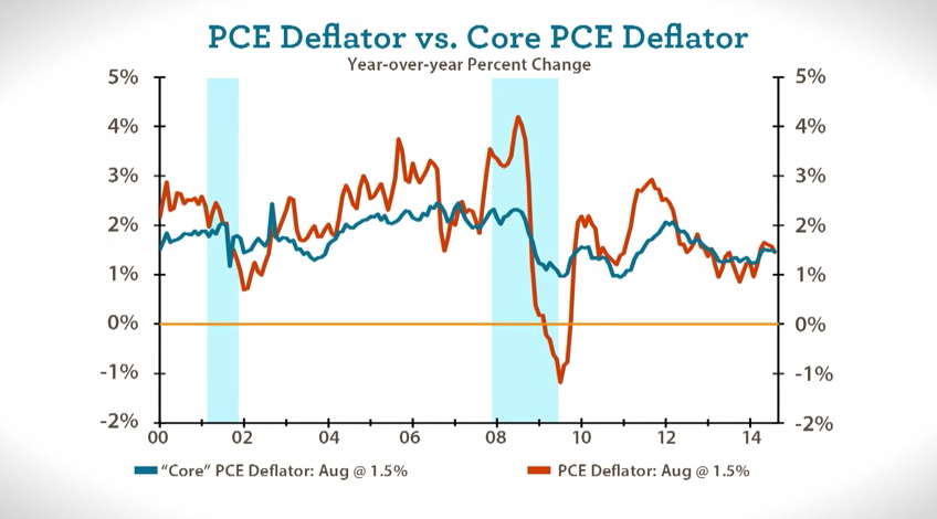
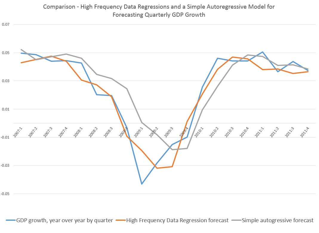
My last post, for example, has this graph.

MIDAScomp

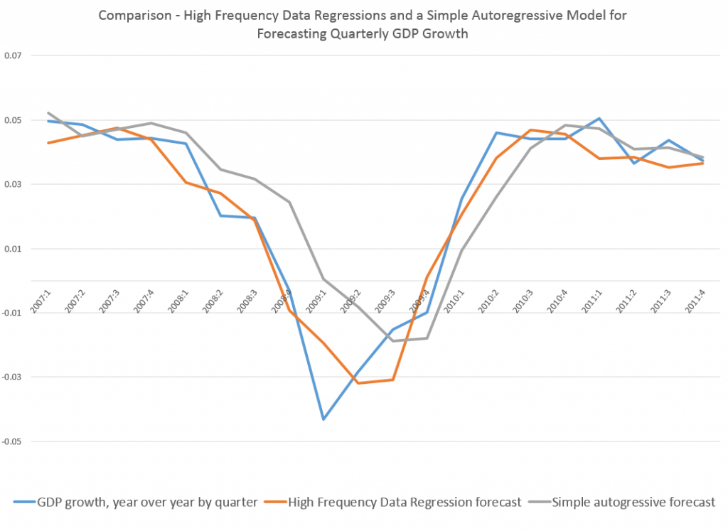
Note how the orange line hugs the blue line during the descent 2008-2009.

This orange line is the out-of-sample forecast of quarterly nominal GDP growth based on the quarter previous GDP and suitable lagged values of the monthly Chicago Fed National Activity Index. The blue line, of course, is actual GDP growth.

The official name for this is Nowcasting and MIDAS or Mixed Data Sampling techniques are widely-discussed approaches to this problem.

But because I was only mapping monthly and not, say, daily values onto quarterly values, I was able to simply specify the last period quarterly value and fifteen lagged values of the CFNAI in a straight-forward regression.

And in reviewing literature on MIDAS and mixing data frequencies, it is clear to me that, often, it is not necessary to calibrate polynomial lag expressions to encapsulate all the higher frequency data, as in the classic MIDAS approach.

Instead, one can deploy all the “many predictors” techniques developed over the past decade or so, starting with the work of Stock and Watson and factor analysis. These methods also can bring “ragged edge” data into play, or data with different release dates, if not different fundamental frequencies.

So, for example, you could specify daily data against quarterly data, involving perhaps several financial variables with deep lags – maybe totaling more explanatory variables than observations on the quarterly or lower frequency target variable – and wrap the whole estimation up in a bundle with ridge regression or the LASSO. You are really only interested in the result, the prediction of the next value for the quarterly metric, rather than unbiased estimates of the coefficients of explanatory variables.

Or you could run a principal component analysis of the data on explanatory variables, including a rag-tag collection of daily, weekly, and monthly metrics, as well as one or more lagged values of the higher frequency variable (quarterly GDP growth in the graph above).

Dynamic principal components also are a possibility, if anyone can figure out the estimation algorithms to move into a predictive mode.

Being able to put together predictor variables of all different frequencies and reporting periods is really exciting. Maybe in some way this is really what Big Data means in predictive analytics. But, of course, progress in this area is wholly empirical, it not being clear what higher frequency series can successfully map onto the big news indices, until the analysis is performed. And I think it is important to stress the importance of out-of-sample testing of the models, perhaps using cross-validation to estimate parameters if there is simply not enough data.

One thing I believe is for sure, however, and that is we will not be in the dark for so long during the next major downturn. It will be possible to  deploy all sorts of higher frequency data to chart the trajectory of the downturn, probably allowing a call on the turning point sooner than if we waited for the “big number” to come out officially.

Top picture courtesy of the Bridgespan Group

Mapping High Frequency Data Onto Aggregated Variables – Monthly and Quarterly Data

A lot of important economic data only are available in quarterly installments. The US Gross Domestic Product (GDP) is one example.

Other financial series and indexes, such as the Chicago Fed National Activity Index, are available in monthly, or even higher frequencies.

Aggregation is a common tactic in this situation. So monthly data is aggregated to quarterly data, and then mapped against quarterly GDP.

But there are alternatives.

One is what Elena Andreou, Eric Ghysels and Andros Kourtellos call a naïve specification –

MIDASsim0ple

With daily (D) and quarterly (Q) data, there typically are a proliferation of parameters to estimate – 66 if you allow 22 trading days per month. Here ND in the above equation is the number of days in the quarterly period.

The usual workaround is a weighting scheme. Thus, two parameter exponential Almon lag polynomials are identified with MIDAS, or Mixed Data Sampling.

However, other researchers note that with the monthly and quarterly data, direct estimation of expressions such as the one above (with XM instead of XD ) is more feasible.

The example presented here shows that such models can achieve dramatic gains in accuracy.

Quarterly and Monthly Data Example

Let’s consider forecasting releases of the US nominal Gross Domestic Product by the Bureau of Economic Analysis.

From the BEA’s 2014 News Release Schedule for the National Economic Accounts, one can see that advance estimates of GDP occur a minimum of one month after the end of the quarter being reported. So, for example, the advance estimate for the Third Quarter was released October 30 of this year.

This means the earliest quarter updates on US GDP become available fully a month after the end of the quarter in question.

The Chicago Fed National Activity Index (CFNAI), a monthly guage of overall economic activity, is released three weeks after the month being measured.

So, by the time the preliminary GDP for the latest quarter (analyzed or measured) is released, as many as four CFNAI recent monthly indexes are available, three of which pertain to the months constituting this latest measured quarter.

Accordingly, I set up an equation with a lagged term for GDP growth and fifteen terms or values for CFNAImonthly indexes. For each case, I regress a value for GDP growth for quarter t onto GDP growth for quarter t-1 and values for all the monthly CFNAI indices for quarter t, except for the most recent or last month, and twelve other values for the CFNAI index for the three quarters preceding the final quarter to be estimated – quarter t-1, quarter t-2, and quarter t-3.

One of the keys to this data structure is that the monthly CFNAI values do not “stack,” as it were. Instead the most recent lagged CFNAI value for a case always jumps by three months. So, for the 3rd quarter GDP in, say, 2006, the CFNAI value starts with the value for August 2006 and tracks back 14 values to July 2005. Then for the 4th quarter of 2006, the CFNAI values start with November 2006, and so forth.

This somewhat intricate description supports the idea that we are estimating current quarter GDP just at the end of the current quarter before the preliminary measurements are released.

Data and Estimation

I compile BEA quarterly data for nominal US GDP dating from the first Quarter of 1981 or 1981:1 to the 4th Quarter of 2011. I also download monthly data from the Chicago Fed National Activity Index from October 1979 to December 2011.

For my dependent or target variable, I calculate year-over-year GDP growth rates by quarter, from the BEA data.

I estimate an equation, as illustrated initially in this post, by ordinary least squares (OLS). For quarters, I use the sample period 1981:2 to 2006:4. The monthly data start earlier to assure enough lagged terms for the CFNAI index, and run from 1979:10 to 2006:12.

Results

The results are fairly impressive. The regression equation estimated over quarterly and monthly data to the end of 2006 performs much better than a simple first order autocorrelation during the tremendous dip in growth characterizing the Great Recession. In general, even after stabilization of GDP growth in 2010 and 2011, the high frequency data regression produces better out-of-sample forecasts.

Here is a graph comparing the out-of-sample forecast accuracy of the high frequency regression and a simple first order autocorrelation relationship.

MIDAScomp

What’s especially interesting is that the high frequency data regression does a good job of capturing the drop in GDP and the movement at the turning point in 2009 – the depth of the Great Recession.

I throw this chart up as a proof-of-concept. More detailed methods, using a specially-constructed Chicago Fed index, are described in a paper in the Journal of Economic Perspectives.

The Holy Grail of Business Forecasting – Forecasting the Next Downturn

What if you could predict the Chicago Fed National Activity Index (CFNAI), interpolated monthly values of the growth of nominal GDP, the Aruoba-Diebold-Scotti (ADS) Business Conditions Index, and the Kansas City Financial Stress Index (KCFSI) three, five, seven, even twelve months into the future? What if your model also predicted turning points in these US indexes, and also similar macroeconomic variables for countries in Asia and the European Union? And what if you could do all this with data on monthly returns on the stock prices of companies in the financial sector?

That’s the claim of Linda Allen, Turan Bali, and Yi Tang in a fascinating 2012 paper Does Systemic Risk in the Financial Sector Predict Future Economic Downturns?

I’m going to refer to these authors as Bali et al, since it appears that Turan Bali, shown below, did some of the ground-breaking research on estimating parametric distributions of extreme losses. Bali also is the corresponding author.

T_bali

Bali et al develop a new macroindex of systemic risk that predicts future real economic downturns which they call CATFIN.

CATFIN is estimated using both value-at-risk (VaR) and expected shortfall (ES) methodologies, each of which are estimated using three approaches: one nonparametric and two different parametric specifications. All data used to construct the CATFIN measure are available at each point in time (monthly, in our analysis), and we utilize an out-of-sample forecasting methodology. We find that all versions of CATFIN are predictive of future real economic downturns as measured by gross domestic product (GDP), industrial production, the unemployment rate, and an index of eighty-five existing monthly economic indicators (the Chicago Fed National Activity Index, CFNAI), as well as other measures of real macroeconomic activity (e.g., NBER recession periods and the Aruoba-Diebold-Scott [ADS] business conditions index maintained by the Philadelphia Fed). Consistent with an extensive body of literature linking the real and financial sectors of the economy, we find that CATFIN forecasts aggregate bank lending activity.

The following graphic illustrates three components of CATFIN and the simple arithmetic average, compared with US recession periods.

CATFIN

Thoughts on the Method

OK, here’s the simple explanation. First, these researchers identify US financial companies based on definitions in Kenneth French’s site at the Tuck School of Business (Dartmouth). There are apparently 500-1000 of these companies for the period 1973-2009. Then, for each month in this period, rates of return of the stock prices of these companies are calculated. Then, three methods are used to estimate 1% value at risk (VaR) – two parametric methods and one nonparametric methods. The nonparametric method is straight-forward –

The nonparametric approach to estimating VaR is based on analysis of the left tail of the empirical return distribution conducted without imposing any restrictions on the moments of the underlying density…. Assuming that we have 900 financial firms in month t , the nonparametric measure of1%VaR is the ninth lowest observation in the cross-section of excess returns. For each month, we determine the one percentile of the cross-section of excess returns on financial firms and obtain an aggregate 1% VaR measure of the financial system for the period 1973–2009.

So far, so good. This gives us the data for the graphic shown above.

In order to make this predictive, the authors write that –

CATFINEQ

Like a lot of leading indicators, the CATFIN predictive setup “over-predicts” to some extent. Thus, there are there are five instances in which a spike in CATFIN is not followed by a recession, thereby providing a false positive signal of future real economic distress. However, the authors note that in many of these cases, predicted macroeconomic declines may have been averted by prompt policy intervention. Their discussion of this is very interesting, and plausible.

What This Means

The implications of this research are fairly profound – indicating, above all, the priority of the finance sector in leading the overall economy today. Certainly, this consistent with the balance sheet recession of 2008-2009, and probably will continue to be relevant going forward – since nothing really has changed and more concentration of ownership in finance has followed 2008-2009.

I do think that Serena Ng’s basic point in a recent review article probably is relevant – that not all recessions are the same. So it may be that this method would not work as well for, say, the period 1945-1970, before financialization of the US and global economies.

The incredibly ornate mathematics of modeling the tails of return distributions are relevant in this context, incidentally, since the nonparametric approach of looking at the empirical distributions month-by-month could be suspect because of “cherry-picking.” So some companies could be included, others excluded to make the numbers come out. This is much difficult in a complex maximum likelihood estimation process for the location parameters of these obscure distributions.

So the question on everybody’s mind is – WHAT DOES THE CATFIN MODEL INDICATE NOW ABOUT THE NEXT FEW MONTHS? Unfortunately, I am unable to answer that, although I have corresponded with some of the authors to inquire whether any research along such lines can be cited.

Bottom line – very impressive research and another example of how important science can get lost in the dance of prestige and names.