Category Archives: macroeconomic forecasting

The Consumer Durable Inventory Cycle – Canary in the Coal Mine?

I’m continuing this week with posts about cycles and, inevitably, need to address one very popular method of extracting cycles from time series data – the Hodrick-Prescott (HP) filter.

Recently, I’ve been exploring inventory cycles, hoping to post something coherent.

I think I hit paydirt, as they say in gold mining circles.

Here is the cycle component extracted from consumer durable inventories (not seasonally adjusted) from the Census manufacturing with a Hodrick-Prescott filter. I use a Matlab implementation here called hpfilter.

CDcycle

In terms of mechanics, the HP filter extracts the trend and cyclical component from a time series by minimizing an expression, as described by Wikipedia –

HPexp

What’s particularly interesting to me is that the peak of the two cycles in the diagram are spot-on the points at which the business cycle goes into recession – in 2001 and 2008.

Not only that, but the current consumer durable inventory cycle is credibly peaking right now and, based on these patterns, should go into a downward movement soon.

Of course, amplitudes of these cycles are a little iffy.

But the existence of a consumer durable cycle configured along these lines is consistent with the literature on inventory cycles, which emphasizes stockout-avoidance and relatively long pro-cyclical swings in inventories.

Cycles -1

I’d like  to focus on cycles in business and economic forecasting for the next posts.

The Business Cycle

“Cycles” – in connection with business and economic time series – evoke the so-called business cycle.

Immediately after World War II, Burns and Mitchell offered the following characterization –

Business cycles are a type of fluctuation found in the aggregate economic activity of nations that organize their work mainly in business enterprises: a cycle consists of expansions occurring at about the same time in many economic activities, followed by similarly general recessions, contractions, and revivals which merge into the expansion phase of the next cycle

Earlier, several types of business and economic cycles were hypothesized, based on their average duration. These included the 3 to 4 year Kitchin inventory investment cycle, a 7 to 11 year Juglar cycle associated with investment in machines, the 15 to 25 year Kuznets cycle, and the controversial Kondratieff cycle of from 48 to 60 years.

Industry Cycles

I have looked at industry cycles relating to movements of sales and prices in semiconductor and computer markets. While patterns may be changing, there is clear evidence of semi-regular pulses of activity in semiconductors and related markets. These stochastic cycles probably are connected with Moore’s Law and the continuing thrust of innovation and new product development.

Methods

Spectral analysis, VAR modeling, and standard autoregressive analysis are tools for developing evidence for time series cycles. STAMP, now part of the Oxmetrics suite of software, fits cycles with time-varying parameters.

Sometimes one hears of estimations in the time domain moving into the frequency domain. Time series, as normally graphed with time on the horizontal axis, are in the “time domain.” This is where VAR and autoregressive models operate. The frequency domain is where we get indications of the periodicity of cycles and semi-cycles in a time series.

Cycles as Artifacts

There is something roughly analogous to spurious correlation in regression analysis in the identification of cyclical phenomena in time series. Eugen Slutsky, a Russian mathematical economist and statistician, wrote a famous “unknown” paper on how moving averages of random numbers can create the illusion of cycles. Thus, if we add or average together elements of a time series in a moving window, it is easy to generate apparently cyclical phenomena. This can be demonstrated with the digits in the irrational number π, for example, since the sequence of digits 1 through 9 in its expansion is roughly random.

Significances

Cycles in business have sort of reassuring effect, it seems to me. And, of course, we are all very used to any number of periodic phenomena, ranging from the alternation of night and day, the phases of the moon, the tides, and the myriad of biological cycles.

As a paradigm, however, they probably used to be more important in business and economic circles, than they are today. There is perhaps one exception, and that is in rapidly changing high tech fields of which IT (information technology) is still in many respects a subcategory.

I’m looking forward to exploring some estimations, putting together some quantitative materials on this.

Seasonal Adjustment – A Swirl of Controversies

My reading on procedures followed by the Bureau of Labor Statistics (BLS) and the Bureau of Economic Analysis (BLS) suggests some key US macroeconomic data series are in a profound state of disarray. Never-ending budget cuts to these “non-essential” agencies, since probably the time of Bill Clinton, have taken their toll.

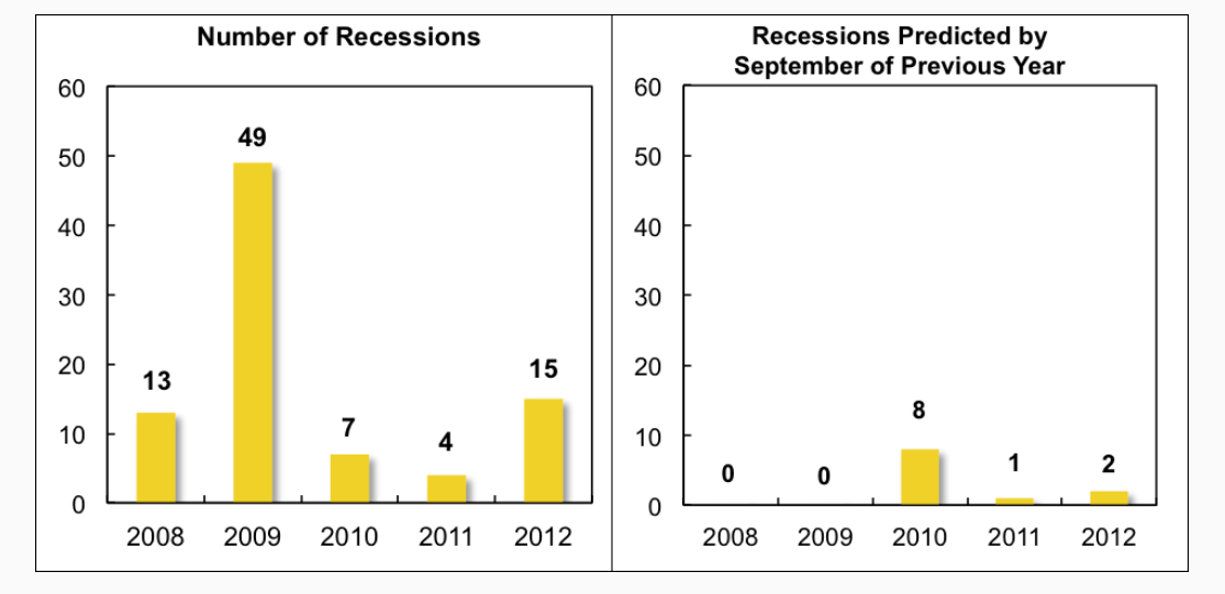
For example, for some years now it has been impossible for independent analysts to verify or replicate real GDP and many other numbers issued by the BEA, since, only SA (seasonally adjusted) series are released, originally supposedly as an “economy measure.” Since estimates of real GDP growth by quarter are charged with political significance in an Election Year, this is a potential problem. And the problem is immediate, since the media naturally will interpret a weak 2nd quarter growth – less than, say, 2.9 percent – as a sign the economy has slipped into recession.

Evidence of Political Pressure on Government Statistical Agencies

John Williams has some fame with his site Shadow Government Statistics. But apart from extreme stances from time to time (“hyperinflation”), he does document the politicization of the BLS Consumer Price Index (CPI).

In a recent white paper called No. 515—PUBLIC COMMENT ON INFLATION MEASUREMENT AND THE CHAINED-CPI (C-CPI), Williams cites Katharine Abraham, former commissioner of the Bureau of Labor Statistics, when she notes,

“Back in the early winter of 1995, Federal Reserve Board Chairman Alan Greenspan testified before the Congress that he thought the CPI substantially overstated the rate of growth in the cost of living. His testimony generated a considerable amount of discussion. Soon afterwards, Speaker of the House Newt Gingrich, at a town meeting in Kennesaw, Georgia, was asked about the CPI and responded by saying, ‘We have a handful of bureaucrats who, all professional economists agree, have an error in their calculations. If they can’t get it right in the next 30 days or so, we zero them out, we transfer the responsibility to either the Federal Reserve or the Treasury and tell them to get it right.’”[v]

Abraham is quoted in newspaper articles as remembering sitting in Republican House Speaker Newt Gingrich’s office:

“ ‘He said to me, If you could see your way clear to doing these things, we might have more money for BLS programs.’ ” [vi]

The “things” in question were to move to quality adjustments for the basket of commodities used to calculate the CPI. The analogue today, of course, is the chained-CPI measure which many suggest is being promoted to slow cost-of-living adjustments in Social Security payments.

Of course, the “real” part in real GDP is linked with the CPI inflation outlook though a process supervised by the BEA.

Seasonal Adjustment Procedures for GDP

Here is a short video by Johnathan H. Wright, a young economist whose Unseasonal Seasonals? is featured in a recent issue of the Brookings Papers on Economic Activity.

Wright’s research is interesting to forecasters, because he concludes that algorithms for seasonally adjusting GDP should be selected based on their predictive performance.

Wright favors state-space models, rather than the moving-average techniques associated with the X-12 seasonal filters that date back to the 1980’s and even the 1960’s.

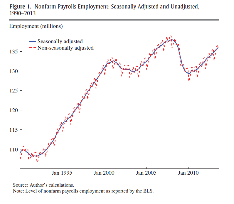
Given BLS methods of seasonal adjustment, seasonal and cyclical elements are confounded in the SA nonfarm payrolls series, due to sharp drops in employment concentrated in the November 2008 to March 2009 time window.

The upshot – initially this effect pushed reported seasonally adjusted nonfarm payrolls up in the first half of the year and down in the second half of the year, by slightly more than 100,000 in both cases…

One of his prime exhibits compares SA and NSA nonfarm payrolls, showing that,

The regular within-year variation in employment is comparable in magnitude to the effects of the 1990–1991 and 2001 recessions. In monthly change, the average absolute difference between the SA and NSA number is 660,000, which dwarfs the normal month-over-month variation in the SA data.

SEASnonseas

The basic procedure for this data and most releases since 2008-2009 follows what Wright calls the X-12 process.

The X-12 process focuses on certain types of centered moving averages with a fixed weights, based on distance from the central value.

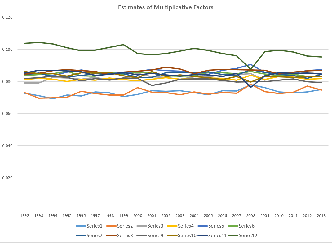
A critical part of the X-12 process involves estimating the seasonal factors by taking weighted moving averages of data in the same period of different years. This is done by taking a symmetric n-term moving average of m-term averages, which is referred to as an n × m seasonal filter. For example, for n = m = 3, the weights are 1/3 on the year in question, 2/9 on the years before and after, and 1/9 on the two years before and after.16 The filter can be a 3 × 1, 3 × 3, 3 × 5, 3 × 9, 3 × 15, or stable filter. The stable filter averages the data in the same period of all available years. The default settings of the X-12…involve using a 3 × 3, 3 × 5, or 3 × 9 seasonal filter, depending on [various criteria]

Obviously, a problem arises at the beginning and at the end of the time series data. A work-around is to use an ARIMA model to extend the time series back and forward in time sufficiently to calculate these centered moving averages.

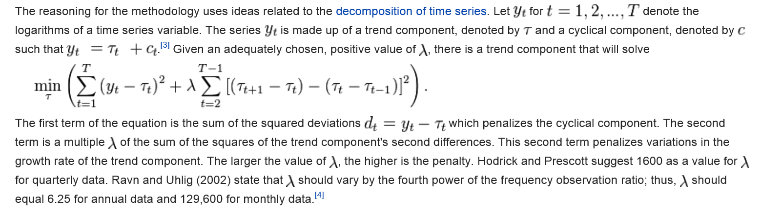
Wright shows these arbitrary weights and time windows lead to volatile seasonal adjustments, and that, predictively, the BEA and BLS would be better served with a state-space model based on the Kalman filter.

Loopy seasonal adjustment leads to controversy that airs on the web – such as this piece by Zero Hedge from 2012 which highlights the “ficititious” aspect of seasonal adjustments of highly tangible series, such as the number of persons employed –

What is very notable is that in January, absent BLS smoothing calculation, which are nowhere in the labor force, but solely in the mind of a few BLS employees, the real economy lost 2,689,000 jobs, while net of the adjustment, it actually gained 243,000 jobs: a delta of 2,932,000 jobs based solely on statistical assumptions in an excel spreadsheet!

To their credit, Census now documents an X-13ARIMA-SEATS Seasonal Adjustment Program with software incorporating elements of the SEATS procedure originally developed at the Bank of Spain and influenced by the state space models of Andrew Harvey.

Maybe Wright is getting some traction.

What Is The Point of Seasonal Adjustment?

You can’t beat the characterization, apparently from the German Bundesbank, of the purpose and objective of “seasonal adjustment.”

..seasonal adjustment transforms the world we live in into a world where no seasonal and working-day effects occur. In a seasonally adjusted world the temperature is exactly the same in winter as in the summer, there are no holidays, Christmas is abolished, people work every day in the week with the same intensity (no break over the weekend)..

I guess the notion is that, again, if we seasonally adjust and see a change in direction of a time series, why then it probably is a change in trend, rather than from special uses of a certain period.

But I think most of the professional forecasting community is beyond just taking their cue from a single number. It would be better to have the raw or not seasonally adjusted (NSA) series available with every press release, so analysts can apply their own models.

Seasonal Variation

Evaluating and predicting seasonal variation is a core competence of forecasting, dating back to the 1920’s or earlier. It’s essential to effective business decisions. For example, as the fiscal year unfolds, the question is “how are we doing?” Will budget forecasts come in on target, or will more (or fewer) resources be required? Should added resources be allocated to Division X and taken away from Division Y? To answer such questions, you need a within-year forecast model, which in most organizations involves quarterly or monthly seasonal components or factors.

Seasonal adjustment, on the other hand, is more mysterious. The purpose is more interpretive. Thus, when the Bureau of Labor Statistics (BLS) or Bureau of Economic Analysis (BEA) announce employment or other macroeconomic numbers, they usually try to take out special effects (the “Christmas effect”) that purportedly might mislead readers of the Press Release. Thus, the series we hear about typically are “seasonally adjusted.”

You can probably sense my bias. I almost always prefer data that is not seasonally adjusted in developing forecasting models. I just don’t know what magic some agency statistician has performed on a series – whether artifacts have been introduced, and so forth.

On the other hand, I take the methods of identifying seasonal variation quite seriously. These range from Buys-Ballot tables and seasonal dummy variables to methods based on moving averages, trigonometric series (Fourier analysis), and maximum likelihood estimation.

Identifying seasonal variation can be fairly involved mathematically.

But there are some simple reality tests.

Take this US retail and food service sales series, for example.

retailfs

Here you see the highly regular seasonal movement around a trend which, at times, is almost straight-line.

Are these additive or multiplicative seasonal effects? If we separate out the trend and the seasonal effects, do we add them or are the seasonal effects “factors” which multiply into the level for a month?

Well, for starters, we can re-arrange this time series into a kind of Buys-Ballot table. Here I only show the last two years.

BBTab

The point is that we look at the differences between the monthly values in a year and the average for that year. Also, we calculate the ratios of each month to the annual total.

The issue is which of these numbers is most stable over the data period, which extends back to 1992 (click to enlarge).

additive

mult

Now here Series N relates to the Nth month, e.g. Series 12 = December.

It seems pretty clear that the multiplicative factors are more stable than the additive components in two senses. First, some additive components have a more pronounced trend; secondly, the variability of the additive components around this trend is greater.

This gives you a taste of some quick methods to evaluate aspects of seasonality.

Of course, there can be added complexities. What if you have daily data, or suppose there are other recurrent relationships. Then, trig series may be your best bet.

What if you only have two, three, or four years of data? Well, this interesting problem is frequently encountered in practical applications.

I’m trying to sort this material into posts for this coming week, along with stuff on controversies that swirl around the seasonal adjustment of macro time series, such as employment and real GDP.

Stay tuned.

Top image from http://www.livescience.com/25202-seasons.html

Mid-Year Economic Projections and Some Fireworks

Greetings and Happy Fourth of July! Always one of my favorite holidays.

Practically every American kid loves the Fourth, because there are fireworks. Of course, back in the day, we had cherry bombs and really big firecrackers. Lots of thumbs and fingers were blown off. But it’s still fun for kids, and safer no doubt.

Before that, here are two mid-year forecasts from Goldman Sachs’ Chief Economist Jan Hatzius and an equity outlook from Wells Fargo Bank.

Jan Hatzius Goldman Sachs – mid-year forecast (June 12) 

And Wells Fargo (June 23rd). 

Both these, unfortunately, did not have the information about the additional write-down of the 1st quarter real GDP that came out June 25, so we will be looking for futher updates.

Meanwhile, some fireworks.

First, Happy Fourth from the US Navy. 

And some ordinary fireworks from the National Mall, US Capitol, 2012. 

The Class Struggle

This chart is about what kind of world we live in. It’s drawn from the official source of the US national income accounts – the Bureau of Economic Analysis (BEA).

The chart shows the shares of national income going to compensation of employees and to corporate profits of domestic industries (with inventory valuation and capital consumption adjustments).

profitswages

Note the vertical axes. On the left, there is the axis for the share for employee compensation – the blue line – which varies from 53-59 percent. The share for profits, which is on the order of 5-10 percent, is on the right vertical axis.

There is a high negative correlation between these two series, approximately -0.85.

Also, the scale of the changes in the shares of each are roughly of the same size, although not exactly.

Finally, the turning points in corporate profits and employee compensation line up in almost every case.

It’s important to note that employee compensation and profits do not simply sum to 100 percent; there are other categories of national income, and these have lower correlations with employee compensation.

There is much lower correlation between employee compensation and the sum of interest plus rents – both key components of property income.

There is also less (negative) correlation between proprietors income, which is about the same size as the corporate profit share, and employee compensation (-0.55). Presumeably, this is because proprietors income includes more sole proprietorships and family businesses; also, because wages for these companies may be lower than the corporate sector.

Of course, corporate profits have gone ballistic since 2008-2009, outpacing the increase in proprietors income.

corporateprofits

So what this looks like is that increases in corporate profits come out of the share paid to employees somehow. Shades of Karl Marx!

In titling a post like this, I proceed cautiously, thinking some of my mentors in economics years back – Ray Marshall, A.G. Hart, and, briefly, W.W. Rostow to name a few.

Rostow used to talk of a Social Compact forged between labor and business after World War II. Fewer strikes and more automatic wage increases. That clearly has ended.

Prospects for the 2nd Quarter 2014 and the Rest of the Year

Well, it’s the first day of the 3rd quarter 2014, and time to make an assessment of what happened in Q2 and also what is likely to transpire the rest of the year.

The Big Write-Down

Of course, the 1st quarter 2014 numbers were surprisingly negative – and almost no one saw that coming. Last Wednesday (June 25) the Bureau of Economic Analysis (BEA) revised last estimates of 1st quarter real GDP down a -2.9 percent decrease on a quarter-by-quarter basis.

The Accelerating Growth Meme

Somehow media pundits and the usual ranks of celebrity forecasters seem heavily invested in the “accelerating growth” meme in 2014.

Thus, in mid-June Mark Zandi of Moody’s tries to back up Moody’s Analytics U.S. Macro Forecast calling for accelerating growth the rest of the year, writing,

The economy’s strength is increasingly evident in the job market. Payroll employment rose to a new high in May as the U.S. finally replaced all of the 8.7 million jobs lost during the recession, and job growth has accelerated above 200,000 per month since the start of the year. The pace of job creation is almost double that needed to reduce unemployment, even with typical labor force gains. More of the new positions are also better paying than was the case earlier in the recovery.

After the BEA released its write-down numbers June 25, the Canadian Globe and Mail put a happy face on everything, writing that The US Economy is Back on Track since,

Hiring, retail sales, new-home construction and consumer confidence all rebounded smartly this spring. A separate government report Wednesday showed inventories for non-defense durable goods jumped 1 per cent in May after a 0.4-per-cent increase the previous month.

Forecasts for the Year Being Cut-Back

On the other hand, the International Monetary Fund (IMF) cut its forecast for US growth,

In its annual review of the U.S. economy, the IMF cut its forecast for U.S. economic growth this year by 0.8 percentage point to 2%, citing a harsh winter, a struggling housing market and weak international demand for the country’s products.

Some Specifics

The first thing to understand in this context is that employment is usually a lagging indicator of the business cycle. Ahead of the Curve makes this point dramatically with the following chart.

employment

The chart shows employment change and growth lag changes in the business cycle. Thus, note that the green line peaks after growth in personal consumption expenditures in almost every case, where these growth rates are calculated on a year-over-year basis.

So Zandi’s defense of the Moody’s Analytics accelerating growth forecast for the rest of 2014 has to be taken with a grain of salt.

It really depends on other things – whether for example, retail sales are moving forward, what’s happening in the housing market (to new-home construction and other variables), also to inventories and durable goods spending. Also have exports rebounded, and imports (a subtraction from GDP) been reined in?

Retail Sales

If there is going to be accelerating economic growth, consumer demand, which certainly includes retail sales, has to improve dramatically.

However, the picture is mixed with significant rebound in sales in April, but lower-than-expected retail sales growth in May.

Bloomberg’s June take on this is in an article Cooling Sales Curb Optimism on U.S. Growth Rebound: Economy.

The US Census report estimates U.S. retail and food services sales for May, adjusted for seasonal variation and holiday and trading-day differences, but not for price changes, were $437.6 billion, an increase of 0.3 percent (±0.5)* from the previous month.

Durable Goods Spending

In the Advance Report on Durable Goods Manufacturers’ Shipments, Inventories and Orders May 2014 we learn that,

New orders for manufactured durable goods in May decreased $2.4 billion or 1.0 percent to $238.0 billion, the U.S. Census Bureau announced today.

On the other hand,

Shipments of manufactured durable goods in May, up four consecutive months, increased $0.6 billion or 0.3 percent to $238.6 billion

Of course, shipments are a lagging indicator of the business cycle.

Finally, inventories are surging –

Inventories of manufactured durable goods in May, up thirteen of the last fourteen months, increased $3.8 billion or 1.0 percent to $397.8 billion. This was at the highest level since the series was first published on a NAICS basis and followed a 0.3 percent April increase.

Inventory accumulation is a coincident indicator (in a negative sense) of the business cycle, according to NBER documents.

New Home Construction

From the Joint Release U.S. Department of Housing and Urban Development,

Privately-owned housing units authorized by building permits in May were at a seasonally adjusted annual rate of 991,000. This is 6.4 percent (±0.8%) below the revised April rate of 1,059,000 and is 1.9 percent (±1.4%) below the May 2013 estimate of 1,010,000…

Privately-owned housing starts in May were at a seasonally adjusted annual rate of 1,001,000. This is 6.5 percent (±10.2%)* below the

revised April estimate of 1,071,000, but is 9.4 percent (±11.0%)* above the May 2013 rate of 915,000.

Single-family housing starts in May were at a rate of 625,000; this is 5.9 percent (±12.7%)* below the revised April figure of 664,000.

No sign of a rebound in new home construction in these numbers.

Exports and Imports

The latest BEA report estimates,

April exports were $0.3 billion less than March exports of $193.7 billion. April imports were $2.7 billion more than March imports of $237.8 billion

Here is a several month perspective.

XM

Essentially, the BEA trade numbers suggest the trade balance deteriorated March to April with a sharp uptick in imports and a slight drop in exports.

Summary

Well, it’s not a clear picture. The economy is teetering on the edge of a downturn, which it may still escape.

Clearly, real growth in Q2 has to be at least 2.9 percent in order to counterbalance the drop in Q1, or else the first half of 2014 will show a net decrease.

CNN offers this with an accompanying video

Goldman Sachs economists trimmed second quarter tracking GDP to 3.5 percent from 4.1 percent, and Barclays economists said tracking GDP for the second quarter fell to 2.9 percent from 4 percent. At a pace below 3 percent, the economy could show contraction for the first half due to the steep first quarter decline of 2.9 percent.

top picture http://www.bbc.com/news/magazine-24045598

Leading Indicators

One value the forecasting community can provide is to report on the predictive power of various leading indicators for key economic and business series.

The Conference Board Leading Indicators

The Conference Board, a private, nonprofit organization with business membership, develops and publishes leading indicator indexes (LEI) for major national economies. Their involvement began in 1995, when they took over maintaining Business Cycle Indicators (BCI) from the US Department of Commerce.

For the United States, the index of leading indicators is based on ten variables: average weekly hours, manufacturing,  average weekly initial claims for unemployment insurance, manufacturers’ new orders, consumer goods and materials, vendor performance, slower deliveries diffusion index,manufacturers’ new orders, nondefense capital goods, building permits, new private housing units, stock prices, 500 common stocks, money supply, interest rate spread, and an index of consumer expectations.

The Conference Board, of course, also maintains coincident and lagging indicators of the business cycle.

This list has been imprinted on the financial and business media mind, and is a convenient go-to, when a commentator wants to talk about what’s coming in the markets. And it used to be that a rule of thumb that three consecutive declines in the Index of Leading Indicators over three months signals a coming recession. This rule over-predicts, however, and obviously, given the track record of economists for the past several decades, these Conference Board leading indicators have questionable predictive power.

Serena Ng Research

What does work then?

Obviously, there is lots of research on this question, but, for my money, among the most comprehensive and coherent is that of Serena Ng, writing at times with various co-authors.

SerenaNg

So in this regard, I recommend two recent papers

Boosting Recessions

Facts and Challenges from the Great Recession for Forecasting and Macroeconomic Modeling

The first paper is most recent, and is a talk presented before the Canadian Economic Association (State of the Art Lecture).

Hallmarks of a Serena Ng paper are coherent and often quite readable explanations of what you might call the Big Picture, coupled with ambitious and useful computation – usually reporting metrics of predictive accuracy.

Professor Ng and her co-researchers apparently have determined several important facts about predicting recessions and turning points in the business cycle.

For example –

  1. Since World War II, and in particular, over the period from the 1970’s to the present, there have been different kinds of recessions. Following Ng and Wright, ..business cycles of the 1970s and early 80s are widely believed to be due to supply shocks and/or monetary policy. The three recessions since 1985, on the other hand, originate from the financial sector with the Great Recession of 2008-2009 being a full-blown balance sheet recession. A balance sheet recession involves, a sharp increase in leverage leaves the economy vulnerable to small shocks because, once asset prices begin to fall, financial institutions, firms, and households all attempt to deleverage. But with all agents trying to increase savings simultaneously, the economy loses demand, further lowering asset prices and frustrating the attempt to repair balance sheets. Financial institutions seek to deleverage, lowering the supply of credit. Households and firms seek to deleverage, lowering the demand for credit.
  2. Examining a monthly panel of 132 macroeconomic and financial time series for the period 1960-2011, Ng and her co-researchers find that .. the predictor set with systematic and important predictive power consists of only 10 or so variables. It is reassuring that most variables in the list are already known to be useful, though some less obvious variables are also identified. The main finding is that there is substantial time variation in the size and composition of the relevant predictor set, and even the predictive power of term and risky spreads are recession specific. The full sample estimates and rolling regressions give confidence to the 5yr spread, the Aaa and CP spreads (relative to the Fed funds rate) as the best predictors of recessions.

So, the yield curve, a old favorite when it comes to forecasting recessions or turning points in the business cycle, performs less well in the contemporary context – although other (limited) research suggests that indicators combining facts about the yield curve with other metrics might be helpful.

And this exercise shows that the predictor set for various business cycles changes over time, although there are a few predictors that stand out. Again,

there are fewer than ten important predictors and the identity of these variables change with the forecast horizon. There is a distinct difference in the size and composition of the relevant predictor set before and after mid-1980. Rolling window estimation reveals that the importance of the term and default spreads are recession specific. The Aaa spread is the most robust predictor of recessions three and six months ahead, while the risky bond and 5yr spreads are important for twelve months ahead predictions. Certain employment variables have predictive power for the two most recent recessions when the interest rate spreads were uninformative. Warning signals for the post 1990 recessions have been sporadic and easy to miss.

Let me throw in my two bits here, before going on in subsequent posts to consider turning points in stock markets and in more micro-focused or industry time series.

At the end of “Boosting Recessions” Professor Ng suggests that higher frequency data may be a promising area for research in this field.

My guess is that is true, and that, more and more, Big Data and data analytics from machine learning will be applied to larger and more diverse sets of macroeconomics and business data, at various frequencies.

This is tough stuff, because more information is available today than in, say, the 1970’s or 1980’s. But I think we know what type of recession is coming – it is some type of bursting of the various global bubbles in stock markets, real estate, and possibly sovereign debt. So maybe more recent data will be highly relevant.

“The Record of Failure to Predict Recessions is Virtually Unblemished”

That’s Prakash Loungani from work published in 2001.

Recently, Loungani , working with Hites Ahir, put together an update – “Fail Again, Fail Better, Forecasts by Economists During the Great Recession” reprised in a short piece in VOX – “There will be growth in the spring”: How well do economists predict turning points?

Hites and Loungani looked at the record of professional forecasters 2008-2012. Defining recessions as a year-over-year fall in real GDP, there were 88 recessions in this period. Based on country-by-country predictions documented by Consensus Forecasts, economic forecasters were right less than 10 percent of the time, when it came to forecasting recessions – even a few months before their onset.

recessions

The chart on the left shows the timing of the 88 recession years, while the chart on the right shows the number of recession predicted by economists by the September of the previous year.

..none of the 62 recessions in 2008–09 was predicted as the previous year was drawing to a close. However, once the full realisation of the magnitude and breadth of the Great Recession became known, forecasters did predict by September 2009 that eight countries would be in recession in 2010, which turned out to be the right call in three of these cases. But the recessions in 2011–12 again came largely as a surprise to forecasters.

This type of result holds up to robustness checks

•First, lowering the bar on how far in advance the recession is predicted does not appreciably improve the ability to forecast turning points.

•Second, using a more precise definition of recessions based on quarterly data does not change the results.

•Third, the failure to predict turning points is not particular to the Great Recession but holds for earlier periods as well.

Forecasting Turning Points

How can macroeconomic and business forecasters consistently get it so wrong?

Well, the data is pretty bad, although there is more and more of it available and with greater time depths and higher frequencies. Typically, government agencies doing the national income accounts – the Bureau of Economic Analysis (BEA) in the United States – release macroeconomic information at one or two months lag (or more). And these releases usually involve revision, so there may be preliminary and then revised numbers.

And the general accuracy of GDP forecasts is pretty low, as Ralph Dillon of Global Financial Data (GFD) documents in the following chart, writing,

Below is a chart that has 5 years of quarterly GDP consensus estimates and actual GDP [for the US]. In addition, I have also shown in real dollars the surprise in both directions. The estimate vs actual with the surprise indicating just how wrong consensus was in that quarter.

RalphDillon

Somehow, though, it is hard not to believe economists are doing something wrong with their almost total lack of success in predicting recessions. Perhaps there is a herding phenomenon, coupled with a distaste for being a bearer of bad tidings.

Or maybe economic theory itself plays a role. Indeed, earlier research published on Vox suggests that application of about 50 macroeconomic models to data preceding the recession of 2008-2009, leads to poor results in forecasting the downturn in those years, again even well into that period.

All this suggests economics is more or less at the point medicine was in the 1700’s, when bloodletting was all the rage..

quack_bleeding_sm

In any case, this is the planned topic for several forthcoming posts, hopefully this coming week – forecasting turning points.

Note: The picture at the top of this post is Peter Sellers in his last role as Chauncey Gardiner – the simple-minded gardener who by an accident and stroke of luck was taken as a savant, and who said to the President – “There will be growth in the spring.”

The “Hollowing Out” of Middle Class America

Two charts in a 2013 American Economic Review (AER) article put numbers to the “hollowing out” of middle class America – a topic celebrated with profuse anecdotes in the media.

Autor1

The top figure shows the change in employment 1980-2005 by skill level, based on Census IPUMS and American Community Survey (ACS) data. Occupations are ranked by skill level, approximated by wages in each occupation in 1980.

The lower figure documents the changes in wages of these skill levels 1980-2005.

These charts are from David Autor and David Dorn – The Growth of Low-Skill Service Jobs and the Polarization of the US Labor Market – who write that,

Consistent with the conventional view of skill-biased technological change, employment growth is differentially rapid in occupations in the upper two skill quartiles. More surprising in light of the canonical model are the employment shifts seen below the median skill level. While occupations in the second skill quartile fell as a share of employment, those in the lowest skill quartile expanded sharply. In net, employment changes in the United States during this period were strongly U-shaped in skill level, with relative employment declines in the middle of the distribution and relative gains at the tails. Notably, this pattern of employment polarization is not unique to the United States. Although not recognized until recently, a similar “polarization” of employment by skill level has been underway in numerous industrialized economies in the last 20 to 30 years.

So, employment and wage growth has been fastest in the past three or so decades (extrapolating to the present) in low skill and high skill occupations.

Among lower skill occupations, such as food service workers, security guards, janitors and gardeners, cleaners, home health aides, child care workers, hairdressers and beauticians, and recreational workers, employment grew 30 percent 1980-2005.

Among the highest paid occupations – classified as managers, professionals, technicians, and workers in finance, and public safety – the share of employment also grew by about 30 percent, but so did wages – which increased at about double the pace of the lower skill occupations over this period.

Professor Autor is in the MIT economics department, and seems to be the nexus of a lot of interesting research casting light on changes in US labor markets.

DavidAutor

In addition to “doing Big Data” as the above charts suggest, David Autor is closely associated with a new, common sense model of production activities, based on tasks and skills.

This model of the production process, enables Autor and his coresearchers to conclude that,

…recent technological developments have enabled information and communication technologies to either directly perform or permit the offshoring of a subset of the core job tasks previously performed by middle skill workers, thus causing a substantial change in the returns to certain types of skills and a measurable shift in the assignment of skills to tasks.

So it’s either a computer (robot) or a Chinaman who gets the middle-class bloke’s job these days.

And to drive that point home – (and, please, I consider the achievements of the PRC in lifting hundreds of millions out of extreme poverty to be of truly historic dimension) Autor with David Dorn and Gordon Hansen publihsed another 2013 article in the AER titled The China Syndrome: Local Labor Market Effects of Import Competition in the United States.

This study analyzes local labor markets and trade shocks to these markets, according to initial patterns of industry specialization.

The findings are truly staggering – or at least have been equivocated or obfuscated for years by special pleaders and lobbyists.

Dorn et al write,

The value of annual US goods imports from China increased by a staggering 1,156 percent from 1991 to 2007, whereas US exports to China grew by much less…. 

Our analysis finds that exposure to Chinese import competition affects local labor markets not just through manufacturing employment, which unsurprisingly is adversely affected, but also along numerous other margins. Import shocks trigger a decline in wages that is primarily observed outside of the manufacturing sector. Reductions in both employment and wage levels lead to a steep drop in the average earnings of households. These changes contribute to rising transfer payments through multiple federal and state programs, revealing an important margin of adjustment to trade that the literature has largely overlooked,

This research – conducted in terms of ordinary least squares (OLS), two stage least squares (2SLS) as well as “instrumental” regressions – is definitely not something a former trade unionist is going to ponder in the easy chair after work at the convenience store. So it’s kind of safe in terms of arousing the ire of the masses.

But I digress.

For my purposes here, Autor and his co-researchers put pieces of the puzzle in place so we can see the picture.

The US occupational environment has changed profoundly since the 1980’s. Middle class jobs have simply vanished over large parts of the landscape. More specifically, good-paying production jobs, along with a lot of other more highly paid, but routinized work, has been the target of outsourcing, often to China it seems it can be demonstrated. Higher paid work by professionals in business and finance benefits from complementarities with the advances in data processing and information technology (IT) generally. In addition, there are a small number of highly paid production workers whose job skills have been updated to run more automated assembly operations which seem to be the chief beneficiaries of new investment in production in the US these days.

There you have it.

Market away, and include these facts in any forecasts you develop for the US market.

Of course, there are issues of dynamics.