Category Archives: stock market forecasts

Microsoft Stock Prices and the Laplace Distribution

The history of science, like the history of all human ideas, is a history of irresponsible dreams, of obstinacy, and of error. But science is one of the very few human activities perhaps the only one in which errors are systematically criticized and fairly often, in time, corrected. This is why we can say that, in science, we often learn from our mistakes, and why we can speak clearly and sensibly about making progress there. — Karl Popper, Conjectures and Refutations

Microsoft daily stock prices and oil futures seem to fall in the same class of distributions as those for the S&P 500 and NASDAQ 100 – what I am calling the Laplace distribution.

This is contrary to the conventional wisdom. The whole thrust of Box-Jenkins time series modeling seems to be to arrive at Gaussian white noise. Most textbooks on econometrics prominently feature normally distributed error processes ~ N(0,σ).

Benoit Mandelbrot, of course, proposed alternatives as far back as the 1960’s, but still we find aggressive application of Gaussian assumptions in applied work – as for example in widespread use of the results of the Black-Scholes theorem or in computing value at risk in portfolios.

Basic Steps

I’m taking a simple approach.

First, I collect daily closing prices for a stock index, stock, or, as you will see, for commodity futures.

Then, I do one of two things: (a) I take the natural logarithms of the daily closing prices, or (b) I simply calculate first differences of the daily closing prices.

I did not favor option (b) initially, because I can show that the first differences, in every case I have looked at, are autocorrelated at various lags. In other words, these differences have an algorithmic structure, although this structure usually has weak explanatory power.

However, it is interesting that the first differences, again in every case I have looked at, are distributed according to one of these sharp-peaked or pointy distributions which are highly symmetric.

Take the daily closing prices of the stock of the Microsoft Corporation (MST), as an example.

Here is a graph of the daily closing prices.

MSFTgraph

And here is a histogram of the raw first differences of those closing prices over this period since 1990.

rawdifMSFT

Now in close reading of The Laplace Distribution and Generalizations I can see there are a range of possibilities in modeling distributions of the above type.

And here is another peaked, relatively symmetric distribution based on the residuals of an autoregressive equation calculated on the first differences of the logarithm of the daily closing prices. That’s a mouthful, but the idea is to extract at least some of the algorithmic component of the first differences.

MSFTregreshisto

That regression is as follows.

MSFTreg

Note the deep depth of the longest lags.

This type of regression, incidentally, makes money in out-of-sample backcasts, although possibly not enough to exceed trading costs unless the size of the trade is large. However, it’s possible that some advanced techniques, such as bagging and boosting, regression trees and random forecasts could enhance the profitability of trading strategies.

Well, a quick look at daily oil futures (CLQ4) from 2007 to the present.

oilfutures

Not quite as symmetric, but still profoundly not a Gaussian distribution.

The Difference It Makes

I’ve got to go back and read Mandelbrot carefully on his analysis of stock and commodity prices. It’s possible that these peaked distributions all fit in a broad class including the Laplace distribution.

But the basic issue here is that the characteristics of these distributions are substantially different than the Gaussian or normal probability distribution. This would affect maximum likelihood estimation of parameters in models, and therefore could affect regression coefficients.

Furthermore, the risk characteristics of assets whose prices have these distributions can be quite different.

And I think there is a moral here about the conventional wisdom and the durability of incorrect ideas.

Top pic is Karl Popper, the philosopher of science

The NASDAQ 100 Daily Returns and Laplace Distributed Errors

I once ran into Norman Mailer at the Museum of Modern Art in Manhattan. We were both looking at Picasso’s “Blue Boy” and, recognizing him, I started up some kind of conversation, and Mailer was quite civil about the whole thing.

I mention this because I always associate Mailer with his collection Advertisements for Myself.

And that segues – loosely – into my wish to let you know that, in fact, I developed a generalization of the law of demand for the situation in which a commodity is sold at a schedule of rates and fees, instead of a uniform price. That was in 1987, when I was still a struggling academic and beginning a career in business consulting.

OK, and that relates to a point I want to suggest here. And that is that minor players can have big ideas.

So I recognize an element of “hubris” in suggesting that the error process of S&P 500 daily returns – up to certain transformations – is described by a Laplace distribution.

What about other stock market indexes, then? This morning, I woke up and wondered whether the same thing is true for, say, the NASDAQ 100.

NASDAQ100

So I downloaded daily closing prices for the NASDAQ 100 from Yahoo Finance dating back to October 1, 1985. Then, I took the natural log of each of these closing prices. After that, I took trading day by trading day differences. So the series I am analyzing comes from the first differences of the natural log of the NASDAQ 100 daily closing prices.

Note that this series of first differences is sometimes cast into a histogram by itself – and this also frequently is a “pointy peaked” relatively symmetric distribution. You could motivate this graph with the idea that stock prices are a random walk. So if you take first differences, you get the random component that generates the random walk.

I am troubled, however, by the fact that this component has considerable structure in and of itself. So I undertake further analysis.

For example, the autocorrelation function of these first differences of the log of NASDAQ 100 daily closing prices looks like this.

NASDAQAC

Now if you calculate bivariate regressions on these first differences and their lagged values, many of them produce coefficient estimates with t-statistics that exceed the magic value of 2.

Just selecting these significant regressors from the first 47 lags produces this regression equation, I get this equation.

Regression

Now this regression is estimated over all 7200 observations from October 1 1984 to almost right now.

Graphing the residuals, I get the familiar pointy-peaked distribution that we saw with the S&P 500.

LaplaceNASDAQ100

Here is a fit of the Laplace distribution to this curve (Again using EasyFit).

EFLNQ

Here are the metrics for this fit and fits to a number of other probability distributions from this program.

EFtable

I have never seen as clear a linkage of returns from stock indexes and the Laplace distribution (maybe with a slight asymmetry – there are also asymmetric Laplace distributions).

One thing is for sure – the distribution above for the NASDAQ 100 data and the earlier distribution developed for the S&P 500 are not close to be normally distributed. Thus, in the table above that the normal distribution is number 12 on the list of possible candidates identified by EasyFit.

Note “Error” listed in the above table, is not the error function related to the normal distribution. Instead it is another exponential distribution with an absolute value in the exponent like the Laplace distribution. In fact, it looks like a transformation of the Laplace, but I need to do further investigation. In any case, it’s listed as number 2, even though the metrics show the same numbers.

The plot thickens.

Obviously, the next step is to investigate individual stocks with respect to Laplacian errors in this type of transformation.

Also, some people will be interested in whether the autoregressive relationship listed above makes money under the right trading rules. I will report further on that.

Anyway, thanks for your attention. If you have gotten this far – you believe numbers have power. Or you maybe are interested in finance and realize that indirect approaches may be the best shot at getting to something fundamental.

The Laplace Distribution and Financial Returns

Well, using EasyFit from Mathwave, I fit a Laplace distribution to the residuals of the regression on S&P daily returns I discussed yesterday.

Here is the result.

Laplacefit

This beats a normal distribution hands down. It also appears to beat the Matlab fit of a t distribution, but I have to run down more details on forms of the t-distribution to completely understand what is going on in the Matlab setup.

Note that EasyFit is available for a free 30-day trial download. It’s easy to use and provides metrics on goodness of fit to make comparisons between distributions.

There is a remarkable book online called The Laplace Distribution and Generalizations. If you have trouble downloading it from the site linked here, Google the title and find the download for a free PDF file.

This book, dating from 2001, runs to 458 pages, has a good introductory discussion, extensive mathematical explorations, as well as applications to engineering, physical science, and finance.

The French mathematical genius Pierre Simon Laplace proposed the distribution named after him as a first law of errors when he was 25, before his later discussions of the normal distribution.

The normal probability distribution, of course, “took over” – in part because of its convenient mathematical properties and also, probably, because a lot of ordinary phenomena are linked with Gaussian processes.

John Maynard Keynes, the English economist, wrote an early monograph (Keynes, J.M. (1911). The principal averages and the laws of error which lead to them, J. Roy. Statist. Soc. 74, New Series, 322-331) which substantially focuses on the Laplace distribution, highlighting the importance it gives to the median, rather than average, of sample errors.

The question I’ve struggled with is “why should stock market trading, stock prices, stock indexes lead, after logarithmic transformation and first differencing to the Laplace distribution?”

Of course, the Laplace distribution can be generated as a difference of exponential distributions, or as combination of a number of distributions, as the following table from Kotz, Kozubowski, and Podgorski’s book shows.

Ltable

This is all very suggestive, but how can it be related to the process of trading?

Indeed, there are quite a number of questions which follow from this hypothesis – that daily trading activity is fundamentally related to a random component following a Laplace distribution.

What about regression, if the error process is not normally distributed? By following the standard rules on “statistical significance,” might we be led to disregard variables which are drivers for daily returns or accept bogus variables in predictive relationships?

Distributional issues are important, but too frequently disregarded.

I recall a blog discussion by a hedge fund trader lamenting excesses in the application of the Black-Scholes Theorem to options in 2007 and thereafter.

Possibly, the problem is as follows. The residuals of autoregressions on daily returns and their various related transformations tend to cluster right around zero, but have big outliers. This clustering creates false confidence, making traders vulnerable to swings or outliers that occur much more frequently than suggested by a normal or Gaussian error distribution.

The Distribution of Daily Stock Market Returns

I think it is about time for another dive into stock market forecasting. The US market is hitting new highs with the usual warnings of excess circulating around. And there are interesting developments in volatility.

To get things rolling, consider the following distribution of residuals from an autoregressive model on the difference in the natural logarithms of the S&P 500.

This is what I am calling “the distribution of daily stock market returns.” I’ll explain that further in a minute.

residualsLSPD

Now I’ve seen this distribution before, and once asked in a post, “what type of distribution is this?”

Now I think I have the answer – it’s a Laplace distribution, sometimes known as the double exponential distribution.

Since this might be important, let me explain the motivation and derivation of these residuals, and then consider some implications.

Derivation of the Residuals

First, why not just do a histogram of the first differences of daily returns to identify the underlying distribution? After all, people say movement of stock market indexes are a random walk.

OK, well you could do that, and the resulting distribution would also look “Laplacian” with a pointy peak and relative symmetry. However, I am bothered in developing this by the fact that these first differences show significant, even systematic, autocorrelation.

I’m influenced here by the idea that you always want to try to graph independent draws from a distribution to explore the type of distribution.

OK, now to details of my method.

The data are based on daily closing values for the S&P 500 index from December 4, 1989 to February 7, 2014.

I took the natural log of these closing values and then took first differences – subtracting the previous trading day’s closing value from the current day’s closing value. This means that these numbers encode the critical part of the daily returns, which are calculated as day-over-day percent changes. Thus, the difference of natural logs is in fact a ratio of the original numbers – what you might look at as the key part of the percent change from one trading day to the next.

So I generate a conventional series of first differences of the natural log of this nonstationary time series. This transforms the original nonstationary series to a  one that basically fluctuates around a level – essentially zero. Furthermore, the log transform tends to reduce the swings in the variability of the series, although significant variability remains.

1stdiflnsp

Removing Serial Correlation

The series graphed above exhibits first order serial correlation. It also exhibits second order serial correlation, or correlation between values at a lag of 2.

Based on the correlations for the first 24 lags, I put together this regression equation. Of course, the “x’s” refer to time dated first differences of the natural log of the S&P daily closing values.

reg1stdiflnsp

Note that most of the t-statistics pass our little test of significance (which I think is predicted to an extent on the error process belonging to certain distributions..but). The coefficient of determination or R2 is miniscule – at 0.017. This autoregressive equation thus explains only about 2 percent of the variation in this differenced log daily closing values series.

Now one of the things I plan to address is how, indeed, that faint predictive power can exert significant influence on earnings from stock trading, given trading rules.

But let me leave that whole area – how you make money with such a relationship – to a later discussion, since I’ve touched on this before.

Instead, let me just observe that if you subtract the predicted values from this regression from the actuals trading day by trading day, you get the data for the pointy, highly symmetric distribution of residuals.

Furthermore, these residuals do not exhibit first or second, or higher, autocorrelation, so far as I am able to determine.

This means we have separated out algorithmic components of this series from random components that are not serially correlated.

So you might jump to the conclusion that these residuals are then white noise, and I think many time series modelers have gotten to this point, simply assuming they are dealing with Gaussian white noise.

Nothing could be further from the truth, as the following Matlab fit of a normal distribution to some fairly crude bins for these numbers.

normfitLSPRes

A Student-t distribution does better, as the following chart shows.

TfitSPRes

But the t-distribution still misses the pointed peak.

The Laplace distribution is also called the double exponential, since it can be considered to be a composite of exponentials on the right and to the left of the mean – symmetric but mirror images of each other.

The following chart shows how this works over the positive residuals.

Exponposfit

Now, of course, there are likelihood ratios and those sorts of metrics, and I am busy putting together a comparison between the t-distribution fit and Laplace distribution fit.

There is a connection between the Laplace distribution and power laws, too, and I note considerable literature on this distribution in finance and commodities.

I think I have answered the question I put out some time back, though, and, of course, it raises other questions in its wake.

Daily Updates on Whether Key Financial Series Are Going Into Bubble Mode

Financial and asset bubbles are controversial, amazingly enough, in standard economics, where a bubble is defined as a divergence in a market from fundamental value. The problem, of course, is what is fundamental value. Maybe investors in the dot.com frenzy of the late 1990’s believed all the hype about never-ending and accelerating growth in IT, as a result of the Internet.

So we have this chart for the ETF SPY which tracks the S&P500. Now, there are similarities between the upswing of the two previous peaks – which both led to busts – and the current surge in the index.

sp500yahoo

Where is this going to end?

Well, I’ve followed the research of Didier Sornette and his co-researchers, and, of course, Sornette’s group has an answer to this question, which is “probably not well.” Currently, Professor Sornette occupies the Chair of Entreprenuerial Risk at the Swiss Federal Institute of Technology in Zurich.

There is an excellent website maintained by ETH Zurich for the theory and empirical analysis of financial bubbles.

Sornette and his group view bubbles from a more mathematical perspective, finding similarities in bubbles of durations from months to years in the concept of “faster than exponential growth.” At some point, that is, asset prices embark on this type of trajectory. Because of various feedback mechanisms in financial markets, as well as just herding behavior, asset prices in bubble mode oscillate around an accelerating trajectory which – at some point that Sornette claims can be identified mathematically – becomes unsupportable. At such a moment, there is a critical point where the probability of a collapse or reversal of the process becomes significantly greater.

This group is on the path of developing a new science of asset bubbles, if you will.

And, by this logic, there are positive and negative bubbles.

The sharp drop in stock prices in 2008, for example, represents a negative stock market bubble movement, and also is governed or described, by this theory, by an underlying differential equation. This differential equation leads to critical points, where the probability of reversal of the downward price movement is significantly greater.

I have decided I am going to compute the full price equation suggested by Sornette and others to see what prediction for a critical point emerges for the S&P 500 or SPY.

But actually, this would be for my own satisfaction, since Sornette’s group already is doing this in the Financial Crisis Observatory.

I hope I am not violating Swiss copyright rules by showing the following image of the current Financial Crisis Observatory page (click to enlarge)

FCO

As you notice there are World Markets, Commodities, US Sectors, US Large Cap categories and little red and green boxes scattered across the page, by date.

The red boxes indicate computations by the ETH Zurich group that indicate the financial series in question is going into bubble mode. This is meant as a probabilistic evaluation and is accompanied by metrics which indicate the likelihood of a critical point. These computations are revised daily, according to the site.

For example, there is a red box associated with the S&P 500 in late May. If you click on this red box, you  produces the following chart.

SornetteSP500

The implication is that the highest red spike in the chart at the end of December 2013 is associated with a reversal in the index, and also that one would be well-advised to watch for another similar spike coming up.

Negative bubbles, as I mention, also are in the lexicon. One of the green boxes for gold, for example, produces the following chart.

Goldnegbubble

This is fascinating stuff, and although Professor Sornette has gotten some media coverage over the years, even giving a TED talk recently, the economics profession generally seems to have given him almost no attention.

I plan a post on this approach with a worked example. It certainly is much more robust that some other officially sanctioned approaches.

Trend Following in the Stock Market

Noah Smith highlights some amazing research on investor attitudes and behavior in Does trend-chasing explain financial markets?

He cites 2012 research by Greenwood and Schleifer where these researchers consider correlations between investor expectations, as measured by actual investor surveys, and subsequent investor behavior.

A key graphic is the following:

Untitled

This graph shows rather amazingly, as Smith points out..when people say they expect stocks to do well, they actually put money into stocks. How do you find out what investor expectations are? – You ask them – then it’s interesting it’s possible to show that for the most part they follow up attitudes with action.

This discussion caught my eye since Sornette and others attribute the emergence of bubbles to momentum investing or trend-following behavior. Sometimes Sornette reduces this to “herding” or mimicry. I think there are simulation models, combining trend investors with others following a market strategy based on “fundamentals”, which exhibit cumulating and collapsing bubbles.

More on that later, when I track all that down.

For the moment, some research put out by AQR Capital Management in Greenwich CT makes big claims for an investment strategy based on trend following –

The most basic trend-following strategy is time series momentum – going long markets with recent positive returns and shorting those with recent negative returns. Time series momentum has been profitable on average since 1985 for nearly all equity index futures, fixed income futures, commodity futures, and currency forwards. The strategy explains the strong performance of Managed Futures funds from the late 1980s, when fund returns and index data first becomes available.

This paragraph references research by Moscowitz and Pederson published in the Journal of Financial Economics – an article called Time Series Momentum.

But more spectacularly, this AQR white paper presents this table of results for a trend-following investment strategy decade-by-decade.

Trend

There are caveats to this rather earth-shaking finding, but what it really amounts to for many investors is a recommendation to look into managed futures.

Along those lines there is this video interview, conducted in 2013, with Brian Hurst, one of the authors of the AQR white paper. He reports that recently trending-following investing has run up against “choppy” markets, but holds out hope for the longer term –

http://www.morningstar.com/advisor/v/69423366/will-trends-reverse-for-managed-futures.htm

At the same time, caveat emptor. Bloomberg reported late last year that a lot of investors plunging into managed futures after the Great Recession of 2008-2009 have been disappointed, in many cases, because of the high, unregulated fees and commissions involved in this type of alternative investment.

Looking Ahead, Looking Back

Looking ahead, I’m almost sure I want to explore forecasting in the medical field this coming week. Menzie Chin at Econbrowser, for example, highlights forecasts that suggest states opting out of expanded Medicare are flirting with higher death rates. This sets off a flurry of comments, highlighting the importance and controversy attached to various forecasts in the field of medical practice.

There’s a lot more – from bizarre and sad mortality trends among Russian men since the collapse of the Soviet Union, now stabilizing to an extent, to systems which forecast epidemics, to, again, cost and utilization forecasts.

Today, however, I want to wind up this phase of posts on forecasting the stock and related financial asset markets.

Market Expectations in the Cross Section of Present Values

That’s the title of Bryan Kelly and Seth Pruitt’s article in the Journal of Finance, downloadable from the Social Science Research Network (SSRN).

The following chart from this paper shows in-sample (IS) and out-of-sample (OOS) performance of Kelly and Pruitt’s new partial least squares (PLS) predictor, and IS and OOS forecasts from another model based on the aggregate book-to-market ratio. (Click to enlarge)

KellyPruitt1

The Kelly-Pruitt PLS predictor is much better in both in-sample and out-of-sample than the more traditional regression model based on aggregate book-t0-market ratios.

What Kelly and Pruitt do is use what I would call cross-sectional time series data to estimate aggregate market returns.

Basically, they construct a single factor which they use to predict aggregate market returns from cross-sections of portfolio-level book-to-market ratios.

So,

To harness disaggregated information we represent the cross section of asset-specific book-to-market ratios as a dynamic latent factor model. We relate these disaggregated value ratios to aggregate expected market returns and cash flow growth. Our model highlights the idea that the same dynamic state variables driving aggregate expectations also govern the dynamics of the entire panel of asset-specific valuation ratios. This representation allows us to exploit rich cross-sectional information to extract precise estimates of market expectations.

This cross-sectional data presents a “many predictors” type of estimation problem, and the authors write that,

Our solution is to use partial least squares (PLS, Wold (1975)), which is a simple regression-based procedure designed to parsimoniously forecast a single time series using a large panel of predictors. We use it to construct a univariate forecaster for market returns (or dividend growth) that is a linear combination of assets’ valuation ratios. The weight of each asset in this linear combination is based on the covariance of its value ratio with the forecast target.

I think it is important to add that the authors extensively explore PLS as a procedure which can be considered to be built from a series of cross-cutting regressions, as it were (See their white paper on three-pass regression filter).

But, it must be added, this PLS procedure can be summarized in a single matrix formula, which is

KPmatrixformula

Readers wanting definitions of these matrices should consult the Journal of Finance article and/or the white paper mentioned above.

The Kelly-Pruitt analysis works where other methods essentially fail – in OOS prediction,

Using data from 1930-2010, PLS forecasts based on the cross section of portfolio-level book-to-market ratios achieve an out-of-sample predictive R2 as high as 13.1% for annual market returns and 0.9% for monthly returns (in-sample R2 of 18.1% and 2.4%, respectively). Since we construct a single factor from the cross section, our results can be directly compared with univariate forecasts from the many alternative predictors that have been considered in the literature. In contrast to our results, previously studied predictors typically perform well in-sample but become insignifcant out-of-sample, often performing worse than forecasts based on the historical mean return …

So, the bottom line is that aggregate stock market returns are predictable from a common-sense perspective, without recourse to abstruse error measures. And I believe Amit Goyal, whose earlier article with Welch contests market predictability, now agrees (personal communication) that this application of a PLS estimator breaks new ground out-of-sample – even though its complexity asks quite a bit from the data.

Note, though, how volatile aggregate realized returns for the US stock market are, and how forecast errors of the Kelly-Pruitt analysis become huge during the 2008-2009 recession and some previous recessions – indicated by the shaded lines in the above figure.

Still something is better than nothing, and I look for improvements to this approach – which already has been applied to international stocks by Kelly and Pruitt and other slices portfolio data.

Predicting the Market Over Short Time Horizons

Google “average time a stock is held.” You will come up with figures that typically run around 20 seconds. High frequency trades (HFT) dominate trading volume on the US exchanges.

All of which suggests the focus on the predictability of stock returns needs to position more on intervals lasting seconds or minutes, rather than daily, monthly, or longer trading periods.

So, it’s logical that Michael Rechenthin, a newly minted Iowa Ph.D., and Nick Street, a Professor of Management, are getting media face time from research which purportedly demonstrates the existence of predictable short-term trends in the market (see Using conditional probability to identify trends in intra-day high-frequency equity pricing).

Here’s the abstract –

By examining the conditional probabilities of price movements in a popular US stock over different high-frequency intra-day timespans, varying levels of trend predictability are identified. This study demonstrates the existence of predictable short-term trends in the market; understanding the probability of price movement can be useful to high-frequency traders. Price movement was examined in trade-by-trade (tick) data along with temporal timespans between 1 s to 30 min for 52 one-week periods for one highly-traded stock. We hypothesize that much of the initial predictability of trade-by-trade (tick) data is due to traditional market dynamics, or the bouncing of the price between the stock’s bid and ask. Only after timespans of between 5 to 10 s does this cease to explain the predictability; after this timespan, two consecutive movements in the same direction occur with higher probability than that of movements in the opposite direction. This pattern holds up to a one-minute interval, after which the strength of the pattern weakens.

The study examined price movements of the exchange traded fund SPY, during 2005, finding that

.. price movements can be predicted with a better than 50-50 accuracy for anywhere up to one minute after the stock leaves the confines of its bid-ask spread. Probabilities continue to be significant until about five minutes after it leaves the spread. By 30 minutes, the predictability window has closed.

Of course, the challenges of generalization in this world of seconds and minutes is tremendous. Perhaps, for example, the patterns the authors identify are confined to the year of the study. Without any theoretical basis, brute force generalization means riffling through additional years of 31.5 million seconds each.

Then, there are the milliseconds, and the recent blockbuster written by Michael Lewis – Flash Boys: A Wall Street Revolt.

I’m on track for reading this book for a bookclub to which I belong.

As I understand it, Lewis, who is one of my favorite financial writers, has uncovered a story whereby high frequency traders, operating with optical fiber connections to the New York Stock Exchange, sometimes being geographically as proximate as possible, can exploit more conventional trading – basically buying a stock after you have put in a buy order, but before your transaction closes, thus raising your price if you made a market order.

MLewis

The LA Times  has a nice review of the book and ran the above photo of Lewis.

Stock Market Predictability – Controversy

In the previous post, I drew from papers by Neeley, who is Vice President of the Federal Reserve Bank of St. Louis, David Rapach at St. Louis University and Goufu Zhou at Washington University in St. Louis.

These authors contribute two papers on the predictability of equity returns.

The earlier one – Forecasting the Equity Risk Premium: The Role of Technical Indicators – is coming out in Management Science. Of course, the survey article – Forecasting the Equity Risk Premium: The Role of Technical Indicators – is a chapter in the recent volume 2 of the Handbook of Forecasting.

I go through this rather laborious set of citations because it turns out that there is an underlying paper which provides the data for the research of these authors, but which comes to precisely the opposite conclusion –

The goal of our own article is to comprehensively re-examine the empirical evidence as of early 2006, evaluating each variable using the same methods (mostly, but not only, in linear models), time-periods, and estimation frequencies. The evidence suggests that most models are unstable or even spurious. Most models are no longer significant even insample (IS), and the few models that still are usually fail simple regression diagnostics.Most models have performed poorly for over 30 years IS. For many models, any earlier apparent statistical significance was often based exclusively on years up to and especially on the years of the Oil Shock of 1973–1975. Most models have poor out-of-sample (OOS) performance, but not in a way that merely suggests lower power than IS tests. They predict poorly late in the sample, not early in the sample. (For many variables, we have difficulty finding robust statistical significance even when they are examined only during their most favorable contiguous OOS sub-period.) Finally, the OOS performance is not only a useful model diagnostic for the IS regressions but also interesting in itself for an investor who had sought to use these models for market-timing. Our evidence suggests that the models would not have helped such an investor. Therefore, although it is possible to search for, to occasionally stumble upon, and then to defend some seemingly statistically significant models, we interpret our results to suggest that a healthy skepticism is appropriate when it comes to predicting the equity premium, at least as of early 2006. The models do not seem robust.

This is from Ivo Welch and Amit Goyal’s 2008 article A Comprehensive Look at The Empirical Performance of Equity Premium Prediction in the Review of Financial Studies which apparently won an award from that journal as the best paper for the year.

And, very importantly, the data for this whole discussion is available, with updates, from Amit Goyal’s site now at the University of Lausanne.

AmitGoyal

Where This Is Going

Currently, for me, this seems like a genuine controversy in the forecasting literature. And, as an aside, in writing this blog I’ve entertained the notion that maybe I am on the edge of a new form of or focus in journalism – namely stories about forecasting controversies. It’s kind of wonkish, but the issues can be really, really important.

I also have a “hands-on” philosophy, when it comes to this sort of information. I much rather explore actual data and run my own estimates, than pick through theoretical arguments.

So anyway, given that Goyal generously provides updated versions of the data series he and Welch originally used in their Review of Financial Studies article, there should be some opportunity to check this whole matter. After all, the estimation issues are not very difficult, insofar as the first level of argument relates primarily to the efficacy of simple bivariate regressions.

By the way, it’s really cool data.

Here is the book-to-market ratio, dating back to 1926.

bmratio

But beyond these simple regressions that form a large part of the argument, there is another claim made by Neeley, Rapach, and Zhou which I take very seriously. And this is that – while a “kitchen sink” model with all, say, fourteen so-called macroeconomic variables does not outperform the benchmark, a principal components regression does.

This sounds really plausible.

Anyway, if readers have flagged updates to this controversy about the predictability of stock market returns, let me know. In addition to grubbing around with the data, I am searching for additional analysis of this point.

Evidence of Stock Market Predictability

In business forecast applications, I often have been asked, “why don’t you forecast the stock market?” It’s almost a variant of “if you’re so smart, why aren’t you rich?” I usually respond something about stock prices being largely random walks.

But, stock market predictability is really the nut kernel of forecasting, isn’t it?

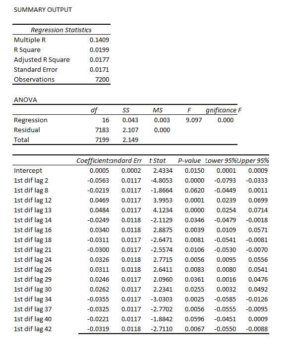
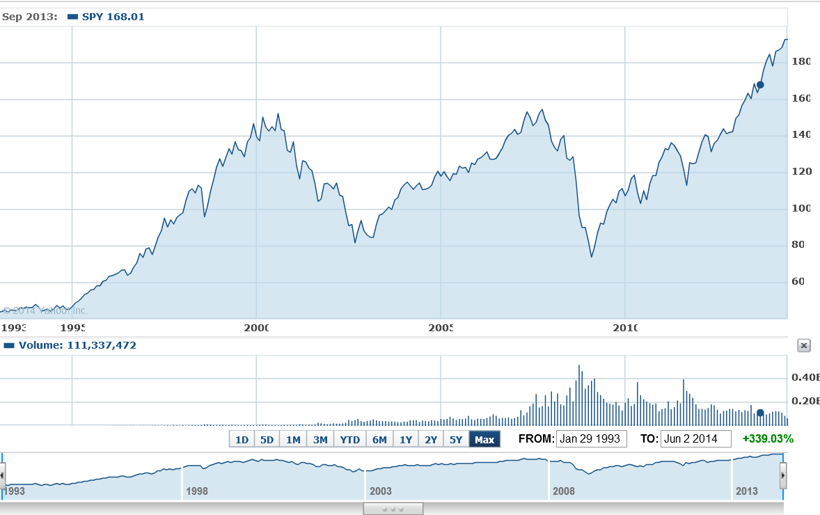
Earlier this year, I looked at the S&P 500 index and the SPY ETF numbers, and found I could beat a buy and hold strategy with a regression forecasting model. This was an autoregressive model with lots of lagged values of daily S&P returns. In some variants, it included lagged values of the Chicago Board of Trade VIX volatility index returns. My portfolio gains were compiled over an out-of-sample (OS) period. This means, of course, that I estimated the predictive regression on historical data that preceded and did not include the OS or test data.

Well, today I’m here to report to you that it looks like it is officially possible to achieve some predictability of stock market returns in out-of-sample data.

One authoritative source is Forecasting Stock Returns, an outstanding review by Rapach and Zhou  in the recent, second volume of the Handbook of Economic Forecasting.

The story is fascinating.

For one thing, most of the successful models achieve their best performance – in terms of beating market averages or other common benchmarks – during recessions.

And it appears that technical market indicators, such as the oscillators, momentum, and volume metrics so common in stock trading sites, have predictive value. So do a range of macroeconomic indicators.

But these two classes of predictors – technical market and macroeconomic indicators – are roughly complementary in their performance through the business cycle. As Christopher Neeley et al detail in Forecasting the Equity Risk Premium: The Role of Technical Indicators,

Macroeconomic variables typically fail to detect the decline in the actual equity risk premium early in recessions, but generally do detect the increase in the actual equity risk premium late in recessions. Technical indicators exhibit the opposite pattern: they pick up the decline in the actual premium early in recessions, but fail to match the unusually high premium late in recessions.

Stock Market Predictors – Macroeconomic and Technical Indicators

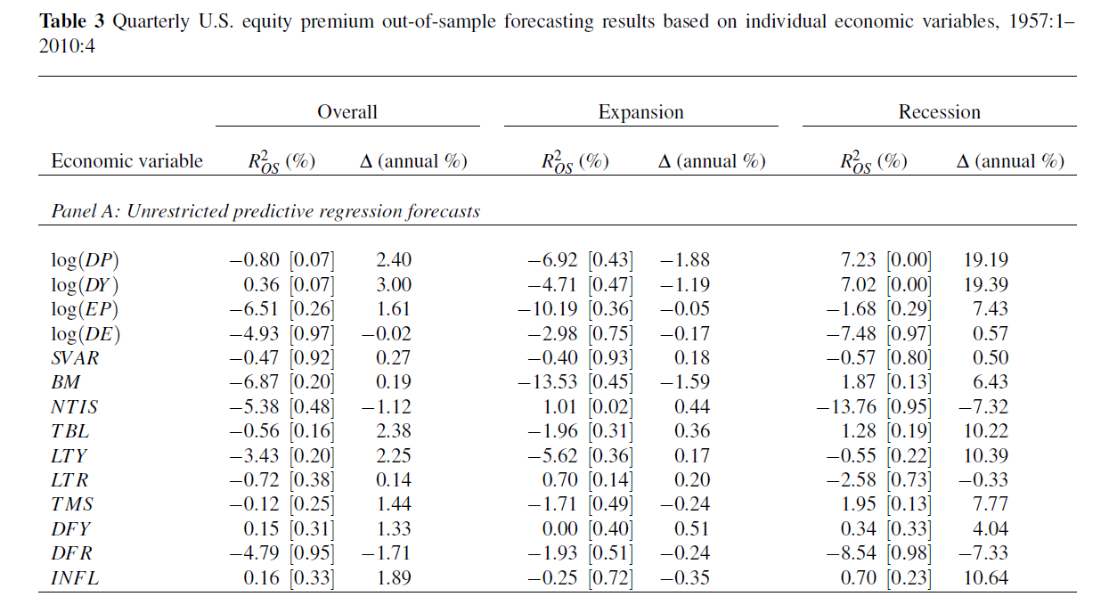
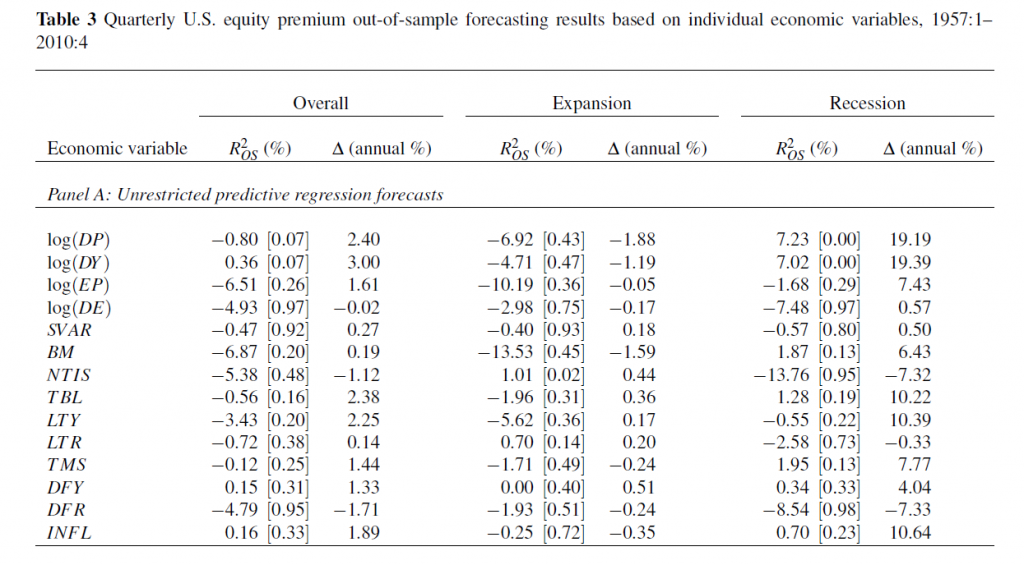
Rapach and Zhou highlight fourteen macroeconomic predictors popular in the finance literature.

1. Log dividend-price ratio (DP): log of a 12-month moving sum of dividends paid on the S&P 500 index minus the log of stock prices (S&P 500 index).

2. Log dividend yield (DY): log of a 12-month moving sum of dividends minus the log of lagged stock prices.

3. Log earnings-price ratio (EP): log of a 12-month moving sum of earnings on the S&P 500 index minus the log of stock prices.

4. Log dividend-payout ratio (DE): log of a 12-month moving sum of dividends minus the log of a 12-month moving sum of earnings.

5. Stock variance (SVAR): monthly sum of squared daily returns on the S&P 500 index.

6. Book-to-market ratio (BM): book-to-market value ratio for the DJIA.

7. Net equity expansion (NTIS): ratio of a 12-month moving sum of net equity issues by NYSE-listed stocks to the total end-of-year market capitalization of NYSE stocks.

8. Treasury bill rate (TBL): interest rate on a three-month Treasury bill (secondary market).

9. Long-term yield (LTY): long-term government bond yield.

10. Long-term return (LTR): return on long-term government bonds.

11. Term spread (TMS): long-term yield minus the Treasury bill rate.

12. Default yield spread (DFY): difference between BAA- and AAA-rated corporate bond yields.

13. Default return spread (DFR): long-term corporate bond return minus the long-term government bond return.

14. Inflation (INFL): calculated from the CPI (all urban consumers

In addition, there are technical indicators, which are generally moving average, momentum, or volume-based.

The moving average indicators typically provide a buy or sell signal based on a comparing two moving averages – a short and a long period MA.

Momentum based rules are based on the time trajectory of prices. A current stock price higher than its level some number of periods ago indicates “positive” momentum and expected excess returns, and generates a buy signal.

Momentum rules can be combined with information about the volume of stock purchases, such as Granville’s on-balance volume.

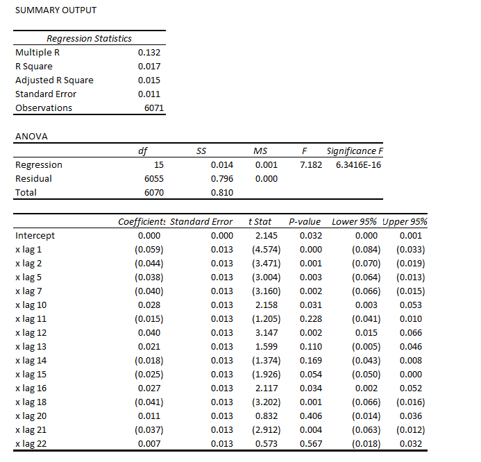
Each of these predictors can be mapped onto equity premium excess returns – measured by the rate of return on the S&P 500 index net of return on a risk-free asset. This mapping is a simple bi-variate regression with equity returns from time t on the left side of the equation and the economic predictor lagged by one time period on the right side of the equation. Monthly data are used from 1927 to 2008. The out-of-sample (OS) period is extensive, dating from the 1950’s, and includes most of the post-war recessions.

The following table shows what the authors call out-of-sample (OS) R2 for the 14 so-called macroeconomic variables, based on a table in the Handbook of Forecasting chapter. The OS R2 is equal to 1 minus a ratio. This ratio has the mean square forecast error (MSFE) of the predictor forecast in the numerator and the MSFE of the forecast based on historic average equity returns in the denominator. So if the economic indicator functions to improve the OS forecast of equity returns, the OS R2 is positive. If, on the other hand, the historic average trumps the economic indicator forecast, the OS R2 is negative.

Rapach1

(click to enlarge).

Overall, most of the macro predictors in this list don’t make it.  Thus, 12 of the 14 OS R2 statistics are negative in the second column of the Table, indicating that the predictive regression forecast has a higher MSFE than the historical average.

For two of the predictors with a positive out-of-sample R2, the p-values reported in the brackets are greater than 0.10, so that these predictors do not display statistically significant out-of-sample performance at conventional levels.

Thus, the first two columns in this table, under “Overall”, support a skeptical view of the predictability of equity returns.

However, during recessions, the situation is different.

For several the predictors, the R2 OS statistics move from being negative (and typically below -1%) during expansions to 1% or above during recessions. Furthermore, some of these R2 OS statistics are significant at conventional levels during recessions according to the  p-values, despite the decreased number of available observations.

Now imposing restrictions on the regression coefficients substantially improves this forecast performance, as the lower panel (not shown) in this table shows.

Rapach and Zhou were coauthors of the study with Neeley, published earlier as a working paper with the St. Louis Federal Reserve.

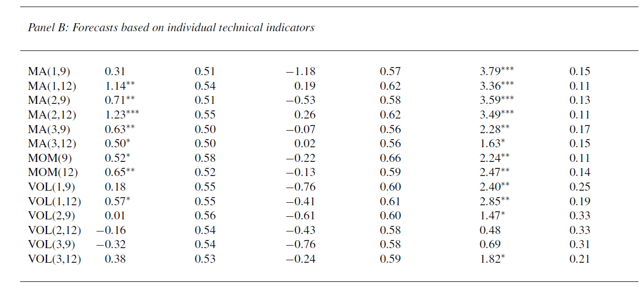
This working paper is where we get the interesting report about how technical factors add to the predictability of equity returns (again, click to enlarge).

RapachNeeley

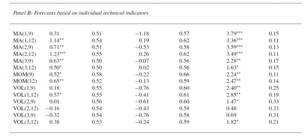
This table has the same headings for the columns as Table 3 above.

It shows out-of-sample forecasting results for several technical indicators, using basically the same dataset, for the overall OS period, for expansions, and recessions in this period dating from the 1950’s to 2008.

In fact, these technical indicators generally seem to do better than the 14 macroeconomic indicators.

Low OS R2

Even when these models perform their best, their increase in mean square forecast error (MSFE) is only slightly more than the MSFE of the benchmark historic average return estimate.

This improved performance, however, can still achieve portfolio gains for investors, based on various trading rules, and, as both papers point out, investors can use the information in these forecasts to balance their portfolios, even when the underlying forecast equations are not statistically significant by conventional standards. Interesting argument, and I need to review it further to fully understand it.

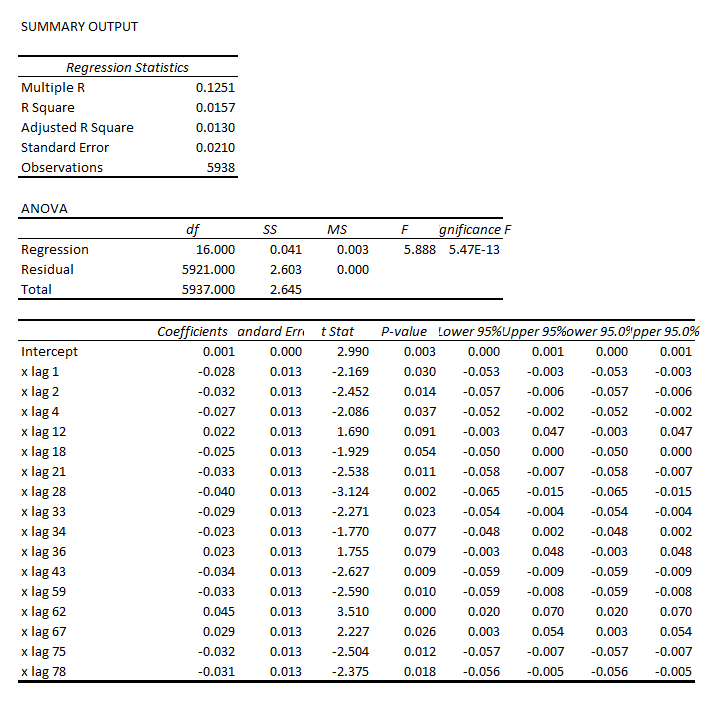
In any case, my experience with an autoregressive model for the S&P 500 is that trading rules can be devised which produce portfolio gains over a buy and hold strategy, even when the Ris on the order of 1 or a few percent. All you have to do is correctly predict the sign of the return on the following trading day, for instance, and doing this a little more than 50 percent of the time produces profits.

Rapach and Zhou, in fact, develop insights into how predictability of stock returns can be consistent with rational expectations – providing the relevant improvements in predictability are bounded to be low enough.

Some Thoughts

There is lots more to say about this, naturally. And I hope to have further comments here soon.

But, for the time being, I have one question.

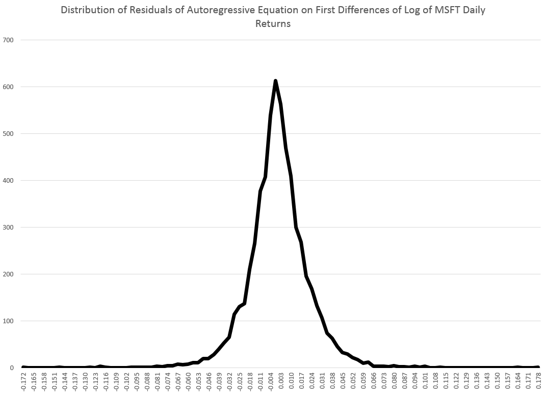
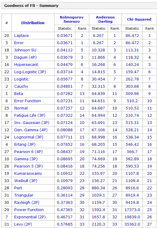
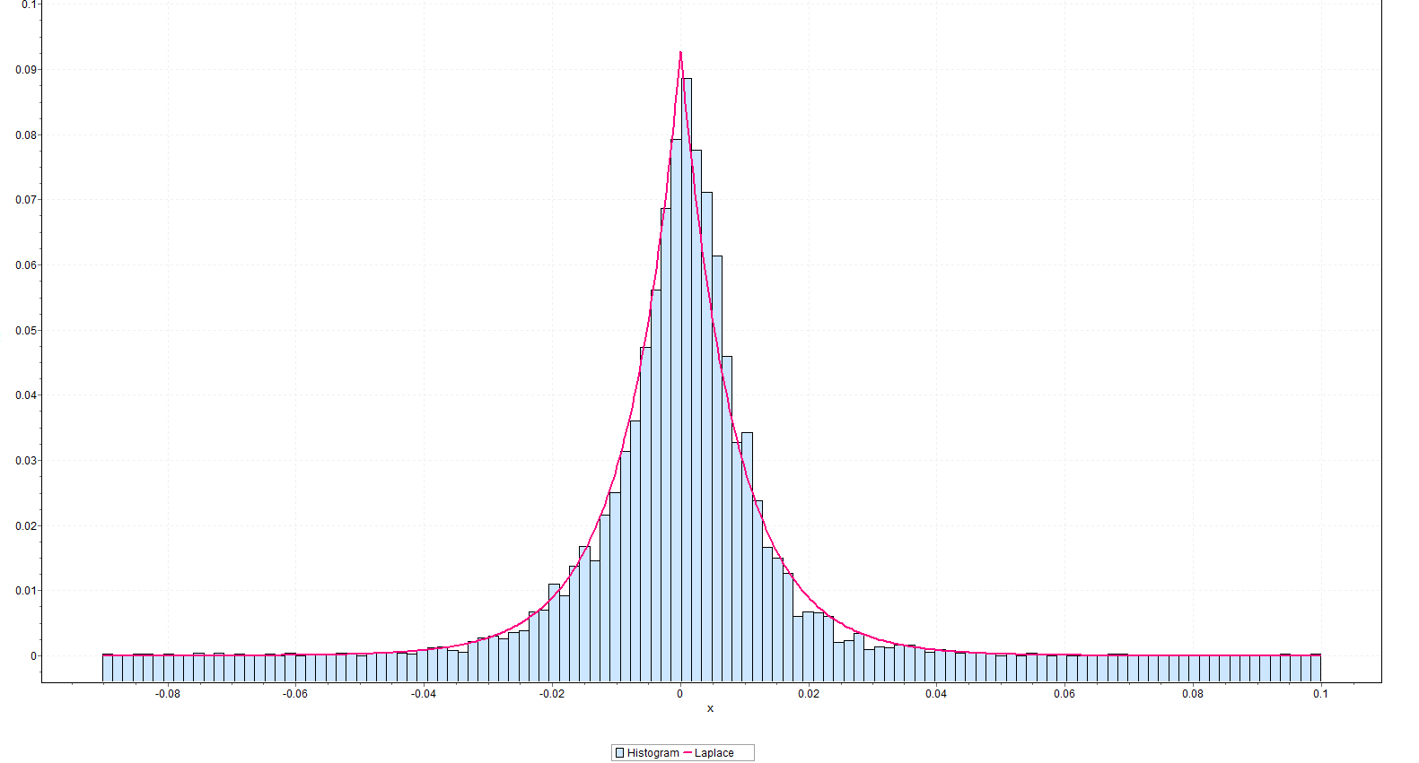
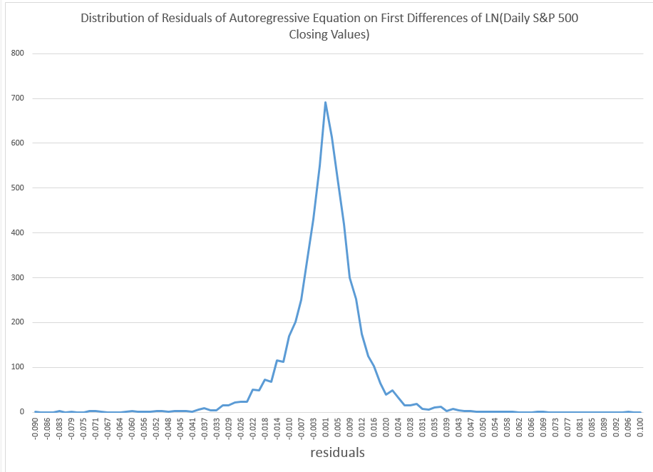
The is why econometricians of the caliber of Rapach, Zhou, and Neeley persist in relying on tests of statistical significance which are predicated, in a strict sense, on the normality of the residuals of these financial return regressions.

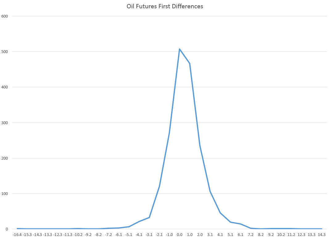
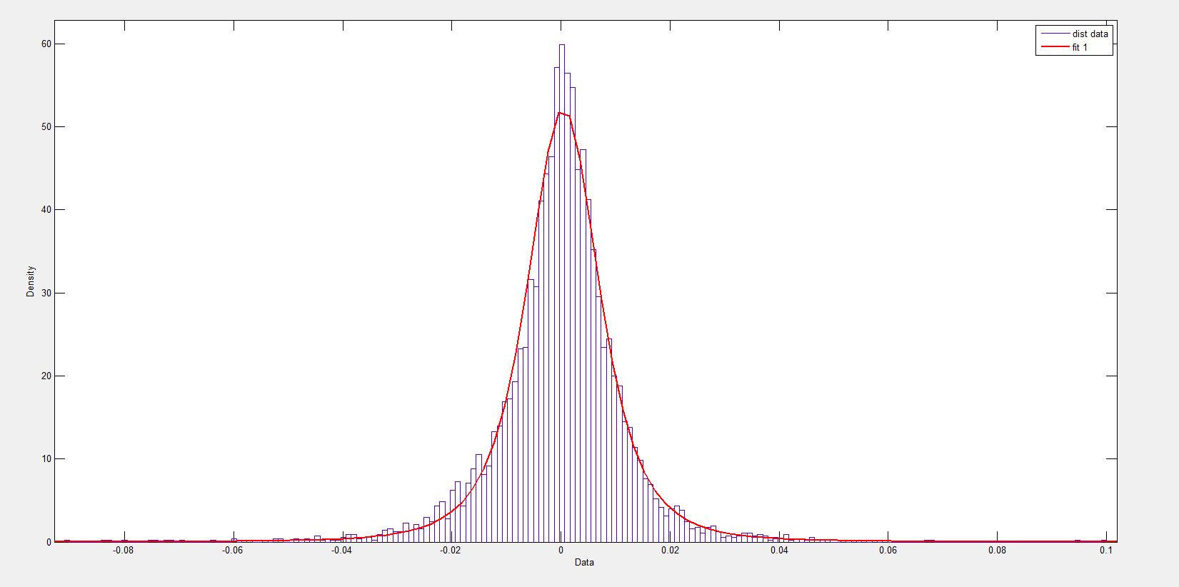
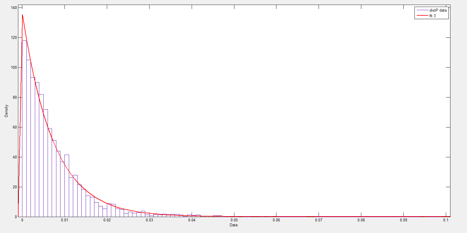
I’ve looked at this some, and it seems the t-statistic is somewhat robust to violations of normality of the underlying error distribution of the regression. However, residuals of a regression on equity rates of return can be very non-normal with fat tails and generally some skewness. I keep wondering whether anyone has really looked at how this translates into tests of statistical significance, or whether what we see on this topic is mostly arm-waving.

For my money, OS predictive performance is the key criterion.