Prospects for the 2nd Quarter 2014 and the Rest of the Year

Well, it’s the first day of the 3rd quarter 2014, and time to make an assessment of what happened in Q2 and also what is likely to transpire the rest of the year.

The Big Write-Down

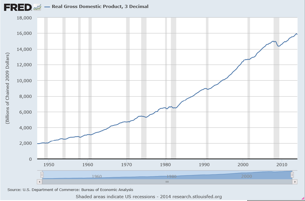
Of course, the 1st quarter 2014 numbers were surprisingly negative – and almost no one saw that coming. Last Wednesday (June 25) the Bureau of Economic Analysis (BEA) revised last estimates of 1st quarter real GDP down a -2.9 percent decrease on a quarter-by-quarter basis.

The Accelerating Growth Meme

Somehow media pundits and the usual ranks of celebrity forecasters seem heavily invested in the “accelerating growth” meme in 2014.

Thus, in mid-June Mark Zandi of Moody’s tries to back up Moody’s Analytics U.S. Macro Forecast calling for accelerating growth the rest of the year, writing,

The economy’s strength is increasingly evident in the job market. Payroll employment rose to a new high in May as the U.S. finally replaced all of the 8.7 million jobs lost during the recession, and job growth has accelerated above 200,000 per month since the start of the year. The pace of job creation is almost double that needed to reduce unemployment, even with typical labor force gains. More of the new positions are also better paying than was the case earlier in the recovery.

After the BEA released its write-down numbers June 25, the Canadian Globe and Mail put a happy face on everything, writing that The US Economy is Back on Track since,

Hiring, retail sales, new-home construction and consumer confidence all rebounded smartly this spring. A separate government report Wednesday showed inventories for non-defense durable goods jumped 1 per cent in May after a 0.4-per-cent increase the previous month.

Forecasts for the Year Being Cut-Back

On the other hand, the International Monetary Fund (IMF) cut its forecast for US growth,

In its annual review of the U.S. economy, the IMF cut its forecast for U.S. economic growth this year by 0.8 percentage point to 2%, citing a harsh winter, a struggling housing market and weak international demand for the country’s products.

Some Specifics

The first thing to understand in this context is that employment is usually a lagging indicator of the business cycle. Ahead of the Curve makes this point dramatically with the following chart.

employment

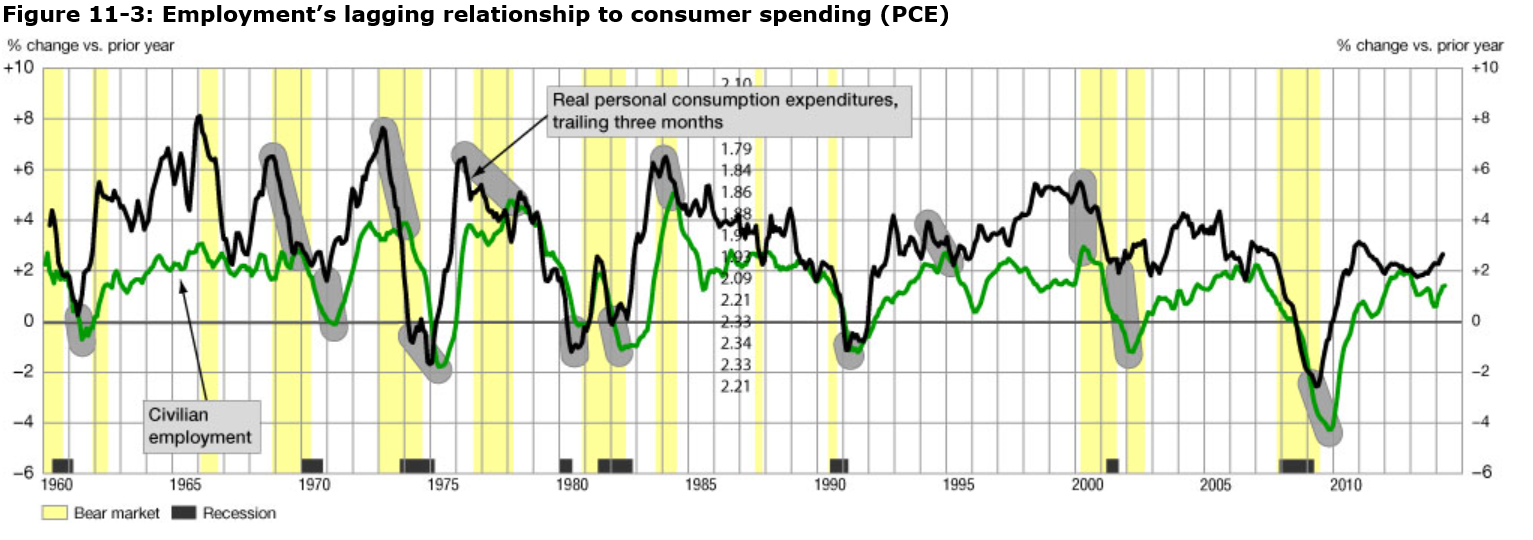
The chart shows employment change and growth lag changes in the business cycle. Thus, note that the green line peaks after growth in personal consumption expenditures in almost every case, where these growth rates are calculated on a year-over-year basis.

So Zandi’s defense of the Moody’s Analytics accelerating growth forecast for the rest of 2014 has to be taken with a grain of salt.

It really depends on other things – whether for example, retail sales are moving forward, what’s happening in the housing market (to new-home construction and other variables), also to inventories and durable goods spending. Also have exports rebounded, and imports (a subtraction from GDP) been reined in?

Retail Sales

If there is going to be accelerating economic growth, consumer demand, which certainly includes retail sales, has to improve dramatically.

However, the picture is mixed with significant rebound in sales in April, but lower-than-expected retail sales growth in May.

Bloomberg’s June take on this is in an article Cooling Sales Curb Optimism on U.S. Growth Rebound: Economy.

The US Census report estimates U.S. retail and food services sales for May, adjusted for seasonal variation and holiday and trading-day differences, but not for price changes, were $437.6 billion, an increase of 0.3 percent (±0.5)* from the previous month.

Durable Goods Spending

In the Advance Report on Durable Goods Manufacturers’ Shipments, Inventories and Orders May 2014 we learn that,

New orders for manufactured durable goods in May decreased $2.4 billion or 1.0 percent to $238.0 billion, the U.S. Census Bureau announced today.

On the other hand,

Shipments of manufactured durable goods in May, up four consecutive months, increased $0.6 billion or 0.3 percent to $238.6 billion

Of course, shipments are a lagging indicator of the business cycle.

Finally, inventories are surging –

Inventories of manufactured durable goods in May, up thirteen of the last fourteen months, increased $3.8 billion or 1.0 percent to $397.8 billion. This was at the highest level since the series was first published on a NAICS basis and followed a 0.3 percent April increase.

Inventory accumulation is a coincident indicator (in a negative sense) of the business cycle, according to NBER documents.

New Home Construction

From the Joint Release U.S. Department of Housing and Urban Development,

Privately-owned housing units authorized by building permits in May were at a seasonally adjusted annual rate of 991,000. This is 6.4 percent (±0.8%) below the revised April rate of 1,059,000 and is 1.9 percent (±1.4%) below the May 2013 estimate of 1,010,000…

Privately-owned housing starts in May were at a seasonally adjusted annual rate of 1,001,000. This is 6.5 percent (±10.2%)* below the

revised April estimate of 1,071,000, but is 9.4 percent (±11.0%)* above the May 2013 rate of 915,000.

Single-family housing starts in May were at a rate of 625,000; this is 5.9 percent (±12.7%)* below the revised April figure of 664,000.

No sign of a rebound in new home construction in these numbers.

Exports and Imports

The latest BEA report estimates,

April exports were $0.3 billion less than March exports of $193.7 billion. April imports were $2.7 billion more than March imports of $237.8 billion

Here is a several month perspective.

XM

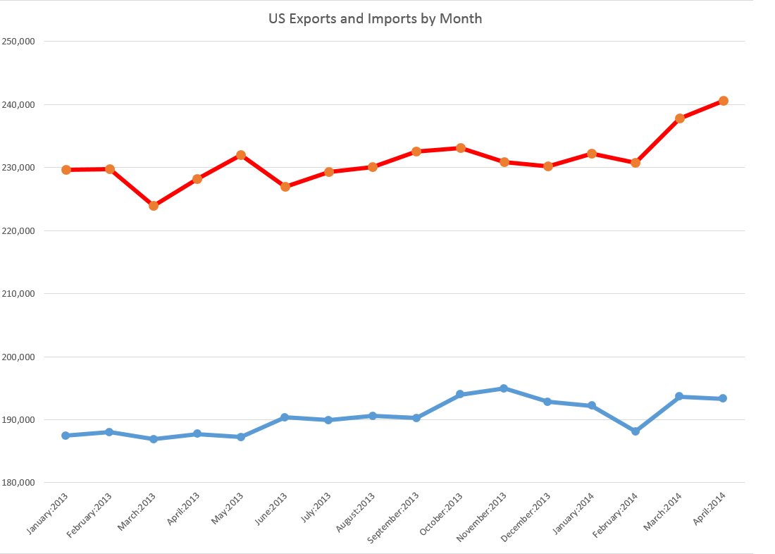
Essentially, the BEA trade numbers suggest the trade balance deteriorated March to April with a sharp uptick in imports and a slight drop in exports.

Summary

Well, it’s not a clear picture. The economy is teetering on the edge of a downturn, which it may still escape.

Clearly, real growth in Q2 has to be at least 2.9 percent in order to counterbalance the drop in Q1, or else the first half of 2014 will show a net decrease.

CNN offers this with an accompanying video

Goldman Sachs economists trimmed second quarter tracking GDP to 3.5 percent from 4.1 percent, and Barclays economists said tracking GDP for the second quarter fell to 2.9 percent from 4 percent. At a pace below 3 percent, the economy could show contraction for the first half due to the steep first quarter decline of 2.9 percent.

top picture http://www.bbc.com/news/magazine-24045598

Distributions of Stock Returns and Other Asset Prices

This is a kind of wrap-up discussion of probability distributions and daily stock returns.

When I did autoregressive models for daily stock returns, I kept getting this odd, pointy, sharp-peaked distribution of residuals with heavy tails. Recent posts have been about fitting a Laplace distribution to such data.

I have recently been working with the first differences of the logarithm of daily closing prices – an entity the quantitative finance literature frequently calls “daily returns.”

It turns out many researchers have analyzed the distribution of stock returns, finding fundamental similarities in the resulting distributions. There are also similarities for many stocks in many international markets in the distribution of trading volumes and the number of trades. These similarities exist at a range of frequencies – over a few minutes, over trading days, and longer periods.

The paradigmatic distribution of returns looks like this:

NASDAQDR

This is based on closing prices of the NASDAQ 100 from October 1985 to the present.

There also are power laws that can be extracted from the probabilities that the absolute value of returns will exceed a certain amount.

For example, again with daily returns from the NASDAQ 100, we get an exponential distribution if we plot these probabilities of exceedance. This curve can be fit by a relationship ~x where θ is between 2.7 and 3.7, depending on where you start the estimation from the top or largest probabilities.

NASDAQABSDR

These magnitudes of the exponent are significant, because they seem to rule out whole classes, such as Levy stable distributions, which require θ < 2.

Also, let me tell you why I am not “extracting the autoregressive components” here. There are probably nonlinear lag effects in these stock price data. So my linear autoregressive equations probably cannot extract all the time dependence that exist in the data. For that reason, and also because it seems pro forma in quantitative finance, my efforts have turned to analyzing what you might call the raw daily returns calculated with price data and suitable transformations.

Levy Stable Distributions

At the turn of the century, Mandelbrot, then Sterling Professor of Mathematics at Yale, wrote an introductory piece for a new journal called Quantitative Finance called Scaling in financial prices: I. Tails and dependence. In that piece, which is strangely convoluted by my lights, Mandelbrot discusses how he began working with Levy-stable distributions in the 1960’s to model the heavy tails of various stock and commodity price returns.

The terminology is a challenge, since there appear to be various ways of discussing so-called stable distributions, which are distributions which yield other distributions of the same type under operations like summing random variables, or taking their ratios.

The Quantitative Finance section of Stack Exchange has a useful Q&A on Levy-stable distributions in this context.

Answers refer readers to Nolan’s 2005 paper Modeling Financial Data With Stable Distributions which tells us that the class of all distributions that are sum-stable is described by four parameters. The distributions controlled by these parameters, however, are generally not accessible as closed algebraic expressions, but must be traced out numerically by computer computations.

Nolan gives several applications, for example, to currency data, illustrated with the following graphs.

Nolan1

So, the characteristics of the Laplace distribution I find so compelling are replicated to an extent by the Levy-stable distributions.

While Levy-stable distributions continue to be the focus of research in some areas of quantitative finance – risk assessment, for instance – it’s probably true that applications to stock returns are less popular lately. There are two reasons in particular. First, Levy stable distributions apparently have infinite variance, and as Cont writes, there is conclusive evidence that stock prices have finite second moments. Secondly, Levy stable distributions imply power laws for the probability of exceedance of a given level of absolute value of returns, but unfortunately these power laws have an exponent less than 2.

Neither of these “facts” need prove conclusive, though. Various truncated versions of Levy stable distributions have been used in applications like estimating Value at Risk (VAR).

Nolan also maintains a webpage which addresses some of these issues, and provides tools to apply Levy stable distributions.

Why Do These Regularities in Daily Returns and Other Price Data Exist?

If I were to recommend a short list of articles as “must-reads” in this field, Rama Cont’s 2001 survey in Quantitative Finance would be high on the list, as well as Gabraix et al’s 2003 paper on power laws in finance.

Cont provides a list of11 stylized facts regarding the distribution of stock returns.

1. Absence of autocorrelations: (linear) autocorrelations of asset returns are often insignificant, except for very small intraday time scales (

20 minutes) for which microstructure effects come into play.

2. Heavy tails: the (unconditional) distribution of returns seems to display a power-law or Pareto-like tail, with a tail index which is finite, higher than two and less than five for most data sets studied. In particular this excludes stable laws with infinite variance and the normal distribution. However the precise form of the tails is difficult to determine.

3. Gain/loss asymmetry: one observes large drawdowns in stock prices and stock index values but not equally large upward movements.

4. Aggregational Gaussianity: as one increases the time scale t over which returns are calculated, their distribution looks more and more like a normal distribution. In particular, the shape of the distribution is not the same at different time scales.

5. Intermittency: returns display, at any time scale, a high degree of variability. This is quantified by the presence of irregular bursts in time series of a wide variety of volatility estimators.

6. Volatility clustering: different measures of volatility display a positive autocorrelation over several days, which quantifies the fact that high-volatility events tend to cluster in time.

7. Conditional heavy tails: even after correcting returns for volatility clustering (e.g. via GARCH-type models), the residual time series still exhibit heavy tails. However, the tails are less heavy than in the unconditional distribution of returns.

8. Slow decay of autocorrelation in absolute returns: the autocorrelation function of absolute returns decays slowly as a function of the time lag, roughly as a power law with an exponent β ∈ [0.2, 0.4]. This is sometimes interpreted as a sign of long-range dependence.

9. Leverage effect: most measures of volatility of an asset are negatively correlated with the returns of that asset.

10. Volume/volatility correlation: trading volume is correlated with all measures of volatility.

11. Asymmetry in time scales: coarse-grained measures of volatility predict fine-scale volatility better than the other way round.

There’s a huge amount here, and it’s very plainly and well stated.

But then why?

Gabraix et al address this question, in a short paper published in Nature.

Insights into the dynamics of a complex system are often gained by focusing on large fluctuations. For the financial system, huge databases now exist that facilitate the analysis of large fluctuations and the characterization of their statistical behavior. Power laws appear to describe histograms of relevant financial fluctuations, such as fluctuations in stock price, trading volume and the number of trades. Surprisingly, the exponents that characterize these power laws are similar for different types and sizes of markets, for different market trends and even for different countries suggesting that a generic theoretical basis may underlie these phenomena. Here we propose a model, based on a plausible set of assumptions, which provides an explanation for these empirical power laws. Our model is based on the hypothesis that large movements in stock market activity arise from the trades of large participants. Starting from an empirical characterization of the size distribution of those large market participants (mutual funds), we show that the power laws observed in financial data arise when the trading behaviour is performed in an optimal way. Our model additionally explains certain striking empirical regularities that describe the relationship between large fluctuations in prices, trading volume and the number of trades.

The kernel of this paper in Nature is as follows:

powerlaws

Thus, Gabraix links the distribution of purchases in stock and commodity markets with the resulting distribution of daily returns.

I like this hypothesis and see ways it connects with the Laplace distribution and its variants. Probably, I will write more about this in a later post.

Surprising Revision of First Quarter GDP

I showed a relative this blog a couple of days ago, and, wanting “something spicy,” I pulled up The Record of Failure to Predict Recessions is Virtually Unblemished. The lead picture, as for this post, is Peter Sellers in his role as “Chauncey Gardiner” in Being There. Sellers played a simpleton mistaken for a savant, who would say things that everyone thought was brilliant, such as “There will be growth in the Spring.”

Well, last Wednesday, the US Bureau of Economic Analysis released a third revision of its estimate of the 1st quarter 2014 real GDP growthdown from an initial estimate of a positive .1 percent to -2.9 percent growth at an annual rate.

The BEA News Release says,

Real gross domestic product — the output of goods and services produced by labor and property located in the United States — decreased at an annual rate of 2.9 percent in the first quarter of 2014 according to the “third” estimate released by the Bureau of Economic Analysis….

The decrease in real GDP in the first quarter primarily reflected negative contributions from private inventory investment, exports, state and local government spending, nonresidential fixed investment, and residential fixed investment that were partly offset by a positive contribution from PCE. Imports, which are a subtraction in the calculation of GDP, increased.

Looking at this graph of quarterly real GDP growth rates for the past several years, it’s clear that a -2.9 percent quarter-over-quarter change is a significant size.

usgdpchartcustom

Again, macroeconomic forecasters were caught off guard.

In February of this year, the Survey of Professional Forecasters released its 1st Quarter 2014 consensus forecasts with numbers like –

SPF

Some SPF participants do predict 2014 overall will be a year of recession, as the following chart shows, but they are a tiny minority.

spfrange

A downward revision of almost 3 percentage points on the part of the BEA and almost 5 percent change for the median SPF forecast is poor performance indeed.

One hears things sped up in Q2, but on what basis I do not really know – and I am thinking of tracking key markets in future posts, such as housing, consumer spending, and so forth.

My feeling is that the quandary of the Fed – its desperate need to wind down asset purchases and restore interest rates to historic levels –creates an environment for a kind of “happy talk.”

Here’s some history on the real GDP.

USGDPnew


Business Forecasting – Some Thoughts About Scope

In many business applications, forecasting is not a hugely complex business. For a sales forecasting, the main challenge can be obtaining the data, which may require sifting through databases compiled before and after mergers or other reorganizations. Often, available historical data goes back only three or four years, before which time product cycles make comparisons iffy. Then, typically, you plug the sales data into an automatic forecasting program, one that can assess potential seasonality, and probably employing some type of exponential smoothing, and, bang, you produce forecasts for one to several quarters going forward.

The situation becomes more complex when you take into account various drivers and triggers for sales. The customer revenues and income are major drivers, which lead into assessments of business conditions generally. Maybe you want to evaluate the chances of a major change in government policy or the legal framework – both which are classifiable under “triggers.” What if the Federal Reserve starts raising the interest rates, for example.

For many applications, a driver-trigger matrix can be useful. This is a qualitative tool for presentations to management. Essentially, it helps keep track of assumptions about the scenarios which you expect to unfold from which you can glean directions of change for the drivers – GDP, interest rates, market conditions. You list the major influences on sales in the first column. In the second column you indicate the direction of this influences (+/-) and in the third column you put in the expected direction of change, plus, minus, or no change.

The next step up in terms of complexity is to collect historical data on the drivers and triggers – “explanatory variables” driving sales in the company. This opens the way for a full-blown multivariate model of sales performance. The hitch is to make this operational, you have to forecast the explanatory variables. Usually, this is done by relying, again, on forecasts by other organizations, such as market research vendors, consensus forecasts such as available from the Survey of Professional Forecasters and so forth. Sometimes it is possible to identify “leading indicators” which can be built into multivariate models. This is really the best of all possible worlds, since you can plug in known values of drivers and get a prediction for the target variable.

The value of forecasting to a business is linked with benefits of improvements in accuracy, as well as providing a platform to explore “what-if’s,” supporting learning about the business, customers, and so forth.

With close analysis, it is often possible to improve the accuracy of sales forecasts by a few percentage points. This may not sound like much, but in a business with $100 million or more in sales, competent forecasting can pay for itself several times over in terms of better inventory management and purchasing, customer satisfaction, and deployment of resources.

Time Horizon

When you get a forecasting assignment, you soon learn about several different time horizons. To some extent, each forecasting time horizon is best approached with certain methods and has different uses.

Conventionally, there are short, medium, and long term forecasting horizons.

In general business applications, the medium term perspective of a few quarters to a year or two is probably the first place forecasting is deployed. The issue is usually the budget, and allocating resources in the organization generally. Exponential smoothing, possibly combined with information about anticipated changes in key drivers, usually works well in this context. Forecast accuracy is a real consideration, since retrospectives on the budget are a common practice. How did we do last year? What mistakes were made? How can we do better?

The longer term forecast horizons of several years or more usually support planning, investment evaluation, business strategy. The M-competitions suggest the issue has to be being able to pose and answer various “what-if’s,” rather than achieving a high degree of accuracy. Of course, I refer here to the finding that forecast accuracy almost always deteriorates in direct proportion to the length of the forecast horizon.

Short term forecasting of days, weeks, a few months is an interesting application. Usually, there is an operational focus. Very short term forecasting in terms of minutes, hours, days is almost strictly a matter of adjusting a system, such as generating electric power from a variety of sources, i.e. combining hydro and gas fired turbines, etc.

As far as techniques, short term forecasting can get sophisticated and mathematically complex. If you are developing a model for minute-by-minute optimization of a system, you may have several months or even years of data at your disposal. There are, thus, more than a half a million minutes in a year.

Forecasting and Executive Decisions

The longer the forecasting horizon, the more the forecasting function becomes simply to “inform judgment.”

A smart policy for an executive is to look at several forecasts, consider several sources of information, before determining a policy or course of action. Management brings judgment to bear on the numbers. It’s probably not smart to just take the numbers on blind faith. Usually, executives, if they pay attention to a presentation, will insist on a coherent story behind the model and the findings, and also checking the accuracy of some points. Numbers need to compute. Round-off-errors need to be buried for purposes of the presentation. Everything should add up exactly.

As forecasts are developed for shorter time horizons and more for direct operation control of processes, acceptance and use of the forecast can become more automatic. This also can be risky, since developers constantly have to ask whether the output of the model is reasonable, whether the model is still working with the new data, and so forth.

Shiny New Techniques

The gap between what is theoretically possible in data analysis and what is actually done is probably widening. Companies enthusiastically take up the “Big Data” mantra – hiring “Chief Data Scientists.” I noticed with amusement an article in a trade magazine quoting an executive who wondered whether hiring a data scientist was something like hiring a unicorn.

There is a lot of data out there, more all the time. More and more data is becoming accessible with expansion of storage capabilities and of course storage in the cloud.

And really the range of new techniques is dazzling.

I’m thinking, for example, of bagging and boosting forecast models. Or of the techniques that can be deployed for the problem of “many predictors,” techniques including principal component analysis, ridge regression, the lasso, and partial least squares.

Probably one of the areas where these new techniques come into their own is in target marketing. Target marketing is kind of a reworking of forecasting. As in forecasting sales generally, you identify key influences (“drivers and triggers”) on the sale of a product, usually against survey data or past data on customers and their purchases. Typically, there is a higher degree of disaggregation, often to the customer level, than in standard forecasting.

When you are able to predict sales to a segment of customers, or to customers with certain characteristics, you then are ready for the sales campaign to this target group. Maybe a pricing decision is involved, or development of a product with a particular mix of features. Advertising, where attitudinal surveys supplement customer demographics and other data, is another key area.

Related Areas

Many of the same techniques, perhaps with minor modifications, are applicable to other areas for what has come to be called “predictive analytics.”

The medical/health field has a growing list of important applications. As this blog tries to show, quantitative techniques, such as logistic regression, have a lot to offer medical diagnostics. I think the extension of predictive analytics to medicine and health care ism at this point, merely a matter of access to the data. This is low-hanging fruit. Physicians diagnosing a guy with an enlarged prostate and certain PSA and other metrics should be able to consult a huge database for similarities with respect to age, health status, collateral medical issues and so forth. There is really no reason to suspect that normally bright, motivated people who progress through medical school and come out to practice should know the patterns in 100,000 medical records of similar cases throughout the nation, or have read all the scientific articles on that particular niche. While there are technical and interpretive issues, I think this corresponds well to what Nate Silver identifies as promising – areas where application of a little quantitative analysis and study can reap huge rewards.

And cancer research is coming to be closely allied with predictive analytics and data science. The paradigmatic application is the DNA assay, where a sample of a tumor is compared with healthy tissue from the same individual to get an idea of what cancer configuration is at play. Indeed, at that fine new day when big pharma will develop hundreds of genetically targeted therapies for people with a certain genetic makeup with a certain cancer – when that wonderful new day comes – cancer treatment may indeed go hand in hand with mathematical analysis of the patient’s makeup.

Microsoft Stock Prices and the Laplace Distribution

The history of science, like the history of all human ideas, is a history of irresponsible dreams, of obstinacy, and of error. But science is one of the very few human activities perhaps the only one in which errors are systematically criticized and fairly often, in time, corrected. This is why we can say that, in science, we often learn from our mistakes, and why we can speak clearly and sensibly about making progress there. — Karl Popper, Conjectures and Refutations

Microsoft daily stock prices and oil futures seem to fall in the same class of distributions as those for the S&P 500 and NASDAQ 100 – what I am calling the Laplace distribution.

This is contrary to the conventional wisdom. The whole thrust of Box-Jenkins time series modeling seems to be to arrive at Gaussian white noise. Most textbooks on econometrics prominently feature normally distributed error processes ~ N(0,σ).

Benoit Mandelbrot, of course, proposed alternatives as far back as the 1960’s, but still we find aggressive application of Gaussian assumptions in applied work – as for example in widespread use of the results of the Black-Scholes theorem or in computing value at risk in portfolios.

Basic Steps

I’m taking a simple approach.

First, I collect daily closing prices for a stock index, stock, or, as you will see, for commodity futures.

Then, I do one of two things: (a) I take the natural logarithms of the daily closing prices, or (b) I simply calculate first differences of the daily closing prices.

I did not favor option (b) initially, because I can show that the first differences, in every case I have looked at, are autocorrelated at various lags. In other words, these differences have an algorithmic structure, although this structure usually has weak explanatory power.

However, it is interesting that the first differences, again in every case I have looked at, are distributed according to one of these sharp-peaked or pointy distributions which are highly symmetric.

Take the daily closing prices of the stock of the Microsoft Corporation (MST), as an example.

Here is a graph of the daily closing prices.

MSFTgraph

And here is a histogram of the raw first differences of those closing prices over this period since 1990.

rawdifMSFT

Now in close reading of The Laplace Distribution and Generalizations I can see there are a range of possibilities in modeling distributions of the above type.

And here is another peaked, relatively symmetric distribution based on the residuals of an autoregressive equation calculated on the first differences of the logarithm of the daily closing prices. That’s a mouthful, but the idea is to extract at least some of the algorithmic component of the first differences.

MSFTregreshisto

That regression is as follows.

MSFTreg

Note the deep depth of the longest lags.

This type of regression, incidentally, makes money in out-of-sample backcasts, although possibly not enough to exceed trading costs unless the size of the trade is large. However, it’s possible that some advanced techniques, such as bagging and boosting, regression trees and random forecasts could enhance the profitability of trading strategies.

Well, a quick look at daily oil futures (CLQ4) from 2007 to the present.

oilfutures

Not quite as symmetric, but still profoundly not a Gaussian distribution.

The Difference It Makes

I’ve got to go back and read Mandelbrot carefully on his analysis of stock and commodity prices. It’s possible that these peaked distributions all fit in a broad class including the Laplace distribution.

But the basic issue here is that the characteristics of these distributions are substantially different than the Gaussian or normal probability distribution. This would affect maximum likelihood estimation of parameters in models, and therefore could affect regression coefficients.

Furthermore, the risk characteristics of assets whose prices have these distributions can be quite different.

And I think there is a moral here about the conventional wisdom and the durability of incorrect ideas.

Top pic is Karl Popper, the philosopher of science

The NASDAQ 100 Daily Returns and Laplace Distributed Errors

I once ran into Norman Mailer at the Museum of Modern Art in Manhattan. We were both looking at Picasso’s “Blue Boy” and, recognizing him, I started up some kind of conversation, and Mailer was quite civil about the whole thing.

I mention this because I always associate Mailer with his collection Advertisements for Myself.

And that segues – loosely – into my wish to let you know that, in fact, I developed a generalization of the law of demand for the situation in which a commodity is sold at a schedule of rates and fees, instead of a uniform price. That was in 1987, when I was still a struggling academic and beginning a career in business consulting.

OK, and that relates to a point I want to suggest here. And that is that minor players can have big ideas.

So I recognize an element of “hubris” in suggesting that the error process of S&P 500 daily returns – up to certain transformations – is described by a Laplace distribution.

What about other stock market indexes, then? This morning, I woke up and wondered whether the same thing is true for, say, the NASDAQ 100.

NASDAQ100

So I downloaded daily closing prices for the NASDAQ 100 from Yahoo Finance dating back to October 1, 1985. Then, I took the natural log of each of these closing prices. After that, I took trading day by trading day differences. So the series I am analyzing comes from the first differences of the natural log of the NASDAQ 100 daily closing prices.

Note that this series of first differences is sometimes cast into a histogram by itself – and this also frequently is a “pointy peaked” relatively symmetric distribution. You could motivate this graph with the idea that stock prices are a random walk. So if you take first differences, you get the random component that generates the random walk.

I am troubled, however, by the fact that this component has considerable structure in and of itself. So I undertake further analysis.

For example, the autocorrelation function of these first differences of the log of NASDAQ 100 daily closing prices looks like this.

NASDAQAC

Now if you calculate bivariate regressions on these first differences and their lagged values, many of them produce coefficient estimates with t-statistics that exceed the magic value of 2.

Just selecting these significant regressors from the first 47 lags produces this regression equation, I get this equation.

Regression

Now this regression is estimated over all 7200 observations from October 1 1984 to almost right now.

Graphing the residuals, I get the familiar pointy-peaked distribution that we saw with the S&P 500.

LaplaceNASDAQ100

Here is a fit of the Laplace distribution to this curve (Again using EasyFit).

EFLNQ

Here are the metrics for this fit and fits to a number of other probability distributions from this program.

EFtable

I have never seen as clear a linkage of returns from stock indexes and the Laplace distribution (maybe with a slight asymmetry – there are also asymmetric Laplace distributions).

One thing is for sure – the distribution above for the NASDAQ 100 data and the earlier distribution developed for the S&P 500 are not close to be normally distributed. Thus, in the table above that the normal distribution is number 12 on the list of possible candidates identified by EasyFit.

Note “Error” listed in the above table, is not the error function related to the normal distribution. Instead it is another exponential distribution with an absolute value in the exponent like the Laplace distribution. In fact, it looks like a transformation of the Laplace, but I need to do further investigation. In any case, it’s listed as number 2, even though the metrics show the same numbers.

The plot thickens.

Obviously, the next step is to investigate individual stocks with respect to Laplacian errors in this type of transformation.

Also, some people will be interested in whether the autoregressive relationship listed above makes money under the right trading rules. I will report further on that.

Anyway, thanks for your attention. If you have gotten this far – you believe numbers have power. Or you maybe are interested in finance and realize that indirect approaches may be the best shot at getting to something fundamental.

The Laplace Distribution and Financial Returns

Well, using EasyFit from Mathwave, I fit a Laplace distribution to the residuals of the regression on S&P daily returns I discussed yesterday.

Here is the result.

Laplacefit

This beats a normal distribution hands down. It also appears to beat the Matlab fit of a t distribution, but I have to run down more details on forms of the t-distribution to completely understand what is going on in the Matlab setup.

Note that EasyFit is available for a free 30-day trial download. It’s easy to use and provides metrics on goodness of fit to make comparisons between distributions.

There is a remarkable book online called The Laplace Distribution and Generalizations. If you have trouble downloading it from the site linked here, Google the title and find the download for a free PDF file.

This book, dating from 2001, runs to 458 pages, has a good introductory discussion, extensive mathematical explorations, as well as applications to engineering, physical science, and finance.

The French mathematical genius Pierre Simon Laplace proposed the distribution named after him as a first law of errors when he was 25, before his later discussions of the normal distribution.

The normal probability distribution, of course, “took over” – in part because of its convenient mathematical properties and also, probably, because a lot of ordinary phenomena are linked with Gaussian processes.

John Maynard Keynes, the English economist, wrote an early monograph (Keynes, J.M. (1911). The principal averages and the laws of error which lead to them, J. Roy. Statist. Soc. 74, New Series, 322-331) which substantially focuses on the Laplace distribution, highlighting the importance it gives to the median, rather than average, of sample errors.

The question I’ve struggled with is “why should stock market trading, stock prices, stock indexes lead, after logarithmic transformation and first differencing to the Laplace distribution?”

Of course, the Laplace distribution can be generated as a difference of exponential distributions, or as combination of a number of distributions, as the following table from Kotz, Kozubowski, and Podgorski’s book shows.

Ltable

This is all very suggestive, but how can it be related to the process of trading?

Indeed, there are quite a number of questions which follow from this hypothesis – that daily trading activity is fundamentally related to a random component following a Laplace distribution.

What about regression, if the error process is not normally distributed? By following the standard rules on “statistical significance,” might we be led to disregard variables which are drivers for daily returns or accept bogus variables in predictive relationships?

Distributional issues are important, but too frequently disregarded.

I recall a blog discussion by a hedge fund trader lamenting excesses in the application of the Black-Scholes Theorem to options in 2007 and thereafter.

Possibly, the problem is as follows. The residuals of autoregressions on daily returns and their various related transformations tend to cluster right around zero, but have big outliers. This clustering creates false confidence, making traders vulnerable to swings or outliers that occur much more frequently than suggested by a normal or Gaussian error distribution.

The Distribution of Daily Stock Market Returns

I think it is about time for another dive into stock market forecasting. The US market is hitting new highs with the usual warnings of excess circulating around. And there are interesting developments in volatility.

To get things rolling, consider the following distribution of residuals from an autoregressive model on the difference in the natural logarithms of the S&P 500.

This is what I am calling “the distribution of daily stock market returns.” I’ll explain that further in a minute.

residualsLSPD

Now I’ve seen this distribution before, and once asked in a post, “what type of distribution is this?”

Now I think I have the answer – it’s a Laplace distribution, sometimes known as the double exponential distribution.

Since this might be important, let me explain the motivation and derivation of these residuals, and then consider some implications.

Derivation of the Residuals

First, why not just do a histogram of the first differences of daily returns to identify the underlying distribution? After all, people say movement of stock market indexes are a random walk.

OK, well you could do that, and the resulting distribution would also look “Laplacian” with a pointy peak and relative symmetry. However, I am bothered in developing this by the fact that these first differences show significant, even systematic, autocorrelation.

I’m influenced here by the idea that you always want to try to graph independent draws from a distribution to explore the type of distribution.

OK, now to details of my method.

The data are based on daily closing values for the S&P 500 index from December 4, 1989 to February 7, 2014.

I took the natural log of these closing values and then took first differences – subtracting the previous trading day’s closing value from the current day’s closing value. This means that these numbers encode the critical part of the daily returns, which are calculated as day-over-day percent changes. Thus, the difference of natural logs is in fact a ratio of the original numbers – what you might look at as the key part of the percent change from one trading day to the next.

So I generate a conventional series of first differences of the natural log of this nonstationary time series. This transforms the original nonstationary series to a  one that basically fluctuates around a level – essentially zero. Furthermore, the log transform tends to reduce the swings in the variability of the series, although significant variability remains.

1stdiflnsp

Removing Serial Correlation

The series graphed above exhibits first order serial correlation. It also exhibits second order serial correlation, or correlation between values at a lag of 2.

Based on the correlations for the first 24 lags, I put together this regression equation. Of course, the “x’s” refer to time dated first differences of the natural log of the S&P daily closing values.

reg1stdiflnsp

Note that most of the t-statistics pass our little test of significance (which I think is predicted to an extent on the error process belonging to certain distributions..but). The coefficient of determination or R2 is miniscule – at 0.017. This autoregressive equation thus explains only about 2 percent of the variation in this differenced log daily closing values series.

Now one of the things I plan to address is how, indeed, that faint predictive power can exert significant influence on earnings from stock trading, given trading rules.

But let me leave that whole area – how you make money with such a relationship – to a later discussion, since I’ve touched on this before.

Instead, let me just observe that if you subtract the predicted values from this regression from the actuals trading day by trading day, you get the data for the pointy, highly symmetric distribution of residuals.

Furthermore, these residuals do not exhibit first or second, or higher, autocorrelation, so far as I am able to determine.

This means we have separated out algorithmic components of this series from random components that are not serially correlated.

So you might jump to the conclusion that these residuals are then white noise, and I think many time series modelers have gotten to this point, simply assuming they are dealing with Gaussian white noise.

Nothing could be further from the truth, as the following Matlab fit of a normal distribution to some fairly crude bins for these numbers.

normfitLSPRes

A Student-t distribution does better, as the following chart shows.

TfitSPRes

But the t-distribution still misses the pointed peak.

The Laplace distribution is also called the double exponential, since it can be considered to be a composite of exponentials on the right and to the left of the mean – symmetric but mirror images of each other.

The following chart shows how this works over the positive residuals.

Exponposfit

Now, of course, there are likelihood ratios and those sorts of metrics, and I am busy putting together a comparison between the t-distribution fit and Laplace distribution fit.

There is a connection between the Laplace distribution and power laws, too, and I note considerable literature on this distribution in finance and commodities.

I think I have answered the question I put out some time back, though, and, of course, it raises other questions in its wake.

The Loebner Prize and Turing Test

In a brilliant, early article on whether machines can “think,” Alan Turing, the genius behind a lot of early computer science, suggested that if a machine cannot be distinguished from a human during text-based conversation, that machine could be said to be thinking and have intelligence.

Every year, the Loebner Prize holds this type of Turing comptition. Judges, such as those below, interact with computer programs (and real people posing as computer programs). If a

judges

computer program fools enough people, the program is elible for various prizes.

The 2013 prize was won by Mitsuki Chatbox advertised as an artificial lifeform living on the web.

chatbot

She certainly is fun, and is an avatar of a whole range of chatbots which are increasingly employed in customer service and other business applications.

Mitsuku’s botmaster, Steve Worswick, ran a music website with a chatbot. Apparently, more people visited to chat than for music so he concentrated his efforts on the bot, which he still regards as a hobby. Mitsuku uses AIML (Artificial Intelligence Markup Language) used by members of pandorabot.

Mitsuki is very cute, which perhaps one reason why she gets worldwide attention.

pageviews

It would be fun to develop a forecastbot, capable of answering basic questions about which forecasting method might be appropriate. We’ve all seen those flowcharts and tabular arrays with data characteristics and forecast objectives on one side, and recommended methods on the other.


Energy Forecasts – Parting Shots

There is obviously a big difference between macro and micro, when it comes to energy forecasting.

At the micro-level – for example, electric utility load forecasting – considerable precision often can be attained in the short run, or very short run, when seasonal, daily, and holiday usage patterns are taken into account.

At the macro level, on the other hand – for global energy supply, demand, and prices – big risks are associated with projections beyond a year or so. Many things can intervene, such as supply disruptions which in 2013, occurred in Nigeria, Iraq, and Lybia. And long range energy forecasts – forget it. Even well-funded studies with star researchers from the best universities and biggest companies show huge errors ten or twenty years out (See A Half Century of Long-Range Energy Forecasts: Errors Made, Lessons Learned, and Implications for Forecasting).

Peak Oil

This makes big picture concepts such as peak oil challenging to evaluate. Will there be a time in the future when global oil production levels peak and then decline, triggering a frenzied search for substitutes and exerting pressure on the whole structure of civilization in what some have called the petrochemical age?

Since the OPEC Oil Embargo of 1974, there have been researchers, thinkers, and writers who point to this as an eventuality. Commentators and researchers associated with the post carbon institute carry on the tradition.

Oil prices have not always cooperated, as the following CPI-adjusted price of crude oil suggests.

oilprice

The basic axiom is simply that natural resource reserves and availability are always conditional on price. With high enough prices, more oil can be extracted from somewhere – from deeper wells, from offshore platforms that are expensive and dangerous to erect, from secondary recovery, and now, from nonconventional sources, such as shale oil and gas.

Note this axiom of resource economics does not really say that there will never be a time when total oil production begins to decline. It just implies that oil will never be totally exhausted, if we loosen the price constraint.

Net Energy Analysis

Net energy analysis provides a counterpoint to the peak oil conversation. In principle, we can calculate the net energy contributions of various energy sources today. No forecasting is really necessary. Just a deep understanding of industrial process and input-output relationships.

Along these lines, several researchers and again David Hughes with the post carbon institute project that the Canadian tar sands have a significantly lower net energy contribution that, say, oil from conventional wells.

Net energy analysis resembles life cycle cost analysis, which has seen widespread application in environmental assessment. Still neither technique is foolproof, or perhaps I should say that both techniques would require huge research investments, including on-site observation and modeling, to properly implement.

Energy Conservation

Higher energy prices since the 1970’s also have encouraged increasing energy efficiency. This is probably one of the main reasons why long range energy projections from, say, the 1980’s usually look like wild overestimates by 2000.

The potential is still there, as a 2009 McKinsey study documents –

The research shows that the US economy has the potential to reduce annual non-transportation energy consumption by roughly 23 percent by 2020, eliminating more than $1.2 trillion in waste—well beyond the $520 billion upfront investment (not including program costs) that would be required. The reduction in energy use would also result in the abatement of 1.1 gigatons of greenhouse-gas emissions annually—the equivalent of taking the entire US fleet of passenger vehicles and light trucks off the roads.

The McKinsey folks are pretty hard-nosed, tough-minded, not usually given to gross exaggerations.

A Sense In Which We May Already Have Reached Peak Oil

Check this YouTube out. Steven Kopits’ view of supply-constrained markets in oil is novel, but his observations about dollar investment to conventional oil output seem to hit the mark. The new oil production is from the US in large part, and comes from nonconventional sources, i.e. shale oil. This requires more effort, as witnessed by the poor financials of a lot of these players, who are speculating on expansion of export markets, but who would go bust at current domestic prices.

For Kopits slides go here. Check out these graphs from the recent BP report, too.

Sales and new product forecasting in data-limited (real world) contexts