Medical/Health Predictive Analytics – Logistic Regression

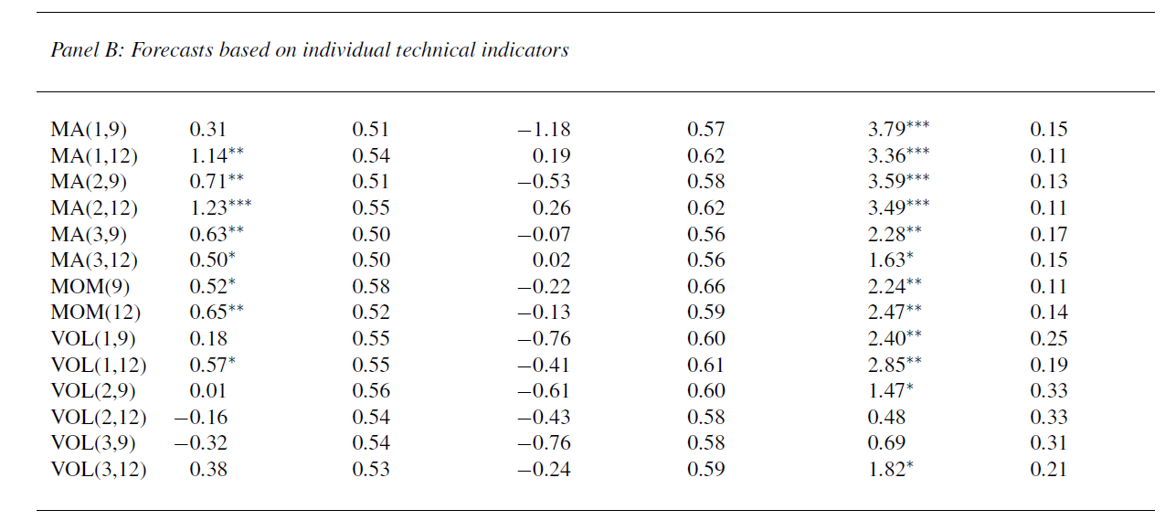
The case for assessing health risk with logistic regression is made by authors of a 2009 study, which is also a sort of model example for Big Data in diagnostic medicine.

As the variables that help predict breast cancer increase in number, physicians must rely on subjective impressions based on their experience to make decisions. Using a quantitative modeling technique such as logistic regression to predict the risk of breast cancer may help radiologists manage the large amount of information available, make better decisions, detect more cancers at early stages, and reduce unnecessary biopsies

This study – A Logistic Regression Model Based on the National Mammography Database Format to Aid Breast Cancer Diagnosis  – pulled together 62,219 consecutive mammography records from 48,744 studies in 18,270 patients reported using the Breast Imaging Reporting and Data System (BI-RADS) lexicon and the National Mammography Database format between April 5, 1999 and February 9, 2004.

The combination of medical judgment and an algorithmic diagnostic tool based on extensive medical records is, in the best sense, the future of medical diagnosis and treatment.

And logistic regression has one big thing going for it – a lot of logistic regressions have been performed to identify risk factors for various diseases or for mortality from a particular ailment.

A logistic regression, of course, maps a zero/one or categorical variable onto a set of explanatory variables.

This is not to say that there are not going to be speedbumps along the way. Interestingly, these are data science speedbumps, what some would call statistical modeling issues.

Picking the Right Variables, Validating the Logistic Regression

The problems of picking the correct explanatory variables for a logistic regression and model validation are linked.

The problem of picking the right predictors for a logistic regression is parallel to the problem of picking regressors in, say, an ordinary least squares (OLS) regression with one or two complications. You need to try various specifications (sets of explanatory variables) and utilize a raft of diagnostics to evaluate the different models. Cross-validation, utilized in the breast cancer research mentioned above, is probably better than in-sample tests. And, in addition, you need to be wary of some of the weird features of logistic regression.

A survey of medical research from a few years back highlights the fact that a lot of studies shortcut some of the essential steps in validation.

A Short Primer on Logistic Regression

I want to say a few words about how the odds-ratio is the key to what logistic regression is all about.

Logistic regression, for example, does not “map” a predictive relationship onto a discrete, categorical index, typically a binary, zero/one variable, in the same way ordinary least squares (OLS) regression maps a predictive relationship onto dependent variables. In fact, one of the first things one tends to read, when you broach the subject of logistic regression, is that, if you try to “map” a binary, 0/1 variable onto a linear relationship β01x12x2 with OLS regression, you are going to come up against the problem that the predictive relationship will almost always “predict” outside the [0,1] interval.

Instead, in logistic regression we have a kind of background relationship which relates an odds-ratio to a linear predictive relationship, as in,

ln(p/(1-p)) = β01x12x2

Here p is a probability or proportion and the xi are explanatory variables. The function ln() is the natural logarithm to the base e (a transcendental number), rather than the logarithm to the base 10.

The parameters of this logistic model are β0, β1, and β2.

This odds ratio is really primary and from the logarithm of the odds ratio we can derive the underlying probability p. This probability p, in turn, governs the mix of values of an indicator variable Z which can be either zero or 1, in the standard case (there being a generalization to multiple discrete categories, too).

Thus, the index variable Z can encapsulate discrete conditions such as hospital admissions, having a heart attack, or dying – generally, occurrences and non-occurrences of something.

Chinesemathteacher

It’s exactly analogous to flipping coins, say, 100 times. There is a probability of getting a heads on a flip, usually 0.50. The distribution of the number of heads in 100 flips is a binomial, where the probability of getting say 60 heads and 40 tails is the combination of 100 things taken 60 at a time, multiplied into (0.5)60*(0.5)40. The combination of 100 things taken 60 at a time equals 60!/(60!40!) where the exclamation mark indicates “factorial.”

Similarly, the probability of getting 60 occurrences of the index Z=1 in a sample of 100 observations is (p)60*(1-p)40multiplied by 60!/(60!40!).

The parameters βi in a logistic regression are estimated by means of maximum likelihood (ML).  Among other things, this can mean the optimal estimates of the beta parameters – the parameter values which maximize the likelihood function – must be estimated by numerical analysis, there being no closed form solutions for the optimal values of β0, β1, and β2.

In addition, interpretation of the results is intricate, there being no real consensus on the best metrics to test or validate models.

SAS and SPSS as well as software packages with smaller market shares of the predictive analytics space, offer algorithms, whereby you can plug in data and pull out parameter estimates, along with suggested metrics for statistical significance and goodness of fit.

There also are logistic regression packages in R.

But you can do a logistic regression, if the data are not extensive, with an Excel spreadsheet.

This can be instructive, since, if you set it up from the standpoint of the odds-ratio, you can see that only certain data configurations are suitable. These configurations – I refer to the values which the explanatory variables xi can take, as well as the associated values of the βi – must be capable of being generated by the underlying probability model. Some data configurations are virtually impossible, while others are inconsistent.

This is a point I find lacking in discussions about logistic regression, which tend to note simply that sometimes the maximum likelihood techniques do not converge, but explode to infinity, etc.

Here is a spreadsheet example, where the predicting equation has three parameters and I determine the underlying predictor equation to be,

ln(p/(1-p))=-6+3x1+.05x2

and we have the data-

logisticregmodel

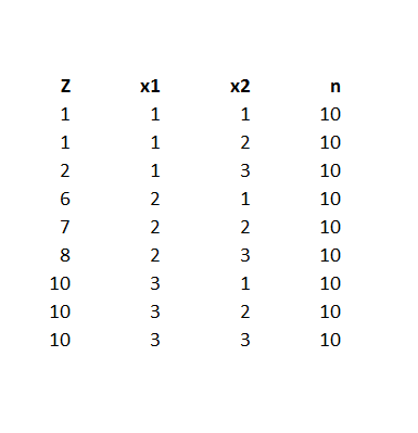
Notice the explanatory variables x1 and x2 also are categorical, or at least, discrete, and I have organized the data into bins, based on the possible combinations of the values of the explanatory variables – where the number of cases in each of these combinations or populations is given to equal 10 cases. A similar setup can be created if the explanatory variables are continuous, by partitioning their ranges and sorting out the combination of ranges in however many explanatory variables there are, associating the sum of occurrences associated with these combinations. The purpose of looking at the data this way, of course, is to make sense of an odds-ratio.

The predictor equation above in the odds ratio can be manipulated into a form which explicitly indicates the probability of occurrence of something or of Z=1. Thus,

p= eβ0+β1×1+β2×2/(1+ eβ0+β1×1+β2×2)

where this transformation takes advantage of the principle that elny = y.

So with this equation for p, I can calculate the probabilities associated with each of the combinations in the data rows of the spreadsheet. Then, given the probability of that configuration, I calculate the expected value of Z=1 by the formula 10p. Thus, the mean of a binomial variable with probability p is np, where n is the number of trials. This sequence is illustrated below (click to enlarge).

sequence

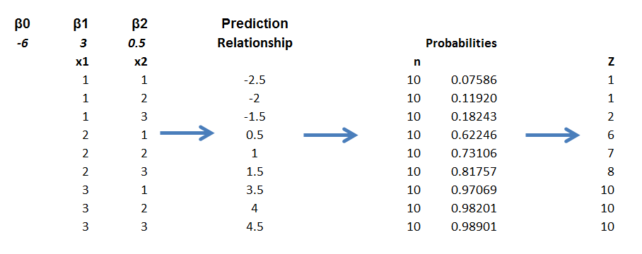
Picking the “success rates” for each of the combinations to equal the expected value of the occurrences, given 10 “trials,” produces a highly consistent set of data.

Along these lines, the most valuable source I have discovered for ML with logistic regression is a paper by Scott
Czepiel – Maximum Likelihood Estimation of Logistic Regression Models: Theory and Implementation
.

I can readily implement Czepiel’s log likelihood function in his Equation (9) with an Excel spreadsheet and Solver.

It’s also possible to see what can go wrong with this setup.

For example, the standard deviation of a binomial process with probability p and n trials is np(1-p). If we then simulate the possible “occurrences” for each of the nine combinations, some will be closer to the estimate of np used in the above spreadsheet, others will be more distant. Peforming such simulations, however, highlights that some numbers of occurrences for some combinations will simply never happen, or are well nigh impossible, based on the laws of chance.

Of course, this depends on the values of the parameters selected, too – but it’s easy to see that, whatever values selected for the parameters, some low probability combinations will be highly unlikely to produce a high number for successes. This results in a nonconvergent ML process, so some parameters simply may not be able to be estimated.

This means basically that logistic regression is less flexible in some sense than OLS regression, where it is almost always possible to find values for the parameters which map onto the dependent variable.

What This Means

Logistic regression, thus, is not the exact analogue of OLS regression, but has nuances of its own. This has not prohibited its wide application in medical risk assessment (and I am looking for a survey article which really shows the extent of its application across different medical fields).

There also are more and more reports of the successful integration of medical diagnostic systems, based in some way on logistic regression analysis, in informing medical practices.

But the march of data science is relentless. Just when doctors got a handle on logistic regression, we have a raft of new techniques, such as random forests and splines.

Header image courtesy of: National Kidney & Urologic Diseases Information Clearinghouse (NKUDIC)

Forecasts in the Medical and Health Care Fields

I’m focusing on forecasting issues in the medical field and health care for the next few posts.

One major issue is the cost of health care in the United States and future health care spending. Just when many commentators came to believe the growth in health care expenditures was settling down to a more moderate growth path, spending exploded in late 2013 and in the first quarter of 2014, growing at a year-over-year rate of 7 percent (or higher, depending on how you cut the numbers). Indeed, preliminary estimates of first quarter GDP growth would have been negative– indicating start of a possible new recession – were it not for the surge in healthcare spending.

Annualizing March 2014 numbers, US health case spending is now on track to hit a total of $3.07 trillion.

Here are estimates of month-by-month spending from the Altarum Institute.

YOYgrhcspend

The Altarum Institute blends data from several sources to generate this data, and also compiles information showing how medical spending has risen in reference to nominal and potential GDP.

altarum1

Payments from Medicare and Medicaid have been accelerating, as the following chart from the comprehensive Center for
Disease Control (CDC) report
 suggests.

Personalhealthcareexppic

 Projections of Health Care Spending

One of the primary forecasts in this field is the Centers for Medicare & Medicaid Services’ (CMS) National Health Expenditures (NHE) projections.

The latest CMS projections have health spending projected to grow at an average rate of 5.8 percent from 2012-2022, a percentage point faster than expected growth in nominal GDP.

The Affordable Care Act is one of the major reasons why health care spending is surging, as millions who were previously not covered by health insurance join insurance exchanges.

The effects of the ACA, as well as continued aging of the US population and entry of new and expensive medical technologies, are anticipated to boost health care spending to 19-20 percent of GDP by 2021.

healthgdp

The late Robert Fogel put together a projection for the National Bureau of Economic Research (NBER) which suggested the ratio of health care spending to GDP would rise to 29 percent by 2040.

The US Health Care System Is More Expensive Than Others

I get the feeling that the econometric and forecasting models for these extrapolations – as well as the strategically important forecasts for future Medicare and Medicaid costs – are sort of gnarly, compared to the bright shiny things which could be developed with the latest predictive analytics and Big Data methods.

Neverhteless, it is interesting that an accuracy analysis of the CMS 11 year projections shows them to be are relatively good, at least one to three years out from current estimates. That was, of course, over a period with slowing growth.

But before considering any forecasting model in detail, I think it is advisable to note how anomalous the US health care system is in reference to other (highly developed) countries.

The OECD, for example, develops
interesting comparisons of medical spending
 in the US and other developed and emerging economies.

OECDcomp2

The OECD data also supports a breakout of costs per capita, as follows.

OECDmedicalcomp

So the basic reason why the US health care system is so expensive is that, for example, administrative costs per capita are more than double those in other developed countries. Practitioners also are paid almost double that per capital of what they receive in these other countries, countries with highly regarded healthcare systems. And so forth and so on.

The Bottom Line

Health care costs in the US typically grow faster than GDP, and are expected to accelerate for the rest of this decade. The ratio of health care costs to US GDP is rising, and longer range forecasts suggest almost a third of all productive activity by mid-century will be in health care and the medical field.

This suggests either a radically different type of society – a care-giving culture, if you will – or that something is going to break or make a major transition between now and then.

A Medical Forecasting Controversy – Increased Deaths from Opting-out From Expanding Medicaid Coverage

Menzie Chinn at Econbrowser recently posted – Estimated Elevated Mortality Rates Associated with Medicaid Opt-Outs. This features projections from a study which suggests an additional 7000-17,000 persons will die annually, if 25 states opt out of Medicaid expansion associated with the Affordable Care Act (ACA). Thus, the Econbrowser chart with these extrapolations suggests within only few years the additional deaths in these 25 states would exceed causalities in the Vietnam War (58,220).

The controversy ran hot in the Comments.

Apart from the smoke and mirrors, though, I wanted to look into the underlying estimates to see whether they support such a clear connection between policy choices and human mortality.

I think what I found is that the sources behind the estimates do, in fact, support the idea that expanding Medicaid can lower mortality and, additionally, generally improve the health status of participating populations.

But at what cost – and it seems the commenters mostly left that issue alone – preferring to rant about the pernicious effects of regulation, implying more Medicaid would actually probably exert negative or no effects on mortality.

As an aside, the accursed “death panels” even came up, with a zinger by one commentator –

Ah yes, the old death panel canard. No doubt those death panels will be staffed by Nigerian born radical gay married Marxist Muslim atheists with fake birth certificates. Did I miss any of the idiotic tropes we hear on Fox News? Oh wait, I forgot…those death panels will meet in Benghazi. And after the death panels it will be on to fight the war against Christmas.

The Evidence

Econbrowser cites Opting Out Of Medicaid Expansion: The Health And Financial Impacts as the source of the impact numbers for 25 states opting out of expanded Medicaid.

This Health Affairs blog post draws on three statistical studies –

The Oregon Experiment — Effects of Medicaid on Clinical Outcomes

Mortality and Access to Care among Adults after State Medicaid Expansions

Health Insurance and Mortality in US Adults

I list these the most recent first. Two of them appear in the New England Journal of Medicine, a publication with a reputation for high standards. The third and historically oldest article appears in the American Journal of Public Health.

The Oregon Experiment is exquisite statistical research with a randomized sample and control group, but does not directly estimate mortality. Rather, it highlights the reductions in a variety of health problems from a limited expansion of Medicaid coverage for low-income adults through a lottery drawing in 2008.

Data collection included –

..detailed questionnaires on health care, health status, and insurance coverage; an inventory of medications; and performance of anthropometric and blood-pressure measurements. Dried blood spots were also obtained.

If you are considering doing a similar study, I recommend the Appendix to this research for methodological ideas. Regression, both OLS and logistic, was a major tool to compare the experimental and control groups.

The data look very clean to me. Consider, for example, these comparisons between the experimental and control groups.

Oregonsurvey

Here are the basic results.

Oregon2

The bottom line is that the Oregon study found –

..that insurance led to increased access to and utilization of health care, substantial improvements in mental health, and reductions in financial strain, but we did not observe reductions in measured blood-pressure, cholesterol, or glycated hemoglobin levels.

The second study, published in 2012, considered mortality impacts of expanding Medicare in Arizona, Maine, and New York. New Hampshire, Pennsylvania, and Nevada and New Mexico were used as controls, in a study that encompassed five years before and after expansion of Medicaid programs.

Here are the basic results of this research.

mortality1

As another useful Appendix documents, the mortality estimates of this study are based on a regression analysis incorporating county-by-county data from the study states.

There are some key facts associated with some of the tables displayed which are in the source links. Also, you would do well to click on these tables to enlarge them for reading.

The third study, by authors associated with the Harvard Medical School, had the following Abstract

Objectives. A 1993 study found a 25% higher risk of death among uninsured compared with privately insured adults. We analyzed the relationship between uninsurance and death with more recent data.

Methods. We conducted a survival analysis with data from the Third National Health and Nutrition Examination Survey. We analyzed participants aged 17 to 64 years to determine whether uninsurance at the time of interview predicted death.

Results. Among all participants, 3.1% (95% confidence interval [CI] = 2.5%, 3.7%) died. The hazard ratio for mortality among the uninsured compared with the insured, with adjustment for age and gender only, was 1.80 (95% CI = 1.44, 2.26). After additional adjustment for race/ethnicity, income, education, self- and physician-rated health status, body mass index, leisure exercise, smoking, and regular alcohol use, the uninsured were more likely to die (hazard ratio = 1.40; 95% CI = 1.06, 1.84) than those with insurance.

Conclusions. Uninsurance is associated with mortality. The strength of that association appears similar to that from a study that evaluated data from the mid-1980s, despite changes in medical therapeutics and the demography of the uninsured since that time.

Some Thoughts

Statistical information and studies are good for informing judgment. And on this basis, I would say the conclusion that health insurance increases life expectancy and reduces the incidence of some complaints is sound.

On the other hand, whether one can just go ahead and predict the deaths from a blanket adoption of an expansion of Medicaid seems like a stretch – particularly if one is going to present, as the Econbrowser post does, a linear projection over several years. Presumably, there are covariates which might change in these years, so why should it be straight-line? OK, maybe the upper and lower bounds are there to deal with this problem. But what are the covariates?

Forecasting in the medical and health fields has come of age, as I hope to show in several upcoming posts.

Looking Ahead, Looking Back

Looking ahead, I’m almost sure I want to explore forecasting in the medical field this coming week. Menzie Chin at Econbrowser, for example, highlights forecasts that suggest states opting out of expanded Medicare are flirting with higher death rates. This sets off a flurry of comments, highlighting the importance and controversy attached to various forecasts in the field of medical practice.

There’s a lot more – from bizarre and sad mortality trends among Russian men since the collapse of the Soviet Union, now stabilizing to an extent, to systems which forecast epidemics, to, again, cost and utilization forecasts.

Today, however, I want to wind up this phase of posts on forecasting the stock and related financial asset markets.

Market Expectations in the Cross Section of Present Values

That’s the title of Bryan Kelly and Seth Pruitt’s article in the Journal of Finance, downloadable from the Social Science Research Network (SSRN).

The following chart from this paper shows in-sample (IS) and out-of-sample (OOS) performance of Kelly and Pruitt’s new partial least squares (PLS) predictor, and IS and OOS forecasts from another model based on the aggregate book-to-market ratio. (Click to enlarge)

KellyPruitt1

The Kelly-Pruitt PLS predictor is much better in both in-sample and out-of-sample than the more traditional regression model based on aggregate book-t0-market ratios.

What Kelly and Pruitt do is use what I would call cross-sectional time series data to estimate aggregate market returns.

Basically, they construct a single factor which they use to predict aggregate market returns from cross-sections of portfolio-level book-to-market ratios.

So,

To harness disaggregated information we represent the cross section of asset-specific book-to-market ratios as a dynamic latent factor model. We relate these disaggregated value ratios to aggregate expected market returns and cash flow growth. Our model highlights the idea that the same dynamic state variables driving aggregate expectations also govern the dynamics of the entire panel of asset-specific valuation ratios. This representation allows us to exploit rich cross-sectional information to extract precise estimates of market expectations.

This cross-sectional data presents a “many predictors” type of estimation problem, and the authors write that,

Our solution is to use partial least squares (PLS, Wold (1975)), which is a simple regression-based procedure designed to parsimoniously forecast a single time series using a large panel of predictors. We use it to construct a univariate forecaster for market returns (or dividend growth) that is a linear combination of assets’ valuation ratios. The weight of each asset in this linear combination is based on the covariance of its value ratio with the forecast target.

I think it is important to add that the authors extensively explore PLS as a procedure which can be considered to be built from a series of cross-cutting regressions, as it were (See their white paper on three-pass regression filter).

But, it must be added, this PLS procedure can be summarized in a single matrix formula, which is

KPmatrixformula

Readers wanting definitions of these matrices should consult the Journal of Finance article and/or the white paper mentioned above.

The Kelly-Pruitt analysis works where other methods essentially fail – in OOS prediction,

Using data from 1930-2010, PLS forecasts based on the cross section of portfolio-level book-to-market ratios achieve an out-of-sample predictive R2 as high as 13.1% for annual market returns and 0.9% for monthly returns (in-sample R2 of 18.1% and 2.4%, respectively). Since we construct a single factor from the cross section, our results can be directly compared with univariate forecasts from the many alternative predictors that have been considered in the literature. In contrast to our results, previously studied predictors typically perform well in-sample but become insignifcant out-of-sample, often performing worse than forecasts based on the historical mean return …

So, the bottom line is that aggregate stock market returns are predictable from a common-sense perspective, without recourse to abstruse error measures. And I believe Amit Goyal, whose earlier article with Welch contests market predictability, now agrees (personal communication) that this application of a PLS estimator breaks new ground out-of-sample – even though its complexity asks quite a bit from the data.

Note, though, how volatile aggregate realized returns for the US stock market are, and how forecast errors of the Kelly-Pruitt analysis become huge during the 2008-2009 recession and some previous recessions – indicated by the shaded lines in the above figure.

Still something is better than nothing, and I look for improvements to this approach – which already has been applied to international stocks by Kelly and Pruitt and other slices portfolio data.

Links May 2014

If there is a theme for this current Links page, it’s that trends spotted a while ago are maturing, becoming clearer.

So with the perennial topic of Big Data and predictive analytics, there is an excellent discussion in Algorithms Beat Intuition – the Evidence is Everywhere. There is no question – the machines are going to take over; it’s only a matter of time.

And, as far as freaky, far-out science, how about Scientists Create First Living Organism With ‘Artificial’ DNA.

Then there are China trends. Workers in China are better paid, have higher skills, and they are starting to use the strike. Striking Chinese Workers Are Headache for Nike, IBM, Secret Weapon for Beijing . This is a long way from the poor peasant women from rural areas living in dormitories, doing anything for five or ten dollars a day.

The Chinese dominance in the economic sphere continues, too, as noted by the Economist. Crowning the dragon – China will become the world’s largest economy by the end of the year

China

But there is the issue of the Chinese property bubble. China’s Property Bubble Has Already Popped, Report Says

Chinaproperty

Then, there are issues and trends of high importance surrounding the US Federal Reserve Bank. And I can think of nothing more important and noteworthy, than Alan Blinder’s recent comments.

Former Fed Leader Alan Blinder Sees Market-rattling Infighting at Central Bank

“The Fed may get more raucous about what to do next as tapering draws to a close,” Alan Blinder, a banking industry consultant and economics professor at Princeton University said in a speech to the Investment Management Consultants Association in Boston.

The cacophony is likely to “rattle the markets” beginning in late summer as traders debate how precipitously the Fed will turn from reducing its purchases of U.S. government debt and mortgage securities to actively selling it.

The Open Market Committee will announce its strategy in October or December, he said, but traders will begin focusing earlier on what will happen with rates as some members of the rate-setting panel begin openly contradicting Fed Chair Janet Yellen, he said.

Then, there are some other assorted links with good infographics, charts, or salient discussion.

Alibaba IPO Filing Indicates Yahoo Undervalued Heck of an interesting issue.

Alibaba

Twitter Is Here To Stay

Three Charts on Secular Stagnation Krugman toying with secular stagnation hypothesis.

Rethinking Property in the Digital Era Personal data should be viewed as property

Larry Summers Goes to Sleep After Introducing Piketty at Harvard Great pic. But I have to have sympathy for Summers, having attended my share of sleep-inducing presentations on important economics issues.

lawrencesummers

Turkey’s Institutions Problem from the Stockholm School of Economics, nice infographics, visual aids. Should go along with your note cards on an important emerging economy.

Post-Crash economics clashes with ‘econ tribe’ – economics students in England are proposing reform of the university economics course of study, but, as this link points out, this is an uphill battle and has been suggested before.

The Life of a Bond – everybody needs to know what is in this infographic.

Very Cool Video of Ocean Currents From NASA

perpetualocean_cover_1024x676

Predicting the Market Over Short Time Horizons

Google “average time a stock is held.” You will come up with figures that typically run around 20 seconds. High frequency trades (HFT) dominate trading volume on the US exchanges.

All of which suggests the focus on the predictability of stock returns needs to position more on intervals lasting seconds or minutes, rather than daily, monthly, or longer trading periods.

So, it’s logical that Michael Rechenthin, a newly minted Iowa Ph.D., and Nick Street, a Professor of Management, are getting media face time from research which purportedly demonstrates the existence of predictable short-term trends in the market (see Using conditional probability to identify trends in intra-day high-frequency equity pricing).

Here’s the abstract –

By examining the conditional probabilities of price movements in a popular US stock over different high-frequency intra-day timespans, varying levels of trend predictability are identified. This study demonstrates the existence of predictable short-term trends in the market; understanding the probability of price movement can be useful to high-frequency traders. Price movement was examined in trade-by-trade (tick) data along with temporal timespans between 1 s to 30 min for 52 one-week periods for one highly-traded stock. We hypothesize that much of the initial predictability of trade-by-trade (tick) data is due to traditional market dynamics, or the bouncing of the price between the stock’s bid and ask. Only after timespans of between 5 to 10 s does this cease to explain the predictability; after this timespan, two consecutive movements in the same direction occur with higher probability than that of movements in the opposite direction. This pattern holds up to a one-minute interval, after which the strength of the pattern weakens.

The study examined price movements of the exchange traded fund SPY, during 2005, finding that

.. price movements can be predicted with a better than 50-50 accuracy for anywhere up to one minute after the stock leaves the confines of its bid-ask spread. Probabilities continue to be significant until about five minutes after it leaves the spread. By 30 minutes, the predictability window has closed.

Of course, the challenges of generalization in this world of seconds and minutes is tremendous. Perhaps, for example, the patterns the authors identify are confined to the year of the study. Without any theoretical basis, brute force generalization means riffling through additional years of 31.5 million seconds each.

Then, there are the milliseconds, and the recent blockbuster written by Michael Lewis – Flash Boys: A Wall Street Revolt.

I’m on track for reading this book for a bookclub to which I belong.

As I understand it, Lewis, who is one of my favorite financial writers, has uncovered a story whereby high frequency traders, operating with optical fiber connections to the New York Stock Exchange, sometimes being geographically as proximate as possible, can exploit more conventional trading – basically buying a stock after you have put in a buy order, but before your transaction closes, thus raising your price if you made a market order.

MLewis

The LA Times  has a nice review of the book and ran the above photo of Lewis.

More on the Predictability of Stock and Bond Markets

Research by Lin, Wu, and Zhou in Predictability of Corporate Bond Returns: A Comprehensive Study suggests a radical change in perspective, based on new forecasting methods. The research seems to me to of a piece with a lot of developments in Big Data and the data mining movement generally. Gains in predictability are associated with more extensive databases and new techniques.

The abstract to their white paper, presented at various conferences and colloquia, is straight-forward –

Using a comprehensive data set, we find that corporate bond returns not only remain predictable by traditional predictors (dividend yields, default, term spreads and issuer quality) but also strongly predictable by a new predictor formed by an array of 26 macroeconomic, stock and bond predictors. Results strongly suggest that macroeconomic and stock market variables contain important information for expected corporate bond returns. The predictability of returns is of both statistical and economic significance, and is robust to different ratings and maturities.

Now, in a way, the basic message of the predictability of corporate bond returns is not news, since Fama and French made this claim back in 1989 – namely that default and term spreads can predict corporate bond returns both in and out of sample.

What is new is the data employed in the Lin, Wu, and Zhou (LWZ) research. According to the authors, it involves 780,985 monthly observations spanning from January 1973 to June 2012 from combined data sources, including Lehman Brothers Fixed Income (LBFI), Datastream, National Association of Insurance Commissioners (NAIC), Trade Reporting and Compliance Engine (TRACE) and Mergents Fixed Investment Securities Database (FISD).

There also is a new predictor which LWZ characterize as a type of partial least squares (PLS) formulation, but which is none other than the three pass regression filter discussed in a post here in March.

The power of this PLS formulation is evident in a table showing out-of-sample R2 of the various modeling setups. As in the research discussed in a recent post, out-of-sample (OS) R2 is a ratio which measures the improvement in mean square prediction errors (MSPE) for the predictive regression model over the historical average forecast. A negative OS R2 thus means that the MSPE of the benchmark forecast is less than the MSPE of the forecast by the designated predictor formulation.

PLSTableZhou

Again, this research finds predictability varies with economic conditions – and is higher during economic downturns.

There are cross-cutting and linked studies here, often with Goyal’s data and fourteen financial/macroeconomic variables figuring within the estimations. There also is significant linkage with researchers at regional Federal Reserve Banks.

My purpose in this and probably the next one or two posts is to just get this information out, so we can see the larger outlines of what is being done and suggested.

My guess is that the sum total of this research is going to essentially re-write financial economics and has huge implications for forecasting operations within large companies and especially financial institutions.

Stock Market Predictability – Controversy

In the previous post, I drew from papers by Neeley, who is Vice President of the Federal Reserve Bank of St. Louis, David Rapach at St. Louis University and Goufu Zhou at Washington University in St. Louis.

These authors contribute two papers on the predictability of equity returns.

The earlier one – Forecasting the Equity Risk Premium: The Role of Technical Indicators – is coming out in Management Science. Of course, the survey article – Forecasting the Equity Risk Premium: The Role of Technical Indicators – is a chapter in the recent volume 2 of the Handbook of Forecasting.

I go through this rather laborious set of citations because it turns out that there is an underlying paper which provides the data for the research of these authors, but which comes to precisely the opposite conclusion –

The goal of our own article is to comprehensively re-examine the empirical evidence as of early 2006, evaluating each variable using the same methods (mostly, but not only, in linear models), time-periods, and estimation frequencies. The evidence suggests that most models are unstable or even spurious. Most models are no longer significant even insample (IS), and the few models that still are usually fail simple regression diagnostics.Most models have performed poorly for over 30 years IS. For many models, any earlier apparent statistical significance was often based exclusively on years up to and especially on the years of the Oil Shock of 1973–1975. Most models have poor out-of-sample (OOS) performance, but not in a way that merely suggests lower power than IS tests. They predict poorly late in the sample, not early in the sample. (For many variables, we have difficulty finding robust statistical significance even when they are examined only during their most favorable contiguous OOS sub-period.) Finally, the OOS performance is not only a useful model diagnostic for the IS regressions but also interesting in itself for an investor who had sought to use these models for market-timing. Our evidence suggests that the models would not have helped such an investor. Therefore, although it is possible to search for, to occasionally stumble upon, and then to defend some seemingly statistically significant models, we interpret our results to suggest that a healthy skepticism is appropriate when it comes to predicting the equity premium, at least as of early 2006. The models do not seem robust.

This is from Ivo Welch and Amit Goyal’s 2008 article A Comprehensive Look at The Empirical Performance of Equity Premium Prediction in the Review of Financial Studies which apparently won an award from that journal as the best paper for the year.

And, very importantly, the data for this whole discussion is available, with updates, from Amit Goyal’s site now at the University of Lausanne.

AmitGoyal

Where This Is Going

Currently, for me, this seems like a genuine controversy in the forecasting literature. And, as an aside, in writing this blog I’ve entertained the notion that maybe I am on the edge of a new form of or focus in journalism – namely stories about forecasting controversies. It’s kind of wonkish, but the issues can be really, really important.

I also have a “hands-on” philosophy, when it comes to this sort of information. I much rather explore actual data and run my own estimates, than pick through theoretical arguments.

So anyway, given that Goyal generously provides updated versions of the data series he and Welch originally used in their Review of Financial Studies article, there should be some opportunity to check this whole matter. After all, the estimation issues are not very difficult, insofar as the first level of argument relates primarily to the efficacy of simple bivariate regressions.

By the way, it’s really cool data.

Here is the book-to-market ratio, dating back to 1926.

bmratio

But beyond these simple regressions that form a large part of the argument, there is another claim made by Neeley, Rapach, and Zhou which I take very seriously. And this is that – while a “kitchen sink” model with all, say, fourteen so-called macroeconomic variables does not outperform the benchmark, a principal components regression does.

This sounds really plausible.

Anyway, if readers have flagged updates to this controversy about the predictability of stock market returns, let me know. In addition to grubbing around with the data, I am searching for additional analysis of this point.

Evidence of Stock Market Predictability

In business forecast applications, I often have been asked, “why don’t you forecast the stock market?” It’s almost a variant of “if you’re so smart, why aren’t you rich?” I usually respond something about stock prices being largely random walks.

But, stock market predictability is really the nut kernel of forecasting, isn’t it?

Earlier this year, I looked at the S&P 500 index and the SPY ETF numbers, and found I could beat a buy and hold strategy with a regression forecasting model. This was an autoregressive model with lots of lagged values of daily S&P returns. In some variants, it included lagged values of the Chicago Board of Trade VIX volatility index returns. My portfolio gains were compiled over an out-of-sample (OS) period. This means, of course, that I estimated the predictive regression on historical data that preceded and did not include the OS or test data.

Well, today I’m here to report to you that it looks like it is officially possible to achieve some predictability of stock market returns in out-of-sample data.

One authoritative source is Forecasting Stock Returns, an outstanding review by Rapach and Zhou  in the recent, second volume of the Handbook of Economic Forecasting.

The story is fascinating.

For one thing, most of the successful models achieve their best performance – in terms of beating market averages or other common benchmarks – during recessions.

And it appears that technical market indicators, such as the oscillators, momentum, and volume metrics so common in stock trading sites, have predictive value. So do a range of macroeconomic indicators.

But these two classes of predictors – technical market and macroeconomic indicators – are roughly complementary in their performance through the business cycle. As Christopher Neeley et al detail in Forecasting the Equity Risk Premium: The Role of Technical Indicators,

Macroeconomic variables typically fail to detect the decline in the actual equity risk premium early in recessions, but generally do detect the increase in the actual equity risk premium late in recessions. Technical indicators exhibit the opposite pattern: they pick up the decline in the actual premium early in recessions, but fail to match the unusually high premium late in recessions.

Stock Market Predictors – Macroeconomic and Technical Indicators

Rapach and Zhou highlight fourteen macroeconomic predictors popular in the finance literature.

1. Log dividend-price ratio (DP): log of a 12-month moving sum of dividends paid on the S&P 500 index minus the log of stock prices (S&P 500 index).

2. Log dividend yield (DY): log of a 12-month moving sum of dividends minus the log of lagged stock prices.

3. Log earnings-price ratio (EP): log of a 12-month moving sum of earnings on the S&P 500 index minus the log of stock prices.

4. Log dividend-payout ratio (DE): log of a 12-month moving sum of dividends minus the log of a 12-month moving sum of earnings.

5. Stock variance (SVAR): monthly sum of squared daily returns on the S&P 500 index.

6. Book-to-market ratio (BM): book-to-market value ratio for the DJIA.

7. Net equity expansion (NTIS): ratio of a 12-month moving sum of net equity issues by NYSE-listed stocks to the total end-of-year market capitalization of NYSE stocks.

8. Treasury bill rate (TBL): interest rate on a three-month Treasury bill (secondary market).

9. Long-term yield (LTY): long-term government bond yield.

10. Long-term return (LTR): return on long-term government bonds.

11. Term spread (TMS): long-term yield minus the Treasury bill rate.

12. Default yield spread (DFY): difference between BAA- and AAA-rated corporate bond yields.

13. Default return spread (DFR): long-term corporate bond return minus the long-term government bond return.

14. Inflation (INFL): calculated from the CPI (all urban consumers

In addition, there are technical indicators, which are generally moving average, momentum, or volume-based.

The moving average indicators typically provide a buy or sell signal based on a comparing two moving averages – a short and a long period MA.

Momentum based rules are based on the time trajectory of prices. A current stock price higher than its level some number of periods ago indicates “positive” momentum and expected excess returns, and generates a buy signal.

Momentum rules can be combined with information about the volume of stock purchases, such as Granville’s on-balance volume.

Each of these predictors can be mapped onto equity premium excess returns – measured by the rate of return on the S&P 500 index net of return on a risk-free asset. This mapping is a simple bi-variate regression with equity returns from time t on the left side of the equation and the economic predictor lagged by one time period on the right side of the equation. Monthly data are used from 1927 to 2008. The out-of-sample (OS) period is extensive, dating from the 1950’s, and includes most of the post-war recessions.

The following table shows what the authors call out-of-sample (OS) R2 for the 14 so-called macroeconomic variables, based on a table in the Handbook of Forecasting chapter. The OS R2 is equal to 1 minus a ratio. This ratio has the mean square forecast error (MSFE) of the predictor forecast in the numerator and the MSFE of the forecast based on historic average equity returns in the denominator. So if the economic indicator functions to improve the OS forecast of equity returns, the OS R2 is positive. If, on the other hand, the historic average trumps the economic indicator forecast, the OS R2 is negative.

Rapach1

(click to enlarge).

Overall, most of the macro predictors in this list don’t make it.  Thus, 12 of the 14 OS R2 statistics are negative in the second column of the Table, indicating that the predictive regression forecast has a higher MSFE than the historical average.

For two of the predictors with a positive out-of-sample R2, the p-values reported in the brackets are greater than 0.10, so that these predictors do not display statistically significant out-of-sample performance at conventional levels.

Thus, the first two columns in this table, under “Overall”, support a skeptical view of the predictability of equity returns.

However, during recessions, the situation is different.

For several the predictors, the R2 OS statistics move from being negative (and typically below -1%) during expansions to 1% or above during recessions. Furthermore, some of these R2 OS statistics are significant at conventional levels during recessions according to the  p-values, despite the decreased number of available observations.

Now imposing restrictions on the regression coefficients substantially improves this forecast performance, as the lower panel (not shown) in this table shows.

Rapach and Zhou were coauthors of the study with Neeley, published earlier as a working paper with the St. Louis Federal Reserve.

This working paper is where we get the interesting report about how technical factors add to the predictability of equity returns (again, click to enlarge).

RapachNeeley

This table has the same headings for the columns as Table 3 above.

It shows out-of-sample forecasting results for several technical indicators, using basically the same dataset, for the overall OS period, for expansions, and recessions in this period dating from the 1950’s to 2008.

In fact, these technical indicators generally seem to do better than the 14 macroeconomic indicators.

Low OS R2

Even when these models perform their best, their increase in mean square forecast error (MSFE) is only slightly more than the MSFE of the benchmark historic average return estimate.

This improved performance, however, can still achieve portfolio gains for investors, based on various trading rules, and, as both papers point out, investors can use the information in these forecasts to balance their portfolios, even when the underlying forecast equations are not statistically significant by conventional standards. Interesting argument, and I need to review it further to fully understand it.

In any case, my experience with an autoregressive model for the S&P 500 is that trading rules can be devised which produce portfolio gains over a buy and hold strategy, even when the Ris on the order of 1 or a few percent. All you have to do is correctly predict the sign of the return on the following trading day, for instance, and doing this a little more than 50 percent of the time produces profits.

Rapach and Zhou, in fact, develop insights into how predictability of stock returns can be consistent with rational expectations – providing the relevant improvements in predictability are bounded to be low enough.

Some Thoughts

There is lots more to say about this, naturally. And I hope to have further comments here soon.

But, for the time being, I have one question.

The is why econometricians of the caliber of Rapach, Zhou, and Neeley persist in relying on tests of statistical significance which are predicated, in a strict sense, on the normality of the residuals of these financial return regressions.

I’ve looked at this some, and it seems the t-statistic is somewhat robust to violations of normality of the underlying error distribution of the regression. However, residuals of a regression on equity rates of return can be very non-normal with fat tails and generally some skewness. I keep wondering whether anyone has really looked at how this translates into tests of statistical significance, or whether what we see on this topic is mostly arm-waving.

For my money, OS predictive performance is the key criterion.

Bootstrapping

I’ve been reading about the bootstrap. I’m interested in bagging or bootstrap aggregation.

The primary task of a statistician is to summarize a sample based study and generalize the finding to the parent population in a scientific manner..

The purpose of a sample study is to gather information cheaply in a timely fashion. The idea behind bootstrap is to use the data of a sample study at hand as a “surrogate population”, for the purpose of approximating the sampling distribution of a statistic; i.e. to resample (with replacement) from the sample data at hand and create a large number of “phantom samples” known as bootstrap samples. The sample summary is then computed on each of the bootstrap samples (usually a few thousand). A histogram of the set of these computed values is referred to as the bootstrap distribution of the statistic.

These well-phrased quotes come from Bootstrap: A Statistical Method by Singh and Xie.

OK, so let’s do a simple example.

Suppose we generate ten random numbers, drawn independently from a Gaussian or normal distribution with a mean of 10 and standard deviation of 1.

vector

This sample has an average of 9.7684. We would like to somehow project a 95 percent confidence interval around this sample mean, to understand how close it is to the population average.

So we bootstrap this sample, drawing 10,000 samples of ten numbers with replacement.

Here is the distribution of bootstrapped means of these samples.

bootstrapdist

The mean is 9.7713.

Based on the method of percentiles, the 95 percent confidence interval for the sample mean is between 9.32 and 10.23, which, as you note, correctly includes the true mean for the population of 10.

Bias-correction is another primary use of the bootstrap. For techies, there is a great paper from the old Bell Labs called A Real Example That Illustrates Properties of Bootstrap Bias Correction. Unfortunately, you have to pay a fee to the American Statistical Association to read it – I have not found a free copy on the Web.

In any case, all this is interesting and a little amazing, but what we really want to do is look at the bootstrap in developing forecasting models.

Bootstrapping Regressions

There are several methods for using bootstrapping in connection with regressions.

One is illustrated in a blog post from earlier this year. I treated the explanatory variables as variables which have a degree of randomness in them, and resampled the values of the dependent variable and explanatory variables 200 times, finding that doing so “brought up” the coefficient estimates, moving them closer to the underlying actuals used in constructing or simulating them.

This method works nicely with hetereoskedastic errors, as long as there is no autocorrelation.

Another method takes the explanatory variables as fixed, and resamples only the residuals of the regression.

Bootstrapping Time Series Models

The underlying assumptions for the standard bootstrap include independent and random draws.

This can be violated in time series when there are time dependencies.

Of course, it is necessary to transform a nonstationary time series to a stationary series to even consider bootstrapping.

But even with a time series that fluctuates around a constant mean, there can be autocorrelation.

So here is where the block bootstrap can come into play. Let me cite this study – conducted under the auspices of the Cowles Foundation (click on link) – which discusses the asymptotic properties of the block bootstrap and provides key references.

There are many variants, but the basic idea is to sample blocks of a time series, probably overlapping blocks. So if a time series yt  has n elements, y1,..,yn and the block length is m, there are n-m blocks, and it is necessary to use n/m of these blocks to construct another time series of length n. Issues arise when m is not a perfect divisor of n, and it is necessary to develop special rules for handling the final values of the simulated series in that case.

Block bootstrapping is used by Bergmeir, Hyndman, and Benıtez in bagging exponential smoothing forecasts.

How Good Are Bootstrapped Estimates?

Consistency in statistics or econometrics involves whether or not an estimate or measure converges to an unbiased value as sample size increases – or basically goes to infinity.

This is a huge question with bootstrapped statistics, and there are new findings all the time.

Interestingly, sometimes bootstrapped estimates can actually converge faster to the appropriate unbiased values than can be achieved simply by increasing sample size.

And some metrics really do not lend themselves to bootstrapping.

Also some samples are inappropriate for bootstrapping.  Gelman, for example, writes about the problem of “separation” in a sample

[In} ..an example of a poll from the 1964 U.S. presidential election campaign, … none of the black respondents in the sample supported the Republican candidate, Barry Goldwater… If zero black respondents in the sample supported Barry Goldwater, then zero black respondents in any bootstrap sample will support Goldwater as well. Indeed, bootstrapping can exacerbate separation by turning near-separation into complete separation for some samples. For example, consider a survey in which only one or two of the black respondents support the Republican candidate. The resulting logistic regression estimate will be noisy but it will be finite.

Here is a video doing a good job of covering the bases on boostrapping. I suggest sampling portions of it first. It’s quite good, but it may seem too much going into it.

Sales and new product forecasting in data-limited (real world) contexts