Interest Rates – 3

Can interest rates be nonstationary?

This seems like a strange question, since interest rates are bounded, except in circumstances, perhaps, of total economic collapse.

“Standard” nonstationary processes, by contrast, can increase or decrease without limit, as can conventional random walks.

But, be careful. It’s mathematically possible to define and study random walks with reflecting barriers –which, when they reach a maximum or minimum, “bounce” back from the barrier.

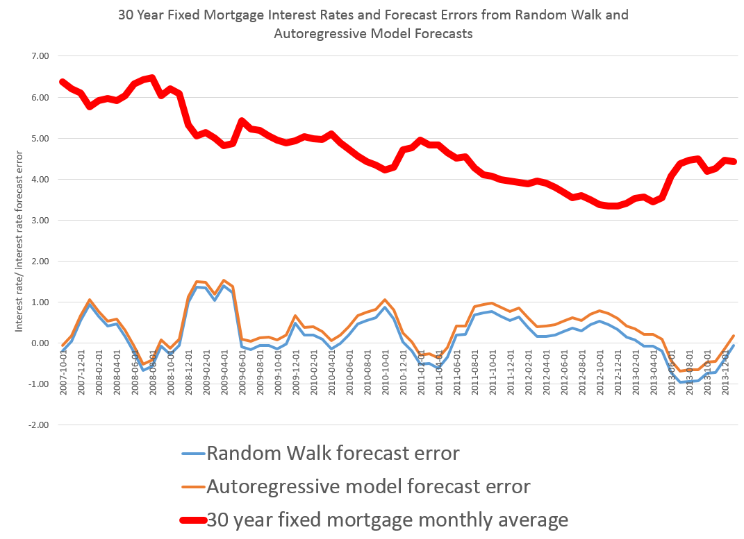
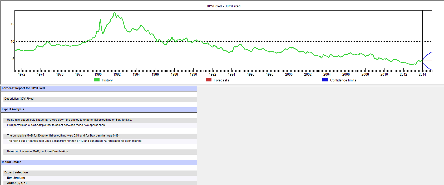
This is more than esoteric, since the 30 year fixed mortgage rate monthly averages series discussed in the previous post has a curious property. It can be differenced many times, and yet display first order autocorrelation of the resulting series.

This contrasts with the 10 year fixed maturity Treasury bond rates (also monthly averages). After first differencing this Treasury bond series, the resulting residuals do not show statistically significant first order autocorrelation.

Here a stationary stochastic process is one in which the probability distribution of the outcomes does not shift with time, so the conditional mean and conditional variance are, in the strict case, constant. A classic example is white noise, where each element can be viewed as an independent draw from a Gaussian distribution with zero mean and constant variance.

30 Year Fixed Mortgage Monthly Averages – a Nonstationary Time Series?

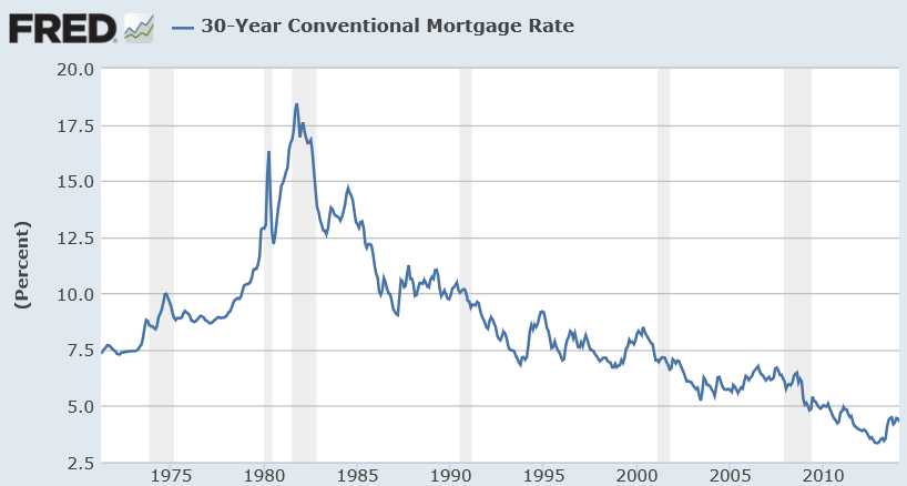
Here are some autocorrelation functions (ACF’s) and partial autocorrelation functions (PACF’s) of the 30 year fixed mortgage monthly averages from April 1971 to January 2014, first differences of this series, and second differences of this series – altogether six charts produced by MATLAB’s plot routines.

Data for this and the following series are downloaded from the St. Louis Fed FRED site.

MLmort0

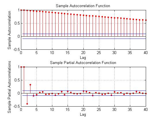
Here the PACF appears to cut off after 4 periods, but maybe not quite, since there are values for lags which touch the statistical significance boundary further out.

MLmort1

This seems more satisfactory, since there is only one major spike in the ACF and 2-3 initial spikes in the PACF. Again, however, values for lags far out on the horizontal axis appear to touch the boundary of statistical significance.

MLmort2

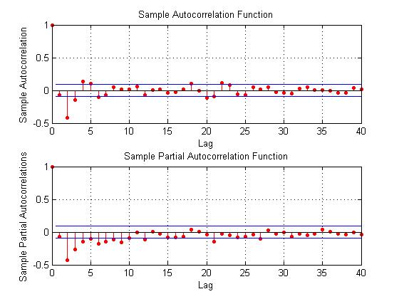
Here are the ACF and PACF’s of the “difference of the first difference” or the second difference, if you like. This spike at period 2 for the ACF and PACF is intriguing, and, for me, difficult to interpret.

The data series includes 514 values, so we are not dealing with a small sample in conventional terms.

I also checked for seasonal variation – either additive or multiplicative seasonal components or factors. After taking steps to remove this type of variation, if it exists, the same pattern of repeated significance of autocorrelations of differences and higher order differences persists.

Forecast Pro, a good business workhorse for automatic forecasting, selects ARIMA(0,1,1) as the optimal forecast model for this 30 year fixed interest mortgage monthly averages. In other words, Forecast Pro glosses over the fact that the residuals from an ARIMA(0,1,1) setup still contain significant autocorrelation.

Here is a sample of the output (click to enlarge)

FP30yr

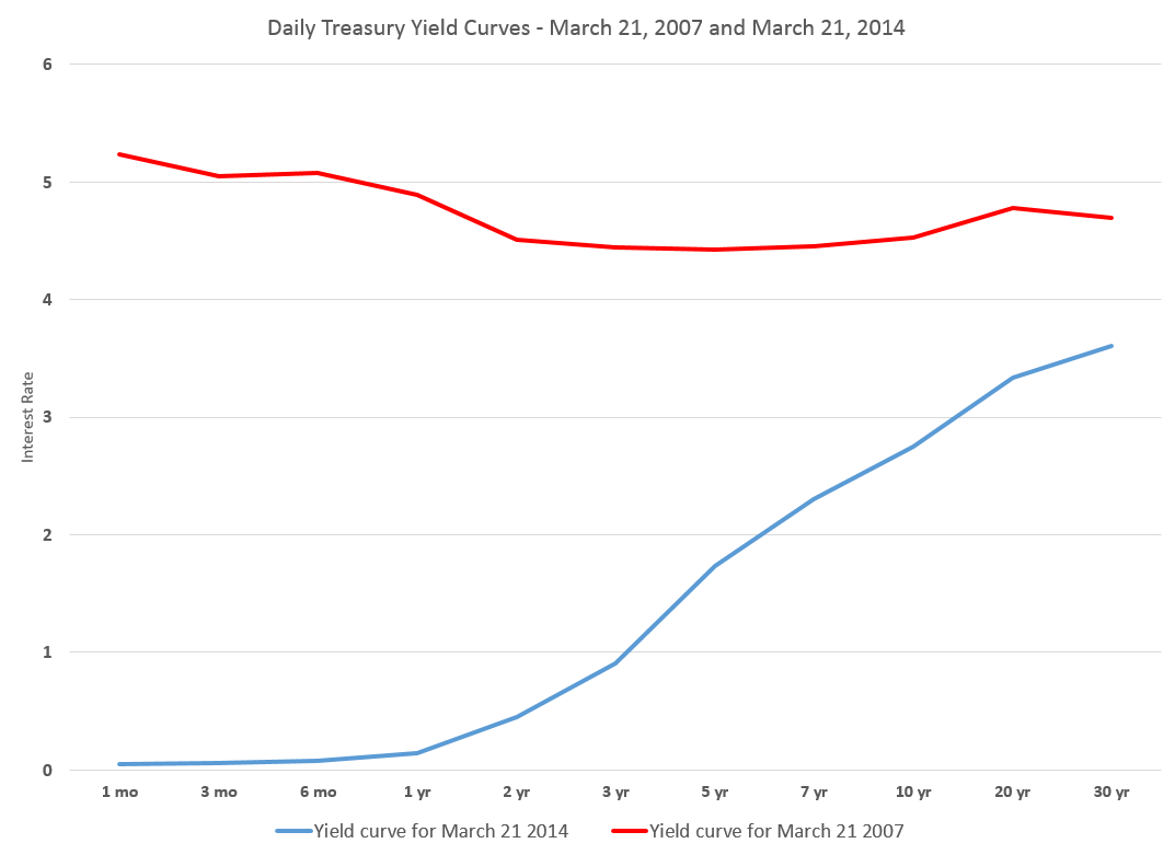
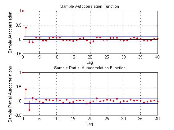
10 Year Treasury Bonds Constant Maturity

The situation is quite different for 10 year Treasury Bonds monthly averages, where the downloaded series starts April 1953 and, again, ends January 2014.

Here is the ordinary least squares (OLS) regression of the first order autocorrelation.

10yrTreasreg
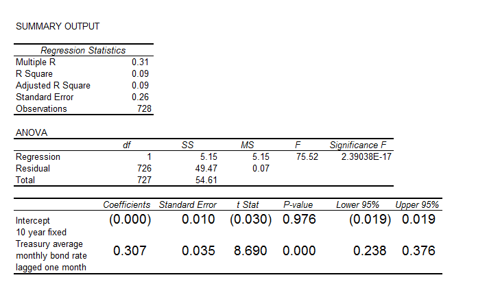
Here the R2 or coefficient of determination is much lower than for the 30 year fixed mortgage monthly averages, but the first order lagged rate is highly significant statistically.

On the other hand, the residuals of this regression do not exhibit a high degree of first order autocorrelation, falling below the 80 percent significance level.

What Does This Mean?

The closest I have come to formulating an explanation for this weird difference between these two “interest rates” is the discussion in a paper from 2002 –

On Mean Reversion in Real Interest Rates: An Application of Threshold Cointegration

The authors of this research paper from the Institute for Advanced Studies in Vienna acknowledge findings that some interests rates may be nonstationary, at least over some periods of time. Their solution is a nonlinear time series approach, but they highlight several of the more exotic statistical features of interest rates in passing – such as evidence of non-normal distributions, excess kurtosis, conditional heteroskedasticity, and long memory.

In any case, I wonder whether the 30 year fixed mortgage monthly averages might be suitable for some type of boosting model working on residuals and residuals of residuals.

I’m going to try that later on this Spring.

Interest Rates – 2

I’ve been looking at forecasting interest rates, the accuracy of interest rate forecasts, and teasing out predictive information from the yield curve.

This literature can be intensely theoretical and statistically demanding. But it might be quickly summarized by saying that, for horizons of more than a few months, most forecasts (such as from the Wall Street Journal’s Panel of Economists) do not beat a random walk forecast.

At the same time, there are hints that improvements on a random walk forecast might be possible under special circumstances, or for periods of time.

For example, suppose we attempt to forecast the 30 year fixed mortgage rate monthly averages, picking a six month forecast horizon.

The following chart compares a random walk forecast with an autoregressive (AR) model.

30yrfixed2

Let’s dwell for a moment on some of the underlying details of the data and forecast models.

The thick red line is the 30 year fixed mortgage rate for the prediction period which extends from 2007 to the most recent monthly average in 2014 in January 2014. These mortgage rates are downloaded from the St. Louis Fed data site FRED.

This is, incidentally, an out-of-sample period, as the autoregressive model is estimated over data beginning in April 1971 and ending September 2007. The autoregressive model is simple, employing a single explanatory variable, which is the 30 year fixed rate at a lag of six months. It has the following form,

rt = k + βrt-6

where the constant term k and the coefficient β of the lagged rate rt-6 are estimated by ordinary least squares (OLS).

The random walk model forecast, as always, is the most current value projected ahead however many periods there are in the forecast horizon. This works out to using the value of the 30 year fixed mortgage in any month as the best forecast of the rate that will obtain six months in the future.

Finally, the errors for the random walk and autoregressive models are calculated as the forecast minus the actual value.

When an Autoregressive Model Beats a Random Walk Forecast

The random walk errors are smaller in absolute value than the autoregressive model errors over most of this out-of-sample period, but there are times when this is not true, as shown in the graph below.

30yrfixedARbetter

This chart itself suggests that further work could be done on optimizing the autoregressive model, perhaps by adding further corrections from the residuals, which themselves are autocorrelated.

However, just taking this at face value, it’s clear the AR model beats the random walk forecast when the direction of interest rates changes from a downward movement.

Does this mean that going forward, an AR model, probably considerably more sophisticated than developed for this exercise, could beat a random walk forecast over six month forecast horizons?

That’s an interesting and bankable question. It of course depends on the rate at which the Fed “withdraws the punch bowl” but it’s also clear the Fed is no longer in complete control in this situation. The markets themselves will develop a dynamic based on expectations and so forth.

In closing, for reference, I include a longer picture of the 30 year fixed mortgage rates, which as can be seen, resemble the whole spectrum of rates in having a peak in the early 1980’s and showing what amounts to trends before and after that.

30yrfixedFRED

Interest Rates – 1

Let’s focus on forecasting interest rates.

The first question, of course, is “which interest rate”?

So, there is a range of interest rates from short term rates to rates on longer term loans and bonds. The St. Louis Fed data service FRED lists 719 series under “interest rates.”

Interest rates, however, tend to move together over time, as this chart on the bank prime rate of interest and the federal funds rate shows.

IratesFRED1

There’s a lot in this chart.

There is the surge in interest rates at the beginning of the 1980’s. The prime rate rocketed to more than 20 percent, or, in the words of the German Chancellor at the time higher “than any year since the time of Jesus Christ.” This ramp-up in interest rates followed actions of the US Federal Reserve Bank under Paul Volcker – extreme and successful tactics to break the back of inflation running at a faster and faster pace in the 1970’s.

Recessions are indicated on this graph with shaded areas.

Also, almost every recession in this more than fifty year period is preceded by a spike in the federal funds rate – the rate under the control of or targeted by the central bank.

Another feature of this chart is the federal funds rate is almost always less than the prime rate, often by several percentages.

This makes sense because the federal funds rate is a very short term interest rate – on overnight loans by depository institutions in surplus at the Federal Reserve to banks in deficit at the end of the business day – surplus and deficit with respect to the reserve requirement.

The interest rate the borrowing bank pays the lending bank is negotiated, and the weighted average across all such transactions is the federal funds effective rate. This “effective rate” is subject to targets set by the Federal Reserve Open Market Committee. Fed open market operations influence the supply of money to bring the federal funds effective rate in line with the federal funds target rate.

The prime rate, on the other hand, is the underlying index for most credit cards, home equity loans and lines of credit, auto loans, and personal loans. Many small business loans are also indexed to the prime rate. The term of these loans is typically longer than “overnight,” i.e. the prime rate applies to longer term loans.

The Yield Curve

The relationship between interest rates on shorter term and longer term loans and bonds is a kind of predictive relationship. It is summarized in the yield curve.

The US Treasury maintains a page Daily Treasury Yield Curve Rates which documents the yield on a security to its time to maturity .. based on the closing market bid yields on actively traded Treasury securities in the over-the-counter market.

The current yield curve is shown by the blue line in the chart below, and can be contrasted with a yield curve seven years previously, prior to the financial crisis of 2008-09 shown by the red line.

YieldCurve

Treasury notes on this curve report that –

These market yields are calculated from composites of quotations obtained by the Federal Reserve Bank of New York. The yield values are read from the yield curve at fixed maturities, currently 1, 3 and 6 months and 1, 2, 3, 5, 7, 10, 20, and 30 years. This method provides a yield for a 10 year maturity, for example, even if no outstanding security has exactly 10 years remaining to maturity.

Short term yields are typically less than longer term yields because there is an opportunity cost in tying up money for longer periods.

However, on occasion, there is an inversion of the yield curve, as shown for March 21, 2007 in the chart.

Inversion of the yield curve is often a sign of oncoming recession – although even the Fed authorities, who had some hand in causing the increase in the short term rates at the time, appeared clueless about what was coming in Spring 2007.

Current Prospects for Interest Rates

Globally, we have experienced an extraordinary period of low interest rates with short term rates hovering just at the zero bound. Clearly, this cannot go on forever, so the longer term outlook is for interest rates of all sorts to rise.

The Survey of Professional Forecasters develops consensus forecasts of key macroeconomic indicators, such as interest rates.

The latest survey, from the first quarter of 2014, includes the following consensus projections for the 3-month Treasury bill and the 10-year Treasury bond rates.

SPFforecast

Bankrate.com has short articles predicting mortgage rates, car loans, credit card rates, and bonds over the next year or two. Mortgage rates might rise to 5 percent by the end of 2014, but that is predicated on a strong recovery in the economy, according to this site.

As anyone participating in modern civilization knows, a great deal depends on the actions of the US Federal Reserve bank. Currently, the Fed influences both short and longer term interest rates. Short term rates are keyed closely to the federal funds rate. Longer term rates are influenced by Fed Quantitative Easing (QE) programs of bond-buying. The Fed’s bond buying is scheduled to be cut back step-by-step (“tapering”) about $10 billion per month.

Actions of the Bank of Japan and the European central bank in Frankfurt also bear on global prospects and impacts of higher interest rates.

Interest rates, however, are not wholly controlled by central banks. Capital markets have a dynamic all their own, which makes forecasting interest rates an increasingly relevant topic.

And Now – David Stockman

David Stockman, according to his new website Contra Corner,

is the ultimate Washington insider turned iconoclast. He began his career in Washington as a young man and quickly rose through the ranks of the Republican Party to become the Director of the Office of Management and Budget under President Ronald Reagan. After leaving the White House, Stockman had a 20-year career on Wall Street.

Currently, Stockman takes the contrarian view that the US Federal Reserve Bank is feeding a giant bubble which is bound to collapse

He states his opinions with humor and wit, as some of article titles on Contra Corner indicate –

Fed’s Taper Kabuki is Farce; Gong Show of Cacophony, Confusion and Calamity Coming

Or

General John McCain Strikes Again!

Forecasting the Price of Gold – 3

Ukraine developments and other counter-currents, such as Janet Yellen’s recent comments, highlight my final topic on gold price forecasting – multivariate gold price forecasting models.

On the one hand, there has been increasing uncertainty as a result of Ukrainian turmoil, counterbalanced today by the reaction to the seemingly hawkish comments by Chairperson Janet Yellen of the US Federal Reserve Bank.

SPYDRGold

Traditionally, gold is considered a hedge against uncertainty. Indulge your imagination and it’s not hard to conjure up scary scenarios in the Ukraine. On the other hand, some interpret Yellen as signaling an earlier move to moving the Federal funds rate off zero, increasing interest rates, and, in the eyes of the market, making gold more expensive to hold.

Multivariate Forecasting Models of Gold Price – Some Considerations

It’s this zoo of factors and influences that you have to enter, if you want to try to forecast the price of gold in the short or longer term.

Variables to consider include inflation, exchange rates, gold lease rates, interest rates, stock market levels and volatility, and political uncertainty.

A lot of effort has been devoted to proving or attempting to question that gold is a hedge against inflation.

The bottom line appears to be that gold prices rise with inflation – over a matter of decades, but in shorter time periods, intervening factors can drive the real price of gold substantially away from a constant relationship to the overall price level.

Real (and possibly nominal) interest rates are a significant influence on gold prices in shorter time periods, but this relationship is complex. My reading of the literature suggests a better understanding of the supply side of the picture is probably necessary to bring all this into focus.

The Goldman Sachs Global Economics Paper 183 – Forecasting Gold as a Commodity – focuses on the supply side with charts such as the following –

GSfigure1

The story here is that gold mine production responds to real interest rates, and thus the semi-periodic fluctuations in real interest rates are linked with a cycle of growth in gold production.

The Goldman Sachs Paper 183 suggests that higher real interest rates speed extraction, since the opportunity cost of leaving ore deposits in the ground increases. This is indeed the flip side of the negative impact of real interest rates on investment.

And, as noted in an earlier post,the Goldman Sachs forecast in 2010 proved prescient. Real interest rates have remained low since that time, and gold prices drifted down from higher levels at the end of the last decade.

Elasticities

Elasticities of response in a regression relationship show how percentage changes in the dependent variable – gold prices in this case – respond to percentage changes in, for example, the price level.

For gold to be an effective hedge against inflation, the elasticity of gold price with respect to changes in the price level should be approximately equal to 1.

This appears to be a credible elasticity for the United States, based on two studies conducted with different time spans of gold price data.

These studies are Gold as an Inflation Hedge? and the more recent Does Gold Act As An Inflation Hedge in the US and Japan. Also, a Gold Council report, Short-run and long-run determinants of the price of gold, develops a competent analysis.

These studies explore the cointegration of gold prices and inflation. Cointegration of unit root time series is an alternative to first differencing to reduce such time series to stationarity.

Thus, it’s not hard to show strong evidence that standard gold price series are one type or another of a random walk. Accordingly, straight-forward regression analysis of such series can easily lead to spurious correlation.

You might, for example, regress the price of gold onto some metric of the cumulative activity of an amoeba (characterized by Brownian motion) and come up with t-statistics that are, apparently, statistically significant. But that would, of course, be nonsense, and the relationship could evaporate with subsequent movements of either series.

So, the better research always gives consideration to the question of whether the variables in the models are, first of all, nonstationary OR whether there are cointegrated relationships.

While I am on the topic literature, I have to recommend looking at Theories of Gold Price Movements: Common Wisdom or Myths? This appears in the Wesleyan University Undergraduate Economic Review and makes for lively reading.

Thus, instead of viewing gold as a special asset, the authors suggest it is more reasonable to view gold as another currency, whose value is a reflection of the value of U.S. dollar.

The authors consider and reject a variety of hypotheses – such as the safe haven or consumer fear motivation to hold gold. They find a very significant relationship between the price movement of gold, real interest rates and the exchange rate, suggesting a close relationship between gold and the value of U.S. dollar. The multiple linear regressions verify these findings.

The Bottom Line

Over relatively long time periods – one to several decades – the price of gold moves more or less in concert with measures of the price level. In the shorter term, forecasting faces serious challenges, although there is a literature on the multivariate prediction of gold prices.

One prediction, however, seems reasonable on the basis of this review. Real interest rates should rise as the US Federal Reserve backs off from quantitative easing and other central banks around the world follow suit. Thus, increases in real interest rates seem likely at some point in the next few years. This seems to indicate that gold mining will strive to increase output, and perhaps that gold mining stocks might be a play.

Russia and Energy – Some Geopolitics

A couple of charts highlight the dominant position Russia holds with respect to energy, and, specifically, specifically, natural gas production.

First, there is this trade graphic from the BP Statistical Review of World Energy 2013.

naturalgastrades

Clearly, Russia has dominant global position in natural gas trades.

The Europeans are primary consumers for Russian natural gas, and there are some significant dependencies, as this graphic shows.

Ukrainegas

So Russia’s position as a major energy supplier no doubt is operating as a constraint on sanctions for the annexation of Crimea.

On the other  hand, this is a mutual dependency. The US Energy Information Agency, for example, reports that oil and gas revenues accounted for 52% of federal budget revenues and over 70% of total exports in 2012.

Forecasting the Price of Gold – 2

Searching “forecasting gold prices” on Google lands on a number of ARIMA (autoregressive integrated moving average) models of gold prices. Ideally, researchers focus on shorter term forecast horizons with this type of time series model.

I take a look at this approach here, moving onto multivariate approaches in subsequent posts.

Stylized Facts

These ARIMA models support stylized facts about gold prices such as: (1) gold prices constitute a nonstationary time series, (2) first differencing can reduce gold price time series to a stationary process, and, usually, (3) gold prices are random walks.

For example, consider daily gold prices from 1978 to the present.

DailyGold

This chart, based World Gold Council data and the London PM fix, shows gold prices do not fluctuate about a fixed level, but can move in patterns with a marked trend over several years.

The trick is to reduce such series to a mean stationary series through appropriate differencing and, perhaps, other data transformations, such as detrending and taking out seasonal variation. Guidance in this is provided by tools such as the autocorrelation function (ACF) and partial autocorrelation function (PACF) of the time series, as well as tests for unit roots.

Some Terminology

I want to talk about specific ARIMA models, such as ARIMA(0,1,1) or ARIMA(p,d,q), so it might be a good idea to review what this means.

Quickly, ARIMA models are described by three parameters: (1) the autoregressive parameter p, (2) the number of times d the time series needs to be differenced to reduce it to a mean stationary series, and (3) the moving average parameter q.

ARIMA(0,1,1) indicates a model where the original time series yt is differenced once (d=1), and which has one lagged moving average term.

If the original time series is yt, t=1,2,..n, the first differenced series is zt=yt-yt-1, and an ARIMA(0,1,1) model looks like,

zt = θ1εt-1

or converting back into the original series yt,

yt = μ + yt-1 + θ1εt-1

This is a random walk process with a drift term μ, incidentally.

As a note in the general case, the p and q parameters describe the span of the lags and moving average terms in the model.  This is often done with backshift operators Lk (click to enlarge)  

LagOperator

So you could have a sum of these backshift operators of different orders operating against yt or zt to generate a series of lags of order p. Similarly a sum of backshift operators of order q can operate against the error terms at various times. This supposedly provides a compact way of representing the general model with p lags and q moving average terms.

Similar terminology can indicate the nature of seasonality, when that is operative in a time series.

These parameters are determined by considering the autocorrelation function ACF and partial autocorrelation function PACF, as well as tests for unit roots.

I’ve seen this referred to as “reading the tea leaves.”

Gold Price ARIMA models

I’ve looked over several papers on ARIMA models for gold prices, and conducted my own analysis.

My research confirms that the ACF and PACF indicates gold prices (of course, always defined as from some data source and for some trading frequency) are, in fact, random walks.

So this means that we can take, for example, the recent research of Dr. M. Massarrat Ali Khan of College of Computer Science and Information System, Institute of Business Management, Korangi Creek, Karachi as representative in developing an ARIMA model to forecast gold prices.

Dr. Massarrat’s analysis uses daily London PM fix data from January 02, 2003 to March 1, 2012, concluding that an ARIMA(0,1,1) has the best forecasting performance. This research also applies unit root tests to verify that the daily gold price series is stationary, after first differencing. Significantly, an ARIMA(1,1,0) model produced roughly similar, but somewhat inferior forecasts.

I think some of the other attempts at ARIMA analysis of gold price time series illustrate various modeling problems.

For example there is the classic over-reach of research by Australian researchers in An overview of global gold market and gold price forecasting. These academics identify the nonstationarity of gold prices, but attempt a ten year forecast, based on a modeling approach that incorporates jumps as well as standard ARIMA structure.

A new model proposed a trend stationary process to solve the nonstationary problems in previous models. The advantage of this model is that it includes the jump and dip components into the model as parameters. The behaviour of historical commodities prices includes three differ- ent components: long-term reversion, diffusion and jump/dip diffusion. The proposed model was validated with historical gold prices. The model was then applied to forecast the gold price for the next 10 years. The results indicated that, assuming the current price jump initiated in 2007 behaves in the same manner as that experienced in 1978, the gold price would stay abnormally high up to the end of 2014. After that, the price would revert to the long-term trend until 2018.

As the introductory graph shows, this forecast issued in 2009 or 2010 was massively wrong, since gold prices slumped significantly after about 2012.

So much for long-term forecasts based on univariate time series.

Summing Up

I have not referenced many ARIMA forecasting papers relating to gold price I have seen, but focused on a couple – one which “gets it right” and another which makes a heroically wrong but interesting ten year forecast.

Gold prices appear to be random walks in many frequencies – daily, monthly average, and so forth.

Attempts at superimposing long term trends or even jump patterns seem destined to failure.

However, multivariate modeling approaches, when carefully implemented, may offer some hope of disentangling longer term trends and changes in volatility. I’m working on that post now.

Forecasting the Price of Gold – 1

I’m planning posts on forecasting the price of gold this week. This is an introductory post.

The Question of Price

What is the “price” of gold, or, rather, is there a single, integrated global gold market?

This is partly an anthropological question. Clearly in some locales, perhaps in rural India, people bring their gold jewelry to some local merchant or craftsman, and get widely varying prices. Presumably, though this merchant negotiates with a broker in a larger city of India, and trades at prices which converge to some global average. Very similar considerations apply to interest rates, which are significantly higher at pawnbrokers and so forth.

The World Gold Council uses the London PM fix, which at the time of this writing was $1,379 per troy ounce.

The Wikipedia article on gold fixing recounts the history of this twice daily price setting, dating back, with breaks for wars, to 1919.

One thing is clear, however. The “price of gold” varies with the currency unit in which it is stated. The World Gold Council, for example, supplies extensive historical data upon registering with them. Here is a chart of the monthly gold prices based on the PM or afternoon fix, dating back to 1970.

Goldprices

Another insight from this chart is that the price of gold may be correlated with the price of oil, which also ramped up at the end of the 1970’s and again in 2007, recovering quickly from the Great Recession in 2008-09 to surge up again by 2010-11.

But that gets ahead of our story.

The Supply and Demand for Gold

Here are two valuable tables on gold supply and demand fundamentals, based on World Gold Council sources, via an  An overview of global gold market and gold price forecasting. I’ve more to say about the forecasting model in that article, but the descriptive material is helpful (click to enlarge).

Tab1and2These tables give an idea of the main components of gold supply and demand over a several years recently.

Gold is an unusual commodity in that one of its primary demand components – jewelry – can contribute to the supply-side. Thus, gold is in some sense renewable and recyclable.

Table 1 above shows the annual supplies in this period in the last decade ran on the order of three to four thousand tonnes, where a tonne is 2,240 pounds and equal conveniently to 1000 kilograms.

Demand for jewelry is a good proportion of this annual supply, with demands by ETF’s or exchange traded funds rising rapidly in this period. The industrial and dental demand is an order of magnitude lower and steady.

One of the basic distinctions is between the monetary versus nonmonetary uses or demands for gold.

In total, central banks held about 30,000 tonnes of gold as reserves in 2008.

Another estimated 30,000 tonnes was held in inventory for industrial uses, with a whopping 100,000 tonnes being held as jewelry.

India and China constitute the largest single countries in terms of consumer holdings of gold, where it clearly functions as a store of value and hedge against uncertainty.

Gold Market Activity

In addition to actual purchases of gold, there are gold futures. The CME Group hosts a website with gold future listings. The site states,

Gold futures are hedging tools for commercial producers and users of gold. They also provide global gold price discovery and opportunities for portfolio diversification. In addition, they: Offer ongoing trading opportunities, since gold prices respond quickly to political and economic events, Serve as an alternative to investing in gold bullion, coins, and mining stocks

Some of these contracts are recorded at exchanges, but it seems the bulk of them are over-the-counter.

A study by the London Bullion Market Association estimates that 10.9bn ounces of gold, worth $15,200bn, changed hands in the first quarter of 2011 just in London’s markets. That’s 125 times the annual output of the world’s gold mines – and twice the quantity of gold that has ever been mined.

The Forecasting Problem

The forecasting problem for gold prices, accordingly, is complex. Extant series for gold prices do exist and underpin a lot of the market activity at central exchanges, but the total volume of contracts and gold exchanging hands is many times the actual physical quantity of the product. And there is a definite political dimension to gold pricing, because of the monetary uses of gold and the actions of central banks increasing and decreasing their reserves.

But the standard approaches to the forecasting problem are the same as can be witnessed in any number of other markets. These include the usual time series methods, focused around arima or autoregressive moving average models and multivariate regression models. More up-to-date tactics revolve around tests of cointegration of time series and VAR models. And, of course, one of the fundamental questions is whether gold prices in their many incarnations are best considered to be a random walk.

Flu Forecasting and Google – An Emerging Big Data Controversy

It started innocently enough, when an article in the scientific journal Nature caught my attention – When Google got flu wrong. This highlights big errors in Google flu trends in the 2012-2013 flu season.

flutrends

Then digging into the backstory, I’m intrigued to find real controversy bubbling below the surface. Phrases like “big data hubris” are being thrown around, and there are insinuations Google is fudging model outcomes, at least in backtests. Beyond that, there are substantial statistical criticisms of the Google flu trends model – relating to autocorrelation and seasonality of residuals.

I’m using this post to keep track of some of the key documents and developments.

Background on Google Flu Trends

Google flu trends, launched in 2008, targets public health officials, as well as the general public.

Cutting lead-time on flu forecasts can support timely stocking and distribution of vaccines, as well as encourage health practices during critical flue months.

What’s the modeling approach?

There seem to be two official Google-sponsored reports on the underlying prediction model.

Detecting influenza epidemics using search engine query data appears in Nature in early 2009, and describes a logistic regression model estimating the probability that a random physician visit in a particular region is related to an influenza-like illness (ILI). This approach is geared to historical logs of online web search queries submitted between 2003 and 2008, and publicly available data series from the CDC’s US Influenza Sentinel Provider Surveillance Network (http://www.cdc.gov/flu/weekly).

The second Google report – Google Disease Trends: An Update – came out recently, in response to our algorithm overestimating influenza-like illness (ILI) and the 2013 Nature article. It mentions in passing corrections discussed in a 2011 research study, but focuses on explaining the over-estimate in peak doctor visits during the 2012-2013 flu season.

The current model, while a well performing predictor in previous years, did not do very well in the 2012-2013 flu season and significantly deviated from the source of truth, predicting substantially higher incidence of ILI than the CDC actually found in their surveys. It became clear that our algorithm was susceptible to bias in situations where searches for flu-related terms on Google.com were uncharacteristically high within a short time period. We hypothesized that concerned people were reacting to heightened media coverage, which in turn created unexpected spikes in the query volume. This assumption led to a deep investigation into the algorithm that looked for ways to insulate the model from this type of media influence

The antidote – “spike detectors” and more frequent updating.

The Google Flu Trends Still Appears Sick Report

A just-published critique –Google Flu Trends Still Appears Sick – available as a PDF download from a site at Harvard University – provides an in-depth review of the errors and failings of Google foray into predictive analytics. This latest critique of Google flu trends even raises the issue of “transparency” of the modeling approach and seems to insinuate less than impeccable honesty at Google with respect to model performance and model details.

This white paper follows the March 2014 publication of The Parable of Google Flu: Traps in Big Data Analysis in Science magazine. The Science magazine article identifies substantive statistical problems with the Google flu trends modeling, such as the fact that,

..the overestimation problem in GFT was also present in the 2011‐2012 flu season (2). The report also found strong evidence of autocorrelation and seasonality in the GFT errors, and presented evidence that the issues were likely, at least in part, due to modifications made by Google’s search algorithm and the decision by GFT engineers not to use previous CDC reports or seasonality estimates in their models – what the article labeled “algorithm dynamics” and “big data hubris” respectively.

Google Flu Trends Still Appears Sick follows up on the very recent science article, pointing out that the 2013-2014 flu season also shows fairly large errors, and asking –

So have these changes corrected the problem? While it is impossible to say for sure based on one subsequent season, the evidence so far does not look promising. First, the problems identified with replication in GFT appear to, if anything, have gotten worse. Second, the evidence that the problems in 2012‐2013 were due to media coverage is tenuous. While GFT engineers have shown that there was a spike in coverage during the 2012‐2013 season, it seems unlikely that this spike was larger than during the 2005‐2006 A/H5N1 (“bird flu”) outbreak and the 2009 A/H1N1 (“swine flu”) pandemic. Moreover, it does not explain why the proportional errors were so large in the 2011‐2012 season. Finally, while the changes made have dampened the propensity for overestimation by GFT, they have not eliminated the autocorrelation and seasonality problems in the data.

The white paper authors also highlight continuing concerns with Google’s transparency.

One of our main concerns about GFT is the degree to which the estimates are a product of a highly nontransparent process… GFT has not been very forthcoming with this information in the past, going so far as to release misleading example search terms in previous publications (2, 3, 8). These transparency problems have, if anything, become worse. While the data on the intensity of media coverage of flu outbreaks does not involve privacy concerns, GFT has not released this data nor have they provided an explanation of how the information was collected and utilized. This information is critically important for future uses of GFT. Scholars and practitioners in public health will need to be aware of where the information on media coverage comes from and have at least a general idea of how it is applied in order to understand how to interpret GFT estimates the next time there is a season with both high flu prevalence and high media coverage.

They conclude by stating that GFT is still ignoring data that could help it avoid future problems.

Finally, to really muddy the waters Columbia University medical researcher Jeffrey Shaman recently announced First Real-Time Flu Forecast Successful. Shaman’s model apparently keys off Google flu trends.

What Does This Mean?

I think the Google flu trends controversy is important for several reasons.

First, predictive models drawing on internet search activity and coordinated with real-time clinical information are an ambitious and potentially valuable undertaking, especially if they can provide quicker feedback on prospective ILI in specific metropolitan areas. And the Google teams involved in developing and supporting Google flu trends have been somewhat forthcoming in presenting their modeling approach and acknowledging problems that have developed.

“Somewhat” but not fully forthcoming – and that seems to be the problem. Unlike research authored by academicians or the usual scientific groups, the authors of the two main Google reports mentioned above remain difficult to reach directly, apparently. So question linger and critics start to get impatient.

And it appears that there are some standard statistical issues with the Google flu forecasts, such as autocorrelation and seasonality in residuals that remain uncorrected.

I guess I am not completely surprised, since the Google team may have come from the data mining or machine learning community, and not be sufficiently indoctrinated in the “old ways” of developing statistical models.

Craig Venter has been able to do science, and yet operate in private spaces, rather than in the government or nonprofit sector. Whether Google as a company will allow scientific protocols to be followed – as apparently clueless as these are to issues of profit or loss – remains to be seen. But if we are going to throw the concept of “data scientist” around, I guess we need to think through the whole package of stuff that goes with that.

The Worst Bear Market in History – Guest Post

This is a fascinating case study of financial aberration, authored by Bryan Taylor, Ph.D., Chief Economist, Global Financial Data.

**********************************************************

Which country has the dubious distinction of suffering the worst bear market in history?

To answer this question, we ignore countries where the government closed down the stock exchange, leaving investors with nothing, as occurred in Russia in 1917 or Eastern European countries after World War II. We focus on stock markets that continued to operate during their equity-destroying disaster.

There is a lot of competition in this category.  Almost every major country has had a bear market in which share prices have dropped over 80%, and some countries have had drops of over 90%. The Dow Jones Industrial Average dropped 89% between 1929 and 1932, the Greek Stock market fell 92.5% between 1999 and 2012, and adjusted for inflation, Germany’s stock market fell over 97% between 1918 and 1922.

The only consolation to investors is that the maximum loss on their investment is 100%, and one country almost achieved that dubious distinction. Cyprus holds the record for the worst bear market of all time in which investors have lost over 99% of their investment! Remember, this loss isn’t for one stock, but for all the shares listed on the stock exchange.

The Cyprus Stock Exchange All Share Index hit a high of 11443 on November 29, 1999, fell to 938 by October 25, 2004, a 91.8% drop.  The index then rallied back to 5518 by October 31, 2007 before dropping to 691 on March 6, 2009.  Another rally ensued to October 20, 2009 when the index hit 2100, but collapsed from there to 91 on October 24, 2013.  The chart below makes any roller-coaster ride look boring by comparison (click to enlarge).

GFD1

The fall from 11443 to 91 means that someone who invested at the top in 1999 would have lost 99.2% of their investment by 2013.  And remember, this is for ALL the shares listed on the Cyprus Stock Exchange.  By definition, some companies underperform the average and have done even worse, losing their shareholders everything.

For the people in Cyprus, this achievement only adds insult to injury.  One year ago, in March 2013, Cyprus became the fifth Euro country to have its financial system rescued by a bail-out.  At its height, the banking system’s assets were nine times the island’s GDP. As was the case in Iceland, that situation was unsustainable.

Since Germany and other paymasters for Ireland, Portugal, Spain and Greece were tired of pouring money down the bail-out drain, they demanded not only the usual austerity and reforms to put the country on the right track, but they also imposed demands on the depositors of the banks that had created the crisis, creating a “bail-in”.

As a result of the bail-in, debt holders and uninsured depositors had to absorb bank losses. Although some deposits were converted into equity, given the decline in the stock market, this provided little consolation. Banks were closed for two weeks and capital controls were imposed upon Cyprus.  Not only did depositors who had money in banks beyond the insured limit lose money, but depositors who had money in banks were restricted from withdrawing their funds. The impact on the economy has been devastating. GDP has declined by 12%, and unemployment has gone from 4% to 17%.

GFD2

On the positive side, when Cyprus finally does bounce back, large profits could be made by investors and speculators.  The Cyprus SE All-Share Index is up 50% so far in 2014, and could move up further. Of course, there is no guarantee that the October 2013 will be the final low in the island’s fourteen-year bear market.  To coin a phrase, Cyprus is a nice place to visit, but you wouldn’t want to invest there.

Sales and new product forecasting in data-limited (real world) contexts