Sales Forecasts and Incentives

In some contexts, the problem is to find out what someone else thinks the best forecast is.

Thus, management may want to have accurate reporting or forecasts from the field sales force of “sales in the funnel” for the next quarter.

In a widely reprinted article from the Harvard Business Review, Gonik shows how to design sales bonuses to elicit the best estimates of future sales from the field sales force. The publication dates from the 1970’s, but is still worth considering, and has become enshrined in the management science literature.

Quotas are set by management, and forecasts or sales estimates are provided by the field salesforce.

In Gonik’s scheme, salesforce bonus percentages are influenced by three factors: actual sales volume, sales quota, and the forecast of sales provided from the field.

Consider the following bonus percentages (click to enlarge).

 Gonik                      

Grid coordinates across the top are the sales agent’s forecast divided by the quota.

Actual sales divided by the sales quota are listed down the left column of the table.

Suppose the quota from management for a field sales office is $50 million in sales for a quarter. This is management’s perspective on what is possible, given first class effort.

The field sales office, in turn, has information on the scope of repeat and new customer sales that are likely in the coming quarter. The sales office forecasts, conservatively, that they can sell $25 million in the next quarter.

This situates the sales group along the column under a Forecast/Quota figure of 0.5.

Then, it turns out that, lo and behold, the field sales office brings in $50 million in sales by the end of the quarter in question.

Their bonus, accordingly, is determined by the row labeled “100″ – for 100% of sales to quota. Thus, the field sales office gets a bonus which is 90 percent of the standard bonus for that period, whatever that is.

Naturally, the salesmen will see that they left money on the table. If they had forecast $50 million in sales for the quarter and achieved it, they would have 120 percent of the standard quota.

Notice that the diagonal highlighted in green shows the maximum bonus percentages for any given ratio of actual sales to quota (any given row). These maximum bonus percents are exactly at the intersection where the ratio of actual sales to quota equals the ratio of sales forecast to quota.

The area of the table colored in pink identifies a situation in which the sales forecasts exceed the actual sales.

The portion of the table highlighted in light blue, on the other hand, shows the cases in which the actual sales exceed the forecast.

This bonus setup provides monetary incentives for the sales force to accurately report their best estimates of prospects in the field, rather than “lowballing” the numbers. And just to review the background to the problem – management sometimes considers that the sales force is likely to under-report opportunities, so they look better when these are realized.

This setup has been applied by various companies, including IBM, and is enshrined in the management literature.

The algebra to develop a table of percentages like the one shown is provided in an article by Mantrala and Rama.

These authors also point out a similarity between Gonik’s setup and reforms of central planning in the old Soviet Union and communist Hungary. This odd association should not discredit the Gonik scheme in anyone’s mind. Instead, the linkage really highlights how fundamental the logic of the bonuses table is. In my opinion, Soviet Russia experienced economic collapse for entirely separate reasons – primarily failures of the pricing system and reluctance to permit private ownership of assets.

A subsequent post will consider business-to-business (B2B) supply contracts and related options frameworks which provide incentives for sharing demand or forecast information along the supply chain.

Predicting the Stock Market, Making Profits in the Stock Market

Often, working with software and electronics engineers, a question comes up – “if you are so good at forecasting (company sales, new product introductions), why don’t you forecast the stock market?” This might seem to be a variant of “if you are so smart, why aren’t you rich?” but I think it usually is asked more out of curiosity, than malice.

In any case, my standard reply has been that basically you could not forecast the stock market; that the stock market was probably more or less a random walk. If it were possible to forecast the stock market, someone would have done it. And the effect of successful forecasts would be to nullify further possibility of forecasting. I own an early edition of Burton Malkiel’s Random Walk Down Wall Street.

Today, I am in the amazing position of earnestly attempting to bring attention to the fact that, at least since 2008, a major measure of the stock market – the SPY ETF which tracks the S&P 500 Index, in fact, can be forecast. Or, more precisely, a forecasting model for daily returns of the SPY can lead to sustainable, increasing returns over the past several years, despite the fact the forecasting model, is, by many criteria, a weak predictor.

I think this has to do with special features of this stock market time series which have not, heretofore, received much attention in econometric modeling.

So here are the returns from applying this SPY from early 2008 to early 2014 (click to enlarge).

SPYTradingProgramcompBH

I begin with a $1000 investment 1/22/2008 and trade potentially every day, based on either the Trading Program or a Buy & Hold strategy.

Now there are several remarkable things about this Trading Program and the underlying regression model.

First, the regression model is a most unlikely candidate for making money in the stock market. The R2 or coefficient of determination is 0.0238, implying that the 60 regressors predict only 2.38 percent of the variation in the SPY rates of return. And it’s possible to go on in this vein – for example, the F-statistic indicating whether there is a relation between the regressors and the dependent variable is 1.42, just marginally above the 1 percent significance level, according to my reading of the Tables.

And the regression with 60 regressors correctly predicts the correct sign of the next days’ SPY rates of return only 50.1 percent of the time.

This, of course, is a key fact, since the Trading Program (see below) is triggered by positive predictions of the next day’s rate of return. When the next day rate of return is predicted to be positive and above a certain minimum value, the Trading Program buys SPY with the money on hand from previous sales – or, if the investor is already holding SPY because the previous day’s prediction also was positive, the investor stands pat.

The Conventional Wisdom

Professor Jim Hamilton, one of the principals (with Menzie Chin) in Econbrowser had a post recently On R-squared and economic prediction which makes the sensible point that R2 or the coefficient of determination in a regression is not a great guide to predictive performance. The post shows, among other things, that first differences of the daily S&P 500 index values regressed against lagged values of these first differences have low R2 – almost zero.

Hamilton writes,

Actually, there’s a well-known theory of stock prices that claims that an R-squared near zero is exactly what you should find. Specifically, the claim is that everything anybody could have known last month should already have been reflected in the value of pt -1. If you knew last month, when pt-1 was 1800, that this month it was headed to 1900, you should have bought last month. But if enough savvy investors tried to do that, their buy orders would have driven pt-1 up closer to 1900. The stock price should respond the instant somebody gets the news, not wait around a month before changing.

That’s not a bad empirical description of stock prices– nobody can really predict them. If you want a little fancier model, modern finance theory is characterized by the more general view that the product of today’s stock return with some other characteristics of today’s economy (referred to as the “pricing kernel”) should have been impossible to predict based on anything you could have known last month. In this formulation, the theory is confirmed– our understanding of what’s going on is exactly correct– only if when regressing that product on anything known at t – 1 we always obtain an R-squared near zero.

Well, I’m in the position here of seeking to correct one of my intellectual mentors. Although Professor Hamilton and I have never met nor communicated directly, I did work my way through Hamilton’s seminal book on time series analysis – and was duly impressed.

I am coming to the opinion that the success of this fairly low-power regression model on the SPY must have to do with special characteristics of the underlying distribution of rates of return.

For example, it’s interesting that the correlations between the (61) regressors and the daily returns are higher, when the absolute values of the dependent variable rates of return are greater. There is, in fact, a lot of meaningless buzz at very low positive and negative rates of return. This seems consistent with the odd shape of the residuals of the regression, shown below.

RegResidualsSPY

I’ve made this point before, most recently in a post-2014 post Predicting the S&P 500 or the SPY Exchange-Traded Fund, where I actually provide coefficients for a autoregressive model estimated by Matlab’s arima procedure. That estimation, incidentally, takes more account of the non-normal characteristics of the distribution of the rates of return, employing a t-distribution in maximum likelihood estimates of the parameters. It also only uses lagged values of SPY daily returns, and does not include any contribution from the VIX.

I guess in the remote possibility Jim Hamilton glances at either of these posts, it might seem comparable to reading claims of a perpetual motion machine, a method to square the circle, or something similar- quackery or wrong-headedness and error.

A colleague with a Harvard Ph.D in applied math, incidentally, has taken the trouble to go over my data and numbers, checking and verifying I am computing what I say I am computing.

Further details follow on this simple ordinary least squares (OLS) regression model I am presenting here.

Data and the Model

The focus of this modeling effort is on the daily returns of the SPDR S&P 500 (SPY), calculated with daily closing prices, as -1+(today’s closing price/the previous trading day’s closing price). The data matrix includes 30 lagged values of the daily returns of the SPY (SPYRR) along with 30 lagged values of the daily returns of the VIX volatility index (VIXRR). The data span from 11/26/1993 to 1/16/2014 – a total of 5,072 daily returns.

There is enough data to create separate training and test samples, which is good, since in-sample performance can be a very poor guide to out-of-sample predictive capabilities. The training sample extends from 11/26/1993 to 1/18/2008, for a total of 3563 observations. The test sample is the complement of this, extending from 1/22/2008 to 1/16/2014, including 1509 cases.

So the basic equation I estimate is of the form

SPYRRt=a0+a1SPYRRt-1…a30SPYRRt-30+b1VIXRRt-1+..+b30VIXRRt-30

Thus, the equation has 61 parameters – 60 coefficients multiplying into the lagged returns for the SPY and VIX indices and a constant term.

Estimation Technique

To make this simple, I estimate the above equation with the above data by ordinary least squares, implementing the standard matrix equation b = (XTX)-1XTY, where T indicates ‘transpose.’ I add a leading column of ‘1’s’ to the data matrix X to allow for a constant term a0. I do not mean center or standardize the observations on daily rates of return.

Rule for Trading Program and Summing UP

The Trading Program is the same one I described in earlier blog posts on this topic. Basically, I update forecasts every day and react to the forecast of the next day’s daily return. If it is positive, and now above a certain minimum, I either buy or hold. If it is not, I sell or do not enter the market. Oh yeah, I start out with $1000 in all these simulations and only trade with proceeds from this initial investment.

The only element of unrealism is that I have to predict the closing price of the SPY some short period before the close of the market to be able to enter my trade. I have not looked closely at this, but I am assuming volatility in the last few seconds is bounded, except perhaps in very unusual circumstances.

I take the trouble to present the results of an OLS regression to highlight the fact that what looks like a weak model in this context can work to achieve profits. I don’t think that point has ever been made. There are, of course, all sorts of possibilities for further optimizing this model.

I also suspect that monetary policy has some role in the success of this Trading Program over this period – so it would be interesting to look at similar models at other times and perhaps in other markets.

Links – February 1, 2014

IT and Big Data

Kayak and Big Data Kayak is adding prediction of prices of flights over the coming 7 days to its meta search engine for the travel industry.

China’s Lenovo steps into ring against Samsung with Motorola deal Lenovo Group, the Chinese technology company that earns about 80 percent of its revenue from personal computers, is betting it can also be a challenger to Samsung Electronics Co Ltd and Apple Inc in the smartphone market.

5 Things To Know About Cognitive Systems and IBM Watson Rob High video on Watson at http://www.redbooks.ibm.com/redbooks.nsf/pages/watson?Open. Valuable to review. Watson is probably different than you think. Deep natural language processing.

Playing Computer Games and Winning with Artificial Intelligence (Deep Learning) Pesents the first deep learning model to successfully learn control policies directly from high-dimensional sensory input using reinforcement learning. The model is a convolutional neural network, trained with a variant of Q-learning, whose input is raw pixels and whose output is a value function estimating future rewards… [applies] method to seven Atari 2600 games from the Arcade Learning Environment, with no adjustment of the architecture or learning algorithm…outperforms all previous approaches on six of the games and surpasses a human expert on three of them.

Global Economy

China factory output points to Q1 lull Chinese manufacturing activity slipped to its lowest level in six months, with indications of slowing growth for the quarter to come in the world’s second-largest economy.

Japan inflation rises to a 5 year high, output rebounds Japan’s core consumer inflation rose at the fastest pace in more than five years in December and the job market improved, encouraging signs for the Bank of Japan as it seeks to vanquish deflation with aggressive money printing.

Coup Forecasts for 2014

coupforecast                       

World risks deflationary shock as BRICS puncture credit bubbles Ambrose Evans-Pritchard does some nice analysis in this piece.

Former IMF Chief Economist, Now India’s Central Bank Governor Rajan Takes Shot at Bernanke’s Destabilizing Policies

Some of his key points:

Emerging markets were hurt both by the easy money which flowed into their economies and made it easier to forget about the necessary reforms, the necessary fiscal actions that had to be taken, on top of the fact that emerging markets tried to support global growth by huge fiscal and monetary stimulus across the emerging markets. This easy money, which overlaid already strong fiscal stimulus from these countries. The reason emerging markets were unhappy with this easy money is “This is going to make it difficult for us to do the necessary adjustment.” And the industrial countries at this point said, “What do you want us to do, we have weak economies, we’ll do whatever we need to do. Let the money flow.”

Now when they are withdrawing that money, they are saying, “You complained when it went in. Why should you complain when it went out?” And we complain for the same reason when it goes out as when it goes in: it distorts our economies, and the money coming in made it more difficult for us to do the adjustment we need for the sustainable growth and to prepare for the money going out

International monetary cooperation has broken down. Industrial countries have to play a part in restoring that, and they can’t at this point wash their hands off and say we’ll do what we need to and you do the adjustment. ….Fortunately the IMF has stopped giving this as its mantra, but you hear from the industrial countries: We’ll do what we have to do, the markets will adjust and you can decide what you want to do…. We need better cooperation and unfortunately that’s not been forthcoming so far.

Science Perspective

Researchers Discover How Traders Act Like Herds And Cause Market Bubbles

Building on similarities between earthquakes and extreme financial events, we use a self-organized criticality-generating model to study herding and avalanche dynamics in financial markets. We consider a community of interacting investors, distributed in a small-world network, who bet on the bullish (increasing) or bearish (decreasing) behavior of the market which has been specified according to the S&P 500 historical time series. Remarkably, we find that the size of herding-related avalanches in the community can be strongly reduced by the presence of a relatively small percentage of traders, randomly distributed inside the network, who adopt a random investment strategy. Our findings suggest a promising strategy to limit the size of financial bubbles and crashes. We also obtain that the resulting wealth distribution of all traders corresponds to the well-known Pareto power law, while that of random traders is exponential. In other words, for technical traders, the risk of losses is much greater than the probability of gains compared to those of random traders. http://pre.aps.org/abstract/PRE/v88/i6/e062814

Blogs review: Getting rid of the Euler equation – the equation at the core of modern macro The Euler equation is one of the fundamentals, at a deep level, of dynamic stochastic general equilibrium (DSGE) models promoted as the latest and greatest in theoretical macroeconomics. After the general failures in mainstream macroeconomics with 2008-09, DGSE have come into question, and this review is interesting because it suggests, to my way of thinking, that the Euler equation linking past and future consumption patterns is essentially grafted onto empirical data artificially. It is profoundly in synch with neoclassical economic theory of consumer optimization, but cannot be said to be supported by the data in any robust sense. Interesting read with links to further exploration.

BOSTON COLLOQUIUM FOR PHILOSOPHY OF SCIENCE: Revisiting the Foundations of Statistics – check this out – we need the presentations online.

Mergers and Acquisitions

Are we on the threshold of a rise in corporate mergers and acqusitions (M&A)?

According to the KPMA Mergers & Acquisitions Predictor, the answer is ‘yes.’

The world’s largest corporates are expected to show a greater appetite for deals in 2014 compared to 12 months ago, according to analyst predictions. Predicted forward P/E ratios (our measure of corporate appetite) in December 2013 were 16 percent higher than in December 2012. This reflects the last half of the year, which saw a 17 percent increase in forward P/E between June and December 2013. This was compared to a 1 percent fall in the previous 6 months, after concerns over the anticipated mid-year tapering of quantitative easing in the US. The increase in appetite is matched by an anticipated increase of capacity of 12 percent over the next year.

This prediction is based on

..tracking and projecting important indicators 12 months forward. The rise or fall of forward P/E (price/earnings) ratios offers a good guide to the overall market confidence, while net debt to EBITDA (earnings before interest, tax, depreciation and amortization) ratios helps gauge the capacity of companies to fund future acquisitions.

KPMGM&A

Similarly, JPMorgan forecasts 30% rebound in mergers and acquisitions in Asia for 2014.

Waves and Patterns in M&A Activity

Mergers and acquisitions tend to occur in waves, or clusters.

GlobalM&A

Source: Waves
of International Mergers and Acquisitions

It’s not exactly clear what the underlying drivers of M&A waves are, although there is a rich literature on this.

Riding the wave, for example – an Economist article – highlights four phases of merger activity, based on a recent book Masterminding the Deal: Breakthroughs in M&A Strategy and Analysis,

In the first phase, usually when the economy is in poor shape, just a handful of deals are struck, often desperation sales at bargain prices in a buyer’s market. In the second, an improving economy means that finance is more readily available and so the volume of M&A rises—but not fast, as most deals are regarded as risky, scaring away all but the most confident buyers. It is in the third phase that activity accelerates sharply, because the “merger boom is legitimised; chief executives feel it is safe to do a deal, that no one is going to criticise them for it,” says Mr Clark.

This is when the premiums that acquirers are willing to pay over the target’s pre-bid share price start to rise rapidly. In the merger waves since 1980, bid premiums in phase one have averaged just 10-18%, rising in phase two to 20-35%. In phase three, they surge past 50%, setting the stage for the catastrophically frothy fourth and final phase. This is when premiums rise above 100%, as bosses do deals so bad they are the stuff of legend. Thus, the 1980s merger wave ended soon after the disastrous debt-fuelled hostile bid for RJR Nabisco by KKR, a private-equity fund. A bestselling book branded the acquirers “Barbarians at the Gate”. The turn-of-the-century boom ended soon after Time Warner’s near-suicidal (at least for its shareholders) embrace of AOL.

This typology comes from Clark And Mills book’ ‘Masterminding The Deal’, which suggests that two-thirds of mergers fail.

In their attempt to assess why some mergers succeed while most fail, the authors offer a ranking scheme by merger type. The most successful deals are made by bottom trawlers (87%-92%). Then, in decreasing order of success, come bolt-ons, line extension equivalents, consolidation mature, multiple core related complementary, consolidation-emerging, single core related complementary, lynchpin strategic, and speculative strategic (15%-20%). Speculative strategic deals, which prompt “a collective financial market response of ‘Is this a joke?’ have included the NatWest/Gleacher deal, Coca-Cola’s purchase of film producer Columbia Pictures, AOL/Time Warner, eBay/Skype, and nearly every deal attempted by former Vivendi Universal chief executive officer Jean-Marie Messier.” (pp. 159-60)

More simply put, acquisitions fail for three key reasons. The acquirer could have selected the wrong target (Conseco/Green Tree, Quaker Oats/Snapple), paid too much for it (RBS Fortis/ABN Amro, AOL/Huffington Press), or poorly integrated it (AT&T/NCR, Terra Firma/EMI, Unum/Provident).

Be all this as it may, the signs point to a significant uptick in M&A activity in 2014. Thus, Dealogic reports that Global Technology M&A volume totals $22.4bn in 2014 YTD, up from $6.4bn in 2013 YTD and the highest YTD volume since 2006 ($34.8bn).

Global Economy Outlook – Some Problems

There seems to be a meme evolving around the idea that – while the official business outlook for 2014 is positive – problems with Chinese debt, or more generally, emerging markets could be the spoiler.

The encouraging forecasts posted by bank and financial economists (see Hatzius, for example) present 2014 as a balance of forces, with things tipping in the direction of faster growth in the US and Europe. Austerity constraints, sequestration in the US and draconian EU policies, will loosen, allowing the natural robustness of the underlying economy to assert itself – after years of sub-par performance. In the meanwhile, growth in the emerging economies is admittedly slowing, but is still is expected at much higher rates than in heartland areas of the industrial West or Japan.

So, fingers crossed, the World Bank and other official economic forecasting agencies show an uptick in economic growth in the US and, even, Europe for 2014.

But then we have articles that highlight emerging market risks:

China’s debtfuelled boom is in danger of turning to bust This Financial Times article develops the idea that only five developing countries have had a credit boom nearly as big as China’s, in each case leading to a credit crisis and slowdown. So currently Chinese “total debt” – a concept not well-defined in this short piece – is currently running about 230 per cent of gross domestic product. The article offers comparison with “33 previous credit binges” and to smaller economies, such as Taiwan, Thailand, Zimbabwe, and so forth. Strident, but not compelling.

With China Awash in Money, Leaders Start to Weigh Raising the Floodgates  From the New York Times, a more solid discussion – The amount of money sloshing around China’s economy, according to a broad measure that is closely watched here, has now tripled since the end of 2006. China’s tidal wave of money has powered the economy to new heights, but it has also helped drive asset prices through the roof. Housing prices have soared, feeding fears of a bubble while leaving many ordinary Chinese feeling poor and left out.

The People’s Bank of China has been creating money to a considerable extent by issuing more renminbi to bankroll its purchase of hundreds of billions of dollars a year in currency markets to minimize the appreciation of the renminbi against the dollar and keep Chinese exports inexpensive in foreign markets; the central bank disclosed on Wednesday that the country’s foreign reserves, mostly dollars, soared $508.4 billion last year, a record increase.

 ChinaM2                 

Source: New York Times

Moreover, the rapidly expanding money supply reflects a flood of loans from the banking system and the so-called shadow banking system that have kept afloat many inefficient state-owned enterprises and bankrolled the construction of huge overcapacity in the manufacturing sector.

There also are two at least two recent, relevant posts by Yves Smith – who is always on the watch for sources of instability in the banking system

How Serious is China’s Shadow Banking/Wealth Management Products Problem?

China Credit Worries Rise as Large Shadow Banking Default Looms

In addition to concerns about China, of course, there are major currency problems developing for Russia, India, Chile, Brazil, Turkey, South Africa, and Argentina.

emergingcurrencies

From the Economist The plunging currency club

So there are causes for concern, especially with the US Fed, under Janet Yellen, planning on winding down QE or quantitative easing.

When Easy Money Ends is a good read in this regard, highlighting the current scale of QE (quantitative easing) programs globally, and savings from lower interest rates – coupled with impacts of higher interest rates.

Since the start of the financial crisis, the Fed, the European Central Bank, the Bank of England, and the Bank of Japan have used QE to inject more than $4 trillion of additional liquidity into their economies…If interest rates were to return to 2007 levels, interest payments on government debt could rise by 20%, other things being equal…US and European nonfinancial corporations saved $710 billion from lower debt-service payments, with ultralow interest rates thus boosting profits by about 5% in the US and the UK, and by 3% in the euro-zone. This source of profit growth will disappear as interest rates rise, and some firms will need to reconsider business models – for example, private equity – that rely on cheap capital…We could also witness the return of asset-price bubbles in some sectors, especially real estate, if QE continues. The International Monetary Fund noted in 2013 that there were already “signs of overheating in real-estate markets” in Europe, Canada, and some emerging-market economies. 

Climate Gotterdammerung

For video fans, here are three videos on climate change and global warming. Be sure and see the third – it’s very dramatic.

White House smacks down climate deniers in new video

“If you’ve been hearing that extreme cold spells like the one that we’re having in the United States now disprove global warming, don’t believe it,” Holdren [White House Science Advisor] says in the video, before launching into a succinct explanation of how uneven global temperature changes are destabilizing the polar vortex and making it “wavier.”

“The waviness means that there can be increased, larger excursions of wintertime cold air southward,” Holdren says. He adds that “increased excursions of relatively warmer” air can also move into the “far north” as the globe warms.

NASA Graphic Shows Six Terrifying Decades Of Global Warming (VIDEO)

Largest Glacier Calving Ever Filmed

This is from “Chasing Ice.” James Balog, the National Geographic photographer, speaks at the end of the film, and his assistants, are staked out on a high ridge above all this and took the videos.

Some of shards of ice are three times taller than the skyscrapers in Lower Manhattan – a comparable area to the breakup zone.

Hal Varian and the “New” Predictive Techniques

Big Data: New Tricks for Econometrics is, for my money, one of the best discussions of techniques like classification and regression trees, random forests, and penalized  regression (such as lasso, lars, and elastic nets) that can be found.

Varian, pictured aove, is emeritus professor in the School of Information, the Haas School of Business, and the Department of Economics at the University of California at Berkeley. Varian retired from full-time appointments at Berkeley to become Chief Economist at Google.

He also is among the elite academics publishing in the area of forecasting according to IDEAS!.

Big Data: New Tricks for Econometrics, as its title suggests, uses the wealth of data now being generated (Google is a good example) as a pretext for promoting techniques that are more well-known in machine learning circles, than in econometrics or standard statistics, at least as understood by economists.

First, the sheer size of the data involved may require more sophisticated 18 data manipulation tools. Second, we may have more potential predictors than appropriate for estimation, so we need to do some kind of variable selection. Third, large data sets may allow for more flexible relationships than simple linear models. Machine learning techniques such as decision trees, support vector machines, neural nets, deep learning and so on may allow for more effective ways to model complex relationships.

He handles the definitional stuff deftly, which is good, since there is not standardization of terms yet in this rapidly evolving field of data science or predictive analytics, whatever you want to call it.

Thus, “NoSQL” databases are

sometimes interpreted as meaning “not only SQL.” NoSQL databases are more primitive than SQL databases in terms of data manipulation capabilities but can handle larger amounts of data.

The essay emphasizes out-of-sample prediction and presents a nice discussion of k-fold cross validation.

1. Divide the data into k roughly equal subsets and label them by s =1; : : : ; k. Start with subset s = 1.

2. Pick a value for the tuning parameter.

3. Fit your model using the k -1 subsets other than subset s.

4. Predict for subset s and measure the associated loss.

5. Stop if s = k, otherwise increment s by 1 and go to step 2.

Common choices for k are 10, 5, and the sample size minus 1 (“leave one out”). After cross validation, you end up with k values of the tuning parameter and the associated loss which you can then examine to choose an appropriate value for the tuning parameter. Even if there is no tuning parameter, it is useful to use cross validation to report goodness-of-t measures since it measures out-of-sample performance which is what is typically of interest.

Varian remarks that Test-train and cross validation, are very commonly used in machine learning and, in my view, should be used much more in economics, particularly when working with large datasets

But this essay is by no means methodological, and presents several nice worked examples, showing how, for example, regression trees can outperform logistic regression in analyzing survivors of the sinking of the Titanic – the luxury ship, and how several of these methods lead to different imputations of significance to the race factor in the Boston Housing Study.

The essay also presents easy and good discussions of bootstrapping, bagging, boosting, and random forests, among the leading examples of “new” techniques – new to economists.

For the statistics wonks, geeks, and enthusiasts among readers, here is a YouTube presentation of the paper cited above with extra detail.


Some Observations on Cluster Analysis (Data Segmentation)

Here are some notes and insights relating to clustering or segmentation.

1. Cluster Analysis is Data Discovery

Anil Jain’s 50-year retrospective on data clustering emphasizes data discovery – Clustering is inherently an ill-posed problem where the goal is to partition the data into some unknown number of clusters based on intrinsic information alone.

Clustering is “ill-posed” because identifying groups turns on the concept of similarity, and there are, as Jain highlights, many usable distance metrics to deploy, defining similarity of groups.

Also, an ideal cluster is compact and isolated, but, implicitly, this involves a framework of specific dimensions or coordinates, which may themselves be objects of choice. Thus, domain knowledge almost always comes into play in evaluating any specific clustering.

The importance of”subjective” elements is highlighted by research into wines, where, according to Gallo research, the basic segments are sweet and fruity, light body and fruity, medium body and rich flavor, medium body and light oak, and full body and robust flavor.

K-means clustering on chemical features of wines may or may not capture these groupings – but they are compelling to Gallo product development and marketing.

The domain expert looks over the results of formal clustering algorithms and makes the judgment call as to how many significant clusters they are and what they are.

2. Cluster Analysis is Unsupervised Learning

Cluster analysis does not use category labels that tag objects with prior identifiers, i.e., class labels. The absence of category information distinguishes data clustering (unsupervised learning) from classification or discriminant analysis (supervised learning).

Supervised  learning means is that there are classification labels in the dataset.

Linear discriminant analysis, as developed by the statistician Fisher, maximizes the distances between points in different clusters.

K-means clustering, on the other hand, classically minimizes the distances between the points in each cluster and the centroids of these clusters.

This is basically the difference between the inner products and the outer product of the relevant vectors.

3. Data reduction through principal component analysis can be helpful to clustering

K-means clustering in the sub-space defined by the first several principal components can boost a cluster analysis. I offer an example based on the University of California at Irving (UCI) Machine Learning Depository, where it is possible to find the Wine database.

GrapesandWine

The Wine database dates from 1996 and involves 14 variables based on a chemical analysis of wines grown in the same region of Italy, but derived from three different cultivars.

Dataset variables include (1) alcohol, (2) Malic acid, (3) Ash, (4) Alcalinity of ash, (5) Magnesium, (6) Total phenols, (7) Flavanoids, (8) Nonflavanoid phenols, (9) Proanthocyanins, (10) Color intensity, (11) Hue, (12) OD280/OD315 of diluted wines, and (13) Proline.

The dataset also includes, in the first column, a 1, 2, or 3 for the cultivar whose chemical properties follow. A total of 178 wines are listed in the dataset.

To develop my example, I first run k-means clustering on the original wine dataset – without, of course, the first column designating the cultivars. My assumption is that cluster analysis ought to provide a guide as to which cultivar the chemical data come from.

I ran a search for three segments.

The best match I got was in predicting membership of wines from the first cultivar. I get an approximately 78 percent hit rate – 77.9 percent of the first cultivar are correctly identified by a k-means cluster analysis of all 13 variables in the Wine dataset.  The worst performance is with the third cultivar – less than 50 percent accuracy in identification of this segment. There were a lot of false positives, in other words – a lot of instances where the k-means analysis of the whole dataset indicates that a wine stems from the third cultivar, when in fact it does not.

For comparison, I calculate the first three principal components, after standardizing the wine data. Then, I run the k-means clustering algorithm on the scores produced by these first three or the three most important principal components.

There is dramatic improvement.

I achieve a 92 percent score in predicting association with the first cultivar, and higher scores in predicting the next two cultivars.

The Matlab code for this is straight-forward. After importing the wine data from a spreadsheet with  x=xlsread(“Wine”), I execute IDX=kmeans(y,3), where the data matrix y is just the original data x stripped of its first column. The result matrix IDX gives the segment numbers of the data, organized by row. These segment values can be compared with the cultivar number to see how accurate the segmentation is. The second run involved using [COEFF, SCORE, latent] = princomp(zscore(y)) grabbing the first three SCORE’s and then segmenting them with the kmeans(3SCORE,3) command. It is not always this easy, but this example, which is readily replicated, shows that in some cases, radical improvements in segmentation can be achieved by working just with a subspace determined by the first several principal components.

4. More on Wine Segmentation

How Gallo Brings Analytics Into The Winemaking Craft is a case study on data mining as practiced by Gallo Wine, and is almost a text-book example of Big Data and product segmentation in the 21st Century.

Gallo’s analytics maturation mirrors the broader IT industry’s move from rear-view mirror reporting to predictive and proactive analytics. Gallo uses the deep insight it gets from all of this analytics to develop new breakout brands.

Based on consumer surveys at tasting events and in tasting rooms at its California and Washington vineyards, Gallo sees five core wine style clusters:

  • sweet and fruity
  • light body and fruity
  • medium body and rich flavor
  • medium body and light oak
  • full body and robust flavor

Gallo maps its own and competitors’ products to these clusters, and correlates them with internal sales data and third-party retail trend data to understand taste preferences and emerging trends in different markets.

In one brand development effort, Gallo spotted big potential demand for a blended red wine that would appeal to the first three of its style clusters. It used extensive knowledge of the flavor characteristics of more than 5,000 varieties of grapes and data on varietal business fundamentals—like the availability and cost patterns of different grapes from season to season—to come up with the Apothic brand last year. After just a year on the market, Apothic is expected to sell 1 million cases with the help of a new white blend.

The Cheapskates Wine Guide, incidentally, has a fairly recent and approving post on Apothic.

Unfortunately, Gallo is not inclined to share its burgeoning deep data on wine preferences and buying by customer type and sales region.

But there is an open access source for market research and other datasets for testing data science and market research techniques.

5. The Optimal Number of Clusters in K-means Clustering

Two metrics for assessing the number of clusters in k-means clustering employ the “within-cluster sum of squares” W(k) and the “between-cluster sum of squares” B(k) – where k indicates the number of clusters.

These metrics are the CH index and Hartigan’s index applied here to the “Wine” database from the Machine Learning databases at Cal Irvine.

Recall that the Wine data involve 14 variables from a chemical analysis of 178 wines grown in a region of Italy, derived from three cultivars. The dataset includes, in the first column, a 1,2, or 3 indicating the cultivar of each wine.

This dataset is ideal for supervised learning with, for example, linear discriminant analysis, but it also supports an interesting exploration of the performance of k-means clustering – an unsupervised learning technique.

Previously, we used the first three principal components to cluster the Wine dataset, arriving at fairly accurate predictions of which cultivar the wines came from.

Matlab’s k-means algorithm returns several relevant pieces of data, including the cluster assignment for each case or, here, 13 dimensional point (stripping off the cultivar identifier at the start), but also information on the within-cluster and total cluster sum of squares, and, of course, the final centroid values.

This makes computation of the CH index and Hartigan’s index easy, and, in the case of the Wine dataset, leads to the following graph.

NumClusters

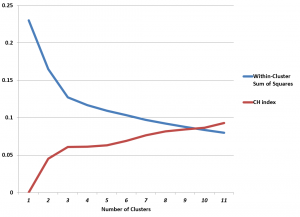
The CH index has an “elbow” at k=3 clusters. The possibility that this indicates the optimal number of clusters is enhanced by the rather abupt change of slope in Hartigan’s index.

Of course, we know that there are good grounds for believing that three is the optimal number of clusters .

With this information, then, one could feel justified in looking at and clustering the first three principal components, which would produce a good indicator of the cultivar of the wine.

Details

The objective of k-means clustering is to minimize the within-cluster sum of squares or the squared differences between the points belonging to a cluster and the associated centroid of that cluster.

Thus, suppose we have m observations on n-dimensional points xi=(x1i, x2i,..,xni), and, for this discussion, assume these points are mean-centered and divided by their column standard deviations.

Designate the centroids by the vector m=(m1, m2, …,mk). These are the average values for each variable for all the points assigned to a cluster.

Then, the objective is to minimize,

Clustermaxequation

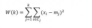
This problem is, in general, NP difficult, but the standard algorithm is straight-forward. The number of clusters k is selected. Then, an initial set of centroids is determined, by one means or another, and distances of points to these centroids are calculated. Points closest to the centroids are assigned to the cluster associated with that centroid. Then, the centroids are recalculated, and distances between the points and centroids are computed again. This loops until there are no further changes in centroid values or cluster assignment.

Minimization of the above objective function frequently leads to a local minima, so usually algorithms develop multiple assignments of the initial centroids, with the final solution being the cluster assignment with the lowest value of W(k).

Calculating the CH and Hartigan Indexes

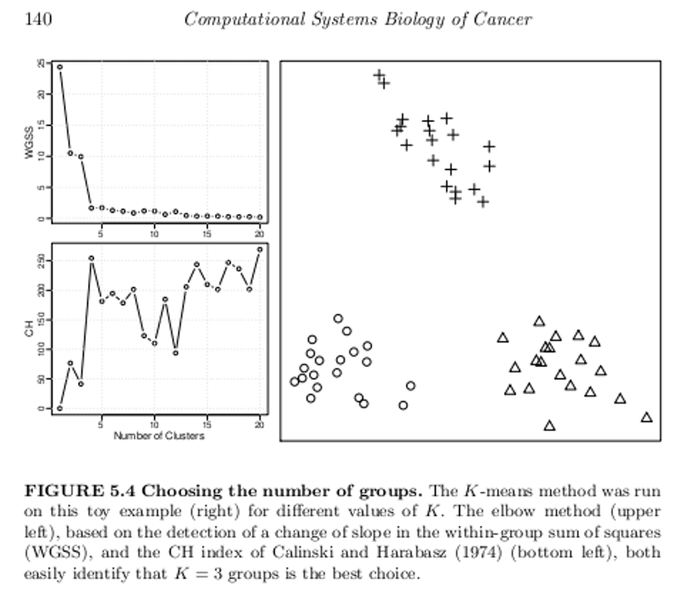
Let me throw up a text box from the excellent work Computational Systems Biology of Cancer .

Box1

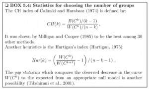
Making allowances for slight variation in notation, one can see that the CH index is a ratio of the between-cluster sum of squares and the within-cluster sum of squares, multiplied by constants determined by the number of clusters and number of cases or observations in the dataset.

Also, Hartigan’s index is a ratio of successive within-cluster sum of squares, divided by constants determined by the number of observations and number of clusters.

I focused on clustering the first ten principal components of the Wine data matrix in the graph above, incidentally.

Let me also quote from the above-mentioned work, which is available as a Kindle download from Amazon,

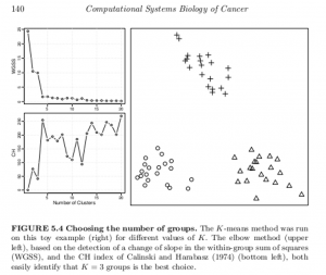
A generic problem with clustering methods is to choose the number of groups K. In an ideal situation in which samples would be well partitioned into a finite number of clusters and each cluster would correspond to the various hypothesis made by a clustering method (e.g. being a spherical Gaussian distribution), statistical criteria such as the Bayesian Information Criterion (BIC) can be used to select the optimal K consistently (Kass and Wasserman, 1995; Pelleg and Moore, 2000). On real data, the assumptions underlying such criteria are rarely met, and a variety of more or less heuristic criteria have been proposed to select a good number of clusters K (Milligan and Cooper, 1985;Gordon, 1999). For example, given a sequence of partitions C1, C2, …with k = 1, 2,…  groups, a useful and simple method is to monitor the decrease in W( Ck) (see Box 5.3) with k, and try to detect an elbow in the curve, i.e. a transition between sharp and slow decrease (see Figure 5.4, upper left). Alternatively, several statistics have been proposed to precisely detect a change of regime in this curve (see Box 5.4). For hierarchical clustering methods, the selection of clusters is often performed by searching the branches of dendrograms which are stable with respect to within- and between-group distance (Jain et al., 1999; Bertoni and Valentini, 2008).

It turns out that key references here are available on the Internet.

Thus, the Aikake or Bayesian Information Criteria applied to the number of clusters is described in Dan Pelleg and Andrew Moore’s 2000 paper X-means: Extending K-means with Efficient Estimation of the Number of Clusters.

Robert Tibshirani’s 2000 paper on the gap statistic also is available.

Another example of the application of these two metrics is drawn from this outstanding book on data analysis in cancer research, below.

Box2

These methods of identifying the optimal number of clusters might be viewed as heuristic, and certainly are not definitive. They are, however, possibly helpful in a variety of contexts.

Top Forecasting Institutions and Researchers According to IDEAS!

Here is a real goldmine of research on forecasting.

IDEAS! is a RePEc service hosted by the Research Division of the Federal Reserve Bank of St. Louis.

This website compiles rankings on authors who have registered with the RePEc Author Service, institutions listed on EDIRC, bibliographic data collected by RePEc, citation analysis performed by CitEc and popularity data compiled by LogEc – under the category of forecasting.

Here is a list of the top fifteen of the top 10% institutions in the field of forecasting, according to IDEAS!. The institutions are scored based on a weighted sum of all authors affiliated with the respective institutions (click to enlarge).

top15ForecastingSchool

The Economics Department of the University of Wisconsin, the #1 institution, lists 36 researchers who claim affiliation and whose papers are listed under the category forecasting in IDEAS!.

The same IDEAS! Webpage also lists the top 10% authors in the field of forecasting. I extract the top 20 of this list here below. If you click through on an author, you can see their list of publications, many of which often are available as PDF downloads.

IDEASauthors20

This is a good place to start in updating your knowledge and understanding of current thinking and contextual issues relating to forecasting.

The Applied Perspective

For an applied forecasting perspective, there is Bloomberg with this fairly recent video on several top economic forecasters providing services to business and investors.

I believe Bloomberg will release extensive, updated lists of top forecasters by country, based on a two year perspective, in a few weeks.

What’s the Lift of Your Churn Model? – Predictive Analytics and Big Data

Churn analysis is a staple of predictive analytics and big data. The idea is to identify attributes of customers who are likely leave a mobile phone plan or other subscription service, or, more generally, switch who they do business with. Knowing which customers are likely to “churn” can inform customer retention plans. Such customers, for example, may be contacted in targeted call or mailing campaigns with offers of special benefits or discounts.

Lift is a concept in churn analysis. The lift of a target group identified by churn analysis reflects the higher proportion of customers who actually drop the service or give someone else their business, when compared with the population of customers as a whole. If, typically, 2 percent of customers drop the service per month, and, within the group identified as “churners,” 8 percent drop the service, the “lift” is 4.

In interesting research, originally published in the Harvard Business Review, Gregory Piatetsky-Shapiro questions the efficacy of big data applied to churn analysis – based on an estimation of costs and benefits.

We looked at some 30 different churn-modeling efforts in banking and telecom, and surprisingly, although the efforts used different data and different modeling algorithms, they had very similar lift curves. The lists of top 1% likely defectors had a typical lift of around 9-11. Lists of top 10% defectors all had a lift of about 3-4. Very similar lift curves have been reported in other work. (See here and here.) All this suggests a limiting factor to prediction accuracy for consumer behavior such as churn.

Backtracking through earlier research by Piatetsky-Shapiro and his co-researchers, there is this nugget,

For targeted marketing campaigns, a good model lift at T, where T is the target rate in the overall population, is usually sqrt(1/T) +/- 20%.

So, if the likely “churners” are 5 percent of the customer group, a reasonable expectation of the lift that can be obtained from churn analysis is 4.47. This means probably no more than 25 percent of the target group identified by the churn analysis will, in fact, do business elsewhere in the defined period.

This is a very applied type of result, based on review of 30 or more studies.

But the point Piatetsky-Shapiro make is that big data probably can’t push these lift numbers much higher, because of the inherent randomness in the behavior of consumers. And small gains to existing methods simply do not meet a cost/benefit criterion.

Some Israeli researchers may in fact best these numbers with a completely different approach based on social network analysis. Their initial working hypothesis was that social influence on churn is highly dominant in relatively tight social groups. Their approach is clearly telecommunications-based, since they analyzed patterns of calling between customers, identifying networks of callers who had more frequent communications.

Still, there is a good argument for an evolution from standard churn analysis to predictive analytics that uncovers the value-at-risk in the customer base, or even the value that can be saved by customer retention programs. Customers who have trouble paying their bill, for example, might well be romanced less strongly by customer retention efforts, than premium customers.

evolution

Along these lines, I enjoyed reading the Stochastic Solutions piece on who can be saved and who will be driven away by retention activity, which is responsible for the above graphic.

It has been repeatedly demonstrated that the very act of trying to ‘save’ some customers provokes them to leave. This is not hard to understand, for a key targeting criterion is usually estimated churn probability, and this is highly correlated with customer dissatisfaction. Often, it is mainly lethargy that is preventing a dissatisfied customer from actually leaving. Interventions designed with the express purpose of reducing customer loss can provide an opportunity for such dissatisfaction to crystallise, provoking or bringing forward customer departures that might otherwise have been avoided, or at least delayed. This is especially true when intrusive contact mechanisms, such as outbound calling, are employed. Retention programmes can be made more effective and more profitable by switching the emphasis from customers with a high probability of leaving to those likely to react positively to retention activity.

This is a terrific point. Furthermore,

..many customers are antagonised by what they feel to be intrusive contact mechanisms; indeed, we assert without fear of contradiction that only a small proportion of customers are thrilled, on hearing their phone ring, to discover that the caller is their operator. In some cases, particularly for customers who are already unhappy, such perceived intrusions may act not merely as a catalyst but as a constituent cause of churn.

Bottom-line, this is among the most interesting applications of predictive analytics.

Logistic regression is a favorite in analyzing churn data, although techniques range from neural networks to regression trees.

Sales and new product forecasting in data-limited (real world) contexts