Tag Archives: accuracy of forecasts

Forecasting the Price of Gold – 2

Searching “forecasting gold prices” on Google lands on a number of ARIMA (autoregressive integrated moving average) models of gold prices. Ideally, researchers focus on shorter term forecast horizons with this type of time series model.

I take a look at this approach here, moving onto multivariate approaches in subsequent posts.

Stylized Facts

These ARIMA models support stylized facts about gold prices such as: (1) gold prices constitute a nonstationary time series, (2) first differencing can reduce gold price time series to a stationary process, and, usually, (3) gold prices are random walks.

For example, consider daily gold prices from 1978 to the present.

DailyGold

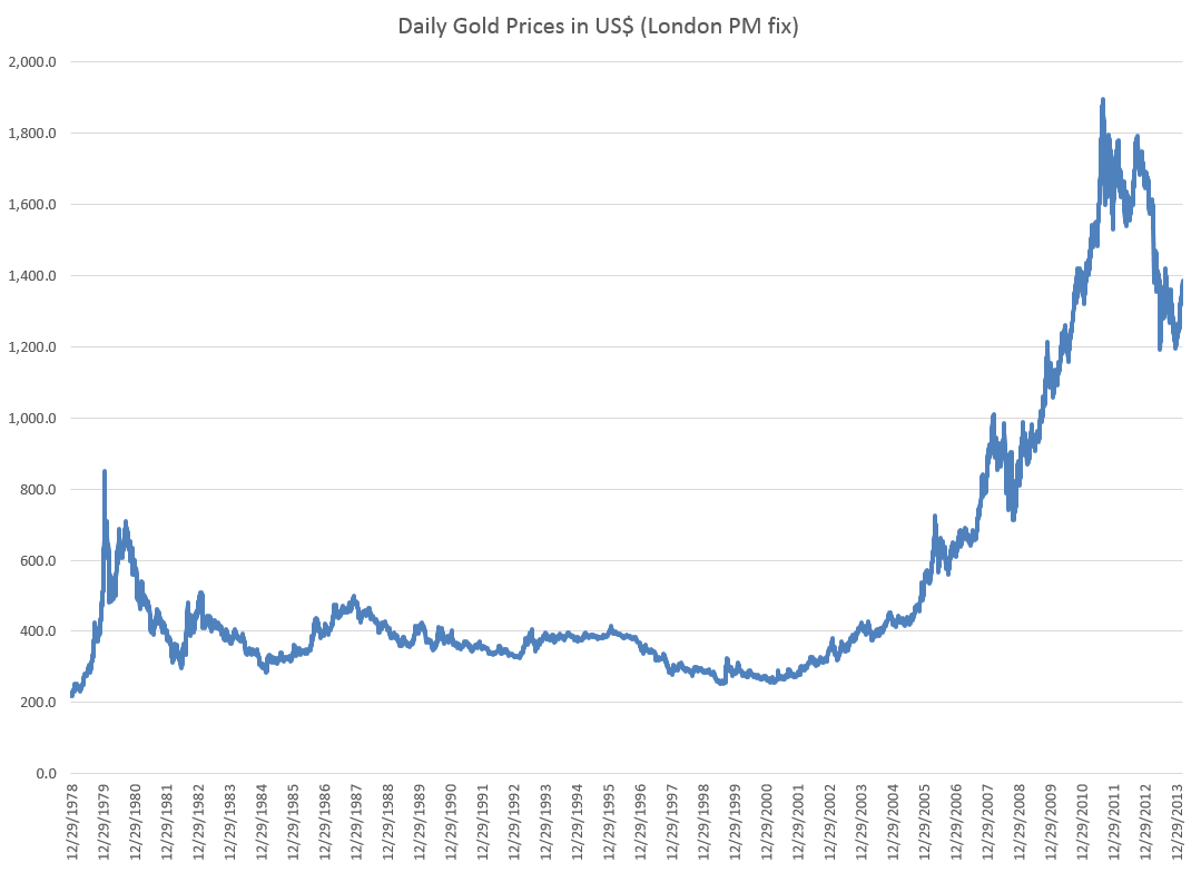
This chart, based World Gold Council data and the London PM fix, shows gold prices do not fluctuate about a fixed level, but can move in patterns with a marked trend over several years.

The trick is to reduce such series to a mean stationary series through appropriate differencing and, perhaps, other data transformations, such as detrending and taking out seasonal variation. Guidance in this is provided by tools such as the autocorrelation function (ACF) and partial autocorrelation function (PACF) of the time series, as well as tests for unit roots.

Some Terminology

I want to talk about specific ARIMA models, such as ARIMA(0,1,1) or ARIMA(p,d,q), so it might be a good idea to review what this means.

Quickly, ARIMA models are described by three parameters: (1) the autoregressive parameter p, (2) the number of times d the time series needs to be differenced to reduce it to a mean stationary series, and (3) the moving average parameter q.

ARIMA(0,1,1) indicates a model where the original time series yt is differenced once (d=1), and which has one lagged moving average term.

If the original time series is yt, t=1,2,..n, the first differenced series is zt=yt-yt-1, and an ARIMA(0,1,1) model looks like,

zt = θ1εt-1

or converting back into the original series yt,

yt = μ + yt-1 + θ1εt-1

This is a random walk process with a drift term μ, incidentally.

As a note in the general case, the p and q parameters describe the span of the lags and moving average terms in the model.  This is often done with backshift operators Lk (click to enlarge)  

LagOperator

So you could have a sum of these backshift operators of different orders operating against yt or zt to generate a series of lags of order p. Similarly a sum of backshift operators of order q can operate against the error terms at various times. This supposedly provides a compact way of representing the general model with p lags and q moving average terms.

Similar terminology can indicate the nature of seasonality, when that is operative in a time series.

These parameters are determined by considering the autocorrelation function ACF and partial autocorrelation function PACF, as well as tests for unit roots.

I’ve seen this referred to as “reading the tea leaves.”

Gold Price ARIMA models

I’ve looked over several papers on ARIMA models for gold prices, and conducted my own analysis.

My research confirms that the ACF and PACF indicates gold prices (of course, always defined as from some data source and for some trading frequency) are, in fact, random walks.

So this means that we can take, for example, the recent research of Dr. M. Massarrat Ali Khan of College of Computer Science and Information System, Institute of Business Management, Korangi Creek, Karachi as representative in developing an ARIMA model to forecast gold prices.

Dr. Massarrat’s analysis uses daily London PM fix data from January 02, 2003 to March 1, 2012, concluding that an ARIMA(0,1,1) has the best forecasting performance. This research also applies unit root tests to verify that the daily gold price series is stationary, after first differencing. Significantly, an ARIMA(1,1,0) model produced roughly similar, but somewhat inferior forecasts.

I think some of the other attempts at ARIMA analysis of gold price time series illustrate various modeling problems.

For example there is the classic over-reach of research by Australian researchers in An overview of global gold market and gold price forecasting. These academics identify the nonstationarity of gold prices, but attempt a ten year forecast, based on a modeling approach that incorporates jumps as well as standard ARIMA structure.

A new model proposed a trend stationary process to solve the nonstationary problems in previous models. The advantage of this model is that it includes the jump and dip components into the model as parameters. The behaviour of historical commodities prices includes three differ- ent components: long-term reversion, diffusion and jump/dip diffusion. The proposed model was validated with historical gold prices. The model was then applied to forecast the gold price for the next 10 years. The results indicated that, assuming the current price jump initiated in 2007 behaves in the same manner as that experienced in 1978, the gold price would stay abnormally high up to the end of 2014. After that, the price would revert to the long-term trend until 2018.

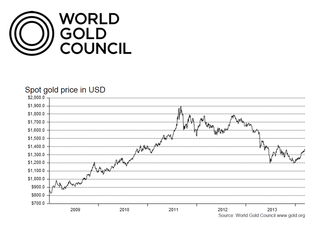
As the introductory graph shows, this forecast issued in 2009 or 2010 was massively wrong, since gold prices slumped significantly after about 2012.

So much for long-term forecasts based on univariate time series.

Summing Up

I have not referenced many ARIMA forecasting papers relating to gold price I have seen, but focused on a couple – one which “gets it right” and another which makes a heroically wrong but interesting ten year forecast.

Gold prices appear to be random walks in many frequencies – daily, monthly average, and so forth.

Attempts at superimposing long term trends or even jump patterns seem destined to failure.

However, multivariate modeling approaches, when carefully implemented, may offer some hope of disentangling longer term trends and changes in volatility. I’m working on that post now.

Forecasting Gold Prices – Goldman Sachs Hits One Out of the Park

March 25, 2009, Goldman Sachs’ Commodity and Strategy Research group published Global Economics Paper No 183: Forecasting Gold as a Commodity.

This offers a fascinating overview of supply and demand in global gold markets and an immediate prediction –

This “gold as a commodity” framework suggests that gold prices have strong support at and above current price levels should the current low real interest rate environment persist. Specifically, assuming real interest rates stay near current levels and the buying from gold-ETFs slows to last year’s pace, we would expect to see gold prices stay near $930/toz over the next six months, rising to $962/toz on a 12-month horizon.

The World Gold Council maintains an interactive graph of gold prices based on the London PM fix.

GoldpriceNow, of course, the real interest rate is an inflation-adjusted nominal interest rate. It’s usually estimated as a difference between some representative interest rate and relevant rate of inflation. Thus, the real interest rates in the Goldman Sachs report is really an extrapolation from extant data provided, for example, by the US Federal Reserve FRED database.

Gratis of Paul Krugman’s New York Times blog from last August, we have this time series for real interest rates –

realinterestrates

The graph shows that “real interest rates stay near current levels” (from spring 2009), putting the Goldman Sachs group authoring Report No 183 on record as producing one of the most successful longer term forecasts that you can find.

I’ve been collecting materials on forecasting systems for gold prices, and hope to visit that topic in coming posts here.

Partial Least Squares and Principal Components

I’ve run across outstanding summaries of “partial least squares” (PLS) research recently – for example Rosipal and Kramer’s Overview and Recent Advances in Partial Least Squares and the 2010 Handbook of Partial Least Squares.

Partial least squares (PLS) evolved somewhat independently from related statistical techniques, owing to what you might call family connections. The technique was first developed by Swedish statistician Herman Wold and his son, Svante Wold, who applied the method in particular to chemometrics. Rosipal and Kramer suggest that the success of PLS in chemometrics resulted in a lot of applications in other scientific areas including bioinformatics, food research, medicine, [and] pharmacology..

Someday, I want to look into “path modeling” with PLS, but for now, let’s focus on the comparison between PLS regression and principal component (PC) regression. This post develops a comparison with Matlab code and macroeconomics data from Mark Watson’s website at Princeton.

The Basic Idea Behind PC and PLS Regression

Principal component and partial least squares regression share a couple of features.

Both, for example, offer an approach or solution to the problem of “many predictors” and multicollinearity. Also, with both methods, computation is not transparent, in contrast to ordinary least squares (OLS). Both PC and PLS regression are based on iterative or looping algorithms to extract either the principal components or underlying PLS factors and factor loadings.

PC Regression

The first step in PC regression is to calculate the principal components of the data matrix X. This is a set of orthogonal (which is to say completely uncorrelated) vectors which are weighted sums of the predictor variables in X.

This is an iterative process involving transformation of the variance-covariance or correlation matrix to extract the eigenvalues and eigenvectors.

Then, the data matrix X is multiplied by the eigenvectors to obtain the new basis for the data – an orthogonal basis. Typically, the first few (the largest) eigenvalues – which explain the largest proportion of variance in X – and their associated eigenvectors are used to produce one or more principal components which are regressed onto Y. This involves a dimensionality reduction, as well as elimination of potential problems of multicollinearity.

PLS Regression

The basic idea behind PLS regression, on the other hand, is to identify latent factors which explain the variation in both Y and X, then use these factors, which typically are substantially fewer in number than k, to predict Y values.

Clearly, just as in PC regression, the acid test of the model is how it performs on out-of-sample data.

The reason why PLS regression often outperforms PC regression, thus, is that factors which explain the most variation in the data matrix may not, at the same time, explain the most variation in Y. It’s as simple as that.

Matlab example

I grabbed some data from Mark Watson’s website at Princeton — from the links to a recent paper called Generalized Shrinkage Methods for Forecasting Using Many Predictors (with James H. Stock), Journal of Business and Economic Statistics, 30:4 (2012), 481-493.Download Paper (.pdf). Download Supplement (.pdf), Download Data and Replication Files (.zip). The data include the following variables, all expressed as year-over-year (yoy) growth rates: The first variable – real GDP – is taken as the forecasting target. The time periods of all other variables are lagged one period (1 quarter) behind the quarterly values of this target variable.

macrolist

Matlab makes calculation of both principal component and partial least squares regressions easy.

The command to extract principal components is

[coeff, score, latent]=princomp(X)

Here X the data matrix, and the entities in the square brackets are vectors or matrices produced by the algorithm. It’s possible to compute a principal components regression with the contents of the matrix score. Generally, the first several principal components are selected for the regression, based on the importance of a component or its associated eigenvalue in latent. The following scree chart illustrates the contribution of the first few principal components to explaining the variance in X.

Screechart

The relevant command for regression in Matlab is

b=regress(Y,score(:,1:6))

where b is the column vector of estimated coefficients and the first six principal components are used in place of the X predictor variables.

The Matlab command for a partial least square regresssion is

[XL,YL,XS,YS,beta] = plsregress(X,Y,ncomp)

where ncomp is the number of latent variables of components to be utilized in the regression. There are issues of interpreting the matrices and vectors in the square brackets, but I used this code –

data=xlsread(‘stock.xls’); X=data(1:47,2:79); y = data(2:48,1);

[XL,yl,XS,YS,beta] = plsregress(X,y,10); yfit = [ones(size(X,1),1) X]*beta;

lookPLS=[y yfit]; ZZ=data(48:50,2:79);newy=data(49:51,1);

new=[ones(3,1) ZZ]*beta; out=[newy new];

The bottom line is to test the estimates of the response coefficients on out-of-sample data.

The following chart shows that PLS outperforms PC, although the predictions of both are not spectacularly accurate.

plspccomp

Commentary

There are nuances to what I have done which help explain the dominance of PLS in this situation, as well as the weakly predictive capabilities of both approaches.

First, the target variable is quarterly year-over-year growth of real US GDP. The predictor set X contains 78 other macroeconomic variables, all expressed in terms of yoy (year-over-year) percent changes.

Again, note that the time period of all the variables or observations in X are lagged one quarter from the values in Y, or the values or yoy quarterly percent growth of real US GDP.

This means that we are looking for a real, live leading indicator. Furthermore, there are plausibly common factors in the Y series shared with at least some of the X variables. For example, the percent changes of a block of variables contained in real GDP are included in X, and by inspection move very similarly with the target variable.

Other Example Applications

There are at least a couple of interesting applied papers in the Handbook of Partial Least Squares – a downloadable book in the Springer Handbooks of Computational Statistics. See –

Chapter 20 A PLS Model to Study Brand Preference: An Application to the Mobile Phone Market

Chapter 22 Modeling the Impact of Corporate Reputation on Customer Satisfaction and Loyalty Using Partial Least Squares

Another macroeconomics application from the New York Fed –

“Revisiting Useful Approaches to Data-Rich Macroeconomic Forecasting”

http://www.newyorkfed.org/research/staff_reports/sr327.pdf

Finally, the software company XLStat has a nice, short video on partial least squares regression applied to a marketing example.

Complete Subset Regressions

A couple of years or so ago, I analyzed a software customer satisfaction survey, focusing on larger corporate users. I had firmagraphics – specifying customer features (size, market segment) – and customer evaluation of product features and support, as well as technical training. Altogether, there were 200 questions that translated into metrics or variables, along with measures of customer satisfaction. Altogether, the survey elicited responses from about 5000 companies.

Now this is really sort of an Ur-problem for me. How do you discover relationships in this sort of data space? How do you pick out the most important variables?

Since researching this blog, I’ve learned a lot about this problem. And one of the more fascinating approaches is the recent development named complete subset regressions.

And before describing some Monte Carlo exploring this approach here, I’m pleased Elliot, Gargano, and Timmerman (EGT) validate an intuition I had with this “Ur-problem.” In the survey I mentioned above, I calculated a whole bunch of univariate regressions with customer satisfaction as the dependent variable and each questionnaire variable as the explanatory variable – sort of one step beyond calculating simple correlations. Then, it occurred to me that I might combine all these 200 simple regressions into a predictive relationship. To my surprise, EGT’s research indicates that might have worked, but not be as effective as complete subset regression.

Complete Subset Regression (CSR) Procedure

As I understand it, the idea behind CSR is you run regressions with all possible combinations of some number r less than the total number n of candidate or possible predictors. The final prediction is developed as a simple average of the forecasts from these regressions with r predictors. While some of these regressions may exhibit bias due to specification error and covariance between included and omitted variables, these biases tend to average out, when the right number r < n is selected.

So, maybe you have a database with m observations or cases on some target variable and n predictors.

And you are in the dark as to which of these n predictors or potential explanatory variables really do relate to the target variable.

That is, in a regression y = β01 x1 +…+βn xn some of the beta coefficients may in fact be zero, since there may be zero influence between the associated xi and the target variable y.

Of course, calling all the n variables xi i=1,…n “predictor variables” presupposes more than we know initially. Some of the xi could in fact be “irrelevant variables” with no influence on y.

In a nutshell, the CSR procedure involves taking all possible combinations of some subset r of the n total number of potential predictor variables in the database, and mapping or regressing all these possible combinations onto the dependent variable y. Then, for prediction, an average of the forecasts of all these regressions is often a better predictor than can be generated by other methods – such as the LASSO or bagging.

EGT offer a time series example as an empirical application. based on stock returns, quarterly from 1947-2010 and twelve (12) predictors. The authors determine that the best results are obtained with a small subset of the twelve predictors, and compare these results with ridge regression, bagging, Lasso and Bayesian Model Averaging.

The article in The Journal of Econometrics is well-worth purchasing, if you are not a subscriber. Otherwise, there is a draft in PDF format from 2012.

The combination of n things taken r at a time is n!/[(n-r)!(r!)] and increases faster than exponentially, as n increases. For large n, accordingly, it is necessary to sample from the possible set of combinations – a procedure which still can generate improvements in forecast accuracy over a “kitchen sink” regression (under circumstances further delineated below). Otherwise, you need a quantum computer to process very fat databases.

When CSR Works Best – Professor Elloitt

I had email correspondence with Professor Graham Elliott, one of the co-authors of the above-cited paper in the Journal of Econometrics.

His recommendation is that CSR works best with when there are “weak predictors” sort of buried among a superset of candidate variables,

If a few (say 3) of the variables have large coefficients such as that they result in a relatively large R-square for the prediction regression when they are all included, then CSR is not likely to be the best approach. In this case model selection has a high chance of finding a decent model, the kitchen sink model is not all that much worse (about 3/T times the variance of the residual where T is the sample size) and CSR is likely to be not that great… When there is clear evidence that a predictor should be included then it should be always included…, rather than sometimes as in our method. You will notice that in section 2.3 of the paper that we construct properties where beta is local to zero – what this math says in reality is that we mean the situation where there is very little clear evidence that any predictor is useful but we believe that some or all have some minor predictive ability (the stock market example is a clear case of this). This is the situation where we expect the method to work well. ..But at the end of the day, there is no perfect method for all situations.

I have been toying with “hidden variables” and, then, measurement error in the predictor variables in simulations that further validate Graham Elliot’s perspective that CSR works best with “weak predictors.”

Monte Carlo Simulation

Here’s the spreadsheet for a relevant simulation (click to enlarge).

CSRTable

It is pretty easy to understand this spreadsheet, but it may take a few seconds. It is a case of latent variables, or underlying variables disguised by measurement error.

The z values determine the y value. The z values are multiplied by the bold face numbers in the top row, added together, and then the epsilon error ε value is added to this sum of terms to get each y value. You have to associate the first bold face coefficient with the first z variable, and so forth.

At the same time, an observer only has the x values at his or her disposal to estimate a predictive relationship.

These x variables are generated by adding a Gaussian error to the corresponding value of the z variables.

Note that z5 is an irrelevant variable, since its coefficient loading is zero.

This is a measurement error situation (see the lecture notes on “measurement error in X variables” ).

The relationship with all six regressors – the so-called “kitchen-sink” regression – clearly shows a situation of “weak predictors.”

I consider all possible combinations of these 6 variables, taken 3 at a time, or 20 possible distinct combinations of regressors and resulting regressions.

In terms of the mechanics of doing this, it’s helpful to set up the following type of listing of the combinations.

Combos

Each digit in the above numbers indicates a variable to include. So 123 indicates a regression with y and x1, x2, and x3. Note that writing the combinations in this way so they look like numbers in order of increasing size can be done by a simple algorithm for any r and n.

And I can generate thousands of cases by allowing the epsilon ε values and other random errors to vary.

In the specific run above, the CSR average soundly beats the mean square error (MSE) of this full specification in forecasts over ten out-of-sample values. The MSE of the kitchen sink regression, thus, is 2,440 while the MSE of the regression specifying all six regressors is 2653. It’s also true that picking the lowest within-sample MSE among the 20 possible combinations for k = 3 does not produce a lower MSE in the out-of-sample run.

This is characteristics of results in other draws of the random elements. I hesitate to characterize the totality without further studying the requirements for the number of runs, given the variances, and so forth.

I think CSR is exciting research, and hope to learn more about these procedures and report in future posts.

The Accuracy of Macroeconomics Forecasts – Survey of Professional Forecasters

The Philadelphia Federal Reserve Bank maintains historic records of macroeconomic forecasts from the Survey of Professional Forecasters (SPF). These provide an outstanding opportunity to assess forecasting accuracy in macroeconomics.

For example, in 2014, what is the chance the “steady as she goes” forecast from the current SPF is going to miss a downturn 1, 2, or 3 quarters into the future?

1-Quarter-Ahead Forecast Performance on Real GDP

Here is a chart I’ve ginned up for a 1-quarter ahead performance of the SPF forecasts of real GDP since 1990.

SP!1Q

The blue line is the forecast growth rate for real GDP from the SPF on a 1-quarter-ahead basis. The red line is the Bureau of Economic Analysis (BEA) final number for the growth rate for the relevant quarters. The growth rates in both instances are calculated on a quarter-over-quarter basis and annualized.

Side-stepping issues regarding BEA revisions, I used BEA final numbers for the level and growth of real GDP by quarter. This may not completely fair to the SPF forecasters, but it is the yardstick SPF is usually judged by its “consumers.”

Forecast errors for the 1-quarter-ahead forecasts, calculated on this basis, average about 2 percent in absolute value.

They also exhibit significant first order autocorrelation, as is readily suggested by the chart above. So, the SPF tends to under-predict during expansion phases of the business cycle and over-predict during contraction phases.

Currently, the SPF 2014:Q1 forecast for 2014:Q2 is for 3.0 percent real growth of GDP, so maybe it’s unlikely that an average error for this forecast would result in actual 2014:Q2 growth dipping into negative territory.

2-Quarter-Ahead Forecast Performance on Real GDP

Errors for the 2-quarter-ahead SPF forecast, judged against BEA final numbers for real GDP growth, only rise to about 2.14 percent.

However, I am interested in more than the typical forecast error associated with forecasts of real Gross Domestic Product (GDP) on a 1-, 2-, or 3- quarter ahead forecast horizon.

Rather, I’m curious whether the SPF is likely to catch a
downturn over these forecast horizons, given that one will occur.

So if we just look at recessions in this period, in 2001, 2002-2003, and 2008-2009, the performance significantly deteriorates. This can readily be seen in the graph for 1-quarter-ahead forecast errors shown above in 2008 when the consensus SPF forecast indicated a slight recovery for real GDP in exactly the quarter it totally tanked.

Bottom Line

In general, the SPF records provide vivid documentation of the difficulty of predicting turning points in key macroeconomic time series, such as GDP, consumer spending, investment, and so forth. At the same time, the real-time macroeconomic databases provided alongside the SPF records offer interesting opportunities for second- and third-guessing both the experts and the agencies responsible for charting US macroeconomics.

Additional Background

The Survey of Professional Forecasters is the oldest quarterly survey of macroeconomic forecasts in the United States. It dates back to 1968, when it was conducted by the American Statistical Association and the National Bureau of Economic Research (NBER). In 1990, the Federal Reserve Bank of Philadelphia assumed responsibility, and, today, devotes a special section on its website to the SPF, as well “Historical SPF Forecast Data.”

Current and recent contributors to the SPF include “celebrity forecasters” highlighted in other posts here, as well as bank-associated and university-affiliated forecasters.

The survey’s timing is geared to the release of the Bureau of Economic Analysis’ advance report of the national income and product accounts. This report is released at the end of the first month of each quarter. It contains the first estimate of GDP (and components) for the previous quarter. Survey questionnaires are sent after this report is released to the public. The survey’s questionnaires report recent historical values of the data from the BEA’s advance report and the most recent reports of other government statistical agencies. Thus, in submitting their projections, panelists’ information includes data reported in the advance report.

Recent participants include:

Lewis Alexander, Nomura Securities; Scott Anderson, Bank of the West (BNP Paribas Group); Robert J. Barbera, Johns Hopkins University Center for Financial Economics; Peter Bernstein, RCF Economic and Financial Consulting, Inc.; Christine Chmura, Ph.D. and Xiaobing Shuai, Ph.D., Chmura Economics & Analytics; Gary Ciminero, CFA, GLC Financial Economics; Julia Coronado, BNP Paribas; David Crowe, National Association of Home Builders; Nathaniel Curtis, Navigant; Rajeev Dhawan, Georgia State University; Shawn Dubravac, Consumer Electronics Association; Gregory Daco, Oxford Economics USA, Inc.; Michael R. Englund, Action Economics, LLC; Timothy Gill, NEMA; Matthew Hall and Daniil Manaenkov, RSQE, University of Michigan; James Glassman, JPMorgan Chase & Co.; Jan Hatzius, Goldman Sachs; Peter Hooper, Deutsche Bank Securities, Inc.; IHS Global Insight; Fred Joutz, Benchmark Forecasts and Research Program on Forecasting, George Washington University; Sam Kahan, Kahan Consulting Ltd. (ACT Research LLC); N. Karp, BBVA Compass; Walter Kemmsies, Moffatt & Nichol; Jack Kleinhenz, Kleinhenz & Associates, Inc.; Thomas Lam, OSK-DMG/RHB; L. Douglas Lee, Economics from Washington; Allan R. Leslie, Economic Consultant; John Lonski, Moody’s Capital Markets Group; Macroeconomic Advisers, LLC; Dean Maki, Barclays Capital; Jim Meil and Arun Raha, Eaton Corporation; Anthony Metz, Pareto Optimal Economics; Michael Moran, Daiwa Capital Markets America; Joel L. Naroff, Naroff Economic Advisors; Michael P. Niemira, International Council of Shopping Centers; Luca Noto, Anima Sgr; Brendon Ogmundson, BC Real Estate Association; Martin A. Regalia, U.S. Chamber of Commerce; Philip Rothman, East Carolina University; Chris Rupkey, Bank of Tokyo-Mitsubishi UFJ; John Silvia, Wells Fargo; Allen Sinai, Decision Economics, Inc.; Tara M. Sinclair, Research Program on Forecasting, George Washington University; Sean M. Snaith, Ph.D., University of Central Florida; Neal Soss, Credit Suisse; Stephen Stanley, Pierpont Securities; Charles Steindel, New Jersey Department of the Treasury; Susan M. Sterne, Economic Analysis Associates, Inc.; Thomas Kevin Swift, American Chemistry Council; Richard Yamarone, Bloomberg, LP; Mark Zandi, Moody’s Analytics.

Sayings of the Top Macro Forecasters

Yesterday, I posted the latest Bloomberg top twenty US macroeconomic forecaster rankings, also noting whether this current crop made it into the top twenty in previous “competitions” for November 2010-November 2012 or November 2009-November 2011.

It turns out the Bloomberg top twenty is relatively stable. Seven names or teams on the 2014 list appear in both previous competitions. Seventeen made it into the top twenty at least twice in the past three years.

But who are these people and how can we learn about their forecasts on a real-time basis?

Well, as you might guess, this is a pretty exclusive club. Many are Chief Economists and company Directors in investment advisory organizations serving private clients. Several did a stint on the staff of the Federal Reserve earlier in their career. Their public interface is chiefly through TV interviews, especially Bloomberg TV, or other media coverage.

I found a couple of exceptions, however – Michael Carey and Russell Price.

Michael Carey and Crédit Agricole

Michael Carey is Chief Economist North America Crédit Agricole CIB. He ranked 14, 7, and 5, based on his average scores for his forecasts of the key indicators in these three consecutive competitions. He apparently is especially good on employment forecasts.

MikeCarey

Carey is a lead author for a quarterly publication from Crédit Agricole called Prospects Macro.

The Summary for the current issue (1st Quarter 2014) caught my interest –

On the economic trend front, an imperfect normalisation seems to be getting underway. One may talk about a normalisation insofar as – unlike the two previous financial years – analysts have forecast a resumption of synchronous growth in the US, the Eurozone and China. US growth is forecast to rise from 1.8% in 2013 to 2.7%; Eurozone growth is slated to return to positive territory, improving from -0.4% to +1.0%; while Chinese growth is forecast to dip slightly, from 7.7% to 7.2%, which does not appear unwelcome nor requiring remedial measures. The imperfect character of the forecast normalisation quickly emerges when one looks at the growth predictions for 2015. In each of the three regions, growth is not gathering pace, or only very slightly. It is very difficult to defend the idea of a cyclical mechanism of self-sustaining economic acceleration. This observation seems to echo an ongoing academic debate: growth in industrialised countries seems destined to be weak in the years ahead. Partly, this is because structural growth drivers seem to be hampered (by demographics, debt and technology shocks), and partly because real interest rates seem too high and difficult to cut, with money-market rates that are already virtually at zero and low inflation, which is likely to last. For the markets, monetary policies can only be ‘reflationist’. Equities prices will rise until they come upagainst the overvaluation barrier and long-term rates will continue to climb, but without reaching levels justified by growth and inflation fundamentals.

I like that – an “imperfect normalization” (note the British spelling). A key sentence seems to be “It is very difficult to defend the idea of a cyclical mechanism of self-sustaining economic acceleration.”

So maybe the issue is 2015.

The discussion of emerging markets prospects is well-worth quoting also.

At 4.6% (and 4.2% excluding China), average growth in 2013 across all emerging countries seems likely to have been at its lowest since 2002, apart from the crisis year of 2009. Despite the forecast slowdown in China (7.2%, after 7.7%), the overall pace of growth for EMs is likely to pick up slightly in 2014 (to 4.8%, and 4.5% excluding China). The trend is likely to continue through 2015. This modest rebound, despite the poor growth figures expected from Brazil, is due to the slightly improved performance of a few other large emerging economies such as India, and above all Mexico, South Korea and some Central European countries. As regards the content of this growth, it is investment that should improve, on the strength of better growth prospects in the industrialised countries…

The growth differential with the industrialised countries has narrowed to around 3%, whereas it had stood at around 5% between 2003 and 2011…

This situation is unlikely to change radically in 2014. Emerging markets should continue to labour under two constraints. First off, the deterioration in current accounts has worsened as a result of fairly weak external demand, stagnating commodity prices, and domestic demand levels that are still sticky in many emerging countries…Commodity-exporting countries and most Asian exporters of manufactured goods are still generating surpluses, although these are shrinking. Conversely, large emerging countries such as India, Indonesia, Brazil, Turkey and South Africa are generating deficits that are in some cases reaching alarming proportions – especially in Turkey. These imbalances could restrict growth in 2014-15, either by encouraging governments to tighten monetary conditions or by limiting access to foreign financing.

Secondly, most emerging countries are now paying the price for their reluctance to embrace reform in the years of strong global growth prior to the great global financial crisis. This price is today reflected in falling potential growth levels in some emerging countries, whose weaknesses are now becoming increasingly clear. Examples are Russia and its addiction to commodities; Brazil and its lack of infrastructure, low savings rate and unruly inflation; India and its lack of infrastructure, weakening rate of investment and political dependence of the Federal state on the federated states. Unfortunately, the less favourable international situation (think rising interest rates) and local contexts (eg, elections in India and Brazil in 2014) make implementing significant reforms more difficult over the coming quarters. This is having a depressing effect on prospects for growth

I’m subscribing to notices of updates to this and other higher frequency reports from Crédit Agricole.

Russell Price and Ameriprise

Russell Price, younger than Michael Carey, was Number 7 on the current Bloomberg list of top US macro forecasters, ranking 16 the previous year. He has his own monthly publication with Ameriprise called Economic Perspectives.

RussellPrice

The current issue dated January 28, 2014 is more US-centric, and projects a “modest pace of recovery” for the “next 3 to 5 years.” Still, the current issue warns that analyst projections of company profits are probably “overly optimistic.”

I need to read one or two more of the issues to properly evaluate, but Economic Perspectives is definitely a cut above the average riff on macroeconomic prospects.

Another Way To Tap Into Forecasts of the Top Bloomberg Forecasters

The Wall Street Journal’s Market Watch is another way to tap into forecasts from names and teams on the top Bloomberg lists.

The Market Watch site publishes weekly median forecasts based on the 15 economists who have scored the highest in our contest over the past 12 months, as well as the forecasts of the most recent winner of the Forecaster of the Month contest.

The economists in the Market Watch consensus forecast include many currently or recently in the top twenty Bloomberg list – Jim O’Sullivan of High Frequency Economics, Michael Feroli of J.P. Morgan, Paul Edelstein of IHS Global Insight, Brian Jones of Société Générale, Spencer Staples of EconAlpha, Ted Wieseman of Morgan Stanley, Jan Hatzius’s team at Goldman Sachs, Stephen Stanley of Pierpont Securities, Avery Shenfeld of CIBC, Maury Harris’s team at UBS, Brian Wesbury and Robert Stein of First Trust, Jeffrey Rosen of Briefing.com, Paul Ashworth of Capital Economics, Julia Coronado of BNP Paribas, and Eric Green’s team at TD Securities.

And I like the format of doing retrospectives on these consensus forecasts, in tables such as this:

MarketWatchTable

So what’s the bottom line here? Well, to me, digging deeper into the backgrounds of these top ranked forecasters, finding access to their current thinking is all part of improving competence.

I can think of no better mantra than Malcolm Gladwell’s 10,000 Hour Rule –

Sales Forecasts and Incentives

In some contexts, the problem is to find out what someone else thinks the best forecast is.

Thus, management may want to have accurate reporting or forecasts from the field sales force of “sales in the funnel” for the next quarter.

In a widely reprinted article from the Harvard Business Review, Gonik shows how to design sales bonuses to elicit the best estimates of future sales from the field sales force. The publication dates from the 1970’s, but is still worth considering, and has become enshrined in the management science literature.

Quotas are set by management, and forecasts or sales estimates are provided by the field salesforce.

In Gonik’s scheme, salesforce bonus percentages are influenced by three factors: actual sales volume, sales quota, and the forecast of sales provided from the field.

Consider the following bonus percentages (click to enlarge).

 Gonik                      

Grid coordinates across the top are the sales agent’s forecast divided by the quota.

Actual sales divided by the sales quota are listed down the left column of the table.

Suppose the quota from management for a field sales office is $50 million in sales for a quarter. This is management’s perspective on what is possible, given first class effort.

The field sales office, in turn, has information on the scope of repeat and new customer sales that are likely in the coming quarter. The sales office forecasts, conservatively, that they can sell $25 million in the next quarter.

This situates the sales group along the column under a Forecast/Quota figure of 0.5.

Then, it turns out that, lo and behold, the field sales office brings in $50 million in sales by the end of the quarter in question.

Their bonus, accordingly, is determined by the row labeled “100″ – for 100% of sales to quota. Thus, the field sales office gets a bonus which is 90 percent of the standard bonus for that period, whatever that is.

Naturally, the salesmen will see that they left money on the table. If they had forecast $50 million in sales for the quarter and achieved it, they would have 120 percent of the standard quota.

Notice that the diagonal highlighted in green shows the maximum bonus percentages for any given ratio of actual sales to quota (any given row). These maximum bonus percents are exactly at the intersection where the ratio of actual sales to quota equals the ratio of sales forecast to quota.

The area of the table colored in pink identifies a situation in which the sales forecasts exceed the actual sales.

The portion of the table highlighted in light blue, on the other hand, shows the cases in which the actual sales exceed the forecast.

This bonus setup provides monetary incentives for the sales force to accurately report their best estimates of prospects in the field, rather than “lowballing” the numbers. And just to review the background to the problem – management sometimes considers that the sales force is likely to under-report opportunities, so they look better when these are realized.

This setup has been applied by various companies, including IBM, and is enshrined in the management literature.

The algebra to develop a table of percentages like the one shown is provided in an article by Mantrala and Rama.

These authors also point out a similarity between Gonik’s setup and reforms of central planning in the old Soviet Union and communist Hungary. This odd association should not discredit the Gonik scheme in anyone’s mind. Instead, the linkage really highlights how fundamental the logic of the bonuses table is. In my opinion, Soviet Russia experienced economic collapse for entirely separate reasons – primarily failures of the pricing system and reluctance to permit private ownership of assets.

A subsequent post will consider business-to-business (B2B) supply contracts and related options frameworks which provide incentives for sharing demand or forecast information along the supply chain.

Measuring the Intelligence of Crowds

Researchers at Microsoft Research in the UK and Cambridge University report some fascinating and potentially useful results on crowdsourcing, based on a study of aggregating questions from a standard IQ test on Amazon’s Mechanical Turk (AMT).

The AMT site provides a place where workers can find problems that requesters have set up for crowdsourcing.

The introductory page to the site looks like this (click to enlarge).

AMT

So here’s an interesting way for people to make some money working from home, at their own hours, and yet stay busy. I’d like to look more deeply into this in a future post, but what these Crowd IQ researchers did is divvy up the questions from a widely utilized IQ test on the AMT site. They studied the effects of changing several parameters on their measures of Crowd IQ, but basically found that, with five or more reputable workers in a group, the Crowd IQ was usually higher than that of the individual workers in the group.

The Abstract for their 2012 study Crowd IQ: Measuring the Intelligence of Crowdsourcing Platforms describes the research and findings succinctly:

We measure crowdsourcing performance based on a standard IQ questionnaire, and examine Amazon’s Mechanical Turk (AMT) performance under different conditions. These include variations of the payment amount offered, the way incorrect responses affect workers’ reputations, threshold reputation scores of participating AMT workers, and the number of workers per task. We show that crowds composed of workers of high reputation achieve higher performance than low reputation crowds, and the effect of the amount of payment is non-monotone—both paying too much and too little affects performance. Furthermore, higher performance is achieved when the task is designed such that incorrect responses can decrease workers’ reputation scores. Using majority vote to aggregate multiple responses to the same task can significantly improve performance, which can be further boosted by dynamically allocating workers to tasks in order to break ties.

The IQ test is Raven’s Standard Progressive Matrices (SPM). If you want to take the test, look here.

SPM is a nonverbal, multiple-choice intelligence test based on the theory of general ability. The general setup is as in the following example.

Ravenex

Free riders are an interesting problem in a site like the Mechanical Turk. So, if people get paid by the number of correct answers, some simply select responses at random to maximize the speed at which they can put up answers. Because of this, AMT has a reputation mechanism indicating the expected quality of work of a worker, based on his or her past performance.

This research is has real-world implications. For example, increasing the payment for tasks too much results in actually diminuishing the quality of the answers, for a variety of reasons the authors consider.

The “workers” in this AMT-based study did not consult with each other about the answers, but were grouped into teams somehow by the researchers.

Here is a chart showing the increase in crowd IQ with the number of people in the group.

MSFTcurve

Here a HIT refers to a Human Intelligence Task.

 Recommendations

First, experiment and monitor the performance. Our results suggest that relatively small changes to the parameters of the task may result in great changes in crowd performance. Changing parameters of the task (e.g. reward, time limits, reputation rage) and observing changes in performance may allow you to greatly increase performance. Second, make sure to threaten workers’ reputation by emphasizing that their solutions will be monitored and wrong responses rejected. Obviously, in a real-world setting it may be hard to detect free-riders without using a “gold-set” of test questions to which the requester already knows the correct response. However, designing and communicating HIT rejection conditions can discourage free riding or make it risky and more difficult. For instance, in the case of translation tasks requesters should determine what is not acceptable (e.g. using Google Translate) and may suggest that the response quality would be monitored and solutions of low quality would be rejected. Third, do not over-pay. Although the reward structure obviously depends on the task at hand and the expected amount of effort required to solve it, our results suggest that pricing affects not only the ability to s source enough workers to perform the task but also the quality of the obtained results. Higher rewards are likely to encourage a free-riding behavior and may affect the cognitive abilities of workers by increasing psychological pressure. Thus, for long term projects or tasks that are run repeatedly in a production environment, we believe it is worthwhile to experiment with the reward scheme in order to
find an optimum reward level. Fourth, aggregate multiple solutions to each HIT, preferably using an adaptive sourcing scheme. Even the simplest aggregation method – majority voting – has a potential to greatly improve the quality of the solution. In the context of more complicated tasks, e.g. translations, requesters may consider a two-stage design in which they first request several solutions, and then use another batch of workers to vote for the best one. Additionally, requesters may consider inspecting the responses provided by individuals that often disagree with the crowd – they might be coveted geniuses or free-riders deserving rejection.

Interesting stuff, and makes you want to try crowdsourcing.

The On-Coming Tsunami of Data Analytics

More than 25,000 visited businessforecastblog, March 2012-December 2013, some spending hours on the site. Interest ran nearly 200 visitors a day in December, before my ability to post was blocked by a software glitch, and we did this re-boot.

Now I have hundreds of posts offline, pertaining to several themes, discussed below. How to put this material back up – as reposts, re-organized posts, or as longer topic summaries?

There’s a silver lining. This forces me to think through forecasting, predictive and data analytics.

One thing this blog does is compile information on which forecasting and data analytics techniques work, and, to some extent, how they work, how key results are calculated. I’m big on computation and performance metrics, and I want to utilize the SkyDrive more extensively to provide full access to spreadsheets with worked examples.

Often my perspective is that of a “line worker” developing sales forecasts. But there is another important focus – business process improvement. The strength of a forecast is measured, ultimately, by its accuracy. Efforts to improve business processes, on the other hand, are clocked by whether improvement occurs – whether costs of reaching customers are lower, participation rates higher, customer retention better or in stabilization mode (lower churn), and whether the executive suite and managers gain understanding of who the customers are. And there is a third focus – that of the underlying economics, particularly the dynamics of the institutions involved, such as the US Federal Reserve.

Right off, however, let me say there is a direct solution to forecasting sales next quarter or in the coming budget cycle. This is automatic forecasting software, with Forecast Pro being one of the leading products. Here’s a YouTube video with the basics about that product.

You can download demo versions and participate in Webinars, and attend the periodic conferences organized by Business Forecast Systems showcasing user applications in a wide variety of companies.

So that’s a good solution for starters, and there are similar products, such as the SAS/ETS time series software, and Autobox.

So what more would you want?

Well, there’s need for background information, and there’s a lot of terminology. It’s useful to know about exponential smoothing and random walks, as well as autoregressive and moving averages.  Really, some reaches of this subject are arcane, but nothing is worse than a forecast setup which gains the confidence of stakeholders, and then falls flat on its face. So, yes, eventually, you need to know about “pathologies” of the classic linear regression (CLR) model – heteroscedasticity, autocorrelation, multicollinearity, and specification error!

And it’s good to gain this familiarity in small doses, in connection with real-world applications or even forecasting personalities or celebrities. After a college course or two, it’s easy to lose track of concepts. So you might look at this blog as a type of refresher sometimes.

Anticipating Turning Points in Time Series

But the real problem comes with anticipating turning points in business and economic time series. Except when modeling seasonal variation, exponential smoothing usually shoots over or under a turning point in any series it is modeling.

If this were easy to correct, macroeconomic forecasts would be much better. The following chart highlights the poor performance, however, of experts contributing to the quarterly Survey of Professional Forecasters, maintained by the Philadelphia Fed.

SPFcomp2

So, the red line is the SPF consensus forecast for GDP growth on a three quarter horizon, and the blue line is the forecast or nowcast for the current quarter (there is a delay in release of current numbers). Notice the huge dips in the current quarter estimate, associated with four recessions 1981, 1992, 2001-2, and 2008-9. A mere three months prior to these catastrophic drops in growth, leading forecasters at big banks, consulting companies, and universities totally missed the boat.

This is important in a practical sense, because recessions turn the world of many businesses upside down. All bets are off. The forecasting team is reassigned or let go as an economy measure, and so forth.

Some forward-looking information would help business intelligence focus on reallocating resources to sustain revenue as much as possible, using analytics to design cuts exerting the smallest impact on future ability to maintain and increase market share.

Hedgehogs and Foxes

Nate Silver has a great table in his best-selling The
Signal and the Noise
on the qualities and forecasting performance of hedgehogs and foxes. The idea comes from a Greek poet, “The fox knows many little things, but the hedgehog knows one big thing.”

Following Tetlock, Silver finds foxes are multidisplinary, adaptable, self-critical, cautious, and empirical, tolerant of complexity. By contrast, the Hedgehog is specialized, sticks to the same approaches, stubbornly adheres to his model in spite of counter-evidence, is order-seeking, confident, and ideological. The evidence suggests foxes generally outperform hedgehogs, just as ensemble methods typically outperform a single technique in forecasting.

Message – be a fox.

So maybe this can explain some of the breadth of this blog. If we have trouble predicting GDP growth, what about forecasts in other areas – such as weather, climate change, or that old chestnut, sun spots? And maybe it is useful to take a look at how to forecast all the inputs and associated series – such as exchange rates, growth by global region, the housing market, interest rates, as well as profits.

And while we are looking around, how about brain waves? Can brain waves be forecast? Oh yes, it turns out there is a fascinating and currently applied new approach called neuromarketing, which uses headbands and electrodes, and even MRI machines, to detect deep responses of consumers to new products and advertising.

New Methods

I know I have not touched on cluster analysis and classification, areas making big contributions to improvement of business process. But maybe if we consider the range of “new” techniques for predictive analytics, we can see time series forecasting and analysis of customer behavior coming under one roof.

There is, for example, this many predictor thread emerging in forecasting in the late 1990’s and especially in the last decade with factor models for macroeconomic forecasting. Reading this literature, I’ve become aware of methods for mapping N explanatory variables onto a target variable, when there are M<N observations. These are sometimes called methods of data shrinkage, and include principal components regression, ridge regression, and the lasso. There are several others, and a good reference is The Elements of Statistical Learning, Data Mining, Learning and Prediction, 2nd edition, by Trevor Hastie, Robert Tibshirani, and Jerome Friedman. This excellent text is downloadable, accessible via the Tools, Apps, Texts, Free Stuff menu option located just to the left of the search utility on the heading for this blog.

There also is bagging, which is the topic of the previous post, as well as boosting, and a range of decision tree and regression tree modeling tactics, including random forests.

I’m actively exploring a number of these approaches, ginning up little examples to see how they work and how the computation goes. So far, it’s impressive. This stuff can really improve over the old approaches, which someone pointed out, have been around since the 1950’s at least.

It’s here I think that we can sight the on-coming wave, just out there on the horizon – perhaps hundreds of feet high. It’s going to swamp the old approaches, changing market research forever and opening new vistas, I think, for forecasting, as traditionally understood.

I hope to be able to ride that wave, and now I put it that way, I get a sense of urgency in keeping practicing my web surfing.

Hope you come back and participate in the comments section, or email me at [email protected]