Tag Archives: Forecasting turning points

Mapping High Frequency Data Onto Aggregated Variables – Monthly and Quarterly Data

A lot of important economic data only are available in quarterly installments. The US Gross Domestic Product (GDP) is one example.

Other financial series and indexes, such as the Chicago Fed National Activity Index, are available in monthly, or even higher frequencies.

Aggregation is a common tactic in this situation. So monthly data is aggregated to quarterly data, and then mapped against quarterly GDP.

But there are alternatives.

One is what Elena Andreou, Eric Ghysels and Andros Kourtellos call a naïve specification –

MIDASsim0ple

With daily (D) and quarterly (Q) data, there typically are a proliferation of parameters to estimate – 66 if you allow 22 trading days per month. Here ND in the above equation is the number of days in the quarterly period.

The usual workaround is a weighting scheme. Thus, two parameter exponential Almon lag polynomials are identified with MIDAS, or Mixed Data Sampling.

However, other researchers note that with the monthly and quarterly data, direct estimation of expressions such as the one above (with XM instead of XD ) is more feasible.

The example presented here shows that such models can achieve dramatic gains in accuracy.

Quarterly and Monthly Data Example

Let’s consider forecasting releases of the US nominal Gross Domestic Product by the Bureau of Economic Analysis.

From the BEA’s 2014 News Release Schedule for the National Economic Accounts, one can see that advance estimates of GDP occur a minimum of one month after the end of the quarter being reported. So, for example, the advance estimate for the Third Quarter was released October 30 of this year.

This means the earliest quarter updates on US GDP become available fully a month after the end of the quarter in question.

The Chicago Fed National Activity Index (CFNAI), a monthly guage of overall economic activity, is released three weeks after the month being measured.

So, by the time the preliminary GDP for the latest quarter (analyzed or measured) is released, as many as four CFNAI recent monthly indexes are available, three of which pertain to the months constituting this latest measured quarter.

Accordingly, I set up an equation with a lagged term for GDP growth and fifteen terms or values for CFNAImonthly indexes. For each case, I regress a value for GDP growth for quarter t onto GDP growth for quarter t-1 and values for all the monthly CFNAI indices for quarter t, except for the most recent or last month, and twelve other values for the CFNAI index for the three quarters preceding the final quarter to be estimated – quarter t-1, quarter t-2, and quarter t-3.

One of the keys to this data structure is that the monthly CFNAI values do not “stack,” as it were. Instead the most recent lagged CFNAI value for a case always jumps by three months. So, for the 3rd quarter GDP in, say, 2006, the CFNAI value starts with the value for August 2006 and tracks back 14 values to July 2005. Then for the 4th quarter of 2006, the CFNAI values start with November 2006, and so forth.

This somewhat intricate description supports the idea that we are estimating current quarter GDP just at the end of the current quarter before the preliminary measurements are released.

Data and Estimation

I compile BEA quarterly data for nominal US GDP dating from the first Quarter of 1981 or 1981:1 to the 4th Quarter of 2011. I also download monthly data from the Chicago Fed National Activity Index from October 1979 to December 2011.

For my dependent or target variable, I calculate year-over-year GDP growth rates by quarter, from the BEA data.

I estimate an equation, as illustrated initially in this post, by ordinary least squares (OLS). For quarters, I use the sample period 1981:2 to 2006:4. The monthly data start earlier to assure enough lagged terms for the CFNAI index, and run from 1979:10 to 2006:12.

Results

The results are fairly impressive. The regression equation estimated over quarterly and monthly data to the end of 2006 performs much better than a simple first order autocorrelation during the tremendous dip in growth characterizing the Great Recession. In general, even after stabilization of GDP growth in 2010 and 2011, the high frequency data regression produces better out-of-sample forecasts.

Here is a graph comparing the out-of-sample forecast accuracy of the high frequency regression and a simple first order autocorrelation relationship.

MIDAScomp

What’s especially interesting is that the high frequency data regression does a good job of capturing the drop in GDP and the movement at the turning point in 2009 – the depth of the Great Recession.

I throw this chart up as a proof-of-concept. More detailed methods, using a specially-constructed Chicago Fed index, are described in a paper in the Journal of Economic Perspectives.

The Business Cycle

The National Bureau of Economic Research (NBER) has a standing committee which designates the start and finish of recessions, or more precisely, the dates of the peaks and troughs of the US business cycle.

And the NBER site maintains a complete record of the US business cycle, dating back to the middle 1800’s, as shown in the following tables.

NBERbsdates

Periods of contraction, from peak to trough, are typically shorter than periods of expansion – or the movement from previous trough to the next peak.

Since World War II, the average length of the business cycle, variously measured from trough to trough or from peak to peak, is more than 5 years.

Focusing on the current situation, we are interested in the length of time from the previous peak of the business cycle in December 2007 to the next peak. The longest peak to peak period was over the prosperity of the 1990’s, and lasted more than 10 years (128 months).

So, it would be unusual if the peak of this current business cycle were much later than 2017-2018.

In terms of predicting turning points, matters are complicated by the fact that, unlike many European countries, the NBER does not define a recession in terms of two consecutive quarters of decline in real GDP.

Rather, a recession is a significant decline in economic activity spread across the economy, lasting more than a few months, normally visible in real GDP, real income, employment, industrial production, and wholesale-retail sales.

But just predicting the onset of two consecutive quarters of decline in real GDP is challenging. Indeed, the record of macroeconomic forecasting is very poor in this regard.

Part of the problem with the concept of a “cycle” in this context is the irregularity of the fluctuations derived by standard filters and methods.

Harvey, for example, applies low band and pass Butterworth filters to US total investment and other macroeconomic series, deriving, at one pont, an investment “cycle” that looks like this.

Invcycle

So almost everything that makes a cycle useful in prediction is missing from this investment cycle. Thus, one cannot conclude that a turning point will occur, when the amplitude of the cycle is reached, since the amplitudes of these quasi-cycles vary considerably. Similarly, the “period” of the cycle is by no means fixed, but is basically stochastic, with a certain variance sometimes expressed as a “hyperparameter.” Only a certain quality of smoothness presents itself, and, of course, is a result of the filtering parameters that are applied.

In my opinion, industry cycles make a certain amount of sense, for particular industries, over particular spans of time. What I mean is that identification of such industry cycles improves predictability of the underlying series – be it sales or inventories or what have you.

The business cycle, on the other hand, is something of a metaphor, or maybe just an evocative phrase.

True, there are periods of economic contraction and periods of expansion.

But the extraction of macroeconomic cycles often does not improve predictability, because the fluctuations so identified are highly irregular from a number of different viewpoints.

I’ve sort of confirmed this is a quantitative sense by applying various cycle-extraction softwares to US real GDP to see whether any product or approach gave a hint that the Great Recession which began in 2008 would (a) occur, and (b) be as dramatic as it was. So far, no go.

And, of course, Ng points out that the Great Recession was fundamentally different than, say, recessions in the 1960’s sand 1970’s in that it was a balance sheet recession.

The Consumer Durable Inventory Cycle – Canary in the Coal Mine?

I’m continuing this week with posts about cycles and, inevitably, need to address one very popular method of extracting cycles from time series data – the Hodrick-Prescott (HP) filter.

Recently, I’ve been exploring inventory cycles, hoping to post something coherent.

I think I hit paydirt, as they say in gold mining circles.

Here is the cycle component extracted from consumer durable inventories (not seasonally adjusted) from the Census manufacturing with a Hodrick-Prescott filter. I use a Matlab implementation here called hpfilter.

CDcycle

In terms of mechanics, the HP filter extracts the trend and cyclical component from a time series by minimizing an expression, as described by Wikipedia –

HPexp

What’s particularly interesting to me is that the peak of the two cycles in the diagram are spot-on the points at which the business cycle goes into recession – in 2001 and 2008.

Not only that, but the current consumer durable inventory cycle is credibly peaking right now and, based on these patterns, should go into a downward movement soon.

Of course, amplitudes of these cycles are a little iffy.

But the existence of a consumer durable cycle configured along these lines is consistent with the literature on inventory cycles, which emphasizes stockout-avoidance and relatively long pro-cyclical swings in inventories.

Surprising Revision of First Quarter GDP

I showed a relative this blog a couple of days ago, and, wanting “something spicy,” I pulled up The Record of Failure to Predict Recessions is Virtually Unblemished. The lead picture, as for this post, is Peter Sellers in his role as “Chauncey Gardiner” in Being There. Sellers played a simpleton mistaken for a savant, who would say things that everyone thought was brilliant, such as “There will be growth in the Spring.”

Well, last Wednesday, the US Bureau of Economic Analysis released a third revision of its estimate of the 1st quarter 2014 real GDP growthdown from an initial estimate of a positive .1 percent to -2.9 percent growth at an annual rate.

The BEA News Release says,

Real gross domestic product — the output of goods and services produced by labor and property located in the United States — decreased at an annual rate of 2.9 percent in the first quarter of 2014 according to the “third” estimate released by the Bureau of Economic Analysis….

The decrease in real GDP in the first quarter primarily reflected negative contributions from private inventory investment, exports, state and local government spending, nonresidential fixed investment, and residential fixed investment that were partly offset by a positive contribution from PCE. Imports, which are a subtraction in the calculation of GDP, increased.

Looking at this graph of quarterly real GDP growth rates for the past several years, it’s clear that a -2.9 percent quarter-over-quarter change is a significant size.

usgdpchartcustom

Again, macroeconomic forecasters were caught off guard.

In February of this year, the Survey of Professional Forecasters released its 1st Quarter 2014 consensus forecasts with numbers like –

SPF

Some SPF participants do predict 2014 overall will be a year of recession, as the following chart shows, but they are a tiny minority.

spfrange

A downward revision of almost 3 percentage points on the part of the BEA and almost 5 percent change for the median SPF forecast is poor performance indeed.

One hears things sped up in Q2, but on what basis I do not really know – and I am thinking of tracking key markets in future posts, such as housing, consumer spending, and so forth.

My feeling is that the quandary of the Fed – its desperate need to wind down asset purchases and restore interest rates to historic levels –creates an environment for a kind of “happy talk.”

Here’s some history on the real GDP.

USGDPnew


Daily Updates on Whether Key Financial Series Are Going Into Bubble Mode

Financial and asset bubbles are controversial, amazingly enough, in standard economics, where a bubble is defined as a divergence in a market from fundamental value. The problem, of course, is what is fundamental value. Maybe investors in the dot.com frenzy of the late 1990’s believed all the hype about never-ending and accelerating growth in IT, as a result of the Internet.

So we have this chart for the ETF SPY which tracks the S&P500. Now, there are similarities between the upswing of the two previous peaks – which both led to busts – and the current surge in the index.

sp500yahoo

Where is this going to end?

Well, I’ve followed the research of Didier Sornette and his co-researchers, and, of course, Sornette’s group has an answer to this question, which is “probably not well.” Currently, Professor Sornette occupies the Chair of Entreprenuerial Risk at the Swiss Federal Institute of Technology in Zurich.

There is an excellent website maintained by ETH Zurich for the theory and empirical analysis of financial bubbles.

Sornette and his group view bubbles from a more mathematical perspective, finding similarities in bubbles of durations from months to years in the concept of “faster than exponential growth.” At some point, that is, asset prices embark on this type of trajectory. Because of various feedback mechanisms in financial markets, as well as just herding behavior, asset prices in bubble mode oscillate around an accelerating trajectory which – at some point that Sornette claims can be identified mathematically – becomes unsupportable. At such a moment, there is a critical point where the probability of a collapse or reversal of the process becomes significantly greater.

This group is on the path of developing a new science of asset bubbles, if you will.

And, by this logic, there are positive and negative bubbles.

The sharp drop in stock prices in 2008, for example, represents a negative stock market bubble movement, and also is governed or described, by this theory, by an underlying differential equation. This differential equation leads to critical points, where the probability of reversal of the downward price movement is significantly greater.

I have decided I am going to compute the full price equation suggested by Sornette and others to see what prediction for a critical point emerges for the S&P 500 or SPY.

But actually, this would be for my own satisfaction, since Sornette’s group already is doing this in the Financial Crisis Observatory.

I hope I am not violating Swiss copyright rules by showing the following image of the current Financial Crisis Observatory page (click to enlarge)

FCO

As you notice there are World Markets, Commodities, US Sectors, US Large Cap categories and little red and green boxes scattered across the page, by date.

The red boxes indicate computations by the ETH Zurich group that indicate the financial series in question is going into bubble mode. This is meant as a probabilistic evaluation and is accompanied by metrics which indicate the likelihood of a critical point. These computations are revised daily, according to the site.

For example, there is a red box associated with the S&P 500 in late May. If you click on this red box, you  produces the following chart.

SornetteSP500

The implication is that the highest red spike in the chart at the end of December 2013 is associated with a reversal in the index, and also that one would be well-advised to watch for another similar spike coming up.

Negative bubbles, as I mention, also are in the lexicon. One of the green boxes for gold, for example, produces the following chart.

Goldnegbubble

This is fascinating stuff, and although Professor Sornette has gotten some media coverage over the years, even giving a TED talk recently, the economics profession generally seems to have given him almost no attention.

I plan a post on this approach with a worked example. It certainly is much more robust that some other officially sanctioned approaches.

“The Record of Failure to Predict Recessions is Virtually Unblemished”

That’s Prakash Loungani from work published in 2001.

Recently, Loungani , working with Hites Ahir, put together an update – “Fail Again, Fail Better, Forecasts by Economists During the Great Recession” reprised in a short piece in VOX – “There will be growth in the spring”: How well do economists predict turning points?

Hites and Loungani looked at the record of professional forecasters 2008-2012. Defining recessions as a year-over-year fall in real GDP, there were 88 recessions in this period. Based on country-by-country predictions documented by Consensus Forecasts, economic forecasters were right less than 10 percent of the time, when it came to forecasting recessions – even a few months before their onset.

recessions

The chart on the left shows the timing of the 88 recession years, while the chart on the right shows the number of recession predicted by economists by the September of the previous year.

..none of the 62 recessions in 2008–09 was predicted as the previous year was drawing to a close. However, once the full realisation of the magnitude and breadth of the Great Recession became known, forecasters did predict by September 2009 that eight countries would be in recession in 2010, which turned out to be the right call in three of these cases. But the recessions in 2011–12 again came largely as a surprise to forecasters.

This type of result holds up to robustness checks

•First, lowering the bar on how far in advance the recession is predicted does not appreciably improve the ability to forecast turning points.

•Second, using a more precise definition of recessions based on quarterly data does not change the results.

•Third, the failure to predict turning points is not particular to the Great Recession but holds for earlier periods as well.

Forecasting Turning Points

How can macroeconomic and business forecasters consistently get it so wrong?

Well, the data is pretty bad, although there is more and more of it available and with greater time depths and higher frequencies. Typically, government agencies doing the national income accounts – the Bureau of Economic Analysis (BEA) in the United States – release macroeconomic information at one or two months lag (or more). And these releases usually involve revision, so there may be preliminary and then revised numbers.

And the general accuracy of GDP forecasts is pretty low, as Ralph Dillon of Global Financial Data (GFD) documents in the following chart, writing,

Below is a chart that has 5 years of quarterly GDP consensus estimates and actual GDP [for the US]. In addition, I have also shown in real dollars the surprise in both directions. The estimate vs actual with the surprise indicating just how wrong consensus was in that quarter.

RalphDillon

Somehow, though, it is hard not to believe economists are doing something wrong with their almost total lack of success in predicting recessions. Perhaps there is a herding phenomenon, coupled with a distaste for being a bearer of bad tidings.

Or maybe economic theory itself plays a role. Indeed, earlier research published on Vox suggests that application of about 50 macroeconomic models to data preceding the recession of 2008-2009, leads to poor results in forecasting the downturn in those years, again even well into that period.

All this suggests economics is more or less at the point medicine was in the 1700’s, when bloodletting was all the rage..

quack_bleeding_sm

In any case, this is the planned topic for several forthcoming posts, hopefully this coming week – forecasting turning points.

Note: The picture at the top of this post is Peter Sellers in his last role as Chauncey Gardiner – the simple-minded gardener who by an accident and stroke of luck was taken as a savant, and who said to the President – “There will be growth in the spring.”

Credit Spreads As Predictors of Real-Time Economic Activity

Several distinguished macroeconomic researchers, including Ben Bernanke, highlight the predictive power of the “paper-bill” spread.

The following graphs, from a 1993 article by Benjamin M. Friedman and Kenneth N. Kuttner, show the promise of credit spreads in forecasting recessions – indicated by the shaded blocks in the charts.

CPTBspread

Credit spreads, of course, are the differences in yields between various corporate debt instruments and government securities of comparable maturity.

The classic credit spread illustrated above is the difference between six-month commercial paper rates and 6 month Treasury bill rates.

Recent Research

More recent research underlines the importance of building up credit spreads from metrics relating to individual corporate bonds , rather than a mishmash of bonds with different duration, credit risk and other characteristics.

Credit Spreads as Predictors of Real-Time Economic Activity: A Bayesian Model-Averaging Approach is key research in this regard.

The authors first note that,

the “paper-bill” spread—the difference between yields on nonfinancial commercial paper and comparable-maturity Treasury bills—had substantial forecasting power for economic activity during the 1970s and the 1980s, but its predictive ability vanished in the subsequent decade

They then acknowledge that credit spreads based on indexes of speculative-grade or “junk” corporate bonds work fairly well for the 1990s, but their performance is uneven.

Accordingly, Faust, Gilchrist, Wright, and Zakrajsek (GYZ) write that

In part to address these problems, GYZ constructed 20 monthly credit spread indexes for different maturity and credit risk categories using secondary market prices of individual senior unsecured corporate bonds.. [measuring]..the underlying credit risk by the issuer’s expected default frequency (EDF™), a market-based default-risk indicator calculated by Moody’s/KMV that is more timely that the issuer’s credit rating]

Their findings indicate that these credit spread indexes have substantial predictive power, at both short- and longer-term horizons, for the growth of payroll employment and industrial production. Moreover, they significantly outperform the predictive ability of the standard default-risk indicators, a result that suggests that using “cleaner” measures of credit spreads may, indeed, lead to more accurate forecasts of economic activity.

Their research applies credit spreads constructed from the ground up, as it were, to out-of-sample forecasts of

…real economic activity, as measured by real GDP, real personal consumption expenditures (PCE), real business fixed investment, industrial production, private payroll employment, the civilian unemployment rate, real exports, and real imports over the period from 1986:Q1 to 2011:Q3. All of these series are in quarter-over-quarter growth rates (actually 400 times log first differences), except for the unemployment rate, which is simply in first differences

The results are forecasts which significantly beat univariate (autoregressive) model forecass, as shown in the following table.

Cspreadresults

Here BMA is an abbreviation for Bayesian Model Averaging, the author’s method of incorporating these calculated credit spreads in predictive relationships.

Additional research validates the usefulness of credit spreads so constructed for predicting macroeconomic dynamics in several European economies –

We find that credit spreads and excess bond premiums, when used alongside monetary policy tightness indicators and leading indicators of economic performance, are highly significant for predicting the growth in the index of industrial production, employment growth, the unemployment rate and real GDP growth at horizons ranging from one quarter to two years ahead. These results are confirmed for individual countries in the euroarea and for the United Kingdom, and are robust to different measures of the credit spread. It is the unpredictable part associated with the excess bond premium that has greater influence on real activity compared to the predictable part of the credit spread. The implications of our results are that careful selection of the bonds used to construct the credit spreads, excluding those with embedded options and or illiquid secondary markets, delivers a robust indicator of financial market tightness that is distinct from tightness due to monetary policy measures or leading indicators of economic activity.

The Situation Today

A Morgan Stanley Credit Report for fixed income, released March 21, 2014, notes that

Spreads in both IG and HY are at the lowest levels we have seen since 2007, roughly 110bp for IG and 415bp for HY. A question we are commonly asked is how much tighter can spreads go in this cycle

So this is definitely something to watch. 

And Now – David Stockman

David Stockman, according to his new website Contra Corner,

is the ultimate Washington insider turned iconoclast. He began his career in Washington as a young man and quickly rose through the ranks of the Republican Party to become the Director of the Office of Management and Budget under President Ronald Reagan. After leaving the White House, Stockman had a 20-year career on Wall Street.

Currently, Stockman takes the contrarian view that the US Federal Reserve Bank is feeding a giant bubble which is bound to collapse

He states his opinions with humor and wit, as some of article titles on Contra Corner indicate –

Fed’s Taper Kabuki is Farce; Gong Show of Cacophony, Confusion and Calamity Coming

Or

General John McCain Strikes Again!

The Accuracy of Macroeconomics Forecasts – Survey of Professional Forecasters

The Philadelphia Federal Reserve Bank maintains historic records of macroeconomic forecasts from the Survey of Professional Forecasters (SPF). These provide an outstanding opportunity to assess forecasting accuracy in macroeconomics.

For example, in 2014, what is the chance the “steady as she goes” forecast from the current SPF is going to miss a downturn 1, 2, or 3 quarters into the future?

1-Quarter-Ahead Forecast Performance on Real GDP

Here is a chart I’ve ginned up for a 1-quarter ahead performance of the SPF forecasts of real GDP since 1990.

SP!1Q

The blue line is the forecast growth rate for real GDP from the SPF on a 1-quarter-ahead basis. The red line is the Bureau of Economic Analysis (BEA) final number for the growth rate for the relevant quarters. The growth rates in both instances are calculated on a quarter-over-quarter basis and annualized.

Side-stepping issues regarding BEA revisions, I used BEA final numbers for the level and growth of real GDP by quarter. This may not completely fair to the SPF forecasters, but it is the yardstick SPF is usually judged by its “consumers.”

Forecast errors for the 1-quarter-ahead forecasts, calculated on this basis, average about 2 percent in absolute value.

They also exhibit significant first order autocorrelation, as is readily suggested by the chart above. So, the SPF tends to under-predict during expansion phases of the business cycle and over-predict during contraction phases.

Currently, the SPF 2014:Q1 forecast for 2014:Q2 is for 3.0 percent real growth of GDP, so maybe it’s unlikely that an average error for this forecast would result in actual 2014:Q2 growth dipping into negative territory.

2-Quarter-Ahead Forecast Performance on Real GDP

Errors for the 2-quarter-ahead SPF forecast, judged against BEA final numbers for real GDP growth, only rise to about 2.14 percent.

However, I am interested in more than the typical forecast error associated with forecasts of real Gross Domestic Product (GDP) on a 1-, 2-, or 3- quarter ahead forecast horizon.

Rather, I’m curious whether the SPF is likely to catch a
downturn over these forecast horizons, given that one will occur.

So if we just look at recessions in this period, in 2001, 2002-2003, and 2008-2009, the performance significantly deteriorates. This can readily be seen in the graph for 1-quarter-ahead forecast errors shown above in 2008 when the consensus SPF forecast indicated a slight recovery for real GDP in exactly the quarter it totally tanked.

Bottom Line

In general, the SPF records provide vivid documentation of the difficulty of predicting turning points in key macroeconomic time series, such as GDP, consumer spending, investment, and so forth. At the same time, the real-time macroeconomic databases provided alongside the SPF records offer interesting opportunities for second- and third-guessing both the experts and the agencies responsible for charting US macroeconomics.

Additional Background

The Survey of Professional Forecasters is the oldest quarterly survey of macroeconomic forecasts in the United States. It dates back to 1968, when it was conducted by the American Statistical Association and the National Bureau of Economic Research (NBER). In 1990, the Federal Reserve Bank of Philadelphia assumed responsibility, and, today, devotes a special section on its website to the SPF, as well “Historical SPF Forecast Data.”

Current and recent contributors to the SPF include “celebrity forecasters” highlighted in other posts here, as well as bank-associated and university-affiliated forecasters.

The survey’s timing is geared to the release of the Bureau of Economic Analysis’ advance report of the national income and product accounts. This report is released at the end of the first month of each quarter. It contains the first estimate of GDP (and components) for the previous quarter. Survey questionnaires are sent after this report is released to the public. The survey’s questionnaires report recent historical values of the data from the BEA’s advance report and the most recent reports of other government statistical agencies. Thus, in submitting their projections, panelists’ information includes data reported in the advance report.

Recent participants include:

Lewis Alexander, Nomura Securities; Scott Anderson, Bank of the West (BNP Paribas Group); Robert J. Barbera, Johns Hopkins University Center for Financial Economics; Peter Bernstein, RCF Economic and Financial Consulting, Inc.; Christine Chmura, Ph.D. and Xiaobing Shuai, Ph.D., Chmura Economics & Analytics; Gary Ciminero, CFA, GLC Financial Economics; Julia Coronado, BNP Paribas; David Crowe, National Association of Home Builders; Nathaniel Curtis, Navigant; Rajeev Dhawan, Georgia State University; Shawn Dubravac, Consumer Electronics Association; Gregory Daco, Oxford Economics USA, Inc.; Michael R. Englund, Action Economics, LLC; Timothy Gill, NEMA; Matthew Hall and Daniil Manaenkov, RSQE, University of Michigan; James Glassman, JPMorgan Chase & Co.; Jan Hatzius, Goldman Sachs; Peter Hooper, Deutsche Bank Securities, Inc.; IHS Global Insight; Fred Joutz, Benchmark Forecasts and Research Program on Forecasting, George Washington University; Sam Kahan, Kahan Consulting Ltd. (ACT Research LLC); N. Karp, BBVA Compass; Walter Kemmsies, Moffatt & Nichol; Jack Kleinhenz, Kleinhenz & Associates, Inc.; Thomas Lam, OSK-DMG/RHB; L. Douglas Lee, Economics from Washington; Allan R. Leslie, Economic Consultant; John Lonski, Moody’s Capital Markets Group; Macroeconomic Advisers, LLC; Dean Maki, Barclays Capital; Jim Meil and Arun Raha, Eaton Corporation; Anthony Metz, Pareto Optimal Economics; Michael Moran, Daiwa Capital Markets America; Joel L. Naroff, Naroff Economic Advisors; Michael P. Niemira, International Council of Shopping Centers; Luca Noto, Anima Sgr; Brendon Ogmundson, BC Real Estate Association; Martin A. Regalia, U.S. Chamber of Commerce; Philip Rothman, East Carolina University; Chris Rupkey, Bank of Tokyo-Mitsubishi UFJ; John Silvia, Wells Fargo; Allen Sinai, Decision Economics, Inc.; Tara M. Sinclair, Research Program on Forecasting, George Washington University; Sean M. Snaith, Ph.D., University of Central Florida; Neal Soss, Credit Suisse; Stephen Stanley, Pierpont Securities; Charles Steindel, New Jersey Department of the Treasury; Susan M. Sterne, Economic Analysis Associates, Inc.; Thomas Kevin Swift, American Chemistry Council; Richard Yamarone, Bloomberg, LP; Mark Zandi, Moody’s Analytics.

Possibilities for Abrupt Climate Change

The National Research Council (NRC) published ABRUPT IMPACTS OF CLIMATE CHANGE recently, downloadable from the National Academies Press website.

It’s the third NRC report to focus on abrupt climate change, the first being published in 2002. NRC members are drawn from the councils of the National Academy of Sciences, the National Academy of Engineering, and the Institute of Medicine.

The climate change issue is a profound problem in causal discovery and forecasting, to say the very least.

Before I highlight graphic and pictoral resources of the recent NRC report, let me note that Menzie Chin at Econbrowser posted recently on Economic Implications of Anthropogenic Climate Change and Extreme Weather. Chin focuses on the scientific consensus, presenting graphics illustrating the more or less relentless upward march of global average temperatures and estimates (by James Stock no less) of the man-made (anthropogenic) component.

The Econbrowser Comments section is usually interesting and revealing, and this time is no exception. Comments range from “climate change is a left-wing conspiracy” and arguments that “warmer would be better” to the more defensible thought that coming to grips with global climate change would probably mean restructuring our economic setup, its incentives, and so forth.

But I do think the main aspects of the climate change problem – is it real, what are its impacts, what can be done – are amenable to causal analysis at fairly deep levels.

To dispel ideological nonsense, current trends in energy use – growing globally at about 2 percent per annum over a long period – lead to the Earth becoming a small star within two thousand years, or less – generating the amount of energy radiated by the Sun. Of course, changes in energy use trends can be expected before then, when for example the average ambient temperature reaches the boiling point of water, and so forth. These types of calculations also can be made realistically about the proliferation of the automobile culture globally with respect to air pollution and, again, contributions to average temperature. Or one might simply consider the increase in the use of materials and energy for a global population of ten billion, up from today’s number of about 7 billion.

Highlights of the Recent NRC Report

It’s worth quoting the opening paragraph of the report summary –

Levels of carbon dioxide and other greenhouse gases in Earth’s atmosphere are exceeding levels recorded in the past millions of years, and thus climate is being forced beyond the range of the recent geological era. Lacking concerted action by the world’s nations, it is clear that the future climate will be warmer, sea levels will rise, global rainfall patterns will change, and ecosystems will be altered.

So because of growing CO2 (and other greenhouse gases), climate change is underway.

The question considered in ABRUPT IMPACTS OF CLIMATE CHANGE (AICH), however, is whether various thresholds will be crossed, whereby rapid, relatively discontinuous climate change occurs. Such abrupt changes – with radical shifts occurring over decades, rather than centuries – before. AICH thus cites,

..the end of the Younger Dryas, a period of cold climatic conditions and drought in the north that occurred about 12,000 years ago. Following a millennium-long cold period, the Younger Dryas abruptly terminated in a few decades or less and is associated with the extinction of 72 percent of the large-bodied mammals in North America.

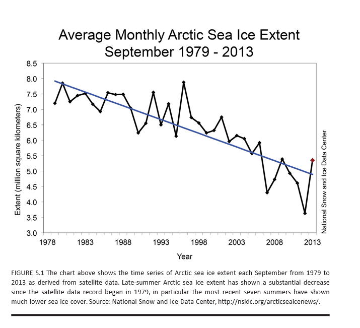
The main abrupt climate change noted in AICH is rapid decline of the Artic sea ice. AICH puts up a chart which is one of the clearest examples of a trend you can pull from environmental science, I would think.

ArticSeaIce

AICH also puts species extinction front and center as a near-term and certain discontinuous effect of current trends.

Apart from melting of the Artic sea ice and species extinction, AICH lists destabilization of the Antarctic ice sheet as a nearer term possibility with dramatic consequences. Because a lot of this ice in the Antarctic is underwater, apparently, it is more at risk than, say, the Greenland ice sheet. Melting of either one (or both) of these ice sheets would raise sea levels tens of meters – an estimated 60 meters with melting of both.

Two other possibilities mentioned in previous NRC reports on abrupt climate change are discussed and evaluated as low probability developments until after 2100. These are stopping of the ocean currents that circulate water in the Atlantic, warming northern Europe, and release of methane from permafrost or deep ocean deposits.

The AMOC is the ocean circulation pattern that involves the northward flow of warm near-surface waters into the northern North Atlantic and Nordic Seas, and the south- ward flow at depth of the cold dense waters formed in those high latitude regions. This circulation pattern plays a critical role in the global transport of oceanic heat, salt, and carbon. Paleoclimate evidence of temperature and other changes recorded in North Atlantic Ocean sediments, Greenland ice cores and other archives suggest that the AMOC abruptly shut down and restarted in the past—possibly triggered by large pulses of glacial meltwater or gradual meltwater supplies crossing a threshold—raising questions about the potential for abrupt change in the future.

Despite these concerns, recent climate and Earth system model simulations indicate that the AMOC is currently stable in the face of likely perturbations, and that an abrupt change will not occur in this century. This is a robust result across many different models, and one that eases some of the concerns about future climate change.

With respect to the methane deposits in Siberia and elsewhere,

Large amounts of carbon are stored at high latitudes in potentially labile reservoirs such as permafrost soils and methane-containing ices called methane hydrate or clathrate, especially offshore in ocean marginal sediments. Owing to their sheer size, these carbon stocks have the potential to massively affect Earth’s climate should they somehow be released to the atmosphere. An abrupt release of methane is particularly worrisome because methane is many times more potent than carbon dioxide as a greenhouse gas over short time scales. Furthermore, methane is oxidized to carbon dioxide in the atmosphere, representing another carbon dioxide pathway from the biosphere to the atmosphere.

According to current scientific understanding, Arctic carbon stores are poised to play a significant amplifying role in the century-scale buildup of carbon dioxide and methane in the atmosphere, but are unlikely to do so abruptly, i.e., on a timescale of one or a few decades. Although comforting, this conclusion is based on immature science and sparse monitoring capabilities. Basic research is required to assess the long-term stability of currently frozen Arctic and sub-Arctic soil stocks, and of the possibility of increasing the release of methane gas bubbles from currently frozen marine and terrestrial sediments, as temperatures rise.

So some bad news and, I suppose, good news – more time to address what would certainly be completely catastrophic to the global economy and world population.

AICH has some neat graphics and pictoral exhibits.

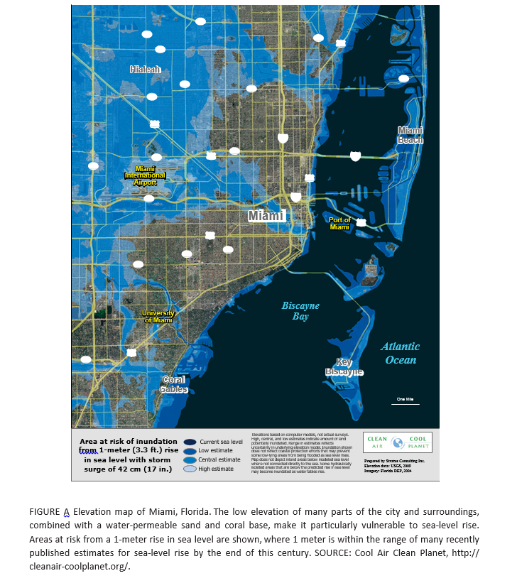
For example, Miami Florida will be largely underwater within a few decades, according to many standard forecasts of increases in sea level (click to enlarge).

Florida

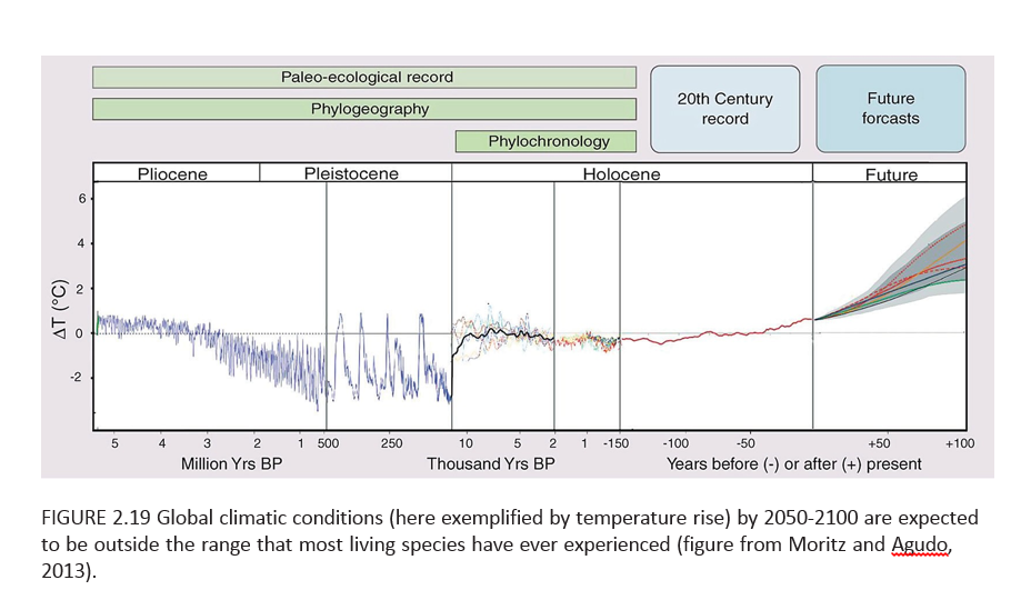
But perhaps most chilling of all (actually not a good metaphor here but you know what I mean) is a graphic I have not seen before, but which dovetails with my initial comments and observations of physicists.

This chart toward the end of the AICH report projects increase in global temperature beyond any past historic level (or prehistoric, for that matter) by the end of the century.

TempRise

So, for sure, there will be species extinction in the near term, hopefully not including the human species just yet.

Economic Impacts

In closing, I do think the primary obstacle to a sober evaluation of climate change involves social and economic implications. The climate change deniers may be right – acknowledging and adequately planning for responses to climate change would involve significant changes in social control and probably economic organization.

Of course, the AICH adopts a more moderate perspective – let’s be sure and set up monitoring of all this, so we can be prepared.

Hopefully, that will happen to some degree.

But adopting a more pro-active stance seems unlikely, at least in the near term. There is a wholesale rush to bringing one to several trillion persons who are basically living in huts with dirt floors into “the modern world.” Their children are traveling to cities, where they will earn much higher incomes, probably, and send money back home. The urge to have a family is almost universal, almost a concomitant of healthy love of a man and a woman. Tradeoffs between economic growth and environmental quality are a tough sell, when there are millions of new consumers and workers to be incorporated into the global supply chain. The developed nations – where energy and pollution output ratios are much better – are not persuasive when they suggest a developing giant like India or China should tow the line, limit energy consumption, throttle back economic growth in order to have a cooler future for the planet. You already got yours Jack, and now you want to cut back? What about mine? As standards of living degrade in the developed world with slower growth there, and as the wealthy grab more power in the situation, garnering even more relative wealth, the political dialogue gets stuck, when it comes to making changes for the good of all.

I could continue, and probably will sometime, but it seems to me that from a longer term forecasting perspective darker scenarios could well be considered. I’m sure we will see quite a few of these. One of the primary ones would be a kind of devolution of the global economy – the sort of thing one might expect if air travel were less possible because of, say, a major uptick in volcanism, or huge droughts took hold in parts of Asia.

Again and again, I come back to the personal thought of local self-reliance. There has been a growth with global supply chains and various centralizations, mergers, and so forth toward de-skilling populations, pushing them into meaningless service sector jobs (fast food), and losing old knowledge about, say, canning fruits and vegetables, or simply growing your own food. This sort of thing has always been a sort of quirky alternative to life in the fast lane. But inasmuch as life in the fast lane involves too much energy use for too many people to pursue, I think decentralized alternatives for lifestyle deserve a serious second look.

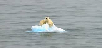
Polar bear on ice flow at top from http://metro.co.uk/2010/03/03/polar-bears-cling-to-iceberg-as-climate-change-ruins-their-day-141656/