Tag Archives: macroeconomic forecasts

“The Record of Failure to Predict Recessions is Virtually Unblemished”

That’s Prakash Loungani from work published in 2001.

Recently, Loungani , working with Hites Ahir, put together an update – “Fail Again, Fail Better, Forecasts by Economists During the Great Recession” reprised in a short piece in VOX – “There will be growth in the spring”: How well do economists predict turning points?

Hites and Loungani looked at the record of professional forecasters 2008-2012. Defining recessions as a year-over-year fall in real GDP, there were 88 recessions in this period. Based on country-by-country predictions documented by Consensus Forecasts, economic forecasters were right less than 10 percent of the time, when it came to forecasting recessions – even a few months before their onset.

recessions

The chart on the left shows the timing of the 88 recession years, while the chart on the right shows the number of recession predicted by economists by the September of the previous year.

..none of the 62 recessions in 2008–09 was predicted as the previous year was drawing to a close. However, once the full realisation of the magnitude and breadth of the Great Recession became known, forecasters did predict by September 2009 that eight countries would be in recession in 2010, which turned out to be the right call in three of these cases. But the recessions in 2011–12 again came largely as a surprise to forecasters.

This type of result holds up to robustness checks

•First, lowering the bar on how far in advance the recession is predicted does not appreciably improve the ability to forecast turning points.

•Second, using a more precise definition of recessions based on quarterly data does not change the results.

•Third, the failure to predict turning points is not particular to the Great Recession but holds for earlier periods as well.

Forecasting Turning Points

How can macroeconomic and business forecasters consistently get it so wrong?

Well, the data is pretty bad, although there is more and more of it available and with greater time depths and higher frequencies. Typically, government agencies doing the national income accounts – the Bureau of Economic Analysis (BEA) in the United States – release macroeconomic information at one or two months lag (or more). And these releases usually involve revision, so there may be preliminary and then revised numbers.

And the general accuracy of GDP forecasts is pretty low, as Ralph Dillon of Global Financial Data (GFD) documents in the following chart, writing,

Below is a chart that has 5 years of quarterly GDP consensus estimates and actual GDP [for the US]. In addition, I have also shown in real dollars the surprise in both directions. The estimate vs actual with the surprise indicating just how wrong consensus was in that quarter.

RalphDillon

Somehow, though, it is hard not to believe economists are doing something wrong with their almost total lack of success in predicting recessions. Perhaps there is a herding phenomenon, coupled with a distaste for being a bearer of bad tidings.

Or maybe economic theory itself plays a role. Indeed, earlier research published on Vox suggests that application of about 50 macroeconomic models to data preceding the recession of 2008-2009, leads to poor results in forecasting the downturn in those years, again even well into that period.

All this suggests economics is more or less at the point medicine was in the 1700’s, when bloodletting was all the rage..

quack_bleeding_sm

In any case, this is the planned topic for several forthcoming posts, hopefully this coming week – forecasting turning points.

Note: The picture at the top of this post is Peter Sellers in his last role as Chauncey Gardiner – the simple-minded gardener who by an accident and stroke of luck was taken as a savant, and who said to the President – “There will be growth in the spring.”

Automation, Robotics -Trends and Impacts

Trying to figure out the employment impacts of automation, computerization, and robotics is challenging, to say the least.

There are clear facts, such as the apparent permanent loss of jobs in US manufacturing since the early 1990’s.

MANEMP

But it would be short-sighted to conclude these jobs have been lost to increased use of computers and robots in production.

That’s because, for one thing, you might compare a chart like the above with statistics on Chinese manufacturing.

Chinesemanemp

Now you can make a case – if you focus on the urban Chinese manufacturing employment – that these two charts are more or less mirror images of one another in recent years. That is urban manufacturing employment in China, according the US BLS, increased about 4 mllion 2002-2009, while US manufacturing employment dropped by about that amount over the same period.

Of course, there are other off-shore manufacturing sites of importance, such as the maquiladoras along the US border with Mexico.

But what brings robotics into focus for me is that significant automation and robotics are being installed in factories in China.

Terry Guo, head of Foxconn – the huge Chinese contract manufacturer making the I-phone and many other leading electronics products – has called for installation of a million industrial robots in Foxconn factories over the next few years.

In fact, Foxconn apparently is quietly partnering with Google to help bring its vision of robotics to life.

Decoupling of Productivity and Employment?

Erik Brynjolfsson at MIT is an expert on the productivity implications of information technology (IT).

About a year ago, the MIT Technology Review ran an article How Technology Is Destroying Jobs featuring the perspective developed recently by Brynjolfsson that there is increasingly a disconnect between productivity growth and jobs in the US.

The article featured two infographics – one of which I reproduce here.

info

There have been highly focused studies of the effects of computerization on specific industries.

Research published just before the recent economic crisis did an in-depth regarding automation or computerization in a “valve industry,” arriving at three, focused findings.

First, plants that adopt new IT-enhanced equipment also shift their business strategies by producing more customized valve products. Second, new IT investments improve the efficiency of all stages of the production process by reducing setup times, run times, and inspection times. The reductions in setup times are theoretically important because they make it less costly to switch production from one product to another and support the change in business strategy to more customized production. Third, adoption of new IT-enhanced capital equipment coincides with increases in the skill requirements of machine operators, notably technical and problem-solving skills, and with the adoption of new human resource practices to support these skills

This is the positive side of the picture.

No more drudgery on assembly lines with highly repetitive tasks. Factory workers are being upgraded to computer operatives.

More to follow.

US Growth Stalls

The US Bureau of Economic Analysis (BEA) announced today that,

Real gross domestic product — the output of goods and services produced by labor and property located in the United States — increased at an annual rate of 0.1 percent in the first quarter (that is, from the fourth quarter of 2013 to the first quarter of 2014), according to the “advance” estimate released by the Bureau of Economic Analysis.  In the fourth quarter, real GDP increased 2.6 percent.

This flatline growth number is in stark contrast to the median forecast of 83 economists surveyed by Bloomberg, which called for a 1.2 percent increase for the first quarter.

Bloomberg writes in a confusingly titled report – Dow Hits Record as Fed Trims Stimulus as Economy Improves

The pullback in growth came as snow blanketed much of the eastern half of the country, keeping shoppers from stores, preventing builders from breaking ground and raising costs for companies including United Parcel Service Inc. Another report today showing a surge in regional manufacturing this month adds to data on retail sales, production and employment that signal a rebound is under way as temperatures warm.

Here’s is the BEA table of real GDP, along with the advanced estimates for the first quarter 2014 (click to enlarge).

usgdp

The large negative slump in investment in equipment (-5.5) indicates to me something more is going on than bad weather.

Indeed, Econbrowser notes that,

Both business fixed investment and new home construction fell in the quarter, which would be ominous developments if they’re repeated through the rest of this year. And a big drop in exports reminds us that America is not immune to weakness elsewhere in the world.

Even the 2% growth in consumption spending is not all that encouraging. As Bricklin Dwyer of BNP Paribas noted, 1.1% of that consumption growth– more than half– was attributed to higher household expenditures on health care.

What May Be Happening

I think there is some amount of “happy talk” about the US economy linked to the urgency about reducing Fed bond purchases. So just think of what might happen if the federal funds rate is still at the zero bound when another recession hits. What tools would the Fed have left? Somehow the Fed has to position itself rather quickly for the inevitable swing of the business cycle.

I have wondered, therefore, whether some of the pronouncements recently from the Fed did not have a unrealistic slant.

So, as the Fed unwinds quantitative easing (QE), dropping bond (mortgage-backed securities) purchases to zero, surely there will be further impacts on the housing markets.

Also, China is not there this time to take up the slack.

And it is always good to remember that new employment numbers are basically a lagging indicator of the business cycle.

Let’s hope for a better second and third quarter, and that this flatline growth for the first quarter is a blip.

Forecasting Controversies – Impacts of QE

Where there is smoke, there is fire, and other similar adages are suggested by an arcane statistical controversy over quantitative easing (QE) by the US Federal Reserve Bank.

Some say this Fed policy, estimated to have involved $3.7 trillion dollars in asset purchases, has been a bust, a huge waste of money, a give-away program to speculators, but of no real consequence to Main Street.

Others credit QE as the main force behind lower long term interest rates, which have supported US housing markets.

Into the fray jump two elite econometricians – Johnathan Wright of Johns Hopkins and Christopher Neeley, Vice President of the St. Louis Federal Reserve Bank.

The controversy provides an ersatz primer in estimation and forecasting issues with VAR’s (vector autoregressions). I’m not going to draw out all the nuances, but highlight the main features of the argument.

The Effect of QE Announcements From the Fed Are Transitory – Lasting Maybe Two or Three Months

Basically, there is the VAR (vector autoregression) analysis of Johnathan Wright of Johns Hopkins Univeristy, which finds that  –

..stimulative monetary policy shocks lower Treasury and corporate bond yields, but the effects die o¤ fairly fast, with an estimated half-life of about two months.

This is in a paper What does Monetary Policy do to Long-Term Interest Rates at the Zero Lower Bound? made available in PDF format dated May 2012.

More specifically, Wright finds that

Over the period since November 2008, I estimate that monetary policy shocks have a significant effect on ten-year yields and long-maturity corporate bond yields that wear o¤ over the next few months. The effect on two-year Treasury yields is very small. The initial effect on corporate bond yields is a bit more than half as large as the effect on ten-year Treasury yields. This finding is important as it shows that the news about purchases of Treasury securities had effects that were not limited to the Treasury yield curve. That is, the monetary policy shocks not only impacted Treasury rates, but were also transmitted to private yields which have a more direct bearing on economic activity. There is slight evidence of a rotation in breakeven rates from Treasury Inflation Protected Securities (TIPS), with short-term breakevens rising and long-term forward breakevens falling.

Not So, Says A Federal Reserve Vice-President

Christopher Neeley at the St. Louis Federal Reserve argues Wright’s VAR system is unstable and has poor performance in out-of-sample predictions. Hence, Wright’s conclusions cannot be accepted, and, furthermore, that there are good reasons to believe that QE has had longer term impacts than a couple of months, although these become more uncertain at longer horizons.

ChristopherNeely

Neeley’s retort is in a Federal Reserve working paper How Persistent are Monetary Policy Effects at the Zero Lower Bound?

A key passage is the following:

Specifically, although Wright’s VAR forecasts well in sample, it forecasts very poorly out-of-sample and fails structural stability tests. The instability of the VAR coefficients imply that any conclusions about the persistence of shocks are unreliable. In contrast, a naïve, no-change model out-predicts the unrestricted VAR coefficients. This suggests that a high degree of persistence is more plausible than the transience implied by Wright’s VAR. In addition to showing that the VAR system is unstable, this paper argues that transient policy effects are inconsistent with standard thinking about risk-aversion and efficient markets. That is, the transient effects estimated by Wright would create an opportunity for risk-adjusted  expected returns that greatly exceed values that are consistent with plausible risk aversion. Restricted VAR models that are consistent with reasonable risk aversion and rational asset pricing, however, forecast better than unrestricted VAR models and imply a more plausible structure. Even these restricted models, however, do not outperform naïve models OOS. Thus, the evidence supports the view that unconventional monetary policy shocks probably have fairly persistent effects on long yields but we cannot tell exactly how persistent and our uncertainty about the effects of shocks grows with the forecast horizon.

And, it’s telling, probably, that Neeley attempts to replicate Wright’s estimation of a VAR with the same data, checking the parameters, and then conducting additional tests to show that this model cannot be trusted – it’s unstable.

Pretty serious stuff.

Neeley gets some mileage out of research he conducted at the end of the 1990’s in Predictability in International Asset Returns: A Re-examination where he again called into question the longer term forecasting capability of VAR models, given their instabilities.

What is a VAR model?

We really can’t just highlight this controversy without saying a few words about VAR models.

A simple autoregressive relationship for a time series yt can be written as

yt = a1yt-1+..+anyt-n + et

Now if we have other variables (wt, zt..) and we write yt and all these other variables as equations in which the current values of these variables are functions of lagged values of all the variables.

The matrix notation is somewhat hairy, but that is a VAR. It is a system of autoregressive equations, where each variable is expressed as a linear sum of lagged terms of all the other variables.

One of the consequences of setting up a VAR is there are lots of parameters to estimate. So if p lags are important for each of three variables, each equation contains 3p parameters to estimate, so altogether you need to estimate 9p parameters – unless it is reasonable to impose certain restrictions.

Another implication is that there can be reduced form expressions for each of the variables – written only in terms of their own lagged values. This, in turn, suggests construction of impulse-response functions to see how effects propagate down the line.

Additionally, there is a whole history of Bayesian VAR’s, especially associated with the Minneapolis Federal Reserve and the University of Minnesota.

My impression is that, ultimately, VAR’s were big in the 1990’s, but did not live up to their expectations, in terms of macroeconomic forecasting. They gave way after 2000 to the Stock and Watson type of factor models. More variables could be encompassed in factor models than VAR’s, for one thing. Also, factor models often beat the naïve benchmark, while VAR’s frequently did not, at least out-of-sample.

The Naïve Benchmark

The naïve benchmark is a martingale, which often boils down to a simple random walk. The best forecast for the next period value of a martingale is the current period value.

This is the benchmark which Neeley shows the VAR model does not beat, generally speaking, in out-of-sample applications.

Naive

When the ratio is 1 or greater, this means that the mean square forecast error of the VAR is greater than the benchmark model.

Reflections

There are many fascinating details of these papers I am not highlighting. As an old Republican Congressman once said, “a billion here and a billion there, and pretty soon you are spending real money.”

So the defense of QE in this instance boils down to invalidating an analysis which suggests the impacts of QE are transitory, lasting a few months.

There is no proof, however, that QE has imparted lasting impacts on long term interest rates developed in this relatively recent research.

Inflation/Deflation – 3

Business forecasters often do not directly forecast inflation, but usually are consumers of inflation forecasts from specialized research organizations.

But there is a level of literacy that is good to achieve on the subject – something a quick study of recent, authoritative sources can convey.

A good place to start is the following chart of US Consumer Price Index (CPI) and the GDP price index, both expressed in terms of year-over-year (yoy) percentage changes. The source is the St. Louis Federal Reserve FRED data site.

InflationFRED

The immediate post-WW II period and the 1970;s and 1980’s saw surging inflation. Since somewhere in the 1980’s and certainly after the early 1990’s, inflation has been on a downward trend.

Some Stylized Facts About Forecasting Inflation

James Stock and Mark Watson wrote an influential NBER (National Bureau of Economic Research) paper in 2006 titled Why Has US Inflation Become Harder to Forecast.

These authors point out that the rate of price inflation in the United States has become both harder and easier to forecast, depending on one’s point of view.

On the one hand, inflation (along with many other macroeconomic time series) is much less volatile than it was in the 1970s or early 1980s, and the root mean squared error of naïve inflation forecasts has declined sharply since the mid-1980s. In this sense, inflation has become easier to forecast: the risk of inflation forecasts, as measured by mean squared forecast errors (MSFE), has fallen.

On the other hand, multivariate forecasting models inspired by economic theory – such as the Phillips curve –lose ground to univariate forecasting models after the middle 1980’s or early 1990’s. The Phillips curve, of course, postulates a tradeoff between inflation and economic activity and is typically parameterized in inflationary expectations and the gap between potential and actual GDP.

A more recent paper Forecasting Inflation evaluates sixteen inflation forecast models and some judgmental projections. Root mean square prediction errors (RMSE’s) are calculated in quasi-realtime recursive out-of-sample data – basically what I would call “backcasts.” In other words, the historic data is divided into training and test samples. The models are estimated on the various possible training samples (involving, in this case, consecutive data) and forecasts from these estimated models are matched against the out-of-sample or test data.

The study suggests four principles. 

  1. Subjective forecasts do the best
  2. Good forecasts must account for a slowly varying local mean.
  3. The Nowcast is important and typically utilizes different techniques than standard forecasting
  4.  Heavy shrinkage in the use of information improves inflation forecasts

Interestingly, this study finds that judgmental forecasts (private sector surveys and the Greenbook) are remarkably hard to beat. Otherwise, most of the forecasting models fail to consistently trump a “naïve forecast” which is the average inflation rate over four previous periods.

What This Means

I’m willing to offer interpretations of these findings in terms of (a) the resilience of random walk models, and (b) the eclipse of unionized labor in the US.

So forecasting inflation as an average of several previous values suggests the underlying stochastic process is some type of random walk. Thus, the optimal forecast for a simple random walk is the most currently observed value. The optimal forecast for a random walk with noise is an exponentially weighted average of the past values of the series.

The random walk is a recurring theme in many macroeconomic forecasting contexts. It’s hard to beat.

As far as the Phillips curve goes, it’s not clear to me that the same types of tradeoffs between inflation and unemployment exist in the contemporary US economy, as did, say, in the 1950’s or 1960’s. The difference, I would guess, is the lower membership in and weaker power of unions. After the 1980’s, things began to change significantly on the labor front. Companies exacted concessions from unions, holding out the risk that the manufacturing operation might be moved abroad to a lower wage area, for instance. And manufacturing employment, the core of the old union power, fell precipitously.

As far as the potency of subjective forecasts – I’ll let Faust and Wright handle that. While these researchers find what they call subjective forecasts beat almost all the formal modeling approaches, I’ve seen other evaluations calling into question whether any inflation forecast beats a random walk approach consistently. I’ll have to dig out the references to make this stick.

Hyperinflation and Asset Bubbles

According to Mizuno et al, the worst inflation in recent history occurred in Hungary after World War II. The exchange rate for the Hungarian Pengo to the US dollar rose from 100 in July 1945 to 6 x 1024 Pengos per dollar by July 1946.

Hyperinflations are triggered by inflationary expectations.  Past increases in prices influence expectations about future prices. These expectations trigger market behavior which accelerate price increases in the current period, in a positive feedback loop. Bounds on inflationary expectations are loosened by legitimacy issues relating to the state or social organization.

Hyperinflation can become important for applied forecasting in view of the possibility of smaller countries withdrawing from the Euro.

However, that is not the primary reason I want to address this topic at this point in time.

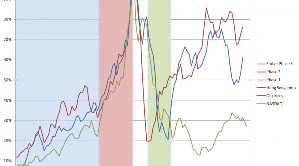
Rather, episodes of hyperinflation share broad and interesting similarities to the movement of prices in asset bubbles – like the dotcom bubble of the late 1990’s, the Hong Kong Hang Seng Stock Market Index from 1970 to 2000, and housing price bubbles in the US, Spain, Ireland, and elsewhere more recently.

Hyperinflations exhibit faster than exponential growth in prices to some point, at which time the regime shifts. This is analogous to the faster than exponential growth of asset prices in asset bubbles, and has a similar basis. Thus, in an asset bubble, the growth of prices becomes the focus of action. Noise or momentum traders become active, buying speculatively, often financing with Ponzi-like schemes. In a hyperinflation, inflation and its acceleration gets written into to the pricing equation. People stockpile and place advance orders  and, on the supply side, markup prices assuming rising factor costs.

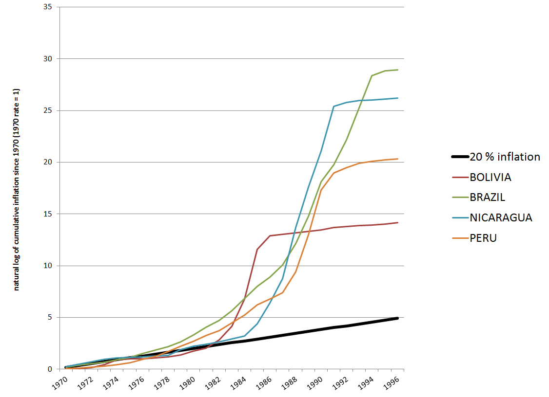
The following is a logarithmic chart of inflation indexes in four South and Central American countries from 1970 to 1996 based on archives of the IMF World Economic Outlook (click to enlarge).

The straight line indicates an exponential growth of prices of 20 percent per year, underlining the faster than exponential growth in the other curves.

Hyper

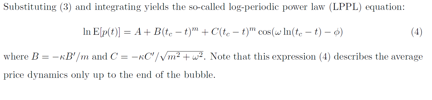
After an initial period, each of these hyperinflation curves exhibit similar mathematical properties. Mizuno et al fit negative double exponentials of the following form to the price data.

negdexp

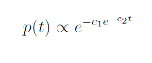
Sornette, Takayasu, and Zhouargue that the double exponential is “nothing but a discrete-time approximation of a general power law growth endowed with a finite-time singularity at some critical time tc.”

This enables the authors to develop an analysis which not only fits the ramping prices in each country, but also to predicts the end of the hyperinflation with varying success.

The rationale for this is simply that unleashing inflationary expectations, beyond a certain point, follows a common mathematical theme, and ends at a predictable point.

It is true that simple transformations render these hyperinflation curves very similar, as shown in the following chart.

scaledHyper

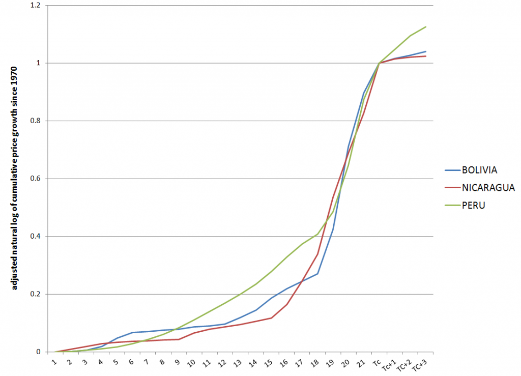
Here I scale the logs of the cumulative price growth for Bolivia, Nicaragua, and Peru, adjusting them to the same time period (22 years). Clearly, the hyperinflation becomes more predictable after several years, and the takeoff rate to collapse seems to be approximately the same.

The same type of simple transformations would appear to regularize the market bubbles in the Macrotrends chart, although I have not yet collected all the data.

In reading the literature on asset bubbles, there is a split between so-called rational bubbles, and asset bubbles triggered, in some measure, by “bounded rationality” or what economists are prone to call “irrationality.”

Examples of how “irrational” agents might proceed to fuel an asset bubble are given in a selective review of the asset bubble literature developed recently by Anna Scherbina from which I take several extracts below.

For example, there is “feedback trading” involving traders who react solely to past price movements (momentum traders?). Scherbina writes,

In response to positive news, an asset experiences a high initial return. This is noticed by a group of feedback traders who assume that the high return will continue and, therefore, buy the asset, pushing prices above fundamentals. The further price increase attracts additional feedback traders, who also buy the asset and push prices even higher, thereby attracting subsequent feedback traders, and so on. The price will keep rising as long as more capital is being invested. Once the rate of new capital inflow slows down, so does the rate of price growth; at this point, capital might start flowing out, causing the bubble to deflate.

Other mechanisms are biased self-attribution and the representativeness heuristic. In biased self-attribution,

..people to take into account signals that confirm their beliefs and dismiss as noise signals that contradict their beliefs…. Investors form their initial beliefs by receiving a noisy private signal about the value of a security.. for example, by researching the security. Subsequently, investors receive a noisy public signal…..[can be]  assumed to be almost pure noise and therefore should be ignored. However, since investors suffer from biased self-attribution, they grow overconfident in their belief after the public signal confirms their private information and further revise their valuation in the direction of their private signal. When the public signal contradicts the investors’ private information, it is appropriately ignored and the price remains unchanged. Therefore, public signals, in expectation, lead to price movements in the same direction as the initial price response to the private signal. These subsequent price moves are not justified by fundamentals and represent a bubble. The bubble starts to deflate after the accumulated public signals force investors to eventually grow less confident in their private signal.

Scherbina describes the representativeness heuristic as follows.

 The fourth model combines two behavioral phenomena, the representativeness heuristic and the conservatism bias. Both phenomena were previously documented in psychology and represent deviations from optimal Bayesian information processing. The representativeness heuristic leads investors to put too much weight on attention-grabbing (“strong”) news, which causes overreaction. In contrast, conservatism bias captures investors’ tendency to be too slow to revise their models, such that they underweight relevant but non-attention-grabbing (routine) evidence, which causes underreaction… In this setting, a positive bubble will arise purely by chance, for example, if a series of unexpected good outcomes have occurred, causing investors to over-extrapolate from the past trend. Investors make a mistake by ignoring the low unconditional probability that any company can grow or shrink for long periods of time. The mispricing will persist until an accumulation of signals forces investors to switch from the trending to the mean-reverting model of earnings.

Interesting, several of these “irrationalities” can generate negative, as well as positive bubbles.

Finally, Scherbina makes an important admission, namely that

 The behavioral view of bubbles finds support in experimental studies. These studies set up artificial markets with finitely-lived assets and observe that price bubbles arise frequently. The presence of bubbles is often attributed to the lack of common knowledge of rationality among traders. Traders expect bubbles to arise because they believe that other traders may be irrational. Consequently, optimistic media stories and analyst reports may help create bubbles not because investors believe these views but because the optimistic stories may indicate the existence of other investors who do, destroying the common knowledge of rationality.

I dwell on these characterizations because I think it is important to put to rest the nonsensical “perfect information, perfect foresight, infinite time horizon discounting” models which litter this literature. Behavioral economics is a fresh breeze, for sure, in this context. And behavioral economics  seems to me linked with the more muscular systems dynamics and complexity theory approaches to bubbles, epitomized by the work of Sornette and his coauthors.

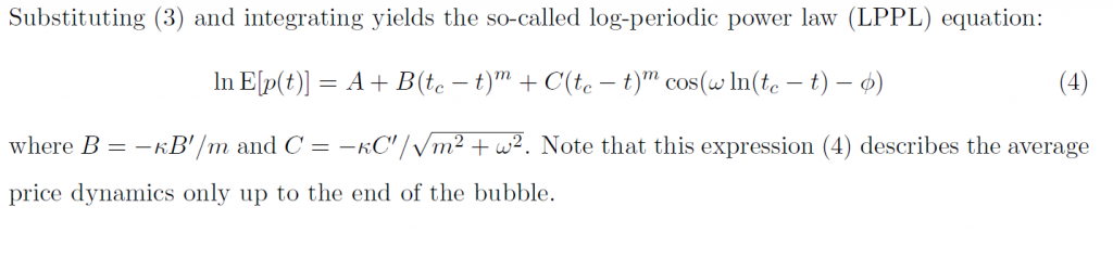
Let me then leave you with the fundamental equation for the price dynamics of an asset bubble.

Sornettepricedynamics

Links – end of March

US Economy and Social Issues

Reasons for Declining Labor Force Participation

LFchartVital Signs: Still No Momentum in Business Spending

investment

Urban Institute Study – How big is the underground sex economy in eight cities employs an advanced statistical design. It’s sort of a model study, really.

Americans Can’t Retire When Bill Gross Sees Repression

Feeble returns on the safest investments such as bank deposits and fixed-income securities represent a “financial repression” transferring money from savers to borrowers, says Bill Gross, manager of the world’s biggest bond fund.

Robert Reich – The New Billionaire Political Bosses

American democracy used to depend on political parties that more or less represented most of us. Political scientists of the 1950s and 1960s marveled at American “pluralism,” by which they meant the capacities of parties and other membership groups to reflect the preferences of the vast majority of citizens.

Then around a quarter century ago, as income and wealth began concentrating at the top, the Republican and Democratic Parties started to morph into mechanisms for extracting money, mostly from wealthy people.

Finally, after the Supreme Court’s “Citizen’s United” decision in 2010, billionaires began creating their own political mechanisms, separate from the political parties. They started providing big money directly to political candidates of their choice, and creating their own media campaigns to sway public opinion toward their own views.

Global Economy

Top global risks you can’t ignore – good, short read

How Can Africa’s Water and Sanitation Shortfall be Solved? – interesting comments by experts on the scene, including –

Most African water utilities began experiencing a nose-dive in the late 1970s under World Bank and IMF policies. Many countries were suffering from serious trade deficits which had enormous implications for their budgets, incomes, and their abilities to honour loan obligations to, among others, bilateral and multilateral partners. These difficulties for African countries coincided around that period, with a major shift in global economic thought; a shift from heterodox economic thinking which favoured state intervention in critical sectors of the economy, to neoliberal economic thought which is more hostile to state intervention and prefers the deregulation of markets and their unfettered operation. This thought became dominant in the IMF and World Bank and influenced structural adjustment austerity packages that the two institutions prescribed to the struggling African economies at the time. This point is fundamental and cannot be divorced from any comprehensive analysis of the access deficit in African countries.

The austerity measures enforced by the Bank and IMF ensured a drastic reduction of state funding to the utilities, resulting in deterioration of facilities, poor conditions for staff and a mass exodus of expert staff. In the face of the resulting difficulties, the Bank and IMF held out only one option for the governments; the option of full cost recovery and of privatisation. This sealed the expectations of any funding for the sector as the private sector found the water sector highly risky to invest in. Following the common interventions set out by the World Bank, the countries achieved mostly poor results.

Contrary to much mainstream discourse, neither privatisation nor commercialisation constitute an adequate or sustainable way of managing urban water utilities to ensure access to people in Africa given the extreme poverty that confronts a significant portion of the population. The solution lies in a progressive tax-supported water delivery system that ensures access for all, supported by a management structure and a balanced set of incentives that ensure performance.

Analytics

Machine Learning in 7 Pictures

Basic machine learning concepts of Bias vs Variance Tradeoff, Avoiding overfitting, Bayesian inference and Occam razor, Feature combination, Non-linear basis functions, and more – explained via pictures

The Universe

Great picture of the planet Mercury https://twitter.com/Iearnsomething/status/448165339290173440/photo/1

Mercury

Interest Rates – Forecasting and Hedging

A lot relating to forecasting interest rates is encoded in the original graph I put up, several posts ago, of two major interest rate series – the federal funds and the prime rates.

IratesFRED1

This chart illustrates key features of interest rate series and signals several important questions. Thus, there is relationship between a very short term rate and a longer term interest rates – a sort of two point yield curve. Almost always, the federal funds rate is below the prime rate. If for short periods this is not the case, it indicates a radical reversion of the typical slope of the yield curve.

Credit spreads are not illustrated in this figure, but have been shown to be significant in forecasting key macroeconomic variables.

The shape of the yield curve itself can be brought into play in forecasting future rates, as can typical spreads between interest rates.

But the bottom line is that interest rates cannot be forecast with much accuracy beyond about a two quarter forecast horizon.

There is quite a bit of research showing this to be true, including –

Professional Forecasts of Interest Rates and Exchange Rates: Evidence from the Wall Street Journal’s Panel of Economists

We use individual economists’ 6-month-ahead forecasts of interest rates and exchange rates from the Wall Street Journal’s survey to test for forecast unbiasedness, accuracy, and heterogeneity. We find that a majority of economists produced unbiased forecasts but that none predicted directions of changes more accurately than chance. We find that the forecast accuracy of most of the economists is statistically indistinguishable from that of the random walk model when forecasting the Treasury bill rate but that the forecast accuracy is significantly worse for many of the forecasters for predictions of the Treasury bond rate and the exchange rate. Regressions involving deviations in economists’ forecasts from forecast averages produced evidence of systematic heterogeneity across economists, including evidence that independent economists make more radical forecasts

Then, there is research from the London School of Economics Interest Rate Forecasts: A Pathology

In this paper we have demonstrated that, in the two countries and short data periods studied, the forecasts of interest rates had little or no informational value when the horizon exceeded two quarters (six months), though they were good in the next quarter and reasonable in the second quarter out. Moreover, all the forecasts were ex post and, systematically, inefficient, underestimating (overestimating) future outturns during up (down) cycle phases. The main reason for this is that forecasters cannot predict the timing of cyclical turning points, and hence predict future developments as a convex combination of autoregressive momentum and a reversion to equilibrium

Also, the Chapter in the Handbook of Forecasting Forecasting interest rates is relevant, although highly theoretical.

Hedging Interest Rate Risk

As if in validation of this basic finding – beyond about two quarters, interest rate forecasts generally do not beat a random walk forecast – interest rate swaps, are the largest category of interest rate contracts of derivatives, according to the Bank of International Settlements (BIS).

BIStable

Not only that, but interest rate contracts generally are, by an order of magnitude, the largest category of OTC derivatives – totaling more than a half a quadrillion dollars as of the BIS survey in July 2013.

The gross value of these contracts was only somewhat less than the Gross Domestic Product (GDP) of the US.

A Bank of International Settlements background document defines “gross market values” as follows;

Gross positive and negative market values: Gross market values are defined as the sums of the absolute values of all open contracts with either positive or negative replacement values evaluated at market prices prevailing on the reporting date. Thus, the gross positive market value of a dealer’s outstanding contracts is the sum of the replacement values of all contracts that are in a current gain position to the reporter at current market prices (and therefore, if they were settled immediately, would represent claims on counterparties). The gross negative market value is the sum of the values of all contracts that have a negative value on the reporting date (ie those that are in a current loss position and therefore, if they were settled immediately, would represent liabilities of the dealer to its counterparties).  The term “gross” indicates that contracts with positive and negative replacement values with the same counterparty are not netted. Nor are the sums of positive and negative contract values within a market risk category such as foreign exchange contracts, interest rate contracts, equities and commodities set off against one another. As stated above, gross market values supply information about the potential scale of market risk in derivatives transactions. Furthermore, gross market value at current market prices provides a measure of economic significance that is readily comparable across markets and products.

Clearly, by any account, large sums of money and considerable exposure are tied up in interest rate contracts in the over the counter (OTC) market.

A Final Thought

This link between forecastability and financial derivatives is interesting. There is no question but that, in practical terms, business is putting eggs in the basket of managing interest rate risk, as opposed to refining forecasts – which may not be possible beyond a certain point, in any case.

What is going to happen when the quantitative easing maneuvers of central banks around the world cease, as they must, and long term interest rates rise in a consistent fashion? That’s probably where to put the forecasting money.

Interest Rates – 2

I’ve been looking at forecasting interest rates, the accuracy of interest rate forecasts, and teasing out predictive information from the yield curve.

This literature can be intensely theoretical and statistically demanding. But it might be quickly summarized by saying that, for horizons of more than a few months, most forecasts (such as from the Wall Street Journal’s Panel of Economists) do not beat a random walk forecast.

At the same time, there are hints that improvements on a random walk forecast might be possible under special circumstances, or for periods of time.

For example, suppose we attempt to forecast the 30 year fixed mortgage rate monthly averages, picking a six month forecast horizon.

The following chart compares a random walk forecast with an autoregressive (AR) model.

30yrfixed2

Let’s dwell for a moment on some of the underlying details of the data and forecast models.

The thick red line is the 30 year fixed mortgage rate for the prediction period which extends from 2007 to the most recent monthly average in 2014 in January 2014. These mortgage rates are downloaded from the St. Louis Fed data site FRED.

This is, incidentally, an out-of-sample period, as the autoregressive model is estimated over data beginning in April 1971 and ending September 2007. The autoregressive model is simple, employing a single explanatory variable, which is the 30 year fixed rate at a lag of six months. It has the following form,

rt = k + βrt-6

where the constant term k and the coefficient β of the lagged rate rt-6 are estimated by ordinary least squares (OLS).

The random walk model forecast, as always, is the most current value projected ahead however many periods there are in the forecast horizon. This works out to using the value of the 30 year fixed mortgage in any month as the best forecast of the rate that will obtain six months in the future.

Finally, the errors for the random walk and autoregressive models are calculated as the forecast minus the actual value.

When an Autoregressive Model Beats a Random Walk Forecast

The random walk errors are smaller in absolute value than the autoregressive model errors over most of this out-of-sample period, but there are times when this is not true, as shown in the graph below.

30yrfixedARbetter

This chart itself suggests that further work could be done on optimizing the autoregressive model, perhaps by adding further corrections from the residuals, which themselves are autocorrelated.

However, just taking this at face value, it’s clear the AR model beats the random walk forecast when the direction of interest rates changes from a downward movement.

Does this mean that going forward, an AR model, probably considerably more sophisticated than developed for this exercise, could beat a random walk forecast over six month forecast horizons?

That’s an interesting and bankable question. It of course depends on the rate at which the Fed “withdraws the punch bowl” but it’s also clear the Fed is no longer in complete control in this situation. The markets themselves will develop a dynamic based on expectations and so forth.

In closing, for reference, I include a longer picture of the 30 year fixed mortgage rates, which as can be seen, resemble the whole spectrum of rates in having a peak in the early 1980’s and showing what amounts to trends before and after that.

30yrfixedFRED

Interest Rates – 1

Let’s focus on forecasting interest rates.

The first question, of course, is “which interest rate”?

So, there is a range of interest rates from short term rates to rates on longer term loans and bonds. The St. Louis Fed data service FRED lists 719 series under “interest rates.”

Interest rates, however, tend to move together over time, as this chart on the bank prime rate of interest and the federal funds rate shows.

IratesFRED1

There’s a lot in this chart.

There is the surge in interest rates at the beginning of the 1980’s. The prime rate rocketed to more than 20 percent, or, in the words of the German Chancellor at the time higher “than any year since the time of Jesus Christ.” This ramp-up in interest rates followed actions of the US Federal Reserve Bank under Paul Volcker – extreme and successful tactics to break the back of inflation running at a faster and faster pace in the 1970’s.

Recessions are indicated on this graph with shaded areas.

Also, almost every recession in this more than fifty year period is preceded by a spike in the federal funds rate – the rate under the control of or targeted by the central bank.

Another feature of this chart is the federal funds rate is almost always less than the prime rate, often by several percentages.

This makes sense because the federal funds rate is a very short term interest rate – on overnight loans by depository institutions in surplus at the Federal Reserve to banks in deficit at the end of the business day – surplus and deficit with respect to the reserve requirement.

The interest rate the borrowing bank pays the lending bank is negotiated, and the weighted average across all such transactions is the federal funds effective rate. This “effective rate” is subject to targets set by the Federal Reserve Open Market Committee. Fed open market operations influence the supply of money to bring the federal funds effective rate in line with the federal funds target rate.

The prime rate, on the other hand, is the underlying index for most credit cards, home equity loans and lines of credit, auto loans, and personal loans. Many small business loans are also indexed to the prime rate. The term of these loans is typically longer than “overnight,” i.e. the prime rate applies to longer term loans.

The Yield Curve

The relationship between interest rates on shorter term and longer term loans and bonds is a kind of predictive relationship. It is summarized in the yield curve.

The US Treasury maintains a page Daily Treasury Yield Curve Rates which documents the yield on a security to its time to maturity .. based on the closing market bid yields on actively traded Treasury securities in the over-the-counter market.

The current yield curve is shown by the blue line in the chart below, and can be contrasted with a yield curve seven years previously, prior to the financial crisis of 2008-09 shown by the red line.

YieldCurve

Treasury notes on this curve report that –

These market yields are calculated from composites of quotations obtained by the Federal Reserve Bank of New York. The yield values are read from the yield curve at fixed maturities, currently 1, 3 and 6 months and 1, 2, 3, 5, 7, 10, 20, and 30 years. This method provides a yield for a 10 year maturity, for example, even if no outstanding security has exactly 10 years remaining to maturity.

Short term yields are typically less than longer term yields because there is an opportunity cost in tying up money for longer periods.

However, on occasion, there is an inversion of the yield curve, as shown for March 21, 2007 in the chart.

Inversion of the yield curve is often a sign of oncoming recession – although even the Fed authorities, who had some hand in causing the increase in the short term rates at the time, appeared clueless about what was coming in Spring 2007.

Current Prospects for Interest Rates

Globally, we have experienced an extraordinary period of low interest rates with short term rates hovering just at the zero bound. Clearly, this cannot go on forever, so the longer term outlook is for interest rates of all sorts to rise.

The Survey of Professional Forecasters develops consensus forecasts of key macroeconomic indicators, such as interest rates.

The latest survey, from the first quarter of 2014, includes the following consensus projections for the 3-month Treasury bill and the 10-year Treasury bond rates.

SPFforecast

Bankrate.com has short articles predicting mortgage rates, car loans, credit card rates, and bonds over the next year or two. Mortgage rates might rise to 5 percent by the end of 2014, but that is predicated on a strong recovery in the economy, according to this site.

As anyone participating in modern civilization knows, a great deal depends on the actions of the US Federal Reserve bank. Currently, the Fed influences both short and longer term interest rates. Short term rates are keyed closely to the federal funds rate. Longer term rates are influenced by Fed Quantitative Easing (QE) programs of bond-buying. The Fed’s bond buying is scheduled to be cut back step-by-step (“tapering”) about $10 billion per month.

Actions of the Bank of Japan and the European central bank in Frankfurt also bear on global prospects and impacts of higher interest rates.

Interest rates, however, are not wholly controlled by central banks. Capital markets have a dynamic all their own, which makes forecasting interest rates an increasingly relevant topic.