Tag Archives: Medical predictive analytics

Bayesian Methods in Biomedical Research

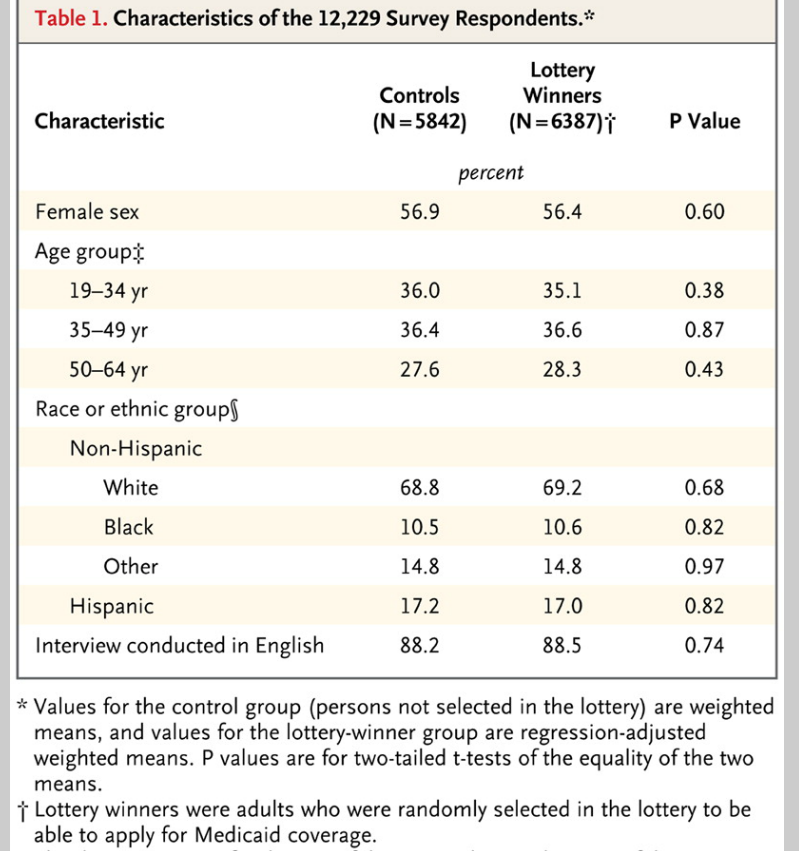
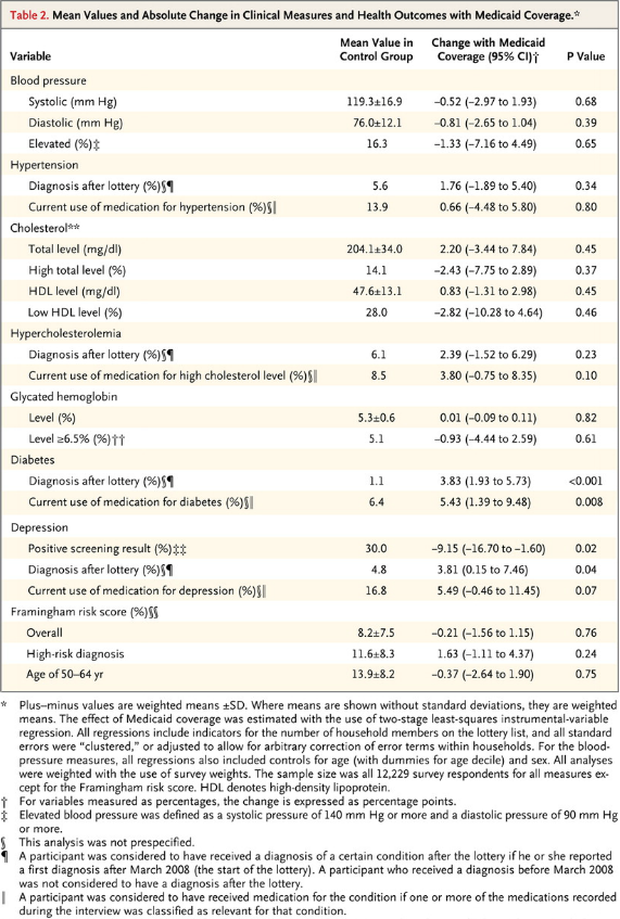
I’ve come across an interesting document – Guidance for the Use of Bayesian Statistics in Medical Device Clinical Trials developed by the Federal Drug Administration (FDA).

It’s billed as “Guidance for Industry and FDA Staff,” and provides recent (2010) evidence of the growing acceptance and success of Bayesian methods in biomedical research.

This document, which I’m just going to refer to as “the Guidance,” focuses on using Bayesian methods to incorporate evidence from prior research in clinical trials of medical equipment.

Bayesian statistics is an approach for learning from evidence as it accumulates. In clinical trials, traditional (frequentist) statistical methods may use information from previous studies only at the design stage. Then, at the data analysis stage, the information from these studies is considered as a complement to, but not part of, the formal analysis. In contrast, the Bayesian approach uses Bayes’ Theorem to formally combine prior information with current information on a quantity of interest. The Bayesian idea is to consider the prior information and the trial results as part of a continual data stream, in which inferences are being updated each time new data become available.

This Guidance focuses on medical devices and equipment, I think, because changes in technology can be incremental, and sometimes do not invalidate previous clinical trials of similar or earlier model equipment.

Thus,

When good prior information on clinical use of a device exists, the Bayesian approach may enable this information to be incorporated into the statistical analysis of a trial. In some circumstances, the prior information for a device may be a justification for a smaller-sized or shorter-duration pivotal trial.

Good prior information is often available for medical devices because of their mechanism of action and evolutionary development. The mechanism of action of medical devices is typically physical. As a result, device effects are typically local, not systemic. Local effects can sometimes be predictable from prior information on the previous generations of a device when modifications to the device are minor. Good prior information can also be available from studies of the device overseas. In a randomized controlled trial, prior information on the control can be available from historical control data.

The Guidance says that Bayesian methods are more commonly applied now because of computational advances – namely Markov Chain Monte Carlo (MCMC) sampling.

The Guidance also recommends that meetings be scheduled with the FDA for any Bayesian experimental design, where the nature of the prior information can be discussed.

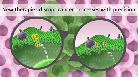
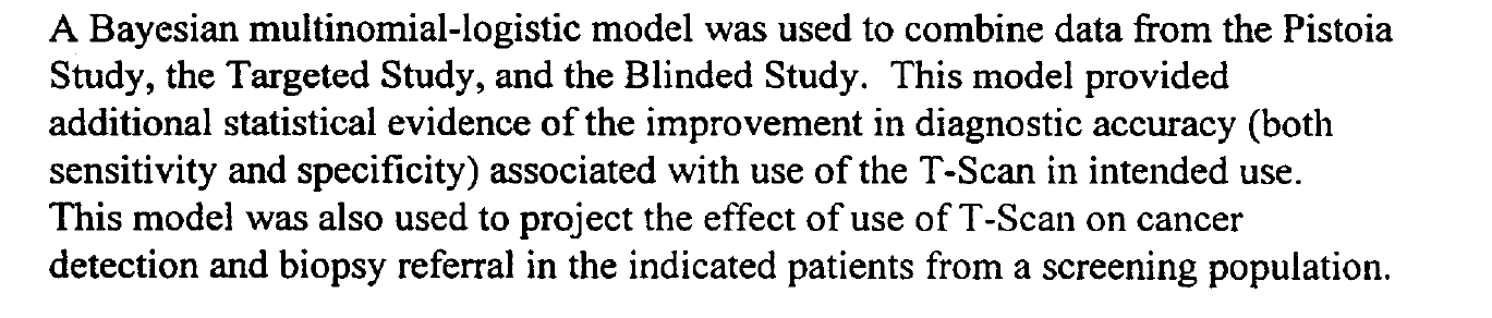
An example clinical study is referenced in the Guidance – relating to a multi-frequency impedence breast scanner. This study combined clinical trials conducted in Israel with US trials,

Israelistudy

The Guidance provides extensive links to the literature and to WinBUGS where BUGS stands for Bayesian Inference Using Gibbs Sampling.

Bayesian Hierarchical Modeling

One of the more interesting sections in the Guidance is the discussion of Bayesian hierarchical modeling. Bayesian hierarchical modeling is a methodology for combining results from multiple studies to estimate safety and effectiveness of study findings. This is definitely an analysis-dependent approach, involving adjusting results of various studies, based on similarities and differences in covariates of the study samples. In other words, if the ages of participants were quite different in one study than in another, the results of the study might be adjusted for this difference (by regression?).

An example of Bayesian hierarchical modeling is provided in approval of a device called for Cervical Interbody Fusion Instrumentation.

The BAK/Cervical (hereinafter called the BAK/C) Interbody Fusion System is indicated for use in skeletally mature patients with degenerative disc disease (DDD) of the cervical spine with accompanying radicular symptoms at one disc level.

The Summary of the FDA approval for this device documents extensive Bayesian hierarchical modeling.

Bottom LIne

Stephen Goodman from the Stanford University Medical School writes in a recent editorial,

“First they ignore you, then they laugh at you, then they fight you, then you win,” a saying reportedly misattributed to Mahatma Ghandi, might apply to the use of Bayesian statistics in medical research. The idea that Bayesian approaches might be used to “affirm” findings derived from conventional methods, and thereby be regarded as more authoritative, is a dramatic turnabout from an era not very long ago when those embracing Bayesian ideas were considered barbarians at the gate. I remember my own initiation into the Bayesian fold, reading with a mixture of astonishment and subversive pleasure one of George Diamond’s early pieces taking aim at conventional interpretations of large cardiovascular trials of the early 80’s..It is gratifying to see that the Bayesian approach, which saw negligible application in biomedical research in the 80’s and began to get traction in the 90’s, is now not just a respectable alternative to standard methods, but sometimes might be regarded as preferable.

There’s a tremendous video provided by Medscape (not easily inserted directly here) involving an interview with one of the original and influential medical Bayesians – Dr. George Diamond of UCLA.

Diamond

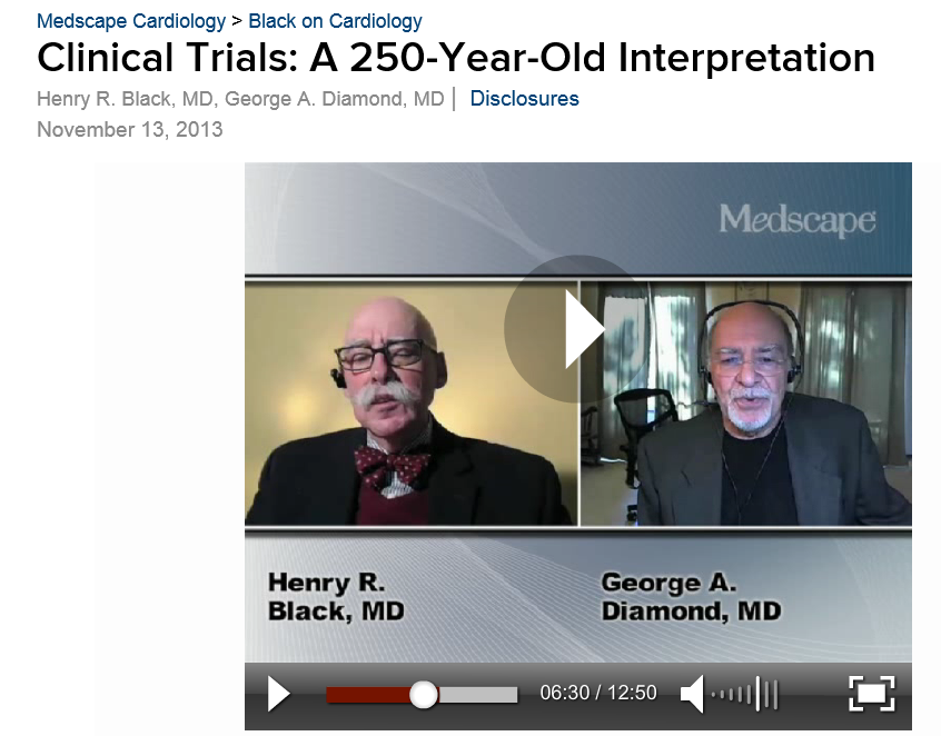
URL: http://www.medscape.com/viewarticle/813984


Predictive Models in Medicine and Health – Forecasting Epidemics

I’m interested in everything under the sun relating to forecasting – including sunspots (another future post). But the focus on medicine and health is special for me, since my closest companion, until her untimely death a few years ago, was a physician. So I pay particular attention to details on forecasting in medicine and health, with my conversations from the past somewhat in mind.

There is a major area which needs attention for any kind of completion of a first pass on this subject – forecasting epidemics.

Several major diseases ebb and flow according to a pattern many describe as an epidemic or outbreak – influenza being the most familiar to people in North America.

I’ve already posted on the controversy over Google flu trends, which still seems to be underperforming, judging from the 2013-2014 flu season numbers.

However, combining Google flu trends with other forecasting models, and, possibly, additional data, is reported to produce improved forecasts. In other words, there is information there.

In tropical areas, malaria and dengue fever, both carried by mosquitos, have seasonal patterns and time profiles that health authorities need to anticipate to stock supplies to keep fatalities lower and take other preparatory steps.

Early Warning Systems

The following slide from A Prototype Malaria Forecasting System illustrates the promise of early warning systems, keying off of weather and climatic predictions.

  malaria                     

There is a marked seasonal pattern, in other words, to malaria outbreaks, and this pattern is linked with developments in weather.

Researchers from the Howard Hughes Medical Institute, for example, recently demonstrated that temperatures in a large area of the tropical South Atlantic are directly correlated with the size of malaria outbreaks in India each year – lower sea surface temperatures led to changes in how the atmosphere over the ocean behaved and, over time, led to increased rainfall in India.

Another mosquito-borne disease claiming many thousands of lives each year is dengue fever.

And there is interesting, sophisticated research detailing the development of an early warning system for climate-sensitive disease risk from dengue epidemics in Brazil.

The following exhibits show the strong seasonality of dengue outbreaks, and a revealing mapping application, showing geographic location of high incidence areas.

dengue

This research used out-of-sample data to test the performance of the forecasting model.

The model was compared to a simple conceptual model of current practice, based on dengue cases three months previously. It was found that the developed model including climate, past dengue risk and observed and unobserved confounding factors, enhanced dengue predictions compared to model based on past dengue risk alone.

MERS

The latest global threat, of course, is MERS – or Middle East Respiratory Syndrome, which is a coronavirus, It’s transmission from source areas in Saudi Arabia is pointedly suggested by the following graphic.

MERS

The World Health Organization is, as yet, refusing to declare MERS a global health emergency. Instead, spokesmen for the organization say,

..that much of the recent surge in cases was from large outbreaks of MERS in hospitals in Saudi Arabia, where some emergency rooms are crowded and infection control and prevention are “sub-optimal.” The WHO group called for all hospitals to immediately strengthen infection prevention and control measures. Basic steps, such as washing hands and proper use of gloves and masks, would have an immediate impact on reducing the number of cases..

Millions of people, of course, will travel to Saudi Arabia for Ramadan in July and the hajj in October. Thirty percent of the cases so far diagnosed have resulted in fatalties.

Medical/Health Predictive Analytics – Logistic Regression

The case for assessing health risk with logistic regression is made by authors of a 2009 study, which is also a sort of model example for Big Data in diagnostic medicine.

As the variables that help predict breast cancer increase in number, physicians must rely on subjective impressions based on their experience to make decisions. Using a quantitative modeling technique such as logistic regression to predict the risk of breast cancer may help radiologists manage the large amount of information available, make better decisions, detect more cancers at early stages, and reduce unnecessary biopsies

This study – A Logistic Regression Model Based on the National Mammography Database Format to Aid Breast Cancer Diagnosis  – pulled together 62,219 consecutive mammography records from 48,744 studies in 18,270 patients reported using the Breast Imaging Reporting and Data System (BI-RADS) lexicon and the National Mammography Database format between April 5, 1999 and February 9, 2004.

The combination of medical judgment and an algorithmic diagnostic tool based on extensive medical records is, in the best sense, the future of medical diagnosis and treatment.

And logistic regression has one big thing going for it – a lot of logistic regressions have been performed to identify risk factors for various diseases or for mortality from a particular ailment.

A logistic regression, of course, maps a zero/one or categorical variable onto a set of explanatory variables.

This is not to say that there are not going to be speedbumps along the way. Interestingly, these are data science speedbumps, what some would call statistical modeling issues.

Picking the Right Variables, Validating the Logistic Regression

The problems of picking the correct explanatory variables for a logistic regression and model validation are linked.

The problem of picking the right predictors for a logistic regression is parallel to the problem of picking regressors in, say, an ordinary least squares (OLS) regression with one or two complications. You need to try various specifications (sets of explanatory variables) and utilize a raft of diagnostics to evaluate the different models. Cross-validation, utilized in the breast cancer research mentioned above, is probably better than in-sample tests. And, in addition, you need to be wary of some of the weird features of logistic regression.

A survey of medical research from a few years back highlights the fact that a lot of studies shortcut some of the essential steps in validation.

A Short Primer on Logistic Regression

I want to say a few words about how the odds-ratio is the key to what logistic regression is all about.

Logistic regression, for example, does not “map” a predictive relationship onto a discrete, categorical index, typically a binary, zero/one variable, in the same way ordinary least squares (OLS) regression maps a predictive relationship onto dependent variables. In fact, one of the first things one tends to read, when you broach the subject of logistic regression, is that, if you try to “map” a binary, 0/1 variable onto a linear relationship β01x12x2 with OLS regression, you are going to come up against the problem that the predictive relationship will almost always “predict” outside the [0,1] interval.

Instead, in logistic regression we have a kind of background relationship which relates an odds-ratio to a linear predictive relationship, as in,

ln(p/(1-p)) = β01x12x2

Here p is a probability or proportion and the xi are explanatory variables. The function ln() is the natural logarithm to the base e (a transcendental number), rather than the logarithm to the base 10.

The parameters of this logistic model are β0, β1, and β2.

This odds ratio is really primary and from the logarithm of the odds ratio we can derive the underlying probability p. This probability p, in turn, governs the mix of values of an indicator variable Z which can be either zero or 1, in the standard case (there being a generalization to multiple discrete categories, too).

Thus, the index variable Z can encapsulate discrete conditions such as hospital admissions, having a heart attack, or dying – generally, occurrences and non-occurrences of something.

Chinesemathteacher

It’s exactly analogous to flipping coins, say, 100 times. There is a probability of getting a heads on a flip, usually 0.50. The distribution of the number of heads in 100 flips is a binomial, where the probability of getting say 60 heads and 40 tails is the combination of 100 things taken 60 at a time, multiplied into (0.5)60*(0.5)40. The combination of 100 things taken 60 at a time equals 60!/(60!40!) where the exclamation mark indicates “factorial.”

Similarly, the probability of getting 60 occurrences of the index Z=1 in a sample of 100 observations is (p)60*(1-p)40multiplied by 60!/(60!40!).

The parameters βi in a logistic regression are estimated by means of maximum likelihood (ML).  Among other things, this can mean the optimal estimates of the beta parameters – the parameter values which maximize the likelihood function – must be estimated by numerical analysis, there being no closed form solutions for the optimal values of β0, β1, and β2.

In addition, interpretation of the results is intricate, there being no real consensus on the best metrics to test or validate models.

SAS and SPSS as well as software packages with smaller market shares of the predictive analytics space, offer algorithms, whereby you can plug in data and pull out parameter estimates, along with suggested metrics for statistical significance and goodness of fit.

There also are logistic regression packages in R.

But you can do a logistic regression, if the data are not extensive, with an Excel spreadsheet.

This can be instructive, since, if you set it up from the standpoint of the odds-ratio, you can see that only certain data configurations are suitable. These configurations – I refer to the values which the explanatory variables xi can take, as well as the associated values of the βi – must be capable of being generated by the underlying probability model. Some data configurations are virtually impossible, while others are inconsistent.

This is a point I find lacking in discussions about logistic regression, which tend to note simply that sometimes the maximum likelihood techniques do not converge, but explode to infinity, etc.

Here is a spreadsheet example, where the predicting equation has three parameters and I determine the underlying predictor equation to be,

ln(p/(1-p))=-6+3x1+.05x2

and we have the data-

logisticregmodel

Notice the explanatory variables x1 and x2 also are categorical, or at least, discrete, and I have organized the data into bins, based on the possible combinations of the values of the explanatory variables – where the number of cases in each of these combinations or populations is given to equal 10 cases. A similar setup can be created if the explanatory variables are continuous, by partitioning their ranges and sorting out the combination of ranges in however many explanatory variables there are, associating the sum of occurrences associated with these combinations. The purpose of looking at the data this way, of course, is to make sense of an odds-ratio.

The predictor equation above in the odds ratio can be manipulated into a form which explicitly indicates the probability of occurrence of something or of Z=1. Thus,

p= eβ0+β1×1+β2×2/(1+ eβ0+β1×1+β2×2)

where this transformation takes advantage of the principle that elny = y.

So with this equation for p, I can calculate the probabilities associated with each of the combinations in the data rows of the spreadsheet. Then, given the probability of that configuration, I calculate the expected value of Z=1 by the formula 10p. Thus, the mean of a binomial variable with probability p is np, where n is the number of trials. This sequence is illustrated below (click to enlarge).

sequence

Picking the “success rates” for each of the combinations to equal the expected value of the occurrences, given 10 “trials,” produces a highly consistent set of data.

Along these lines, the most valuable source I have discovered for ML with logistic regression is a paper by Scott
Czepiel – Maximum Likelihood Estimation of Logistic Regression Models: Theory and Implementation
.

I can readily implement Czepiel’s log likelihood function in his Equation (9) with an Excel spreadsheet and Solver.

It’s also possible to see what can go wrong with this setup.

For example, the standard deviation of a binomial process with probability p and n trials is np(1-p). If we then simulate the possible “occurrences” for each of the nine combinations, some will be closer to the estimate of np used in the above spreadsheet, others will be more distant. Peforming such simulations, however, highlights that some numbers of occurrences for some combinations will simply never happen, or are well nigh impossible, based on the laws of chance.

Of course, this depends on the values of the parameters selected, too – but it’s easy to see that, whatever values selected for the parameters, some low probability combinations will be highly unlikely to produce a high number for successes. This results in a nonconvergent ML process, so some parameters simply may not be able to be estimated.

This means basically that logistic regression is less flexible in some sense than OLS regression, where it is almost always possible to find values for the parameters which map onto the dependent variable.

What This Means

Logistic regression, thus, is not the exact analogue of OLS regression, but has nuances of its own. This has not prohibited its wide application in medical risk assessment (and I am looking for a survey article which really shows the extent of its application across different medical fields).

There also are more and more reports of the successful integration of medical diagnostic systems, based in some way on logistic regression analysis, in informing medical practices.

But the march of data science is relentless. Just when doctors got a handle on logistic regression, we have a raft of new techniques, such as random forests and splines.

Header image courtesy of: National Kidney & Urologic Diseases Information Clearinghouse (NKUDIC)

Forecasts in the Medical and Health Care Fields

I’m focusing on forecasting issues in the medical field and health care for the next few posts.

One major issue is the cost of health care in the United States and future health care spending. Just when many commentators came to believe the growth in health care expenditures was settling down to a more moderate growth path, spending exploded in late 2013 and in the first quarter of 2014, growing at a year-over-year rate of 7 percent (or higher, depending on how you cut the numbers). Indeed, preliminary estimates of first quarter GDP growth would have been negative– indicating start of a possible new recession – were it not for the surge in healthcare spending.

Annualizing March 2014 numbers, US health case spending is now on track to hit a total of $3.07 trillion.

Here are estimates of month-by-month spending from the Altarum Institute.

YOYgrhcspend

The Altarum Institute blends data from several sources to generate this data, and also compiles information showing how medical spending has risen in reference to nominal and potential GDP.

altarum1

Payments from Medicare and Medicaid have been accelerating, as the following chart from the comprehensive Center for
Disease Control (CDC) report
 suggests.

Personalhealthcareexppic

 Projections of Health Care Spending

One of the primary forecasts in this field is the Centers for Medicare & Medicaid Services’ (CMS) National Health Expenditures (NHE) projections.

The latest CMS projections have health spending projected to grow at an average rate of 5.8 percent from 2012-2022, a percentage point faster than expected growth in nominal GDP.

The Affordable Care Act is one of the major reasons why health care spending is surging, as millions who were previously not covered by health insurance join insurance exchanges.

The effects of the ACA, as well as continued aging of the US population and entry of new and expensive medical technologies, are anticipated to boost health care spending to 19-20 percent of GDP by 2021.

healthgdp

The late Robert Fogel put together a projection for the National Bureau of Economic Research (NBER) which suggested the ratio of health care spending to GDP would rise to 29 percent by 2040.

The US Health Care System Is More Expensive Than Others

I get the feeling that the econometric and forecasting models for these extrapolations – as well as the strategically important forecasts for future Medicare and Medicaid costs – are sort of gnarly, compared to the bright shiny things which could be developed with the latest predictive analytics and Big Data methods.

Neverhteless, it is interesting that an accuracy analysis of the CMS 11 year projections shows them to be are relatively good, at least one to three years out from current estimates. That was, of course, over a period with slowing growth.

But before considering any forecasting model in detail, I think it is advisable to note how anomalous the US health care system is in reference to other (highly developed) countries.

The OECD, for example, develops
interesting comparisons of medical spending
 in the US and other developed and emerging economies.

OECDcomp2

The OECD data also supports a breakout of costs per capita, as follows.

OECDmedicalcomp

So the basic reason why the US health care system is so expensive is that, for example, administrative costs per capita are more than double those in other developed countries. Practitioners also are paid almost double that per capital of what they receive in these other countries, countries with highly regarded healthcare systems. And so forth and so on.

The Bottom Line

Health care costs in the US typically grow faster than GDP, and are expected to accelerate for the rest of this decade. The ratio of health care costs to US GDP is rising, and longer range forecasts suggest almost a third of all productive activity by mid-century will be in health care and the medical field.

This suggests either a radically different type of society – a care-giving culture, if you will – or that something is going to break or make a major transition between now and then.

A Medical Forecasting Controversy – Increased Deaths from Opting-out From Expanding Medicaid Coverage

Menzie Chinn at Econbrowser recently posted – Estimated Elevated Mortality Rates Associated with Medicaid Opt-Outs. This features projections from a study which suggests an additional 7000-17,000 persons will die annually, if 25 states opt out of Medicaid expansion associated with the Affordable Care Act (ACA). Thus, the Econbrowser chart with these extrapolations suggests within only few years the additional deaths in these 25 states would exceed causalities in the Vietnam War (58,220).

The controversy ran hot in the Comments.

Apart from the smoke and mirrors, though, I wanted to look into the underlying estimates to see whether they support such a clear connection between policy choices and human mortality.

I think what I found is that the sources behind the estimates do, in fact, support the idea that expanding Medicaid can lower mortality and, additionally, generally improve the health status of participating populations.

But at what cost – and it seems the commenters mostly left that issue alone – preferring to rant about the pernicious effects of regulation, implying more Medicaid would actually probably exert negative or no effects on mortality.

As an aside, the accursed “death panels” even came up, with a zinger by one commentator –

Ah yes, the old death panel canard. No doubt those death panels will be staffed by Nigerian born radical gay married Marxist Muslim atheists with fake birth certificates. Did I miss any of the idiotic tropes we hear on Fox News? Oh wait, I forgot…those death panels will meet in Benghazi. And after the death panels it will be on to fight the war against Christmas.

The Evidence

Econbrowser cites Opting Out Of Medicaid Expansion: The Health And Financial Impacts as the source of the impact numbers for 25 states opting out of expanded Medicaid.

This Health Affairs blog post draws on three statistical studies –

The Oregon Experiment — Effects of Medicaid on Clinical Outcomes

Mortality and Access to Care among Adults after State Medicaid Expansions

Health Insurance and Mortality in US Adults

I list these the most recent first. Two of them appear in the New England Journal of Medicine, a publication with a reputation for high standards. The third and historically oldest article appears in the American Journal of Public Health.

The Oregon Experiment is exquisite statistical research with a randomized sample and control group, but does not directly estimate mortality. Rather, it highlights the reductions in a variety of health problems from a limited expansion of Medicaid coverage for low-income adults through a lottery drawing in 2008.

Data collection included –

..detailed questionnaires on health care, health status, and insurance coverage; an inventory of medications; and performance of anthropometric and blood-pressure measurements. Dried blood spots were also obtained.

If you are considering doing a similar study, I recommend the Appendix to this research for methodological ideas. Regression, both OLS and logistic, was a major tool to compare the experimental and control groups.

The data look very clean to me. Consider, for example, these comparisons between the experimental and control groups.

Oregonsurvey

Here are the basic results.

Oregon2

The bottom line is that the Oregon study found –

..that insurance led to increased access to and utilization of health care, substantial improvements in mental health, and reductions in financial strain, but we did not observe reductions in measured blood-pressure, cholesterol, or glycated hemoglobin levels.

The second study, published in 2012, considered mortality impacts of expanding Medicare in Arizona, Maine, and New York. New Hampshire, Pennsylvania, and Nevada and New Mexico were used as controls, in a study that encompassed five years before and after expansion of Medicaid programs.

Here are the basic results of this research.

mortality1

As another useful Appendix documents, the mortality estimates of this study are based on a regression analysis incorporating county-by-county data from the study states.

There are some key facts associated with some of the tables displayed which are in the source links. Also, you would do well to click on these tables to enlarge them for reading.

The third study, by authors associated with the Harvard Medical School, had the following Abstract

Objectives. A 1993 study found a 25% higher risk of death among uninsured compared with privately insured adults. We analyzed the relationship between uninsurance and death with more recent data.

Methods. We conducted a survival analysis with data from the Third National Health and Nutrition Examination Survey. We analyzed participants aged 17 to 64 years to determine whether uninsurance at the time of interview predicted death.

Results. Among all participants, 3.1% (95% confidence interval [CI] = 2.5%, 3.7%) died. The hazard ratio for mortality among the uninsured compared with the insured, with adjustment for age and gender only, was 1.80 (95% CI = 1.44, 2.26). After additional adjustment for race/ethnicity, income, education, self- and physician-rated health status, body mass index, leisure exercise, smoking, and regular alcohol use, the uninsured were more likely to die (hazard ratio = 1.40; 95% CI = 1.06, 1.84) than those with insurance.

Conclusions. Uninsurance is associated with mortality. The strength of that association appears similar to that from a study that evaluated data from the mid-1980s, despite changes in medical therapeutics and the demography of the uninsured since that time.

Some Thoughts

Statistical information and studies are good for informing judgment. And on this basis, I would say the conclusion that health insurance increases life expectancy and reduces the incidence of some complaints is sound.

On the other hand, whether one can just go ahead and predict the deaths from a blanket adoption of an expansion of Medicaid seems like a stretch – particularly if one is going to present, as the Econbrowser post does, a linear projection over several years. Presumably, there are covariates which might change in these years, so why should it be straight-line? OK, maybe the upper and lower bounds are there to deal with this problem. But what are the covariates?

Forecasting in the medical and health fields has come of age, as I hope to show in several upcoming posts.

Flu Forecasting and Google – An Emerging Big Data Controversy

It started innocently enough, when an article in the scientific journal Nature caught my attention – When Google got flu wrong. This highlights big errors in Google flu trends in the 2012-2013 flu season.

flutrends

Then digging into the backstory, I’m intrigued to find real controversy bubbling below the surface. Phrases like “big data hubris” are being thrown around, and there are insinuations Google is fudging model outcomes, at least in backtests. Beyond that, there are substantial statistical criticisms of the Google flu trends model – relating to autocorrelation and seasonality of residuals.

I’m using this post to keep track of some of the key documents and developments.

Background on Google Flu Trends

Google flu trends, launched in 2008, targets public health officials, as well as the general public.

Cutting lead-time on flu forecasts can support timely stocking and distribution of vaccines, as well as encourage health practices during critical flue months.

What’s the modeling approach?

There seem to be two official Google-sponsored reports on the underlying prediction model.

Detecting influenza epidemics using search engine query data appears in Nature in early 2009, and describes a logistic regression model estimating the probability that a random physician visit in a particular region is related to an influenza-like illness (ILI). This approach is geared to historical logs of online web search queries submitted between 2003 and 2008, and publicly available data series from the CDC’s US Influenza Sentinel Provider Surveillance Network (http://www.cdc.gov/flu/weekly).

The second Google report – Google Disease Trends: An Update – came out recently, in response to our algorithm overestimating influenza-like illness (ILI) and the 2013 Nature article. It mentions in passing corrections discussed in a 2011 research study, but focuses on explaining the over-estimate in peak doctor visits during the 2012-2013 flu season.

The current model, while a well performing predictor in previous years, did not do very well in the 2012-2013 flu season and significantly deviated from the source of truth, predicting substantially higher incidence of ILI than the CDC actually found in their surveys. It became clear that our algorithm was susceptible to bias in situations where searches for flu-related terms on Google.com were uncharacteristically high within a short time period. We hypothesized that concerned people were reacting to heightened media coverage, which in turn created unexpected spikes in the query volume. This assumption led to a deep investigation into the algorithm that looked for ways to insulate the model from this type of media influence

The antidote – “spike detectors” and more frequent updating.

The Google Flu Trends Still Appears Sick Report

A just-published critique –Google Flu Trends Still Appears Sick – available as a PDF download from a site at Harvard University – provides an in-depth review of the errors and failings of Google foray into predictive analytics. This latest critique of Google flu trends even raises the issue of “transparency” of the modeling approach and seems to insinuate less than impeccable honesty at Google with respect to model performance and model details.

This white paper follows the March 2014 publication of The Parable of Google Flu: Traps in Big Data Analysis in Science magazine. The Science magazine article identifies substantive statistical problems with the Google flu trends modeling, such as the fact that,

..the overestimation problem in GFT was also present in the 2011‐2012 flu season (2). The report also found strong evidence of autocorrelation and seasonality in the GFT errors, and presented evidence that the issues were likely, at least in part, due to modifications made by Google’s search algorithm and the decision by GFT engineers not to use previous CDC reports or seasonality estimates in their models – what the article labeled “algorithm dynamics” and “big data hubris” respectively.

Google Flu Trends Still Appears Sick follows up on the very recent science article, pointing out that the 2013-2014 flu season also shows fairly large errors, and asking –

So have these changes corrected the problem? While it is impossible to say for sure based on one subsequent season, the evidence so far does not look promising. First, the problems identified with replication in GFT appear to, if anything, have gotten worse. Second, the evidence that the problems in 2012‐2013 were due to media coverage is tenuous. While GFT engineers have shown that there was a spike in coverage during the 2012‐2013 season, it seems unlikely that this spike was larger than during the 2005‐2006 A/H5N1 (“bird flu”) outbreak and the 2009 A/H1N1 (“swine flu”) pandemic. Moreover, it does not explain why the proportional errors were so large in the 2011‐2012 season. Finally, while the changes made have dampened the propensity for overestimation by GFT, they have not eliminated the autocorrelation and seasonality problems in the data.

The white paper authors also highlight continuing concerns with Google’s transparency.

One of our main concerns about GFT is the degree to which the estimates are a product of a highly nontransparent process… GFT has not been very forthcoming with this information in the past, going so far as to release misleading example search terms in previous publications (2, 3, 8). These transparency problems have, if anything, become worse. While the data on the intensity of media coverage of flu outbreaks does not involve privacy concerns, GFT has not released this data nor have they provided an explanation of how the information was collected and utilized. This information is critically important for future uses of GFT. Scholars and practitioners in public health will need to be aware of where the information on media coverage comes from and have at least a general idea of how it is applied in order to understand how to interpret GFT estimates the next time there is a season with both high flu prevalence and high media coverage.

They conclude by stating that GFT is still ignoring data that could help it avoid future problems.

Finally, to really muddy the waters Columbia University medical researcher Jeffrey Shaman recently announced First Real-Time Flu Forecast Successful. Shaman’s model apparently keys off Google flu trends.

What Does This Mean?

I think the Google flu trends controversy is important for several reasons.

First, predictive models drawing on internet search activity and coordinated with real-time clinical information are an ambitious and potentially valuable undertaking, especially if they can provide quicker feedback on prospective ILI in specific metropolitan areas. And the Google teams involved in developing and supporting Google flu trends have been somewhat forthcoming in presenting their modeling approach and acknowledging problems that have developed.

“Somewhat” but not fully forthcoming – and that seems to be the problem. Unlike research authored by academicians or the usual scientific groups, the authors of the two main Google reports mentioned above remain difficult to reach directly, apparently. So question linger and critics start to get impatient.

And it appears that there are some standard statistical issues with the Google flu forecasts, such as autocorrelation and seasonality in residuals that remain uncorrected.

I guess I am not completely surprised, since the Google team may have come from the data mining or machine learning community, and not be sufficiently indoctrinated in the “old ways” of developing statistical models.

Craig Venter has been able to do science, and yet operate in private spaces, rather than in the government or nonprofit sector. Whether Google as a company will allow scientific protocols to be followed – as apparently clueless as these are to issues of profit or loss – remains to be seen. But if we are going to throw the concept of “data scientist” around, I guess we need to think through the whole package of stuff that goes with that.

Using Math to Cure Cancer

There are a couple of takes on this.

One is like “big data and data analytics supplanting doctors.”

So Dr. Cary Oberije certainly knows how to gain popularity with conventional-minded doctors.

In Mathematical Models Out-Perform Doctors in Predicting Cancer Patients’ Responses to Treatment she reports on research showing predictive models are better than doctors at predicting the outcomes and responses of lung cancer patients to treatment… “The number of treatment options available for lung cancer patients are increasing, as well as the amount of information available to the individual patient. It is evident that this will complicate the task of the doctor in the future,” said the presenter, Dr Cary Oberije, a postdoctoral researcher at the MAASTRO Clinic, Maastricht University Medical Center, Maastricht, The Netherlands. “If models based on patient, tumor and treatment characteristics already out-perform the doctors, then it is unethical to make treatment decisions based solely on the doctors’ opinions. We believe models should be implemented in clinical practice to guide decisions.”

 CaryOberije                      

Dr Oberije says,

Correct prediction of outcomes is important for several reasons… First, it offers the possibility to discuss treatment options with patients. If survival chances are very low, some patients might opt for a less aggressive treatment with fewer side-effects and better quality of life. Second, it could be used to assess which patients are eligible for a specific clinical trial. Third, correct predictions make it possible to improve and optimise the treatment. Currently, treatment guidelines are applied to the whole lung cancer population, but we know that some patients are cured while others are not and some patients suffer from severe side-effects while others don’t. We know that there are many factors that play a role in the prognosis of patients and prediction models can combine them all.”

At present, prediction models are not used as widely as they could be by doctors…. some models lack clinical credibility; others have not yet been tested; the models need to be available and easy to use by doctors; and many doctors still think that seeing a patient gives them information that cannot be captured in a model.

Dr. Oberije asserts, Our study shows that it is very unlikely that a doctor can outperform a model.

Along the same lines, mathematical models also have been deployed to predict erectile dysfunction after prostate cancer.

I think Dr. Oberije is probably right that physicians could do well to avail themselves of broader medical databases – on prostate conditions, for example – rather than sort of shooting from the hip with each patient.

The other approach is “teamwork between physicians, data and other analysts should be the goal.”

So it’s with interest I note the Moffit Cancer Center in Tampa Florida espouses a teamwork concept in cancer treatment with new targeted molecular therapies.

page1_clip_image006

The IMO program’s approach is to develop mathematical models and computer simulations to link data that is obtained in a laboratory and the clinic. The models can provide insight into which drugs will or will not work in a clinical setting, and how to design more effective drug administration schedules, especially for drug combinations.  The investigators collaborate with experts in the fields of biology, mathematics, computer science, imaging, and clinical science.

“Limited penetration may be one of the main causes that drugs that showed good therapeutic effect in laboratory experiments fail in clinical trials,” explained Rejniak. “Mathematical modeling can help us understand which tumor, or drug-related factors, hinder the drug penetration process, and how to overcome these obstacles.” 

A similar story cropped up in in the Boston Globe – Harvard researchers use math to find smarter ways to defeat cancer

Now, a new study authored by an unusual combination of Harvard mathematicians and oncologists from leading cancer centers uses modeling to predict how tumors mutate to foil the onslaught of targeted drugs. The study suggests that administering targeted medications one at a time may actually insure that the disease will not be cured. Instead, the study suggests that drugs should be given in combination.

header picture: http://www.en.utexas.edu/Classes/Bremen/e316k/316kprivate/scans/hysteria.html