Tag Archives: predictive analytics

How Did BusinessForecastBlog’s Stock Market Forecast Algorithm Perform June 20 and July 1?

As a spinoff from blogging for the past several years, I’ve discovered a way to predict the high and low of stock prices over periods, like one or several days, a week, or other periods.

As a general rule, I can forecast the high and low of the SPY – the exchange traded fund (ETF) which tracks the S&P 500 – with average absolute errors around 1 percent.

Recently, friends asked me – “how did you do Monday?” – referring to June 29th when Greece closed its banks, punting on a scheduled loan payment to the International Monetary Fund (IMF) the following day.

SPY closing prices tumbled more than 2 percent June 30th, the largest daily drop since June 20, 2013.

Performance of the EVPA

I’m now calling my approach the EVPA or extreme value prediction algorithm. I’ve codified procedures and moved from spreadsheets to programming languages, like Matlab and R.

The performance of the EVPA June 29th depends on whether you allow the programs the Monday morning opening price – something I typically build in to the information set. That is, if I am forecasting a week ahead, I trigger the forecast after the opening of that week’s trading, obtaining the opening price for that week.

Given the June 29 opening price for the SPY ($208.05 a share), the EVPA predicts a Monday high and low of 209.25 and 207.11, for percent forecast errors of -0.6% and -1% respectively.

Of course, Monday’s opening price was significantly down from the previous Friday (by -1.1%).

Without Monday’s opening price, the performance of the EVPA degrades somewhat in the face of the surprising incompetence of Eurozone negotiators. The following chart shows forecast errors for predictions of the daily low price, using only the information available at the close of the trading day Friday June 26.

Actual Forecast % Error
29-Jun 205.33 208.71 1.6%
30-Jun 205.28 208.75 1.7%

Forecasts of the high price for one and two-trading day periods average 1 percent errors (over actuals), when generated only with closing information from the previous week.

Where the Market Is Going

So where is the market going?

The following chart shows the high and low for Monday through Wednesday of the week of June 30 to July 3, and forecasts for the high and low which will be reached in a nested series of periods from one to ten trading days, starting Wednesday.

WhereGoing

What makes interpretation of these predictions tricky is the fact that they do not pertain to 1, 2, and so forth trading days forward, per se. Rather, they are forecasts for 1 day periods, 2 day periods, 3 day periods, and so forth.

One classic pattern is the highs level, but predictions for the lows drop over increasing groups of trading days. That is a signal for a drop in the averages for the security in question, since highs can be reached initially and still stand for these periods of increasing trading days.

These forecasts offer some grounds for increases in the SPY averages going forward, after an initial decrease through the beginning of the coming week.

Of course the Greek tragedy is by no means over, and there can be more surprises.

Still, I’m frankly amazed at how well the EVPA does, in the humming, buzzing and chaotic confusion of global events.

Stock Market Price Predictability, Random Walks, and Market Efficiency

Can stock market prices be predicted? Can they be predicted with enough strength to make profits?

The current wisdom may be that market predictability is like craps. That is, you might win (correctly predict) for a while, maybe walking away with nice winnings, if you are lucky. But over the long haul, the casino is the winner.

This seems close to the view in Andrew P. Lo and Craig MacKinlay’s A NonRandom Walk Down Wall Street (NRW), a foil to Burton Malkiel’s A Random Walk Down Wall Street, perhaps.

Lo and MacKinlay (L&M) collect articles from the 1980’s and 1990’s – originally published in the “very best journals” – in a 2014 compilation with interesting intoductions and discussions.

Their work more or less conclusively demonstrates that US stock market prices are not, for identified historic periods, random walks.

The opposite idea – that stock prices are basically random walks – has a long history, “recently” traceable to the likes of Paul Samuelson, as well as Burton Malkiel. Supposedly, any profit opportunity in a deeply traded market will be quickly exploited, leaving price movements largely random.

The ringer for me in this whole argument is the autocorrelation (AC) coefficient.

The first order autocorrelation coefficient of a random walk is 1, but metrics derived from stock price series have positive first order autocorrelations less than 1 over daily or weekly data. In fact, L&M were amazed to discover the first order autocorrelation coefficient of weekly stock returns, based on CRSP data, was 30 percent and statistically highly significant. In terms of technical approach, a key part of their analysis involves derivation of asymptotic limits for distributions and confidence intervals, based on assumptions which encompass nonconstant (heteroskedastic) error processes.

Finding this strong autocorrelation was somewhat incidental to their initial attack on the issue of the randomness, which is based on variance ratios.

L&M were really surprised to discover significant AC in stock market returns, and, indeed, several of their articles explore ways they could be wrong, or things could be different than what they appear to be.

All this is more than purely theoretical, as Morgan Stanley and D.P. Shaw’s development of “high frequency equity trading strategies” shows. These strategies exploit this autocorrelation or time dependency through “statistical arbitrage.” By now, though, according to the authors, this is a thin-margin business, because of the “proliferation of hedge funds engaged in these activities.”

Well, there are some great, geeky lines for cocktail party banter, such as “rational expectations equilibrium prices need not even form a martingale sequence, of which the random walk is special case.”

By itself, the “efficient market hypothesis” (EFM) is rather nebulous, and additional contextualization is necessary to “test” the concept. This means testing several joint hypotheses. Accordingly, negative results can simply be attributed to failure of one or more collateral assumptions. This builds a protective barrier around the EFM, allowing it to retain its character as an article of faith among many economists.

AWL

Andrew W. Lo is a Professor of Finance at MIT and Director of the Laboratory for Financial Engineering. His site through MIT lists other recent publications, and I would like to draw readers’ attention to two:

Can Financial Engineering Cure Cancer?

Reading About the Financial Crisis: A Twenty-One-Book Review

Monday Morning Stock Forecasts May 18 – Highs and Lows for SPY, QQQ, GE, and MSFT

Look at it this way. There are lots of business and finance blogs, but how many provide real-time forecasts, along with updates on how prior predictions performed?

Here on BusinessForecastBlog – we roll out forecasts of the highs and lows of a growing list of securities for the coming week on Monday morning, along with an update on past performance.

It’s a good discipline, if you think you have discovered a pattern which captures some part of the variation in future values of a variable. Do the backtesting, but also predict in real-time. It’s very unforgiving.

Here is today’s forecast, along with a recap for last week (click to enlarge).TableMay18

There is an inevitable tendency to narrate these in “Nightly Business Report” fashion.

So the highs are going higher this week, and so are the lows, except perhaps for a slight drop in Microsoft’s low – almost within the margin of statistical noise. Not only that, but predicted increases in the high for QQQ are fairly substantial.

Last week’s forecasts were solid, in terms of forecast error, except Microsoft’s high came in above what was forecast. Still, -2.6 percent error is within the range of variation in the backtests for this security. Recall, too, that in the previous week, the forecast error for the high of MSFT was only .04 percent, almost spot on.

Since the market moved sideways for many securities, No Change forecasts were a strong competitor to the NPV (new proximity variable) forecasts. In fact, there was an 50:50 split. In half the four cases, the NPV forecasts performed better; in the other half, No Change forecasts had lower errors.

Direction of change predictions also came in about 50:50. They were correct for QQQ and SPY, and wrong for the two stocks.

Where is the Market Going?

This tool – forecasts based on the NPV algorithms – provides longer terms looks into the future, probably effectively up to one month ahead.

So in two weeks, I’m going to add that forecast to the mix. I think it may be important, incidentally, to conform to the standard practice of taking stock at the beginning of the month, rather than, say, simply going out four weeks from today.

To preview the power of this monthly NPV model, here are the backtests for the crisis months before and during the 2008 financial crisis.

SPYM2008

This is a remarkable performance, really. Once the crash really gets underway in late Summer-Fall 2008, the NPV forecast drops in a straight-line descent, as do the actual monthly highs. There are some turning points in common, too, between the two series. And generally, even at the start of the process, the monthly NPV model provides good guidance as to the direction and magnitude of changes.

Over the next two weeks, I’m collecting high frequency data to see whether I can improve these forecasts with supplemental information – such as interest rates spreads and other variables available on a weekly or monthly basis.

In closing, let me plug Barry Eichengreen’s article in Syndicate An Economics to Fit the Facts.

Eichengreen writes,

While older members of the economics establishment continue to debate the merits of competing analytical frameworks, younger economists are bringing to bear important new evidence about how the economy operates.

It’s all about dealing with the wealth of data that is being collected everywhere now, and much less about theoretical disputes involving formal models.

Finally, it’s always necessary to insert a disclaimer, whenever one provides real-time, actionable forecasts. This stuff is for informational and scientific purposes only. It is not intended to provide recommendations for specific stock trading, and what you do on that score is strictly your own business and responsibility.

Mountain climbing pic from Blink.

Reading the Tea Leaves – Forecasts of Stock High and Low Prices

The residuals of predictive models are central to their statistical evaluation – with implications for confidence intervals of forecasts.

Of course, another name for the residuals of a predictive model is their errors.

Today, I want to present some information on the errors for the forecast models that underpin the Monday morning forecasts in this blog.

The results are both reassuring and challenging.

The good news is that the best fit distributions support confidence intervals, and, in some cases, can be viewed as transformations of normal variates. This is by no means given, as monstrous forms such as the Cauchy distribution sometimes present themselves in financial modeling as a best candidate fit.

The challenge is that the skew patterns of the forecasts of the high and low prices are weirdly symmetric. It looks to me as if traders tend to pile on when the price signals are positive for the high, or flee the sinking ship when the price history indicates the low is going lower.

Here is the error distribution of percent errors for backtests of the five day forecast of the QQQ high, based on an out-of-sample study from 2004 to the present, a total of 573 five consecutive trading day periods.

JohnSUHigh

Here is the error distribution of percent errors for backtests of the five day forecast of the QQQ low.

JohnSULow

In the first chart for forecasts of high prices, errors are concentrated in the positive side of the percent error or horizontal axis. In the second graph, errors from forecasts of low prices are concentrated on the negative side of the horizontal axis.

In terms of statistics-speak, the first chart is skewed to the left, having a long tail of values to the left, while the second chart is skewed to the right.

What does this mean? Well, one interpretation is that traders are overshooting the price signals indicating a positive change in the high price or a lower low price.

Thus, the percent error is calculated as

(Actual – Predicted)/Actual

So the distribution of errors for forecasts of the high has an average which is slightly greater than zero, and the average for errors for forecasts of the low is slightly negative. And you can see the bulk of observations being concentrated, on the one hand, to the right of zero and, on the other, to the left of zero.

I’d like to find some way to fill out this interpretation, since it supports the idea that forecasts in this context are self-reinforcing, rather than self-nihilating.

I have more evidence consistent with this interpretation. So, if traders dive in when prices point to a high going higher, predictions of the high should be more reliable vis a vis direction of change with bigger predicted increases in the high. That’s also verifiable with backtests.

I use MathWave’s EasyFit. It’s user-friendly, and ranks best fit distributions based on three standard metrics of goodness of fit – the Chi-Squared, Komogorov-Smirnov, and Anderson-Darling statistics. There is a trial download of the software, if you are interested.

The Johnson SU distribution ranks first for the error distribution for the high forecasts, in terms of EasyFit’s measures of goodness of fit. The Johnson SU distribution also ranks first for Chi-Squared and the Anderson-Darling statistics for the errors of forecasts of the low.

This is an interesting distribution which can be viewed as a transformation of normal variates and which has applications, apparently, in finance (See http://www.ntrand.com/johnson-su-distribution/).

It is something I have encountered repeatedly in analyzing errors of proximity variable models. I am beginning to think it provides the best answer in determining confidence intervals of the forecasts.

Top picture from mysteryarts


Links May 10, 2015

I start these Links with how the polls in the UK Election fell on their face and why. The cell phone is somewhat implicated, and, almost by association, I move onto the Internet of Everything (IoE), then to thoughts on how the Internet and artificial intelligence (AI) is shaping things.

It’s important to keep things loose and open on occasion, since the world itself doesn’t show tremendous closure, but is open, and evolving.

Election Poll Predictions In La-La Land

Nate Silver, the celebrity forecaster heading up FiveThirtyEight, had a big miss in calling the recent British Election (See What We Got Wrong In Our 2015 U.K. General Election Model and Nate Silver: Polls are failing us).

DavidCameron

A similar misfire happened in the recent Israeli elections, where Netanyuahu won by significant numbers in an election predicted to be neck-and-neck.

The cell phone may be partly to blame, as noted in British polling flop prompts global reassessments

..changes in communications are threatening the viability of public election polling in many developed countries where the landline phone was once a reliable medium for representative surveys.

This is going to be a big forecasting issue in the upcoming General Elections in the US.

The Internet of Everything (IoE)

From time to time, Cisco Systems produces projections and forecasts of Internet traffic volumes (presumably to some extent on its equipment). Now there is the Internet of Everything (IoE), a sort of expansion of the “internet of things.”

InternetOfEverything

Internet of Everything: A $4.6 Trillion Public-Sector Opportunity

Peter Diamandis writes,

..Imagine a world in which everything is connected and packed with sensors. 50+ billion connected devices, loaded with a dozen or more sensors, will create a trillion-sensor ecosystem. These devices will create what I call a state of perfect knowledge, where we’ll be able to know what we want, where we want, when we want. Combined with the power of data mining and machine learning, the value that you can create and the capabilities you will have as an individual and as a business will be extraordinary.

Here are some examples posted by Vincent Granville at Data Science Central.

◾Retail: Beyond knowing what you purchased, stores will monitor your eye gaze, knowing what you glanced at… what you picked up and considered, and put back on the shelf. Dynamic pricing will entice you to pick it up again.

◾City Traffic: Cars looking for parking cause 40% of traffic in city centers. Parking sensors will tell your car where to find an open spot.

◾Lighting: Streetlights and house lights will only turn on when you’re nearby.

◾Dynamic pricing: In the future, everything has dynamic pricing where supply and demand drives pricing. Uber already knows when demand is high, or when I’m stuck miles from my house, and can charge more as a result.

◾Transportation: Self-driving cars and IoE will make ALL traffic a thing of the past.

◾Healthcare: You will be the CEO of your own health. Wearables will be tracking your vitals constantly, allowing you and others to make better health decisions.

◾Forests: With connected sensors placed on trees, you can make urban forests healthier and better able to withstand — and even take advantage of — the effects of climate change.

◾Office Furniture: Software and sensors embedded in office furniture are being used to improve office productivity, ergonomics and employee health.

◾Invisibles: Forget wearables, the next big thing is sensor-based technology that you can’t see, whether they are in jewelry, attached to the skin like a bandage, or perhaps even embedded under the skin or inside the body. By 2017, 30% of wearables will be “unobtrusive to the naked eye,” according to market researcher Gartner.

Daniel Kraft, a physician, is a name to watch in this @Daniel_Kraft.

Impact of Artificial Intelligence (AI)

Generally, the under-the-radar spread of AI – in cell phone and tablet features such as Siri, or Google’s Now, which, incidentally, may be pulling ahead in terms of sheer accuracy – meets criteria of technology which can fundamentally change things.

It’s so easy to drive along and ask Siri for directions, or where a good restaurant is. And people focus on their cell phones in public places. There’s even the cartoon about a couple out on a date texting each other across the table.

The impact of technology on society has always been one of my favorite topics. For more than a decade, the Internet and emergent IT companies, have triggered huge, on-the-ground changes, possibly not all good. But the absorption of advertising revenues by Google has been dramatic, and a game-changer for newspapers and magazines (print technology). Online book sales put Borders Books out of business, and impacts book stores everywhere. The music business has changed forever, with singers and bands now almost wholly reliant on tours and real audiences for real revenue, with record and song sales contributing only minor funds to most.

I’d be interested in adding to this list, if readers have thoughts on this.

How Did This Week’s Forecasts of QQQ, SPY, GE, and MSFT High Prices Do?

The following Table provides an update for this week’s forecasts of weekly highs for the securities currently being followed – QQQ, SPY, GE, and MSFT. Price forecasts and actual numbers are in US dollars.

TableMay8

This batch of forecasts performed extremely well in terms of absolute size of forecast errors, and, in addition, beating a “no change” forecast in three out of four predictions (exception being SPY) and correctly calling the change in direction of the high for QQQ.

It would be nice to be able to forecast the high prices for five-day-forward periods with the accuracy seen in the Microsoft (MSFT) forecast.

As all you market mavens know, US stock markets experienced a lot of declines in prices this week, so the highs for the week occurred Monday.

I’ve had several questions about the future direction of the market. Are declines going to be in the picture for the coming week, and even longer, for example?

I’ve been studying the capabilities of these algorithms to predict turning points in indexes and prices of individual securities. The answer is going to be probabilistic, and so is complicated. Sometimes the algorithm seems to provide pretty unambiguous signals as to turning points. In other instances, the tea leaves are harder to read, but, arguably, a signal does exist for most major turning points with the indexes I have focused on – SPY, QQQ, and the S&P 500.

So, the next question is – has the market hit a high for a week or a few weeks, or even perhaps a major turnaround?

Deploying these algorithms, coded in Visual Basic and C#, to attack this question is a little like moving a siege engine to the castle wall. A major undertaking.

I want to get there, but don’t want to be a “Chicken Little” saying “the sky is falling,” “the sky is falling.”

Stock Market Predictability

This little Monday morning exercise, which will be continued for the next several weeks, is providing evidence for the predictability of aspects of stock prices on a short term basis.

Once the basic facts are out there for everyone to see, a lot of questions arise. So what about new information? Surely yesterday’s open, high, low, and closing prices, along with similar information for previous days, do not encode an event like 9/11, or the revelation of massive accounting fraud with a stock issuing concern.

But apart from such surprises, I’m leaning to the notion that a lot more information about the general economy, company prospects and performance, and so forth are subtly embedded in the flow of price data.

I talked recently with an analyst who is applying methods from Kelly and Pruitt’s Market Expectations in the Cross Section of Present Values for wealth management clients. I hope to soon provide an “in-depth” on this type of applied stock market forecasting model, which focuses, incidentally, on stock market returns and dividends.

There is also some compelling research on the performance of momentum trading strategies which seems to indicate a higher level of predictability in stock prices than is commonly thought to exist.

Incidentally, in posting this slightly before the bell today, Friday, I am engaging in intra-day forecasting – betting that prices for these securities will stay below their earlier highs.

Forecasts of High Prices for Week May 4-8 – QQQ, SPY, GE, and MSFT

Here are forecasts of high prices for key securities for this week, May 4-8, along with updates to check the accuracy of previous forecasts. So far, there is a new security each week. This week it is Microsoft (MSFT). Click on the Table to enlarge.

TableMay4

These forecasts from the new proximity variable (NPV) algorithms compete with the “no change” forecast – supposedly the optimal predictions for a random walk.

The NPV forecasts in the Table are more accurate than no change forecasts at 3:2 odds. That is, if you take into account the highs of the previous weeks for each security – actual high numbers not shown in the Table – the NPV forecasts are more accurate 4 out of 6 times.

This performance corresponds roughly with the improvements of the NPV approach over the no change forecasts in backtests back to 2003.

The advantages of the NPV approach extend beyond raw accuracy, measured here in simple percent terms, since the “no change” forecast is uninformative about the direction of change. The NPV forecasts, on the other hand, generally get the direction of change right. In the Table above, again considering data from weeks preceding those shown, the direction of change of the high forecasts is spot on every time. Backtests suggest the NPV algorithm will correctly predict the direction of change of the high price about 75 percent of the time for this five day interval.

It will be interesting to watch QQQ in this batch of forecasts. This ETF is forecast to decline week-over-week in terms of the high price.

Next week I plan to expand the forecast table to include forecasts of the low prices.

There is a lot of information here. Much of the finance literature focuses on the rates of returns based on closing prices, or adjusted closing prices. Perhaps analysts figure that attempting to predict “extreme values” is not a promising idea. Nothing could be further from the truth.

This week I plan a post showing how to identify turning points in the movement of major indices with the NPV algorithms. The concept is simple. I forecast the high and low over coming periods, like a day, five days, ten trading days and so forth. For these “nested forecast periods” the high for the week ahead must be greater than or equal to the high for tomorrow or shorter periods. This means when the price of the SPY or QQQ heads south, the predictions of the high of these ETF’s sort of freeze at a constant value. The predictions for the low, however, plummet.

Really pretty straight-forward.

I’ve appreciated and benefitted from your questions, comments, and suggestions. Keep them coming.

Track Record of Forecasts of High Prices

Well, US markets have closed for the week, and here is an update on how our forecasts did.

TableMay1

Apart from the numbers, almost everything I wrote last Monday about market trends was wrong. Some of the highs were reached Monday, for example, and the market dived after that. The lowest forecast error is for GE, which backtesting suggests is harder to forecast than the SPY and QQQ.

I will keep doing this, expanding the securities covered for several weeks. I also hope to get smarter about using this tool.

Forecast Turning Points

I want to comment on how to use this approach to get forward information about turning points in the market.

While the research is on-going, the basic finding is that turning points, which we need to define as changes in the direction of a security or index which are sustained for several trading days or periods, are indicated by a simple tactic.

Suppose the QQQ reaches a high and then declines for several days or longer. Then, the forecasts of the high over 1, 2, and several days will tend to freeze at their initial or early values, while forecasts of low price over an expanding series of forecast periods will drop. There will, in other words, be a pronounced divergence between the forecasts of the high and low, when a turning point is in the picture.

There are interesting charts from 2008 highlighting these relationships between the high and low forecasts over telescoping forecast horizons.

I am fairly involved in some computer programming around this “proximity variable forecasting approach.” However, I am happy to dialogue with readers and interested parties via the Comments section in this blog. If you want to communicate off-line, send your email and what your interest or concern is.

And check the forecasts for this coming week, which I will have out Monday morning. Should be an interesting week.

What’s Going On?

Teaching economics during Vietnam and, later, the onset of Reagan – I developed a sort of sideline patter about current events. Later, I realized this bore resemblance to a kind of global system dynamics.

Then, my consulting made these considerations more relevant – to the point that, in recent years, I make correlations between what you might call a global regional analysis and sales prospects, as well as corporate strategy.

How do you go about developing this perspective? The question is especially relevant for me now, since I am emerging from a deep dive into hands-on statistical modeling.

Well, one way to visualize this is as a series of threads through time. Each of these threads is strung with events that can turn out one way or another. There are main threads as believed to be constituted by “serious people.” The conventional view of things, if you will. There also are many outliers, story lines which incorporate unusual, perhaps foreboding developments. I guess you could think of these threads as scenarios, too. A whole bunch of movie scripts about how the future is going to unfold.

Now before getting into specifics, let me make what might be considered an obscure remark, but one relevant to forecasting. What you want to do is disentangle and identify as many of these threads as you have the energy to consider, and then, watch for convergences. If there are several ways, in other words, for some events to become manifested, these events become more likely.

One of the things this methodology accommodates is a fact that it seems to me that many people overlook or downplay. This is that there can be really fundamental differences between how different groups of people, perhaps with different interests or things to gain or lose out of situations, look at things.

One of the clearest examples, perceptually, is the arrow illusion.

arrowillusion

So this is one reason why I try to glean perspectives from all over – including heterodox and contrarian views.

Noone at this point can convince me this is not a good practice, even though it may make those who busy themselves with thought control (“reality construction”) uncomfortable.

For example, many years ago, I was sitting at my father’s breakfast nook glancing at some books he had recently bought, and I found Andrei Amalrik’s Will the Soviet Union Survive Until 1984? What a preposterous idea, it seemed to me. Collapse of the Soviet Union.

It pays to look at heterodox views, even if only a few of these will have any relevance to the future.

Some Specifics

Well, today we have the internet – a font of views of all types.

In thinking about developing this and its successors on the same or similar topics this morning, I first turned to Zero Hedge. From Wikipedia,

Zero Hedge is a financial blog that aggregates news and presents editorial opinions from original and outside sources. It has been described as offering a “deeply conspiratorial, anti-establishment and pessimistic view of the world”… It reports on economics, Wall Street, and the financial sector and is credited with bringing the controversial practice of flash trading to public attention in 2009 via a series of posts alleging that Goldman Sachs’ access to flash order information allowed it to gain unfair profits. The news portion of the site is written by a group of editors who collectively write under the pseudonym “Tyler Durden”, a character from the novel and film Fight Club.

Since I have been out of the loop for a while, the litany of shocking or bad news on this site does not bother me yet.

Some of the headings include:

Iran Forces Seize US Cargo Ship With 34 People On Board, Al Arabiya Reports

West Baltimore In Ashes: A Night Of Violence And Looting In Photos

Stocks Soar On Non-War, Bad-News-Is-Good-News V-Shaped Recovery

Well, I’m not sure what to make of all that. Conflict is increasing. War and riot memes.

Another site I frequently turn to, quite frankly, is Naked Capitalism, and, in particular, Links assembled by “Yves Smith” and others. Today, these range over topics like the Greek-European Union negotiations and the threat of an exit of Greece from the Eurozone, the TPP (trans-Pacific Partnership secret trade bill), Yemen and Syria, and a reference to a new and important report from MIT about the decline in US science spending –The Future Postponed.

I also consult what I would call “libertarian” financial blogs such as Mish Shedlock’s Global Economic Trend Analysis.

Then, I guess, after surveying these “oppositional views,” I turn to official forecasts and publications of US and European banks and financial institutions, as well as central banks.

I’ve given play to JP Morgan forecasters here, as well as Bloomberg’s list of leading macroeconomic forecasters.  It is always good to try to keep tabs on the latest sayings of these celebrity forecasters.

The Bank of England Financial Stability Report, most recently issued December 2014, is a relevant publication.

I also tend to look at, but basically discount, sources such as the Survey of Professional Forecasters, assembled by the Philadelphia Federal Reserve Bank. The record of macroeconomic forecasting is truly abysmal. But, apart from turning points, there may be value in tracking the projected movement of indicators and their trends.

The Central Issue

I have not mentioned slowing of the Chinese economy in the above discussion or several other megatrends, but let me move on to a key pivot for the next few years.

Business expansions never last forever. The current expansion, perhaps because it began so slowly, has sustained for a relatively long time already.

Another key point is that many central banks have pushed interest rates to near the zero bound, and they remain historically very low.

Frankly, it challenges my capabilities to imagine a future in which interest rates sort of disappear as key economic factors – although this may be a thread we need to consider. The attack on cash and movement to purely electronic money could be part of this, with negative interest rates entering the picture in a real way.

But assuming that does not happen, central banks will have to encourage higher interest rates, and that will have wide-ranging effects on business, it seems certain. There are many tangible forecasting problems associated with this prospective development.

I have to believe this is the central issue at present. How can the US Federal Reserve, for example, move off the zero bound for the federal funds rate, when the US economic recovery should, according to historical patterns, be moving toward its final months or years?

There are other tough issues – in the Middle East, the Ukraine, climate change, and so forth – but, as an economic or business forecaster, I have to believe this tension between normal banking practice and the business cycle is fundamental.

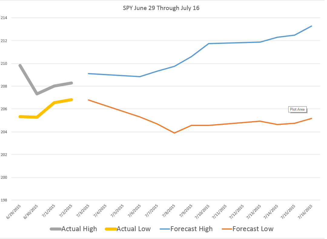
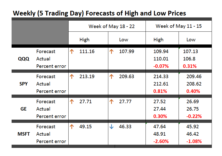
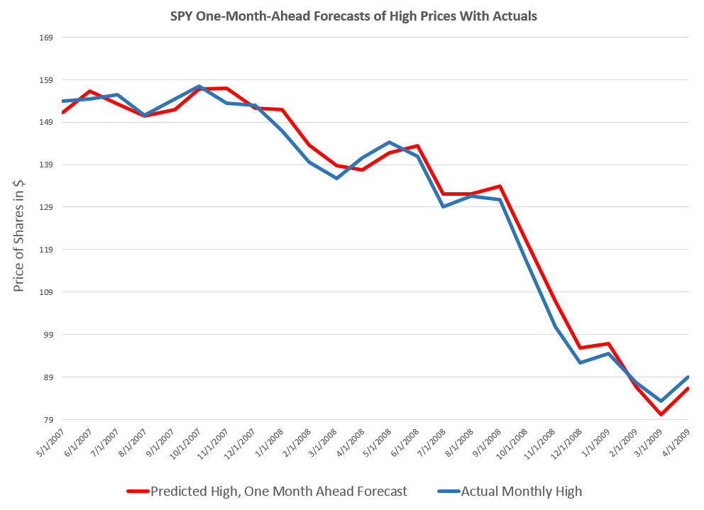
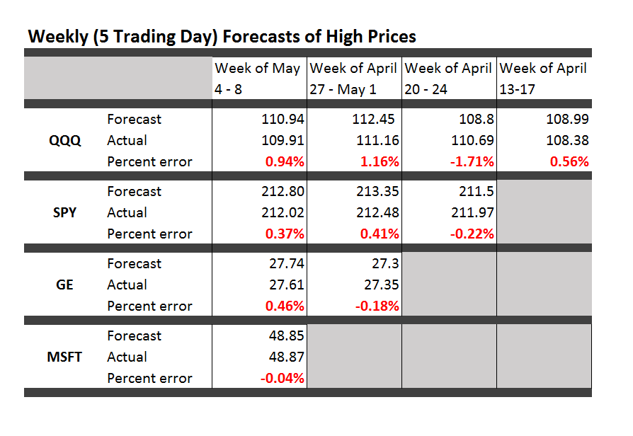
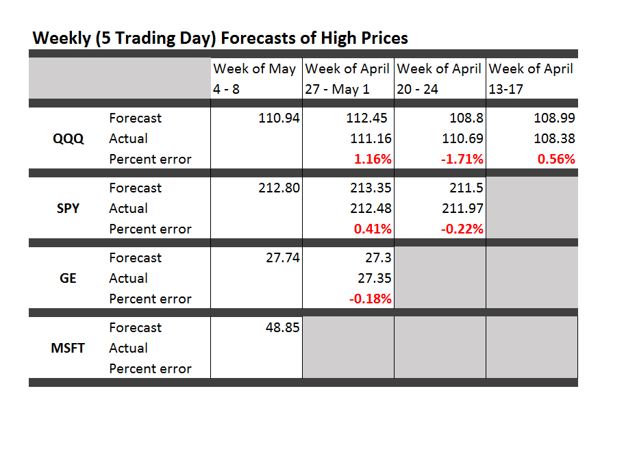
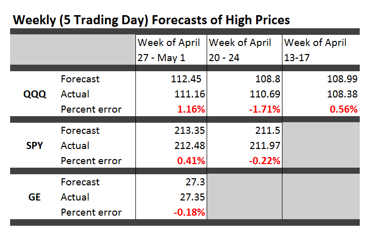
In any case, I want to return to putting up business forecasts, including longer term scenarios, in addition to carrying forth with my stock market forecasting experiment.

Some Comments on Forecasting High and Low Stock Prices

I want to pay homage to Paul Erdős, the eccentric Hungarian-British-American-Israeli mathematician, whom I saw lecture a few years before his death. Erdős kept producing work in mathematics into his 70’s and 80’s – showing this is quite possible. Of course, he took amphetamines and slept on people’s couches while he was doing this work in combinatorics, number theory, and probability.

erdos

In any case, having invoked Erdős, let me offer comments on forecasting high and low stock prices – a topic which seems to be terra incognita, for the most part, to financial research.

First, let’s take a quick look at a chart showing the maximum prices reached by the exchange traded fund QQQ over a critical period during the last major financial crisis in 2008-2009.

MaxHighChart

The graph charts five series representing QQQ high prices over periods extending from 1 day to 40 days.

The first thing to notice is that the variability of these time series decreases as the period for the high increases.

This suggests that forecasting the 40 day high could be easier than forecasting the high price for, say, tomorrow.

While this may be true in some sense, I want to point out that my research is really concerned with a slightly different problem.

This is forecasting ahead by the interval for the maximum prices. So, rather than a one-day-ahead forecast of the 40 day high price (which would include 39 known possible high prices), I forecast the high price which will be reached over the next 40 days.

This problem is better represented by the following chart.

Sampled5Highs

This chart shows the high prices for QQQ over periods ranging from 1 to 40 days, sampled at what you might call “40 day frequencies.”

Now I am not quite going to 40 trading day ahead forecasts yet, but here are results for backtests of the algorithm which produces 20-trading-day-ahead predictions of the high for QQQ.

20Dayforecast

The blue lines shows the predictions for the QQQ high, and the orange line indicates the actual QQQ highs for these (non-overlapping) 20 trading day intervals. As you can see, the absolute percent errors – the grey bars – are almost all less than 1 percent error.

Random Walk

Now, these results are pretty good, and the question arises – what about the random walk hypothesis for stock prices?

Recall that a simple random walk can be expressed by the equation xt=xt-1 + εt where εt is conventionally assumed to be distributed according to N(0,σ) or, in other words, as a normal distribution with zero mean and constant variance σ.

An interesting question is whether the maximum prices for a stock whose prices follow a random walk also can be described, mathematically, as a random walk.

This is elementary, when we consider that any two observations in a time series of random walks can be connected together as xt+k = xt + ω where ω is distributed according to a Gaussian distribution but does not necessarily have a constant variance for different values of the spacing parameter k.

From this it follows that the methods producing these predictions or forecasts of the high of QQQ over periods of several trading days also are strong evidence against the underlying QQQ series being a random walk, even one with heteroskedastic errors.

That is, I believe the predictability demonstrated for these series are more than cointegration relationships.

Where This is Going

While demonstrating the above point could really rock the foundations of finance theory, I’m more interested, for the moment, in exploring the extent of what you can do with these methods.

Very soon I’m going to post on how these methods may provide signals as to turning points in stock market prices.

Stay tuned, and thanks for your comments and questions.

Erdős picture from Encyclopaedia Britannica