Tag Archives: Time series analysis

Analysis of Highs and Lows of the Hong Kong Hang Seng Index, 1987 to the Present

I have discovered a fundamental feature of stock market prices, relating to prediction of the highs and lows in daily, weekly, monthly, and to other more arbitrary groupings of trading days in consecutive blocks.

What I have found is a degree of predictability previously unimagined with respect to forecasts of the high and low for a range of trading periods, extending from daily to 60 days so far.

Currently, I am writing up this research for journal submission, but I am documenting essential features of my findings on this blog.

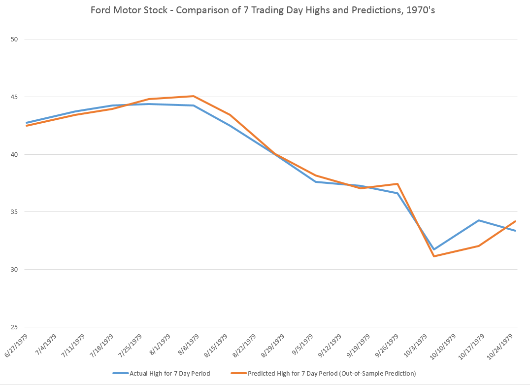
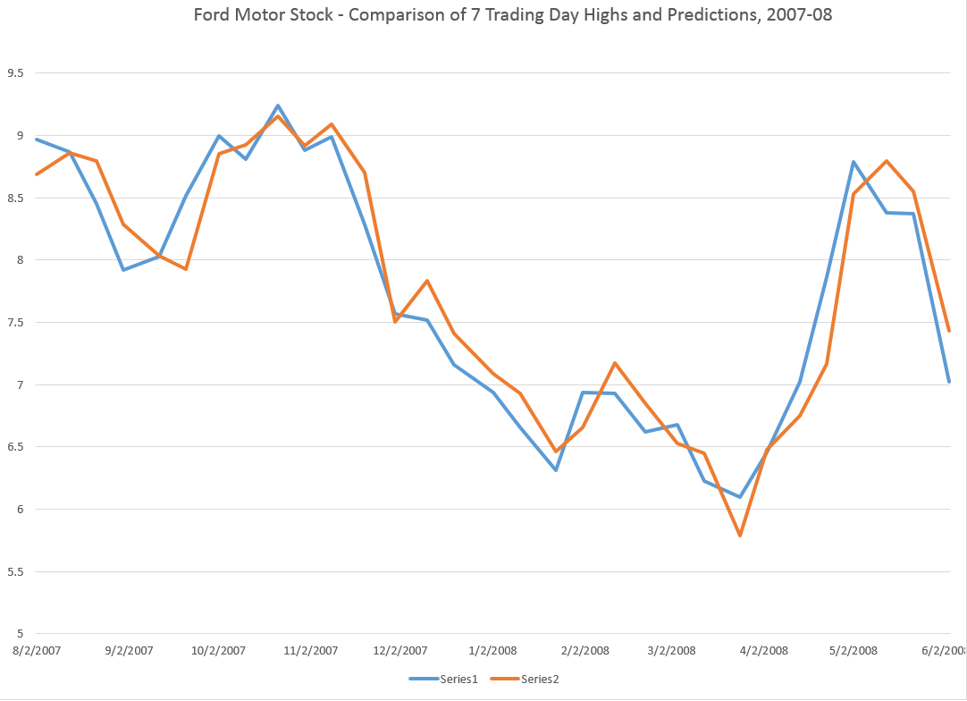
A few days ago, I posted about the predictability of daily highs and lows for the SPY exchange traded fund. Subsequent posts highlight the generality of the result for the SPY, and more recently, for stocks such as common stock of the Ford Motor Company.

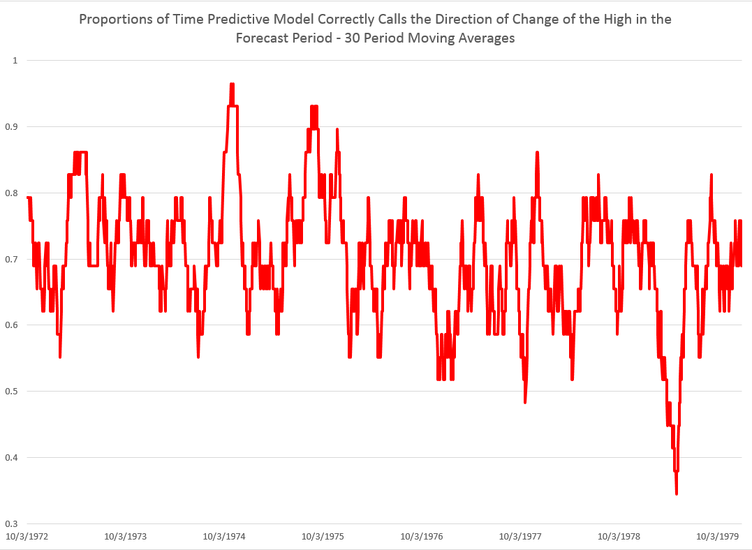
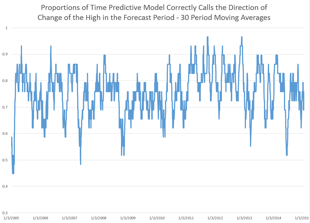
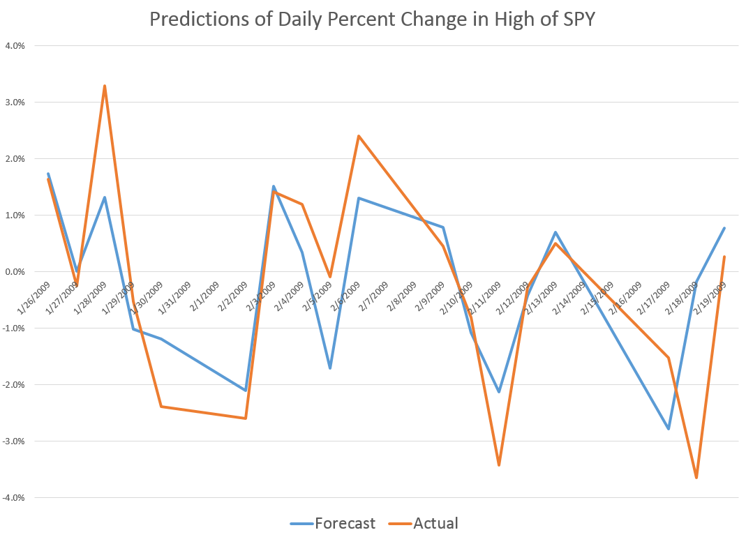
These posts present various graphs illustrating how well the prediction models for the high and low in periods capture the direction of change of the actual highs and lows. Generally, the models are right about 70 to 80 percent of the time, which is incredible.

Furthermore, since one of my long concerns has been to get better forward perspective on turning points – I am particularly interested in the evidence that these models also do fairly well as predicting turning points.

Finally, it is easy to show that these predictive models for the highs and lows of stocks and stock indices over various periods, furthermore, are not simply creations of modern program trading. The same regularities can be identified in earlier periods before easy access to computational power, in the 1980’s and early 1990’s, for example.

Hong Kong’s Hang Seng Index

Today, I want to reach out and look at international data and present findings for Hong Kong’s Hang Seng Index. I suspect Chinese investors will be interested in these results. Perhaps, releasing this information to such an active community of traders will test my hypothesis that these are self-fulfilling predictions, to a degree, and knowledge of their existence intensifies their predictive power.

A few facts about the Hang Seng Index – The Hang Seng Index (HSI) is a free-float adjusted, capitalization-weighted index of approximately 40 of the larger companies on the Hong Kong exchange. First published in 1969, the HSI, according to Investopedia, covers approximately 65% of the total market capitalization of the Hong Kong Stock Exchange. It is currently maintained by HSI Services Limited, a wholly owned subsidiary of Hang Seng Bank – the largest bank registered and listed in Hong Kong in terms of market capitalization.

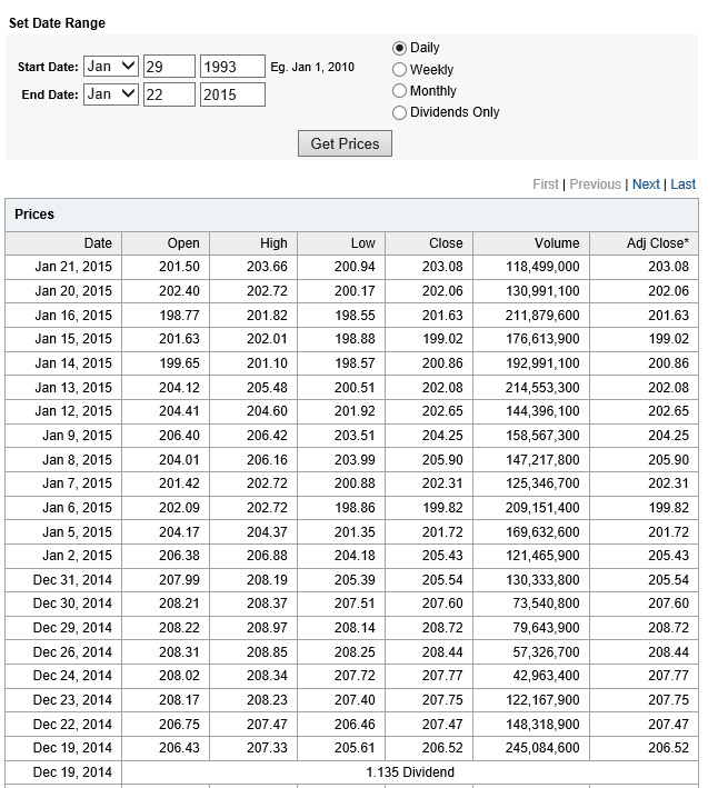
For data, I download daily open, high, low, close and other metrics from Yahoo Finance. This data begins with the last day in 1986, continuing to the present.

The Hang Seng is a volatile index, as the following chart illustrates.

HSI

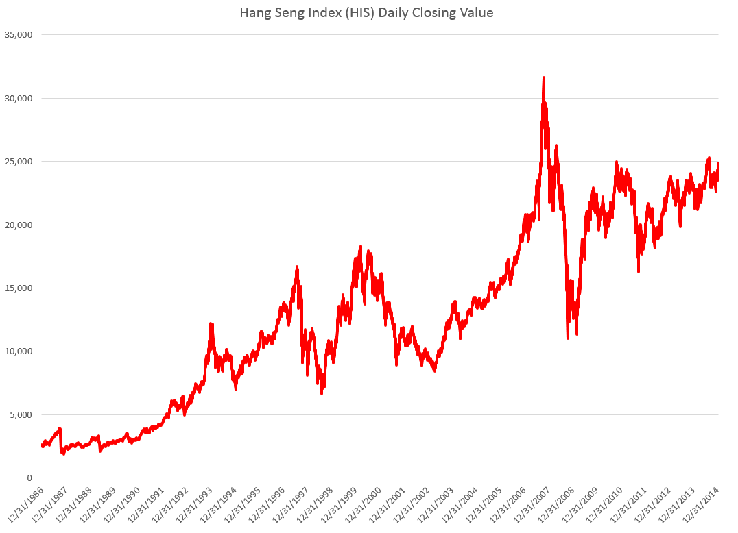
Now there are peculiarities about the data on HSI from Yahoo. Trading volumes are zero until 2001, for example, after which time large positive values are to be found in the volume column. Initially, I assume HSI was a pure index and later came to be actually traded in some fashion.

Nevertheless, the same type of predictive models can be developed for the Hang Seng Index, as can be estimated for the SPY and the US stocks.

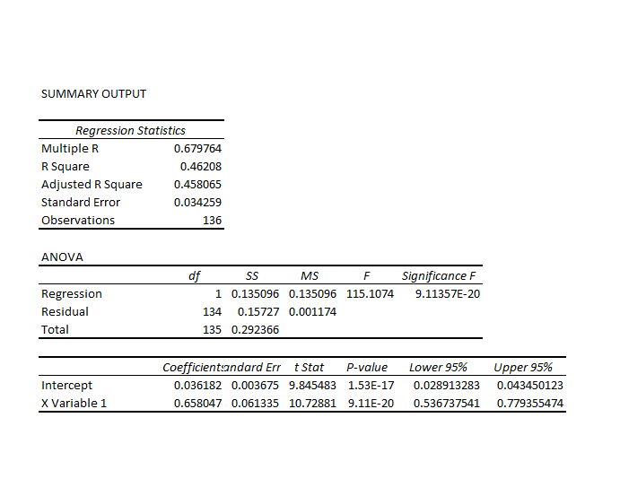
Again, the key variables in these predictive relationships are the proximity of the period opening price to the previous period high and the previous period low. I estimate regressions with variables constructed from these explanatory variables, mapping them onto growth in period-by-period highs with ordinary least squares (OLS). I find the similar relationships for the Hang Seng in, say, a 30 day periodization as I estimate for the SPY ETF. At the same time there are differences, one of the most notable being the significantly less first order autocorrelation in the Hang Seng regression.

Essentially, higher growth rates for the period-over-previous-period high are predicted whenever the opening price of the current period is greater than the high of the previous period. There are other cases, however, and ultimately the rule is quantitative, taking into account the size of the growth rates for the high as well as these inequality relationships.

Findings

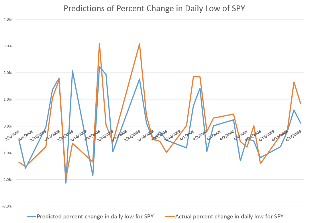
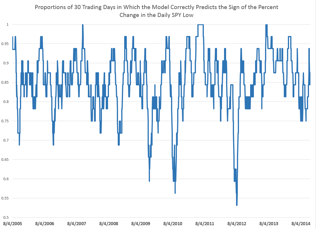
Here is another one of those charts showing the “hit-rate” for predictions of the direction of change of the sign of period-by-period growth rates for the high. In this case, the chart refers to daily trading data. The chart graphs 30 day moving averages of the proportions of time in which the predictive model forecasts the correct sign of the change or growth in the target or independent variable – the growth rate of daily highs (for consecutive trading days). Note that for recent years, the “hit rate” of the predictive model approaches 90 percent of the time, and all these are all out-of-sample predictions.

 HSIproportions

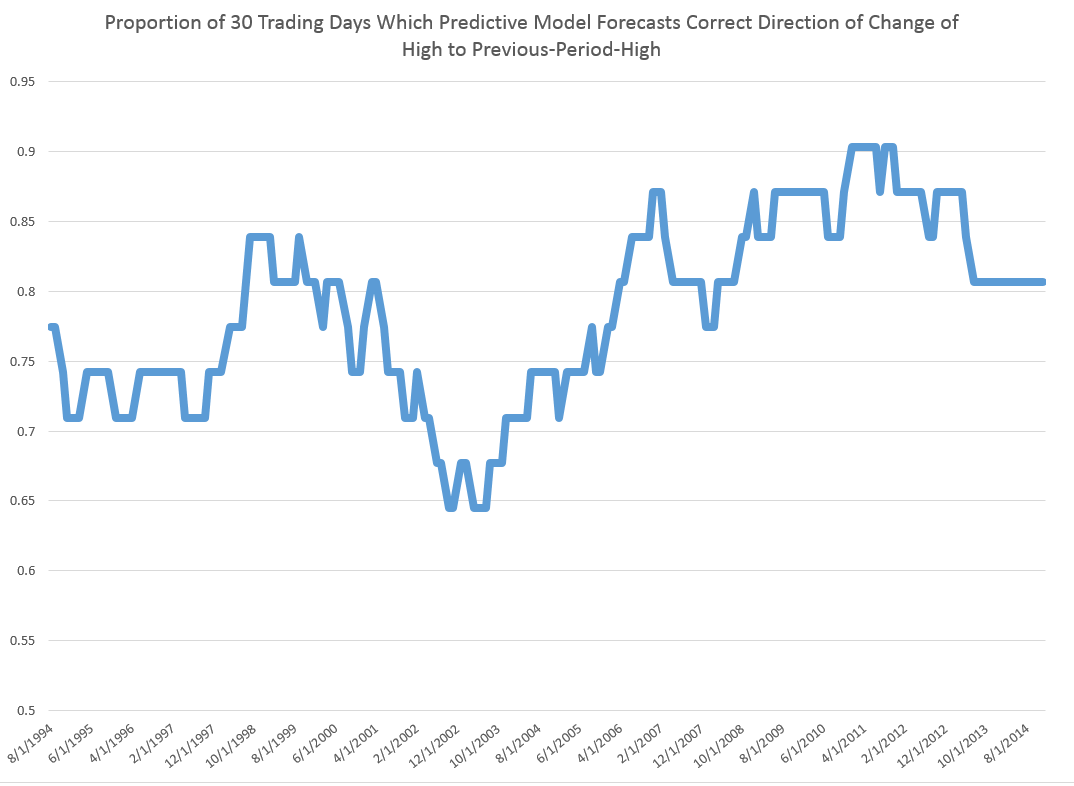
The relationship for the Hang Seng Index, thus, is powerful. Similarly impressive relationships can be derived to predict the daily lows and their direction of change.

But the result I really like with this data is developed with grouping the daily trading data by 30 day intervals.

HSItp

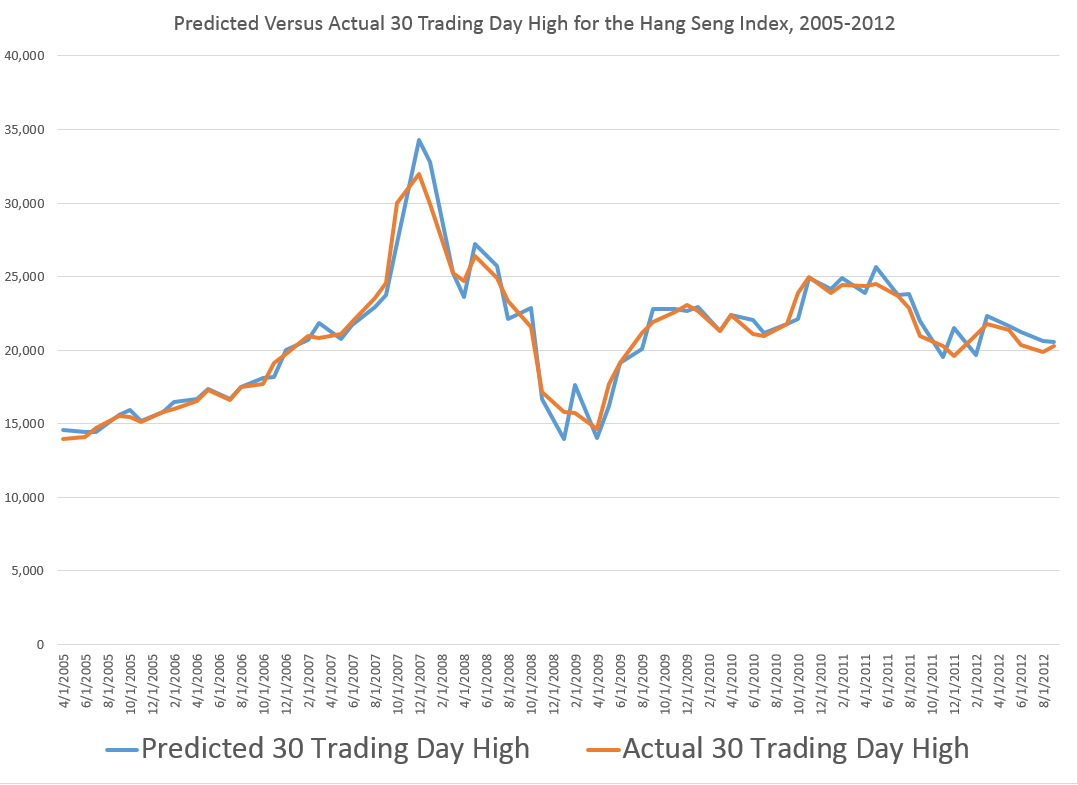
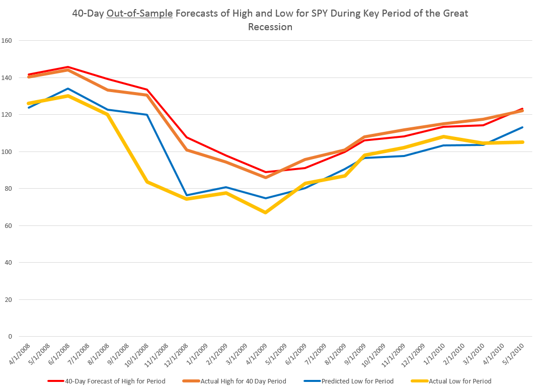
If you do this, you develop a tool which apparently is quite capable of predicting turning points in the Hang Seng.

Thus, between April 2005 and August 2012, a 30-day predictive model captures many of the key features of inflection and turning in the Hang Seng High for comparable periods.

Note that the predictive model makes these forecasts of the high for a period out-of-sample. All the relationships are estimated over historical data which do not include the high (or low) being predicted for the coming 30 day period. Only the opening price for the Hang Seng for that period is necessary.

Concluding Thoughts

I do not present the regression results here, but am pleased to share further information for readers responding to the Comments section to this blog (title ” Request for High/Low Model Information”) or who send requests to the following mail address: Clive Jones, PO Box 1009, Boulder, CO 80306 USA.

Top image from Ancient Chinese Fashion

Further Research into Predicting Daily and Other Period High and Low Stock Prices

The Internet is an amazing scientific tool. Communication of results is much faster, although, of course, with, potentially, dreck and misinformation. At the same time, pressures within the academy and Big Science seem to translate into a shocking amount of bogus research being touted. So maybe this free-for-all on the Web is where it’s at, if you are trying to get up to speed on new findings.

So this post today seeks to nail down some further and key points about predicting the high and low of stocks over various periods – conventionally, daily, weekly, and monthly periods, but also, as I have discovered, highs and lows over consecutive blocks of trading days ranging from 1 to 60 days, and probably more.

My recent posts focus on the SPY exchange traded fund, which tracks the S&P 500.

Yesterday, I formulated my general findings as follows:

For every period from daily periods to 60 day periods I have investigated, the high and low prices are “relatively” predictable and the direction of change from period to period is predictable, in backcasting analysis, about 70-80 percent of the time, on average.

In this post, let me show you the same basic relationship for a common stock – Ford Motor stock (F). I also consider data from the 1970’s, as well as recent data, to underline that modern program or high-speed computer-based algorithms have nothing to do with the underlying pattern.

I also show that the predictive model for the high in a period successfully captures turning points in the stock price in the 1970’s and more recently for 2008-2009.

Approach

Yahoo Finance, my free source of daily trading data, has history for Ford Motor stock dating back to June 1, 1972, charted as follows.

Ford

Now, the predictive models for the daily high and low stock price are formulated, as before, keying off the opening price in each trading day. One of the key relationships is the proximity of the daily opening price to the previous period high. The other key relationship is the proximity of the daily opening price to the previous period low. Ordinary least squares (OLS) regression models can be developed which do a good job of predicting the direction of change of the daily high and low, based on knowledge of the opening price for the day.

Predicting the Direction of Change of the High

As before, these models make correct predictions regarding the directions of change of the high and low about 70 percent of the time.

Here are 30 period moving averages for the 1970’s, showing the proportions of time the predictive model for the daily high is right about the direction of change.

MAFord

So the underlying relationship definitely holds in this age in which computer modeling of trading was in its infancy.

Here is a similar chart for the first decade of this century.

MAFordrecent

So whether we are considering the 1970’s or the last ten years, these predictive models do well in forecasting the direction of change of the high in daily (and it turns out other) periods.

Predicting Turning Points

We can make the same type of comparison – between the 1970’s and more recent years – for the capability of the predictive models to forecast turning points in the stock high (or low).

To do this usually requires aggregating the stock data. In the charts below, I aggregate to 7 trading day periods – not quite the same as weekly periods, since weekly segmentation can be short a day and so forth.

So the high which the predictive model focuses on is the high for the coming seven trading days, given the current day opening price.

Here are two charts, one for dates in the 1970’s and the other for a period in the recession of 2008-2009. For each chart I estimate OLS regressions with data predating each forecast of the high, based on blocks of 7 trading days.

70'sTP

These predictions of the high crisply capture most of the important turning and inflection point features.

recentTP

The application of similar predictive models for the 2008-2009 period is a little choppier, but does nail many of the important swings in the direction of change of the high of Ford Motor stock.

Concluding Thoughts

Well, this relationship between the opening prices and previous period highs and lows is highly predictive of the direction of change of the highs and lows in the current period – which can be a span of time from a day to 60 days in my findings.

These predictive models work for the S&P 500 and for individual stocks, like Ford Motor (and I might add Exxon and Microsoft).

They work in recent time periods and way back in the 1970’s.

And there’s more – for example, one could argue these patterns in the high and low prices are fractal, in the sense they represent “self similarity” at all (really many or a range of) time scales.

This is literally a new and fundamental regularity in stock prices.

Why does this work?

Well, the predictive models are closely related to very simple momentum trading strategies. But I think there is a lot of research to be done here. If you want further detail on any of this, please put your request in the Comments with the heading “Request for High/Low Model Information.”

Top picture from Strategic Monk.

Forecasting the S&P 500 – Short and Long Time Horizons

Friends and acquaintances know that I believe I have discovered amazing, deep, and apparently simple predictability in aspects of the daily, weekly, monthly movement of stock prices.

People say – “don’t blog about it, keep it to yourself, and use it to make a million dollars.” That does sound attractive, but I guess I am a data scientist, rather than stock trader. Not only that, but the pattern looks to be self-fulfilling. Generally, the result of traders learning about this pattern should be to reinforce, rather than erase, it. There seems to be no other explanation consistent with its long historical vintage, nor the broadness of its presence. And that is big news to those of us who like to linger in the forecasting zoo.

I am going to share my discovery with you, at least in part, in this blog post.

But first, let me state some ground rules and describe the general tenor of my analysis. I am using OLS regression in spreadsheets at first, to explore the data. I am only interested, really, in models which have significant out-of-sample prediction capabilities. This means I estimate the regression model over a set of historical data and then use that model to predict – in this case the high and low of the SPY exchange traded fund. The predictions (or “retrodictions” or “backcasts”) are for observations on the high and low stock prices for various periods not included in the data used to estimate the model.

Now let’s look at the sort of data I use. The following table is from Yahoo Finance for the SPY. The site allows you to download this data into a spreadsheet, although you have to invert the order of the dating with a sort on the date. Note that all data is for trading days, and when I speak of N-day periods in the following, I mean periods of N trading days.

Yahoo

OK, now let me state my major result.

For every period from daily periods to 60 day periods I have investigated, the high and low prices are “relatively” predictable and the direction of change from period to period is predictable, in backcasting analysis, about 70-80 percent of the time, on average.

To give an example of a backcasting analysis, consider this chart from the period of free-fall in markets during 2008-2009, the Great Recession (click to enlarge).

40dayforecast

Now note that the indicated lines for the forecasts are not, strictly-speaking, 40-day-ahead forecasts. The forecasts are for the level of the high and low prices of the SPY which will be attained in each period of 40 trading days.

But the point is these rather time-indeterminate forecasts, when graphed alongside the actual highs and lows for the 40 trading day periods in question, are relatively predictive.

More to the point, the forecasts suffice to signal a key turning point in the SPY. Of course, it is simple to relate the high and low of the SPY for a period to relevant measures of the average or closing stock prices.

So seasoned forecasters and students of the markets and economics should know by this example that we are in terra incognita. Forecasting turning points out-of-sample is literally the toughest thing to do in forecasting, and certain with respect to the US stock market.

Many times technical analysts claim to predict turning points, but their results may seem more artistic, involving subtle interpretations of peaks and shoulders, as well as levels of support.

Now I don’t want to dismiss technical analysis, since, indeed, I believe my findings may prove out certain types of typical results in technical analysis. Or at least I can see a way to establish that claim, if things work out empirically.

Forecast of SPY High And Low for the Next Period of 40 Trading Days

What about the coming period of 40 trading days, starting from this morning’s (January 22, 2015) opening price for the SPY – $203.99?

Well, subject to qualifications I will state further on here, my estimates suggest the high for the period will be in the range of $215 and the period low will be around $194. Cents attached to these forecasts would be, of course, largely spurious precision.

In my opinion, these predictions are solid enough to suggest that no stock market crash is in the cards over the next 40 trading days, nor will there be a huge correction. Things look to trade within a range not too distant from the current situation, with some likelihood of higher highs.

It sounds a little like weather forecasting.

The Basic Model

Here is the actual regression output for predicting the 40 trading day high of the SPY.

40Highreg

This is a simpler than many of the models I have developed, since it only relies on one explanatory variable designated X Variable 1 in the Excel regression output. This explanatory variable is the ratio of the current opening price to the previous high for the 40 day trading period, all minus 1.

Let’s call this -1+ O/PH. Instances of -1+ O/PH are generated for data bunched by 40 trading day periods, and put into the regression against the growth in consecutive highs for these 40 day periods.

So what happens is this, apparently.

Everything depends on the opening price. If the high for the previous period equals the opening price, the predicted high for the next 40 day period will be the same as the high for the previous 40 day period.

If the previous high is less than the opening price, the prediction is that the next period high will be higher. Otherwise, the prediction is that the next period high will be lower.

This then looks like a trading rule which even the numerically challenged could follow.

And this sort of relationship is not something that has just emerged with quants and high frequency trading. On the contrary, it is possible to find the same type of rule operating with, say, Exxon’s stock (XOM) in the 1970’s and 1980’s.

But, before jumping to test this out completely, understand that the above regression is, in terms of most of my analysis, partial, missing at least one other important explanatory variable.

Previous posts, which employ similar forecasting models for daily, weekly, and monthly trading periods, show that these models can predict the direction of change of the period highs with about 70 to 80 percent accuracy (See, for example, here).

Provisos and Qualifications

In deploying OLS regression analysis, in Excel spreadsheets no less, I am aware there are many refinements which, logically, might be developed and which may improve forecast accuracy.

One thing I want to stress is that residuals of the OLS regressions on the growth in the period highs generally are not normally distributed. The distribution tends to be very peaked, reminiscent of discussions earlier in this blog of the Laplace distribution for Microsoft stock prices.

There also is first order serial correlation in many of these regressions. And, my software indicates that there could be autocorrelations extending deep into the historical record.

Finally, the regression coefficients may vary over the historical record.

Bottom LIne

I like Robb Hyndman’s often drawn distinction between modeling and reality. Somewhere Hyndman suggests that no model is right.

But this class of models has an extremely logical motivation, and is, as I say, relatively predictive – predictive enough to be useful in a number of contexts.

Momentum traders for years apparently have looked at the opening price and compared it with the highs (and lows) for previous periods – extending 60 days or more into history if not more – and decided whether to trade. If the opening price is greater than the past high, the next high is anticipated to be even higher. On this basis, stock may be purchased. That action tends to reinforce the relationship. So, in some sense, this is a self-fulfilling relationship.

To recapitulate – I can show you iron-clad, incontrovertible evidence that some fairly simple models built on daily trading data produce workable forecasts of the high and low for stock indexes and stocks. These forecasts are available for a variety of time periods, and, apparently, in backcasts can indicate turning points in the market.

As I say, feel free to request further documentation. I am preparing a write-up for a journal, and I think I can find a way to send out versions of this.

You can contact me confidentially via the Comments box below. Leave your email or phone number. Title the Comment “Request for High/Low Model Information” and the webmeister will forward it to me without having your request listed in the side panel of the blog.

Predicting the High and Low of SPY – and a Generalization

Well, here are some results on forecasting the daily low prices of the SPY exchange traded fund (ETF), complementing the previous post.

This line of inquiry has exploded into something much bigger, as I will relate shortly, but first ….

Predicting the Daily Low

This graph gives a flavor of the accuracy of a very simple bivariate regression, estimated on the daily percent changes in the lows for SPY.

DailyLowPredict

The blue line is the predicted percent change. And the orange line shows the actual percent changes of the daily lows for this period in early 2008.

These are out-of-sample results, in the sense the predicted percent changes in the lows are not included in the regression data used to develop the forecast model.

And considering we are predicting one component of volatility itself, the results are not bad.

For this analysis, I develop dynamic or adaptive regressions that start in August 2005 and run up to the present. The models predict the direction of change in the daily lows, on average, about 85 percent of the time over nearly 15 years.

The following chart shows 30 day rolling averages of the proportion of time the models predict the correct sign of the percent change for this period.

RatiosLow

This performance is produced by a simple bivariate regression of the daily percent change in the lows to the percent change in the previous low compared with the current daily opening price. So, of course, to get the explanatory variable you divide the previous trading day value for the low by the current day opening price and subtract 1 – and you can convert to percentages for purposes of display.

The equation is

PERCENT CHANGE IN CURRENT DAILY LOW = -0.00448 -0.951689(PERCENT CHANGE IN THE PREVIOUS DAILY LOW IN COMPARISON WITH THE CURRENT OPENING PRICE).

If the previous low is greater than the current opening price, the coefficient on this variable creates negative value which, added to the negative constant of the regression, would predict the daily low to drop.

If you have any role in instructing students, let me suggest this example. The data is readily accessible from Yahoo Finance (under SPY) and once you invert the calendar order of the data, the relevant percent changes are easy to compute, and then to plug into regressions with the Microsoft Excel Trend(.) function.

Now the amazing thing is that similar relationships operate over various time scales, both for predicting the low and the high in a group of trading days. I’m working up the post showing this right now.

There is, in other words, a remarkable thread running through daily, weekly, and monthly settings.

In closing here – a thought.

Often, when a predictive relationship relating to stock prices is put out there, you get the feeling the underlying regularities will evaporate, as traders jump on the opportunity.

But these predictive relationships for the high and low of the SPY may be examples of self-fulfiling prophesies.

In other words, if a trader learns that the daily, weekly, or monthly high or low is related to (a) the opening price, and (b) the high or low for the preceding period, whatever it may be, their actions could very well strengthen the relationship. So, predicting an increase in the daily high, a trader very well could go long, by buying the SPY at opening. The stock price should thereby go higher. Similarly, if a trader acts on information regarding predictions of a dropping low, they may short the SPY, which again could have the effect of causing the low to ratchet down further.

It would be fascinating if we could somehow establish that this is actually going on and sustaining this type of relationship.

Predicting the Daily High and Low of an Exchange Traded Fund – SPY

Currently, I am privileged to have access to databases relating to health insurance and oil and gas developments.

But the richest source of Big Data available to researchers is probably financial, and I can’t resist exploring time series data on the S&P 500 and related exchange traded funds.

This is a tricky field. It is not only crowded with “quants,” but there are, in theory, pitfalls of “rational expectations.” There are strong and weak versions, but, essentially, if “rational expectations” operate, there should be no public information which can give anyone a predictive advantage, since otherwise it would already have been exploited.

Keep that in mind as I relate some remarkable discoveries – so far as I can determine nowhere else documented – on the predictability of the daily high and low values of the SPY, the exchange traded fund (ETF) linked with the S&P 500.

Some Results

A picture is worth a thousand words.

DailyHigh

So the above chart shows out-of-sample predictions for several trading days in 2009 that can be achieved with a linear regression based on daily values available, for example, on Yahoo Finance.

Based on the opening value of the SPY, this regression predicts the percent change in the high for the SPY that will be achieved during the trading day – the percent change calculated with the high reached that day, compared with the previous day.

I find it remarkable that there is any predictability at all, since the daily high is an extreme value, highly sensitive to the volatility that day, and so forth.

And it may not be necessary to predict the exact percentage change of the high of SPY from day to day to gain a trading advantage.

Accurate predictions of the direction of change should be useful. In this respect, the analysis is especially powerful. For the particular dates in the chart shown above, for example, the predictive model correctly identifies the direction of change for every trading day but one – February 23, 2009.

I develop an analysis for the period 8/4/2005 to 1/4/2015, developing adaptive regressions to predict, out of sample, the high following the opening of each trading day.

I develop hundreds of regressions in this analysis with some indication that the underlying coefficients vary over time.

The explanatory variables are based on the spread between the opening price for the current period and the high or low of the previous period.

The coefficient of determination or R2 is about 0.6 – much higher than is typical for such regressions with stock or financial time series.This is a powerful relationship.

Here is a chart showing rolling 30 trading day averages of how often (1 = 100% of the time) this modeling effort correctly identifies the sign of the change in the high – again on an out-of-sample basis.

proportionhigh

Note that for some 30 day periods, the “hit rate” in which the correct sign of change is predicted exceeds 0.9, or, in other words, is greater than 90 percent of the time.

Overall, for the whole period under consideration, which comes right up to the present, the model averages about 76 percent accuracy in identifying the direction of change in the daily high of SPY.

Stay tuned to Business Forecast blog for a similar analysis of predicting the low values of SPY.

In closing, though, let me note that this remarkable predictability does not, in itself, support profitable trading, at least with any type of simple or direct approach.

Here is why.

If at the opening of the trading day, the model indicates positive change in the level of the high for SPY that day, it would make sense to buy shares of this ETF. Then, you could unload them, presumably at a profit, when the SPY reached the previous day’s high value.

The catch, however, is that you cannot be sure this will happen. Given the forecast, it is probable, or at least has a calculable probability. However, it is also possible that the stock will not reach the previous day’s high during the trading day. The forecast may be correct in its sign, but wrong in its magnitude.

So then, you are stuck with shares of SPY.

If you want to sell that day, not having, for example, any clear idea what will happen the following trading day – in general you will not do very well. In fact, it’s easy to show that this trading strategy – buy when the model indicates growth in the level of the high, sell if you can at the previous high, and otherwise close out your position at the closing price for that trading day – this strategy generally does not do as well as buy-and-hold.

This is probably the rational expectations gremlin at work.

Anyway, stay tuned for some insights on modeling the low of the SPY daily price.

Forecasting Issue – Projected Rise in US Health Care Spending

Between one fifth and one sixth of all spending in the US economy, measured by the Gross Domestic Product (GDP), is for health care – and the ratio is projected to rise.

From a forecasting standpoint, an interesting thing about this spending  is that it can be forecast in the aggregate on a 1, 2 and 3 year ahead basis with a fair degree of accuracy.

This is because growth in disposable personal income (DPI) is a leading indicator of private personal healthcare spending – which comprises the lion’s share of total healthcare spending.

Here is a chart from PROJECTIONS OF NATIONAL HEALTH EXPENDITURES: METHODOLOGY AND MODEL SPECIFICATION highlighting the lagged relationship and private health care spending.

laggedeffect

Thus, the impact of the recession of 2008-2009 on disposable personal income has resulted in relatively low increases in private healthcare spending until quite recently. (Note here, too, that the above curves are smoothed by taking centered moving averages.)

The economic recovery, however, is about to exert an impact on overall healthcare spending – with the effects of the Affordable Care Act (ACA) aka Obamacare being a wild card.

A couple of news articles signal this, the first from the Washington Post and the second from the New Republic.

The end of health care’s historic spending slowdown is near

The historic slowdown in health-care spending has been one of the biggest economic stories in recent years — but it looks like that is soon coming to an end.

As the economy recovers, Obamacare expands coverage and baby boomers join Medicare in droves, the federal Centers for Medicare and Medicaid Services’ actuary now projects that health spending will grow on average 5.7 percent each year through 2023, which is 1.1 percentage points greater than the expected rise in GDP over the same period. Health care’s share of GDP over that time will rise from 17.2 percent now to 19.3 percent in 2023, or about $5.2 trillion, as the following chart shows.

NHCE

America’s Medical Bill Didn’t Spike Last Year

The questions are by how much health care spending will accelerate—and about that, nobody can be sure. The optimistic case is that the slowdown in health care spending isn’t entirely the product of a slow economy. Another possible factor could be changes in the health care market—in particular, the increasing use of plans with high out-of-pocket costs, which discourage people from getting health care services they might not need. Yet another could be the influence of the Affordable Care Act—which reduced what Medicare pays for services while introducing tax and spending modifications designed to bring down the price of care.

There seems to be some wishful thinking on this subject in the media.

Betting against the lagged income effect is not advisable, however, as an analysis of the accuracy of past projections of Centers for Medicare and Medicaid Services (CMS) shows.

Forecasting Holiday Retail Sales

Holiday retail sales are a really “spikey” time series, illustrated by the following graph (click to enlarge).

HolidayRetailSales

These are monthly data from FRED and are not seasonally adjusted.

Following the National Retail Federation (NRF) convention, I define holiday retail sales to exclude retail sales by automobile dealers, gasoline stations and restaurants. The graph above includes all months of the year, but we can again follow the NRF convention and define “sales from the Holiday period” as being November and December sales.

Current Forecasts

The National Retail Federation (NRF) issues its forecast for the Holiday sales period in late October.

This year, it seems they were a tad optimistic, opting for

..sales in November and December (excluding autos, gas and restaurant sales) to increase a healthy 4.1 percent to $616.9 billion, higher than 2013’s actual 3.1 percent increase during that same time frame.

As the news release for this forecast observed, this would make the Holiday Season 2014 the first time in many years to see more than 4 percent growth – comparing to the year previous holiday periods.

The NRF is still holding to its bet (See https://nrf.com/news/retail-sales-increase-06-percent-november-line-nrf-holiday-forecast), noting that November 2014 sales come in around 3.2 percent over the total for November in 2013.

This means that December sales have to grow by about 4.8 percent on a month-over-year-previous-month basis to meet the overall, two month 4.1 percent growth.

You don’t get to this number by applying univariate automatic forecasting software. Forecast Pro, for example, suggests overall year-over-year growth this holiday season will be more like 3.3 percent, or a little lower than the 2013 growth of 3.7 percent.

Clearly, the argument for higher growth is the extra cash in consumer pockets from lower gas prices, as well as the strengthening employment outlook.

The 4.1 percent growth, incidentally, is within the 97.5 percent confidence interval for the Forecast Pro forecast, shown in the following chart.

FPHolidaySales

This forecast follows from a Box-Jenkins model with the parameters –

ARIMA(1, 1, 3)*(0, 1, 2)

In other words, Forecast Pro differences the “Holiday Sales” Retail Series and finds moving average and autoregressive terms, as well as seasonality. For a crib on ARIMA modeling and the above notation, a Duke University site is good.

I guess we will see which is right – the NRF or Forecast Pro forecast.

Components of US Retail Sales

The following graphic shows the composition of total US retail sales, and the relative sizes of the main components.

USRETAILPIE 

Retail and food service sales totaled around $5 trillion in 2012. Taking out motor vehicle and parts dealers, gas stations, and food services and drinking places considerably reduces the size of the relevant Holiday retail time series.

Forecasting Issues and Opportunities

I have not yet done the exercise, but it would be interesting to forecast the individual series in the above pie chart, and compare the sum of those forecasts with a forecast of the total.

For example, if some of the component series are best forecast with exponential smoothing, while others are best forecast with Box-Jenkins time series models, aggregation could be interesting.

Of course, in 2007-09, application of univariate methods would have performed poorly. What we cry out for here is a multivariate model, perhaps based on the Kalman filter, which specifies leading indicators. That way, we could get one or two month ahead forecasts without having to forecast the drivers or explanatory variables.

In any case, barring unforeseen catastrophes, this Holiday Season should show comfortable growth for retailers, especially online retail (more on that in a subsequent post.)

Heading picture from New York Times

Quantitative Easing (QE) and the S&P 500

Reading Jeff Miller’s Weighing the Week Ahead: Time to Buy Commodities 11/16/14 on Dash of Insight the following chart (copied from Business insider) caught my attention.

stocksandQE

In the Business Insider discussion – There’s A Major Problem With The Popular Chart That Connects The Fed To The Stock Market – Myles Udland quotes an economist at Bank of America Merrill Lynch who says,

“Implicitly, this chart assumes that the markets are not forward looking and it is the implementation of Q that drives the stock market: when the Fed buys, the market booms and when it stops, the market swoons..”

“As our readers know [Ethan Harris of Bank of America Merrill Lynch writes] we think this relationship is a classic case of spurious correlation: anything that trended higher over the last 5 years has a 90%-plus correlation with the Fed’s balance sheet.”

This makes a good point inasmuch as two increasing time series can be correlated, but lack any essential relationship to each other – a condition known as “spurious correlation.”

But there’s more to it than that.

I am surprised that these commentators, all of whom are sophisticated with numbers, don’t explore one step further further and look at first differences of these time series. Taking first differences turns Fed liabilities and the S&P 500 into stationary series, and eliminates the possibility of spurious correlation in the above sense.

I’ve done some calculations.

Before reporting my results, let me underline that we have to be talking about something unusual in time, as this chart indicates.

SPMB

Clearly, if there is any determining link between these monthly data for the monetary base (downloaded from FRED) and monthly averages for the S&P 500, it has be to after sometime in 2008.

In the chart above and in my  computations, I use St. Louis monetary base data as a proxy for the Fed liabilities series in the Business Insider discussion,

So then considering the period from January 2008 to the present, are there any grounds for claiming a relationship?

Maybe.

I develop a “bathtub” model regression, with 16 lagged values of the first differences of the monetary base numbers to predict the change in the month-to-month change in the S&P 500. I use a sample from January 2008 to December 2011 to estimate the first regression. Then, I forecast the S&P 500 on a one-month-ahead basis, comparing the errors in these projections with a “no-change” forecast. Of course, a no change forecast is essentially a simple random walk forecast.

Here are the average mean absolute percent errors (MAPE’s) from the first of 2012 to the present. These are calculated in each case over periods spanning January 2012’s MAPE to the month of the indicated average, so the final numbers on the far right of these lines are the averages for the whole period.

cumMAPE

Lagged changes in the monetary base do seem to have some predictive power in this time frame.

But their absence in the earlier period, when the S&P 500 fell and rose to its pre-recession peak has got to be explained. Maybe the recovery has been so weak that the Fed QE programs have played a role this time in sustaining stock market advances. Or the onset of essentially zero interest rates gave the monetary base special power. Pure speculation.

Interesting, because it involves the stock market, of course, but also because it highlights a fundamental issue in statistical modeling for forecasting. Watch out for correlations in increasing time series. Always check first differences or other means of reducing the series to stationarity before trying regressions – unless, of course, you want to undertake an analysis of cointegration.

Do Oil and Gas Futures Forecast Oil and Gas Spot Prices?

I’m looking at evidence that oil and gas futures are useful in forecasting future prices. This is an important for reasons ranging from investment guidance to policy analysis (assessing the role of speculators in influencing current market prices).

So – what are futures contracts, where are they traded, and where do you find out about them?

A futures contract (long position) is an agreement to buy an amount of a commodity (oil or gas) at a specified price at the expiration of the contract. The seller (the party with a short position) agrees to sell the underlying commodity to the buyer at expiration at the fixed sales price. Futures contracts can be traded many times prior to the expiration date.

At the expiration of the contract, if the price of the contract is below the market or spot price at that time, the buyer makes money. Futures contracts also can be used to lock in prices, and hedge risk.

The New York Mercantile Exchange (NYMEX) maintains futures markets for oil and gas. Natural gas futures are based on delivery at the Henry Hub, Louisiana, a major crossroads for natural gas pipelines.

So there are futures contracts for 1 month, 2 month, and so forth, delivery dates.

Evidence Futures Predict Spot Prices

As noted by Menzie Chinn, a popular idea is that the futures price is the optimal forecast of the spot price is an implication of the efficient market hypothesis.

Nevertheless, the evidence for futures prices being unbiased estimators of future spot prices is mixed, despite widespread acceptance of the idea in central banks and the International Monetary Fund (IMF).

A recent benchmark study, Forecasting the Price of Oil, finds –

some evidence that the price of oil futures has additional predictive content compared with the current spot price at the 12-month horizon; the magnitude of the reduction in mean-squared prediction error (MSPE) is modest even at the 12-month horizon, however, and there are indications that this result is sensitive to fairly small changes in the sample period and in the forecast horizon. There is no evidence of significant forecast accuracy gains at shorter horizons, and at the long horizons of interest to policymakers, oil futures prices are clearly inferior to the no-change forecast.

Here, the “no-change forecast” can be understood and is sometimes also referred to as a “random walk forecast.”

Both Chinn and the Forecasting the Price of Oil chapter in the Handbook of Forecasting are good places for readers to check the extensive literature on this topic.

Hands-On Calculation

Forecasting is about computation and calculation, working with real data.

So I downloaded the Contract1 daily futures prices from the US EIA, a source which also provides the Henry Hub spot prices.

Natural gas contracts, for example, expire three business days prior to the first calendar day of the delivery month. Thus, the delivery month for Contract 1 in the US EIA tables is the calendar month following the trade date.

Here is a chart from the spreadsheet I developed.

FuturesDirectionCallChart1

I compared the daily spot prices and 1 month futures contract prices by date to see how often the futures prices correctly indicate the direction of change of the spot price at the settlement or delivery date, three days prior to the first calendar day of the delivery month. So, the April 14, 2014 spot price was $4.64 and the Contract1 futures closing price for that day was $4.56, indicating that the spot price in late May would be lower than the current spot price. In fact, the May 27th spot price was $4.56. So, in this case, not only was the predicted direction of change correct, but also the point estimate of the future spot price.

The chart above averages the performance of these daily forecasts of the future direction of spot prices over rolling 20 trading day windows.

From January through the end of September 2014, these averages score better than 50:50 about 71 percent of the time.

I have not calculated how accurate these one month natural gas futures are per se, but my guess is that the accuracies would be close.

However, clearly, a “no-change forecast” is incapable of indicating the future direction of changes in the gas spot price.

So the above chart and the associated information structure are potentially useful regardless of the point forecast accuracy. My explorations suggest additional information about direction and, possibly, even turning points in price, can be extracted from longer range gas futures contracts.

Speculators and Oil Prices

One of the more important questions in the petroleum business is the degree to which speculators influence oil prices.

CrudeOilSpotPrice

If speculators can significantly move oil spot prices, there might be “overshooting” on the downside, in the current oil price environment. That is, the spot price of oil might drop more than fundamentals warrant, given that spot prices have dropped significantly in recent weeks and the Saudi’s may not reduce production, as they have in the past.

This issue can be rephrased more colorfully in terms of whether the 2008 oil price spike, shown below, was a “bubble,” driven in part by speculators, or whether, as some economists argue, things can be explained in terms of surging Chinese demand and supply constraints.

James Hamilton’s Causes and Consequences of the Oil Shock of 2007–08, Spring 2009, documents a failure of oil production to increase between 2005-2007, and the exponential growth in Chinese petroleum demand through 2007.

Hamilton, nevertheless, admits “the speed and magnitude of the price collapse leads one to give serious consideration to the alternative hypothesis that this episode represents a speculative price bubble that popped.”

Enter hedge fund manager Michael Masters stage left.

In testimony before the US Senate, Masters blames the 2007-08 oil price spike on speculators, and specifically on commodity index trading funds which held a quarter trillion dollars worth of futures contracts in 2008.

Hamilton characterizes Masters’ position as follows,

A typical strategy is to take a long position in a near-term futures contract, sell it a few weeks before expiry, and use the proceeds to take a long position in a subsequent near-term futures contract. When commodity prices are rising, the sell price should be higher than the buy, and the investor can profit without ever physically taking delivery. As more investment funds sought to take positions in commodity futures contracts for this purpose, so that the number of buys of next contracts always exceeded the number of sells of expiring ones, the effect, Masters argues, was to drive up the futures price, and with it the spot price. This “financialization” of commodities, according to Masters, introduced a speculative bubble in the price of oil.

Where’s the Beef?

If speculators were instrumental in driving up oil prices in 2008, however, where is the inventory build one would expect to accompany such activity? As noted above, oil production 2005-2007 was relatively static.

There are several possible answers.

One is simply that activity in the futures markets involve “paper barrels of oil” and that pricing of real supplies follows signals being generated by the futures markets. This is essentially Masters’ position.

A second, more sophisticated response is that the term structure of the oil futures markets changed, running up to 2008. The sweet spot changed from short term to long term futures, encouraging “ground storage,” rather than immediate extraction and stockpiling of inventories in storage tanks. Short term pricing followed the lead being indicated by longer term oil futures. The MIT researcher Parsons makes this case in a fascinating paper Black Gold & Fool’s Gold: Speculation in the Oil Futures Market.

..successful innovations in the financial industry made it possible for paper oil to be a financial asset in a very complete way. Once that was accomplished, a speculative bubble became possible. Oil is no different from equities or housing in this regard.

A third, more conventional answer is that, in fact, it is possible to show a direct causal link from activity in the oil futures markets to oil inventories, despite the appearances of flat production leading up to 2008.

Where This Leads

The uproar on this issue is related to efforts to increase regulation on the nasty speculators, who are distorting oil and other commodity prices away from values determined by fundamental forces.

While that might be a fine objective, I am more interested in the predictive standpoint.

Well, there is enough here to justify collecting a wide scope of data on production, prices, storage, reserves, and futures markets, and developing predictive models. It’s not clear the result would be most successful short term, or for the longer term. But I suspect forward-looking perspective is possible through predictive analytics in this area.

Top graphic from Evil Speculator.