Highlights of National and Global Energy Projections

Christof Rühl – Group Chief Economist at British Petroleum (BP) just released an excellent, short summary of the global energy situation, focused on 2013.

Ruhl

Rühl’s video is currently only available on the BP site at –

http://www.bp.com/en/global/corporate/about-bp/energy-economics/statistical-review-of-world-energy.html

Note the BP Statistical Review of World Energy June 2014 was just released (June 16).

Highlights include –

  • Economic growth is one of the biggest determinants of energy growth. This means that energy growth prospects in Asia and other emerging markets are likely to dominate slower growth in Europe – where demand is actually less now than in 2005 – and the US.
  • Tradeoffs and balancing are a theme of 2013. While oil prices remained above $100/barrel for the third year in a row, seemingly stable, underneath two forces counterbalanced one another – expanding production from shale deposits in the US and an increasing number of supply disruptions in the Middle East and elsewhere.
  • 2013 saw a slowdown in natural gas demand growth with coal the fastest growing fuel. Growth in shale gas is slowing down, partly because of a big price differential between gas and oil.
  • While CO2 emissions continue to increase, the increased role of renewables or non-fossil fuels (including nuclear) have helped hold the line.
  • The success story of the year is that the US is generating new fuels, improving its trade position and trade balance with what Rühl calls the “shale revolution.”

The BP Statistical Reviews of World Energy are widely-cited, and, in my mind, rank alongside the Energy Information Agency (EIA) Annual Energy Outlook and the International Energy Agency’s World Energy Outlook. The EIA’s International Energy Outlook is another frequently-cited document, scheduled for update in July.

Price is the key, but is difficult to predict

The EIA, to its credit, publishes a retrospective on the accuracy of its forecasts of prices, demand and production volumes. The latest is on a page called Annual Energy Outlook Retrospective Review which has a revealing table showing the EIA projections of the price of natural gas at wellhead and actual figures (as developed from the Monthly Energy Review).

I pulled together a graph showing the actual nominal price at the wellhead and the EIA forecasts.

natgasforecasterrorgraph

The solid red line indicates actual prices. The horizontal axis shows the year for which forecasts are made. The initial value in any forecast series is nowcast, since wellhead prices are available at only a year lag. The most accurate forecasts were for 2008-2009 in the 2009 and 2010 AEO documents, when the impact of the severe recession was already apparent.

Otherwise, the accuracy of the forecasts is completely underwhelming.

Indeed, the EIA presents another revealing chart showing the absolute percentage errors for the past two decades of forecasts. Natural gas prices show up with more than 30 percent errors, as do imported oil prices to US refineries.

Predicting Reserves Without Reference to Prices

Possibly as a result of the difficulty of price projections, the EIA apparently has decoupled the concept of Technically Recoverable Resources (TRR) from price projections.

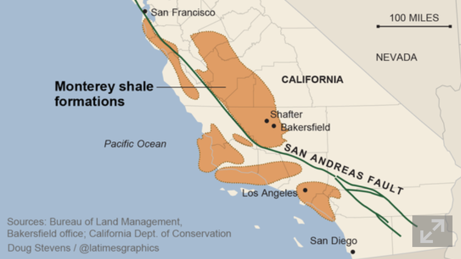
This helps explain how you can make huge writedowns of TRR in the Monterey Shale without affecting forecasts of future shale oil and gas production.

Thus in Assumptions to AEO2014 and the section called the Oil and Gas Supply Module, we read –

While technically recoverable resources (TRR) is a useful concept, changes in play-level TRR estimates do not necessarily have significant implications for projected oil and natural gas production, which are heavily influenced by economic considerations that do not enter into the estimation of TRR. Importantly, projected oil production from the Monterey play is not a material part of the U.S. oil production outlook in either AEO2013 or AEO2014, and was largely unaffected by the change in TRR estimates between the 2013 and 2014 editions of the AEO. EIA estimates U.S. total crude oil production averaged 8.3 million barrels/day in April 2014. In the AEO2014 Reference case, economically recoverable oil from the Monterey averaged 57,000 barrels/day between 2010 and 2040, and in the AEO2013 the same play’s estimated production averaged 14,000 barrels/day. The difference in production between the AEO2013 and AEO2014 is a result of data updates for currently producing wells which were not previously linked to the Monterey play and include both conventionally-reservoired and continuous-type shale areas of the play. Clearly, there is not a proportional relationship between TRR and production estimates – economics matters, and the Monterey play faces significant economic challenges regardless of the TRR estimate.

This year EIA’s estimate for total proved and unproved U.S. technically recoverable oil resources increased 5.4 billion barrels to 238 billion barrels, even with a reduction of the Monterey/Santos shale play estimate of unproved technically recoverable tight oil resources from 13.7 billion barrels to 0.6 billion barrels. Proved reserves in EIA’s U.S. Crude Oil and Natural Gas Proved Reserves report for the Monterey/Santos shale play are withheld to avoid disclosure of individual company data. However, estimates of proved reserves in NEMS are 0.4 billion barrels, which result in 1 billion barrels of total TRR.

Key factors driving the adjustment included new geology information from a U. S. Geological Survey review of the Monterey shale and a lack of production growth relative to other shale plays like the Bakken and Eagle Ford. Geologically, the thermally mature area is 90% smaller than previously thought and is in a tectonically active area which has created significant natural fractures that have allowed oil to leave the source rock and accumulate in the overlying conventional oil fields, such as Elk Hills, Cat Canyon and Elwood South (offshore). Data also indicate the Monterey play is not over pressured and thus lacks the gas drive found in highly productive tight oil plays like the Bakken and Eagle Ford. The number of wells per square mile was revised down from 16 to 6 to represent horizontal wells instead of vertical wells. TRR estimates will likely continue to evolve over time as technology advances, and as additional geologic information and results from drilling activity provide a basis for further updates.

So the shale oil in the Monterey formation may have “migrated” from that convoluted geologic structure to sand deposits or elsewhere, leaving the productive potential much less.

I still don’t understand how it is possible to estimate any geologic reserve without reference to price, but there you have it.

I plan to move on to more manageable energy aggregates, like utility power loads and time series forecasts of consumption in coming posts.

But the shale oil and gas scene in the US is fascinating and a little scary. Part of the gestalt is the involvement of smaller players – not just BP and Exxon, for example. According to Chad Moutray, Economist for the National Association of Manufacturers, the fracking boom is a major stimulus to manufacturing jobs up and down the supply chain. But the productive life of a fracked oil or gas well is typically shorter than a conventional oil or gas well. So some claim that the increases in US production cannot be sustained or will not lead to any real period of “energy independence.” For my money, I need to watch this more before making that kind of evaluation, but the issue is definitely there.

Data Analytics Reverses Grandiose Claims for California’s Monterey Shale Formation

In May, “federal officials” contacted the Los Angeles Times with advance news of a radical revision of estimates of reserves in the Monterey Formation,

Just 600 million barrels of oil can be extracted with existing technology, far below the 13.7 billion barrels once thought recoverable from the jumbled layers of subterranean rock spread across much of Central California, the U.S. Energy Information Administration said.

The LA Times continues with a bizarre story of how “an independent firm under contract with the government” made the mistake of assuming that deposits in the Monterey Shale formation were as easily recoverable as those found in shale formations elsewhere.

There was a lot more too, such as the information that –

The Monterey Shale formation contains about two-thirds of the nation’s shale oil reserves. It had been seen as an enormous bonanza, reducing the nation’s need for foreign oil imports through the use of the latest in extraction techniques, including acid treatments, horizontal drilling and fracking…

The estimate touched off a speculation boom among oil companies.

Well, I’ve combed the web trying to find more about this “mistake,” deciding that, probably, it was the analysis of David Hughes in “Drilling California,” released in March of this year, that turned the trick.

Hughes – a geoscientist working decades with the Geological Survey of Canada – utterly demolishes studies which project 15 billion barrels in reserve in the Monterey Formation. And he does this by analyzing an extensive database (Big Data) of wells drilled in the Formation.

The video below is well worth the twenty minutes or so. It’s a tour de force of data analysis, but it takes a little patience at points.

First, though, check out a sample of the hype associated with all this, before the overblown estimates were retracted.

Monterey Shale: California’s Trillion-Dollar Energy Source

Here’s a video on Hughes’ research in Drilling California

Finally, here’s the head of the US Energy Information Agency in December 2013, discussing a preliminary release of figures in the 2014 Energy Outlook, also released in May 2014.

Natural Gas 2014 Projections by the EIA’s Adam Sieminski

One question is whether the EIA projections eventually will be acknowledged to be affected by a revision of reserves for a formation that is thought to contain two thirds of all shale oil in the US.

Energy Forecasts – the Controversy

Here’s a forecasting controversy that has analysts in the Kremlin, Beijing, Venezuela, and certainly in the US environmental community taking note.

May 21st, Reuters ran a story UPDATE 2-U.S. EIA cuts recoverable Monterey shale oil estimate by 96 pct from 15.4 billion to 600 million barrels.

Monterey

The next day the Guardian took up the thread with Write-down of two-thirds of US shale oil explodes fracking myth. This article took a hammer to findings of a USC March 2013 study which claimed huge economic benefits for California pursuing advanced extraction technologies in the Monterey Formation (The Monterey Shale & California’s Economic Future).

But wait. Every year the US Energy Information Agency (EIA) releases its Annual Energy Outlook about this time of the year.

Strangely, the just-released Annual Energy Outlook 2014 With Projections to 2014 do not show any cutback in shale oil production projections.

Quite the contrary –

The downgrade [did] not impact near term production in the Monterey, estimates of which have increased to 57,000 barrels per day on average between 2010 and 2040.. Last year’s estimate for 2010 to 2040 was 14,000 barrels per day.

The head of the EIA, Adam Sieminski, in emails with industry sources, emphasizes Technically Recoverable Reserves (TRR) are not (somehow) not linked with estimates of actual production.

At the same time, some claim the boom is actually a bubble.

What’s the bottom line here?

It’s going to take a deep dive into documents. The 2014 Energy Outlook is 269 pages long, and it’s probably necessary to dig into several years reports. I’m hoping someone has done this. But I want to followup on this story.

How did the Monterey Formation reserve estimates get so overblown? How can taking such a huge volume of reserves out of the immediate future not affect production estimates for the next decade or two? What is the typical accuracy of the EIA energy projections anyway?

According to the EIA, the US will briefly – for a decade or two – be energy independent, because of shale oil and other nonstandard fossil fuel sources. This looms even larger with geopolitical developments in Crimea, the Ukraine, Europe’s dependence on Russian natural gas supplies, and the recently concluded agreements between Russia and China.

It’s a great example of how politics can enter into forecasting, or vice versa.

Coming Attractions

While shale/fracking and the global geopolitics of natural gas are hot stories, there is a lot more to the topic of energy forecasting.

Electric power planning is a rich source of challenges for forecasting – from short term load forecasts identifying seasonal patterns of usage. Real innovation can be found here.

And what about peak oil? Was that just another temporary delusion in the energy futures discussion?

I hope to put up posts on these sorts of questions in coming days.

Links, middle of June

Optimizing the current business setup does not appear to be triggering significant new growth – more like a convergence to secular stagnation, as Larry Summers has suggested.

So it’s important to document where the trends in new business and venture capital, as well as patents, are going.

The good news is you are looking at this, and via the Internet we can – with enough fumbling around – probably find a way out of this low to negative growth puzzle.

Declining Business Dynamism in the United States: A Look at States and Metros– Brookings Institution research shows more firms exited than entered business in all states and in virtually all metropolitan areas for more than a decade.

Businesentryexit

Job reallocation is another measure of new business formation, since startups mean new hires. It has fallen too.

jobreallocation

The Atlantic monthly blog on this topic is a nice read, if you don’t go through the Brookings report directly. It’s at The Rate of New Business Formation Has Fallen By Almost Half Since 1978.

The policy recommendation is reforming immigration. Apparently, about half Silicon Valley startups over some recent period were headed by entrepreneurs who were not born in the US. Currently, many positions in US graduate schools of engineering and science are occupied by foreign students. This seems like a promising proposal, but, of course, drat, Eric Cantor lost his bid in the Virginia Republican primary.

The Kauffman Foundation has an update for 2013 Entrepreneurial Activity Declines Again in 2013 as Labor Market Strengthens. There is an interesting report attached to this story exploring the concept that people starting new businesses is related to the level of unemployment.

National Venture Capital Association statistics show that venture capital funding recovered from the Great Recession and has stabilized, but by no means has taken up the slack in new business formation.

VC1

There’s also this chart on venture capital funds –

VC2

Of course, EY or what used to be called Ernst and Young produces a fairly authoritative annual report on venture capital activity globally. See Global Venture Capital Insights and Trends, 2014. This report shows global venture capital activity to have stabilized at about $50 billion in 2013.

EY

U.S. Firms Hold Record $1.64 Trillion in Cash With Apple in Lead – meanwhile, the largest US corporations amass huge cash reserves, much of it head abroad to take advantage of tax provisions.

Apple, whose cash pile surged to $158.8 billion from $5.46 billion in 2004, now holds 9.7 percent of total corporate cash outside the financial industry..

Firms in the technology industry kept $450 billion overseas — 47 percent of the total corporate cash pile held outside the U.S.

Federal Spending on Science, Already Down, Would Remain Tight

The Obama administration, constrained by spending caps imposed by Congress, suggested on Tuesday a federal budget for 2015 that would mean another year of cuts in the government’s spending on basic scientific research.

The budget of the National Institutes of Health, the largest provider of basic research money to universities, would be $30.4-billion, an increase of just $200-million from the current year. After accounting for inflation, that would be a cut of about 1 percent.

Three other leading sources of research money to universities—the National Science Foundation, the Department of Defense, and the National Aeronautics and Space Administration—also would see their science budgets shrink or grow slower than the expected 1.7-percent rate of inflation.

Over all, federal spending on research and development would increase only 1.2 percent, before inflation, in the 2015 fiscal year, which begins on October 1. The portion for basic research would fall 1 percent, a reduction that inflation would nearly triple.

Latest Patent Filing Figures – World Intellectual Property Organization The infographic pertains to filings under the Patent Cooperation (PC) Treaty, under covers the largest number of patents. The World Intellectual Property Organization also provides information on Madrid and Hague System filings. Note the US and Japan are still at the top of the list, but that China has moved to number 3.

Patents

In general, a WIPO report for 2013 documents, IP [intellectual property] filings sharply rebounded in 2012, following a decrease in 2009, at the height of the financial crisis, and are now even exceeding pre-global economic crisis rates of growth.

Bayesian Reasoning and Intuition

In thinking about Bayesian methods, I wanted to focus on whether and how Bayesian probabilities are or can be made “intuitive.”

Or are they just numbers plugged into a formula which sometimes is hard to remember?

A classic example of Bayesian reasoning concerns breast cancer and mammograms.

 1%   of the women at age forty who participate in routine screening have breast    cancer
 80%   of women with breast cancer will get positive mammograms.
 9.6%   of women with no breast cancer will also get positive mammograms

Question – A women in this age group has a positive mammogram in a routine screening. What is the probability she has cancer?

There is a tendency for intuition to anchor on the high percentage of women with breast cancer with positive mammograms – 80 percent. In fact, this type of scenario elicits significant over-estimates of cancer probabilities among mammographers!

Bayes Theorem, however, shows that the probability of women with a positive mammogram having cancer is an order of magnitude less than the percent of women with breast cancer and positive mammograms.

By the Formula

Recall Bayes Theorem –

BayesThm

Let A stand for the event a women has breast cancer, and B denote the event that a women tests positive on the mammogram.

We need the conditional probability of a positive mammogram, given that a woman has breast cancer, or P(B|A). In addition, we need the prior probability that a woman has breast cancer P(A), as well as the probability of a positive mammogram P(B).

So we know P(B|A)=0.8, and P(B|~A)=0.096, where the tilde ~ indicates “not”.

For P(B) we can make the following expansion, based on first principles –

P(B)=P(B|A)P(A)+P(B|~A)P(B)= P(B|A)P(A)+P(B|~A)(1-P(A))=0.10304

Either a woman has cancer or does not have cancer. The probability of a woman having cancer is P(A), so the probability of not having cancer is 1-P(A). These are mutually exclusive events, that is, and the probabilities sum to 1.

Putting the numbers together, we calculate the probability of a forty-year-old women with a positive mammogram having cancer is 0.0776.

So this woman has about an 8 percent chance of cancer, even though her mammogram is positive.

Survey after survey of physicians shows that this type of result in not very intuitive. Many doctors answer incorrectly, assigning a much higher probability to the woman having cancer.

Building Intuition

This example is the subject of a 2003 essay by Eliezer Yudkowsky – An Intuitive Explanation of Bayes’ Theorem.

As An Intuitive (and Short) Explanation of Bayes’ Theorem notes, Yudkowsky’s intuitive explanation is around 15,000 words in length.

For a shorter explanation that helps build intuition, the following table is useful, showing the crosstabs of women in this age bracket who (a) have or do not have cancer, and (b) who test positive or negative.

Testtable

The numbers follow from our original data. The percentage of women with cancer who test positive is given as 80 percent, so the percent with cancer who test negative must be 20 percent, and so forth.

Now let’s embed the percentages of true and false positives and negatives into the table, as follows:

Testtable2

So 1 percent of forty year old women (who have routine screening) have cancer. If we multiply this 1 percent by the percent of women who have cancer and test positive, we get .008 or the chances of a true positive. Then, the chance of getting any type of positive result is .008+.99*.096=.008+.0954=0.10304.

The ratio then of the chances of a true positive to the chance of any type of positive result is 0.07763 – exactly the result following from Bayes Theorem!

CoolClips_cart0781

This may be an easier two-step procedure than trying to develop conditional probabilities directly, and plug them into a formula.

Allen Downey lists other problems of this type, with YouTube talks on Bayesian stuff that are good for beginners.

Closing Comments

I have a couple more observations.

First, this analysis is consistent with a frequency interpretation of probability.

In fact, the 1 percent figure for women who are forty getting cancer could be calculated from cause of death data and Census data. Similarly with the other numbers in the scenario.

So that’s interesting.

Bayes theorem is, in some phrasing, true by definition (of conditional probability). It can just be tool for reorganizing data about observed frequencies.

The magic comes when we transition from events to variables y and parameters θ in a version like,

Bayes2

What is this parameter θ? It certainly does not exist in “event” space in the same way as does the event of “having cancer and being a forty year old woman.” In the batting averages example, θ is a vector of parameter values of a Beta distribution – parameters which encapsulate our view of the likely variation of a batting average, given information from the previous playing season. So I guess this is where we go into “belief space”and subjective probabilities.

In my view, the issue is always whether these techniques are predictive.

Top picture courtesy of Siemens

Some Ways in Which Bayesian Methods Differ From the “Frequentist” Approach

I’ve been doing a deep dive into Bayesian materials, the past few days. I’ve tried this before, but I seem to be making more headway this time.

One question is whether Bayesian methods and statistics informed by the more familiar frequency interpretation of probability can give different answers.

I found this question on CrossValidated, too – Examples of Bayesian and frequentist approach giving different answers.

Among other things, responders cite YouTube videos of John Kruschke – the author of Doing Bayesian Data Analysis A Tutorial With R and BUGS

Here is Kruschke’s “Bayesian Estimation Supercedes the t Test,” which, frankly, I recommend you click on after reading the subsequent comments here.

I guess my concern is not just whether Bayesian and the more familiar frequentist methods give different answers, but, really, whether they give different predictions that can be checked.

I get the sense that Kruschke focuses on the logic and coherence of Bayesian methods in a context where standard statistics may fall short.

But I have found a context where there are clear differences in predictive outcomes between frequentist and Bayesian methods.

This concerns Bayesian versus what you might call classical regression.

In lecture notes for a course on Machine Learning given at Ohio State in 2012, Brian Kulis demonstrates something I had heard mention of two or three years ago, and another result which surprises me big-time.

Let me just state this result directly, then go into some of the mathematical details briefly.

Suppose you have a standard ordinary least squares (OLS) linear regression, which might look like,

linreg

where we can assume the data for y and x are mean centered. Then, as is well, known, assuming the error process ε is N(0,σ) and a few other things, the BLUE (best linear unbiased estimate) of the regression parameters w is –

regressionformulaNow Bayesian methods take advantage of Bayes Theorem, which has a likelihood function and a prior probability on the right hand side of the equation, and the resulting posterior distribution on the left hand side of the equation.

What priors do we use for linear regression in a Bayesian approach?

Well, apparently, there are two options.

First, suppose we adopt priors for the predictors x, and suppose the prior is a normal distribution – that is the predictors are assumed to be normally distributed variables with various means and standard deviations.

In this case, amazingly, the posterior distribution for a Bayesian setup basically gives the equation for ridge regression.

ridgebayes

On the other hand, assuming a prior which is a Laplace distribution gives a posterior distribution which is equivalent to the lasso.

This is quite stunning, really.

Obviously, then, predictions from an OLS regression, in general, will be different from predictions from a ridge regression estimated on the same data, depending on the value of the tuning parameter λ (See the post here on this).

Similarly with a lasso regression – different forecasts are highly likely.

Now it’s interesting to question which might be more accurate – the standard OLS or the Bayesian formulations. The answer, of course, is that there is a tradeoff between bias and variability effected here. In some situations, ridge regression or the lasso will produce superior forecasts, measured, for example, by root mean square error (RMSE).

This is all pretty wonkish, I realize. But it conclusively shows that there can be significant differences in regression forecasts between the Bayesian and frequentist approaches.

What interests me more, though, is Bayesian methods for forecast combination. I am still working on examples of these procedures. But this is an important area, and there are a number of studies which show gains in forecast accuracy, measured by conventional metrics, for Bayesian model combinations.

Predicting Season Batting Averages, Bernoulli Processes – Bayesian vs Frequentist

Recently, Nate Silver boosted Bayesian methods in his popular book The Signal and the Noise – Why So Many Predictions Fail – But Some Don’t. I’m guessing the core application for Silver is estimating batting averages. Silver first became famous with PECOTA, a system for forecasting the performance of Major League baseball players.

Let’s assume a player’s probability p of getting a hit is constant over a season, but that it varies from year to year. He has up years, and down years. And let’s compare frequentist (gnarly word) and Bayesian approaches at the beginning of the season.

The frequentist approach is based on maximum likelihood estimation with the binomial formula

binomial

Here the n and the k in parentheses at the beginning of the expression stand for the combination of n things taken k at a time. That is, the number of possible ways of interposing k successes (hits) in n trials (times at bat) is the combination of n things taken k at a time (formula here).

If p is the player’s probability of hitting at bat, then the entire expression is the probability the player will have k hits in n times at bat.

The Frequentist Approach

There are a couple of ways to explain the frequentist perspective.

One is that this binomial expression is approximated to a higher and higher degree of accuracy by a normal distribution. This means that – with large enough n – the ratio of hits to total times at bat is the best estimate of the probability of a player hitting at bat – or k/n.

This solution to the problem also can be shown to follow from maximizing the likelihood of the above expression for any n and k. The large sample or asymptotic and maximum likelihood solutions are numerically identical.

The problem comes with applying this estimate early on in the season. So if the player has a couple of rough times at bat initially, the frequentist estimate of his batting average for the season at that point is zero.

The Bayesian Approach

The Bayesian approach is based on the posterior probability distribution for the player’s batting average. From Bayes Theorem, this is a product of the likelihood and a prior for the batting average.

Now generally, especially if we are baseball mavens, we have an idea of player X’s batting average. Say we believe it will be .34 – he’s going to have a great season, and did last year.

In this case, we can build that belief or information into a prior that is a beta distribution with two parameters α and β that generate a mean of α/(α+β).

In combination with the binomial likelihood function, this beta distribution prior combines algebraically into a closed form expression for another beta function with parameters which are adjusted by the values of k and n-k (the number of strike-outs). Note that walks (also being hit by the ball) do not count as times at bat.

This beta function posterior distribution then can be moved back to the other side of the Bayes equation when there is new information – another hit or strikeout.

Taking the average of the beta posterior as the best estimate of p, then, we get successive approximations, such as shown in the following graph.

BAyesbatting

So the player starts out really banging ‘em, and the frequentist estimate of his batting average for that season starts at 100 percent. The Bayesian estimate on the other hand is conditioned by a belief that his batting average should be somewhere around 0.34. In fact, as the grey line indicates, his actual probability p for that year is 0.3. Both the frequentist and Bayesian estimates converge towards this value with enough times at bat.

I used α=33 and β=55 for the initial values of the Beta distribution.

See this for a great discussion of the intuition behind the Beta distribution.

This, then, is a worked example showing how Bayesian methods can include prior information, and have small sample properties which can outperform a frequentist approach.

Of course, in setting up this example in a spreadsheet, it is possible to go on and generate a large number of examples to explore just how often the Bayesian estimate beats the frequentist estimate in the early part of a Bernoulli process.

Which goes to show that what you might call the classical statistical approach – emphasizing large sample properties, covering all cases, still has legs.

Bayesian Methods in Biomedical Research

I’ve come across an interesting document – Guidance for the Use of Bayesian Statistics in Medical Device Clinical Trials developed by the Federal Drug Administration (FDA).

It’s billed as “Guidance for Industry and FDA Staff,” and provides recent (2010) evidence of the growing acceptance and success of Bayesian methods in biomedical research.

This document, which I’m just going to refer to as “the Guidance,” focuses on using Bayesian methods to incorporate evidence from prior research in clinical trials of medical equipment.

Bayesian statistics is an approach for learning from evidence as it accumulates. In clinical trials, traditional (frequentist) statistical methods may use information from previous studies only at the design stage. Then, at the data analysis stage, the information from these studies is considered as a complement to, but not part of, the formal analysis. In contrast, the Bayesian approach uses Bayes’ Theorem to formally combine prior information with current information on a quantity of interest. The Bayesian idea is to consider the prior information and the trial results as part of a continual data stream, in which inferences are being updated each time new data become available.

This Guidance focuses on medical devices and equipment, I think, because changes in technology can be incremental, and sometimes do not invalidate previous clinical trials of similar or earlier model equipment.

Thus,

When good prior information on clinical use of a device exists, the Bayesian approach may enable this information to be incorporated into the statistical analysis of a trial. In some circumstances, the prior information for a device may be a justification for a smaller-sized or shorter-duration pivotal trial.

Good prior information is often available for medical devices because of their mechanism of action and evolutionary development. The mechanism of action of medical devices is typically physical. As a result, device effects are typically local, not systemic. Local effects can sometimes be predictable from prior information on the previous generations of a device when modifications to the device are minor. Good prior information can also be available from studies of the device overseas. In a randomized controlled trial, prior information on the control can be available from historical control data.

The Guidance says that Bayesian methods are more commonly applied now because of computational advances – namely Markov Chain Monte Carlo (MCMC) sampling.

The Guidance also recommends that meetings be scheduled with the FDA for any Bayesian experimental design, where the nature of the prior information can be discussed.

An example clinical study is referenced in the Guidance – relating to a multi-frequency impedence breast scanner. This study combined clinical trials conducted in Israel with US trials,

Israelistudy

The Guidance provides extensive links to the literature and to WinBUGS where BUGS stands for Bayesian Inference Using Gibbs Sampling.

Bayesian Hierarchical Modeling

One of the more interesting sections in the Guidance is the discussion of Bayesian hierarchical modeling. Bayesian hierarchical modeling is a methodology for combining results from multiple studies to estimate safety and effectiveness of study findings. This is definitely an analysis-dependent approach, involving adjusting results of various studies, based on similarities and differences in covariates of the study samples. In other words, if the ages of participants were quite different in one study than in another, the results of the study might be adjusted for this difference (by regression?).

An example of Bayesian hierarchical modeling is provided in approval of a device called for Cervical Interbody Fusion Instrumentation.

The BAK/Cervical (hereinafter called the BAK/C) Interbody Fusion System is indicated for use in skeletally mature patients with degenerative disc disease (DDD) of the cervical spine with accompanying radicular symptoms at one disc level.

The Summary of the FDA approval for this device documents extensive Bayesian hierarchical modeling.

Bottom LIne

Stephen Goodman from the Stanford University Medical School writes in a recent editorial,

“First they ignore you, then they laugh at you, then they fight you, then you win,” a saying reportedly misattributed to Mahatma Ghandi, might apply to the use of Bayesian statistics in medical research. The idea that Bayesian approaches might be used to “affirm” findings derived from conventional methods, and thereby be regarded as more authoritative, is a dramatic turnabout from an era not very long ago when those embracing Bayesian ideas were considered barbarians at the gate. I remember my own initiation into the Bayesian fold, reading with a mixture of astonishment and subversive pleasure one of George Diamond’s early pieces taking aim at conventional interpretations of large cardiovascular trials of the early 80’s..It is gratifying to see that the Bayesian approach, which saw negligible application in biomedical research in the 80’s and began to get traction in the 90’s, is now not just a respectable alternative to standard methods, but sometimes might be regarded as preferable.

There’s a tremendous video provided by Medscape (not easily inserted directly here) involving an interview with one of the original and influential medical Bayesians – Dr. George Diamond of UCLA.

Diamond

URL: http://www.medscape.com/viewarticle/813984


Bayesian Methods in Forecasting and Data Analysis

The basic idea of Bayesian methods is outstanding. Here is a way of incorporating prior information into analysis, helping to manage, for example, small samples that are endemic in business forecasting.

What I am looking for, in the coming posts on this topic, is what difference does it make.

Bayes Theorem

Just to set the stage, consider the simple statement and derivation of Bayes Theorem –

BayesThm

Here A and B are events or occurrences, and P(.) is the probability (of the argument . ) function. So P(A) is the probability of event A. And P(A|B) is the conditional probability of event A, given that event B has occurred.

A Venn diagram helps.

Venn

Here, there is the universal set U, and the two subsets A and B. The diagram maps some type of event or belief space. So the probability of A or P(A) is the ratio of the areas A and U.

Then, the conditional probability of the occurrence of A, given the occurrence of B is the ratio of the area labeled AB to the area labeled B in the diagram. Also area AB is the intersection of the areas A and B or A ∩ B in set theory notation. So we have P(A|B)=P(A ∩ B)/P(B).

By the same logic, we can create the expression for P(B|A) = P(B ∩ A)/P(A).

Now to be mathematically complete here, we note that intersection in set theory is commutative, so A ∩ B = B ∩ A, and thus P(A ∩ B)=P(B|A)•P(A). This leads to the initially posed formulation of Bayes Theorem by substitution.

So Bayes Theorem, in its simplest terms, follows from the concept or definition of conditional probability – nothing more.

Prior and Posterior Distributions and the Likelihood Function

With just this simple formulation, one can address questions that are essentially what I call “urn problems.” That is, having drawn some number of balls of different colors from one of several sources (urns), what is the probability that the combination of, say, red and white balls drawn comes from, say, Urn 2? Some versions of even this simple setup seem to provide counter-intuitive values for the resulting P(A|B).

But I am interested primarily in forecasting and data analysis, so let me jump ahead to address a key interpretation of the Bayes Theorem.

Thus, what is all this business about prior and posterior distributions, and also the likelihood function?

Well, considering Bayes Theorem as a statement of beliefs or subjective probabilities, P(A) is the prior distribution, and P(A|B) is the posterior distribution, or the probability distribution that follows revelation of the facts surrounding event (or group of events) B.

P(B|A) then is the likelihood function.

Now all this is more understandable, perhaps, if we reframe Bayes rule in terms of data y and parameters θ of some statistical model.

So we have

Bayes2

In this case, we have some data observations {y1, y2,…,yn}, and can have covariates x={x1,..,xk}, which could be inserted in the conditional probability of the data, given the parameters on the right hand side of the equation, as P(y|θ,x).

In any case, clear distinctions between the Bayesian and frequentist approach can be drawn with respect to the likelihood function P(y|θ).

So the frequentist approach focuses on maximizing the likelihood function with respect to the unknown parameters θ, which of course can be a vector of several parameters.

As one very clear overview says,

One maximizes the likelihood function L(·) with respect the parameters to obtain the maximum likelihood estimates; i.e., the parameter values most likely to have produced the observed data. To perform inference about the parameters, the frequentist recognizes that the estimated parameters ˆ result from a single sample, and uses the sampling distribution to compute standard errors, perform hypothesis tests, construct confidence intervals, and the like..

In the Bayesian perspective, the unknown parameters θ are treated as random variables, while the observations y are treated as fixed in some sense.

The focus of attention is then on how the observed data y changes the prior distribution P(θ) into the posterior distribution P(y|θ).

The posterior distribution, in essence, translates the likelihood function into a proper probability distribution over the unknown parameters, which can be summarized just as any probability distribution; by computing expected values, standard deviations, quantiles, and the like. What makes this possible is the formal inclusion of prior information in the analysis.

One difference then is that the frequentist approach optimizes the likelihood function with respect to the unknown parameters, while the Bayesian approach is more concerned with integrating the posterior distribution to obtain values for key metrics and parameters of the situation, after data vector y is taken into account.

Extracting Parameters From the Posterior Distribution

The posterior distribution, in other words, summarizes the statistical model of a phenomenon which we are analyzing, given all the available information.

That sounds pretty good, but the issue is that the result of all these multiplications and divisions on the right hand side of the equation can lead to a posterior distribution which is difficult to evaluate. It’s a probability distribution, for example, and thus some type of integral equation, but there may be no closed form solution.

Prior to Big Data and the muscle of modern computer computations, Bayesian statisticians spent a lot of time and energy searching out conjugate prior’s. Wikipedia has a whole list of these.

So the Beta distribution is a conjugate prior for a Bernoulli distribution – the familiar probability p of success and probability q of failure model (like coin-flipping, when p=q=0.5). This means simply that multiplying a Bernoulli likelihood function by an appropriate Beta distribution leads to a posterior distribution that is again a Beta distribution, and which can be integrated and, also, which supports a sort of loop of estimation with existing and then further data.

Here’s an example and prepare yourself for the flurry of symbolism –

BayesexampleB

Note the update of the distribution of whether the referendum is won or lost results in a much sharper distribution and increase in the probability of loss of the referendum.

Monte Carlo Methods

Stanislaus Ulam, along with John von Neumann, developed Monte Carlo simulation methods to address what might happen if radioactive materials were brought together in sufficient quantities and with sufficient emissions of neutrons to achieve a critical mass. That is, researchers at Los Alamos at the time were not willing to simply experiment to achieve this effect, and watch the unfolding.

Monte Carlo computation methods, thus, take complicated mathematical relationships and calculate final states or results from random assignments of values of the explanatory variables.

Two algorithms—the Gibbs sampling and Metropolis-Hastings algorithms— are widely used for applied Bayesian work, and both are Markov chain Monte Carlo methods.

The Markov chain aspect of the sampling involves selection of the simulated values along a path determined by prior values that have been sampled.

The object is to converge on the key areas of the posterior distribution.

The Bottom Line

It has taken me several years to comfortably grasp what is going on here with Bayesian statistics.

The question, again, is what difference does it make in forecasting and data analysis? And, also, if it made a difference in comparison with a frequentist interpretation or approach, would that be an entirely good thing?

A lot of it has to do with a reorientation of perspective. So some of the enthusiasm and combative qualities of Bayesians seems to come from their belief that their system of concepts is simply the only coherent one.

But there are a lot of medical applications, including some relating to trials of new drugs and procedures. What goes there? Is the representation that it is not necessary to take all this time required by the FDA to test a drug or procedure, when we can access prior knowledge and bring it to the table in evaluating outcomes?

Or what about forecasting applications? Is there something more productive about some Bayesian approaches to forecasting – something that can be measured in, for example, holdout samples or the like? Or I don’t know whether that violates the spirit of the approach – holdout samples.

I’m planning some posts on this topic. Let me know what you think.

Top picture from Los Alamos laboratories

The Distribution of Income and Wealth – Global Estimates

There’s a lot of buzz about Thomas Piketty’s work Capital in the Twenty-First Century which altogether runs 685 pages in the hardcover edition.

I’m reading it. It’s well written and, for the material, entertaining, with entertaining allusions and examples from literature and other media (TV, film). I’m not prepared or willing, at this point, to comment on key contentions – such as whether the rate of return on capital r tends historically to be greater than g, the overall growth rate of the economy. The basic finding that the distribution of wealth is growing significantly more unequal once, of course, is rock solid.

The following links fill in some of the contemporary context on income and wealth distribution, which might help if you read the book and which have clear implications for business and marketing, if you think things through and get the trends right.

Wealth is different from income, of course. Here is a graphic taking a swipe at estimating the global distribution of wealth (2012 OECD Forum).

globalwealth

The estimate here is there are, globally, about 29 million millionaires, as individuals. That estimate masks, of course, significant within-group differences, as is shown in the following detail on the apex of the pyramid.

apex

Similarly, detail for the bottom of the global wealth pyramid, where average individual wealth is less than 10,000 US dollar equivalents, can be expanded.

Felix Salmon reports that the poorest 2 billion persons in the global population actually have negative net worth. So based on the data source for the above pyramids, the bottom 30 percent of global population has a negative net worth of about half a trillion dollar equivalents. They owe it to the company store, the landlord, to petty lenders, to Uncle Omar and so forth.

Note these charts are cast in terms of adults. The total global population currently is about 7.2 trillion so without making an exact translation, this means billions of children are being raised in extreme poverty.

In the US, about 50 percent of the US population is reported to have zero net wealth.

In 2006, about 4 trillion persons are estimated to subsist on less than $10 per day or an annual individual income of less than $3,650 a year in dollar equivalents. About 2.4 trillion persons in 2006 lived on less than $5 a day.

Some Implications

Electronics and especially cell phones intersect with these numbers in a dynamic way. The cell phone is a vital investment for some remote farming villages. Families can scrape together the $100 or so for an “inexpensive” phone and have a kind of business, renting it to members of the community to check prices in local markets, keep in touch with family, and so forth.

And, in general, declining unit prices of information processing mean that more and more of the global population is interconnected and have access, in some fashion, to global markets and communications.

Anyway, here is Thomas Piketty on economic inequality.

Top photo from http://blog.wycliffe.org/2012/04/16/featured-photo-from-the-field-rich-and-poor/