Category Archives: financial forecasting

How Did My Forecast of the SPY High and Low Issued January 22 Do?

A couple of months ago, I applied the stock market forecasting approach based on what I call “proximity variables” to forward-looking forecasts – as opposed to “backcasts” testing against history.

I’m surprised now that I look back at this, because I offered a forecast for 40 trading days (a little foolhardy?).

In any case, I offered forecasts for the high and low of the exchange traded fund SPY, as follows:

What about the coming period of 40 trading days, starting from this morning’s (January 22, 2015) opening price for the SPY – $203.99?

Well, subject to qualifications I will state further on here, my estimates suggest the high for the period will be in the range of $215 and the period low will be around $194. Cents attached to these forecasts would be, of course, largely spurious precision.

In my opinion, these predictions are solid enough to suggest that no stock market crash is in the cards over the next 40 trading days, nor will there be a huge correction. Things look to trade within a range not too distant from the current situation, with some likelihood of higher highs.

It sounds a little like weather forecasting.

Well, 27 trading days have transpired since January 22, 2015 – more than half the proposed 40 associated with the forecast.

How did I do?

Here is a screenshot of the Yahoo Finance table showing opening, high, low, and closing prices since January 22, 2015.

SPYJan22etpassim

The bottom line – so far, so good. Neither the high nor low of any trading day has broached my proposed forecasts of $194 for the low and $215 for the high.

Now, I am pleased – a win just out of the gates with the new modeling approach.

However, I would caution readers seeking to use this for investment purposes. This approach recommends shorter term forecasts to focus in on the remaining days of the original forecast period. So, while I am encouraged the $215 high has not been broached, despite the hoopla about recent gains in the market, I don’t recommend taking $215 as an actual forecast at this point for the remaining 13 trading days – two or three weeks. Better forecasts are available from the model now.

“What are they?”

Well, there are a lot of moving parts in the computer programs to make these types of updates.

Still, it is interesting and relevant to forecasting practice – just how well do the models perform in real time?

So I am planning a new feature, a periodic update of stock market forecasts, with a look at how well these did. Give me a few days to get this up and running.

Pvar Models for Forecasting Stock Prices

When I began this blog three years ago, I wanted to deepen my understanding of technique – especially stuff growing up alongside Big Data and machine learning.

I also was encouraged by Malcolm Gladwell’s 10,000 hour idea – finding it credible from past study of mathematical topics. So maybe my performance as a forecaster would improve by studying everything about the subject.

Little did I suspect I would myself stumble on a major forecasting discovery.

But, as I am wont to quote these days, even a blind pig uncovers a truffle from time to time.

Forecasting Stock Prices

My discovery pertains to forecasting stock prices.

Basically, I have stumbled on a method of developing much more accurate forecasts of high and low stock prices, given the opening price in a period. These periods can be days, groups of days, weeks, months, and, based on what I present here – quarters.

Additionally, I have discovered a way to translate these results into much more accurate forecasts of closing prices over long forecast horizons.

I would share the full details, except I need some official acknowledgement for my work (in process) and, of course, my procedures lead to profits, so I hope to recover some of what I have invested in this research.

Having struggled through a maze of ways of doing this, however, I feel comfortable sharing a key feature of my approach – which is that it is based on the spreads between opening prices and the high and low of previous periods. Hence, I call these “Pvar models” for proximity variable models.

There is really nothing in the literature like this, so far as I am able to determine – although the discussion of 52 week high investing captures some of the spirit.

S&P 500 Quarterly Forecasts

Let’s look an example – forecasting quarterly closing prices for the S&P 500, shown in this chart.

S&PQ

We are all familiar with this series. And I think most of us are worried that after the current runup, there may be another major correction.

In any case, this graph compares out-of-sample forecasts of ARIMA(1,1,0) and Pvar models. The ARIMA forecasts are estimated by the off-the-shelf automatic forecast program Forecast Pro. The Pvar models are estimated by ordinary least squares (OLS) regression, using Matlab and Excel spreadsheets.

CompPvarARIMA

The solid red line shows the movement of the S&P 500 from 2005 to just recently. Of course, the big dip in 2008 stands out.

The blue line charts out-of-sample forecasts of the Pvar model, which are from visual inspection, clearly superior to the ARIMA forecasts, in orange.

And note the meaning of “out-of-sample” here. Parameters of the Pvar and ARIMA models are estimated over historic data which do not include the prices in the period being forecast. So the results are strictly comparable with applying these models today and checking their performance over the next three months.

The following bar chart shows the forecast errors of the Pvar and ARIMA forecasts.

PvarARIMAcomp

Thus, the Pvar model forecasts are not always more accurate than ARIMA forecasts, but clearly do significantly better at major turning points, like the 2008 recession.

The mean absolute percent errors (MAPE) for the two approaches are 7.6 and 10.2 percent, respectively.

This comparison is intriguing, since Forecast Pro automatically selected an ARIMA(1,1,0) model in each instance of its application to this series. This involves autoregressions on differences of a time series, to some extent challenging the received wisdom that stock prices are random walks right there. But Pvar poses an even more significant challenge to versions of the efficient market hypothesis, since Pvar models pull variables from the time series to predict the time series – something you are really not supposed to be able to do, if markets are, as it were, “efficient.” Furthermore, this price predictability is persistent, and not just a fluke of some special period of market history.

I will have further comments on the scalability of this approach soon. Stay tuned.

Stock Market Predictability

The research findings in recent posts here suggest that, in broad outline, the stock market is predictable.

This is one of the most intensively researched areas of financial econometrics.

There certainly is no shortage of studies claiming to forecast stock prices. See for example, Atsalakis, G., and K. Valavanis. “Surveying stock market forecasting techniques-part i: Conventional methods.” Journal of Computational Optimization in Economics and Finance 2.1 (2010): 45-92.

But the field is dominated by decades-long controversy over the efficient market hypothesis (EMH).

I’ve been reading Lim and Brooks outstanding survey article – The Evolution of Stock Market Efficiency Over Time: A Survey of the Empirical Literature.

They highlight two types of studies focusing on the validity of a weak form of the EMH which asserts that security prices fully reflect all information contained in the past price history of the market…

The first strand of studies, which is the focus of our survey, tests the predictability of security returns on the basis of past price changes. More specifically, previous studies in this sub-category employ a wide array of statistical tests to detect different types of deviations from a random walk in financial time series, such as linear serial correlations, unit root, low-dimensional chaos, nonlinear serial dependence and long memory. The second group of studies examines the profitability of trading strategies based on past returns, such as technical trading rules (see the survey paper by Park and Irwin, 2007), momentum and contrarian strategies (see references cited in Chou et al., 2007).

Another line, related to this second branch of research tests.. return predictability using other variables such as the dividend–price ratio, earnings–price ratio, book-to-market ratio and various measures of the interest rates.

Lim and Brooks note the tests for the semi-strong-form and strong-form EMH are renamed as event studies and tests for private information, respectively.

So bottom line – maybe your forecasting model predicts stock prices or rates of return over certain periods, but the real issue is whether it makes money. As Granger writes much earlier, mere forecastability is not enough.

I certainly respect this criterion, and recognize it is challenging. It may be possible to trade on the models of high and low stock prices over periods such I have been discussing, but I can also show you situations in which the irreducibly stochastic elements in the predictions can lead to losses. And avoiding these losses puts you into the field of higher frequency trading, where “all bets are off,” since there is so much that is not known about how that really works, particularly for individual investors.

My  primary purpose, however, in pursuing these types of models is originally not so much for trading (although that is seductive), but to explore new ways of forecasting turning points in economic time series. Confronted with the dismal record of macroeconomic forecasters, for example, one can see that predicting turning points is a truly fundamental problem. And this is true, I hardly need to add, for practical business forecasts. Your sales may do well – and exponential smoothing models may suffice – until the next phase of the business cycle, and so forth.

So I am amazed by the robustness of the turning point predictions from the longer (30 trading days, 40 days, etc.) groupings.

I just have never myself developed or probably even seen an example of predicting turning points as clearly as the one I presented in the previous post relating to the Hong Kong Hang Seng Index.

HSItp

A Simple Example of Stock Market Predictability

Again, without claims as to whether it will help you make money, I want to close this post today with comments about another area of stock price predictability – perhaps even simpler and more basic than relationships regarding the high and low stock price over various periods.

This is an exercise you can try for yourself in a few minutes, and which leads to remarkable predictive relationships which I do not find easy to identify or track in the existing literature regarding stock market predictability.

First, download the Yahoo Finance historical data for SPY, the ETF mirroring the S&P 500. This gives you a spreadsheet with approximately 5530 trading day values for the open, high, low, close, volume, and adjusted close. Sort from oldest to most recent. Then calculate trading-day over trading-day growth rates, for the opening prices and then the closing prices. Then, set up a data structure associating the opening price growth for day t with the closing price growth for day t-1. In other words, lag the growth in the closing prices.

Then, calculate the OLS regression of growth in lagged closing prices onto the growth in opening prices.

You should get something like,

openoverlcose

This is, of course, an Excel package regression output. It indicates that X Variable 1, which is the lagged growth in the closing prices, is highly significant as an explanatory variable, although the intercept or constant is not.

This equation explains about 21 percent of the variation in the growth data for the opening prices.

It also successfully predicts the direction of change of the opening price about 65 percent of the time, or considerably better than chance.

Not only that, but the two and three-period growth in the closing prices are successful predictors of the two and three-period growth in the opening prices.

And it probably is possible to improve the predictive performance of these equations by autocorrelation adjustments.

Comments

Why present the above example? Well, because I want to establish credibility on the point that there are clearly predictable aspects of stock prices, and ones you perhaps have not heard of heretofore.

The finance literature on stock market prediction and properties of stock market returns, not to mention volatility, is some of the most beautiful and complex technical literatures I know of.

But, still, I think new and important relationships can be discovered.

Whether this leads to profit-making is another question. And really, the standards have risen significantly in recent times, with program and high frequency trading possibly snatching profit opportunities from traders at the last microsecond.

So I think the more important point, from a policy standpoint if nothing else, may be whether it is possible to predict turning points – to predict broader movements of stock prices within which high frequency trading may be pushing the boundary.

Predicting the High of SPY Over Daily, Weekly, and Monthly Forecast Horizons

Here are some remarkable findings relating to predicting the high and low prices of the SPDR S&P 500 ETF (SPY) in daily, weekly, and monthly periods.

Basically, the high and low prices for SPY can be forecast with some accuracy – especially with regards the sign of the percent change from the high or low of the previous period.

The simplicity of the predictive relationships are remarkable, and key off the ratio of the previous period high or low to the opening price for the new period under consideration. There is precedent in the work of George and Hwang, for example, who show picking portfolios of stocks whose price is near their 52-week high can generate superior returns (validated in 2010 for international portfolios). But my analysis concerns a specific exchange traded fund (ETF) which, of course, mirrors the S&P 500 Index.

Evidence

For data, I utilize daily, weekly, and monthly open, close, high, low, and volume data on the SPDR S&P 500 ETF SPY from Yahoo Finance from January 1993 to the present.

I estimate ordinary least squares (OLS) regression estimates on a rolling or adaptive basis.

So, for example, I begin weekly estimates to predict the high for a forecast horizon of one week on the period February 1, 1993 to December 12, 1994. The dependent variable is the growth in the highs from week to week – 97 observations on weekly data to begin with.

The initial regression has a coefficient of determination of 0.405 and indicates high statistical significance for the regression coefficients – although the underlying stochastic elements here are probably profoundly non-normal.

I use a similar setup to predict the weekly low of SPY, substituting the “growth” of the preceding low (in the previous week) to the current opening price in the set of explanatory variables. I continue using the lagged logarithm of the trading volume.

This chart shows the proportion of correct signs predicted by weekly models for the growth or percentage changes in the high and low prices in terms of 30 week moving averages (click to enlarge).

weeklycomp

There is a lot to think about in this chart, clearly.

The basic truth, however, is that the predictive models, which are simple OLS regressions with two explanatory variables, predict the correct sign of the growth weekly percentage changes in the high and low SPY prices about 75 percent of the time.

Similar analysis of monthly data also leads to predictive models for the monthly high and lows. The predictive models for the high and low prices in monthly forecast horizons correctly predict more than 70 percent of the directions of change in these respective growth rates, with the model for the lows being more powerful statistically.

The actual forecasts of the growth in the monthly highs and lows may be helpful in discerning turning points in the SPY and, thus, the S&P 500, as the following chart suggests.

Bounded

Here I apply the predicted high and low growth rates week-by-week to the previous week values for the high and low and also chart the SPY closing prices for the week (in bold red).

For discussion of the models for the daily highs and lows, see my previous blog posts here and here.

I might add that these findings relating to predicatability of the high and low of SPY on a daily, weekly, and monthly basis are among the strongest and simplest statistical relationships I have had the fortune to encounter.

Academic researchers are free to use and build on these results, but I would appreciate being credited with the underlying insight or as at least a source.

Discussion – Pathways of Predictability

Since this is not a refereed publication, I take the liberty of offering some conjectures on why this predictability exists.

My basic idea is that there are positive feedback loops for investing, based on fairly simple predictive models for the high of SPY that will be reached over a day, a week, or a month. So this would mean investors are aware of this relationship, and act upon it in real time. Their actions, furthermore, reinforce the strength of the relationship, creating pathways of predictability into the future in otherwise highly volatile, noisy data. Discovery of such pathways serves to reinforce their existence.

If this is true, it is real news and something relatively novel in economic forecasting.

And there is a second conjecture. I suspect that these “pathways of predictability” in the high and probably the low of SPY give us a window into turning points in the underlying stock index, the S&P 500. It should be possible to array daily, weekly, and monthly forecasts of the highs and lows for SPY and get some indication of a change in the direction of movement of the series.

These are a big claims, and eventually, may become shaded in colors of lighter and darker grey. However, I believe they work well as research hypotheses.

Predicting the Daily High and Low of an Exchange Traded Fund – SPY

Currently, I am privileged to have access to databases relating to health insurance and oil and gas developments.

But the richest source of Big Data available to researchers is probably financial, and I can’t resist exploring time series data on the S&P 500 and related exchange traded funds.

This is a tricky field. It is not only crowded with “quants,” but there are, in theory, pitfalls of “rational expectations.” There are strong and weak versions, but, essentially, if “rational expectations” operate, there should be no public information which can give anyone a predictive advantage, since otherwise it would already have been exploited.

Keep that in mind as I relate some remarkable discoveries – so far as I can determine nowhere else documented – on the predictability of the daily high and low values of the SPY, the exchange traded fund (ETF) linked with the S&P 500.

Some Results

A picture is worth a thousand words.

DailyHigh

So the above chart shows out-of-sample predictions for several trading days in 2009 that can be achieved with a linear regression based on daily values available, for example, on Yahoo Finance.

Based on the opening value of the SPY, this regression predicts the percent change in the high for the SPY that will be achieved during the trading day – the percent change calculated with the high reached that day, compared with the previous day.

I find it remarkable that there is any predictability at all, since the daily high is an extreme value, highly sensitive to the volatility that day, and so forth.

And it may not be necessary to predict the exact percentage change of the high of SPY from day to day to gain a trading advantage.

Accurate predictions of the direction of change should be useful. In this respect, the analysis is especially powerful. For the particular dates in the chart shown above, for example, the predictive model correctly identifies the direction of change for every trading day but one – February 23, 2009.

I develop an analysis for the period 8/4/2005 to 1/4/2015, developing adaptive regressions to predict, out of sample, the high following the opening of each trading day.

I develop hundreds of regressions in this analysis with some indication that the underlying coefficients vary over time.

The explanatory variables are based on the spread between the opening price for the current period and the high or low of the previous period.

The coefficient of determination or R2 is about 0.6 – much higher than is typical for such regressions with stock or financial time series.This is a powerful relationship.

Here is a chart showing rolling 30 trading day averages of how often (1 = 100% of the time) this modeling effort correctly identifies the sign of the change in the high – again on an out-of-sample basis.

proportionhigh

Note that for some 30 day periods, the “hit rate” in which the correct sign of change is predicted exceeds 0.9, or, in other words, is greater than 90 percent of the time.

Overall, for the whole period under consideration, which comes right up to the present, the model averages about 76 percent accuracy in identifying the direction of change in the daily high of SPY.

Stay tuned to Business Forecast blog for a similar analysis of predicting the low values of SPY.

In closing, though, let me note that this remarkable predictability does not, in itself, support profitable trading, at least with any type of simple or direct approach.

Here is why.

If at the opening of the trading day, the model indicates positive change in the level of the high for SPY that day, it would make sense to buy shares of this ETF. Then, you could unload them, presumably at a profit, when the SPY reached the previous day’s high value.

The catch, however, is that you cannot be sure this will happen. Given the forecast, it is probable, or at least has a calculable probability. However, it is also possible that the stock will not reach the previous day’s high during the trading day. The forecast may be correct in its sign, but wrong in its magnitude.

So then, you are stuck with shares of SPY.

If you want to sell that day, not having, for example, any clear idea what will happen the following trading day – in general you will not do very well. In fact, it’s easy to show that this trading strategy – buy when the model indicates growth in the level of the high, sell if you can at the previous high, and otherwise close out your position at the closing price for that trading day – this strategy generally does not do as well as buy-and-hold.

This is probably the rational expectations gremlin at work.

Anyway, stay tuned for some insights on modeling the low of the SPY daily price.

Links – Beginning of the Holiday Season

Economy and Trade

Asia and Global Production Networks—Implications for Trade, Incomes and Economic Vulnerability Important new book –

The publication has two broad themes. The first is national economies’ heightened exposure to adverse shocks (natural disasters, political disputes, recessions) elsewhere in the world as a result of greater integration and interdependence. The second theme is focused on the evolution of global value chains at the firm level and how this will affect competitiveness in Asia. It also traces the past and future development of production sharing in Asia.

Chapter 1 features the following dynamite graphic – (click to enlarge)

GVC2009

The Return of Currency Wars

Nouriel Roubini –

Central banks in China, South Korea, Taiwan, Singapore, and Thailand, fearful of losing competitiveness relative to Japan, are easing their own monetary policies – or will soon ease more. The European Central Bank and the central banks of Switzerland, Sweden, Norway, and a few Central European countries are likely to embrace quantitative easing or use other unconventional policies to prevent their currencies from appreciating.

All of this will lead to a strengthening of the US dollar, as growth in the United States is picking up and the Federal Reserve has signaled that it will begin raising interest rates next year. But, if global growth remains weak and the dollar becomes too strong, even the Fed may decide to raise interest rates later and more slowly to avoid excessive dollar appreciation.

The cause of the latest currency turmoil is clear: In an environment of private and public deleveraging from high debts, monetary policy has become the only available tool to boost demand and growth. Fiscal austerity has exacerbated the impact of deleveraging by exerting a direct and indirect drag on growth. Lower public spending reduces aggregate demand, while declining transfers and higher taxes reduce disposable income and thus private consumption.

Financial Markets

The 15 Most Valuable Startups in the World

Uber is among the top, raising $2.5 billion in direct investment funds since 2009. Airbnb, Dropbox, and many others.

The Stock Market Bull Who Got 2014 Right Just Published This Fantastic Presentation I especially like the “Mayan Temple” effect, viz

MayanTemple

Why Gold & Oil Are Trading So Differently supply and demand – worth watching to keep primed on the key issues.

Technology

10 Astonishing Technologies On The Horizon – Some of these are pretty far-out, like teleportation which is now just gleam in the eye of quantum physicists, but some in the list are in prototype – like flying cars. Read more at Digital Journal entry on Business Insider.

  1. Flexible and bendable smartphones
  2. Smart jewelry
  3. “Invisible” computers
  4. Virtual shopping
  5. Teleportation
  6. Interplanetary Internet
  7. Flying cars
  8. Grow human organs
  9. Prosthetic eyes
  10. Electronic tattoos

Albert Einstein’s Entire Collection of Papers, Letters is Now Online

Princeton University Press makes this available.

AEinstein

Practice Your French Comprehension

Olivier Grisel, Software Engineer, Inria – broad overview of machine learning technologies. Helps me that the slides are in English.

Volatility – I

Greetings, Sports Fans. I’m back from visiting with some relatives in Kent in what is still called the United Kingdom (UK). I’ve had some time to think over the blog and possible directions in the next few weeks.

I’ve not made any big decisions – except to realize there is lots more to modern forecasting research, even on an applied level, than is encapsulated in any book I know of.

But I plan several posts on volatility.

What is Volatility in Finance?

Since this blog functions as a gateway, let’s talk briefly about volatility in finance generally.

In a word, financial volatility refers to the variability of prices of financial assets.

And how do you measure this variability?

Well, by considering something like the variance of a set of prices, or time series of financial prices. For example, you might take daily closing prices of the S&P 500 Index, calculate the daily returns, and square them. This would provide a metric for the variability of the S&P 500 over a daily interval, and would give you a chart looking like the following, where I have squared the running differences of the log of the closing prices.

S&PVolatility

Clearly, prices get especially volatile just before and during periods of economic recession, when there is a clustering of higher volatility measurements.

This clustering effect is one of the two or three well-established stylized facts about financial volatility.

Can You Forecast Volatility?

This is the real question.

And, obviously, the existence of this clustering of high volatility events suggests that some forecastability does exist.

And, notice also, that we are looking at a key element of a variance of these financial prices – the other elements more or less dropping by the wayside since they add (or subtract) or divide the series in the above chart by constants.

One immediate conclusion, therefore, is that the variability of the S&P 500 daily returns is heteroscedastic, which is the opposite of the usual assumption in regression and other statistical research that a nice series to model is one in which all the variances of the errors are constant.

Anyway, a GARCH model, such as described in the following screen capture, is one of the most popular ways of modeling this changing variance of the volatility of financial returns.

GARCH

GARCH stands for generalized autoregressive conditional heteroscedascity, and the screen capture comes from a valuable recent work called Futures Market Volatility: What Has Changed?

The VIX Index

There are many related acronyms and a whole cottage industry in financial econometrics, but I want to first mention here the Chicago Board Options Exchange (CBOE) VIX or Volatility Index.

The VIX provides a measure of the implied volatility of options with a maturity of 30 days on the S&P500 index from eight different SPX option series. It therefore is a measure of the market expectation of volatility over the next 30 days. Also known as the “fear gauge,” the VIX index tends to rise in times of market turmoil and large price movements.

Futures Market Volatility: What Has Changed? Provides an overview of stock market volatility over time, and has an interesting accompanying table suggesting that upward spikes in the VIX are associated with unexpected macro or political developments.

volatilityhistoryThe 20-point table below is linked, of course, with the circled numbers in the chart.

Table20

Bottom Line

Obviously, if you could forcast volatility, that would probably provide useful information about the specific prediction of stock prices. Thus, I have developed models which indicate the direction of change on a one-day-ahead basis somewhat better than chance. If you could add a volatility forecast to this, you would have some idea of when a big change up or down might occur.

Similarly, forecasting the VIX might be helpful in forecasting stock market volatility generally.

At the present time, I might add, the VIX seems to have aroused itself from a slumber at low levels.

Stay tuned, and please, if you know something you would like to share, use the comments section, after you click on this particular post.

Lead graphic from Oyster Consulting

Europe, the European Union, the Eurozone – Key Facts and Salient Issues

Considering that social and systems analysis originated largely in Europe (Machiavelli, Vico, Max Weber, Emile Durkheim, Walras, Adam Smith and the English school of political economics, and so forth), it’s not surprising that any deep analysis of the current European situation is almost alarmingly complex, reticulate, and full of nuance.

However, numbers speak for themselves, to an extent, and I want to start with some basic facts about geography, institutions, and economy.

Then, I’d like to precis the current problem from an economic perspective, leaving the Ukraine conflict and its potential for destabilizing things for a later post.

Some Basic Facts About Europe and Its Institutions

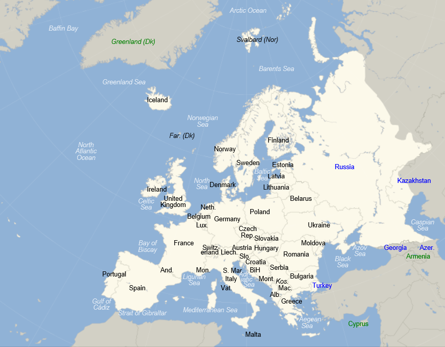
But some basic facts, for orientation. The 2013 population of Europe, shown in the following map, is estimated at just above 740 million persons. This makes Europe a little over 10 percent of total global population.

europe

The European Union (EU) includes 28 countries, as follows with their date of entry in parenthesis:

Austria (1995), Belgium (1952), Bulgaria (2007), Croatia (2013), Cyprus (2004), Czech Republic (2004), Denmark (1973), Estonia (2004), Finland (1995), France (1952), Germany (1952), Greece (1981), Hungary (2004), Ireland (1973), Italy (1952), Latvia (2004), Lithuania (2004), Luxembourg (1952), Malta (2004), Netherlands (1952), Poland (2004), Portugal (1986), Romania (2007), Slovakia (2004), Slovenia (2004), Spain (1986), Sweden (1995), United Kingdom (1973).

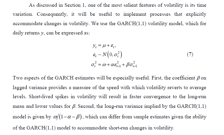
The EU site states that –

The single or ‘internal’ market is the EU’s main economic engine, enabling most goods, services, money and people to move freely. Another key objective is to develop this huge resource to ensure that Europeans can draw the maximum benefit from it.

There also are governing bodies which are headquartered for the most part in Brussels and administrative structures.

The Eurozone consists of 18 European Union countries which have adopted the euro as their common currency. These countries includes Belgium, Germany, Estonia, Ireland, Greece, Spain, France, Italy, Cyprus, Latvia, Luxembourg, Malta, the Netherlands, Austria, Portugal, Slovenia, Slovakia and Finland.

The European Central Bank (ECB) is located in Frankfurt, Germany and performs a number of central bank functions, but does not clearly state its mandate on its website, so far as I can discover. The ECB has a governing council comprised of representatives from Eurozone banking and finance circles.

Economic Significance of Europe

Something like 160 out of the Global 500 Corporations identified by Fortune magazine are headquartered in Europe – and, of course, tax slides are moving more and more US companies to nominally move their operations to Europe.

According to the International Monetary Fund World Economic Outlook (July 14, 2013 update), the Eurozone accounts for an estimated 17 percent of global output, while the European Union countries comprise an estimated 24 percent of global output. By comparison the US accounts for 23 percent of global output, where all these percents are measured in terms of output in current US dollar equivalents.

What is the Problem?

I began engaging with Europe and its economic setup professionally, some years ago. The European market is important to information technology (IT) companies. Europe was a focus for me in 2008 and through the so-called Great Recession, when sharp drops in output occurred on both sides of the Atlantic. Then, after 2009 for several years, the impact of the global downturn continued to be felt in Europe, especially in the Eurozone, where there was alarm about the possible breakup of the Eurozone, defaults on sovereign debt, and massive banking failure.

I have written dozens of pages on European economic issues for circulation in business contexts. It’s hard to distill all this into a more current perspective, but I think the Greek economist Yanis Varoufakis does a fairly good job.

Let me cite two posts – WHY IS EUROPE NOT ‘COMING TOGETHER’ IN RESPONSE TO THE EURO CRISIS? and MODEST PROPOSAL.

The first quote highlights the problems (and lure) of a common currency to a weaker economy, such as Greece.

Right from the beginning, the original signatories of the Treaty of Rome, the founding members of the European Economic Community, constituted an asymmetrical free trade zone….

To see the significance of this asymmetry, take as an example two countries, Germany and Greece today (or Italy back in the 1950s). Germany, features large oligopolistic manufacturing sectors that produce high-end consumption as well as capital goods, with significant economies of scale and large excess capacity which makes it hard for foreign competitors to enter its markets. The other, Greece for instance, produces next to no capital goods, is populated by a myriad tiny firms with low price-cost margins, and its industry has no capacity to deter competitors from entering.

By definition, a country like Germany can simply not generate enough domestic demand to absorb the products its capital intensive industry can produce and must, thus, export them to the country with the lower capital intensity that cannot produce these goods competitively. This causes a chronic trade surplus in Germany and a chronic trade deficit in Greece.

If the exchange rate is flexible, it will inevitably adjust, constantly devaluing the currency of the country with the lower price-cost margins and revaluing that of the more capital-intensive economy. But this is a problem for the elites of both nations. Germany’s industry is hampered by uncertainty regarding how many DMs it will receive for a BMW produced today and destined to be sold in Greece in, say, ten months. Similarly, the Greek elites are worried by the devaluation of the drachma because, every time the drachma devalues, their lovely homes in the Northern Suburbs of Athens, or indeed their yachts and other assets, lose value relative to similar assets in London and Paris (which is where they like to spend their excess cash). Additionally, Greek workers despise devaluation because it eats into every small pay rise they manage to extract from their employers. This explains the great lure of a common currency to Greeks and to Germans, to capitalists and labourers alike. It is why, despite the obvious pitfalls of the euro, whole nations are drawn to it like moths to the flame.

So there is a problem within the Eurozone of “recycling trade surpluses” basically from Germany and the stronger members to peripheral countries such as Greece, Portugal, Ireland, and even Spain – where Italy is almost a special, but very concerning case.

The next quote is from a section in MODEST PROPOSAL called “The Nature of the Eurozone Crisis.” It is is about as succinct an overview of the problem as I know of – without being excessively ideological.

The Eurozone crisis is unfolding on four interrelated domains.

Banking crisis: There is a common global banking crisis, which was sparked off mainly by the catastrophe in American finance. But the Eurozone has proved uniquely unable to cope with the disaster, and this is a problem of structure and governance. The Eurozone features a central bank with no government, and national governments with no supportive central bank, arrayed against a global network of mega-banks they cannot possibly supervise. Europe’s response has been to propose a full Banking Union – a bold measure in principle but one that threatens both delay and diversion from actions that are needed immediately.

Debt crisis: The credit crunch of 2008 revealed the Eurozone’s principle of perfectly separable public debts to be unworkable. Forced to create a bailout fund that did not violate the no-bailout clauses of the ECB charter and Lisbon Treaty, Europe created the temporary European Financial Stability Facility (EFSF) and then the permanent European Stability Mechanism (ESM). The creation of these new institutions met the immediate funding needs of several member-states, but retained the flawed principle of separable public debts and so could not contain the crisis. One sovereign state, Cyprus, has now de facto gone bankrupt, imposing capital controls even while remaining inside the euro.

During the summer of 2012, the ECB came up with another approach: the Outright Monetary Transactions’ Programme (OMT). OMT succeeded in calming the bond markets for a while. But it too fails as a solution to the crisis, because it is based on a threat against bond markets that cannot remain credible over time.

And while it puts the public debt crisis on hold, it fails to reverse it; ECB bond purchases cannot restore the lending power of failed markets or the borrowing power of failing governments.

Investment crisis: Lack of investment in Europe threatens its living standards and its international competitiveness. As Germany alone ran large surpluses after 2000, the resulting trade imbalances ensured that when crisis hit in 2008, the deficit zones would collapse. And the burden of adjustment fell exactly on the deficit zones, which could not bear it. Nor could it be offset by devaluation or new public spending, so the scene was set for disinvestment in the regions that needed investment the most.

Thus, Europe ended up with both low total investment and an even more uneven distribution of that investment between its surplus and deficit regions.

Social crisis: Three years of harsh austerity have taken their toll on Europe’s peoples. From Athens to Dublin and from Lisbon to Eastern Germany, millions of Europeans have lost access to basic goods and dignity. Unemployment is rampant. Homelessness and hunger are rising. Pensions have been cut; taxes on necessities meanwhile continue to rise. For the first time in two generations, Europeans are questioning the European project, while nationalism, and even Nazi parties, are gaining strength.

This is from a white paper jointly authored by Yanis Varoufakis, Stuart Holland and James K. Galbraith which offers a rationale and proposal for a European “New Deal.” In other words, take advantage of the record low global interest rates and build infrastructure.

The passage covers quite a bit of ground without appearing to be comprehensive. However, it will be be a good guide to check, I think, if a significant downturn unfolds in the next few quarters. Some of the nuances will come to life, as flaws in original band-aid solutions get painfully uncovered.

Now there is no avoiding some type of ideological or political stance in commenting on these issues, but the future is the real question. What will happen if a recession takes hold in the next few quarters?

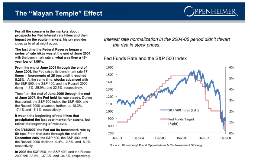
More on European Banks

European banks have been significantly under-capitalized, as the following graphic from before the Great Recession highlights.

bankleverage

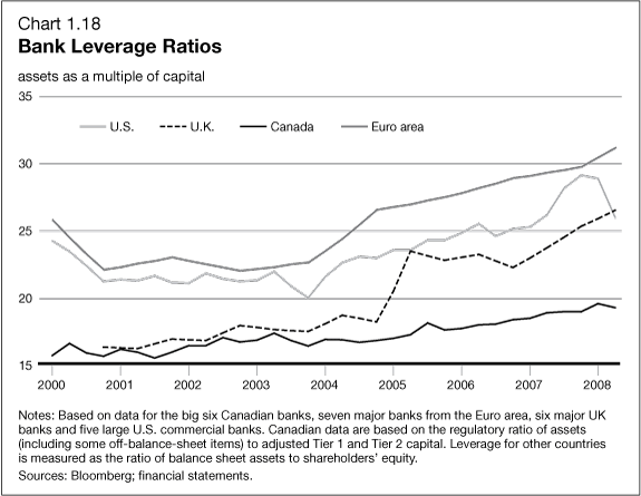
Another round of stress tests are underway by the ECB, and, according to the Wall Street Journal, will be shared with banks in coming weeks. Significant recapitalization of European banks, often through stock issues, has taken place. Things have moved forward from the point at which, last year, the US Federal Deposit Insurance Corporation (FDIC) Vice Chairman called Deutsche Banks capitalization ratios “horrible,” “horribly undercapitalized” and with “no margin of error.”

Bottom LIne

If a recession unfolds in the next few quarters, it is likely to significantly impact the European economy, opening up old wounds, so to speak, wounds covered with band-aid solutions. I know I have not proven this assertion in this post, but it is a message I want to convey.

The banking sector is probably where the problems will first flare up, since banks have significant holdings of sovereign debt from EU states that already are on the ropes – like Greece, Spain, Portugal, and Italy. There also appears to be some evidence of froth in some housing markets, with record low interest rates and the special conditions in the UK.

Hopefully, the global economy can side-step this current wobble from the first quarter 2014 and maybe even further in some quarters, and somehow sustain positive or at least zero growth for a few years.

Otherwise, this looks like a house of cards.

Distributions of Stock Returns and Other Asset Prices

This is a kind of wrap-up discussion of probability distributions and daily stock returns.

When I did autoregressive models for daily stock returns, I kept getting this odd, pointy, sharp-peaked distribution of residuals with heavy tails. Recent posts have been about fitting a Laplace distribution to such data.

I have recently been working with the first differences of the logarithm of daily closing prices – an entity the quantitative finance literature frequently calls “daily returns.”

It turns out many researchers have analyzed the distribution of stock returns, finding fundamental similarities in the resulting distributions. There are also similarities for many stocks in many international markets in the distribution of trading volumes and the number of trades. These similarities exist at a range of frequencies – over a few minutes, over trading days, and longer periods.

The paradigmatic distribution of returns looks like this:

NASDAQDR

This is based on closing prices of the NASDAQ 100 from October 1985 to the present.

There also are power laws that can be extracted from the probabilities that the absolute value of returns will exceed a certain amount.

For example, again with daily returns from the NASDAQ 100, we get an exponential distribution if we plot these probabilities of exceedance. This curve can be fit by a relationship ~x where θ is between 2.7 and 3.7, depending on where you start the estimation from the top or largest probabilities.

NASDAQABSDR

These magnitudes of the exponent are significant, because they seem to rule out whole classes, such as Levy stable distributions, which require θ < 2.

Also, let me tell you why I am not “extracting the autoregressive components” here. There are probably nonlinear lag effects in these stock price data. So my linear autoregressive equations probably cannot extract all the time dependence that exist in the data. For that reason, and also because it seems pro forma in quantitative finance, my efforts have turned to analyzing what you might call the raw daily returns calculated with price data and suitable transformations.

Levy Stable Distributions

At the turn of the century, Mandelbrot, then Sterling Professor of Mathematics at Yale, wrote an introductory piece for a new journal called Quantitative Finance called Scaling in financial prices: I. Tails and dependence. In that piece, which is strangely convoluted by my lights, Mandelbrot discusses how he began working with Levy-stable distributions in the 1960’s to model the heavy tails of various stock and commodity price returns.

The terminology is a challenge, since there appear to be various ways of discussing so-called stable distributions, which are distributions which yield other distributions of the same type under operations like summing random variables, or taking their ratios.

The Quantitative Finance section of Stack Exchange has a useful Q&A on Levy-stable distributions in this context.

Answers refer readers to Nolan’s 2005 paper Modeling Financial Data With Stable Distributions which tells us that the class of all distributions that are sum-stable is described by four parameters. The distributions controlled by these parameters, however, are generally not accessible as closed algebraic expressions, but must be traced out numerically by computer computations.

Nolan gives several applications, for example, to currency data, illustrated with the following graphs.

Nolan1

So, the characteristics of the Laplace distribution I find so compelling are replicated to an extent by the Levy-stable distributions.

While Levy-stable distributions continue to be the focus of research in some areas of quantitative finance – risk assessment, for instance – it’s probably true that applications to stock returns are less popular lately. There are two reasons in particular. First, Levy stable distributions apparently have infinite variance, and as Cont writes, there is conclusive evidence that stock prices have finite second moments. Secondly, Levy stable distributions imply power laws for the probability of exceedance of a given level of absolute value of returns, but unfortunately these power laws have an exponent less than 2.

Neither of these “facts” need prove conclusive, though. Various truncated versions of Levy stable distributions have been used in applications like estimating Value at Risk (VAR).

Nolan also maintains a webpage which addresses some of these issues, and provides tools to apply Levy stable distributions.

Why Do These Regularities in Daily Returns and Other Price Data Exist?

If I were to recommend a short list of articles as “must-reads” in this field, Rama Cont’s 2001 survey in Quantitative Finance would be high on the list, as well as Gabraix et al’s 2003 paper on power laws in finance.

Cont provides a list of11 stylized facts regarding the distribution of stock returns.

1. Absence of autocorrelations: (linear) autocorrelations of asset returns are often insignificant, except for very small intraday time scales (

20 minutes) for which microstructure effects come into play.

2. Heavy tails: the (unconditional) distribution of returns seems to display a power-law or Pareto-like tail, with a tail index which is finite, higher than two and less than five for most data sets studied. In particular this excludes stable laws with infinite variance and the normal distribution. However the precise form of the tails is difficult to determine.

3. Gain/loss asymmetry: one observes large drawdowns in stock prices and stock index values but not equally large upward movements.

4. Aggregational Gaussianity: as one increases the time scale t over which returns are calculated, their distribution looks more and more like a normal distribution. In particular, the shape of the distribution is not the same at different time scales.

5. Intermittency: returns display, at any time scale, a high degree of variability. This is quantified by the presence of irregular bursts in time series of a wide variety of volatility estimators.

6. Volatility clustering: different measures of volatility display a positive autocorrelation over several days, which quantifies the fact that high-volatility events tend to cluster in time.

7. Conditional heavy tails: even after correcting returns for volatility clustering (e.g. via GARCH-type models), the residual time series still exhibit heavy tails. However, the tails are less heavy than in the unconditional distribution of returns.

8. Slow decay of autocorrelation in absolute returns: the autocorrelation function of absolute returns decays slowly as a function of the time lag, roughly as a power law with an exponent β ∈ [0.2, 0.4]. This is sometimes interpreted as a sign of long-range dependence.

9. Leverage effect: most measures of volatility of an asset are negatively correlated with the returns of that asset.

10. Volume/volatility correlation: trading volume is correlated with all measures of volatility.

11. Asymmetry in time scales: coarse-grained measures of volatility predict fine-scale volatility better than the other way round.

There’s a huge amount here, and it’s very plainly and well stated.

But then why?

Gabraix et al address this question, in a short paper published in Nature.

Insights into the dynamics of a complex system are often gained by focusing on large fluctuations. For the financial system, huge databases now exist that facilitate the analysis of large fluctuations and the characterization of their statistical behavior. Power laws appear to describe histograms of relevant financial fluctuations, such as fluctuations in stock price, trading volume and the number of trades. Surprisingly, the exponents that characterize these power laws are similar for different types and sizes of markets, for different market trends and even for different countries suggesting that a generic theoretical basis may underlie these phenomena. Here we propose a model, based on a plausible set of assumptions, which provides an explanation for these empirical power laws. Our model is based on the hypothesis that large movements in stock market activity arise from the trades of large participants. Starting from an empirical characterization of the size distribution of those large market participants (mutual funds), we show that the power laws observed in financial data arise when the trading behaviour is performed in an optimal way. Our model additionally explains certain striking empirical regularities that describe the relationship between large fluctuations in prices, trading volume and the number of trades.

The kernel of this paper in Nature is as follows:

powerlaws

Thus, Gabraix links the distribution of purchases in stock and commodity markets with the resulting distribution of daily returns.

I like this hypothesis and see ways it connects with the Laplace distribution and its variants. Probably, I will write more about this in a later post.

The NASDAQ 100 Daily Returns and Laplace Distributed Errors

I once ran into Norman Mailer at the Museum of Modern Art in Manhattan. We were both looking at Picasso’s “Blue Boy” and, recognizing him, I started up some kind of conversation, and Mailer was quite civil about the whole thing.

I mention this because I always associate Mailer with his collection Advertisements for Myself.

And that segues – loosely – into my wish to let you know that, in fact, I developed a generalization of the law of demand for the situation in which a commodity is sold at a schedule of rates and fees, instead of a uniform price. That was in 1987, when I was still a struggling academic and beginning a career in business consulting.

OK, and that relates to a point I want to suggest here. And that is that minor players can have big ideas.

So I recognize an element of “hubris” in suggesting that the error process of S&P 500 daily returns – up to certain transformations – is described by a Laplace distribution.

What about other stock market indexes, then? This morning, I woke up and wondered whether the same thing is true for, say, the NASDAQ 100.

NASDAQ100

So I downloaded daily closing prices for the NASDAQ 100 from Yahoo Finance dating back to October 1, 1985. Then, I took the natural log of each of these closing prices. After that, I took trading day by trading day differences. So the series I am analyzing comes from the first differences of the natural log of the NASDAQ 100 daily closing prices.

Note that this series of first differences is sometimes cast into a histogram by itself – and this also frequently is a “pointy peaked” relatively symmetric distribution. You could motivate this graph with the idea that stock prices are a random walk. So if you take first differences, you get the random component that generates the random walk.

I am troubled, however, by the fact that this component has considerable structure in and of itself. So I undertake further analysis.

For example, the autocorrelation function of these first differences of the log of NASDAQ 100 daily closing prices looks like this.

NASDAQAC

Now if you calculate bivariate regressions on these first differences and their lagged values, many of them produce coefficient estimates with t-statistics that exceed the magic value of 2.

Just selecting these significant regressors from the first 47 lags produces this regression equation, I get this equation.

Regression

Now this regression is estimated over all 7200 observations from October 1 1984 to almost right now.

Graphing the residuals, I get the familiar pointy-peaked distribution that we saw with the S&P 500.

LaplaceNASDAQ100

Here is a fit of the Laplace distribution to this curve (Again using EasyFit).

EFLNQ

Here are the metrics for this fit and fits to a number of other probability distributions from this program.

EFtable

I have never seen as clear a linkage of returns from stock indexes and the Laplace distribution (maybe with a slight asymmetry – there are also asymmetric Laplace distributions).

One thing is for sure – the distribution above for the NASDAQ 100 data and the earlier distribution developed for the S&P 500 are not close to be normally distributed. Thus, in the table above that the normal distribution is number 12 on the list of possible candidates identified by EasyFit.

Note “Error” listed in the above table, is not the error function related to the normal distribution. Instead it is another exponential distribution with an absolute value in the exponent like the Laplace distribution. In fact, it looks like a transformation of the Laplace, but I need to do further investigation. In any case, it’s listed as number 2, even though the metrics show the same numbers.

The plot thickens.

Obviously, the next step is to investigate individual stocks with respect to Laplacian errors in this type of transformation.

Also, some people will be interested in whether the autoregressive relationship listed above makes money under the right trading rules. I will report further on that.

Anyway, thanks for your attention. If you have gotten this far – you believe numbers have power. Or you maybe are interested in finance and realize that indirect approaches may be the best shot at getting to something fundamental.