Tag Archives: accuracy of forecasts

Bootstrapping

I’ve been reading about the bootstrap. I’m interested in bagging or bootstrap aggregation.

The primary task of a statistician is to summarize a sample based study and generalize the finding to the parent population in a scientific manner..

The purpose of a sample study is to gather information cheaply in a timely fashion. The idea behind bootstrap is to use the data of a sample study at hand as a “surrogate population”, for the purpose of approximating the sampling distribution of a statistic; i.e. to resample (with replacement) from the sample data at hand and create a large number of “phantom samples” known as bootstrap samples. The sample summary is then computed on each of the bootstrap samples (usually a few thousand). A histogram of the set of these computed values is referred to as the bootstrap distribution of the statistic.

These well-phrased quotes come from Bootstrap: A Statistical Method by Singh and Xie.

OK, so let’s do a simple example.

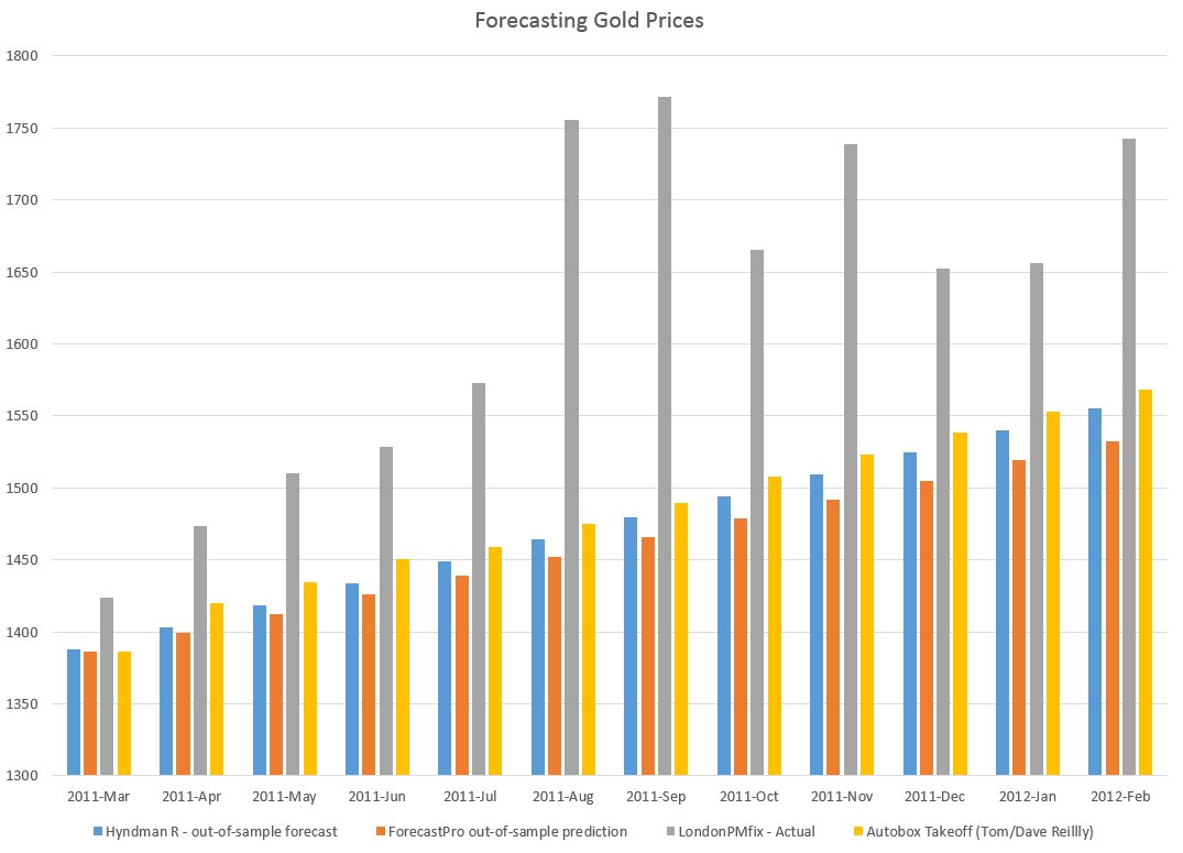
Suppose we generate ten random numbers, drawn independently from a Gaussian or normal distribution with a mean of 10 and standard deviation of 1.

vector

This sample has an average of 9.7684. We would like to somehow project a 95 percent confidence interval around this sample mean, to understand how close it is to the population average.

So we bootstrap this sample, drawing 10,000 samples of ten numbers with replacement.

Here is the distribution of bootstrapped means of these samples.
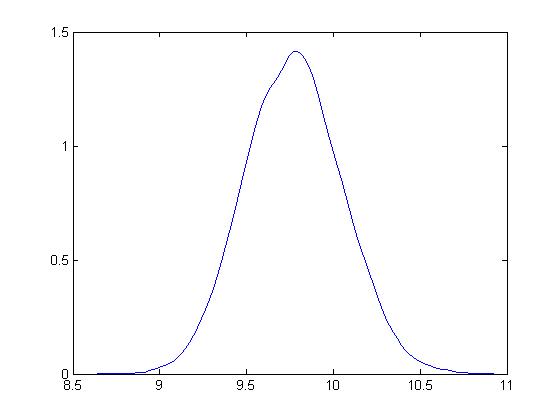
bootstrapdist

The mean is 9.7713.

Based on the method of percentiles, the 95 percent confidence interval for the sample mean is between 9.32 and 10.23, which, as you note, correctly includes the true mean for the population of 10.

Bias-correction is another primary use of the bootstrap. For techies, there is a great paper from the old Bell Labs called A Real Example That Illustrates Properties of Bootstrap Bias Correction. Unfortunately, you have to pay a fee to the American Statistical Association to read it – I have not found a free copy on the Web.

In any case, all this is interesting and a little amazing, but what we really want to do is look at the bootstrap in developing forecasting models.

Bootstrapping Regressions

There are several methods for using bootstrapping in connection with regressions.

One is illustrated in a blog post from earlier this year. I treated the explanatory variables as variables which have a degree of randomness in them, and resampled the values of the dependent variable and explanatory variables 200 times, finding that doing so “brought up” the coefficient estimates, moving them closer to the underlying actuals used in constructing or simulating them.

This method works nicely with hetereoskedastic errors, as long as there is no autocorrelation.

Another method takes the explanatory variables as fixed, and resamples only the residuals of the regression.

Bootstrapping Time Series Models

The underlying assumptions for the standard bootstrap include independent and random draws.

This can be violated in time series when there are time dependencies.

Of course, it is necessary to transform a nonstationary time series to a stationary series to even consider bootstrapping.

But even with a time series that fluctuates around a constant mean, there can be autocorrelation.

So here is where the block bootstrap can come into play. Let me cite this study – conducted under the auspices of the Cowles Foundation (click on link) – which discusses the asymptotic properties of the block bootstrap and provides key references.

There are many variants, but the basic idea is to sample blocks of a time series, probably overlapping blocks. So if a time series yt  has n elements, y1,..,yn and the block length is m, there are n-m blocks, and it is necessary to use n/m of these blocks to construct another time series of length n. Issues arise when m is not a perfect divisor of n, and it is necessary to develop special rules for handling the final values of the simulated series in that case.

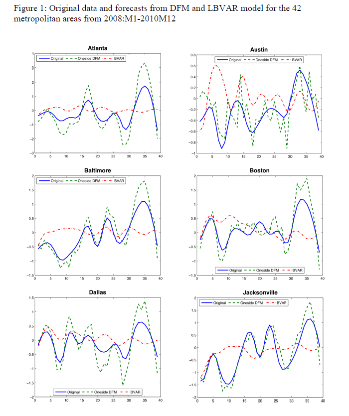
Block bootstrapping is used by Bergmeir, Hyndman, and Benıtez in bagging exponential smoothing forecasts.

How Good Are Bootstrapped Estimates?

Consistency in statistics or econometrics involves whether or not an estimate or measure converges to an unbiased value as sample size increases – or basically goes to infinity.

This is a huge question with bootstrapped statistics, and there are new findings all the time.

Interestingly, sometimes bootstrapped estimates can actually converge faster to the appropriate unbiased values than can be achieved simply by increasing sample size.

And some metrics really do not lend themselves to bootstrapping.

Also some samples are inappropriate for bootstrapping.  Gelman, for example, writes about the problem of “separation” in a sample

[In} ..an example of a poll from the 1964 U.S. presidential election campaign, … none of the black respondents in the sample supported the Republican candidate, Barry Goldwater… If zero black respondents in the sample supported Barry Goldwater, then zero black respondents in any bootstrap sample will support Goldwater as well. Indeed, bootstrapping can exacerbate separation by turning near-separation into complete separation for some samples. For example, consider a survey in which only one or two of the black respondents support the Republican candidate. The resulting logistic regression estimate will be noisy but it will be finite.

Here is a video doing a good job of covering the bases on boostrapping. I suggest sampling portions of it first. It’s quite good, but it may seem too much going into it.

More on Automatic Forecasting Packages – Autobox Gold Price Forecasts

Yesterday, my post discussed the statistical programming language R and Rob Hyndman’s automatic forecasting package, written in R – facts about this program, how to download it, and an application to gold prices.

In passing, I said I liked Hyndman’s disclosure of his methods in his R package and “contrasted” that with leading competitors in the automatic forecasting market space –notably Forecast Pro and Autobox.

This roused Tom Reilly, currently Senior Vice-President and CEO of Automatic Forecast Systems – the company behind Autobox.

62_tom

Reilly, shown above, wrote  –

You say that Autobox doesn’t disclose its methods.  I think that this statement is unfair to Autobox.  SAS tried this (Mike Gilliland) on the cover of his book showing something purporting to a black box.  We are a white box.  I just downloaded the GOLD prices and recreated the problem and ran it. If you open details.htm it walks you through all the steps of the modeling process.  Take a look and let me know your thoughts.  Much appreciated!

AutoBox Gold Price Forecast

First, disregarding the issue of transparency for a moment, let’s look at a comparison of forecasts for this monthly gold price series (London PM fix).

A picture tells the story (click to enlarge).

ABFPHcomp

So, for this data, 2007 to early 2011, Autobox dominates. That is, all forecasts are less than the respective actual monthly average gold prices. Thus, being linear, if one forecast method is more inaccurate than another for one month, that method is less accurate than the forecasts generated by this other approach for the entire forecast horizon.

I guess this does not surprise me. Autobox has been a serious contender in the M-competitions, for example, usually running just behind or perhaps just ahead of Forecast Pro, depending on the accuracy metric and forecast horizon. (For a history of these “accuracy contests” see Markridakis and Hibon’s article on M3).

And, of course, this is just one of many possible forecasts that can be developed with this time series, taking off from various ending points in the historic record.

The Issue of Transparency

In connection with all this, I also talked with Dave Reilly, a founding principal of Autobox, shown below.

DaveReilly

Among other things, we went over the “printout” Tom Reilly sent, which details the steps in the estimation of a final time series model to predict these gold prices.

A blog post on the Autobox site is especially pertinent, called Build or Make your own ARIMA forecasting model? This discussion contains two flow charts which describe the process of building a time series model, I reproduce here, by kind permission.

The first provides a plain vanilla description of Box-Jenkins modeling.

Rflowchart1

The second flowchart adds steps revised for additions by Tsay, Tiao, Bell, Reilly & Gregory Chow (ie chow test).

Rflowchart2

Both start with plotting the time series to be analyzed and calculating the autocorrelation and partial autocorrelation functions.

But then additional boxes are added for accounting for and removing “deterministic” elements in the time series and checking for the constancy of parameters over the sample.

The analysis run Tom Reilly sent suggests to me that “deterministic” elements can mean outliers.

Dave Reilly made an interesting point about outliers. He suggested that the true autocorrelation structure can be masked or dampened in the presence of outliers. So the tactic of specifying an intervention variable in the various trial models can facilitate identification of autoregressive lags which otherwise might appear to be statistically not significant.

Really, the point of Autobox model development is to “create an error process free of structure.” That a Dave Reilly quote.

So, bottom line, Autobox’s general methods are well-documented. There is no problem of transparency with respect to the steps in the recommended analysis in the program. True, behind the scenes, comparisons are being made and alternatives are being rejected which do not make it to the printout of results. But you can argue that any commercial software has to keep some kernel of its processes proprietary.

I expect to be writing more about Autobox. It has a good track record in various forecasting competitions and currently has a management team that actively solicits forecasting challenges.

Forecasting Controversies – Impacts of QE

Where there is smoke, there is fire, and other similar adages are suggested by an arcane statistical controversy over quantitative easing (QE) by the US Federal Reserve Bank.

Some say this Fed policy, estimated to have involved $3.7 trillion dollars in asset purchases, has been a bust, a huge waste of money, a give-away program to speculators, but of no real consequence to Main Street.

Others credit QE as the main force behind lower long term interest rates, which have supported US housing markets.

Into the fray jump two elite econometricians – Johnathan Wright of Johns Hopkins and Christopher Neeley, Vice President of the St. Louis Federal Reserve Bank.

The controversy provides an ersatz primer in estimation and forecasting issues with VAR’s (vector autoregressions). I’m not going to draw out all the nuances, but highlight the main features of the argument.

The Effect of QE Announcements From the Fed Are Transitory – Lasting Maybe Two or Three Months

Basically, there is the VAR (vector autoregression) analysis of Johnathan Wright of Johns Hopkins Univeristy, which finds that  –

..stimulative monetary policy shocks lower Treasury and corporate bond yields, but the effects die o¤ fairly fast, with an estimated half-life of about two months.

This is in a paper What does Monetary Policy do to Long-Term Interest Rates at the Zero Lower Bound? made available in PDF format dated May 2012.

More specifically, Wright finds that

Over the period since November 2008, I estimate that monetary policy shocks have a significant effect on ten-year yields and long-maturity corporate bond yields that wear o¤ over the next few months. The effect on two-year Treasury yields is very small. The initial effect on corporate bond yields is a bit more than half as large as the effect on ten-year Treasury yields. This finding is important as it shows that the news about purchases of Treasury securities had effects that were not limited to the Treasury yield curve. That is, the monetary policy shocks not only impacted Treasury rates, but were also transmitted to private yields which have a more direct bearing on economic activity. There is slight evidence of a rotation in breakeven rates from Treasury Inflation Protected Securities (TIPS), with short-term breakevens rising and long-term forward breakevens falling.

Not So, Says A Federal Reserve Vice-President

Christopher Neeley at the St. Louis Federal Reserve argues Wright’s VAR system is unstable and has poor performance in out-of-sample predictions. Hence, Wright’s conclusions cannot be accepted, and, furthermore, that there are good reasons to believe that QE has had longer term impacts than a couple of months, although these become more uncertain at longer horizons.

ChristopherNeely

Neeley’s retort is in a Federal Reserve working paper How Persistent are Monetary Policy Effects at the Zero Lower Bound?

A key passage is the following:

Specifically, although Wright’s VAR forecasts well in sample, it forecasts very poorly out-of-sample and fails structural stability tests. The instability of the VAR coefficients imply that any conclusions about the persistence of shocks are unreliable. In contrast, a naïve, no-change model out-predicts the unrestricted VAR coefficients. This suggests that a high degree of persistence is more plausible than the transience implied by Wright’s VAR. In addition to showing that the VAR system is unstable, this paper argues that transient policy effects are inconsistent with standard thinking about risk-aversion and efficient markets. That is, the transient effects estimated by Wright would create an opportunity for risk-adjusted  expected returns that greatly exceed values that are consistent with plausible risk aversion. Restricted VAR models that are consistent with reasonable risk aversion and rational asset pricing, however, forecast better than unrestricted VAR models and imply a more plausible structure. Even these restricted models, however, do not outperform naïve models OOS. Thus, the evidence supports the view that unconventional monetary policy shocks probably have fairly persistent effects on long yields but we cannot tell exactly how persistent and our uncertainty about the effects of shocks grows with the forecast horizon.

And, it’s telling, probably, that Neeley attempts to replicate Wright’s estimation of a VAR with the same data, checking the parameters, and then conducting additional tests to show that this model cannot be trusted – it’s unstable.

Pretty serious stuff.

Neeley gets some mileage out of research he conducted at the end of the 1990’s in Predictability in International Asset Returns: A Re-examination where he again called into question the longer term forecasting capability of VAR models, given their instabilities.

What is a VAR model?

We really can’t just highlight this controversy without saying a few words about VAR models.

A simple autoregressive relationship for a time series yt can be written as

yt = a1yt-1+..+anyt-n + et

Now if we have other variables (wt, zt..) and we write yt and all these other variables as equations in which the current values of these variables are functions of lagged values of all the variables.

The matrix notation is somewhat hairy, but that is a VAR. It is a system of autoregressive equations, where each variable is expressed as a linear sum of lagged terms of all the other variables.

One of the consequences of setting up a VAR is there are lots of parameters to estimate. So if p lags are important for each of three variables, each equation contains 3p parameters to estimate, so altogether you need to estimate 9p parameters – unless it is reasonable to impose certain restrictions.

Another implication is that there can be reduced form expressions for each of the variables – written only in terms of their own lagged values. This, in turn, suggests construction of impulse-response functions to see how effects propagate down the line.

Additionally, there is a whole history of Bayesian VAR’s, especially associated with the Minneapolis Federal Reserve and the University of Minnesota.

My impression is that, ultimately, VAR’s were big in the 1990’s, but did not live up to their expectations, in terms of macroeconomic forecasting. They gave way after 2000 to the Stock and Watson type of factor models. More variables could be encompassed in factor models than VAR’s, for one thing. Also, factor models often beat the naïve benchmark, while VAR’s frequently did not, at least out-of-sample.

The Naïve Benchmark

The naïve benchmark is a martingale, which often boils down to a simple random walk. The best forecast for the next period value of a martingale is the current period value.

This is the benchmark which Neeley shows the VAR model does not beat, generally speaking, in out-of-sample applications.

Naive

When the ratio is 1 or greater, this means that the mean square forecast error of the VAR is greater than the benchmark model.

Reflections

There are many fascinating details of these papers I am not highlighting. As an old Republican Congressman once said, “a billion here and a billion there, and pretty soon you are spending real money.”

So the defense of QE in this instance boils down to invalidating an analysis which suggests the impacts of QE are transitory, lasting a few months.

There is no proof, however, that QE has imparted lasting impacts on long term interest rates developed in this relatively recent research.

Forecasting Housing Markets – 3

Maybe I jumped to conclusions yesterday. Maybe, in fact, a retrospective analysis of the collapse in US housing prices in the recent 2008-2010 recession has been accomplished – but by major metropolitan area.

The Yarui Li and David Leatham paper Forecasting Housing Prices: Dynamic Factor Model versus LBVAR Model focuses on out-of-sample forecasts for house price indices for 42 metropolitan areas. Forecast models are built with data from 1980:01 to 2007:12. These models – dynamic factor and Large-scale Bayesian Vector Autoregressive (LBVAR) models – are used to generate forecasts of the one- to twelve- months ahead price growth 2008:01 to 2010:12.

Judging from the graphics and other information, the dynamic factor model (DFM) produces impressive results.

For example, here are out-of-sample forecasts of the monthly growth of housing prices (click to enlarge).

DFMhousing

The house price indices for the 42 metropolitan areas are from the Office of Federal Housing Enterprise Oversight (OFEO). The data for macroeconomic indicators in the dynamic factor and VAR models are from the DRI/McGraw Hill Basic Economics Database provided by IHS Global Insight.

I have seen forecasting models using Internet search activity which purportedly capture turning points in housing price series, but this is something different.

The claim here is that calculating dynamic or generalized principal components of some 141 macroeconomic time series can lead to forecasting models which accurately capture fluctuations in cumulative growth rates of metropolitan house price indices over a forecasting horizon of up to 12 months.

That’s pretty startling, and I for one would like to see further output of such models by city.

But where is the publication of the final paper? The PDF file linked above was presented at the Agricultural & Applied Economics Association’s 2011 Annual Meeting in Pittsburgh, Pennsylvania, July, 2011. A search under both authors does not turn up a final publication in a refereed journal, but does indicate there is great interest in this research. The presentation paper thus is available from quite a number of different sources which obligingly archive it.

Yarui

Currently, the lead author, Yarui Li, Is a Decision Tech Analyst at JPMorgan Chase, according to LinkedIn, having received her PhD from Texas A&M University in 2013. The second author is Professor at Texas A&M, most recently publishing on VAR models applied to business failure in the US.

Dynamic Principal Components

It may be that dynamic principal components are the new ingredient accounting for an uncanny capability to identify turning points in these dynamic factor model forecasts.

The key research is associated with Forni and others, who originally documented dynamic factor models in the Review of Economics and Statistics in 2000. Subsequently, there have been two further publications by Forni on this topic:

Do financial variables help forecasting inflation and real activity in the euro area?

The Generalized Dynamic Factor Model, One Sided Estimation and Forecasting

Forni and associates present this method of dynamic prinicipal componets as an alternative to the Stock and Watson factor models based on many predictors – an alternative with superior forecasting performance.

Run-of-the-mill standard principal components are, according to Li and Leatham, based on contemporaneous covariances only. So they fail to exploit the potentially crucial information contained in the leading-lagging relations between the elements of the panel.

By contrast, the Forni dynamic component approach is used in this housing price study to

obtain estimates of common and idiosyncratic variance-covariance matrices at all leads and lags as inverse Fourier transforms of the corresponding estimated spectral density matrices, and thus overcome(s)[ing] the limitation of static PCA.

There is no question but that any further discussion of this technique must go into high mathematical dudgeon, so I leave that to another time, when I have had an opportunity to make computations of my own.

However, I will say that my explorations with forecasting principal components last year have led to me to wonder whether, in fact, it may be possible to pull out some turning points from factor models based on large panels of macroeconomic data.

Forecasting Housing Markets – 2

I am interested in business forecasting “stories.” For example, the glitch in Google’s flu forecasting program.

In real estate forecasting, the obvious thing is whether quantitative forecasting models can (or, better yet, did) forecast the collapse in housing prices and starts in the recent 2008-2010 recession (see graphics from the previous post).

There are several ways of going at this.

Who Saw The Housing Bubble Coming?

One is to look back to see whether anyone saw the bursting of the housing bubble coming and what forecasting models they were consulting.

That’s entertaining. Some people, like Ron Paul, and Nouriel Roubini, were prescient.

Roubini earned the soubriquet Dr. Doom for an early prediction of housing market collapse, as reported by the New York Times:

On Sept. 7, 2006, Nouriel Roubini, an economics professor at New York University, stood before an audience of economists at the International Monetary Fund and announced that a crisis was brewing. In the coming months and years, he warned, the United States was likely to face a once-in-a-lifetime housing bust, an oil shock, sharply declining consumer confidence and, ultimately, a deep recession. He laid out a bleak sequence of events: homeowners defaulting on mortgages, trillions of dollars of mortgage-backed securities unraveling worldwide and the global financial system shuddering to a halt. These developments, he went on, could cripple or destroy hedge funds, investment banks and other major financial institutions like Fannie Mae and Freddie Mac.

NR

Roubini was spot-on, of course, even though, at the time, jokes circulated such as “even a broken clock is right twice a day.” And my guess is his forecasting model, so to speak, is presented in Crisis Economics: A Crash Course in the Future of Finance, his 2010 book with Stephen Mihm. It is less a model than whole database of tendencies, institutional facts, areas in which Roubini correctly identifies moral hazard.

I think Ron Paul, whose projections of collapse came earlier (2003), was operating from some type of libertarian economic model.  So Paul testified before House Financial Services Committee on Fannie Mae and Freddy Mac, that –

Ironically, by transferring the risk of a widespread mortgage default, the government increases the likelihood of a painful crash in the housing market,” Paul predicted. “This is because the special privileges granted to Fannie and Freddie have distorted the housing market by allowing them to attract capital they could not attract under pure market conditions. As a result, capital is diverted from its most productive use into housing. This reduces the efficacy of the entire market and thus reduces the standard of living of all Americans.

On the other hand, there is Ben Bernanke, who in a CNBC interview in 2005 said:

7/1/05 – Interview on CNBC 

INTERVIEWER: Ben, there’s been a lot of talk about a housing bubble, particularly, you know [inaudible] from all sorts of places. Can you give us your view as to whether or not there is a housing bubble out there?

BERNANKE: Well, unquestionably, housing prices are up quite a bit; I think it’s important to note that fundamentals are also very strong. We’ve got a growing economy, jobs, incomes. We’ve got very low mortgage rates. We’ve got demographics supporting housing growth. We’ve got restricted supply in some places. So it’s certainly understandable that prices would go up some. I don’t know whether prices are exactly where they should be, but I think it’s fair to say that much of what’s happened is supported by the strength of the economy.

Bernanke was backed by one of the most far-reaching economic data collection and analysis operations in the United States, since he was in 2005 a member of the Board of Governors of the Federal Reserve System and Chairman of the President’s Council of Economic Advisors.

So that’s kind of how it is. Outsiders, like Roubini and perhaps Paul, make the correct call, but highly respected and well-placed insiders like Bernanke simply cannot interpret the data at their fingertips to suggest that a massive bubble was underway.

I think it is interesting currently that Roubini, in March, promoted the idea that Yellen Is Creating another huge Bubble in the Economy

But What Are the Quantitative Models For Forecasting the Housing Market?

In a long article in the New York Times in 2009, How Did Economists Get It So Wrong?, Paul Krugman lays the problem at the feet of the efficient market hypothesis –

When it comes to the all-too-human problem of recessions and depressions, economists need to abandon the neat but wrong solution of assuming that everyone is rational and markets work perfectly.

Along these lines, it is interesting that the Zillow home value forecast methodology builds on research which, in one set of models, assumes serial correlation and mean reversion to a long-term price trend.

Zillow

Key research in housing market dynamics includes Case and Shiller (1989) and Capozza et al (2004), who show that the housing market is not efficient and house prices exhibit strong serial correlation and mean reversion, where large market swings are usually followed by reversals to the unobserved fundamental price levels.

Based on the estimated model parameters, Capozza et al are able to reveal the housing market characteristics where serial correlation, mean reversion, and oscillatory, convergent, or divergent trends can be derived from the model parameters.

Here is an abstract from critical research underlying this approach done in 2004.

An Anatomy of Price Dynamics in Illiquid Markets: Analysis and Evidence from Local Housing Markets

This research analyzes the dynamic properties of the difference equation that arises when markets exhibit serial correlation and mean reversion. We identify the correlation and reversion parameters for which prices will overshoot equilibrium (“cycles”) and/or diverge permanently from equilibrium. We then estimate the serial correlation and mean reversion coefficients from a large panel data set of 62 metro areas from 1979 to 1995 conditional on a set of economic variables that proxy for information costs, supply costs and expectations. Serial correlation is higher in metro areas with higher real incomes, population growth and real construction costs. Mean reversion is greater in large metro areas and faster growing cities with lower construction costs. The average fitted values for mean reversion and serial correlation lie in the convergent oscillatory region, but specific observations fall in both the damped and oscillatory regions and in both the convergent and divergent regions. Thus, the dynamic properties of housing markets are specific to the given time and location being considered.

The article is not available for free download so far as I can determine. But it is based on earler research, dating back to the later 1990’s in the pdf The Dynamic Structure of Housing Markets.

The more recent Housing Market Dynamics: Evidence of Mean Reversion and Downward Rigidity by Fannie Mae researchers, lists a lot of relevant research on the serial correlation of housing prices, which is usually locality-dependent.

In fact, the Zillow forecasts are based on ensemble methods, combining univariate and multivariate models – a sign of modernity in the era of Big Data.

So far, though, I have not found a truly retrospective study of the housing market collapse, based on quantitative models. Perhaps that is because only the Roubini approach works with such complex global market phenomena.

We are left, thus, with solid theoretical foundations, validated by multiple housing databases over different time periods, that suggests that people invest in housing based on momentum factors – and that this fairly obvious observation can be shown statistically, too.

Loess Seasonal Decomposition as a Forecasting Tool

I’ve applied something called loess decomposition to the London PM Fix gold series previously discussed in this blog.

This suggests insights missing from an application of Forecast Pro – a sort of standard in the automatic forecasting field.

Loess decomposition separates a time series into components – trend, seasonals, and residuals or remainder – based on locally weighted regression smoothing of the data.

I always wondered whether, in fact, there was a seasonal component to the monthly London PM fix time series.

Not every monthly or quarterly time series has credible seasonal components, of course.

The proof would seem to be in the pudding. If a program derives seasonal components for a time series, do those seasonal components improve forecasts? That seems to be the critical issue.

STL Decomposition

STL decomposition – seasonal trend decomposition based on loess – was proposed by Cleveland et al in an interesting-sounding publication called “The Journal of Official Statistics.” I found the citation working through the procedure for bagging exponential smoothing mentioned in the previous post.

Amazingly, there is an online resource which calculates this loess decomposition for data you input, based on a listed R routine. The citation is Wessa P., (2013), Decomposition by Loess (v1.0.2) in Free Statistics Software (v1.1.23-r7), Office for Research Development and Education, URL http://www.wessa.net/rwasp_decomposeloess.wasp/

Comparison of STL Decomposition and Forecast Pro Gold Price Forecasts

Here’s a typical graph comparing the forecast errors from the Forecast Pro runs with STL Decomposition.

goldloessFP

The trend component extracted by the STL decomposition was uncomplicated and easy to forecast by linear extrapolation. I added the seasonal component to these extrapolations to get the monthly forecasts over the six month forecast horizon. Forecast Pro, on the other hand, did not signal the existence of a seasonal component in this series, and, furthermore, identified the optimal forecast model as a random walk and the optimal forecast as the last observed value.

Here is the trend component from the STL decomposition.

Goldtrend

Discussion

Potentially, there is lots more to discuss here.

For example, to establish forecasts based on the loess decomposition of the gold price outperform Forecast Pro means compiling a large number of forecast comparisons, ideally one for all possible training sets beyond a minimum number of observations required for stable calculation of the STL algorithm. That is, each training set generates somewhat different values for the trend, seasonals, and residuals with loess decomposition. And Forecast Pro needs to be run for all these possible training sets also, with forecasts compared to out-of-sample data.

While I have not gone to this extent, I have done these computations several times with good results for STL decomposition.

Also, it’s clear that loess decomposition extracts constant variance seasonals. However, the shape of these seasonals change as the training set changes. It is necessary, thus, to study whether these changes can reflect multiplicative seasonality, for series in which that type of seasonality predominates. For example, perhaps STL seasonals tend to reflect the end points of the training sets.

Bergmeir, Hyndman, and Benıtez (BHB) apply a Box Cox transformation in one of their bagged exponential smoothing methods. This is possibly another way to sidestep problems of multiplicative or hetereoskedastic seasonality. It also makes sense when one is attempting to bag a time series.

However, my explorations suggest the results of STL decomposition are quite flexible, and, in the case of this gold price series, often produce superior forecasts to results from one of the main off-the-shelf automatic forecasting programs.

I personally am going to work on including STL decomposition in my forecasting toolkit.

Bagging Exponential Smoothing Forecasts

Bergmeir, Hyndman, and Benıtez (BHB) successfully combine two powerful techniques – exponential smoothing and bagging (bootstrap aggregation) – in ground-breaking research.

I predict the forecasting system described in Bagging Exponential Smoothing Methods using STL Decomposition and Box-Cox Transformation will see wide application in business and industry forecasting.

These researchers demonstrate their algorithms for combining exponential smoothing and bagging outperform all other forecasting approaches in the M3 forecasting competition database for monthly time series, and do better than many approaches for quarterly and annual data. Furthermore, the BHB approach can be implemented with extant routines in the programming language R.

This table compares bagged exponential smoothing with other approaches on monthly data from the M3 competition.

BaggedES

Here BaggedETS.BC refers to a variant of the bagged exponential smoothing model which uses a Box Cox transformation of the data to reduce the variance of model disturbances, The error metrics are the symmetric mean absolute percentage error (sMAPE) and the mean absolute scaled error (MASE). These are calculated for applications of the various models to out-of-sample, holdout, or test sample data from each of 1428 monthly time series in the competition.

See the online text by Hyndman and Athanasopoulos for motivations and discussions of these error metrics.

The BHB Algorithm

In a nutshell, here is the BHB description of their algorithm.

After applying a Box-Cox transformation to the data, the series is decomposed into trend, seasonal and remainder components. The remainder component is then bootstrapped using the MBB, the trend and seasonal components are added back, and the Box-Cox transformation is inverted. In this way, we generate a random pool of similar bootstrapped time series. For each one of these bootstrapped time series, we choose a model among several exponential smoothing models, using the bias-corrected AIC. Then, point forecasts are calculated using all the different models, and the resulting forecasts are averaged.

The MBB is the moving block bootstrap. It involves random selection of blocks of the remainders or residuals, preserving the time sequence and, hence, autocorrelation structure in these residuals.

Several R routines supporting these algorithms have previously been developed by Hyndman et al. In particular, the ets routine developed by Hyndman and Khandakar fits 30 different exponential smoothing models to a time series, identifying the optimal model by an Akaike information criterion.

Some Thoughts

This research lays out an almost industrial-scale effort to extract more information for prediction purposes from time series, and at the same time to use an applied forecasting workhorse – exponential smoothing.

Exponential smoothing emerged as a forecasting technique in applied contexts in the 1950’s and 1960’s. The initial motivation was error correction from forecasts of arbitrary origin, instead of an underlying stochastic model. Only later were relationships between exponential smoothing and time series processes, such as random walks, revealed with the work of Muth and others.

The M-competitions, initially organized in the 1970’s, gave exponential smoothing a big boost, since, by some accounts, exponential smoothing “won.” This is one of the sources of the meme – simpler models beat more complex models.

Then, at the end of the 1990’s, Makridakis and others organized a penultimate M-competition which was, in fact, won by the automatic forecasting software program Forecast Pro. This program typically compares ARIMA and exponential smoothing models, picking the best model through proprietary optimization of the parameters and tests on holdout samples. As in most sales and revenue forecasting applications, the underlying data are time series.

While all this was going on, the machine learning community was ginning up new and powerful tactics, such as bagging or bootstrap aggregation. Bagging can be a powerful technique for focusing on parameter estimates which are otherwise masked by noise.

So this application and research builds interestingly on a series of efforts by Hyndman and his associates and draws in a technique that has been largely confined to machine learning and data mining.

It is really almost the first of its kind – where bagging applications to time series forecasting have been less spectacularly successful than in cross-sectional regression modeling, for example.

A future post here will go through the step-by-step of this approach using some specific and familiar time series from the M competition data.

Inflation/Deflation – 3

Business forecasters often do not directly forecast inflation, but usually are consumers of inflation forecasts from specialized research organizations.

But there is a level of literacy that is good to achieve on the subject – something a quick study of recent, authoritative sources can convey.

A good place to start is the following chart of US Consumer Price Index (CPI) and the GDP price index, both expressed in terms of year-over-year (yoy) percentage changes. The source is the St. Louis Federal Reserve FRED data site.

InflationFRED

The immediate post-WW II period and the 1970;s and 1980’s saw surging inflation. Since somewhere in the 1980’s and certainly after the early 1990’s, inflation has been on a downward trend.

Some Stylized Facts About Forecasting Inflation

James Stock and Mark Watson wrote an influential NBER (National Bureau of Economic Research) paper in 2006 titled Why Has US Inflation Become Harder to Forecast.

These authors point out that the rate of price inflation in the United States has become both harder and easier to forecast, depending on one’s point of view.

On the one hand, inflation (along with many other macroeconomic time series) is much less volatile than it was in the 1970s or early 1980s, and the root mean squared error of naïve inflation forecasts has declined sharply since the mid-1980s. In this sense, inflation has become easier to forecast: the risk of inflation forecasts, as measured by mean squared forecast errors (MSFE), has fallen.

On the other hand, multivariate forecasting models inspired by economic theory – such as the Phillips curve –lose ground to univariate forecasting models after the middle 1980’s or early 1990’s. The Phillips curve, of course, postulates a tradeoff between inflation and economic activity and is typically parameterized in inflationary expectations and the gap between potential and actual GDP.

A more recent paper Forecasting Inflation evaluates sixteen inflation forecast models and some judgmental projections. Root mean square prediction errors (RMSE’s) are calculated in quasi-realtime recursive out-of-sample data – basically what I would call “backcasts.” In other words, the historic data is divided into training and test samples. The models are estimated on the various possible training samples (involving, in this case, consecutive data) and forecasts from these estimated models are matched against the out-of-sample or test data.

The study suggests four principles. 

  1. Subjective forecasts do the best
  2. Good forecasts must account for a slowly varying local mean.
  3. The Nowcast is important and typically utilizes different techniques than standard forecasting
  4.  Heavy shrinkage in the use of information improves inflation forecasts

Interestingly, this study finds that judgmental forecasts (private sector surveys and the Greenbook) are remarkably hard to beat. Otherwise, most of the forecasting models fail to consistently trump a “naïve forecast” which is the average inflation rate over four previous periods.

What This Means

I’m willing to offer interpretations of these findings in terms of (a) the resilience of random walk models, and (b) the eclipse of unionized labor in the US.

So forecasting inflation as an average of several previous values suggests the underlying stochastic process is some type of random walk. Thus, the optimal forecast for a simple random walk is the most currently observed value. The optimal forecast for a random walk with noise is an exponentially weighted average of the past values of the series.

The random walk is a recurring theme in many macroeconomic forecasting contexts. It’s hard to beat.

As far as the Phillips curve goes, it’s not clear to me that the same types of tradeoffs between inflation and unemployment exist in the contemporary US economy, as did, say, in the 1950’s or 1960’s. The difference, I would guess, is the lower membership in and weaker power of unions. After the 1980’s, things began to change significantly on the labor front. Companies exacted concessions from unions, holding out the risk that the manufacturing operation might be moved abroad to a lower wage area, for instance. And manufacturing employment, the core of the old union power, fell precipitously.

As far as the potency of subjective forecasts – I’ll let Faust and Wright handle that. While these researchers find what they call subjective forecasts beat almost all the formal modeling approaches, I’ve seen other evaluations calling into question whether any inflation forecast beats a random walk approach consistently. I’ll have to dig out the references to make this stick.

Interest Rates – Forecasting and Hedging

A lot relating to forecasting interest rates is encoded in the original graph I put up, several posts ago, of two major interest rate series – the federal funds and the prime rates.

IratesFRED1

This chart illustrates key features of interest rate series and signals several important questions. Thus, there is relationship between a very short term rate and a longer term interest rates – a sort of two point yield curve. Almost always, the federal funds rate is below the prime rate. If for short periods this is not the case, it indicates a radical reversion of the typical slope of the yield curve.

Credit spreads are not illustrated in this figure, but have been shown to be significant in forecasting key macroeconomic variables.

The shape of the yield curve itself can be brought into play in forecasting future rates, as can typical spreads between interest rates.

But the bottom line is that interest rates cannot be forecast with much accuracy beyond about a two quarter forecast horizon.

There is quite a bit of research showing this to be true, including –

Professional Forecasts of Interest Rates and Exchange Rates: Evidence from the Wall Street Journal’s Panel of Economists

We use individual economists’ 6-month-ahead forecasts of interest rates and exchange rates from the Wall Street Journal’s survey to test for forecast unbiasedness, accuracy, and heterogeneity. We find that a majority of economists produced unbiased forecasts but that none predicted directions of changes more accurately than chance. We find that the forecast accuracy of most of the economists is statistically indistinguishable from that of the random walk model when forecasting the Treasury bill rate but that the forecast accuracy is significantly worse for many of the forecasters for predictions of the Treasury bond rate and the exchange rate. Regressions involving deviations in economists’ forecasts from forecast averages produced evidence of systematic heterogeneity across economists, including evidence that independent economists make more radical forecasts

Then, there is research from the London School of Economics Interest Rate Forecasts: A Pathology

In this paper we have demonstrated that, in the two countries and short data periods studied, the forecasts of interest rates had little or no informational value when the horizon exceeded two quarters (six months), though they were good in the next quarter and reasonable in the second quarter out. Moreover, all the forecasts were ex post and, systematically, inefficient, underestimating (overestimating) future outturns during up (down) cycle phases. The main reason for this is that forecasters cannot predict the timing of cyclical turning points, and hence predict future developments as a convex combination of autoregressive momentum and a reversion to equilibrium

Also, the Chapter in the Handbook of Forecasting Forecasting interest rates is relevant, although highly theoretical.

Hedging Interest Rate Risk

As if in validation of this basic finding – beyond about two quarters, interest rate forecasts generally do not beat a random walk forecast – interest rate swaps, are the largest category of interest rate contracts of derivatives, according to the Bank of International Settlements (BIS).

BIStable

Not only that, but interest rate contracts generally are, by an order of magnitude, the largest category of OTC derivatives – totaling more than a half a quadrillion dollars as of the BIS survey in July 2013.

The gross value of these contracts was only somewhat less than the Gross Domestic Product (GDP) of the US.

A Bank of International Settlements background document defines “gross market values” as follows;

Gross positive and negative market values: Gross market values are defined as the sums of the absolute values of all open contracts with either positive or negative replacement values evaluated at market prices prevailing on the reporting date. Thus, the gross positive market value of a dealer’s outstanding contracts is the sum of the replacement values of all contracts that are in a current gain position to the reporter at current market prices (and therefore, if they were settled immediately, would represent claims on counterparties). The gross negative market value is the sum of the values of all contracts that have a negative value on the reporting date (ie those that are in a current loss position and therefore, if they were settled immediately, would represent liabilities of the dealer to its counterparties).  The term “gross” indicates that contracts with positive and negative replacement values with the same counterparty are not netted. Nor are the sums of positive and negative contract values within a market risk category such as foreign exchange contracts, interest rate contracts, equities and commodities set off against one another. As stated above, gross market values supply information about the potential scale of market risk in derivatives transactions. Furthermore, gross market value at current market prices provides a measure of economic significance that is readily comparable across markets and products.

Clearly, by any account, large sums of money and considerable exposure are tied up in interest rate contracts in the over the counter (OTC) market.

A Final Thought

This link between forecastability and financial derivatives is interesting. There is no question but that, in practical terms, business is putting eggs in the basket of managing interest rate risk, as opposed to refining forecasts – which may not be possible beyond a certain point, in any case.

What is going to happen when the quantitative easing maneuvers of central banks around the world cease, as they must, and long term interest rates rise in a consistent fashion? That’s probably where to put the forecasting money.

Interest Rates – 2

I’ve been looking at forecasting interest rates, the accuracy of interest rate forecasts, and teasing out predictive information from the yield curve.

This literature can be intensely theoretical and statistically demanding. But it might be quickly summarized by saying that, for horizons of more than a few months, most forecasts (such as from the Wall Street Journal’s Panel of Economists) do not beat a random walk forecast.

At the same time, there are hints that improvements on a random walk forecast might be possible under special circumstances, or for periods of time.

For example, suppose we attempt to forecast the 30 year fixed mortgage rate monthly averages, picking a six month forecast horizon.

The following chart compares a random walk forecast with an autoregressive (AR) model.

30yrfixed2

Let’s dwell for a moment on some of the underlying details of the data and forecast models.

The thick red line is the 30 year fixed mortgage rate for the prediction period which extends from 2007 to the most recent monthly average in 2014 in January 2014. These mortgage rates are downloaded from the St. Louis Fed data site FRED.

This is, incidentally, an out-of-sample period, as the autoregressive model is estimated over data beginning in April 1971 and ending September 2007. The autoregressive model is simple, employing a single explanatory variable, which is the 30 year fixed rate at a lag of six months. It has the following form,

rt = k + βrt-6

where the constant term k and the coefficient β of the lagged rate rt-6 are estimated by ordinary least squares (OLS).

The random walk model forecast, as always, is the most current value projected ahead however many periods there are in the forecast horizon. This works out to using the value of the 30 year fixed mortgage in any month as the best forecast of the rate that will obtain six months in the future.

Finally, the errors for the random walk and autoregressive models are calculated as the forecast minus the actual value.

When an Autoregressive Model Beats a Random Walk Forecast

The random walk errors are smaller in absolute value than the autoregressive model errors over most of this out-of-sample period, but there are times when this is not true, as shown in the graph below.

30yrfixedARbetter

This chart itself suggests that further work could be done on optimizing the autoregressive model, perhaps by adding further corrections from the residuals, which themselves are autocorrelated.

However, just taking this at face value, it’s clear the AR model beats the random walk forecast when the direction of interest rates changes from a downward movement.

Does this mean that going forward, an AR model, probably considerably more sophisticated than developed for this exercise, could beat a random walk forecast over six month forecast horizons?

That’s an interesting and bankable question. It of course depends on the rate at which the Fed “withdraws the punch bowl” but it’s also clear the Fed is no longer in complete control in this situation. The markets themselves will develop a dynamic based on expectations and so forth.

In closing, for reference, I include a longer picture of the 30 year fixed mortgage rates, which as can be seen, resemble the whole spectrum of rates in having a peak in the early 1980’s and showing what amounts to trends before and after that.

30yrfixedFRED