Tag Archives: predictive analytics

Let’s Get Real Here – QQQ Stock Price Forecast for Week of April 13-17

The thing I like about forecasting is that it is operational, rather than merely theoretical. Of course, you are always wrong, but the issue is “how wrong?” How close do the forecasts come to the actuals?

I have been toiling away developing methods to forecast stock market prices. Through an accident of fortune, I have come on an approach which predicts stock prices more accurately than thought possible.

After spending hundreds of hours over several months, I am ready to move beyond “backtesting” to provide forward-looking forecasts of key stocks, stock indexes, and exchange traded funds.

For starters, I’ve been looking at QQQ, the PowerShares QQQ Trust, Series 1.

Invesco describes this exchange traded fund (ETF) as follows:

PowerShares QQQ™, formerly known as “QQQ” or the “NASDAQ- 100 Index Tracking Stock®”, is an exchange-traded fund based on the Nasdaq-100 Index®. The Fund will, under most circumstances, consist of all of stocks in the Index. The Index includes 100 of the largest domestic and international nonfinancial companies listed on the Nasdaq Stock Market based on market capitalization. The Fund and the Index are rebalanced quarterly and reconstituted annually.

This means, of course, that QQQ has been tracking some of the most dynamic elements of the US economy, since its inception in 1999.

In any case, here is my forecast, along with tracking information on the performance of my model since late January of this year.

QQQForecast

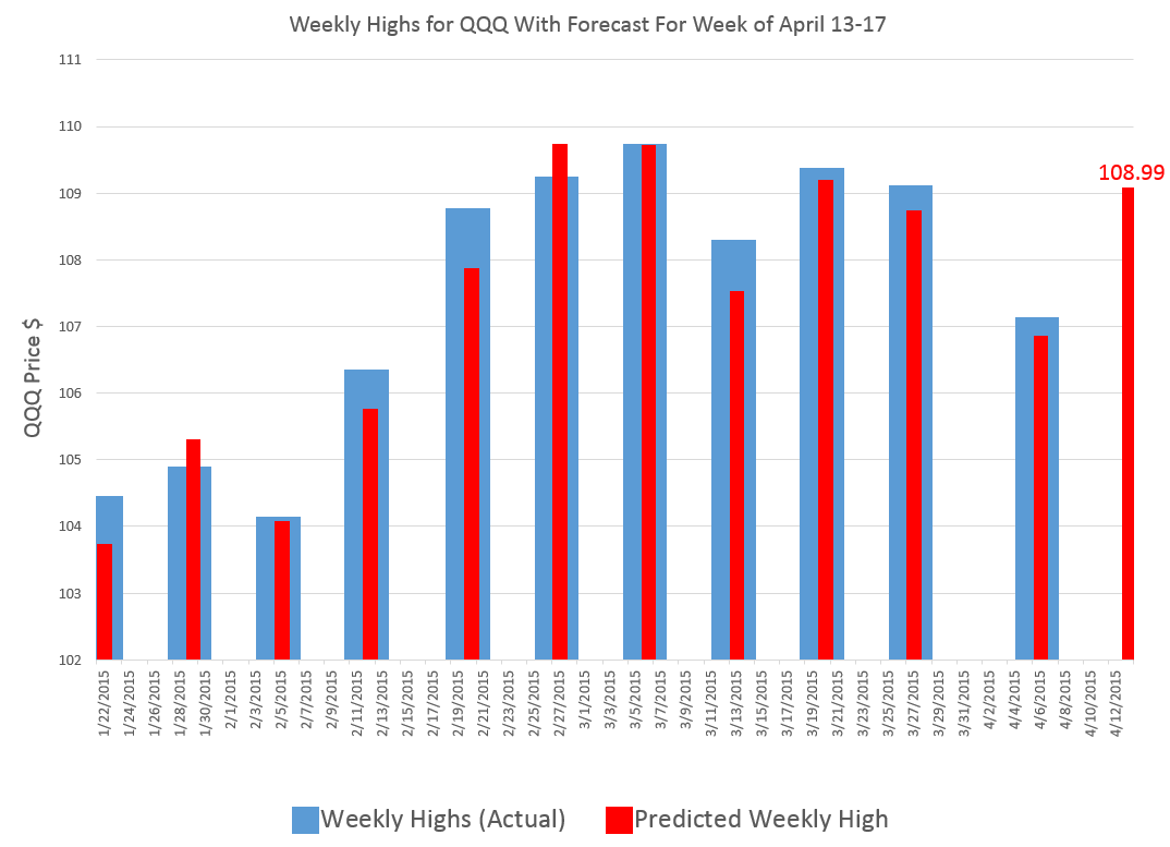
The time of this blog post is the morning of April 13, 2015.

My algorithms indicate that the high for QQQ this week will be around $109 or, more precisely, $108.99.

So this is, in essence, a five day forecast, since this high price can occur in any of the trading days of this week.

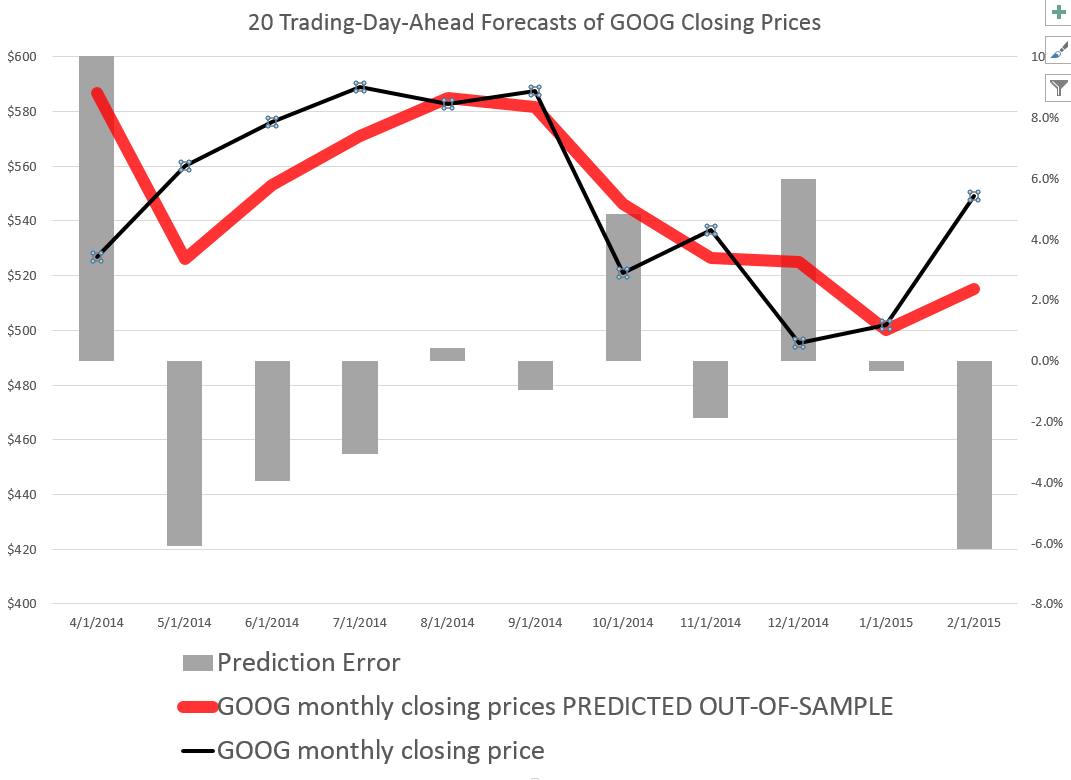
The chart above shows backtests for the algorithm for ten weeks. The forecast errors are all less than 0.65% over this history with a mean absolute percent error (MAPE) of 0.34%.

So that’s what I have today, and count on succeeding installments looking back and forward at the beginning of the next several weeks (Monday), insofar as my travel schedule allows this.

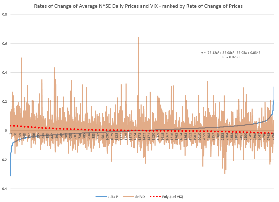
Also, my initial comments on this post appear to offer a dig against theory, but that would be unfair, really, since “theory” – at least the theory of new forecasting techniques and procedures – has been very important in my developing these algorithms. I have looked at residuals more or less as a gold miner examines the chat in his pan. I have considered issues related to the underlying distribution of stock prices and stock returns – NOTE TO THE UNINITIATED – STOCK PRICES ARE NOT NORMALLY DISTRIBUTED. There is indeed almost nothing about stocks or stock returns which is related to the normal probability distribution, and I think this has been a huge failing of conventional finance, the Black Scholes Theorem, and the like.

So theory is important. But you can’t stop there.

This should be interesting. Stay tuned. I will add other securities in coming weeks, and provide updates of QQQ forecasts.

Readers interested in the underlying methods can track back on previous blog posts (for example, Pvar Models for Forecasting Stock Prices or Time-Varying Coefficients and the Risk Environment for Investing).

Links – Data Science

I’ve always thought the idea of “data science” was pretty exciting. But what is it, how should organizations proceed when they want to hire “data scientists,” and what’s the potential here?

Clearly, data science is intimately associated with Big Data. Modern semiconductor and computer technology make possible rich harvests of “bits” and “bytes,” stored in vast server farms. Almost every personal interaction can be monitored, recorded, and stored for some possibly fiendish future use, along with what you might call “demographics.” Who are you? Where do you live? Who are your neighbors and friends? Where do you work? How much money do you make? What are your interests, and what websites do you browse? And so forth.

As Edward Snowden and others point out, there is a dark side. It’s possible, for example, all phone conversations are captured as data flows and stored somewhere in Utah for future analysis by intrepid…yes, that’s right…data scientists.

In any case, the opportunities for using all this data to influence buying decisions, decide how to proceed in business, to develop systems to “nudge” people to do the right thing (stop smoking, lose weight), and, as I have recently discovered – do good, are vast and growing. And I have not even mentioned the exploding genetics data from DNA arrays and its mobilization to, for example, target cancer treatment.

The growing body of methods and procedures to make sense of this extensive and disparate data is properly called “data science.” It’s the blind man and the elephant problem. You have thousands or millions of rows of cases, perhaps with thousands or even millions of columns representing measurable variables. How do you organize a search to find key patterns which are going to tell your sponsors how to do what they do better?

Hiring a Data Scientist

Companies wanting to “get ahead of the curve” are hiring data scientists – from positions as illustrious and mysterious as Chief Data Scientist to operators in what are almost now data sweatshops.

But how do you hire a data scientist if universities are not granting that degree yet, and may even be short courses on “data science?”

I found a terrific article – How to Consistently Hire Remarkable Data Scientists.

It cites Drew Conway’s data science Venn Diagram suggesting where data science falls in these intersecting areas of knowledge and expertise.

DataScienceVenn

This article, which I first found in a snappy new compilation Data Elixir also highlights methods used by Alan Turing to recruit talent at Benchley.

In the movie The Imitation Game, Alan Turing’s management skills nearly derail the British counter-intelligence effort to crack the German Enigma encryption machine. By the time he realized he needed help, he’d already alienated the team at Bletchley Park. However, in a moment of brilliance characteristic of the famed computer scientist, Turing developed a radically different way to recruit new team members.

To build out his team, Turing begins his search for new talent by publishing a crossword puzzle in The London Daily Telegraph inviting anyone who could complete the puzzle in less than 12 minutes to apply for a mystery position. Successful candidates were assembled in a room and given a timed test that challenged their mathematical and problem solving skills in a controlled environment. At the end of this test, Turing made offers to two out of around 30 candidates who performed best.

In any case, the recommendation is a six step process to replace the traditional job interview –

SixStageHiringTest

Doing Good With Data Science

Drew Conway, the author of the Venn Diagram shown above, is associated with a new kind of data company called Data Kind.

Here’s an entertaining video of Conway, an excellent presenter, discussing Big Data as a movement and as something which can be used for social good.

For additional detail see http://venturebeat.com/2014/08/21/datakinds-benevolent-data-science-projects-arrive-in-5-more-cities/

Stock Trading – Volume and Volatility

What about the relationship between the volume of trades and stock prices? And while we are on the topic, how about linkages between volume, volatility, and stock prices?

These questions have absorbed researchers for decades, recently drawing forth very sophisticated analysis based on intraday data.

I highlight big picture and key findings, and, of course, cannot resolve everything. My concern is not to be blindsided by obvious facts.

Relation Between Stock Transactions and Volatility

One thing is clear.

From a “macrofinancial” perspective, stock volumes, as measured by transactions, and volatility, as measured by the VIX volatility index, are essentially the same thing.

This is highlighted in the following chart, based on NYSE transactions data obtained from the Facts and Figures resource maintained by the Exchange Group.

VIXandNYSETrans

Now eyeballing this chart, it is possible, given this is daily data, that there could be slight lags or leads between these variables. However, the greatest correlation between these series is contemporaneous. Daily transactions and the closing value of the VIX move together trading day by trading day.

And just to bookmark what the VIX is, it is maintained by the Chicago Board Options Exchange (CBOE) and

The CBOE Volatility Index® (VIX®) is a key measure of market expectations of near-term volatility conveyed by S&P 500 stock index option prices. Since its introduction in 1993, VIX has been considered by many to be the world’s premier barometer of investor sentiment and market volatility. Several investors expressed interest in trading instruments related to the market’s expectation of future volatility, and so VIX futures were introduced in 2004, and VIX options were introduced in 2006.

Although the CBOE develops the VIX via options information, volatility in conventional terms is a price-based measure, being variously calculated with absolute or squared returns on closing prices.

Relation Between Stock Prices and Volume of Transactions

As you might expect, the relation between stock prices and the volume of stock transactions is controversial

It seems reasonable there should be a positive relationship between changes in transactions and price changes. However, shifts to the downside can trigger or be associated with surges in selling and higher volume. So, at the minimum, the relationship probably is asymmetric and conditional on other factors.

The NYSE data in the graph above – and discussed more extensively in the previous post – is valuable, when it comes to testing generalizations.

Here is a chart showing the rate of change in the volume of daily transactions sorted or ranked by the rate of change in the average prices of stocks sold each day on the New York Stock Exchange (click to enlarge).

delPdelT

So, in other words, array the daily transactions and the daily average price of stocks sold side-by-side. Then, calculate the day-over-day growth (which can be negative of course) or rate of change in these variables. Finally, sort the two columns of data, based on the size and sign of the rate of change of prices – indicated by the blue line in the above chart.

This chart indicates the largest negative rates of daily change in NYSE average prices are associated with the largest positive changes in daily transactions, although the data is noisy. The trendline for the rate of transactions data is indicated by the trend line in red dots.

The relationship, furthermore, is slightly nonlinear,and weak.

There may be more frequent or intense surges to unusual levels in transactions associated with the positive side of the price change chart. But, if you remove “outliers” by some criteria, you colud find that the average level of transactions tends to be higher for price drops, that for price increases, except perhaps for the highest price increases.

As you might expect from the similarity of the stock transactions volume and VIX series, a similar graph can be cooked up showing the rates of change for the VIX, ranked by rates of change in daily average prices of stock on the NYSE.

delPdelVIX

Here the trendline more clearly delineates a negative relationship between rates of change in the VIX and rates of change of prices – as, indeed, the CBOE site suggests, at one point.

Its interesting a high profile feature of the NYSE and, presumably, other exchanges – volume of stock transactions – has, by some measures, only a tentative relationship with price change.

I’d recommend several articles on this topic:

The relation between price changes and trading volume: a survey (from the 1980’s, no less)

Causality between Returns and Traded Volumes (from the late 1990’)

The bivariate GARCH approach to investigating the relation between stock returns, trading volume, and return volatility (from 2011)

The plan is to move on to predictability issues for stock prices and other relevant market variables in coming posts.

Time-Varying Coefficients and the Risk Environment for Investing

My research provides strong support for variation of key forecasting parameters over time, probably reflecting the underlying risk environment facing investors. This type of variation is suggested by Lo ( 2005).

So I find evidence for time varying coefficients for “proximity variables” that predict the high or low of a stock in a period, based on the spread between the opening price and the high or low price of the previous period.

Figure 1 charts the coefficients associated with explanatory variables that I call OPHt and OPLt. These coefficients are estimated in rolling regressions estimated with five years of history on trading day data for the S&P 500 stock index. The chart is generated with more than 3000 separate regressions.

Here OPHt is the difference between the opening price and the high of the previous period, scaled by the high of the previous period. Similarly, OPLt is the difference between the opening price and the low of the previous period, scaled by the low of the previous period. Such rolling regressions sometimes are called “adaptive regressions.”

Figure 1 Evidence for Time Varying Coefficients – Estimated Coefficients of OPHt and OPLt Over Study Sample

TvaryCoeff

Note the abrupt changes in the values of the coefficients of OPHt and OPLt in 2008.

These plausibly reflect stock market volatility in the Great Recession. After 2010 the value of both coefficients tends to move back to levels seen at the beginning of the study period.

This suggests trajectories influenced by the general climate of risk for investors and their risk preferences.

I am increasingly convinced the influence of these so-called proximity variables is based on heuristics such as “buy when the opening price is greater than the previous period high” or “sell, if the opening price is lower than the previous period low.”

Recall, for example, that the coefficient of OPHt measures the influence of the spread between the opening price and the previous period high on the growth in the daily high price.

The trajectory, shown in the narrow, black line, trends up in the approach to 2007. This may reflect investors’ greater inclination to buy the underlying stocks, when the opening price is above the previous period high. But then the market experiences the crisis of 2008, and investors abruptly back off from their eagerness to respond to this “buy” signal. With onset of the Great Recession, investors become increasingly risk adverse to such “buy” signals, only starting to recover their nerve after 2013.

A parallel interpretation of the trajectory of the coefficient of OPLt can be developed based on developments 2008-2009.

Time variation of these coefficients also has implications for out-of-sample forecast errors.

Thus, late 2008, when values of the coefficients of both OPH and OPL make almost vertical movements in opposite directions, is the period of maximum out-of-sample forecast errors. Forecast errors for daily highs, for example, reach a maximum of 8 percent in October 2008. This can be compared with typical errors of less than 0.4 percent for out-of-sample forecasts of daily highs with the proximity variable regressions.

Heuristics

Finally, I recall a German forecasting expert discussing heuristics with an example from baseball. I will try to find his name and give him proper credit. By the idea is that an outfielder trying to catch a flyball does not run calculations involving mass, angle, velocity, acceleration, windspeed, and so forth. Instead, basically, an outfielder runs toward the flyball, keeping it at a constant angle in his vision, so that it falls then into his glove at the last second. If the ball starts descending in his vision, as he approaches it, it may fall on the ground before him. If it starts to float higher in his perspective as he runs to get under it, it may soar over him, landing further back int he field.

I wonder whether similar arguments can be advanced for the strategy of buying based or selling based on spreads between the opening price in a period and the high and low prices in a previous period.

How Did My Forecast of the SPY High and Low Issued January 22 Do?

A couple of months ago, I applied the stock market forecasting approach based on what I call “proximity variables” to forward-looking forecasts – as opposed to “backcasts” testing against history.

I’m surprised now that I look back at this, because I offered a forecast for 40 trading days (a little foolhardy?).

In any case, I offered forecasts for the high and low of the exchange traded fund SPY, as follows:

What about the coming period of 40 trading days, starting from this morning’s (January 22, 2015) opening price for the SPY – $203.99?

Well, subject to qualifications I will state further on here, my estimates suggest the high for the period will be in the range of $215 and the period low will be around $194. Cents attached to these forecasts would be, of course, largely spurious precision.

In my opinion, these predictions are solid enough to suggest that no stock market crash is in the cards over the next 40 trading days, nor will there be a huge correction. Things look to trade within a range not too distant from the current situation, with some likelihood of higher highs.

It sounds a little like weather forecasting.

Well, 27 trading days have transpired since January 22, 2015 – more than half the proposed 40 associated with the forecast.

How did I do?

Here is a screenshot of the Yahoo Finance table showing opening, high, low, and closing prices since January 22, 2015.

SPYJan22etpassim

The bottom line – so far, so good. Neither the high nor low of any trading day has broached my proposed forecasts of $194 for the low and $215 for the high.

Now, I am pleased – a win just out of the gates with the new modeling approach.

However, I would caution readers seeking to use this for investment purposes. This approach recommends shorter term forecasts to focus in on the remaining days of the original forecast period. So, while I am encouraged the $215 high has not been broached, despite the hoopla about recent gains in the market, I don’t recommend taking $215 as an actual forecast at this point for the remaining 13 trading days – two or three weeks. Better forecasts are available from the model now.

“What are they?”

Well, there are a lot of moving parts in the computer programs to make these types of updates.

Still, it is interesting and relevant to forecasting practice – just how well do the models perform in real time?

So I am planning a new feature, a periodic update of stock market forecasts, with a look at how well these did. Give me a few days to get this up and running.

More on the “Efficiency” of US Stock Markets – Evidence from 1871 to 2003

In a pivotal article, Andrew Lo writes,

Many of the examples that behavioralists cite as violations of rationality that are inconsistent with market efficiency loss aversion, overconfidence, overreaction, mental accounting, and other behavioral biases are, in fact, consistent with an evolutionary model of individuals adapting to a changing environment via simple heuristics.

He also supplies an intriguing graph of the rolling first order autocorrelation of monthly returns of the S&P Composite Index from January 1971 to April 2003.

LoACchart

Lo notes the Random Walk Hypothesis implies that returns are serially uncorrelated, so the serial correlation coefficient ought to be zero – or at least, converging to zero over time as markets move into equilibrium.

However, the above chart shows this does not happen, although there are points in time when the first order serial correlation coefficient is small in magnitude, or even zero.

My point is that the first order serial correlation in daily returns for the S&P 500 is large enough for long enough periods to generate profits above a Buy-and-Hold strategy – that is, if one can negotiate the tricky milliseconds of trading at the end of each trading day.

Scalability of the Pvar Stock Market Forecasting Approach

Ok, I am documenting and extending a method of forecasting stock market prices based on what I call Pvar models. Here Pvar stands for “proximity variable” – or, more specifically, variables based on the spread or difference between the opening price of a stock, ETF, or index, and the high or low of the previous period. These periods can be days, groups of days, weeks, months, and so forth.

I share features of these models and some representative output on this blog.

And, of course, I continue to have wider interests in forecasting controversies, issues, methods, as well as the global economy.

But for now, I’ve got hold of something, and since I appreciate your visits and comments, let’s talk about “scalability.”

Forecast Error and Data Frequency

Years ago, when I first heard of the M-competition (probably later than for some), I was intrigued by reports of how forecast error blows up “three or four periods in the forecast horizon,” almost no matter what the data frequency. So, if you develop a forecast model with monthly data, forecast error starts to explode three or four months into the forecast horizon. If you use quarterly data, you can push the error boundary out three or four quarters, and so forth.

I have not seen mention of this result so much recently, so my memory may be playing tricks.

But the basic concept seems sound. There is irreducible noise in data and in modeling. So whatever data frequency you are analyzing, it makes sense that forecast errors will start to balloon more or less at the same point in the forecast horizon – in terms of intervals of the data frequency you are analyzing.

Well, this concept seems emergent in forecasts of stock market prices, when I apply the analysis based on these proximity variables.

Prediction of Highs and Lows of Microsoft (MSFT) Stock at Different Data Frequencies

What I have discovered is that in order to predict over longer forecast horizons, when it comes to stock prices, it is necessary to look back over longer historical periods.

Here are some examples of scalability in forecasts of the high and low of MSFT.

Forecasting 20 trading days ahead, you get this type of chart for recent 20-day-periods.

MSFT20day

One of the important things to note is that these are out-of-sample forecasts, and that, generally, they encapsulate the actual closing prices for these 20 trading day periods.

Here is a comparable chart for 10 trading days.

MSFTHL10

Same data, forecasts also are out-of-sample, and, of course, there are more closing prices to chart, too.

Finally, here is a very busy chart with forecasts by trading day.

MSFTdaily

Now there are several key points to take away from these charts.

First, the predictions of MSFT high and low prices for these periods are developed by similar forecast models, at least with regard to the specification of explanatory variables. Also, the Pvar method works for specific stocks, as well as for stock market indexes and ETF’s that might track them.

However, and this is another key point, the definitions of these variables shift with the periods being considered.

So the high for MSFT by trading day is certainly different from the MSFT high over groups of 20 trading days, and so forth.

In any case, there is remarkable scalability with Pvar models, all of which suggests they capture some of the interplay between long and shorter term trading.

While I am handing out conjectures, here is another one.

I think it will be possible to conduct a “causal analysis” to show that the Pvar variables reflect or capture trader actions, and that these actions tend to drive the market.

Forecasting Google’s Stock Price (GOOG) On 20-Trading-Day Horizons

Google’s stock price (GOOG) is relatively volatile, as the following chart shows.

GOOG

So it’s interesting that a stock market forecasting algorithm can produce the following 20 Trading-Day-Ahead forecasts for GOOG, for the recent period.

GOG20

The forecasts in the above chart, as are those mentioned subsequently, are out-of-sample predictions. That is, the parameters of the forecast model – which I call the PVar model – are estimated over one set of historic prices. Then, the forecasts from PVar are generated with values for the explanatory variables that are “outside” or not the same as this historic data.

How good are these forecasts and how are they developed?

Well, generally forecasting algorithms are compared with benchmarks, such as an autoregressive model or a “no-change” forecast.

So I constructed an autoregressive (AR) model for the Google closing prices, sampled at 20 day frequencies. This model has ten lagged versions of the closing price series, so I do not just rely here on first order autocorrelations.

Here is a comparison of the 20 trading-day-ahead predictions of this AR model, the above “proximity variable” (PVar) model which I take credit for, and the actual closing prices.

compGOOG

As you can see, the AR model is worse in comparison to the PVar model, although they share some values at the end of the forecast series.

The mean absolute percent errors (MAPE) of the AR model for a period more extended than shown in the graph is 7.0, compared with 5.1 for PVar. This comparison is calculated over data from 4/20/2011.

So how do I do it?

Well, since these models show so much promise, it makes sense to keep working on them, making improvements. However, previous posts here give broad hints, indeed pretty well laying out the framework, at least on an introductory basis.

Essentially, I move from predicting highs and lows to predicting closing prices.

To predict highs and lows, my post “further research” states

Now, the predictive models for the daily high and low stock price are formulated, as before, keying off the opening price in each trading day. One of the key relationships is the proximity of the daily opening price to the previous period high. The other key relationship is the proximity of the daily opening price to the previous period low. Ordinary least squares (OLS) regression models can be developed which do a good job of predicting the direction of change of the daily high and low, based on knowledge of the opening price for the day.

Other posts present actual regression models, although these are definitely prototypes, based on what I know now.

Why Does This Work?

I’ll bet this works because investors often follow simple rules such as “buy when the opening price is sufficiently greater than the previous period high” or “sell, if the opening price is sufficiently lower than the previous period low.”

I have assembled evidence, based on time variation in the predictive coefficients of the PVar variables, which I probably will put out here sometime.

But the point is that momentum trading is a major part of stock market activity, not only in the United States, but globally. There’s even research claiming to show that momentum traders do better than others, although that’s controversial.

This means that the daily price record for a stock, the opening, high, low, and closing prices, encode information that investors are likely to draw upon over different investing horizons.

I’m pleased these insights open up many researchable questions. I predict all this will lead to wholly new generations of models in stock market analysis. And my guess, and so far it is largely just that, is that these models may prove more durable than many insights into patterns of stock market prices – due to a sort of self-confirming aspect.

On Self-Fulfilling Prophecy

In their excellent “Forecasting Stock Returns” in the Handbook of Economic Forecasting, David Rapach and Guofu Zhou write,

While stock return forecasting is fascinating, it can also be frustrating. Stock returns inherently contain a sizable unpredictable component, so that the best forecasting models can explain only a relatively small part of stock returns. Furthermore, competition among traders implies that once successful forecasting models are discovered, they will be readily adopted by others; the widespread adoption of successful forecasting models can then cause stock prices to move in a manner that eliminates the models’ forecasting ability..

Almost an article of faith currently, this perspective seems to rule out other reactions to forecasts which have been important in economic affairs, namely the self-fulfilling prophecy.

Now as “self-fulfilling prophecy” entered the lexicon, it was a prediction which originally was in error, but it became true, because people believed it was true and acted upon it.

Bank runs are the classic example.

The late Robert Merton wrote of the Last National Bank in his classic Social Theory and Social Structure, but there is no need for recourse to apocryphal history. Gary Richardson of the Federal Reserve Bank of Richmond has a nice writeup – Banking Panics of 1930 and 1931

..Caldwell was a rapidly expanding conglomerate and the largest financial holding company in the South. It provided its clients with an array of services – banking, brokerage, insurance – through an expanding chain controlled by its parent corporation headquartered in Nashville, Tennessee. The parent got into trouble when its leaders invested too heavily in securities markets and lost substantial sums when stock prices declined. In order to cover their own losses, the leaders drained cash from the corporations that they controlled.

On November 7, one of Caldwell’s principal subsidiaries, the Bank of Tennessee (Nashville) closed its doors. On November 12 and 17, Caldwell affiliates in Knoxville, Tennessee, and Louisville, Kentucky, also failed. The failures of these institutions triggered a correspondent cascade that forced scores of commercial banks to suspend operations. In communities where these banks closed, depositors panicked and withdrew funds en masse from other banks. Panic spread from town to town. Within a few weeks, hundreds of banks suspended operations. About one-third of these organizations reopened within a few months, but the majority were liquidated (Richardson 2007).

Of course, most of us know but choose to forget these examples, for a variety of reasons – the creation of the Federal Deposit Insurance Corporation has removed most of the threat, that was a long time ago, and so forth.

So it was with interest that I discovered a recent paper of researchers at Cal Tech and UCLA’s Andersson Management School The Self Fulfilling Prophecy of Popular Asset Pricing Models. The authors explore the impact of delegating investment decisions to investment professionals who, by all evidence, apply discounted cash flow models that are disconnected from investor’s individual utility functions.

Despite its elegance, the consumption-based model has one glaring deficiency.

The standard model and its more conventional variants have failed miserably at explaining the cross-section of returns; even tortured versions of the standard model have struggled to match data.

The authors then propose a Gendanken experiment where discounted cash flow models are used by the professional money managers who are delegated to invest by individuals.

The upshot –

Our thought experiment has an intriguing and heretofore unappreciated implication— there is a feedback relation between asset pricing models and the cross-section of expected returns. Our analysis implies that the cross-section of expected returns is not only described by theories of asset pricing, it is also determined by them.

I think Cornell and Hsu are on to something here.

More specifically, I have been trying to understand how to model a trading situation in which predictions of stock high and low prices in a period are self-confirming or self-fulfilling.

Suppose my prediction is that the daily high of Dazzle will be above yesterday’s daily high, if the opening price is above yesterday’s opening price. Then, if this persuades you to buy shares of Dazzle, it would seem that you contribute to the tendency for the stock price to increase. Furthermore, I don’t tell you exactly when the daily high will be reached, so I sort of put you in play. The onus is on you to make the right moves. The forecast does not come under suspicion.

As something of a data scientist, I think I can report that models of stock market trading at the level of agents participating in the market are not a major preoccupation of market analysts or theorists. The starting point seems to be Walras and the problem is how to set the price adjustment mechanism, since the tatonnement is obviously unrealistic

That then brings us probably to experimental economics, which shares a lot of turf with what is called behavioral economics.

The other possibility is simply to observe stock market prices and show that, quite generally, this type of rule must be at play and, because it is not inherently given to be true, it furthermore must be creating the conditions of its own success, to an extent.