Here are some notes and insights relating to clustering or segmentation.
1. Cluster Analysis is Data Discovery
Anil Jain’s 50-year retrospective on data clustering emphasizes data discovery – Clustering is inherently an ill-posed problem where the goal is to partition the data into some unknown number of clusters based on intrinsic information alone.
Clustering is “ill-posed” because identifying groups turns on the concept of similarity, and there are, as Jain highlights, many usable distance metrics to deploy, defining similarity of groups.
Also, an ideal cluster is compact and isolated, but, implicitly, this involves a framework of specific dimensions or coordinates, which may themselves be objects of choice. Thus, domain knowledge almost always comes into play in evaluating any specific clustering.
The importance of”subjective” elements is highlighted by research into wines, where, according to Gallo research, the basic segments are sweet and fruity, light body and fruity, medium body and rich flavor, medium body and light oak, and full body and robust flavor.
K-means clustering on chemical features of wines may or may not capture these groupings – but they are compelling to Gallo product development and marketing.
The domain expert looks over the results of formal clustering algorithms and makes the judgment call as to how many significant clusters they are and what they are.
2. Cluster Analysis is Unsupervised Learning
Cluster analysis does not use category labels that tag objects with prior identifiers, i.e., class labels. The absence of category information distinguishes data clustering (unsupervised learning) from classification or discriminant analysis (supervised learning).
Supervised learning means is that there are classification labels in the dataset.
Linear discriminant analysis, as developed by the statistician Fisher, maximizes the distances between points in different clusters.
K-means clustering, on the other hand, classically minimizes the distances between the points in each cluster and the centroids of these clusters.
This is basically the difference between the inner products and the outer product of the relevant vectors.
3. Data reduction through principal component analysis can be helpful to clustering
K-means clustering in the sub-space defined by the first several principal components can boost a cluster analysis. I offer an example based on the University of California at Irving (UCI) Machine Learning Depository, where it is possible to find the Wine database.
The Wine database dates from 1996 and involves 14 variables based on a chemical analysis of wines grown in the same region of Italy, but derived from three different cultivars.
Dataset variables include (1) alcohol, (2) Malic acid, (3) Ash, (4) Alcalinity of ash, (5) Magnesium, (6) Total phenols, (7) Flavanoids, (8) Nonflavanoid phenols, (9) Proanthocyanins, (10) Color intensity, (11) Hue, (12) OD280/OD315 of diluted wines, and (13) Proline.
The dataset also includes, in the first column, a 1, 2, or 3 for the cultivar whose chemical properties follow. A total of 178 wines are listed in the dataset.
To develop my example, I first run k-means clustering on the original wine dataset – without, of course, the first column designating the cultivars. My assumption is that cluster analysis ought to provide a guide as to which cultivar the chemical data come from.
I ran a search for three segments.
The best match I got was in predicting membership of wines from the first cultivar. I get an approximately 78 percent hit rate – 77.9 percent of the first cultivar are correctly identified by a k-means cluster analysis of all 13 variables in the Wine dataset. The worst performance is with the third cultivar – less than 50 percent accuracy in identification of this segment. There were a lot of false positives, in other words – a lot of instances where the k-means analysis of the whole dataset indicates that a wine stems from the third cultivar, when in fact it does not.
For comparison, I calculate the first three principal components, after standardizing the wine data. Then, I run the k-means clustering algorithm on the scores produced by these first three or the three most important principal components.
There is dramatic improvement.
I achieve a 92 percent score in predicting association with the first cultivar, and higher scores in predicting the next two cultivars.
The Matlab code for this is straight-forward. After importing the wine data from a spreadsheet with x=xlsread(“Wine”), I execute IDX=kmeans(y,3), where the data matrix y is just the original data x stripped of its first column. The result matrix IDX gives the segment numbers of the data, organized by row. These segment values can be compared with the cultivar number to see how accurate the segmentation is. The second run involved using [COEFF, SCORE, latent] = princomp(zscore(y)) grabbing the first three SCORE’s and then segmenting them with the kmeans(3SCORE,3) command. It is not always this easy, but this example, which is readily replicated, shows that in some cases, radical improvements in segmentation can be achieved by working just with a subspace determined by the first several principal components.
4. More on Wine Segmentation
How Gallo Brings Analytics Into The Winemaking Craft is a case study on data mining as practiced by Gallo Wine, and is almost a text-book example of Big Data and product segmentation in the 21st Century.
Gallo’s analytics maturation mirrors the broader IT industry’s move from rear-view mirror reporting to predictive and proactive analytics. Gallo uses the deep insight it gets from all of this analytics to develop new breakout brands.
Based on consumer surveys at tasting events and in tasting rooms at its California and Washington vineyards, Gallo sees five core wine style clusters:
- sweet and fruity
- light body and fruity
- medium body and rich flavor
- medium body and light oak
- full body and robust flavor
Gallo maps its own and competitors’ products to these clusters, and correlates them with internal sales data and third-party retail trend data to understand taste preferences and emerging trends in different markets.
In one brand development effort, Gallo spotted big potential demand for a blended red wine that would appeal to the first three of its style clusters. It used extensive knowledge of the flavor characteristics of more than 5,000 varieties of grapes and data on varietal business fundamentals—like the availability and cost patterns of different grapes from season to season—to come up with the Apothic brand last year. After just a year on the market, Apothic is expected to sell 1 million cases with the help of a new white blend.
The Cheapskates Wine Guide, incidentally, has a fairly recent and approving post on Apothic.
Unfortunately, Gallo is not inclined to share its burgeoning deep data on wine preferences and buying by customer type and sales region.
But there is an open access source for market research and other datasets for testing data science and market research techniques.
5. The Optimal Number of Clusters in K-means Clustering
Two metrics for assessing the number of clusters in k-means clustering employ the “within-cluster sum of squares” W(k) and the “between-cluster sum of squares” B(k) – where k indicates the number of clusters.
These metrics are the CH index and Hartigan’s index applied here to the “Wine” database from the Machine Learning databases at Cal Irvine.
Recall that the Wine data involve 14 variables from a chemical analysis of 178 wines grown in a region of Italy, derived from three cultivars. The dataset includes, in the first column, a 1,2, or 3 indicating the cultivar of each wine.
This dataset is ideal for supervised learning with, for example, linear discriminant analysis, but it also supports an interesting exploration of the performance of k-means clustering – an unsupervised learning technique.
Previously, we used the first three principal components to cluster the Wine dataset, arriving at fairly accurate predictions of which cultivar the wines came from.
Matlab’s k-means algorithm returns several relevant pieces of data, including the cluster assignment for each case or, here, 13 dimensional point (stripping off the cultivar identifier at the start), but also information on the within-cluster and total cluster sum of squares, and, of course, the final centroid values.
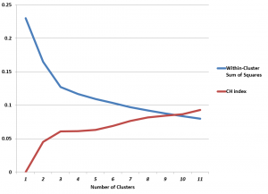
This makes computation of the CH index and Hartigan’s index easy, and, in the case of the Wine dataset, leads to the following graph.
The CH index has an “elbow” at k=3 clusters. The possibility that this indicates the optimal number of clusters is enhanced by the rather abupt change of slope in Hartigan’s index.
Of course, we know that there are good grounds for believing that three is the optimal number of clusters .
With this information, then, one could feel justified in looking at and clustering the first three principal components, which would produce a good indicator of the cultivar of the wine.
Details
The objective of k-means clustering is to minimize the within-cluster sum of squares or the squared differences between the points belonging to a cluster and the associated centroid of that cluster.
Thus, suppose we have m observations on n-dimensional points xi=(x1i, x2i,..,xni), and, for this discussion, assume these points are mean-centered and divided by their column standard deviations.
Designate the centroids by the vector m=(m1, m2, …,mk). These are the average values for each variable for all the points assigned to a cluster.
Then, the objective is to minimize,
This problem is, in general, NP difficult, but the standard algorithm is straight-forward. The number of clusters k is selected. Then, an initial set of centroids is determined, by one means or another, and distances of points to these centroids are calculated. Points closest to the centroids are assigned to the cluster associated with that centroid. Then, the centroids are recalculated, and distances between the points and centroids are computed again. This loops until there are no further changes in centroid values or cluster assignment.
Minimization of the above objective function frequently leads to a local minima, so usually algorithms develop multiple assignments of the initial centroids, with the final solution being the cluster assignment with the lowest value of W(k).
Calculating the CH and Hartigan Indexes
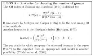
Let me throw up a text box from the excellent work Computational Systems Biology of Cancer .
Making allowances for slight variation in notation, one can see that the CH index is a ratio of the between-cluster sum of squares and the within-cluster sum of squares, multiplied by constants determined by the number of clusters and number of cases or observations in the dataset.
Also, Hartigan’s index is a ratio of successive within-cluster sum of squares, divided by constants determined by the number of observations and number of clusters.
I focused on clustering the first ten principal components of the Wine data matrix in the graph above, incidentally.
Let me also quote from the above-mentioned work, which is available as a Kindle download from Amazon,
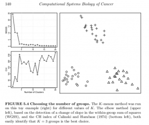
A generic problem with clustering methods is to choose the number of groups K. In an ideal situation in which samples would be well partitioned into a finite number of clusters and each cluster would correspond to the various hypothesis made by a clustering method (e.g. being a spherical Gaussian distribution), statistical criteria such as the Bayesian Information Criterion (BIC) can be used to select the optimal K consistently (Kass and Wasserman, 1995; Pelleg and Moore, 2000). On real data, the assumptions underlying such criteria are rarely met, and a variety of more or less heuristic criteria have been proposed to select a good number of clusters K (Milligan and Cooper, 1985;Gordon, 1999). For example, given a sequence of partitions C1, C2, …with k = 1, 2,… groups, a useful and simple method is to monitor the decrease in W( Ck) (see Box 5.3) with k, and try to detect an elbow in the curve, i.e. a transition between sharp and slow decrease (see Figure 5.4, upper left). Alternatively, several statistics have been proposed to precisely detect a change of regime in this curve (see Box 5.4). For hierarchical clustering methods, the selection of clusters is often performed by searching the branches of dendrograms which are stable with respect to within- and between-group distance (Jain et al., 1999; Bertoni and Valentini, 2008).
It turns out that key references here are available on the Internet.
Thus, the Aikake or Bayesian Information Criteria applied to the number of clusters is described in Dan Pelleg and Andrew Moore’s 2000 paper X-means: Extending K-means with Efficient Estimation of the Number of Clusters.
Robert Tibshirani’s 2000 paper on the gap statistic also is available.
Another example of the application of these two metrics is drawn from this outstanding book on data analysis in cancer research, below.
These methods of identifying the optimal number of clusters might be viewed as heuristic, and certainly are not definitive. They are, however, possibly helpful in a variety of contexts.
