I wanted to share a rich trove of Dilbert cartoons poking fun at Big Data curated by Baiju NT at Big Data Made Simple.
Like this one,
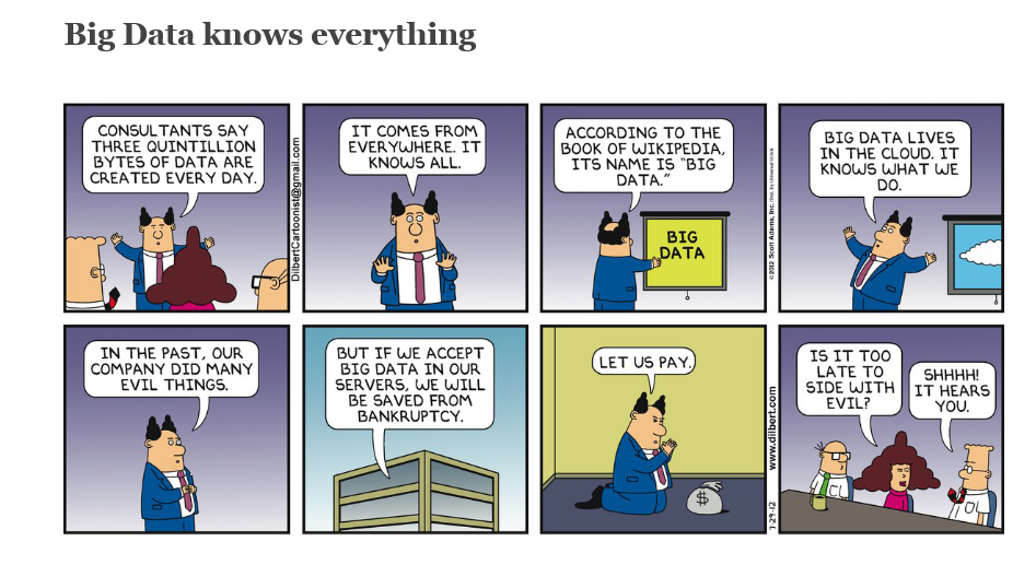
http://dilbert.com/strip/2012-07-29
I wanted to share a rich trove of Dilbert cartoons poking fun at Big Data curated by Baiju NT at Big Data Made Simple.
Like this one,
http://dilbert.com/strip/2012-07-29
Why get involved with the complexity of multivariate GARCH models?
Well, because you may want to exploit systematic and persisting changes in the correlations of stocks and bonds, and other major classes of financial assets. If you know how these correlations change over, say, a forecast horizon of one month, you can do a better job of balancing risk in portfolios.
This a lively area of applied forecasting, as I discovered recently from Henry Bee of Cassia Research – based in Vancouver, British Columbia (and affiliated with CONCERT Capital Management of San Jose, California). Cassia Research provides Institutional Quant Technology for Investment Advisors.

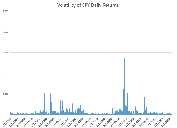
Basic Idea The key idea is that the volatility of stock prices cluster in time, and most definitely is not a random walk. Just to underline this – volatility is classically measured as the square of daily stock returns. It’s absolutely straight-forward to make a calculation and show that volatility clusters, as for example with this more than year series for the SPY exchange traded fund.
Then, if you consider a range of assets, calculating not only their daily volatilities, in terms of their own prices, but how these prices covary – you will find similar clustering of covariances.
Multivariate GARCH models provide an integrated solution for fitting and predicting these variances and covariances. For a key survey article, check out – Multivariate GARCH Models A Survey.
Some quotes from the company site provide details: We use a high-frequency multivariate GARCH model to control for volatility clustering and spillover effects, reducing drawdowns by 50% vs. historical variance. …We are able to tailor our systems to target client risk preferences and stay within their tolerance levels in any market condition…. [Dynamic Rebalancing can]..adapt quickly to market shifts and reduce drawdowns by dynamically changing rebalance frequency based on market behavior.
The COO of Cassia Research also is a younger guy – Jesse Chen. As I understand it, Jesse handles a lot of the hands-on programming for computations and is the COO.

I asked Bee what he saw as the direction of stock market and investment volatility currently, and got a surprising answer. He pointed me to the following exhibit on the company site.
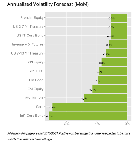 The point is that for most assets considered in one of the main portfolios targeted by Cassia Research, volatilities have been dropping – as indicated by the negative signs in the chart. These are volatilities projected ahead by one month, developed by the proprietary multivariate GARCH modeling of this company – an approach which exploits intraday data for additional accuracy.
There is a wonderful 2013 article by Kirilenko and Lo called Moore’s Law versus Murphy’s Law: Algorithmic Trading and Its Discontents. Look on Google Scholar for this title and you will find a downloadable PDF file from MIT.
The Quant revolution in financial analysis is here to stay, and, if you pay attention, provides many examples of successful application of forecasting algorithms.
I’ve always thought the idea of “data science” was pretty exciting. But what is it, how should organizations proceed when they want to hire “data scientists,” and what’s the potential here?
Clearly, data science is intimately associated with Big Data. Modern semiconductor and computer technology make possible rich harvests of “bits” and “bytes,” stored in vast server farms. Almost every personal interaction can be monitored, recorded, and stored for some possibly fiendish future use, along with what you might call “demographics.” Who are you? Where do you live? Who are your neighbors and friends? Where do you work? How much money do you make? What are your interests, and what websites do you browse? And so forth.
As Edward Snowden and others point out, there is a dark side. It’s possible, for example, all phone conversations are captured as data flows and stored somewhere in Utah for future analysis by intrepid…yes, that’s right…data scientists.
In any case, the opportunities for using all this data to influence buying decisions, decide how to proceed in business, to develop systems to “nudge” people to do the right thing (stop smoking, lose weight), and, as I have recently discovered – do good, are vast and growing. And I have not even mentioned the exploding genetics data from DNA arrays and its mobilization to, for example, target cancer treatment.
The growing body of methods and procedures to make sense of this extensive and disparate data is properly called “data science.” It’s the blind man and the elephant problem. You have thousands or millions of rows of cases, perhaps with thousands or even millions of columns representing measurable variables. How do you organize a search to find key patterns which are going to tell your sponsors how to do what they do better?
Hiring a Data Scientist
Companies wanting to “get ahead of the curve” are hiring data scientists – from positions as illustrious and mysterious as Chief Data Scientist to operators in what are almost now data sweatshops.
But how do you hire a data scientist if universities are not granting that degree yet, and may even be short courses on “data science?”
I found a terrific article – How to Consistently Hire Remarkable Data Scientists.
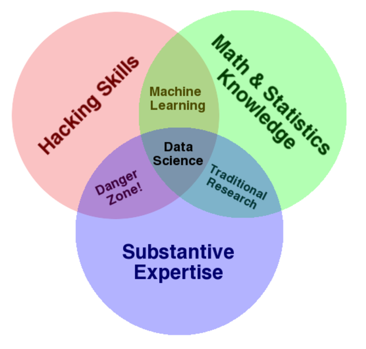
It cites Drew Conway’s data science Venn Diagram suggesting where data science falls in these intersecting areas of knowledge and expertise.
This article, which I first found in a snappy new compilation Data Elixir also highlights methods used by Alan Turing to recruit talent at Benchley.
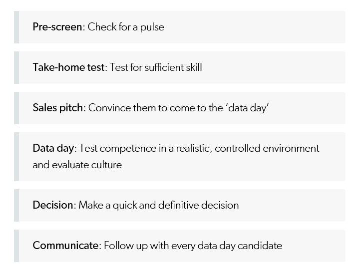
In the movie The Imitation Game, Alan Turing’s management skills nearly derail the British counter-intelligence effort to crack the German Enigma encryption machine. By the time he realized he needed help, he’d already alienated the team at Bletchley Park. However, in a moment of brilliance characteristic of the famed computer scientist, Turing developed a radically different way to recruit new team members.
To build out his team, Turing begins his search for new talent by publishing a crossword puzzle in The London Daily Telegraph inviting anyone who could complete the puzzle in less than 12 minutes to apply for a mystery position. Successful candidates were assembled in a room and given a timed test that challenged their mathematical and problem solving skills in a controlled environment. At the end of this test, Turing made offers to two out of around 30 candidates who performed best.
In any case, the recommendation is a six step process to replace the traditional job interview –
Doing Good With Data Science
Drew Conway, the author of the Venn Diagram shown above, is associated with a new kind of data company called Data Kind.
Here’s an entertaining video of Conway, an excellent presenter, discussing Big Data as a movement and as something which can be used for social good.
For additional detail see http://venturebeat.com/2014/08/21/datakinds-benevolent-data-science-projects-arrive-in-5-more-cities/
Today, I chatted with Emmanuel Marot, CEO and Co-founder at LendingRobot.
We were talking about stock market forecasting, for the most part, but Marot’s peer to peer (P2P) lending venture is fascinating.

According to Gilad Golan, another co-founder of LendingRobot, interviewed in GeekWire Startup Spotlight May of last year,
With over $4 billion in loans issued already, and about $500 million issued every month, the peer lending market is experiencing phenomenal growth. But that’s nothing compared to where it’s going. The market is doubling every nine months. Yet it is still only 0.2 percent of the overall consumer credit market today.
And, yes, P2P lending is definitely an option for folks with less-than-perfect credit.
In addition to lending to persons with credit scores lower than currently acceptable to banks (700 or so), P2P lending can offer lower interest rates and larger loans, because of lower overhead costs and other efficiencies.
LendIt USA is scheduled for April 13-15, 2015 in New York City, and features luminaries such as Lawrence Summers, former head of the US Treasury, as well as executives in some leading P2P lending companies (only a selection shown).

Lending Club and OnDeck went public last year and boast valuations of $9.5 and $1.5 billion, respectively.
Topics at the Lendit USA Conference include:
◾ State of the Industry: Today and Beyond
◾ Lending to Small Business
◾ Buy Now! Pay Later! – Purchase Finance meets P2P
◾ Working Capital for Companies through invoice financing
◾ Real Estate Investing: Equity, Debt and In-Between
◾ Big Money Talks: the institutional investor panel
◾ Around the World in 40 minutes: the Global Lending Landscape
◾ The Giant Overseas: Chinese P2P Lending
◾ The Support Network: Service Providers for a Healthy Ecosystem
Peer-to-peer lending is small in comparison to the conventional banking sector, but has the potential to significantly disrupt conventional banking with its marble pillars, spacious empty floors, and often somewhat decorative bank officers.
By eliminating the need for traditional banks, P2P lending is designed to improve efficiency and unnecessary frictions in the lending and borrowing processes. P2P lending has been recognised as being successful in reducing the time it takes to process these transactions as compared to the traditional banking sector, and also in many cases costs are reduced to borrowers. Furthermore in the current extremely low interest-rate environment that we are facing across the globe, P2P lending provides investors with easy access to alternative venues for their capital so that their returns may be boosted significantly by the much higher rates of return available on the P2P projects on offer. The P2P lending and investing business is therefore disrupting, albeit moderately for the moment, the traditional banking sector at its very core.
Peer-to-Peer Lending—Disruption for the Banking Sector?
Top photo of LendingRobot team from GeekWire.
What about the relationship between the volume of trades and stock prices? And while we are on the topic, how about linkages between volume, volatility, and stock prices?
These questions have absorbed researchers for decades, recently drawing forth very sophisticated analysis based on intraday data.
I highlight big picture and key findings, and, of course, cannot resolve everything. My concern is not to be blindsided by obvious facts.
Relation Between Stock Transactions and Volatility
One thing is clear.
From a “macrofinancial” perspective, stock volumes, as measured by transactions, and volatility, as measured by the VIX volatility index, are essentially the same thing.
This is highlighted in the following chart, based on NYSE transactions data obtained from the Facts and Figures resource maintained by the Exchange Group.
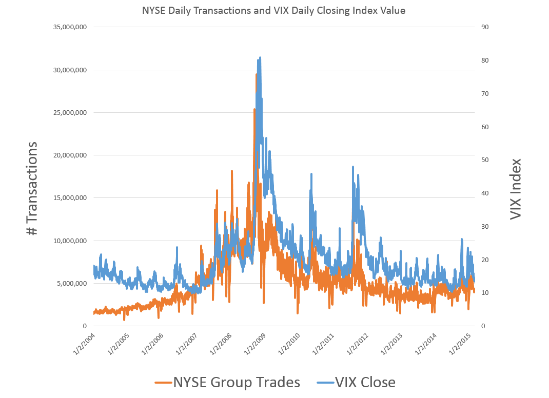
Now eyeballing this chart, it is possible, given this is daily data, that there could be slight lags or leads between these variables. However, the greatest correlation between these series is contemporaneous. Daily transactions and the closing value of the VIX move together trading day by trading day.
And just to bookmark what the VIX is, it is maintained by the Chicago Board Options Exchange (CBOE) and
The CBOE Volatility Index® (VIX®) is a key measure of market expectations of near-term volatility conveyed by S&P 500 stock index option prices. Since its introduction in 1993, VIX has been considered by many to be the world’s premier barometer of investor sentiment and market volatility. Several investors expressed interest in trading instruments related to the market’s expectation of future volatility, and so VIX futures were introduced in 2004, and VIX options were introduced in 2006.
Although the CBOE develops the VIX via options information, volatility in conventional terms is a price-based measure, being variously calculated with absolute or squared returns on closing prices.
Relation Between Stock Prices and Volume of Transactions
As you might expect, the relation between stock prices and the volume of stock transactions is controversial
It seems reasonable there should be a positive relationship between changes in transactions and price changes. However, shifts to the downside can trigger or be associated with surges in selling and higher volume. So, at the minimum, the relationship probably is asymmetric and conditional on other factors.
The NYSE data in the graph above – and discussed more extensively in the previous post – is valuable, when it comes to testing generalizations.
Here is a chart showing the rate of change in the volume of daily transactions sorted or ranked by the rate of change in the average prices of stocks sold each day on the New York Stock Exchange (click to enlarge).
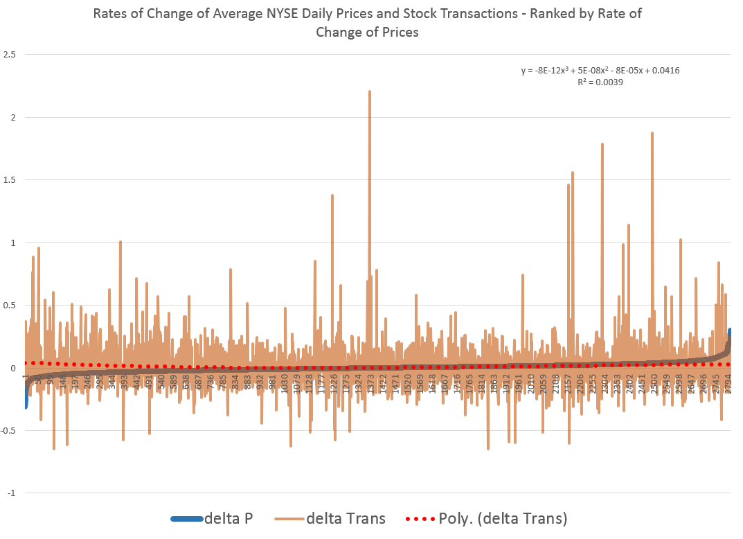
So, in other words, array the daily transactions and the daily average price of stocks sold side-by-side. Then, calculate the day-over-day growth (which can be negative of course) or rate of change in these variables. Finally, sort the two columns of data, based on the size and sign of the rate of change of prices – indicated by the blue line in the above chart.
This chart indicates the largest negative rates of daily change in NYSE average prices are associated with the largest positive changes in daily transactions, although the data is noisy. The trendline for the rate of transactions data is indicated by the trend line in red dots.
The relationship, furthermore, is slightly nonlinear,and weak.
There may be more frequent or intense surges to unusual levels in transactions associated with the positive side of the price change chart. But, if you remove “outliers” by some criteria, you colud find that the average level of transactions tends to be higher for price drops, that for price increases, except perhaps for the highest price increases.
As you might expect from the similarity of the stock transactions volume and VIX series, a similar graph can be cooked up showing the rates of change for the VIX, ranked by rates of change in daily average prices of stock on the NYSE.
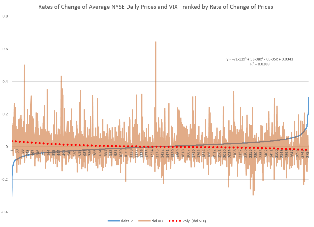
Here the trendline more clearly delineates a negative relationship between rates of change in the VIX and rates of change of prices – as, indeed, the CBOE site suggests, at one point.
Its interesting a high profile feature of the NYSE and, presumably, other exchanges – volume of stock transactions – has, by some measures, only a tentative relationship with price change.
I’d recommend several articles on this topic:
The relation between price changes and trading volume: a survey (from the 1980’s, no less)
Causality between Returns and Traded Volumes (from the late 1990’)
The plan is to move on to predictability issues for stock prices and other relevant market variables in coming posts.
Working on a white paper about my recent findings, I stumbled on more confirmation of the decoupling of predictability and profitability in the market – the culprit being high frequency trading (HFT).
It makes a good story.
So I am looking for high quality stock data and came across the CalTech Quantitative Finance Group market data guide. They tout QuantQuote, which does look attractive, and was cited as the data source for – How And Why Kraft Surged 29% In 19 Seconds – on Seeking Alpha.
In early October 2012 (10/3/2012), shares of Kraft Foods Group, Inc surged to a high of $58.54 after opening at $45.36, and all in just 19.93 seconds. The Seeking Alpha post notes special circumstances, such as spinoff of Kraft Foods Group, Inc. (KRFT) from Modelez International, Inc., and addition of KRFT to the S&P500. Funds and ETF’s tracking the S&P500 then needed to hold KRFT, boosting prospects for KRFT’s price.
For 17 seconds and 229 milliseconds after opening October 3, 2012, the following situation, shown in the QuantQuote table, unfolded.
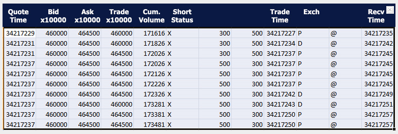
Times are given in milliseconds past midnight with the open at 34200000.
There is lots of information in this table – KRFT was not shortable (see the X in the Short Status column), and some trades were executed for dark pools of money, signified by the D in the Exch column.
In any case, things spin out of control a few milliseconds later, in ways and for reasons illustrated with further QuantQuote screen shots.
The moral –
So how do traders compete in a marketplace full of computers? The answer, ironically enough, is to not compete. Unless you are prepared to pay for a low latency feed and write software to react to market movements on the millisecond timescale, you simply will not win. As aptly shown by the QuantQuote tick data…, the required reaction time is on the order of 10 milliseconds. You could be the fastest human trader in the world chasing that spike, but 100% of the time, the computer will beat you to it.
CNN’s Watch high-speed trading in action is a good companion piece to the Seeking Alpha post.
HFT trading has grown by leaps and bounds, but estimates vary – partly because NASDAQ provides the only Datasets to academic researchers that directly classify HFT activity in U.S. equities. Even these do not provide complete coverage, excluding firms that also act as brokers for customers.
Still, the Security and Exchange Commission (SEC) 2014 Literature Review cites research showing that HFT accounted for about 70 percent of NASDAQ trades by dollar volume.
And associated with HFT are shorter holding times for stocks, now reputed to be as low as 22 seconds, although Barry Ritholz contests this sort of estimate.
Felix Salmon provides a list of the “evils” of HFT, suggesting a small transactions tax might mitigate many of these,
But my basic point is that the efficient market hypothesis (EMH) has been warped by technology.
I am leaning to the view that the stock market is predictable in broad outline.
But this predictability does not guarantee profitability. It really depends on how you handle entering the market to take or close out a position.
As Michael Lewis shows in Flash Boys, HFT can trump traders’ ability to make a profit
As Hal Varian writes in his popular Big Data: New Tricks for Econometrics the wealth of data now available to researchers demands new techniques of analysis.
In particular, often there is the problem of “many predictors.” In classic regression, the number of observations is assumed to exceed the number of explanatory variables. This obviously is challenged in the Big Data context.
Variable selection procedures are one tactic in this situation.
Readers may want to consult the post Selecting Predictors. It has my list of methods, as follows:
Some more supporting posts are found here, usually with spreadsheet-based “toy” examples:
Three Pass Regression Filter, Partial Least Squares and Principal Components, Complete Subset Regressions, Variable Selection Procedures – the Lasso, Kernel Ridge Regression – A Toy Example, Dimension Reduction With Principal Components, bootstrapping, exponential smoothing, Estimation and Variable Selection with Ridge Regression and the LASSO
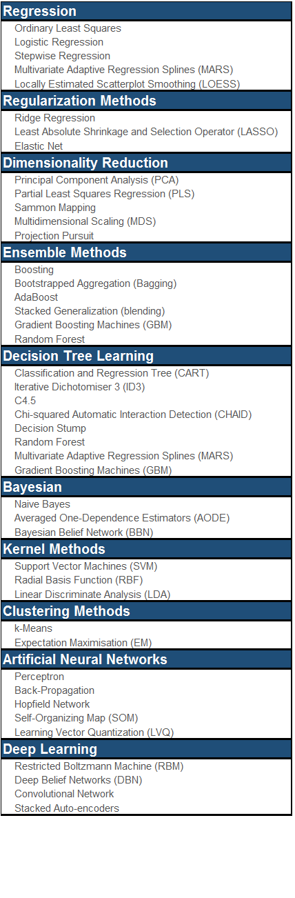
Plus one of the nicest infographics on machine learning – a related subject – is developed by the Australian blog Machine Learning Mastery.
Last Spring I started writing about “forecasting controversies.”
A short list of these includes Google’s flu forecasting algorithm, impacts of Quantitative Easing, estimates of energy reserves in the Monterey Shale, seasonal adjustment of key series from Federal statistical agencies, and China – Trade Colossus or Assembly Site?
Well, the end of the year is a good time to revisit these, particularly if there are any late-breaking developments.
Google Flu Trends
Google Flu Trends got a lot of negative press in early 2014. A critical article in Nature – When Google got flu wrong – kicked it off. A followup Times article used the phrase “the limits of big data,” while the Guardian wrote of Big Data “hubris.”
The problem was, as the Google Trends team admits –
In the 2012/2013 season, we significantly overpredicted compared to the CDC’s reported U.S. flu levels.
Well, as of October, Google Flu Trends has a new engine. This like many of the best performing methods … in the literature—takes official CDC flu data into account as the flu season progresses.
Interestingly, the British Royal Society published an account at the end of October – Adaptive nowcasting of influenza outbreaks using Google searches – which does exactly that – merges Google Flu Trends and CDC data, achieving impressive results.
The authors develop ARIMA models using “standard automatic model selection procedures,” citing a 1998 forecasting book by Hyndman, Wheelwright, and Makridakis and a recent econometrics text by Stock and Watson. They deploy these adaptively-estimated models in nowcasting US patient visits due to influenza-like illnesses (ILI), as recorded by the US CDC.
The results are shown in the following panel of charts.
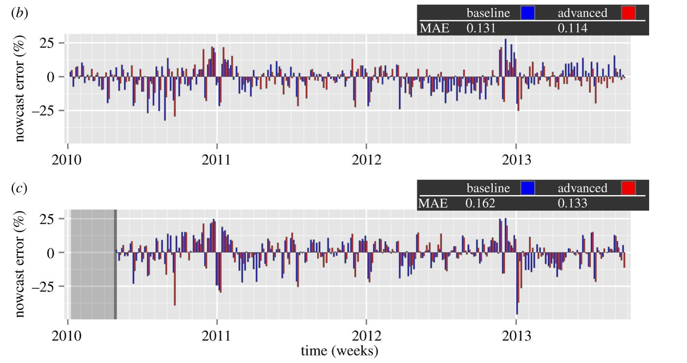
Definitely click on this graphic to enlarge it, since the key point is the red bars are the forecast or nowcast models incorporating Google Flu Trends data, while the blue bars only utilize more conventional metrics, such as those supplied by the Centers for Disease Control (CDC). In many cases, the red bars are smaller than the blue bar for the corresponding date.
The lower chart labeled ( c ) documents out-of-sample performance. Mean Absolute Error (MAE) for the models with Google Flu Trends data are 17 percent lower.
It’s relevant , too, that the authors, Preis and Moat, utilize unreconstituted Google Flu Trends output – before the recent update, for example – and still get highly significant improvements.
I can think of ways to further improve this research – for example, deploy the Hyndman R programs to automatically parameterize the ARIMA models, providing a more explicit and widely tested procedural referent.
But, score one for Google and Hal Varian!
The other forecasting controversies noted above are less easily resolved, although there are developments to mention.
Stay tuned.
I’ve been going over past posts, projecting forward my coming topics. I thought I would share some of the best and some of the topics I want to develop.
Recommendations From Early in 2014
I would recommend Forecasting in Data-Limited Situations – A New Day. There, I illustrate the power of bagging to “bring up” the influence of weakly significant predictors with a regression example. This is fairly profound. Weakly significant predictors need not be weak predictors in an absolute sense, providing you can bag the sample to hone in on their values.
There also are several posts on asset bubbles.
Asset Bubbles contains an intriguing chart which proposes a way to “standardize” asset bubbles, highlighting their different phases.
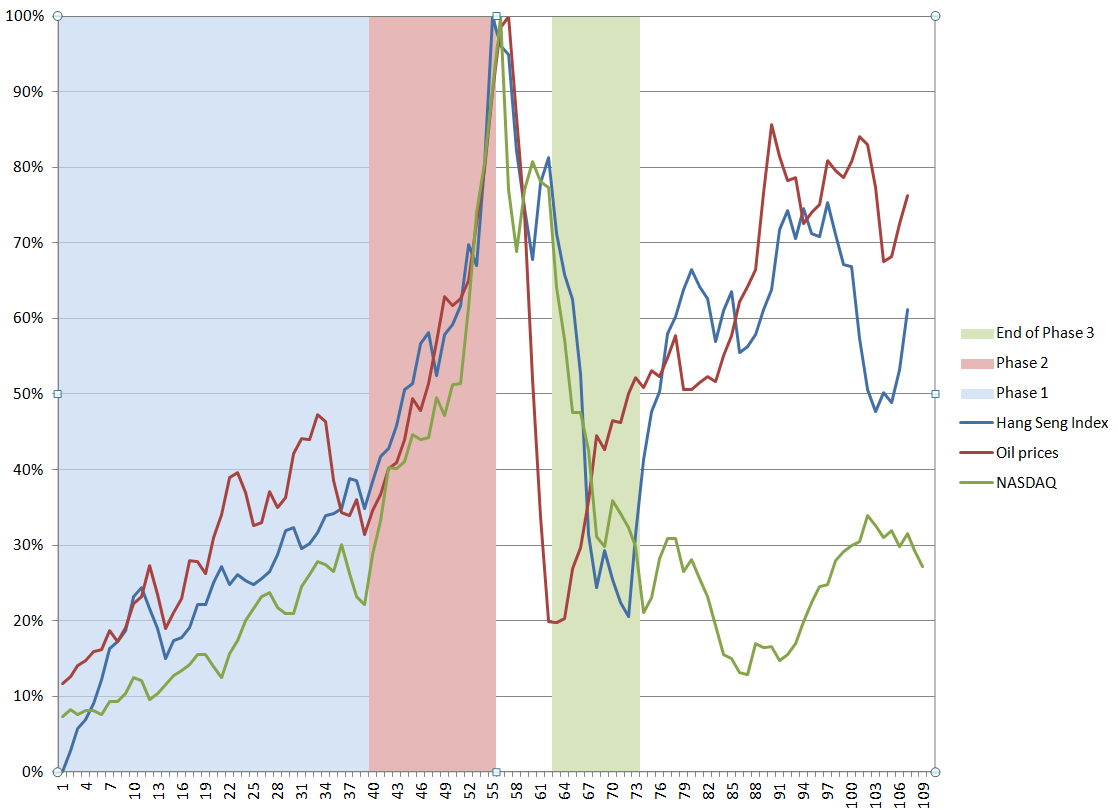
The data are from the Hong Kong Hang Seng Index, oil prices to refiners (combined), and the NASDAQ 100 Index. I arrange the series so their peak prices – the peak of the bubble – coincide, despite the fact that the peaks occurred at different times (October 2007, August 2008, March 2000, respectively). Including approximately 5 years of prior values of each time series, and scaling the vertical dimensions so the peaks equal 100 percent, suggesting three distinct phases. These might be called the ramp-up, faster-than-exponential growth, and faster-than-exponential decline. Clearly, I am influenced by Didier Sornette in choice of these names.
I’ve also posted several times on climate change, but I think, hands down, the most amazing single item is this clip from “Chasing Ice” showing calving of a Greenland glacier with shards of ice three times taller than the skyscrapers in Lower Manhattan.
See also Possibilities for Abrupt Climate Change.
I’ve been told that Forecasting and Data Analysis – Principal Component Regression is a helpful introduction. Principal component regression is one of the several ways one can approach the problem of “many predictors.”
In terms of slide presentations, the Business Insider presentation on the “Digital Future” is outstanding, commented on in The Future of Digital – I.
Threads I Want to Build On
There are threads from early in the year I want to follow up in Crime Prediction. Just how are these systems continuing to perform?
Another topic I want to build on is in Using Math to Cure Cancer. I’d like to find a sensitive discussion of how MD’s respond to predictive analytics sometime. It seems to me that US physicians are sometimes way behind the curve on what could be possible, if we could merge medical databases and bring some machine learning to bear on diagnosis and treatment.
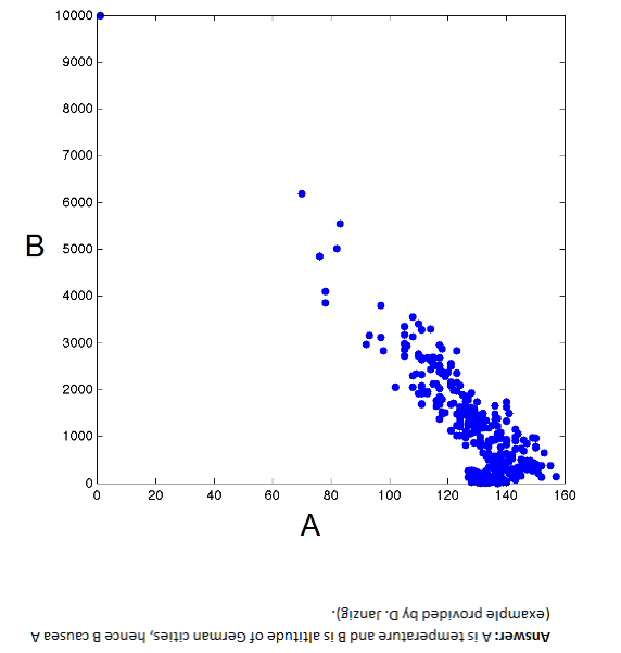
I am intrigued by the issues in Causal Discovery. You can get the idea from this chart. Here, B → A but A does not cause B – Why?
I tried to write an informed post on power laws. The holy grail here is, as Xavier Gabaix says, robust, detail-independent economic laws.
Federal Reserve Policies
Federal Reserve policies are of vital importance to business forecasting. In the past two or three years, I’ve come to understand the Federal Reserve Balance sheet better, available from Treasury Department reports. What stands out is this chart, which anyone surfing finance articles on the net has seen time and again.
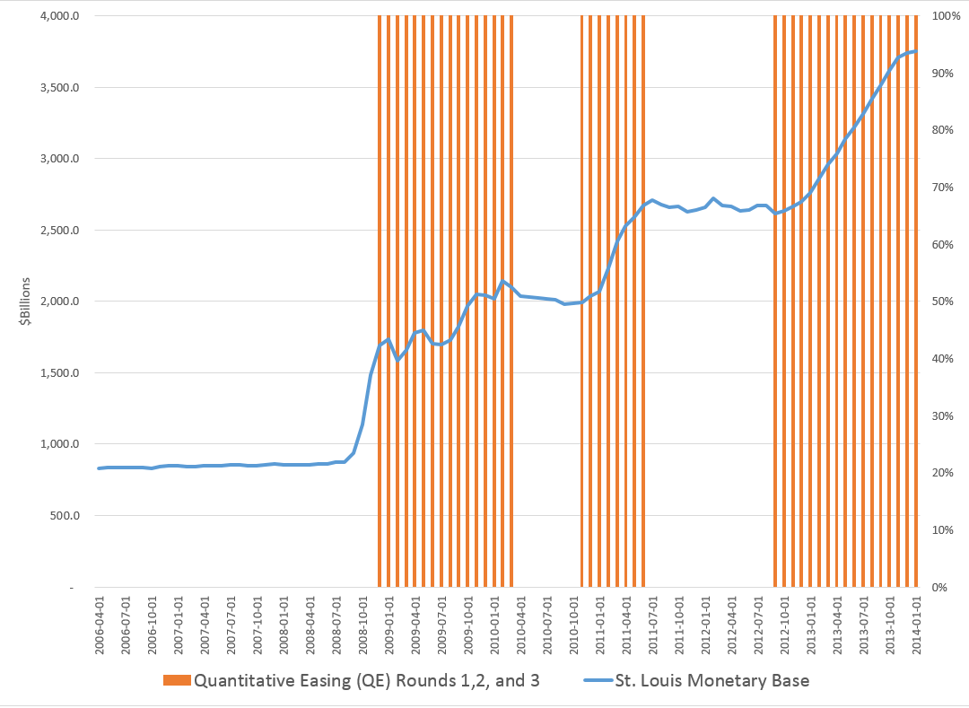
This shows the total of the “monetary base” dating from the beginning of 2006. The red shaded areas of the graph indicate the time windows in which the various “Quantitative Easing” (QE) policies have been in effect – now three QE’s, QE1, QE2, and QE3.
Obviously, something is going on.
I had fun with this chart in a post called Rhino and Tapers in the Room – Janet Yellen’s Menagerie.
OK, folks, for this intermission, you might want to take a look at Malcolm Gladwell on the 10,000 Hour Rule
So what happens if you immerse yourself in all aspects of the forecasting field?
Coming – how posts in Business Forecast Blog pretty much establish that rational expectations is a concept way past its sell date.
Guy contemplating with wine at top from dreamstime.
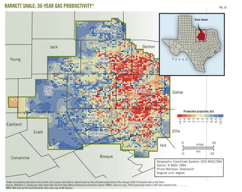
Texas’ Barnett Shale, shown below, is the focus of recent Big Data analytics conducted by the Texas Bureau of Economic Geology.
The results provide, among other things, forecasts of when natural gas production from this field will peak – suggesting at current prices that peak production may already have been reached.
The Barnett Shale study examines production data from all individual wells drilled 1995-2010 in this shale play in the Fort Worth basin – altogether more than 15,000 wells.
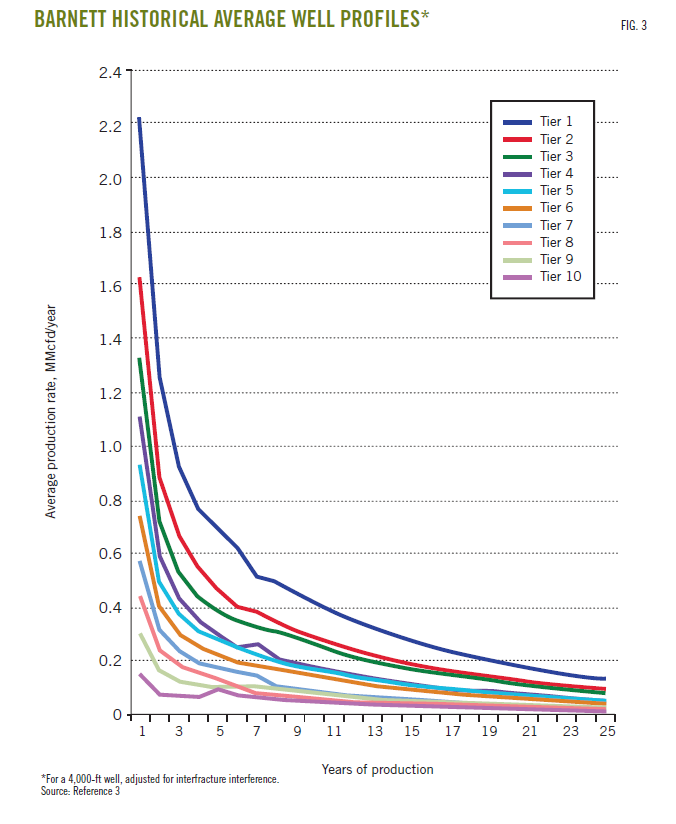
Well-by-well analysis leads to segmentation of natural gas and liquid production potential in 10 productivity tiers, which are then used to forecast future production.
Decline curves, such as the following, are developed for each of these productivity tiers. The per-well production decline curves were found to be inversely proportional to the square root of time for the first 8-10 years of well life, followed by exponential decline as what the geologists call “interfracture interference” began to affect production.
A write-up of the Barnett Shale study by its lead researchers is available to the public in two parts at the following URL’s:
http://www.beg.utexas.edu/info/docs/OGJ_SFSGAS_pt1.pdf
http://www.beg.utexas.edu/info/docs/OGJ_SFSGAS_pt2.pdf
Econometric analysis of well production, based on porosity and a range of other geologic and well parameters is contained in a followup report Panel Analysis of Well Production History in the Barnett Shale conducted under the auspices of Rice University.
Natural Gas Production Forecasts
Among the most amazing conclusions for me are the predictions regarding total natural gas production at various prices, shown below.
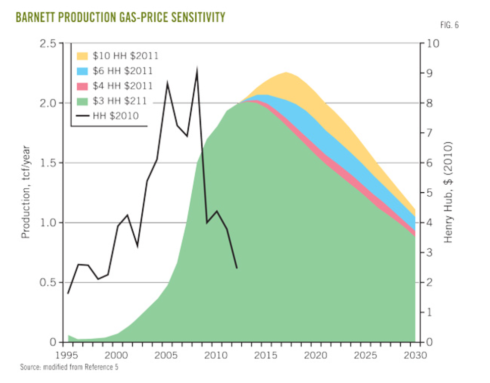
This results from a forecast of field development (drilling) which involved a period of backcasting 2011-2012 to calibrate the BEG economic and production forecast models.
Essentially, it this low price regime continues through 2015, there is a high likelihood we will see declining production in the Barnett field as a whole.
Of course, there are other major fields – the Bakken, the Marcellus, the Eagle-Ford, and a host of smaller, newer fields.
But the Barnett Shale study provides good parameters for estimating EUR (estimate ultimate recovery) in these other fields, as well as time profiles of production at various prices.