Reading Jeff Miller’s Weighing the Week Ahead: Time to Buy Commodities 11/16/14 on Dash of Insight the following chart (copied from Business insider) caught my attention.
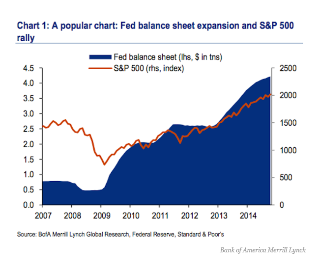
In the Business Insider discussion – There’s A Major Problem With The Popular Chart That Connects The Fed To The Stock Market – Myles Udland quotes an economist at Bank of America Merrill Lynch who says,
“Implicitly, this chart assumes that the markets are not forward looking and it is the implementation of Q that drives the stock market: when the Fed buys, the market booms and when it stops, the market swoons..”
“As our readers know [Ethan Harris of Bank of America Merrill Lynch writes] we think this relationship is a classic case of spurious correlation: anything that trended higher over the last 5 years has a 90%-plus correlation with the Fed’s balance sheet.”
This makes a good point inasmuch as two increasing time series can be correlated, but lack any essential relationship to each other – a condition known as “spurious correlation.”
But there’s more to it than that.
I am surprised that these commentators, all of whom are sophisticated with numbers, don’t explore one step further further and look at first differences of these time series. Taking first differences turns Fed liabilities and the S&P 500 into stationary series, and eliminates the possibility of spurious correlation in the above sense.
I’ve done some calculations.
Before reporting my results, let me underline that we have to be talking about something unusual in time, as this chart indicates.
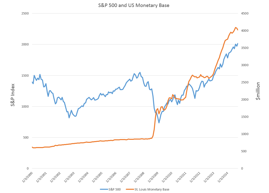
Clearly, if there is any determining link between these monthly data for the monetary base (downloaded from FRED) and monthly averages for the S&P 500, it has be to after sometime in 2008.
In the chart above and in my computations, I use St. Louis monetary base data as a proxy for the Fed liabilities series in the Business Insider discussion,
So then considering the period from January 2008 to the present, are there any grounds for claiming a relationship?
Maybe.
I develop a “bathtub” model regression, with 16 lagged values of the first differences of the monetary base numbers to predict the change in the month-to-month change in the S&P 500. I use a sample from January 2008 to December 2011 to estimate the first regression. Then, I forecast the S&P 500 on a one-month-ahead basis, comparing the errors in these projections with a “no-change” forecast. Of course, a no change forecast is essentially a simple random walk forecast.
Here are the average mean absolute percent errors (MAPE’s) from the first of 2012 to the present. These are calculated in each case over periods spanning January 2012’s MAPE to the month of the indicated average, so the final numbers on the far right of these lines are the averages for the whole period.

Lagged changes in the monetary base do seem to have some predictive power in this time frame.
But their absence in the earlier period, when the S&P 500 fell and rose to its pre-recession peak has got to be explained. Maybe the recovery has been so weak that the Fed QE programs have played a role this time in sustaining stock market advances. Or the onset of essentially zero interest rates gave the monetary base special power. Pure speculation.
Interesting, because it involves the stock market, of course, but also because it highlights a fundamental issue in statistical modeling for forecasting. Watch out for correlations in increasing time series. Always check first differences or other means of reducing the series to stationarity before trying regressions – unless, of course, you want to undertake an analysis of cointegration.