Category Archives: financial forecasts

Negative Interest Rates

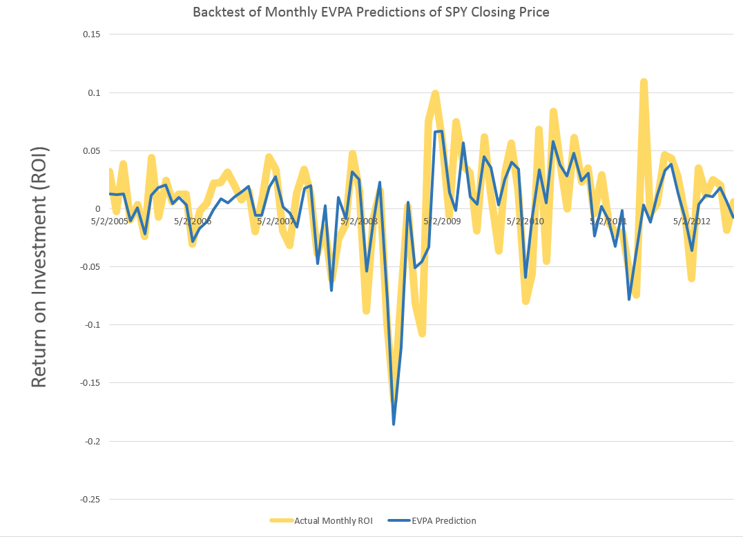
What are we to make of negative interest rates?

Burton Malkiel (Princeton) writes in the Library of Economics and Liberty that The rate of interest measures the percentage reward a lender receives for deferring the consumption of resources until a future date. Correspondingly, it measures the price a borrower pays to have resources now.

So, in a topsy-turvy world, negative interest rates might measure the penalty a lender receives for delaying consumption of resources to some future date from a more near-term date, or from now.

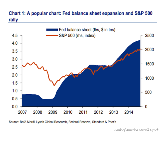
This is more or less the idea of this unconventional monetary policy, now taking hold in the environs of the European and Japanese Central Banks, and possibly spreading sometime soon to your local financial institution. Thus, one of the strange features of business behavior since the Great Recession of 2008-2009 has been the hoarding of cash either in the form of retained corporate earnings or excess bank reserves.

So, in practical terms, a negative interest rate flips the relation between depositors and banks.

With negative interest rates, instead of receiving money on deposits, depositors must pay regular sums, based on the size of their deposits, to keep their money with the bank.

“If rates go negative, consumer deposit rates go to zero and PNC would charge fees on accounts.”

The Bank of Japan, the European Central Bank and several smaller European authorities have ventured into this once-uncharted territory recently.

Bloomberg QuickTake on negative interest rates

The Bank of Japan surprised markets Jan. 29 by adopting a negative interest-rate strategy. The move came 1 1/2 years after the European Central Bank became the first major central bank to venture below zero. With the fallout limited so far, policy makers are more willing to accept sub-zero rates. The ECB cut a key rate further into negative territory Dec. 3, even though President Mario Draghi earlier said it had hit the “lower bound.” It now charges banks 0.3 percent to hold their cash overnight. Sweden also has negative rates, Denmark used them to protect its currency’s peg to the euro and Switzerland moved its deposit rate below zero for the first time since the 1970s. Since central banks provide a benchmark for all borrowing costs, negative rates spread to a range of fixed-income securities. By the end of 2015, about a third of the debt issued by euro zone governments had negative yields. That means investors holding to maturity won’t get all their money back. Banks have been reluctant to pass on negative rates for fear of losing customers, though Julius Baer began to charge large depositors.

These developments have triggered significant criticism and concern in the financial community.

Japan’s Negative Interest Rates Are Even Crazier Than They Sound

The Japanese government got paid to borrow money for a decade for the first time, selling 2.2 trillion yen ($19.5 billion) of the debt at an average yield of minus 0.024 percent on Tuesday…

The central bank buys as much as 12 trillion yen of the nation’s government debt a month…

Life insurance companies, for instance, take in premiums today and invest them to be able to cover their obligations when policyholders eventually die. They price their policies on the assumption of a mid-single-digit positive return on their bond portfolios. Turn that return negative and all of a sudden the world’s life insurers are either unprofitable or insolvent. And that’s a big industry.

Pension funds, meanwhile, operate the same way, taking in and investing contributions against future obligations. Many US pension plans are already borderline broke, and in a NIRP environment they’ll suffer a mass extinction. Again, big industry, many employees, huge potential impact on both Wall Street and Main Street.

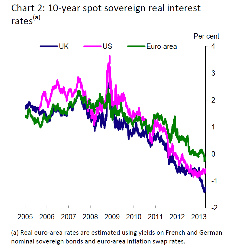
It has to be noted, however, that real (or inflation-adjusted) interest rates have gone below zero already for certain asset classes. Thus, a highlight of the Bank of England Study on negative interest rates circa 2013 is this chart, showing the emergence of negative real interest rates.

NegRealIR

Are these developments the canary in the mine?

We really need some theoretical analysis from the economics community – perspectives that encompass developments like the advent of China as a major player in world markets and patterns of debt expansion and servicing in the older industrial nations.

Back to the Drawing Board

Well, not exactly, since I never left it.

But the US and other markets opened higher today, after round-the-clock negotiations on the Greek debt.

I notice that Jeff Miller of Dash of Insight frequently writes stuff like, We would all like to know the direction of the market in advance. Good luck with that! Second best is planning what to look for and how to react.

Running the EVPA with this morning’s pop up in the opening price of the SPY, I get a predicted high for the day of 210.17 and a predicted low of 207.5. The predicted low for the day will be spot-on, if the current actual low for the trading range holds.

I can think of any number of arguments to the point that the stock market is basically not predictable, because unanticipated events constantly make an impact on prices. I think it would even be possible to invoke Goedel’s Theorem – you know, the one that uses meta-mathematics to show that every axiomatic system of complexity greater than a group is essentially incomplete. There are always new truths.

On the other hand, backtesting the EVPA – extreme value prediction algorithm – is opening up new vistas. I’m appreciative of helpful comments of and discussions with professionals in the finance and stock market investing field.

I strain every resource to develop backtests which are out-of-sample (OOS), and recently have found a way to predict closing prices with resources from the EVPA.

MOnthlyROISPYevpa

Great chart. The wider gold lines are the actual monthly ROI for the SPY, based on monthly closing prices. The blue line shows the OOS prediction of these closing prices, based on EVPA metrics. As you can see, the blue line predictions flat out miss or under-predict some developments in the closing prices. At the same time, in other cases, the EVPA predictions show uncanny accuracy, particularly in some of the big dips down.

Recognize this is something new. Rather than, say, predicting developments likely over a range of trading days – the high and low of a month, the  chart above shows predictions for stock prices at specific times, at the closing bell of the market the last trading day of each month.

I calculate the OOS R2 at 0.63 for the above series, which I understand is better than can be achieved with an autoregressive model for the closing prices and associated ROI’s.

I’ve also developed spreadsheets showing profits, after broker fees and short term capital gains taxes, from trading based on forecasts of the EVPA.

But, in addition to guidance for my personal trading, I’m interested in following out the implications of how much the historic prices predict about the prices to come.

Out-Of-Sample R2 Values for PVAR Models

Out-of-sample (OOS) R2 is a good metric to apply to test whether your predictive relationship has out-of-sample predictability. Checking this for the version of the proximity variable model which is publically documented, I find OOS R2 of 0.63 for forecasts of daily high prices.

In other words, 63 percent of the variation of the daily growth in high prices for the S&P 500 is explained by four variables, documented in Predictability of the Daily High and Low of the S&P 500 Index.

This is a really high figure for any kind of predictive relationship involving security prices, so I thought I would put the data out there for anyone interested to check.

OOS R2

This metric is often found in connection with efforts to predict daily or other rates of return on securities, and is commonly defined as

OOSR2

See, for example, Campbell and Thompson.

The white paper linked above and downloadable from University of Munich archives shows –

Ratios involving the current period opening price and the high or low price of the previous period are significant predictors of the current period high or low price for many stocks and stock indexes. This is illustrated with daily trading data from the S&P 500 index. Regressions specifying these “proximity variables” have higher explanatory and predictive power than benchmark autoregressive and “no change” models. This is shown with out-of-sample comparisons of MAPE, MSE, and the proportion of time models predict the correct direction or sign of change of daily high and low stock prices. In addition, predictive models incorporating these proximity variables show time varying effects over the study period, 2000 to February 2015. This time variation looks to be more than random and probably relates to investor risk preferences and changes in the general climate of investment risk.

I wanted to provide interested readers with a spreadsheet containing the basic data and computations of this model, which I call the “proximity variable” model. The idea is that the key variables are ratios of nearby values.

And this is sort of an experiment, since I have not previously put up a spreadsheet for downloading on this blog. And please note the spreadsheet data linked below is somewhat different than the original data for the white paper, chiefly by having more recent observations. This does change the parameter estimates for the whole sample, since the paper shows we are in the realm of time-varying coefficients.

So here goes. Check out this link. PVARresponse

Of course, no spreadsheet is totally self-explanatory, so a few words.

First, the price data (open, high, low, etc) for the S&P 500 come from Yahoo Finance, although the original paper used other sources, too.

Secondly, the data matrix for the regressions is highlighted in light blue. The first few rows of this data matrix include the formulas with later rows being converted to numbers, to reduce the size of the file.

If you look in column K below about row 1720, you will find out-of-sample regression forecasts, created by using data from the immediately preceding trading day and before and current day opening price ratios.

There are 35 cases, I believe, in which the high of the day and the opening price are the same. These can easily be eliminated in calculating any metrics, and, doing so, in fact increases the OOS R2.

I’m sympathetic with readers who develop a passion to “show this guy to be all wrong.” I’ve been there, and it may help to focus on computational matters.

However, there is just no question but this approach is novel, and beats both No Change forecasts and a first order autoregressive forecasts (see the white paper) by a considerable amount.

I personally think these ratios are closely watched by some in the community of traders, and that other price signals motivating trades are variously linked with these variables.

My current research goes further than outlined in the white paper – a lot further. At this point, I am tempted to suggest we are looking at a new paradigm in predictability of stock prices. I project “waves of predictability” will be discovered in the movement of ensembles of security prices. These might be visualized like the wave at a football game, if you will. But the basic point is that I reckon we can show how early predictions of these prices changes are self-confirming to a degree, so emerging signs of the changes being forecast in fact intensify the phenomena being predicted.

Think big.

Keep the comments coming.

Track Record of Forecasts of High Prices

Well, US markets have closed for the week, and here is an update on how our forecasts did.

TableMay1

Apart from the numbers, almost everything I wrote last Monday about market trends was wrong. Some of the highs were reached Monday, for example, and the market dived after that. The lowest forecast error is for GE, which backtesting suggests is harder to forecast than the SPY and QQQ.

I will keep doing this, expanding the securities covered for several weeks. I also hope to get smarter about using this tool.

Forecast Turning Points

I want to comment on how to use this approach to get forward information about turning points in the market.

While the research is on-going, the basic finding is that turning points, which we need to define as changes in the direction of a security or index which are sustained for several trading days or periods, are indicated by a simple tactic.

Suppose the QQQ reaches a high and then declines for several days or longer. Then, the forecasts of the high over 1, 2, and several days will tend to freeze at their initial or early values, while forecasts of low price over an expanding series of forecast periods will drop. There will, in other words, be a pronounced divergence between the forecasts of the high and low, when a turning point is in the picture.

There are interesting charts from 2008 highlighting these relationships between the high and low forecasts over telescoping forecast horizons.

I am fairly involved in some computer programming around this “proximity variable forecasting approach.” However, I am happy to dialogue with readers and interested parties via the Comments section in this blog. If you want to communicate off-line, send your email and what your interest or concern is.

And check the forecasts for this coming week, which I will have out Monday morning. Should be an interesting week.

Some Comments on Forecasting High and Low Stock Prices

I want to pay homage to Paul Erdős, the eccentric Hungarian-British-American-Israeli mathematician, whom I saw lecture a few years before his death. Erdős kept producing work in mathematics into his 70’s and 80’s – showing this is quite possible. Of course, he took amphetamines and slept on people’s couches while he was doing this work in combinatorics, number theory, and probability.

erdos

In any case, having invoked Erdős, let me offer comments on forecasting high and low stock prices – a topic which seems to be terra incognita, for the most part, to financial research.

First, let’s take a quick look at a chart showing the maximum prices reached by the exchange traded fund QQQ over a critical period during the last major financial crisis in 2008-2009.

MaxHighChart

The graph charts five series representing QQQ high prices over periods extending from 1 day to 40 days.

The first thing to notice is that the variability of these time series decreases as the period for the high increases.

This suggests that forecasting the 40 day high could be easier than forecasting the high price for, say, tomorrow.

While this may be true in some sense, I want to point out that my research is really concerned with a slightly different problem.

This is forecasting ahead by the interval for the maximum prices. So, rather than a one-day-ahead forecast of the 40 day high price (which would include 39 known possible high prices), I forecast the high price which will be reached over the next 40 days.

This problem is better represented by the following chart.

Sampled5Highs

This chart shows the high prices for QQQ over periods ranging from 1 to 40 days, sampled at what you might call “40 day frequencies.”

Now I am not quite going to 40 trading day ahead forecasts yet, but here are results for backtests of the algorithm which produces 20-trading-day-ahead predictions of the high for QQQ.

20Dayforecast

The blue lines shows the predictions for the QQQ high, and the orange line indicates the actual QQQ highs for these (non-overlapping) 20 trading day intervals. As you can see, the absolute percent errors – the grey bars – are almost all less than 1 percent error.

Random Walk

Now, these results are pretty good, and the question arises – what about the random walk hypothesis for stock prices?

Recall that a simple random walk can be expressed by the equation xt=xt-1 + εt where εt is conventionally assumed to be distributed according to N(0,σ) or, in other words, as a normal distribution with zero mean and constant variance σ.

An interesting question is whether the maximum prices for a stock whose prices follow a random walk also can be described, mathematically, as a random walk.

This is elementary, when we consider that any two observations in a time series of random walks can be connected together as xt+k = xt + ω where ω is distributed according to a Gaussian distribution but does not necessarily have a constant variance for different values of the spacing parameter k.

From this it follows that the methods producing these predictions or forecasts of the high of QQQ over periods of several trading days also are strong evidence against the underlying QQQ series being a random walk, even one with heteroskedastic errors.

That is, I believe the predictability demonstrated for these series are more than cointegration relationships.

Where This is Going

While demonstrating the above point could really rock the foundations of finance theory, I’m more interested, for the moment, in exploring the extent of what you can do with these methods.

Very soon I’m going to post on how these methods may provide signals as to turning points in stock market prices.

Stay tuned, and thanks for your comments and questions.

Erdős picture from Encyclopaedia Britannica

Time-Varying Coefficients and the Risk Environment for Investing

My research provides strong support for variation of key forecasting parameters over time, probably reflecting the underlying risk environment facing investors. This type of variation is suggested by Lo ( 2005).

So I find evidence for time varying coefficients for “proximity variables” that predict the high or low of a stock in a period, based on the spread between the opening price and the high or low price of the previous period.

Figure 1 charts the coefficients associated with explanatory variables that I call OPHt and OPLt. These coefficients are estimated in rolling regressions estimated with five years of history on trading day data for the S&P 500 stock index. The chart is generated with more than 3000 separate regressions.

Here OPHt is the difference between the opening price and the high of the previous period, scaled by the high of the previous period. Similarly, OPLt is the difference between the opening price and the low of the previous period, scaled by the low of the previous period. Such rolling regressions sometimes are called “adaptive regressions.”

Figure 1 Evidence for Time Varying Coefficients – Estimated Coefficients of OPHt and OPLt Over Study Sample

TvaryCoeff

Note the abrupt changes in the values of the coefficients of OPHt and OPLt in 2008.

These plausibly reflect stock market volatility in the Great Recession. After 2010 the value of both coefficients tends to move back to levels seen at the beginning of the study period.

This suggests trajectories influenced by the general climate of risk for investors and their risk preferences.

I am increasingly convinced the influence of these so-called proximity variables is based on heuristics such as “buy when the opening price is greater than the previous period high” or “sell, if the opening price is lower than the previous period low.”

Recall, for example, that the coefficient of OPHt measures the influence of the spread between the opening price and the previous period high on the growth in the daily high price.

The trajectory, shown in the narrow, black line, trends up in the approach to 2007. This may reflect investors’ greater inclination to buy the underlying stocks, when the opening price is above the previous period high. But then the market experiences the crisis of 2008, and investors abruptly back off from their eagerness to respond to this “buy” signal. With onset of the Great Recession, investors become increasingly risk adverse to such “buy” signals, only starting to recover their nerve after 2013.

A parallel interpretation of the trajectory of the coefficient of OPLt can be developed based on developments 2008-2009.

Time variation of these coefficients also has implications for out-of-sample forecast errors.

Thus, late 2008, when values of the coefficients of both OPH and OPL make almost vertical movements in opposite directions, is the period of maximum out-of-sample forecast errors. Forecast errors for daily highs, for example, reach a maximum of 8 percent in October 2008. This can be compared with typical errors of less than 0.4 percent for out-of-sample forecasts of daily highs with the proximity variable regressions.

Heuristics

Finally, I recall a German forecasting expert discussing heuristics with an example from baseball. I will try to find his name and give him proper credit. By the idea is that an outfielder trying to catch a flyball does not run calculations involving mass, angle, velocity, acceleration, windspeed, and so forth. Instead, basically, an outfielder runs toward the flyball, keeping it at a constant angle in his vision, so that it falls then into his glove at the last second. If the ball starts descending in his vision, as he approaches it, it may fall on the ground before him. If it starts to float higher in his perspective as he runs to get under it, it may soar over him, landing further back int he field.

I wonder whether similar arguments can be advanced for the strategy of buying based or selling based on spreads between the opening price in a period and the high and low prices in a previous period.

The Greek Conundrum

I’ve been focused on stock price forecast models, recently, and before that, on dynamics of oil prices.

However, it’s clear that almost any global market these days can be affected by developments in Europe.

There’s an excellent backgrounder to the crisis over restructuring Greek debt. See Greece, Its International Competitors and the Euro by the Turkish financial analyst T. Sabri Öncü – a PDF from the Economic and Political Weekly, an Indian Journal.

According to Öncü, the Greeks got in trouble with loans to finance consumption and nonproductive spending, when and after they joined the Eurozone in 2001. The extent of the problem was masked by accounting smoke and mirrors, only being revealed in 2009. Since then “bailouts” from European banking authorities have been designed to insure steady repayment of this debt to German and French banks, among others, although some Greek financial parties have benefited also.

Still, as Öncü writes,

Fast forward to today, despite two bailouts and adjustment programmes Greece has been in depression since the beginning of 2009. The Greece’s GDP is down about 25% from its peak in 2008, unemployment is at about 25%, youth unemployment is above 50%, Greece’s public debt to GDP ratio is at about a mind-boggling 175% and many Greeks are lining up for soup in front of soup kitchens reminiscent of the soup kitchens of the Great Depression of 1929.

As this post is written, negotiations between the new Syrizia government and European authorities have broken down, but here is an interesting video outlining the opposing positions, to an extent, prior to Monday.

Bruegel’s Interview: Debt Restructuring & Greece

Austerity is on the line here, since it seems clear Greece can never repay its debts as currently scheduled, even with imposing further privations on the Greek population.

Forecasting Google’s Stock Price (GOOG) On 20-Trading-Day Horizons

Google’s stock price (GOOG) is relatively volatile, as the following chart shows.

GOOG

So it’s interesting that a stock market forecasting algorithm can produce the following 20 Trading-Day-Ahead forecasts for GOOG, for the recent period.

GOG20

The forecasts in the above chart, as are those mentioned subsequently, are out-of-sample predictions. That is, the parameters of the forecast model – which I call the PVar model – are estimated over one set of historic prices. Then, the forecasts from PVar are generated with values for the explanatory variables that are “outside” or not the same as this historic data.

How good are these forecasts and how are they developed?

Well, generally forecasting algorithms are compared with benchmarks, such as an autoregressive model or a “no-change” forecast.

So I constructed an autoregressive (AR) model for the Google closing prices, sampled at 20 day frequencies. This model has ten lagged versions of the closing price series, so I do not just rely here on first order autocorrelations.

Here is a comparison of the 20 trading-day-ahead predictions of this AR model, the above “proximity variable” (PVar) model which I take credit for, and the actual closing prices.

compGOOG

As you can see, the AR model is worse in comparison to the PVar model, although they share some values at the end of the forecast series.

The mean absolute percent errors (MAPE) of the AR model for a period more extended than shown in the graph is 7.0, compared with 5.1 for PVar. This comparison is calculated over data from 4/20/2011.

So how do I do it?

Well, since these models show so much promise, it makes sense to keep working on them, making improvements. However, previous posts here give broad hints, indeed pretty well laying out the framework, at least on an introductory basis.

Essentially, I move from predicting highs and lows to predicting closing prices.

To predict highs and lows, my post “further research” states

Now, the predictive models for the daily high and low stock price are formulated, as before, keying off the opening price in each trading day. One of the key relationships is the proximity of the daily opening price to the previous period high. The other key relationship is the proximity of the daily opening price to the previous period low. Ordinary least squares (OLS) regression models can be developed which do a good job of predicting the direction of change of the daily high and low, based on knowledge of the opening price for the day.

Other posts present actual regression models, although these are definitely prototypes, based on what I know now.

Why Does This Work?

I’ll bet this works because investors often follow simple rules such as “buy when the opening price is sufficiently greater than the previous period high” or “sell, if the opening price is sufficiently lower than the previous period low.”

I have assembled evidence, based on time variation in the predictive coefficients of the PVar variables, which I probably will put out here sometime.

But the point is that momentum trading is a major part of stock market activity, not only in the United States, but globally. There’s even research claiming to show that momentum traders do better than others, although that’s controversial.

This means that the daily price record for a stock, the opening, high, low, and closing prices, encode information that investors are likely to draw upon over different investing horizons.

I’m pleased these insights open up many researchable questions. I predict all this will lead to wholly new generations of models in stock market analysis. And my guess, and so far it is largely just that, is that these models may prove more durable than many insights into patterns of stock market prices – due to a sort of self-confirming aspect.

Predicting the High and Low of SPY – and a Generalization

Well, here are some results on forecasting the daily low prices of the SPY exchange traded fund (ETF), complementing the previous post.

This line of inquiry has exploded into something much bigger, as I will relate shortly, but first ….

Predicting the Daily Low

This graph gives a flavor of the accuracy of a very simple bivariate regression, estimated on the daily percent changes in the lows for SPY.

DailyLowPredict

The blue line is the predicted percent change. And the orange line shows the actual percent changes of the daily lows for this period in early 2008.

These are out-of-sample results, in the sense the predicted percent changes in the lows are not included in the regression data used to develop the forecast model.

And considering we are predicting one component of volatility itself, the results are not bad.

For this analysis, I develop dynamic or adaptive regressions that start in August 2005 and run up to the present. The models predict the direction of change in the daily lows, on average, about 85 percent of the time over nearly 15 years.

The following chart shows 30 day rolling averages of the proportion of time the models predict the correct sign of the percent change for this period.

RatiosLow

This performance is produced by a simple bivariate regression of the daily percent change in the lows to the percent change in the previous low compared with the current daily opening price. So, of course, to get the explanatory variable you divide the previous trading day value for the low by the current day opening price and subtract 1 – and you can convert to percentages for purposes of display.

The equation is

PERCENT CHANGE IN CURRENT DAILY LOW = -0.00448 -0.951689(PERCENT CHANGE IN THE PREVIOUS DAILY LOW IN COMPARISON WITH THE CURRENT OPENING PRICE).

If the previous low is greater than the current opening price, the coefficient on this variable creates negative value which, added to the negative constant of the regression, would predict the daily low to drop.

If you have any role in instructing students, let me suggest this example. The data is readily accessible from Yahoo Finance (under SPY) and once you invert the calendar order of the data, the relevant percent changes are easy to compute, and then to plug into regressions with the Microsoft Excel Trend(.) function.

Now the amazing thing is that similar relationships operate over various time scales, both for predicting the low and the high in a group of trading days. I’m working up the post showing this right now.

There is, in other words, a remarkable thread running through daily, weekly, and monthly settings.

In closing here – a thought.

Often, when a predictive relationship relating to stock prices is put out there, you get the feeling the underlying regularities will evaporate, as traders jump on the opportunity.

But these predictive relationships for the high and low of the SPY may be examples of self-fulfiling prophesies.

In other words, if a trader learns that the daily, weekly, or monthly high or low is related to (a) the opening price, and (b) the high or low for the preceding period, whatever it may be, their actions could very well strengthen the relationship. So, predicting an increase in the daily high, a trader very well could go long, by buying the SPY at opening. The stock price should thereby go higher. Similarly, if a trader acts on information regarding predictions of a dropping low, they may short the SPY, which again could have the effect of causing the low to ratchet down further.

It would be fascinating if we could somehow establish that this is actually going on and sustaining this type of relationship.

Quantitative Easing (QE) and the S&P 500

Reading Jeff Miller’s Weighing the Week Ahead: Time to Buy Commodities 11/16/14 on Dash of Insight the following chart (copied from Business insider) caught my attention.

stocksandQE

In the Business Insider discussion – There’s A Major Problem With The Popular Chart That Connects The Fed To The Stock Market – Myles Udland quotes an economist at Bank of America Merrill Lynch who says,

“Implicitly, this chart assumes that the markets are not forward looking and it is the implementation of Q that drives the stock market: when the Fed buys, the market booms and when it stops, the market swoons..”

“As our readers know [Ethan Harris of Bank of America Merrill Lynch writes] we think this relationship is a classic case of spurious correlation: anything that trended higher over the last 5 years has a 90%-plus correlation with the Fed’s balance sheet.”

This makes a good point inasmuch as two increasing time series can be correlated, but lack any essential relationship to each other – a condition known as “spurious correlation.”

But there’s more to it than that.

I am surprised that these commentators, all of whom are sophisticated with numbers, don’t explore one step further further and look at first differences of these time series. Taking first differences turns Fed liabilities and the S&P 500 into stationary series, and eliminates the possibility of spurious correlation in the above sense.

I’ve done some calculations.

Before reporting my results, let me underline that we have to be talking about something unusual in time, as this chart indicates.

SPMB

Clearly, if there is any determining link between these monthly data for the monetary base (downloaded from FRED) and monthly averages for the S&P 500, it has be to after sometime in 2008.

In the chart above and in my  computations, I use St. Louis monetary base data as a proxy for the Fed liabilities series in the Business Insider discussion,

So then considering the period from January 2008 to the present, are there any grounds for claiming a relationship?

Maybe.

I develop a “bathtub” model regression, with 16 lagged values of the first differences of the monetary base numbers to predict the change in the month-to-month change in the S&P 500. I use a sample from January 2008 to December 2011 to estimate the first regression. Then, I forecast the S&P 500 on a one-month-ahead basis, comparing the errors in these projections with a “no-change” forecast. Of course, a no change forecast is essentially a simple random walk forecast.

Here are the average mean absolute percent errors (MAPE’s) from the first of 2012 to the present. These are calculated in each case over periods spanning January 2012’s MAPE to the month of the indicated average, so the final numbers on the far right of these lines are the averages for the whole period.

cumMAPE

Lagged changes in the monetary base do seem to have some predictive power in this time frame.

But their absence in the earlier period, when the S&P 500 fell and rose to its pre-recession peak has got to be explained. Maybe the recovery has been so weak that the Fed QE programs have played a role this time in sustaining stock market advances. Or the onset of essentially zero interest rates gave the monetary base special power. Pure speculation.

Interesting, because it involves the stock market, of course, but also because it highlights a fundamental issue in statistical modeling for forecasting. Watch out for correlations in increasing time series. Always check first differences or other means of reducing the series to stationarity before trying regressions – unless, of course, you want to undertake an analysis of cointegration.