Category Archives: time series forecasting

Five Day Forecasts of High and Low for QQQ, SPY, GE, and MSFT – Week of May 11-15

Here are high and low forecasts for two heavily traded exchange traded funds (ETF’s) and two popular stocks. Like the ones in preceding weeks, these are for the next five trading days, in this case Monday through Friday May 11-15.

HLWeekMay11to15

The up and down arrows indicate the direction of change from last week – for the high prices only, since the predictions of lows are a new feature this week.

Generally, these prices are essentially “moving sideways” or with relatively small changes, except in the case of SPY.

For the record, here is the performance of previous forecasts.

TableMay8

Strong disclaimer: These forecasts are provided for information and scientific purposes only. This blog accepts no responsibility for what might happen, if you base investment or trading decisions on these forecasts. What you do with these predictions is strictly your own business.

Incidentally, let me plug the recent book by Andrew W. Lo and A. Craig McKinlay – A Non-Random Walk Down Wall Street from Princeton University Press and available as a e-book.

I’ve been reading an earlier book which Andrew Lo co-authored The Econometrics of Financial Markets.

What I especially like in these works is the insistence that statistically significant autocorrelations exist in stock prices and stock returns. They also present multiple instances in which stock prices fail tests for being random walks, and establish a degree of predictability for these time series.

Again, almost all the focus of work in the econometrics of financial markets is on closing prices and stock returns, rather than predictions of the high and low prices for periods.

Trading Volume- Trends, Forecasts, Predictive Role

The New York Stock Exchange (NYSE) maintains a data library with historic numbers on trading volumes. Three charts built with some of this data tell an intriguing story about trends and predictability of volumes of transactions and dollars on the NYSE.

First, the number of daily transactions peaked during the financial troubles of 2008, only showing some resurgence lately.

transvol

This falloff in the number of transactions is paralleled by the volume of dollars spent in these transactions.

dollartrans

These charts are instructive, since both highlight the existence of “spikes” in transaction and dollar volume that would seem to defy almost any run-of-the-mill forecasting algorithm. This is especially true for the transactions time series, since the spikes are more irregularly spaced. The dollar volume time series suggests some type of periodicity is possible for these spikes, particularly in recent years.

But lower trading volume has not impacted stock prices, which, as everyone knows, surged past 2008 levels some time ago.

A raw ratio between the value of trades and NYSE stock transactions gives the average daily price per transaction.

vluepershare

So stock prices have rebounded, for the most part, to 2008 levels. Note here that the S&P 500 index stocks have done much better than this average for all stocks.

Why has trading volume declined on the NYSE? Some reasons gleaned from the commentariat.

  1. Mom and Pop traders largely exited the market, after the crash of 2008
  2. Some claim that program trading or high frequency trading peaked a few years back, and is currently in something of a decline in terms of its proportion of total stock transactions. This is, however, not confirmed by the NYSE Facts and Figures, which shows program trading pretty consistently at around 30 percent of total trading transactions..
  3. Interest has shifted to options and futures, where trading volumes are rising.
  4. Exchange Traded Funds (ETF’s) make up a larger portion of the market, and they, of course, do not actively trade.
  5. Banks have reduced their speculation in equities, in anticipation of Federal regulations

See especially Market Watch and Barry Ritholtz on these trends.

But what about the impact of trading volume on price? That’s the real zinger of a question I hope to address in coming posts this week.

Revisiting the Predictability of the S&P 500

Almost exactly a year ago, I posted on an algorithm and associated trading model for the S&P 500, the stock index which supports the SPY exchange traded fund.

I wrote up an autoregressive (AR) model, using daily returns for the S&P 500 from 1993 to early 2008. This AR model outperforms a buy-and-hold strategy for the period 2008-2013, as the following chart shows.

SPYTradingProgramcompBH

The trading algorithm involves “buying the S&P 500” when the closing price indicates a positive return for the following trading day. Then, I “close out the investment” the next trading day at that day’s closing price. Otherwise, I stay in cash.

It’s important to be your own worst critic, and, along those lines, I’ve had the following thoughts.

First, the above graph disregards trading costs. Your broker would have to be pretty forgiving to execute 2000-3000 trades for less than the $500 you make over the buy-and-hold strategy. SO, I should deduct something for the trades in calculating the cumulative value.

The other criticism concerns high frequency trading. The daily returns are calculated against closing values, but, of course, to use this trading system you have to trade prior to closing. However, even a few seconds can make a crucial difference in the price of the S&P 500 or SPY – and even smaller intervals.

An Up-Dated AR Model

Taking some of these criticisms into account, I re-estimate an autoregressive model on more recent data –again calculating returns against closing prices on successive trading days.

This time I start with an initial investment of $100,000, and deduct $5 per trade off the totals as they cumulate.

I also utilize only seven (7) lags for the daily returns. This compares with the 30 lag model from the post a year ago, and I estimate the current model with OLS, rather than maximum likelihood.

The model is

Rt = 0.0007-0.0651Rt-1+0.0486Rt-2-0.0999Rt-3-0.0128Rt-4-0.1256Rt-5 +0.0063Rt-6-0.0140Rt-7

where Rt is the daily return for trading day t. This model originates on data from June 11, 2011. The coefficients of the equation result from bagging OLS regressions – developing coefficient estimates for 100,000 similar size samples drawn with replacement from this dataset of 809 observations. These 100,000 coefficient estimates are averaged to arrive at the numbers shown above.

Here is the result of applying my revised model to recent stock market activity. The results are out-of-sample. In other words, I use the predictive equation which is calculated over data prior to the start of the investment comparison. I also filter the positive predictions for the next day closing price, only acting when they are a certain size or larger.

NewARmodel

There is a 2-3 percent return on a hundred thousand dollar investment in one month, and a projected annual return on the order of 20-30 percent.

The current model also correctly predicts the sign of the daily return 58 percent of the time, compared with a much lower figure for the model from a year ago.

This looks like the best thing since sliced bread.

But wait – what about high frequency trading?

I’m exploring the implementation of this model – and maybe should never make it public.

But let me clue you in on what I suspect, and some evidence I have.

So, first, it is interesting the gains from trading on closing day prices more than evaporate by the opening of the New York Stock Exchange, following the generation of a “buy” signal according to this algorithm.

In other words, if you adjust the trading model to buy at the open of the following trading day, when the closing price indicates a positive return for the following day – you do not beat a buy-and-hold strategy. Something happens between the closing and the opening of the NYSE market for the SPY.

Someone else knows about this model?

I’m exploring the “final second’ volatility of the market, focusing on trading days when the closing prices look like they might come in to indicate a positive return the following day. This is complicated, and it puts me into issues of predictability in high frequency data.

I also am looking at the SPY numbers specifically to bring this discussion closer to trading reality.

Bottom line – It’s hard to make money in the market on trading algorithms if you are a day-trader – although probably easier with a super-computer at your command and when you sit within microseconds of executing an order on the NY Stock Exchange.

But these researches serve to indicate one thing fairly clearly. And that is that there definitely are aspects of stock prices which are predictable. Acting on the predictions is the hard part.

And Postscript: Readers may have noticed a lesser frequency of posting on Business Forecast blog in the past week or so. I am spending time running estimations and refreshing and extending my understanding of some newer techniques. Keep checking in – there is rapid development in “real world forecasting” – exciting and whiz bang stuff. I need to actually compute the algorithms to gain a good understanding – and that is proving time-consuming. There is cool stuff in the data warehouse though.

Forecasting Issue – Projected Rise in US Health Care Spending

Between one fifth and one sixth of all spending in the US economy, measured by the Gross Domestic Product (GDP), is for health care – and the ratio is projected to rise.

From a forecasting standpoint, an interesting thing about this spending  is that it can be forecast in the aggregate on a 1, 2 and 3 year ahead basis with a fair degree of accuracy.

This is because growth in disposable personal income (DPI) is a leading indicator of private personal healthcare spending – which comprises the lion’s share of total healthcare spending.

Here is a chart from PROJECTIONS OF NATIONAL HEALTH EXPENDITURES: METHODOLOGY AND MODEL SPECIFICATION highlighting the lagged relationship and private health care spending.

laggedeffect

Thus, the impact of the recession of 2008-2009 on disposable personal income has resulted in relatively low increases in private healthcare spending until quite recently. (Note here, too, that the above curves are smoothed by taking centered moving averages.)

The economic recovery, however, is about to exert an impact on overall healthcare spending – with the effects of the Affordable Care Act (ACA) aka Obamacare being a wild card.

A couple of news articles signal this, the first from the Washington Post and the second from the New Republic.

The end of health care’s historic spending slowdown is near

The historic slowdown in health-care spending has been one of the biggest economic stories in recent years — but it looks like that is soon coming to an end.

As the economy recovers, Obamacare expands coverage and baby boomers join Medicare in droves, the federal Centers for Medicare and Medicaid Services’ actuary now projects that health spending will grow on average 5.7 percent each year through 2023, which is 1.1 percentage points greater than the expected rise in GDP over the same period. Health care’s share of GDP over that time will rise from 17.2 percent now to 19.3 percent in 2023, or about $5.2 trillion, as the following chart shows.

NHCE

America’s Medical Bill Didn’t Spike Last Year

The questions are by how much health care spending will accelerate—and about that, nobody can be sure. The optimistic case is that the slowdown in health care spending isn’t entirely the product of a slow economy. Another possible factor could be changes in the health care market—in particular, the increasing use of plans with high out-of-pocket costs, which discourage people from getting health care services they might not need. Yet another could be the influence of the Affordable Care Act—which reduced what Medicare pays for services while introducing tax and spending modifications designed to bring down the price of care.

There seems to be some wishful thinking on this subject in the media.

Betting against the lagged income effect is not advisable, however, as an analysis of the accuracy of past projections of Centers for Medicare and Medicaid Services (CMS) shows.

Quantitative Easing (QE) and the S&P 500

Reading Jeff Miller’s Weighing the Week Ahead: Time to Buy Commodities 11/16/14 on Dash of Insight the following chart (copied from Business insider) caught my attention.

stocksandQE

In the Business Insider discussion – There’s A Major Problem With The Popular Chart That Connects The Fed To The Stock Market – Myles Udland quotes an economist at Bank of America Merrill Lynch who says,

“Implicitly, this chart assumes that the markets are not forward looking and it is the implementation of Q that drives the stock market: when the Fed buys, the market booms and when it stops, the market swoons..”

“As our readers know [Ethan Harris of Bank of America Merrill Lynch writes] we think this relationship is a classic case of spurious correlation: anything that trended higher over the last 5 years has a 90%-plus correlation with the Fed’s balance sheet.”

This makes a good point inasmuch as two increasing time series can be correlated, but lack any essential relationship to each other – a condition known as “spurious correlation.”

But there’s more to it than that.

I am surprised that these commentators, all of whom are sophisticated with numbers, don’t explore one step further further and look at first differences of these time series. Taking first differences turns Fed liabilities and the S&P 500 into stationary series, and eliminates the possibility of spurious correlation in the above sense.

I’ve done some calculations.

Before reporting my results, let me underline that we have to be talking about something unusual in time, as this chart indicates.

SPMB

Clearly, if there is any determining link between these monthly data for the monetary base (downloaded from FRED) and monthly averages for the S&P 500, it has be to after sometime in 2008.

In the chart above and in my  computations, I use St. Louis monetary base data as a proxy for the Fed liabilities series in the Business Insider discussion,

So then considering the period from January 2008 to the present, are there any grounds for claiming a relationship?

Maybe.

I develop a “bathtub” model regression, with 16 lagged values of the first differences of the monetary base numbers to predict the change in the month-to-month change in the S&P 500. I use a sample from January 2008 to December 2011 to estimate the first regression. Then, I forecast the S&P 500 on a one-month-ahead basis, comparing the errors in these projections with a “no-change” forecast. Of course, a no change forecast is essentially a simple random walk forecast.

Here are the average mean absolute percent errors (MAPE’s) from the first of 2012 to the present. These are calculated in each case over periods spanning January 2012’s MAPE to the month of the indicated average, so the final numbers on the far right of these lines are the averages for the whole period.

cumMAPE

Lagged changes in the monetary base do seem to have some predictive power in this time frame.

But their absence in the earlier period, when the S&P 500 fell and rose to its pre-recession peak has got to be explained. Maybe the recovery has been so weak that the Fed QE programs have played a role this time in sustaining stock market advances. Or the onset of essentially zero interest rates gave the monetary base special power. Pure speculation.

Interesting, because it involves the stock market, of course, but also because it highlights a fundamental issue in statistical modeling for forecasting. Watch out for correlations in increasing time series. Always check first differences or other means of reducing the series to stationarity before trying regressions – unless, of course, you want to undertake an analysis of cointegration.

Oil and Gas Prices II

One of the more interesting questions in applied forecasting is the relationship between oil and natural gas prices in the US market, shown below.

OIlGasPrices

Up to the early 1990’s, the interplay between oil and gas prices followed “rules of thumb” – for example, gas prices per million Btu were approximately one tenth oil prices.

There is still some suggestion of this – for example, peak oil prices recently hit nearly $140 a barrel, at the same time gas prices were nearly $14 per million Btu’s.

However, generally, ratio relationships appear to break down around 2009, if not earlier, during the first decade of the century.

A Longer Term Relationship?

Perhaps oil and gas prices are in a longer term relationship, but one disturbed in many cases in short run time periods.

One way economists and ecommetricians think of this is in terms of “co-integrating relationships.” That’s a fancy way of saying that regressions of the form,

Gas price in time t = constant + α(oil price in time t) + (residual in time t)

are predictive. Here, α is a coefficient to be estimated.

Now this looks like a straight-forward regression, so you might say – “what’s the problem?”

Well, the catch is that gas prices and oil prices might be nonstationary – that is, one or another form of a random walk.

If this is so – and positive results on standard tests such as the augmented Dickey Fuller (ADR) and Phillips-Peron are widely reported – there is a big potential problem. It’s easy to regress one completely unrelated nonstationary time series onto another, getting an apparently significant result, only to find this relationship disappears in the forecast. In other words two random series can, by chance, match up to each other over closely, but that’s no guarantee they will continue to do so.

Here’s where the concept of a co-integrating relationship comes into play.

If you can show, by various statistical tests, that variables are cointegrated, regressions such as the one above are more likely to be predictive.

Well, several econometric studies show gas and oil prices are in a cointegrated relationship, using data from the 1990’s through sometime in the first decade of the 2000’s. The more sophisticated specify auxiliary variables to account for weather or changes in gas storage. You might download and read, for example, a study published in 2007 under the auspices of the Dallas Federal Reserve Bank – What Drives Natural Gas Prices?

But it does not appear that this cointegrated relationship is fixed. Instead, it changes over time, perhaps exemplifying various regimes, i.e. periods of time in which the underlying parameters switch to new values, even though a determinate relationship can still be demonstrated.

Changing parameters are shown in the excellent 2012 study by Ramberg and Parsons in the Energy Journal – The Weak Tie Between Natural Gas and Oil Prices.

The Underlying Basis

Anyway, there are facts relating to production and use of oil and natural gas which encourage us to postulate a relationship in their prices, although the relationship may shift over time.

This makes sense since oil and gas are limited or completely substitutes in various industrial processes. This used to be more compelling in electric power generation, than it is today. According to the US Department of Energy, there are only limited amounts of electric power still produced by generators running on oil, although natural gas turbines have grown in importance.

Still, natural gas is often produced alongside of and is usually dissolved in oil, so oil and natural gas are usually joint products.

Recently, technology has changed the picture with respect to gas and oil.

On the demand side, the introduction of the combined-cycle combustion turbine made natural gas electricity generation more cost effective, thereby making natural gas in electric power generation even more dominant.

On the demand side, the new technologies of extracting shale oil and natural gas – often summarized under the rubric of “fracking” or hydraulic fracturing – have totally changed the equation, resulting in dramatic increases in natural gas supplies in the US.

This leaves the interesting question of what sort of forecasting model for natural gas might be appropriate.

Recession and Economic Projections

I’ve been studying the April 2014 World Economic Outlook (WEO) of the International Monetary Fund (IMF) with an eye to its longer term projections of GDP.

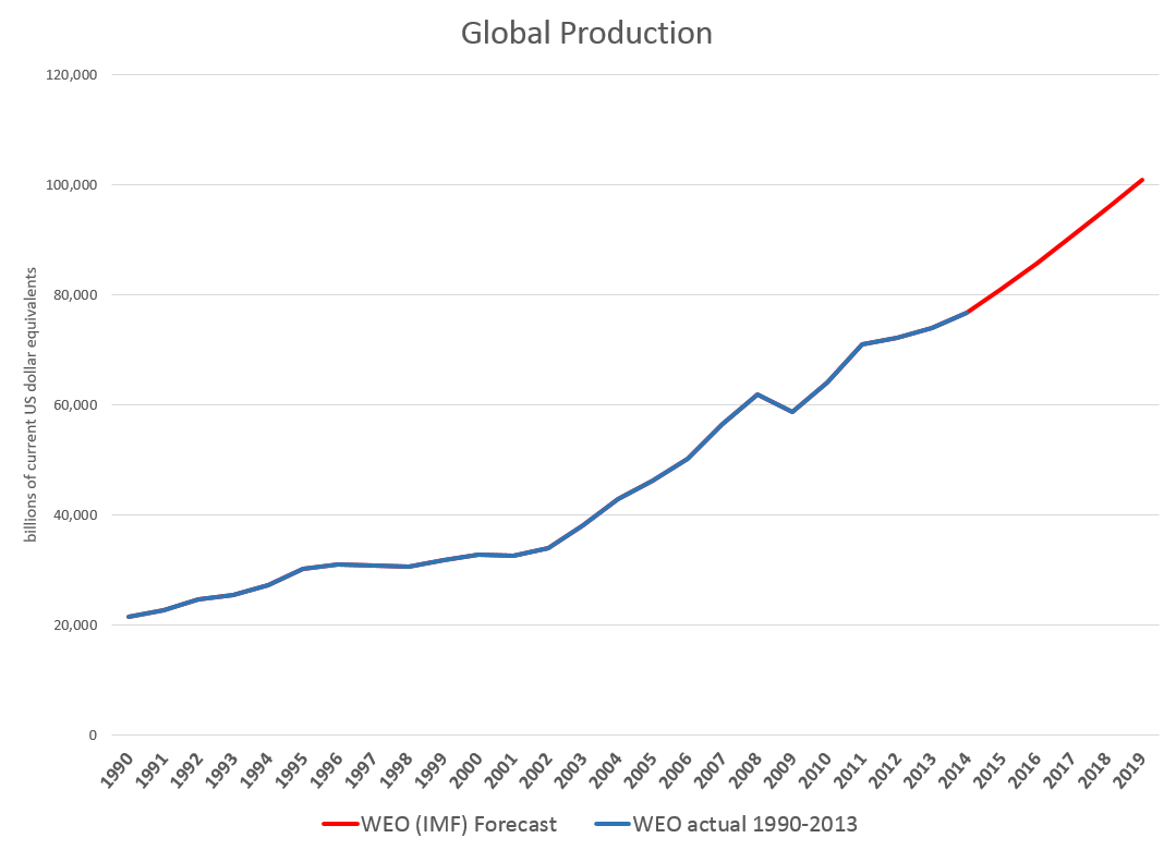
Downloading the WEO database and summing the historic and projected GDP’s suggests this chart.

GlobalGDP

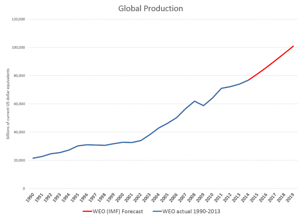
The WEO forecasts go to 2019, almost to our first benchmark date of 2020. Global production is projected to increase from around $76.7 trillion in current US dollar equivalents to just above $100 trillion. An update in July marked the estimated 2014 GDP growth down from 3.7 to 3.4 percent, leaving the 2015 growth estimate at a robust 4 percent.

The WEO database is interesting, because it’s country detail allows development of charts, such as this.

gbobalproout

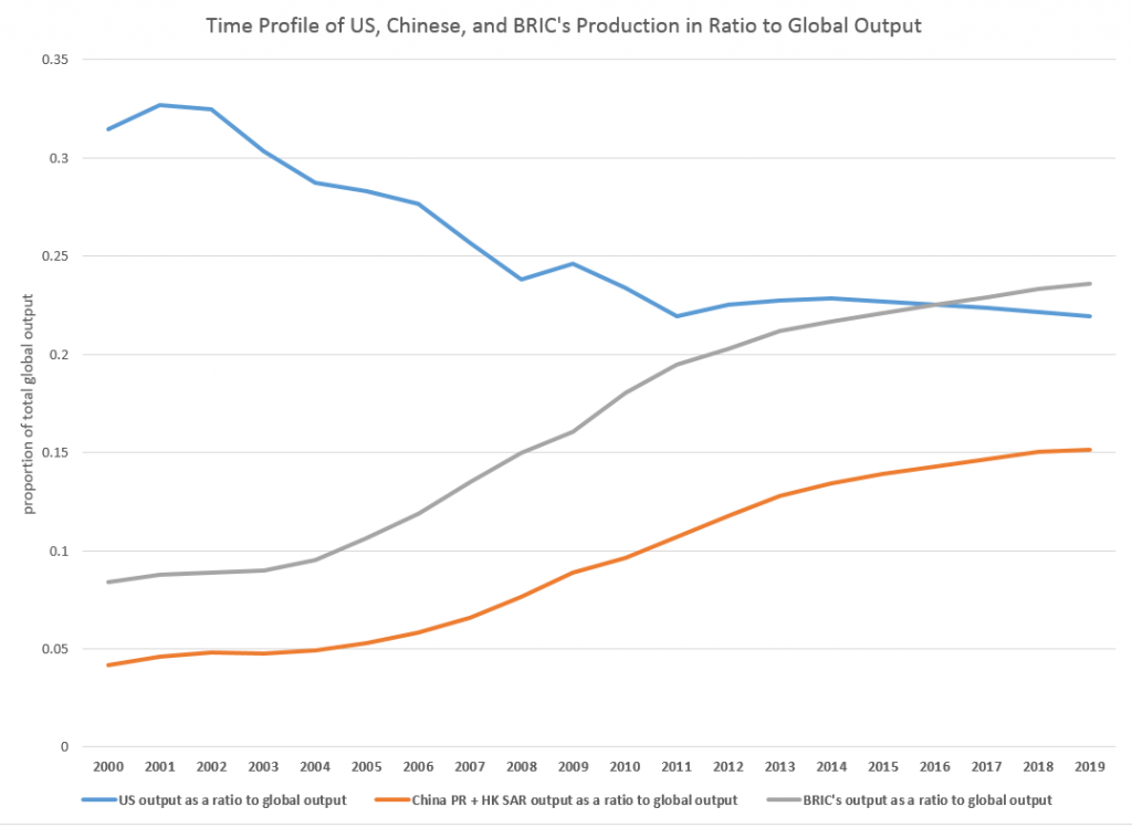
So, based on this country detail on GDP and projections thereof, the BRIC’s (Brazil, Russia, India, and China) will surpass US output, measured in current dollar equivalents, in a couple of years.

In purchasing power parity (PPP) terms, China is currently or will soon pass the US GDP, incidentally. Thus, according to the Big Mac index, a hamburger is 41 percent undervalued in China, compared to the US. So boosting Chinese production 41 percent puts its value greater than US output. However, the global totals would change if you take this approach, and it’s not clear the Chinese proportion would outrank the US yet.

The Impacts of Recession

The method of caging together GDP forecasts to the year 2030, the second benchmark we want to consider in this series of posts, might be based on some type of average GDP growth rate.

However, there is a fundamental issue with this, one I think which may play significantly into the actual numbers we will see in coming years.

Notice, for example, the major “wobble” in the global GDP curve historically around 2008-2009. The Great Recession, in fact, was globally synchronized, although it only caused a slight inflection in Chinese and BRIC growth. Europe and Japan, however, took a major hit, bringing global totals down for those years.

Looking at 2015-2020 and, certainly, 2015-2030, it would be nothing short of miraculous if there were not another globally synchronized recession. Currently, for example, as noted in an earlier post here, the Eurozone, including Germany, moved into zero to negative growth last quarter, and there has been a huge drop in Japanese production. Also, Chinese economic growth is ratcheting down from it atmospheric levels of recent years, facing a massive real estate bubble and debt overhang.

But how to include a potential future recession in economic projections?

One guide might be to look at how past projections have related to these types of events. Here, for example, is a comparison of the 2008 and 2014 US GDP projections in the WEO’s.

WEOUS

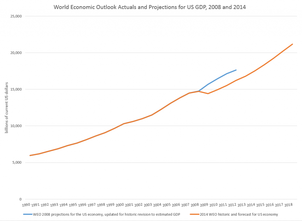
So, according to the IMF, the Great Recession resulted in a continuing loss of US production through until the present.

This corresponds with the concept that, indeed, the GDP time series is, to a large extent, a random walk with drift, as Nelson and Plosser suggested decades ago (triggering a huge controversy over unit roots).

And this chart highlights a meaning for potential GDP. Thus, the capability to produce things did not somehow mysteriously vanish in 2008-2009. Rather, there was no point in throwing up new housing developments in a market that was already massively saturated, Not only that, but the financial sector was unable to perform its usual duties because it was insolvent – holding billions of dollars of apparently worthless collateralized mortgage securities and other financial innovations.

There is a view, however, that over a long period of time some type of mean reversion crops up.

This is exemplified in the 2014 Congressional Budget Office (CBO) projections, as shown in this chart from the underlying detail.

CBOpotentialGDP

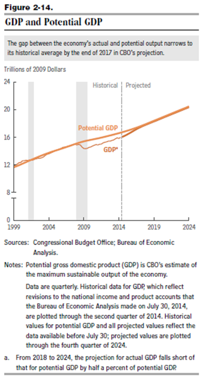
This convergence on potential GDP, which somehow is shown in the diagram with a weaker growth rate just after 2008, is based on the following forecasts of underlying drivers, incidentally.

CBOdrivers

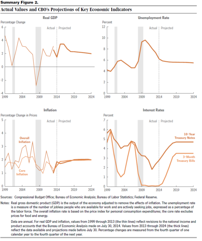
So again, despite the choppy historical detail for US real GDP growth in the chart on the upper left, the forecast adopted by the CBO blithely assumes no recession through 2024 as well as increase in US interest rates back to historic levels by 2019.

I think this clearly suggests the Congressional Budget Office is somewhere in la-la land.

But the underlying question still remains.

How would one incorporate the impacts of an event – a recession – which is probably almost a certainty by the end of these forecast horizons, but whose timing is uncertain?

Of course, there are always scenarios, and I think, particularly for budget discussions, it would be good to display one or two of these.

I’m interested in reader suggestions on this.

Random Cycles

In 1927, the Russian statistician Eugen Slutsky wrote a classic article called ‘The summation of random causes as the source of cyclic processes,’ a short summary of which is provided by Barnett

If the variables that were taken to represent business cycles were moving averages of past determining quantities that were not serially correlated – either real-world moving averages or artificially generated moving averages – then the variables of interest would become serially correlated, and this process would produce a periodicity approaching that of sine waves

It’s possible to illustrate this phenomena with rolling sums of the digits of pi (π). The following chart illustrates the wave-like result of charting rolling sums of ten consecutive digits of pi.

picycle

So to be explicit, I downloaded the first 450 digits of pi, took them apart, and then graphed the first 440 rolling sums.

The wave-like pattern Illustrates a random cycle.

Forecasting Random Cycles

If we consider this as a time series, each element xk is the following sum,

xk = dk+dk-1+..+dk-10

where dj is the jth digit in the decimal expansion of pi to the right of the initial value of 3.

Now, apparently, it is not proven that the digits of pi are truly random, although one can show that, so far as we can compute, these digits are described by a uniform distribution.

As far as we know, the probability that the next digit will be any digit from 0 to 9 is 1/10=0.1

So as one moves through the digits of pi, generating rolling sums, each new sum means the addition of a new digit, which is unknown and can only be predicted up to its probability. And, at the same time, a digit at the beginning of the preceding sum drops away in the new sum.

Note also that we can always deduce what the series of original digits is, given a series of these rolling sums up to some point.

So the issue is whether the new digit added to the next sum is greater than, equal to, or less than the leading digit of the current sum – which is where we now stand in this sort of analysis. This determines whether the next rolling sum will be greater than, equal to, or less than the current sum.

Here’s where the forecasts can be produced. If the rolling sum is large enough, approaching or equal to 90, there is a high probability that the next rolling sum will be lower, leading to this wave-like pattern. Conversely, if the rolling sum is near zero, the chances are the subsequent sum will be larger. And all this arm-waving can be complemented by exact probabilistic calculations.

Some Ultimate Thoughts

It’s interesting we are really dealing here with a random cycle. That’s proven by the fact that, at any time, the series could go flat-line or trace out some other kind of weird movement.

Thus, the quasi-periodic aspect can be violated for as many periods as you might choose, if one arrives at a run of the same digit in the expansion of pi.

This reminds me of something George Gamow wrote in one of his popular books, where he discusses thermodynamics and the random movement of atoms and molecules in the air of a room. Gamow observes it is entirely possible all the air by chance will congregate in one corner, leaving a vacuum elsewhere. Of course, this is highly improbable.

The only difference would be that there are a finite number of atoms and molecules in the air of any room, but, presumably, an infinite number of digits in the expansion of pi.

The morale of the story is, in any case, to be cautious in imposing a fixed cycle on this type of series.

Seasonal Variation

Evaluating and predicting seasonal variation is a core competence of forecasting, dating back to the 1920’s or earlier. It’s essential to effective business decisions. For example, as the fiscal year unfolds, the question is “how are we doing?” Will budget forecasts come in on target, or will more (or fewer) resources be required? Should added resources be allocated to Division X and taken away from Division Y? To answer such questions, you need a within-year forecast model, which in most organizations involves quarterly or monthly seasonal components or factors.

Seasonal adjustment, on the other hand, is more mysterious. The purpose is more interpretive. Thus, when the Bureau of Labor Statistics (BLS) or Bureau of Economic Analysis (BEA) announce employment or other macroeconomic numbers, they usually try to take out special effects (the “Christmas effect”) that purportedly might mislead readers of the Press Release. Thus, the series we hear about typically are “seasonally adjusted.”

You can probably sense my bias. I almost always prefer data that is not seasonally adjusted in developing forecasting models. I just don’t know what magic some agency statistician has performed on a series – whether artifacts have been introduced, and so forth.

On the other hand, I take the methods of identifying seasonal variation quite seriously. These range from Buys-Ballot tables and seasonal dummy variables to methods based on moving averages, trigonometric series (Fourier analysis), and maximum likelihood estimation.

Identifying seasonal variation can be fairly involved mathematically.

But there are some simple reality tests.

Take this US retail and food service sales series, for example.

retailfs

Here you see the highly regular seasonal movement around a trend which, at times, is almost straight-line.

Are these additive or multiplicative seasonal effects? If we separate out the trend and the seasonal effects, do we add them or are the seasonal effects “factors” which multiply into the level for a month?

Well, for starters, we can re-arrange this time series into a kind of Buys-Ballot table. Here I only show the last two years.

BBTab

The point is that we look at the differences between the monthly values in a year and the average for that year. Also, we calculate the ratios of each month to the annual total.

The issue is which of these numbers is most stable over the data period, which extends back to 1992 (click to enlarge).

additive

mult

Now here Series N relates to the Nth month, e.g. Series 12 = December.

It seems pretty clear that the multiplicative factors are more stable than the additive components in two senses. First, some additive components have a more pronounced trend; secondly, the variability of the additive components around this trend is greater.

This gives you a taste of some quick methods to evaluate aspects of seasonality.

Of course, there can be added complexities. What if you have daily data, or suppose there are other recurrent relationships. Then, trig series may be your best bet.

What if you only have two, three, or four years of data? Well, this interesting problem is frequently encountered in practical applications.

I’m trying to sort this material into posts for this coming week, along with stuff on controversies that swirl around the seasonal adjustment of macro time series, such as employment and real GDP.

Stay tuned.

Top image from http://www.livescience.com/25202-seasons.html

Microsoft Stock Prices and the Laplace Distribution

The history of science, like the history of all human ideas, is a history of irresponsible dreams, of obstinacy, and of error. But science is one of the very few human activities perhaps the only one in which errors are systematically criticized and fairly often, in time, corrected. This is why we can say that, in science, we often learn from our mistakes, and why we can speak clearly and sensibly about making progress there. — Karl Popper, Conjectures and Refutations

Microsoft daily stock prices and oil futures seem to fall in the same class of distributions as those for the S&P 500 and NASDAQ 100 – what I am calling the Laplace distribution.

This is contrary to the conventional wisdom. The whole thrust of Box-Jenkins time series modeling seems to be to arrive at Gaussian white noise. Most textbooks on econometrics prominently feature normally distributed error processes ~ N(0,σ).

Benoit Mandelbrot, of course, proposed alternatives as far back as the 1960’s, but still we find aggressive application of Gaussian assumptions in applied work – as for example in widespread use of the results of the Black-Scholes theorem or in computing value at risk in portfolios.

Basic Steps

I’m taking a simple approach.

First, I collect daily closing prices for a stock index, stock, or, as you will see, for commodity futures.

Then, I do one of two things: (a) I take the natural logarithms of the daily closing prices, or (b) I simply calculate first differences of the daily closing prices.

I did not favor option (b) initially, because I can show that the first differences, in every case I have looked at, are autocorrelated at various lags. In other words, these differences have an algorithmic structure, although this structure usually has weak explanatory power.

However, it is interesting that the first differences, again in every case I have looked at, are distributed according to one of these sharp-peaked or pointy distributions which are highly symmetric.

Take the daily closing prices of the stock of the Microsoft Corporation (MST), as an example.

Here is a graph of the daily closing prices.

MSFTgraph

And here is a histogram of the raw first differences of those closing prices over this period since 1990.

rawdifMSFT

Now in close reading of The Laplace Distribution and Generalizations I can see there are a range of possibilities in modeling distributions of the above type.

And here is another peaked, relatively symmetric distribution based on the residuals of an autoregressive equation calculated on the first differences of the logarithm of the daily closing prices. That’s a mouthful, but the idea is to extract at least some of the algorithmic component of the first differences.

MSFTregreshisto

That regression is as follows.

MSFTreg

Note the deep depth of the longest lags.

This type of regression, incidentally, makes money in out-of-sample backcasts, although possibly not enough to exceed trading costs unless the size of the trade is large. However, it’s possible that some advanced techniques, such as bagging and boosting, regression trees and random forecasts could enhance the profitability of trading strategies.

Well, a quick look at daily oil futures (CLQ4) from 2007 to the present.

oilfutures

Not quite as symmetric, but still profoundly not a Gaussian distribution.

The Difference It Makes

I’ve got to go back and read Mandelbrot carefully on his analysis of stock and commodity prices. It’s possible that these peaked distributions all fit in a broad class including the Laplace distribution.

But the basic issue here is that the characteristics of these distributions are substantially different than the Gaussian or normal probability distribution. This would affect maximum likelihood estimation of parameters in models, and therefore could affect regression coefficients.

Furthermore, the risk characteristics of assets whose prices have these distributions can be quite different.

And I think there is a moral here about the conventional wisdom and the durability of incorrect ideas.

Top pic is Karl Popper, the philosopher of science