Category Archives: bias in forecasts

Energy Forecasts – the Controversy

Here’s a forecasting controversy that has analysts in the Kremlin, Beijing, Venezuela, and certainly in the US environmental community taking note.

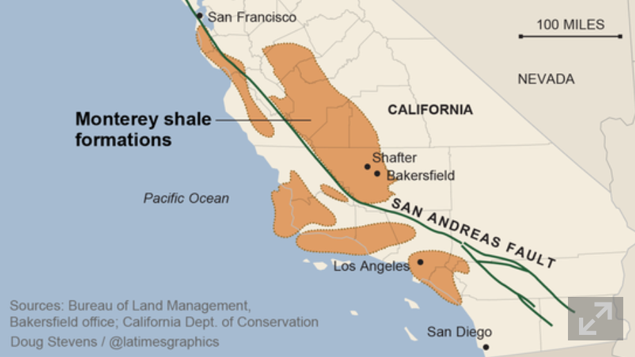
May 21st, Reuters ran a story UPDATE 2-U.S. EIA cuts recoverable Monterey shale oil estimate by 96 pct from 15.4 billion to 600 million barrels.

Monterey

The next day the Guardian took up the thread with Write-down of two-thirds of US shale oil explodes fracking myth. This article took a hammer to findings of a USC March 2013 study which claimed huge economic benefits for California pursuing advanced extraction technologies in the Monterey Formation (The Monterey Shale & California’s Economic Future).

But wait. Every year the US Energy Information Agency (EIA) releases its Annual Energy Outlook about this time of the year.

Strangely, the just-released Annual Energy Outlook 2014 With Projections to 2014 do not show any cutback in shale oil production projections.

Quite the contrary –

The downgrade [did] not impact near term production in the Monterey, estimates of which have increased to 57,000 barrels per day on average between 2010 and 2040.. Last year’s estimate for 2010 to 2040 was 14,000 barrels per day.

The head of the EIA, Adam Sieminski, in emails with industry sources, emphasizes Technically Recoverable Reserves (TRR) are not (somehow) not linked with estimates of actual production.

At the same time, some claim the boom is actually a bubble.

What’s the bottom line here?

It’s going to take a deep dive into documents. The 2014 Energy Outlook is 269 pages long, and it’s probably necessary to dig into several years reports. I’m hoping someone has done this. But I want to followup on this story.

How did the Monterey Formation reserve estimates get so overblown? How can taking such a huge volume of reserves out of the immediate future not affect production estimates for the next decade or two? What is the typical accuracy of the EIA energy projections anyway?

According to the EIA, the US will briefly – for a decade or two – be energy independent, because of shale oil and other nonstandard fossil fuel sources. This looms even larger with geopolitical developments in Crimea, the Ukraine, Europe’s dependence on Russian natural gas supplies, and the recently concluded agreements between Russia and China.

It’s a great example of how politics can enter into forecasting, or vice versa.

Coming Attractions

While shale/fracking and the global geopolitics of natural gas are hot stories, there is a lot more to the topic of energy forecasting.

Electric power planning is a rich source of challenges for forecasting – from short term load forecasts identifying seasonal patterns of usage. Real innovation can be found here.

And what about peak oil? Was that just another temporary delusion in the energy futures discussion?

I hope to put up posts on these sorts of questions in coming days.

Some Ways in Which Bayesian Methods Differ From the “Frequentist” Approach

I’ve been doing a deep dive into Bayesian materials, the past few days. I’ve tried this before, but I seem to be making more headway this time.

One question is whether Bayesian methods and statistics informed by the more familiar frequency interpretation of probability can give different answers.

I found this question on CrossValidated, too – Examples of Bayesian and frequentist approach giving different answers.

Among other things, responders cite YouTube videos of John Kruschke – the author of Doing Bayesian Data Analysis A Tutorial With R and BUGS

Here is Kruschke’s “Bayesian Estimation Supercedes the t Test,” which, frankly, I recommend you click on after reading the subsequent comments here.

I guess my concern is not just whether Bayesian and the more familiar frequentist methods give different answers, but, really, whether they give different predictions that can be checked.

I get the sense that Kruschke focuses on the logic and coherence of Bayesian methods in a context where standard statistics may fall short.

But I have found a context where there are clear differences in predictive outcomes between frequentist and Bayesian methods.

This concerns Bayesian versus what you might call classical regression.

In lecture notes for a course on Machine Learning given at Ohio State in 2012, Brian Kulis demonstrates something I had heard mention of two or three years ago, and another result which surprises me big-time.

Let me just state this result directly, then go into some of the mathematical details briefly.

Suppose you have a standard ordinary least squares (OLS) linear regression, which might look like,

linreg

where we can assume the data for y and x are mean centered. Then, as is well, known, assuming the error process ε is N(0,σ) and a few other things, the BLUE (best linear unbiased estimate) of the regression parameters w is –

regressionformulaNow Bayesian methods take advantage of Bayes Theorem, which has a likelihood function and a prior probability on the right hand side of the equation, and the resulting posterior distribution on the left hand side of the equation.

What priors do we use for linear regression in a Bayesian approach?

Well, apparently, there are two options.

First, suppose we adopt priors for the predictors x, and suppose the prior is a normal distribution – that is the predictors are assumed to be normally distributed variables with various means and standard deviations.

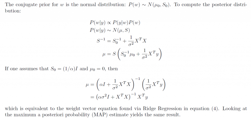
In this case, amazingly, the posterior distribution for a Bayesian setup basically gives the equation for ridge regression.

ridgebayes

On the other hand, assuming a prior which is a Laplace distribution gives a posterior distribution which is equivalent to the lasso.

This is quite stunning, really.

Obviously, then, predictions from an OLS regression, in general, will be different from predictions from a ridge regression estimated on the same data, depending on the value of the tuning parameter λ (See the post here on this).

Similarly with a lasso regression – different forecasts are highly likely.

Now it’s interesting to question which might be more accurate – the standard OLS or the Bayesian formulations. The answer, of course, is that there is a tradeoff between bias and variability effected here. In some situations, ridge regression or the lasso will produce superior forecasts, measured, for example, by root mean square error (RMSE).

This is all pretty wonkish, I realize. But it conclusively shows that there can be significant differences in regression forecasts between the Bayesian and frequentist approaches.

What interests me more, though, is Bayesian methods for forecast combination. I am still working on examples of these procedures. But this is an important area, and there are a number of studies which show gains in forecast accuracy, measured by conventional metrics, for Bayesian model combinations.

“The Record of Failure to Predict Recessions is Virtually Unblemished”

That’s Prakash Loungani from work published in 2001.

Recently, Loungani , working with Hites Ahir, put together an update – “Fail Again, Fail Better, Forecasts by Economists During the Great Recession” reprised in a short piece in VOX – “There will be growth in the spring”: How well do economists predict turning points?

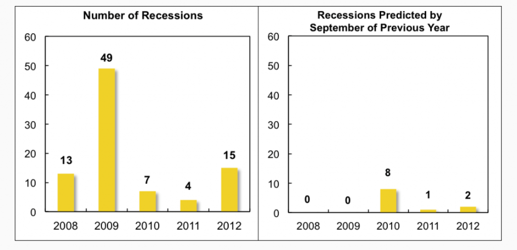
Hites and Loungani looked at the record of professional forecasters 2008-2012. Defining recessions as a year-over-year fall in real GDP, there were 88 recessions in this period. Based on country-by-country predictions documented by Consensus Forecasts, economic forecasters were right less than 10 percent of the time, when it came to forecasting recessions – even a few months before their onset.

recessions

The chart on the left shows the timing of the 88 recession years, while the chart on the right shows the number of recession predicted by economists by the September of the previous year.

..none of the 62 recessions in 2008–09 was predicted as the previous year was drawing to a close. However, once the full realisation of the magnitude and breadth of the Great Recession became known, forecasters did predict by September 2009 that eight countries would be in recession in 2010, which turned out to be the right call in three of these cases. But the recessions in 2011–12 again came largely as a surprise to forecasters.

This type of result holds up to robustness checks

•First, lowering the bar on how far in advance the recession is predicted does not appreciably improve the ability to forecast turning points.

•Second, using a more precise definition of recessions based on quarterly data does not change the results.

•Third, the failure to predict turning points is not particular to the Great Recession but holds for earlier periods as well.

Forecasting Turning Points

How can macroeconomic and business forecasters consistently get it so wrong?

Well, the data is pretty bad, although there is more and more of it available and with greater time depths and higher frequencies. Typically, government agencies doing the national income accounts – the Bureau of Economic Analysis (BEA) in the United States – release macroeconomic information at one or two months lag (or more). And these releases usually involve revision, so there may be preliminary and then revised numbers.

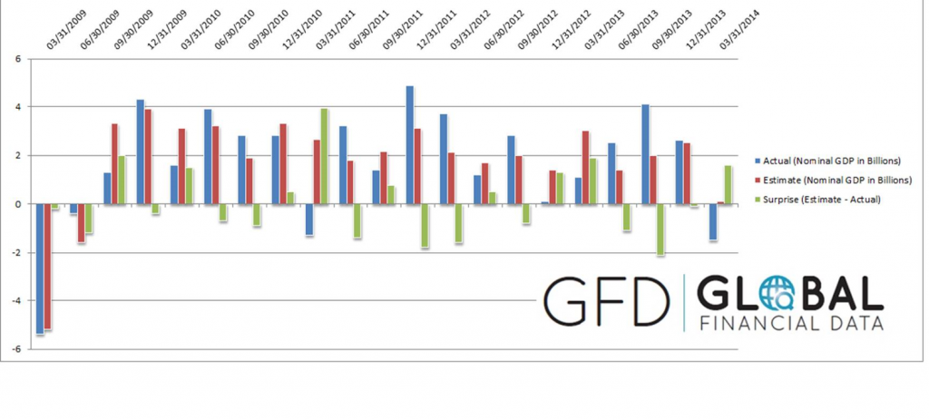
And the general accuracy of GDP forecasts is pretty low, as Ralph Dillon of Global Financial Data (GFD) documents in the following chart, writing,

Below is a chart that has 5 years of quarterly GDP consensus estimates and actual GDP [for the US]. In addition, I have also shown in real dollars the surprise in both directions. The estimate vs actual with the surprise indicating just how wrong consensus was in that quarter.

RalphDillon

Somehow, though, it is hard not to believe economists are doing something wrong with their almost total lack of success in predicting recessions. Perhaps there is a herding phenomenon, coupled with a distaste for being a bearer of bad tidings.

Or maybe economic theory itself plays a role. Indeed, earlier research published on Vox suggests that application of about 50 macroeconomic models to data preceding the recession of 2008-2009, leads to poor results in forecasting the downturn in those years, again even well into that period.

All this suggests economics is more or less at the point medicine was in the 1700’s, when bloodletting was all the rage..

quack_bleeding_sm

In any case, this is the planned topic for several forthcoming posts, hopefully this coming week – forecasting turning points.

Note: The picture at the top of this post is Peter Sellers in his last role as Chauncey Gardiner – the simple-minded gardener who by an accident and stroke of luck was taken as a savant, and who said to the President – “There will be growth in the spring.”

Sales Forecasts and Incentives

In some contexts, the problem is to find out what someone else thinks the best forecast is.

Thus, management may want to have accurate reporting or forecasts from the field sales force of “sales in the funnel” for the next quarter.

In a widely reprinted article from the Harvard Business Review, Gonik shows how to design sales bonuses to elicit the best estimates of future sales from the field sales force. The publication dates from the 1970’s, but is still worth considering, and has become enshrined in the management science literature.

Quotas are set by management, and forecasts or sales estimates are provided by the field salesforce.

In Gonik’s scheme, salesforce bonus percentages are influenced by three factors: actual sales volume, sales quota, and the forecast of sales provided from the field.

Consider the following bonus percentages (click to enlarge).

 Gonik                      

Grid coordinates across the top are the sales agent’s forecast divided by the quota.

Actual sales divided by the sales quota are listed down the left column of the table.

Suppose the quota from management for a field sales office is $50 million in sales for a quarter. This is management’s perspective on what is possible, given first class effort.

The field sales office, in turn, has information on the scope of repeat and new customer sales that are likely in the coming quarter. The sales office forecasts, conservatively, that they can sell $25 million in the next quarter.

This situates the sales group along the column under a Forecast/Quota figure of 0.5.

Then, it turns out that, lo and behold, the field sales office brings in $50 million in sales by the end of the quarter in question.

Their bonus, accordingly, is determined by the row labeled “100″ – for 100% of sales to quota. Thus, the field sales office gets a bonus which is 90 percent of the standard bonus for that period, whatever that is.

Naturally, the salesmen will see that they left money on the table. If they had forecast $50 million in sales for the quarter and achieved it, they would have 120 percent of the standard quota.

Notice that the diagonal highlighted in green shows the maximum bonus percentages for any given ratio of actual sales to quota (any given row). These maximum bonus percents are exactly at the intersection where the ratio of actual sales to quota equals the ratio of sales forecast to quota.

The area of the table colored in pink identifies a situation in which the sales forecasts exceed the actual sales.

The portion of the table highlighted in light blue, on the other hand, shows the cases in which the actual sales exceed the forecast.

This bonus setup provides monetary incentives for the sales force to accurately report their best estimates of prospects in the field, rather than “lowballing” the numbers. And just to review the background to the problem – management sometimes considers that the sales force is likely to under-report opportunities, so they look better when these are realized.

This setup has been applied by various companies, including IBM, and is enshrined in the management literature.

The algebra to develop a table of percentages like the one shown is provided in an article by Mantrala and Rama.

These authors also point out a similarity between Gonik’s setup and reforms of central planning in the old Soviet Union and communist Hungary. This odd association should not discredit the Gonik scheme in anyone’s mind. Instead, the linkage really highlights how fundamental the logic of the bonuses table is. In my opinion, Soviet Russia experienced economic collapse for entirely separate reasons – primarily failures of the pricing system and reluctance to permit private ownership of assets.

A subsequent post will consider business-to-business (B2B) supply contracts and related options frameworks which provide incentives for sharing demand or forecast information along the supply chain.