Tag Archives: accuracy of forecasts

Business Forecasting – Practical Problems and Solutions

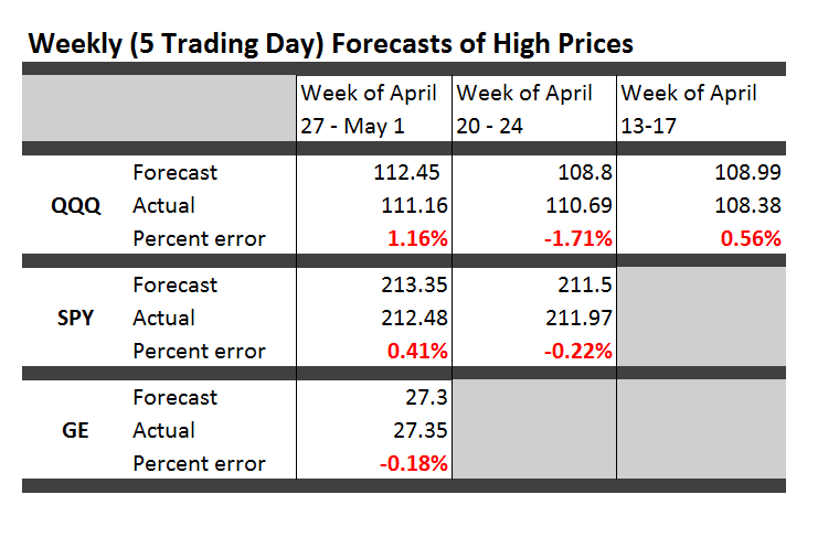
Forecasts in business are unavoidable, since decisions must be made for annual budgets and shorter term operational plans, and investments must be made.

And regardless of approach, practical problems arise.

For example, should output from formal algorithms be massaged, so final numbers include judgmental revisions? What about error metrics? Is the mean absolute percent error (MAPE) best, because everybody is familiar with percents? What are plus’es and minus’es of various forecast error metrics? And, organizationally, where should forecasting teams sit – marketing, production, finance, or maybe in a free-standing unit?

The editors of Business Forecasting – Practical Problems and Solutions integrate dozens of selections to focus on these and other practical forecasting questions.

Here are some highlights.

In my experience, many corporate managers, even VP’s and executives, understand surprisingly little about fitting models to data.

So guidelines for reporting results are important.

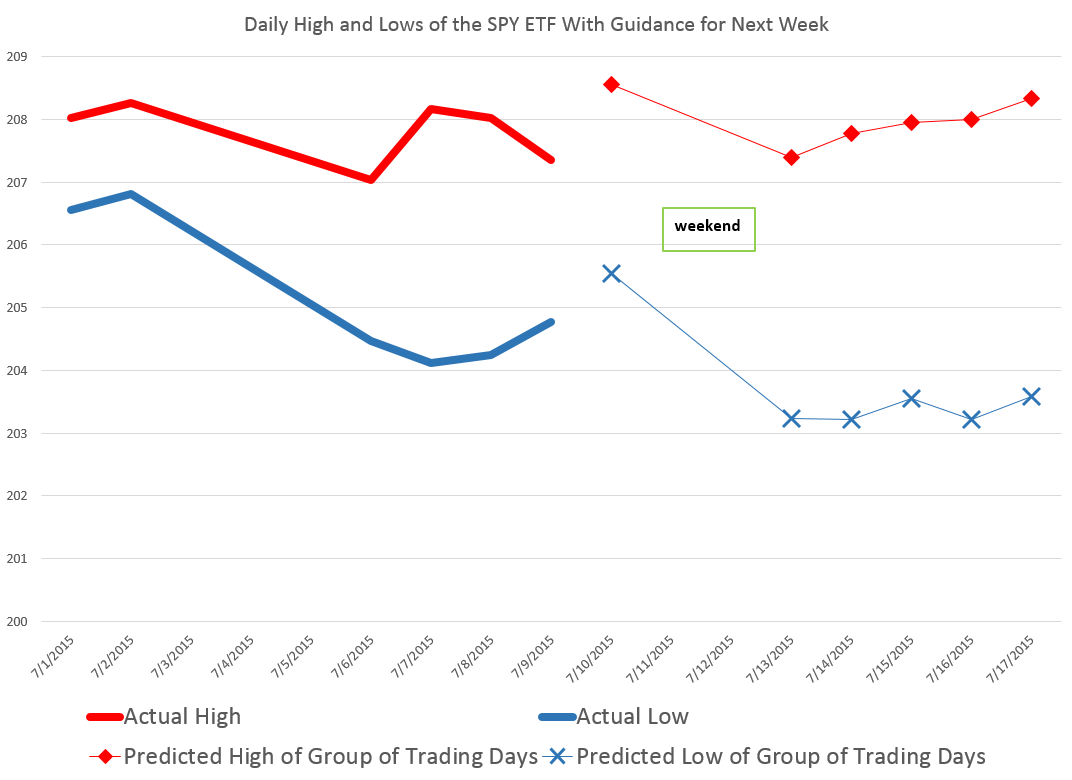
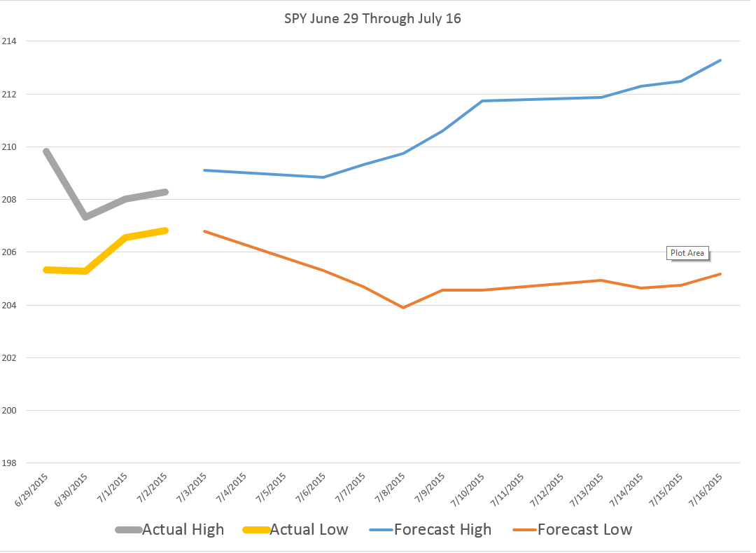
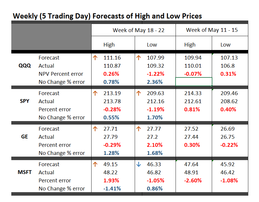
In “Dos and Don’ts of Forecast Accuracy Measurement: A Tutorial,” Len Tashman advises “distinguish in-sample from out-of-sample accuracy,” calling it “the most basic issue.”

The acid test is how well the forecast model does “out-of-sample.” Holdout samples and cross-validation simulate how the forecast model will perform going forward. “If your average error in-sample is found to be 10%, it is very probable that forecast errors will average substantially more than 10%.” That’s because model parameters are calibrated to the sample over which they are estimated. There is a whole discussion of “over-fitting,” R2, and model complexity hinging on similar issues. Don’t fool yourself. Try to find ways to test your forecast model on out-of-sample data.

The discussion of fitting models when there is “extreme seasonality” broke new ground for me. In retail forecasting, there might be a toy or product that sells only at Christmastime. Demand is highly intermittent. As Udo Sglavo reveals, one solution is “time compression.” Collapse the time series data into two periods – the holiday season and the rest of the year. Then, the on-off characteristics of sales can be more adequately modeled. Clever.

John Mello’s “The Impact of Sales Forecast Game Playing on Supply Chains,” is probably destined to be a kind of classic, since it rolls up a lot of what we have all heard and observed about strategic behavior vis a vis forecasts.

Mello describes stratagems including

  • Enforcing – maintaining a higher forecast than actually anticipated, to keep forecasts in line with goals
  • Filtering – changing forecasts to reflect product on hand for sale
  • Hedging – overestimating sales to garner more product or production capability
  • Sandbagging – underestimating sales to set expectations lower than actually anticipated demand
  • Second-guessing – changing forecasts to reflect instinct or intuition
  • Spinning – manipulating forecasts to get favorable reactions from individuals or departments in the organization
  • Withholding – refusing to share current sales information

I’ve seen “sand-bagging” at work, when the salesforce is allowed to generate the forecasts, setting expectations for future sales lower than should, objectively, be the case. Purely by coincidence, of course, sales quotas are then easier to meet and bonuses easier to achieve.

I’ve always wondered why Gonik’s system, mentioned in an accompanying article by Michael Gilliland on the “Role of the Sales Force in Forecasting,” is not deployed more often. Gonik, in a classic article in the Harvard Business Review, ties sales bonuses jointly to the level of sales that are forecast by the field, and also to how well actual sales match the forecasts that were made. It literally provides incentives for field sales staff to come up with their best, objective estimate of sales in the coming period. (See Sales Forecasts and Incentives)

Finally, Larry Lapide’s “Where Should the Forecasting Function Reside?” asks a really good question.

The following graphic (apologies for the scan reproduction) summarizes some of his key points.

TTable

There is no fixed answer, Lapide provides a list of things to consider for each organization.

This book is a good accompaniment for Rob Hyndman and George Athanasopoulos’s online Forecasting: Principles and Practice.

Direction of the Market Next Week – July 13

Last Friday, before July 4th, I ran some numbers on the SPY exchange traded fund, looking at backcasts from the EVPA (extreme value prediction algorithm) for the Monday and Tuesday before, when Greece kept the banks closed and defaulted on its IMF payment. I also put up a ten day look forward on the EVPA predictions.

Of course, the SPY is an ETF which tracks the S&P 500.

The EVPA predicted the SPY high and low would drop at the beginning of the following week, beginning July 6, but seemed to suggest some rebound by the end of this week – that is today, July 10.

Here is a chart for today and next week with comments on interpreting the forecasts.

NextWeek

So the EVPA predicts the high and low over the current trading day, and aggregations of 2,3,4,.. trading days going forward.

The red diamonds in the chart map out forecasts for the high price of the SPY today, July 10, and for groups of trading days beginning today and ending Monday, July 13, and the rest of the days of next week.

Similarly, the blue crosses map out forecasts for the SPY low prices which are predicted to be reached over 1 day, the next two trading days, the next three trading days, and so forth.

Attentive readers will notice an apparent glitch in the forecasts for the high prices to come – namely that the predicted high of the next two trading days is lower than the predicted high for today – which is, of course, logically impossible.

But, hey, this is econometrics, not logic, and what we need to do is interpret the output of the models against what it is we are looking for.

In this case, a solid reduction in the predicted high of the coming two day period, compared with the prediction of today’s high signals that the high of the SPY is likely to be lower Monday than today.

This is consistent with predictions for the low today and for the next two trading days shown in blue – which indicates lower lows will be reached the second day.

Following that, the EVPA predictions for higher groupings of trading days are inconclusive, given statistical tolerances of the approach.

Note that the predictions of the high and low for today, Friday, July 10, are quite accurate, assuming these bounds have been reached by this point – two o’clock on Wall Street. In percentage error terms, the EVAP forecasts are over-forecasting 0.3% for the high and 0.2% for the low.

Again, the EVPA always keys off the opening price of the period being forecast.

I also have a version of the EVPA which forecasts ahead for the coming week, for two week periods, and so forth.

Leading up to the financial crisis of 2008 and then after the worst in October of that year, the EVPA weekly forecasts clearly highlight turning points.

Currently, weekly forecasts going up to monthly durations do not signal any clear trend in the market, but rather signal increasing volatility.

How Did BusinessForecastBlog’s Stock Market Forecast Algorithm Perform June 20 and July 1?

As a spinoff from blogging for the past several years, I’ve discovered a way to predict the high and low of stock prices over periods, like one or several days, a week, or other periods.

As a general rule, I can forecast the high and low of the SPY – the exchange traded fund (ETF) which tracks the S&P 500 – with average absolute errors around 1 percent.

Recently, friends asked me – “how did you do Monday?” – referring to June 29th when Greece closed its banks, punting on a scheduled loan payment to the International Monetary Fund (IMF) the following day.

SPY closing prices tumbled more than 2 percent June 30th, the largest daily drop since June 20, 2013.

Performance of the EVPA

I’m now calling my approach the EVPA or extreme value prediction algorithm. I’ve codified procedures and moved from spreadsheets to programming languages, like Matlab and R.

The performance of the EVPA June 29th depends on whether you allow the programs the Monday morning opening price – something I typically build in to the information set. That is, if I am forecasting a week ahead, I trigger the forecast after the opening of that week’s trading, obtaining the opening price for that week.

Given the June 29 opening price for the SPY ($208.05 a share), the EVPA predicts a Monday high and low of 209.25 and 207.11, for percent forecast errors of -0.6% and -1% respectively.

Of course, Monday’s opening price was significantly down from the previous Friday (by -1.1%).

Without Monday’s opening price, the performance of the EVPA degrades somewhat in the face of the surprising incompetence of Eurozone negotiators. The following chart shows forecast errors for predictions of the daily low price, using only the information available at the close of the trading day Friday June 26.

Actual Forecast % Error
29-Jun 205.33 208.71 1.6%
30-Jun 205.28 208.75 1.7%

Forecasts of the high price for one and two-trading day periods average 1 percent errors (over actuals), when generated only with closing information from the previous week.

Where the Market Is Going

So where is the market going?

The following chart shows the high and low for Monday through Wednesday of the week of June 30 to July 3, and forecasts for the high and low which will be reached in a nested series of periods from one to ten trading days, starting Wednesday.

WhereGoing

What makes interpretation of these predictions tricky is the fact that they do not pertain to 1, 2, and so forth trading days forward, per se. Rather, they are forecasts for 1 day periods, 2 day periods, 3 day periods, and so forth.

One classic pattern is the highs level, but predictions for the lows drop over increasing groups of trading days. That is a signal for a drop in the averages for the security in question, since highs can be reached initially and still stand for these periods of increasing trading days.

These forecasts offer some grounds for increases in the SPY averages going forward, after an initial decrease through the beginning of the coming week.

Of course the Greek tragedy is by no means over, and there can be more surprises.

Still, I’m frankly amazed at how well the EVPA does, in the humming, buzzing and chaotic confusion of global events.

Thoughts on Stock Market Forecasting

Here is an update on the forecasts from last Monday – forecasts of the high and low of SPY, QQQ, GE, and MSFT.

This table is easy to read, even though it is a little” busy”.

TableMay22

One key is to look at the numbers highlighted in red and blue (click to enlarge).

These are the errors from the week’s forecast based on the NPV algorithm (explained further below) and a No Change forecast.

So if you tried to forecast the high for the week to come, based on nothing more than the high achieved last week – you would be using a No Change model. This is a benchmark in many forecasting discussions, since it is optimal (subject to some qualifications) for a random walk. Of course, the idea stock prices are a random walk came into favor several decades ago, and now gradually is being rejected of modified, based on findings such as those above.

The NPV forecasts are more accurate for this last week than No Change projections 62.5 percent of the time, or in 5 out of the 8 forecasts in the table for the week of May 18-22. Furthermore, in all three cases in which the No Change forecasts were better, the NPV forecast error was roughly comparable in absolute size. On the other hand, there were big relative differences in the absolute size of errors in the situations in which the NPV forecasts proved more accurate, for what that is worth.

The NPV algorithm, by the way, deploys various price ratios (nearby prices) and their transformations as predictors. Originally, the approach focused on ratios of the opening price in a period and the high or low prices in the previous period. The word “new” indicates a generalization has been made from this original specification.

Ridge Regression

I have been struggling with Visual Basic and various matrix programming code for ridge regression with the NPV specifications.

Using cross validation of the λ parameter, ridge regression can improve forecast accuracy on the order of 5 to 10 percent. For forecasts of the low prices, this brings forecast errors closer to acceptable error ranges.

Having shown this, however, I am now obligated to deploy ridge regression in several of the forecasts I provide for a week or perhaps a month ahead.

This requires additional programming to be convenient and transparent to validation.

So, I plan to work on that this coming week, delaying other tables with weekly or maybe monthly forecasts for a week or so.

I will post further during the coming week, however, on the work of Andrew Lo (MIT Financial Engineering Center) and high frequency data sources in business forecasts.

Probable Basis of Success of NPV Forecasts

Suppose you are an observer of a market in which securities are traded. Initially, tests show strong evidence stock prices in this market follow random walk processes.

Then, someone comes along with a theory that certain price ratios provide a guide to when stock prices will move higher.

Furthermore, by accident, that configuration of price ratios occurs and is associated with higher prices at some date, or maybe a couple dates in succession.

Subsequently, whenever price ratios fall into this configuration, traders pile into a stock, anticipating its price will rise during the next trading day or trading period.

Question – isn’t this entirely plausible, and would it not be an example of a self-confirming prediction?

I have a draft paper pulling together evidence for this, and have shared some findings in previous posts. For example, take a look at the weird mirror symmetry of the forecast errors for the high and low.

And, I suspect, the absence or ambivalence of this underlying dynamic is why closing prices are harder to predict than period high or low prices of a stock. If I tell you the closing price will be higher, you do not necessarily buy the stock. Instead, you might sell it, since the next morning opening prices could jump down. Or there are other possibilities.

Of course, there are all kinds of systems traders employ to decide whether to buy or sell a stock, so you have to cast your net pretty widely to capture effects of the main methods.

Long Term Versus Short Term

I am getting mixed results about extending the NPV approach to longer forecast horizons – like a quarter or a year or more.

Essentially, it looks to me as if the No Change model becomes harder and harder to beat over longer forecast horizons – although there may be long run persistence in returns or other features that I see  other researchers (such as Andrew Lo) have noted.

Reading the Tea Leaves – Forecasts of Stock High and Low Prices

The residuals of predictive models are central to their statistical evaluation – with implications for confidence intervals of forecasts.

Of course, another name for the residuals of a predictive model is their errors.

Today, I want to present some information on the errors for the forecast models that underpin the Monday morning forecasts in this blog.

The results are both reassuring and challenging.

The good news is that the best fit distributions support confidence intervals, and, in some cases, can be viewed as transformations of normal variates. This is by no means given, as monstrous forms such as the Cauchy distribution sometimes present themselves in financial modeling as a best candidate fit.

The challenge is that the skew patterns of the forecasts of the high and low prices are weirdly symmetric. It looks to me as if traders tend to pile on when the price signals are positive for the high, or flee the sinking ship when the price history indicates the low is going lower.

Here is the error distribution of percent errors for backtests of the five day forecast of the QQQ high, based on an out-of-sample study from 2004 to the present, a total of 573 five consecutive trading day periods.

JohnSUHigh

Here is the error distribution of percent errors for backtests of the five day forecast of the QQQ low.

JohnSULow

In the first chart for forecasts of high prices, errors are concentrated in the positive side of the percent error or horizontal axis. In the second graph, errors from forecasts of low prices are concentrated on the negative side of the horizontal axis.

In terms of statistics-speak, the first chart is skewed to the left, having a long tail of values to the left, while the second chart is skewed to the right.

What does this mean? Well, one interpretation is that traders are overshooting the price signals indicating a positive change in the high price or a lower low price.

Thus, the percent error is calculated as

(Actual – Predicted)/Actual

So the distribution of errors for forecasts of the high has an average which is slightly greater than zero, and the average for errors for forecasts of the low is slightly negative. And you can see the bulk of observations being concentrated, on the one hand, to the right of zero and, on the other, to the left of zero.

I’d like to find some way to fill out this interpretation, since it supports the idea that forecasts in this context are self-reinforcing, rather than self-nihilating.

I have more evidence consistent with this interpretation. So, if traders dive in when prices point to a high going higher, predictions of the high should be more reliable vis a vis direction of change with bigger predicted increases in the high. That’s also verifiable with backtests.

I use MathWave’s EasyFit. It’s user-friendly, and ranks best fit distributions based on three standard metrics of goodness of fit – the Chi-Squared, Komogorov-Smirnov, and Anderson-Darling statistics. There is a trial download of the software, if you are interested.

The Johnson SU distribution ranks first for the error distribution for the high forecasts, in terms of EasyFit’s measures of goodness of fit. The Johnson SU distribution also ranks first for Chi-Squared and the Anderson-Darling statistics for the errors of forecasts of the low.

This is an interesting distribution which can be viewed as a transformation of normal variates and which has applications, apparently, in finance (See http://www.ntrand.com/johnson-su-distribution/).

It is something I have encountered repeatedly in analyzing errors of proximity variable models. I am beginning to think it provides the best answer in determining confidence intervals of the forecasts.

Top picture from mysteryarts


Track Record of Forecasts of High Prices

Well, US markets have closed for the week, and here is an update on how our forecasts did.

TableMay1

Apart from the numbers, almost everything I wrote last Monday about market trends was wrong. Some of the highs were reached Monday, for example, and the market dived after that. The lowest forecast error is for GE, which backtesting suggests is harder to forecast than the SPY and QQQ.

I will keep doing this, expanding the securities covered for several weeks. I also hope to get smarter about using this tool.

Forecast Turning Points

I want to comment on how to use this approach to get forward information about turning points in the market.

While the research is on-going, the basic finding is that turning points, which we need to define as changes in the direction of a security or index which are sustained for several trading days or periods, are indicated by a simple tactic.

Suppose the QQQ reaches a high and then declines for several days or longer. Then, the forecasts of the high over 1, 2, and several days will tend to freeze at their initial or early values, while forecasts of low price over an expanding series of forecast periods will drop. There will, in other words, be a pronounced divergence between the forecasts of the high and low, when a turning point is in the picture.

There are interesting charts from 2008 highlighting these relationships between the high and low forecasts over telescoping forecast horizons.

I am fairly involved in some computer programming around this “proximity variable forecasting approach.” However, I am happy to dialogue with readers and interested parties via the Comments section in this blog. If you want to communicate off-line, send your email and what your interest or concern is.

And check the forecasts for this coming week, which I will have out Monday morning. Should be an interesting week.

Update and Extension – Weekly Forecasts of QQQ and Other ETF’s

Well, the first official forecast rolled out for QQQ last week.

It did relatively well. Applying methods I have been developing for the past several months, I predicted the weekly high for QQQ last week at 108.98.

In fact, the high price for QQQ for the week was 108.38, reached Monday, April 13.

This means the forecast error in percent terms was 0.55%.

It’s possible to look more comprehensively at the likely forecast errors with my approach with backtesting.

Here is a chart showing backtests for the “proximity variable method” for the QQQ high price for five day trading periods since the beginning of 2015.

QQQupdate

The red bars are errors, and, from their axis on the right, you can see most of these are below 0.5%.

This is encouraging, and there are several adjustments which may improve forecasting performance beyond this level of accuracy I want to explore.

So here is the forecast of the high prices that will be reached by QQQ and SPY for the week of April 20-24.

ForecastTab1

As you can see, I’ve added SPY, an ETF tracking the S&P500.

I put this up on Businessforecastblog because I seek to make a point – namely, that I believe methods I have developed can produce much more accurate forecasts of stock prices.

It’s often easier and more compelling to apply forecasting methods and show results, than it is to prove theoretically or otherwise argue that a forecasting method is worth its salt.

Disclaimer –  These forecasts are for informational purposes only. If you make investments based on these numbers, it is strictly your responsibility. Businessforecastblog is not responsible or liable for any potential losses investors may experience in their use of any forecasts presented in this blog.

Well, I am working on several stock forecasts to add to projections for these ETF’s – so will expand this feature in forthcoming Mondays.

High Frequency Trading and the Efficient Market Hypothesis

Working on a white paper about my recent findings, I stumbled on more confirmation of the decoupling of predictability and profitability in the market – the culprit being high frequency trading (HFT).

It makes a good story.

So I am looking for high quality stock data and came across the CalTech Quantitative Finance Group market data guide. They tout QuantQuote, which does look attractive, and was cited as the data source for – How And Why Kraft Surged 29% In 19 Seconds – on Seeking Alpha.

In early October 2012 (10/3/2012), shares of Kraft Foods Group, Inc surged to a high of $58.54 after opening at $45.36, and all in just 19.93 seconds. The Seeking Alpha post notes special circumstances, such as spinoff of Kraft Foods Group, Inc. (KRFT) from Modelez International, Inc., and addition of KRFT to the S&P500. Funds and ETF’s tracking the S&P500 then needed to hold KRFT, boosting prospects for KRFT’s price.

For 17 seconds and 229 milliseconds after opening October 3, 2012, the following situation, shown in the QuantQuote table, unfolded.

QuantQuote1

Times are given in milliseconds past midnight with the open at 34200000.

There is lots of information in this table – KRFT was not shortable (see the X in the Short Status column), and some trades were executed for dark pools of money, signified by the D in the Exch column.

In any case, things spin out of control a few milliseconds later, in ways and for reasons illustrated with further QuantQuote screen shots.

The moral –

So how do traders compete in a marketplace full of computers? The answer, ironically enough, is to not compete. Unless you are prepared to pay for a low latency feed and write software to react to market movements on the millisecond timescale, you simply will not win. As aptly shown by the QuantQuote tick data…, the required reaction time is on the order of 10 milliseconds. You could be the fastest human trader in the world chasing that spike, but 100% of the time, the computer will beat you to it.

CNN’s Watch high-speed trading in action is a good companion piece to the Seeking Alpha post.

HFT trading has grown by leaps and bounds, but estimates vary – partly because NASDAQ provides the only Datasets to academic researchers that directly classify HFT activity in U.S. equities. Even these do not provide complete coverage, excluding firms that also act as brokers for customers.

Still, the Security and Exchange Commission (SEC) 2014 Literature Review cites research showing that HFT accounted for about 70 percent of NASDAQ trades by dollar volume.

And associated with HFT are shorter holding times for stocks, now reputed to be as low as 22 seconds, although Barry Ritholz contests this sort of estimate.

Felix Salmon provides a list of the “evils” of HFT, suggesting a small transactions tax might mitigate many of these,

But my basic point is that the efficient market hypothesis (EMH) has been warped by technology.

I am leaning to the view that the stock market is predictable in broad outline.

But this predictability does not guarantee profitability. It really depends on how you handle entering the market to take or close out a position.

As Michael Lewis shows in Flash Boys, HFT can trump traders’ ability to make a profit

Followup on OPEC and the Price of Oil

Well, readers here may have noticed, Business Forecast Blog correctly predicted the OPEC decision about reducing oil production at their Thanksgiving Thursday (November 27) meeting in Vienna.

USA Today reports,

VIENNA — Crude prices plunged Thursday after the powerful Organization of Petroleum Exporting Countries said it wouldn’t cut production levels to stem the collapse in oil prices that have fallen 40% since June.

Saudi Arabia’s oil minister Ali Al-Naimi delivered the news as he left a nearly five-hour meeting of the cartel’s 12 oil ministers here.

Our post was called The Limits of OPEC and was studded with passages of deep foresight, such as

I’m kind of a contrarian here. I think the sound and fury about this Vienna meeting on Thanksgiving may signify very little in terms of oil prices – unless global (and especially Chinese) economic growth picks up. As the dominant OPEC producer, Saudi Arabia may have market power, but, otherwise, there is little evidence OPEC functions as a cartel. It’s hard to see, also, that the Saudi’s would unilaterally reduce their output only to see higher oil prices support US frackers continuing to increase their production levels at current rates.

The immediate response to the much-anticipated OPEC meeting was a plunge in the spot price of West Texas Intermediate (WTI) to below $70 a barrel.

WTINov28

Brent, the other pricing standard, fared a little better, but dropped significantly,

BrentNov28

Both charts are courtesy of the Financial Times of London.

The Reuters article on the OPEC decision – Saudis block OPEC output cut, sending oil price plunging – is full of talk that letting prices drift lower, perhaps down to $60-65 a barrel, is motivated by a desire to wing higher-cost US producers, and also, maybe, to squeeze Russia and Iran – other players who are out of favor with Saudi Arabia and other Gulf oil states.

Forecasting Issues and Techniques

Advice – get the data, get the facts. Survey Bloomberg and other media by relevant news story and topic, but whenever possible, go to the source.

For example, lower oil prices may mean Saudi Arabia and some other Gulf oil states have to rely more on accumulated foreign exchange to pay their bills, since their lavish life-styles probably adjusted to higher prices (even though raw production costs may be as low as $25 a barrel). Just how big are these currency reserves, and can we watch them being drawn down? There is another OPEC meeting apparently scheduled for June 2015

Lead picture of Saudi Oil Minister from Yahoo.

Population Forecasts, 2020 and 2030

The United Nations population division produces widely-cited forecasts with country detail on a number of key metrics, such as age structure and median age.

The latest update (2012 revision) estimates 2010 base population at 6.9 billion persons, projecting global population at 7.7 billion and 8.4 billion in 2020 and 2030, respectively, in a medium fertility scenario.

The low fertility scenario projects 7.5 billion persons for 2020 and approximately 8.0 billion for 2030.

So, bottom line, global population is unlikely to peak during this forecast period to 2030, although it is likely to decline, under all fertility scenarios, for key players in the global economy – such as Japan and Germany.

Population decline is even possible, according to the 2012 revision, in a low fertility scenario for China, although not with higher birth rates, as indicated in the following chart.

ChinaIndia

Some rudimentary data analytics shows the importance of the estimate of median age in a country for its projected population growth in the 2012 revision.

For example, here is a scatter diagram of the median age within a country (horizontal or x-axis) and the percentage increase or decrease 2010-2030 in the medium fertility scenario of the UN projections. Thus, just to clarify, a 60 percent “percentage growth” on the vertical axis means 2030 population is 60 percent larger than the estimated base year 2010 population.

scatter

Note that a polynomial regression fits this scatter of points with a relatively high R2. This indicates that the median age is negatively related to the projected population change for a country in this period with drop-offs in the earliest and oldest median ages in the population of countries.

Thus, in the first chart, Chinese growth includes the possibility of a decline over this period, and India’s does not. This is related to the fact that the median age of China in 2010 is estimated at 34.6 years, while the median age in 2010 in India is estimated at 25.5 years of age.

China and India, of course, are the world’s two most populous countries.

Here are some other interesting charts from the UN projections.

Russia, Japan, and Germany

RJG

The comparison for these countries is between the high fertility and low fertility scenarios. The middle fertility scenario lies pretty squarely between these curves for each nation.

Indonesia, Brazil, and Nigeria

IBN

Nigeria has the highest population growth rates for any larger country for this period, again because its 2010 median age is listed as around 18 years of age.

Accuracy of UN Population Forecasts

The accuracy of UN population forecasts has improved over the past several decades, with improved estimates of base population (See for example. Data quality and accuracy of UN Population Projections, 1950-1995). Needless to say forecasts for industrially developed counties usually have been better than for nations in the developing world.

Changes in migration account for significant errors in national population forecasts, as when a large contingent, some legal, some side-stepping legal immigration channels, came from Mexico and other Spanish-speaking areas “South of the Border,” changing birth patterns in the US from the early 1990’s to the years after 2000. In fact, during the early 1990’s, Census was predicting peak population for the US might occur as early as 2025. This idea went by the wayside, however, as younger, more fertile Hispanic families took their place in the country.

Current UN forecasts indicate US population should increase in the medium fertility scenario from 312 million to 338 million and 363 million, respectively, by 2020 and 2030.