
The residuals of predictive models are central to their statistical evaluation – with implications for confidence intervals of forecasts.
Of course, another name for the residuals of a predictive model is their errors.
Today, I want to present some information on the errors for the forecast models that underpin the Monday morning forecasts in this blog.
The results are both reassuring and challenging.
The good news is that the best fit distributions support confidence intervals, and, in some cases, can be viewed as transformations of normal variates. This is by no means given, as monstrous forms such as the Cauchy distribution sometimes present themselves in financial modeling as a best candidate fit.
The challenge is that the skew patterns of the forecasts of the high and low prices are weirdly symmetric. It looks to me as if traders tend to pile on when the price signals are positive for the high, or flee the sinking ship when the price history indicates the low is going lower.
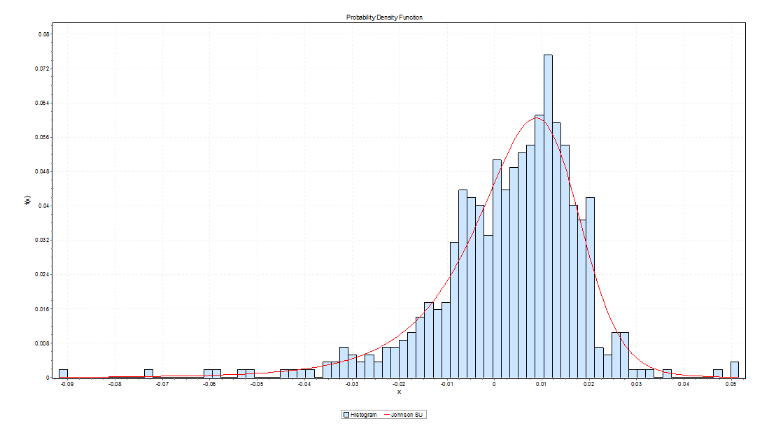
Here is the error distribution of percent errors for backtests of the five day forecast of the QQQ high, based on an out-of-sample study from 2004 to the present, a total of 573 five consecutive trading day periods.
Here is the error distribution of percent errors for backtests of the five day forecast of the QQQ low.

In the first chart for forecasts of high prices, errors are concentrated in the positive side of the percent error or horizontal axis. In the second graph, errors from forecasts of low prices are concentrated on the negative side of the horizontal axis.
In terms of statistics-speak, the first chart is skewed to the left, having a long tail of values to the left, while the second chart is skewed to the right.
What does this mean? Well, one interpretation is that traders are overshooting the price signals indicating a positive change in the high price or a lower low price.
Thus, the percent error is calculated as
(Actual – Predicted)/Actual
So the distribution of errors for forecasts of the high has an average which is slightly greater than zero, and the average for errors for forecasts of the low is slightly negative. And you can see the bulk of observations being concentrated, on the one hand, to the right of zero and, on the other, to the left of zero.
I’d like to find some way to fill out this interpretation, since it supports the idea that forecasts in this context are self-reinforcing, rather than self-nihilating.
I have more evidence consistent with this interpretation. So, if traders dive in when prices point to a high going higher, predictions of the high should be more reliable vis a vis direction of change with bigger predicted increases in the high. That’s also verifiable with backtests.
I use MathWave’s EasyFit. It’s user-friendly, and ranks best fit distributions based on three standard metrics of goodness of fit – the Chi-Squared, Komogorov-Smirnov, and Anderson-Darling statistics. There is a trial download of the software, if you are interested.
The Johnson SU distribution ranks first for the error distribution for the high forecasts, in terms of EasyFit’s measures of goodness of fit. The Johnson SU distribution also ranks first for Chi-Squared and the Anderson-Darling statistics for the errors of forecasts of the low.
This is an interesting distribution which can be viewed as a transformation of normal variates and which has applications, apparently, in finance (See http://www.ntrand.com/johnson-su-distribution/).
It is something I have encountered repeatedly in analyzing errors of proximity variable models. I am beginning to think it provides the best answer in determining confidence intervals of the forecasts.
Top picture from mysteryarts