Category Archives: ARIMA models

Forecasting and Data Analysis – Principal Component Regression

I get excited that principal components offer one solution to the problem of the curse of dimensionality – having fewer observations on the target variable to be predicted, than there are potential drivers or explanatory variables.

It seems we may have to revise the idea that simpler models typically outperform more complex models.

Principal component (PC) regression has seen a renaissance since 2000, in part because of the work of James Stock and Mark Watson (see also) and Bai in macroeconomic forecasting (and also because of applications in image processing and text recognition).

Let me offer some PC basics  and explore an example of PC regression and forecasting in the context of macroeconomics with a famous database.

Dynamic Factor Models in Macroeconomics

Stock and Watson have a white paper, updated several times, in PDF format at this link

stock watson generalized shrinkage June _2012.pdf

They write in the June 2012 update,

We find that, for most macroeconomic time series, among linear estimators the DFM forecasts make efficient use of the information in the many predictors by using only a small number of estimated factors. These series include measures of real economic activity and some other central macroeconomic series, including some interest rates and monetary variables. For these series, the shrinkage methods with estimated parameters fail to provide mean squared error improvements over the DFM. For a small number of series, the shrinkage forecasts improve upon DFM forecasts, at least at some horizons and by some measures, and for these few series, the DFM might not be an adequate approximation. Finally, none of the methods considered here help much for series that are notoriously difficult to forecast, such as exchange rates, stock prices, or price inflation.

Here DFM refers to dynamic factor models, essentially principal components models which utilize PC’s for lagged data.

What’s a Principal Component?

Essentially, you can take any bundle of data and compute the principal components. If you mean-center and (in most cases) standardize the data, the principal components divide up the variance of this data, based on the size of their associated eigenvalues. The associated eigenvectors can be used to transform the data into an equivalent and same size set of orthogonal vectors. Really, the principal components operate to change the basis of the data, transforming it into an equivalent representation, but one in which all the variables have zero correlation with each other.

The Wikipaedia article on principal components is useful, but there is no getting around the fact that principal components can only really be understood with matrix algebra.

Often you see a diagram, such as the one below, showing a cloud of points distributed around a line passing through the origin of a coordinate system, but at an acute angle to those coordinates.

PrincipalComponents

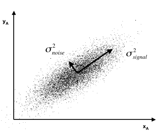
This illustrates dimensionality reduction with principal components. If we express all these points in terms of this rotated set of coordinates, one of these coordinates – the signal – captures most of the variation in the data. Projections of the datapoints onto the second principal component, therefore, account for much less variance.

Principal component regression characteristically specifies only the first few principal components in the regression equation, knowing that, typically, these explain the largest portion of the variance in the data.

It’s also noteworthy that some researchers are talking about “targeted” principal components. So the first few principal components account for the largest, the next largest, and so on amount of variance in the data. However, the “data” in this context does not include the information we have on the target variable. Targeted principal components therefore involves first developing the simple correlations between the target variable and all the potential predictors, then ordering these potential predictors from highest to lowest correlation. Then, by one means or another, you establish a cutoff, below which you exclude weak potential predictors from the data matrix you use to compute the principal components. Interesting approach which makes sense. Testing it with a variety of examples seems in order. 

PC Regression and Forecasting – A Macroeconomics Example

I downloaded a trial copy of XLSTAT – an Excel add-in with a well-developed set of principal component procedures. In the past, I’ve used SPSS and SAS on corporate networked systems. Now I am using Matlab and GAUSS for this purpose.

The problem is what does it mean to have a time series of principal components? Over the years, there have been relevant discussions – Jolliffe’s key work, for example, and more recent papers.

The problem with time series, apart from the temporal interdependencies, is that you always are calculating the PC’s over different data, as more data comes in. What does this do to the PC’s or factor scores? Do they evolve gradually? Can you utilize the factor scores from a smaller dataset to predict subsequent values of factor scores estimated over an augmented dataset?

Based on a large macroeconomic dataset I downloaded from Mark Watson’s page, I think the answer can be a qualified “yes” to several of these questions. The Mark Watson dataset contains monthly observations on 106 macroeconomic variables for the period 1950 to 2006.

For the variables not bounded within a band, I calculated year-over-year (yoy) growth rates for each monthly observation. Then, I took first differences again over 12 months. These transformations eliminated trends, which mess up the PC computations (basically, if you calculate PC’s with a set of increasing variables, the first PC will represent a common growth factor, and is almost useless for modeling purposes.) The result of my calculations was to center each series at nearly zero, and to make the variability of each series comparable – so I did not standardize.

Anyway, using XLSTAT and Forecast Pro – I find that the factor scores

(a)   Evolve slowly as you add more data.

(b)   Factor scores for smaller datasets provide insight into subsequent factor scores one to several months ahead.

(c)    Amazingly, turning points of the first principal component, which I have studied fairly intensively, are remarkably predictable.

ForecastProPCForecast

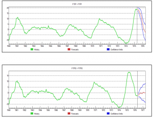
So what are we looking at here (click to enlarge)?

Well, the top chart is the factor score for the first PC, estimated over data to May 1975, with a forecast indicated by the red line at the right of the graph. This forecast produces values which are very close to the factor score values for data estimated to May 1976 – where both datasets begin in 1960. Not only that, but we have here an example of prediction of a turning point bigtime.

Of course this is the magic of Box-Jenkins, since, this factor score series is best estimated, according to Forecast Pro, with an ARIMA model.

I’m encouraged by this exercise to think that it may be possible to go beyond the lagged variable specification in many of these DFM’s to a contemporaneous specification, where the target variable forecasts are based on extrapolations of the relevant PC’s.

In any case, for applied business modeling, if we got something like a medical device new order series (suitably processed data) linked with these macro factor scores, it could be interesting – and we might get something that is not accessible with ordinary methods of exponential smoothing.

Underlying Theory of PC’s

Finally, I don’t think it is possible to do much better than to watch Andrew Ng at Stanford in Lectures 14 and 15. I recommend skipping to 17:09 – seventeen minutes and nine seconds – into Lecture 14, where Ng begins the exposition of principal components. He winds up this Lecture with a fascinating illustration of high dimensionality principal component analysis applied to recognizing or categorizing faces in photographs at the end of this lecture. Lecture 15 also is very useful – especially as it highlights the role of the Singular Value Decomposition (SVD) in actually calculating principal components.

Lecture 14

http://www.youtube.com/watch?v=ey2PE5xi9-A

Lecture 15

http://www.youtube.com/watch?v=QGd06MTRMHs

Granger Causality

After review, I have come to the conclusion that from a predictive and operational standpoint, causal explanations translate to directed graphs, such as the following:

causegraph

And I think it is interesting the machine learning community focuses on causal explanations for “manipulation” to guide reactive and interactive machines, and that directed graphs (or perhaps a Bayesian networks) are a paramount concept.

Keep that thought, and consider “Granger causality.”

This time series concept is well explicated in C.W.J. Grangers’ 2003 Nobel Prize lecture – which motivates its discovery and links with cointegration.

An earlier concept that I was concerned with was that of causality. As a postdoctoral student in Princeton in 1959–1960, working with Professors John Tukey and Oskar Morgenstern, I was involved with studying something called the “cross-spectrum,” which I will not attempt to explain. Essentially one has a pair of inter-related time series and one would like to know if there are a pair of simple relations, first from the variable X explaining Y and then from the variable Y explaining X. I was having difficulty seeing how to approach this question when I met Dennis Gabor who later won the Nobel Prize in Physics in 1971. He told me to read a paper by the eminent mathematician Norbert Wiener which contained a definition that I might want to consider. It was essentially this definition, somewhat refined and rounded out, that I discussed, together with proposed tests in the mid 1960’s.

The statement about causality has just two components: 1. The cause occurs before the effect; and 2. The cause contains information about the effect that that is unique, and is in no other variable.

A consequence of these statements is that the causal variable can help forecast the effect variable after other data has first been used. Unfortunately, many users concentrated on this forecasting implication rather than on the original definition. At that time, I had little idea that so many people had very fixed ideas about causation, but they did agree that my definition was not “true causation” in their eyes, it was only “Granger causation.” I would ask for a definition of true causation, but no one would reply. However, my definition was pragmatic and any applied researcher with two or more time series could apply it, so I got plenty of citations. Of course, many ridiculous papers appeared.

When the idea of cointegration was developed, over a decade later, it became clear immediately that if a pair of series was cointegrated then at least one of them must cause the other. There seems to be no special reason why there two quite different concepts should be related; it is just the way that the mathematics turned out

In the two-variable case, suppose we have time series Y={y1,y2,…,yt} and X = {x1,..,xt}. Then, there are, at the outset, two cases, depending on whether Y and X are stationary or nonstationary. The classic case is where we have an autoregressive relationship for yt,

yt = a0+a1yt-1+..+akyt-k

and this relationship can be shown to be a weaker predictor than


yt = a0+a1yt-1+..+akyt-k + b0+b1xt-1+..+bmxt-m

In this case, we say that X exhibits Granger causality with respect to Y.

Of course, if Y and X are nonstationary time series, autoregressive predictive equations make no sense, and instead we have the case of cointegration of time series, where in the two-variable case,

yt=φxt-1+ut

and the series of residuals ut are reduced to a white noise process.

So these cases follow what good old Wikipedia says,

A time series X is said to Granger-cause Y if it can be shown, usually through a series of t-tests and F-tests on lagged values of X (and with lagged values of Y also included), that those X values provide statistically significant information about future values of Y.

There are a number of really interesting extensions of this linear case, discussed in a recent survey paper.

Stern points out that the main enemies or barriers to establishing causal relations are endogeneity and omitted variables.

So I find that margin loans and the level of the S&P 500 appear to be mutually interrelated. Thus, it is forecasts of the S&P 500 can be improved with lagged values of margin loans, and you can improve forecasts of the monthly total of margin loans with lagged values of the S&P 500 – at least over broad ranges of time and in the period since 2008. The predictions of the S&P 500 with lagged values of margin loans, however, are marginally more powerful or accurate predictions.

Stern gives a colorful example where an explanatory variable is clearly exogenous and appears to have a significant effect on the dependent variable and yet theory suggests that the relationship is spurious and due to omitted variables that happen to be correlated with the explanatory variable in question.

Westling (2011) regresses national economic growth rates on average reported penis lengths and other variables and finds that there is an inverted U shape relationship between economic growth and penis length from 1960 to 1985. The growth maximizing length was 13.5cm, whereas the global average was 14.5cm. Penis length would seem to be exogenous but the nature of this relationship would have changed over time as the fastest growing region has changed from Europe and its Western Offshoots to Asia. So, it seems that the result is likely due to omitted variables bias.

Here Stern notes that Westling’s data indicates penis length is lowest in Asia and greatest in Africa with Europe and its Western Offshoots having intermediate lengths.

There’s a paper which shows stock prices exhibit Granger causality with respect to economic growth in the US, but vice versa does not obtain. This is a good illustration of the careful ste-by-step in conducting this type of analysis, and how it is in fact fraught with issues of getting the number of lags exactly right and avoiding big specification problems.

Just at the moment when it looks as if the applications of Granger causality are petering out in economics, neuroscience rides to the rescue. I offer you a recent article from a journal in computation biology in this regard – Measuring Granger Causality between Cortical Regions from Voxelwise fMRI BOLD Signals with LASSO.

Here’s the Abstract:

Functional brain network studies using the Blood Oxygen-Level Dependent (BOLD) signal from functional Magnetic Resonance Imaging (fMRI) are becoming increasingly prevalent in research on the neural basis of human cognition. An important problem in functional brain network analysis is to understand directed functional interactions between brain regions during cognitive performance. This problem has important implications for understanding top-down influences from frontal and parietal control regions to visual occipital cortex in visuospatial attention, the goal motivating the present study. A common approach to measuring directed functional interactions between two brain regions is to first create nodal signals by averaging the BOLD signals of all the voxels in each region, and to then measure directed functional interactions between the nodal signals. Another approach, that avoids averaging, is to measure directed functional interactions between all pairwise combinations of voxels in the two regions. Here we employ an alternative approach that avoids the drawbacks of both averaging and pairwise voxel measures. In this approach, we first use the Least Absolute Shrinkage Selection Operator (LASSO) to pre-select voxels for analysis, then compute a Multivariate Vector AutoRegressive (MVAR) model from the time series of the selected voxels, and finally compute summary Granger Causality (GC) statistics from the model to represent directed interregional interactions. We demonstrate the effectiveness of this approach on both simulated and empirical fMRI data. We also show that averaging regional BOLD activity to create a nodal signal may lead to biased GC estimation of directed interregional interactions. The approach presented here makes it feasible to compute GC between brain regions without the need for averaging. Our results suggest that in the analysis of functional brain networks, careful consideration must be given to the way that network nodes and edges are defined because those definitions may have important implications for the validity of the analysis.

So Granger causality is still a vital concept, despite its probably diminishing use in econometrics per se.

Let me close with this thought and promise a future post on the Kaggle and machine learning competitions on identifying the direction of causality in pairs of variables without context.

Correlation does not imply causality—you’ve heard it a thousand times. But causality does imply correlation.

Simulating the SPDR SPY Index

Here is a simulation of the SPDR SPY exchange traded fund index, using an autoregressive model estimated with maximum likehood methods, assuming the underlying distribution is not normal, but is instead a Student t distribution.

SimulatedSPY

The underlying model is of the form

SPYRRt=a0+a1SPYRRt-1…a30SPYRRt-30

Where SPYRR is the daily return (trading day to trading day) of the SPY, based on closing prices.

This is a linear model, and an earlier post lists its exact parameters or, in other words, the coefficients attached to each of the lagged terms, as well as the value of the constant term.

This model is estimated on a training sample of daily returns from 1993 to 2008, and, is applied to out-of-sample data from 2008 to the present. It predicts about 53 percent of the signs of the next-day-returns correctly. The model generates more profits in the 2008 to the present period than a Buy & Hold strategy.

The simulation listed above uses the model equation and parameters, generating a series of 4000 values recursively, adding in randomized error terms from the fit of the equation to the training or estimation data.

This is work-in-progress. Currently, I am thinking about how to properly incorporate volatility. Obviously, any number of realizations are possible. The chart shows one of them, which has an uncanny resemblance to the actual historical series, due to the fact that volatility is created over certain parts of the simulation, in this case by chance.

To review, I set in motion the following process:

  1. Predict a xt = f(xt-1,..,xt-30) based on the 30 coefficients and a constant term from the autoregressive model, applied to 30 preceding values of xt generated by this process (The estimation is initialized with the first 30 actual values of the test data).
  2. Randomly select a residual for this xt based on the empirical distribution of errors from the fit of the predictive relationship to the training set.
  3. Iterate.

The error distribution looks like this.

MLresidualsSPY

This is obviously not a normal distribution, since “too many” predictive errors are concentrated around the zero error line.

For puzzles and problems, this is a fertile area for research, and you can make money. But obviously, be careful.

In any case, I think this research, in an ultimate analysis, converges to the work being done by Didier Sornette and his co-researchers and co-authors. Sornette et al develop an approach through differential equations, focusing on critical points where a phase shift occurs in trading with a rapid collapse of an asset bubble. 

This approach comes at similar, semi-periodic, logarithmically increasing values through linear autoregressive equations, which, as is well known, have complex dynamics when analyzed as difference equations.

The prejudice in economics and econometrics that “you can’t predict the stock market” is an impediment to integrating these methods. 

While my research on modeling stock prices is a by-product of my general interest in forecasting and quantitative techniques, I may have an advantage because I will try stuff that more seasoned financial analysts may avoid, because they have been told it does not work.

So I maintain it is possible, at least in the era of quantitative easing (QE), to profit from autoregressive models of daily returns on a major index like the SPY. The models are, admittedly, weak predictors, but they interact with the weird error structure of SPY daily returns in interesting ways. And, furthermore, it is possible for anyone to verify my claims simply by calculating the predictions for the test period from 2008 to the present and then looking at what a Buy & Hold Strategy would have done over the same period.

In this post, I reverse the process. I take one of my autoregressive models and generate, by simulation, time series that look like historical SPY daily values.

On Sornette, about which I think we will be hearing more, since currently the US stock market seems to be in correction model, see – Turbulent times ahead: Q&A with economist Didier Sornette. Also check http://www.er.ethz.ch/presentations/index.

Boosting Time Series

If you learned your statistical technique more than ten years ago, consider it necessary to learn a whole bunch of new methods. Boosting is certainly one of these.

Let me pick a leading edge of this literature here – boosting time series predictions.

Results

Let’s go directly to the performance improvements.

In Boosting multi-step autoregressive forecasts, (Souhaib Ben Taieb and Rob J Hyndman, International Conference on Machine Learning (ICML) 2014) we find the following Table applying boosted time series forecasts to two forecasting competition datasets –

HyndmanTable1

The three columns refer to three methods for generating forecasts over horizons of 1-18 periods (M3 Competition and 1-56 period (Neural Network Competition). The column labeled BOOST is, as its name suggests, the error metric for a boosted time series prediction. Either by the lowest symmetric mean absolute percentage error or a rank criterion, BOOST usually outperforms forecasts produced recursively from an autoregressive (AR) model, or forecasts from an AR model directly mapped onto the different forecast horizons.

There were a lot of empirical time series involved in these two datasets –

The M3 competition dataset consists of 3003 monthly, quarterly, and annual time series. The time series of the M3 competition have a variety of features. Some have a seasonal component, some possess a trend, and some are just fluctuating around some level. The length of the time series ranges between 14 and 126. We have considered time series with a range of lengths between T = 117 and T = 126. So, the number of considered time series turns out to be M = 339. For these time series, the competition required forecasts for the next H = 18 months, using the given historical data. The NN5 competition dataset comprises M = 111 time series representing roughly two years of daily cash withdrawals (T = 735 observations) at ATM machines at one of the various cities in the UK. For each time series, the  competition required to forecast the values of the next H = 56 days (8 weeks), using the given historical data.

This research, notice of which can be downloaded from Rob Hyndman’s site, builds on the methodology of Ben Taieb and Hyndman’s recent paper in the International Journal of Forecasting A gradient boosting approach to the Kaggle load forecasting competition. Ben Taieb and Hyndman’s submission came in 5th out of 105 participating teams in this Kaggle electric load forecasting competition, and used boosting algorithms.

Let me mention a third application of boosting to time series, this one from Germany. So we have Robinzonov, Tutz, and Hothorn’s Boosting Techniques for Nonlinear Time Series Models (Technical Report Number 075, 2010 Department of Statistics University of Munich) which focuses on several synthetic time series and predictions of German industrial production.

Again, boosted time series models comes out well in comparisons.

GErmanIndustrialProd

GLMBoost or GAMBoost are quite competitive at these three forecast horizons for German industrial production.

What is Boosting?

My presentation here is a little “black box” in exposition, because boosting is, indeed, mathematically intricate, although it can be explained fairly easily at a very general level.

Weak predictors and weak learners play an important role in bagging and boosting –techniques which are only now making their way into forecasting and business analytics, although the machine learning community has been discussing them for more than two decades.

Machine learning must be a fascinating field. For example, analysts can formulate really general problems –

In an early paper, Kearns and Valiant proposed the notion of a weak learning algorithm which need only achieve some error rate bounded away from 1/2 and posed the question of whether weak and strong learning are equivalent for efficient (polynomial time) learning algorithms.

So we get the “definition” of boosting in general terms:

Boosting algorithms are procedures that “boost” low-accuracy weak learning algorithms to achieve arbitrarily high accuracy.

And a weak learner is a learning method that achieves only slightly better than chance correct classification of binary outcomes or labeling.

This sounds like the best thing since sliced bread.

But there’s more.

For example, boosting can be understood as a functional gradient descent algorithm.

Now I need to mention that some of the most spectacular achievements in boosting come in classification. A key text is the recent book Boosting: Foundations and Algorithms (Adaptive Computation and Machine Learning series) by Robert E. Schapire and Yoav Freund. This is a very readable book focusing on AdaBoost, one of the early methods and its extensions. The book can be read on Kindle and is starts out –

boostingquote

So worth the twenty bucks or so for the download.

The papers discussed above vis a vis boosting time series apply p-splines in an effort to estimate nonlinear effects in time series. This is really unfamiliar to most of us in the conventional econometrics and forecasting communities, so we have to start conceptualizing stuff like “knots” and component-wise fitting algortihms.

Fortunately, there is a canned package for doing a lot of the grunt work in R, called mboost.

Bottom line, I really don’t think time series analysis will ever be the same.

Predicting the S&P 500 or the SPY Exchange-Traded Fund

By some lights, predicting the stock market is the ultimate challenge. Tremendous resources are dedicated to it – pundits on TV, specialized trading programs, PhD’s doing high-end quantitative analysis in hedge funds. And then, of course, theories of “rational expectations” and “efficient markets” deny the possibility of any consistent success at stock market prediction, on grounds that stock prices are basically random walks.

I personally have not dabbled much in forecasting the market, until about two months ago, when I grabbed a bunch of data on the S&P 500 and tried some regressions with lags on S&P 500 daily returns and daily returns from the VIX volatility index.

What I discovered is completely replicable, and also, so far as I can see, is not widely known.

An autoregressive time series model of S&P 500 or SPY daily returns, built with data from 1993 to early 2008, can outperform a Buy & Hold strategy initiated with out-of-sample data beginning January 2008 and carrying through to recent days.

Here is a comparison of cumulative gains from a Buy & Hold strategy initiated January 23, 2008 with a Trading Strategy informed by my autoregressive (AR) model.

TradingStrategy1

So, reading this chart, investing $1000 January 23, 2008 and not touching this investment leads to cumulative returns of $1586.84 – that’s the Buy & Hold strategy.

The AR trading model, however, generates cumulative returns over this period of $2097.

The trading program based on the autoregressive model I am presenting here works like this. The AR model predicts the next day return for the SPY, based on the model coefficients (which I detail below) and the daily returns through the current day. So, if there is an element of unrealism, it is because the model is based on the daily returns computed on closing values day-by-day. But, obviously, you have to trade before the closing bell (in standard trading), so you need to use a estimate of the current day’s closing value obtained very close to the bell, before deciding whether to invest, sell, or buy SPY for the next day’s action.

But basically, assuming we can do this, perhaps seconds before the bell, and come close to an estimate of the current day closing price – the AR trading program is to buy SPY if the next day’s return is predicted to be positive – or if you currently hold SPY, to continue holding it. If the next day’s return is predicted to be negative, you sell your holdings.

It’s as simple as that.

So the AR model predicts daily returns on a one-day-ahead basis, using information on daily returns through the current trading day, plus the model coefficients.

Speaking of which, here are the coefficients from the Matlab “printout.”

MatlabTM1

There are a couple of nuances here. First, these parameter values do not derive from an ordinary least squares (OLS) regression. Instead, they are produced by maximum likelihood estimation, assuming the underlying distribution is a t-distribution (not a Gaussian distribution).

The use of a t-distribution, the idea of which I got to some extent from Nassim Taleb’s new text-in-progress mentioned two posts ago, is motivated by the unusual distribution of residuals of an OLS regression of lagged daily returns.

The proof is in the pudding here, too, since the above coefficients work better than ones developed on the (manifestly incorrect) assumption that the underlying error distribution is Gaussian.

Here is a graph of the 30-day moving averages of the proportion of signs of daily returns correctly predicted by this model.

TPproportions

Overall, about 53 percent of the signs of the daily returns in this out-of-sample period are predicted correctly.

If you look at this graph, too, it’s clear there are some differences in performance over this period. Thus, the accuracy of the model took a dive in 2009, in the depths of the Great Recession. And, model performance achieved significantly higher success proportions in 2012 and early 2013, perhaps related to markets getting used to money being poured in by the Fed’s policies of quantitative easing.

Why This AR Model is Such a Big Deal

I find it surprising that a set of fixed coefficients applied to the past 30 values of the SPY daily returns continue to predict effectively, months and years after the end of the in-sample values.

And, I might add, it’s not clear that updating the AR model always improves the outcomes, although I can do more work on this and also on the optimal sample period generally.

Can this be a matter of pure chance? This has to be considered, but I don’t think so. Monte Carlo simulations of randomized trading indicate that there is a 95 percent chance or better than returns of $2097 in this period are not due to chance. In other words, if I decide to trade on a day based on a flip of a fair coin, heads I buy, tails I sell at the end of the day, it’s highly unlikely I will generate cumulative returns of $2097, given the SPY returns over this period.

The performance of this trading model holds up fairly well through December of last year, but degrades some in the first days of 2014.

I think this is a feather in the cap of forecasting, so to speak. Also, it seems to me that economists promoting ideas of market efficiency and rational expectations need to take these findings into account. Everything is extant. I have provided the coefficients. You can get the SPY daily return values from Yahoo Finance. You can calculate everything yourself to check. I’ve done this several times, slightly differently each time. This time I used Matlab, and its arima estimation procedures work well.

I’m not quite sure what to make of all this, but I think it’s important. Naturally, I am extending these results in my personal model-building, and I can report that extensions are possible. At the same time, no extension of this model I have seen achieves more than nearly 60 percent accuracy in predicting the direction of change or sign of the daily returns, so you are going to lose money sometimes applying these models. Day-trading is a risky business.