Category Archives: predictive analytics

The Arc Sine Law and Competitions

There is a topic I think you can call the “structure of randomness.” Power laws are included, as are various “arcsine laws” governing the probability of leads and changes in scores in competitive games and, of course, in winnings from gambling.

I ran onto a recent article showing how basketball scores follow arcsine laws.

Safe Leads and Lead Changes in Competitive Team Sports is based on comprehensive data from league games over several seasons in the National Basketball Association (NBA).

“..we find that many …statistical properties are explained by modeling the evolution of the lead time X as a simple random walk. More strikingly, seemingly unrelated properties of lead statistics, specifically, the distribution of the times t: (i) for which one team is leading..(ii) for the last lead change..(and (iii) when the maximal lead occurs, are all described by the ..celebrated arcsine law..”

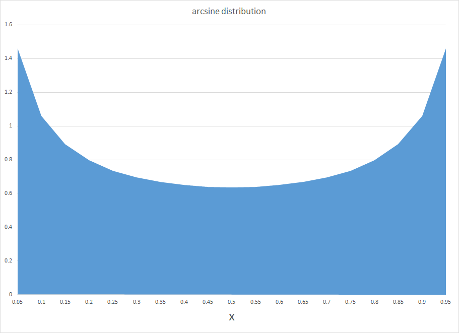
The chart below shows the arcsine probability distribution function (PDF). This probability curve is almost the opposite or reverse of the widely known normal probability distribution. Instead of a bell-shape with a maximum probability in the middle, the arcsine distribution has the unusual property that probabilities are greatest at the lower and upper bounds of the range. Of course, what makes both curves probability distributions is that the area they span adds up to 1.

arcsine

So, apparently, the distribution of time that a basketball team holds a lead in a basketball game is well-described by the arcsine distribution. This means lead changes are most likely at the beginning and end of the game, and least likely in the middle.

An earlier piece in the Financial Analysts Journal (The Arc Sine Law and the Treasure Bill Futures Market) notes,

..when two sports teams play, even though they have equal ability, the arc sine law dictates that one team will probably be in the lead most of the game. But the law also says that games with a close final score are surprisingly likely to be “last minute, come from behind” affairs, in which the ultimate winner trailed for most of the game..[Thus] over a series of games in which close final scores are common, one team could easily achieve a string of several last minute victories. The coach of such a team might be credited with being brilliantly talented, for having created a “second half” team..[although] there is a good possibility that he owes his success to chance.

There is nice mathematics underlying all this.

The name “arc sine distribution” derives from the integration of the PDF in the chart – a PDF which has the formula –

f(x) = 1/(π (x(1-x).5)

Here, the integral of f(x) yields the cumulative distribution function F(x) and involves an arcsine function,

F(x) = 2/(π arcsin(x.5))

Fundamentally, the arcsine law relates to processes where there are probabilities of winning and losing in sequential trials. The PDF follows from the application of Stirling’s formula to estimate expressions with factorials, such as the combination of p+q things taken p at a time, which quickly becomes computationally cumbersome as p+q increases in size.

There is probably no better introduction to the relevant mathematics than Feller’s exposition in his classic An Introduction to Probability Theory and Its Applications, Volume I.

Feller had an unusual ability to write lucidly about mathematics. His Chapter III “Fluctuations in Coin Tossing and Random Walks” in IPTAIA is remarkable, as I have again convinced myself by returning to study it again.

Feller

He starts out this Chapter III with comments:

We shall encounter theoretical conclusions which not only are unexpected but actually come as a shock to intuition and common sense. They will reveal that commonly accepted motions concerning chance fluctuations are without foundation and that the implications of the law of large numbers are widely misconstrued. For example, in various applications it is assumed that observations on an individual coin-tossing game during a long time interval will yield the same statistical characteristics as the observation of the results of a huge number of independent games at one given instant. This is not so..

Most pointedly, for example, “contrary to popular opinion, it is quite likely that in a long coin-tossing game one of the players remains practically the whole time on the winning side, the other on the losing side.”

The same underlying mathematics produces the Ballot Theorem, which states the chances a candidate will be ahead from an early point in vote counting, based on the final number of votes for that candidate.

This application, of course, comes very much to the fore in TV coverage of the results of on-going primaries at the present time. CNN’s initial announcement, for example, that Bernie Sanders beat Hillary Clinton in the New Hampshire primary came when less than half the precincts had reported in their vote totals.

In returning to Feller’s Volume 1, I recommend something like Sholmo Sternberg’s Lecture 8. If you read Feller, you have to be prepared to make little derivations to see the links between formulas. Sternberg cleared up some puzzles for me, which, alas, otherwise might have absorbed hours of my time.

The arc sine law may be significant for social and economic inequality, which perhaps can be considered in another post.

Direction of the Market Next Week – July 13

Last Friday, before July 4th, I ran some numbers on the SPY exchange traded fund, looking at backcasts from the EVPA (extreme value prediction algorithm) for the Monday and Tuesday before, when Greece kept the banks closed and defaulted on its IMF payment. I also put up a ten day look forward on the EVPA predictions.

Of course, the SPY is an ETF which tracks the S&P 500.

The EVPA predicted the SPY high and low would drop at the beginning of the following week, beginning July 6, but seemed to suggest some rebound by the end of this week – that is today, July 10.

Here is a chart for today and next week with comments on interpreting the forecasts.

NextWeek

So the EVPA predicts the high and low over the current trading day, and aggregations of 2,3,4,.. trading days going forward.

The red diamonds in the chart map out forecasts for the high price of the SPY today, July 10, and for groups of trading days beginning today and ending Monday, July 13, and the rest of the days of next week.

Similarly, the blue crosses map out forecasts for the SPY low prices which are predicted to be reached over 1 day, the next two trading days, the next three trading days, and so forth.

Attentive readers will notice an apparent glitch in the forecasts for the high prices to come – namely that the predicted high of the next two trading days is lower than the predicted high for today – which is, of course, logically impossible.

But, hey, this is econometrics, not logic, and what we need to do is interpret the output of the models against what it is we are looking for.

In this case, a solid reduction in the predicted high of the coming two day period, compared with the prediction of today’s high signals that the high of the SPY is likely to be lower Monday than today.

This is consistent with predictions for the low today and for the next two trading days shown in blue – which indicates lower lows will be reached the second day.

Following that, the EVPA predictions for higher groupings of trading days are inconclusive, given statistical tolerances of the approach.

Note that the predictions of the high and low for today, Friday, July 10, are quite accurate, assuming these bounds have been reached by this point – two o’clock on Wall Street. In percentage error terms, the EVAP forecasts are over-forecasting 0.3% for the high and 0.2% for the low.

Again, the EVPA always keys off the opening price of the period being forecast.

I also have a version of the EVPA which forecasts ahead for the coming week, for two week periods, and so forth.

Leading up to the financial crisis of 2008 and then after the worst in October of that year, the EVPA weekly forecasts clearly highlight turning points.

Currently, weekly forecasts going up to monthly durations do not signal any clear trend in the market, but rather signal increasing volatility.

One-Month-Ahead Stock Market Forecasts

I have been spending a lot of time analyzing stock market forecast algorithms I stumbled on several months ago which I call the New Proximity Algorithms (NPA’s).

There is a white paper on the University of Munich archive called Predictability of the Daily High and Low of the S&P 500 Index. This provides a snapshot of the NPA at one stage of development, and is rock solid in terms of replicability. For example, an analyst replicated my results with Python, and I’ll probably will provide his code here at some point.

I now have moved on to longer forecast periods and more complex models, and today want to discuss month-ahead forecasts of high and low prices of the S&P 500 for this month – June.

Current Month Forecast for S&P 500

For the current month – June 2015 – things look steady with no topping out or crash in sight

With opening price data from June 1, the NPA month-ahead forecast indicates a high of 2144 and a low of 2030. These are slightly above the high and low for May 2015, 2,134.72 and 2,067.93, respectively.

But, of course, a week of data for June already is in, so, strictly speaking, we need a three week forecast, rather than a forecast for a full month ahead, to be sure of things. And, so far, during June, daily high and low prices have approached the predicted values, already.

In the interests of gaining better understanding of the model, however, I am going to “talk this out” without further computations at this moment.

So, one point is that the model for the low is less reliable than the high price forecast on a month-ahead basis. Here, for example, is the track record of the NPA month-ahead forecasts for the past 12 months or so with S&P 500 data.

12MOSNPA

The forecast model for the high tracks along with the actuals within around 1 percent forecast error, plus or minus. The forecast model for the low, however, has a big miss with around 7 percent forecast error in late 2014.

This sort of “wobble” for the NPA forecast of low prices is not unusual, as the following chart, showing backtests to 2003, shows.

LowMonthAheadBig

What’s encouraging is the NPA model for the low price adjusts quickly. If large errors signal a new direction in price movement, the model catches that quickly. More often, the wobble in the actual low prices seems to be transitory.

Predicting Turning Points

One reason why the NPA monthly forecast for June might be significant, is that the underlying method does a good job of predicting major turning points.

If a crash were coming in June, it seems likely, based on backtesting, that the model would signal something more than a slight upward trend in both the high and low prices.

Here are some examples.

First, the NPA forecast model for the high price of the S&P 500 caught the turning point in 2007 when the market began to go into reverse.

S&P2008high

But that is not all.

The NPA model for the month-ahead high price also captures a more recent reversal in the S&P 500.

laterHighS&P500


Also, the model for the low did capture the bottom in the S&P 500 in 2009, when the direction of the market changed from decline to increase.

2008High

This type of accuracy in timing in forecast modeling is quite remarkable.

It’s something I also saw earlier with the Hong Kong Hang Seng Index, but which seemed at that stage of model development to be confined to Chinese market data.

Now I am confident the NPA forecasts have some capability to predict turning points quite widely across many major indexes, ETF’s, and markets.

Note that all the charts shown above are based on out-of-sample extrapolations of the NPA model. In other words, one set of historical data are used to estimate the parameters of the NPA model, and other data, outside this sample, are then plugged in to get the month-ahead forecasts of the high and low prices.

Where This Is Going

I am compiling materials for presentations relating to the NPA, its capabilities, its forecast accuracy.

The NPA forecasts, as the above exhibits show, work well when markets are going down or turning directions, as when in a steady period of trending growth.

But don’t mistake my focus on these stock market forecasting algorithms for a last minute conversion to the view that nothing but the market is important. In fact, a lot of signals from business and global data suggest we could be in store for some big changes later in 2015 or in 2016.

What I want to do, I think, is understand how stock markets function as sort of prisms for these external developments – perhaps involving Greek withdrawal from the Eurozone, major geopolitical shifts affecting oil prices, and the onset of the crazy political season in the US.

Thoughts on Stock Market Forecasting

Here is an update on the forecasts from last Monday – forecasts of the high and low of SPY, QQQ, GE, and MSFT.

This table is easy to read, even though it is a little” busy”.

TableMay22

One key is to look at the numbers highlighted in red and blue (click to enlarge).

These are the errors from the week’s forecast based on the NPV algorithm (explained further below) and a No Change forecast.

So if you tried to forecast the high for the week to come, based on nothing more than the high achieved last week – you would be using a No Change model. This is a benchmark in many forecasting discussions, since it is optimal (subject to some qualifications) for a random walk. Of course, the idea stock prices are a random walk came into favor several decades ago, and now gradually is being rejected of modified, based on findings such as those above.

The NPV forecasts are more accurate for this last week than No Change projections 62.5 percent of the time, or in 5 out of the 8 forecasts in the table for the week of May 18-22. Furthermore, in all three cases in which the No Change forecasts were better, the NPV forecast error was roughly comparable in absolute size. On the other hand, there were big relative differences in the absolute size of errors in the situations in which the NPV forecasts proved more accurate, for what that is worth.

The NPV algorithm, by the way, deploys various price ratios (nearby prices) and their transformations as predictors. Originally, the approach focused on ratios of the opening price in a period and the high or low prices in the previous period. The word “new” indicates a generalization has been made from this original specification.

Ridge Regression

I have been struggling with Visual Basic and various matrix programming code for ridge regression with the NPV specifications.

Using cross validation of the λ parameter, ridge regression can improve forecast accuracy on the order of 5 to 10 percent. For forecasts of the low prices, this brings forecast errors closer to acceptable error ranges.

Having shown this, however, I am now obligated to deploy ridge regression in several of the forecasts I provide for a week or perhaps a month ahead.

This requires additional programming to be convenient and transparent to validation.

So, I plan to work on that this coming week, delaying other tables with weekly or maybe monthly forecasts for a week or so.

I will post further during the coming week, however, on the work of Andrew Lo (MIT Financial Engineering Center) and high frequency data sources in business forecasts.

Probable Basis of Success of NPV Forecasts

Suppose you are an observer of a market in which securities are traded. Initially, tests show strong evidence stock prices in this market follow random walk processes.

Then, someone comes along with a theory that certain price ratios provide a guide to when stock prices will move higher.

Furthermore, by accident, that configuration of price ratios occurs and is associated with higher prices at some date, or maybe a couple dates in succession.

Subsequently, whenever price ratios fall into this configuration, traders pile into a stock, anticipating its price will rise during the next trading day or trading period.

Question – isn’t this entirely plausible, and would it not be an example of a self-confirming prediction?

I have a draft paper pulling together evidence for this, and have shared some findings in previous posts. For example, take a look at the weird mirror symmetry of the forecast errors for the high and low.

And, I suspect, the absence or ambivalence of this underlying dynamic is why closing prices are harder to predict than period high or low prices of a stock. If I tell you the closing price will be higher, you do not necessarily buy the stock. Instead, you might sell it, since the next morning opening prices could jump down. Or there are other possibilities.

Of course, there are all kinds of systems traders employ to decide whether to buy or sell a stock, so you have to cast your net pretty widely to capture effects of the main methods.

Long Term Versus Short Term

I am getting mixed results about extending the NPV approach to longer forecast horizons – like a quarter or a year or more.

Essentially, it looks to me as if the No Change model becomes harder and harder to beat over longer forecast horizons – although there may be long run persistence in returns or other features that I see  other researchers (such as Andrew Lo) have noted.

Five Day Forecasts of High and Low for QQQ, SPY, GE, and MSFT – Week of May 11-15

Here are high and low forecasts for two heavily traded exchange traded funds (ETF’s) and two popular stocks. Like the ones in preceding weeks, these are for the next five trading days, in this case Monday through Friday May 11-15.

HLWeekMay11to15

The up and down arrows indicate the direction of change from last week – for the high prices only, since the predictions of lows are a new feature this week.

Generally, these prices are essentially “moving sideways” or with relatively small changes, except in the case of SPY.

For the record, here is the performance of previous forecasts.

TableMay8

Strong disclaimer: These forecasts are provided for information and scientific purposes only. This blog accepts no responsibility for what might happen, if you base investment or trading decisions on these forecasts. What you do with these predictions is strictly your own business.

Incidentally, let me plug the recent book by Andrew W. Lo and A. Craig McKinlay – A Non-Random Walk Down Wall Street from Princeton University Press and available as a e-book.

I’ve been reading an earlier book which Andrew Lo co-authored The Econometrics of Financial Markets.

What I especially like in these works is the insistence that statistically significant autocorrelations exist in stock prices and stock returns. They also present multiple instances in which stock prices fail tests for being random walks, and establish a degree of predictability for these time series.

Again, almost all the focus of work in the econometrics of financial markets is on closing prices and stock returns, rather than predictions of the high and low prices for periods.

How Did This Week’s Forecasts of QQQ, SPY, GE, and MSFT High Prices Do?

The following Table provides an update for this week’s forecasts of weekly highs for the securities currently being followed – QQQ, SPY, GE, and MSFT. Price forecasts and actual numbers are in US dollars.

TableMay8

This batch of forecasts performed extremely well in terms of absolute size of forecast errors, and, in addition, beating a “no change” forecast in three out of four predictions (exception being SPY) and correctly calling the change in direction of the high for QQQ.

It would be nice to be able to forecast the high prices for five-day-forward periods with the accuracy seen in the Microsoft (MSFT) forecast.

As all you market mavens know, US stock markets experienced a lot of declines in prices this week, so the highs for the week occurred Monday.

I’ve had several questions about the future direction of the market. Are declines going to be in the picture for the coming week, and even longer, for example?

I’ve been studying the capabilities of these algorithms to predict turning points in indexes and prices of individual securities. The answer is going to be probabilistic, and so is complicated. Sometimes the algorithm seems to provide pretty unambiguous signals as to turning points. In other instances, the tea leaves are harder to read, but, arguably, a signal does exist for most major turning points with the indexes I have focused on – SPY, QQQ, and the S&P 500.

So, the next question is – has the market hit a high for a week or a few weeks, or even perhaps a major turnaround?

Deploying these algorithms, coded in Visual Basic and C#, to attack this question is a little like moving a siege engine to the castle wall. A major undertaking.

I want to get there, but don’t want to be a “Chicken Little” saying “the sky is falling,” “the sky is falling.”

Stock Market Predictability

This little Monday morning exercise, which will be continued for the next several weeks, is providing evidence for the predictability of aspects of stock prices on a short term basis.

Once the basic facts are out there for everyone to see, a lot of questions arise. So what about new information? Surely yesterday’s open, high, low, and closing prices, along with similar information for previous days, do not encode an event like 9/11, or the revelation of massive accounting fraud with a stock issuing concern.

But apart from such surprises, I’m leaning to the notion that a lot more information about the general economy, company prospects and performance, and so forth are subtly embedded in the flow of price data.

I talked recently with an analyst who is applying methods from Kelly and Pruitt’s Market Expectations in the Cross Section of Present Values for wealth management clients. I hope to soon provide an “in-depth” on this type of applied stock market forecasting model, which focuses, incidentally, on stock market returns and dividends.

There is also some compelling research on the performance of momentum trading strategies which seems to indicate a higher level of predictability in stock prices than is commonly thought to exist.

Incidentally, in posting this slightly before the bell today, Friday, I am engaging in intra-day forecasting – betting that prices for these securities will stay below their earlier highs.

What’s Going On?

Teaching economics during Vietnam and, later, the onset of Reagan – I developed a sort of sideline patter about current events. Later, I realized this bore resemblance to a kind of global system dynamics.

Then, my consulting made these considerations more relevant – to the point that, in recent years, I make correlations between what you might call a global regional analysis and sales prospects, as well as corporate strategy.

How do you go about developing this perspective? The question is especially relevant for me now, since I am emerging from a deep dive into hands-on statistical modeling.

Well, one way to visualize this is as a series of threads through time. Each of these threads is strung with events that can turn out one way or another. There are main threads as believed to be constituted by “serious people.” The conventional view of things, if you will. There also are many outliers, story lines which incorporate unusual, perhaps foreboding developments. I guess you could think of these threads as scenarios, too. A whole bunch of movie scripts about how the future is going to unfold.

Now before getting into specifics, let me make what might be considered an obscure remark, but one relevant to forecasting. What you want to do is disentangle and identify as many of these threads as you have the energy to consider, and then, watch for convergences. If there are several ways, in other words, for some events to become manifested, these events become more likely.

One of the things this methodology accommodates is a fact that it seems to me that many people overlook or downplay. This is that there can be really fundamental differences between how different groups of people, perhaps with different interests or things to gain or lose out of situations, look at things.

One of the clearest examples, perceptually, is the arrow illusion.

arrowillusion

So this is one reason why I try to glean perspectives from all over – including heterodox and contrarian views.

Noone at this point can convince me this is not a good practice, even though it may make those who busy themselves with thought control (“reality construction”) uncomfortable.

For example, many years ago, I was sitting at my father’s breakfast nook glancing at some books he had recently bought, and I found Andrei Amalrik’s Will the Soviet Union Survive Until 1984? What a preposterous idea, it seemed to me. Collapse of the Soviet Union.

It pays to look at heterodox views, even if only a few of these will have any relevance to the future.

Some Specifics

Well, today we have the internet – a font of views of all types.

In thinking about developing this and its successors on the same or similar topics this morning, I first turned to Zero Hedge. From Wikipedia,

Zero Hedge is a financial blog that aggregates news and presents editorial opinions from original and outside sources. It has been described as offering a “deeply conspiratorial, anti-establishment and pessimistic view of the world”… It reports on economics, Wall Street, and the financial sector and is credited with bringing the controversial practice of flash trading to public attention in 2009 via a series of posts alleging that Goldman Sachs’ access to flash order information allowed it to gain unfair profits. The news portion of the site is written by a group of editors who collectively write under the pseudonym “Tyler Durden”, a character from the novel and film Fight Club.

Since I have been out of the loop for a while, the litany of shocking or bad news on this site does not bother me yet.

Some of the headings include:

Iran Forces Seize US Cargo Ship With 34 People On Board, Al Arabiya Reports

West Baltimore In Ashes: A Night Of Violence And Looting In Photos

Stocks Soar On Non-War, Bad-News-Is-Good-News V-Shaped Recovery

Well, I’m not sure what to make of all that. Conflict is increasing. War and riot memes.

Another site I frequently turn to, quite frankly, is Naked Capitalism, and, in particular, Links assembled by “Yves Smith” and others. Today, these range over topics like the Greek-European Union negotiations and the threat of an exit of Greece from the Eurozone, the TPP (trans-Pacific Partnership secret trade bill), Yemen and Syria, and a reference to a new and important report from MIT about the decline in US science spending –The Future Postponed.

I also consult what I would call “libertarian” financial blogs such as Mish Shedlock’s Global Economic Trend Analysis.

Then, I guess, after surveying these “oppositional views,” I turn to official forecasts and publications of US and European banks and financial institutions, as well as central banks.

I’ve given play to JP Morgan forecasters here, as well as Bloomberg’s list of leading macroeconomic forecasters.  It is always good to try to keep tabs on the latest sayings of these celebrity forecasters.

The Bank of England Financial Stability Report, most recently issued December 2014, is a relevant publication.

I also tend to look at, but basically discount, sources such as the Survey of Professional Forecasters, assembled by the Philadelphia Federal Reserve Bank. The record of macroeconomic forecasting is truly abysmal. But, apart from turning points, there may be value in tracking the projected movement of indicators and their trends.

The Central Issue

I have not mentioned slowing of the Chinese economy in the above discussion or several other megatrends, but let me move on to a key pivot for the next few years.

Business expansions never last forever. The current expansion, perhaps because it began so slowly, has sustained for a relatively long time already.

Another key point is that many central banks have pushed interest rates to near the zero bound, and they remain historically very low.

Frankly, it challenges my capabilities to imagine a future in which interest rates sort of disappear as key economic factors – although this may be a thread we need to consider. The attack on cash and movement to purely electronic money could be part of this, with negative interest rates entering the picture in a real way.

But assuming that does not happen, central banks will have to encourage higher interest rates, and that will have wide-ranging effects on business, it seems certain. There are many tangible forecasting problems associated with this prospective development.

I have to believe this is the central issue at present. How can the US Federal Reserve, for example, move off the zero bound for the federal funds rate, when the US economic recovery should, according to historical patterns, be moving toward its final months or years?

There are other tough issues – in the Middle East, the Ukraine, climate change, and so forth – but, as an economic or business forecaster, I have to believe this tension between normal banking practice and the business cycle is fundamental.

In any case, I want to return to putting up business forecasts, including longer term scenarios, in addition to carrying forth with my stock market forecasting experiment.

Some Comments on Forecasting High and Low Stock Prices

I want to pay homage to Paul Erdős, the eccentric Hungarian-British-American-Israeli mathematician, whom I saw lecture a few years before his death. Erdős kept producing work in mathematics into his 70’s and 80’s – showing this is quite possible. Of course, he took amphetamines and slept on people’s couches while he was doing this work in combinatorics, number theory, and probability.

erdos

In any case, having invoked Erdős, let me offer comments on forecasting high and low stock prices – a topic which seems to be terra incognita, for the most part, to financial research.

First, let’s take a quick look at a chart showing the maximum prices reached by the exchange traded fund QQQ over a critical period during the last major financial crisis in 2008-2009.

MaxHighChart

The graph charts five series representing QQQ high prices over periods extending from 1 day to 40 days.

The first thing to notice is that the variability of these time series decreases as the period for the high increases.

This suggests that forecasting the 40 day high could be easier than forecasting the high price for, say, tomorrow.

While this may be true in some sense, I want to point out that my research is really concerned with a slightly different problem.

This is forecasting ahead by the interval for the maximum prices. So, rather than a one-day-ahead forecast of the 40 day high price (which would include 39 known possible high prices), I forecast the high price which will be reached over the next 40 days.

This problem is better represented by the following chart.

Sampled5Highs

This chart shows the high prices for QQQ over periods ranging from 1 to 40 days, sampled at what you might call “40 day frequencies.”

Now I am not quite going to 40 trading day ahead forecasts yet, but here are results for backtests of the algorithm which produces 20-trading-day-ahead predictions of the high for QQQ.

20Dayforecast

The blue lines shows the predictions for the QQQ high, and the orange line indicates the actual QQQ highs for these (non-overlapping) 20 trading day intervals. As you can see, the absolute percent errors – the grey bars – are almost all less than 1 percent error.

Random Walk

Now, these results are pretty good, and the question arises – what about the random walk hypothesis for stock prices?

Recall that a simple random walk can be expressed by the equation xt=xt-1 + εt where εt is conventionally assumed to be distributed according to N(0,σ) or, in other words, as a normal distribution with zero mean and constant variance σ.

An interesting question is whether the maximum prices for a stock whose prices follow a random walk also can be described, mathematically, as a random walk.

This is elementary, when we consider that any two observations in a time series of random walks can be connected together as xt+k = xt + ω where ω is distributed according to a Gaussian distribution but does not necessarily have a constant variance for different values of the spacing parameter k.

From this it follows that the methods producing these predictions or forecasts of the high of QQQ over periods of several trading days also are strong evidence against the underlying QQQ series being a random walk, even one with heteroskedastic errors.

That is, I believe the predictability demonstrated for these series are more than cointegration relationships.

Where This is Going

While demonstrating the above point could really rock the foundations of finance theory, I’m more interested, for the moment, in exploring the extent of what you can do with these methods.

Very soon I’m going to post on how these methods may provide signals as to turning points in stock market prices.

Stay tuned, and thanks for your comments and questions.

Erdős picture from Encyclopaedia Britannica

Update and Extension – Weekly Forecasts of QQQ and Other ETF’s

Well, the first official forecast rolled out for QQQ last week.

It did relatively well. Applying methods I have been developing for the past several months, I predicted the weekly high for QQQ last week at 108.98.

In fact, the high price for QQQ for the week was 108.38, reached Monday, April 13.

This means the forecast error in percent terms was 0.55%.

It’s possible to look more comprehensively at the likely forecast errors with my approach with backtesting.

Here is a chart showing backtests for the “proximity variable method” for the QQQ high price for five day trading periods since the beginning of 2015.

QQQupdate

The red bars are errors, and, from their axis on the right, you can see most of these are below 0.5%.

This is encouraging, and there are several adjustments which may improve forecasting performance beyond this level of accuracy I want to explore.

So here is the forecast of the high prices that will be reached by QQQ and SPY for the week of April 20-24.

ForecastTab1

As you can see, I’ve added SPY, an ETF tracking the S&P500.

I put this up on Businessforecastblog because I seek to make a point – namely, that I believe methods I have developed can produce much more accurate forecasts of stock prices.

It’s often easier and more compelling to apply forecasting methods and show results, than it is to prove theoretically or otherwise argue that a forecasting method is worth its salt.

Disclaimer –  These forecasts are for informational purposes only. If you make investments based on these numbers, it is strictly your responsibility. Businessforecastblog is not responsible or liable for any potential losses investors may experience in their use of any forecasts presented in this blog.

Well, I am working on several stock forecasts to add to projections for these ETF’s – so will expand this feature in forthcoming Mondays.

Predicting the High Reached by the SPY ETF 30 Days in Advance – Some Results

Here are some backtests of my new stock market forecasting procedures.

Here, for example, is a chart showing the performance of what I call the “proximity variable approach” in predicting the high price of the exchange traded fund SPY over 30 day forward periods (click to enlarge).

3oDaySPY

So let’s be clear what the chart shows.

The proximity variable approach- which so far I have been abbreviating as “PVar” – is able to identify the high prices reached by the SPY in the coming 30 trading days with forecast errors mostly under 5 percent. In fact, the MAPE for this approximately ten year period is 3 percent. The percent errors, of course, are charted in red with their metric on the axis to the right.

The blue line traces out the predictions, and the grey line shows the actual highs by 30 trading day period.

These results far surpass what can be produced by benchmark models, such as the workhorse No Change model, or autoregressive models.

Why not just do this month-by-month?

Well, months have varying numbers of trading days, and I have found I can boost accuracy by stabilizing the number of trading days considered in the algorithm.

Comments

Realize, of course, that a prediction of the high price that a stock or ETF will reach in a coming period does not tell you when the high will be reached – so it does not immediately translate to trading profits. The high in question could come with the opening price of the period, for example, leaving you out of the money, if you hear there is this big positive prediction of growth and then jump in the market.

However, I do think that market participants react to anticipated increases or decreases in the high or low of a security.

You might explain these results as follows. Traders react to fairly simple metrics predicting the high price which will be reached in the next period – and let this concept be extensible from a day to a month in this discussion. In so reacting, these traders tend to make such predictive models self-fulfilling.

Therefore, daily prices – the opening, the high, the low, and the closing prices – encode a lot more information about trader responses than is commonly given in the literature on stock market forecasting.

Of course, increasingly, scholars and experts are chipping away at the “efficient market hypothesis” and showing various ways in which stock market prices are predictable, or embody an element of predictability.

However, combing Google Scholar and other sources, it seems almost no one has taken the path to modeling stock market prices I am developing here. The focus in the literature is on closing prices and daily returns, for example, rather than high and low prices.

I can envision a whole research program organized around this proximity variable approach, and am drawn to taking this on, reporting various results on this blog.

If any readers would like to join with me in this endeavor, or if you know of resources which would be available to support such a project – feel free to contact me via the Comments and indicate, if you wish, whether you want your communication to be private.