Category Archives: volatility forecasting

Multivariate GARCH and Portfolio Risk Management

Why get involved with the complexity of multivariate GARCH models?

Well, because you may want to exploit systematic and persisting changes in the correlations of stocks and bonds, and other major classes of financial assets. If you know how these correlations change over, say, a forecast horizon of one month, you can do a better job of balancing risk in portfolios.

This a lively area of applied forecasting, as I discovered recently from Henry Bee of Cassia Research – based in Vancouver, British Columbia (and affiliated with CONCERT Capital Management of San Jose, California). Cassia Research provides Institutional Quant Technology for Investment Advisors.

HenryBee

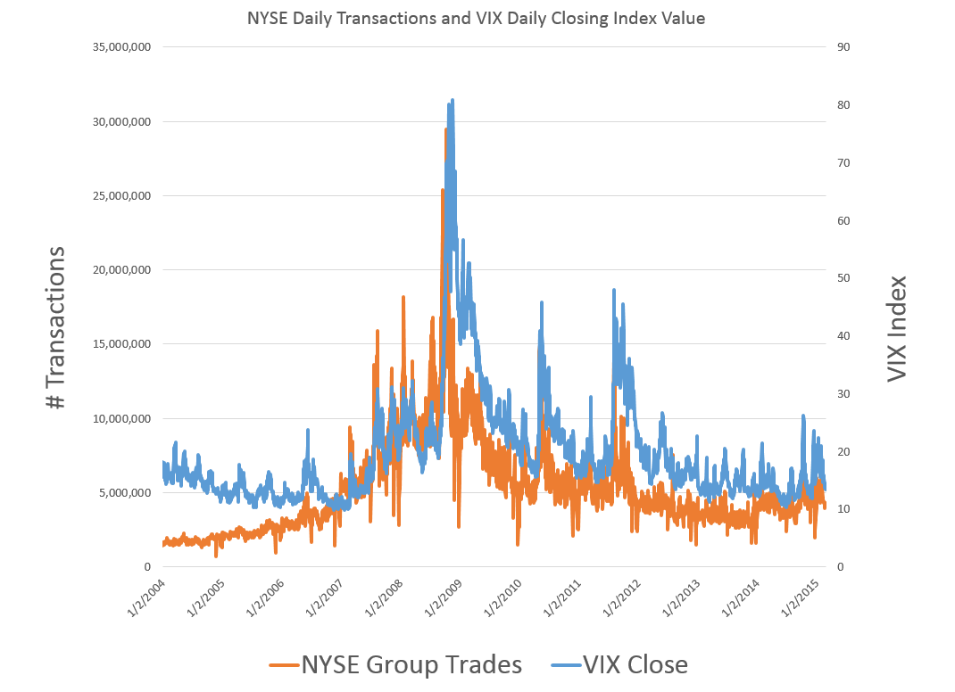
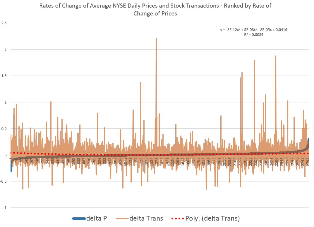
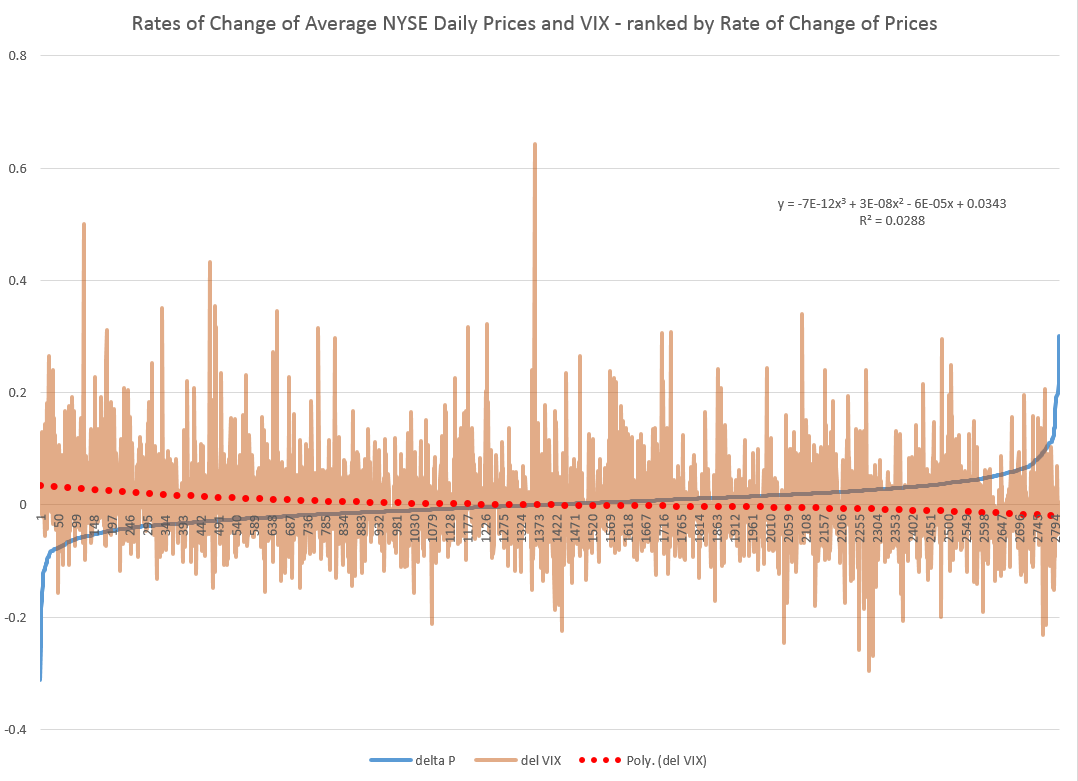
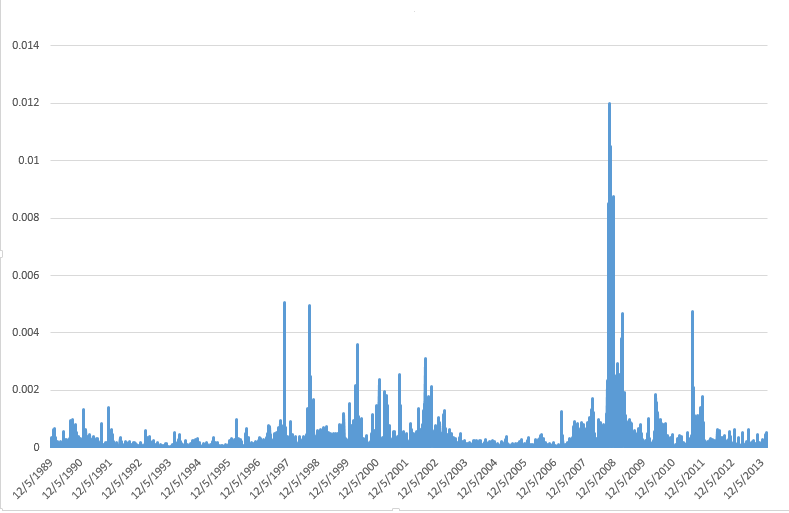
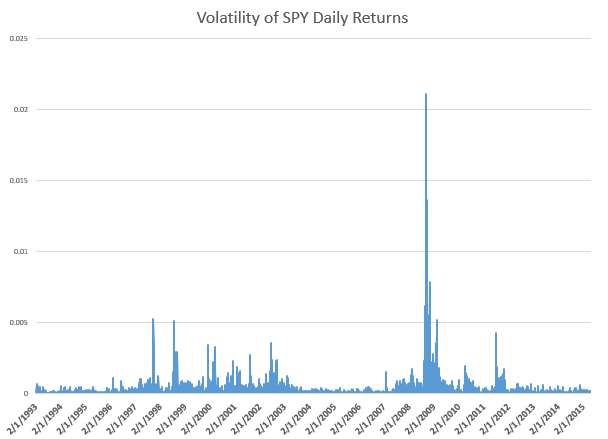
Basic Idea The key idea is that the volatility of stock prices cluster in time, and most definitely is not a random walk. Just to underline this – volatility is classically measured as the square of daily stock returns. It’s absolutely straight-forward to make a calculation and show that volatility clusters, as for example with this more than year series for the SPY exchange traded fund.

SPYVolatility

Then, if you consider a range of assets, calculating not only their daily volatilities, in terms of their own prices, but how these prices covary – you will find similar clustering of covariances.

Multivariate GARCH models provide an integrated solution for fitting and predicting these variances and covariances. For a key survey article, check out – Multivariate GARCH Models A Survey.

Some quotes from the company site provide details: We use a high-frequency multivariate GARCH model to control for volatility clustering and spillover effects, reducing drawdowns by 50% vs. historical variance. …We are able to tailor our systems to target client risk preferences and stay within their tolerance levels in any market condition…. [Dynamic Rebalancing can]..adapt quickly to market shifts and reduce drawdowns by dynamically changing rebalance frequency based on market behavior.

The COO of Cassia Research also is a younger guy – Jesse Chen. As I understand it, Jesse handles a lot of the hands-on programming for computations and is the COO.

JesseChen

I asked Bee what he saw as the direction of stock market and investment volatility currently, and got a surprising answer. He pointed me to the following exhibit on the company site.

Bee1 
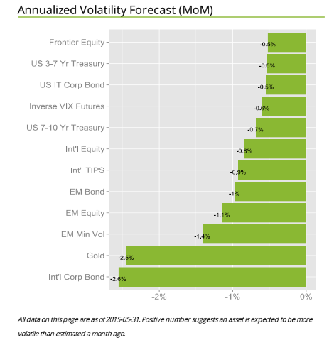
The point is that for most assets considered in one of the main portfolios targeted by Cassia Research, volatilities have been dropping – as indicated by the negative signs in the chart. These are volatilities projected ahead by one month, developed by the proprietary multivariate GARCH modeling of this company – an approach which exploits intraday data for additional accuracy.

There is a wonderful 2013 article by Kirilenko and Lo called Moore’s Law versus Murphy’s Law: Algorithmic Trading and Its Discontents. Look on Google Scholar for this title and you will find a downloadable PDF file from MIT.

The Quant revolution in financial analysis is here to stay, and, if you pay attention, provides many examples of successful application of forecasting algorithms.

Stock Trading – Volume and Volatility

What about the relationship between the volume of trades and stock prices? And while we are on the topic, how about linkages between volume, volatility, and stock prices?

These questions have absorbed researchers for decades, recently drawing forth very sophisticated analysis based on intraday data.

I highlight big picture and key findings, and, of course, cannot resolve everything. My concern is not to be blindsided by obvious facts.

Relation Between Stock Transactions and Volatility

One thing is clear.

From a “macrofinancial” perspective, stock volumes, as measured by transactions, and volatility, as measured by the VIX volatility index, are essentially the same thing.

This is highlighted in the following chart, based on NYSE transactions data obtained from the Facts and Figures resource maintained by the Exchange Group.

VIXandNYSETrans

Now eyeballing this chart, it is possible, given this is daily data, that there could be slight lags or leads between these variables. However, the greatest correlation between these series is contemporaneous. Daily transactions and the closing value of the VIX move together trading day by trading day.

And just to bookmark what the VIX is, it is maintained by the Chicago Board Options Exchange (CBOE) and

The CBOE Volatility Index® (VIX®) is a key measure of market expectations of near-term volatility conveyed by S&P 500 stock index option prices. Since its introduction in 1993, VIX has been considered by many to be the world’s premier barometer of investor sentiment and market volatility. Several investors expressed interest in trading instruments related to the market’s expectation of future volatility, and so VIX futures were introduced in 2004, and VIX options were introduced in 2006.

Although the CBOE develops the VIX via options information, volatility in conventional terms is a price-based measure, being variously calculated with absolute or squared returns on closing prices.

Relation Between Stock Prices and Volume of Transactions

As you might expect, the relation between stock prices and the volume of stock transactions is controversial

It seems reasonable there should be a positive relationship between changes in transactions and price changes. However, shifts to the downside can trigger or be associated with surges in selling and higher volume. So, at the minimum, the relationship probably is asymmetric and conditional on other factors.

The NYSE data in the graph above – and discussed more extensively in the previous post – is valuable, when it comes to testing generalizations.

Here is a chart showing the rate of change in the volume of daily transactions sorted or ranked by the rate of change in the average prices of stocks sold each day on the New York Stock Exchange (click to enlarge).

delPdelT

So, in other words, array the daily transactions and the daily average price of stocks sold side-by-side. Then, calculate the day-over-day growth (which can be negative of course) or rate of change in these variables. Finally, sort the two columns of data, based on the size and sign of the rate of change of prices – indicated by the blue line in the above chart.

This chart indicates the largest negative rates of daily change in NYSE average prices are associated with the largest positive changes in daily transactions, although the data is noisy. The trendline for the rate of transactions data is indicated by the trend line in red dots.

The relationship, furthermore, is slightly nonlinear,and weak.

There may be more frequent or intense surges to unusual levels in transactions associated with the positive side of the price change chart. But, if you remove “outliers” by some criteria, you colud find that the average level of transactions tends to be higher for price drops, that for price increases, except perhaps for the highest price increases.

As you might expect from the similarity of the stock transactions volume and VIX series, a similar graph can be cooked up showing the rates of change for the VIX, ranked by rates of change in daily average prices of stock on the NYSE.

delPdelVIX

Here the trendline more clearly delineates a negative relationship between rates of change in the VIX and rates of change of prices – as, indeed, the CBOE site suggests, at one point.

Its interesting a high profile feature of the NYSE and, presumably, other exchanges – volume of stock transactions – has, by some measures, only a tentative relationship with price change.

I’d recommend several articles on this topic:

The relation between price changes and trading volume: a survey (from the 1980’s, no less)

Causality between Returns and Traded Volumes (from the late 1990’)

The bivariate GARCH approach to investigating the relation between stock returns, trading volume, and return volatility (from 2011)

The plan is to move on to predictability issues for stock prices and other relevant market variables in coming posts.

Stylized Facts About Stock Market Volatility

Volatility of stock market returns is more predictable, in several senses, than stock market returns themselves.

Generally, if pt is the price of a stock at time t, stock market returns often are defined as ln(pt)-ln(pt-1). Volatility can be the absolute value of these returns, or as their square. Thus, hourly, daily, monthly or other returns can be positive or negative, while volatility is always positive.

Masset highlights several stylized facts about volatility in a recent paper –

  • Volatility is not constant and tends to cluster through time. Observing a large (small) return today (whatever its sign) is a good precursor of large (small) returns in the coming days.
  • Changes in volatility typically have a very long-lasting impact on its subsequent evolution. We say that volatility has a long memory.
  • The probability of observing an extreme event (either a dramatic downturn or an enthusiastic takeoff) is way larger than what is hypothesized by common data generating processes. The returns distribution has fat tails.
  • Such a shock also has a significant impact on subsequent returns. Like in an earthquake, we typically observe aftershocks during a number of trading days after the main shock has taken place.
  • The amplitude of returns displays an intriguing relation with the returns themselves: when prices go down – volatility increases; when prices go up – volatility decreases but to a lesser extent. This is known as the leverage effect … or the asymmetric volatility phenomenon.
  • Recently, some researchers have noticed that there were also some significant differences in terms of information content among volatility estimates computed at various frequencies. Changes in low-frequency volatility have more impact on subsequent high-frequency volatility than the opposite. This is due to the heterogeneous nature of market participants, some having short-, medium- or long-term investment horizons, but all being influenced by long-term moves on the markets…
  • Furthermore, … the intensity of this relation between long and short time horizons depends on the level of volatility at long horizons: when volatility at a long time horizon is low, this typically leads to low volatility at short horizons too. The reverse is however not always true…

Masset extends and deepens this type of result for bull and bear markets and developed/emerging markets. Generally, emerging markets display higher volatility with some differences in third and higher moments.

A key reference is Rami Cont’s Empirical properties of asset returns: stylized facts and statistical issues which provides this list of features of stock market returns, some of which directly relate to volatility. This is one of the most widely-cited articles in the financial literature:

  1. Absence of autocorrelations: (linear) autocorrelations of asset returns are often insignificant, except for very small intraday time scales (~20 minutes) for which microstructure effects come into play.
  2. Heavy tails: the (unconditional) distribution of returns seems to display a power-law or Pareto-like tail, with a tail index which is finite, higher than two and less than five for most data sets studied. In particular this excludes stable laws with infinite variance and the normal distribution. However the precise form of the tails is difficult to determine.
  3. Gain/loss asymmetry: one observes large drawdowns in stock prices and stock index values but not equally large upward movements.
  4. Aggregational Gaussianity: as one increases the time scale t over which returns are calculated, their distribution looks more and more like a normal distribution. In particular, the shape of the distribution is not the same at different time scales.
  5. Intermittency: returns display, at any time scale, a high degree of variability. This is quantified by the presence of irregular bursts in time series of a wide variety of volatility estimators.
  6. Volatility clustering: different measures of volatility display a positive autocorrelation over several days, which quantifies the fact that high-volatility events tend to cluster in time.
  7. Conditional heavy tails: even after correcting returns for volatility clustering (e.g. via GARCH-type models), the residual time series still exhibit heavy tails. However, the tails are less heavy than in the unconditional distribution of returns.
  8. Slow decay of autocorrelation in absolute returns: the autocorrelation function of absolute returns decays slowly as a function of the time lag, roughly as a power law with an exponent β ∈ [0.2, 0.4]. This is sometimes interpreted as a sign of long-range dependence.
  9. Leverage effect: most measures of volatility of an asset are negatively correlated with the returns of that asset.
  10. Volume/volatility correlation: trading volume is correlated with all measures of volatility.
  11. Asymmetry in time scales: coarse-grained measures of volatility predict fine-scale volatility better than the other way round.

Just to position the discussion, here are graphs of the NASDAQ 100 daily closing prices and the volatility of daily returns, since October 1, 1985.

NASDAQ100new

The volatility here is calculated as the absolute value of the differences of the logarithms of the daily closing prices.

NASDAQ100V

Video Friday – Volatility

Here are a couple of short YouTube videos from Bionic Turtle on estimating a GARCH (generalized autoregressive conditional heteroskedasticity) model and the simpler exponentially weighted moving average (EWMA) model.

GARCH models are designed to capture the clustering of volatility illustrated in the preceding post.

Forecast volatility with GARCH(1,1)

The point is that the parameters of a GARCH model are estimated over historic data, so the model can be utilized prospectively, to forecast future volatility, usually in the near term.

EWMA models, insofar as they put more weight on recent values, than on values more distant back in time, also tend to capture clustering phenomena.

Here is a comparison.

EWMA versus GARCH(1,1) volatility

Several of the Bionic Turtle series on estimating financial metrics are worth checking out.

Volatility – I

Greetings, Sports Fans. I’m back from visiting with some relatives in Kent in what is still called the United Kingdom (UK). I’ve had some time to think over the blog and possible directions in the next few weeks.

I’ve not made any big decisions – except to realize there is lots more to modern forecasting research, even on an applied level, than is encapsulated in any book I know of.

But I plan several posts on volatility.

What is Volatility in Finance?

Since this blog functions as a gateway, let’s talk briefly about volatility in finance generally.

In a word, financial volatility refers to the variability of prices of financial assets.

And how do you measure this variability?

Well, by considering something like the variance of a set of prices, or time series of financial prices. For example, you might take daily closing prices of the S&P 500 Index, calculate the daily returns, and square them. This would provide a metric for the variability of the S&P 500 over a daily interval, and would give you a chart looking like the following, where I have squared the running differences of the log of the closing prices.

S&PVolatility

Clearly, prices get especially volatile just before and during periods of economic recession, when there is a clustering of higher volatility measurements.

This clustering effect is one of the two or three well-established stylized facts about financial volatility.

Can You Forecast Volatility?

This is the real question.

And, obviously, the existence of this clustering of high volatility events suggests that some forecastability does exist.

And, notice also, that we are looking at a key element of a variance of these financial prices – the other elements more or less dropping by the wayside since they add (or subtract) or divide the series in the above chart by constants.

One immediate conclusion, therefore, is that the variability of the S&P 500 daily returns is heteroscedastic, which is the opposite of the usual assumption in regression and other statistical research that a nice series to model is one in which all the variances of the errors are constant.

Anyway, a GARCH model, such as described in the following screen capture, is one of the most popular ways of modeling this changing variance of the volatility of financial returns.

GARCH

GARCH stands for generalized autoregressive conditional heteroscedascity, and the screen capture comes from a valuable recent work called Futures Market Volatility: What Has Changed?

The VIX Index

There are many related acronyms and a whole cottage industry in financial econometrics, but I want to first mention here the Chicago Board Options Exchange (CBOE) VIX or Volatility Index.

The VIX provides a measure of the implied volatility of options with a maturity of 30 days on the S&P500 index from eight different SPX option series. It therefore is a measure of the market expectation of volatility over the next 30 days. Also known as the “fear gauge,” the VIX index tends to rise in times of market turmoil and large price movements.

Futures Market Volatility: What Has Changed? Provides an overview of stock market volatility over time, and has an interesting accompanying table suggesting that upward spikes in the VIX are associated with unexpected macro or political developments.

volatilityhistoryThe 20-point table below is linked, of course, with the circled numbers in the chart.

Table20

Bottom Line

Obviously, if you could forcast volatility, that would probably provide useful information about the specific prediction of stock prices. Thus, I have developed models which indicate the direction of change on a one-day-ahead basis somewhat better than chance. If you could add a volatility forecast to this, you would have some idea of when a big change up or down might occur.

Similarly, forecasting the VIX might be helpful in forecasting stock market volatility generally.

At the present time, I might add, the VIX seems to have aroused itself from a slumber at low levels.

Stay tuned, and please, if you know something you would like to share, use the comments section, after you click on this particular post.

Lead graphic from Oyster Consulting