From the standpoint of business forecasting, Donald Trump is important. His challenge to various conventional wisdoms and apparently settled matters raises questions about where things will go in 2017 and beyond. Furthermore, his style of governance is unknown, since as a businessman and minor celebrity, Trump has literally no government experience. He is an Outsider to the political scene, arriving with a portfolio of ideas like mass deportations of illegal immigrants, a massive wall between the United States and its southern neighbor, Mexico, bringing manufacturing jobs back, no further gun controls, and more rigorous screening of immigrants from the Middle East and Muslim countries.
So, with Donald Trump’s Inauguration January 20, a lot seems up in the air. But behind the hoopla, fundamental economic processes and trends are underway. What types of forecasts, therefore, seem reasonable, defensible?
Some Thoughts on Economics
Let’s start with economics.
Donald Trump could be the President who returns inflation and higher interest rates to the equation.
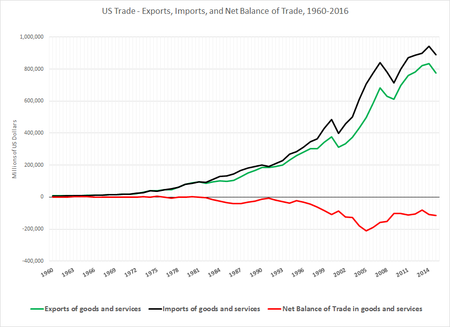
Offshoring and outsourcing have been factors in creating industrial wastelands and hollowed out production in the US – areas where you can drive for miles through abandoned buildings and decaying business centers. At the same time, offshoring and outsourcing bring low-cost electronics and other products to US consumers.
It is a Faustian bargain. If you were a wage-earner with a high school education (or less), supporting a family working in the “fast food sector” or convenience store, maybe holding two jobs to patch together enough income for bills – what you got was a $500 big screen TV and all sorts of gadgets for your kids. You could buy a cheap computer, and cheap clothing, too. Credit cards are available, although less so after 2008.
Oh yeah, another place you could work is in a Big Box store, whose long aisles and vanishing sakes clerks serve as the terminus of global supply chains coursing through ports on the West and East coasts. These are the ports where box-car size containers from China and elsewhere are unloaded, and put on rail cars or moved by truck to stores where consumers can purchase the goods packed in these containers largely on credit.
Is it even possible to slow, stop, or reverse this dynamic?
Let’s see, the plan for bringing manufacturing back to the United States involves deregulation of business, making doing business in the US more profitable. One idea that has been floated is that deregulation would provide incentives for US business to repatriate all that money they are holding overseas back to the US, where it could be invested in America.
Before taking office, President-elect Trump earned points with his supporters by “jawboning” US and foreign companies to keep jobs here, threatening taxes or fees for re-importing stuff to the US from newly relocated operations.
But most of the returning manufacturing would be highly capital intensive (think”robots”) so that only a few more jobs could be garnered from this re-investment in America, right?
Well, before dismissing the idea, note that some of these new jobs would be good-paying, probably requiring higher skills to run more automated production processes.
But this is a different game – producing in the United States, discouraging companies to move operations abroad to lower cost environments, placing taxes, fees, or tariffs on goods manufactured abroad coming into the US. This also involves higher prices.
There is another thread, though, to do with the impact of “deregulation” on the US oil and gas industry, aka “fracking.”
When American ingenuity developed hydraulic fracturing technology (“fracking”) to tap lower yield oil and gas reserves in areas of Texas, South Dakota, and elsewhere, US oil and gas production surged almost to the point of self-sufficiency. But then the Saudi’s lowered the boom, and oil prices dropped, making the higher cost US wells unprofitable, and slowing their expansion.
Before that happened, however, it was apparent fracking in the West and the older oil fields of the Eastern US energized activity up the supply chain, drawing forth significant manufacturing of pipes and equipment. The proverbial boom towns cropped up in the Dakotas and Texas, where hours of work could be long, and pay was good.
Clearly, as oil prices rise again with various global geopolitical instabilities, the US oil and gas industry can rise again, create large numbers of jobs and, also, significant environmental degradation – unless done with high standards for controlling wastes and methane emissions.
But Mr. Trump nominated the former Oklahoma Attorney General to head the US Environmental Protection Agency (EPA) – an agency which Mr. Trump vowed at one point in the campaign to eliminate and which his nominee Scott Pruitt fought tooth and nail in the courts.
So, concern with the environment to the winds, there is a case for a Trump “boom” in 2017 and 2018 – if global oil prices can stay above the breakeven point for US oil and gas production.
Another thread or storyline ties in here – deportations and stronger controls over illegal immigration.
Again, we have to consider how things are actually made, and we see that, as Anthony Bourdain has noted, many of the restaurant jobs in New York City and other big cities – in the kitchen especially – are filled by new migrants, many not here legally.
Also, scores of construction jobs in the Rocky Mountain West are filled by Hispanic workers.
Pressure on these working populations to produce their papers can only lead to higher wages and costs, which will be passed along to consumers.
And don’t forget President Trump’s promise to restore US military preparedness. As “cost-plus” contracts, US defense production acts as a conduit for price increases, and may be overpriced (the alternative being to let potential enemies manufacture US weapons).
So what this thought experiment suggests is that, initially, jobs in the Trump era may be boosted by captive or returning manufacturing operations and resumption of the US oil and gas boom – but be accompanied by higher prices. Higher prices also are thematic to limiting the labor pool in US industries, and the cost-overruns are endemic to US defense production.
This is not the end of the economics story, obviously.
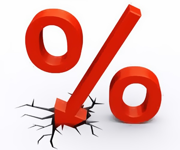
The next thing to consider is the US Federal Reserve Bank, which, under Chairman Yellen and other members of the Board of Governors is itching to increase interest rates, as the US economy recovers.
Witnessing a surge of employment from fracking jobs plus a smatter of repatriation of US manufacturing, and the associated higher prices involved with all of this, the Fed should have plenty of excuse to bring interest rates back to historic levels.
Will this truncate the Trump boom?
And what about international response to these developments in the United States?