All posts by Clive Jones

Links – mid-September

After highlighting billionaires by state, I focus on data analytics and marketing, and then IT in these links. Enjoy!

The Wealthiest Individual In Every State [Map]

wealthyindividuals

Data Analytics and Marketing

A Predictive Analytics Primer

Has your company, for example, developed a customer lifetime value (CLTV) measure? That’s using predictive analytics to determine how much a customer will buy from the company over time. Do you have a “next best offer” or product recommendation capability? That’s an analytical prediction of the product or service that your customer is most likely to buy next. Have you made a forecast of next quarter’s sales? Used digital marketing models to determine what ad to place on what publisher’s site? All of these are forms of predictive analytics.

Making sense of Google Analytics audience data

Earlier this year, Google added Demographics and Interest reports to the Audience section of Google Analytics (GA). Now not only can you see how many people are visiting your site, but how old they are, whether they’re male or female, what their interests are, and what they’re in the market for.

Data Visualization, Big Data, and the Quest for Better Decisions – a Synopsis

Simon uses Netflix as a prime example of a company that gets data and its use “to promote experimentation, discovery, and data-informed decision-making among its people.”….

They know a lot about their customers.

For example, the company knows how many people binge-watched the entire season four of Breaking Bad the day before season five came out (50,000 people). The company therefore can extrapolate viewing patterns for its original content produced to appeal to Breaking Bad fans. Moreover, Netflix markets the same show differently to different customers based on whether their viewing history suggests they like the director or one of the stars….

The crux of their analytics is the visualization of “what each streaming customer watches, when, and on what devices, but also at what points shows are paused and resumed (or not) and even the color schemes of the marketing graphics to which individuals respond.”

How to Market Test a New Idea

Formulate a hypothesis to be tested. Determine specific objectives for the test. Make a prediction, even if it is just a wild guess, as to what should happen. Then execute in a way that enables you to accurately measure your prediction…Then involve a dispassionate outsider in the process, ideally one who has learned through experience how to handle decisions with imperfect information…..Avoid considering an idea in isolation. In the absence of choice, you will almost always be able to develop a compelling argument about why to proceed with an innovation project. So instead of asking whether you should invest in a specific project, ask if you are more excited about investing in Project X versus other alternatives in your innovation portfolio…And finally, ensure there is some kind of constraint forcing a decision.

Information Technology (IT)

5 Reasons why Wireless Charging Never Caught on

Charger Bundling, Limited handsets, Time, Portability, and Standardisation – interesting case study topic for IT

Why Jimmy the Robot Means New Opportunities for IT

While Jimmy was created initially for kids, the platform is actually already evolving to be a training platform for everyone. There are two versions: one at $1,600, which really is more focused on kids, and one at $16,000, for folks like us who need a more industrial-grade solution. The Apple I wasn’t just for kids and neither is Jimmy. Consider at least monitoring this effort, if not embracing it, so when robots go vertical you have the skills to ride this wave and not be hit by it.

jimmy-the-robot

Beyond the Reality Distortion Field: A Sober Look at Apple Pay

.. Apple Pay could potentially kick-start the mobile payment business the way the iPod and iTunes launched mobile music 13 years ago. Once again, Apple is leveraging its powerful brand image to bring disparate companies together all in the name of consumer convenience.

From Dr. 4Ward How To Influence And Persuade (click to enlarge)

influence

Ebola and Data Analysis

Data analysis and predictive analytics can support national and international responses to ebola.

One of the primary ways at present is by verifying and extrapolating the currently exponential growth of ebola in affected areas – especially in Monrovia, the capital of Liberia, as well as Sierra Leone, Guinea, Nigeria, and the Democratic Republic of the Congo.

At this point, given data from the World Health Organization (WHO) and other agencies, predictive modeling can be as simple as in the following two charts, developed from the data compiled (and documented) in the Wikipedia site.

The first charts datapoints from the end of the months of May through August of this year.

Ebolacasesmodeling

The second chart extrapolates an exponential fit to these cases, shown in the lines in the above figure, by month through December 2014.

Ebolaprojections

So by the end of this year, if this epidemic courses unchecked, without the major public health investments necessary in terms of hospital beds, supplies, medical and supporting personnel, including military or police forces to maintain public order in some of the worst-hit areas – there will be nearly 80,000 cases and approximately 30,000 deaths, by this simple extrapolation.

A slightly more sophisticated analysis by Geert Barentsen, utilizing data within calendar months as well, concludes that currently Ebola cases have a doubling time of 29 days.

One possibly positive aspect of these projections is the death rate declines from around 60 to 40 percent, from May through December 2014.

However, if the epidemic continues through 2015 at this rate, the projections suggest there will be more than 300 million cases.

World Health Organization (WHO) estimates released the first week of September indicate nearly 2,400 deaths. Total numbers of cases from the same period in early September is 4,846. So the projections are on track so far.

And, if you wish, you can validate these crude data analytics with reference to modeling using the classic compartment approach and other more advanced setups. See, for example, Disease modelers project a rapidly rising toll from Ebola or the recent New York Times article.

Visual Analytics

There have been advanced modeling efforts at discovering the possibilities of transmission of Ebola through persons traveling by air to other affected areas.

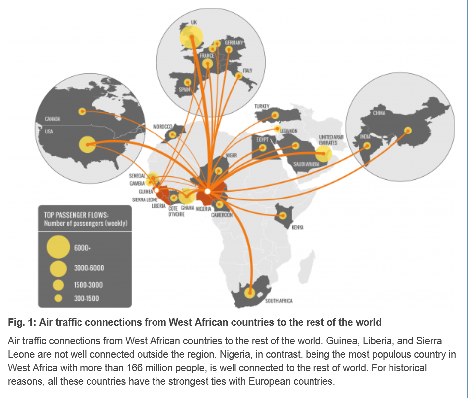
Here is a chart from Assessing the International Spreading Risk Associated with the 2014 West African Ebola Outbreak.

ebolaairroutes

As a data and forecasting analyst, I am not specially equipped to comment on the conditions which make transmission of this disease particularly dangerous. But I think, to some extent, it’s not rocket science.

Crowded conditions in many African cities, low educational attainment, poverty, poor medical infrastructure, rapid population growth – all these factors contribute to the high basic reproductive number of the disease in this outbreak. And, if the numbers of cases increase toward 100,000, the probability that some of the affected individuals will travel elsewhere grows, particularly when efforts to quarantine areas seem heavy-handed and, given little understanding of modern disease models in the affected populations, possibly suspicious.

There is a growing response from agencies and places as widely ranging as the Gates Foundation and Cuba, but what I read is that a military-type operation will be necessary to bring the epidemic under control. I suppose this means command-and-control centers must be established, set procedures must be implemented when cases are identified, adequate field hospitals need to be established, enough medical personnel must be deployed, and so forth. And if there are potential vaccines, these probably will be expensive to administer in early stages.

These thoughts are suggested by the numbers. So far, the numbers speak for themselves.

Ebola

Everyone should read the Op-Ed piece September 11 in the New York Times titled What We’re Afraid to Say About Ebola.

The author, Michael T. Osterholm, suggests two possibilities.

One is that Ebola travels to other large cities in the developing world, where poor sanitary and crowded conditions are common. This would be very bad.

The second possibility is that –

… an Ebola virus could mutate to become transmissible through the air. You can now get Ebola only through direct contact with bodily fluids. But viruses like Ebola are notoriously sloppy in replicating, meaning the virus entering one person may be genetically different from the virus entering the next. The current Ebola virus’s hyper-evolution is unprecedented; there has been more human-to-human transmission in the past four months than most likely occurred in the last 500 to 1,000 years. Each new infection represents trillions of throws of the genetic dice.

If certain mutations occurred, it would mean that just breathing would put one at risk of contracting Ebola. Infections could spread quickly to every part of the globe, as the H1N1 influenza virus did in 2009, after its birth in Mexico.

Why are public officials afraid to discuss this? They don’t want to be accused of screaming “Fire!” in a crowded theater — as I’m sure some will accuse me of doing. But the risk is real, and until we consider it, the world will not be prepared to do what is necessary to end the epidemic.

In 2012, a team of Canadian researchers proved that Ebola Zaire, the same virus that is causing the West Africa outbreak, could be transmitted by the respiratory route from pigs to monkeys, both of whose lungs are very similar to those of humans. Richard Preston’s 1994 best seller “The Hot Zone” chronicled a 1989 outbreak of a different strain, Ebola Reston virus, among monkeys at a quarantine station near Washington. The virus was transmitted through breathing, and the outbreak ended only when all the monkeys were euthanized. We must consider that such transmissions could happen between humans, if the virus mutates.

This would be a planetary threat, much like the huge flu epidemics.

Here is a recent BBC program with an hour length documentary and discussion of cures – which appear to exist at least in part.

Ebola The Search for a Cure BBC 2014

Priorities

I’ve got to say that this outbreak and its threatened spread to much wider populations in Africa and perhaps elsewhere – without much being done from the United States or from European countries (or Japan and China) highlights a huge problem with priorities.

The World Health Organization (WHO) has indicated that the actual numbers of infected persons and deaths are likely to be an order of magnitude larger than are reported. And the outbreak is by no means contained, but seems to be on the verge of causing complete social breakdown in some areas.

At some point, perhaps when the number of infected grows from maybe 20,000 to 200,000, people will have to wake up. President Obama has acknowledged that the real danger is mutation. The chances of mutation increase as the number of infected persons increases.

More on Negative Nominal Interest Rates

The European Central Bank (ECB) experiment with negative interest rates has not occurred in a vacuum. The concept has been discussed with special urgency since 2008 in academic and financial circles.

Recently, Larry Summers and Paul Krugman have developed perspectives on the desirability of busting through the zero bound on interest rates to help balance aggregate demand and supply at something like full employment.

Then, there is Ken Rogoff’s Costs and Benefits to Phasing Out Paper Currency, distributed by the National Bureau of Economic Research (NBER).

Rogoff notes,

If all central bank liabilities were electronic, paying a negative interest on reserves (basically charging a fee) would be trivial. But as long as central banks stand ready to convert electronic deposits to zero-interest paper currency in unlimited amounts, it suddenly becomes very hard to push interest rates below levels of, say, -0.25 to -0.50 percent, certainly not on a sustained basis. Hoarding cash may be inconvenient and risky, but if rates become too negative, it becomes worth it.

Rogoff cites Buiter’s research at the London School of Economics (LSE) which dates to a decade earler, but has been significantly revised in the 2009-10 timeframe.

For example, there is Negative Nominal Interest Rates: Three ways to overcome the zero lower bound, which sports the following abstract:

The paper considers three methods for eliminating the zero lower bound on nominal interest rates and thus for restoring symmetry to domain over which the central bank can vary its policy rate. They are: (1) abolishing currency (which would also be a useful crime-fighting measure); (2) paying negative interest on currency by taxing currency; and (3) decoupling the numéraire from the currency/medium of exchange/means of payment and introducing an exchange rate between the numéraire and the currency which can be set to achieve a forward discount (expected depreciation) of the currency vis-a-vis the numéraire when the nominal interest rate in terms of the numéraire is set at a negative level for monetary policy purposes.

Buiter notes the “scrip” money developed locally during the Great Depression (also see Champ) effectively involved a tax on holding this type of currency.

Stamp scrip, sometimes called coupon scrip, arose in several communities. It was denominated in dollars, in denominations from 25 cents to $5, with $1 denominations most common. Stamp scrip often became redeemable by the issuer in official U.S. dollars after one year.

What made stamp scrip unique among scrip schemes was a series of boxes on the reverse side of the note. Stamp scrip took two basic forms—dated and undated (often called “transaction stamp scrip”). Typically, 52 boxes appeared on the back of dated stamp scrip, one for each week of the year. In order to spend the dated scrip, the stamps on the back had to be current. Each week, a two-cent stamp needed to be purchased from the issuer and affixed over the corresponding week’s box on the back of the scrip. Over the coming week, the scrip could be spent freely within the community. Whoever was caught holding the scrip at week’s end was required to attach a new stamp before spending the scrip. In this scheme, money became a hot potato, with individuals passing it quickly to avoid having to pay for the next stamp.

Among the virtues of eliminating paper currency and going entirely to electronic transactions, thus, would be that the central bank could charge a negative interest rate.

Additionally, by eliminating the anonymity of paper money and coin, criminal activities could be more effectively controlled. Rogoff offers calculations suggesting the percentages of US currency held in Europe in ratio to overall economic activity are suspicious, especially since there are apparently a surfeit of 100 dollar bills in these foreign holdings.

These ideas go considerably beyond the small negative interest charged by the ECB on banks holding excess reserves in the central bank accounts. What is being discussed is an extension of negative nominal interest, or a tax on holding cash, to all business agents and individuals in an economy.

Europe, the European Union, the Eurozone – Key Facts and Salient Issues

Considering that social and systems analysis originated largely in Europe (Machiavelli, Vico, Max Weber, Emile Durkheim, Walras, Adam Smith and the English school of political economics, and so forth), it’s not surprising that any deep analysis of the current European situation is almost alarmingly complex, reticulate, and full of nuance.

However, numbers speak for themselves, to an extent, and I want to start with some basic facts about geography, institutions, and economy.

Then, I’d like to precis the current problem from an economic perspective, leaving the Ukraine conflict and its potential for destabilizing things for a later post.

Some Basic Facts About Europe and Its Institutions

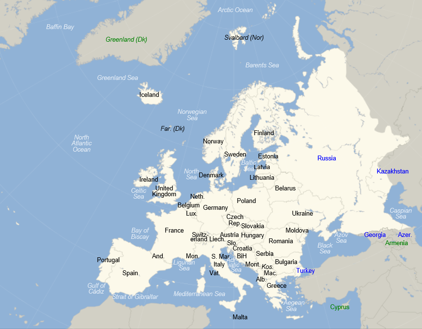
But some basic facts, for orientation. The 2013 population of Europe, shown in the following map, is estimated at just above 740 million persons. This makes Europe a little over 10 percent of total global population.
europe

The European Union (EU) includes 28 countries, as follows with their date of entry in parenthesis:

Austria (1995), Belgium (1952), Bulgaria (2007), Croatia (2013), Cyprus (2004), Czech Republic (2004), Denmark (1973), Estonia (2004), Finland (1995), France (1952), Germany (1952), Greece (1981), Hungary (2004), Ireland (1973), Italy (1952), Latvia (2004), Lithuania (2004), Luxembourg (1952), Malta (2004), Netherlands (1952), Poland (2004), Portugal (1986), Romania (2007), Slovakia (2004), Slovenia (2004), Spain (1986), Sweden (1995), United Kingdom (1973).

The EU site states that –

The single or ‘internal’ market is the EU’s main economic engine, enabling most goods, services, money and people to move freely. Another key objective is to develop this huge resource to ensure that Europeans can draw the maximum benefit from it.

There also are governing bodies which are headquartered for the most part in Brussels and administrative structures.

The Eurozone consists of 18 European Union countries which have adopted the euro as their common currency. These countries includes Belgium, Germany, Estonia, Ireland, Greece, Spain, France, Italy, Cyprus, Latvia, Luxembourg, Malta, the Netherlands, Austria, Portugal, Slovenia, Slovakia and Finland.

The European Central Bank (ECB) is located in Frankfurt, Germany and performs a number of central bank functions, but does not clearly state its mandate on its website, so far as I can discover. The ECB has a governing council comprised of representatives from Eurozone banking and finance circles.

Economic Significance of Europe

Something like 160 out of the Global 500 Corporations identified by Fortune magazine are headquartered in Europe – and, of course, tax slides are moving more and more US companies to nominally move their operations to Europe.

According to the International Monetary Fund World Economic Outlook (July 14, 2013 update), the Eurozone accounts for an estimated 17 percent of global output, while the European Union countries comprise an estimated 24 percent of global output. By comparison the US accounts for 23 percent of global output, where all these percents are measured in terms of output in current US dollar equivalents.

What is the Problem?

I began engaging with Europe and its economic setup professionally, some years ago. The European market is important to information technology (IT) companies. Europe was a focus for me in 2008 and through the so-called Great Recession, when sharp drops in output occurred on both sides of the Atlantic. Then, after 2009 for several years, the impact of the global downturn continued to be felt in Europe, especially in the Eurozone, where there was alarm about the possible breakup of the Eurozone, defaults on sovereign debt, and massive banking failure.

I have written dozens of pages on European economic issues for circulation in business contexts. It’s hard to distill all this into a more current perspective, but I think the Greek economist Yanis Varoufakis does a fairly good job.

Let me cite two posts – WHY IS EUROPE NOT ‘COMING TOGETHER’ IN RESPONSE TO THE EURO CRISIS? and MODEST PROPOSAL.

The first quote highlights the problems (and lure) of a common currency to a weaker economy, such as Greece.

Right from the beginning, the original signatories of the Treaty of Rome, the founding members of the European Economic Community, constituted an asymmetrical free trade zone….

To see the significance of this asymmetry, take as an example two countries, Germany and Greece today (or Italy back in the 1950s). Germany, features large oligopolistic manufacturing sectors that produce high-end consumption as well as capital goods, with significant economies of scale and large excess capacity which makes it hard for foreign competitors to enter its markets. The other, Greece for instance, produces next to no capital goods, is populated by a myriad tiny firms with low price-cost margins, and its industry has no capacity to deter competitors from entering.

By definition, a country like Germany can simply not generate enough domestic demand to absorb the products its capital intensive industry can produce and must, thus, export them to the country with the lower capital intensity that cannot produce these goods competitively. This causes a chronic trade surplus in Germany and a chronic trade deficit in Greece.

If the exchange rate is flexible, it will inevitably adjust, constantly devaluing the currency of the country with the lower price-cost margins and revaluing that of the more capital-intensive economy. But this is a problem for the elites of both nations. Germany’s industry is hampered by uncertainty regarding how many DMs it will receive for a BMW produced today and destined to be sold in Greece in, say, ten months. Similarly, the Greek elites are worried by the devaluation of the drachma because, every time the drachma devalues, their lovely homes in the Northern Suburbs of Athens, or indeed their yachts and other assets, lose value relative to similar assets in London and Paris (which is where they like to spend their excess cash). Additionally, Greek workers despise devaluation because it eats into every small pay rise they manage to extract from their employers. This explains the great lure of a common currency to Greeks and to Germans, to capitalists and labourers alike. It is why, despite the obvious pitfalls of the euro, whole nations are drawn to it like moths to the flame.

So there is a problem within the Eurozone of “recycling trade surpluses” basically from Germany and the stronger members to peripheral countries such as Greece, Portugal, Ireland, and even Spain – where Italy is almost a special, but very concerning case.

The next quote is from a section in MODEST PROPOSAL called “The Nature of the Eurozone Crisis.” It is is about as succinct an overview of the problem as I know of – without being excessively ideological.

The Eurozone crisis is unfolding on four interrelated domains.

Banking crisis: There is a common global banking crisis, which was sparked off mainly by the catastrophe in American finance. But the Eurozone has proved uniquely unable to cope with the disaster, and this is a problem of structure and governance. The Eurozone features a central bank with no government, and national governments with no supportive central bank, arrayed against a global network of mega-banks they cannot possibly supervise. Europe’s response has been to propose a full Banking Union – a bold measure in principle but one that threatens both delay and diversion from actions that are needed immediately.

Debt crisis: The credit crunch of 2008 revealed the Eurozone’s principle of perfectly separable public debts to be unworkable. Forced to create a bailout fund that did not violate the no-bailout clauses of the ECB charter and Lisbon Treaty, Europe created the temporary European Financial Stability Facility (EFSF) and then the permanent European Stability Mechanism (ESM). The creation of these new institutions met the immediate funding needs of several member-states, but retained the flawed principle of separable public debts and so could not contain the crisis. One sovereign state, Cyprus, has now de facto gone bankrupt, imposing capital controls even while remaining inside the euro.

During the summer of 2012, the ECB came up with another approach: the Outright Monetary Transactions’ Programme (OMT). OMT succeeded in calming the bond markets for a while. But it too fails as a solution to the crisis, because it is based on a threat against bond markets that cannot remain credible over time.

And while it puts the public debt crisis on hold, it fails to reverse it; ECB bond purchases cannot restore the lending power of failed markets or the borrowing power of failing governments.

Investment crisis: Lack of investment in Europe threatens its living standards and its international competitiveness. As Germany alone ran large surpluses after 2000, the resulting trade imbalances ensured that when crisis hit in 2008, the deficit zones would collapse. And the burden of adjustment fell exactly on the deficit zones, which could not bear it. Nor could it be offset by devaluation or new public spending, so the scene was set for disinvestment in the regions that needed investment the most.

Thus, Europe ended up with both low total investment and an even more uneven distribution of that investment between its surplus and deficit regions.

Social crisis: Three years of harsh austerity have taken their toll on Europe’s peoples. From Athens to Dublin and from Lisbon to Eastern Germany, millions of Europeans have lost access to basic goods and dignity. Unemployment is rampant. Homelessness and hunger are rising. Pensions have been cut; taxes on necessities meanwhile continue to rise. For the first time in two generations, Europeans are questioning the European project, while nationalism, and even Nazi parties, are gaining strength.

This is from a white paper jointly authored by Yanis Varoufakis, Stuart Holland and James K. Galbraith which offers a rationale and proposal for a European “New Deal.” In other words, take advantage of the record low global interest rates and build infrastructure.

The passage covers quite a bit of ground without appearing to be comprehensive. However, it will be be a good guide to check, I think, if a significant downturn unfolds in the next few quarters. Some of the nuances will come to life, as flaws in original band-aid solutions get painfully uncovered.

Now there is no avoiding some type of ideological or political stance in commenting on these issues, but the future is the real question. What will happen if a recession takes hold in the next few quarters?

More on European Banks

European banks have been significantly under-capitalized, as the following graphic from before the Great Recession highlights.
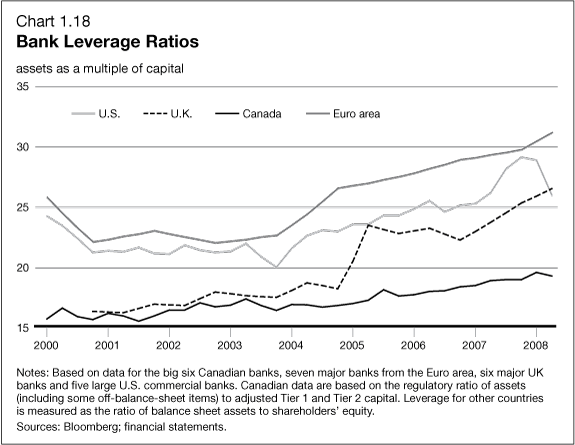
bankleverage

Another round of stress tests are underway by the ECB, and, according to the Wall Street Journal, will be shared with banks in coming weeks. Significant recapitalization of European banks, often through stock issues, has taken place. Things have moved forward from the point at which, last year, the US Federal Deposit Insurance Corporation (FDIC) Vice Chairman called Deutsche Banks capitalization ratios “horrible,” “horribly undercapitalized” and with “no margin of error.”

Bottom LIne

If a recession unfolds in the next few quarters, it is likely to significantly impact the European economy, opening up old wounds, so to speak, wounds covered with band-aid solutions. I know I have not proven this assertion in this post, but it is a message I want to convey.

The banking sector is probably where the problems will first flare up, since banks have significant holdings of sovereign debt from EU states that already are on the ropes – like Greece, Spain, Portugal, and Italy. There also appears to be some evidence of froth in some housing markets, with record low interest rates and the special conditions in the UK.

Hopefully, the global economy can side-step this current wobble from the first quarter 2014 and maybe even further in some quarters, and somehow sustain positive or at least zero growth for a few years.

Otherwise, this looks like a house of cards.

Negative Nominal Interest Rates – the European Central Bank Experiment

Larry Summers, former US Treasury Secretary and, earlier, President of Harvard delivered a curious speech at an IMF Economic Forum last year. After nice words about Stanley Fischer, currently Vice Chair of the Fed, Summers entertains the notion of negative interest rates to combat secular stagnation and restore balance between aggregate demand and supply at something like full employment.

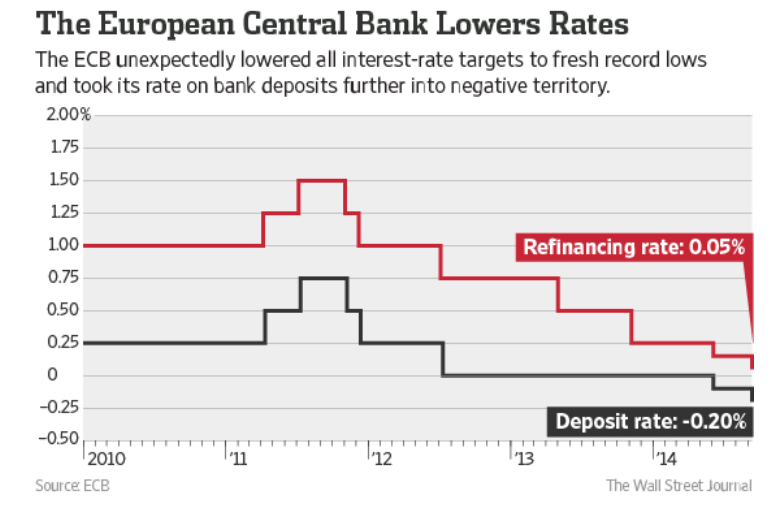
Fast forward to June 2014, when the European Central Bank (ECB) pushes the interest rate on deposits European banks hold in the ECB into negative territory. And on September 4, the ECB drops the deposit rates further to -0.2 percent, also reducing a refinancing rate to virtually zero.

ECBnegint

The ECB discusses this on its website – Why Has the ECB Introduced a Negative interest Rate. After highlighting the ECB mandate to ensure price stability by aiming for an inflation rate of below but close to 2% over the medium term, the website observes euro area inflation is expected to remain considerably below 2% for a prolonged period.

This provides a rationale for lower interest rates, of which there are principally three under ECB control – a marginal lending facility for overnight lending to banks, the main refinancing operations and the deposit facility.

Note that the main refinancing rate is the rate at which banks can regularly borrow from the ECB while the deposit rate is the rate banks receive for funds parked at the central bank.

The ECB is adjusting interest rates under their control across the board, as suggested by the chart, but worries that to maintain a functioning money market in which commercial banks lend to each other, these rates cannot be too close to each other.

So, bottom line, the deposit rate was lowered to − 0.10 % in June to maintain this corridor, and then further as the refinancing rate was dropped to -.05 percent.

The hope is that lower refinancing rates will mean lower rates for customers for bank loans, while negative deposit rates will act as a disincentive for banks to simply park excess reserves in the ECB.

Nominal Versus Real Interest Rates and Bond Yields

If you want to prep for, say, negative yields on two year Irish bonds, or issuance of various European bonds with negative yield, as well as the negative yields of a variety of US securities in recent years, after inflation, check out How Low Can You Go? Negative Interest Rates and Investors’ Flight to Safety.

An asset can generate a negative yield, on a conventional, rather than catastrophic basis, in a nominal or real, which is to say, inflation-adjusted, sense.

Some examples of negative real interest rates of yields –

The yield to maturity on the 5-year Treasury note has been below 2 percent since July 2010, and the yield to maturity on the 10-year Treasury note has been below 2 percent since May 2012. Yet, looking forward, the Federal Open Market Committee in January 2012 announced an inflation target of 2 percent—implying an anticipated negative real yield over the life of the securities. Investors, facing uncertainty, appear willing to pay the U.S. government—when measured in real, ex post inflation-adjusted dollars—for the privilege of owning Treasury securities.

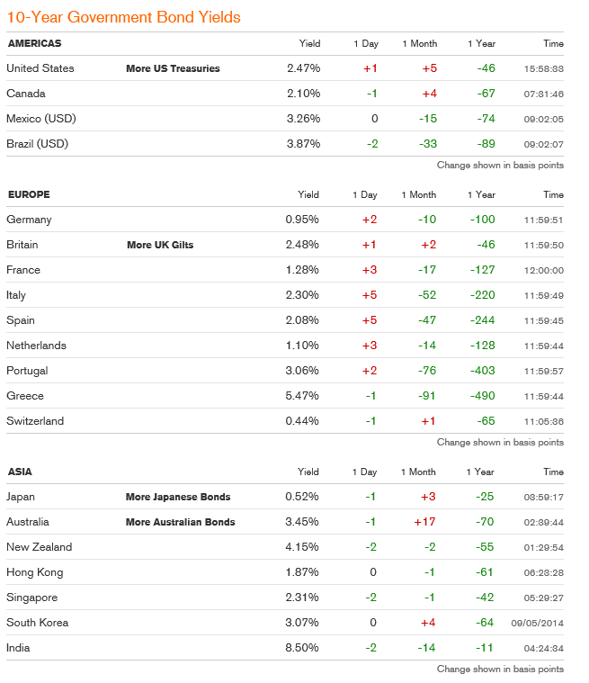
And the current government bond yield situation, from Bloomberg, shows important instances of negative yields, notably Germany and Japan – two of the largest global economies. Click to enlarge.

bondyields

Where the ECB Goes From Here

Mario Draghi, ECB head, gave a speech clearly stating monetary policy is not enough, at the recent Jackson Hole conference of central bankers. After this, the financial press was abuzz with the idea Draghi is moving toward the Japanese leader Abe’s formulation in which there are three weapons or arrows in the Japanese formulation– monetary policy, fiscal policy and structural reforms.

The problem, in the case of the Eurozone, is achieving political consensus for fiscal policies such as backing bonds for badly needed infrastructure development. German opposition seems to be sustained and powerful.

Because of the “political economy” factors , currency and banking problems in the Eurozone are probably more complicated and puzzling than many business executives and managers, looking for a take on the situation, would prefer.

A Thought Experiment

Before diving into this conceptually hazardous topic, though, I’d like to pose a puzzle for readers.

Can banks realistically “charge” negative interest rates to commercial customers?

I seem to have cooked up a spreadsheet where such loans could pay a rate of positive real return to banks, if the rate of deflation can be projected.  In one variant, the bank collects a lending fee at the outset and then the interest rate for installments is negative.

The “save” for banks is that future deflation could inflate the real value of declining nominal installment payments, creating a present value of this stream of payments which is greater than the simple sum of such payments.

I’m not ready for primetime television with this, but it seems such a world encapsulates a very dour view of the future – one that may not be too far from the actual situation in Europe and Japan.

Money black hole at top from Conservative Read

Something is Happening in Europe

Something is going on in Europe.

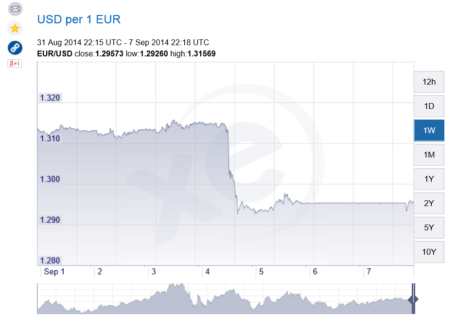
Take a look at this chart of the euro/dollar exchange rate, and how some event triggered a step down mid week of last week (from xe.com).

euroexchange

The event in question was a press conference by Mario Draghi (See the Wall Street Journal real time blog on this event at Mario Draghi Delivers Fresh ECB Plan — Recap).

The European Central Bank under Draghi is moving into exotic territory – trying negative interest rates on bank deposits and toying with variants of Quantitative Easing (QE) involving ABS – asset backed securities.

All because the basic numbers for major European economies, including notably Germany and France (as well as long-time problem countries such as Spain), are not good. Growth has stalled or is reversing, bank lending is falling, and deflation stalks the European markets.

Europe – which, of course, is sectored into the countries inside and outside the currency union, countries in the common market, and countries in none of the above – accounts for several hundred million persons and maybe 20-30 percent of global production.

So what happens there is significant.

Then there is the Ukraine crisis.

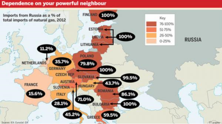
Zerohedge ran this graphic recently showing the dependence of European countries on gas from Russia.

eurdependence

The US-led program of imposing sanctions on Russia – key individuals, companies, banks perhaps – flies in the face of the physical dependence of Germany, for example, on Russian gas.

On the other hand, there is lots of history here on all sides, including, notably, the countries formerly in the USSR in eastern Europe, who no doubt fear the increasingly nationalistic or militant stance shown by Russia currently in, for example, re-acquiring Crimea.

As Chancellor Merkel has stressed, this is an area for diplomacy and negotiation – although there are other voices and forces ready to rush more weapons and even troops to the region of conflict.

Finally, as I have been stressing from time to time, there is an emerging demographic reality which many European nations have to confront.

Edward Hugh has several salient posts on possibly overlooked impacts of aging on the various macroeconomies involved.

There also is the vote on Scotland coming up in the United Kingdom (what we may, if the “yes” votes carry, need to start calling “the British Isles.”)

I’d like to keep current with the signals coming from Europe in a few blogs upcoming – to see, for example, whether swing events in the next six months to a year could originate there.

CO2 Concentrations Spiral Up, Global Temperature Stabilizes – Was Gibst?

Predicting global temperature is challenging. This is not only because climate and weather are complex, but because carbon dioxide (CO2) concentrations continue to skyrocket, while global temperature has stabilized since around 2000.

Changes in Global Mean Temperature

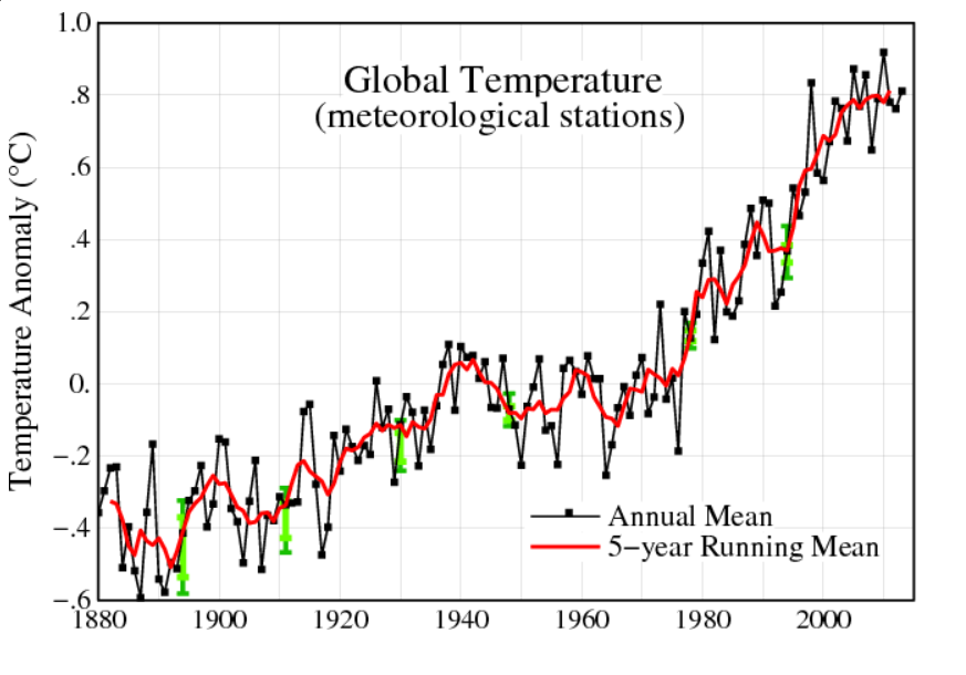
The NASA Goddard Institute for Space Studies maintains extensive and updated charts on global temperature.

globalmeantempdelta

The chart for changes annual mean global temperature is compiled from weather stations from around the planet.

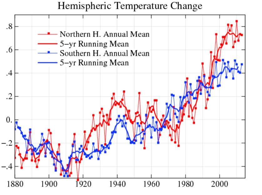
There is also hermispheric variation, with the northern hemisphere showing more increases than the southern hemisphere.

hemi

At the same time, observations of the annual change in mean temperature have stabilized since around 2000, as the five year moving averages show.

Atmospheric Carbon Dioxide Concentrations

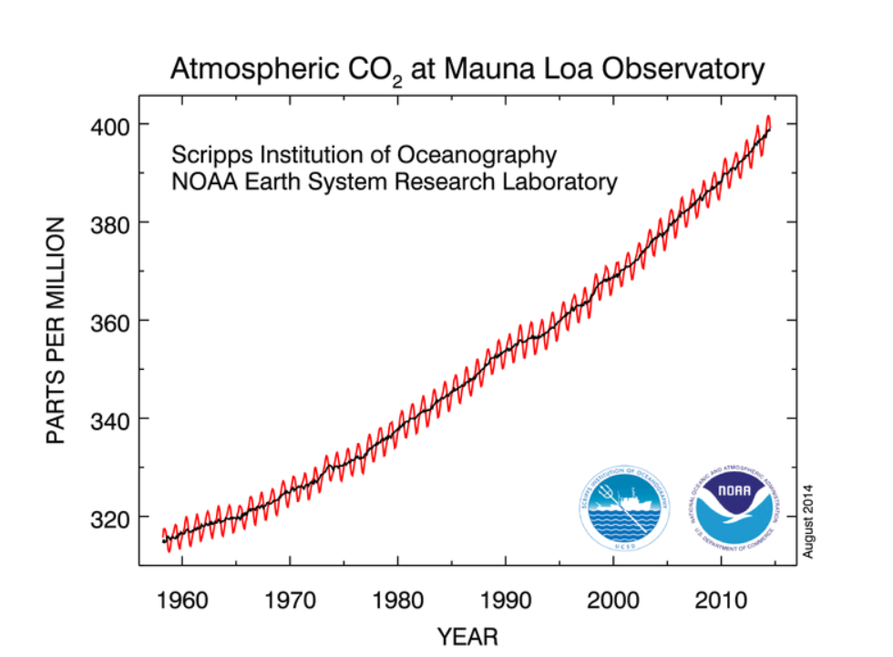
The National Oceanic and Atmospheric Administration (NOAA) maintains measurements of atmospheric carbon dioxide taken in Hawaii at Mauna Loa. These show continual increase since the measurements were first initiated in the late 1950’s.

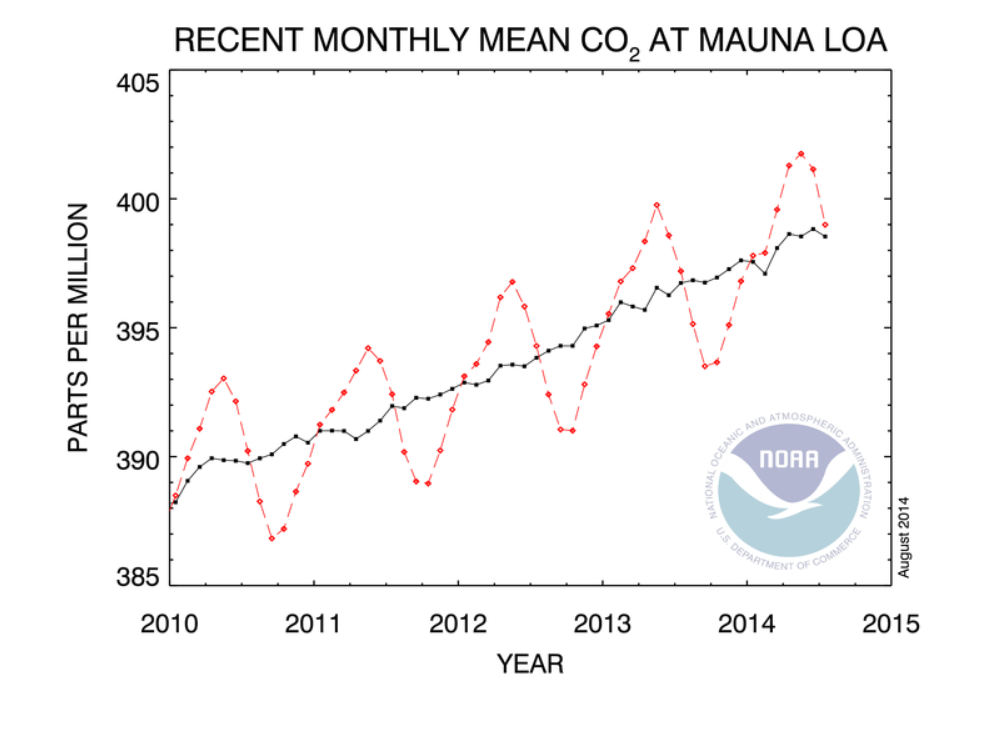
Here’s a chart showing recent monthly measurements, highlighting the consistent seasonal pattern and strong positive trend since 2010.

Maunaloa1

Here’s all the data. The black line in both charts represents the seasonally corrected trend.

Maunaloa2

A Forecasting Problem

This is a big problem for anyone interested in predicting the future trajectory of climate.

So, according to these measurements on Mauna Loa, carbon dioxide concentrations in the atmosphere have been increasing monotonically (with seasonal variation) since 1958, when measurements first began. Yet global temperatures have not increased on a clear trend since around 2000.

I want to comment in detail sometime on the forecasting controversies that have swirled around these types of measurements and their interpretation, but here let me just suggest the outlines of the problem.

So, it’s clear that the relationship between atmospheric CO2 concentrations and global temperature is not linear, or that there are major intervening variables. Cloud cover may increase with higher temperatures, due to more evaporation. The oceans are still warming, so maybe they are absorbing the additional heat. Perhaps there are other complex feedback processes involved.

However, if my reading of the IPCC literature is correct, these suggestions are still anecdotal, since the big systems models seem quite unable to account for this trajectory of temperature – or at least, recent data appear as outliers.

So there you have it. As noted in earlier posts here, global population is forecast to increase by perhaps one billion by 2030. Global output, even given uncertain impacts of coming recessions, may grow to $150 trillion dollars by 2030. Emissions of greenhouse gases, including but not limited to CO2 also will increase – especially given the paralyzing impacts of the current “pause in global warming” on coordinated policy responses. Deforestation is certainly a problem in this context, although we have not here reviewed the prospects.

One thing to note, however, is that the first two charts presented above trace out changes in global mean temperature by year. The actual level of global mean temperature surged through the 1990’s and remains high. That mean that ice caps are melting, and various processes related to higher temperatures are currently underway.

Climate Change by 2030

Is climate change real? Is it predictable? How much warming can we expect by 2020 and then by 2030 in a business as usual scenario? How bad can it get? What about mitigation? Is there any credibility to the loud protestations of the climate change deniers? What about the so-called hockey stick and the exchange of sinister emails?

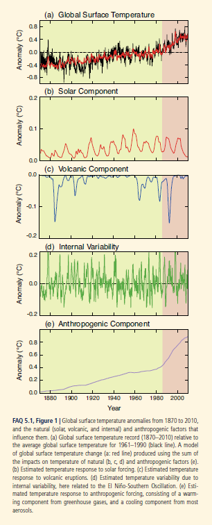
The Fifth Assessment Report of the Intergovernmental Panel on Climate Change (IPCC) addresses some of these questions. Its section The Physical Science Basis, which collates contributions of 250 scientists, contains this interesting graphic (click to enlarge) showing the upward trend in global temperature and the importance of the anthropogenic component, along with contributions from fluctuations in solar intensity and volcanic activity.

IPCCtemp

The Hockey Stick

Paleoclimate studies, also documented in this report, are the basis for the famous (notorious) hockey stick chart of long term global temperatures.

I was surprised to read, in catching up on this controversy, that the climate scientist Michael Mann who originated this chart has been totally vindicated (See The Hockey Stick: The Most Controversial Chart in Science, Explained).

Currently, scientific evidence suggests,

… present-day (2011) concentrations of the atmospheric greenhouse gases (GHGs) carbon dioxide (CO2), methane (CH4) and nitrous oxide (N2O) exceed the range of concentrations recorded in ice cores during the past 800,000 years. Past changes in atmospheric GHG concentrations can be determined with very high confidence1 from polar ice cores. Since AR4 these records have been extended from 650,000 years to 800,000 years ago.

The Drumbeat

In preparation for a September 23 summit, the UN has commissioned videos of weather forecasters supposedly announcing dire droughts, floods, and other weather catastrophes in 2050.

The IPCC also has videos. I include two – one on the physical science basis and the second on mitigation.

IPCC video 2013 –The Physical Science Basis

Climate summit 2014 – Mitigation

I personally am persuaded by the basic physics involved. As global GDP rises, so will energy consumption (although the details of this need to be examined carefully – conservation and change of technology can make big differences). In any case, more carbon dioxide and other similar gases will increase the greenhouse effect, raising global temperatures. It’s a good idea to call this climate change, rather than global warming, however, since volatility of weather patterns is a main result. There will be more climatic extremes, more droughts, but also more precipitation and flooding. Additionally, there could be changes in regional weather and climate patterns which could wreak havoc with the current distribution of population over geographic space. More rapid desertification is likely, and, of course, melting of glacial and polar ice will result in increases in sea level. And, as IPCC reports document, a lot of this is already happening.

There are, however, several problems that offer intellectual grounds for stalling the type of economic sacrifice that probably will be necessary to slow or reduce emissions.

First, there is the complexity of the evidence and argument, an issue flagged by Nate Silver recently. Secondly, there is the problem that, despite increases in greenhouse gas emissions after the turn of the century, there has been some leveling of global temperature increase, according to some metrics. Finally, there is the related problem of whether current climate models predict the recent past, whether they “retrodict.”

I’d like to address these issues or problems in a future post, along with my take on these projections or forecasts for 2020 and 2030.