Category Archives: multivariate modeling

CO2 Concentrations Spiral Up, Global Temperature Stabilizes – Was Gibst?

Predicting global temperature is challenging. This is not only because climate and weather are complex, but because carbon dioxide (CO2) concentrations continue to skyrocket, while global temperature has stabilized since around 2000.

Changes in Global Mean Temperature

The NASA Goddard Institute for Space Studies maintains extensive and updated charts on global temperature.

globalmeantempdelta

The chart for changes annual mean global temperature is compiled from weather stations from around the planet.

There is also hermispheric variation, with the northern hemisphere showing more increases than the southern hemisphere.

hemi

At the same time, observations of the annual change in mean temperature have stabilized since around 2000, as the five year moving averages show.

Atmospheric Carbon Dioxide Concentrations

The National Oceanic and Atmospheric Administration (NOAA) maintains measurements of atmospheric carbon dioxide taken in Hawaii at Mauna Loa. These show continual increase since the measurements were first initiated in the late 1950’s.

Here’s a chart showing recent monthly measurements, highlighting the consistent seasonal pattern and strong positive trend since 2010.

Maunaloa1

Here’s all the data. The black line in both charts represents the seasonally corrected trend.

Maunaloa2

A Forecasting Problem

This is a big problem for anyone interested in predicting the future trajectory of climate.

So, according to these measurements on Mauna Loa, carbon dioxide concentrations in the atmosphere have been increasing monotonically (with seasonal variation) since 1958, when measurements first began. Yet global temperatures have not increased on a clear trend since around 2000.

I want to comment in detail sometime on the forecasting controversies that have swirled around these types of measurements and their interpretation, but here let me just suggest the outlines of the problem.

So, it’s clear that the relationship between atmospheric CO2 concentrations and global temperature is not linear, or that there are major intervening variables. Cloud cover may increase with higher temperatures, due to more evaporation. The oceans are still warming, so maybe they are absorbing the additional heat. Perhaps there are other complex feedback processes involved.

However, if my reading of the IPCC literature is correct, these suggestions are still anecdotal, since the big systems models seem quite unable to account for this trajectory of temperature – or at least, recent data appear as outliers.

So there you have it. As noted in earlier posts here, global population is forecast to increase by perhaps one billion by 2030. Global output, even given uncertain impacts of coming recessions, may grow to $150 trillion dollars by 2030. Emissions of greenhouse gases, including but not limited to CO2 also will increase – especially given the paralyzing impacts of the current “pause in global warming” on coordinated policy responses. Deforestation is certainly a problem in this context, although we have not here reviewed the prospects.

One thing to note, however, is that the first two charts presented above trace out changes in global mean temperature by year. The actual level of global mean temperature surged through the 1990’s and remains high. That mean that ice caps are melting, and various processes related to higher temperatures are currently underway.

First Cut Modeling – All Possible Regressions

If you can, form the regression

Y = β0+ β1X1+ β2X2+…+ βNXN

where Y is the target variable and the N variagles Xi are the predictors which have the highest correlations with the target variables, based on some cutoff value of the correlation, say +/- 0.3.

Of course, if the number of observations you have in the data are less than N, you can’t estimate this OLS regression. Some “many predictors” data shrinkage or dimension reduction technique is then necessary – and will be covered in subsequent posts.

So, for this discussion, assume you have enough data to estimate the above regression.

Chances are that the accompanying measures of significance of the coefficients βi – the t-statistics or standard errors – will indicate that only some of these betas are statistically significant.

And, if you poke around some, you probably will find that it is possible to add some of the predictors which showed low correlation with the target variable and have them be “statistically significant.”

So this is all very confusing. What to do?

Well, if the number of predictors is, say, on the order of 20, you can, with modern computing power, simply calculate all possible regressions with combinations of these 20 predictors. That turns out to be around 1 million regressions (210 – 1). And you can reduce this number by enforcing known constraints on the betas, e.g. increasing family income should be unambiguously related to the target variable and, so, if its sign in a regression is reversed, throw that regression out from consideration.

The statistical programming language R has packages set up to do all possible regressions. See, for example, Quick-R which offers this useful suggestion –

leapsBut what other metrics, besides R2, should be used to evaluate the possible regressions?

In-Sample Regression Metrics

I am not an authority on the Akaike Information Criterion (AIC) or the Bayesian Information Criterion (BIC), which, in addition, to good old R2, are leading in-sample metrics for regression adequacy.

With this disclaimer, here are a few points about the AIC and BIC.

AIC

So, as you can see, both the AIC and BIC are functions of the mean square error (MSE), as well as the number of predictors in the equation and the sample size. Both metrics essentially penalize models with a lot of explanatory variables, compared with other models that might perform similarly with fewer predictors.

  • There is something called the AIC-BIC dilemma. In a valuable reference on variable selection, Serena Ng writes that the AIC is understood to fall short when it comes to consistent model selection. Hyndman, in another must-read on this topic, writes that because of the heavier penalty, the model chosen by BIC is either the same as that chosen by AIC, or one with fewer terms.

Consistency in discussions of regression methods relates to the large sample properties of the metric or procedure in question. Basically, as the sample size n becomes indefinitely large (goes to infinity) consistent estimates or metrics converge to unbiased values. So the AIC is not in every case consistent, although I’ve read research which suggests that the problem only arises in very unusual setups.

  • In many applications, the AIC and BIC can both be minimum for a particular model, suggesting that this model should be given serious consideration.

Out-of-Sample Regression Metrics

I’m all about out-of-sample (OOS) metrics of adequacy of forecasting models.

It’s too easy to over-parameterize models and come up with good testing on in-sample data.

So I have been impressed with endorsements such as that of Hal Varian of cross-validation.

So, ideally, you partition the sample data into training and test samples. You estimate the predictive model on the training sample, and then calculate various metrics of adequacy on the test sample.

The problem is that often you can’t really afford to give up that much data to the test sample.

So cross-validation is one solution.

In k-fold cross validation, you partition the sample into k parts, estimating the designated regression on data from k-1 of those segments, and using the other or kth segment to test the model. Do this k times and then average or somehow collate the various error metrics. That’s the drill.,

Again, Quick-R suggests useful R code.

Hyndman also highlights a handy matrix formula to quickly compute the Leave Out One Cross Validation (LOOCV) metric.

LOOCV

LOOCV is not guaranteed to find the true model as the sample size increases, i.e. it is not consistent.

However, k-fold cross-validation can be consistent, if k increases with sample size.

Researchers recently have shown, however, that LOOCV can be consistent for the LASSO.

Selecting regression variables is, indeed, a big topic.

Coming posts will focus on the problem of “many predictors” when the set of predictors is greater in number than the set of observations on the relevant variables.

Top image from Washington Post

Predictive Models in Medicine and Health – Forecasting Epidemics

I’m interested in everything under the sun relating to forecasting – including sunspots (another future post). But the focus on medicine and health is special for me, since my closest companion, until her untimely death a few years ago, was a physician. So I pay particular attention to details on forecasting in medicine and health, with my conversations from the past somewhat in mind.

There is a major area which needs attention for any kind of completion of a first pass on this subject – forecasting epidemics.

Several major diseases ebb and flow according to a pattern many describe as an epidemic or outbreak – influenza being the most familiar to people in North America.

I’ve already posted on the controversy over Google flu trends, which still seems to be underperforming, judging from the 2013-2014 flu season numbers.

However, combining Google flu trends with other forecasting models, and, possibly, additional data, is reported to produce improved forecasts. In other words, there is information there.

In tropical areas, malaria and dengue fever, both carried by mosquitos, have seasonal patterns and time profiles that health authorities need to anticipate to stock supplies to keep fatalities lower and take other preparatory steps.

Early Warning Systems

The following slide from A Prototype Malaria Forecasting System illustrates the promise of early warning systems, keying off of weather and climatic predictions.

  malaria                     

There is a marked seasonal pattern, in other words, to malaria outbreaks, and this pattern is linked with developments in weather.

Researchers from the Howard Hughes Medical Institute, for example, recently demonstrated that temperatures in a large area of the tropical South Atlantic are directly correlated with the size of malaria outbreaks in India each year – lower sea surface temperatures led to changes in how the atmosphere over the ocean behaved and, over time, led to increased rainfall in India.

Another mosquito-borne disease claiming many thousands of lives each year is dengue fever.

And there is interesting, sophisticated research detailing the development of an early warning system for climate-sensitive disease risk from dengue epidemics in Brazil.

The following exhibits show the strong seasonality of dengue outbreaks, and a revealing mapping application, showing geographic location of high incidence areas.

dengue

This research used out-of-sample data to test the performance of the forecasting model.

The model was compared to a simple conceptual model of current practice, based on dengue cases three months previously. It was found that the developed model including climate, past dengue risk and observed and unobserved confounding factors, enhanced dengue predictions compared to model based on past dengue risk alone.

MERS

The latest global threat, of course, is MERS – or Middle East Respiratory Syndrome, which is a coronavirus, It’s transmission from source areas in Saudi Arabia is pointedly suggested by the following graphic.

MERS

The World Health Organization is, as yet, refusing to declare MERS a global health emergency. Instead, spokesmen for the organization say,

..that much of the recent surge in cases was from large outbreaks of MERS in hospitals in Saudi Arabia, where some emergency rooms are crowded and infection control and prevention are “sub-optimal.” The WHO group called for all hospitals to immediately strengthen infection prevention and control measures. Basic steps, such as washing hands and proper use of gloves and masks, would have an immediate impact on reducing the number of cases..

Millions of people, of course, will travel to Saudi Arabia for Ramadan in July and the hajj in October. Thirty percent of the cases so far diagnosed have resulted in fatalties.

Forecasting Housing Markets – 3

Maybe I jumped to conclusions yesterday. Maybe, in fact, a retrospective analysis of the collapse in US housing prices in the recent 2008-2010 recession has been accomplished – but by major metropolitan area.

The Yarui Li and David Leatham paper Forecasting Housing Prices: Dynamic Factor Model versus LBVAR Model focuses on out-of-sample forecasts for house price indices for 42 metropolitan areas. Forecast models are built with data from 1980:01 to 2007:12. These models – dynamic factor and Large-scale Bayesian Vector Autoregressive (LBVAR) models – are used to generate forecasts of the one- to twelve- months ahead price growth 2008:01 to 2010:12.

Judging from the graphics and other information, the dynamic factor model (DFM) produces impressive results.

For example, here are out-of-sample forecasts of the monthly growth of housing prices (click to enlarge).

DFMhousing

The house price indices for the 42 metropolitan areas are from the Office of Federal Housing Enterprise Oversight (OFEO). The data for macroeconomic indicators in the dynamic factor and VAR models are from the DRI/McGraw Hill Basic Economics Database provided by IHS Global Insight.

I have seen forecasting models using Internet search activity which purportedly capture turning points in housing price series, but this is something different.

The claim here is that calculating dynamic or generalized principal components of some 141 macroeconomic time series can lead to forecasting models which accurately capture fluctuations in cumulative growth rates of metropolitan house price indices over a forecasting horizon of up to 12 months.

That’s pretty startling, and I for one would like to see further output of such models by city.

But where is the publication of the final paper? The PDF file linked above was presented at the Agricultural & Applied Economics Association’s 2011 Annual Meeting in Pittsburgh, Pennsylvania, July, 2011. A search under both authors does not turn up a final publication in a refereed journal, but does indicate there is great interest in this research. The presentation paper thus is available from quite a number of different sources which obligingly archive it.

Yarui

Currently, the lead author, Yarui Li, Is a Decision Tech Analyst at JPMorgan Chase, according to LinkedIn, having received her PhD from Texas A&M University in 2013. The second author is Professor at Texas A&M, most recently publishing on VAR models applied to business failure in the US.

Dynamic Principal Components

It may be that dynamic principal components are the new ingredient accounting for an uncanny capability to identify turning points in these dynamic factor model forecasts.

The key research is associated with Forni and others, who originally documented dynamic factor models in the Review of Economics and Statistics in 2000. Subsequently, there have been two further publications by Forni on this topic:

Do financial variables help forecasting inflation and real activity in the euro area?

The Generalized Dynamic Factor Model, One Sided Estimation and Forecasting

Forni and associates present this method of dynamic prinicipal componets as an alternative to the Stock and Watson factor models based on many predictors – an alternative with superior forecasting performance.

Run-of-the-mill standard principal components are, according to Li and Leatham, based on contemporaneous covariances only. So they fail to exploit the potentially crucial information contained in the leading-lagging relations between the elements of the panel.

By contrast, the Forni dynamic component approach is used in this housing price study to

obtain estimates of common and idiosyncratic variance-covariance matrices at all leads and lags as inverse Fourier transforms of the corresponding estimated spectral density matrices, and thus overcome(s)[ing] the limitation of static PCA.

There is no question but that any further discussion of this technique must go into high mathematical dudgeon, so I leave that to another time, when I have had an opportunity to make computations of my own.

However, I will say that my explorations with forecasting principal components last year have led to me to wonder whether, in fact, it may be possible to pull out some turning points from factor models based on large panels of macroeconomic data.

Forecasting Housing Markets – 2

I am interested in business forecasting “stories.” For example, the glitch in Google’s flu forecasting program.

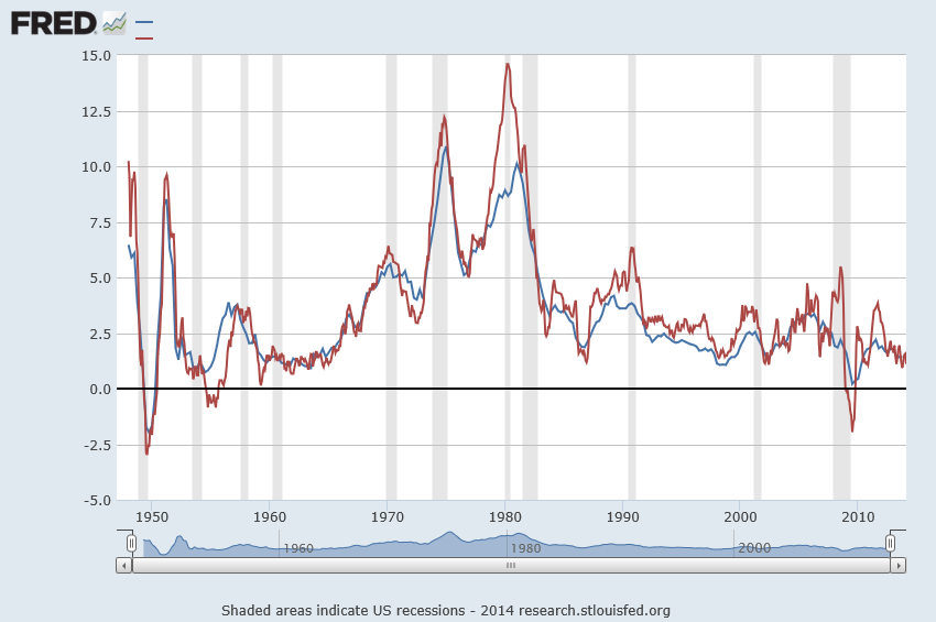
In real estate forecasting, the obvious thing is whether quantitative forecasting models can (or, better yet, did) forecast the collapse in housing prices and starts in the recent 2008-2010 recession (see graphics from the previous post).

There are several ways of going at this.

Who Saw The Housing Bubble Coming?

One is to look back to see whether anyone saw the bursting of the housing bubble coming and what forecasting models they were consulting.

That’s entertaining. Some people, like Ron Paul, and Nouriel Roubini, were prescient.

Roubini earned the soubriquet Dr. Doom for an early prediction of housing market collapse, as reported by the New York Times:

On Sept. 7, 2006, Nouriel Roubini, an economics professor at New York University, stood before an audience of economists at the International Monetary Fund and announced that a crisis was brewing. In the coming months and years, he warned, the United States was likely to face a once-in-a-lifetime housing bust, an oil shock, sharply declining consumer confidence and, ultimately, a deep recession. He laid out a bleak sequence of events: homeowners defaulting on mortgages, trillions of dollars of mortgage-backed securities unraveling worldwide and the global financial system shuddering to a halt. These developments, he went on, could cripple or destroy hedge funds, investment banks and other major financial institutions like Fannie Mae and Freddie Mac.

NR

Roubini was spot-on, of course, even though, at the time, jokes circulated such as “even a broken clock is right twice a day.” And my guess is his forecasting model, so to speak, is presented in Crisis Economics: A Crash Course in the Future of Finance, his 2010 book with Stephen Mihm. It is less a model than whole database of tendencies, institutional facts, areas in which Roubini correctly identifies moral hazard.

I think Ron Paul, whose projections of collapse came earlier (2003), was operating from some type of libertarian economic model.  So Paul testified before House Financial Services Committee on Fannie Mae and Freddy Mac, that –

Ironically, by transferring the risk of a widespread mortgage default, the government increases the likelihood of a painful crash in the housing market,” Paul predicted. “This is because the special privileges granted to Fannie and Freddie have distorted the housing market by allowing them to attract capital they could not attract under pure market conditions. As a result, capital is diverted from its most productive use into housing. This reduces the efficacy of the entire market and thus reduces the standard of living of all Americans.

On the other hand, there is Ben Bernanke, who in a CNBC interview in 2005 said:

7/1/05 – Interview on CNBC 

INTERVIEWER: Ben, there’s been a lot of talk about a housing bubble, particularly, you know [inaudible] from all sorts of places. Can you give us your view as to whether or not there is a housing bubble out there?

BERNANKE: Well, unquestionably, housing prices are up quite a bit; I think it’s important to note that fundamentals are also very strong. We’ve got a growing economy, jobs, incomes. We’ve got very low mortgage rates. We’ve got demographics supporting housing growth. We’ve got restricted supply in some places. So it’s certainly understandable that prices would go up some. I don’t know whether prices are exactly where they should be, but I think it’s fair to say that much of what’s happened is supported by the strength of the economy.

Bernanke was backed by one of the most far-reaching economic data collection and analysis operations in the United States, since he was in 2005 a member of the Board of Governors of the Federal Reserve System and Chairman of the President’s Council of Economic Advisors.

So that’s kind of how it is. Outsiders, like Roubini and perhaps Paul, make the correct call, but highly respected and well-placed insiders like Bernanke simply cannot interpret the data at their fingertips to suggest that a massive bubble was underway.

I think it is interesting currently that Roubini, in March, promoted the idea that Yellen Is Creating another huge Bubble in the Economy

But What Are the Quantitative Models For Forecasting the Housing Market?

In a long article in the New York Times in 2009, How Did Economists Get It So Wrong?, Paul Krugman lays the problem at the feet of the efficient market hypothesis –

When it comes to the all-too-human problem of recessions and depressions, economists need to abandon the neat but wrong solution of assuming that everyone is rational and markets work perfectly.

Along these lines, it is interesting that the Zillow home value forecast methodology builds on research which, in one set of models, assumes serial correlation and mean reversion to a long-term price trend.

Zillow

Key research in housing market dynamics includes Case and Shiller (1989) and Capozza et al (2004), who show that the housing market is not efficient and house prices exhibit strong serial correlation and mean reversion, where large market swings are usually followed by reversals to the unobserved fundamental price levels.

Based on the estimated model parameters, Capozza et al are able to reveal the housing market characteristics where serial correlation, mean reversion, and oscillatory, convergent, or divergent trends can be derived from the model parameters.

Here is an abstract from critical research underlying this approach done in 2004.

An Anatomy of Price Dynamics in Illiquid Markets: Analysis and Evidence from Local Housing Markets

This research analyzes the dynamic properties of the difference equation that arises when markets exhibit serial correlation and mean reversion. We identify the correlation and reversion parameters for which prices will overshoot equilibrium (“cycles”) and/or diverge permanently from equilibrium. We then estimate the serial correlation and mean reversion coefficients from a large panel data set of 62 metro areas from 1979 to 1995 conditional on a set of economic variables that proxy for information costs, supply costs and expectations. Serial correlation is higher in metro areas with higher real incomes, population growth and real construction costs. Mean reversion is greater in large metro areas and faster growing cities with lower construction costs. The average fitted values for mean reversion and serial correlation lie in the convergent oscillatory region, but specific observations fall in both the damped and oscillatory regions and in both the convergent and divergent regions. Thus, the dynamic properties of housing markets are specific to the given time and location being considered.

The article is not available for free download so far as I can determine. But it is based on earler research, dating back to the later 1990’s in the pdf The Dynamic Structure of Housing Markets.

The more recent Housing Market Dynamics: Evidence of Mean Reversion and Downward Rigidity by Fannie Mae researchers, lists a lot of relevant research on the serial correlation of housing prices, which is usually locality-dependent.

In fact, the Zillow forecasts are based on ensemble methods, combining univariate and multivariate models – a sign of modernity in the era of Big Data.

So far, though, I have not found a truly retrospective study of the housing market collapse, based on quantitative models. Perhaps that is because only the Roubini approach works with such complex global market phenomena.

We are left, thus, with solid theoretical foundations, validated by multiple housing databases over different time periods, that suggests that people invest in housing based on momentum factors – and that this fairly obvious observation can be shown statistically, too.

Inflation/Deflation – 3

Business forecasters often do not directly forecast inflation, but usually are consumers of inflation forecasts from specialized research organizations.

But there is a level of literacy that is good to achieve on the subject – something a quick study of recent, authoritative sources can convey.

A good place to start is the following chart of US Consumer Price Index (CPI) and the GDP price index, both expressed in terms of year-over-year (yoy) percentage changes. The source is the St. Louis Federal Reserve FRED data site.

InflationFRED

The immediate post-WW II period and the 1970;s and 1980’s saw surging inflation. Since somewhere in the 1980’s and certainly after the early 1990’s, inflation has been on a downward trend.

Some Stylized Facts About Forecasting Inflation

James Stock and Mark Watson wrote an influential NBER (National Bureau of Economic Research) paper in 2006 titled Why Has US Inflation Become Harder to Forecast.

These authors point out that the rate of price inflation in the United States has become both harder and easier to forecast, depending on one’s point of view.

On the one hand, inflation (along with many other macroeconomic time series) is much less volatile than it was in the 1970s or early 1980s, and the root mean squared error of naïve inflation forecasts has declined sharply since the mid-1980s. In this sense, inflation has become easier to forecast: the risk of inflation forecasts, as measured by mean squared forecast errors (MSFE), has fallen.

On the other hand, multivariate forecasting models inspired by economic theory – such as the Phillips curve –lose ground to univariate forecasting models after the middle 1980’s or early 1990’s. The Phillips curve, of course, postulates a tradeoff between inflation and economic activity and is typically parameterized in inflationary expectations and the gap between potential and actual GDP.

A more recent paper Forecasting Inflation evaluates sixteen inflation forecast models and some judgmental projections. Root mean square prediction errors (RMSE’s) are calculated in quasi-realtime recursive out-of-sample data – basically what I would call “backcasts.” In other words, the historic data is divided into training and test samples. The models are estimated on the various possible training samples (involving, in this case, consecutive data) and forecasts from these estimated models are matched against the out-of-sample or test data.

The study suggests four principles. 

  1. Subjective forecasts do the best
  2. Good forecasts must account for a slowly varying local mean.
  3. The Nowcast is important and typically utilizes different techniques than standard forecasting
  4.  Heavy shrinkage in the use of information improves inflation forecasts

Interestingly, this study finds that judgmental forecasts (private sector surveys and the Greenbook) are remarkably hard to beat. Otherwise, most of the forecasting models fail to consistently trump a “naïve forecast” which is the average inflation rate over four previous periods.

What This Means

I’m willing to offer interpretations of these findings in terms of (a) the resilience of random walk models, and (b) the eclipse of unionized labor in the US.

So forecasting inflation as an average of several previous values suggests the underlying stochastic process is some type of random walk. Thus, the optimal forecast for a simple random walk is the most currently observed value. The optimal forecast for a random walk with noise is an exponentially weighted average of the past values of the series.

The random walk is a recurring theme in many macroeconomic forecasting contexts. It’s hard to beat.

As far as the Phillips curve goes, it’s not clear to me that the same types of tradeoffs between inflation and unemployment exist in the contemporary US economy, as did, say, in the 1950’s or 1960’s. The difference, I would guess, is the lower membership in and weaker power of unions. After the 1980’s, things began to change significantly on the labor front. Companies exacted concessions from unions, holding out the risk that the manufacturing operation might be moved abroad to a lower wage area, for instance. And manufacturing employment, the core of the old union power, fell precipitously.

As far as the potency of subjective forecasts – I’ll let Faust and Wright handle that. While these researchers find what they call subjective forecasts beat almost all the formal modeling approaches, I’ve seen other evaluations calling into question whether any inflation forecast beats a random walk approach consistently. I’ll have to dig out the references to make this stick.

Forecasting the Price of Gold – 3

Ukraine developments and other counter-currents, such as Janet Yellen’s recent comments, highlight my final topic on gold price forecasting – multivariate gold price forecasting models.

On the one hand, there has been increasing uncertainty as a result of Ukrainian turmoil, counterbalanced today by the reaction to the seemingly hawkish comments by Chairperson Janet Yellen of the US Federal Reserve Bank.

SPYDRGold

Traditionally, gold is considered a hedge against uncertainty. Indulge your imagination and it’s not hard to conjure up scary scenarios in the Ukraine. On the other hand, some interpret Yellen as signaling an earlier move to moving the Federal funds rate off zero, increasing interest rates, and, in the eyes of the market, making gold more expensive to hold.

Multivariate Forecasting Models of Gold Price – Some Considerations

It’s this zoo of factors and influences that you have to enter, if you want to try to forecast the price of gold in the short or longer term.

Variables to consider include inflation, exchange rates, gold lease rates, interest rates, stock market levels and volatility, and political uncertainty.

A lot of effort has been devoted to proving or attempting to question that gold is a hedge against inflation.

The bottom line appears to be that gold prices rise with inflation – over a matter of decades, but in shorter time periods, intervening factors can drive the real price of gold substantially away from a constant relationship to the overall price level.

Real (and possibly nominal) interest rates are a significant influence on gold prices in shorter time periods, but this relationship is complex. My reading of the literature suggests a better understanding of the supply side of the picture is probably necessary to bring all this into focus.

The Goldman Sachs Global Economics Paper 183 – Forecasting Gold as a Commodity – focuses on the supply side with charts such as the following –

GSfigure1

The story here is that gold mine production responds to real interest rates, and thus the semi-periodic fluctuations in real interest rates are linked with a cycle of growth in gold production.

The Goldman Sachs Paper 183 suggests that higher real interest rates speed extraction, since the opportunity cost of leaving ore deposits in the ground increases. This is indeed the flip side of the negative impact of real interest rates on investment.

And, as noted in an earlier post,the Goldman Sachs forecast in 2010 proved prescient. Real interest rates have remained low since that time, and gold prices drifted down from higher levels at the end of the last decade.

Elasticities

Elasticities of response in a regression relationship show how percentage changes in the dependent variable – gold prices in this case – respond to percentage changes in, for example, the price level.

For gold to be an effective hedge against inflation, the elasticity of gold price with respect to changes in the price level should be approximately equal to 1.

This appears to be a credible elasticity for the United States, based on two studies conducted with different time spans of gold price data.

These studies are Gold as an Inflation Hedge? and the more recent Does Gold Act As An Inflation Hedge in the US and Japan. Also, a Gold Council report, Short-run and long-run determinants of the price of gold, develops a competent analysis.

These studies explore the cointegration of gold prices and inflation. Cointegration of unit root time series is an alternative to first differencing to reduce such time series to stationarity.

Thus, it’s not hard to show strong evidence that standard gold price series are one type or another of a random walk. Accordingly, straight-forward regression analysis of such series can easily lead to spurious correlation.

You might, for example, regress the price of gold onto some metric of the cumulative activity of an amoeba (characterized by Brownian motion) and come up with t-statistics that are, apparently, statistically significant. But that would, of course, be nonsense, and the relationship could evaporate with subsequent movements of either series.

So, the better research always gives consideration to the question of whether the variables in the models are, first of all, nonstationary OR whether there are cointegrated relationships.

While I am on the topic literature, I have to recommend looking at Theories of Gold Price Movements: Common Wisdom or Myths? This appears in the Wesleyan University Undergraduate Economic Review and makes for lively reading.

Thus, instead of viewing gold as a special asset, the authors suggest it is more reasonable to view gold as another currency, whose value is a reflection of the value of U.S. dollar.

The authors consider and reject a variety of hypotheses – such as the safe haven or consumer fear motivation to hold gold. They find a very significant relationship between the price movement of gold, real interest rates and the exchange rate, suggesting a close relationship between gold and the value of U.S. dollar. The multiple linear regressions verify these findings.

The Bottom Line

Over relatively long time periods – one to several decades – the price of gold moves more or less in concert with measures of the price level. In the shorter term, forecasting faces serious challenges, although there is a literature on the multivariate prediction of gold prices.

One prediction, however, seems reasonable on the basis of this review. Real interest rates should rise as the US Federal Reserve backs off from quantitative easing and other central banks around the world follow suit. Thus, increases in real interest rates seem likely at some point in the next few years. This seems to indicate that gold mining will strive to increase output, and perhaps that gold mining stocks might be a play.