All posts by Clive Jones

Future Scenarios

An item from ETF Daily News caught my eye. It’s a post from Tyler Durden Lord Rothschild Warns Investors: Geopolitical Situation Most Dangerous Since WWII.

Lord Rothschild is concerned about the growing military conflict in eastern Europe and the mid-east, deflation and economic challenge in Europe, stock market prices moving above valuations, zero interest rates, and other risk prospects.

Durden has access to some advisory document associated with Rothschild which features two interesting exhibits.

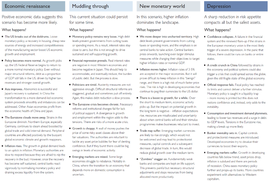
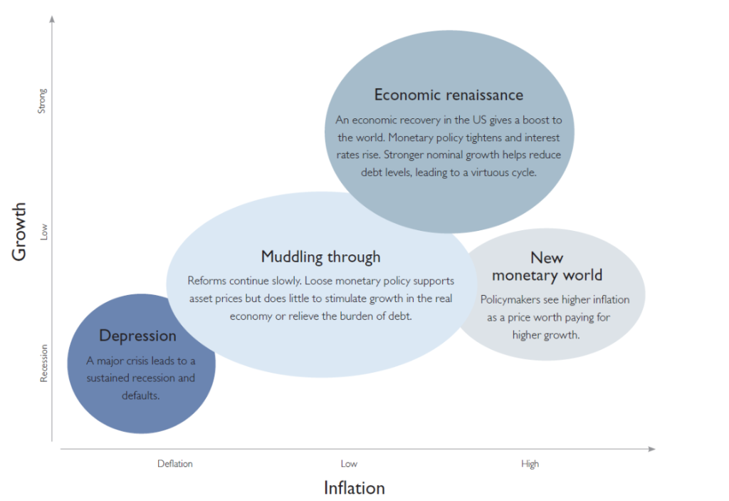
There is this interesting graphic highlighting four scenarios for the future.

R2

And there are details, as follows, for each scenario (click to enlarge).

RSheet

If I am not mistaken, these exhibits originate from last year at this time.

Think of them then as forecasts, and what has actually happened since they were released, as the actual trajectory of events.

For example, we have been in the “Muddling through” scenario. Monetary policy has remained “very loose,” and real interest rates have remained negative. We have even seen negative nominal interest rates being explored by, for example, the European Central Bank (ECB) – charging banks for maintaining excess reserves, rather than putting them into circulation. Emerging markets certainly are mixed, with confusing signals coming out of China. Growth has been choppy – witness quarterly GDP growth in the US recently – weak and then strong. And one could argue that stagnation has become more or less endemic in Europe with signs of real deflation.

It is useful to decode “structural reform” in the above exhibit. I believe this refers to eliminating protections and rules governing labor, I suppose, to follow a policy of general wage reduction in the idea that European production then could again become competitive with China.

One thing is clear to me pertaining to these scenarios. Infrastructure investment at virtually zero interest rates is no brainer in this economic context, especially for Europe. Also, there is quite a bit of infrastructure investment which can be justified as a response to, say, rising sea levels or other climate change prospects.

This looks to be on track to becoming a very challenging time. The uproar over Iranian nuclear ambitions is probably a sideshow compared to the emerging conflict between nuclear powers shaping up in the Ukraine. A fragile government in Pakistan, also, it must be remembered, has nuclear capability. For more on the growing nuclear threat, see the recent Economist article cited in Business Insider.

In terms of forecasting, the type of scenario formulation we see Rothschild doing is going to become a mainstay of our outlook for 2015-16. There are many balls in the air.

Time-Varying Coefficients and the Risk Environment for Investing

My research provides strong support for variation of key forecasting parameters over time, probably reflecting the underlying risk environment facing investors. This type of variation is suggested by Lo ( 2005).

So I find evidence for time varying coefficients for “proximity variables” that predict the high or low of a stock in a period, based on the spread between the opening price and the high or low price of the previous period.

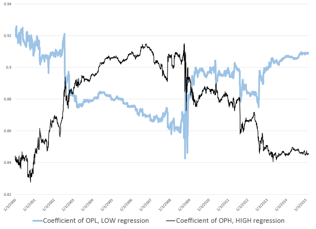
Figure 1 charts the coefficients associated with explanatory variables that I call OPHt and OPLt. These coefficients are estimated in rolling regressions estimated with five years of history on trading day data for the S&P 500 stock index. The chart is generated with more than 3000 separate regressions.

Here OPHt is the difference between the opening price and the high of the previous period, scaled by the high of the previous period. Similarly, OPLt is the difference between the opening price and the low of the previous period, scaled by the low of the previous period. Such rolling regressions sometimes are called “adaptive regressions.”

Figure 1 Evidence for Time Varying Coefficients – Estimated Coefficients of OPHt and OPLt Over Study Sample

TvaryCoeff

Note the abrupt changes in the values of the coefficients of OPHt and OPLt in 2008.

These plausibly reflect stock market volatility in the Great Recession. After 2010 the value of both coefficients tends to move back to levels seen at the beginning of the study period.

This suggests trajectories influenced by the general climate of risk for investors and their risk preferences.

I am increasingly convinced the influence of these so-called proximity variables is based on heuristics such as “buy when the opening price is greater than the previous period high” or “sell, if the opening price is lower than the previous period low.”

Recall, for example, that the coefficient of OPHt measures the influence of the spread between the opening price and the previous period high on the growth in the daily high price.

The trajectory, shown in the narrow, black line, trends up in the approach to 2007. This may reflect investors’ greater inclination to buy the underlying stocks, when the opening price is above the previous period high. But then the market experiences the crisis of 2008, and investors abruptly back off from their eagerness to respond to this “buy” signal. With onset of the Great Recession, investors become increasingly risk adverse to such “buy” signals, only starting to recover their nerve after 2013.

A parallel interpretation of the trajectory of the coefficient of OPLt can be developed based on developments 2008-2009.

Time variation of these coefficients also has implications for out-of-sample forecast errors.

Thus, late 2008, when values of the coefficients of both OPH and OPL make almost vertical movements in opposite directions, is the period of maximum out-of-sample forecast errors. Forecast errors for daily highs, for example, reach a maximum of 8 percent in October 2008. This can be compared with typical errors of less than 0.4 percent for out-of-sample forecasts of daily highs with the proximity variable regressions.

Heuristics

Finally, I recall a German forecasting expert discussing heuristics with an example from baseball. I will try to find his name and give him proper credit. By the idea is that an outfielder trying to catch a flyball does not run calculations involving mass, angle, velocity, acceleration, windspeed, and so forth. Instead, basically, an outfielder runs toward the flyball, keeping it at a constant angle in his vision, so that it falls then into his glove at the last second. If the ball starts descending in his vision, as he approaches it, it may fall on the ground before him. If it starts to float higher in his perspective as he runs to get under it, it may soar over him, landing further back int he field.

I wonder whether similar arguments can be advanced for the strategy of buying based or selling based on spreads between the opening price in a period and the high and low prices in a previous period.

How Did My Forecast of the SPY High and Low Issued January 22 Do?

A couple of months ago, I applied the stock market forecasting approach based on what I call “proximity variables” to forward-looking forecasts – as opposed to “backcasts” testing against history.

I’m surprised now that I look back at this, because I offered a forecast for 40 trading days (a little foolhardy?).

In any case, I offered forecasts for the high and low of the exchange traded fund SPY, as follows:

What about the coming period of 40 trading days, starting from this morning’s (January 22, 2015) opening price for the SPY – $203.99?

Well, subject to qualifications I will state further on here, my estimates suggest the high for the period will be in the range of $215 and the period low will be around $194. Cents attached to these forecasts would be, of course, largely spurious precision.

In my opinion, these predictions are solid enough to suggest that no stock market crash is in the cards over the next 40 trading days, nor will there be a huge correction. Things look to trade within a range not too distant from the current situation, with some likelihood of higher highs.

It sounds a little like weather forecasting.

Well, 27 trading days have transpired since January 22, 2015 – more than half the proposed 40 associated with the forecast.

How did I do?

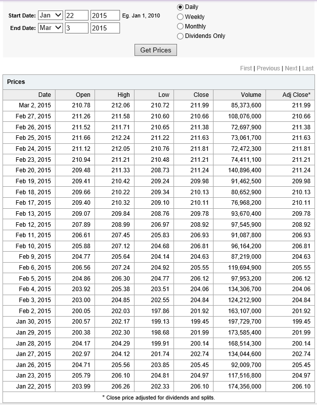
Here is a screenshot of the Yahoo Finance table showing opening, high, low, and closing prices since January 22, 2015.

SPYJan22etpassim

The bottom line – so far, so good. Neither the high nor low of any trading day has broached my proposed forecasts of $194 for the low and $215 for the high.

Now, I am pleased – a win just out of the gates with the new modeling approach.

However, I would caution readers seeking to use this for investment purposes. This approach recommends shorter term forecasts to focus in on the remaining days of the original forecast period. So, while I am encouraged the $215 high has not been broached, despite the hoopla about recent gains in the market, I don’t recommend taking $215 as an actual forecast at this point for the remaining 13 trading days – two or three weeks. Better forecasts are available from the model now.

“What are they?”

Well, there are a lot of moving parts in the computer programs to make these types of updates.

Still, it is interesting and relevant to forecasting practice – just how well do the models perform in real time?

So I am planning a new feature, a periodic update of stock market forecasts, with a look at how well these did. Give me a few days to get this up and running.

More on the “Efficiency” of US Stock Markets – Evidence from 1871 to 2003

In a pivotal article, Andrew Lo writes,

Many of the examples that behavioralists cite as violations of rationality that are inconsistent with market efficiency loss aversion, overconfidence, overreaction, mental accounting, and other behavioral biases are, in fact, consistent with an evolutionary model of individuals adapting to a changing environment via simple heuristics.

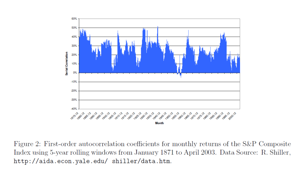
He also supplies an intriguing graph of the rolling first order autocorrelation of monthly returns of the S&P Composite Index from January 1971 to April 2003.

LoACchart

Lo notes the Random Walk Hypothesis implies that returns are serially uncorrelated, so the serial correlation coefficient ought to be zero – or at least, converging to zero over time as markets move into equilibrium.

However, the above chart shows this does not happen, although there are points in time when the first order serial correlation coefficient is small in magnitude, or even zero.

My point is that the first order serial correlation in daily returns for the S&P 500 is large enough for long enough periods to generate profits above a Buy-and-Hold strategy – that is, if one can negotiate the tricky milliseconds of trading at the end of each trading day.

The King Has No Clothes or Why There Is High Frequency Trading (HFT)

I often present at confabs where there are engineers with management or executive portfolios. You start the slides, but, beforehand, prepare for the tough question. Make sure the numbers in the tables add up and that round-off errors or simple typos do not creep in to mess things up.

To carry this on a bit, I recall a Hewlett Packard VP whose preoccupation during meetings was to fiddle with their calculator – which dates the story a little. In any case, the only thing that really interested them was to point out mistakes in the arithmetic. The idea is apparently that if you cannot do addition, why should anyone believe your more complex claims?

I’m bending this around to the theory of efficient markets and rational expectations, by the way.

And I’m playing the role of the engineer.

Rational Expectations

The theory of rational expectations dates at least to the work of Muth in the 1960’s, and is coupled with “efficient markets.”

Lim and Brooks explain market efficiency in – The Evolution of Stock Market Efficiency Over Time: A Survey of the Empirical Literature

The term ‘market efficiency’, formalized in the seminal review of Fama (1970), is generally referred to as the informational efficiency of financial markets which emphasizes the role of information in setting prices.. More specifically, the efficient markets hypothesis (EMH) defines an efficient market as one in which new information is quickly and correctly reflected in its current security price… the weak-form version….asserts that security prices fully reflect all information contained in the past price history of the market.

Lim and Brooks focus, among other things, on statistical tests for random walks in financial time series, noting this type of research is giving way to approaches highlighting adaptive expectations.

Proof US Stock Markets Are Not Efficient (or Maybe That HFT Saves the Concept)

I like to read mathematically grounded research, so I have looked a lot of the papers purporting to show that the hypothesis that stock prices are random walks cannot be rejected statistically.

But really there is a simple constructive proof that this literature is almost certainly wrong.

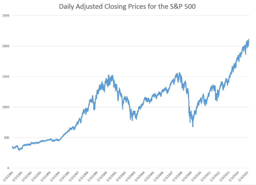
STEP 1: Grab the data. Download daily adjusted closing prices for the S&P 500 from some free site (e,g, Yahoo Finance). I did this again recently, collecting data back to 1990. Adjusted closing prices, of course, are based on closing prices for the trading day, adjusted for dividends and stock splits. Oh yeah, you may have to resort the data from oldest to newest, since a lot of sites present the newest data on top, originally.

Here’s a graph of the data, which should be very familiar by now.
adjCLPS&P

STEP 2: Create the relevant data structure. In the same spreadsheet, compute the trading-day-over-treading day growth in the adjusted closing price (ACP). Then, side-by-side with this growth rate of the ACP, create another series which, except for the first value, maps the growth in ACP for the previous trading day onto the growth of the ACP for any particular day. That gives you two columns of new data.

STEP 3: Run adaptive regressions. Most spreadsheet programs include an ordinary least squares (OLS) regression routine. Certainly, Excel does. In any case, you want to setup up a regression to predict the growth in the ACP, based on one trading lags in the growth of the ACP.

I did this, initially, to predict the growth in ACP for January 3, 2000, based on data extending back to January 3, 1990 – a total of 2528 trading days. Then, I estimated regressions going down for later dates with the same size time window of 2528 trading days.

The resulting “predictions” for the growth in ACP are out-of-sample, in the sense that each prediction stands outside the sample of historic data used to develop the regression parameters used to forecast it.

It needs to be said that these predictions for the growth of the adjusted closing price (ACP) are marginal, correctly predicting the sign of the ACP only about 53 percent of the time.

An interesting question, though, is whether these just barely predictive forecasts can be deployed in a successful trading model. Would a trading algorithm based on this autoregressive relationship beat the proverbial “buy-and-hold?”

So, for example, suppose we imagine that we can trade at closing each trading day, close enough to the actual closing prices.

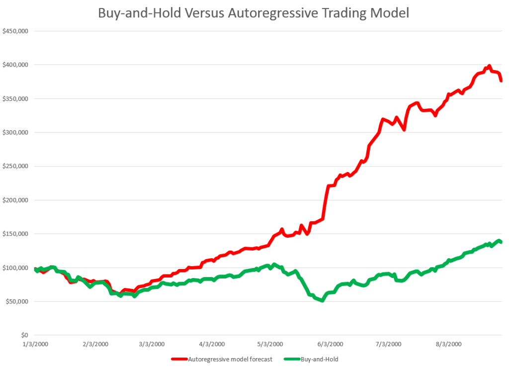
Then, you get something like this, if you invest $100,000 at the beginning of 2000, and trade through last week. If the predicted growth in the ACP is positive, you buy at the previous day’s close. If not, you sell at the previous day’s close. For the Buy-and-Hold portfolio, you just invest the $100,000 January 3, 2000, and travel to Tahiti for 15 years or so.
BandHversusAR

So, as should be no surprise, the Buy-and-Hold strategy results in replicating the S&P 500 Index on a $100,000 base.

The trading strategy based on the simple first order autoregressive model, on the other hand, achieves more than twice these cumulative earnings.

Now I suppose you could say that all this was an accident, or that it was purely a matter of chance, distributed over more than 3,810 trading days. But I doubt it. After all, this trading interval 2000-2015 includes the worst economic crisis since before World War II.

Or you might claim that the profits from the simple AR trading strategy would be eaten up by transactions fees and taxes. On this point, there were 1,774 trades, for an average of $163 per trade. So, worst case, if trading costs $10 a transaction, and there is a tax rate of 40 percent, that leaves $156K over these 14-15 years in terms of take-away profit, or about $10,000 a year.

Where This May Go Wrong

This does sound like a paen to stock market investing – even “day-trading.”

What could go wrong?

Well, I assume here, of course, that exchange traded funds (ETF’s) tracking the S&P 500 can be bought and sold with the same tactics, as outlined here.

Beyond that, I don’t have access to the data currently (although I will soon), but I suspect high frequency trading (HFT) may stand in the way of realizing this marvelous investing strategy.

So remember you have to trade some small instant before market closing to implement this trading strategy. But that means you get into the turf of the high frequency traders. And, as previous posts here observe, all kinds of unusual things can happen in a blink of an eye, faster than any human response time.

So – a conjecture. I think that the choicest situations from the standpoint of this more or less macro interday perspective, may be precisely the places where you see huge spikes in the volume of HFT. This is a proposition that can be tested.

I also think something like this has to be appealed to in order to save the efficient markets hypothesis, or rational expectations. But in this case, it is not the rational expectations of human subjects, but the presumed rationality of algorithms and robots, as it were, which may be driving the market, when push comes to shove.

Top picture from CommSmart Global.
Scalability of the Pvar Stock Market Forecasting Approach

Ok, I am documenting and extending a method of forecasting stock market prices based on what I call Pvar models. Here Pvar stands for “proximity variable” – or, more specifically, variables based on the spread or difference between the opening price of a stock, ETF, or index, and the high or low of the previous period. These periods can be days, groups of days, weeks, months, and so forth.

I share features of these models and some representative output on this blog.

And, of course, I continue to have wider interests in forecasting controversies, issues, methods, as well as the global economy.

But for now, I’ve got hold of something, and since I appreciate your visits and comments, let’s talk about “scalability.”

Forecast Error and Data Frequency

Years ago, when I first heard of the M-competition (probably later than for some), I was intrigued by reports of how forecast error blows up “three or four periods in the forecast horizon,” almost no matter what the data frequency. So, if you develop a forecast model with monthly data, forecast error starts to explode three or four months into the forecast horizon. If you use quarterly data, you can push the error boundary out three or four quarters, and so forth.

I have not seen mention of this result so much recently, so my memory may be playing tricks.

But the basic concept seems sound. There is irreducible noise in data and in modeling. So whatever data frequency you are analyzing, it makes sense that forecast errors will start to balloon more or less at the same point in the forecast horizon – in terms of intervals of the data frequency you are analyzing.

Well, this concept seems emergent in forecasts of stock market prices, when I apply the analysis based on these proximity variables.

Prediction of Highs and Lows of Microsoft (MSFT) Stock at Different Data Frequencies

What I have discovered is that in order to predict over longer forecast horizons, when it comes to stock prices, it is necessary to look back over longer historical periods.

Here are some examples of scalability in forecasts of the high and low of MSFT.

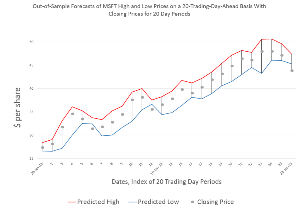
Forecasting 20 trading days ahead, you get this type of chart for recent 20-day-periods.

MSFT20day

One of the important things to note is that these are out-of-sample forecasts, and that, generally, they encapsulate the actual closing prices for these 20 trading day periods.

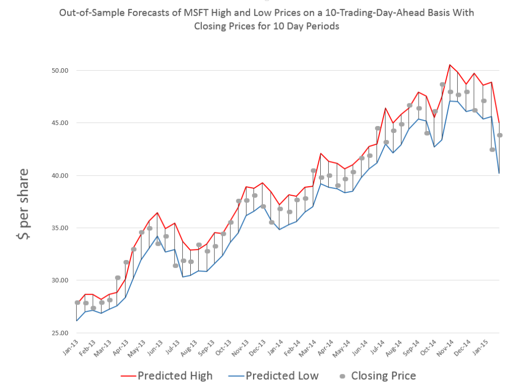
Here is a comparable chart for 10 trading days.

MSFTHL10

Same data, forecasts also are out-of-sample, and, of course, there are more closing prices to chart, too.

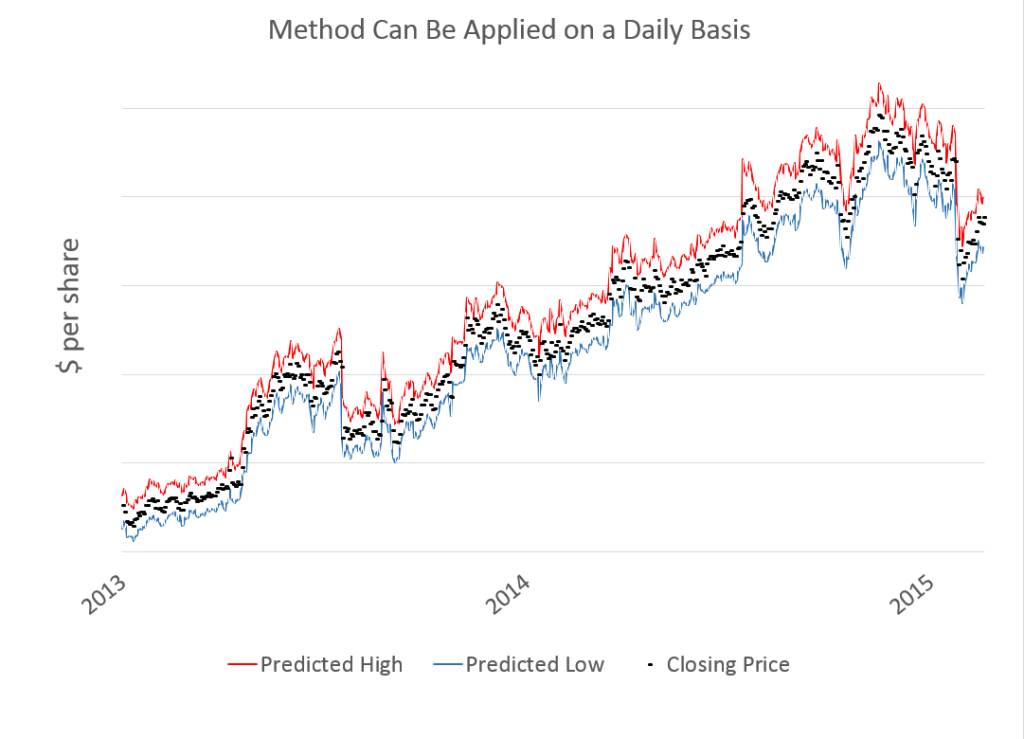
Finally, here is a very busy chart with forecasts by trading day.

MSFTdaily

Now there are several key points to take away from these charts.

First, the predictions of MSFT high and low prices for these periods are developed by similar forecast models, at least with regard to the specification of explanatory variables. Also, the Pvar method works for specific stocks, as well as for stock market indexes and ETF’s that might track them.

However, and this is another key point, the definitions of these variables shift with the periods being considered.

So the high for MSFT by trading day is certainly different from the MSFT high over groups of 20 trading days, and so forth.

In any case, there is remarkable scalability with Pvar models, all of which suggests they capture some of the interplay between long and shorter term trading.

While I am handing out conjectures, here is another one.

I think it will be possible to conduct a “causal analysis” to show that the Pvar variables reflect or capture trader actions, and that these actions tend to drive the market.

Pvar Models for Forecasting Stock Prices

When I began this blog three years ago, I wanted to deepen my understanding of technique – especially stuff growing up alongside Big Data and machine learning.

I also was encouraged by Malcolm Gladwell’s 10,000 hour idea – finding it credible from past study of mathematical topics. So maybe my performance as a forecaster would improve by studying everything about the subject.

Little did I suspect I would myself stumble on a major forecasting discovery.

But, as I am wont to quote these days, even a blind pig uncovers a truffle from time to time.

Forecasting Stock Prices

My discovery pertains to forecasting stock prices.

Basically, I have stumbled on a method of developing much more accurate forecasts of high and low stock prices, given the opening price in a period. These periods can be days, groups of days, weeks, months, and, based on what I present here – quarters.

Additionally, I have discovered a way to translate these results into much more accurate forecasts of closing prices over long forecast horizons.

I would share the full details, except I need some official acknowledgement for my work (in process) and, of course, my procedures lead to profits, so I hope to recover some of what I have invested in this research.

Having struggled through a maze of ways of doing this, however, I feel comfortable sharing a key feature of my approach – which is that it is based on the spreads between opening prices and the high and low of previous periods. Hence, I call these “Pvar models” for proximity variable models.

There is really nothing in the literature like this, so far as I am able to determine – although the discussion of 52 week high investing captures some of the spirit.

S&P 500 Quarterly Forecasts

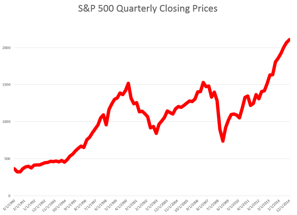
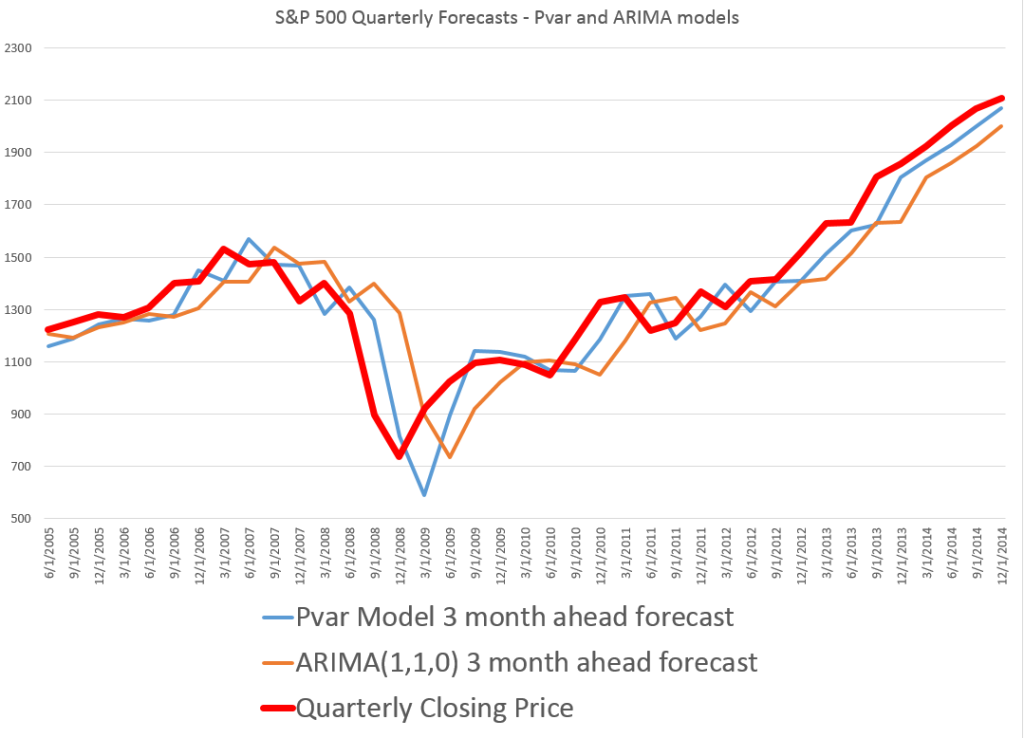
Let’s look an example – forecasting quarterly closing prices for the S&P 500, shown in this chart.

S&PQ

We are all familiar with this series. And I think most of us are worried that after the current runup, there may be another major correction.

In any case, this graph compares out-of-sample forecasts of ARIMA(1,1,0) and Pvar models. The ARIMA forecasts are estimated by the off-the-shelf automatic forecast program Forecast Pro. The Pvar models are estimated by ordinary least squares (OLS) regression, using Matlab and Excel spreadsheets.

CompPvarARIMA

The solid red line shows the movement of the S&P 500 from 2005 to just recently. Of course, the big dip in 2008 stands out.

The blue line charts out-of-sample forecasts of the Pvar model, which are from visual inspection, clearly superior to the ARIMA forecasts, in orange.

And note the meaning of “out-of-sample” here. Parameters of the Pvar and ARIMA models are estimated over historic data which do not include the prices in the period being forecast. So the results are strictly comparable with applying these models today and checking their performance over the next three months.

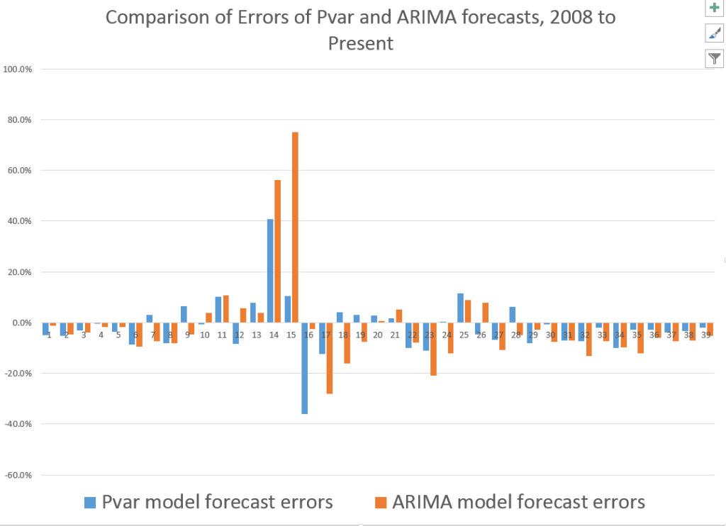
The following bar chart shows the forecast errors of the Pvar and ARIMA forecasts.

PvarARIMAcomp

Thus, the Pvar model forecasts are not always more accurate than ARIMA forecasts, but clearly do significantly better at major turning points, like the 2008 recession.

The mean absolute percent errors (MAPE) for the two approaches are 7.6 and 10.2 percent, respectively.

This comparison is intriguing, since Forecast Pro automatically selected an ARIMA(1,1,0) model in each instance of its application to this series. This involves autoregressions on differences of a time series, to some extent challenging the received wisdom that stock prices are random walks right there. But Pvar poses an even more significant challenge to versions of the efficient market hypothesis, since Pvar models pull variables from the time series to predict the time series – something you are really not supposed to be able to do, if markets are, as it were, “efficient.” Furthermore, this price predictability is persistent, and not just a fluke of some special period of market history.

I will have further comments on the scalability of this approach soon. Stay tuned.

Some Thoughts for Monday

There’s a kind of principle in invention and innovation which goes like this – often the originator of new ideas and approaches is a kind of outsider, stumbling on a discovery by pursuing avenues others thought, through training, would be fruitless. Or at least this innovator pursues a line of research outside of the mainstream – where accolades are being awarded.

You can make too much of this, but it does have wide applicability.

In science, for example, it’s the guy from the out-of-the-way school, who makes the important discovery, then gets recruited to the big time. I recall reading about the migration of young academics from lesser schools to major institutions – Berkeley and the Ivy League – after an important book or discovery.

And, really, a lot of information technology (IT) was launched by college drop-outs, such as the estimable Mr. Bill Gates, or the late Steve Jobs.

This is a happy observation in a way, because it means the drumbeat of bad news from, say, the Ukrainian or Syrian fronts, or insight such as in Satjajit Das’ The Sum of All Our Fears! The Outlook for 2015, is not the whole story. There are “sideways movements” of change which can occur, precisely because they are not obvious to mainstream observers.

Without innovation, our goose is cooked.

I’m going to write more on innovation this week, detailing some of my more recent financial and stock market research under that heading.

But for now, let me comment on  the “libertarian” edge that accompanies a lot of innovation, these days.

The new new peer-to-peer (P2P) “sharing” or social access services provide great examples.

Uber, Lyft, Airbnb – these companies provide access to rides, vehicles, and accommodations. They rely on bidirectional rating systems, background checks, frictionless payment systems, and platforms that encourage buyers and sellers to get to know each other face-to-face before doing business. With venture funding from Wall Street and Silicon Valley, their valuations rise a dramatic way. Uber’s valuation has risen to an estimated $40 billion, making it one of the 150 biggest companies in the world–larger than Delta, FedEx or Viacom. Airbnb coordinates lodging for an estimated 425,000 persons a night, and has an estimated valuation of $13.5 billion, almost half as much as 96-year-old Hilton Worldwide.

There are increased calls for regulation of these companies, as they bite into markets dominated by the traditional hotel and hospitality sector, or taxi-cab companies. Clearly, raising hundreds of millions in venture capital can impart hubris to top management, as in the mad threats coming from a Uber executive against journalists who report, for example, sexual harassment of female customers by Uber drivers.

Noone should attempt to stop the push-and-pull of regulation and disruptive technology, however. Innovations in P2P platforms, pioneered by eBay, pave the way for cultural and institutional innovation. At the same time, I feel better about accepting a ride within the Uber system, if I know the driver is insured and has a safe vehicle.

The Greek Conundrum

I’ve been focused on stock price forecast models, recently, and before that, on dynamics of oil prices.

However, it’s clear that almost any global market these days can be affected by developments in Europe.

There’s an excellent backgrounder to the crisis over restructuring Greek debt. See Greece, Its International Competitors and the Euro by the Turkish financial analyst T. Sabri Öncü – a PDF from the Economic and Political Weekly, an Indian Journal.

According to Öncü, the Greeks got in trouble with loans to finance consumption and nonproductive spending, when and after they joined the Eurozone in 2001. The extent of the problem was masked by accounting smoke and mirrors, only being revealed in 2009. Since then “bailouts” from European banking authorities have been designed to insure steady repayment of this debt to German and French banks, among others, although some Greek financial parties have benefited also.

Still, as Öncü writes,

Fast forward to today, despite two bailouts and adjustment programmes Greece has been in depression since the beginning of 2009. The Greece’s GDP is down about 25% from its peak in 2008, unemployment is at about 25%, youth unemployment is above 50%, Greece’s public debt to GDP ratio is at about a mind-boggling 175% and many Greeks are lining up for soup in front of soup kitchens reminiscent of the soup kitchens of the Great Depression of 1929.

As this post is written, negotiations between the new Syrizia government and European authorities have broken down, but here is an interesting video outlining the opposing positions, to an extent, prior to Monday.

Bruegel’s Interview: Debt Restructuring & Greece

Austerity is on the line here, since it seems clear Greece can never repay its debts as currently scheduled, even with imposing further privations on the Greek population.