Tag Archives: Medical predictive analytics

Perspectives

Blogging gets to be enjoyable, although demanding. It’s a great way to stay in touch, and probably heightens personal mental awareness, if you do it enough.

The “Business Forecasting” focus allows for great breadth, but may come with political constraints.

On this latter point, I assume people have to make a living. Populations cannot just spend all their time in mass rallies, and in political protests – although that really becomes dominant at certain crisis points. We have not reached one of those for a long time in the US, although there have been mobilizations throughout the Mid-East and North Africa recently.

Nate Silver brought forth the “hedgehog and fox” parable in his best seller – The Signal and the Noise. “The fox knows many things, but the hedgehog knows one big thing.”

My view is that business and other forecasting endeavors should be “fox-like” – drawing on many sources, including, but not limited to quantitative modeling.

What I Think Is Happening – Big Picture

Global dynamics often are directly related to business performance, particularly for multinationals.

And global dynamics usually are discussed by regions – Europe, North America, Asia-Pacific, South Asia, the Mid-east, South American, Africa.

The big story since around 2000 has been the emergence of the People’s Republic of China as a global player. You really can’t project the global economy without a fairly detailed understanding of what’s going on in China, the home of around 1.5 billion persons (not the official number).

Without delving much into detail, I think it is clear that a multi-centric world is emerging. Growth rates of China and India far surpass those of the United States and certainly of Europe – where many countries, especially those along the southern or outer rim – are mired in high unemployment, deflation, and negative growth since just after the financial crisis of 2008-2009.

The “old core” countries of Western Europe, the United States, Canada, and, really now, Japan are moving into a “post-industrial” world, as manufacturing jobs are outsourced to lower wage areas.

Layered on top of and providing support for out-sourcing, not only of manufacturing but also skilled professional tasks like computer programming, is an increasingly top-heavy edifice of finance.

Clearly, “the West” could not continue its pre-World War II monopoly of science and technology (Japan being in the pack here somewhere). Knowledge had to diffuse globally.

With the GATT (General Agreement on Tariffs and Trade) and the creation of the World Trade Organization (WTO) the volume of trade expanded with reduction on tariffs and other barriers (1980’s, 1990’s, early 2000’s).

In the United States the urban landscape became littered with “Big Box stores” offering shelves full of clothing, electronics, and other stuff delivered to the US in the large shipping containers you see stacked hundreds of feet high at major ports, like San Francisco or Los Angeles.

There is, indeed, a kind of “hollowing out” of the American industrial machine.

Possibly it’s only the US effort to maintain a defense establishment second-to-none and of an order of magnitude larger than anyone elses’ that sustains certain industrial activities shore-side. And even that is problematical, since the chain of contracting out can be complex and difficult and costly to follow, if you are a US regulator.

I’m a big fan of post-War Japan, in the sense that I strongly endorse the kinds of evaluations and decisions made by the Japanese Ministry of International Trade and Investment (MITI) in the decades following World War II. Of course, a nation whose industries and even standing structures lay in ruins has an opportunity to rebuild from the ground up.

In any case, sticking to a current focus, I see opportunities in the US, if the political will could be found. I refer here to the opportunity for infrastructure investment to replace aging bridges, schools, seaport and airport facilities.

In case you had not noticed, interest rates are almost zero. Issuing bonds to finance infrastructure could not face more favorable terms.

Another option, in my mind – and a hat-tip to the fearsome Walt Rostow for this kind of thinking – is for the US to concentrate its resources into medicine and medical care. Already, about one quarter of all spending in the US goes to health care and related activities. There are leading pharma and biotech companies, and still a highly developed system of biomedical research facilities affiliated with universities and medical schools – although the various “austerities” of recent years are taking their toll.

So, instead of pouring money down a rathole of chasing errant misfits in the deserts of the Middle East, why not redirect resources to amplify the medical industry in the US? Hospitals, after all, draw employees from all socioeconomic groups and all ethnicities. The US and other national populations are aging, and will want and need additional medical care. If the world could turn to the US for leading edge medical treatment, that in itself could be a kind of foreign policy, for those interested in maintaining US international dominance.

Tangential Forces

While writing in this vein, I might as well offer my underlying theory of social and economic change. It is that major change occurs primarily through the impact of tangential forces, things not fully seen or anticipated. Perhaps the only certainty about the future is that there will be surprises.

Quite a few others subscribe to this theory, and the cottage industry in alarming predictions of improbable events – meteor strikes, flipping of the earth’s axis, pandemics – is proof of this.

Really, it is quite amazing how the billions on this planet manage to muddle through.

But I am thinking here of climate change as a tangential force.

And it is also a huge challenge.

But it is a remarkably subtle thing, not withstanding the on-the-ground reality of droughts, hurricanes, tornados, floods, and so forth.

And it is something smack in the sweet spot of forecasting.

There is no discussion of suitable responses to climate change without reference to forecasts of global temperature and impacts, say, of significant increases in sea level.

But these things take place over many years and, then, boom a whole change of regime may be triggered – as ice core and other evidence suggests.

Flexibility, Redundancy, Avoidance of Over-Specialization

My brother (by a marriage) is a priest, formerly a tax lawyer. We have begun a dialogue recently where we are looking for some basis for a new politics and new outlook, really that would take the increasing fragility of some of our complex and highly specialized systems into account – creating some backup systems, places, refuges, if you will.

I think there is a general principle that we need to empower people to be able to help themselves – and I am not talking about eliminating the social safety net. The ruling groups in the United States, powerful interests, and politicians would be well advised to consider how we can create spaces for people “to do their thing.” We need to preserve certain types of environments and opportunities, and have a politics that speaks to this, as well as to how efficiency is going to be maximized by scrapping local control and letting global business from wherever come in and have its way – no interference allowed.

The reason Reid and I think of this as a search for a new politics is that, you know, the counterpoint is that all these impediments to getting the best profits possible just result in lower production levels, meaning then that you have not really done good by trying to preserve land uses or local agriculture, or locally produced manufactures.

I got it from a good source in Beijing some years ago that the Chinese Communist Party believes that full-out growth of production, despite the intense pollution, should be followed for a time, before dealing with that problem directly. If anyone has any doubts about the rationality of limiting profits (as conventionally defined), I suggest they spend some time in China during an intense bout of urban pollution somewhere.

Maybe there are abstract, theoretical tools which could be developed to support a new politics. Why not, for example, quantify value experienced by populations in a more comprehensive way? Why not link achievement of higher value differently measured with direct payments, somehow? I mean the whole system of money is largely an artifact of cyberspace anyway.

Anyway – takeaway thought, create spaces for people to do their thing. Pretty profound 21st Century political concept.

Coming attractions here – more on predicting the stock market (a new approach), summaries of outlooks for the year by major sources (banks, government agencies, leading economists), megatrends, forecasting controversies.

Top picture from FIREBELLY marketing

Pvar Models for Forecasting Stock Prices

When I began this blog three years ago, I wanted to deepen my understanding of technique – especially stuff growing up alongside Big Data and machine learning.

I also was encouraged by Malcolm Gladwell’s 10,000 hour idea – finding it credible from past study of mathematical topics. So maybe my performance as a forecaster would improve by studying everything about the subject.

Little did I suspect I would myself stumble on a major forecasting discovery.

But, as I am wont to quote these days, even a blind pig uncovers a truffle from time to time.

Forecasting Stock Prices

My discovery pertains to forecasting stock prices.

Basically, I have stumbled on a method of developing much more accurate forecasts of high and low stock prices, given the opening price in a period. These periods can be days, groups of days, weeks, months, and, based on what I present here – quarters.

Additionally, I have discovered a way to translate these results into much more accurate forecasts of closing prices over long forecast horizons.

I would share the full details, except I need some official acknowledgement for my work (in process) and, of course, my procedures lead to profits, so I hope to recover some of what I have invested in this research.

Having struggled through a maze of ways of doing this, however, I feel comfortable sharing a key feature of my approach – which is that it is based on the spreads between opening prices and the high and low of previous periods. Hence, I call these “Pvar models” for proximity variable models.

There is really nothing in the literature like this, so far as I am able to determine – although the discussion of 52 week high investing captures some of the spirit.

S&P 500 Quarterly Forecasts

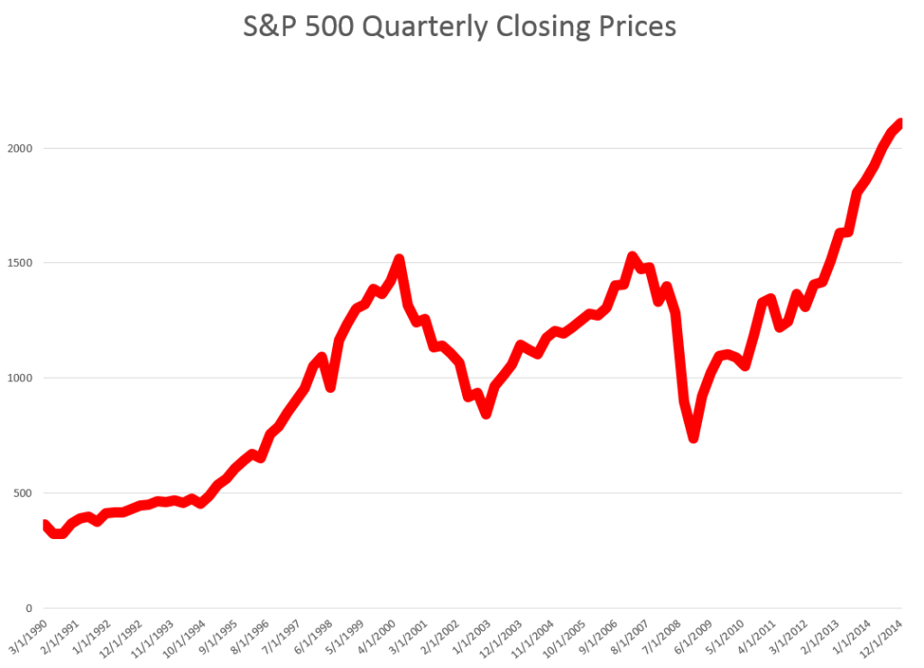
Let’s look an example – forecasting quarterly closing prices for the S&P 500, shown in this chart.

S&PQ

We are all familiar with this series. And I think most of us are worried that after the current runup, there may be another major correction.

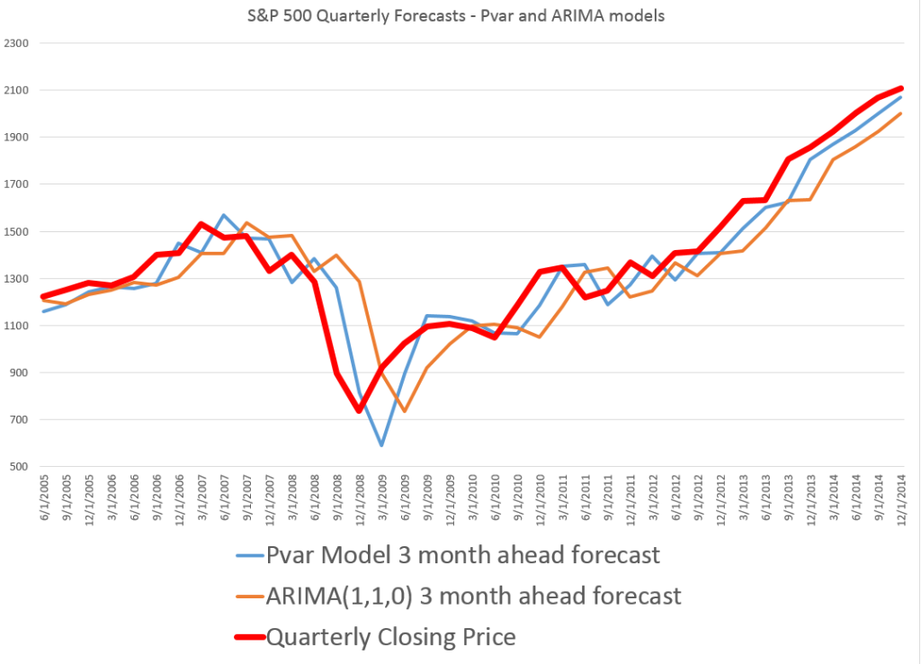
In any case, this graph compares out-of-sample forecasts of ARIMA(1,1,0) and Pvar models. The ARIMA forecasts are estimated by the off-the-shelf automatic forecast program Forecast Pro. The Pvar models are estimated by ordinary least squares (OLS) regression, using Matlab and Excel spreadsheets.

CompPvarARIMA

The solid red line shows the movement of the S&P 500 from 2005 to just recently. Of course, the big dip in 2008 stands out.

The blue line charts out-of-sample forecasts of the Pvar model, which are from visual inspection, clearly superior to the ARIMA forecasts, in orange.

And note the meaning of “out-of-sample” here. Parameters of the Pvar and ARIMA models are estimated over historic data which do not include the prices in the period being forecast. So the results are strictly comparable with applying these models today and checking their performance over the next three months.

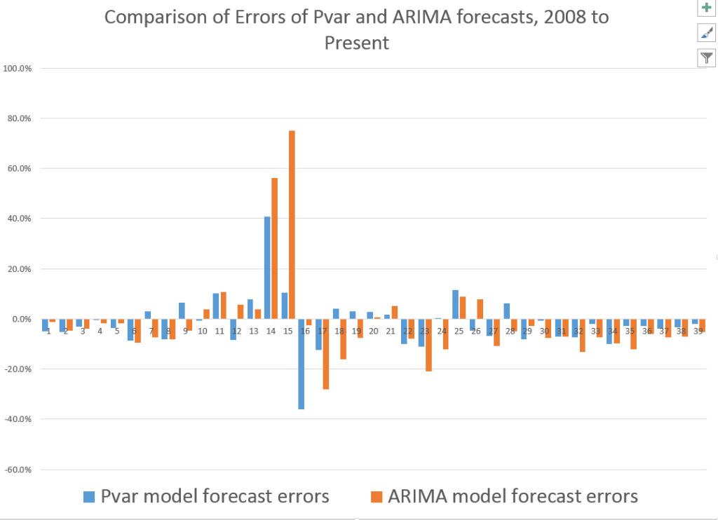
The following bar chart shows the forecast errors of the Pvar and ARIMA forecasts.

PvarARIMAcomp

Thus, the Pvar model forecasts are not always more accurate than ARIMA forecasts, but clearly do significantly better at major turning points, like the 2008 recession.

The mean absolute percent errors (MAPE) for the two approaches are 7.6 and 10.2 percent, respectively.

This comparison is intriguing, since Forecast Pro automatically selected an ARIMA(1,1,0) model in each instance of its application to this series. This involves autoregressions on differences of a time series, to some extent challenging the received wisdom that stock prices are random walks right there. But Pvar poses an even more significant challenge to versions of the efficient market hypothesis, since Pvar models pull variables from the time series to predict the time series – something you are really not supposed to be able to do, if markets are, as it were, “efficient.” Furthermore, this price predictability is persistent, and not just a fluke of some special period of market history.

I will have further comments on the scalability of this approach soon. Stay tuned.

Modeling High Tech – the Demand for Communications Services

A colleague was kind enough to provide me with a copy of –

Demand for Communications Services – Insights and Perspectives, Essays in Honor of Lester D. Taylor, Alleman, NíShúilleabháin, and Rappoport, editors, Springer 2014

Some essays in this Festschrift for Lester Taylor are particularly relevant, since they deal directly with forecasting the disarray caused by disruptive technologies in IT markets and companies.

Thus, Mohsen Hamoudia in “Forecasting the Demand for Business Communications Services” observes about the telecom space that

“..convergence of IT and telecommunications market has created more complex behavior of market participants. Customers expect new product offerings to coincide with these emerging needs fostered by their growth and globalization. Enterprises require more integrated solutions for security, mobility, hosting, new added-value services, outsourcing and voice over internet protocol (VoiP). This changing landscape has led to the decline of traditional product markets for telecommunications operators.

In this shifting landscape, it is nothing less than heroic to discriminate “demand variables” and “ independent variables” deploying and produce useful demand forecasts from three stage least squares (3SLS) models, as does Mohsen Hamoudia in his analysis of BCS.

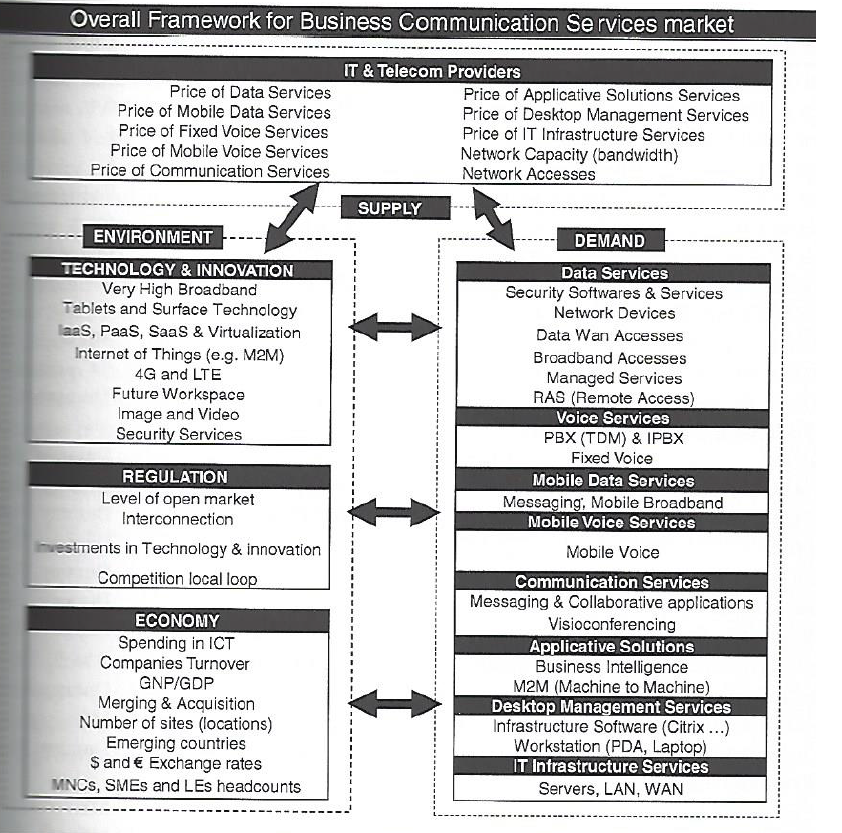
Here is Hamoudia’s schematic of supply and demand in the BCS space, as of a 2012 update.

BCS

Other cutting-edge contributions, dealing with shifting priorities of consumers, faced with new communications technologies and services, include, “Forecasting Video Cord-Cutting: The Bypass of Traditional Pay Television” and “Residential Demand for Wireless Telephony.”

Festschrift and Elasticities

This Springer Festschrift is distinctive inasmuch as Professor Taylor himself contributes papers – one a reminiscence titled “Fifty Years of Studying Economics.”

Taylor, of course, is known for his work in the statistical analysis of empirical demand functions and broke ground with two books, Telecommunications Demand: A Survey and Critique (1980) and Telecommunications Demand in Theory and Practice (1994).

Accordingly, forecasting and analysis of communications and high tech are a major focus of several essays in the book.

Elasticities are an important focus of statistical demand analysis. They flow nicely from double logarithmic or log-log demand specifications – since, then, elasticities are constant. In a simple linear demand specification, of course, the price elasticity varies across the range of prices and demand, which complicates testimony before public commissions, to say the least.

So it is interesting, in this regard, that Professor Taylor is still active in modeling, contributing to his own Festschrift with a note on translating logs of negative numbers to polar coordinates and the complex plane.

“Pricing and Maximizing Profits Within Corporations” captures the flavor of a telecom regulatory era which is fast receding behind us. The authors, Levy and Tardiff, write that,

During the time in which he was finishing the update, Professor Taylor participated in one of the most hotly debated telecommunications demand elasticity issues of the early 1990’s: how price-sensitive were short-distance toll calls (then called intraLATA long-distance calls)? The answer to that question would determine the extent to which the California state regulator reduced long-distance prices (and increased other prices, such as basic local service prices) in a “revenue-neutral” fashion.

Followup Workshop

Research in this volume provides a good lead-up to a forthcoming International Institute of Forecasters (IIF) workshop – the 2nd ICT and Innovation Forecasting Workshop to be held this coming May in Paris.

The dynamic, ever changing nature of the Information & Communications Technology (ICT) Industry is a challenge for business planners and forecasters. The rise of Twitter and the sudden demise of Blackberry are dramatic examples of the uncertainties of the industry; these events clearly demonstrate how radically the environment can change. Similarly, predicting demand, market penetration, new markets, and the impact of new innovations in the ICT sector offer a challenge to businesses and policymakers. This Workshop will focus on forecasting new services and innovation in this sector as well as the theory and practice of forecasting in the sector (Telcos, IT providers, OTTs, manufacturers). For more information on venue, organizers and registration, Download brochure

Forecasting Issue – Projected Rise in US Health Care Spending

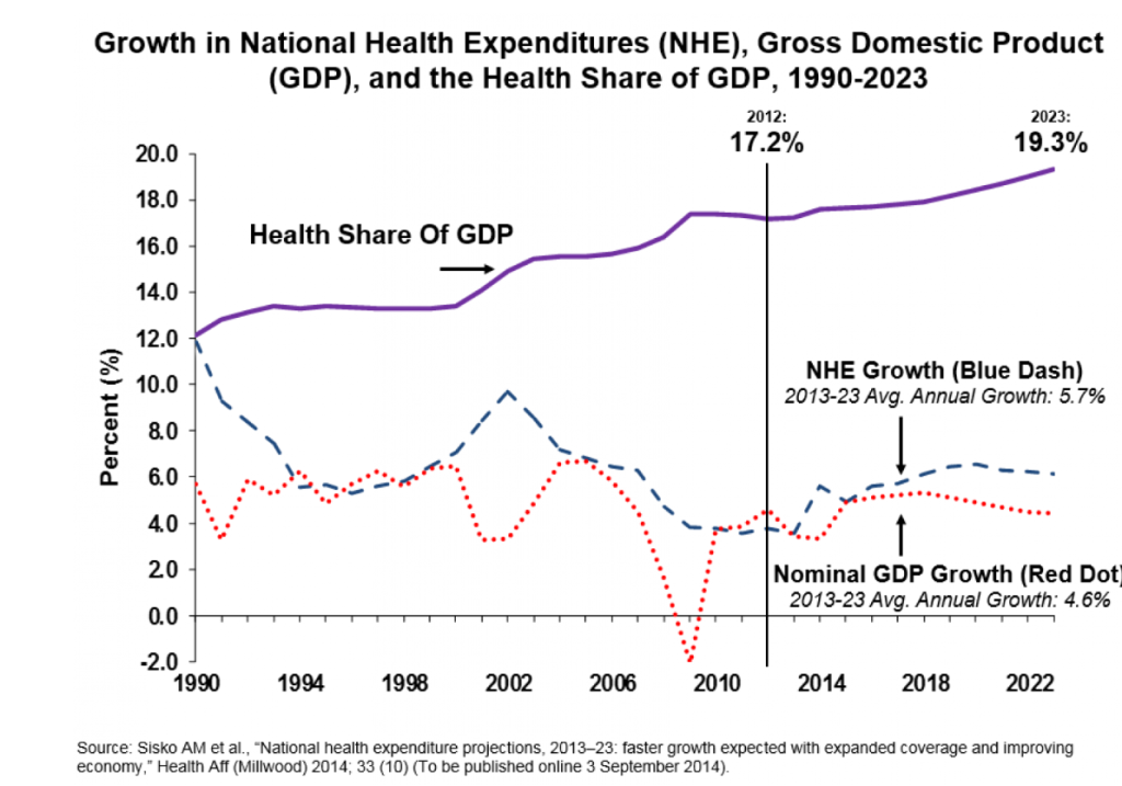
Between one fifth and one sixth of all spending in the US economy, measured by the Gross Domestic Product (GDP), is for health care – and the ratio is projected to rise.

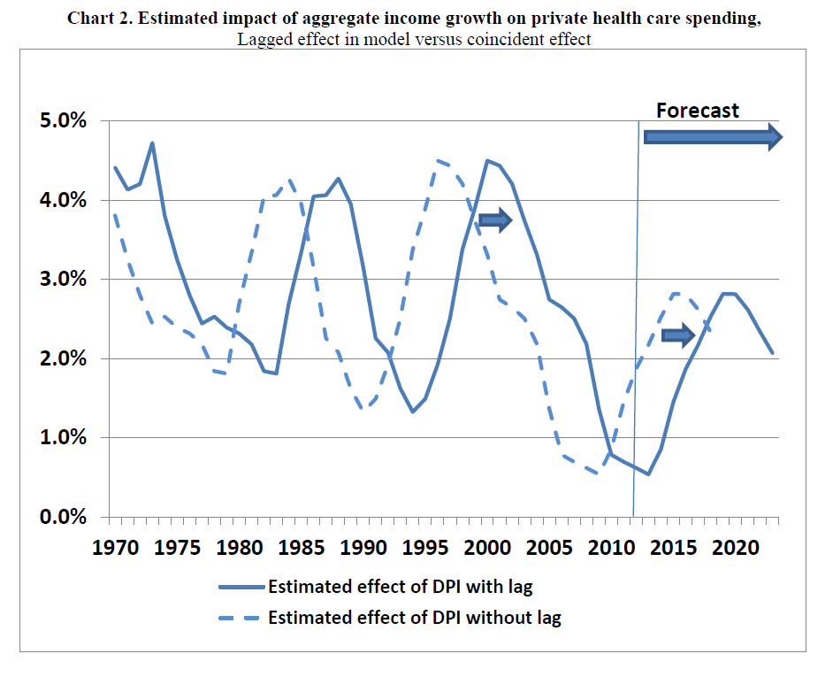
From a forecasting standpoint, an interesting thing about this spending  is that it can be forecast in the aggregate on a 1, 2 and 3 year ahead basis with a fair degree of accuracy.

This is because growth in disposable personal income (DPI) is a leading indicator of private personal healthcare spending – which comprises the lion’s share of total healthcare spending.

Here is a chart from PROJECTIONS OF NATIONAL HEALTH EXPENDITURES: METHODOLOGY AND MODEL SPECIFICATION highlighting the lagged relationship and private health care spending.

laggedeffect

Thus, the impact of the recession of 2008-2009 on disposable personal income has resulted in relatively low increases in private healthcare spending until quite recently. (Note here, too, that the above curves are smoothed by taking centered moving averages.)

The economic recovery, however, is about to exert an impact on overall healthcare spending – with the effects of the Affordable Care Act (ACA) aka Obamacare being a wild card.

A couple of news articles signal this, the first from the Washington Post and the second from the New Republic.

The end of health care’s historic spending slowdown is near

The historic slowdown in health-care spending has been one of the biggest economic stories in recent years — but it looks like that is soon coming to an end.

As the economy recovers, Obamacare expands coverage and baby boomers join Medicare in droves, the federal Centers for Medicare and Medicaid Services’ actuary now projects that health spending will grow on average 5.7 percent each year through 2023, which is 1.1 percentage points greater than the expected rise in GDP over the same period. Health care’s share of GDP over that time will rise from 17.2 percent now to 19.3 percent in 2023, or about $5.2 trillion, as the following chart shows.

NHCE

America’s Medical Bill Didn’t Spike Last Year

The questions are by how much health care spending will accelerate—and about that, nobody can be sure. The optimistic case is that the slowdown in health care spending isn’t entirely the product of a slow economy. Another possible factor could be changes in the health care market—in particular, the increasing use of plans with high out-of-pocket costs, which discourage people from getting health care services they might not need. Yet another could be the influence of the Affordable Care Act—which reduced what Medicare pays for services while introducing tax and spending modifications designed to bring down the price of care.

There seems to be some wishful thinking on this subject in the media.

Betting against the lagged income effect is not advisable, however, as an analysis of the accuracy of past projections of Centers for Medicare and Medicaid Services (CMS) shows.

Updates on Forecasting Controversies – Google Flu Trends

Last Spring I started writing about “forecasting controversies.”

A short list of these includes Google’s flu forecasting algorithm, impacts of Quantitative Easing, estimates of energy reserves in the Monterey Shale, seasonal adjustment of key series from Federal statistical agencies, and China – Trade Colossus or Assembly Site?

Well, the end of the year is a good time to revisit these, particularly if there are any late-breaking developments.

Google Flu Trends

Google Flu Trends got a lot of negative press in early 2014. A critical article in Nature – When Google got flu wrong – kicked it off. A followup Times article used the phrase “the limits of big data,” while the Guardian wrote of Big Data “hubris.”

The problem was, as the Google Trends team admits –

In the 2012/2013 season, we significantly overpredicted compared to the CDC’s reported U.S. flu levels.

Well, as of October, Google Flu Trends has a new engine. This like many of the best performing methods … in the literature—takes official CDC flu data into account as the flu season progresses.

Interestingly, the British Royal Society published an account at the end of October – Adaptive nowcasting of influenza outbreaks using Google searches – which does exactly that – merges Google Flu Trends and CDC data, achieving impressive results.

The authors develop ARIMA models using “standard automatic model selection procedures,” citing a 1998 forecasting book by Hyndman, Wheelwright, and Makridakis and a recent econometrics text by Stock and Watson. They deploy these adaptively-estimated models in nowcasting US patient visits due to influenza-like illnesses (ILI), as recorded by the US CDC.

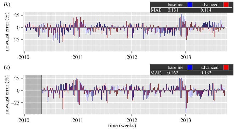
The results are shown in the following panel of charts.

GoogleFluTrends

Definitely click on this graphic to enlarge it, since the key point is the red bars are the forecast or nowcast models incorporating Google Flu Trends data, while the blue bars only utilize more conventional metrics, such as those supplied by the Centers for Disease Control (CDC). In many cases, the red bars are smaller than the blue bar for the corresponding date.

The lower chart labeled ( c ) documents out-of-sample performance. Mean Absolute Error (MAE) for the models with Google Flu Trends data are 17 percent lower.

It’s relevant , too, that the authors, Preis and Moat, utilize unreconstituted Google Flu Trends output – before the recent update, for example – and still get highly significant improvements.

I can think of ways to further improve this research – for example, deploy the Hyndman R programs to automatically parameterize the ARIMA models, providing a more explicit and widely tested procedural referent.

But, score one for Google and Hal Varian!

The other forecasting controversies noted above are less easily resolved, although there are developments to mention.

Stay tuned.

Video Friday – Benefits and Risks of Alcoholic Drinks

Like almost everyone who enjoys beer, wine, and mixed drinks, I have been interested in the research showing links between moderate alcohol consumption and cardiovascular health. In discussions with others, I’ve often heard, “now that’s the kind of scientific research we need more of” and so forth.

But obviously, booze is a two-edge sword.

So this research by Dr. James O’Keefe, a cardiologist from Mid America Heart Institute, with his co-authors Dr. Salman K. Bhatti, Dr. Ata Bajwa, James J. DiNicolantonio, Doctor of Pharmacy, and Dr. Carl J. Lavie caught my eye, because its comprehensive review of the literature on both benefits and risks.

It was published in the Mayo Clinic Proceedings, and here Dr. O’Keefe summarizing the findings.


The Abstract for this research paper, Alcohol and Cardiovascular Health: The Dose Makes the Poison…or the Remedy, lays it out pretty clearly.

Habitual light to moderate alcohol intake (up to 1 drink per day for women and 1 or 2 drinks per day for men) is associated with decreased risks for total mortality, coronary artery disease, diabetes mellitus, congestive heart failure, and stroke. However, higher levels of alcohol consumption are associated with increased cardiovascular risk. Indeed, behind only smoking and obesity, excessive alcohol consumption is the third leading cause of premature death in the United States. Heavy alcohol use (1) is one of the most common causes of reversible hypertension, (2) accounts for about one-third of all cases of nonischemic dilated cardiomyopathy, (3) is a frequent cause of atrial fibrillation, and (4) markedly increases risks of stroke—both ischemic and hemorrhagic. The risk-to-benefit ratio of drinking appears higher in younger individuals, who also have higher rates of excessive or binge drinking and more frequently have adverse consequences of acute intoxication (for example, accidents, violence, and social strife). In fact, among males aged 15 to 59 years, alcohol abuse is the leading risk factor for premature death. Of the various drinking patterns, daily low- to moderate-dose alcohol intake, ideally red wine before or during the evening meal, is associated with the strongest reduction in adverse cardiovascular outcomes. Health care professionals should not recommend alcohol to nondrinkers because of the paucity of randomized outcome data and the potential for problem drinking even among individuals at apparently low risk. The findings in this review were based on a literature search of PubMed for the 15-year period 1997 through 2012 using the search terms alcohol, ethanol, cardiovascular disease, coronary artery disease, heart failure, hypertension, stroke, and mortality. Studies were considered if they were deemed to be of high quality, objective, and methodologically sound.

Did someone say there is no such thing as a free lunch? Note, “among males aged 15 to 59 years, alcohol abuse is the leading risk factor for premature death.”

There is some moral here, possibly related to the size of the US booze industry, an estimated $331 billions in 2011 about equally distributed between beer and for the other part wine and hard liquor.

Also I wonder with the growing legal acceptance of marijuana at the state level in the US, whether negative health impacts would be mitigated by substitution of weed for drinking. Of course, combination of both is a possibility, leading to drug-crazed drunks?

Maybe the more important issue is to bring people’s unquestionable desire for mind-altering substances into focus, to understand this urge, and be able to develop cultural contexts in which moderate usage can take place.

Ebola and Data Analysis

Data analysis and predictive analytics can support national and international responses to ebola.

One of the primary ways at present is by verifying and extrapolating the currently exponential growth of ebola in affected areas – especially in Monrovia, the capital of Liberia, as well as Sierra Leone, Guinea, Nigeria, and the Democratic Republic of the Congo.

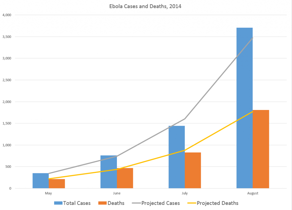
At this point, given data from the World Health Organization (WHO) and other agencies, predictive modeling can be as simple as in the following two charts, developed from the data compiled (and documented) in the Wikipedia site.

The first charts datapoints from the end of the months of May through August of this year.

Ebolacasesmodeling

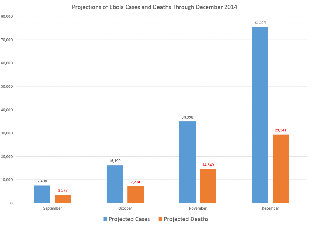
The second chart extrapolates an exponential fit to these cases, shown in the lines in the above figure, by month through December 2014.

Ebolaprojections

So by the end of this year, if this epidemic courses unchecked, without the major public health investments necessary in terms of hospital beds, supplies, medical and supporting personnel, including military or police forces to maintain public order in some of the worst-hit areas – there will be nearly 80,000 cases and approximately 30,000 deaths, by this simple extrapolation.

A slightly more sophisticated analysis by Geert Barentsen, utilizing data within calendar months as well, concludes that currently Ebola cases have a doubling time of 29 days.

One possibly positive aspect of these projections is the death rate declines from around 60 to 40 percent, from May through December 2014.

However, if the epidemic continues through 2015 at this rate, the projections suggest there will be more than 300 million cases.

World Health Organization (WHO) estimates released the first week of September indicate nearly 2,400 deaths. Total numbers of cases from the same period in early September is 4,846. So the projections are on track so far.

And, if you wish, you can validate these crude data analytics with reference to modeling using the classic compartment approach and other more advanced setups. See, for example, Disease modelers project a rapidly rising toll from Ebola or the recent New York Times article.

Visual Analytics

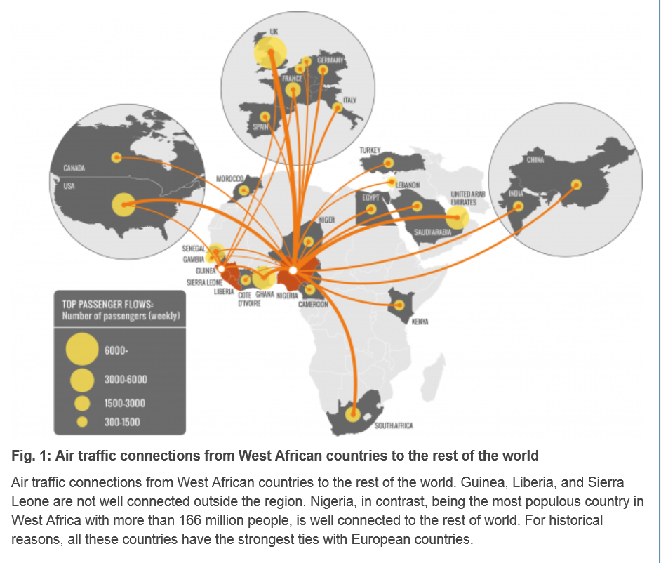
There have been advanced modeling efforts at discovering the possibilities of transmission of Ebola through persons traveling by air to other affected areas.

Here is a chart from Assessing the International Spreading Risk Associated with the 2014 West African Ebola Outbreak.

ebolaairroutes

As a data and forecasting analyst, I am not specially equipped to comment on the conditions which make transmission of this disease particularly dangerous. But I think, to some extent, it’s not rocket science.

Crowded conditions in many African cities, low educational attainment, poverty, poor medical infrastructure, rapid population growth – all these factors contribute to the high basic reproductive number of the disease in this outbreak. And, if the numbers of cases increase toward 100,000, the probability that some of the affected individuals will travel elsewhere grows, particularly when efforts to quarantine areas seem heavy-handed and, given little understanding of modern disease models in the affected populations, possibly suspicious.

There is a growing response from agencies and places as widely ranging as the Gates Foundation and Cuba, but what I read is that a military-type operation will be necessary to bring the epidemic under control. I suppose this means command-and-control centers must be established, set procedures must be implemented when cases are identified, adequate field hospitals need to be established, enough medical personnel must be deployed, and so forth. And if there are potential vaccines, these probably will be expensive to administer in early stages.

These thoughts are suggested by the numbers. So far, the numbers speak for themselves.

Ebola

Everyone should read the Op-Ed piece September 11 in the New York Times titled What We’re Afraid to Say About Ebola.

The author, Michael T. Osterholm, suggests two possibilities.

One is that Ebola travels to other large cities in the developing world, where poor sanitary and crowded conditions are common. This would be very bad.

The second possibility is that –

… an Ebola virus could mutate to become transmissible through the air. You can now get Ebola only through direct contact with bodily fluids. But viruses like Ebola are notoriously sloppy in replicating, meaning the virus entering one person may be genetically different from the virus entering the next. The current Ebola virus’s hyper-evolution is unprecedented; there has been more human-to-human transmission in the past four months than most likely occurred in the last 500 to 1,000 years. Each new infection represents trillions of throws of the genetic dice.

If certain mutations occurred, it would mean that just breathing would put one at risk of contracting Ebola. Infections could spread quickly to every part of the globe, as the H1N1 influenza virus did in 2009, after its birth in Mexico.

Why are public officials afraid to discuss this? They don’t want to be accused of screaming “Fire!” in a crowded theater — as I’m sure some will accuse me of doing. But the risk is real, and until we consider it, the world will not be prepared to do what is necessary to end the epidemic.

In 2012, a team of Canadian researchers proved that Ebola Zaire, the same virus that is causing the West Africa outbreak, could be transmitted by the respiratory route from pigs to monkeys, both of whose lungs are very similar to those of humans. Richard Preston’s 1994 best seller “The Hot Zone” chronicled a 1989 outbreak of a different strain, Ebola Reston virus, among monkeys at a quarantine station near Washington. The virus was transmitted through breathing, and the outbreak ended only when all the monkeys were euthanized. We must consider that such transmissions could happen between humans, if the virus mutates.

This would be a planetary threat, much like the huge flu epidemics.

Here is a recent BBC program with an hour length documentary and discussion of cures – which appear to exist at least in part.

Ebola The Search for a Cure BBC 2014

Priorities

I’ve got to say that this outbreak and its threatened spread to much wider populations in Africa and perhaps elsewhere – without much being done from the United States or from European countries (or Japan and China) highlights a huge problem with priorities.

The World Health Organization (WHO) has indicated that the actual numbers of infected persons and deaths are likely to be an order of magnitude larger than are reported. And the outbreak is by no means contained, but seems to be on the verge of causing complete social breakdown in some areas.

At some point, perhaps when the number of infected grows from maybe 20,000 to 200,000, people will have to wake up. President Obama has acknowledged that the real danger is mutation. The chances of mutation increase as the number of infected persons increases.

Links – July 10, 2014

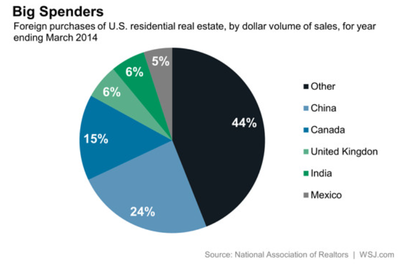
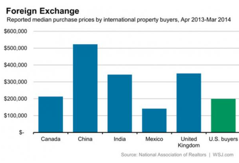
Did China Just Crush The US Housing Market? Zero Hedge has established that Chinese money is a major player in the US luxury housing market with charts like these.

pieNAR

NASbarchart

Then, looking within China, it’s apparent that the source of this money could be shut off – a possibility which evokes some really florid language from Zero Hedge –

Because without the Chinese bid in a market in which the Chinese are the biggest marginal buyer scooping up real estate across the land, sight unseen, and paid for in laundered cash (which the NAR blissfully does not need to know about due to its AML exemptions), watch as suddenly the 4th dead cat bounce in US housing since the Lehman failure rediscovers just how painful gravity really is.

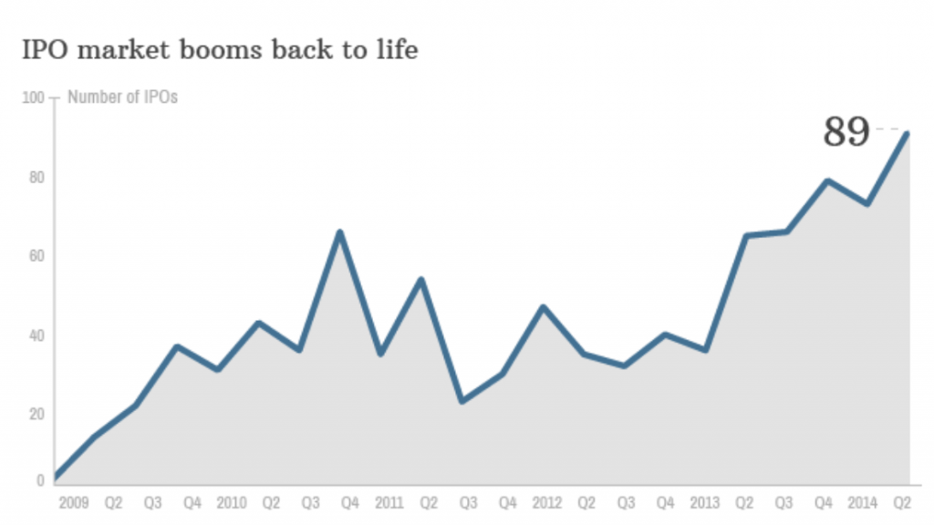
IPO market achieves liftoff More IPO’s coming to market now.

IPO

The Mouse That Wouldn’t Die: How a Lack of Public Funding Holds Back a Promising Cancer Treatment Fascinating. Dr. Zheng Cui has gone from identifying, then breeding cancer resistant mice, to discovering the genetics and mechanism of this resistance, focusing on a certain type of white blood cell. Then, moving on to human research, Dr. Cui has identified similar genetics in humans, and successfully treated advanced metastatic cancer in trials. But somehow – maybe since transfusions are involved and Big pharma can’t make money on it – the research is losing support.

Scientists Create ‘Dictionary’ of Chimp Gestures to Decode Secret Meanings

Some of those discovered meanings include the following:

•When a chimpanzee taps another chimp, it means “Stop that”

•When a chimpanzee slaps an object or flings its hand, it means “Move away” or “Go away”

•When a chimpanzee raises its arm, it means “I want that”

Chimp-Gestures

Medicine w/o antibiotics

The Hillary Clinton Juggernaut Courts Wall Street and Neocons Describes Hillary as the “uber-establishment candidate.”

US-AFGHANISTAN-WOMEN-RIGHTS-CLINTON

Bayesian Reasoning and Intuition

In thinking about Bayesian methods, I wanted to focus on whether and how Bayesian probabilities are or can be made “intuitive.”

Or are they just numbers plugged into a formula which sometimes is hard to remember?

A classic example of Bayesian reasoning concerns breast cancer and mammograms.

 1%   of the women at age forty who participate in routine screening have breast    cancer
 80%   of women with breast cancer will get positive mammograms.
 9.6%   of women with no breast cancer will also get positive mammograms

Question – A women in this age group has a positive mammogram in a routine screening. What is the probability she has cancer?

There is a tendency for intuition to anchor on the high percentage of women with breast cancer with positive mammograms – 80 percent. In fact, this type of scenario elicits significant over-estimates of cancer probabilities among mammographers!

Bayes Theorem, however, shows that the probability of women with a positive mammogram having cancer is an order of magnitude less than the percent of women with breast cancer and positive mammograms.

By the Formula

Recall Bayes Theorem –

BayesThm

Let A stand for the event a women has breast cancer, and B denote the event that a women tests positive on the mammogram.

We need the conditional probability of a positive mammogram, given that a woman has breast cancer, or P(B|A). In addition, we need the prior probability that a woman has breast cancer P(A), as well as the probability of a positive mammogram P(B).

So we know P(B|A)=0.8, and P(B|~A)=0.096, where the tilde ~ indicates “not”.

For P(B) we can make the following expansion, based on first principles –

P(B)=P(B|A)P(A)+P(B|~A)P(B)= P(B|A)P(A)+P(B|~A)(1-P(A))=0.10304

Either a woman has cancer or does not have cancer. The probability of a woman having cancer is P(A), so the probability of not having cancer is 1-P(A). These are mutually exclusive events, that is, and the probabilities sum to 1.

Putting the numbers together, we calculate the probability of a forty-year-old women with a positive mammogram having cancer is 0.0776.

So this woman has about an 8 percent chance of cancer, even though her mammogram is positive.

Survey after survey of physicians shows that this type of result in not very intuitive. Many doctors answer incorrectly, assigning a much higher probability to the woman having cancer.

Building Intuition

This example is the subject of a 2003 essay by Eliezer Yudkowsky – An Intuitive Explanation of Bayes’ Theorem.

As An Intuitive (and Short) Explanation of Bayes’ Theorem notes, Yudkowsky’s intuitive explanation is around 15,000 words in length.

For a shorter explanation that helps build intuition, the following table is useful, showing the crosstabs of women in this age bracket who (a) have or do not have cancer, and (b) who test positive or negative.

Testtable

The numbers follow from our original data. The percentage of women with cancer who test positive is given as 80 percent, so the percent with cancer who test negative must be 20 percent, and so forth.

Now let’s embed the percentages of true and false positives and negatives into the table, as follows:

Testtable2

So 1 percent of forty year old women (who have routine screening) have cancer. If we multiply this 1 percent by the percent of women who have cancer and test positive, we get .008 or the chances of a true positive. Then, the chance of getting any type of positive result is .008+.99*.096=.008+.0954=0.10304.

The ratio then of the chances of a true positive to the chance of any type of positive result is 0.07763 – exactly the result following from Bayes Theorem!

CoolClips_cart0781

This may be an easier two-step procedure than trying to develop conditional probabilities directly, and plug them into a formula.

Allen Downey lists other problems of this type, with YouTube talks on Bayesian stuff that are good for beginners.

Closing Comments

I have a couple more observations.

First, this analysis is consistent with a frequency interpretation of probability.

In fact, the 1 percent figure for women who are forty getting cancer could be calculated from cause of death data and Census data. Similarly with the other numbers in the scenario.

So that’s interesting.

Bayes theorem is, in some phrasing, true by definition (of conditional probability). It can just be tool for reorganizing data about observed frequencies.

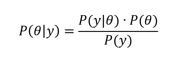
The magic comes when we transition from events to variables y and parameters θ in a version like,

Bayes2

What is this parameter θ? It certainly does not exist in “event” space in the same way as does the event of “having cancer and being a forty year old woman.” In the batting averages example, θ is a vector of parameter values of a Beta distribution – parameters which encapsulate our view of the likely variation of a batting average, given information from the previous playing season. So I guess this is where we go into “belief space”and subjective probabilities.

In my view, the issue is always whether these techniques are predictive.

Top picture courtesy of Siemens