Category Archives: accuracy of forecasts

Some Ways in Which Bayesian Methods Differ From the “Frequentist” Approach

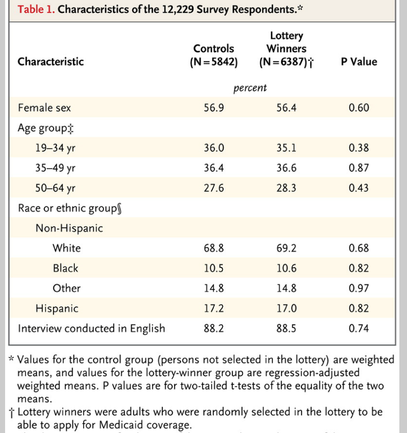
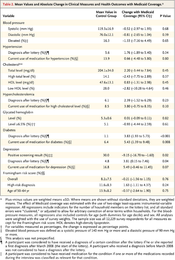
I’ve been doing a deep dive into Bayesian materials, the past few days. I’ve tried this before, but I seem to be making more headway this time.

One question is whether Bayesian methods and statistics informed by the more familiar frequency interpretation of probability can give different answers.

I found this question on CrossValidated, too – Examples of Bayesian and frequentist approach giving different answers.

Among other things, responders cite YouTube videos of John Kruschke – the author of Doing Bayesian Data Analysis A Tutorial With R and BUGS

Here is Kruschke’s “Bayesian Estimation Supercedes the t Test,” which, frankly, I recommend you click on after reading the subsequent comments here.

I guess my concern is not just whether Bayesian and the more familiar frequentist methods give different answers, but, really, whether they give different predictions that can be checked.

I get the sense that Kruschke focuses on the logic and coherence of Bayesian methods in a context where standard statistics may fall short.

But I have found a context where there are clear differences in predictive outcomes between frequentist and Bayesian methods.

This concerns Bayesian versus what you might call classical regression.

In lecture notes for a course on Machine Learning given at Ohio State in 2012, Brian Kulis demonstrates something I had heard mention of two or three years ago, and another result which surprises me big-time.

Let me just state this result directly, then go into some of the mathematical details briefly.

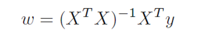
Suppose you have a standard ordinary least squares (OLS) linear regression, which might look like,

linreg

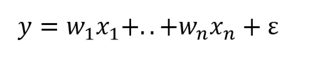
where we can assume the data for y and x are mean centered. Then, as is well, known, assuming the error process ε is N(0,σ) and a few other things, the BLUE (best linear unbiased estimate) of the regression parameters w is –

regressionformulaNow Bayesian methods take advantage of Bayes Theorem, which has a likelihood function and a prior probability on the right hand side of the equation, and the resulting posterior distribution on the left hand side of the equation.

What priors do we use for linear regression in a Bayesian approach?

Well, apparently, there are two options.

First, suppose we adopt priors for the predictors x, and suppose the prior is a normal distribution – that is the predictors are assumed to be normally distributed variables with various means and standard deviations.

In this case, amazingly, the posterior distribution for a Bayesian setup basically gives the equation for ridge regression.

ridgebayes

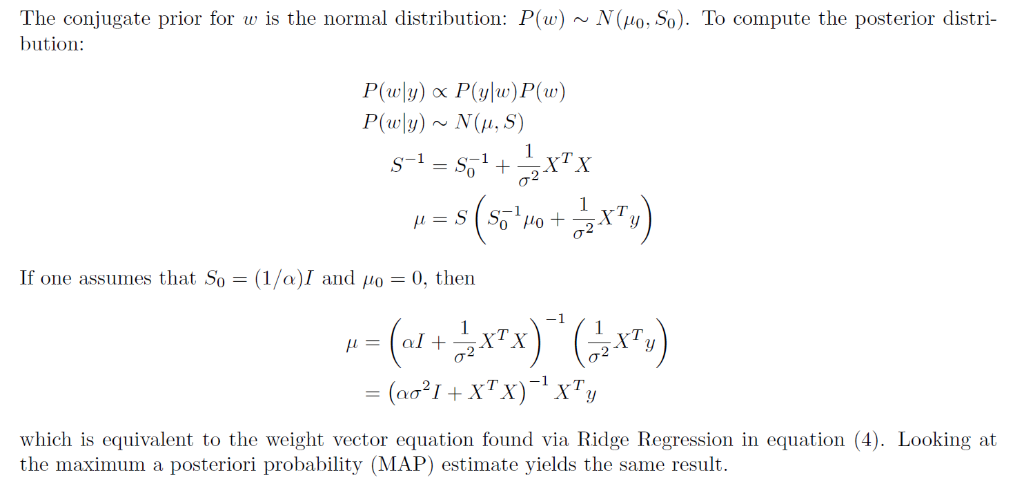
On the other hand, assuming a prior which is a Laplace distribution gives a posterior distribution which is equivalent to the lasso.

This is quite stunning, really.

Obviously, then, predictions from an OLS regression, in general, will be different from predictions from a ridge regression estimated on the same data, depending on the value of the tuning parameter λ (See the post here on this).

Similarly with a lasso regression – different forecasts are highly likely.

Now it’s interesting to question which might be more accurate – the standard OLS or the Bayesian formulations. The answer, of course, is that there is a tradeoff between bias and variability effected here. In some situations, ridge regression or the lasso will produce superior forecasts, measured, for example, by root mean square error (RMSE).

This is all pretty wonkish, I realize. But it conclusively shows that there can be significant differences in regression forecasts between the Bayesian and frequentist approaches.

What interests me more, though, is Bayesian methods for forecast combination. I am still working on examples of these procedures. But this is an important area, and there are a number of studies which show gains in forecast accuracy, measured by conventional metrics, for Bayesian model combinations.

Predicting Season Batting Averages, Bernoulli Processes – Bayesian vs Frequentist

Recently, Nate Silver boosted Bayesian methods in his popular book The Signal and the Noise – Why So Many Predictions Fail – But Some Don’t. I’m guessing the core application for Silver is estimating batting averages. Silver first became famous with PECOTA, a system for forecasting the performance of Major League baseball players.

Let’s assume a player’s probability p of getting a hit is constant over a season, but that it varies from year to year. He has up years, and down years. And let’s compare frequentist (gnarly word) and Bayesian approaches at the beginning of the season.

The frequentist approach is based on maximum likelihood estimation with the binomial formula

binomial

Here the n and the k in parentheses at the beginning of the expression stand for the combination of n things taken k at a time. That is, the number of possible ways of interposing k successes (hits) in n trials (times at bat) is the combination of n things taken k at a time (formula here).

If p is the player’s probability of hitting at bat, then the entire expression is the probability the player will have k hits in n times at bat.

The Frequentist Approach

There are a couple of ways to explain the frequentist perspective.

One is that this binomial expression is approximated to a higher and higher degree of accuracy by a normal distribution. This means that – with large enough n – the ratio of hits to total times at bat is the best estimate of the probability of a player hitting at bat – or k/n.

This solution to the problem also can be shown to follow from maximizing the likelihood of the above expression for any n and k. The large sample or asymptotic and maximum likelihood solutions are numerically identical.

The problem comes with applying this estimate early on in the season. So if the player has a couple of rough times at bat initially, the frequentist estimate of his batting average for the season at that point is zero.

The Bayesian Approach

The Bayesian approach is based on the posterior probability distribution for the player’s batting average. From Bayes Theorem, this is a product of the likelihood and a prior for the batting average.

Now generally, especially if we are baseball mavens, we have an idea of player X’s batting average. Say we believe it will be .34 – he’s going to have a great season, and did last year.

In this case, we can build that belief or information into a prior that is a beta distribution with two parameters α and β that generate a mean of α/(α+β).

In combination with the binomial likelihood function, this beta distribution prior combines algebraically into a closed form expression for another beta function with parameters which are adjusted by the values of k and n-k (the number of strike-outs). Note that walks (also being hit by the ball) do not count as times at bat.

This beta function posterior distribution then can be moved back to the other side of the Bayes equation when there is new information – another hit or strikeout.

Taking the average of the beta posterior as the best estimate of p, then, we get successive approximations, such as shown in the following graph.

BAyesbatting

So the player starts out really banging ‘em, and the frequentist estimate of his batting average for that season starts at 100 percent. The Bayesian estimate on the other hand is conditioned by a belief that his batting average should be somewhere around 0.34. In fact, as the grey line indicates, his actual probability p for that year is 0.3. Both the frequentist and Bayesian estimates converge towards this value with enough times at bat.

I used α=33 and β=55 for the initial values of the Beta distribution.

See this for a great discussion of the intuition behind the Beta distribution.

This, then, is a worked example showing how Bayesian methods can include prior information, and have small sample properties which can outperform a frequentist approach.

Of course, in setting up this example in a spreadsheet, it is possible to go on and generate a large number of examples to explore just how often the Bayesian estimate beats the frequentist estimate in the early part of a Bernoulli process.

Which goes to show that what you might call the classical statistical approach – emphasizing large sample properties, covering all cases, still has legs.

Leading Indicators

One value the forecasting community can provide is to report on the predictive power of various leading indicators for key economic and business series.

The Conference Board Leading Indicators

The Conference Board, a private, nonprofit organization with business membership, develops and publishes leading indicator indexes (LEI) for major national economies. Their involvement began in 1995, when they took over maintaining Business Cycle Indicators (BCI) from the US Department of Commerce.

For the United States, the index of leading indicators is based on ten variables: average weekly hours, manufacturing,  average weekly initial claims for unemployment insurance, manufacturers’ new orders, consumer goods and materials, vendor performance, slower deliveries diffusion index,manufacturers’ new orders, nondefense capital goods, building permits, new private housing units, stock prices, 500 common stocks, money supply, interest rate spread, and an index of consumer expectations.

The Conference Board, of course, also maintains coincident and lagging indicators of the business cycle.

This list has been imprinted on the financial and business media mind, and is a convenient go-to, when a commentator wants to talk about what’s coming in the markets. And it used to be that a rule of thumb that three consecutive declines in the Index of Leading Indicators over three months signals a coming recession. This rule over-predicts, however, and obviously, given the track record of economists for the past several decades, these Conference Board leading indicators have questionable predictive power.

Serena Ng Research

What does work then?

Obviously, there is lots of research on this question, but, for my money, among the most comprehensive and coherent is that of Serena Ng, writing at times with various co-authors.

SerenaNg

So in this regard, I recommend two recent papers

Boosting Recessions

Facts and Challenges from the Great Recession for Forecasting and Macroeconomic Modeling

The first paper is most recent, and is a talk presented before the Canadian Economic Association (State of the Art Lecture).

Hallmarks of a Serena Ng paper are coherent and often quite readable explanations of what you might call the Big Picture, coupled with ambitious and useful computation – usually reporting metrics of predictive accuracy.

Professor Ng and her co-researchers apparently have determined several important facts about predicting recessions and turning points in the business cycle.

For example –

  1. Since World War II, and in particular, over the period from the 1970’s to the present, there have been different kinds of recessions. Following Ng and Wright, ..business cycles of the 1970s and early 80s are widely believed to be due to supply shocks and/or monetary policy. The three recessions since 1985, on the other hand, originate from the financial sector with the Great Recession of 2008-2009 being a full-blown balance sheet recession. A balance sheet recession involves, a sharp increase in leverage leaves the economy vulnerable to small shocks because, once asset prices begin to fall, financial institutions, firms, and households all attempt to deleverage. But with all agents trying to increase savings simultaneously, the economy loses demand, further lowering asset prices and frustrating the attempt to repair balance sheets. Financial institutions seek to deleverage, lowering the supply of credit. Households and firms seek to deleverage, lowering the demand for credit.
  2. Examining a monthly panel of 132 macroeconomic and financial time series for the period 1960-2011, Ng and her co-researchers find that .. the predictor set with systematic and important predictive power consists of only 10 or so variables. It is reassuring that most variables in the list are already known to be useful, though some less obvious variables are also identified. The main finding is that there is substantial time variation in the size and composition of the relevant predictor set, and even the predictive power of term and risky spreads are recession specific. The full sample estimates and rolling regressions give confidence to the 5yr spread, the Aaa and CP spreads (relative to the Fed funds rate) as the best predictors of recessions.

So, the yield curve, a old favorite when it comes to forecasting recessions or turning points in the business cycle, performs less well in the contemporary context – although other (limited) research suggests that indicators combining facts about the yield curve with other metrics might be helpful.

And this exercise shows that the predictor set for various business cycles changes over time, although there are a few predictors that stand out. Again,

there are fewer than ten important predictors and the identity of these variables change with the forecast horizon. There is a distinct difference in the size and composition of the relevant predictor set before and after mid-1980. Rolling window estimation reveals that the importance of the term and default spreads are recession specific. The Aaa spread is the most robust predictor of recessions three and six months ahead, while the risky bond and 5yr spreads are important for twelve months ahead predictions. Certain employment variables have predictive power for the two most recent recessions when the interest rate spreads were uninformative. Warning signals for the post 1990 recessions have been sporadic and easy to miss.

Let me throw in my two bits here, before going on in subsequent posts to consider turning points in stock markets and in more micro-focused or industry time series.

At the end of “Boosting Recessions” Professor Ng suggests that higher frequency data may be a promising area for research in this field.

My guess is that is true, and that, more and more, Big Data and data analytics from machine learning will be applied to larger and more diverse sets of macroeconomics and business data, at various frequencies.

This is tough stuff, because more information is available today than in, say, the 1970’s or 1980’s. But I think we know what type of recession is coming – it is some type of bursting of the various global bubbles in stock markets, real estate, and possibly sovereign debt. So maybe more recent data will be highly relevant.

“The Record of Failure to Predict Recessions is Virtually Unblemished”

That’s Prakash Loungani from work published in 2001.

Recently, Loungani , working with Hites Ahir, put together an update – “Fail Again, Fail Better, Forecasts by Economists During the Great Recession” reprised in a short piece in VOX – “There will be growth in the spring”: How well do economists predict turning points?

Hites and Loungani looked at the record of professional forecasters 2008-2012. Defining recessions as a year-over-year fall in real GDP, there were 88 recessions in this period. Based on country-by-country predictions documented by Consensus Forecasts, economic forecasters were right less than 10 percent of the time, when it came to forecasting recessions – even a few months before their onset.

recessions

The chart on the left shows the timing of the 88 recession years, while the chart on the right shows the number of recession predicted by economists by the September of the previous year.

..none of the 62 recessions in 2008–09 was predicted as the previous year was drawing to a close. However, once the full realisation of the magnitude and breadth of the Great Recession became known, forecasters did predict by September 2009 that eight countries would be in recession in 2010, which turned out to be the right call in three of these cases. But the recessions in 2011–12 again came largely as a surprise to forecasters.

This type of result holds up to robustness checks

•First, lowering the bar on how far in advance the recession is predicted does not appreciably improve the ability to forecast turning points.

•Second, using a more precise definition of recessions based on quarterly data does not change the results.

•Third, the failure to predict turning points is not particular to the Great Recession but holds for earlier periods as well.

Forecasting Turning Points

How can macroeconomic and business forecasters consistently get it so wrong?

Well, the data is pretty bad, although there is more and more of it available and with greater time depths and higher frequencies. Typically, government agencies doing the national income accounts – the Bureau of Economic Analysis (BEA) in the United States – release macroeconomic information at one or two months lag (or more). And these releases usually involve revision, so there may be preliminary and then revised numbers.

And the general accuracy of GDP forecasts is pretty low, as Ralph Dillon of Global Financial Data (GFD) documents in the following chart, writing,

Below is a chart that has 5 years of quarterly GDP consensus estimates and actual GDP [for the US]. In addition, I have also shown in real dollars the surprise in both directions. The estimate vs actual with the surprise indicating just how wrong consensus was in that quarter.

RalphDillon

Somehow, though, it is hard not to believe economists are doing something wrong with their almost total lack of success in predicting recessions. Perhaps there is a herding phenomenon, coupled with a distaste for being a bearer of bad tidings.

Or maybe economic theory itself plays a role. Indeed, earlier research published on Vox suggests that application of about 50 macroeconomic models to data preceding the recession of 2008-2009, leads to poor results in forecasting the downturn in those years, again even well into that period.

All this suggests economics is more or less at the point medicine was in the 1700’s, when bloodletting was all the rage..

quack_bleeding_sm

In any case, this is the planned topic for several forthcoming posts, hopefully this coming week – forecasting turning points.

Note: The picture at the top of this post is Peter Sellers in his last role as Chauncey Gardiner – the simple-minded gardener who by an accident and stroke of luck was taken as a savant, and who said to the President – “There will be growth in the spring.”

First Cut Modeling – All Possible Regressions

If you can, form the regression

Y = β0+ β1X1+ β2X2+…+ βNXN

where Y is the target variable and the N variagles Xi are the predictors which have the highest correlations with the target variables, based on some cutoff value of the correlation, say +/- 0.3.

Of course, if the number of observations you have in the data are less than N, you can’t estimate this OLS regression. Some “many predictors” data shrinkage or dimension reduction technique is then necessary – and will be covered in subsequent posts.

So, for this discussion, assume you have enough data to estimate the above regression.

Chances are that the accompanying measures of significance of the coefficients βi – the t-statistics or standard errors – will indicate that only some of these betas are statistically significant.

And, if you poke around some, you probably will find that it is possible to add some of the predictors which showed low correlation with the target variable and have them be “statistically significant.”

So this is all very confusing. What to do?

Well, if the number of predictors is, say, on the order of 20, you can, with modern computing power, simply calculate all possible regressions with combinations of these 20 predictors. That turns out to be around 1 million regressions (210 – 1). And you can reduce this number by enforcing known constraints on the betas, e.g. increasing family income should be unambiguously related to the target variable and, so, if its sign in a regression is reversed, throw that regression out from consideration.

The statistical programming language R has packages set up to do all possible regressions. See, for example, Quick-R which offers this useful suggestion –

leapsBut what other metrics, besides R2, should be used to evaluate the possible regressions?

In-Sample Regression Metrics

I am not an authority on the Akaike Information Criterion (AIC) or the Bayesian Information Criterion (BIC), which, in addition, to good old R2, are leading in-sample metrics for regression adequacy.

With this disclaimer, here are a few points about the AIC and BIC.

AIC

So, as you can see, both the AIC and BIC are functions of the mean square error (MSE), as well as the number of predictors in the equation and the sample size. Both metrics essentially penalize models with a lot of explanatory variables, compared with other models that might perform similarly with fewer predictors.

  • There is something called the AIC-BIC dilemma. In a valuable reference on variable selection, Serena Ng writes that the AIC is understood to fall short when it comes to consistent model selection. Hyndman, in another must-read on this topic, writes that because of the heavier penalty, the model chosen by BIC is either the same as that chosen by AIC, or one with fewer terms.

Consistency in discussions of regression methods relates to the large sample properties of the metric or procedure in question. Basically, as the sample size n becomes indefinitely large (goes to infinity) consistent estimates or metrics converge to unbiased values. So the AIC is not in every case consistent, although I’ve read research which suggests that the problem only arises in very unusual setups.

  • In many applications, the AIC and BIC can both be minimum for a particular model, suggesting that this model should be given serious consideration.

Out-of-Sample Regression Metrics

I’m all about out-of-sample (OOS) metrics of adequacy of forecasting models.

It’s too easy to over-parameterize models and come up with good testing on in-sample data.

So I have been impressed with endorsements such as that of Hal Varian of cross-validation.

So, ideally, you partition the sample data into training and test samples. You estimate the predictive model on the training sample, and then calculate various metrics of adequacy on the test sample.

The problem is that often you can’t really afford to give up that much data to the test sample.

So cross-validation is one solution.

In k-fold cross validation, you partition the sample into k parts, estimating the designated regression on data from k-1 of those segments, and using the other or kth segment to test the model. Do this k times and then average or somehow collate the various error metrics. That’s the drill.,

Again, Quick-R suggests useful R code.

Hyndman also highlights a handy matrix formula to quickly compute the Leave Out One Cross Validation (LOOCV) metric.

LOOCV

LOOCV is not guaranteed to find the true model as the sample size increases, i.e. it is not consistent.

However, k-fold cross-validation can be consistent, if k increases with sample size.

Researchers recently have shown, however, that LOOCV can be consistent for the LASSO.

Selecting regression variables is, indeed, a big topic.

Coming posts will focus on the problem of “many predictors” when the set of predictors is greater in number than the set of observations on the relevant variables.

Top image from Washington Post

Selecting Predictors

In a recent post on logistic regression, I mentioned research which developed diagnostic tools for breast cancer based on true Big Data parameters – notably 62,219 consecutive mammography records from 48,744 studies in 18,270 patients reported using the Breast Imaging Reporting and Data System (BI-RADS) lexicon and the National Mammography Database format between April 5, 1999 and February 9, 2004.

This research built a logistic regression model with 36 predictors, selected from the following information residing in the National Mammography Database (click to enlarge).

        breastcancertyp               

The question arises – are all these 36 predictors significant? Or what is the optimal model? How does one select the subset of the available predictor variables which really count?

This is the problem of selecting predictors in multivariate analysis – my focus for several posts coming up.

So we have a target variable y and set of potential predictors x={x1,x2,….,xn}. We are interested in discovering a predictive relationship, y=F(x*) where x* is some possibly proper subset of x. Furthermore, we have data comprising m observations on y and x, which in due time we will label with subscripts.

There are a range of solutions to this very real, very practical modeling problem.

Here is my short list.

  1. Forward Selection. Begin with no candidate variables in the model. Select the variable that boosts some goodness-of-fit or predictive metric the most. Traditionally, this has been R-Squared for an in-sample fit. At each step, select the candidate variable that increases the metric the most. Stop adding variables when none of the remaining variables are significant. Note that once a variable enters the model, it cannot be deleted.
  2. Backward Selection. This starts with the superset of potential predictors and eliminates variables which have the lowest score by some metric – traditionally, the t-statistic.
  3. Stepwise regression. This combines backward and forward selection of regressors.
  4. Regularization and Selection by means of the LASSO. Here is the classic article and here is a post, and here is a post in this blog on the LASSO.
  5. Information criteria applied to all possible regressions – pick the best specification by applying the Aikaike Information Criterion (AIC) or Bayesian Information Criterion (BIC) to all possible combinations of regressors. Clearly, this is only possible with a limited number of potential predictors.
  6. Cross-validation or other out-of-sample criteria applied to all possible regressions – Typically, the error metrics on the out-of-sample data cuts are averaged, and the lowest average error model is selected out of all possible combinations of predictors.
  7. Dimension reduction or data shrinkage with principal components. This is a many predictors formulation, whereby it is possible to reduce a large number of predictors to a few principal components which explain most of the variation in the data matrix.
  8. Dimension reduction or data shrinkage with partial least squares. This is similar to the PC approach, but employs a reduction to information from both the set of potential predictors and the dependent or target variable.

There certainly are other candidate techniques, but this is a good list to start with.

Wonderful topic, incidentally. Dives right into the inner sanctum of the mysteries of statistical science as practiced in the real world.

Let me give you the flavor of how hard it is to satisfy the classical criterion for variable selection, arriving at unbiased or consistent estimates of effects of a set of predictors.

And, really, the paradigmatic model is ordinary least squares (OLS) regression in which the predictive function F(.) is linear.

The Specification Problem

The problem few analysts understand is called specification error.

So assume that there is a true model – some linear expression in variables multiplied by their coefficients, possibly with a constant term added.

Then, we have some data to estimate this model.

Now the specification problem is that when predictors are not orthogonal, i.e. when they are correlated, leaving out a variable from the “true” specification imparts a bias to the estimates of coefficients of variables included in the regression.

This complications sequential methods of selecting predictors for the regression.

So in any case I will have comments forthcoming on methods of selecting predictors.

Trend Following in the Stock Market

Noah Smith highlights some amazing research on investor attitudes and behavior in Does trend-chasing explain financial markets?

He cites 2012 research by Greenwood and Schleifer where these researchers consider correlations between investor expectations, as measured by actual investor surveys, and subsequent investor behavior.

A key graphic is the following:

Untitled

This graph shows rather amazingly, as Smith points out..when people say they expect stocks to do well, they actually put money into stocks. How do you find out what investor expectations are? – You ask them – then it’s interesting it’s possible to show that for the most part they follow up attitudes with action.

This discussion caught my eye since Sornette and others attribute the emergence of bubbles to momentum investing or trend-following behavior. Sometimes Sornette reduces this to “herding” or mimicry. I think there are simulation models, combining trend investors with others following a market strategy based on “fundamentals”, which exhibit cumulating and collapsing bubbles.

More on that later, when I track all that down.

For the moment, some research put out by AQR Capital Management in Greenwich CT makes big claims for an investment strategy based on trend following –

The most basic trend-following strategy is time series momentum – going long markets with recent positive returns and shorting those with recent negative returns. Time series momentum has been profitable on average since 1985 for nearly all equity index futures, fixed income futures, commodity futures, and currency forwards. The strategy explains the strong performance of Managed Futures funds from the late 1980s, when fund returns and index data first becomes available.

This paragraph references research by Moscowitz and Pederson published in the Journal of Financial Economics – an article called Time Series Momentum.

But more spectacularly, this AQR white paper presents this table of results for a trend-following investment strategy decade-by-decade.

Trend

There are caveats to this rather earth-shaking finding, but what it really amounts to for many investors is a recommendation to look into managed futures.

Along those lines there is this video interview, conducted in 2013, with Brian Hurst, one of the authors of the AQR white paper. He reports that recently trending-following investing has run up against “choppy” markets, but holds out hope for the longer term –

http://www.morningstar.com/advisor/v/69423366/will-trends-reverse-for-managed-futures.htm

At the same time, caveat emptor. Bloomberg reported late last year that a lot of investors plunging into managed futures after the Great Recession of 2008-2009 have been disappointed, in many cases, because of the high, unregulated fees and commissions involved in this type of alternative investment.

Forecasts in the Medical and Health Care Fields

I’m focusing on forecasting issues in the medical field and health care for the next few posts.

One major issue is the cost of health care in the United States and future health care spending. Just when many commentators came to believe the growth in health care expenditures was settling down to a more moderate growth path, spending exploded in late 2013 and in the first quarter of 2014, growing at a year-over-year rate of 7 percent (or higher, depending on how you cut the numbers). Indeed, preliminary estimates of first quarter GDP growth would have been negative– indicating start of a possible new recession – were it not for the surge in healthcare spending.

Annualizing March 2014 numbers, US health case spending is now on track to hit a total of $3.07 trillion.

Here are estimates of month-by-month spending from the Altarum Institute.

YOYgrhcspend

The Altarum Institute blends data from several sources to generate this data, and also compiles information showing how medical spending has risen in reference to nominal and potential GDP.

altarum1

Payments from Medicare and Medicaid have been accelerating, as the following chart from the comprehensive Center for
Disease Control (CDC) report
 suggests.

Personalhealthcareexppic

 Projections of Health Care Spending

One of the primary forecasts in this field is the Centers for Medicare & Medicaid Services’ (CMS) National Health Expenditures (NHE) projections.

The latest CMS projections have health spending projected to grow at an average rate of 5.8 percent from 2012-2022, a percentage point faster than expected growth in nominal GDP.

The Affordable Care Act is one of the major reasons why health care spending is surging, as millions who were previously not covered by health insurance join insurance exchanges.

The effects of the ACA, as well as continued aging of the US population and entry of new and expensive medical technologies, are anticipated to boost health care spending to 19-20 percent of GDP by 2021.

healthgdp

The late Robert Fogel put together a projection for the National Bureau of Economic Research (NBER) which suggested the ratio of health care spending to GDP would rise to 29 percent by 2040.

The US Health Care System Is More Expensive Than Others

I get the feeling that the econometric and forecasting models for these extrapolations – as well as the strategically important forecasts for future Medicare and Medicaid costs – are sort of gnarly, compared to the bright shiny things which could be developed with the latest predictive analytics and Big Data methods.

Neverhteless, it is interesting that an accuracy analysis of the CMS 11 year projections shows them to be are relatively good, at least one to three years out from current estimates. That was, of course, over a period with slowing growth.

But before considering any forecasting model in detail, I think it is advisable to note how anomalous the US health care system is in reference to other (highly developed) countries.

The OECD, for example, develops
interesting comparisons of medical spending
 in the US and other developed and emerging economies.

OECDcomp2

The OECD data also supports a breakout of costs per capita, as follows.

OECDmedicalcomp

So the basic reason why the US health care system is so expensive is that, for example, administrative costs per capita are more than double those in other developed countries. Practitioners also are paid almost double that per capital of what they receive in these other countries, countries with highly regarded healthcare systems. And so forth and so on.

The Bottom Line

Health care costs in the US typically grow faster than GDP, and are expected to accelerate for the rest of this decade. The ratio of health care costs to US GDP is rising, and longer range forecasts suggest almost a third of all productive activity by mid-century will be in health care and the medical field.

This suggests either a radically different type of society – a care-giving culture, if you will – or that something is going to break or make a major transition between now and then.

A Medical Forecasting Controversy – Increased Deaths from Opting-out From Expanding Medicaid Coverage

Menzie Chinn at Econbrowser recently posted – Estimated Elevated Mortality Rates Associated with Medicaid Opt-Outs. This features projections from a study which suggests an additional 7000-17,000 persons will die annually, if 25 states opt out of Medicaid expansion associated with the Affordable Care Act (ACA). Thus, the Econbrowser chart with these extrapolations suggests within only few years the additional deaths in these 25 states would exceed causalities in the Vietnam War (58,220).

The controversy ran hot in the Comments.

Apart from the smoke and mirrors, though, I wanted to look into the underlying estimates to see whether they support such a clear connection between policy choices and human mortality.

I think what I found is that the sources behind the estimates do, in fact, support the idea that expanding Medicaid can lower mortality and, additionally, generally improve the health status of participating populations.

But at what cost – and it seems the commenters mostly left that issue alone – preferring to rant about the pernicious effects of regulation, implying more Medicaid would actually probably exert negative or no effects on mortality.

As an aside, the accursed “death panels” even came up, with a zinger by one commentator –

Ah yes, the old death panel canard. No doubt those death panels will be staffed by Nigerian born radical gay married Marxist Muslim atheists with fake birth certificates. Did I miss any of the idiotic tropes we hear on Fox News? Oh wait, I forgot…those death panels will meet in Benghazi. And after the death panels it will be on to fight the war against Christmas.

The Evidence

Econbrowser cites Opting Out Of Medicaid Expansion: The Health And Financial Impacts as the source of the impact numbers for 25 states opting out of expanded Medicaid.

This Health Affairs blog post draws on three statistical studies –

The Oregon Experiment — Effects of Medicaid on Clinical Outcomes

Mortality and Access to Care among Adults after State Medicaid Expansions

Health Insurance and Mortality in US Adults

I list these the most recent first. Two of them appear in the New England Journal of Medicine, a publication with a reputation for high standards. The third and historically oldest article appears in the American Journal of Public Health.

The Oregon Experiment is exquisite statistical research with a randomized sample and control group, but does not directly estimate mortality. Rather, it highlights the reductions in a variety of health problems from a limited expansion of Medicaid coverage for low-income adults through a lottery drawing in 2008.

Data collection included –

..detailed questionnaires on health care, health status, and insurance coverage; an inventory of medications; and performance of anthropometric and blood-pressure measurements. Dried blood spots were also obtained.

If you are considering doing a similar study, I recommend the Appendix to this research for methodological ideas. Regression, both OLS and logistic, was a major tool to compare the experimental and control groups.

The data look very clean to me. Consider, for example, these comparisons between the experimental and control groups.

Oregonsurvey

Here are the basic results.

Oregon2

The bottom line is that the Oregon study found –

..that insurance led to increased access to and utilization of health care, substantial improvements in mental health, and reductions in financial strain, but we did not observe reductions in measured blood-pressure, cholesterol, or glycated hemoglobin levels.

The second study, published in 2012, considered mortality impacts of expanding Medicare in Arizona, Maine, and New York. New Hampshire, Pennsylvania, and Nevada and New Mexico were used as controls, in a study that encompassed five years before and after expansion of Medicaid programs.

Here are the basic results of this research.

mortality1

As another useful Appendix documents, the mortality estimates of this study are based on a regression analysis incorporating county-by-county data from the study states.

There are some key facts associated with some of the tables displayed which are in the source links. Also, you would do well to click on these tables to enlarge them for reading.

The third study, by authors associated with the Harvard Medical School, had the following Abstract

Objectives. A 1993 study found a 25% higher risk of death among uninsured compared with privately insured adults. We analyzed the relationship between uninsurance and death with more recent data.

Methods. We conducted a survival analysis with data from the Third National Health and Nutrition Examination Survey. We analyzed participants aged 17 to 64 years to determine whether uninsurance at the time of interview predicted death.

Results. Among all participants, 3.1% (95% confidence interval [CI] = 2.5%, 3.7%) died. The hazard ratio for mortality among the uninsured compared with the insured, with adjustment for age and gender only, was 1.80 (95% CI = 1.44, 2.26). After additional adjustment for race/ethnicity, income, education, self- and physician-rated health status, body mass index, leisure exercise, smoking, and regular alcohol use, the uninsured were more likely to die (hazard ratio = 1.40; 95% CI = 1.06, 1.84) than those with insurance.

Conclusions. Uninsurance is associated with mortality. The strength of that association appears similar to that from a study that evaluated data from the mid-1980s, despite changes in medical therapeutics and the demography of the uninsured since that time.

Some Thoughts

Statistical information and studies are good for informing judgment. And on this basis, I would say the conclusion that health insurance increases life expectancy and reduces the incidence of some complaints is sound.

On the other hand, whether one can just go ahead and predict the deaths from a blanket adoption of an expansion of Medicaid seems like a stretch – particularly if one is going to present, as the Econbrowser post does, a linear projection over several years. Presumably, there are covariates which might change in these years, so why should it be straight-line? OK, maybe the upper and lower bounds are there to deal with this problem. But what are the covariates?

Forecasting in the medical and health fields has come of age, as I hope to show in several upcoming posts.

Looking Ahead, Looking Back

Looking ahead, I’m almost sure I want to explore forecasting in the medical field this coming week. Menzie Chin at Econbrowser, for example, highlights forecasts that suggest states opting out of expanded Medicare are flirting with higher death rates. This sets off a flurry of comments, highlighting the importance and controversy attached to various forecasts in the field of medical practice.

There’s a lot more – from bizarre and sad mortality trends among Russian men since the collapse of the Soviet Union, now stabilizing to an extent, to systems which forecast epidemics, to, again, cost and utilization forecasts.

Today, however, I want to wind up this phase of posts on forecasting the stock and related financial asset markets.

Market Expectations in the Cross Section of Present Values

That’s the title of Bryan Kelly and Seth Pruitt’s article in the Journal of Finance, downloadable from the Social Science Research Network (SSRN).

The following chart from this paper shows in-sample (IS) and out-of-sample (OOS) performance of Kelly and Pruitt’s new partial least squares (PLS) predictor, and IS and OOS forecasts from another model based on the aggregate book-to-market ratio. (Click to enlarge)

KellyPruitt1

The Kelly-Pruitt PLS predictor is much better in both in-sample and out-of-sample than the more traditional regression model based on aggregate book-t0-market ratios.

What Kelly and Pruitt do is use what I would call cross-sectional time series data to estimate aggregate market returns.

Basically, they construct a single factor which they use to predict aggregate market returns from cross-sections of portfolio-level book-to-market ratios.

So,

To harness disaggregated information we represent the cross section of asset-specific book-to-market ratios as a dynamic latent factor model. We relate these disaggregated value ratios to aggregate expected market returns and cash flow growth. Our model highlights the idea that the same dynamic state variables driving aggregate expectations also govern the dynamics of the entire panel of asset-specific valuation ratios. This representation allows us to exploit rich cross-sectional information to extract precise estimates of market expectations.

This cross-sectional data presents a “many predictors” type of estimation problem, and the authors write that,

Our solution is to use partial least squares (PLS, Wold (1975)), which is a simple regression-based procedure designed to parsimoniously forecast a single time series using a large panel of predictors. We use it to construct a univariate forecaster for market returns (or dividend growth) that is a linear combination of assets’ valuation ratios. The weight of each asset in this linear combination is based on the covariance of its value ratio with the forecast target.

I think it is important to add that the authors extensively explore PLS as a procedure which can be considered to be built from a series of cross-cutting regressions, as it were (See their white paper on three-pass regression filter).

But, it must be added, this PLS procedure can be summarized in a single matrix formula, which is

KPmatrixformula

Readers wanting definitions of these matrices should consult the Journal of Finance article and/or the white paper mentioned above.

The Kelly-Pruitt analysis works where other methods essentially fail – in OOS prediction,

Using data from 1930-2010, PLS forecasts based on the cross section of portfolio-level book-to-market ratios achieve an out-of-sample predictive R2 as high as 13.1% for annual market returns and 0.9% for monthly returns (in-sample R2 of 18.1% and 2.4%, respectively). Since we construct a single factor from the cross section, our results can be directly compared with univariate forecasts from the many alternative predictors that have been considered in the literature. In contrast to our results, previously studied predictors typically perform well in-sample but become insignifcant out-of-sample, often performing worse than forecasts based on the historical mean return …

So, the bottom line is that aggregate stock market returns are predictable from a common-sense perspective, without recourse to abstruse error measures. And I believe Amit Goyal, whose earlier article with Welch contests market predictability, now agrees (personal communication) that this application of a PLS estimator breaks new ground out-of-sample – even though its complexity asks quite a bit from the data.

Note, though, how volatile aggregate realized returns for the US stock market are, and how forecast errors of the Kelly-Pruitt analysis become huge during the 2008-2009 recession and some previous recessions – indicated by the shaded lines in the above figure.

Still something is better than nothing, and I look for improvements to this approach – which already has been applied to international stocks by Kelly and Pruitt and other slices portfolio data.