Category Archives: anatomy of an asset bubble

An Update on Bitcoin

Fairly hum-drum days of articles on testing for unit roots in time series led to discovery of an extraordinary new forecasting approach – using the future to predict the present.

Since virtually the only empirical application of the new technique is predicting bubbles in Bitcoin values, I include some of the recent news about Bitcoins at the end of the post.

Noncausal Autoregressive Models

I think you have to describe the forecasting approach recently considered by Lanne and Saikkonen, as well as Hencic, Gouriéroux and others, as “exciting,” even “sexy” in a Saturday Night Live sort of way.

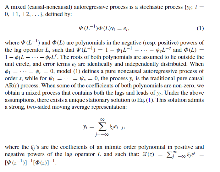
Here is a brief description from a 2015 article in the Econometrics of Risk called Noncausal Autoregressive Model in Application to Bitcoin/USD Exchange Rates

noncausal

I’ve always been a little behind the curve on lag operators, but basically Ψ(L-1) is a function of the standard lagged operators, while Φ(L) is a second function of offsets to future time periods.

To give an example, consider,

yt = k1yt-1+s1yt+1 + et

where subscripts t indicate time period.

In other words, the current value of the variable y is related to its immediately past value, and also to its future value, with an error term e being included.

This is what I mean by the future being used to predict the present.

Ordinarily in forecasting, one would consider such models rather fruitless. After all, you are trying to forecast y for period t+1, so how can you include this variable in the drivers for the forecasting setup?

But the surprising thing is that it is possible to estimate a relationship like this on historic data, and then take the estimated parameters and develop simulations which lead to predictions at the event horizon, of, say, the next period’s value of y.

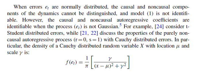
This is explained in the paragraph following the one cited above –

noncausal2

In other words, because et in equation (1) can have infinite variance, it is definitely not normally distributed, or distributed according to a Gaussian probability distribution.

This is fascinating, since many financial time series are associated with nonGaussian error generating processes – distributions with fat tails that often are platykurtotic.

I recommend the Hencic and Gouriéroux article as a good read, as well as interesting analytics.

The authors proposed that a stationary time series is overlaid by explosive speculative periods, and that something can be abstracted in common from the structure of these speculative excesses.

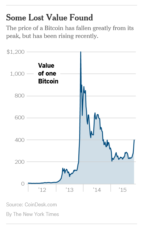
Mt. Gox, of course, mentioned in this article, was raided in 2013 by Japanese authorities, after losses of more than $465 million from Bitcoin holders.

Now, two years later, the financial industry is showing increasing interest in the underlying Bitcoin technology and Bitcoin prices are on the rise once again.

bitcoin

Anyway, the bottom line is that I really, really like a forecast methodology based on recognition that data come from nonGaussian processes, and am intrigued by the fact that the ability to forecast with noncausal AR models depends on the error process being nonGaussian.

2014 in Review – I

I’ve been going over past posts, projecting forward my coming topics. I thought I would share some of the best and some of the topics I want to develop.

Recommendations From Early in 2014

I would recommend Forecasting in Data-Limited Situations – A New Day. There, I illustrate the power of bagging to “bring up” the influence of weakly significant predictors with a regression example. This is fairly profound. Weakly significant predictors need not be weak predictors in an absolute sense, providing you can bag the sample to hone in on their values.

There also are several posts on asset bubbles.

Asset Bubbles contains an intriguing chart which proposes a way to “standardize” asset bubbles, highlighting their different phases.

BubbleAnatomy

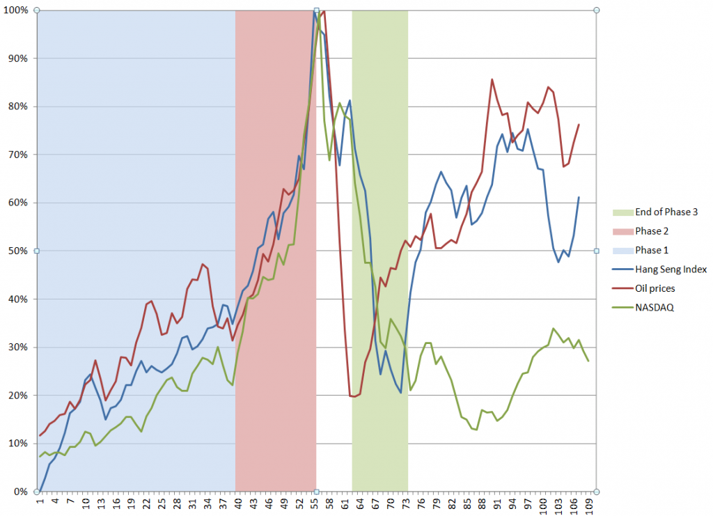
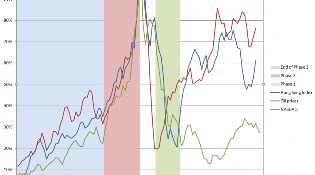
The data are from the Hong Kong Hang Seng Index, oil prices to refiners (combined), and the NASDAQ 100 Index. I arrange the series so their peak prices – the peak of the bubble – coincide, despite the fact that the peaks occurred at different times (October 2007, August 2008, March 2000, respectively). Including approximately 5 years of prior values of each time series, and scaling the vertical dimensions so the peaks equal 100 percent, suggesting three distinct phases. These might be called the ramp-up, faster-than-exponential growth, and faster-than-exponential decline. Clearly, I am influenced by Didier Sornette in choice of these names.

I’ve also posted several times on climate change, but I think, hands down, the most amazing single item is this clip from “Chasing Ice” showing calving of a Greenland glacier with shards of ice three times taller than the skyscrapers in Lower Manhattan.

See also Possibilities for Abrupt Climate Change.

I’ve been told that Forecasting and Data Analysis – Principal Component Regression is a helpful introduction. Principal component regression is one of the several ways one can approach the problem of “many predictors.”

In terms of slide presentations, the Business Insider presentation on the “Digital Future” is outstanding, commented on in The Future of Digital – I.

Threads I Want to Build On

There are threads from early in the year I want to follow up in Crime Prediction. Just how are these systems continuing to perform?

Another topic I want to build on is in Using Math to Cure Cancer. I’d like to find a sensitive discussion of how MD’s respond to predictive analytics sometime. It seems to me that US physicians are sometimes way behind the curve on what could be possible, if we could merge medical databases and bring some machine learning to bear on diagnosis and treatment.

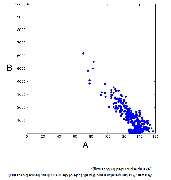
I am intrigued by the issues in Causal Discovery. You can get the idea from this chart. Here, B → A but A does not cause B – Why?

casualpic

I tried to write an informed post on power laws. The holy grail here is, as Xavier Gabaix says, robust, detail-independent economic laws.

Federal Reserve Policies

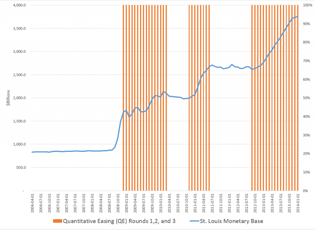
Federal Reserve policies are of vital importance to business forecasting. In the past two or three years, I’ve come to understand the Federal Reserve Balance sheet better, available from Treasury Department reports. What stands out is this chart, which anyone surfing finance articles on the net has seen time and again.

FedMBandQEgraph

This shows the total of the “monetary base” dating from the beginning of 2006. The red shaded areas of the graph indicate the time windows in which the various “Quantitative Easing” (QE) policies have been in effect – now three QE’s, QE1, QE2, and QE3.

Obviously, something is going on.

I had fun with this chart in a post called Rhino and Tapers in the Room – Janet Yellen’s Menagerie.

OK, folks, for this intermission, you might want to take a look at Malcolm Gladwell on the 10,000 Hour Rule


So what happens if you immerse yourself in all aspects of the forecasting field?

Coming – how posts in Business Forecast Blog pretty much establish that rational expectations is a concept way past its sell date.

Guy contemplating with wine at top from dreamstime.


Daily Updates on Whether Key Financial Series Are Going Into Bubble Mode

Financial and asset bubbles are controversial, amazingly enough, in standard economics, where a bubble is defined as a divergence in a market from fundamental value. The problem, of course, is what is fundamental value. Maybe investors in the dot.com frenzy of the late 1990’s believed all the hype about never-ending and accelerating growth in IT, as a result of the Internet.

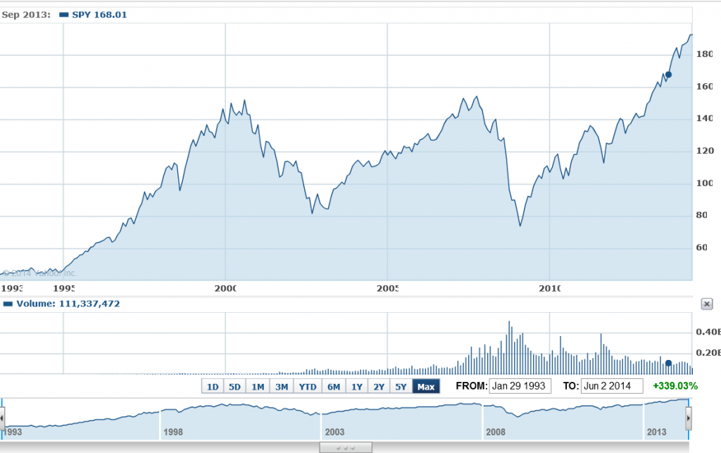
So we have this chart for the ETF SPY which tracks the S&P500. Now, there are similarities between the upswing of the two previous peaks – which both led to busts – and the current surge in the index.

sp500yahoo

Where is this going to end?

Well, I’ve followed the research of Didier Sornette and his co-researchers, and, of course, Sornette’s group has an answer to this question, which is “probably not well.” Currently, Professor Sornette occupies the Chair of Entreprenuerial Risk at the Swiss Federal Institute of Technology in Zurich.

There is an excellent website maintained by ETH Zurich for the theory and empirical analysis of financial bubbles.

Sornette and his group view bubbles from a more mathematical perspective, finding similarities in bubbles of durations from months to years in the concept of “faster than exponential growth.” At some point, that is, asset prices embark on this type of trajectory. Because of various feedback mechanisms in financial markets, as well as just herding behavior, asset prices in bubble mode oscillate around an accelerating trajectory which – at some point that Sornette claims can be identified mathematically – becomes unsupportable. At such a moment, there is a critical point where the probability of a collapse or reversal of the process becomes significantly greater.

This group is on the path of developing a new science of asset bubbles, if you will.

And, by this logic, there are positive and negative bubbles.

The sharp drop in stock prices in 2008, for example, represents a negative stock market bubble movement, and also is governed or described, by this theory, by an underlying differential equation. This differential equation leads to critical points, where the probability of reversal of the downward price movement is significantly greater.

I have decided I am going to compute the full price equation suggested by Sornette and others to see what prediction for a critical point emerges for the S&P 500 or SPY.

But actually, this would be for my own satisfaction, since Sornette’s group already is doing this in the Financial Crisis Observatory.

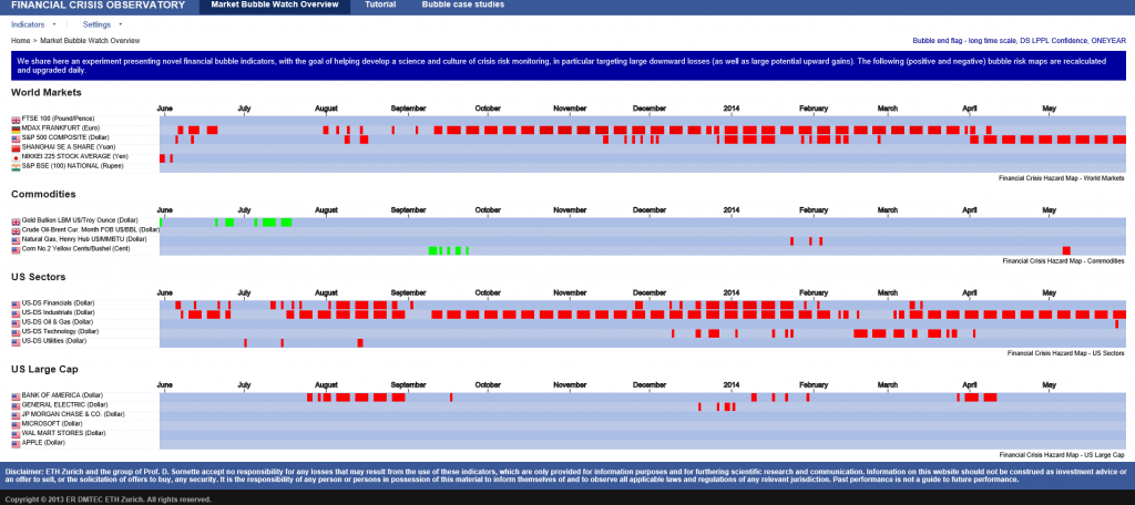
I hope I am not violating Swiss copyright rules by showing the following image of the current Financial Crisis Observatory page (click to enlarge)

FCO

As you notice there are World Markets, Commodities, US Sectors, US Large Cap categories and little red and green boxes scattered across the page, by date.

The red boxes indicate computations by the ETH Zurich group that indicate the financial series in question is going into bubble mode. This is meant as a probabilistic evaluation and is accompanied by metrics which indicate the likelihood of a critical point. These computations are revised daily, according to the site.

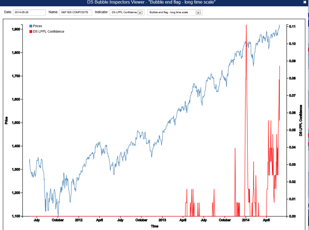
For example, there is a red box associated with the S&P 500 in late May. If you click on this red box, you  produces the following chart.

SornetteSP500

The implication is that the highest red spike in the chart at the end of December 2013 is associated with a reversal in the index, and also that one would be well-advised to watch for another similar spike coming up.

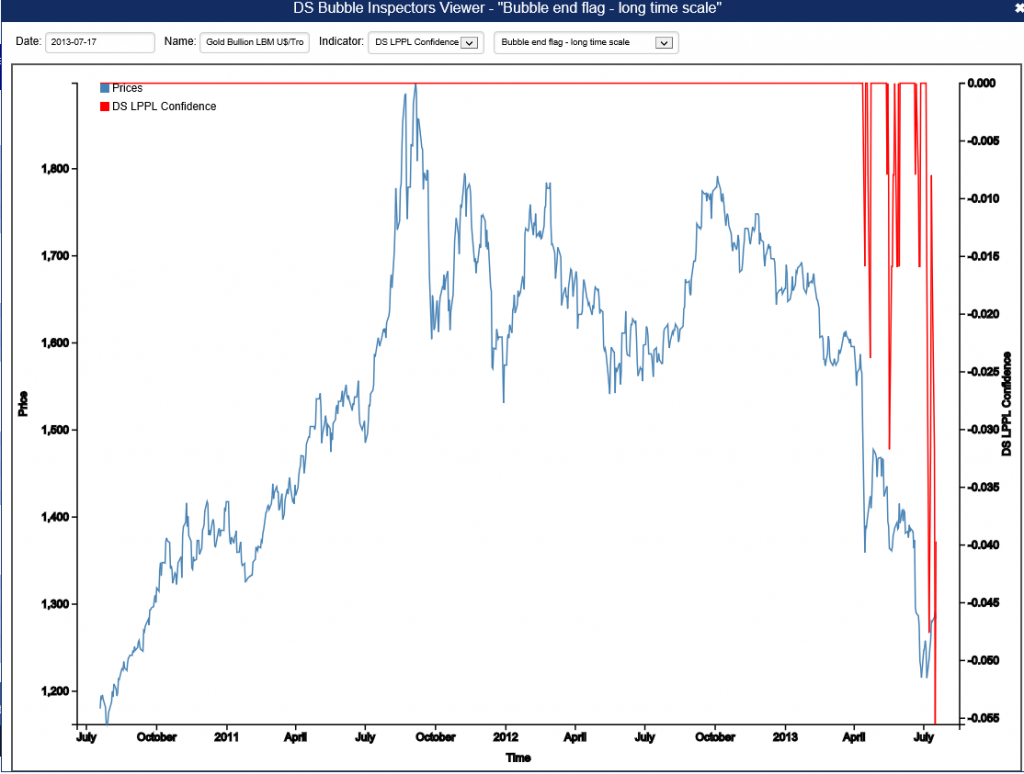
Negative bubbles, as I mention, also are in the lexicon. One of the green boxes for gold, for example, produces the following chart.

Goldnegbubble

This is fascinating stuff, and although Professor Sornette has gotten some media coverage over the years, even giving a TED talk recently, the economics profession generally seems to have given him almost no attention.

I plan a post on this approach with a worked example. It certainly is much more robust that some other officially sanctioned approaches.

Didier Sornette – Celebrity Bubble Forecaster

Professor Didier Sornette, who holds the Chair in Entreprenuerial Risks at ETH Zurich, is an important thinker, and it is heartening to learn the American Association for the Advancement of Science (AAAS) is electing Professor Sornette a Fellow.

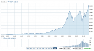
It is impossible to look at, say, the historical performance of the S&P 500 over the past several decades, without concluding that, at some point, the current surge in the market will collapse, as it has done previously when valuations ramped up so rapidly and so far.

S&P500recent

Sornette focuses on asset bubbles and has since 1998, even authoring a book in 2004 on the stock market.

At the same time, I think it is fair to say that he has been largely ignored by mainstream economics (although not finance), perhaps because his training is in physical science. Indeed, many of his publications are in physics journals – which is interesting, but justified because complex systems dynamics cross the boundaries of many subject areas and sciences.

Over the past year or so, I have perused dozens of Sornette papers, many from the extensive list at http://www.er.ethz.ch/publications/finance/bubbles_empirical.

This list is so long and, at times, technical, that videos are welcome.

Along these lines there is Sornette’s Ted talk (see below), and an MP4 file which offers an excellent, high level summary of years of research and findings. This MP4 video was recorded at a talk before the International Center for Mathematical Sciences at the University of Edinburgh.

Intermittent criticality in financial markets: high frequency trading to large-scale bubbles and crashes. You have to download the file to play it.

By way of précis, this presentation offers a high-level summary of the roots of his approach in the economics literature, and highlights the role of a central differential equation for price change in an asset market.

So since I know everyone reading this blog was looking forward to learning about a differential equation, today, let me highlight the importance of the equation,

dp/dt = cpd

This basically says that price change in a market over time depends on the level of prices – a feature of markets where speculative forces begin to hold sway.

This looks to be a fairly simple equation, but the solutions vary, depending on the values of the parameters c and d. For example, when c>0 and the exponent d  is greater than one, prices change faster than exponentially and within some finite period, a singularity is indicated by the solution to the equation. Technically, in the language of differential equations this is called a finite time singularity.

Well, the essence of Sornette’s predictive approach is to estimate the parameters of a price equation that derives, ultimately, from this differential equation in order to predict when an asset market will reach its peak price and then collapse rapidly to lower prices.

The many sources of positive feedback in asset pricing markets are the basis for the faster than exponential growth, resulting from d>1. Lots of empirical evidence backs up the plausibility and credibility of herd and imitative behaviors, and models trace out the interaction of prices with traders motivated by market fundamentals and momentum traders or trend followers.

Interesting new research on this topic shows that random trades could moderate the rush towards collapse in asset markets – possibly offering an alternative to standard regulation.

The important thing, in my opinion, is to discard notions of market efficiency which, even today among some researchers, result in scoffing at the concept of asset bubbles and basic sabotage of research that can help understand the associated dynamics.

Here is a TED talk by Sornette from last summer.

Simulating the SPDR SPY Index

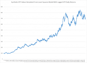
Here is a simulation of the SPDR SPY exchange traded fund index, using an autoregressive model estimated with maximum likehood methods, assuming the underlying distribution is not normal, but is instead a Student t distribution.

SimulatedSPY

The underlying model is of the form

SPYRRt=a0+a1SPYRRt-1…a30SPYRRt-30

Where SPYRR is the daily return (trading day to trading day) of the SPY, based on closing prices.

This is a linear model, and an earlier post lists its exact parameters or, in other words, the coefficients attached to each of the lagged terms, as well as the value of the constant term.

This model is estimated on a training sample of daily returns from 1993 to 2008, and, is applied to out-of-sample data from 2008 to the present. It predicts about 53 percent of the signs of the next-day-returns correctly. The model generates more profits in the 2008 to the present period than a Buy & Hold strategy.

The simulation listed above uses the model equation and parameters, generating a series of 4000 values recursively, adding in randomized error terms from the fit of the equation to the training or estimation data.

This is work-in-progress. Currently, I am thinking about how to properly incorporate volatility. Obviously, any number of realizations are possible. The chart shows one of them, which has an uncanny resemblance to the actual historical series, due to the fact that volatility is created over certain parts of the simulation, in this case by chance.

To review, I set in motion the following process:

  1. Predict a xt = f(xt-1,..,xt-30) based on the 30 coefficients and a constant term from the autoregressive model, applied to 30 preceding values of xt generated by this process (The estimation is initialized with the first 30 actual values of the test data).
  2. Randomly select a residual for this xt based on the empirical distribution of errors from the fit of the predictive relationship to the training set.
  3. Iterate.

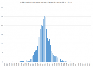
The error distribution looks like this.

MLresidualsSPY

This is obviously not a normal distribution, since “too many” predictive errors are concentrated around the zero error line.

For puzzles and problems, this is a fertile area for research, and you can make money. But obviously, be careful.

In any case, I think this research, in an ultimate analysis, converges to the work being done by Didier Sornette and his co-researchers and co-authors. Sornette et al develop an approach through differential equations, focusing on critical points where a phase shift occurs in trading with a rapid collapse of an asset bubble. 

This approach comes at similar, semi-periodic, logarithmically increasing values through linear autoregressive equations, which, as is well known, have complex dynamics when analyzed as difference equations.

The prejudice in economics and econometrics that “you can’t predict the stock market” is an impediment to integrating these methods. 

While my research on modeling stock prices is a by-product of my general interest in forecasting and quantitative techniques, I may have an advantage because I will try stuff that more seasoned financial analysts may avoid, because they have been told it does not work.

So I maintain it is possible, at least in the era of quantitative easing (QE), to profit from autoregressive models of daily returns on a major index like the SPY. The models are, admittedly, weak predictors, but they interact with the weird error structure of SPY daily returns in interesting ways. And, furthermore, it is possible for anyone to verify my claims simply by calculating the predictions for the test period from 2008 to the present and then looking at what a Buy & Hold Strategy would have done over the same period.

In this post, I reverse the process. I take one of my autoregressive models and generate, by simulation, time series that look like historical SPY daily values.

On Sornette, about which I think we will be hearing more, since currently the US stock market seems to be in correction model, see – Turbulent times ahead: Q&A with economist Didier Sornette. Also check http://www.er.ethz.ch/presentations/index.

Asset Bubbles

It seems only yesterday when “rational expectations” ruled serious discussions of financial economics. Value was determined by the CAPM – capital asset pricing model. Markets reflected the operation of rational agents who bought or sold assets, based largely on fundamentals. Although imprudent, stupid investors were acknowledged to exist, it was impossible for a market in general to be seized by medium- to longer term speculative movements or “bubbles.”

This view of financial and economic dynamics is at the same time complacent and intellectually aggressive. Thus, proponents of the efficient market hypothesis contest the accuracy of earlier discussions of the Dutch tulip mania.

Now, however, there seems no doubt that bubbles in asset markets are both real and intractable to regulation and management, despite their catastrophic impacts.

But asset bubbles are so huge now that Larry Summers suggests, before the International Monetary Fund (IMF) recently, that the US is in a secular stagnation, and that the true, “market-clearing” interest rate is negative. Thus, given the unreality of implementing a negative interest rate, we face a long future of the zero bound – essentially zero interest rates.

Furthermore, as Paul Krugman highlights in a follow-on blog post – Summers says the economy needs bubbles to generate growth.

We now know that the economic expansion of 2003-2007 was driven by a bubble. You can say the same about the latter part of the 90s expansion; and you can in fact say the same about the later years of the Reagan expansion, which was driven at that point by runaway thrift institutions and a large bubble in commercial real estate.

So you might be tempted to say that monetary policy has consistently been too loose. After all, haven’t low interest rates been encouraging repeated bubbles?

But as Larry emphasizes, there’s a big problem with the claim that monetary policy has been too loose: where’s the inflation? Where has the overheated economy been visible?

So how can you reconcile repeated bubbles with an economy showing no sign of inflationary pressures? Summers’s answer is that we may be an economy that needs bubbles just to achieve something near full employment – that in the absence of bubbles the economy has a negative natural rate of interest. And this hasn’t just been true since the 2008 financial crisis; it has arguably been true, although perhaps with increasing severity, since the 1980s.

Re-enter the redoubtable “liquidity trap” stage left.

Summers and Krugman move at a fairly abstract and theoretical level, regarding asset bubbles and the current manifestation.

But more and more, the global financial press points the finger at the US Federal Reserve and its Quantitative Easing (QE) as the cause of emerging bubbles around the world.

One of the latest to chime in is the Chinese financial magazine Caixin with Heading Toward a Cliff.

The Fed’s QE policy has caused a gigantic liquidity bubble in the global economy, especially in emerging economies and asset markets. The improvement in the global economy since 2008 is a bubble phenomenon, centering around the demand from bubble goods or wealth effect. Hence, real Fed tightening would prick the bubble and trigger another recession. This is why some talk of the Fed tightening could trigger the global economy to trend down…

The odds are that the world is experiencing a bigger bubble than the one that unleashed the 2008 Global Financial Crisis. The United States’ household net wealth is much higher than at the peak in the last bubble. China’s property rental yields are similar to what Japan experienced at the peak of its property bubble. The biggest part of today’s bubble is in government bonds valued at about 100 percent of global GDP. Such a vast amount of assets is priced at a negative real yield. Its low yield also benefits other borrowers. My guesstimate is that this bubble subsidizes debtors to the tune of 10 percent of GDP or US$ 7 trillion dollars per annum. The transfer of income from savers to debtors has never happened on such a vast scale, not even close. This is the reason that so many bubbles are forming around the world, because speculation is viewed as an escape route for savers.The property market in emerging economies is the second-largest bubble. It is probably 100 percent overvalued. My guesstimate is that it is US$ 50 trillion overvalued.Stocks, especially in the United States, are significantly overvalued too. The overvaluation could be one-third or about US$ 20 trillion.There are other bubbles too. Credit risk, for example, is underpriced. The art market is bubbly again. These bubbles are not significant compared to the big three above.

The Caixin author – Andy Xie – goes on to predict inflation as the eventual outcome – a prediction I find far-fetched given the coming reaction to Fed tapering.

And the reach of the Chinese real estate bubble is highlighted by a CBS 60 Minutes video filmed some months ago.

Anatomy of a Bubble

The Great Recession of 2008-2009 alerted us – what goes up, can come down. But are there common patterns in asset bubbles? Can the identification of these patterns help predict the peak and subsequent point of rapid decline?

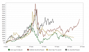
Macrotrends is an interesting resource in this regard. The following is a screenshot of a Macrotrends chart which, in the original, has interactive features.
Macrotrends.org_The_Four_Biggest_US_Bubbles              

Scaling the NASDAQ, gold, and oil prices in terms of percentage changes from points several years preceding price peaks suggests bubbles share the same cadence, in some sense.

These curves highlight that asset bubbles can occur over significant periods – several years to a decade. This is the part of the seduction. At first, when commentators cry “bubble,” prudent investors stand aside to let prices peak and crash. Yet prices may continue to rise for years, leaving investors increasingly feeling they are “being left behind.”

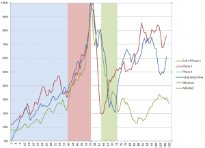
Here are data from three asset bubbles – the Hong Kong Hang Seng Index, oil prices to refiners (combined), and the NASDAQ 100 Index. Click to enlarge.
BubbleAnatomy

I arrange these time series so their peak prices – the peak of the bubble – coincide, despite the fact that these peaks occurred at different historical times (October 2007, August 2008, March 2000, respectively).

I include approximately 5 years of prior values of each time series, and scale the vertical dimensions so the peaks equal 100 percent.

This produces a chart which suggests three distinct phases to an asset bubble.

Phase 1 is a ramp-up. In this initial phase, prices surge for 2-3 years, then experience a relatively minor drop.

Phase 2 is the beginning of a sustained period of faster-than-exponential growth, culminating in the market peak, followed immediately by the market collapse. Within a few months of the peak, the rates of growth of prices in all three series are quite similar, indeed almost identical. These rates of price growth are associated with “an accelerating acceleration” of growth, in fact – as a study of first and second differences of the rates of growth show.

The critical time point, at which peak price occurs, looks like the point at which traders can see the vertical asymptote just a month or two in front of them, given the underlying dynamics.

Phase 3 is the market collapse. Prices drop maybe 80 percent of the value they rose from the initial point, and rapidly – in the course of 1-2 years. This is sometimes modeled as a “negative bubble.” It is commonly considered that the correction overshoots, and then adjusts back.

There also seems to be a Phase 4, when prices can recover some or perhaps almost all of their lost glory, but where volatility can be substantial.

Predictability

It seems reasonable that the critical point, or peak price, should be more or less predictable, a few months into Phase 2.

The extent of the drop from the peak in Phase 3 seems more or less predictable, also.

The question really is whether the dynamics of Phase 1 are truly informative. Is there something going on in Phase 1 that is different than in immediately preceding periods? Phase 1 seems to “set the stage.”

But there is no question the lure of quick riches involved in the advanced stages of an asset bubble can dazzle the most intelligent among us – and as a case in point, I give you Sir Isaac Newton, co-inventor with Liebnitz of the calculus, discoverer of the law of gravitation, and exponent of a vast new science, in his time, of mathematical physics.

SirIsaacNewton

A post on Business Insider highlights his unhappy case with the South Seas stock bubble. Newton was in this scam early, and then got out. But the Bubble kept levitating, so he entered the market again near the top – in Didier Sornette’s terminology, near the critical point of the process, only to lose what in his time was vast fortune of worth $2.4 million dollars in today’s money.