2014 Outlook: Jan Hatzius Forecast for Global Economic Growth

Jan Hatzius is chief economist of Global Investment Research (GIR) at Goldman Sachs, and achieved notoriety with his early recognition of the housing bust in 2008.

Here he discusses the current outlook for 2014.

The outlook is fairly rosy, so it’s interesting Goldman just released “Where we worry: Risks to our outlook”, exerpted extensively at Zero Hedge.

Downside economic risks include:

1. Reduction in fiscal drag is less of a plus than we expect

2. Deleveraging obstacles continue to weigh on private demand

3. Less effective spare capacity leads to earlier wage/inflation pressure

4. Euro area risks resurface

5. China financial/credit concerns become critical


Predicting Financial Crisis – the Interesting Case of Nassim Taleb

Note: This is good post from the old series, and I am re-publishing it with the new citation to Taleb’s book in progress Hidden Risk and a new video.

———————————————–

One of the biggest questions is whether financial crises can be predicted in any real sense. This is a major concern of mine. I was deep in the middle of forecasting on an applied basis during 2008-2010, and kept hoping to find proxies to indicate, for example, when we were coming out of it, or whether it would “double-dip.”

Currently, as noted in this blog, a chorus of voices (commentators, analysts, experts) says that all manner of asset bubbles are forming globally, beginning with the US stock and the Chinese real estate markets.

But does that mean that we can predict the timing of this economic and financial crisis, or are we all becoming “Chicken Littles?”

What we want is well-described by Mark Buchanan, when he writes

The challenge for economists is to find those indicators that can provide regulators with reliable early warnings of trouble. It’s a complicated task. Can we construct measures of asset bubbles, or devise ways to identify “too big to fail” or “too interconnected to fail” institutions? Can we identify the architectural features of financial networks that make them prone to cascades of distress? Can we strike the right balance between the transparency needed to make risks evident, and the privacy required for markets to function?

And, ah yes – there is light at the end of the tunnel –

Work is racing ahead. In the U.S., the newly formed Office of Financial Research has published various papers on topics such as stress tests and data gaps — including one that reviews a list of some 31 proposed systemic-risk measures. The economists John Geanakoplos and Lasse Pedersen have offered specific proposals on measuring the extent to which markets are driven by leverage, which tends to make the whole system more fragile.

The Office of Financial Research (OFR) in the Treasury Department was created by the Dodd-Frank legislation, and it is precisely here Nassim Taleb enters the picture, at a Congressional hearing on formation of the OFR.

   untitled

Mr. Chairman, Ranking Member, Members of the Committee, thank you for giving me the opportunity to testify on the analytical ambitions and centralized risk-management plans of Office of Financial Research (OFR). I am here primarily as a practitioner of risk —not as an analyst but as a decision-maker, an eyewitness of the poor, even disastrous translation of risk research into practice. I spent close to two decades as a derivatives trader before becoming a full-time scholar and researcher in the areas of risk and probability, so I travelled the road between theory and practice in the opposite direction of what is commonly done. Even when I was in full-time practice I specialized in errors linked to theories, and the blindness from the theories of risk management. Allow me to present my conclusions upfront and in no uncertain terms: this measure, if I read it well, aims at the creation of an omniscient Soviet-style central risk manager. It makes us fall into the naive illusion of risk management that got us here —the same illusion has led in the past to the blind accumulation of Black Swan risks. Black Swans are these large, consequential, but unpredicted deviations in the eyes of a given observer —the observer does not see them coming, but, by some mental mechanism, thinks that he predicted them. Simply, there are limitations to our ability to measure the risks of extreme events and throwing government money on it will carry negative side effects. 1) Financial risks, particularly those known as Black Swan events cannot be measured in any possible quantitative and predictive manner; they can only be dealt with nonpredictive ways.  The system needs to be made robust organically, not through centralized risk management. I will keep repeating that predicting financial risks has only worked on computers so far (not in the real world) and there is no compelling reason for that to change—as a matter of fact such class of risks is becoming more unpredictable

A reviewer in the Harvard Business Review notes Taleb is a conservative with a small c. But this does not mean that he is a toady for the Koch brothers or other special interests. In fact, in this Congressional testimony, Taleb also recommends, as his point #3

..risks need to be handled by the entities themselves, in an organic way, paying for their mistakes as they go. It is far more effective to make bankers accountable for their mistakes than try the central risk manager version of Soviet-style central planner, putting hope ahead of empirical reality.

Taleb’s argument has a mathematical side. In an article in the International Journal of Forecasting appended to his testimony, he develops infographics to suggest that fat-tailed risks are intrinsically hard to evaluate. He also notes, correctly, that in 2008, despite manifest proof to the contrary, leading financial institutions often applied risk models based on the idea that outcomes followed a normal or Gaussian probability distribution. It’s easy to show that this is not the case for daily stock and other returns. The characteristic distributions exhibit excess kurtosis, and are hard to pin down in terms of specific distributions. As Taleb points out, the defining events that might tip the identification one way or another are rare. So mistakes are easy to make, and possibly have big effects.

But, Taleb’s extraordinary talent for exposition is on full view in an recent article How To Prevent Another Financial Crisis, coauthored with George Martin. The first paragraphs give us the conclusion,

We believe that “less is more” in complex systems—that simple heuristics and protocols are necessary for complex problems as elaborate rules often lead to “multiplicative branching” of side effects that cumulatively may have first order effects. So instead of relying on thousands of meandering pages of regulation, we should enforce a basic principle of “skin in the game” when it comes to financial oversight: “The captain goes down with the ship; every captain and every ship.” In other words, nobody should be in a position to have the upside without sharing the downside, particularly when others may be harmed. While this principle seems simple, we have moved away from it in the finance world, particularly when it comes to financial organizations that have been deemed “too big to fail.”

Then, the authors drive this point home with a salient reference –

The best risk-management rule was formulated nearly 4,000 years ago. Hammurabi’s code specifies: “If a builder builds a house for a man and does not make its construction firm, and the house which he has built collapses and causes the death of the owner of the house, that builder shall be put to death.” Clearly, the Babylonians understood that the builder will always know more about the risks than the client, and can hide fragilities and improve his profitability by cutting corners—in, say, the foundation. The builder can also fool the inspector (or the regulator). The person hiding risk has a large informational advantage over the one looking for it.

My hat’s off to Taleb. A brilliant example, and the rest of the article bears reading too.

While I have not thrown in the towel when it comes to devising metrics to signal financial crisis, I have to say that thoughts like Taleb’s probability argument occurred to me recently, when considering the arguments over extreme weather events.

Here’s a recent video.

Stock Market Bubble in 2014?

As of November, Janet Yellen, newly confirmed Chair of the US Federal Reserve Bank, doesn’t think so.

As reported in the Wall Street Journal MONEYBEAT, she said,

Stock prices have risen pretty robustly”… But looking at several valuation measures — she specifically cited equity-risk premiums — she said: “you would not see stock prices in territory that suggest…bubble-like conditions.”

Her reference to equity-risk premiums sent me to Aswath Damodaran’s webpage, which estimates this metric -basically the extra return investors demand to lure them into stocks and out of the safety of government bonds (in the Updated Data section). It’s definitely an implied value, so it’s hard to judge.

But what are some of the other Pro’s and Con’s regarding a stock market bubble?

Pros – There Definitely is a Bubble

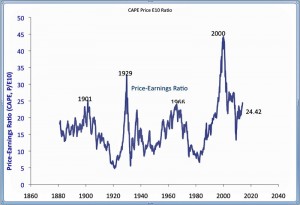
The CAPE (cylically adjusted price earnings ratio) is approaching 2007 levels. This is a metric developed by Robert Shiller and, according to him, is supposed to be a longer term indicator, rather than something that can signal short-term movements in the market. At the same time, recent interviews, who recently shared a Nobel prize in economics, indicate Shiller is currently ‘most worried’ about ‘boom’ in U.S. stock market. Here is his CAPE indext (click this and the other charts here to enlarge).

shiller-cape

Several sector and global bubbles are currently reinforcing each other. When one goes pop, it’s likely to bring down the house of cards. In the words of Jesse Columbo, whose warnings in 2007 were prescient,

..the global economic recovery is actually what I call a “Bubblecovery” or a bubble-driven economic recovery that is driven by inflating post-2009 bubbles in China, emerging markets, Australia, Canada, Northern and Western European housing, U.S. housing, U.S. healthcare, U.S. higher education, global bonds, and tech (Web 2.0 and social media).

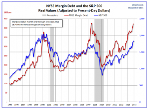
Margin debt, as reported by the New York Stock Exchange, is also at its all-time highs. Here’s a chart from Advisor Perspectives adjusting margin debt for inflation over a long period.

margindebt

Con – No Bubble Here

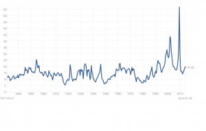
Stocks are the cheapest they have been in decades. This is true, as the chart below shows (based on trailing twelve month “as reported” earnings).

PEratios

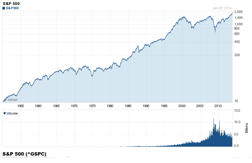
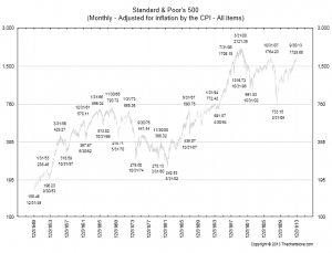
The S&P 500, adjusted for inflation, has not reached the peaks of either 2000 or2007 (chart from All Start Charts)

10-7-13-spx-inf-adj

Bottom Line

I must confess, doing the research for the post, that I think the stock market in the US may have a ways to go, before it hits its peak this time. Dr. Yelen’s appointment suggests quantitative easing (QE) and low interest rates may continue for some time, before the Fed takes away the punch bowl. My guess is that markets are just waiting at this point to see whether this is, in fact, what is likely to happen,  or whether others in the Fed will exercise stronger control over policy, now Ben Bernacke is gone.

And, as seems probable, Yellen consolidates her control and signals continuation of current policies, then I suspect we will see some wild increases in asset values here and globally.

What is a Market Bubble?

Let’s ask what might seem to be a silly question, but which turns out to be challenging. What is an asset bubble? How can asset bubbles be identified quantitatively?

Let me highlight two definitions – major in terms of the economics and analytical literature. And remember when working through “definitions” that the last major asset bubbles that burst triggered the recessions of 2008-2009 globally, resulting in the loss of tens of trillions of dollars.

You know, a trillion here and a trillion there, and pretty soon you are talking about real money.

Bubbles as Deviations from Values Linked to Economic Fundamentals

The first is simply that –

An asset price bubble is a price acceleration that cannot be explained in terms of the underlying fundamental economic variables

This comes from Dreger and Zhang, who cite earlier work by Case and Shiller, including their historic paper – Is There A Bubble in the Housing Market (2003)

Basically, you need a statistical or an econometric model which “explains” price movements in an asset market. While prices can deviate from forecasts produced by this model on a temporary basis, they will return to the predicted relationship to the set of fundamental variables at some time in the future, or eventually, or in the long run.

The sustained speculative distortions of the asset market then can be measured with reference to benchmark projections with this type of relationship and current values of the “fundamentals.”

This is the language of co-integrating relationships. The trick, then, is to identify a relationship between the asset price and its fundamental drivers which net out residuals that are white noise, or at least, ARMA – autoregressive moving average – residuals. Good luck with that!

Bubbles as Faster-Than-Exponential Growth

The second definition comes from Didier Sornette and basically is that an asset bubble exists when prices or values are accelerating at a faster-than-exponential rate.

This phenomenon is generated by behaviors of investors and traders that create positive feedback in the valuation of assets and unsustainable growth, leading to a finite-time singularity at some future time… From a technical view point, the positive feedback mechanisms include (i) option hedging, (ii) insurance portfolio strategies, (iii) market makers bid-ask spread in response to past volatility, (iv) learning of business networks and human capital build-up,(v) procyclical financing of firms by banks (boom vs contracting times), (vi) trend following investment strategies, (vii) asymmetric information on hedging strategies viii) the interplay of mark-to-market accounting and regulatory capital requirements. From a behavior viewpoint, positive feedbacks emerge as a result of the propensity of humans to imitate, their social gregariousness and the resulting herding.

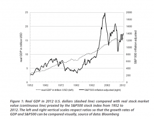
Fundamentals still benchmark asset prices in this approach, as illustrated by this chart.
 Sornett2012            

Here GDP and U.S. stock market valuation grow at approximately the same rate, suggesting a “cointegrated relationship,” such as suggested with the first definition of a bubble introduced above.

However, the market has shown three multiple-year periods of excessive valuation, followed by periods of consolidation.

These periods of bubbly growth in prices are triggered by expectations of higher prices and the ability to speculate, and are given precise mathematical expression in the JLS (Johansen-Ledoit-Sornette) model.

The behavioral underpinnings are familiar and can explained with reference to housing, as follows.

The term “bubble” refers to a situation in which excessive future expectations cause prices to rise. For instance, during a house-price bubble, buyers think that a home that they would normally consider too expensive is now an acceptable purchase because they will be compensated by significant further \price increases. They will not need to save as much as they otherwise might, because they expect the increased value of their home to do the saving for them. First-time homebuyers may also worry during a bubble that if they do not buy now, they will not be able to afford a home later. Furthermore, the expectation of large price increases may have a strong impact on demand if people think that home prices are very unlikely to fall, and certainly not likely to fall for long, so that there is little perceived risk associated with an investment in a home.

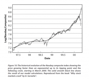
The concept of “faster-than-exponential” growth also is explicated in this chart from a recent article (2011), and originally from Why Stock Markets Crash, published by Princeton.
Sornette2012B

In a recent methodological piece, Sornette and co-authors cite an extensive list of applications of their approach.

..the JLS model has been used widely to detect bubbles and crashes ex-ante (i.e., with advanced documented notice in real time) in various kinds of markets such as the 2006-2008 oil bubble [5], the Chinese index bubble in 2009 [6], the real estate market in Las Vegas [7], the U.K. and U.S. real estate bubbles [8, 9], the Nikkei index anti-bubble in 1990-1998 [10] and the S&P 500 index anti-bubble in 2000-2003 [11]. Other recent ex-post studies include the Dow Jones Industrial Average historical bubbles [12], the corporate bond spreads [13], the Polish stock market bubble [14], the western stock markets [15], the Brazilian real (R$) – US dollar (USD) exchange rate [16], the 2000-2010 world major stock indices [17], the South African stock market bubble [18] and the US repurchase agreements market [19].

I refer readers to the above link for the specifics of these references. Note, in general, most citations in this post are available as PDF files from a webpage maintained by the Swiss Federal Institute of Technology.

The Psychology of Asset Bubbles

After wrestling with this literature for several months, including some advanced math and econometrics, it seems to me that it all comes down, in the heat of the moment just before the bubble crashes, to psychology.

How does that go?

A recent paper coauthored by Sornette and Cauwels and others summarize the group psychology behind asset bubbles.

In its microeconomic formulation, the model assumes a hierarchical organization of the market, comprised of two groups of agents: a group with rational expectations (the value investors), and a group of “noise” agents, who are boundedly rational and exhibit herding behavior (the trend followers). Herding is assumed to be self-reinforcing, corresponding to a nonlinear trend following behavior, which creates price-to-price positive feedback loops that yield an accelerated growth process. The tension and competition between the rational agents and the noise traders produces deviations around the growing prices that take the form of low-frequency oscillations, which increase in frequency due to the acceleration of the price and the nonlinear feedback mechanisms, as the time of the crash approaches.

Examples of how “irrational” agents might proceed to fuel an asset bubble are given in a selective review of the asset bubble literature developed recently by Anna Scherbina from which I take several extracts below.

For example, there is “feedback trading” involving traders who react solely to past price movements (momentum traders?). Scherbina writes,

In response to positive news, an asset experiences a high initial return. This is noticed by a group of feedback traders who assume that the high return will continue and, therefore, buy the asset, pushing prices above fundamentals. The further price increase attracts additional feedback traders, who also buy the asset and push prices even higher, thereby attracting subsequent feedback traders, and so on. The price will keep rising as long as more capital is being invested. Once the rate of new capital inflow slows down, so does the rate of price growth; at this point, capital might start flowing out, causing the bubble to deflate.

Other mechanisms are biased self-attribution and the representativeness heuristic. In biased self-attribution,

..people to take into account signals that confirm their beliefs and dismiss as noise signals that contradict their beliefs…. Investors form their initial beliefs by receiving a noisy private signal about the value of a security.. for example, by researching the security. Subsequently, investors receive a noisy public signal…..[can be]  assumed to be almost pure noise and therefore should be ignored. However, since investors suffer from biased self-attribution, they grow overconfident in their belief after the public signal confirms their private information and further revise their valuation in the direction of their private signal. When the public signal contradicts the investors’ private information, it is appropriately ignored and the price remains unchanged. Therefore, public signals, in expectation, lead to price movements in the same direction as the initial price response to the private signal. These subsequent price moves are not justified by fundamentals and represent a bubble. The bubble starts to deflate after the accumulated public signals force investors to eventually grow less confident in their private signal.

Scherbina describes the representativeness heuristic as follows.

 The fourth model combines two behavioral phenomena, the representativeness heuristic and the conservatism bias. Both phenomena were previously documented in psychology and represent deviations from optimal Bayesian information processing. The representativeness heuristic leads investors to put too much weight on attention-grabbing (“strong”) news, which causes overreaction. In contrast, conservatism bias captures investors’ tendency to be too slow to revise their models, such that they underweight relevant but non-attention-grabbing (routine) evidence, which causes underreaction… In this setting, a positive bubble will arise purely by chance, for example, if a series of unexpected good outcomes have occurred, causing investors to over-extrapolate from the past trend. Investors make a mistake by ignoring the low unconditional probability that any company can grow or shrink for long periods of time. The mispricing will persist until an accumulation of signals forces investors to switch from the trending to the mean-reverting model of earnings.

Interesting, several of these “irrationalities” can generate negative, as well as positive bubbles.

Finally, Scherbina makes an important admission, namely that

 The behavioral view of bubbles finds support in experimental studies. These studies set up artificial markets with finitely-lived assets and observe that price bubbles arise frequently. The presence of bubbles is often attributed to the lack of common knowledge of rationality among traders. Traders expect bubbles to arise because they believe that other traders may be irrational. Consequently, optimistic media stories and analyst reports may help create bubbles not because investors believe these views but because the optimistic stories may indicate the existence of other investors who do, destroying the common knowledge of rationality.

And let me pin that down further here.

Asset Bubbles – the Evidence From Experimental Economics

Vernon Smith is a pioneer in experimental economics. One of his most famous experiments concerns the genesis of asset bubbles.

Here is a short video about this widely replicated experiment.

Stefan Palan recently surveyed these experiments, and also has a downloadable working paper (2013) which collates data from them.

This article is based on the results of 33 published articles and 25 working papers using the experimental asset market design introduced by Smith, Suchanek and Williams (1988). It discusses the design of a baseline market and goes on to present a database of close to 1600 individual bubble measure observations from experiments in the literature, which may serve as a reference resource for the quantitative comparison of existing and future findings.

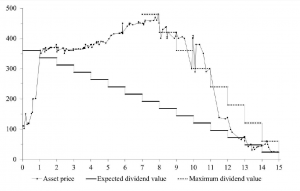
A typical pattern of asset bubble formation emerges in these experiments.
bubleexperimental

As Smith relates in the video, the experimental market is comprised of student subjects who can both buy and sell and asset which declines in value to zero over a fixed period. Students can earn real money at this, and cannot communicate with others in the experiment.

Noahpinion has further discussion of this type of bubble experiment, which, as Palan writes, is the best-documented experimental asset market design in existence and thus offers a superior base of comparison for new work.

There are convergent lines of evidence about the reality and dynamics of asset bubbles, and a growing appreciation that, empirically, asset bubbles share a number of characteristics.

That may not be enough to convince the mainstream economics profession, however, as a humorous piece by Hirshleifer (2001), quoted by a German researcher a few years back, suggests –

In the muddled days before the rise of modern finance, some otherwise-reputable economists, such as Adam Smith, Irving Fisher, John Maynard Keynes, and Harry Markowitz, thought that individual psychology affects prices. What if the creators of asset pricing theory had followed this thread? Picture a school of sociologists at the University of Chicago proposing the Deficient Markets Hypothesis: that prices inaccurately reflect all available information. A brilliant Stanford psychologist, call him Bill Blunte, invents the Deranged Anticipation and Perception Model (or DAPM), in which proxies for market misevaluation are used to predict security returns. Imagine the euphoria when researchers discovered that these mispricing proxies (such as book/market, earnings/price, and past returns) and mood indicators such as amount of sunlight, turned out to be strong predictors of future returns. At this point, it would seem that the deficient markets hypothesis was the best-confirmed theory in the social sciences.

Asset Bubbles

It seems only yesterday when “rational expectations” ruled serious discussions of financial economics. Value was determined by the CAPM – capital asset pricing model. Markets reflected the operation of rational agents who bought or sold assets, based largely on fundamentals. Although imprudent, stupid investors were acknowledged to exist, it was impossible for a market in general to be seized by medium- to longer term speculative movements or “bubbles.”

This view of financial and economic dynamics is at the same time complacent and intellectually aggressive. Thus, proponents of the efficient market hypothesis contest the accuracy of earlier discussions of the Dutch tulip mania.

Now, however, there seems no doubt that bubbles in asset markets are both real and intractable to regulation and management, despite their catastrophic impacts.

But asset bubbles are so huge now that Larry Summers suggests, before the International Monetary Fund (IMF) recently, that the US is in a secular stagnation, and that the true, “market-clearing” interest rate is negative. Thus, given the unreality of implementing a negative interest rate, we face a long future of the zero bound – essentially zero interest rates.

Furthermore, as Paul Krugman highlights in a follow-on blog post – Summers says the economy needs bubbles to generate growth.

We now know that the economic expansion of 2003-2007 was driven by a bubble. You can say the same about the latter part of the 90s expansion; and you can in fact say the same about the later years of the Reagan expansion, which was driven at that point by runaway thrift institutions and a large bubble in commercial real estate.

So you might be tempted to say that monetary policy has consistently been too loose. After all, haven’t low interest rates been encouraging repeated bubbles?

But as Larry emphasizes, there’s a big problem with the claim that monetary policy has been too loose: where’s the inflation? Where has the overheated economy been visible?

So how can you reconcile repeated bubbles with an economy showing no sign of inflationary pressures? Summers’s answer is that we may be an economy that needs bubbles just to achieve something near full employment – that in the absence of bubbles the economy has a negative natural rate of interest. And this hasn’t just been true since the 2008 financial crisis; it has arguably been true, although perhaps with increasing severity, since the 1980s.

Re-enter the redoubtable “liquidity trap” stage left.

Summers and Krugman move at a fairly abstract and theoretical level, regarding asset bubbles and the current manifestation.

But more and more, the global financial press points the finger at the US Federal Reserve and its Quantitative Easing (QE) as the cause of emerging bubbles around the world.

One of the latest to chime in is the Chinese financial magazine Caixin with Heading Toward a Cliff.

The Fed’s QE policy has caused a gigantic liquidity bubble in the global economy, especially in emerging economies and asset markets. The improvement in the global economy since 2008 is a bubble phenomenon, centering around the demand from bubble goods or wealth effect. Hence, real Fed tightening would prick the bubble and trigger another recession. This is why some talk of the Fed tightening could trigger the global economy to trend down…

The odds are that the world is experiencing a bigger bubble than the one that unleashed the 2008 Global Financial Crisis. The United States’ household net wealth is much higher than at the peak in the last bubble. China’s property rental yields are similar to what Japan experienced at the peak of its property bubble. The biggest part of today’s bubble is in government bonds valued at about 100 percent of global GDP. Such a vast amount of assets is priced at a negative real yield. Its low yield also benefits other borrowers. My guesstimate is that this bubble subsidizes debtors to the tune of 10 percent of GDP or US$ 7 trillion dollars per annum. The transfer of income from savers to debtors has never happened on such a vast scale, not even close. This is the reason that so many bubbles are forming around the world, because speculation is viewed as an escape route for savers.The property market in emerging economies is the second-largest bubble. It is probably 100 percent overvalued. My guesstimate is that it is US$ 50 trillion overvalued.Stocks, especially in the United States, are significantly overvalued too. The overvaluation could be one-third or about US$ 20 trillion.There are other bubbles too. Credit risk, for example, is underpriced. The art market is bubbly again. These bubbles are not significant compared to the big three above.

The Caixin author – Andy Xie – goes on to predict inflation as the eventual outcome – a prediction I find far-fetched given the coming reaction to Fed tapering.

And the reach of the Chinese real estate bubble is highlighted by a CBS 60 Minutes video filmed some months ago.

Anatomy of a Bubble

The Great Recession of 2008-2009 alerted us – what goes up, can come down. But are there common patterns in asset bubbles? Can the identification of these patterns help predict the peak and subsequent point of rapid decline?

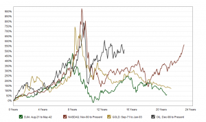
Macrotrends is an interesting resource in this regard. The following is a screenshot of a Macrotrends chart which, in the original, has interactive features.

Macrotrends.org_The_Four_Biggest_US_Bubbles              

Scaling the NASDAQ, gold, and oil prices in terms of percentage changes from points several years preceding price peaks suggests bubbles share the same cadence, in some sense.

These curves highlight that asset bubbles can occur over significant periods – several years to a decade. This is the part of the seduction. At first, when commentators cry “bubble,” prudent investors stand aside to let prices peak and crash. Yet prices may continue to rise for years, leaving investors increasingly feeling they are “being left behind.”

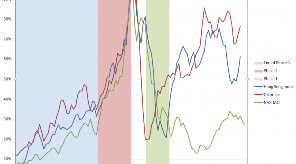
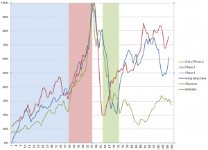
Here are data from three asset bubbles – the Hong Kong Hang Seng Index, oil prices to refiners (combined), and the NASDAQ 100 Index. Click to enlarge.

BubbleAnatomy

I arrange these time series so their peak prices – the peak of the bubble – coincide, despite the fact that these peaks occurred at different historical times (October 2007, August 2008, March 2000, respectively).

I include approximately 5 years of prior values of each time series, and scale the vertical dimensions so the peaks equal 100 percent.

This produces a chart which suggests three distinct phases to an asset bubble.

Phase 1 is a ramp-up. In this initial phase, prices surge for 2-3 years, then experience a relatively minor drop.

Phase 2 is the beginning of a sustained period of faster-than-exponential growth, culminating in the market peak, followed immediately by the market collapse. Within a few months of the peak, the rates of growth of prices in all three series are quite similar, indeed almost identical. These rates of price growth are associated with “an accelerating acceleration” of growth, in fact – as a study of first and second differences of the rates of growth show.

The critical time point, at which peak price occurs, looks like the point at which traders can see the vertical asymptote just a month or two in front of them, given the underlying dynamics.

Phase 3 is the market collapse. Prices drop maybe 80 percent of the value they rose from the initial point, and rapidly – in the course of 1-2 years. This is sometimes modeled as a “negative bubble.” It is commonly considered that the correction overshoots, and then adjusts back.

There also seems to be a Phase 4, when prices can recover some or perhaps almost all of their lost glory, but where volatility can be substantial.

Predictability

It seems reasonable that the critical point, or peak price, should be more or less predictable, a few months into Phase 2.

The extent of the drop from the peak in Phase 3 seems more or less predictable, also.

The question really is whether the dynamics of Phase 1 are truly informative. Is there something going on in Phase 1 that is different than in immediately preceding periods? Phase 1 seems to “set the stage.”

But there is no question the lure of quick riches involved in the advanced stages of an asset bubble can dazzle the most intelligent among us – and as a case in point, I give you Sir Isaac Newton, co-inventor with Liebnitz of the calculus, discoverer of the law of gravitation, and exponent of a vast new science, in his time, of mathematical physics.

SirIsaacNewton

A post on Business Insider highlights his unhappy case with the South Seas stock bubble. Newton was in this scam early, and then got out. But the Bubble kept levitating, so he entered the market again near the top – in Didier Sornette’s terminology, near the critical point of the process, only to lose what in his time was vast fortune of worth $2.4 million dollars in today’s money.

Links – 2014, Early January

US and Global Economy

Bernanke sees headwinds fading as US poised for growth – happy talk about how good things are going to be as quantitative easing is “tapered.”

Slow Growth and Short Tails But Dr. Doom (Nouriel Roubini) is guardedly optimistic about 2014

The good news is that economic performance will pick up modestly in both advanced economies and emerging markets. The advanced economies, benefiting from a half-decade of painful private-sector deleveraging (households, banks, and non-financial firms), a smaller fiscal drag (with the exception of Japan), and maintenance of accommodative monetary policies, will grow at an annual pace closer to 1.9%. Moreover, so-called tail risks (low-probability, high-impact shocks) will be less salient in 2014. The threat, for example, of a eurozone implosion, another government shutdown or debt-ceiling fight in the United States, a hard landing in China, or a war between Israel and Iran over nuclear proliferation, will be far more subdued.

GOLDMAN: Here’s What Will Happen With GDP, Housing, The Fed, And Unemployment Next year Goldman Sachs chief economist Jan Hatzius writes: 10 Questions for 2014  – Jan Hatzius is very bullish on 2014!

Three big macro questions for 2014 Gavyn Davies – tapering QE, China, and the euro. Requires free registration to read.

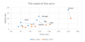
The State of the Euro, In One Graph From Paul Krugman, the point being that the EU’s austerity policies have significantly worsened the debt ratios of Spain, Portugal, Ireland, Greece, and Italy, despite lower interest rates. (Click to enlarge)

StateofEuro

Technology

JCal’s 2014 predictions: Intense competition for YouTube and a shake up in online video economics

Rumblings in the YouTube community in the midst of tremendous growth in video productions – interesting.

Do disruptive technologies really overturn market leadership?

Discusses tests of the idea that ..such technologies have the characteristic that they perform worse on an important metric (or metrics) than current market leading technologies. Of course, if that were it, then the technologies could hardly be called disruptive and would be confined, at best, to niche uses.

The second critical property of such technologies is that while they start behind on key metrics, they improve relatively rapidly and eventually come to outperform existing technologies on many metrics. It is there that disruptive technologies have their bite. Initially, they are poor performers and established firms would not want to integrate them into their products as they would disappoint their customers who happen to be most of the current market. However, when performance improves, the current technologies are displaced and established firms want to get in on the game. The problem is that they may be too late. In other words, Christensen’s prediction was that established firms would have legitimate “blind spots” with regard to disruptive technologies leaving room open for new entrants to come in, adopt those technologies and, ultimately, displace the established firms as market leaders.

Big Data – A Big Opportunity for Telecom Players

Today with sharp increase in online and mobile shopping with use of Apps, telecom companies have access to consumer buying behaviours and preference which are actually being used with real time geo-location and social network analysis to target consumers. Hmmm.

5 Reasons Why Big Data Will Crush Big Research

Traditional marketing research or “big research” focuses disproportionately on data collection.  This mentality is a hold-over from the industry’s early post-WWII boom –when data was legitimately scarce.  But times have changed dramatically since Sputnik went into orbit and the Ford Fairlane was the No. 1-selling car in America.

Here is why big data is going to win.

Reason 1: Big research is just too small…Reason 2 : Big research lacks relevance… Reason 3: Big research doesn’t handle complexity well… Reason 4: Big research’s skill sets are outdated…  Reason 5: Big research lacks the will to change…

I know “market researchers” who fit the profile in this Forbes article, and who are more or less lost in the face of the new extent of data and techniques for its analysis. On the other hand, I hear from the grapevine that many executives and managers can’t really see what the Big Data guys in their company are doing. There are success stories on the Internet (see the previous post here, for example), but this may be best case. Worst case is a company splurges on the hardware to implement Big Data analytics, and the team just comes up with gibberish – very hard to understand relationships with no apparent business value.

Some 2013 Recaps

Top Scientific Discoveries of 2013

Humankind goes interstellar ..Genome editing ..Billions and billions of Earths

exoplanets-660x326

Global warming: a cause for the pause ..See-through brains ..Intergalactic Neutrinos ..A new meat-eating mammal

olinguito

Pesticide controversy grows ..Making organs from stem cells ..Implantable electronics ..Dark matter shows up — or doesn’t ..Fears of the fathers

The 13 Most Important Charts of 2013

TopCharts

And finally, a miscellaneous item. Hedge funds apparently do beat the market, or at least companies operating in the tail of the performance distribution show distinctive characteristics.

How do Hedge Fund “Stars” Create Value? Evidence from Their Daily Trades

I estimate hedge fund performance by computing calendar-time transaction portfolios (see, e.g., Seasholes and Zhu, 2010) with holding periods ranging from 21 to 252 days. Across all holding periods, I find no evidence that the average or median hedge fund outperforms, after accounting for trading commissions. However, I find significant evidence of outperformance in the right-tail of the distribution. Specifically, bootstrap simulations indicate that the annual performance of the top 10-30% of hedge funds cannot be explained by luck. Similarly, I find that superior performance persists. The top 30% of hedge funds outperform by a statistically significant 0.25% per month over the subsequent year. In sharp contrast to my hedge fund findings, both bootstrap simulations and performance persistence tests fail to reveal any outperformance among non-hedge fund institutional investors….

My remaining tests investigate how outperforming hedge funds (i.e., “star” hedge funds) create value. My main findings can be summarized as follows. First, star hedge funds’ profits are concentrated over relatively short holding periods. Specifically, more than 25% (50%) of star hedge funds’ annual outperformance occurs within the first month (quarter) after a trade. Second, star hedge funds tend to be short-term contrarians with small price impacts. Third, the profits of star hedge funds are concentrated in their contrarian trades. Finally, the performance persistence of star hedge funds is substantially stronger among funds that follow contrarian strategies (or funds with small price impacts) and is not at all present for funds that follow momentum strategies (or funds with large price impacts).

The On-Coming Tsunami of Data Analytics

More than 25,000 visited businessforecastblog, March 2012-December 2013, some spending hours on the site. Interest ran nearly 200 visitors a day in December, before my ability to post was blocked by a software glitch, and we did this re-boot.

Now I have hundreds of posts offline, pertaining to several themes, discussed below. How to put this material back up – as reposts, re-organized posts, or as longer topic summaries?

There’s a silver lining. This forces me to think through forecasting, predictive and data analytics.

One thing this blog does is compile information on which forecasting and data analytics techniques work, and, to some extent, how they work, how key results are calculated. I’m big on computation and performance metrics, and I want to utilize the SkyDrive more extensively to provide full access to spreadsheets with worked examples.

Often my perspective is that of a “line worker” developing sales forecasts. But there is another important focus – business process improvement. The strength of a forecast is measured, ultimately, by its accuracy. Efforts to improve business processes, on the other hand, are clocked by whether improvement occurs – whether costs of reaching customers are lower, participation rates higher, customer retention better or in stabilization mode (lower churn), and whether the executive suite and managers gain understanding of who the customers are. And there is a third focus – that of the underlying economics, particularly the dynamics of the institutions involved, such as the US Federal Reserve.

Right off, however, let me say there is a direct solution to forecasting sales next quarter or in the coming budget cycle. This is automatic forecasting software, with Forecast Pro being one of the leading products. Here’s a YouTube video with the basics about that product.

You can download demo versions and participate in Webinars, and attend the periodic conferences organized by Business Forecast Systems showcasing user applications in a wide variety of companies.

So that’s a good solution for starters, and there are similar products, such as the SAS/ETS time series software, and Autobox.

So what more would you want?

Well, there’s need for background information, and there’s a lot of terminology. It’s useful to know about exponential smoothing and random walks, as well as autoregressive and moving averages.  Really, some reaches of this subject are arcane, but nothing is worse than a forecast setup which gains the confidence of stakeholders, and then falls flat on its face. So, yes, eventually, you need to know about “pathologies” of the classic linear regression (CLR) model – heteroscedasticity, autocorrelation, multicollinearity, and specification error!

And it’s good to gain this familiarity in small doses, in connection with real-world applications or even forecasting personalities or celebrities. After a college course or two, it’s easy to lose track of concepts. So you might look at this blog as a type of refresher sometimes.

Anticipating Turning Points in Time Series

But the real problem comes with anticipating turning points in business and economic time series. Except when modeling seasonal variation, exponential smoothing usually shoots over or under a turning point in any series it is modeling.

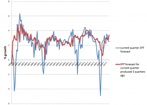
If this were easy to correct, macroeconomic forecasts would be much better. The following chart highlights the poor performance, however, of experts contributing to the quarterly Survey of Professional Forecasters, maintained by the Philadelphia Fed.

SPFcomp2

So, the red line is the SPF consensus forecast for GDP growth on a three quarter horizon, and the blue line is the forecast or nowcast for the current quarter (there is a delay in release of current numbers). Notice the huge dips in the current quarter estimate, associated with four recessions 1981, 1992, 2001-2, and 2008-9. A mere three months prior to these catastrophic drops in growth, leading forecasters at big banks, consulting companies, and universities totally missed the boat.

This is important in a practical sense, because recessions turn the world of many businesses upside down. All bets are off. The forecasting team is reassigned or let go as an economy measure, and so forth.

Some forward-looking information would help business intelligence focus on reallocating resources to sustain revenue as much as possible, using analytics to design cuts exerting the smallest impact on future ability to maintain and increase market share.

Hedgehogs and Foxes

Nate Silver has a great table in his best-selling The
Signal and the Noise
on the qualities and forecasting performance of hedgehogs and foxes. The idea comes from a Greek poet, “The fox knows many little things, but the hedgehog knows one big thing.”

Following Tetlock, Silver finds foxes are multidisplinary, adaptable, self-critical, cautious, and empirical, tolerant of complexity. By contrast, the Hedgehog is specialized, sticks to the same approaches, stubbornly adheres to his model in spite of counter-evidence, is order-seeking, confident, and ideological. The evidence suggests foxes generally outperform hedgehogs, just as ensemble methods typically outperform a single technique in forecasting.

Message – be a fox.

So maybe this can explain some of the breadth of this blog. If we have trouble predicting GDP growth, what about forecasts in other areas – such as weather, climate change, or that old chestnut, sun spots? And maybe it is useful to take a look at how to forecast all the inputs and associated series – such as exchange rates, growth by global region, the housing market, interest rates, as well as profits.

And while we are looking around, how about brain waves? Can brain waves be forecast? Oh yes, it turns out there is a fascinating and currently applied new approach called neuromarketing, which uses headbands and electrodes, and even MRI machines, to detect deep responses of consumers to new products and advertising.

New Methods

I know I have not touched on cluster analysis and classification, areas making big contributions to improvement of business process. But maybe if we consider the range of “new” techniques for predictive analytics, we can see time series forecasting and analysis of customer behavior coming under one roof.

There is, for example, this many predictor thread emerging in forecasting in the late 1990’s and especially in the last decade with factor models for macroeconomic forecasting. Reading this literature, I’ve become aware of methods for mapping N explanatory variables onto a target variable, when there are M<N observations. These are sometimes called methods of data shrinkage, and include principal components regression, ridge regression, and the lasso. There are several others, and a good reference is The Elements of Statistical Learning, Data Mining, Learning and Prediction, 2nd edition, by Trevor Hastie, Robert Tibshirani, and Jerome Friedman. This excellent text is downloadable, accessible via the Tools, Apps, Texts, Free Stuff menu option located just to the left of the search utility on the heading for this blog.

There also is bagging, which is the topic of the previous post, as well as boosting, and a range of decision tree and regression tree modeling tactics, including random forests.

I’m actively exploring a number of these approaches, ginning up little examples to see how they work and how the computation goes. So far, it’s impressive. This stuff can really improve over the old approaches, which someone pointed out, have been around since the 1950’s at least.

It’s here I think that we can sight the on-coming wave, just out there on the horizon – perhaps hundreds of feet high. It’s going to swamp the old approaches, changing market research forever and opening new vistas, I think, for forecasting, as traditionally understood.

I hope to be able to ride that wave, and now I put it that way, I get a sense of urgency in keeping practicing my web surfing.

Hope you come back and participate in the comments section, or email me at [email protected]

Forecasting in Data-limited Situations – A New Day

Over the Holidays – while frustrated in posting by a software glitch – I looked at the whole “shallow data issue” in light of  a new technique I’ve learned called bagging.

Bottom line, using spreadsheet simulations, I can show bagging radically reduces out-of-sample forecast error, in a situation typical for a lot business forecasting – where there are just a few workable observations, quite a few candidate drivers or explanatory variables, and a lot of noise in the data.

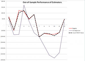
Here is a comparison of the performance of OLS regression and bagging with out-of-sample data generated with the same rules which create the “sample data” in the example spreadsheet shown below.

SmallDATAgraphcomp

The contrast is truly stark. Although, as we will see, the ordinary least squares (OLS) regression has an R2 or “goodness of fit” of 0.99, it does not generalize well out-of-sample, producing the purple line in the graph with 12 additional cases or observations. Bagging the original sample 200 times and re-estimating OLS regression on the bagged samples, then averaging the regression constants and coefficients, produces a much tighter fit on these out-of-sample observations.

Example Spreadsheet

The spreadsheet below illustrates 12 “observations” on a  TARGET or dependent variable and nine (9) explanatory variables, x1 through x9.

SmallDATA1

The top row with numbers in red lists the “true” values of these explanatory variables or drivers, and the column of numbers in red on the far right are the error terms (which are generated by a normal distribution with zero mean and standard deviation of 50).

So if we multiply 3 times 0.22 and add -6 times -2.79 and so forth, adding 68.68 at the end, we get the first value of the TARGET variable 60.17.

While this example is purely artificial, an artifact, one can imagine that these numbers are first differences – that is the current value of a variable minus its preceding value. Thus, the TARGET variable might record first differences in sales of a product quarter by quarter. And we suppose forecasts for  x1 through x9 are available, although not shown above. In fact, they are generated in simulations with the same generating mechanisms utilized to create the sample.

Using the simplest multivariate approach, the ordinary least squares (OLS) regression, displayed in the Excel format, is –

SmallDATAreg

There’s useful information in this display, often the basis of a sort of “talk-through” the regression result. Usually, the R2 is highlighted, and it is terrific here, “explaining” 99 percent of the variation in the data, in, that is, the 12 in-sample values for the TARGET variable. Furthermore, four explanatory variables have statistically significant coefficients, judged by their t-statistics – x2, x6, x7, and x9. These are highlighted in a kind of purple in the display.

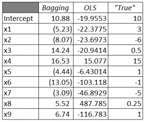
Of course, the estimated values of x1 through x9 are, for the most part, numerically quite different than the true values of the constant term and coefficients {10, 3, -6, 0.5, 15, 1, -1, -5, 0.25, 1}. Nevertheless, because of the large variances or standard errors of the estimates, as noted above some estimated coefficients are within a 95 percent confidence interval of these true values. It’s just that the confidence intervals are very wide.

The in-sample predicted values are accurate, generally speaking. These loopy coefficient estimates essentially balance one another off in-sample.

But it’s not the in-sample performance we are interested in, but the out-of-sample performance. And we want to compare the out-of-sample performance of this OLS regression estimate with estimates of the coefficients and TARGET variable produced by ridge regression and bagging.

Bagging

Bagging [bootstrap aggregating] was introduced by Breiman in the 1990’s to reduce the variance of predictors. The idea is that you take N bootstrap samples of the original data, and with each of these samples, estimate your model, creating, in the end, an ensemble prediction.

Bootstrap sampling draws random samples with replacement from the original sample, creating other samples of the same size. With 12 cases or observations on the TARGET and explanatory variables there are a large number of possible random samples of these 12 cases drawn with replacement; in fact, given nine explanatory variables and the TARGET variable, there are 129  or somewhat more than 5 billion distinct samples, 12 of which, incidentally, are comprised of exactly the same case drawn repeatedly from the original sample.

A primary application of bagging has been in improving the performance of decision trees and systems of classification. Applications to regression analysis seem to be more or less an after-thought in the literature, and the technique does not seem to be in much use in applied business forecasting contexts.

Thus, in the spreadsheet above, random draws with replacement are taken of the twelve rows of the spreadsheet (TARGET and drivers) 200 times, creating 200 samples. An ordinary least squares regression is estimated over each regression, and the constant and parameter estimates are averaged at the end of the process.

Here is a comparison of the estimated coefficients from Bagging and OLS, compared with the true values.

BaggingTable

There’s still variation of the parameter estimates from the true values with bagging, but the variance of the error process (50) is, by design, high. For example, most of the value of TARGET is from the error process, so this is noisy data.

Discussion

Some questions. For example – Are there specific features of the problem presented here which tip the results markedly in favor of bagging? What are the criteria for determining whether bagging will improve regression forecasts? Another question regards the ease or difficulty of bagging regressions in Excel.

The criterion for bagging to deliver dividends is basically parameter instability over the sample. Thus, in the problem here, deleting any observation from the 12 cases and re-estimating the regression results in big changes to estimated parameters. The basic reason is the error terms constitute by far the largest contribution to the value of TARGET for each case.

In practical forecasting, this criterion, which not very clearly defined, can be explored, and then comparisons with regard to actual outcomes can be studied. Thus, estimate the bagged regression forecast,  wait a period, and compare bagged and simple OLS forecasts. Substantial improvement in forecast accuracy, combined with parameter instability in the sample, would seem to be a smoking gun.

Apart from the large contribution of the errors or residuals to the values of TARGET, the other distinctive feature of the problem presented here is the large number of predictors in comparison with the number of cases or observations. This, in part, accounts for the high coefficient of determination or R2, and also suggests that the close in-sample fit and poor out-of-sample performance are probably related to “over-fitting.”

Changes to Businessforecastblog in 2014 – Where We Have Been, Where We Are Going

We’ve been struggling with a software glitch in WordPress, due to, we think, incompatibilities between plug-in’s and a new version of the blogging software. It’s been pretty intense. The site has been fully up, but there was no possibility of new posts, not even a notice to readers about what was happening. All this started just before Christmas and ended, basically, yesterday.

So greetings. Count on daily posts as rule, and I will get some of the archives accessible ASAP.

But, for now, a few words about my evolving perspective.

I came out of the trenches, so to speak, of sales, revenue, and new product forecasting, for enterprise information technology (IT) and, earlier, for public utilities and state and federal agencies. When I launched Businessforecastblog last year, my bias popped up in the secondary heading for the blog – with its reference to “data-limited contexts” – and in early posts on topics like “simple trending” and random walks.

longterm_study_of_market_trends

I essentially believed that most business and economic time series are basically one form or another of random walks, and that exponential smoothing is often the best forecasting approach in an applied context. Of course, this viewpoint can be bolstered by reference to research from the 1980’s by Nelson and Plosser and the M-Competitions. I also bought into a lazy consensus that it was necessary to have more observations than explanatory variables in order to estimate a multivariate regression. I viewed segmentation analysis, so popular in marketing research, as a sort of diversion from the real task of predicting responses of customers directly, based on their demographics, firmagraphics, and other factors.

So the press of writing frequent posts on business forecasting and related topics has led me to a learn a lot.

The next post to this blog, for example, will be about how “bagging” – from Bootstrap Aggregation – can radically reduce forecasting errors when there are only a few historical or other observations, but a large number of potential predictors. In a way, this provides a new solution to the problem of forecasting in data limited contexts.

This post also includes specific computations, in this case done in a spreadsheet. I’m big on actually computing stuff, where possible. I believe Elliot Shulman’s dictum, “you don’t really know something until you compute it.” And now I see how to include access to spreadsheets for readers, so there will be more of that.

Forecasting turning points is the great unsolved problem of business forecasting. That’s why I’m intensely interested in analysis of what many agree are asset bubbles. Bursting of the dot.com bubble initiated the US recession of 2001. Collapse of the housing market and exotic financial instrument bubbles in 2007 bought on the worst recession since World War II, now called the Great Recession. If it were possible to forecast the peak of various asset bubbles, like researchers such as Didier Sornette suggest, this would mean we would have some advance – perhaps only weeks of course – on the onset of the next major business turndown.

Along the way, there are all sorts of interesting sidelights relating to business forecasting and more generally predictive analytics. In fact, it’s clear that in the era of Big Data, data analytics can contribute to improvement of business processes – things like target marketing for customers – as well as perform less glitzy tasks of projecting sales for budget formulation and the like.

Email me at [email protected] if you want to receive PDF compilations on topics from the archives. I’m putting together compilations on New Methods and Asset Bubbles, for starters, in a week or so.


Sales and new product forecasting in data-limited (real world) contexts