Tag Archives: Time series analysis

Fractal Markets, Fractional Integration, and Long Memory in Financial Time Series – I

The concepts – ‘fractal market hypothesis,’ ‘fractional integration of time series,’ and ‘long memory and persistence in time series’ – are related in terms of their proponents and history.

I’m going to put up ideas, videos, observations, and analysis relating to these concepts over the next several posts, since, more and more, I think they lead to really fundamental things, which, possibly, have not yet been fully explicated.

And there are all sorts of clear connections with practical business and financial forecasting – for example, if macroeconomic or financial time series have “long memory,” why isn’t this characteristic being exploited in applied forecasting contexts?

And, since it is Friday, here are a couple of relevant videos to start the ball rolling.

Benoit Mandelbrot, maverick mathematician and discoverer of ‘fractals,’ stands at the crossroads in the 1970’s, contributing or suggesting many of the concepts still being intensively researched.

In economics, business, and finance, the self-similarity at all scales idea is trimmed in various ways, since none of the relevant time series are infinitely divisible.

A lot of energy has gone into following Mandelbrot suggestions on the estimation of Hurst exponents for stock market returns.

This YouTube by a Parallax Financial in Redmond, WA gives you a good flavor of how Hurst exponents are being used in technical analysis. Later, I will put up materials on the econometrics involved.

Blog posts are a really good way to get into this material, by the way. There is a kind of formalism – such as all the stuff in time series about backward shift operators and conventional Box-Jenkins – which is necessary to get into the discussion. And the analytics are by no means standardized yet.

Forecasts of High Prices for Week May 4-8 – QQQ, SPY, GE, and MSFT

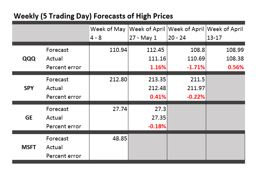
Here are forecasts of high prices for key securities for this week, May 4-8, along with updates to check the accuracy of previous forecasts. So far, there is a new security each week. This week it is Microsoft (MSFT). Click on the Table to enlarge.

TableMay4

These forecasts from the new proximity variable (NPV) algorithms compete with the “no change” forecast – supposedly the optimal predictions for a random walk.

The NPV forecasts in the Table are more accurate than no change forecasts at 3:2 odds. That is, if you take into account the highs of the previous weeks for each security – actual high numbers not shown in the Table – the NPV forecasts are more accurate 4 out of 6 times.

This performance corresponds roughly with the improvements of the NPV approach over the no change forecasts in backtests back to 2003.

The advantages of the NPV approach extend beyond raw accuracy, measured here in simple percent terms, since the “no change” forecast is uninformative about the direction of change. The NPV forecasts, on the other hand, generally get the direction of change right. In the Table above, again considering data from weeks preceding those shown, the direction of change of the high forecasts is spot on every time. Backtests suggest the NPV algorithm will correctly predict the direction of change of the high price about 75 percent of the time for this five day interval.

It will be interesting to watch QQQ in this batch of forecasts. This ETF is forecast to decline week-over-week in terms of the high price.

Next week I plan to expand the forecast table to include forecasts of the low prices.

There is a lot of information here. Much of the finance literature focuses on the rates of returns based on closing prices, or adjusted closing prices. Perhaps analysts figure that attempting to predict “extreme values” is not a promising idea. Nothing could be further from the truth.

This week I plan a post showing how to identify turning points in the movement of major indices with the NPV algorithms. The concept is simple. I forecast the high and low over coming periods, like a day, five days, ten trading days and so forth. For these “nested forecast periods” the high for the week ahead must be greater than or equal to the high for tomorrow or shorter periods. This means when the price of the SPY or QQQ heads south, the predictions of the high of these ETF’s sort of freeze at a constant value. The predictions for the low, however, plummet.

Really pretty straight-forward.

I’ve appreciated and benefitted from your questions, comments, and suggestions. Keep them coming.

Predicting the High Reached by the SPY ETF 30 Days in Advance – Some Results

Here are some backtests of my new stock market forecasting procedures.

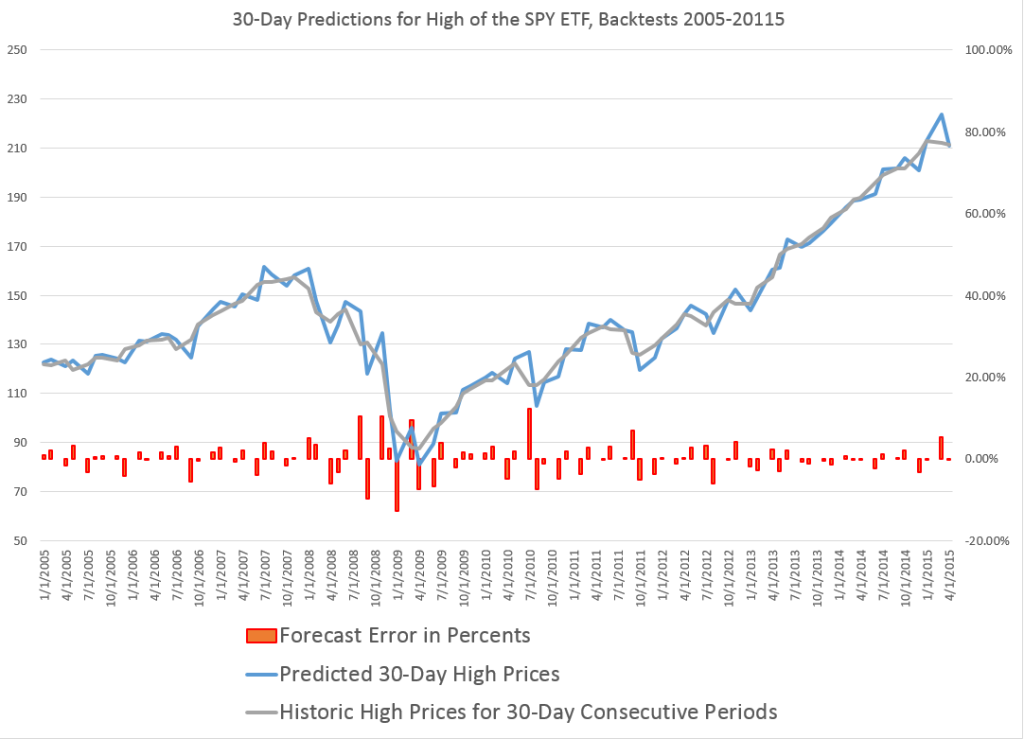
Here, for example, is a chart showing the performance of what I call the “proximity variable approach” in predicting the high price of the exchange traded fund SPY over 30 day forward periods (click to enlarge).

3oDaySPY

So let’s be clear what the chart shows.

The proximity variable approach- which so far I have been abbreviating as “PVar” – is able to identify the high prices reached by the SPY in the coming 30 trading days with forecast errors mostly under 5 percent. In fact, the MAPE for this approximately ten year period is 3 percent. The percent errors, of course, are charted in red with their metric on the axis to the right.

The blue line traces out the predictions, and the grey line shows the actual highs by 30 trading day period.

These results far surpass what can be produced by benchmark models, such as the workhorse No Change model, or autoregressive models.

Why not just do this month-by-month?

Well, months have varying numbers of trading days, and I have found I can boost accuracy by stabilizing the number of trading days considered in the algorithm.

Comments

Realize, of course, that a prediction of the high price that a stock or ETF will reach in a coming period does not tell you when the high will be reached – so it does not immediately translate to trading profits. The high in question could come with the opening price of the period, for example, leaving you out of the money, if you hear there is this big positive prediction of growth and then jump in the market.

However, I do think that market participants react to anticipated increases or decreases in the high or low of a security.

You might explain these results as follows. Traders react to fairly simple metrics predicting the high price which will be reached in the next period – and let this concept be extensible from a day to a month in this discussion. In so reacting, these traders tend to make such predictive models self-fulfilling.

Therefore, daily prices – the opening, the high, the low, and the closing prices – encode a lot more information about trader responses than is commonly given in the literature on stock market forecasting.

Of course, increasingly, scholars and experts are chipping away at the “efficient market hypothesis” and showing various ways in which stock market prices are predictable, or embody an element of predictability.

However, combing Google Scholar and other sources, it seems almost no one has taken the path to modeling stock market prices I am developing here. The focus in the literature is on closing prices and daily returns, for example, rather than high and low prices.

I can envision a whole research program organized around this proximity variable approach, and am drawn to taking this on, reporting various results on this blog.

If any readers would like to join with me in this endeavor, or if you know of resources which would be available to support such a project – feel free to contact me via the Comments and indicate, if you wish, whether you want your communication to be private.

Portfolio Analysis

Greetings again. Took a deep dive into portfolio analysis for a colleague.

Portfolio analysis, of course, has been deeply influenced by Modern Portfolio Theory (MPT) and the work of Harry Markowitz and Robert Merton, to name a couple of the giants in this field.

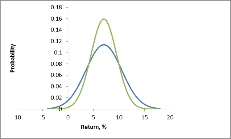
Conventionally, investment risk is associated with the standard deviation of returns. So one might visualize the dispersion of actual returns for investments around expected returns, as in the following chart.

investmentrisk

Here, two investments have the same expected rate of return, but different standard deviations. Viewed in isolation, the green curve indicates the safer investment.

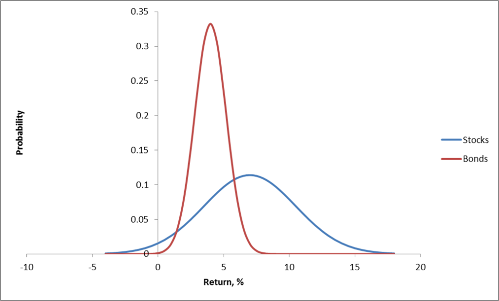
More directly relevant for portfolios are curves depicting the distribution of typical returns for stocks and bonds, which can be portrayed as follows.

stocksbonds

Now the classic portfolio is comprised of 60 percent stocks and 40 percent bonds.

Where would its expected return be? Well, the expected value of a sum of random variables is the sum of their expected values. There is an algebra of expectations to express this around the operator E(.). So we have E(.6S+.4B)=.6E(S)+.4E(B), since a constant multiplied into a random variable just shifts the expectation by that factor. Here, of course, S stands for “stocks” and B “bonds.”

Thus, the expected return for the classic 60/40 portfolio is less than the returns that could be expected from stocks alone.

But the benefit here is that the risks have been reduced, too.

Thus, the variance of the 60/40 portfolio usually is less than the variance of a portfolio composed strictly of stocks.

One of the ways this is true is when the correlation or covariation of stocks and bonds is negative, as it has been in many periods over the last century. Thus, high interest rates mean slow to negative economic growth, but can be associated with high returns on bonds.

Analytically, this is because the variance of the sum of two random variables is the sum of their variances, plus their covariance multiplied by a factor of 2.

Thus, algebra and probability facts underpin arguments for investment diversification. Pick investments which are not perfectly correlated in their reaction to events, and your chances of avoiding poor returns and disastrous losses can be improved.

Implementing MPF

When there are more than two assets, you need computational help to implement MPT portfolio allocations.

For a general discussion of developing optimal portfolios and the efficient frontier see http://faculty.washington.edu/ezivot/econ424/portfoliotheorymatrixslides.pdf

There are associated R programs and a guide to using Excel’s Solver with this University of Washington course.

Also see Package ‘Portfolio’.

These programs help you identify the minimum variance portfolio, based on a group of assets and histories of their returns. Also, it is possible to find the minimum variance combination from a designated group of assets which meet a target rate of return, if, in fact, that is feasible with the assets in question. You also can trace out the efficient frontier – combinations of assets mapped in a space of returns and variances. These assets in each case have expected returns on the curve and are minimum variance compared with all other combinations that generate that rate of return (from your designated group of assets).

One of the governing ideas is that this efficient frontier is something an individual investor might travel along as they age – going from higher risk portfolios when they are younger, to more secure, lower risk portfolios, as they age.

Issues

As someone who believes you don’t really know something until you can compute it, it interests me that there are computational issues with implementing MPT.

I find, for example, that the allocations are quite sensitive to small changes in expected returns, variances, and the underlying covariances.

One of the more intelligent, recent discussions with suggested “fixes” can be found in An Improved Estimation to Make Markowitz’s Portfolio Optimization Theory Users Friendly and Estimation Accurate with Application on the US Stock Market Investment.

The more fundamental issue, however, is that MPT appears to assume that stock returns are normally distributed, when everyone after Mandelbrot should know this is hardly the case.

Again, there is a vast literature, but a useful approach seems to be outlined in Modelling in the spirit of Markowitz portfolio theory in a non-Gaussian world. These authors use MPT algorithms as the start of a search for portfolios which minimize value-at-risk, instead of variances.

Finally, if you want to cool off and still stay on point, check out the 2014 Annual Report of Berkshire Hathaway, and, especially, the Chairman’s Letter. That’s Warren Buffett who has truly mastered an old American form which I believe used to be called “cracker barrel philosophy.” Good stuff.

Trading Volume- Trends, Forecasts, Predictive Role

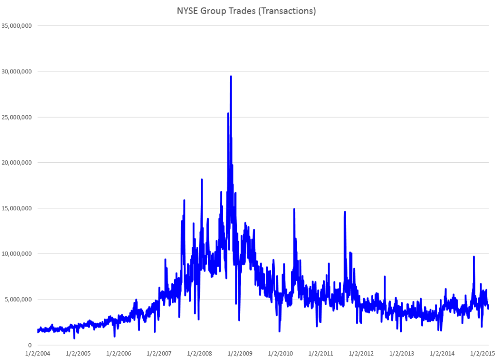
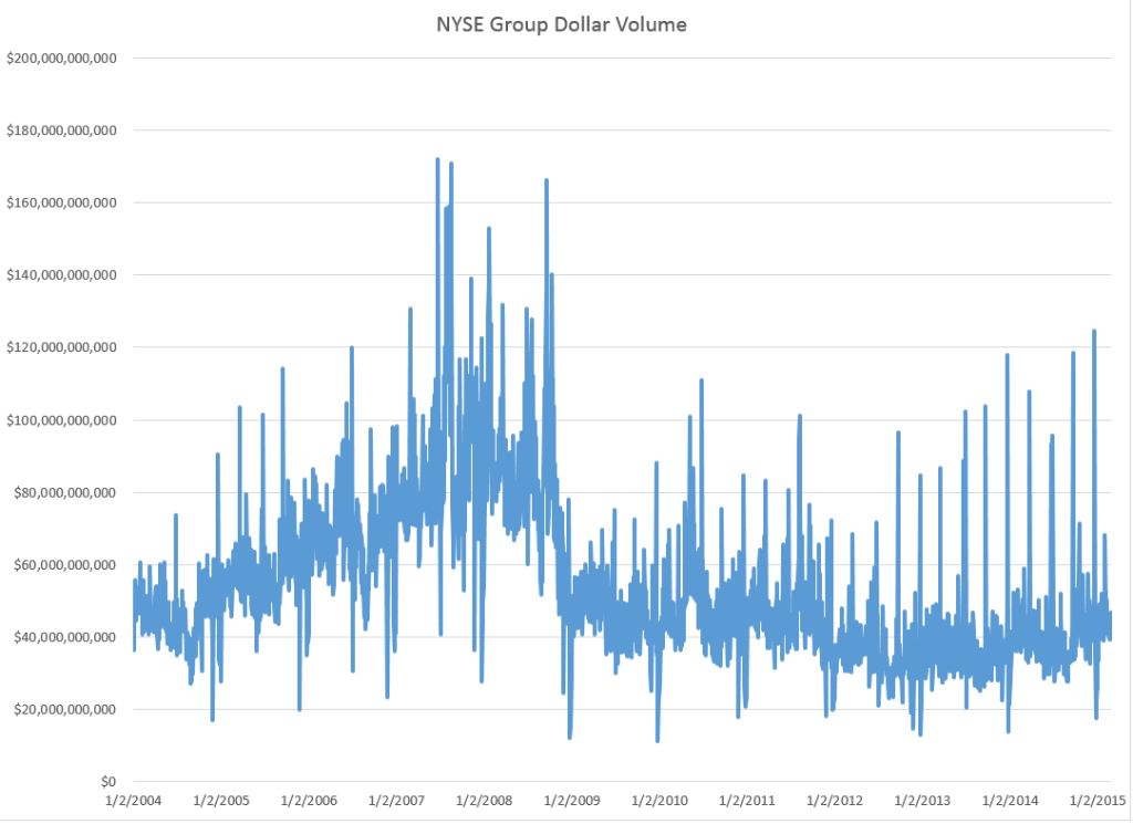
The New York Stock Exchange (NYSE) maintains a data library with historic numbers on trading volumes. Three charts built with some of this data tell an intriguing story about trends and predictability of volumes of transactions and dollars on the NYSE.

First, the number of daily transactions peaked during the financial troubles of 2008, only showing some resurgence lately.

transvol

This falloff in the number of transactions is paralleled by the volume of dollars spent in these transactions.

dollartrans

These charts are instructive, since both highlight the existence of “spikes” in transaction and dollar volume that would seem to defy almost any run-of-the-mill forecasting algorithm. This is especially true for the transactions time series, since the spikes are more irregularly spaced. The dollar volume time series suggests some type of periodicity is possible for these spikes, particularly in recent years.

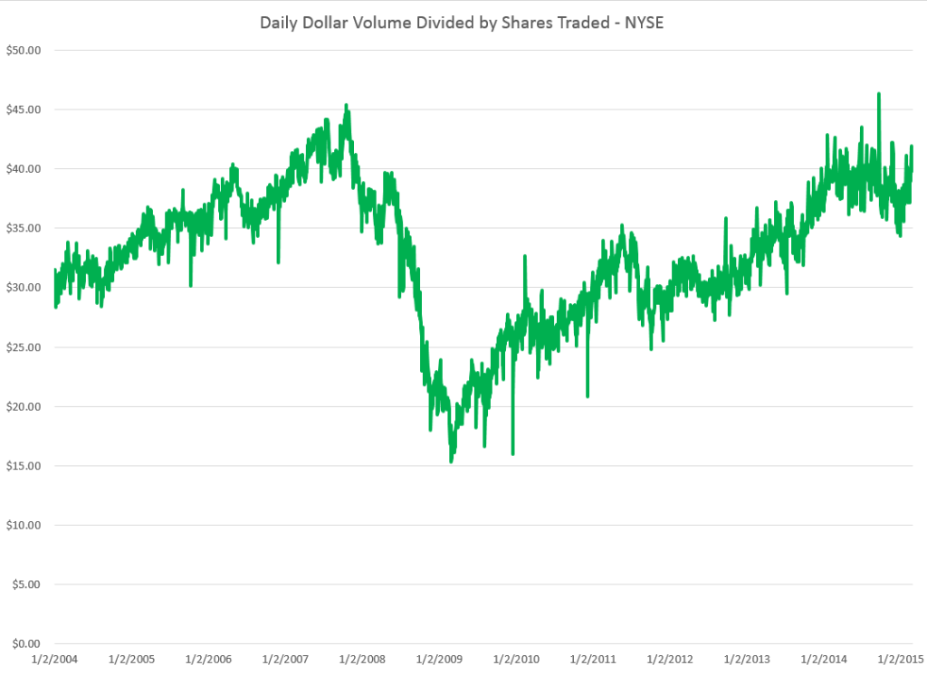
But lower trading volume has not impacted stock prices, which, as everyone knows, surged past 2008 levels some time ago.

A raw ratio between the value of trades and NYSE stock transactions gives the average daily price per transaction.

vluepershare

So stock prices have rebounded, for the most part, to 2008 levels. Note here that the S&P 500 index stocks have done much better than this average for all stocks.

Why has trading volume declined on the NYSE? Some reasons gleaned from the commentariat.

  1. Mom and Pop traders largely exited the market, after the crash of 2008
  2. Some claim that program trading or high frequency trading peaked a few years back, and is currently in something of a decline in terms of its proportion of total stock transactions. This is, however, not confirmed by the NYSE Facts and Figures, which shows program trading pretty consistently at around 30 percent of total trading transactions..
  3. Interest has shifted to options and futures, where trading volumes are rising.
  4. Exchange Traded Funds (ETF’s) make up a larger portion of the market, and they, of course, do not actively trade.
  5. Banks have reduced their speculation in equities, in anticipation of Federal regulations

See especially Market Watch and Barry Ritholtz on these trends.

But what about the impact of trading volume on price? That’s the real zinger of a question I hope to address in coming posts this week.

More on the “Efficiency” of US Stock Markets – Evidence from 1871 to 2003

In a pivotal article, Andrew Lo writes,

Many of the examples that behavioralists cite as violations of rationality that are inconsistent with market efficiency loss aversion, overconfidence, overreaction, mental accounting, and other behavioral biases are, in fact, consistent with an evolutionary model of individuals adapting to a changing environment via simple heuristics.

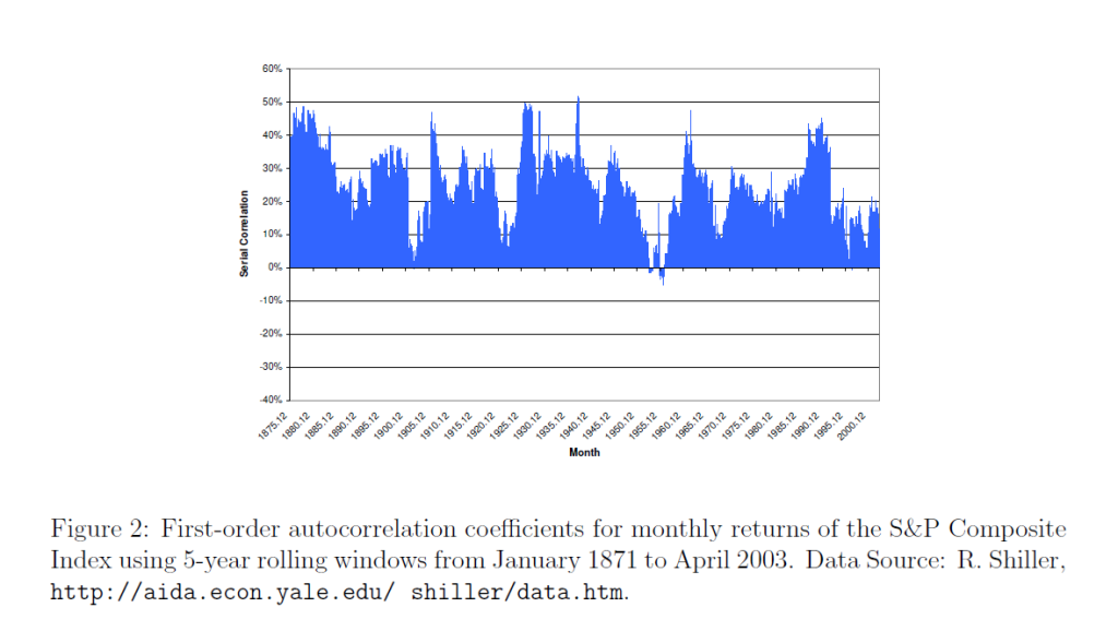
He also supplies an intriguing graph of the rolling first order autocorrelation of monthly returns of the S&P Composite Index from January 1971 to April 2003.

LoACchart

Lo notes the Random Walk Hypothesis implies that returns are serially uncorrelated, so the serial correlation coefficient ought to be zero – or at least, converging to zero over time as markets move into equilibrium.

However, the above chart shows this does not happen, although there are points in time when the first order serial correlation coefficient is small in magnitude, or even zero.

My point is that the first order serial correlation in daily returns for the S&P 500 is large enough for long enough periods to generate profits above a Buy-and-Hold strategy – that is, if one can negotiate the tricky milliseconds of trading at the end of each trading day.

Scalability of the Pvar Stock Market Forecasting Approach

Ok, I am documenting and extending a method of forecasting stock market prices based on what I call Pvar models. Here Pvar stands for “proximity variable” – or, more specifically, variables based on the spread or difference between the opening price of a stock, ETF, or index, and the high or low of the previous period. These periods can be days, groups of days, weeks, months, and so forth.

I share features of these models and some representative output on this blog.

And, of course, I continue to have wider interests in forecasting controversies, issues, methods, as well as the global economy.

But for now, I’ve got hold of something, and since I appreciate your visits and comments, let’s talk about “scalability.”

Forecast Error and Data Frequency

Years ago, when I first heard of the M-competition (probably later than for some), I was intrigued by reports of how forecast error blows up “three or four periods in the forecast horizon,” almost no matter what the data frequency. So, if you develop a forecast model with monthly data, forecast error starts to explode three or four months into the forecast horizon. If you use quarterly data, you can push the error boundary out three or four quarters, and so forth.

I have not seen mention of this result so much recently, so my memory may be playing tricks.

But the basic concept seems sound. There is irreducible noise in data and in modeling. So whatever data frequency you are analyzing, it makes sense that forecast errors will start to balloon more or less at the same point in the forecast horizon – in terms of intervals of the data frequency you are analyzing.

Well, this concept seems emergent in forecasts of stock market prices, when I apply the analysis based on these proximity variables.

Prediction of Highs and Lows of Microsoft (MSFT) Stock at Different Data Frequencies

What I have discovered is that in order to predict over longer forecast horizons, when it comes to stock prices, it is necessary to look back over longer historical periods.

Here are some examples of scalability in forecasts of the high and low of MSFT.

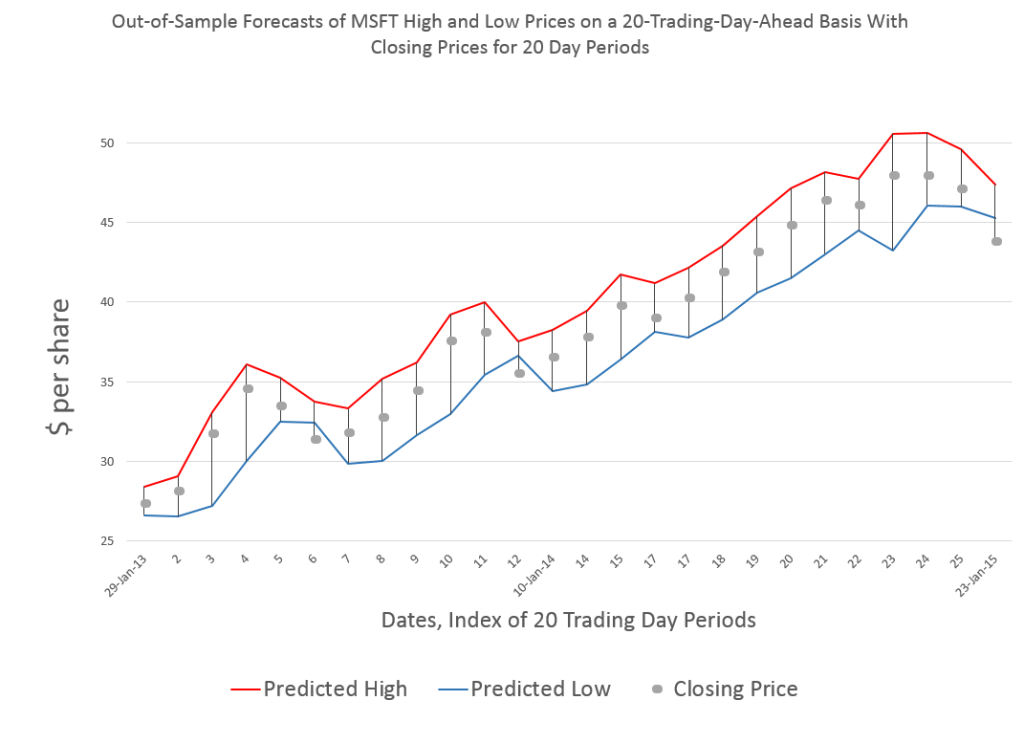
Forecasting 20 trading days ahead, you get this type of chart for recent 20-day-periods.

MSFT20day

One of the important things to note is that these are out-of-sample forecasts, and that, generally, they encapsulate the actual closing prices for these 20 trading day periods.

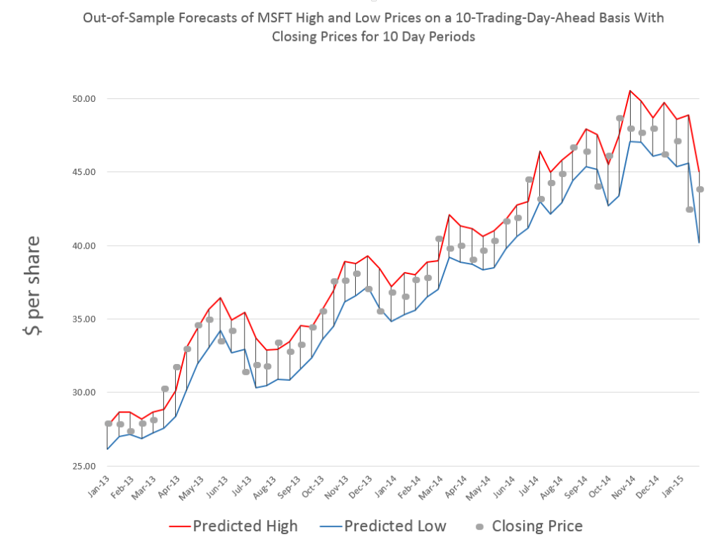
Here is a comparable chart for 10 trading days.

MSFTHL10

Same data, forecasts also are out-of-sample, and, of course, there are more closing prices to chart, too.

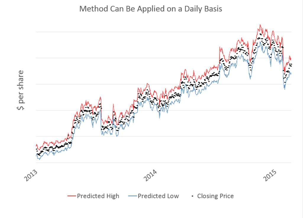
Finally, here is a very busy chart with forecasts by trading day.

MSFTdaily

Now there are several key points to take away from these charts.

First, the predictions of MSFT high and low prices for these periods are developed by similar forecast models, at least with regard to the specification of explanatory variables. Also, the Pvar method works for specific stocks, as well as for stock market indexes and ETF’s that might track them.

However, and this is another key point, the definitions of these variables shift with the periods being considered.

So the high for MSFT by trading day is certainly different from the MSFT high over groups of 20 trading days, and so forth.

In any case, there is remarkable scalability with Pvar models, all of which suggests they capture some of the interplay between long and shorter term trading.

While I am handing out conjectures, here is another one.

I think it will be possible to conduct a “causal analysis” to show that the Pvar variables reflect or capture trader actions, and that these actions tend to drive the market.

Pvar Models for Forecasting Stock Prices

When I began this blog three years ago, I wanted to deepen my understanding of technique – especially stuff growing up alongside Big Data and machine learning.

I also was encouraged by Malcolm Gladwell’s 10,000 hour idea – finding it credible from past study of mathematical topics. So maybe my performance as a forecaster would improve by studying everything about the subject.

Little did I suspect I would myself stumble on a major forecasting discovery.

But, as I am wont to quote these days, even a blind pig uncovers a truffle from time to time.

Forecasting Stock Prices

My discovery pertains to forecasting stock prices.

Basically, I have stumbled on a method of developing much more accurate forecasts of high and low stock prices, given the opening price in a period. These periods can be days, groups of days, weeks, months, and, based on what I present here – quarters.

Additionally, I have discovered a way to translate these results into much more accurate forecasts of closing prices over long forecast horizons.

I would share the full details, except I need some official acknowledgement for my work (in process) and, of course, my procedures lead to profits, so I hope to recover some of what I have invested in this research.

Having struggled through a maze of ways of doing this, however, I feel comfortable sharing a key feature of my approach – which is that it is based on the spreads between opening prices and the high and low of previous periods. Hence, I call these “Pvar models” for proximity variable models.

There is really nothing in the literature like this, so far as I am able to determine – although the discussion of 52 week high investing captures some of the spirit.

S&P 500 Quarterly Forecasts

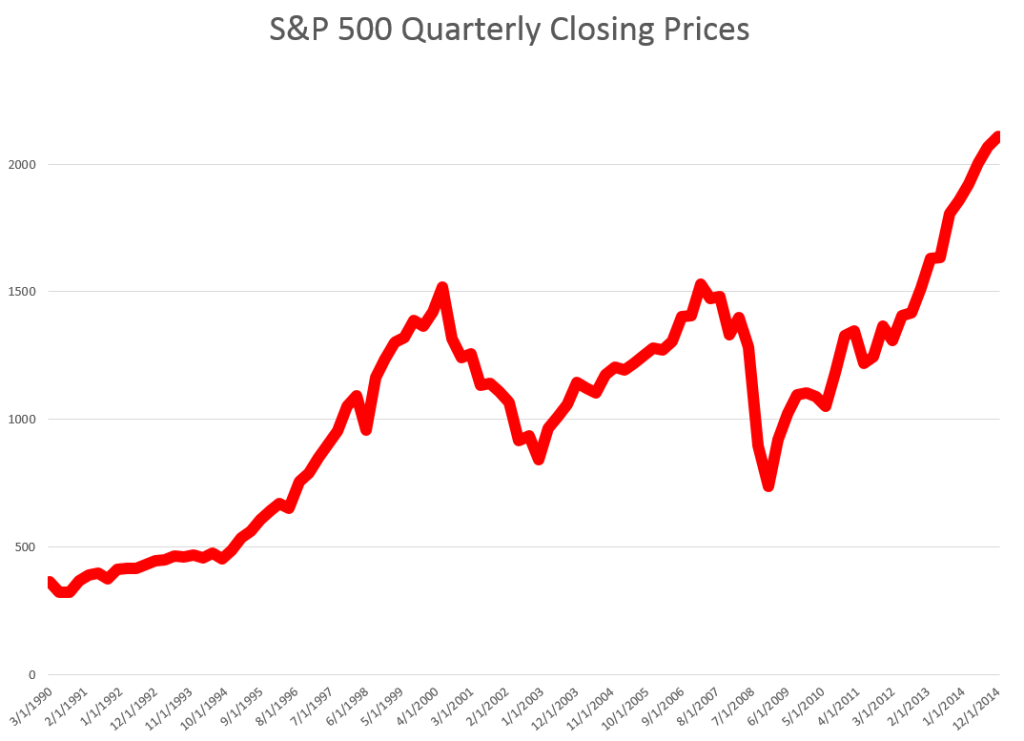
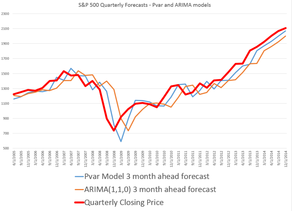
Let’s look an example – forecasting quarterly closing prices for the S&P 500, shown in this chart.

S&PQ

We are all familiar with this series. And I think most of us are worried that after the current runup, there may be another major correction.

In any case, this graph compares out-of-sample forecasts of ARIMA(1,1,0) and Pvar models. The ARIMA forecasts are estimated by the off-the-shelf automatic forecast program Forecast Pro. The Pvar models are estimated by ordinary least squares (OLS) regression, using Matlab and Excel spreadsheets.

CompPvarARIMA

The solid red line shows the movement of the S&P 500 from 2005 to just recently. Of course, the big dip in 2008 stands out.

The blue line charts out-of-sample forecasts of the Pvar model, which are from visual inspection, clearly superior to the ARIMA forecasts, in orange.

And note the meaning of “out-of-sample” here. Parameters of the Pvar and ARIMA models are estimated over historic data which do not include the prices in the period being forecast. So the results are strictly comparable with applying these models today and checking their performance over the next three months.

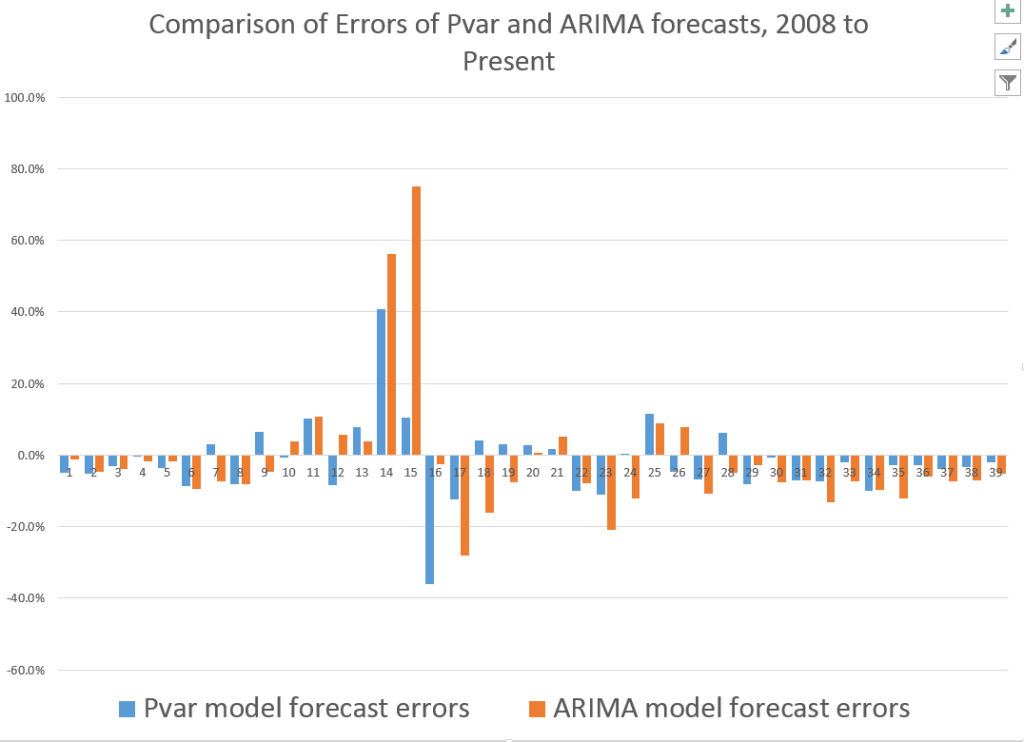
The following bar chart shows the forecast errors of the Pvar and ARIMA forecasts.

PvarARIMAcomp

Thus, the Pvar model forecasts are not always more accurate than ARIMA forecasts, but clearly do significantly better at major turning points, like the 2008 recession.

The mean absolute percent errors (MAPE) for the two approaches are 7.6 and 10.2 percent, respectively.

This comparison is intriguing, since Forecast Pro automatically selected an ARIMA(1,1,0) model in each instance of its application to this series. This involves autoregressions on differences of a time series, to some extent challenging the received wisdom that stock prices are random walks right there. But Pvar poses an even more significant challenge to versions of the efficient market hypothesis, since Pvar models pull variables from the time series to predict the time series – something you are really not supposed to be able to do, if markets are, as it were, “efficient.” Furthermore, this price predictability is persistent, and not just a fluke of some special period of market history.

I will have further comments on the scalability of this approach soon. Stay tuned.

Forecasting Google’s Stock Price (GOOG) On 20-Trading-Day Horizons

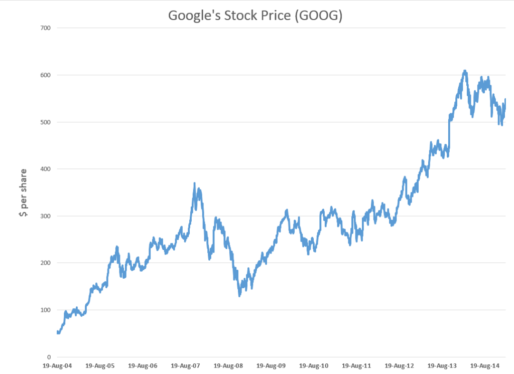
Google’s stock price (GOOG) is relatively volatile, as the following chart shows.

GOOG

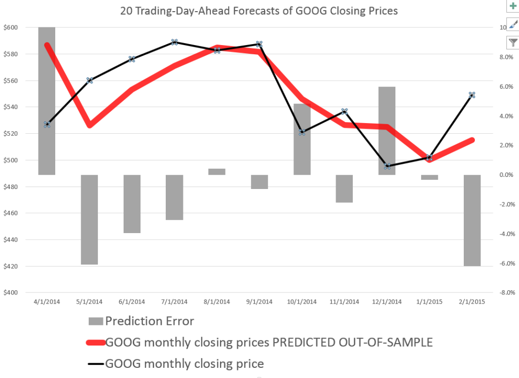
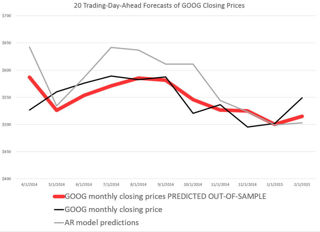
So it’s interesting that a stock market forecasting algorithm can produce the following 20 Trading-Day-Ahead forecasts for GOOG, for the recent period.

GOG20

The forecasts in the above chart, as are those mentioned subsequently, are out-of-sample predictions. That is, the parameters of the forecast model – which I call the PVar model – are estimated over one set of historic prices. Then, the forecasts from PVar are generated with values for the explanatory variables that are “outside” or not the same as this historic data.

How good are these forecasts and how are they developed?

Well, generally forecasting algorithms are compared with benchmarks, such as an autoregressive model or a “no-change” forecast.

So I constructed an autoregressive (AR) model for the Google closing prices, sampled at 20 day frequencies. This model has ten lagged versions of the closing price series, so I do not just rely here on first order autocorrelations.

Here is a comparison of the 20 trading-day-ahead predictions of this AR model, the above “proximity variable” (PVar) model which I take credit for, and the actual closing prices.

compGOOG

As you can see, the AR model is worse in comparison to the PVar model, although they share some values at the end of the forecast series.

The mean absolute percent errors (MAPE) of the AR model for a period more extended than shown in the graph is 7.0, compared with 5.1 for PVar. This comparison is calculated over data from 4/20/2011.

So how do I do it?

Well, since these models show so much promise, it makes sense to keep working on them, making improvements. However, previous posts here give broad hints, indeed pretty well laying out the framework, at least on an introductory basis.

Essentially, I move from predicting highs and lows to predicting closing prices.

To predict highs and lows, my post “further research” states

Now, the predictive models for the daily high and low stock price are formulated, as before, keying off the opening price in each trading day. One of the key relationships is the proximity of the daily opening price to the previous period high. The other key relationship is the proximity of the daily opening price to the previous period low. Ordinary least squares (OLS) regression models can be developed which do a good job of predicting the direction of change of the daily high and low, based on knowledge of the opening price for the day.

Other posts present actual regression models, although these are definitely prototypes, based on what I know now.

Why Does This Work?

I’ll bet this works because investors often follow simple rules such as “buy when the opening price is sufficiently greater than the previous period high” or “sell, if the opening price is sufficiently lower than the previous period low.”

I have assembled evidence, based on time variation in the predictive coefficients of the PVar variables, which I probably will put out here sometime.

But the point is that momentum trading is a major part of stock market activity, not only in the United States, but globally. There’s even research claiming to show that momentum traders do better than others, although that’s controversial.

This means that the daily price record for a stock, the opening, high, low, and closing prices, encode information that investors are likely to draw upon over different investing horizons.

I’m pleased these insights open up many researchable questions. I predict all this will lead to wholly new generations of models in stock market analysis. And my guess, and so far it is largely just that, is that these models may prove more durable than many insights into patterns of stock market prices – due to a sort of self-confirming aspect.

Stock Market Predictability

The research findings in recent posts here suggest that, in broad outline, the stock market is predictable.

This is one of the most intensively researched areas of financial econometrics.

There certainly is no shortage of studies claiming to forecast stock prices. See for example, Atsalakis, G., and K. Valavanis. “Surveying stock market forecasting techniques-part i: Conventional methods.” Journal of Computational Optimization in Economics and Finance 2.1 (2010): 45-92.

But the field is dominated by decades-long controversy over the efficient market hypothesis (EMH).

I’ve been reading Lim and Brooks outstanding survey article – The Evolution of Stock Market Efficiency Over Time: A Survey of the Empirical Literature.

They highlight two types of studies focusing on the validity of a weak form of the EMH which asserts that security prices fully reflect all information contained in the past price history of the market…

The first strand of studies, which is the focus of our survey, tests the predictability of security returns on the basis of past price changes. More specifically, previous studies in this sub-category employ a wide array of statistical tests to detect different types of deviations from a random walk in financial time series, such as linear serial correlations, unit root, low-dimensional chaos, nonlinear serial dependence and long memory. The second group of studies examines the profitability of trading strategies based on past returns, such as technical trading rules (see the survey paper by Park and Irwin, 2007), momentum and contrarian strategies (see references cited in Chou et al., 2007).

Another line, related to this second branch of research tests.. return predictability using other variables such as the dividend–price ratio, earnings–price ratio, book-to-market ratio and various measures of the interest rates.

Lim and Brooks note the tests for the semi-strong-form and strong-form EMH are renamed as event studies and tests for private information, respectively.

So bottom line – maybe your forecasting model predicts stock prices or rates of return over certain periods, but the real issue is whether it makes money. As Granger writes much earlier, mere forecastability is not enough.

I certainly respect this criterion, and recognize it is challenging. It may be possible to trade on the models of high and low stock prices over periods such I have been discussing, but I can also show you situations in which the irreducibly stochastic elements in the predictions can lead to losses. And avoiding these losses puts you into the field of higher frequency trading, where “all bets are off,” since there is so much that is not known about how that really works, particularly for individual investors.

My  primary purpose, however, in pursuing these types of models is originally not so much for trading (although that is seductive), but to explore new ways of forecasting turning points in economic time series. Confronted with the dismal record of macroeconomic forecasters, for example, one can see that predicting turning points is a truly fundamental problem. And this is true, I hardly need to add, for practical business forecasts. Your sales may do well – and exponential smoothing models may suffice – until the next phase of the business cycle, and so forth.

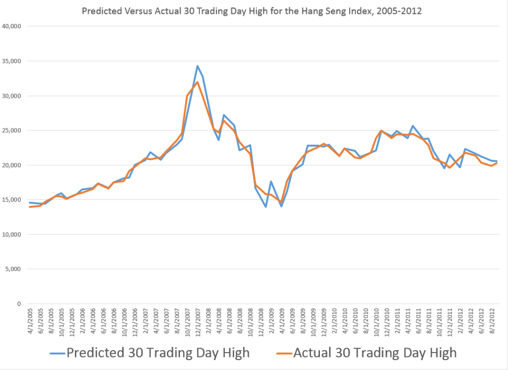
So I am amazed by the robustness of the turning point predictions from the longer (30 trading days, 40 days, etc.) groupings.

I just have never myself developed or probably even seen an example of predicting turning points as clearly as the one I presented in the previous post relating to the Hong Kong Hang Seng Index.
HSItp

A Simple Example of Stock Market Predictability

Again, without claims as to whether it will help you make money, I want to close this post today with comments about another area of stock price predictability – perhaps even simpler and more basic than relationships regarding the high and low stock price over various periods.

This is an exercise you can try for yourself in a few minutes, and which leads to remarkable predictive relationships which I do not find easy to identify or track in the existing literature regarding stock market predictability.

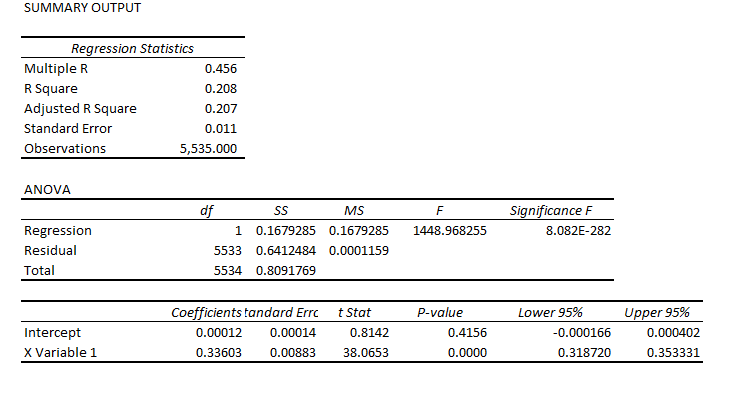
First, download the Yahoo Finance historical data for SPY, the ETF mirroring the S&P 500. This gives you a spreadsheet with approximately 5530 trading day values for the open, high, low, close, volume, and adjusted close. Sort from oldest to most recent. Then calculate trading-day over trading-day growth rates, for the opening prices and then the closing prices. Then, set up a data structure associating the opening price growth for day t with the closing price growth for day t-1. In other words, lag the growth in the closing prices.

Then, calculate the OLS regression of growth in lagged closing prices onto the growth in opening prices.

You should get something like,
openoverlcose

This is, of course, an Excel package regression output. It indicates that X Variable 1, which is the lagged growth in the closing prices, is highly significant as an explanatory variable, although the intercept or constant is not.

This equation explains about 21 percent of the variation in the growth data for the opening prices.

It also successfully predicts the direction of change of the opening price about 65 percent of the time, or considerably better than chance.

Not only that, but the two and three-period growth in the closing prices are successful predictors of the two and three-period growth in the opening prices.

And it probably is possible to improve the predictive performance of these equations by autocorrelation adjustments.

Comments

Why present the above example? Well, because I want to establish credibility on the point that there are clearly predictable aspects of stock prices, and ones you perhaps have not heard of heretofore.

The finance literature on stock market prediction and properties of stock market returns, not to mention volatility, is some of the most beautiful and complex technical literatures I know of.

But, still, I think new and important relationships can be discovered.

Whether this leads to profit-making is another question. And really, the standards have risen significantly in recent times, with program and high frequency trading possibly snatching profit opportunities from traders at the last microsecond.

So I think the more important point, from a policy standpoint if nothing else, may be whether it is possible to predict turning points – to predict broader movements of stock prices within which high frequency trading may be pushing the boundary.