Category Archives: stock market forecasts

Forecasting the S&P 500 – Short and Long Time Horizons

Friends and acquaintances know that I believe I have discovered amazing, deep, and apparently simple predictability in aspects of the daily, weekly, monthly movement of stock prices.

People say – “don’t blog about it, keep it to yourself, and use it to make a million dollars.” That does sound attractive, but I guess I am a data scientist, rather than stock trader. Not only that, but the pattern looks to be self-fulfilling. Generally, the result of traders learning about this pattern should be to reinforce, rather than erase, it. There seems to be no other explanation consistent with its long historical vintage, nor the broadness of its presence. And that is big news to those of us who like to linger in the forecasting zoo.

I am going to share my discovery with you, at least in part, in this blog post.

But first, let me state some ground rules and describe the general tenor of my analysis. I am using OLS regression in spreadsheets at first, to explore the data. I am only interested, really, in models which have significant out-of-sample prediction capabilities. This means I estimate the regression model over a set of historical data and then use that model to predict – in this case the high and low of the SPY exchange traded fund. The predictions (or “retrodictions” or “backcasts”) are for observations on the high and low stock prices for various periods not included in the data used to estimate the model.

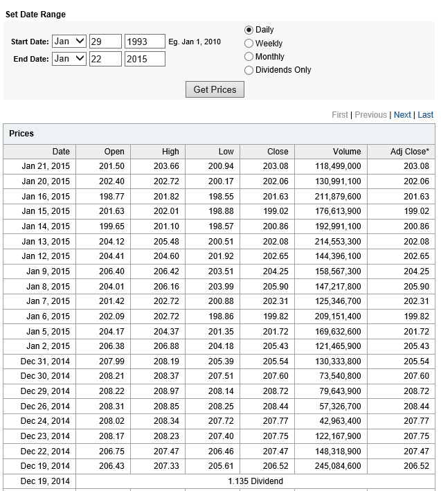
Now let’s look at the sort of data I use. The following table is from Yahoo Finance for the SPY. The site allows you to download this data into a spreadsheet, although you have to invert the order of the dating with a sort on the date. Note that all data is for trading days, and when I speak of N-day periods in the following, I mean periods of N trading days.

Yahoo

OK, now let me state my major result.

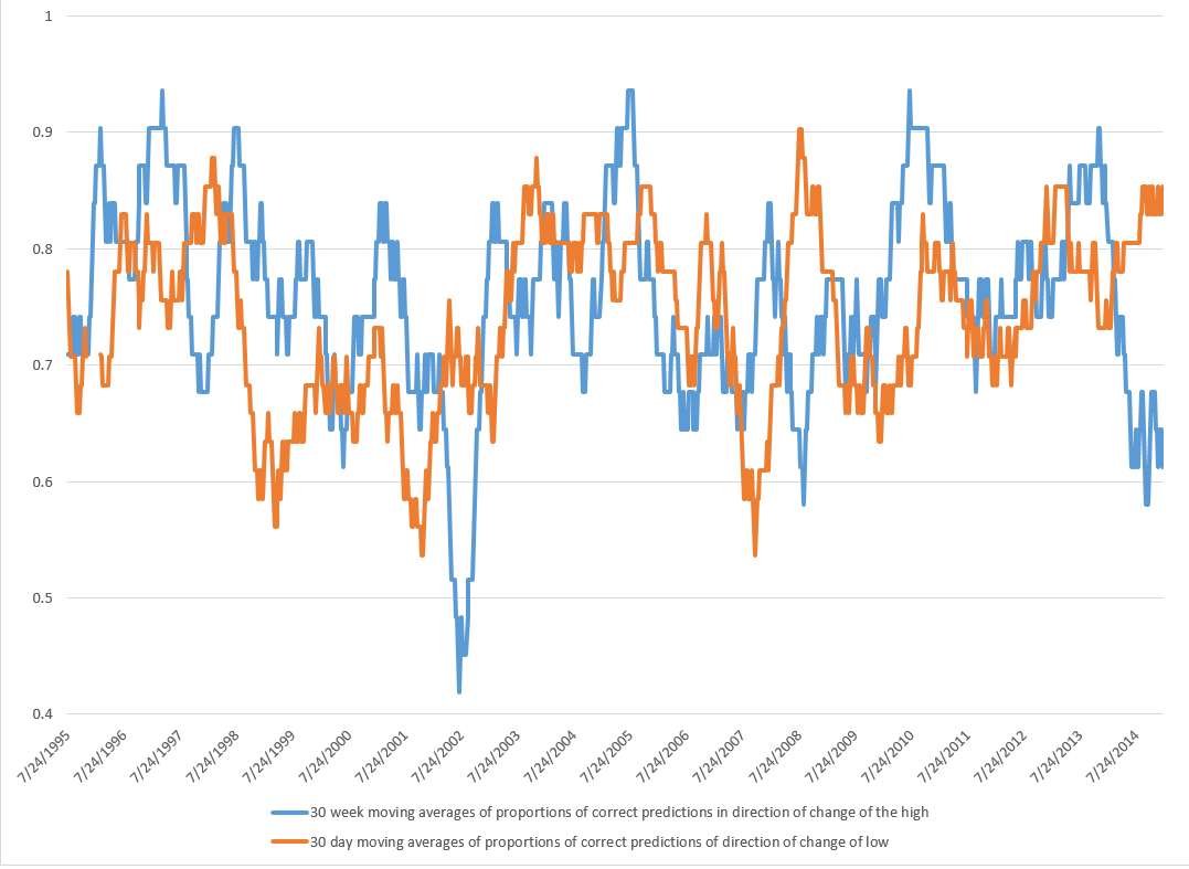
For every period from daily periods to 60 day periods I have investigated, the high and low prices are “relatively” predictable and the direction of change from period to period is predictable, in backcasting analysis, about 70-80 percent of the time, on average.

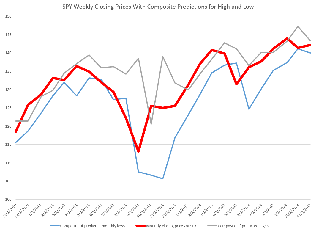
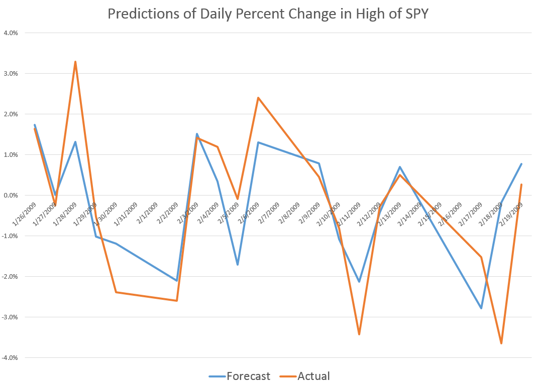
To give an example of a backcasting analysis, consider this chart from the period of free-fall in markets during 2008-2009, the Great Recession (click to enlarge).

40dayforecast

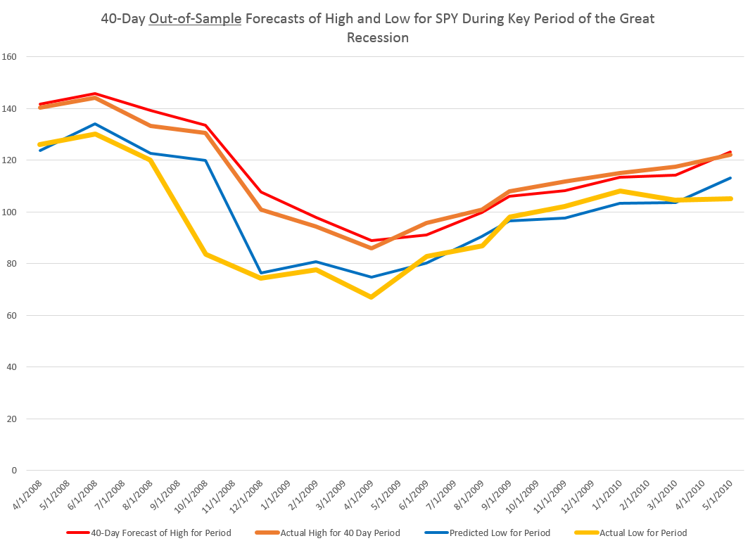
Now note that the indicated lines for the forecasts are not, strictly-speaking, 40-day-ahead forecasts. The forecasts are for the level of the high and low prices of the SPY which will be attained in each period of 40 trading days.

But the point is these rather time-indeterminate forecasts, when graphed alongside the actual highs and lows for the 40 trading day periods in question, are relatively predictive.

More to the point, the forecasts suffice to signal a key turning point in the SPY. Of course, it is simple to relate the high and low of the SPY for a period to relevant measures of the average or closing stock prices.

So seasoned forecasters and students of the markets and economics should know by this example that we are in terra incognita. Forecasting turning points out-of-sample is literally the toughest thing to do in forecasting, and certain with respect to the US stock market.

Many times technical analysts claim to predict turning points, but their results may seem more artistic, involving subtle interpretations of peaks and shoulders, as well as levels of support.

Now I don’t want to dismiss technical analysis, since, indeed, I believe my findings may prove out certain types of typical results in technical analysis. Or at least I can see a way to establish that claim, if things work out empirically.

Forecast of SPY High And Low for the Next Period of 40 Trading Days

What about the coming period of 40 trading days, starting from this morning’s (January 22, 2015) opening price for the SPY – $203.99?

Well, subject to qualifications I will state further on here, my estimates suggest the high for the period will be in the range of $215 and the period low will be around $194. Cents attached to these forecasts would be, of course, largely spurious precision.

In my opinion, these predictions are solid enough to suggest that no stock market crash is in the cards over the next 40 trading days, nor will there be a huge correction. Things look to trade within a range not too distant from the current situation, with some likelihood of higher highs.

It sounds a little like weather forecasting.

The Basic Model

Here is the actual regression output for predicting the 40 trading day high of the SPY.

40Highreg

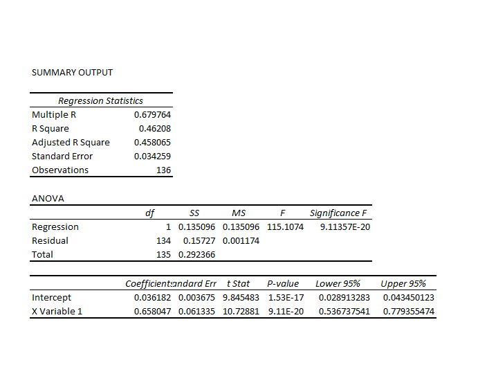
This is a simpler than many of the models I have developed, since it only relies on one explanatory variable designated X Variable 1 in the Excel regression output. This explanatory variable is the ratio of the current opening price to the previous high for the 40 day trading period, all minus 1.

Let’s call this -1+ O/PH. Instances of -1+ O/PH are generated for data bunched by 40 trading day periods, and put into the regression against the growth in consecutive highs for these 40 day periods.

So what happens is this, apparently.

Everything depends on the opening price. If the high for the previous period equals the opening price, the predicted high for the next 40 day period will be the same as the high for the previous 40 day period.

If the previous high is less than the opening price, the prediction is that the next period high will be higher. Otherwise, the prediction is that the next period high will be lower.

This then looks like a trading rule which even the numerically challenged could follow.

And this sort of relationship is not something that has just emerged with quants and high frequency trading. On the contrary, it is possible to find the same type of rule operating with, say, Exxon’s stock (XOM) in the 1970’s and 1980’s.

But, before jumping to test this out completely, understand that the above regression is, in terms of most of my analysis, partial, missing at least one other important explanatory variable.

Previous posts, which employ similar forecasting models for daily, weekly, and monthly trading periods, show that these models can predict the direction of change of the period highs with about 70 to 80 percent accuracy (See, for example, here).

Provisos and Qualifications

In deploying OLS regression analysis, in Excel spreadsheets no less, I am aware there are many refinements which, logically, might be developed and which may improve forecast accuracy.

One thing I want to stress is that residuals of the OLS regressions on the growth in the period highs generally are not normally distributed. The distribution tends to be very peaked, reminiscent of discussions earlier in this blog of the Laplace distribution for Microsoft stock prices.

There also is first order serial correlation in many of these regressions. And, my software indicates that there could be autocorrelations extending deep into the historical record.

Finally, the regression coefficients may vary over the historical record.

Bottom LIne

I like Robb Hyndman’s often drawn distinction between modeling and reality. Somewhere Hyndman suggests that no model is right.

But this class of models has an extremely logical motivation, and is, as I say, relatively predictive – predictive enough to be useful in a number of contexts.

Momentum traders for years apparently have looked at the opening price and compared it with the highs (and lows) for previous periods – extending 60 days or more into history if not more – and decided whether to trade. If the opening price is greater than the past high, the next high is anticipated to be even higher. On this basis, stock may be purchased. That action tends to reinforce the relationship. So, in some sense, this is a self-fulfilling relationship.

To recapitulate – I can show you iron-clad, incontrovertible evidence that some fairly simple models built on daily trading data produce workable forecasts of the high and low for stock indexes and stocks. These forecasts are available for a variety of time periods, and, apparently, in backcasts can indicate turning points in the market.

As I say, feel free to request further documentation. I am preparing a write-up for a journal, and I think I can find a way to send out versions of this.

You can contact me confidentially via the Comments box below. Leave your email or phone number. Title the Comment “Request for High/Low Model Information” and the webmeister will forward it to me without having your request listed in the side panel of the blog.

Predicting the High of SPY Over Daily, Weekly, and Monthly Forecast Horizons

Here are some remarkable findings relating to predicting the high and low prices of the SPDR S&P 500 ETF (SPY) in daily, weekly, and monthly periods.

Basically, the high and low prices for SPY can be forecast with some accuracy – especially with regards the sign of the percent change from the high or low of the previous period.

The simplicity of the predictive relationships are remarkable, and key off the ratio of the previous period high or low to the opening price for the new period under consideration. There is precedent in the work of George and Hwang, for example, who show picking portfolios of stocks whose price is near their 52-week high can generate superior returns (validated in 2010 for international portfolios). But my analysis concerns a specific exchange traded fund (ETF) which, of course, mirrors the S&P 500 Index.

Evidence

For data, I utilize daily, weekly, and monthly open, close, high, low, and volume data on the SPDR S&P 500 ETF SPY from Yahoo Finance from January 1993 to the present.

I estimate ordinary least squares (OLS) regression estimates on a rolling or adaptive basis.

So, for example, I begin weekly estimates to predict the high for a forecast horizon of one week on the period February 1, 1993 to December 12, 1994. The dependent variable is the growth in the highs from week to week – 97 observations on weekly data to begin with.

The initial regression has a coefficient of determination of 0.405 and indicates high statistical significance for the regression coefficients – although the underlying stochastic elements here are probably profoundly non-normal.

I use a similar setup to predict the weekly low of SPY, substituting the “growth” of the preceding low (in the previous week) to the current opening price in the set of explanatory variables. I continue using the lagged logarithm of the trading volume.

This chart shows the proportion of correct signs predicted by weekly models for the growth or percentage changes in the high and low prices in terms of 30 week moving averages (click to enlarge).

weeklycomp

There is a lot to think about in this chart, clearly.

The basic truth, however, is that the predictive models, which are simple OLS regressions with two explanatory variables, predict the correct sign of the growth weekly percentage changes in the high and low SPY prices about 75 percent of the time.

Similar analysis of monthly data also leads to predictive models for the monthly high and lows. The predictive models for the high and low prices in monthly forecast horizons correctly predict more than 70 percent of the directions of change in these respective growth rates, with the model for the lows being more powerful statistically.

The actual forecasts of the growth in the monthly highs and lows may be helpful in discerning turning points in the SPY and, thus, the S&P 500, as the following chart suggests.

Bounded

Here I apply the predicted high and low growth rates week-by-week to the previous week values for the high and low and also chart the SPY closing prices for the week (in bold red).

For discussion of the models for the daily highs and lows, see my previous blog posts here and here.

I might add that these findings relating to predicatability of the high and low of SPY on a daily, weekly, and monthly basis are among the strongest and simplest statistical relationships I have had the fortune to encounter.

Academic researchers are free to use and build on these results, but I would appreciate being credited with the underlying insight or as at least a source.

Discussion – Pathways of Predictability

Since this is not a refereed publication, I take the liberty of offering some conjectures on why this predictability exists.

My basic idea is that there are positive feedback loops for investing, based on fairly simple predictive models for the high of SPY that will be reached over a day, a week, or a month. So this would mean investors are aware of this relationship, and act upon it in real time. Their actions, furthermore, reinforce the strength of the relationship, creating pathways of predictability into the future in otherwise highly volatile, noisy data. Discovery of such pathways serves to reinforce their existence.

If this is true, it is real news and something relatively novel in economic forecasting.

And there is a second conjecture. I suspect that these “pathways of predictability” in the high and probably the low of SPY give us a window into turning points in the underlying stock index, the S&P 500. It should be possible to array daily, weekly, and monthly forecasts of the highs and lows for SPY and get some indication of a change in the direction of movement of the series.

These are a big claims, and eventually, may become shaded in colors of lighter and darker grey. However, I believe they work well as research hypotheses.

Predicting the High and Low of SPY – and a Generalization

Well, here are some results on forecasting the daily low prices of the SPY exchange traded fund (ETF), complementing the previous post.

This line of inquiry has exploded into something much bigger, as I will relate shortly, but first ….

Predicting the Daily Low

This graph gives a flavor of the accuracy of a very simple bivariate regression, estimated on the daily percent changes in the lows for SPY.

DailyLowPredict

The blue line is the predicted percent change. And the orange line shows the actual percent changes of the daily lows for this period in early 2008.

These are out-of-sample results, in the sense the predicted percent changes in the lows are not included in the regression data used to develop the forecast model.

And considering we are predicting one component of volatility itself, the results are not bad.

For this analysis, I develop dynamic or adaptive regressions that start in August 2005 and run up to the present. The models predict the direction of change in the daily lows, on average, about 85 percent of the time over nearly 15 years.

The following chart shows 30 day rolling averages of the proportion of time the models predict the correct sign of the percent change for this period.

RatiosLow

This performance is produced by a simple bivariate regression of the daily percent change in the lows to the percent change in the previous low compared with the current daily opening price. So, of course, to get the explanatory variable you divide the previous trading day value for the low by the current day opening price and subtract 1 – and you can convert to percentages for purposes of display.

The equation is

PERCENT CHANGE IN CURRENT DAILY LOW = -0.00448 -0.951689(PERCENT CHANGE IN THE PREVIOUS DAILY LOW IN COMPARISON WITH THE CURRENT OPENING PRICE).

If the previous low is greater than the current opening price, the coefficient on this variable creates negative value which, added to the negative constant of the regression, would predict the daily low to drop.

If you have any role in instructing students, let me suggest this example. The data is readily accessible from Yahoo Finance (under SPY) and once you invert the calendar order of the data, the relevant percent changes are easy to compute, and then to plug into regressions with the Microsoft Excel Trend(.) function.

Now the amazing thing is that similar relationships operate over various time scales, both for predicting the low and the high in a group of trading days. I’m working up the post showing this right now.

There is, in other words, a remarkable thread running through daily, weekly, and monthly settings.

In closing here – a thought.

Often, when a predictive relationship relating to stock prices is put out there, you get the feeling the underlying regularities will evaporate, as traders jump on the opportunity.

But these predictive relationships for the high and low of the SPY may be examples of self-fulfiling prophesies.

In other words, if a trader learns that the daily, weekly, or monthly high or low is related to (a) the opening price, and (b) the high or low for the preceding period, whatever it may be, their actions could very well strengthen the relationship. So, predicting an increase in the daily high, a trader very well could go long, by buying the SPY at opening. The stock price should thereby go higher. Similarly, if a trader acts on information regarding predictions of a dropping low, they may short the SPY, which again could have the effect of causing the low to ratchet down further.

It would be fascinating if we could somehow establish that this is actually going on and sustaining this type of relationship.

Predicting the Daily High and Low of an Exchange Traded Fund – SPY

Currently, I am privileged to have access to databases relating to health insurance and oil and gas developments.

But the richest source of Big Data available to researchers is probably financial, and I can’t resist exploring time series data on the S&P 500 and related exchange traded funds.

This is a tricky field. It is not only crowded with “quants,” but there are, in theory, pitfalls of “rational expectations.” There are strong and weak versions, but, essentially, if “rational expectations” operate, there should be no public information which can give anyone a predictive advantage, since otherwise it would already have been exploited.

Keep that in mind as I relate some remarkable discoveries – so far as I can determine nowhere else documented – on the predictability of the daily high and low values of the SPY, the exchange traded fund (ETF) linked with the S&P 500.

Some Results

A picture is worth a thousand words.

DailyHigh

So the above chart shows out-of-sample predictions for several trading days in 2009 that can be achieved with a linear regression based on daily values available, for example, on Yahoo Finance.

Based on the opening value of the SPY, this regression predicts the percent change in the high for the SPY that will be achieved during the trading day – the percent change calculated with the high reached that day, compared with the previous day.

I find it remarkable that there is any predictability at all, since the daily high is an extreme value, highly sensitive to the volatility that day, and so forth.

And it may not be necessary to predict the exact percentage change of the high of SPY from day to day to gain a trading advantage.

Accurate predictions of the direction of change should be useful. In this respect, the analysis is especially powerful. For the particular dates in the chart shown above, for example, the predictive model correctly identifies the direction of change for every trading day but one – February 23, 2009.

I develop an analysis for the period 8/4/2005 to 1/4/2015, developing adaptive regressions to predict, out of sample, the high following the opening of each trading day.

I develop hundreds of regressions in this analysis with some indication that the underlying coefficients vary over time.

The explanatory variables are based on the spread between the opening price for the current period and the high or low of the previous period.

The coefficient of determination or R2 is about 0.6 – much higher than is typical for such regressions with stock or financial time series.This is a powerful relationship.

Here is a chart showing rolling 30 trading day averages of how often (1 = 100% of the time) this modeling effort correctly identifies the sign of the change in the high – again on an out-of-sample basis.

proportionhigh

Note that for some 30 day periods, the “hit rate” in which the correct sign of change is predicted exceeds 0.9, or, in other words, is greater than 90 percent of the time.

Overall, for the whole period under consideration, which comes right up to the present, the model averages about 76 percent accuracy in identifying the direction of change in the daily high of SPY.

Stay tuned to Business Forecast blog for a similar analysis of predicting the low values of SPY.

In closing, though, let me note that this remarkable predictability does not, in itself, support profitable trading, at least with any type of simple or direct approach.

Here is why.

If at the opening of the trading day, the model indicates positive change in the level of the high for SPY that day, it would make sense to buy shares of this ETF. Then, you could unload them, presumably at a profit, when the SPY reached the previous day’s high value.

The catch, however, is that you cannot be sure this will happen. Given the forecast, it is probable, or at least has a calculable probability. However, it is also possible that the stock will not reach the previous day’s high during the trading day. The forecast may be correct in its sign, but wrong in its magnitude.

So then, you are stuck with shares of SPY.

If you want to sell that day, not having, for example, any clear idea what will happen the following trading day – in general you will not do very well. In fact, it’s easy to show that this trading strategy – buy when the model indicates growth in the level of the high, sell if you can at the previous high, and otherwise close out your position at the closing price for that trading day – this strategy generally does not do as well as buy-and-hold.

This is probably the rational expectations gremlin at work.

Anyway, stay tuned for some insights on modeling the low of the SPY daily price.

Revisiting the Predictability of the S&P 500

Almost exactly a year ago, I posted on an algorithm and associated trading model for the S&P 500, the stock index which supports the SPY exchange traded fund.

I wrote up an autoregressive (AR) model, using daily returns for the S&P 500 from 1993 to early 2008. This AR model outperforms a buy-and-hold strategy for the period 2008-2013, as the following chart shows.

SPYTradingProgramcompBH

The trading algorithm involves “buying the S&P 500” when the closing price indicates a positive return for the following trading day. Then, I “close out the investment” the next trading day at that day’s closing price. Otherwise, I stay in cash.

It’s important to be your own worst critic, and, along those lines, I’ve had the following thoughts.

First, the above graph disregards trading costs. Your broker would have to be pretty forgiving to execute 2000-3000 trades for less than the $500 you make over the buy-and-hold strategy. SO, I should deduct something for the trades in calculating the cumulative value.

The other criticism concerns high frequency trading. The daily returns are calculated against closing values, but, of course, to use this trading system you have to trade prior to closing. However, even a few seconds can make a crucial difference in the price of the S&P 500 or SPY – and even smaller intervals.

An Up-Dated AR Model

Taking some of these criticisms into account, I re-estimate an autoregressive model on more recent data –again calculating returns against closing prices on successive trading days.

This time I start with an initial investment of $100,000, and deduct $5 per trade off the totals as they cumulate.

I also utilize only seven (7) lags for the daily returns. This compares with the 30 lag model from the post a year ago, and I estimate the current model with OLS, rather than maximum likelihood.

The model is

Rt = 0.0007-0.0651Rt-1+0.0486Rt-2-0.0999Rt-3-0.0128Rt-4-0.1256Rt-5 +0.0063Rt-6-0.0140Rt-7

where Rt is the daily return for trading day t. This model originates on data from June 11, 2011. The coefficients of the equation result from bagging OLS regressions – developing coefficient estimates for 100,000 similar size samples drawn with replacement from this dataset of 809 observations. These 100,000 coefficient estimates are averaged to arrive at the numbers shown above.

Here is the result of applying my revised model to recent stock market activity. The results are out-of-sample. In other words, I use the predictive equation which is calculated over data prior to the start of the investment comparison. I also filter the positive predictions for the next day closing price, only acting when they are a certain size or larger.

NewARmodel

There is a 2-3 percent return on a hundred thousand dollar investment in one month, and a projected annual return on the order of 20-30 percent.

The current model also correctly predicts the sign of the daily return 58 percent of the time, compared with a much lower figure for the model from a year ago.

This looks like the best thing since sliced bread.

But wait – what about high frequency trading?

I’m exploring the implementation of this model – and maybe should never make it public.

But let me clue you in on what I suspect, and some evidence I have.

So, first, it is interesting the gains from trading on closing day prices more than evaporate by the opening of the New York Stock Exchange, following the generation of a “buy” signal according to this algorithm.

In other words, if you adjust the trading model to buy at the open of the following trading day, when the closing price indicates a positive return for the following day – you do not beat a buy-and-hold strategy. Something happens between the closing and the opening of the NYSE market for the SPY.

Someone else knows about this model?

I’m exploring the “final second’ volatility of the market, focusing on trading days when the closing prices look like they might come in to indicate a positive return the following day. This is complicated, and it puts me into issues of predictability in high frequency data.

I also am looking at the SPY numbers specifically to bring this discussion closer to trading reality.

Bottom line – It’s hard to make money in the market on trading algorithms if you are a day-trader – although probably easier with a super-computer at your command and when you sit within microseconds of executing an order on the NY Stock Exchange.

But these researches serve to indicate one thing fairly clearly. And that is that there definitely are aspects of stock prices which are predictable. Acting on the predictions is the hard part.

And Postscript: Readers may have noticed a lesser frequency of posting on Business Forecast blog in the past week or so. I am spending time running estimations and refreshing and extending my understanding of some newer techniques. Keep checking in – there is rapid development in “real world forecasting” – exciting and whiz bang stuff. I need to actually compute the algorithms to gain a good understanding – and that is proving time-consuming. There is cool stuff in the data warehouse though.

Links – Beginning of the Holiday Season

Economy and Trade

Asia and Global Production Networks—Implications for Trade, Incomes and Economic Vulnerability Important new book –

The publication has two broad themes. The first is national economies’ heightened exposure to adverse shocks (natural disasters, political disputes, recessions) elsewhere in the world as a result of greater integration and interdependence. The second theme is focused on the evolution of global value chains at the firm level and how this will affect competitiveness in Asia. It also traces the past and future development of production sharing in Asia.

Chapter 1 features the following dynamite graphic – (click to enlarge)

GVC2009

The Return of Currency Wars

Nouriel Roubini –

Central banks in China, South Korea, Taiwan, Singapore, and Thailand, fearful of losing competitiveness relative to Japan, are easing their own monetary policies – or will soon ease more. The European Central Bank and the central banks of Switzerland, Sweden, Norway, and a few Central European countries are likely to embrace quantitative easing or use other unconventional policies to prevent their currencies from appreciating.

All of this will lead to a strengthening of the US dollar, as growth in the United States is picking up and the Federal Reserve has signaled that it will begin raising interest rates next year. But, if global growth remains weak and the dollar becomes too strong, even the Fed may decide to raise interest rates later and more slowly to avoid excessive dollar appreciation.

The cause of the latest currency turmoil is clear: In an environment of private and public deleveraging from high debts, monetary policy has become the only available tool to boost demand and growth. Fiscal austerity has exacerbated the impact of deleveraging by exerting a direct and indirect drag on growth. Lower public spending reduces aggregate demand, while declining transfers and higher taxes reduce disposable income and thus private consumption.

Financial Markets

The 15 Most Valuable Startups in the World

Uber is among the top, raising $2.5 billion in direct investment funds since 2009. Airbnb, Dropbox, and many others.

The Stock Market Bull Who Got 2014 Right Just Published This Fantastic Presentation I especially like the “Mayan Temple” effect, viz

MayanTemple

Why Gold & Oil Are Trading So Differently supply and demand – worth watching to keep primed on the key issues.

Technology

10 Astonishing Technologies On The Horizon – Some of these are pretty far-out, like teleportation which is now just gleam in the eye of quantum physicists, but some in the list are in prototype – like flying cars. Read more at Digital Journal entry on Business Insider.

  1. Flexible and bendable smartphones
  2. Smart jewelry
  3. “Invisible” computers
  4. Virtual shopping
  5. Teleportation
  6. Interplanetary Internet
  7. Flying cars
  8. Grow human organs
  9. Prosthetic eyes
  10. Electronic tattoos

Albert Einstein’s Entire Collection of Papers, Letters is Now Online

Princeton University Press makes this available.

AEinstein

Practice Your French Comprehension

Olivier Grisel, Software Engineer, Inria – broad overview of machine learning technologies. Helps me that the slides are in English.

Quantitative Easing (QE) and the S&P 500

Reading Jeff Miller’s Weighing the Week Ahead: Time to Buy Commodities 11/16/14 on Dash of Insight the following chart (copied from Business insider) caught my attention.

stocksandQE

In the Business Insider discussion – There’s A Major Problem With The Popular Chart That Connects The Fed To The Stock Market – Myles Udland quotes an economist at Bank of America Merrill Lynch who says,

“Implicitly, this chart assumes that the markets are not forward looking and it is the implementation of Q that drives the stock market: when the Fed buys, the market booms and when it stops, the market swoons..”

“As our readers know [Ethan Harris of Bank of America Merrill Lynch writes] we think this relationship is a classic case of spurious correlation: anything that trended higher over the last 5 years has a 90%-plus correlation with the Fed’s balance sheet.”

This makes a good point inasmuch as two increasing time series can be correlated, but lack any essential relationship to each other – a condition known as “spurious correlation.”

But there’s more to it than that.

I am surprised that these commentators, all of whom are sophisticated with numbers, don’t explore one step further further and look at first differences of these time series. Taking first differences turns Fed liabilities and the S&P 500 into stationary series, and eliminates the possibility of spurious correlation in the above sense.

I’ve done some calculations.

Before reporting my results, let me underline that we have to be talking about something unusual in time, as this chart indicates.

SPMB

Clearly, if there is any determining link between these monthly data for the monetary base (downloaded from FRED) and monthly averages for the S&P 500, it has be to after sometime in 2008.

In the chart above and in my  computations, I use St. Louis monetary base data as a proxy for the Fed liabilities series in the Business Insider discussion,

So then considering the period from January 2008 to the present, are there any grounds for claiming a relationship?

Maybe.

I develop a “bathtub” model regression, with 16 lagged values of the first differences of the monetary base numbers to predict the change in the month-to-month change in the S&P 500. I use a sample from January 2008 to December 2011 to estimate the first regression. Then, I forecast the S&P 500 on a one-month-ahead basis, comparing the errors in these projections with a “no-change” forecast. Of course, a no change forecast is essentially a simple random walk forecast.

Here are the average mean absolute percent errors (MAPE’s) from the first of 2012 to the present. These are calculated in each case over periods spanning January 2012’s MAPE to the month of the indicated average, so the final numbers on the far right of these lines are the averages for the whole period.

cumMAPE

Lagged changes in the monetary base do seem to have some predictive power in this time frame.

But their absence in the earlier period, when the S&P 500 fell and rose to its pre-recession peak has got to be explained. Maybe the recovery has been so weak that the Fed QE programs have played a role this time in sustaining stock market advances. Or the onset of essentially zero interest rates gave the monetary base special power. Pure speculation.

Interesting, because it involves the stock market, of course, but also because it highlights a fundamental issue in statistical modeling for forecasting. Watch out for correlations in increasing time series. Always check first differences or other means of reducing the series to stationarity before trying regressions – unless, of course, you want to undertake an analysis of cointegration.

Stylized Facts About Stock Market Volatility

Volatility of stock market returns is more predictable, in several senses, than stock market returns themselves.

Generally, if pt is the price of a stock at time t, stock market returns often are defined as ln(pt)-ln(pt-1). Volatility can be the absolute value of these returns, or as their square. Thus, hourly, daily, monthly or other returns can be positive or negative, while volatility is always positive.

Masset highlights several stylized facts about volatility in a recent paper –

  • Volatility is not constant and tends to cluster through time. Observing a large (small) return today (whatever its sign) is a good precursor of large (small) returns in the coming days.
  • Changes in volatility typically have a very long-lasting impact on its subsequent evolution. We say that volatility has a long memory.
  • The probability of observing an extreme event (either a dramatic downturn or an enthusiastic takeoff) is way larger than what is hypothesized by common data generating processes. The returns distribution has fat tails.
  • Such a shock also has a significant impact on subsequent returns. Like in an earthquake, we typically observe aftershocks during a number of trading days after the main shock has taken place.
  • The amplitude of returns displays an intriguing relation with the returns themselves: when prices go down – volatility increases; when prices go up – volatility decreases but to a lesser extent. This is known as the leverage effect … or the asymmetric volatility phenomenon.
  • Recently, some researchers have noticed that there were also some significant differences in terms of information content among volatility estimates computed at various frequencies. Changes in low-frequency volatility have more impact on subsequent high-frequency volatility than the opposite. This is due to the heterogeneous nature of market participants, some having short-, medium- or long-term investment horizons, but all being influenced by long-term moves on the markets…
  • Furthermore, … the intensity of this relation between long and short time horizons depends on the level of volatility at long horizons: when volatility at a long time horizon is low, this typically leads to low volatility at short horizons too. The reverse is however not always true…

Masset extends and deepens this type of result for bull and bear markets and developed/emerging markets. Generally, emerging markets display higher volatility with some differences in third and higher moments.

A key reference is Rami Cont’s Empirical properties of asset returns: stylized facts and statistical issues which provides this list of features of stock market returns, some of which directly relate to volatility. This is one of the most widely-cited articles in the financial literature:

  1. Absence of autocorrelations: (linear) autocorrelations of asset returns are often insignificant, except for very small intraday time scales (~20 minutes) for which microstructure effects come into play.
  2. Heavy tails: the (unconditional) distribution of returns seems to display a power-law or Pareto-like tail, with a tail index which is finite, higher than two and less than five for most data sets studied. In particular this excludes stable laws with infinite variance and the normal distribution. However the precise form of the tails is difficult to determine.
  3. Gain/loss asymmetry: one observes large drawdowns in stock prices and stock index values but not equally large upward movements.
  4. Aggregational Gaussianity: as one increases the time scale t over which returns are calculated, their distribution looks more and more like a normal distribution. In particular, the shape of the distribution is not the same at different time scales.
  5. Intermittency: returns display, at any time scale, a high degree of variability. This is quantified by the presence of irregular bursts in time series of a wide variety of volatility estimators.
  6. Volatility clustering: different measures of volatility display a positive autocorrelation over several days, which quantifies the fact that high-volatility events tend to cluster in time.
  7. Conditional heavy tails: even after correcting returns for volatility clustering (e.g. via GARCH-type models), the residual time series still exhibit heavy tails. However, the tails are less heavy than in the unconditional distribution of returns.
  8. Slow decay of autocorrelation in absolute returns: the autocorrelation function of absolute returns decays slowly as a function of the time lag, roughly as a power law with an exponent β ∈ [0.2, 0.4]. This is sometimes interpreted as a sign of long-range dependence.
  9. Leverage effect: most measures of volatility of an asset are negatively correlated with the returns of that asset.
  10. Volume/volatility correlation: trading volume is correlated with all measures of volatility.
  11. Asymmetry in time scales: coarse-grained measures of volatility predict fine-scale volatility better than the other way round.

Just to position the discussion, here are graphs of the NASDAQ 100 daily closing prices and the volatility of daily returns, since October 1, 1985.

NASDAQ100new

The volatility here is calculated as the absolute value of the differences of the logarithms of the daily closing prices.

NASDAQ100V

Volatility – I

Greetings, Sports Fans. I’m back from visiting with some relatives in Kent in what is still called the United Kingdom (UK). I’ve had some time to think over the blog and possible directions in the next few weeks.

I’ve not made any big decisions – except to realize there is lots more to modern forecasting research, even on an applied level, than is encapsulated in any book I know of.

But I plan several posts on volatility.

What is Volatility in Finance?

Since this blog functions as a gateway, let’s talk briefly about volatility in finance generally.

In a word, financial volatility refers to the variability of prices of financial assets.

And how do you measure this variability?

Well, by considering something like the variance of a set of prices, or time series of financial prices. For example, you might take daily closing prices of the S&P 500 Index, calculate the daily returns, and square them. This would provide a metric for the variability of the S&P 500 over a daily interval, and would give you a chart looking like the following, where I have squared the running differences of the log of the closing prices.

S&PVolatility

Clearly, prices get especially volatile just before and during periods of economic recession, when there is a clustering of higher volatility measurements.

This clustering effect is one of the two or three well-established stylized facts about financial volatility.

Can You Forecast Volatility?

This is the real question.

And, obviously, the existence of this clustering of high volatility events suggests that some forecastability does exist.

And, notice also, that we are looking at a key element of a variance of these financial prices – the other elements more or less dropping by the wayside since they add (or subtract) or divide the series in the above chart by constants.

One immediate conclusion, therefore, is that the variability of the S&P 500 daily returns is heteroscedastic, which is the opposite of the usual assumption in regression and other statistical research that a nice series to model is one in which all the variances of the errors are constant.

Anyway, a GARCH model, such as described in the following screen capture, is one of the most popular ways of modeling this changing variance of the volatility of financial returns.

GARCH

GARCH stands for generalized autoregressive conditional heteroscedascity, and the screen capture comes from a valuable recent work called Futures Market Volatility: What Has Changed?

The VIX Index

There are many related acronyms and a whole cottage industry in financial econometrics, but I want to first mention here the Chicago Board Options Exchange (CBOE) VIX or Volatility Index.

The VIX provides a measure of the implied volatility of options with a maturity of 30 days on the S&P500 index from eight different SPX option series. It therefore is a measure of the market expectation of volatility over the next 30 days. Also known as the “fear gauge,” the VIX index tends to rise in times of market turmoil and large price movements.

Futures Market Volatility: What Has Changed? Provides an overview of stock market volatility over time, and has an interesting accompanying table suggesting that upward spikes in the VIX are associated with unexpected macro or political developments.

volatilityhistoryThe 20-point table below is linked, of course, with the circled numbers in the chart.

Table20

Bottom Line

Obviously, if you could forcast volatility, that would probably provide useful information about the specific prediction of stock prices. Thus, I have developed models which indicate the direction of change on a one-day-ahead basis somewhat better than chance. If you could add a volatility forecast to this, you would have some idea of when a big change up or down might occur.

Similarly, forecasting the VIX might be helpful in forecasting stock market volatility generally.

At the present time, I might add, the VIX seems to have aroused itself from a slumber at low levels.

Stay tuned, and please, if you know something you would like to share, use the comments section, after you click on this particular post.

Lead graphic from Oyster Consulting

Distributions of Stock Returns and Other Asset Prices

This is a kind of wrap-up discussion of probability distributions and daily stock returns.

When I did autoregressive models for daily stock returns, I kept getting this odd, pointy, sharp-peaked distribution of residuals with heavy tails. Recent posts have been about fitting a Laplace distribution to such data.

I have recently been working with the first differences of the logarithm of daily closing prices – an entity the quantitative finance literature frequently calls “daily returns.”

It turns out many researchers have analyzed the distribution of stock returns, finding fundamental similarities in the resulting distributions. There are also similarities for many stocks in many international markets in the distribution of trading volumes and the number of trades. These similarities exist at a range of frequencies – over a few minutes, over trading days, and longer periods.

The paradigmatic distribution of returns looks like this:

NASDAQDR

This is based on closing prices of the NASDAQ 100 from October 1985 to the present.

There also are power laws that can be extracted from the probabilities that the absolute value of returns will exceed a certain amount.

For example, again with daily returns from the NASDAQ 100, we get an exponential distribution if we plot these probabilities of exceedance. This curve can be fit by a relationship ~x where θ is between 2.7 and 3.7, depending on where you start the estimation from the top or largest probabilities.

NASDAQABSDR

These magnitudes of the exponent are significant, because they seem to rule out whole classes, such as Levy stable distributions, which require θ < 2.

Also, let me tell you why I am not “extracting the autoregressive components” here. There are probably nonlinear lag effects in these stock price data. So my linear autoregressive equations probably cannot extract all the time dependence that exist in the data. For that reason, and also because it seems pro forma in quantitative finance, my efforts have turned to analyzing what you might call the raw daily returns calculated with price data and suitable transformations.

Levy Stable Distributions

At the turn of the century, Mandelbrot, then Sterling Professor of Mathematics at Yale, wrote an introductory piece for a new journal called Quantitative Finance called Scaling in financial prices: I. Tails and dependence. In that piece, which is strangely convoluted by my lights, Mandelbrot discusses how he began working with Levy-stable distributions in the 1960’s to model the heavy tails of various stock and commodity price returns.

The terminology is a challenge, since there appear to be various ways of discussing so-called stable distributions, which are distributions which yield other distributions of the same type under operations like summing random variables, or taking their ratios.

The Quantitative Finance section of Stack Exchange has a useful Q&A on Levy-stable distributions in this context.

Answers refer readers to Nolan’s 2005 paper Modeling Financial Data With Stable Distributions which tells us that the class of all distributions that are sum-stable is described by four parameters. The distributions controlled by these parameters, however, are generally not accessible as closed algebraic expressions, but must be traced out numerically by computer computations.

Nolan gives several applications, for example, to currency data, illustrated with the following graphs.

Nolan1

So, the characteristics of the Laplace distribution I find so compelling are replicated to an extent by the Levy-stable distributions.

While Levy-stable distributions continue to be the focus of research in some areas of quantitative finance – risk assessment, for instance – it’s probably true that applications to stock returns are less popular lately. There are two reasons in particular. First, Levy stable distributions apparently have infinite variance, and as Cont writes, there is conclusive evidence that stock prices have finite second moments. Secondly, Levy stable distributions imply power laws for the probability of exceedance of a given level of absolute value of returns, but unfortunately these power laws have an exponent less than 2.

Neither of these “facts” need prove conclusive, though. Various truncated versions of Levy stable distributions have been used in applications like estimating Value at Risk (VAR).

Nolan also maintains a webpage which addresses some of these issues, and provides tools to apply Levy stable distributions.

Why Do These Regularities in Daily Returns and Other Price Data Exist?

If I were to recommend a short list of articles as “must-reads” in this field, Rama Cont’s 2001 survey in Quantitative Finance would be high on the list, as well as Gabraix et al’s 2003 paper on power laws in finance.

Cont provides a list of11 stylized facts regarding the distribution of stock returns.

1. Absence of autocorrelations: (linear) autocorrelations of asset returns are often insignificant, except for very small intraday time scales (

20 minutes) for which microstructure effects come into play.

2. Heavy tails: the (unconditional) distribution of returns seems to display a power-law or Pareto-like tail, with a tail index which is finite, higher than two and less than five for most data sets studied. In particular this excludes stable laws with infinite variance and the normal distribution. However the precise form of the tails is difficult to determine.

3. Gain/loss asymmetry: one observes large drawdowns in stock prices and stock index values but not equally large upward movements.

4. Aggregational Gaussianity: as one increases the time scale t over which returns are calculated, their distribution looks more and more like a normal distribution. In particular, the shape of the distribution is not the same at different time scales.

5. Intermittency: returns display, at any time scale, a high degree of variability. This is quantified by the presence of irregular bursts in time series of a wide variety of volatility estimators.

6. Volatility clustering: different measures of volatility display a positive autocorrelation over several days, which quantifies the fact that high-volatility events tend to cluster in time.

7. Conditional heavy tails: even after correcting returns for volatility clustering (e.g. via GARCH-type models), the residual time series still exhibit heavy tails. However, the tails are less heavy than in the unconditional distribution of returns.

8. Slow decay of autocorrelation in absolute returns: the autocorrelation function of absolute returns decays slowly as a function of the time lag, roughly as a power law with an exponent β ∈ [0.2, 0.4]. This is sometimes interpreted as a sign of long-range dependence.

9. Leverage effect: most measures of volatility of an asset are negatively correlated with the returns of that asset.

10. Volume/volatility correlation: trading volume is correlated with all measures of volatility.

11. Asymmetry in time scales: coarse-grained measures of volatility predict fine-scale volatility better than the other way round.

There’s a huge amount here, and it’s very plainly and well stated.

But then why?

Gabraix et al address this question, in a short paper published in Nature.

Insights into the dynamics of a complex system are often gained by focusing on large fluctuations. For the financial system, huge databases now exist that facilitate the analysis of large fluctuations and the characterization of their statistical behavior. Power laws appear to describe histograms of relevant financial fluctuations, such as fluctuations in stock price, trading volume and the number of trades. Surprisingly, the exponents that characterize these power laws are similar for different types and sizes of markets, for different market trends and even for different countries suggesting that a generic theoretical basis may underlie these phenomena. Here we propose a model, based on a plausible set of assumptions, which provides an explanation for these empirical power laws. Our model is based on the hypothesis that large movements in stock market activity arise from the trades of large participants. Starting from an empirical characterization of the size distribution of those large market participants (mutual funds), we show that the power laws observed in financial data arise when the trading behaviour is performed in an optimal way. Our model additionally explains certain striking empirical regularities that describe the relationship between large fluctuations in prices, trading volume and the number of trades.

The kernel of this paper in Nature is as follows:

powerlaws

Thus, Gabraix links the distribution of purchases in stock and commodity markets with the resulting distribution of daily returns.

I like this hypothesis and see ways it connects with the Laplace distribution and its variants. Probably, I will write more about this in a later post.