Further Research into Predicting Daily and Other Period High and Low Stock Prices

The Internet is an amazing scientific tool. Communication of results is much faster, although, of course, with, potentially, dreck and misinformation. At the same time, pressures within the academy and Big Science seem to translate into a shocking amount of bogus research being touted. So maybe this free-for-all on the Web is where it’s at, if you are trying to get up to speed on new findings.

So this post today seeks to nail down some further and key points about predicting the high and low of stocks over various periods – conventionally, daily, weekly, and monthly periods, but also, as I have discovered, highs and lows over consecutive blocks of trading days ranging from 1 to 60 days, and probably more.

My recent posts focus on the SPY exchange traded fund, which tracks the S&P 500.

Yesterday, I formulated my general findings as follows:

For every period from daily periods to 60 day periods I have investigated, the high and low prices are “relatively” predictable and the direction of change from period to period is predictable, in backcasting analysis, about 70-80 percent of the time, on average.

In this post, let me show you the same basic relationship for a common stock – Ford Motor stock (F). I also consider data from the 1970’s, as well as recent data, to underline that modern program or high-speed computer-based algorithms have nothing to do with the underlying pattern.

I also show that the predictive model for the high in a period successfully captures turning points in the stock price in the 1970’s and more recently for 2008-2009.

Approach

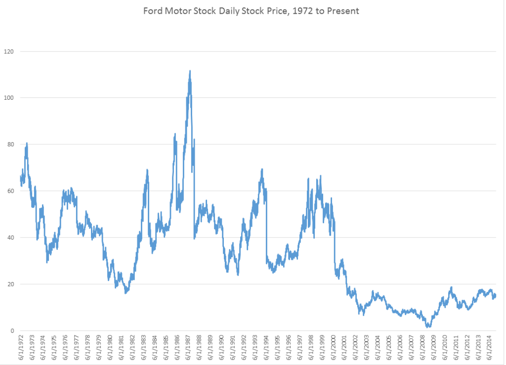
Yahoo Finance, my free source of daily trading data, has history for Ford Motor stock dating back to June 1, 1972, charted as follows.

Ford

Now, the predictive models for the daily high and low stock price are formulated, as before, keying off the opening price in each trading day. One of the key relationships is the proximity of the daily opening price to the previous period high. The other key relationship is the proximity of the daily opening price to the previous period low. Ordinary least squares (OLS) regression models can be developed which do a good job of predicting the direction of change of the daily high and low, based on knowledge of the opening price for the day.

Predicting the Direction of Change of the High

As before, these models make correct predictions regarding the directions of change of the high and low about 70 percent of the time.

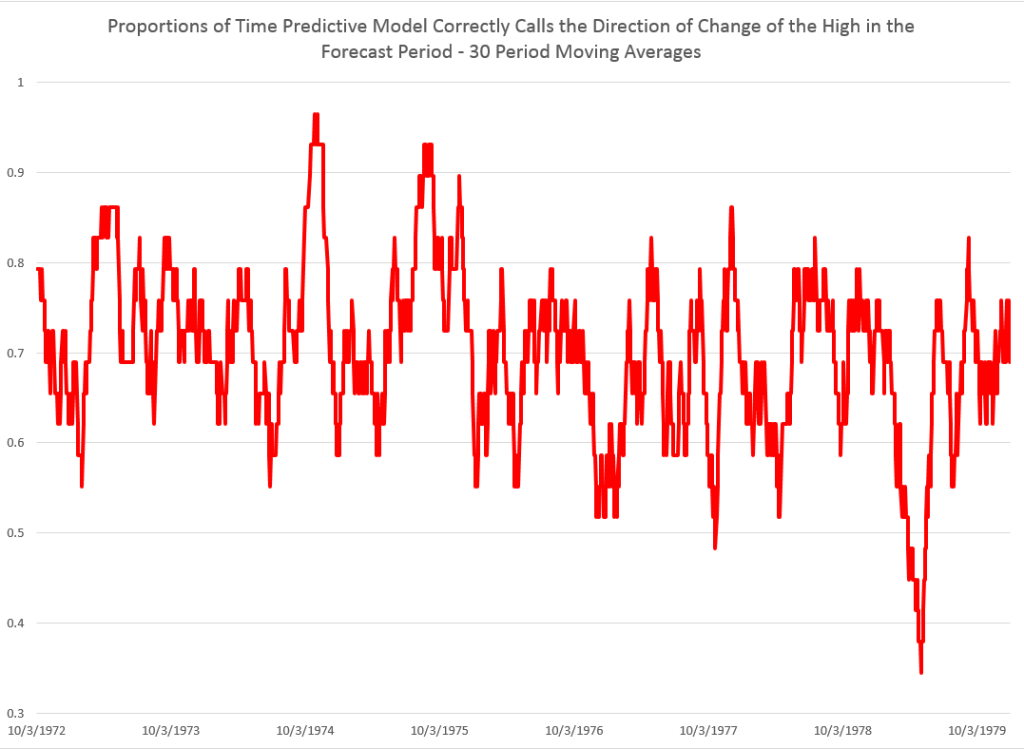
Here are 30 period moving averages for the 1970’s, showing the proportions of time the predictive model for the daily high is right about the direction of change.

MAFord

So the underlying relationship definitely holds in this age in which computer modeling of trading was in its infancy.

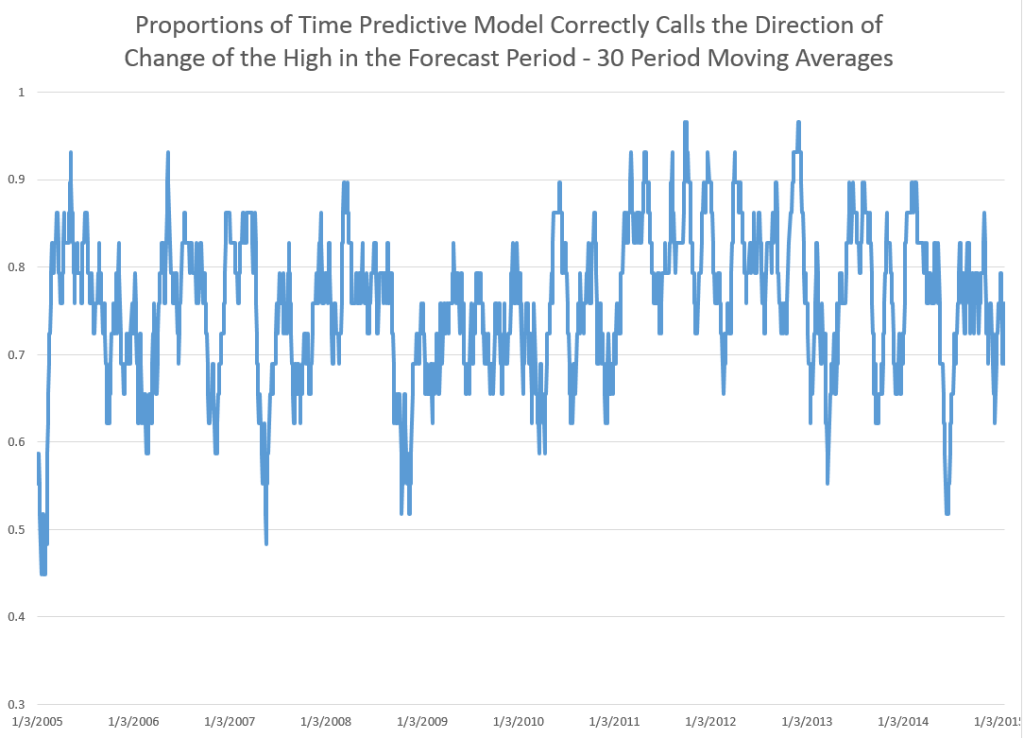
Here is a similar chart for the first decade of this century.

MAFordrecent

So whether we are considering the 1970’s or the last ten years, these predictive models do well in forecasting the direction of change of the high in daily (and it turns out other) periods.

Predicting Turning Points

We can make the same type of comparison – between the 1970’s and more recent years – for the capability of the predictive models to forecast turning points in the stock high (or low).

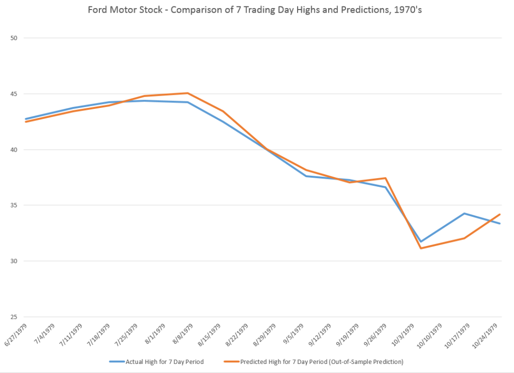
To do this usually requires aggregating the stock data. In the charts below, I aggregate to 7 trading day periods – not quite the same as weekly periods, since weekly segmentation can be short a day and so forth.

So the high which the predictive model focuses on is the high for the coming seven trading days, given the current day opening price.

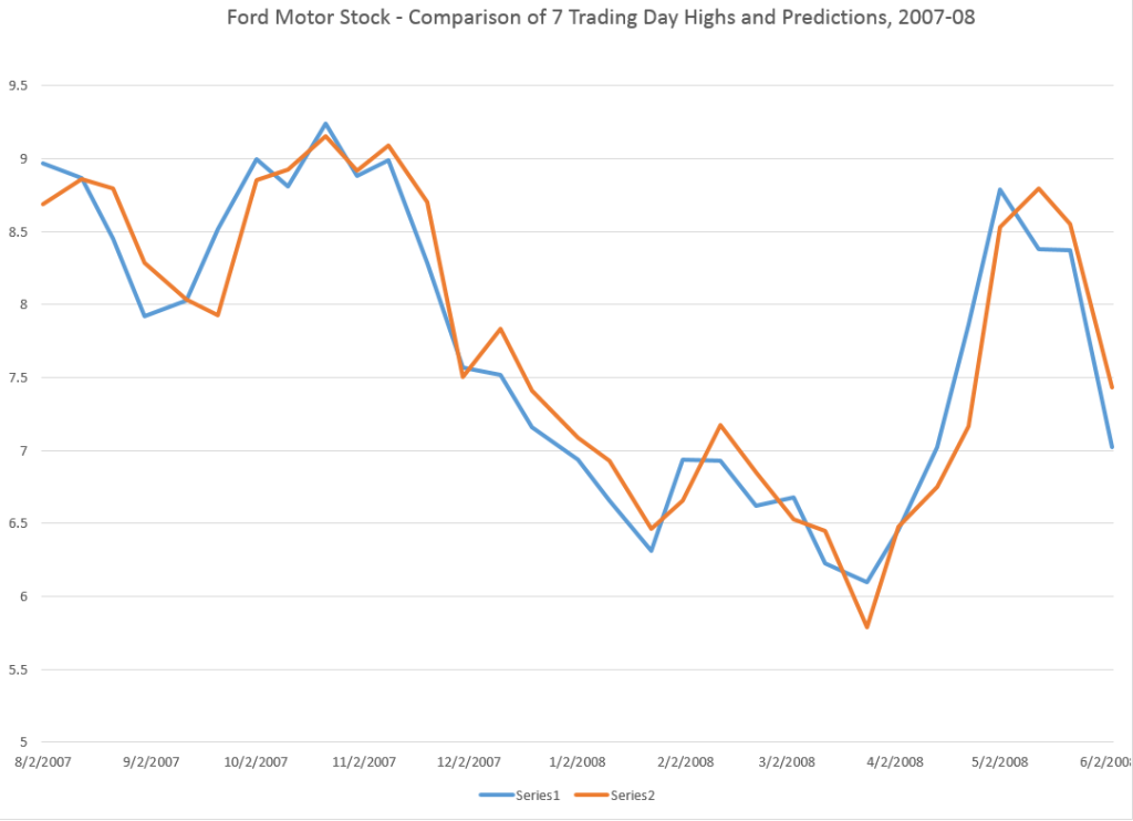
Here are two charts, one for dates in the 1970’s and the other for a period in the recession of 2008-2009. For each chart I estimate OLS regressions with data predating each forecast of the high, based on blocks of 7 trading days.

70'sTP

These predictions of the high crisply capture most of the important turning and inflection point features.

recentTP

The application of similar predictive models for the 2008-2009 period is a little choppier, but does nail many of the important swings in the direction of change of the high of Ford Motor stock.

Concluding Thoughts

Well, this relationship between the opening prices and previous period highs and lows is highly predictive of the direction of change of the highs and lows in the current period – which can be a span of time from a day to 60 days in my findings.

These predictive models work for the S&P 500 and for individual stocks, like Ford Motor (and I might add Exxon and Microsoft).

They work in recent time periods and way back in the 1970’s.

And there’s more – for example, one could argue these patterns in the high and low prices are fractal, in the sense they represent “self similarity” at all (really many or a range of) time scales.

This is literally a new and fundamental regularity in stock prices.

Why does this work?

Well, the predictive models are closely related to very simple momentum trading strategies. But I think there is a lot of research to be done here. If you want further detail on any of this, please put your request in the Comments with the heading “Request for High/Low Model Information.”

Top picture from Strategic Monk.

Forecasting the S&P 500 – Short and Long Time Horizons

Friends and acquaintances know that I believe I have discovered amazing, deep, and apparently simple predictability in aspects of the daily, weekly, monthly movement of stock prices.

People say – “don’t blog about it, keep it to yourself, and use it to make a million dollars.” That does sound attractive, but I guess I am a data scientist, rather than stock trader. Not only that, but the pattern looks to be self-fulfilling. Generally, the result of traders learning about this pattern should be to reinforce, rather than erase, it. There seems to be no other explanation consistent with its long historical vintage, nor the broadness of its presence. And that is big news to those of us who like to linger in the forecasting zoo.

I am going to share my discovery with you, at least in part, in this blog post.

But first, let me state some ground rules and describe the general tenor of my analysis. I am using OLS regression in spreadsheets at first, to explore the data. I am only interested, really, in models which have significant out-of-sample prediction capabilities. This means I estimate the regression model over a set of historical data and then use that model to predict – in this case the high and low of the SPY exchange traded fund. The predictions (or “retrodictions” or “backcasts”) are for observations on the high and low stock prices for various periods not included in the data used to estimate the model.

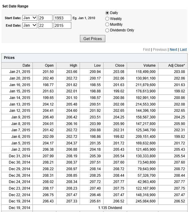
Now let’s look at the sort of data I use. The following table is from Yahoo Finance for the SPY. The site allows you to download this data into a spreadsheet, although you have to invert the order of the dating with a sort on the date. Note that all data is for trading days, and when I speak of N-day periods in the following, I mean periods of N trading days.

Yahoo

OK, now let me state my major result.

For every period from daily periods to 60 day periods I have investigated, the high and low prices are “relatively” predictable and the direction of change from period to period is predictable, in backcasting analysis, about 70-80 percent of the time, on average.

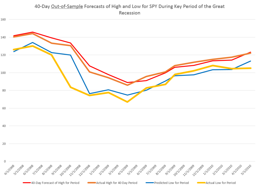
To give an example of a backcasting analysis, consider this chart from the period of free-fall in markets during 2008-2009, the Great Recession (click to enlarge).

40dayforecast

Now note that the indicated lines for the forecasts are not, strictly-speaking, 40-day-ahead forecasts. The forecasts are for the level of the high and low prices of the SPY which will be attained in each period of 40 trading days.

But the point is these rather time-indeterminate forecasts, when graphed alongside the actual highs and lows for the 40 trading day periods in question, are relatively predictive.

More to the point, the forecasts suffice to signal a key turning point in the SPY. Of course, it is simple to relate the high and low of the SPY for a period to relevant measures of the average or closing stock prices.

So seasoned forecasters and students of the markets and economics should know by this example that we are in terra incognita. Forecasting turning points out-of-sample is literally the toughest thing to do in forecasting, and certain with respect to the US stock market.

Many times technical analysts claim to predict turning points, but their results may seem more artistic, involving subtle interpretations of peaks and shoulders, as well as levels of support.

Now I don’t want to dismiss technical analysis, since, indeed, I believe my findings may prove out certain types of typical results in technical analysis. Or at least I can see a way to establish that claim, if things work out empirically.

Forecast of SPY High And Low for the Next Period of 40 Trading Days

What about the coming period of 40 trading days, starting from this morning’s (January 22, 2015) opening price for the SPY – $203.99?

Well, subject to qualifications I will state further on here, my estimates suggest the high for the period will be in the range of $215 and the period low will be around $194. Cents attached to these forecasts would be, of course, largely spurious precision.

In my opinion, these predictions are solid enough to suggest that no stock market crash is in the cards over the next 40 trading days, nor will there be a huge correction. Things look to trade within a range not too distant from the current situation, with some likelihood of higher highs.

It sounds a little like weather forecasting.

The Basic Model

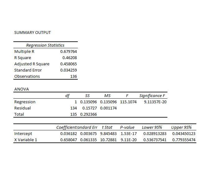
Here is the actual regression output for predicting the 40 trading day high of the SPY.

40Highreg

This is a simpler than many of the models I have developed, since it only relies on one explanatory variable designated X Variable 1 in the Excel regression output. This explanatory variable is the ratio of the current opening price to the previous high for the 40 day trading period, all minus 1.

Let’s call this -1+ O/PH. Instances of -1+ O/PH are generated for data bunched by 40 trading day periods, and put into the regression against the growth in consecutive highs for these 40 day periods.

So what happens is this, apparently.

Everything depends on the opening price. If the high for the previous period equals the opening price, the predicted high for the next 40 day period will be the same as the high for the previous 40 day period.

If the previous high is less than the opening price, the prediction is that the next period high will be higher. Otherwise, the prediction is that the next period high will be lower.

This then looks like a trading rule which even the numerically challenged could follow.

And this sort of relationship is not something that has just emerged with quants and high frequency trading. On the contrary, it is possible to find the same type of rule operating with, say, Exxon’s stock (XOM) in the 1970’s and 1980’s.

But, before jumping to test this out completely, understand that the above regression is, in terms of most of my analysis, partial, missing at least one other important explanatory variable.

Previous posts, which employ similar forecasting models for daily, weekly, and monthly trading periods, show that these models can predict the direction of change of the period highs with about 70 to 80 percent accuracy (See, for example, here).

Provisos and Qualifications

In deploying OLS regression analysis, in Excel spreadsheets no less, I am aware there are many refinements which, logically, might be developed and which may improve forecast accuracy.

One thing I want to stress is that residuals of the OLS regressions on the growth in the period highs generally are not normally distributed. The distribution tends to be very peaked, reminiscent of discussions earlier in this blog of the Laplace distribution for Microsoft stock prices.

There also is first order serial correlation in many of these regressions. And, my software indicates that there could be autocorrelations extending deep into the historical record.

Finally, the regression coefficients may vary over the historical record.

Bottom LIne

I like Robb Hyndman’s often drawn distinction between modeling and reality. Somewhere Hyndman suggests that no model is right.

But this class of models has an extremely logical motivation, and is, as I say, relatively predictive – predictive enough to be useful in a number of contexts.

Momentum traders for years apparently have looked at the opening price and compared it with the highs (and lows) for previous periods – extending 60 days or more into history if not more – and decided whether to trade. If the opening price is greater than the past high, the next high is anticipated to be even higher. On this basis, stock may be purchased. That action tends to reinforce the relationship. So, in some sense, this is a self-fulfilling relationship.

To recapitulate – I can show you iron-clad, incontrovertible evidence that some fairly simple models built on daily trading data produce workable forecasts of the high and low for stock indexes and stocks. These forecasts are available for a variety of time periods, and, apparently, in backcasts can indicate turning points in the market.

As I say, feel free to request further documentation. I am preparing a write-up for a journal, and I think I can find a way to send out versions of this.

You can contact me confidentially via the Comments box below. Leave your email or phone number. Title the Comment “Request for High/Low Model Information” and the webmeister will forward it to me without having your request listed in the side panel of the blog.

Senator Rand Paul and the State of the Union Address

This is an exciting time for forecasters!

That might evoke the Chinese, “May you live in interesting times” – actually a curse.

But the fact is that things are on a knife edge in the US, Europe, China and Japan, not to mention other countries around the world.

And the political season is coming up again. The Christmas season now starts just after Halloween, and the Presidential campaign season begins two years or more before the General Election in the US.

Well, I think Senator Rand Paul of Kentucky is one of the most interesting prospective Presidential candidates, and I found his response to President Obama’s State of the Union speech yesterday super interesting (and I don’t necessarily agree with everything he says).

Senator Paul manages to at the one and the same time (1) call for repeal of the Affordable Care Act, aka Obamacare, (2) call for an audit of the Pentagon, (3) suggest the US is too interventionist in the Middle East, where conflicts go back “1000 years,” (4) suggest that we may be in for a repeat of 2008, so better get our fiscal house in order, (5) mention Ferguson and other police problems, and (6) call for tax cuts and cuts in government spending.

Maybe it’s spending many years working in high tech and software on the West Coast – but I’ve got to say the Libertarian perspective is refreshing.

So reader responses to Senator Paul’s speech are welcome. Again, I am not advocating each and every point, Dr. Paul makes – I put it out there as food for thought, however.

Meanwhile, I am working on some deep analysis which I think you will enjoy. Can’t just be a talking head. Got to do the numbers. 


Predicting the High of SPY Over Daily, Weekly, and Monthly Forecast Horizons

Here are some remarkable findings relating to predicting the high and low prices of the SPDR S&P 500 ETF (SPY) in daily, weekly, and monthly periods.

Basically, the high and low prices for SPY can be forecast with some accuracy – especially with regards the sign of the percent change from the high or low of the previous period.

The simplicity of the predictive relationships are remarkable, and key off the ratio of the previous period high or low to the opening price for the new period under consideration. There is precedent in the work of George and Hwang, for example, who show picking portfolios of stocks whose price is near their 52-week high can generate superior returns (validated in 2010 for international portfolios). But my analysis concerns a specific exchange traded fund (ETF) which, of course, mirrors the S&P 500 Index.

Evidence

For data, I utilize daily, weekly, and monthly open, close, high, low, and volume data on the SPDR S&P 500 ETF SPY from Yahoo Finance from January 1993 to the present.

I estimate ordinary least squares (OLS) regression estimates on a rolling or adaptive basis.

So, for example, I begin weekly estimates to predict the high for a forecast horizon of one week on the period February 1, 1993 to December 12, 1994. The dependent variable is the growth in the highs from week to week – 97 observations on weekly data to begin with.

The initial regression has a coefficient of determination of 0.405 and indicates high statistical significance for the regression coefficients – although the underlying stochastic elements here are probably profoundly non-normal.

I use a similar setup to predict the weekly low of SPY, substituting the “growth” of the preceding low (in the previous week) to the current opening price in the set of explanatory variables. I continue using the lagged logarithm of the trading volume.

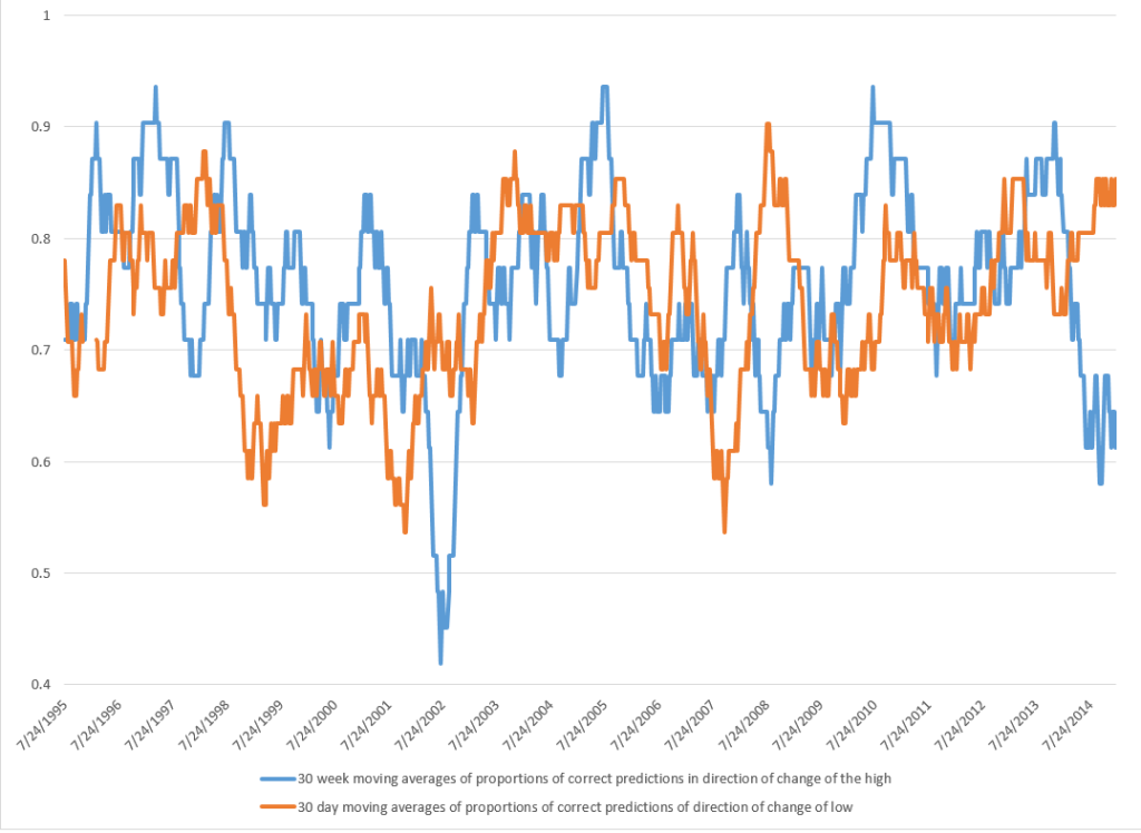
This chart shows the proportion of correct signs predicted by weekly models for the growth or percentage changes in the high and low prices in terms of 30 week moving averages (click to enlarge).

weeklycomp

There is a lot to think about in this chart, clearly.

The basic truth, however, is that the predictive models, which are simple OLS regressions with two explanatory variables, predict the correct sign of the growth weekly percentage changes in the high and low SPY prices about 75 percent of the time.

Similar analysis of monthly data also leads to predictive models for the monthly high and lows. The predictive models for the high and low prices in monthly forecast horizons correctly predict more than 70 percent of the directions of change in these respective growth rates, with the model for the lows being more powerful statistically.

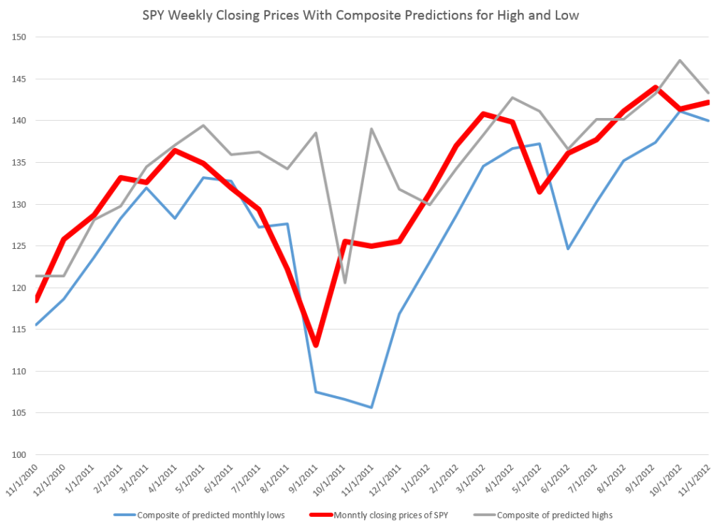
The actual forecasts of the growth in the monthly highs and lows may be helpful in discerning turning points in the SPY and, thus, the S&P 500, as the following chart suggests.

Bounded

Here I apply the predicted high and low growth rates week-by-week to the previous week values for the high and low and also chart the SPY closing prices for the week (in bold red).

For discussion of the models for the daily highs and lows, see my previous blog posts here and here.

I might add that these findings relating to predicatability of the high and low of SPY on a daily, weekly, and monthly basis are among the strongest and simplest statistical relationships I have had the fortune to encounter.

Academic researchers are free to use and build on these results, but I would appreciate being credited with the underlying insight or as at least a source.

Discussion – Pathways of Predictability

Since this is not a refereed publication, I take the liberty of offering some conjectures on why this predictability exists.

My basic idea is that there are positive feedback loops for investing, based on fairly simple predictive models for the high of SPY that will be reached over a day, a week, or a month. So this would mean investors are aware of this relationship, and act upon it in real time. Their actions, furthermore, reinforce the strength of the relationship, creating pathways of predictability into the future in otherwise highly volatile, noisy data. Discovery of such pathways serves to reinforce their existence.

If this is true, it is real news and something relatively novel in economic forecasting.

And there is a second conjecture. I suspect that these “pathways of predictability” in the high and probably the low of SPY give us a window into turning points in the underlying stock index, the S&P 500. It should be possible to array daily, weekly, and monthly forecasts of the highs and lows for SPY and get some indication of a change in the direction of movement of the series.

These are a big claims, and eventually, may become shaded in colors of lighter and darker grey. However, I believe they work well as research hypotheses.

Predicting the High and Low of SPY – and a Generalization

Well, here are some results on forecasting the daily low prices of the SPY exchange traded fund (ETF), complementing the previous post.

This line of inquiry has exploded into something much bigger, as I will relate shortly, but first ….

Predicting the Daily Low

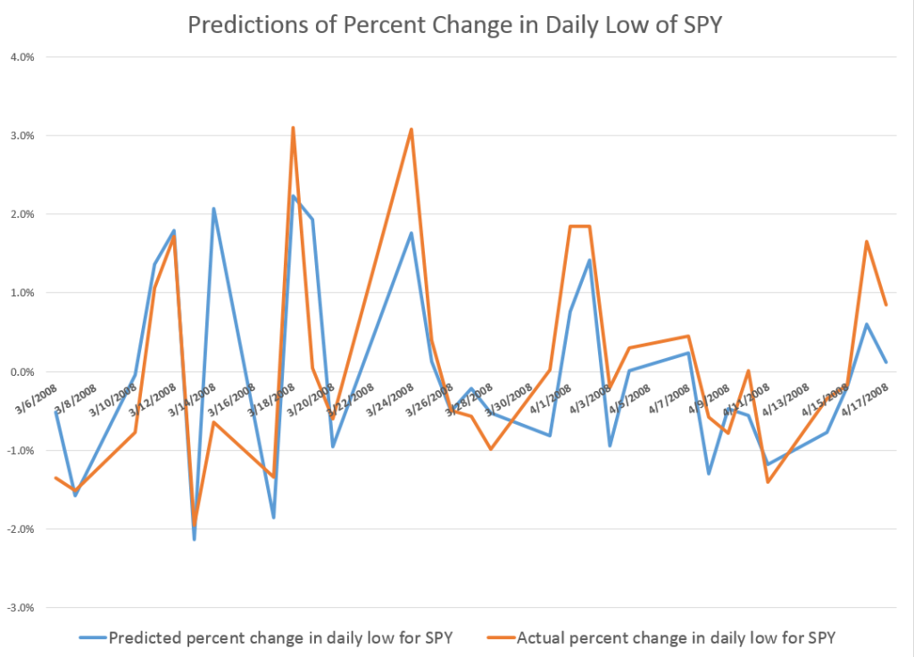
This graph gives a flavor of the accuracy of a very simple bivariate regression, estimated on the daily percent changes in the lows for SPY.

DailyLowPredict

The blue line is the predicted percent change. And the orange line shows the actual percent changes of the daily lows for this period in early 2008.

These are out-of-sample results, in the sense the predicted percent changes in the lows are not included in the regression data used to develop the forecast model.

And considering we are predicting one component of volatility itself, the results are not bad.

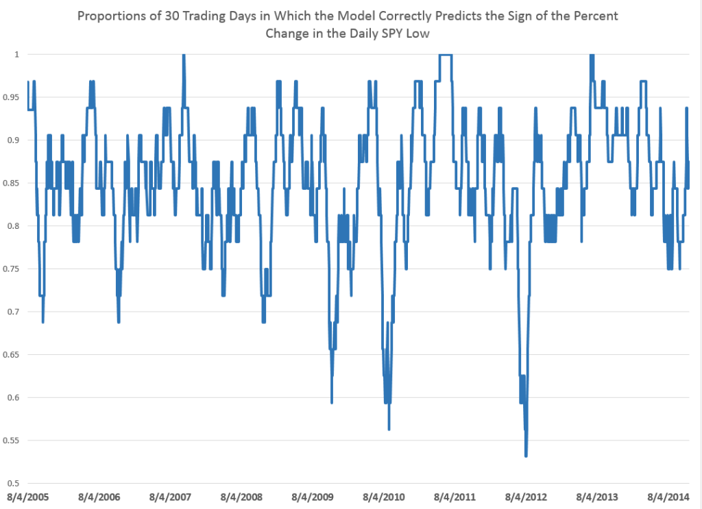
For this analysis, I develop dynamic or adaptive regressions that start in August 2005 and run up to the present. The models predict the direction of change in the daily lows, on average, about 85 percent of the time over nearly 15 years.

The following chart shows 30 day rolling averages of the proportion of time the models predict the correct sign of the percent change for this period.

RatiosLow

This performance is produced by a simple bivariate regression of the daily percent change in the lows to the percent change in the previous low compared with the current daily opening price. So, of course, to get the explanatory variable you divide the previous trading day value for the low by the current day opening price and subtract 1 – and you can convert to percentages for purposes of display.

The equation is

PERCENT CHANGE IN CURRENT DAILY LOW = -0.00448 -0.951689(PERCENT CHANGE IN THE PREVIOUS DAILY LOW IN COMPARISON WITH THE CURRENT OPENING PRICE).

If the previous low is greater than the current opening price, the coefficient on this variable creates negative value which, added to the negative constant of the regression, would predict the daily low to drop.

If you have any role in instructing students, let me suggest this example. The data is readily accessible from Yahoo Finance (under SPY) and once you invert the calendar order of the data, the relevant percent changes are easy to compute, and then to plug into regressions with the Microsoft Excel Trend(.) function.

Now the amazing thing is that similar relationships operate over various time scales, both for predicting the low and the high in a group of trading days. I’m working up the post showing this right now.

There is, in other words, a remarkable thread running through daily, weekly, and monthly settings.

In closing here – a thought.

Often, when a predictive relationship relating to stock prices is put out there, you get the feeling the underlying regularities will evaporate, as traders jump on the opportunity.

But these predictive relationships for the high and low of the SPY may be examples of self-fulfiling prophesies.

In other words, if a trader learns that the daily, weekly, or monthly high or low is related to (a) the opening price, and (b) the high or low for the preceding period, whatever it may be, their actions could very well strengthen the relationship. So, predicting an increase in the daily high, a trader very well could go long, by buying the SPY at opening. The stock price should thereby go higher. Similarly, if a trader acts on information regarding predictions of a dropping low, they may short the SPY, which again could have the effect of causing the low to ratchet down further.

It would be fascinating if we could somehow establish that this is actually going on and sustaining this type of relationship.

Predicting the Daily High and Low of an Exchange Traded Fund – SPY

Currently, I am privileged to have access to databases relating to health insurance and oil and gas developments.

But the richest source of Big Data available to researchers is probably financial, and I can’t resist exploring time series data on the S&P 500 and related exchange traded funds.

This is a tricky field. It is not only crowded with “quants,” but there are, in theory, pitfalls of “rational expectations.” There are strong and weak versions, but, essentially, if “rational expectations” operate, there should be no public information which can give anyone a predictive advantage, since otherwise it would already have been exploited.

Keep that in mind as I relate some remarkable discoveries – so far as I can determine nowhere else documented – on the predictability of the daily high and low values of the SPY, the exchange traded fund (ETF) linked with the S&P 500.

Some Results

A picture is worth a thousand words.

DailyHigh

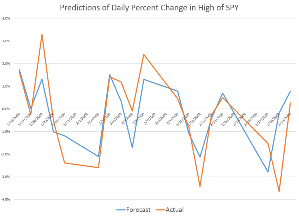
So the above chart shows out-of-sample predictions for several trading days in 2009 that can be achieved with a linear regression based on daily values available, for example, on Yahoo Finance.

Based on the opening value of the SPY, this regression predicts the percent change in the high for the SPY that will be achieved during the trading day – the percent change calculated with the high reached that day, compared with the previous day.

I find it remarkable that there is any predictability at all, since the daily high is an extreme value, highly sensitive to the volatility that day, and so forth.

And it may not be necessary to predict the exact percentage change of the high of SPY from day to day to gain a trading advantage.

Accurate predictions of the direction of change should be useful. In this respect, the analysis is especially powerful. For the particular dates in the chart shown above, for example, the predictive model correctly identifies the direction of change for every trading day but one – February 23, 2009.

I develop an analysis for the period 8/4/2005 to 1/4/2015, developing adaptive regressions to predict, out of sample, the high following the opening of each trading day.

I develop hundreds of regressions in this analysis with some indication that the underlying coefficients vary over time.

The explanatory variables are based on the spread between the opening price for the current period and the high or low of the previous period.

The coefficient of determination or R2 is about 0.6 – much higher than is typical for such regressions with stock or financial time series.This is a powerful relationship.

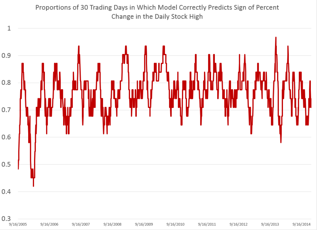
Here is a chart showing rolling 30 trading day averages of how often (1 = 100% of the time) this modeling effort correctly identifies the sign of the change in the high – again on an out-of-sample basis.

proportionhigh

Note that for some 30 day periods, the “hit rate” in which the correct sign of change is predicted exceeds 0.9, or, in other words, is greater than 90 percent of the time.

Overall, for the whole period under consideration, which comes right up to the present, the model averages about 76 percent accuracy in identifying the direction of change in the daily high of SPY.

Stay tuned to Business Forecast blog for a similar analysis of predicting the low values of SPY.

In closing, though, let me note that this remarkable predictability does not, in itself, support profitable trading, at least with any type of simple or direct approach.

Here is why.

If at the opening of the trading day, the model indicates positive change in the level of the high for SPY that day, it would make sense to buy shares of this ETF. Then, you could unload them, presumably at a profit, when the SPY reached the previous day’s high value.

The catch, however, is that you cannot be sure this will happen. Given the forecast, it is probable, or at least has a calculable probability. However, it is also possible that the stock will not reach the previous day’s high during the trading day. The forecast may be correct in its sign, but wrong in its magnitude.

So then, you are stuck with shares of SPY.

If you want to sell that day, not having, for example, any clear idea what will happen the following trading day – in general you will not do very well. In fact, it’s easy to show that this trading strategy – buy when the model indicates growth in the level of the high, sell if you can at the previous high, and otherwise close out your position at the closing price for that trading day – this strategy generally does not do as well as buy-and-hold.

This is probably the rational expectations gremlin at work.

Anyway, stay tuned for some insights on modeling the low of the SPY daily price.

Revisiting the Predictability of the S&P 500

Almost exactly a year ago, I posted on an algorithm and associated trading model for the S&P 500, the stock index which supports the SPY exchange traded fund.

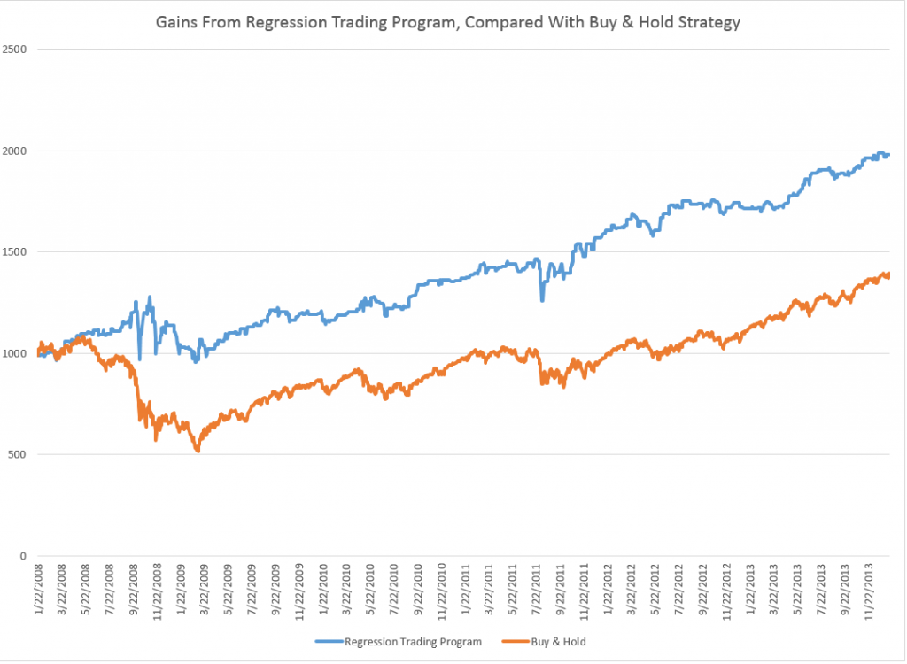
I wrote up an autoregressive (AR) model, using daily returns for the S&P 500 from 1993 to early 2008. This AR model outperforms a buy-and-hold strategy for the period 2008-2013, as the following chart shows.

SPYTradingProgramcompBH

The trading algorithm involves “buying the S&P 500” when the closing price indicates a positive return for the following trading day. Then, I “close out the investment” the next trading day at that day’s closing price. Otherwise, I stay in cash.

It’s important to be your own worst critic, and, along those lines, I’ve had the following thoughts.

First, the above graph disregards trading costs. Your broker would have to be pretty forgiving to execute 2000-3000 trades for less than the $500 you make over the buy-and-hold strategy. SO, I should deduct something for the trades in calculating the cumulative value.

The other criticism concerns high frequency trading. The daily returns are calculated against closing values, but, of course, to use this trading system you have to trade prior to closing. However, even a few seconds can make a crucial difference in the price of the S&P 500 or SPY – and even smaller intervals.

An Up-Dated AR Model

Taking some of these criticisms into account, I re-estimate an autoregressive model on more recent data –again calculating returns against closing prices on successive trading days.

This time I start with an initial investment of $100,000, and deduct $5 per trade off the totals as they cumulate.

I also utilize only seven (7) lags for the daily returns. This compares with the 30 lag model from the post a year ago, and I estimate the current model with OLS, rather than maximum likelihood.

The model is

Rt = 0.0007-0.0651Rt-1+0.0486Rt-2-0.0999Rt-3-0.0128Rt-4-0.1256Rt-5 +0.0063Rt-6-0.0140Rt-7

where Rt is the daily return for trading day t. This model originates on data from June 11, 2011. The coefficients of the equation result from bagging OLS regressions – developing coefficient estimates for 100,000 similar size samples drawn with replacement from this dataset of 809 observations. These 100,000 coefficient estimates are averaged to arrive at the numbers shown above.

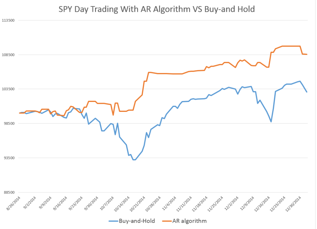
Here is the result of applying my revised model to recent stock market activity. The results are out-of-sample. In other words, I use the predictive equation which is calculated over data prior to the start of the investment comparison. I also filter the positive predictions for the next day closing price, only acting when they are a certain size or larger.

NewARmodel

There is a 2-3 percent return on a hundred thousand dollar investment in one month, and a projected annual return on the order of 20-30 percent.

The current model also correctly predicts the sign of the daily return 58 percent of the time, compared with a much lower figure for the model from a year ago.

This looks like the best thing since sliced bread.

But wait – what about high frequency trading?

I’m exploring the implementation of this model – and maybe should never make it public.

But let me clue you in on what I suspect, and some evidence I have.

So, first, it is interesting the gains from trading on closing day prices more than evaporate by the opening of the New York Stock Exchange, following the generation of a “buy” signal according to this algorithm.

In other words, if you adjust the trading model to buy at the open of the following trading day, when the closing price indicates a positive return for the following day – you do not beat a buy-and-hold strategy. Something happens between the closing and the opening of the NYSE market for the SPY.

Someone else knows about this model?

I’m exploring the “final second’ volatility of the market, focusing on trading days when the closing prices look like they might come in to indicate a positive return the following day. This is complicated, and it puts me into issues of predictability in high frequency data.

I also am looking at the SPY numbers specifically to bring this discussion closer to trading reality.

Bottom line – It’s hard to make money in the market on trading algorithms if you are a day-trader – although probably easier with a super-computer at your command and when you sit within microseconds of executing an order on the NY Stock Exchange.

But these researches serve to indicate one thing fairly clearly. And that is that there definitely are aspects of stock prices which are predictable. Acting on the predictions is the hard part.

And Postscript: Readers may have noticed a lesser frequency of posting on Business Forecast blog in the past week or so. I am spending time running estimations and refreshing and extending my understanding of some newer techniques. Keep checking in – there is rapid development in “real world forecasting” – exciting and whiz bang stuff. I need to actually compute the algorithms to gain a good understanding – and that is proving time-consuming. There is cool stuff in the data warehouse though.

More on the Price of Oil

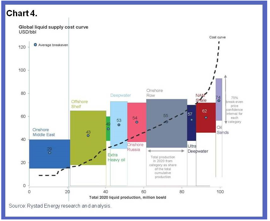
James Hamilton firms up the role for demand factors behind the free fall in oil prices in Supply, demand and the price of oil. This Econbrowser post also features a great chart for the global supply curve for crude oil – highlighting the geographic spread of oil production costs.

LongRunOilSupplyCurve

Hamilton notes (a) the International Energy Agency current estimate of world oil demand growth for 2014:Q3 is 800,000 barrels/day below what the IEA projected as of last June, (b) continuing improvements in the fuel economy of new cars sold in the US, (c) aging populations in the US drive less, and (d) US labor force participation is on a longer trend downward, and, again, unemployed persons drive less.

At the same time, US shale oil production materially contributes to the global oil glut at present.

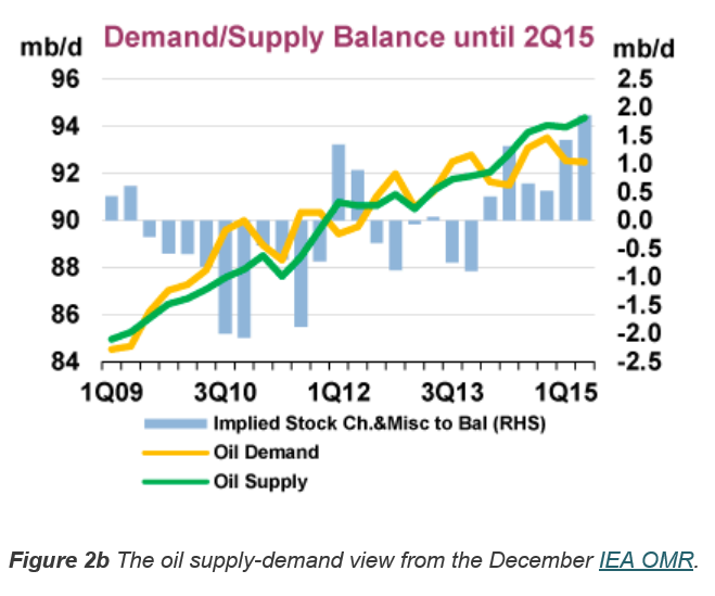
IEA demand and supply projections are contained in the Oil Market Report – which features this interesting graphic.

OMR

Note the large gap between demand (yellow line) and supply (green line) in early 2015 of about 2 million barrels per day (mb/d).

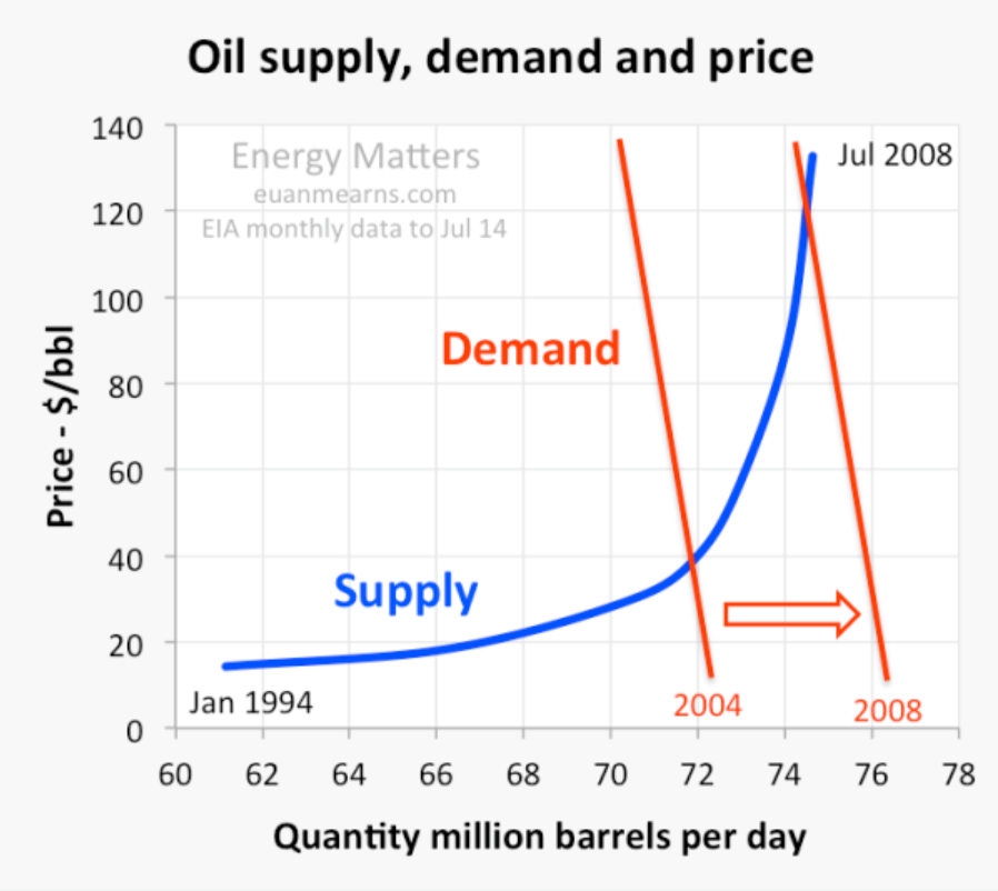
In a piece for OilPrice.com Euan Means does up a lot of supply-demand charts, such as the one below, in Oil Price Scenarios For 2015 And 2016.

SDOil

One point seems to jump out from these discussions.

This is that the supply curve for oil rises steeply at a certain point – as is validated from the geographic production cost curve presented initially in this post.

This means demand does not have to change very much to result in big changes in price, and that peak oil is probably still a relevant concept, despite the current glut of supply on the market.

Wither the Price of Oil?

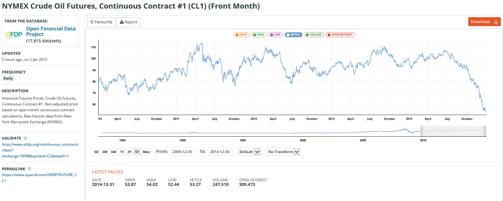
Crude oil futures continue their descent, as the chart below from January 2, 2015 shows.

oilfuturesJan215

What is going to happen here?

Discussions organize around several issues, pretty well nailed recently by IMF bloggers (including Chief Economist Oliver Blanchard) in Seven Questions About The Recent Oil Price Slump.

  1. What are the respective roles of demand and supply factors?
  2. How persistent is this supply shift likely to be?
  3. What are the effects likely to be on the global economy?
  4. What are likely to be the effects on oil importers?
  5. What are likely to be the effects on oil exporters?
  6. What are the financial implications?
  7. What should be the policy response of oil importers and exporters?

The first point to note is the drop in oil prices involves both supply and demand – and is not just the result of increased pumping by Saudi Arabia.

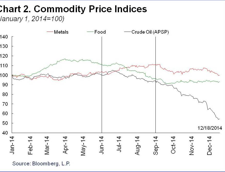
The IMF discussion includes this interesting comparison between oil and other commodity price indices.

commoditypriceindeices

So over 2014, there have been drops in other commodity prices – probably due to weakened global demand – but not nearly much as oil.

Overall, the IMF counts lower oil prices as a net positive to the global economy, resulting in a gain for world GDP between 0.3 and 0.7 percent in 2015, compared to a scenario without the drop in oil prices.

There are big losers, of course. These include oil exporters with higher production costs, such as Russia, Iran, and Venezuela.

To take some examples, energy accounts for 25 percent of Russia’s GDP, 70 percent of its exports, and 50 percent of federal revenues. In the Middle East, the share of oil in federal government revenue is 22.5 percent of GDP and 63.6 percent of exports for the Gulf Cooperation Council countries. In Africa, oil exports accounts for 40-50 percent of GDP for Gabon, Angola and the Republic of Congo, and 80 percent of GDP for Equatorial Guinea. Oil also accounts for 75 percent of government revenues in Angola, Republic of Congo and Equatorial Guinea. In Latin America, oil contributes respectively about 30 percent and 46.6 percent to public sector revenues, and about 55 percent and 94 percent of exports for Ecuador and Venezuela.[8] This shows the dimension of the challenge facing these countries.

How long the Saudi’s can hold the line, maintaining higher production? Is it true, for example, that Saudi Arabia has a $750bn war chest of foreign currency reserves that will be burned through quickly by propping up the shortfall in export revenues? There are speculations that the health of King Abdullah, a strong supporter of the current Saudi Oil Minister, could come into play in coming months.

Interestingly, low oil prices maintained long enough could be self-correcting. This is probably the bet the Saudi’s are making – that their policy can eventually trigger faster growth and enable them to maintain or increase their market share.

As I’ve said before, I think it’s a game changer. The trick is to figure out the linkages and connections, backwards and forwards along the supply chains.

Image of King Abdullah from Telegraph.

Forecasting Controversy – the Polar Vortex

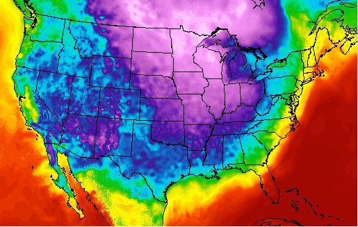
Three short, amusing videos to watch while keeping warm as the snow falls in Las Vegas and most other places are plunged into subzero weather.

The Polar Vortex Explained in 2 Minutes from the White House.

This video clip, originally distributed through the Office of Science and Technology Policy, kicked off the controversy.

Rush Limbaugh Response

Rush Limbaugh, always a reliable source on science and general systems theory, says the polar vortex was invented by liberal conspirators to scare folks.

Limbaugh is Full of Hot Air

Weatherman Al Roker fired back at Limbaugh’s ‘Polar Vortex’ Conspiracy, showing a page from his meteorology textbook from way back when, defining the term,”polar vortex.”

But can the Polar Vortex – recognized as a real weather phenomenon for decades – be forecast and is it related to climate change?

Well, this year there was an interesting split between weather forecasting services. As an article reacting to the October 16 release of the NWS Long Range Forecast notes .. the commercial forecasters are telling us to brace for the return of the Arctic air in the U.S. while the federal forecasters have countered by saying another wavy vortex dipping far south is “unlikely.”

Thus, we had NOAA: Another warm winter likely for western U.S., South may see colder weather           .

Well, the National Weather Service and its Canadian counterpart missed the big cold snap in November and the current incursion of artic air to lower lattitudes, due to shifting of the polar vortex.

Accuweather and the Weather Channel, on the other hand, scored big on their forecasts.

At the same time, Internet studies do not show that Accuweather has any leg up in long range forecasting –  snow in New York, for example – beyond a few days from the release of the forecast.

Also, the scientific basis for linking climate change and these polar vortex events is tenuous, or at least multi-factor.

Thus, a recent article in Nature – Weakening of the stratospheric polar vortex by Arctic sea-ice loss – concludes [footnote numbers removed] –

Through a combination of observation-based data analysis and climate model experiments, we provide corroborative evidence for the notion that Arctic sea-ice loss over the B–K seas plays an important role in weakening the stratospheric polar vortex. Regional sea-ice reductions over the B–K seas cause not only in situ surface warming but also significant upper-level responses that exhibit positive geopotential height anomalies over Eastern Europe and negative anomalies from East Asia to the Eastern Pacific along the wave-guide of the tropospheric westerly jet. This anomaly pattern projects heavily into the climatological wave, intensifying the vertical propagation of planetary-scale wave into the stratosphere and, in turn, weakening the stratospheric polar vortex. Therefore, planetary-scale wave generation by sea-ice losses and its upward propagation during early winter months underline the link between surface climate variability and polar stratospheric variability.

The weakened stratospheric polar vortex is often followed by a negative phase of the AO at the surface, favoring cold surface temperatures across Northern Hemisphere continents during the late winter months (Supplementary Fig. 1). Several physical mechanisms for this downward coupling have been proposed. They include the balanced response of the troposphere to stratospheric potential vorticity anomalies and wave-driven changes in the meridional circulation. It is also suggested that the tropospheric response involves changes in the synoptic eddies. However, it has been difficult to isolate the key process, and the detailed nonlinear processes involved are still under investigation21

As a final remark, we note that Arctic sea-ice loss represents only one of the possible factors that can affect the stratospheric polar vortex. Other factors reported in previous works include Eurasian snow cover, the Quasi Biannual Oscillation, the El-Nino and Southern Oscillation and solar activity.

I think it’s probably possible to show – through psychological and historical studies – that human decision-making over risky alternatives is most likely to fail with respect to (a) collective choices over (b) complex outcomes where target events have relatively low probability, although possibly huge costs. This makes the climate change issue and responding appropriately to it hugely difficult.

Top image from Medical Daily

Sales and new product forecasting in data-limited (real world) contexts