Tag Archives: Data Science

Using Math to Cure Cancer

There are a couple of takes on this.

One is like “big data and data analytics supplanting doctors.”

So Dr. Cary Oberije certainly knows how to gain popularity with conventional-minded doctors.

In Mathematical Models Out-Perform Doctors in Predicting Cancer Patients’ Responses to Treatment she reports on research showing predictive models are better than doctors at predicting the outcomes and responses of lung cancer patients to treatment… “The number of treatment options available for lung cancer patients are increasing, as well as the amount of information available to the individual patient. It is evident that this will complicate the task of the doctor in the future,” said the presenter, Dr Cary Oberije, a postdoctoral researcher at the MAASTRO Clinic, Maastricht University Medical Center, Maastricht, The Netherlands. “If models based on patient, tumor and treatment characteristics already out-perform the doctors, then it is unethical to make treatment decisions based solely on the doctors’ opinions. We believe models should be implemented in clinical practice to guide decisions.”

 CaryOberije                      

Dr Oberije says,

Correct prediction of outcomes is important for several reasons… First, it offers the possibility to discuss treatment options with patients. If survival chances are very low, some patients might opt for a less aggressive treatment with fewer side-effects and better quality of life. Second, it could be used to assess which patients are eligible for a specific clinical trial. Third, correct predictions make it possible to improve and optimise the treatment. Currently, treatment guidelines are applied to the whole lung cancer population, but we know that some patients are cured while others are not and some patients suffer from severe side-effects while others don’t. We know that there are many factors that play a role in the prognosis of patients and prediction models can combine them all.”

At present, prediction models are not used as widely as they could be by doctors…. some models lack clinical credibility; others have not yet been tested; the models need to be available and easy to use by doctors; and many doctors still think that seeing a patient gives them information that cannot be captured in a model.

Dr. Oberije asserts, Our study shows that it is very unlikely that a doctor can outperform a model.

Along the same lines, mathematical models also have been deployed to predict erectile dysfunction after prostate cancer.

I think Dr. Oberije is probably right that physicians could do well to avail themselves of broader medical databases – on prostate conditions, for example – rather than sort of shooting from the hip with each patient.

The other approach is “teamwork between physicians, data and other analysts should be the goal.”

So it’s with interest I note the Moffit Cancer Center in Tampa Florida espouses a teamwork concept in cancer treatment with new targeted molecular therapies.

page1_clip_image006

The IMO program’s approach is to develop mathematical models and computer simulations to link data that is obtained in a laboratory and the clinic. The models can provide insight into which drugs will or will not work in a clinical setting, and how to design more effective drug administration schedules, especially for drug combinations.  The investigators collaborate with experts in the fields of biology, mathematics, computer science, imaging, and clinical science.

“Limited penetration may be one of the main causes that drugs that showed good therapeutic effect in laboratory experiments fail in clinical trials,” explained Rejniak. “Mathematical modeling can help us understand which tumor, or drug-related factors, hinder the drug penetration process, and how to overcome these obstacles.” 

A similar story cropped up in in the Boston Globe – Harvard researchers use math to find smarter ways to defeat cancer

Now, a new study authored by an unusual combination of Harvard mathematicians and oncologists from leading cancer centers uses modeling to predict how tumors mutate to foil the onslaught of targeted drugs. The study suggests that administering targeted medications one at a time may actually insure that the disease will not be cured. Instead, the study suggests that drugs should be given in combination.

header picture: http://www.en.utexas.edu/Classes/Bremen/e316k/316kprivate/scans/hysteria.html

Predicting the Hurricane Season

I’ve been focusing recently on climate change and extreme weather events, such as hurricanes and tornados. This focus is interesting in its own right, offering significant challenges to data analysis and predictive analytics, and I also see strong parallels to economic forecasting.

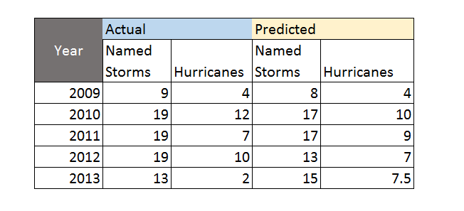
The Florida State University Center for Ocean-Atmospheric Prediction Studies (COAPS) garnered good press 2009-2012, for its accurate calls on the number of hurricanes and named tropical storms in the North Atlantic. Last year was another story, however, and it’s interesting to explore why 2013 was so unusual – there being only two (2) hurricanes and no major hurricanes over the whole season.

Here’s the track record for COAPS, since it launched its new service.

Hurricaneforecastaccuracy

The forecast for 2013 was a major embarrassment, inasmuch as the Press Release at the beginning of June 2013 predicted an “above-average season.”

Tim LaRow, associate research scientist at COAPS, and his colleagues released their fifth annual Atlantic hurricane season forecast today. Hurricane season begins June 1 and runs through Nov. 30.

This year’s forecast calls for a 70 percent probability of 12 to 17 named storms with five to 10 of the storms developing into hurricanes. The mean forecast is 15 named storms, eight of them hurricanes, and an average accumulated cyclone energy (a measure of the strength and duration of storms accumulated during the season) of 135.

“The forecast mean numbers are identical to the observed 1995 to 2010 average named storms and hurricanes and reflect the ongoing period of heightened tropical activity in the North Atlantic,” LaRow said.

The COAPS forecast is slightly less than the official National Oceanic and Atmospheric Administration (NOAA) forecast that predicts a 70 percent probability of 13 to 20 named storms with seven to 11 of those developing into hurricanes this season…

What Happened?

Hurricane forecaster Gary Bell is quoted as saying,

“A combination of conditions acted to offset several climate patterns that historically have produced active hurricane seasons,” said Gerry Bell, Ph.D., lead seasonal hurricane forecaster at NOAA’s Climate Prediction Center, a division of the National Weather Service. “As a result, we did not see the large numbers of hurricanes that typically accompany these climate patterns.”

More informatively,

Forecasters say that three main features loom large for the inactivity: large areas of sinking air, frequent plumes of dry, dusty air coming off the Sahara Desert, and above-average wind shear. None of those features were part of their initial calculations in making seasonal projections. Researchers are now looking into whether they can be predicted in advance like other variables, such as El Niño and La Niña events.

I think it’s interesting NOAA stuck to its “above-normal season” forecast as late as August 2013, narrowing the numbers only a little. At the same time, neutral conditions with respect to la Nina and el Nino in the Pacific were acknowledged as influencing the forecasts. The upshot – the 2013 hurricane season in the North Atlantic was the 7th quietest in 70 years.

Risk Behaviors and Extreme Events

Apparently, it’s been more than 8 years since a category 3 hurricane hit the mainland of the US. This is chilling, inasmuch as Sandy, which caused near-record damage on the East Coast, was only a category 1 when it made landfall in New Jersey in 2012.

Many studies highlight a “ratchet pattern” in risk behaviors following extreme weather, such as a flood or hurricane. Initially, after the devastation, people engage in lots of protective, pre-emptive behavior. Typically, flood insurance coverage shoots up, only to gradually fall off, when further flooding has not been seen for a decade or more.

Similarly, after a volcanic eruption, in Indonesia, for example, and destruction of fields and villages by lava flows or ash – people take some time before they re-claim those areas. After long enough, these events can give rise to rich soils, supporting high crop yields. So since the volcano has not erupted for, say, decades or a century, people move back and build even more intensively than before.

This suggests parallels with economic crisis and its impacts, and measures taken to make sure “it never happens again.”

I also see parallels between weather and economic forecasting.

Maybe there is a chaotic element in economic dynamics, just as there almost assuredly is in weather phenomena.

Certainly, the curse of dimension in forecasting models translates well from weather to economic forecasting. Indeed, a major review of macroeconomic forecasting, especially of its ability to predict recessions, concludes that economic models are always “fighting the last war,” in the sense that new factors seem to emerge and take control during every major economic crises. Things do not repeat themselves exactly. So, if the “true” recession forecasting model has legitimately 100 drivers or explanatory variables, it takes a long historic record to sort out the separate influences of these – and the underlying technological basis of the economy is changing all the time.

Tornado Frequency Distribution

Data analysis, data science, and advanced statistics have an important role to play in climate science.

James Elsner’s blog Hurricane & Tornado Climate offers salient examples, in this regard.

Yesterday’s post was motivated by an Elsner suggestion that the time trend in maximum wind speeds of larger or more powerful hurricanes is strongly positive since weather satellite observations provide better measurement (post-1977).

Here’s a powerful, short video illustrating the importance of proper data segmentation and statistical characterization for tornado data – especially for years of tremendous devastation, such as 2011.

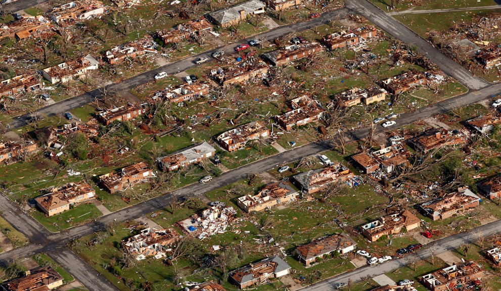
Events that year have a more than academic interest for me, incidentally, since my city of birth – Joplin, Missouri – suffered the effects of a immense supercell which touched down and destroyed everything in its path, including my childhood home. The path of this monster was, at points, nearly a mile wide, and it gouged out a track several miles through this medium size city.

Here is Elsner’s video integrating data analysis with matters of high human import.

There is a sort of extension, in my mind, of the rational expectations issue to impacts of climate change and extreme weather. The question is not exactly one people living in areas subject to these events might welcome. But it is highly relevant to data analysis and statistics.

The question simply is whether US property and other insurance companies are up-to-speed on the type of data segmentation and analysis that is needed to adequately capture the probable future impacts of some of these extreme weather events.

This may be where the rubber hits the road with respect to Bayesian techniques – popular with at least some prominent climate researchers, because they allow inclusion of earlier, less-well documented historical observations.

Causal and Bayesian Networks

In his Nobel Acceptance Lecture, Sir C.J.W. Granger mentions that he did not realize people had so many conceptions of causality, nor that his proposed test would be so controversial – resulting in its being confined to a special category “Granger Causality.’

That’s an astute observation – people harbor many conceptions and shades of meaning for the idea of causality. It’s in this regard that renewed efforts recently – motivated by machine learning – to operationalize the idea of causality, linking it with both directed graphs and equation systems, is nothing less than heroic.

However, despite the confusion engendered by quantum theory and perhaps other “new science,” the identification of “cause” can be materially important in the real world. For example, if you are diagnosed with metastatic cancer, it is important for doctors to discover where in the body the cancer originated – in the lungs, in the breast, and so forth. This can be challenging, because cancer mutates, but making this identification can be crucial for selecting chemotherapy agents. In general, medicine is full of problems of identifying causal nexus, cause and effect.

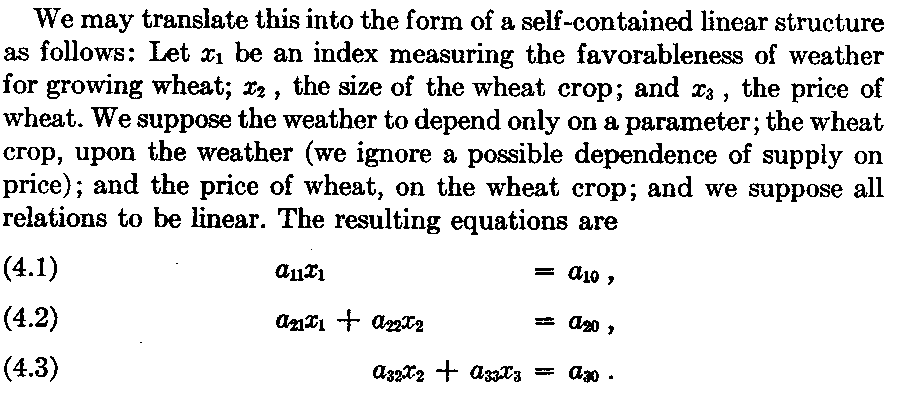
In economics, Herbert Simon, also a Nobel Prize recipient, actively promoted causal analysis and its representation in graphs and equations. In Causal Ordering and Identifiability, Simon writes,

Simon1

For example, we cannot reverse the causal chain poor growing weather → small wheat crops → increase in price of wheat by an attribution increase in price of wheat → poor growing weather.

Simon then proposes that the weather to price causal system might be represented by a series of linear, simultaneous equations, as follows:

Simon2

This example can be solved recursively, first by solving for x1, then by using this value of x1 to solve for x2, and then using the so-obtained values of x1 and x2 to solve for x3. So the system is self-contained, and Simon discusses other conditions. Probably the most important is assymmetry and the direct relationship between variables.

Readers interested in the milestones in this discourse, leading to the present, need to be aware of Pearl’s seminal 1998 article, which begins,

It is an embarrassing but inescapable fact that probability theory, the official mathematical language of many empirical sciences, does not permit us to express sentences such as “”Mud does not cause rain”; all we can say is that the two events are mutually correlated, or dependent – meaning that if we find one, we can expect to encounter the other.”

Positive Impacts of Machine Learning

So far as I can tell, the efforts of Simon and even perhaps Pearl would have been lost in endless and confusing controversy, were it not for the emergence of machine learning as a distinct specialization

A nice, more recent discussion of causality, graphs, and equations is Denver Dash’s A Note on the Correctness of the Causal Ordering Algorithm. Dash links equations with directed graphs, as in the following example.

DAGandEQS Dash shows that Simon’s causal ordering algorithm (COA) to match equations to a cluster graph is consistent with more recent methods of constructing directed causal graphs from the same equation set.

My reading suggests a direct line of development, involving attention to the vertices and nodes of directed acyclic graphs (DAG’s) – or graphs without any backward connections or loops – and evolution to Bayesian networks – which are directed graphs with associated probabilities.

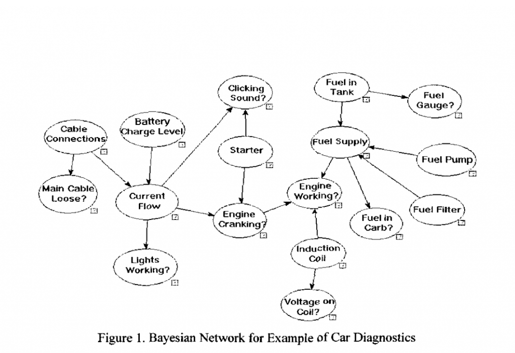
Here is are two examples of Bayesian networks.

First, another contribution from Dash and others

BayesNet

So clearly Bayesian networks are closely akin to expert systems, combining elements of causal reasoning, directed graphs, and conditional probabilities.

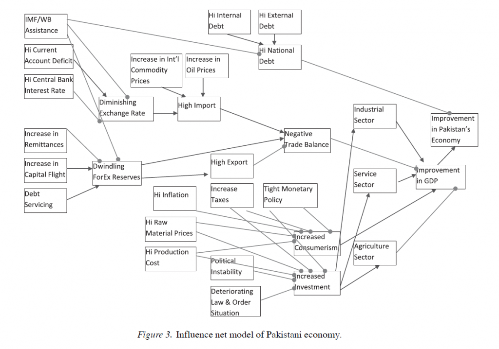
The scale of Bayesian networks can be much larger, or societal-wide, as this example from Using Influence Nets in Financial Informatics: A Case Study of Pakistan.

BnetPaki

The development of machine systems capable of responding to their environment – robots, for example – are a driver of this work currently. This leads to the distinction between identifying causal relations by observation or from existing data, and from intervention, action, or manipulation. Uncovering mechanisms by actively energizing nodes in a directed graph, one-by-one, is, in some sense, an ideal approach. However, there are clearly circumstances – again medical research provides excellent examples – where full-scale experimentation is simply not possible or allowable.

At some point, combinatorial analysis is almost always involved in developing accurate causal networks, and certainly in developing Bayesian networks. But this means that full implementation of these methods must stay confined to smaller systems, cut corners in various ways, or wait for development (one hopes) of quantum computers.

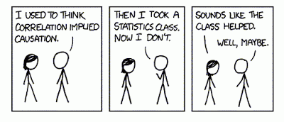
Note: header cartoon from http://xkcd.com/552/

Causal Discovery

So there’s a new kid on the block, really a former resident who moved back to the neighborhood with spiffy new toys – causal discovery.

Competitions and challenges give a flavor of this rapidly developing field – for example, the Causality Challenge #3: Cause-effect pairs, sponsored by a list of pre-eminent IT organizations and scientific societies (including Kaggle).

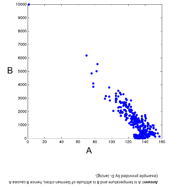
By way of illustration, B → A but A does not cause B – Why?

Kagglealttemp

These data, as the flipped answer indicates, are temperature and altitude of German cities. So altitude causes temperature, but temperature obviously does not cause altitude.

The non-linearity in the scatter diagram is a clue. Thus, values of variable A above about 130 map onto more than one value of B, which is problematic from conventional definition of causality. One cause should not have two completely different effects, unless there are confounding variables.

It’s a little fuzzy, but the associated challenge is very interesting, and data pairs still are available.

We provide hundreds of pairs of real variables with known causal relationships from domains as diverse as chemistry, climatology, ecology, economy, engineering, epidemiology, genomics, medicine, physics. and sociology. Those are intermixed with controls (pairs of independent variables and pairs of variables that are dependent but not causally related) and semi-artificial cause-effect pairs (real variables mixed in various ways to produce a given outcome).  This challenge is limited to pairs of variables deprived of their context.

Asymmetries As Clues to Causal Direction of Influence

The causal direction in the graph above is suggested by the non-invertibility of the functional relationship between B and A.

Another clue from reversing the direction of causal influence relates to the error distributions of the functional relationship between pairs of variables. This occurs when these error distributions are non-Gaussian, as Patrik Hoyer and others illustrate in Nonlinear causal discovery with additive noise models.

The authors present simulation and empirical examples.

Their first real-world example comes from data on eruptions of the Old Faithful geyser in Yellowstone National Park in the US.

OldFaithful Hoyer et al write,

The first dataset, the “Old Faithful” dataset [17] contains data about the duration of an eruption and the time interval between subsequent eruptions of the Old Faithful geyser in Yellowstone National Park, USA. Our method obtains a p-value of 0.5 for the (forward) model “current duration causes next interval length” and a p-value of 4.4 x 10⁻⁹ for the (backward) model “next interval length causes current duration”. Thus, we accept the model where the time interval between the current and the next eruption is a function of the duration of the current eruption, but reject the reverse model. This is in line with the chronological ordering of these events. Figure 3 illustrates the data, the forward and backward fit and the residuals for both fits. Note that for the forward model, the residuals seem to be independent of the duration, whereas for the backward model, the residuals are clearly dependent on the interval length.

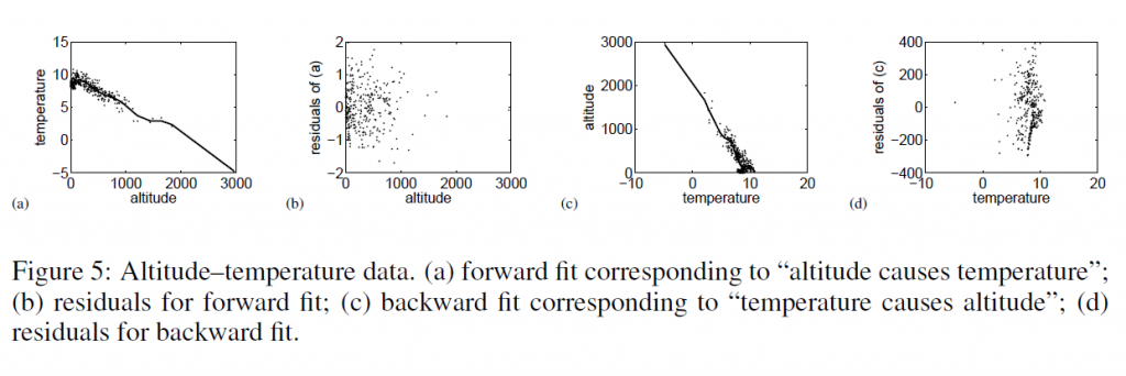
Then, they too consider temperature and altitude pairings.

tempaltHere, the correct model – altitude causes temperature – results in a much more random scatter of residuals, than the reverse direction model.

Patrik Hoyer and Aapo Hyvärinen are a couple of names from this Helsinki group of researchers whose papers are interesting to read and review.

One of the early champions of this resurgence of interest in causality works from a department of philosophy – Peter Spirtes. It’s almost as if the discussion of causal theory were relegated to philosophy, to be revitalized by machine learning and Big Data:

The rapid spread of interest in the last three decades in principled methods of search or estimation of causal relations has been driven in part by technological developments, especially the changing nature of modern data collection and storage techniques, and the increases in the processing power and storage capacities of computers. Statistics books from 30 years ago often presented examples with fewer than 10 variables, in domains where some background knowledge was plausible. In contrast, in new domains such as climate research (where satellite data now provide daily quantities of data unthinkable a few decades ago), fMRI brain imaging, and microarray measurements of gene expression, the number of variables can range into the tens of thousands, and there is often limited background knowledge to reduce the space of alternative causal hypotheses. Even when experimental interventions are possible, performing the many thousands of experiments that would be required to discover causal relationships between thousands or tens of thousands of variables is often not practical. In such domains, non-automated causal discovery techniques from sample data, or sample data together with a limited number of experiments, appears to be hopeless, while the availability of computers with increased processing power and storage capacity allow for the practical implementation of computationally intensive automated search algorithms over large search spaces.

Introduction to Causal Inference

Links – February 14

Global Economy

Yellen Says Recovery in Labor Market Far From Complete – Highlights of Fed Chair Yellen’s recent testimony before the House Financial Services Committee. Message – continuity, steady as she goes unless a there is a major change in outlook.

OECD admits overstating growth forecasts amid eurozone crisis and global crash The Paris-based organisation said it repeatedly overestimated growth prospects for countries around the world between 2007 and 2012. The OECD revised down forecasts at the onset of the financial crisis, but by an insufficient degree, it said….

The biggest forecasting errors were made when looking at the prospects for the next year, rather than the current year.

10 Books for Understanding China’s Economy

Information Technology (IT)

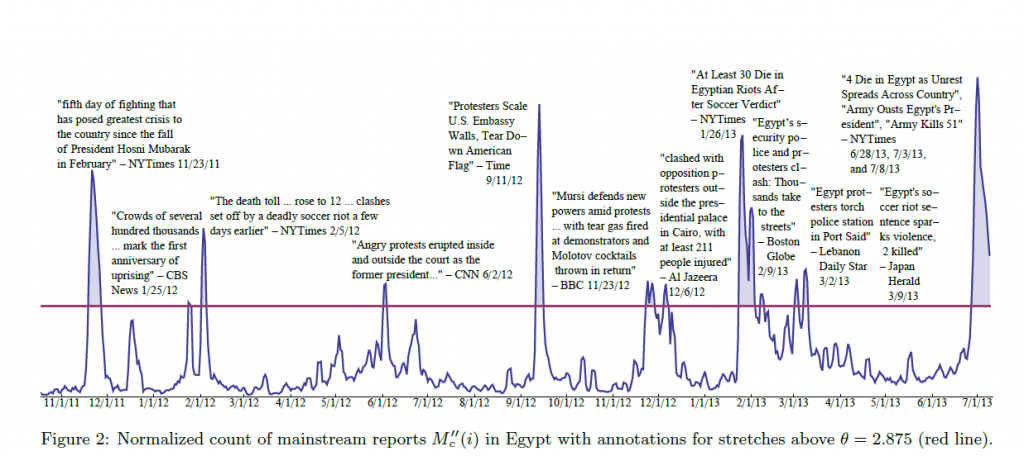
Predicting Crowd Behavior with Big Public Data

SocialMediaEgypt

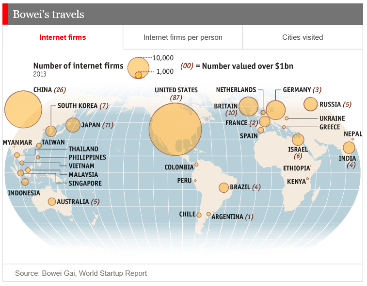
Internet startups

WorldStartups

Alternative Technology

World’s Largest Rooftop Farm Documents Incredible Growth High Above Brooklyn

Power Laws

Zipf’s Law

George Kingsley Zipf (1902-1950) was an American linguist with degrees from Harvard, who had the distinction of being a University Lecturer – meaning he could give any course at Harvard University he wished to give.

At one point, Zipf hired students to tally words and phrases, showing, in a long enough text, if you count the number of times each word appears, the frequency of words is, up to a scaling constant, 1/n, where n is the rank. So second most frequent word occurs approximately ½ as often as the first; the tenth most frequent word occurs 1/10 as often as the first item, and so forth.

In addition to documenting this relationship between frequency and rank in other languages, including Chinese, Zipf discussed applications to income distribution and other phenomena.

More General Power Laws

Power laws are everywhere in the social, economic, and natural world.

Xavier Gabaix with NYU’s Stern School of Business writes the essence of this subject is the ability to extract a general mathematical law from highly diverse details.

For example, the

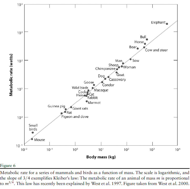
..energy that an animal of mass M requires to live is proportional to M3/4. This empirical regularity… has been explained only recently .. along the following lines: If one wants to design an optimal vascular system to send nutrients to the animal, one designs a fractal system, and maximum efficiency exactly delivers the M3/4 law. In explaining the relationship between energy needs and mass, one should not become distracted by thinking about the specific features of animals, such as feathers and fur. Simple and deep principles underlie the regularities.

AnimalMassPL

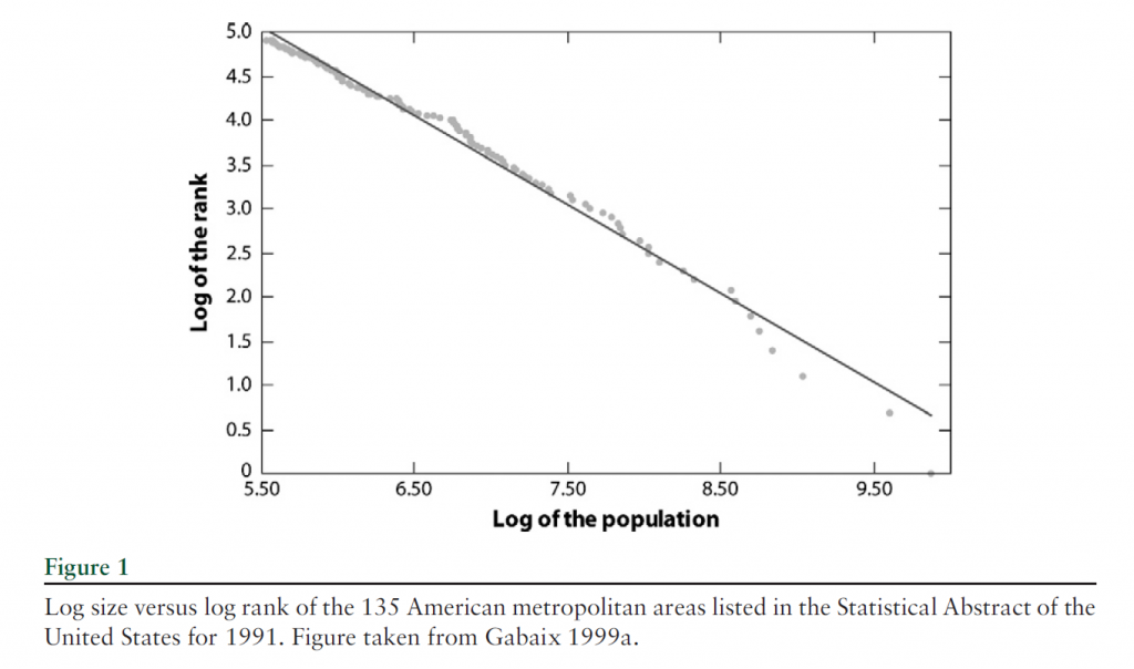
This type of relationship between variables also characterizes city population and rank, income and wealth distribution, visits to Internet blogs and blog rank, and many other phenomena.

Here is the graph of the power law for city size, developed much earlier by Gabaiux.

CitySizeVSRank

There are many valuable sections in Gabaix’s review article.

However, surely one of the most interesting is the inverse cubic law distribution of stock price fluctuations.

The tail distribution of short-term (15 s to a few days) returns has been analyzed in a series of studies on data sets, with a few thousands of data points (Jansen & de Vries 1991, Lux 1996, Mandelbrot 1963), then with an ever increasing number of data points: Mantegna& Stanley (1995) used 2 million data points, whereas Gopikrishnan et al. (1999) used over 200 million data points. Gopikrishnan et al. (1999) established a strong case for an inverse cubic PL of stock market returns. We let rt denote the logarithmic return over a time interval.. Gopikrishnan et al. (1999) found that the distribution function of returns for the 1000 largest U.S. stocks and several major international indices is

CubicPowerLaw

This relationship holds for positive and negative returns separately.

There is also an inverse half-cubic power law distribution of trading volume.

All this is fascinating, and goes beyond a sort of bestiary of weird social regularities. The holy grail here is, as Gabaix says, robust, detail-independent economic laws.

So with this goal in mind, we don’t object to the intricate details of the aggregation of power laws, or their potential genesis in proportional random growth. I was not aware, for example, that power laws are sustained through additive, multiplicative, min and max operations, possibly explaining why they are so widespread. Nor was I aware that randomly assigning multiplicative growth factors to a group of cities, individuals with wealth, and so forth can generate a power law, when certain noise elements are present.

And Gabaix is also aware that stock market crashes display many attributes that resolve or flow from power laws – so eventually it’s possible general mathematical principles could govern bubble dynamics, for example, somewhat independently of the specific context.

St. Petersburg Paradox

Power laws also crop up in places where standard statistical concepts fail. For example, while the expected or mean earnings from the St. Petersburg paradox coin flipping game does not exist, the probability distribution of payouts follow a power law.

Peter offers to let Paul toss a fair coin an indefinite number of times, paying him 2 coins if it comes up tails on the first toss, 4 coins if the first head comes up on the second toss, and 2n, if the first head comes up on the nth toss.

The paradox is that, with a fair coin, it is possible to earn an indefinitely large payout, depending on how long Paul is willing to flip coins. At the same time, behavioral experiments show that “Paul” is not willing to pay more than a token amount up front to play this game.

The probability distribution function of winnings is described by a power law, so that,

There is a high probability of winning a small amount of money. Sometimes, you get a few TAILS before that first HEAD and so you win much more money, because you win $2 raised to the number of TAILS plus one. Therefore, there is a medium probability of winning a large amount of money. Very infrequently you get a long sequence of TAILS and so you win a huge jackpot. Therefore, there is a very low probability of winning a huge amount of money. These frequent small values, moderately often medium values, and infrequent large values are analogous to the many tiny pieces, some medium sized pieces, and the few large pieces in a fractal object. There is no single average value that is the characteristic value of the winnings per game.

And, as Liebovitch and Scheurle illustrate with Monte Carlo simulations, as more games were played, the average winnings per game of the fractal St. Petersburg coin toss game …increase without bound.

So, neither the expected earnings nor the variance of average earnings exists as computable mathematical entities. And yet the PDF of the earnings is described by the formula Ax-α  where α is near 1.

Closing Thoughts

One reason power laws are so pervasive in the real world is that, mathematically, they aggregate over addition and multiplication. So the sum of two variables described by a power law also is described by a power law, and so forth.

As far as their origin or principle of generation, it seems random proportional growth can explain some of the city size, wealth and income distribution power laws. But I hesitate to sketch the argument, because it seems somehow incomplete, requiring “frictions” or weird departures from a standard limit process.

In any case, I think those of us interested in forecasting should figure ways to integrate these unusual regularities into predictions.

Random Subspace Ensemble Methods (Random Forest™ algorithm)

As a term, random forests apparently is trademarked, which is, in a way, a shame because it is so evocative – random forests, for example, are comprised of a large number of different decision or regression trees, and so forth.

Whatever the name we use, however, the Random Forest™ algorithm is a powerful technique. Random subspace ensemble methods form the basis for several real world applications, such as Microsoft’s Kinect, facial recognition programs in cell phone and other digital cameras, and figure importantly in many Kaggle competitions, according to Jeremy Howard, formerly Kaggle Chief Scientist.

I assemble here a Howard talk from 2011 called “Getting In Shape For The Sport Of Data Science” and instructional videos from a data science course at the University of British Columbia (UBC). Watching these involves a time commitment, but it’s possible to let certain parts roll and then to skip ahead. Be sure and catch the last part of Howard’s talk, since he’s good at explaining random subspace ensemble methods, aka random forests.

It certainly helps me get up to speed to watch something, as opposed to reading papers on a fairly unfamiliar combination of set theory and statistics.

By way of introduction, the first step is to consider a decision tree. One of the UBC videos notes that decision trees faded from popularity some decades ago, but have come back with the emergence of ensemble methods.

So a decision tree is a graph which summarizes the classification of multi-dimensional points in some space, usually based on creating rectangular areas with reference to the coordinates. The videos make this clearer.

So this is nice, but decision trees of this sort tend to over-fit; they may not generalize very well. There are methods of “pruning” or simplification which can help generalization, but another tactic is to utilize ensemble methods. In other words, develop a bunch of decision trees classifying some set of multi-attribute items.

Random forests simply build such decision trees with a randomly selected group of attributes, subsets of the total attributes defining the items which need to be classified.

The idea is to build enough of these weak predictors and then average to arrive at a modal or “majority rule” classification.

Here’s the Howard talk.

Then, there is an introductory UBC video on decision trees

This video goes into detail on the method of constructing random forests.

Then the talk on random subspace ensemble applications.

Didier Sornette – Celebrity Bubble Forecaster

Professor Didier Sornette, who holds the Chair in Entreprenuerial Risks at ETH Zurich, is an important thinker, and it is heartening to learn the American Association for the Advancement of Science (AAAS) is electing Professor Sornette a Fellow.

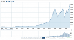
It is impossible to look at, say, the historical performance of the S&P 500 over the past several decades, without concluding that, at some point, the current surge in the market will collapse, as it has done previously when valuations ramped up so rapidly and so far.

S&P500recent

Sornette focuses on asset bubbles and has since 1998, even authoring a book in 2004 on the stock market.

At the same time, I think it is fair to say that he has been largely ignored by mainstream economics (although not finance), perhaps because his training is in physical science. Indeed, many of his publications are in physics journals – which is interesting, but justified because complex systems dynamics cross the boundaries of many subject areas and sciences.

Over the past year or so, I have perused dozens of Sornette papers, many from the extensive list at http://www.er.ethz.ch/publications/finance/bubbles_empirical.

This list is so long and, at times, technical, that videos are welcome.

Along these lines there is Sornette’s Ted talk (see below), and an MP4 file which offers an excellent, high level summary of years of research and findings. This MP4 video was recorded at a talk before the International Center for Mathematical Sciences at the University of Edinburgh.

Intermittent criticality in financial markets: high frequency trading to large-scale bubbles and crashes. You have to download the file to play it.

By way of précis, this presentation offers a high-level summary of the roots of his approach in the economics literature, and highlights the role of a central differential equation for price change in an asset market.

So since I know everyone reading this blog was looking forward to learning about a differential equation, today, let me highlight the importance of the equation,

dp/dt = cpd

This basically says that price change in a market over time depends on the level of prices – a feature of markets where speculative forces begin to hold sway.

This looks to be a fairly simple equation, but the solutions vary, depending on the values of the parameters c and d. For example, when c>0 and the exponent d  is greater than one, prices change faster than exponentially and within some finite period, a singularity is indicated by the solution to the equation. Technically, in the language of differential equations this is called a finite time singularity.

Well, the essence of Sornette’s predictive approach is to estimate the parameters of a price equation that derives, ultimately, from this differential equation in order to predict when an asset market will reach its peak price and then collapse rapidly to lower prices.

The many sources of positive feedback in asset pricing markets are the basis for the faster than exponential growth, resulting from d>1. Lots of empirical evidence backs up the plausibility and credibility of herd and imitative behaviors, and models trace out the interaction of prices with traders motivated by market fundamentals and momentum traders or trend followers.

Interesting new research on this topic shows that random trades could moderate the rush towards collapse in asset markets – possibly offering an alternative to standard regulation.

The important thing, in my opinion, is to discard notions of market efficiency which, even today among some researchers, result in scoffing at the concept of asset bubbles and basic sabotage of research that can help understand the associated dynamics.

Here is a TED talk by Sornette from last summer.

Sales Forecasts and Incentives

In some contexts, the problem is to find out what someone else thinks the best forecast is.

Thus, management may want to have accurate reporting or forecasts from the field sales force of “sales in the funnel” for the next quarter.

In a widely reprinted article from the Harvard Business Review, Gonik shows how to design sales bonuses to elicit the best estimates of future sales from the field sales force. The publication dates from the 1970’s, but is still worth considering, and has become enshrined in the management science literature.

Quotas are set by management, and forecasts or sales estimates are provided by the field salesforce.

In Gonik’s scheme, salesforce bonus percentages are influenced by three factors: actual sales volume, sales quota, and the forecast of sales provided from the field.

Consider the following bonus percentages (click to enlarge).

 Gonik                      

Grid coordinates across the top are the sales agent’s forecast divided by the quota.

Actual sales divided by the sales quota are listed down the left column of the table.

Suppose the quota from management for a field sales office is $50 million in sales for a quarter. This is management’s perspective on what is possible, given first class effort.

The field sales office, in turn, has information on the scope of repeat and new customer sales that are likely in the coming quarter. The sales office forecasts, conservatively, that they can sell $25 million in the next quarter.

This situates the sales group along the column under a Forecast/Quota figure of 0.5.

Then, it turns out that, lo and behold, the field sales office brings in $50 million in sales by the end of the quarter in question.

Their bonus, accordingly, is determined by the row labeled “100″ – for 100% of sales to quota. Thus, the field sales office gets a bonus which is 90 percent of the standard bonus for that period, whatever that is.

Naturally, the salesmen will see that they left money on the table. If they had forecast $50 million in sales for the quarter and achieved it, they would have 120 percent of the standard quota.

Notice that the diagonal highlighted in green shows the maximum bonus percentages for any given ratio of actual sales to quota (any given row). These maximum bonus percents are exactly at the intersection where the ratio of actual sales to quota equals the ratio of sales forecast to quota.

The area of the table colored in pink identifies a situation in which the sales forecasts exceed the actual sales.

The portion of the table highlighted in light blue, on the other hand, shows the cases in which the actual sales exceed the forecast.

This bonus setup provides monetary incentives for the sales force to accurately report their best estimates of prospects in the field, rather than “lowballing” the numbers. And just to review the background to the problem – management sometimes considers that the sales force is likely to under-report opportunities, so they look better when these are realized.

This setup has been applied by various companies, including IBM, and is enshrined in the management literature.

The algebra to develop a table of percentages like the one shown is provided in an article by Mantrala and Rama.

These authors also point out a similarity between Gonik’s setup and reforms of central planning in the old Soviet Union and communist Hungary. This odd association should not discredit the Gonik scheme in anyone’s mind. Instead, the linkage really highlights how fundamental the logic of the bonuses table is. In my opinion, Soviet Russia experienced economic collapse for entirely separate reasons – primarily failures of the pricing system and reluctance to permit private ownership of assets.

A subsequent post will consider business-to-business (B2B) supply contracts and related options frameworks which provide incentives for sharing demand or forecast information along the supply chain.