Tag Archives: Data Science

Daily High and Low Stock Prices – Falling Knives

The mathematics of random walks form the logical underpinning for the dynamics of prices in stock, currency, futures, and commodity markets.

Once you accept this, what is really interesting is to consider departures from random walk movements of prices. Such distortions can signal underlying biases brought to the table by investors and others with influence in these markets.

“Falling knives” may be an example.

A good discussion is presented in Falling Knives: Do Stocks Really Drop 3 Times Faster Than They Rise?

This article in Seeking Alpha is more or less organized around the following chart.

FallingKnives

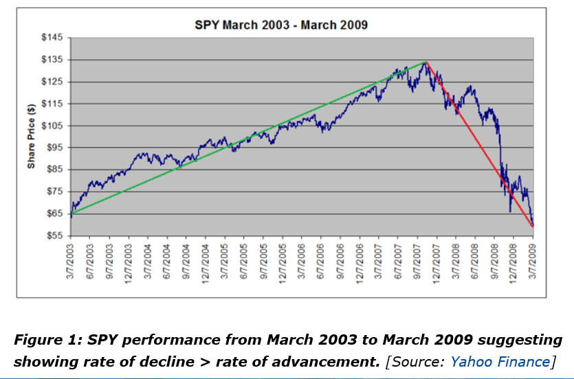
The authors argue this classic chart is really the result of a “Black Swan” event – namely the Great Recession of 2008-2009. Outside of unusual deviations, however, they try to show that “the rate of rallies and pullbacks are approximately equal.”

I’ve been exploring related issues and presently am confident that there are systematic differences in the volatility of high and low prices over a range of time periods.

This seems odd to say, since high and low prices exist within the continuum of prices, their only distinguishing feature being that they are extreme values over the relevant interval – a trading day or collection of trading days.

However, the variance or standard deviation of daily percent changes or rates of change of high and low prices are systematically different for high and low prices in many examples I have seen.

Consider, for example, rates of change of daily high and low prices for the SPY exchange traded fund (ETF) – the security charted in the preceding graph.

RollingSTDEV

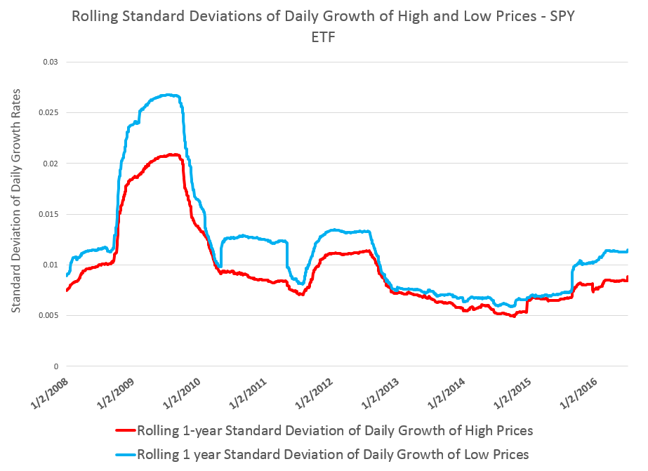
This chart shows the standard deviation of daily rates of change of high and low prices for the SPY over rolling annual time windows.

This evidence suggests higher volatility for daily growth or rates of change of low prices is more than something linked just with “Black Swan events.”

Thus, while the largest differences between standard deviations occur in late 2008 through 2009 – precisely the period of the financial crisis – in 2011 and 2012, as well as recently, we see the variance of daily rates of change of low prices significantly higher than those for high prices.

The following chart shows the distribution of these standard deviations of rates of change of daily high and low prices.

STDEVDist

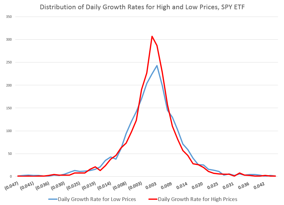
You can see the distribution of the daily growth rates for low prices – the blue line – is fatter in a certain sense, with more instances of somewhat greater standard deviations than the daily growth rates for high prices. As a consequence, too, the distribution of the daily growth rates of low prices shows less concentration near the modal value, which is sharply peaked for both curves.

These are not Gaussian or normal distributions, of course. And I find it interesting that the finance literature, despite decades of recognition of these shapes, does not appear to have a consensus on exactly what types of distributions these are. So I am not going to jump in with my two bits worth, although I’ve long thought that these resemble Laplace Distributions.

In any case, what we have here is quite peculiar, and can be replicated for most of the top 100 ETF’s by market capitalization. The standard deviation of rates of change of current low price to previous low prices generally exceeds the standard deviation of rates of change of high prices, similarly computed.

Some of this might be arithmetic, since by definition high prices are greater numerically than low prices, and we are computing rates of change.

However, it’s easy to dispel the idea that this could account for the types of effects seen with SPY and other securities. You can simulate a random walk, for example, and in thousands of replications with positive prices essentially lose any arithmetic effect of this type in noise.

I believe there is more to this, also.

For example, I find evidence that movements of low prices lead movements of high prices over some time frames.

Investor psychology is probably the most likely explanation, although today we have to take into account the “psychology” of robot trading algorithms. Presumeably, these reflect, in some measure, the predispositions of their human creators.

It’s kind of a puzzle.

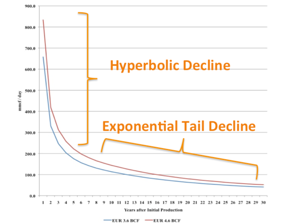
Top image from SGS Swinger BlogSpot

Thoughts on Stock Market Forecasting

Here is an update on the forecasts from last Monday – forecasts of the high and low of SPY, QQQ, GE, and MSFT.

This table is easy to read, even though it is a little” busy”.

TableMay22

One key is to look at the numbers highlighted in red and blue (click to enlarge).

These are the errors from the week’s forecast based on the NPV algorithm (explained further below) and a No Change forecast.

So if you tried to forecast the high for the week to come, based on nothing more than the high achieved last week – you would be using a No Change model. This is a benchmark in many forecasting discussions, since it is optimal (subject to some qualifications) for a random walk. Of course, the idea stock prices are a random walk came into favor several decades ago, and now gradually is being rejected of modified, based on findings such as those above.

The NPV forecasts are more accurate for this last week than No Change projections 62.5 percent of the time, or in 5 out of the 8 forecasts in the table for the week of May 18-22. Furthermore, in all three cases in which the No Change forecasts were better, the NPV forecast error was roughly comparable in absolute size. On the other hand, there were big relative differences in the absolute size of errors in the situations in which the NPV forecasts proved more accurate, for what that is worth.

The NPV algorithm, by the way, deploys various price ratios (nearby prices) and their transformations as predictors. Originally, the approach focused on ratios of the opening price in a period and the high or low prices in the previous period. The word “new” indicates a generalization has been made from this original specification.

Ridge Regression

I have been struggling with Visual Basic and various matrix programming code for ridge regression with the NPV specifications.

Using cross validation of the λ parameter, ridge regression can improve forecast accuracy on the order of 5 to 10 percent. For forecasts of the low prices, this brings forecast errors closer to acceptable error ranges.

Having shown this, however, I am now obligated to deploy ridge regression in several of the forecasts I provide for a week or perhaps a month ahead.

This requires additional programming to be convenient and transparent to validation.

So, I plan to work on that this coming week, delaying other tables with weekly or maybe monthly forecasts for a week or so.

I will post further during the coming week, however, on the work of Andrew Lo (MIT Financial Engineering Center) and high frequency data sources in business forecasts.

Probable Basis of Success of NPV Forecasts

Suppose you are an observer of a market in which securities are traded. Initially, tests show strong evidence stock prices in this market follow random walk processes.

Then, someone comes along with a theory that certain price ratios provide a guide to when stock prices will move higher.

Furthermore, by accident, that configuration of price ratios occurs and is associated with higher prices at some date, or maybe a couple dates in succession.

Subsequently, whenever price ratios fall into this configuration, traders pile into a stock, anticipating its price will rise during the next trading day or trading period.

Question – isn’t this entirely plausible, and would it not be an example of a self-confirming prediction?

I have a draft paper pulling together evidence for this, and have shared some findings in previous posts. For example, take a look at the weird mirror symmetry of the forecast errors for the high and low.

And, I suspect, the absence or ambivalence of this underlying dynamic is why closing prices are harder to predict than period high or low prices of a stock. If I tell you the closing price will be higher, you do not necessarily buy the stock. Instead, you might sell it, since the next morning opening prices could jump down. Or there are other possibilities.

Of course, there are all kinds of systems traders employ to decide whether to buy or sell a stock, so you have to cast your net pretty widely to capture effects of the main methods.

Long Term Versus Short Term

I am getting mixed results about extending the NPV approach to longer forecast horizons – like a quarter or a year or more.

Essentially, it looks to me as if the No Change model becomes harder and harder to beat over longer forecast horizons – although there may be long run persistence in returns or other features that I see  other researchers (such as Andrew Lo) have noted.

Links – Data Science

I’ve always thought the idea of “data science” was pretty exciting. But what is it, how should organizations proceed when they want to hire “data scientists,” and what’s the potential here?

Clearly, data science is intimately associated with Big Data. Modern semiconductor and computer technology make possible rich harvests of “bits” and “bytes,” stored in vast server farms. Almost every personal interaction can be monitored, recorded, and stored for some possibly fiendish future use, along with what you might call “demographics.” Who are you? Where do you live? Who are your neighbors and friends? Where do you work? How much money do you make? What are your interests, and what websites do you browse? And so forth.

As Edward Snowden and others point out, there is a dark side. It’s possible, for example, all phone conversations are captured as data flows and stored somewhere in Utah for future analysis by intrepid…yes, that’s right…data scientists.

In any case, the opportunities for using all this data to influence buying decisions, decide how to proceed in business, to develop systems to “nudge” people to do the right thing (stop smoking, lose weight), and, as I have recently discovered – do good, are vast and growing. And I have not even mentioned the exploding genetics data from DNA arrays and its mobilization to, for example, target cancer treatment.

The growing body of methods and procedures to make sense of this extensive and disparate data is properly called “data science.” It’s the blind man and the elephant problem. You have thousands or millions of rows of cases, perhaps with thousands or even millions of columns representing measurable variables. How do you organize a search to find key patterns which are going to tell your sponsors how to do what they do better?

Hiring a Data Scientist

Companies wanting to “get ahead of the curve” are hiring data scientists – from positions as illustrious and mysterious as Chief Data Scientist to operators in what are almost now data sweatshops.

But how do you hire a data scientist if universities are not granting that degree yet, and may even be short courses on “data science?”

I found a terrific article – How to Consistently Hire Remarkable Data Scientists.

It cites Drew Conway’s data science Venn Diagram suggesting where data science falls in these intersecting areas of knowledge and expertise.

DataScienceVenn

This article, which I first found in a snappy new compilation Data Elixir also highlights methods used by Alan Turing to recruit talent at Benchley.

In the movie The Imitation Game, Alan Turing’s management skills nearly derail the British counter-intelligence effort to crack the German Enigma encryption machine. By the time he realized he needed help, he’d already alienated the team at Bletchley Park. However, in a moment of brilliance characteristic of the famed computer scientist, Turing developed a radically different way to recruit new team members.

To build out his team, Turing begins his search for new talent by publishing a crossword puzzle in The London Daily Telegraph inviting anyone who could complete the puzzle in less than 12 minutes to apply for a mystery position. Successful candidates were assembled in a room and given a timed test that challenged their mathematical and problem solving skills in a controlled environment. At the end of this test, Turing made offers to two out of around 30 candidates who performed best.

In any case, the recommendation is a six step process to replace the traditional job interview –

SixStageHiringTest

Doing Good With Data Science

Drew Conway, the author of the Venn Diagram shown above, is associated with a new kind of data company called Data Kind.

Here’s an entertaining video of Conway, an excellent presenter, discussing Big Data as a movement and as something which can be used for social good.

For additional detail see http://venturebeat.com/2014/08/21/datakinds-benevolent-data-science-projects-arrive-in-5-more-cities/

Trading Volume- Trends, Forecasts, Predictive Role

The New York Stock Exchange (NYSE) maintains a data library with historic numbers on trading volumes. Three charts built with some of this data tell an intriguing story about trends and predictability of volumes of transactions and dollars on the NYSE.

First, the number of daily transactions peaked during the financial troubles of 2008, only showing some resurgence lately.

transvol

This falloff in the number of transactions is paralleled by the volume of dollars spent in these transactions.

dollartrans

These charts are instructive, since both highlight the existence of “spikes” in transaction and dollar volume that would seem to defy almost any run-of-the-mill forecasting algorithm. This is especially true for the transactions time series, since the spikes are more irregularly spaced. The dollar volume time series suggests some type of periodicity is possible for these spikes, particularly in recent years.

But lower trading volume has not impacted stock prices, which, as everyone knows, surged past 2008 levels some time ago.

A raw ratio between the value of trades and NYSE stock transactions gives the average daily price per transaction.

vluepershare

So stock prices have rebounded, for the most part, to 2008 levels. Note here that the S&P 500 index stocks have done much better than this average for all stocks.

Why has trading volume declined on the NYSE? Some reasons gleaned from the commentariat.

  1. Mom and Pop traders largely exited the market, after the crash of 2008
  2. Some claim that program trading or high frequency trading peaked a few years back, and is currently in something of a decline in terms of its proportion of total stock transactions. This is, however, not confirmed by the NYSE Facts and Figures, which shows program trading pretty consistently at around 30 percent of total trading transactions..
  3. Interest has shifted to options and futures, where trading volumes are rising.
  4. Exchange Traded Funds (ETF’s) make up a larger portion of the market, and they, of course, do not actively trade.
  5. Banks have reduced their speculation in equities, in anticipation of Federal regulations

See especially Market Watch and Barry Ritholtz on these trends.

But what about the impact of trading volume on price? That’s the real zinger of a question I hope to address in coming posts this week.

The King Has No Clothes or Why There Is High Frequency Trading (HFT)

I often present at confabs where there are engineers with management or executive portfolios. You start the slides, but, beforehand, prepare for the tough question. Make sure the numbers in the tables add up and that round-off errors or simple typos do not creep in to mess things up.

To carry this on a bit, I recall a Hewlett Packard VP whose preoccupation during meetings was to fiddle with their calculator – which dates the story a little. In any case, the only thing that really interested them was to point out mistakes in the arithmetic. The idea is apparently that if you cannot do addition, why should anyone believe your more complex claims?

I’m bending this around to the theory of efficient markets and rational expectations, by the way.

And I’m playing the role of the engineer.

Rational Expectations

The theory of rational expectations dates at least to the work of Muth in the 1960’s, and is coupled with “efficient markets.”

Lim and Brooks explain market efficiency in – The Evolution of Stock Market Efficiency Over Time: A Survey of the Empirical Literature

The term ‘market efficiency’, formalized in the seminal review of Fama (1970), is generally referred to as the informational efficiency of financial markets which emphasizes the role of information in setting prices.. More specifically, the efficient markets hypothesis (EMH) defines an efficient market as one in which new information is quickly and correctly reflected in its current security price… the weak-form version….asserts that security prices fully reflect all information contained in the past price history of the market.

Lim and Brooks focus, among other things, on statistical tests for random walks in financial time series, noting this type of research is giving way to approaches highlighting adaptive expectations.

Proof US Stock Markets Are Not Efficient (or Maybe That HFT Saves the Concept)

I like to read mathematically grounded research, so I have looked a lot of the papers purporting to show that the hypothesis that stock prices are random walks cannot be rejected statistically.

But really there is a simple constructive proof that this literature is almost certainly wrong.

STEP 1: Grab the data. Download daily adjusted closing prices for the S&P 500 from some free site (e,g, Yahoo Finance). I did this again recently, collecting data back to 1990. Adjusted closing prices, of course, are based on closing prices for the trading day, adjusted for dividends and stock splits. Oh yeah, you may have to resort the data from oldest to newest, since a lot of sites present the newest data on top, originally.

Here’s a graph of the data, which should be very familiar by now.

adjCLPS&P

STEP 2: Create the relevant data structure. In the same spreadsheet, compute the trading-day-over-treading day growth in the adjusted closing price (ACP). Then, side-by-side with this growth rate of the ACP, create another series which, except for the first value, maps the growth in ACP for the previous trading day onto the growth of the ACP for any particular day. That gives you two columns of new data.

STEP 3: Run adaptive regressions. Most spreadsheet programs include an ordinary least squares (OLS) regression routine. Certainly, Excel does. In any case, you want to setup up a regression to predict the growth in the ACP, based on one trading lags in the growth of the ACP.

I did this, initially, to predict the growth in ACP for January 3, 2000, based on data extending back to January 3, 1990 – a total of 2528 trading days. Then, I estimated regressions going down for later dates with the same size time window of 2528 trading days.

The resulting “predictions” for the growth in ACP are out-of-sample, in the sense that each prediction stands outside the sample of historic data used to develop the regression parameters used to forecast it.

It needs to be said that these predictions for the growth of the adjusted closing price (ACP) are marginal, correctly predicting the sign of the ACP only about 53 percent of the time.

An interesting question, though, is whether these just barely predictive forecasts can be deployed in a successful trading model. Would a trading algorithm based on this autoregressive relationship beat the proverbial “buy-and-hold?”

So, for example, suppose we imagine that we can trade at closing each trading day, close enough to the actual closing prices.

Then, you get something like this, if you invest $100,000 at the beginning of 2000, and trade through last week. If the predicted growth in the ACP is positive, you buy at the previous day’s close. If not, you sell at the previous day’s close. For the Buy-and-Hold portfolio, you just invest the $100,000 January 3, 2000, and travel to Tahiti for 15 years or so.

BandHversusAR

So, as should be no surprise, the Buy-and-Hold strategy results in replicating the S&P 500 Index on a $100,000 base.

The trading strategy based on the simple first order autoregressive model, on the other hand, achieves more than twice these cumulative earnings.

Now I suppose you could say that all this was an accident, or that it was purely a matter of chance, distributed over more than 3,810 trading days. But I doubt it. After all, this trading interval 2000-2015 includes the worst economic crisis since before World War II.

Or you might claim that the profits from the simple AR trading strategy would be eaten up by transactions fees and taxes. On this point, there were 1,774 trades, for an average of $163 per trade. So, worst case, if trading costs $10 a transaction, and there is a tax rate of 40 percent, that leaves $156K over these 14-15 years in terms of take-away profit, or about $10,000 a year.

Where This May Go Wrong

This does sound like a paen to stock market investing – even “day-trading.”

What could go wrong?

Well, I assume here, of course, that exchange traded funds (ETF’s) tracking the S&P 500 can be bought and sold with the same tactics, as outlined here.

Beyond that, I don’t have access to the data currently (although I will soon), but I suspect high frequency trading (HFT) may stand in the way of realizing this marvelous investing strategy.

So remember you have to trade some small instant before market closing to implement this trading strategy. But that means you get into the turf of the high frequency traders. And, as previous posts here observe, all kinds of unusual things can happen in a blink of an eye, faster than any human response time.

So – a conjecture. I think that the choicest situations from the standpoint of this more or less macro interday perspective, may be precisely the places where you see huge spikes in the volume of HFT. This is a proposition that can be tested.

I also think something like this has to be appealed to in order to save the efficient markets hypothesis, or rational expectations. But in this case, it is not the rational expectations of human subjects, but the presumed rationality of algorithms and robots, as it were, which may be driving the market, when push comes to shove.

Top picture from CommSmart Global.

Modeling High Tech – the Demand for Communications Services

A colleague was kind enough to provide me with a copy of –

Demand for Communications Services – Insights and Perspectives, Essays in Honor of Lester D. Taylor, Alleman, NíShúilleabháin, and Rappoport, editors, Springer 2014

Some essays in this Festschrift for Lester Taylor are particularly relevant, since they deal directly with forecasting the disarray caused by disruptive technologies in IT markets and companies.

Thus, Mohsen Hamoudia in “Forecasting the Demand for Business Communications Services” observes about the telecom space that

“..convergence of IT and telecommunications market has created more complex behavior of market participants. Customers expect new product offerings to coincide with these emerging needs fostered by their growth and globalization. Enterprises require more integrated solutions for security, mobility, hosting, new added-value services, outsourcing and voice over internet protocol (VoiP). This changing landscape has led to the decline of traditional product markets for telecommunications operators.

In this shifting landscape, it is nothing less than heroic to discriminate “demand variables” and “ independent variables” deploying and produce useful demand forecasts from three stage least squares (3SLS) models, as does Mohsen Hamoudia in his analysis of BCS.

Here is Hamoudia’s schematic of supply and demand in the BCS space, as of a 2012 update.

BCS

Other cutting-edge contributions, dealing with shifting priorities of consumers, faced with new communications technologies and services, include, “Forecasting Video Cord-Cutting: The Bypass of Traditional Pay Television” and “Residential Demand for Wireless Telephony.”

Festschrift and Elasticities

This Springer Festschrift is distinctive inasmuch as Professor Taylor himself contributes papers – one a reminiscence titled “Fifty Years of Studying Economics.”

Taylor, of course, is known for his work in the statistical analysis of empirical demand functions and broke ground with two books, Telecommunications Demand: A Survey and Critique (1980) and Telecommunications Demand in Theory and Practice (1994).

Accordingly, forecasting and analysis of communications and high tech are a major focus of several essays in the book.

Elasticities are an important focus of statistical demand analysis. They flow nicely from double logarithmic or log-log demand specifications – since, then, elasticities are constant. In a simple linear demand specification, of course, the price elasticity varies across the range of prices and demand, which complicates testimony before public commissions, to say the least.

So it is interesting, in this regard, that Professor Taylor is still active in modeling, contributing to his own Festschrift with a note on translating logs of negative numbers to polar coordinates and the complex plane.

“Pricing and Maximizing Profits Within Corporations” captures the flavor of a telecom regulatory era which is fast receding behind us. The authors, Levy and Tardiff, write that,

During the time in which he was finishing the update, Professor Taylor participated in one of the most hotly debated telecommunications demand elasticity issues of the early 1990’s: how price-sensitive were short-distance toll calls (then called intraLATA long-distance calls)? The answer to that question would determine the extent to which the California state regulator reduced long-distance prices (and increased other prices, such as basic local service prices) in a “revenue-neutral” fashion.

Followup Workshop

Research in this volume provides a good lead-up to a forthcoming International Institute of Forecasters (IIF) workshop – the 2nd ICT and Innovation Forecasting Workshop to be held this coming May in Paris.

The dynamic, ever changing nature of the Information & Communications Technology (ICT) Industry is a challenge for business planners and forecasters. The rise of Twitter and the sudden demise of Blackberry are dramatic examples of the uncertainties of the industry; these events clearly demonstrate how radically the environment can change. Similarly, predicting demand, market penetration, new markets, and the impact of new innovations in the ICT sector offer a challenge to businesses and policymakers. This Workshop will focus on forecasting new services and innovation in this sector as well as the theory and practice of forecasting in the sector (Telcos, IT providers, OTTs, manufacturers). For more information on venue, organizers and registration, Download brochure

Links – February 2015

I buy into the “hedgehog/fox” story, when it comes to forecasting. So you have to be dedicated to the numbers, but still cast a wide net. Here are some fun stories, relevant facts, positive developments, and concerns – first Links post for 2015.

Cool Facts and Projections

How the world’s population has changed – we all need to keep track of this, 9.6 billion souls by 2050, Nigeria’s population outstrips US.

worldpop

What does the world eat for breakfast?

Follow a Real New York Taxi’s Daily Slog 30 Days, 30 random cabbie journeys based on actual location data

Information Technology

Could Microsoft’s HoloLens Be The Real Deal?

MSHolo

I’ll Be Back: The Return of Artificial Intelligence

BloomAI

Issues

Why tomorrow’s technology needs a regulatory revolution Fascinating article. References genome sequencing and frontier biotech, such as,

Jennifer Doudna, for instance, is at the forefront of one of the most exciting biomedical advances in living memory: engineering the genomes not of plants, but of people. Her cheap and easy Crispr technology holds out the promise that anybody with a gene defect could get that problem fixed, on an individual, bespoke basis. No more one-size-fits all disease cures: everything can now be personalized. The dystopian potential here, of course, is obvious: while Doudna’s name isn’t Frankenstein, you can be sure that if and when her science gains widespread adoption, the parallels will be hammered home ad nauseam.

Doudna is particularly interesting because she doesn’t dismiss fearmongers as anti-science trolls. While she has a certain amount of control over what her own labs do, her scientific breakthrough is in the public domain, now, and already more than 700 papers have been published in the past two years on various aspects of genome engineering. In one high-profile example, a team of researchers found a way of using Doudna’s breakthrough to efficiently and predictably cause lung cancer in mice.

There is more on Doudna’ Innovative Genomics Initiative here, but the initially linked article on the need for regulatory breakthrough goes on to make some interesting observations about Uber and Airbnb, both of which have thrived by ignoring regulations in various cities, or even flagrantly breaking the law.

China

Is China Preparing for Currency War? Provocative header for Bloomberg piece with some real nuggets, such as,

Any significant drop in the yuan would prompt Japan to unleash another quantitative-easing blitz. The same goes for South Korea, whose exports are already hurting. Singapore might feel compelled to expand upon last week’s move to weaken its dollar. Before long, officials in Bangkok, Hanoi, Jakarta, Manila, Taipei and even Latin America might act to protect their economies’ competitiveness…

There’s obvious danger in so many economies engaging in this race to the bottom. It will create unprecedented levels of volatility in markets and set in motion flows of hot money that overwhelm developing economies, inflating asset bubbles and pushing down bond rates irrationally low. Consider that Germany’s 10-year debt yields briefly fell below Japan’s (they’re both now in the 0.35 percent to 0.36 percent range). In a world in which the Bank of Japan, the European Central Bank and the Federal Reserve are running competing QE programs, the task of pricing risk can get mighty fuzzy.

Early Look: Deflation Clouds Loom Over China’s Economy

The [Chinese] consumer-price index, a main gauge of inflation, likely rose only 0.9% from a year earlier, according to a median forecast of 13 economists surveyed by the Wall Street Journal

China’s Air Pollution: The Tipping Point

Chinapollution

Energy and Renewables

Good News About How America Uses Energy A lot more solar and renewables, increasing energy efficiency – all probably contributors to the Saudi move to push oil prices back to historic lows, wean consumers from green energy and conservation.

Nuclear will die. Solar will live Companion piece to the above. Noah Smith curates Noahpinion, one of the best and quirkiest economics blogs out there. Here’s Smith on the reason nuclear is toast (in his opinion) –

There are three basic reasons conventional nuclear is dead: cost, safety risk, and obsolescence risk. These factors all interact.            

First, cost. Unlike solar, which can be installed in small or large batches, a nuclear plant requires an absolutely huge investment. A single nuclear plant can cost on the order of $10 billion U.S. That is a big chunk of change to plunk down on one plant. Only very large companies, like General Electric or Hitachi, can afford to make that kind of investment, and it often relies on huge loans from governments or from giant megabanks. Where solar is being installed by nimble, gritty entrepreneurs, nuclear is still forced to follow the gigantic corporatist model of the 1950s.

Second, safety risk. In 1945, the U.S. military used nuclear weapons to destroy Hiroshima and Nagasaki, but a decade later, these were thriving, bustling cities again. Contrast that with Fukushima, site of the 2011 Japanese nuclear meltdown, where whole towns are still abandoned. Or look at Chernobyl, almost three decades after its meltdown. It will be many decades before anyone lives in those places again. Nuclear accidents are very rare, but they are also very catastrophic – if one happens, you lose an entire geographical region to human habitation.

Finally, there is the risk of obsolescence. Uranium fission is a mature technology – its costs are not going to change much in the future. Alternatives, like solar, are young technologies – the continued staggering drops in the cost of solar prove it. So if you plunk down $10 billion to build a nuclear plant, thinking that solar is too expensive to compete, the situation can easily reverse in a couple of years, before you’ve recouped your massive fixed costs.

Owners of the wind Greenpeace blog post on Denmark’s extraordinary and successful embrace of wind power.

What’s driving the price of oil down? Econbrowser is always a good read on energy topics, and this post is no exception. Demand factors tend to be downplayed in favor of stories about Saudi production quotas.

Forecasting Shale Oil/Gas Decline Rates

Forecasting and data analytics increasingly are recognized as valued partners in nonconventional oil and gas production.

Fracking and US Oil/Gas Production

“Video Friday” here presented a YouTube with Brian Ellis – a Michigan University engineer – discussing hydraulic fracturing and horizontal drilling (“fracking”).

USannualoilprod

Fracking produced the hockey stick at the end of this series.

These new technologies also are responsible for a bonanza of natural gas, so much that it often has nowhere to go – given the limited pipeline infrastructure and LNG processing facilities.

shalegasprod

Rapid Decline Curves for Fracking Oil and Gas

In contrast to conventional wells, hydraulic fracturing and horizontal drilling (“fracking”) produces oil and gas wells with rapid decline curves.

Here’s an illustration from the Penn State Department of Energy and Mineral Engineering site,

Pennstatedeclinecurve

The two legends at the bottom refer to EUR’s– estimated ultimate recovery times (click to enlarge).

Conventional oil fields typically have decline rates on the order of 5 percent per year.

Shale oil and gas wells, on the other hand, may produce 50 percent or more of their total EUR in their first year of operation.

There are physical science fundamentals behind this, explained, for example, in

Decline and depletion rates of oil production: a comprehensive investigation

You can talk, for example, of shale production being characterized by a Transient Flow Period followed by Boundary Dominated Flow (BDF).

And these rapid decline rates have received a lot of recent attention in the media:

Could The ‘Shale Oil Miracle’ Be Just A Pipe Dream?

Wells That Fizzle Are a ‘Potential Show Stopper’ for the Shale Boom

Is the U.S. Shale Boom Going Bust?

Forecasting and Data Analytics

One forecasting problem in this context, therefore, is simply to take histories from wells and forecast their EUR’s.

Increasingly, software solutions are applying automatic fitting methods to well data to derive decline curves and other shale oil and gas field parameters.

Here is an interesting product called Value Navigator.

This whole subject is developing rapidly, and huge changes in the US industry are expected, if oil and gas prices continue below $60 a barrel and $4 MMBtu.

The forecasting problem may shift from well and oil field optimization to evaluation of the wider consequences of recent funding of the shale oil and gas boom. But, again, the analytics are available to do this, to a large extent, and I want to post up some of what I have discovered in this regard.

Forecasting in the Supply Chain

The Foresight Practitioner’s Conference held last week in on the campus of Ohio State University highlighted business gains in forecasting and the bottom line from integration across the supply chain.

Officially, the title of the Conference was “From S&OP to Demand-Supply Integration: Collaboration Across the Supply Chain.”
S&OP is an important practice in many businesses right now – Sales and Operations Planning. By itself it signifies business integration, but several speakers – starting off with Pete Alle of Oberweiss Dairy – emphasized the importance of linking the S&OP manager with the General Manager directly, and of his sponsorship and support.

Luke Busby described revitalization of an S&OP process for Steris – a medical technology leader focusing on infection prevention, contamination control, surgical and critical care technologies. Problems encountered were that the old process was spreadsheet driven, used minimal analytics, led to finger pointing – “Your numbers!”, was not comprehensive – not all products and plants included, and embodied divergent goals.

Busby had good things to say about software called Smoothie from Demand Works in facilitating the new Steris process. Busby described benefits from the new implementation at a high level of detail, including the ability, for example, to drill down and segment the welter of SKU’s in the company product lines.

I found the talk especially interesting because of its attention to organization detail, such as shown in the following slide.

Busby

But this was more than an S&OP Conference, as underlined by Dr. Mark A. Moon’s presentation From S&OP to True Business Integration. Moon, Head, Department of Marketing and Supply Chain Management, University of Tennessee, Knoxville, started his talk with the following telling slide –

What'swrongS&OP

Glen Lewis of the University of California at Davis and formerly a Del Monte Director spoke on a wider integration of S&OP with Green Energy practices, focusing mainly on time management of peak electric power demands.

Thomas Goldsby, Professor of Logistics Fisher College of Business who introduced the concept of the supply web (shown below), and co-presented with Alicia Hammersmith, GM for Materials, General Electric Aviation. I finally learned what 3D printing was.


supplyweb
Probably the most amazing part of the Conference for me was the Beer Game, led by James Hill, Associate Professor of Management Sciences at The Ohio State University Fisher College of Business. Several tables were set up in a big auditorium in the Business School, each with a layout of production, product warehousing, distributor warehouses, and retail outlets. These four positions were staffed by Conference attendees, many expert in supply chain management.

The objective was to minimize inventory costs, where shortfalls earned a double penalty. No communication was permitted along these fictive supply chains for beer. Demand was unknown at retail, but when discovered resulted in orders being passed back along the chain, where lags were introduced in provisioning. The upshot was that every table created the famous “bullwhip effect” of intensifying volatility of inventory back along the supply chain.

Bottom line was that if you want to become a hero in an organization short-term, find a way to reduce inventory, since that results in immediate increases in cash flow.

All very interesting. Where does forecasting fit into this? Good question, and that was discussed in open sessions.

A common observation was that relying on the field sales teams to provide estimates of future orders can lead to bias.