Oil and Gas Prices II

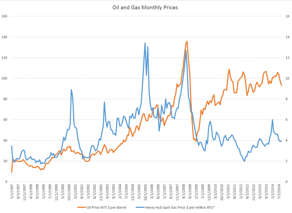
One of the more interesting questions in applied forecasting is the relationship between oil and natural gas prices in the US market, shown below.

OIlGasPrices

Up to the early 1990’s, the interplay between oil and gas prices followed “rules of thumb” – for example, gas prices per million Btu were approximately one tenth oil prices.

There is still some suggestion of this – for example, peak oil prices recently hit nearly $140 a barrel, at the same time gas prices were nearly $14 per million Btu’s.

However, generally, ratio relationships appear to break down around 2009, if not earlier, during the first decade of the century.

A Longer Term Relationship?

Perhaps oil and gas prices are in a longer term relationship, but one disturbed in many cases in short run time periods.

One way economists and ecommetricians think of this is in terms of “co-integrating relationships.” That’s a fancy way of saying that regressions of the form,

Gas price in time t = constant + α(oil price in time t) + (residual in time t)

are predictive. Here, α is a coefficient to be estimated.

Now this looks like a straight-forward regression, so you might say – “what’s the problem?”

Well, the catch is that gas prices and oil prices might be nonstationary – that is, one or another form of a random walk.

If this is so – and positive results on standard tests such as the augmented Dickey Fuller (ADR) and Phillips-Peron are widely reported – there is a big potential problem. It’s easy to regress one completely unrelated nonstationary time series onto another, getting an apparently significant result, only to find this relationship disappears in the forecast. In other words two random series can, by chance, match up to each other over closely, but that’s no guarantee they will continue to do so.

Here’s where the concept of a co-integrating relationship comes into play.

If you can show, by various statistical tests, that variables are cointegrated, regressions such as the one above are more likely to be predictive.

Well, several econometric studies show gas and oil prices are in a cointegrated relationship, using data from the 1990’s through sometime in the first decade of the 2000’s. The more sophisticated specify auxiliary variables to account for weather or changes in gas storage. You might download and read, for example, a study published in 2007 under the auspices of the Dallas Federal Reserve Bank – What Drives Natural Gas Prices?

But it does not appear that this cointegrated relationship is fixed. Instead, it changes over time, perhaps exemplifying various regimes, i.e. periods of time in which the underlying parameters switch to new values, even though a determinate relationship can still be demonstrated.

Changing parameters are shown in the excellent 2012 study by Ramberg and Parsons in the Energy Journal – The Weak Tie Between Natural Gas and Oil Prices.

The Underlying Basis

Anyway, there are facts relating to production and use of oil and natural gas which encourage us to postulate a relationship in their prices, although the relationship may shift over time.

This makes sense since oil and gas are limited or completely substitutes in various industrial processes. This used to be more compelling in electric power generation, than it is today. According to the US Department of Energy, there are only limited amounts of electric power still produced by generators running on oil, although natural gas turbines have grown in importance.

Still, natural gas is often produced alongside of and is usually dissolved in oil, so oil and natural gas are usually joint products.

Recently, technology has changed the picture with respect to gas and oil.

On the demand side, the introduction of the combined-cycle combustion turbine made natural gas electricity generation more cost effective, thereby making natural gas in electric power generation even more dominant.

On the demand side, the new technologies of extracting shale oil and natural gas – often summarized under the rubric of “fracking” or hydraulic fracturing – have totally changed the equation, resulting in dramatic increases in natural gas supplies in the US.

This leaves the interesting question of what sort of forecasting model for natural gas might be appropriate.

Oil and Gas Prices – a “Golden Swan”?

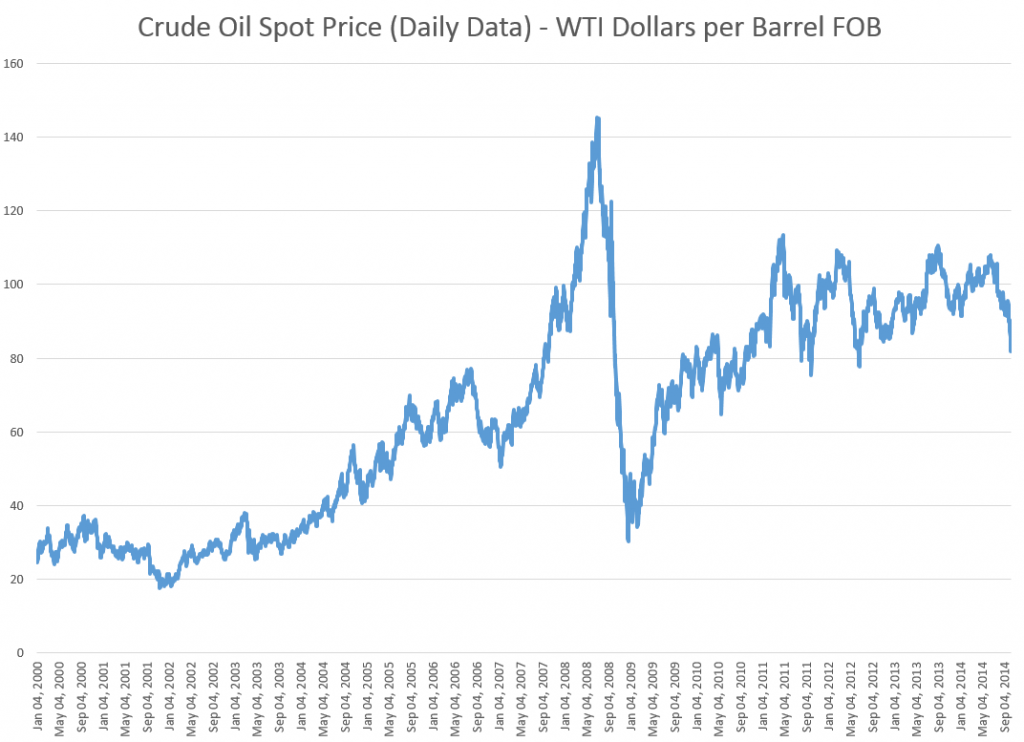
Crude oil prices plummeted last week, moving toward $80/Bbl for West Texas Intermediate (WTI) – the spot pricing standard commodity.

CrudeOilSpotPrice

OPEC – the Organization of Petroleum Exporting Counties – is a key to trajectory of oil prices, accounting for about 40 percent of global oil output.

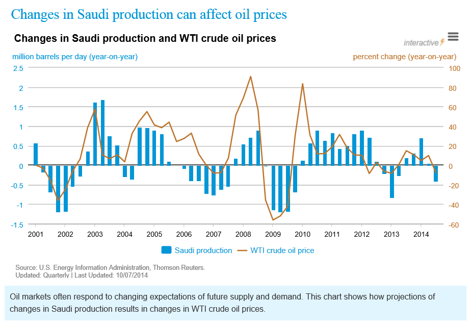
Media reports that the Saudi Arabian Kingdom, which is the largest producer in OPEC, is advising that it will not cut oil production at the current time. The US Energy Information Agency (EIA) has a graph on its website underlining the importance of Saudi production to global oil prices.

Saudiproductionoilprice

Officially, there is very little in the media to pin down the current Saudi policy, although, off-the-record, Saudi representatives apparently have indicated they could allow crude prices to drift between $80 and $90 a barrel for a couple of years. This could impact higher cost producers, such as Iran and burgeoning North American shale oil production.

At the same time, several OPEC members, such as Venezuela and Libya, have called for cuts in output to manage crude prices going forward. And a field jointly maintained by Saudi Arabia and Kuwait just has been shut down, ostensibly for environmental upgrades.

OPEC’s upcoming November 27 meeting in Vienna, Austria should be momentous.

US Oil Production

Currently, US oil production is running at 8.7 million barrels a day, a million barrels a day higher than in a comparable period of 2013, and the highest level since 1986.

The question of the hour is whether US production can continue to increase with significantly lower oil prices.

Many analysts echo the New York Times, which recently compared throttling back US petroleum activity to slowing a freight train.

Most companies make their investment decisions well in advance and need months to slow exploration because of contracts with service companies. And if they do decide to cut back some drilling, they will pick the least prospective fields first as they continue developing the richest prospects.

At the same time, the most recent data suggest US rig activity is starting to slip.

Economic Drivers

It’s all too easy to engage in arm-waving, when discussing energy supplies and prices and their relationship to the global economy.

Of course, we have supply and demand, as one basis. Supplies have been increasing, in part because of new technologies in US production and Libyan production coming back on line.

Demands have not been increasing, on the other hand, as rapidly as in the past. This reflects slowing growth in China and continuing energy conservation.

One imponderable is the influence of speculators on oil prices. Was there a “bubble” before 2009, for example, and could speculators drive oil prices significantly lower in coming months?

Another factor that is hard to assess is whether 2015 will see a recession in major parts of the global economy.

The US Federal Reserve has been planning on eliminating Quantitative Easing (QE) – its program of long-term bond purchases – and increasing the federal funds rate from its present level of virtually zero. Many believe that these actions will materially slow US and global economic growth. Coupled with the current deflationary environment in Europe, there have been increasing signs that factors could converge to trigger a recession sometime in 2015.

However, low energy prices usually are not part of the prelude for a recession, although they can develop after the recession takes hold.

Instead, prices at the pump in the US could fall below $3.00 a gallon, providing several hundred dollars extra in discretionary income over the course of a year. This, just prior to the Christmas shopping season.

So – if US oil production continues to increase and prices at the pump fall below $3.00, there will be jobs and cheap gas, a combination likely to forstall a downturn, at least in the US for the time being.

Top image courtesy of GameDocs

Forecasting in the Supply Chain

The Foresight Practitioner’s Conference held last week in on the campus of Ohio State University highlighted business gains in forecasting and the bottom line from integration across the supply chain.

Officially, the title of the Conference was “From S&OP to Demand-Supply Integration: Collaboration Across the Supply Chain.”
S&OP is an important practice in many businesses right now – Sales and Operations Planning. By itself it signifies business integration, but several speakers – starting off with Pete Alle of Oberweiss Dairy – emphasized the importance of linking the S&OP manager with the General Manager directly, and of his sponsorship and support.

Luke Busby described revitalization of an S&OP process for Steris – a medical technology leader focusing on infection prevention, contamination control, surgical and critical care technologies. Problems encountered were that the old process was spreadsheet driven, used minimal analytics, led to finger pointing – “Your numbers!”, was not comprehensive – not all products and plants included, and embodied divergent goals.

Busby had good things to say about software called Smoothie from Demand Works in facilitating the new Steris process. Busby described benefits from the new implementation at a high level of detail, including the ability, for example, to drill down and segment the welter of SKU’s in the company product lines.

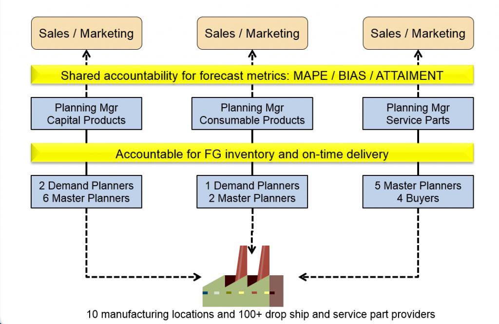
I found the talk especially interesting because of its attention to organization detail, such as shown in the following slide.

Busby

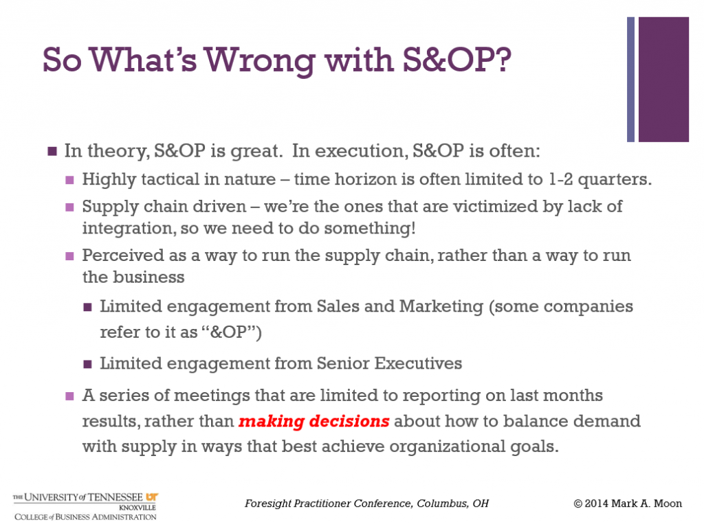
But this was more than an S&OP Conference, as underlined by Dr. Mark A. Moon’s presentation From S&OP to True Business Integration. Moon, Head, Department of Marketing and Supply Chain Management, University of Tennessee, Knoxville, started his talk with the following telling slide –

What'swrongS&OP

Glen Lewis of the University of California at Davis and formerly a Del Monte Director spoke on a wider integration of S&OP with Green Energy practices, focusing mainly on time management of peak electric power demands.

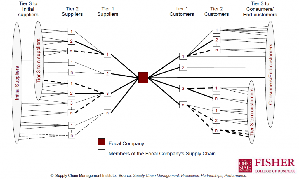
Thomas Goldsby, Professor of Logistics Fisher College of Business who introduced the concept of the supply web (shown below), and co-presented with Alicia Hammersmith, GM for Materials, General Electric Aviation. I finally learned what 3D printing was.


supplyweb
Probably the most amazing part of the Conference for me was the Beer Game, led by James Hill, Associate Professor of Management Sciences at The Ohio State University Fisher College of Business. Several tables were set up in a big auditorium in the Business School, each with a layout of production, product warehousing, distributor warehouses, and retail outlets. These four positions were staffed by Conference attendees, many expert in supply chain management.

The objective was to minimize inventory costs, where shortfalls earned a double penalty. No communication was permitted along these fictive supply chains for beer. Demand was unknown at retail, but when discovered resulted in orders being passed back along the chain, where lags were introduced in provisioning. The upshot was that every table created the famous “bullwhip effect” of intensifying volatility of inventory back along the supply chain.

Bottom line was that if you want to become a hero in an organization short-term, find a way to reduce inventory, since that results in immediate increases in cash flow.

All very interesting. Where does forecasting fit into this? Good question, and that was discussed in open sessions.

A common observation was that relying on the field sales teams to provide estimates of future orders can lead to bias.

Video Friday on Steroids

Here is a list of the URL’s for all the YouTube and other videos shown on this blog from January 2014 through May of this year. I encourage you to shop this list, clicking on the links. There’s a lot of good stuff, including several  instructional videos on machine learning and other technical topics, a series on robotics, and several videos on climate and climate change.

January 2014

The Polar Vortex Explained in Two Minutes

https://www.youtube.com/watch?v=5eDTzV6a9F4

NASA – Six Decades of a Warming Earth

https://www.youtube.com/watch?v=gaJJtS_WDmI

“CHASING ICE” captures largest video calving of glacier

https://www.youtube.com/watch?v=hC3VTgIPoGU

Machine Learning and Econometrics

https://www.youtube.com/watch?v=EraG-2p9VuE

Can Crime Prediction Software Stop Criminals?

https://www.youtube.com/watch?v=s1-pbJKA3H8

Analytics 2013 – Day 1

https://www.youtube.com/watch?v=LsyOLBroVx4

The birth of a salesman

https://www.youtube.com/watch?v=pWM1dR_V7uw

Economies Improve

https://www.youtube.com/watch?v=5_DeCMIig_M

Kaggle – Energy Applications for Machine Learning

https://www.youtube.com/watch?v=mZZFXTUz-nI

2014 Outlook with Jan Hatzius

https://www.youtube.com/watch?v=Ggv0oC8L3Tk

Nassim Taleb Lectures at the NSF

https://www.youtube.com/watch?v=omsYJBMoIJU

Vernon Smith – Experimental Markets

https://www.youtube.com/watch?v=Uncl-wRfoK8


Forecast Pro – Quick Tour

https://www.youtube.com/watch?v=s8jMp5qS8v4

February 2014

Stephen Wolfram’s Introduction to the Wolfram Language

https://www.youtube.com/watch?v=_P9HqHVPeik

Tornados

https://www.youtube.com/watch?v=TEGhgsiNFJ4

Econometrics – Quantile Regression

https://www.youtube.com/watch?v=P9lMmEkXuBw

Quantile Regression Example

https://www.youtube.com/watch?v=qrriFC_WGj8

Brooklyn Grange – A New York Growing Season

http://vimeo.com/86266334

Getting in Shape for the Sport of Data Science

https://www.youtube.com/watch?v=kwt6XEh7U3g

Machine Learning – Decision Trees

https://www.youtube.com/watch?v=-dCtJjlEEgM

Machine Learning – Random Forests

https://www.youtube.com/watch?v=3kYujfDgmNk

Machine Learning – Random Forecasts Applications

https://www.youtube.com/watch?v=zFGPjRPwyFw

Malcolm Gladwell on the 10,000 Hour Rule

https://www.youtube.com/watch?v=XS5EsTc_-2Q

Sornette Talk

https://www.youtube.com/watch?v=Eomb_vbgvpk

Head of India Central Bank Interview

https://www.youtube.com/watch?v=BrVzema7pWE

March 2014

David Stockman

https://www.youtube.com/watch?v=DI718wFmReo

Partial Least Squares Regression

https://www.youtube.com/watch?v=WKEGhyFx0Dg

April 2014

Thomas Piketty on Economic Inequality

https://www.youtube.com/watch?v=qp3AaI5bWPQ

Bonobo builds a fire and tastes marshmellows

https://www.youtube.com/watch?v=GQcN7lHSD5Y

Future Technology

https://www.youtube.com/watch?v=JbQeABIoO6A

May 2014

Ray Kurzweil: The Coming Singularity

https://www.youtube.com/watch?v=1uIzS1uCOcE

Paul Root Wolpe: Kurzweil Critique

https://www.youtube.com/watch?v=qRgMTjTMovc

The Future of Robotics and Artificial Intelligence

https://www.youtube.com/watch?v=AY4ajbu_G3k

Car Factory – KIA Sportage Assembly Line

https://www.youtube.com/watch?v=sjAZGUcjrP8

10 Most Popular Applications for Robots

https://www.youtube.com/watch?v=fH4VwTgfyrQ

Predator Drones

https://www.youtube.com/watch?v=nMh8Cjnzen8

The Future of Robotic Warfare

https://www.youtube.com/watch?v=_atffUtxXtk

Bionic Kangaroo

https://www.youtube.com/watch?v=HUxQM0O7LpQ

Ping Pong Playing Robot

https://www.youtube.com/watch?v=tIIJME8-au8

Baxter, the Industrial Robot

https://www.youtube.com/watch?v=ukehzvP9lqg

Bootstrapping

https://www.youtube.com/watch?v=1OC9ul-1PVg

Stylized Facts About Stock Market Volatility

Volatility of stock market returns is more predictable, in several senses, than stock market returns themselves.

Generally, if pt is the price of a stock at time t, stock market returns often are defined as ln(pt)-ln(pt-1). Volatility can be the absolute value of these returns, or as their square. Thus, hourly, daily, monthly or other returns can be positive or negative, while volatility is always positive.

Masset highlights several stylized facts about volatility in a recent paper –

  • Volatility is not constant and tends to cluster through time. Observing a large (small) return today (whatever its sign) is a good precursor of large (small) returns in the coming days.
  • Changes in volatility typically have a very long-lasting impact on its subsequent evolution. We say that volatility has a long memory.
  • The probability of observing an extreme event (either a dramatic downturn or an enthusiastic takeoff) is way larger than what is hypothesized by common data generating processes. The returns distribution has fat tails.
  • Such a shock also has a significant impact on subsequent returns. Like in an earthquake, we typically observe aftershocks during a number of trading days after the main shock has taken place.
  • The amplitude of returns displays an intriguing relation with the returns themselves: when prices go down – volatility increases; when prices go up – volatility decreases but to a lesser extent. This is known as the leverage effect … or the asymmetric volatility phenomenon.
  • Recently, some researchers have noticed that there were also some significant differences in terms of information content among volatility estimates computed at various frequencies. Changes in low-frequency volatility have more impact on subsequent high-frequency volatility than the opposite. This is due to the heterogeneous nature of market participants, some having short-, medium- or long-term investment horizons, but all being influenced by long-term moves on the markets…
  • Furthermore, … the intensity of this relation between long and short time horizons depends on the level of volatility at long horizons: when volatility at a long time horizon is low, this typically leads to low volatility at short horizons too. The reverse is however not always true…

Masset extends and deepens this type of result for bull and bear markets and developed/emerging markets. Generally, emerging markets display higher volatility with some differences in third and higher moments.

A key reference is Rami Cont’s Empirical properties of asset returns: stylized facts and statistical issues which provides this list of features of stock market returns, some of which directly relate to volatility. This is one of the most widely-cited articles in the financial literature:

  1. Absence of autocorrelations: (linear) autocorrelations of asset returns are often insignificant, except for very small intraday time scales (~20 minutes) for which microstructure effects come into play.
  2. Heavy tails: the (unconditional) distribution of returns seems to display a power-law or Pareto-like tail, with a tail index which is finite, higher than two and less than five for most data sets studied. In particular this excludes stable laws with infinite variance and the normal distribution. However the precise form of the tails is difficult to determine.
  3. Gain/loss asymmetry: one observes large drawdowns in stock prices and stock index values but not equally large upward movements.
  4. Aggregational Gaussianity: as one increases the time scale t over which returns are calculated, their distribution looks more and more like a normal distribution. In particular, the shape of the distribution is not the same at different time scales.
  5. Intermittency: returns display, at any time scale, a high degree of variability. This is quantified by the presence of irregular bursts in time series of a wide variety of volatility estimators.
  6. Volatility clustering: different measures of volatility display a positive autocorrelation over several days, which quantifies the fact that high-volatility events tend to cluster in time.
  7. Conditional heavy tails: even after correcting returns for volatility clustering (e.g. via GARCH-type models), the residual time series still exhibit heavy tails. However, the tails are less heavy than in the unconditional distribution of returns.
  8. Slow decay of autocorrelation in absolute returns: the autocorrelation function of absolute returns decays slowly as a function of the time lag, roughly as a power law with an exponent β ∈ [0.2, 0.4]. This is sometimes interpreted as a sign of long-range dependence.
  9. Leverage effect: most measures of volatility of an asset are negatively correlated with the returns of that asset.
  10. Volume/volatility correlation: trading volume is correlated with all measures of volatility.
  11. Asymmetry in time scales: coarse-grained measures of volatility predict fine-scale volatility better than the other way round.

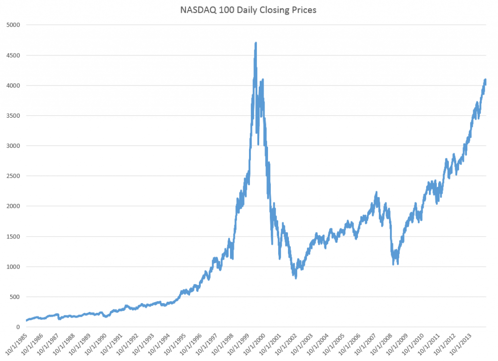
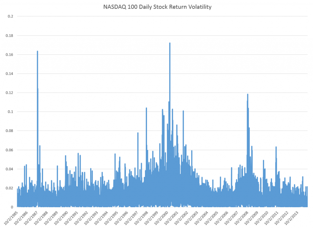
Just to position the discussion, here are graphs of the NASDAQ 100 daily closing prices and the volatility of daily returns, since October 1, 1985.

NASDAQ100new

The volatility here is calculated as the absolute value of the differences of the logarithms of the daily closing prices.

NASDAQ100V

The Holy Grail of Business Forecasting – Forecasting the Next Downturn

What if you could predict the Chicago Fed National Activity Index (CFNAI), interpolated monthly values of the growth of nominal GDP, the Aruoba-Diebold-Scotti (ADS) Business Conditions Index, and the Kansas City Financial Stress Index (KCFSI) three, five, seven, even twelve months into the future? What if your model also predicted turning points in these US indexes, and also similar macroeconomic variables for countries in Asia and the European Union? And what if you could do all this with data on monthly returns on the stock prices of companies in the financial sector?

That’s the claim of Linda Allen, Turan Bali, and Yi Tang in a fascinating 2012 paper Does Systemic Risk in the Financial Sector Predict Future Economic Downturns?

I’m going to refer to these authors as Bali et al, since it appears that Turan Bali, shown below, did some of the ground-breaking research on estimating parametric distributions of extreme losses. Bali also is the corresponding author.

T_bali

Bali et al develop a new macroindex of systemic risk that predicts future real economic downturns which they call CATFIN.

CATFIN is estimated using both value-at-risk (VaR) and expected shortfall (ES) methodologies, each of which are estimated using three approaches: one nonparametric and two different parametric specifications. All data used to construct the CATFIN measure are available at each point in time (monthly, in our analysis), and we utilize an out-of-sample forecasting methodology. We find that all versions of CATFIN are predictive of future real economic downturns as measured by gross domestic product (GDP), industrial production, the unemployment rate, and an index of eighty-five existing monthly economic indicators (the Chicago Fed National Activity Index, CFNAI), as well as other measures of real macroeconomic activity (e.g., NBER recession periods and the Aruoba-Diebold-Scott [ADS] business conditions index maintained by the Philadelphia Fed). Consistent with an extensive body of literature linking the real and financial sectors of the economy, we find that CATFIN forecasts aggregate bank lending activity.

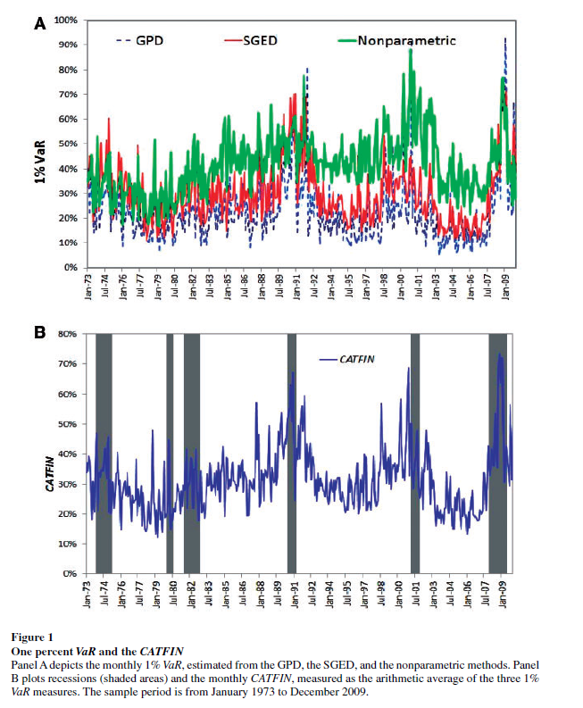
The following graphic illustrates three components of CATFIN and the simple arithmetic average, compared with US recession periods.

CATFIN

Thoughts on the Method

OK, here’s the simple explanation. First, these researchers identify US financial companies based on definitions in Kenneth French’s site at the Tuck School of Business (Dartmouth). There are apparently 500-1000 of these companies for the period 1973-2009. Then, for each month in this period, rates of return of the stock prices of these companies are calculated. Then, three methods are used to estimate 1% value at risk (VaR) – two parametric methods and one nonparametric methods. The nonparametric method is straight-forward –

The nonparametric approach to estimating VaR is based on analysis of the left tail of the empirical return distribution conducted without imposing any restrictions on the moments of the underlying density…. Assuming that we have 900 financial firms in month t , the nonparametric measure of1%VaR is the ninth lowest observation in the cross-section of excess returns. For each month, we determine the one percentile of the cross-section of excess returns on financial firms and obtain an aggregate 1% VaR measure of the financial system for the period 1973–2009.

So far, so good. This gives us the data for the graphic shown above.

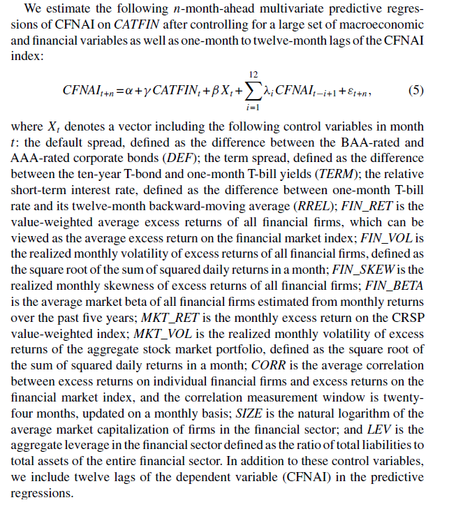
In order to make this predictive, the authors write that –

CATFINEQ

Like a lot of leading indicators, the CATFIN predictive setup “over-predicts” to some extent. Thus, there are there are five instances in which a spike in CATFIN is not followed by a recession, thereby providing a false positive signal of future real economic distress. However, the authors note that in many of these cases, predicted macroeconomic declines may have been averted by prompt policy intervention. Their discussion of this is very interesting, and plausible.

What This Means

The implications of this research are fairly profound – indicating, above all, the priority of the finance sector in leading the overall economy today. Certainly, this consistent with the balance sheet recession of 2008-2009, and probably will continue to be relevant going forward – since nothing really has changed and more concentration of ownership in finance has followed 2008-2009.

I do think that Serena Ng’s basic point in a recent review article probably is relevant – that not all recessions are the same. So it may be that this method would not work as well for, say, the period 1945-1970, before financialization of the US and global economies.

The incredibly ornate mathematics of modeling the tails of return distributions are relevant in this context, incidentally, since the nonparametric approach of looking at the empirical distributions month-by-month could be suspect because of “cherry-picking.” So some companies could be included, others excluded to make the numbers come out. This is much difficult in a complex maximum likelihood estimation process for the location parameters of these obscure distributions.

So the question on everybody’s mind is – WHAT DOES THE CATFIN MODEL INDICATE NOW ABOUT THE NEXT FEW MONTHS? Unfortunately, I am unable to answer that, although I have corresponded with some of the authors to inquire whether any research along such lines can be cited.

Bottom line – very impressive research and another example of how important science can get lost in the dance of prestige and names.

Links, end of September

Information Technology (IT)

This is how the “Shell Shock” bug imperils the whole internet

It’s a hacker’s wet dream: a software bug discovered in the practically ubiquitous computer program known as “Bash” makes hundreds of millions of computers susceptible to hijacking. The impact of this bug is likely to be higher than that of the Heartbleed bug, which was exposed in April. The National Vulnerability Database, a US government system which tracks information security flaws, gave the bug the maximum score for “Impact” and “Exploitability,” and rated it as simple to exploit.

The bug, which has been labeled “Shell Shock” by security experts, affects computers running Unix-based operating systems like Mac OS X and Linux. That means most of the internet: according to a September survey conducted by Netcraft, a British internet services company, just 13% of the busiest one million websites use Microsoft web servers. Almost everyone else likely serves their website via a Unix operating system that probably uses Bash.

Microsoft’s Bing Predicts correctly forecasted the Scottish Independence Referendum vote

Bing Predicts was beta tested in the UK for this referendum. The prediction engine uses machine-learning models to analyse and detect patterns from a range of big data sources such as the web and social activity in order to make accurate predictions about the outcome of events.

Bing got the yes/no vote right, but missed the size of the vote to stay united with England, Wales, and Northern Ireland.

Is the profession of science broken (a possible cause of the great stagnation)? Fascinating discussion which mirrors many friends’ comments that too much time is taken up applying for and administering grants, and not enough time is left for the actual research, for unconventional ideas.

What has changed is the bureaucratic culture. The increasing interpenetration of government, university, and private firms has led everyone to adopt the language, sensibilities, and organizational forms that originated in the corporate world. Although this might have helped in creating marketable products, since that is what corporate bureaucracies are designed to do, in terms of fostering original research, the results have been catastrophic.

Climate

Climate Science Is Not Settled The Wall Street Journal piece by a former Obama adviser and BP scientist inflamed the commentariat, after publication September 16, on the eve of the big climate talks and march in New York City. See On eve of climate march, Wall Street Journal publishes call to wait and do nothing for a critical perspective.

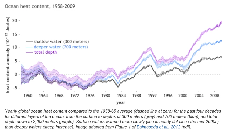
This chart, from NOAA, is one key – showing the divergence in heat stored in various layers of the oceans –

oceanheat

Nicholas Stern: The state of the climate — and what we might do about it TED talk.

Ebola

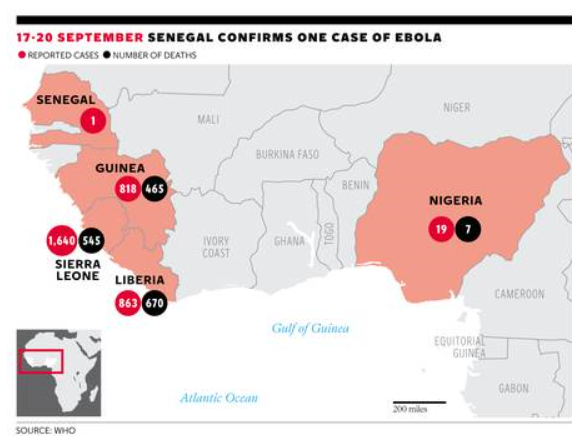
The public response to the Ebola epidemic is ramping up, but the situation is still dire and total cases and deaths are still increasing exponentially.

Ebola outbreak: Death toll passes 3,000 as WHO warns numbers are ‘vastly underestimated’

“The Ebola epidemic ravaging parts of West Africa is the most severe acute public health emergency seen in modern times.Never before in recorded history has a biosafety level four pathogen infected so many people so quickly, over such a broad geographical area, for so long.”

 ebolamap 

Global Economy

What Does a ‘Good’ Chinese Adjustment Look Like? Michael Pettis argues that what some see as a “soft landing” is in fact a preparation for later financial collapse. Instead, based on an intricate argument regarding interest rates and the nominal GDP growth rates in China, he proposes a reduction in Chinese GDP growth going forward through control of credit – in order to rebalance the Chinese consumer economy. Pettis is to my way of thinking always relevant, and often brilliant in the way he makes his analysis.

What Went Wrong? Russia Sanctions, EU, and the Way Out

Washington, Brussels and Moscow are in a vicious circle, which would spare none of them and which has potential to undermine global recovery.

Venture Capital

22 Crowdfunding Sites (and How To Choose Yours!)

inc-magazine-crowdfunding-infographic-june-2013_26652

Video Friday – Volatility

Here are a couple of short YouTube videos from Bionic Turtle on estimating a GARCH (generalized autoregressive conditional heteroskedasticity) model and the simpler exponentially weighted moving average (EWMA) model.

GARCH models are designed to capture the clustering of volatility illustrated in the preceding post.

Forecast volatility with GARCH(1,1)

The point is that the parameters of a GARCH model are estimated over historic data, so the model can be utilized prospectively, to forecast future volatility, usually in the near term.

EWMA models, insofar as they put more weight on recent values, than on values more distant back in time, also tend to capture clustering phenomena.

Here is a comparison.

EWMA versus GARCH(1,1) volatility

Several of the Bionic Turtle series on estimating financial metrics are worth checking out.

Volatility – I

Greetings, Sports Fans. I’m back from visiting with some relatives in Kent in what is still called the United Kingdom (UK). I’ve had some time to think over the blog and possible directions in the next few weeks.

I’ve not made any big decisions – except to realize there is lots more to modern forecasting research, even on an applied level, than is encapsulated in any book I know of.

But I plan several posts on volatility.

What is Volatility in Finance?

Since this blog functions as a gateway, let’s talk briefly about volatility in finance generally.

In a word, financial volatility refers to the variability of prices of financial assets.

And how do you measure this variability?

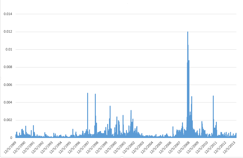
Well, by considering something like the variance of a set of prices, or time series of financial prices. For example, you might take daily closing prices of the S&P 500 Index, calculate the daily returns, and square them. This would provide a metric for the variability of the S&P 500 over a daily interval, and would give you a chart looking like the following, where I have squared the running differences of the log of the closing prices.

S&PVolatility

Clearly, prices get especially volatile just before and during periods of economic recession, when there is a clustering of higher volatility measurements.

This clustering effect is one of the two or three well-established stylized facts about financial volatility.

Can You Forecast Volatility?

This is the real question.

And, obviously, the existence of this clustering of high volatility events suggests that some forecastability does exist.

And, notice also, that we are looking at a key element of a variance of these financial prices – the other elements more or less dropping by the wayside since they add (or subtract) or divide the series in the above chart by constants.

One immediate conclusion, therefore, is that the variability of the S&P 500 daily returns is heteroscedastic, which is the opposite of the usual assumption in regression and other statistical research that a nice series to model is one in which all the variances of the errors are constant.

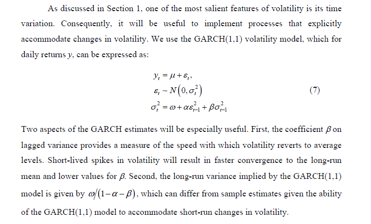
Anyway, a GARCH model, such as described in the following screen capture, is one of the most popular ways of modeling this changing variance of the volatility of financial returns.

GARCH

GARCH stands for generalized autoregressive conditional heteroscedascity, and the screen capture comes from a valuable recent work called Futures Market Volatility: What Has Changed?

The VIX Index

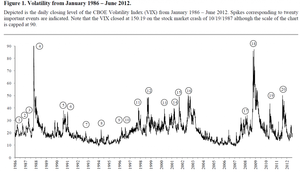
There are many related acronyms and a whole cottage industry in financial econometrics, but I want to first mention here the Chicago Board Options Exchange (CBOE) VIX or Volatility Index.

The VIX provides a measure of the implied volatility of options with a maturity of 30 days on the S&P500 index from eight different SPX option series. It therefore is a measure of the market expectation of volatility over the next 30 days. Also known as the “fear gauge,” the VIX index tends to rise in times of market turmoil and large price movements.

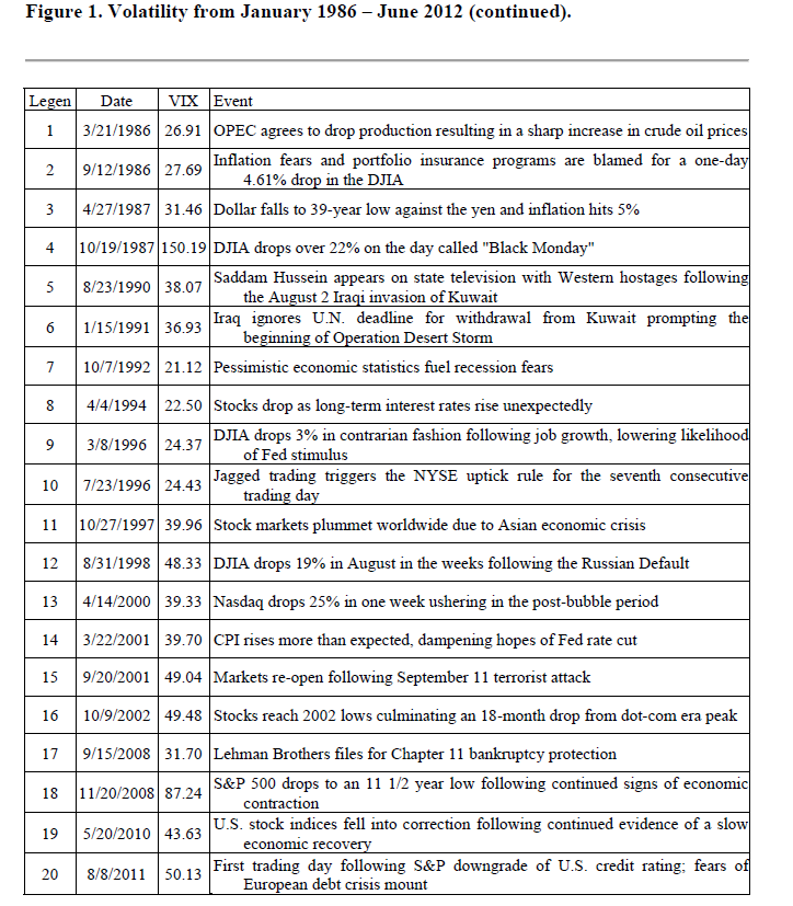
Futures Market Volatility: What Has Changed? Provides an overview of stock market volatility over time, and has an interesting accompanying table suggesting that upward spikes in the VIX are associated with unexpected macro or political developments.

volatilityhistoryThe 20-point table below is linked, of course, with the circled numbers in the chart.

Table20

Bottom Line

Obviously, if you could forcast volatility, that would probably provide useful information about the specific prediction of stock prices. Thus, I have developed models which indicate the direction of change on a one-day-ahead basis somewhat better than chance. If you could add a volatility forecast to this, you would have some idea of when a big change up or down might occur.

Similarly, forecasting the VIX might be helpful in forecasting stock market volatility generally.

At the present time, I might add, the VIX seems to have aroused itself from a slumber at low levels.

Stay tuned, and please, if you know something you would like to share, use the comments section, after you click on this particular post.

Lead graphic from Oyster Consulting

Sales and new product forecasting in data-limited (real world) contexts