Tag Archives: Big Data

Links – early July 2014

While I dig deeper on the current business outlook and one or two other issues, here are some links for this pre-Fourth of July week.

Predictive Analytics

A bunch of papers about the widsom of smaller, smarter crowds I think the most interesting of these (which I can readily access) is Identifying Expertise to Extract the Wisdom of Crowds which develops a way by eliminating poorly performing individuals from the crowd to improve the group response.

Application of Predictive Analytics in Customer Relationship Management: A Literature Review and Classification From the Proceedings of the Southern Association for Information Systems Conference, Macon, GA, USA March 21st–22nd, 2014. Some minor problems with writing English in the article, but solid contribution.

US and Global Economy

Nouriel Roubini: There’s ‘schizophrenia’ between what stock and bond markets tell you Stocks tell you one thing, but bond yields suggest another. Currently, Roubini is guardedly optimistic – Eurozone breakup risks are receding, US fiscal policy is in better order, and Japan’s aggressively expansionist fiscal policy keeps deflation at bay. On the other hand, there’s the chance of a hard landing in China, trouble in emerging markets, geopolitical risks (Ukraine), and growing nationalist tendencies in Asia (India). Great list, and worthwhile following the links.

The four stages of Chinese growth Michael Pettis was ahead of the game on debt and China in recent years and is now calling for reduction in Chinese growth to around 3-4 percent annually.

Because of rapidly approaching debt constraints China cannot continue what I characterize as the set of “investment overshooting” economic polices for much longer (my instinct suggests perhaps three or four years at most). Under these policies, any growth above some level – and I would argue that GDP growth of anything above 3-4% implies almost automatically that “investment overshooting” policies are still driving growth, at least to some extent – requires an unsustainable increase in debt. Of course the longer this kind of growth continues, the greater the risk that China reaches debt capacity constraints, in which case the country faces a chaotic economic adjustment.

Politics

Is This the Worst Congress Ever? Barry Ritholtz decries the failure of Congress to lower interest rates on student loans, observing –

As of July 1, interest on new student loans rises to 4.66 percent from 3.86 percent last year, with future rates potentially increasing even more. This comes as interest rates on mortgages and other consumer credit hovered near record lows. For a comparison, the rate on the 10-year Treasury is 2.6 percent. Congress could have imposed lower limits on student-loan rates, but chose not to.

This is but one example out of thousands of an inability to perform the basic duties, which includes helping to educate the next generation of leaders and productive citizens. It goes far beyond partisanship; it is a matter of lack of will, intelligence and ability.

Hear, hear.

Climate Change

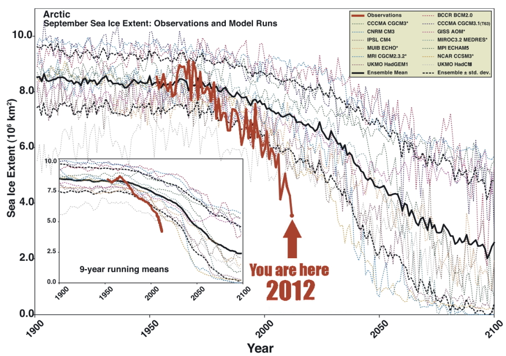
Climate news: Arctic seafloor methane release is double previous estimates, and why that matters This is a ticking time bomb. Article has a great graphic (shown below) which contrasts the projections of loss of Artic sea ice with what actually is happening – underlining that the facts on the ground are outrunning the computer models. Methane has more than an order of magnitude more global warming impact that carbon dioxide, per equivalent mass.

ArcticSeaIce

Dahr Jamail | Former NASA Chief Scientist: “We’re Effectively Taking a Sledgehammer to the Climate System”

I think the sea level rise is the most concerning. Not because it’s the biggest threat, although it is an enormous threat, but because it is the most irrefutable outcome of the ice loss. We can debate about what the loss of sea ice would mean for ocean circulation. We can debate what a warming Arctic means for global and regional climate. But there’s no question what an added meter or two of sea level rise coming from the Greenland ice sheet would mean for coastal regions. It’s very straightforward.

Machine Learning

EG

Computer simulating 13-year-old boy becomes first to pass Turing test A milestone – “Eugene Goostman” fooled more than a third of the Royal Society testers into thinking they were texting with a human being, during a series of five minute keyboard conversations.

The Milky Way Project: Leveraging Citizen Science and Machine Learning to Detect Interstellar Bubbles Combines Big Data and crowdsourcing.

Business Forecasting – Some Thoughts About Scope

In many business applications, forecasting is not a hugely complex business. For a sales forecasting, the main challenge can be obtaining the data, which may require sifting through databases compiled before and after mergers or other reorganizations. Often, available historical data goes back only three or four years, before which time product cycles make comparisons iffy. Then, typically, you plug the sales data into an automatic forecasting program, one that can assess potential seasonality, and probably employing some type of exponential smoothing, and, bang, you produce forecasts for one to several quarters going forward.

The situation becomes more complex when you take into account various drivers and triggers for sales. The customer revenues and income are major drivers, which lead into assessments of business conditions generally. Maybe you want to evaluate the chances of a major change in government policy or the legal framework – both which are classifiable under “triggers.” What if the Federal Reserve starts raising the interest rates, for example.

For many applications, a driver-trigger matrix can be useful. This is a qualitative tool for presentations to management. Essentially, it helps keep track of assumptions about the scenarios which you expect to unfold from which you can glean directions of change for the drivers – GDP, interest rates, market conditions. You list the major influences on sales in the first column. In the second column you indicate the direction of this influences (+/-) and in the third column you put in the expected direction of change, plus, minus, or no change.

The next step up in terms of complexity is to collect historical data on the drivers and triggers – “explanatory variables” driving sales in the company. This opens the way for a full-blown multivariate model of sales performance. The hitch is to make this operational, you have to forecast the explanatory variables. Usually, this is done by relying, again, on forecasts by other organizations, such as market research vendors, consensus forecasts such as available from the Survey of Professional Forecasters and so forth. Sometimes it is possible to identify “leading indicators” which can be built into multivariate models. This is really the best of all possible worlds, since you can plug in known values of drivers and get a prediction for the target variable.

The value of forecasting to a business is linked with benefits of improvements in accuracy, as well as providing a platform to explore “what-if’s,” supporting learning about the business, customers, and so forth.

With close analysis, it is often possible to improve the accuracy of sales forecasts by a few percentage points. This may not sound like much, but in a business with $100 million or more in sales, competent forecasting can pay for itself several times over in terms of better inventory management and purchasing, customer satisfaction, and deployment of resources.

Time Horizon

When you get a forecasting assignment, you soon learn about several different time horizons. To some extent, each forecasting time horizon is best approached with certain methods and has different uses.

Conventionally, there are short, medium, and long term forecasting horizons.

In general business applications, the medium term perspective of a few quarters to a year or two is probably the first place forecasting is deployed. The issue is usually the budget, and allocating resources in the organization generally. Exponential smoothing, possibly combined with information about anticipated changes in key drivers, usually works well in this context. Forecast accuracy is a real consideration, since retrospectives on the budget are a common practice. How did we do last year? What mistakes were made? How can we do better?

The longer term forecast horizons of several years or more usually support planning, investment evaluation, business strategy. The M-competitions suggest the issue has to be being able to pose and answer various “what-if’s,” rather than achieving a high degree of accuracy. Of course, I refer here to the finding that forecast accuracy almost always deteriorates in direct proportion to the length of the forecast horizon.

Short term forecasting of days, weeks, a few months is an interesting application. Usually, there is an operational focus. Very short term forecasting in terms of minutes, hours, days is almost strictly a matter of adjusting a system, such as generating electric power from a variety of sources, i.e. combining hydro and gas fired turbines, etc.

As far as techniques, short term forecasting can get sophisticated and mathematically complex. If you are developing a model for minute-by-minute optimization of a system, you may have several months or even years of data at your disposal. There are, thus, more than a half a million minutes in a year.

Forecasting and Executive Decisions

The longer the forecasting horizon, the more the forecasting function becomes simply to “inform judgment.”

A smart policy for an executive is to look at several forecasts, consider several sources of information, before determining a policy or course of action. Management brings judgment to bear on the numbers. It’s probably not smart to just take the numbers on blind faith. Usually, executives, if they pay attention to a presentation, will insist on a coherent story behind the model and the findings, and also checking the accuracy of some points. Numbers need to compute. Round-off-errors need to be buried for purposes of the presentation. Everything should add up exactly.

As forecasts are developed for shorter time horizons and more for direct operation control of processes, acceptance and use of the forecast can become more automatic. This also can be risky, since developers constantly have to ask whether the output of the model is reasonable, whether the model is still working with the new data, and so forth.

Shiny New Techniques

The gap between what is theoretically possible in data analysis and what is actually done is probably widening. Companies enthusiastically take up the “Big Data” mantra – hiring “Chief Data Scientists.” I noticed with amusement an article in a trade magazine quoting an executive who wondered whether hiring a data scientist was something like hiring a unicorn.

There is a lot of data out there, more all the time. More and more data is becoming accessible with expansion of storage capabilities and of course storage in the cloud.

And really the range of new techniques is dazzling.

I’m thinking, for example, of bagging and boosting forecast models. Or of the techniques that can be deployed for the problem of “many predictors,” techniques including principal component analysis, ridge regression, the lasso, and partial least squares.

Probably one of the areas where these new techniques come into their own is in target marketing. Target marketing is kind of a reworking of forecasting. As in forecasting sales generally, you identify key influences (“drivers and triggers”) on the sale of a product, usually against survey data or past data on customers and their purchases. Typically, there is a higher degree of disaggregation, often to the customer level, than in standard forecasting.

When you are able to predict sales to a segment of customers, or to customers with certain characteristics, you then are ready for the sales campaign to this target group. Maybe a pricing decision is involved, or development of a product with a particular mix of features. Advertising, where attitudinal surveys supplement customer demographics and other data, is another key area.

Related Areas

Many of the same techniques, perhaps with minor modifications, are applicable to other areas for what has come to be called “predictive analytics.”

The medical/health field has a growing list of important applications. As this blog tries to show, quantitative techniques, such as logistic regression, have a lot to offer medical diagnostics. I think the extension of predictive analytics to medicine and health care ism at this point, merely a matter of access to the data. This is low-hanging fruit. Physicians diagnosing a guy with an enlarged prostate and certain PSA and other metrics should be able to consult a huge database for similarities with respect to age, health status, collateral medical issues and so forth. There is really no reason to suspect that normally bright, motivated people who progress through medical school and come out to practice should know the patterns in 100,000 medical records of similar cases throughout the nation, or have read all the scientific articles on that particular niche. While there are technical and interpretive issues, I think this corresponds well to what Nate Silver identifies as promising – areas where application of a little quantitative analysis and study can reap huge rewards.

And cancer research is coming to be closely allied with predictive analytics and data science. The paradigmatic application is the DNA assay, where a sample of a tumor is compared with healthy tissue from the same individual to get an idea of what cancer configuration is at play. Indeed, at that fine new day when big pharma will develop hundreds of genetically targeted therapies for people with a certain genetic makeup with a certain cancer – when that wonderful new day comes – cancer treatment may indeed go hand in hand with mathematical analysis of the patient’s makeup.

Microsoft Stock Prices and the Laplace Distribution

The history of science, like the history of all human ideas, is a history of irresponsible dreams, of obstinacy, and of error. But science is one of the very few human activities perhaps the only one in which errors are systematically criticized and fairly often, in time, corrected. This is why we can say that, in science, we often learn from our mistakes, and why we can speak clearly and sensibly about making progress there. — Karl Popper, Conjectures and Refutations

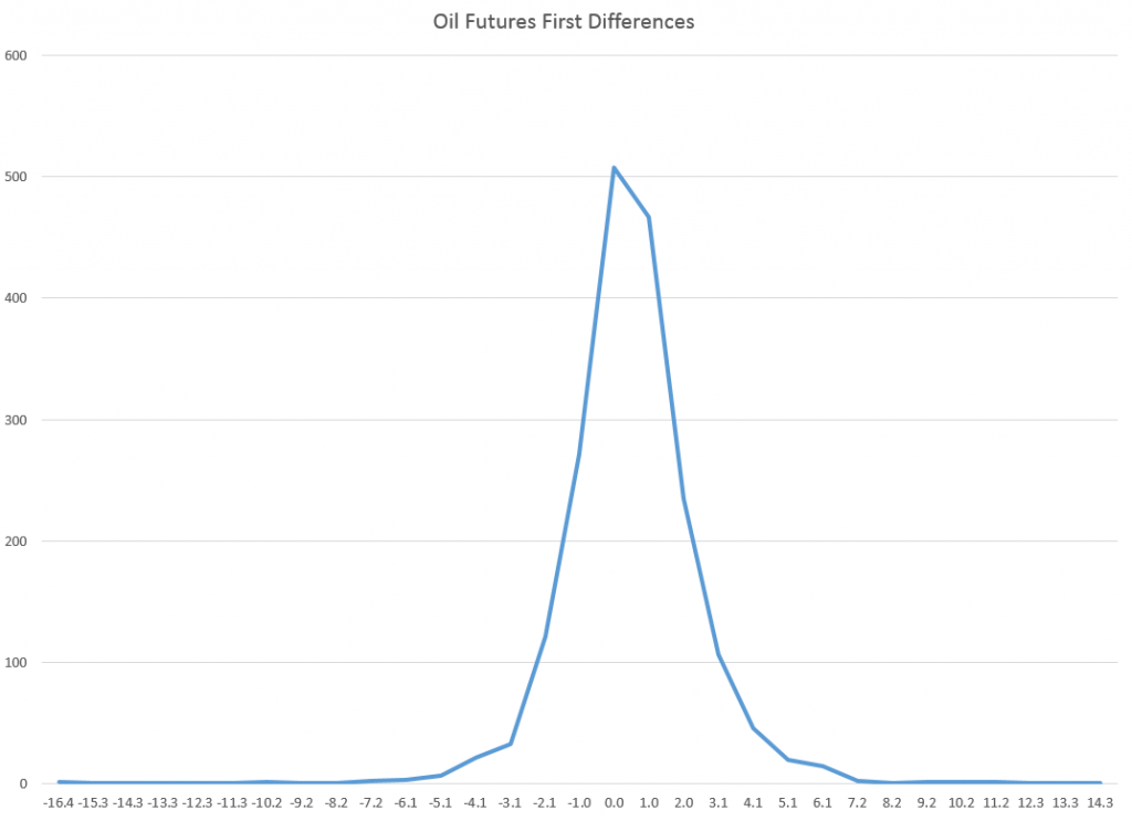
Microsoft daily stock prices and oil futures seem to fall in the same class of distributions as those for the S&P 500 and NASDAQ 100 – what I am calling the Laplace distribution.

This is contrary to the conventional wisdom. The whole thrust of Box-Jenkins time series modeling seems to be to arrive at Gaussian white noise. Most textbooks on econometrics prominently feature normally distributed error processes ~ N(0,σ).

Benoit Mandelbrot, of course, proposed alternatives as far back as the 1960’s, but still we find aggressive application of Gaussian assumptions in applied work – as for example in widespread use of the results of the Black-Scholes theorem or in computing value at risk in portfolios.

Basic Steps

I’m taking a simple approach.

First, I collect daily closing prices for a stock index, stock, or, as you will see, for commodity futures.

Then, I do one of two things: (a) I take the natural logarithms of the daily closing prices, or (b) I simply calculate first differences of the daily closing prices.

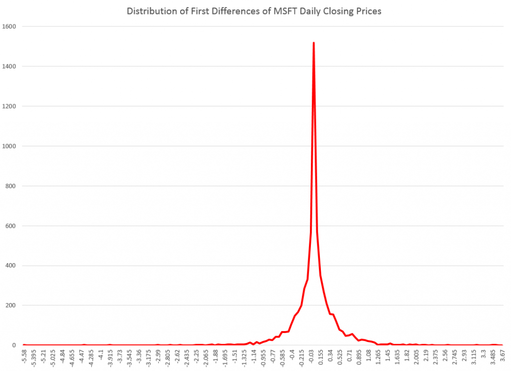
I did not favor option (b) initially, because I can show that the first differences, in every case I have looked at, are autocorrelated at various lags. In other words, these differences have an algorithmic structure, although this structure usually has weak explanatory power.

However, it is interesting that the first differences, again in every case I have looked at, are distributed according to one of these sharp-peaked or pointy distributions which are highly symmetric.

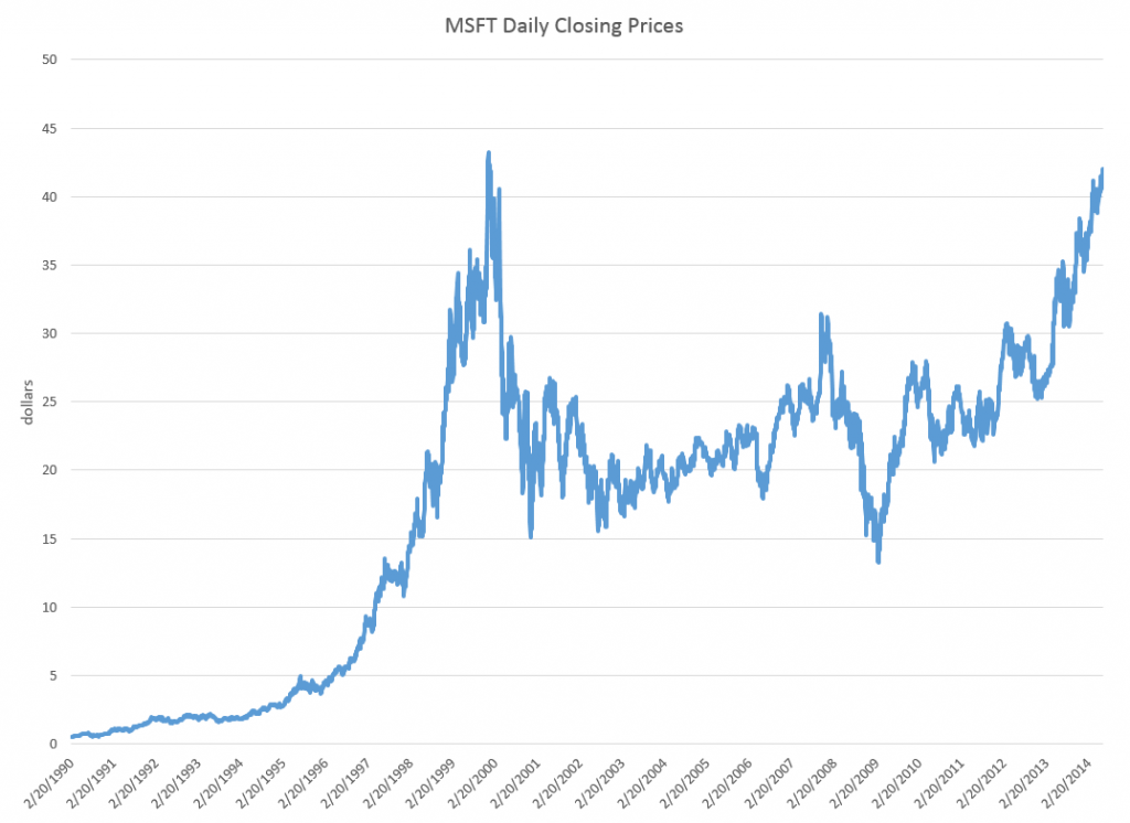
Take the daily closing prices of the stock of the Microsoft Corporation (MST), as an example.

Here is a graph of the daily closing prices.

MSFTgraph

And here is a histogram of the raw first differences of those closing prices over this period since 1990.

rawdifMSFT

Now in close reading of The Laplace Distribution and Generalizations I can see there are a range of possibilities in modeling distributions of the above type.

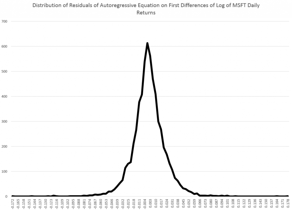
And here is another peaked, relatively symmetric distribution based on the residuals of an autoregressive equation calculated on the first differences of the logarithm of the daily closing prices. That’s a mouthful, but the idea is to extract at least some of the algorithmic component of the first differences.

MSFTregreshisto

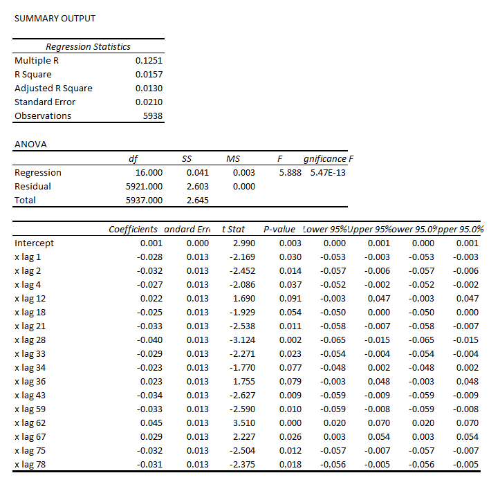
That regression is as follows.

MSFTreg

Note the deep depth of the longest lags.

This type of regression, incidentally, makes money in out-of-sample backcasts, although possibly not enough to exceed trading costs unless the size of the trade is large. However, it’s possible that some advanced techniques, such as bagging and boosting, regression trees and random forecasts could enhance the profitability of trading strategies.

Well, a quick look at daily oil futures (CLQ4) from 2007 to the present.

oilfutures

Not quite as symmetric, but still profoundly not a Gaussian distribution.

The Difference It Makes

I’ve got to go back and read Mandelbrot carefully on his analysis of stock and commodity prices. It’s possible that these peaked distributions all fit in a broad class including the Laplace distribution.

But the basic issue here is that the characteristics of these distributions are substantially different than the Gaussian or normal probability distribution. This would affect maximum likelihood estimation of parameters in models, and therefore could affect regression coefficients.

Furthermore, the risk characteristics of assets whose prices have these distributions can be quite different.

And I think there is a moral here about the conventional wisdom and the durability of incorrect ideas.

Top pic is Karl Popper, the philosopher of science

Data Analytics Reverses Grandiose Claims for California’s Monterey Shale Formation

In May, “federal officials” contacted the Los Angeles Times with advance news of a radical revision of estimates of reserves in the Monterey Formation,

Just 600 million barrels of oil can be extracted with existing technology, far below the 13.7 billion barrels once thought recoverable from the jumbled layers of subterranean rock spread across much of Central California, the U.S. Energy Information Administration said.

The LA Times continues with a bizarre story of how “an independent firm under contract with the government” made the mistake of assuming that deposits in the Monterey Shale formation were as easily recoverable as those found in shale formations elsewhere.

There was a lot more too, such as the information that –

The Monterey Shale formation contains about two-thirds of the nation’s shale oil reserves. It had been seen as an enormous bonanza, reducing the nation’s need for foreign oil imports through the use of the latest in extraction techniques, including acid treatments, horizontal drilling and fracking…

The estimate touched off a speculation boom among oil companies.

Well, I’ve combed the web trying to find more about this “mistake,” deciding that, probably, it was the analysis of David Hughes in “Drilling California,” released in March of this year, that turned the trick.

Hughes – a geoscientist working decades with the Geological Survey of Canada – utterly demolishes studies which project 15 billion barrels in reserve in the Monterey Formation. And he does this by analyzing an extensive database (Big Data) of wells drilled in the Formation.

The video below is well worth the twenty minutes or so. It’s a tour de force of data analysis, but it takes a little patience at points.

First, though, check out a sample of the hype associated with all this, before the overblown estimates were retracted.

Monterey Shale: California’s Trillion-Dollar Energy Source

Here’s a video on Hughes’ research in Drilling California

Finally, here’s the head of the US Energy Information Agency in December 2013, discussing a preliminary release of figures in the 2014 Energy Outlook, also released in May 2014.

Natural Gas 2014 Projections by the EIA’s Adam Sieminski

One question is whether the EIA projections eventually will be acknowledged to be affected by a revision of reserves for a formation that is thought to contain two thirds of all shale oil in the US.

Bayesian Methods in Forecasting and Data Analysis

The basic idea of Bayesian methods is outstanding. Here is a way of incorporating prior information into analysis, helping to manage, for example, small samples that are endemic in business forecasting.

What I am looking for, in the coming posts on this topic, is what difference does it make.

Bayes Theorem

Just to set the stage, consider the simple statement and derivation of Bayes Theorem –

BayesThm

Here A and B are events or occurrences, and P(.) is the probability (of the argument . ) function. So P(A) is the probability of event A. And P(A|B) is the conditional probability of event A, given that event B has occurred.

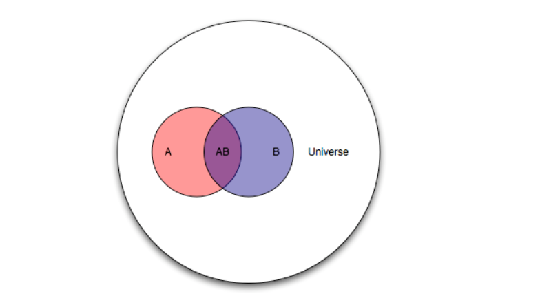
A Venn diagram helps.

Venn

Here, there is the universal set U, and the two subsets A and B. The diagram maps some type of event or belief space. So the probability of A or P(A) is the ratio of the areas A and U.

Then, the conditional probability of the occurrence of A, given the occurrence of B is the ratio of the area labeled AB to the area labeled B in the diagram. Also area AB is the intersection of the areas A and B or A ∩ B in set theory notation. So we have P(A|B)=P(A ∩ B)/P(B).

By the same logic, we can create the expression for P(B|A) = P(B ∩ A)/P(A).

Now to be mathematically complete here, we note that intersection in set theory is commutative, so A ∩ B = B ∩ A, and thus P(A ∩ B)=P(B|A)•P(A). This leads to the initially posed formulation of Bayes Theorem by substitution.

So Bayes Theorem, in its simplest terms, follows from the concept or definition of conditional probability – nothing more.

Prior and Posterior Distributions and the Likelihood Function

With just this simple formulation, one can address questions that are essentially what I call “urn problems.” That is, having drawn some number of balls of different colors from one of several sources (urns), what is the probability that the combination of, say, red and white balls drawn comes from, say, Urn 2? Some versions of even this simple setup seem to provide counter-intuitive values for the resulting P(A|B).

But I am interested primarily in forecasting and data analysis, so let me jump ahead to address a key interpretation of the Bayes Theorem.

Thus, what is all this business about prior and posterior distributions, and also the likelihood function?

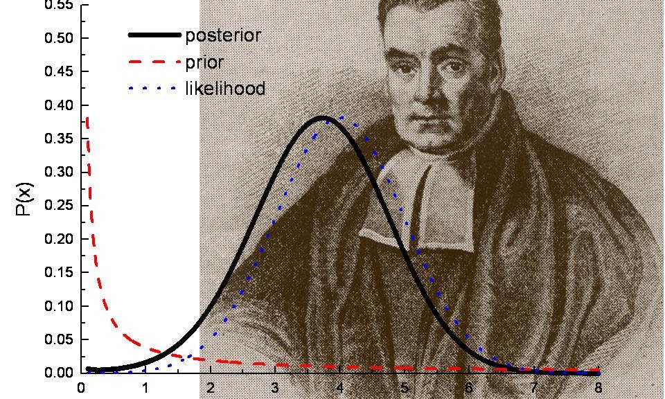
Well, considering Bayes Theorem as a statement of beliefs or subjective probabilities, P(A) is the prior distribution, and P(A|B) is the posterior distribution, or the probability distribution that follows revelation of the facts surrounding event (or group of events) B.

P(B|A) then is the likelihood function.

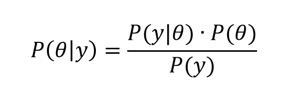
Now all this is more understandable, perhaps, if we reframe Bayes rule in terms of data y and parameters θ of some statistical model.

So we have

Bayes2

In this case, we have some data observations {y1, y2,…,yn}, and can have covariates x={x1,..,xk}, which could be inserted in the conditional probability of the data, given the parameters on the right hand side of the equation, as P(y|θ,x).

In any case, clear distinctions between the Bayesian and frequentist approach can be drawn with respect to the likelihood function P(y|θ).

So the frequentist approach focuses on maximizing the likelihood function with respect to the unknown parameters θ, which of course can be a vector of several parameters.

As one very clear overview says,

One maximizes the likelihood function L(·) with respect the parameters to obtain the maximum likelihood estimates; i.e., the parameter values most likely to have produced the observed data. To perform inference about the parameters, the frequentist recognizes that the estimated parameters ˆ result from a single sample, and uses the sampling distribution to compute standard errors, perform hypothesis tests, construct confidence intervals, and the like..

In the Bayesian perspective, the unknown parameters θ are treated as random variables, while the observations y are treated as fixed in some sense.

The focus of attention is then on how the observed data y changes the prior distribution P(θ) into the posterior distribution P(y|θ).

The posterior distribution, in essence, translates the likelihood function into a proper probability distribution over the unknown parameters, which can be summarized just as any probability distribution; by computing expected values, standard deviations, quantiles, and the like. What makes this possible is the formal inclusion of prior information in the analysis.

One difference then is that the frequentist approach optimizes the likelihood function with respect to the unknown parameters, while the Bayesian approach is more concerned with integrating the posterior distribution to obtain values for key metrics and parameters of the situation, after data vector y is taken into account.

Extracting Parameters From the Posterior Distribution

The posterior distribution, in other words, summarizes the statistical model of a phenomenon which we are analyzing, given all the available information.

That sounds pretty good, but the issue is that the result of all these multiplications and divisions on the right hand side of the equation can lead to a posterior distribution which is difficult to evaluate. It’s a probability distribution, for example, and thus some type of integral equation, but there may be no closed form solution.

Prior to Big Data and the muscle of modern computer computations, Bayesian statisticians spent a lot of time and energy searching out conjugate prior’s. Wikipedia has a whole list of these.

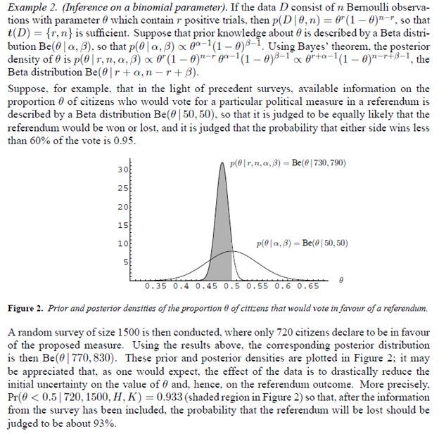
So the Beta distribution is a conjugate prior for a Bernoulli distribution – the familiar probability p of success and probability q of failure model (like coin-flipping, when p=q=0.5). This means simply that multiplying a Bernoulli likelihood function by an appropriate Beta distribution leads to a posterior distribution that is again a Beta distribution, and which can be integrated and, also, which supports a sort of loop of estimation with existing and then further data.

Here’s an example and prepare yourself for the flurry of symbolism –

BayesexampleB

Note the update of the distribution of whether the referendum is won or lost results in a much sharper distribution and increase in the probability of loss of the referendum.

Monte Carlo Methods

Stanislaus Ulam, along with John von Neumann, developed Monte Carlo simulation methods to address what might happen if radioactive materials were brought together in sufficient quantities and with sufficient emissions of neutrons to achieve a critical mass. That is, researchers at Los Alamos at the time were not willing to simply experiment to achieve this effect, and watch the unfolding.

Monte Carlo computation methods, thus, take complicated mathematical relationships and calculate final states or results from random assignments of values of the explanatory variables.

Two algorithms—the Gibbs sampling and Metropolis-Hastings algorithms— are widely used for applied Bayesian work, and both are Markov chain Monte Carlo methods.

The Markov chain aspect of the sampling involves selection of the simulated values along a path determined by prior values that have been sampled.

The object is to converge on the key areas of the posterior distribution.

The Bottom Line

It has taken me several years to comfortably grasp what is going on here with Bayesian statistics.

The question, again, is what difference does it make in forecasting and data analysis? And, also, if it made a difference in comparison with a frequentist interpretation or approach, would that be an entirely good thing?

A lot of it has to do with a reorientation of perspective. So some of the enthusiasm and combative qualities of Bayesians seems to come from their belief that their system of concepts is simply the only coherent one.

But there are a lot of medical applications, including some relating to trials of new drugs and procedures. What goes there? Is the representation that it is not necessary to take all this time required by the FDA to test a drug or procedure, when we can access prior knowledge and bring it to the table in evaluating outcomes?

Or what about forecasting applications? Is there something more productive about some Bayesian approaches to forecasting – something that can be measured in, for example, holdout samples or the like? Or I don’t know whether that violates the spirit of the approach – holdout samples.

I’m planning some posts on this topic. Let me know what you think.

Top picture from Los Alamos laboratories

Daily Updates on Whether Key Financial Series Are Going Into Bubble Mode

Financial and asset bubbles are controversial, amazingly enough, in standard economics, where a bubble is defined as a divergence in a market from fundamental value. The problem, of course, is what is fundamental value. Maybe investors in the dot.com frenzy of the late 1990’s believed all the hype about never-ending and accelerating growth in IT, as a result of the Internet.

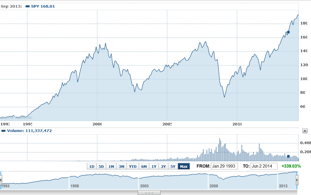
So we have this chart for the ETF SPY which tracks the S&P500. Now, there are similarities between the upswing of the two previous peaks – which both led to busts – and the current surge in the index.

sp500yahoo

Where is this going to end?

Well, I’ve followed the research of Didier Sornette and his co-researchers, and, of course, Sornette’s group has an answer to this question, which is “probably not well.” Currently, Professor Sornette occupies the Chair of Entreprenuerial Risk at the Swiss Federal Institute of Technology in Zurich.

There is an excellent website maintained by ETH Zurich for the theory and empirical analysis of financial bubbles.

Sornette and his group view bubbles from a more mathematical perspective, finding similarities in bubbles of durations from months to years in the concept of “faster than exponential growth.” At some point, that is, asset prices embark on this type of trajectory. Because of various feedback mechanisms in financial markets, as well as just herding behavior, asset prices in bubble mode oscillate around an accelerating trajectory which – at some point that Sornette claims can be identified mathematically – becomes unsupportable. At such a moment, there is a critical point where the probability of a collapse or reversal of the process becomes significantly greater.

This group is on the path of developing a new science of asset bubbles, if you will.

And, by this logic, there are positive and negative bubbles.

The sharp drop in stock prices in 2008, for example, represents a negative stock market bubble movement, and also is governed or described, by this theory, by an underlying differential equation. This differential equation leads to critical points, where the probability of reversal of the downward price movement is significantly greater.

I have decided I am going to compute the full price equation suggested by Sornette and others to see what prediction for a critical point emerges for the S&P 500 or SPY.

But actually, this would be for my own satisfaction, since Sornette’s group already is doing this in the Financial Crisis Observatory.

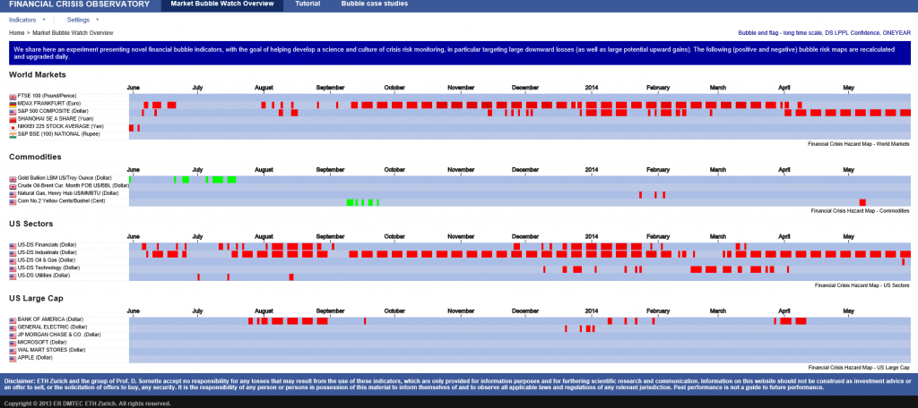
I hope I am not violating Swiss copyright rules by showing the following image of the current Financial Crisis Observatory page (click to enlarge)

FCO

As you notice there are World Markets, Commodities, US Sectors, US Large Cap categories and little red and green boxes scattered across the page, by date.

The red boxes indicate computations by the ETH Zurich group that indicate the financial series in question is going into bubble mode. This is meant as a probabilistic evaluation and is accompanied by metrics which indicate the likelihood of a critical point. These computations are revised daily, according to the site.

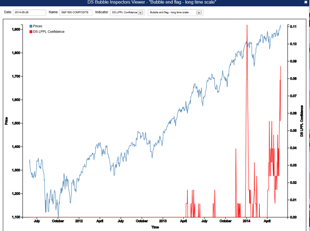
For example, there is a red box associated with the S&P 500 in late May. If you click on this red box, you  produces the following chart.

SornetteSP500

The implication is that the highest red spike in the chart at the end of December 2013 is associated with a reversal in the index, and also that one would be well-advised to watch for another similar spike coming up.

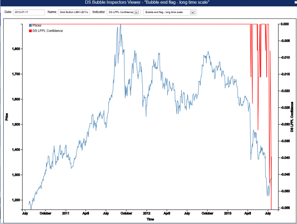
Negative bubbles, as I mention, also are in the lexicon. One of the green boxes for gold, for example, produces the following chart.

Goldnegbubble

This is fascinating stuff, and although Professor Sornette has gotten some media coverage over the years, even giving a TED talk recently, the economics profession generally seems to have given him almost no attention.

I plan a post on this approach with a worked example. It certainly is much more robust that some other officially sanctioned approaches.

Leading Indicators

One value the forecasting community can provide is to report on the predictive power of various leading indicators for key economic and business series.

The Conference Board Leading Indicators

The Conference Board, a private, nonprofit organization with business membership, develops and publishes leading indicator indexes (LEI) for major national economies. Their involvement began in 1995, when they took over maintaining Business Cycle Indicators (BCI) from the US Department of Commerce.

For the United States, the index of leading indicators is based on ten variables: average weekly hours, manufacturing,  average weekly initial claims for unemployment insurance, manufacturers’ new orders, consumer goods and materials, vendor performance, slower deliveries diffusion index,manufacturers’ new orders, nondefense capital goods, building permits, new private housing units, stock prices, 500 common stocks, money supply, interest rate spread, and an index of consumer expectations.

The Conference Board, of course, also maintains coincident and lagging indicators of the business cycle.

This list has been imprinted on the financial and business media mind, and is a convenient go-to, when a commentator wants to talk about what’s coming in the markets. And it used to be that a rule of thumb that three consecutive declines in the Index of Leading Indicators over three months signals a coming recession. This rule over-predicts, however, and obviously, given the track record of economists for the past several decades, these Conference Board leading indicators have questionable predictive power.

Serena Ng Research

What does work then?

Obviously, there is lots of research on this question, but, for my money, among the most comprehensive and coherent is that of Serena Ng, writing at times with various co-authors.

SerenaNg

So in this regard, I recommend two recent papers

Boosting Recessions

Facts and Challenges from the Great Recession for Forecasting and Macroeconomic Modeling

The first paper is most recent, and is a talk presented before the Canadian Economic Association (State of the Art Lecture).

Hallmarks of a Serena Ng paper are coherent and often quite readable explanations of what you might call the Big Picture, coupled with ambitious and useful computation – usually reporting metrics of predictive accuracy.

Professor Ng and her co-researchers apparently have determined several important facts about predicting recessions and turning points in the business cycle.

For example –

  1. Since World War II, and in particular, over the period from the 1970’s to the present, there have been different kinds of recessions. Following Ng and Wright, ..business cycles of the 1970s and early 80s are widely believed to be due to supply shocks and/or monetary policy. The three recessions since 1985, on the other hand, originate from the financial sector with the Great Recession of 2008-2009 being a full-blown balance sheet recession. A balance sheet recession involves, a sharp increase in leverage leaves the economy vulnerable to small shocks because, once asset prices begin to fall, financial institutions, firms, and households all attempt to deleverage. But with all agents trying to increase savings simultaneously, the economy loses demand, further lowering asset prices and frustrating the attempt to repair balance sheets. Financial institutions seek to deleverage, lowering the supply of credit. Households and firms seek to deleverage, lowering the demand for credit.
  2. Examining a monthly panel of 132 macroeconomic and financial time series for the period 1960-2011, Ng and her co-researchers find that .. the predictor set with systematic and important predictive power consists of only 10 or so variables. It is reassuring that most variables in the list are already known to be useful, though some less obvious variables are also identified. The main finding is that there is substantial time variation in the size and composition of the relevant predictor set, and even the predictive power of term and risky spreads are recession specific. The full sample estimates and rolling regressions give confidence to the 5yr spread, the Aaa and CP spreads (relative to the Fed funds rate) as the best predictors of recessions.

So, the yield curve, a old favorite when it comes to forecasting recessions or turning points in the business cycle, performs less well in the contemporary context – although other (limited) research suggests that indicators combining facts about the yield curve with other metrics might be helpful.

And this exercise shows that the predictor set for various business cycles changes over time, although there are a few predictors that stand out. Again,

there are fewer than ten important predictors and the identity of these variables change with the forecast horizon. There is a distinct difference in the size and composition of the relevant predictor set before and after mid-1980. Rolling window estimation reveals that the importance of the term and default spreads are recession specific. The Aaa spread is the most robust predictor of recessions three and six months ahead, while the risky bond and 5yr spreads are important for twelve months ahead predictions. Certain employment variables have predictive power for the two most recent recessions when the interest rate spreads were uninformative. Warning signals for the post 1990 recessions have been sporadic and easy to miss.

Let me throw in my two bits here, before going on in subsequent posts to consider turning points in stock markets and in more micro-focused or industry time series.

At the end of “Boosting Recessions” Professor Ng suggests that higher frequency data may be a promising area for research in this field.

My guess is that is true, and that, more and more, Big Data and data analytics from machine learning will be applied to larger and more diverse sets of macroeconomics and business data, at various frequencies.

This is tough stuff, because more information is available today than in, say, the 1970’s or 1980’s. But I think we know what type of recession is coming – it is some type of bursting of the various global bubbles in stock markets, real estate, and possibly sovereign debt. So maybe more recent data will be highly relevant.

The “Hollowing Out” of Middle Class America

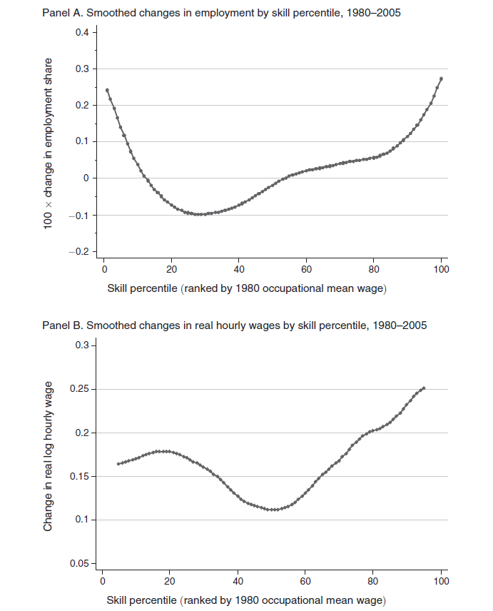
Two charts in a 2013 American Economic Review (AER) article put numbers to the “hollowing out” of middle class America – a topic celebrated with profuse anecdotes in the media.

Autor1

The top figure shows the change in employment 1980-2005 by skill level, based on Census IPUMS and American Community Survey (ACS) data. Occupations are ranked by skill level, approximated by wages in each occupation in 1980.

The lower figure documents the changes in wages of these skill levels 1980-2005.

These charts are from David Autor and David Dorn – The Growth of Low-Skill Service Jobs and the Polarization of the US Labor Market – who write that,

Consistent with the conventional view of skill-biased technological change, employment growth is differentially rapid in occupations in the upper two skill quartiles. More surprising in light of the canonical model are the employment shifts seen below the median skill level. While occupations in the second skill quartile fell as a share of employment, those in the lowest skill quartile expanded sharply. In net, employment changes in the United States during this period were strongly U-shaped in skill level, with relative employment declines in the middle of the distribution and relative gains at the tails. Notably, this pattern of employment polarization is not unique to the United States. Although not recognized until recently, a similar “polarization” of employment by skill level has been underway in numerous industrialized economies in the last 20 to 30 years.

So, employment and wage growth has been fastest in the past three or so decades (extrapolating to the present) in low skill and high skill occupations.

Among lower skill occupations, such as food service workers, security guards, janitors and gardeners, cleaners, home health aides, child care workers, hairdressers and beauticians, and recreational workers, employment grew 30 percent 1980-2005.

Among the highest paid occupations – classified as managers, professionals, technicians, and workers in finance, and public safety – the share of employment also grew by about 30 percent, but so did wages – which increased at about double the pace of the lower skill occupations over this period.

Professor Autor is in the MIT economics department, and seems to be the nexus of a lot of interesting research casting light on changes in US labor markets.

DavidAutor

In addition to “doing Big Data” as the above charts suggest, David Autor is closely associated with a new, common sense model of production activities, based on tasks and skills.

This model of the production process, enables Autor and his coresearchers to conclude that,

…recent technological developments have enabled information and communication technologies to either directly perform or permit the offshoring of a subset of the core job tasks previously performed by middle skill workers, thus causing a substantial change in the returns to certain types of skills and a measurable shift in the assignment of skills to tasks.

So it’s either a computer (robot) or a Chinaman who gets the middle-class bloke’s job these days.

And to drive that point home – (and, please, I consider the achievements of the PRC in lifting hundreds of millions out of extreme poverty to be of truly historic dimension) Autor with David Dorn and Gordon Hansen publihsed another 2013 article in the AER titled The China Syndrome: Local Labor Market Effects of Import Competition in the United States.

This study analyzes local labor markets and trade shocks to these markets, according to initial patterns of industry specialization.

The findings are truly staggering – or at least have been equivocated or obfuscated for years by special pleaders and lobbyists.

Dorn et al write,

The value of annual US goods imports from China increased by a staggering 1,156 percent from 1991 to 2007, whereas US exports to China grew by much less…. 

Our analysis finds that exposure to Chinese import competition affects local labor markets not just through manufacturing employment, which unsurprisingly is adversely affected, but also along numerous other margins. Import shocks trigger a decline in wages that is primarily observed outside of the manufacturing sector. Reductions in both employment and wage levels lead to a steep drop in the average earnings of households. These changes contribute to rising transfer payments through multiple federal and state programs, revealing an important margin of adjustment to trade that the literature has largely overlooked,

This research – conducted in terms of ordinary least squares (OLS), two stage least squares (2SLS) as well as “instrumental” regressions – is definitely not something a former trade unionist is going to ponder in the easy chair after work at the convenience store. So it’s kind of safe in terms of arousing the ire of the masses.

But I digress.

For my purposes here, Autor and his co-researchers put pieces of the puzzle in place so we can see the picture.

The US occupational environment has changed profoundly since the 1980’s. Middle class jobs have simply vanished over large parts of the landscape. More specifically, good-paying production jobs, along with a lot of other more highly paid, but routinized work, has been the target of outsourcing, often to China it seems it can be demonstrated. Higher paid work by professionals in business and finance benefits from complementarities with the advances in data processing and information technology (IT) generally. In addition, there are a small number of highly paid production workers whose job skills have been updated to run more automated assembly operations which seem to be the chief beneficiaries of new investment in production in the US these days.

There you have it.

Market away, and include these facts in any forecasts you develop for the US market.

Of course, there are issues of dynamics.

Jobs and the Next Wave of Computerization

A duo of researchers from Oxford University (Frey and Osborne) made a splash with their analysis of employment and computerization in the US (English spelling). Their research, released September of last year, projects that –

47 percent of total US employment is in the high risk category, meaning that associated occupations are potentially automatable over some unspecified number of years, perhaps a decade or two..

Based on US Bureau of Labor Statistics (BLS) classifications from O*NET Online, their model predicts that most workers in transportation and logistics occupations, together with the bulk of office and administrative support workers, and labour in production occupations, are at risk.

This research deserves attention, if for no other reason than masterful discussions of the impact of technology on employment and many specific examples of new areas for computerization and automation.

For example, I did not know,

Oncologists at Memorial Sloan-Kettering Cancer Center are, for example, using IBM’s Watson computer to provide chronic care and cancer treatment diagnostics. Knowledge from 600,000 medical evidence reports, 1.5 million patient records and clinical trials, and two million pages of text from medical journals, are used for benchmarking and pattern recognition purposes. This allows the computer to compare each patient’s individual symptoms, genetics, family and medication history, etc., to diagnose and develop a treatment plan with the highest probability of success..

There are also specifics of computerized condition monitoring and novelty detection -substituting for closed-circuit TV operators, workers examining equipment defects, and clinical staff in intensive care units.

A followup Atlantic Monthly article – What Jobs Will the Robots Take? – writes,

We might be on the edge of a breakthrough moment in robotics and artificial intelligence. Although the past 30 years have hollowed out the middle, high- and low-skill jobs have actually increased, as if protected from the invading armies of robots by their own moats. Higher-skill workers have been protected by a kind of social-intelligence moat. Computers are historically good at executing routines, but they’re bad at finding patterns, communicating with people, and making decisions, which is what managers are paid to do. This is why some people think managers are, for the moment, one of the largest categories immune to the rushing wave of AI.

Meanwhile, lower-skill workers have been protected by the Moravec moat. Hans Moravec was a futurist who pointed out that machine technology mimicked a savant infant: Machines could do long math equations instantly and beat anybody in chess, but they can’t answer a simple question or walk up a flight of stairs. As a result, menial work done by people without much education (like home health care workers, or fast-food attendants) have been spared, too.

What Frey and Osborne at Oxford suggest is an inflection point, where machine learning (ML) and what they call mobile robotics (MR) have advanced to the point where new areas for applications will open up – including a lot of menial, service tasks that were not sufficiently routinized for the first wave.

In addition, artificial intelligence (AI) and Big Data algorithms are prying open up areas formerly dominated by intellectual workers.

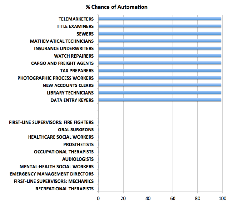
The Atlantic Monthly article cited above has an interesting graphic –

jobsautomationSo at the top of this chart are the jobs which are at 100 percent risk of being automated, while at the bottom are jobs which probably will never be automated (although I do think counseling can be done to a certain degree by AI applications).

The Final Frontier

This blog focuses on many of the relevant techniques in machine learning – basically unsupervised learning of patterns – which in the future will change everything.

Driverless cars are the wow example, of course.

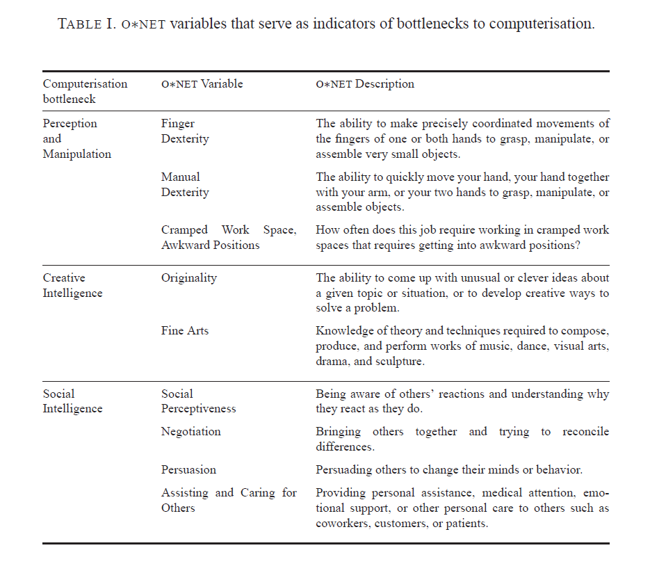
Bottlenecks to moving further up the curve of computerization are highlighted in the following table from the Oxford U report.

ONETvars

As far as dexterity and flexibility goes, Baxter shows great promise, as the following YouTube from his innovators illustrates.

There also are some wonderful examples of apparent creativity by computers or automatic systems, which I plan to detail in a future post.

Frey and Osborn, reflecting on their research in a 2014 discussion, conclude

So, if a computer can drive better than you, respond to requests as well as you and track down information better than you, what tasks will be left for labour? Our research suggests that human social intelligence and creativity are the domains were labour will still have a comparative advantage. Not least, because these are domains where computers complement our abilities rather than substitute for them. This is because creativity and social intelligence is embedded in human values, meaning that computers would not only have to become better, but also increasingly human, to substitute for labour performing such work.

Our findings thus imply that as technology races ahead, low-skill workers will need to reallocate to tasks that are non-susceptible to computerisation – i.e., tasks requiring creative and social intelligence. For workers to win the race, however, they will have to acquire creative and social skills. Development strategies thus ought to leverage the complementarity between computer capital and creativity by helping workers transition into new work, involving working with computers and creative and social ways.

Specifically, we recommend investing in transferable computer-related skills that are not particular to specific businesses or industries. Examples of such skills are computer programming and statistical modeling. These skills are used in a wide range of industries and occupations, spanning from the financial sector, to business services and ICT.

Implications For Business Forecasting

People specializing in forecasting for enterprise level business have some responsibility to “get ahead of the curve” – conceptually, at least.

Not everybody feels comfortable doing this, I realize.

However, I’m coming to the realization that these discussions of how many jobs are susceptible to “automation” or whatever you want to call it (not to mention jobs at risk for “offshoring”) – these discussions are really kind of the canary in the coal mine.

Something is definitely going on here.

But what are the metrics? Can you backdate the analysis Frey and Osborne offer, for example, to account for the coupling of productivity growth and slower employment gains since the last recession?

Getting a handle on this dynamic in the US, Europe, and even China has huge implications for marketing, and, indeed, social control.

Machine Learning and Next Week

Here is a nice list of machine learning algorithms. Remember, too, that they come in two or three flavors – supervised, unsupervised, semi-supervised, and reinforcement learning.

MachineLearning

An objective of mine is to cover each of these techniques with an example or two, with special reference to their relevance to forecasting.

I got this list, incidentally, from an interesting Australian blog Machine Learning Mastery.

The Coming Week

Aligned with this marvelous list, I’ve decided to focus on robotics for a few blog posts coming up.

This is definitely exploratory, but recently I heard a presentation by an economist from the National Association of Manufacturers (NAM) on manufacturing productivity, among other topics. Apparently, robotics is definitely happening on the shop floor – especially in the automobile industry, but also in semiconductors and electronics assembly.

And, as mankind pushes the envelope, drilling for oil in deeper and deeper areas offshore and handling more and more radioactive and toxic material, the need for significant robotic assistance is definitely growing.

I’m looking for indices and how to construct them – how to guage the line between merely automatic and what we might more properly call robotic.