Tag Archives: Big Data

Dimension Reduction With Principal Components

The method of principal components regression has achieved new prominence in machine learning, data reduction, and forecasting over the last decade.

It’s highly relevant in the era of Big Data, because it facilitates analyzing “fat” or wide databases. Fat databases have more predictors than observations. So you might have ten years of monthly data on sales, but 1000 potential predictors, meaning your database would be 120 by 1001 – obeying here the convention of stating row depth first and the number of columns second.

After a brief discussion of these Big Data applications and some elements of principal components, I illustrate dimension reduction with a violent crime database from the UC Irvine Machine Learning Repository.

Dynamic Factor Models

In terms of forecasting, a lot of research over the past decade has focused on “many predictors” and reducing the dimensionality of “fat” databases. Key names are James Stock and Mark Watson (see also) and Bai.

Stock and Watson have a white paper that has been updated several times, which can be found in PDF format at this link

stock watson generalized shrinkage June _2012.pdf

They write in the June 2012 update,

We find that, for most macroeconomic time series, among linear estimators the DFM forecasts make efficient use of the information in the many predictors by using only a small number of estimated factors. These series include measures of real economic activity and some other central macroeconomic series, including some interest rates and monetary variables. For these series, the shrinkage methods with estimated parameters fail to provide mean squared error improvements over the DFM. For a small number of series, the shrinkage forecasts improve upon DFM forecasts, at least at some horizons and by some measures, and for these few series, the DFM might not be an adequate approximation. Finally, none of the methods considered here help much for series that are notoriously difficult to forecast, such as exchange rates, stock prices, or price inflation.

Here DFM refers to dynamic factor models, essentially principal components models which utilize PC’s for lagged data.

Note also that this type of autoregressive or classical time series approach does not work well, in Stock and Watson’s judgment, for “series that are notoriously difficult to forecast, such as exchange rates, stock prices, or price inflation.”

Presumably, these series are closer to being random walks in some configuration.

Intermediate Level Concepts

Essentially, you can take any bundle of data and compute the principal components. If you mean-center and (in most cases) standardize the data, the principal components divide up the variance of this data, based on the size of their associated eigenvalues. The associated eigenvectors can be used to transform the data into an equivalent and same size set of orthogonal vectors. Really, the principal components operate to change the basis of the data, transforming it into an equivalent representation, but one in which all the variables have zero correlation with each other.

The Wikipaedia article on principal components is useful, but there is no getting around the fact that principal components can only really be understood with matrix algebra.

Often you see a diagram, such as the one below, showing a cloud of points distributed around a line passing through the origin of a coordinate system, but at an acute angle to those coordinates.

pcpic

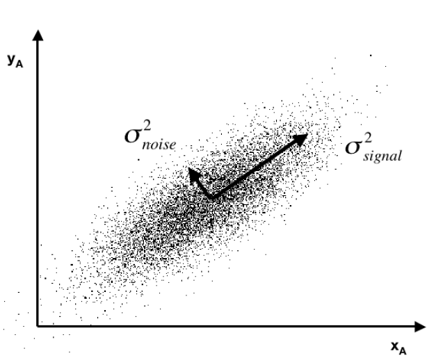
This illustrates dimensionality reduction with principal components. If we express all these points in terms of this rotated set of coordinates, one of these coordinates – the signal – captures most of the variation in the data. Projections of the datapoints onto the second principal component, therefore, account for much less variance.

Principal component regression characteristically specifies only the first few principal components in the regression equation, knowing that, typically, these explain the largest portion of the variance in the data.

An Application to Crime Data

Looking for some non-macroeconomic data to illustrate principal components (PC) regression, I found the Communities and Crime Data Set in the University of California at Irving Machine Learning Repository.

The data do not illustrate “many predictors” in the sense of more predictors than observations.

Here, the crime and other data comprise 128 variables, including a violent crime variable, which are collated for 1994 cities. That is, there are more observations than predictors.

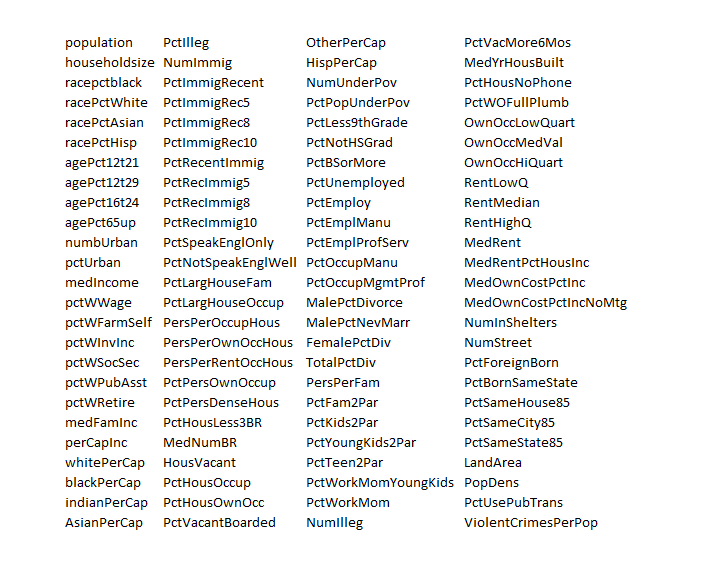
The variables included in the dataset involve the community, such as the percent of the population considered urban, and the median family income, and involving law enforcement, such as per capita number of police officers, and percent of officers assigned to drug units. The per capita violent crimes variable was calculated using population and the sum of crime variables considered violent crimes in the United States: murder, rape, robbery, and assault.

I standardize the data, dropping variables with a lot of missing values. That leaves me 100 variables, including the violent crime metric.

This table gives you a flavor of the variables included – you have to interpret the abbreviations

crime

I developed a comparison of OLS regression with principal components regression, finding that principal component regression can outperform OLS in out-of-sample predictions of violent crimes per capita.

The Matlab program to carry out this analysis is as follows:

Matalbp

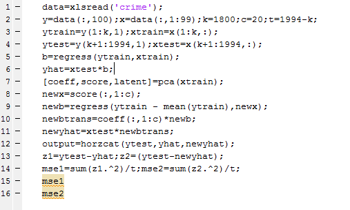
So I used a training set of 1800 cities, and developed OLS and PC regressions to predict violent crime per capita in the remaining 194 cities.  I calculate the  principal components (coeff) from a training set (xtrain) comprised of the first 1800 cities. Then, I select the first twenty pc’s  and translate them back to weightings on all 99 variables for application to the test set (xtest). I also calculate OLS regression coefficients on xtrain.

The mean square prediction error (mse1) of the OLS regression was 0.35 and the mean square prediction error (mse2) of the PC regression was 0.34 – really a marginal difference but large enough to make the point.

What’s really interesting is that I had to use the first twenty (20) principal components to achieve this improvement. Thus, this violent crime database has a quite diverse characteristic, compared with many socioeconomic datasets I have seen, where, as noted above, the first few principal components explain most of the variation in the data.

This method – PC regression – is especially good when there are predictors which are closely correlated (“multicollinearity”) as often is the case with market research surveys of consumer attitudes and income and wealth variables.

The bottom line here is that principal compoments can facilitate data reduction or regression regularization. Quite often, this can improve the prediction capabilities of a regression, when compared with an OLS regression using all the variables. The PC regression assigns higher weights to the most important predictors, in effect performing a kind of variable selection – although the coefficients or pc’s may not zero out variables per se.

I am continuing to work on this data with an eye to implementing k-fold cross-validation as a way of estimating the optimal number of principal components which should be used in the PC regressions.

Estimation and Variable Selection with Ridge Regression and the LASSO

I’ve posted on ridge regression and the LASSO (Least Absolute Shrinkage and Selection Operator) some weeks back.

Here I want to compare them in connection with variable selection  where there are more predictors than observations (“many predictors”).

1. Ridge regression does not really select variables in the many predictors situation. Rather, ridge regression “shrinks” all predictor coefficient estimates toward zero, based on the size of the tuning parameter λ. When ordinary least squares (OLS) estimates have high variability, ridge regression estimates of the betas may, in fact, produce lower mean square error (MSE) in prediction.

2. The LASSO, on the other hand, handles estimation in the many predictors framework and performs variable selection. Thus, the LASSO can produce sparse, simpler, more interpretable models than ridge regression, although neither dominates in terms of predictive performance. Both ridge regression and the LASSO can outperform OLS regression in some predictive situations – exploiting the tradeoff between variance and bias in the mean square error.

3. Ridge regression and the LASSO both involve penalizing OLS estimates of the betas. How they impose these penalties explains why the LASSO can “zero” out coefficient estimates, while ridge regression just keeps making them smaller. From
An Introduction to Statistical Learning

ridgeregressionOF

Similarly, the objective function for the LASSO procedure is outlined by An Introduction to Statistical Learning, as follows

LASSOobkf

4. Both ridge regression and the LASSO, by imposing a penalty on the regression sum of squares (RWW) shrink the size of the estimated betas. The LASSO, however, can zero out some betas, since it tends to shrink the betas by fixed amounts, as λ increases (up to the zero lower bound). Ridge regression, on the other hand, tends to shrink everything proportionally.

5.The tuning parameter λ in ridge regression and the LASSO usually is determined by cross-validation. Here are a couple of useful slides from Ryan Tibshirani’s Spring 2013 Data Mining course at Carnegie Mellon.

RTCV1

RTCV2

6.There are R programs which estimate ridge regression and lasso models and perform cross validation, recommended by these statisticians from Stanford and Carnegie Mellon. In particular, see glmnet at CRAN. Mathworks MatLab also has routines to do ridge regression and estimate elastic net models.

Here, for example, is R code to estimate the LASSO.

lasso.mod=glmnet(x[train,],y[train],alpha=1,lambda=grid)
plot(lasso.mod)
set.seed(1)
cv.out=cv.glmnet(x[train,],y[train],alpha=1)
plot(cv.out)
bestlam=cv.out$lambda.min
lasso.pred=predict(lasso.mod,s=bestlam,newx=x[test,])
mean((lasso.pred-y.test)^2)
out=glmnet(x,y,alpha=1,lambda=grid)
lasso.coef=predict(out,type=”coefficients”,s=bestlam)[1:20,]
lasso.coef
lasso.coef[lasso.coef!=0]

 What You Get

I’ve estimated quite a number of ridge regression and LASSO models, some with simulated data where you know the answers (see the earlier posts cited initially here) and other models with real data, especially medical or health data.

As a general rule of thumb, An Introduction to Statistical Learning notes,

 ..one might expect the lasso to perform better in a setting where a relatively small number of predictors have substantial coefficients, and the remaining predictors have coefficients that are very small or that equal zero. Ridge regression will perform better when the response is a function of many predictors, all with coefficients of roughly equal size.

The R program glmnet linked above is very flexible, and can accommodate logistic regression, as well as regression with continuous, real-valued dependent variables ranging from negative to positive infinity.


The Tibshirani’s – Statistics and Machine Learning Superstars

As regular readers of this blog know, I’ve migrated to a weekly (or potentially longer) topic focus, and this week’s topic is variable selection.

And the next planned post in the series will compare and contrast ridge regression and the LASSO (least absolute shrinkage and selection operator). There also are some new results for the LASSO. But all this takes time and is always better when actual computations can be accomplished to demonstrate points.

But in researching this, I’ve come to a deeper appreciation of the Tibshiranis.

Robert Tibshirani was an early exponent of the LASSO and has probably, as much as anyone, helped integrate the LASSO into standard statistical procedures.

Here’s his picture from Wikipedia.

RobertTib2

You might ask why put his picuture up, and my answer is that Professor Robert Tibshirani (Stanford) has a son Ryan Tibshirani, whose picture is just below.

Ryan Tibsharani has a great Data Mining course online from Carnegie Mellon, where he is an Assistant Professor.

RyanTib

Professor Ryan Tibshirani’s Spring 2013 a Data Mining course can be found at http://www.stat.cmu.edu/~ryantibs/datamining/

Reviewing Ryan Tibsharani’s slides is very helpful in getting insight into topics like cross validation, ridge regression and the LASSO.

And let us not forget Professor Ryan Tibshirani is author of essential reading about how to pick your target in darts, based on your skill level (hint – don’t go for the triple-20 unless you are good).

Free Books on Machine Learning and Statistics

Robert Tibshirani et al’s text – Elements of Statistical Learning is now in the 10th version and is available online free here.

But the simpler An Introduction to Statistical Leaning is also available for an online download of a PDF file here. This is the corrected 4th printing. The book, which I have been reading today, is really dynamite – an outstanding example of scientific exposition and explanation.

These guys and their collaborators are truly gifted teachers. They create windows into new mathematical and statistical worlds, as it were.

Selecting Predictors

In a recent post on logistic regression, I mentioned research which developed diagnostic tools for breast cancer based on true Big Data parameters – notably 62,219 consecutive mammography records from 48,744 studies in 18,270 patients reported using the Breast Imaging Reporting and Data System (BI-RADS) lexicon and the National Mammography Database format between April 5, 1999 and February 9, 2004.

This research built a logistic regression model with 36 predictors, selected from the following information residing in the National Mammography Database (click to enlarge).

        breastcancertyp               

The question arises – are all these 36 predictors significant? Or what is the optimal model? How does one select the subset of the available predictor variables which really count?

This is the problem of selecting predictors in multivariate analysis – my focus for several posts coming up.

So we have a target variable y and set of potential predictors x={x1,x2,….,xn}. We are interested in discovering a predictive relationship, y=F(x*) where x* is some possibly proper subset of x. Furthermore, we have data comprising m observations on y and x, which in due time we will label with subscripts.

There are a range of solutions to this very real, very practical modeling problem.

Here is my short list.

  1. Forward Selection. Begin with no candidate variables in the model. Select the variable that boosts some goodness-of-fit or predictive metric the most. Traditionally, this has been R-Squared for an in-sample fit. At each step, select the candidate variable that increases the metric the most. Stop adding variables when none of the remaining variables are significant. Note that once a variable enters the model, it cannot be deleted.
  2. Backward Selection. This starts with the superset of potential predictors and eliminates variables which have the lowest score by some metric – traditionally, the t-statistic.
  3. Stepwise regression. This combines backward and forward selection of regressors.
  4. Regularization and Selection by means of the LASSO. Here is the classic article and here is a post, and here is a post in this blog on the LASSO.
  5. Information criteria applied to all possible regressions – pick the best specification by applying the Aikaike Information Criterion (AIC) or Bayesian Information Criterion (BIC) to all possible combinations of regressors. Clearly, this is only possible with a limited number of potential predictors.
  6. Cross-validation or other out-of-sample criteria applied to all possible regressions – Typically, the error metrics on the out-of-sample data cuts are averaged, and the lowest average error model is selected out of all possible combinations of predictors.
  7. Dimension reduction or data shrinkage with principal components. This is a many predictors formulation, whereby it is possible to reduce a large number of predictors to a few principal components which explain most of the variation in the data matrix.
  8. Dimension reduction or data shrinkage with partial least squares. This is similar to the PC approach, but employs a reduction to information from both the set of potential predictors and the dependent or target variable.

There certainly are other candidate techniques, but this is a good list to start with.

Wonderful topic, incidentally. Dives right into the inner sanctum of the mysteries of statistical science as practiced in the real world.

Let me give you the flavor of how hard it is to satisfy the classical criterion for variable selection, arriving at unbiased or consistent estimates of effects of a set of predictors.

And, really, the paradigmatic model is ordinary least squares (OLS) regression in which the predictive function F(.) is linear.

The Specification Problem

The problem few analysts understand is called specification error.

So assume that there is a true model – some linear expression in variables multiplied by their coefficients, possibly with a constant term added.

Then, we have some data to estimate this model.

Now the specification problem is that when predictors are not orthogonal, i.e. when they are correlated, leaving out a variable from the “true” specification imparts a bias to the estimates of coefficients of variables included in the regression.

This complications sequential methods of selecting predictors for the regression.

So in any case I will have comments forthcoming on methods of selecting predictors.

Predictive Models in Medicine and Health – Forecasting Epidemics

I’m interested in everything under the sun relating to forecasting – including sunspots (another future post). But the focus on medicine and health is special for me, since my closest companion, until her untimely death a few years ago, was a physician. So I pay particular attention to details on forecasting in medicine and health, with my conversations from the past somewhat in mind.

There is a major area which needs attention for any kind of completion of a first pass on this subject – forecasting epidemics.

Several major diseases ebb and flow according to a pattern many describe as an epidemic or outbreak – influenza being the most familiar to people in North America.

I’ve already posted on the controversy over Google flu trends, which still seems to be underperforming, judging from the 2013-2014 flu season numbers.

However, combining Google flu trends with other forecasting models, and, possibly, additional data, is reported to produce improved forecasts. In other words, there is information there.

In tropical areas, malaria and dengue fever, both carried by mosquitos, have seasonal patterns and time profiles that health authorities need to anticipate to stock supplies to keep fatalities lower and take other preparatory steps.

Early Warning Systems

The following slide from A Prototype Malaria Forecasting System illustrates the promise of early warning systems, keying off of weather and climatic predictions.

  malaria                     

There is a marked seasonal pattern, in other words, to malaria outbreaks, and this pattern is linked with developments in weather.

Researchers from the Howard Hughes Medical Institute, for example, recently demonstrated that temperatures in a large area of the tropical South Atlantic are directly correlated with the size of malaria outbreaks in India each year – lower sea surface temperatures led to changes in how the atmosphere over the ocean behaved and, over time, led to increased rainfall in India.

Another mosquito-borne disease claiming many thousands of lives each year is dengue fever.

And there is interesting, sophisticated research detailing the development of an early warning system for climate-sensitive disease risk from dengue epidemics in Brazil.

The following exhibits show the strong seasonality of dengue outbreaks, and a revealing mapping application, showing geographic location of high incidence areas.

dengue

This research used out-of-sample data to test the performance of the forecasting model.

The model was compared to a simple conceptual model of current practice, based on dengue cases three months previously. It was found that the developed model including climate, past dengue risk and observed and unobserved confounding factors, enhanced dengue predictions compared to model based on past dengue risk alone.

MERS

The latest global threat, of course, is MERS – or Middle East Respiratory Syndrome, which is a coronavirus, It’s transmission from source areas in Saudi Arabia is pointedly suggested by the following graphic.

MERS

The World Health Organization is, as yet, refusing to declare MERS a global health emergency. Instead, spokesmen for the organization say,

..that much of the recent surge in cases was from large outbreaks of MERS in hospitals in Saudi Arabia, where some emergency rooms are crowded and infection control and prevention are “sub-optimal.” The WHO group called for all hospitals to immediately strengthen infection prevention and control measures. Basic steps, such as washing hands and proper use of gloves and masks, would have an immediate impact on reducing the number of cases..

Millions of people, of course, will travel to Saudi Arabia for Ramadan in July and the hajj in October. Thirty percent of the cases so far diagnosed have resulted in fatalties.

Medical/Health Predictive Analytics – Logistic Regression

The case for assessing health risk with logistic regression is made by authors of a 2009 study, which is also a sort of model example for Big Data in diagnostic medicine.

As the variables that help predict breast cancer increase in number, physicians must rely on subjective impressions based on their experience to make decisions. Using a quantitative modeling technique such as logistic regression to predict the risk of breast cancer may help radiologists manage the large amount of information available, make better decisions, detect more cancers at early stages, and reduce unnecessary biopsies

This study – A Logistic Regression Model Based on the National Mammography Database Format to Aid Breast Cancer Diagnosis  – pulled together 62,219 consecutive mammography records from 48,744 studies in 18,270 patients reported using the Breast Imaging Reporting and Data System (BI-RADS) lexicon and the National Mammography Database format between April 5, 1999 and February 9, 2004.

The combination of medical judgment and an algorithmic diagnostic tool based on extensive medical records is, in the best sense, the future of medical diagnosis and treatment.

And logistic regression has one big thing going for it – a lot of logistic regressions have been performed to identify risk factors for various diseases or for mortality from a particular ailment.

A logistic regression, of course, maps a zero/one or categorical variable onto a set of explanatory variables.

This is not to say that there are not going to be speedbumps along the way. Interestingly, these are data science speedbumps, what some would call statistical modeling issues.

Picking the Right Variables, Validating the Logistic Regression

The problems of picking the correct explanatory variables for a logistic regression and model validation are linked.

The problem of picking the right predictors for a logistic regression is parallel to the problem of picking regressors in, say, an ordinary least squares (OLS) regression with one or two complications. You need to try various specifications (sets of explanatory variables) and utilize a raft of diagnostics to evaluate the different models. Cross-validation, utilized in the breast cancer research mentioned above, is probably better than in-sample tests. And, in addition, you need to be wary of some of the weird features of logistic regression.

A survey of medical research from a few years back highlights the fact that a lot of studies shortcut some of the essential steps in validation.

A Short Primer on Logistic Regression

I want to say a few words about how the odds-ratio is the key to what logistic regression is all about.

Logistic regression, for example, does not “map” a predictive relationship onto a discrete, categorical index, typically a binary, zero/one variable, in the same way ordinary least squares (OLS) regression maps a predictive relationship onto dependent variables. In fact, one of the first things one tends to read, when you broach the subject of logistic regression, is that, if you try to “map” a binary, 0/1 variable onto a linear relationship β01x12x2 with OLS regression, you are going to come up against the problem that the predictive relationship will almost always “predict” outside the [0,1] interval.

Instead, in logistic regression we have a kind of background relationship which relates an odds-ratio to a linear predictive relationship, as in,

ln(p/(1-p)) = β01x12x2

Here p is a probability or proportion and the xi are explanatory variables. The function ln() is the natural logarithm to the base e (a transcendental number), rather than the logarithm to the base 10.

The parameters of this logistic model are β0, β1, and β2.

This odds ratio is really primary and from the logarithm of the odds ratio we can derive the underlying probability p. This probability p, in turn, governs the mix of values of an indicator variable Z which can be either zero or 1, in the standard case (there being a generalization to multiple discrete categories, too).

Thus, the index variable Z can encapsulate discrete conditions such as hospital admissions, having a heart attack, or dying – generally, occurrences and non-occurrences of something.

Chinesemathteacher

It’s exactly analogous to flipping coins, say, 100 times. There is a probability of getting a heads on a flip, usually 0.50. The distribution of the number of heads in 100 flips is a binomial, where the probability of getting say 60 heads and 40 tails is the combination of 100 things taken 60 at a time, multiplied into (0.5)60*(0.5)40. The combination of 100 things taken 60 at a time equals 60!/(60!40!) where the exclamation mark indicates “factorial.”

Similarly, the probability of getting 60 occurrences of the index Z=1 in a sample of 100 observations is (p)60*(1-p)40multiplied by 60!/(60!40!).

The parameters βi in a logistic regression are estimated by means of maximum likelihood (ML).  Among other things, this can mean the optimal estimates of the beta parameters – the parameter values which maximize the likelihood function – must be estimated by numerical analysis, there being no closed form solutions for the optimal values of β0, β1, and β2.

In addition, interpretation of the results is intricate, there being no real consensus on the best metrics to test or validate models.

SAS and SPSS as well as software packages with smaller market shares of the predictive analytics space, offer algorithms, whereby you can plug in data and pull out parameter estimates, along with suggested metrics for statistical significance and goodness of fit.

There also are logistic regression packages in R.

But you can do a logistic regression, if the data are not extensive, with an Excel spreadsheet.

This can be instructive, since, if you set it up from the standpoint of the odds-ratio, you can see that only certain data configurations are suitable. These configurations – I refer to the values which the explanatory variables xi can take, as well as the associated values of the βi – must be capable of being generated by the underlying probability model. Some data configurations are virtually impossible, while others are inconsistent.

This is a point I find lacking in discussions about logistic regression, which tend to note simply that sometimes the maximum likelihood techniques do not converge, but explode to infinity, etc.

Here is a spreadsheet example, where the predicting equation has three parameters and I determine the underlying predictor equation to be,

ln(p/(1-p))=-6+3x1+.05x2

and we have the data-

logisticregmodel

Notice the explanatory variables x1 and x2 also are categorical, or at least, discrete, and I have organized the data into bins, based on the possible combinations of the values of the explanatory variables – where the number of cases in each of these combinations or populations is given to equal 10 cases. A similar setup can be created if the explanatory variables are continuous, by partitioning their ranges and sorting out the combination of ranges in however many explanatory variables there are, associating the sum of occurrences associated with these combinations. The purpose of looking at the data this way, of course, is to make sense of an odds-ratio.

The predictor equation above in the odds ratio can be manipulated into a form which explicitly indicates the probability of occurrence of something or of Z=1. Thus,

p= eβ0+β1×1+β2×2/(1+ eβ0+β1×1+β2×2)

where this transformation takes advantage of the principle that elny = y.

So with this equation for p, I can calculate the probabilities associated with each of the combinations in the data rows of the spreadsheet. Then, given the probability of that configuration, I calculate the expected value of Z=1 by the formula 10p. Thus, the mean of a binomial variable with probability p is np, where n is the number of trials. This sequence is illustrated below (click to enlarge).

sequence

Picking the “success rates” for each of the combinations to equal the expected value of the occurrences, given 10 “trials,” produces a highly consistent set of data.

Along these lines, the most valuable source I have discovered for ML with logistic regression is a paper by Scott
Czepiel – Maximum Likelihood Estimation of Logistic Regression Models: Theory and Implementation
.

I can readily implement Czepiel’s log likelihood function in his Equation (9) with an Excel spreadsheet and Solver.

It’s also possible to see what can go wrong with this setup.

For example, the standard deviation of a binomial process with probability p and n trials is np(1-p). If we then simulate the possible “occurrences” for each of the nine combinations, some will be closer to the estimate of np used in the above spreadsheet, others will be more distant. Peforming such simulations, however, highlights that some numbers of occurrences for some combinations will simply never happen, or are well nigh impossible, based on the laws of chance.

Of course, this depends on the values of the parameters selected, too – but it’s easy to see that, whatever values selected for the parameters, some low probability combinations will be highly unlikely to produce a high number for successes. This results in a nonconvergent ML process, so some parameters simply may not be able to be estimated.

This means basically that logistic regression is less flexible in some sense than OLS regression, where it is almost always possible to find values for the parameters which map onto the dependent variable.

What This Means

Logistic regression, thus, is not the exact analogue of OLS regression, but has nuances of its own. This has not prohibited its wide application in medical risk assessment (and I am looking for a survey article which really shows the extent of its application across different medical fields).

There also are more and more reports of the successful integration of medical diagnostic systems, based in some way on logistic regression analysis, in informing medical practices.

But the march of data science is relentless. Just when doctors got a handle on logistic regression, we have a raft of new techniques, such as random forests and splines.

Header image courtesy of: National Kidney & Urologic Diseases Information Clearinghouse (NKUDIC)

Forecasts in the Medical and Health Care Fields

I’m focusing on forecasting issues in the medical field and health care for the next few posts.

One major issue is the cost of health care in the United States and future health care spending. Just when many commentators came to believe the growth in health care expenditures was settling down to a more moderate growth path, spending exploded in late 2013 and in the first quarter of 2014, growing at a year-over-year rate of 7 percent (or higher, depending on how you cut the numbers). Indeed, preliminary estimates of first quarter GDP growth would have been negative– indicating start of a possible new recession – were it not for the surge in healthcare spending.

Annualizing March 2014 numbers, US health case spending is now on track to hit a total of $3.07 trillion.

Here are estimates of month-by-month spending from the Altarum Institute.

YOYgrhcspend

The Altarum Institute blends data from several sources to generate this data, and also compiles information showing how medical spending has risen in reference to nominal and potential GDP.

altarum1

Payments from Medicare and Medicaid have been accelerating, as the following chart from the comprehensive Center for
Disease Control (CDC) report
 suggests.

Personalhealthcareexppic

 Projections of Health Care Spending

One of the primary forecasts in this field is the Centers for Medicare & Medicaid Services’ (CMS) National Health Expenditures (NHE) projections.

The latest CMS projections have health spending projected to grow at an average rate of 5.8 percent from 2012-2022, a percentage point faster than expected growth in nominal GDP.

The Affordable Care Act is one of the major reasons why health care spending is surging, as millions who were previously not covered by health insurance join insurance exchanges.

The effects of the ACA, as well as continued aging of the US population and entry of new and expensive medical technologies, are anticipated to boost health care spending to 19-20 percent of GDP by 2021.

healthgdp

The late Robert Fogel put together a projection for the National Bureau of Economic Research (NBER) which suggested the ratio of health care spending to GDP would rise to 29 percent by 2040.

The US Health Care System Is More Expensive Than Others

I get the feeling that the econometric and forecasting models for these extrapolations – as well as the strategically important forecasts for future Medicare and Medicaid costs – are sort of gnarly, compared to the bright shiny things which could be developed with the latest predictive analytics and Big Data methods.

Neverhteless, it is interesting that an accuracy analysis of the CMS 11 year projections shows them to be are relatively good, at least one to three years out from current estimates. That was, of course, over a period with slowing growth.

But before considering any forecasting model in detail, I think it is advisable to note how anomalous the US health care system is in reference to other (highly developed) countries.

The OECD, for example, develops
interesting comparisons of medical spending
 in the US and other developed and emerging economies.

OECDcomp2

The OECD data also supports a breakout of costs per capita, as follows.

OECDmedicalcomp

So the basic reason why the US health care system is so expensive is that, for example, administrative costs per capita are more than double those in other developed countries. Practitioners also are paid almost double that per capital of what they receive in these other countries, countries with highly regarded healthcare systems. And so forth and so on.

The Bottom Line

Health care costs in the US typically grow faster than GDP, and are expected to accelerate for the rest of this decade. The ratio of health care costs to US GDP is rising, and longer range forecasts suggest almost a third of all productive activity by mid-century will be in health care and the medical field.

This suggests either a radically different type of society – a care-giving culture, if you will – or that something is going to break or make a major transition between now and then.

A Medical Forecasting Controversy – Increased Deaths from Opting-out From Expanding Medicaid Coverage

Menzie Chinn at Econbrowser recently posted – Estimated Elevated Mortality Rates Associated with Medicaid Opt-Outs. This features projections from a study which suggests an additional 7000-17,000 persons will die annually, if 25 states opt out of Medicaid expansion associated with the Affordable Care Act (ACA). Thus, the Econbrowser chart with these extrapolations suggests within only few years the additional deaths in these 25 states would exceed causalities in the Vietnam War (58,220).

The controversy ran hot in the Comments.

Apart from the smoke and mirrors, though, I wanted to look into the underlying estimates to see whether they support such a clear connection between policy choices and human mortality.

I think what I found is that the sources behind the estimates do, in fact, support the idea that expanding Medicaid can lower mortality and, additionally, generally improve the health status of participating populations.

But at what cost – and it seems the commenters mostly left that issue alone – preferring to rant about the pernicious effects of regulation, implying more Medicaid would actually probably exert negative or no effects on mortality.

As an aside, the accursed “death panels” even came up, with a zinger by one commentator –

Ah yes, the old death panel canard. No doubt those death panels will be staffed by Nigerian born radical gay married Marxist Muslim atheists with fake birth certificates. Did I miss any of the idiotic tropes we hear on Fox News? Oh wait, I forgot…those death panels will meet in Benghazi. And after the death panels it will be on to fight the war against Christmas.

The Evidence

Econbrowser cites Opting Out Of Medicaid Expansion: The Health And Financial Impacts as the source of the impact numbers for 25 states opting out of expanded Medicaid.

This Health Affairs blog post draws on three statistical studies –

The Oregon Experiment — Effects of Medicaid on Clinical Outcomes

Mortality and Access to Care among Adults after State Medicaid Expansions

Health Insurance and Mortality in US Adults

I list these the most recent first. Two of them appear in the New England Journal of Medicine, a publication with a reputation for high standards. The third and historically oldest article appears in the American Journal of Public Health.

The Oregon Experiment is exquisite statistical research with a randomized sample and control group, but does not directly estimate mortality. Rather, it highlights the reductions in a variety of health problems from a limited expansion of Medicaid coverage for low-income adults through a lottery drawing in 2008.

Data collection included –

..detailed questionnaires on health care, health status, and insurance coverage; an inventory of medications; and performance of anthropometric and blood-pressure measurements. Dried blood spots were also obtained.

If you are considering doing a similar study, I recommend the Appendix to this research for methodological ideas. Regression, both OLS and logistic, was a major tool to compare the experimental and control groups.

The data look very clean to me. Consider, for example, these comparisons between the experimental and control groups.

Oregonsurvey

Here are the basic results.

Oregon2

The bottom line is that the Oregon study found –

..that insurance led to increased access to and utilization of health care, substantial improvements in mental health, and reductions in financial strain, but we did not observe reductions in measured blood-pressure, cholesterol, or glycated hemoglobin levels.

The second study, published in 2012, considered mortality impacts of expanding Medicare in Arizona, Maine, and New York. New Hampshire, Pennsylvania, and Nevada and New Mexico were used as controls, in a study that encompassed five years before and after expansion of Medicaid programs.

Here are the basic results of this research.

mortality1

As another useful Appendix documents, the mortality estimates of this study are based on a regression analysis incorporating county-by-county data from the study states.

There are some key facts associated with some of the tables displayed which are in the source links. Also, you would do well to click on these tables to enlarge them for reading.

The third study, by authors associated with the Harvard Medical School, had the following Abstract

Objectives. A 1993 study found a 25% higher risk of death among uninsured compared with privately insured adults. We analyzed the relationship between uninsurance and death with more recent data.

Methods. We conducted a survival analysis with data from the Third National Health and Nutrition Examination Survey. We analyzed participants aged 17 to 64 years to determine whether uninsurance at the time of interview predicted death.

Results. Among all participants, 3.1% (95% confidence interval [CI] = 2.5%, 3.7%) died. The hazard ratio for mortality among the uninsured compared with the insured, with adjustment for age and gender only, was 1.80 (95% CI = 1.44, 2.26). After additional adjustment for race/ethnicity, income, education, self- and physician-rated health status, body mass index, leisure exercise, smoking, and regular alcohol use, the uninsured were more likely to die (hazard ratio = 1.40; 95% CI = 1.06, 1.84) than those with insurance.

Conclusions. Uninsurance is associated with mortality. The strength of that association appears similar to that from a study that evaluated data from the mid-1980s, despite changes in medical therapeutics and the demography of the uninsured since that time.

Some Thoughts

Statistical information and studies are good for informing judgment. And on this basis, I would say the conclusion that health insurance increases life expectancy and reduces the incidence of some complaints is sound.

On the other hand, whether one can just go ahead and predict the deaths from a blanket adoption of an expansion of Medicaid seems like a stretch – particularly if one is going to present, as the Econbrowser post does, a linear projection over several years. Presumably, there are covariates which might change in these years, so why should it be straight-line? OK, maybe the upper and lower bounds are there to deal with this problem. But what are the covariates?

Forecasting in the medical and health fields has come of age, as I hope to show in several upcoming posts.

Links May 2014

If there is a theme for this current Links page, it’s that trends spotted a while ago are maturing, becoming clearer.

So with the perennial topic of Big Data and predictive analytics, there is an excellent discussion in Algorithms Beat Intuition – the Evidence is Everywhere. There is no question – the machines are going to take over; it’s only a matter of time.

And, as far as freaky, far-out science, how about Scientists Create First Living Organism With ‘Artificial’ DNA.

Then there are China trends. Workers in China are better paid, have higher skills, and they are starting to use the strike. Striking Chinese Workers Are Headache for Nike, IBM, Secret Weapon for Beijing . This is a long way from the poor peasant women from rural areas living in dormitories, doing anything for five or ten dollars a day.

The Chinese dominance in the economic sphere continues, too, as noted by the Economist. Crowning the dragon – China will become the world’s largest economy by the end of the year

China

But there is the issue of the Chinese property bubble. China’s Property Bubble Has Already Popped, Report Says

Chinaproperty

Then, there are issues and trends of high importance surrounding the US Federal Reserve Bank. And I can think of nothing more important and noteworthy, than Alan Blinder’s recent comments.

Former Fed Leader Alan Blinder Sees Market-rattling Infighting at Central Bank

“The Fed may get more raucous about what to do next as tapering draws to a close,” Alan Blinder, a banking industry consultant and economics professor at Princeton University said in a speech to the Investment Management Consultants Association in Boston.

The cacophony is likely to “rattle the markets” beginning in late summer as traders debate how precipitously the Fed will turn from reducing its purchases of U.S. government debt and mortgage securities to actively selling it.

The Open Market Committee will announce its strategy in October or December, he said, but traders will begin focusing earlier on what will happen with rates as some members of the rate-setting panel begin openly contradicting Fed Chair Janet Yellen, he said.

Then, there are some other assorted links with good infographics, charts, or salient discussion.

Alibaba IPO Filing Indicates Yahoo Undervalued Heck of an interesting issue.

Alibaba

Twitter Is Here To Stay

Three Charts on Secular Stagnation Krugman toying with secular stagnation hypothesis.

Rethinking Property in the Digital Era Personal data should be viewed as property

Larry Summers Goes to Sleep After Introducing Piketty at Harvard Great pic. But I have to have sympathy for Summers, having attended my share of sleep-inducing presentations on important economics issues.

lawrencesummers

Turkey’s Institutions Problem from the Stockholm School of Economics, nice infographics, visual aids. Should go along with your note cards on an important emerging economy.

Post-Crash economics clashes with ‘econ tribe’ – economics students in England are proposing reform of the university economics course of study, but, as this link points out, this is an uphill battle and has been suggested before.

The Life of a Bond – everybody needs to know what is in this infographic.

Very Cool Video of Ocean Currents From NASA

perpetualocean_cover_1024x676

Predicting the Market Over Short Time Horizons

Google “average time a stock is held.” You will come up with figures that typically run around 20 seconds. High frequency trades (HFT) dominate trading volume on the US exchanges.

All of which suggests the focus on the predictability of stock returns needs to position more on intervals lasting seconds or minutes, rather than daily, monthly, or longer trading periods.

So, it’s logical that Michael Rechenthin, a newly minted Iowa Ph.D., and Nick Street, a Professor of Management, are getting media face time from research which purportedly demonstrates the existence of predictable short-term trends in the market (see Using conditional probability to identify trends in intra-day high-frequency equity pricing).

Here’s the abstract –

By examining the conditional probabilities of price movements in a popular US stock over different high-frequency intra-day timespans, varying levels of trend predictability are identified. This study demonstrates the existence of predictable short-term trends in the market; understanding the probability of price movement can be useful to high-frequency traders. Price movement was examined in trade-by-trade (tick) data along with temporal timespans between 1 s to 30 min for 52 one-week periods for one highly-traded stock. We hypothesize that much of the initial predictability of trade-by-trade (tick) data is due to traditional market dynamics, or the bouncing of the price between the stock’s bid and ask. Only after timespans of between 5 to 10 s does this cease to explain the predictability; after this timespan, two consecutive movements in the same direction occur with higher probability than that of movements in the opposite direction. This pattern holds up to a one-minute interval, after which the strength of the pattern weakens.

The study examined price movements of the exchange traded fund SPY, during 2005, finding that

.. price movements can be predicted with a better than 50-50 accuracy for anywhere up to one minute after the stock leaves the confines of its bid-ask spread. Probabilities continue to be significant until about five minutes after it leaves the spread. By 30 minutes, the predictability window has closed.

Of course, the challenges of generalization in this world of seconds and minutes is tremendous. Perhaps, for example, the patterns the authors identify are confined to the year of the study. Without any theoretical basis, brute force generalization means riffling through additional years of 31.5 million seconds each.

Then, there are the milliseconds, and the recent blockbuster written by Michael Lewis – Flash Boys: A Wall Street Revolt.

I’m on track for reading this book for a bookclub to which I belong.

As I understand it, Lewis, who is one of my favorite financial writers, has uncovered a story whereby high frequency traders, operating with optical fiber connections to the New York Stock Exchange, sometimes being geographically as proximate as possible, can exploit more conventional trading – basically buying a stock after you have put in a buy order, but before your transaction closes, thus raising your price if you made a market order.

MLewis

The LA Times  has a nice review of the book and ran the above photo of Lewis.