Chinese Stock Market Collapse

Chinese stocks are more volatile, in terms of percent swings, than stocks on other global markets, as this Bloomberg chart highlights.

ChinaStockVolatileGlobal

So the implication is maybe that the current bursting of the Chinese stock bubble is not such a big deal for the global economy, or perhaps it can be contained – despite signs of correlations between the Global Stocks and Shanghai Composite series.

Facts and Figures

Panic selling hit the major Chinese exchanges in Shanghai and Shenzeng, spreading now to the Hong Kong exchange.

Trades on most companies are limited or frozen, and major indexes continue to drop, despite support from the Chinese government.

Chinese Trading Suspensions Freeze $1.4 Trillion of Shares Amid Rout

The rout in Chinese shares has erased at least $3.2 trillion in value, or twice the size of India’s entire stock market. The Shenzhen Composite Index has led declines with a 38 percent plunge since its June 12 peak, as margin traders unwound bullish bets.

China: The Stock Market Meltdown Continues

Briefly put, there are few alternatives for saving in China. The formal banking system provides negative returns (low deposit yields, lower than inflation typically). Housing is no longer returning positive capital gains — partly as a consequence of deliberate policy actions to moderate a perceived housing bubble. So, what’s left (given you can’t easily save in overseas assets)? Equities. We have a typical boom-bust phenomenon, amplified by underdeveloped financial markets, opacity in valuations, and uncertainty regarding the government’s intentions (and will-power).

Stock Sell-Off Is Unabated in China (New York Times)

Most of the trades on Chinese exchanges are made by “retail traders,” basically individuals speculating on the market. These individuals often are highly leveraged or operating with borrowed money.

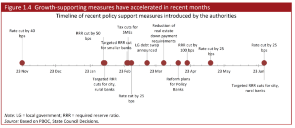
The Chinese markets moved into bubble territory several months back, and when a correction hit and as it accelerated recently, the Chinese government has tried all sorts of stuff, some charted below.

Chinameasures

Public/private funds to buy stocks and slow the fall in their prices have been created, also.

Risks of Contagion

It’s hard for foreign investors to gain access to the Chinese markets, where there are different classes of stocks for Chinese and foreign traders. So, by that light, only a few percent of Chinese stocks are held by foreign interests, and direct linkages between the sharp turn in values in China and elsewhere should be limited.

There may indirect linkages going from the Chinese stock market to the Chinese economy, and then to foreign supplies.

Here’s why the crash in Chinese stocks matters so much to Australia, i.e.  Australian property markets and reduced Chinese demand for iron.

Iron ore demand by China and the drop in Chinese stocks actually seems more related to somewhat independent linkage with the longer term cascade down by Chinese GDP growth, illustrated here (See Ongoing Developments in China).

ChinaGDPgr

But maybe the most dangerous and unpredictable linkage is psychological.

Thus, the Financial Express of India reports Shanghai blues trigger panic selling on Dalal Street, metals feel the heat

Failures of Forecasting in the Greek Crisis

The resounding “No” vote today (Sunday, July 5) by Greeks vis a vis new austerity proposals of the European Commission and European Central Bank (ECB) is pivotal. The immediate task at hand this week is how to avoid or manage financial contagion and whether and how to prop up the Greek banking system to avoid complete collapse of the Greek economy.

Greekvote

Thousands celebrate Greece’s ‘No’ vote despite uncertainty ahead

Greece or, more formally, the Hellenic Republic, is a nation of about 11 million – maybe 2 percent of the population of the European Union (about 500 million). The country has a significance out of proportion to its size as an icon of many of the ideas of western civilization – such as “democracy” and “philosophy.”

But, if we can abstract momentarily from the human suffering involved, Greek developments have everything to do with practical and technical issues in forecasting and economic policy. Indeed, with real failures of applied macroeconomic forecasting since 2010.

Fiscal Multipliers

What is the percent reduction in GDP growth that is likely to be associated with reductions in government spending? This type of question is handled in the macroeconomic forecasting workshops – at the International Monetary Fund (IMF), the ECB, German, French, Italian, and US government agencies, and so forth – through basically simple operations with fiscal multipliers.

The Greek government had been spending beyond its means for years, both before joining the EU in 2001 and after systematically masking these facts with misleading and, in some cases, patently false accounting.

Then, to quote the New York Times,

Greece became the epicenter of Europe’s debt crisis after Wall Street imploded in 2008. With global financial markets still reeling, Greece announced in October 2009 that it had been understating its deficit figures for years, raising alarms about the soundness of Greek finances. Suddenly, Greece was shut out from borrowing in the financial markets. By the spring of 2010, it was veering toward bankruptcy, which threatened to set off a new financial crisis. To avert calamity, the so-called troika — the International Monetary Fund, the European Central Bank and the European Commission — issued the first of two international bailouts for Greece, which would eventually total more than 240 billion euros, or about $264 billion at today’s exchange rates. The bailouts came with conditions. Lenders imposed harsh austerity terms, requiring deep budget cuts and steep tax increases. They also required Greece to overhaul its economy by streamlining the government, ending tax evasion and making Greece an easier place to do business.

The money was supposed to buy Greece time to stabilize its finances and quell market fears that the euro union itself could break up. While it has helped, Greece’s economic problems haven’t gone away. The economy has shrunk by a quarter in five years, and unemployment is above 25 percent.

In short, the austerity policies imposed by the “Troika” – the ECB, the European Commission, and the IMF – proved counter-productive. Designed to release funds to repay creditors by reducing government deficits, insistence on sharp reductions in Greek spending while the nation was still reeling from the global financial crisis led to even sharper reductions in Greek production and output – and thus tax revenues declined faster than spending.

Or, to put this in more technical language, policy analysts made assumptions about fiscal multipliers which simply were not borne out by actual developments. They assumed fiscal multipliers on the order of 0.5, when, in fact, recent meta-studies suggest they can be significantly greater than 1 in magnitude and that multipliers for direct transfer payments under strapped economic conditions grow by multiples of their value under normal circumstances.

Problems with fiscal multipliers used in estimating policy impacts were recognized some time ago – see for example Growth Forecast Errors and Fiscal Multipliers the IMF Working Paper authored by Oliver Blanchard in 2013.

Also, Simon Wren-Lewis, from Oxford University, highlights the IMF recognition that they “got the multipliers wrong” in his post How a Greek drama became a global tragedy from mid-2013.

However, at the negotiating table with the Greeks, and especially with their new, Left-wing government, the niceties of amending assumptions about fiscal multipliers were lost on the hard bargaining that has taken place.

Again, Wren-Lewis is interesting in his Greece and the political capture of the IMF. The creditors were allowed to demand more and sterner austerity measures, as well as fulfillment of past demands which now seem institutionally impossible – prior to any debt restructuring.

IMF Calls for 50 Billion in New Loans and Debt Restructuring for Greece

Just before to the Greek vote, on July 2, the IMF released a “Preliminary Draft Debt Sustainability Analysis.”

This clearly states Greek debt is not sustainable, given the institutional realities in Greece and deterioration of Greek economic and financial indicators, and calls for immediate debt restructuring, as well as additional funds ($50 billion) to shore up the Greek banks and economy.

There is a report that Europeans tried to block IMF debt report on Greece, viewing it as too supportive of the Greek government position and a “NO” vote on today’s referendum.

The IMF document considers that,

If grace periods and maturities on existing European loans are doubled and if new financing is provided for the next few years on similar concessional terms, debt can be deemed to be sustainable with high probability. Underpinning this assessment is the following: (i) more plausible assumptions—given persistent underperformance—than in the past reviews for the primary surplus targets, growth rates, privatization proceeds, and interest rates, all of which reduce the downside risk embedded in previous analyses. This still leads to gross financing needs under the baseline not only below 15 percent of GDP but at the same levels as at the last review; and (ii) delivery of debt relief that to date have been promises but are assumed to materialize in this analysis.

Some may view this analysis from a presumed moral high ground – fixating on the fact that Greeks proved tricky about garnering debt and profligate in spending in the previous decade.

But, unless decision-makers are intent upon simply punishing Greece, at risk of triggering financial crisis, it seems in the best interests of everyone to consider how best to proceed from this point forward.

And the idea of cutting spending and increasing taxes during an economic downturn and its continuing aftermath should be put to rest as another crackpot idea whose time has passed.

How Did BusinessForecastBlog’s Stock Market Forecast Algorithm Perform June 20 and July 1?

As a spinoff from blogging for the past several years, I’ve discovered a way to predict the high and low of stock prices over periods, like one or several days, a week, or other periods.

As a general rule, I can forecast the high and low of the SPY – the exchange traded fund (ETF) which tracks the S&P 500 – with average absolute errors around 1 percent.

Recently, friends asked me – “how did you do Monday?” – referring to June 29th when Greece closed its banks, punting on a scheduled loan payment to the International Monetary Fund (IMF) the following day.

SPY closing prices tumbled more than 2 percent June 30th, the largest daily drop since June 20, 2013.

Performance of the EVPA

I’m now calling my approach the EVPA or extreme value prediction algorithm. I’ve codified procedures and moved from spreadsheets to programming languages, like Matlab and R.

The performance of the EVPA June 29th depends on whether you allow the programs the Monday morning opening price – something I typically build in to the information set. That is, if I am forecasting a week ahead, I trigger the forecast after the opening of that week’s trading, obtaining the opening price for that week.

Given the June 29 opening price for the SPY ($208.05 a share), the EVPA predicts a Monday high and low of 209.25 and 207.11, for percent forecast errors of -0.6% and -1% respectively.

Of course, Monday’s opening price was significantly down from the previous Friday (by -1.1%).

Without Monday’s opening price, the performance of the EVPA degrades somewhat in the face of the surprising incompetence of Eurozone negotiators. The following chart shows forecast errors for predictions of the daily low price, using only the information available at the close of the trading day Friday June 26.

Actual Forecast % Error
29-Jun 205.33 208.71 1.6%
30-Jun 205.28 208.75 1.7%

Forecasts of the high price for one and two-trading day periods average 1 percent errors (over actuals), when generated only with closing information from the previous week.

Where the Market Is Going

So where is the market going?

The following chart shows the high and low for Monday through Wednesday of the week of June 30 to July 3, and forecasts for the high and low which will be reached in a nested series of periods from one to ten trading days, starting Wednesday.

WhereGoing

What makes interpretation of these predictions tricky is the fact that they do not pertain to 1, 2, and so forth trading days forward, per se. Rather, they are forecasts for 1 day periods, 2 day periods, 3 day periods, and so forth.

One classic pattern is the highs level, but predictions for the lows drop over increasing groups of trading days. That is a signal for a drop in the averages for the security in question, since highs can be reached initially and still stand for these periods of increasing trading days.

These forecasts offer some grounds for increases in the SPY averages going forward, after an initial decrease through the beginning of the coming week.

Of course the Greek tragedy is by no means over, and there can be more surprises.

Still, I’m frankly amazed at how well the EVPA does, in the humming, buzzing and chaotic confusion of global events.

Video Friday

Here are some short takes on topics of the day related to the economic outlook for the rest of 2015, nationally and globally.

First a couple of videos on the poor performance of the US economy in the first quarter 2015, when real GDP contracted slightly. This also happened last year, and so there may be a rebound, and, of course, the estimates are released at a significant lag – so we won’t know for a while.

US economy shrank in the first quarter of 2015

U.S. Economy Shrank in First Quarter

Then, a couple of videos on the Chinese stock market crash and condition of the Chinese economy – worrisome since China plays a bigger and bigger role in global business. Bear with the halting English in the first video; there is a payoff in terms of a look from the inside. The second is from a couple of months ago, but is extremely informative vis a vis the big picture.

Stock market of China Falls 16, June 2015

China’s Economy: The Numbers Look Scary

And finally Greece.

Greek crisis in 90 seconds | FT Markets

In closing, I have a comments on technical forecasting issues suggested by the above.

First, “nowcasting” with mixed frequency data should always be applied to these prognostications of what will happen to past economic growth, e.g. the 2nd quarter of 2015. My sense is this is not being done widely, but it’s easy to show its efficacy. There is no reason to drawl on about imponderables, when you can just apply available weekly and monthly data, maybe using MIDAS, to get a better idea of what number we are likely see for the 2nd quarter 2015.

Secondly, I doubt data analytics can provide much light on the situation in China, precisely because there is a lot of evidence the data being announced are suspect. You can go too far in claiming this, but there are warning signs about Chinese data these days. It’s probably comparable to assessing the integrity of Chinese company financials – which see very creative accounting. in certain cases.

As far as Greece goes, I think the outcome is completely unpredictable. Greece is a small economy. If turning Greece away means catastrophic consequences, assistance should be forthcoming, and there are resources available for the size of the problem.  Events, however, may have moved beyond rationality.

The crux of the matter seems to be that there needs to be a way to recirculate funds from the surplus exporters (Germany, largely) to the deficit importers (peripheral Europe).

One proposal is for Germany to create a kind of “New Deal” to invest in the European periphery, so that down the line, their economies can become more balanced and competitive. Another approach, which seems to be that of the Christian Democratic Union (CDU) of Germany, is the neoliberal “solution.” Essentially, force wages and living standards down in debtor countries to the point where they again become globally competitive.

Rational Bubbles

A rational bubble exists when investors are willing to pay more for stocks than is justified by the discounted stream of future dividends. If investors evaluate potential gains from increases in the stock price as justifying movement away from the “fundamental value” of the stock – a self-reinforcing process of price increases can take hold, but be consistent with “rational expectations.”

This concept has been around for a while, and can be traced to eminences such as Oliver Blanchard, now Chief Economist for the International Monetary Fund (IMF), and Mark Watson, Professor of Economics at Princeton University – (See Bubbles, Rational Expectations and Financial Markets).

In terms of formal theory, Diba and Grossman offer a sophisticated analysis in The Theory of Rational Bubbles in Stock Prices. They invoke intriguing language such as “explosive conditional expectations” and the like.

Since these papers from the 1980’s, the relative size of the financial sector has ballooned, and valuation of derivatives now dwarfs totals for annual value of production on the planet (See Bank for International Settlements).

And, in the US, we have witnessed two, dramatic stock market bubbles, here using the phrase in a more popular “plain-as-the-hand-in-front-of-your-face” sense.

SP500

Following through the metaphor, bursting of the bubble leaves financial plans in shambles, and, from the evidence of parts of Europe at least, can cause significant immiseration of large segments of the population.

It would seem reasonable, therefore, to institute some types of controls, as a bubble was emerging. Perhaps an increase in financial transactions taxes, or some other tactic to cause investors to hold stocks for longer periods.

The question, then, is whether it is possible to “test” for a rational bubble pre-emptively or before-the-fact.

So I have been interested recently to come on more recent analysis of so-called rational bubbles, applying advanced statistical techniques.

I offer some notes and links to download the relevant papers.

These include ground-breaking work by Craine in a working paper Rational Bubbles: A Test.

Then, there are two studies focusing on US stock prices (I include extracts below in italics):

Testing for a Rational Bubble Under Long Memory

We analyze the time series properties of the S&P500 dividend-price ratio in the light of long memory, structural breaks and rational bubbles. We find an increase in the long memory parameter in the early 1990s by applying a recently proposed test by Sibbertsen and Kruse (2009). An application of the unit root test against long memory by Demetrescu et al. (2008) suggests that the pre-break data can be characterized by long memory, while the post-break sample contains a unit root. These results reconcile two empirical findings which were seen as contradictory so far: on the one hand they confirm the existence of fractional integration in the S&P500 log dividend-price ratio and on the other hand they are consistent with the existence of a rational bubble. The result of a changing memory parameter in the dividend-price ratio has an important implication for the literature on return predictability: the shift from a stationary dividend-price ratio to a unit root process in 1991 is likely to have caused the well-documented failure of conventional return prediction models since the 1990s. 

The bubble component captures the part of the share price that is due to expected future price changes. Thus, the price contains a rational bubble, if investors are ready to pay more for the share, than they know is justified by the discounted stream of future dividends. Since they expect to be able to sell the share even at a higher price, the current price, although exceeding the fundamental value, is an equilibrium price. The model therefore allows the development of a rational bubble, in the sense that a bubble is fully consistent with rational expectations. In the rational bubble model, investors are fully cognizant of the fundamental value, but nevertheless they may be willing to pay more than this amount… This is the case if expectations of future price appreciation are large enough to satisfy the rational investor’s required rate of return. To sustain a rational bubble, the stock price must grow faster than dividends (or cash flows) in perpetuity and therefore a rational bubble implies a lack of cointegration between the stock price and fundamentals, i.e. dividends, see Craine (1993).

Testing for rational bubbles in a co-explosive vector autoregression

We derive the parameter restrictions that a standard equity market model implies for a bivariate vector autoregression for stock prices and dividends, and we show how to test these restrictions using likelihood ratio tests. The restrictions, which imply that stock returns are unpredictable, are derived both for a model without bubbles and for a model with a rational bubble. In both cases we show how the restrictions can be tested through standard chi-squared inference. The analysis for the no-bubble case is done within the traditional Johansen model for I(1) variables, while the bubble model is analysed using a co-explosive framework. The methodology is illustrated using US stock prices and dividends for the period 1872-2000.

The characterizing feature of a rational bubble is that it is explosive, i.e. it generates an explosive root in the autoregressive representation for prices. 

This is a very interesting analysis, but involves several stages of statistical testing, all of which is somewhat dependent on assumptions regarding underlying distributions.

Finally, it is interesting to see some of these methodologies for identifying rational bubbles applied to other markets, such as housing, where “fundamental value” has a somewhat different and more tangible meaning.

Explosive bubbles in house prices? Evidence from the OECD countries

We conduct an econometric analysis of bubbles in housing markets in the OECD area, using quarterly OECD data for 18 countries from 1970 to 2013. We pay special attention to the explosive nature of bubbles and use econometric methods that explicitly allow for explosiveness. First, we apply the univariate right-tailed unit root test procedure of Phillips et al. (2012) on the individual countries price-rent ratio. Next, we use Engsted and Nielsen’s (2012) co-explosive VAR framework to test for bubbles. Wefind evidence of explosiveness in many housing markets, thus supporting the bubble hypothesis. However, we also find interesting differences in the conclusions across the two test procedures. We attribute these differences to how the two test procedures control for cointegration between house prices and rent.

Out-Of-Sample R2 Values for PVAR Models

Out-of-sample (OOS) R2 is a good metric to apply to test whether your predictive relationship has out-of-sample predictability. Checking this for the version of the proximity variable model which is publically documented, I find OOS R2 of 0.63 for forecasts of daily high prices.

In other words, 63 percent of the variation of the daily growth in high prices for the S&P 500 is explained by four variables, documented in Predictability of the Daily High and Low of the S&P 500 Index.

This is a really high figure for any kind of predictive relationship involving security prices, so I thought I would put the data out there for anyone interested to check.

OOS R2

This metric is often found in connection with efforts to predict daily or other rates of return on securities, and is commonly defined as

OOSR2

See, for example, Campbell and Thompson.

The white paper linked above and downloadable from University of Munich archives shows –

Ratios involving the current period opening price and the high or low price of the previous period are significant predictors of the current period high or low price for many stocks and stock indexes. This is illustrated with daily trading data from the S&P 500 index. Regressions specifying these “proximity variables” have higher explanatory and predictive power than benchmark autoregressive and “no change” models. This is shown with out-of-sample comparisons of MAPE, MSE, and the proportion of time models predict the correct direction or sign of change of daily high and low stock prices. In addition, predictive models incorporating these proximity variables show time varying effects over the study period, 2000 to February 2015. This time variation looks to be more than random and probably relates to investor risk preferences and changes in the general climate of investment risk.

I wanted to provide interested readers with a spreadsheet containing the basic data and computations of this model, which I call the “proximity variable” model. The idea is that the key variables are ratios of nearby values.

And this is sort of an experiment, since I have not previously put up a spreadsheet for downloading on this blog. And please note the spreadsheet data linked below is somewhat different than the original data for the white paper, chiefly by having more recent observations. This does change the parameter estimates for the whole sample, since the paper shows we are in the realm of time-varying coefficients.

So here goes. Check out this link. PVARresponse

Of course, no spreadsheet is totally self-explanatory, so a few words.

First, the price data (open, high, low, etc) for the S&P 500 come from Yahoo Finance, although the original paper used other sources, too.

Secondly, the data matrix for the regressions is highlighted in light blue. The first few rows of this data matrix include the formulas with later rows being converted to numbers, to reduce the size of the file.

If you look in column K below about row 1720, you will find out-of-sample regression forecasts, created by using data from the immediately preceding trading day and before and current day opening price ratios.

There are 35 cases, I believe, in which the high of the day and the opening price are the same. These can easily be eliminated in calculating any metrics, and, doing so, in fact increases the OOS R2.

I’m sympathetic with readers who develop a passion to “show this guy to be all wrong.” I’ve been there, and it may help to focus on computational matters.

However, there is just no question but this approach is novel, and beats both No Change forecasts and a first order autoregressive forecasts (see the white paper) by a considerable amount.

I personally think these ratios are closely watched by some in the community of traders, and that other price signals motivating trades are variously linked with these variables.

My current research goes further than outlined in the white paper – a lot further. At this point, I am tempted to suggest we are looking at a new paradigm in predictability of stock prices. I project “waves of predictability” will be discovered in the movement of ensembles of security prices. These might be visualized like the wave at a football game, if you will. But the basic point is that I reckon we can show how early predictions of these prices changes are self-confirming to a degree, so emerging signs of the changes being forecast in fact intensify the phenomena being predicted.

Think big.

Keep the comments coming.

One-Month-Ahead Stock Market Forecasts

I have been spending a lot of time analyzing stock market forecast algorithms I stumbled on several months ago which I call the New Proximity Algorithms (NPA’s).

There is a white paper on the University of Munich archive called Predictability of the Daily High and Low of the S&P 500 Index. This provides a snapshot of the NPA at one stage of development, and is rock solid in terms of replicability. For example, an analyst replicated my results with Python, and I’ll probably will provide his code here at some point.

I now have moved on to longer forecast periods and more complex models, and today want to discuss month-ahead forecasts of high and low prices of the S&P 500 for this month – June.

Current Month Forecast for S&P 500

For the current month – June 2015 – things look steady with no topping out or crash in sight

With opening price data from June 1, the NPA month-ahead forecast indicates a high of 2144 and a low of 2030. These are slightly above the high and low for May 2015, 2,134.72 and 2,067.93, respectively.

But, of course, a week of data for June already is in, so, strictly speaking, we need a three week forecast, rather than a forecast for a full month ahead, to be sure of things. And, so far, during June, daily high and low prices have approached the predicted values, already.

In the interests of gaining better understanding of the model, however, I am going to “talk this out” without further computations at this moment.

So, one point is that the model for the low is less reliable than the high price forecast on a month-ahead basis. Here, for example, is the track record of the NPA month-ahead forecasts for the past 12 months or so with S&P 500 data.

12MOSNPA

The forecast model for the high tracks along with the actuals within around 1 percent forecast error, plus or minus. The forecast model for the low, however, has a big miss with around 7 percent forecast error in late 2014.

This sort of “wobble” for the NPA forecast of low prices is not unusual, as the following chart, showing backtests to 2003, shows.

LowMonthAheadBig

What’s encouraging is the NPA model for the low price adjusts quickly. If large errors signal a new direction in price movement, the model catches that quickly. More often, the wobble in the actual low prices seems to be transitory.

Predicting Turning Points

One reason why the NPA monthly forecast for June might be significant, is that the underlying method does a good job of predicting major turning points.

If a crash were coming in June, it seems likely, based on backtesting, that the model would signal something more than a slight upward trend in both the high and low prices.

Here are some examples.

First, the NPA forecast model for the high price of the S&P 500 caught the turning point in 2007 when the market began to go into reverse.

S&P2008high

But that is not all.

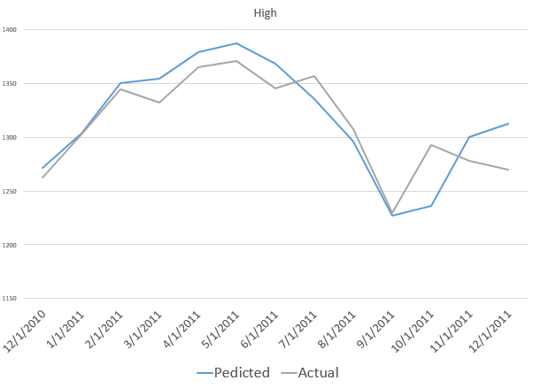
The NPA model for the month-ahead high price also captures a more recent reversal in the S&P 500.

laterHighS&P500


Also, the model for the low did capture the bottom in the S&P 500 in 2009, when the direction of the market changed from decline to increase.

2008High

This type of accuracy in timing in forecast modeling is quite remarkable.

It’s something I also saw earlier with the Hong Kong Hang Seng Index, but which seemed at that stage of model development to be confined to Chinese market data.

Now I am confident the NPA forecasts have some capability to predict turning points quite widely across many major indexes, ETF’s, and markets.

Note that all the charts shown above are based on out-of-sample extrapolations of the NPA model. In other words, one set of historical data are used to estimate the parameters of the NPA model, and other data, outside this sample, are then plugged in to get the month-ahead forecasts of the high and low prices.

Where This Is Going

I am compiling materials for presentations relating to the NPA, its capabilities, its forecast accuracy.

The NPA forecasts, as the above exhibits show, work well when markets are going down or turning directions, as when in a steady period of trending growth.

But don’t mistake my focus on these stock market forecasting algorithms for a last minute conversion to the view that nothing but the market is important. In fact, a lot of signals from business and global data suggest we could be in store for some big changes later in 2015 or in 2016.

What I want to do, I think, is understand how stock markets function as sort of prisms for these external developments – perhaps involving Greek withdrawal from the Eurozone, major geopolitical shifts affecting oil prices, and the onset of the crazy political season in the US.

Multivariate GARCH and Portfolio Risk Management

Why get involved with the complexity of multivariate GARCH models?

Well, because you may want to exploit systematic and persisting changes in the correlations of stocks and bonds, and other major classes of financial assets. If you know how these correlations change over, say, a forecast horizon of one month, you can do a better job of balancing risk in portfolios.

This a lively area of applied forecasting, as I discovered recently from Henry Bee of Cassia Research – based in Vancouver, British Columbia (and affiliated with CONCERT Capital Management of San Jose, California). Cassia Research provides Institutional Quant Technology for Investment Advisors.

HenryBee

Basic Idea The key idea is that the volatility of stock prices cluster in time, and most definitely is not a random walk. Just to underline this – volatility is classically measured as the square of daily stock returns. It’s absolutely straight-forward to make a calculation and show that volatility clusters, as for example with this more than year series for the SPY exchange traded fund.

SPYVolatility

Then, if you consider a range of assets, calculating not only their daily volatilities, in terms of their own prices, but how these prices covary – you will find similar clustering of covariances.

Multivariate GARCH models provide an integrated solution for fitting and predicting these variances and covariances. For a key survey article, check out – Multivariate GARCH Models A Survey.

Some quotes from the company site provide details: We use a high-frequency multivariate GARCH model to control for volatility clustering and spillover effects, reducing drawdowns by 50% vs. historical variance. …We are able to tailor our systems to target client risk preferences and stay within their tolerance levels in any market condition…. [Dynamic Rebalancing can]..adapt quickly to market shifts and reduce drawdowns by dynamically changing rebalance frequency based on market behavior.

The COO of Cassia Research also is a younger guy – Jesse Chen. As I understand it, Jesse handles a lot of the hands-on programming for computations and is the COO.

JesseChen

I asked Bee what he saw as the direction of stock market and investment volatility currently, and got a surprising answer. He pointed me to the following exhibit on the company site.

Bee1 The point is that for most assets considered in one of the main portfolios targeted by Cassia Research, volatilities have been dropping – as indicated by the negative signs in the chart. These are volatilities projected ahead by one month, developed by the proprietary multivariate GARCH modeling of this company – an approach which exploits intraday data for additional accuracy.

There is a wonderful 2013 article by Kirilenko and Lo called Moore’s Law versus Murphy’s Law: Algorithmic Trading and Its Discontents. Look on Google Scholar for this title and you will find a downloadable PDF file from MIT.

The Quant revolution in financial analysis is here to stay, and, if you pay attention, provides many examples of successful application of forecasting algorithms.

Stock Market Price Predictability, Random Walks, and Market Efficiency

Can stock market prices be predicted? Can they be predicted with enough strength to make profits?

The current wisdom may be that market predictability is like craps. That is, you might win (correctly predict) for a while, maybe walking away with nice winnings, if you are lucky. But over the long haul, the casino is the winner.

This seems close to the view in Andrew P. Lo and Craig MacKinlay’s A NonRandom Walk Down Wall Street (NRW), a foil to Burton Malkiel’s A Random Walk Down Wall Street, perhaps.

Lo and MacKinlay (L&M) collect articles from the 1980’s and 1990’s – originally published in the “very best journals” – in a 2014 compilation with interesting intoductions and discussions.

Their work more or less conclusively demonstrates that US stock market prices are not, for identified historic periods, random walks.

The opposite idea – that stock prices are basically random walks – has a long history, “recently” traceable to the likes of Paul Samuelson, as well as Burton Malkiel. Supposedly, any profit opportunity in a deeply traded market will be quickly exploited, leaving price movements largely random.

The ringer for me in this whole argument is the autocorrelation (AC) coefficient.

The first order autocorrelation coefficient of a random walk is 1, but metrics derived from stock price series have positive first order autocorrelations less than 1 over daily or weekly data. In fact, L&M were amazed to discover the first order autocorrelation coefficient of weekly stock returns, based on CRSP data, was 30 percent and statistically highly significant. In terms of technical approach, a key part of their analysis involves derivation of asymptotic limits for distributions and confidence intervals, based on assumptions which encompass nonconstant (heteroskedastic) error processes.

Finding this strong autocorrelation was somewhat incidental to their initial attack on the issue of the randomness, which is based on variance ratios.

L&M were really surprised to discover significant AC in stock market returns, and, indeed, several of their articles explore ways they could be wrong, or things could be different than what they appear to be.

All this is more than purely theoretical, as Morgan Stanley and D.P. Shaw’s development of “high frequency equity trading strategies” shows. These strategies exploit this autocorrelation or time dependency through “statistical arbitrage.” By now, though, according to the authors, this is a thin-margin business, because of the “proliferation of hedge funds engaged in these activities.”

Well, there are some great, geeky lines for cocktail party banter, such as “rational expectations equilibrium prices need not even form a martingale sequence, of which the random walk is special case.”

By itself, the “efficient market hypothesis” (EFM) is rather nebulous, and additional contextualization is necessary to “test” the concept. This means testing several joint hypotheses. Accordingly, negative results can simply be attributed to failure of one or more collateral assumptions. This builds a protective barrier around the EFM, allowing it to retain its character as an article of faith among many economists.

AWL

Andrew W. Lo is a Professor of Finance at MIT and Director of the Laboratory for Financial Engineering. His site through MIT lists other recent publications, and I would like to draw readers’ attention to two:

Can Financial Engineering Cure Cancer?

Reading About the Financial Crisis: A Twenty-One-Book Review

Thoughts on Stock Market Forecasting

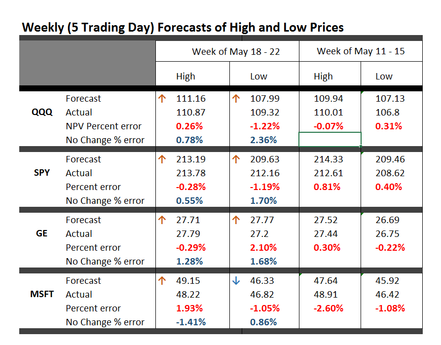
Here is an update on the forecasts from last Monday – forecasts of the high and low of SPY, QQQ, GE, and MSFT.

This table is easy to read, even though it is a little” busy”.

TableMay22

One key is to look at the numbers highlighted in red and blue (click to enlarge).

These are the errors from the week’s forecast based on the NPV algorithm (explained further below) and a No Change forecast.

So if you tried to forecast the high for the week to come, based on nothing more than the high achieved last week – you would be using a No Change model. This is a benchmark in many forecasting discussions, since it is optimal (subject to some qualifications) for a random walk. Of course, the idea stock prices are a random walk came into favor several decades ago, and now gradually is being rejected of modified, based on findings such as those above.

The NPV forecasts are more accurate for this last week than No Change projections 62.5 percent of the time, or in 5 out of the 8 forecasts in the table for the week of May 18-22. Furthermore, in all three cases in which the No Change forecasts were better, the NPV forecast error was roughly comparable in absolute size. On the other hand, there were big relative differences in the absolute size of errors in the situations in which the NPV forecasts proved more accurate, for what that is worth.

The NPV algorithm, by the way, deploys various price ratios (nearby prices) and their transformations as predictors. Originally, the approach focused on ratios of the opening price in a period and the high or low prices in the previous period. The word “new” indicates a generalization has been made from this original specification.

Ridge Regression

I have been struggling with Visual Basic and various matrix programming code for ridge regression with the NPV specifications.

Using cross validation of the λ parameter, ridge regression can improve forecast accuracy on the order of 5 to 10 percent. For forecasts of the low prices, this brings forecast errors closer to acceptable error ranges.

Having shown this, however, I am now obligated to deploy ridge regression in several of the forecasts I provide for a week or perhaps a month ahead.

This requires additional programming to be convenient and transparent to validation.

So, I plan to work on that this coming week, delaying other tables with weekly or maybe monthly forecasts for a week or so.

I will post further during the coming week, however, on the work of Andrew Lo (MIT Financial Engineering Center) and high frequency data sources in business forecasts.

Probable Basis of Success of NPV Forecasts

Suppose you are an observer of a market in which securities are traded. Initially, tests show strong evidence stock prices in this market follow random walk processes.

Then, someone comes along with a theory that certain price ratios provide a guide to when stock prices will move higher.

Furthermore, by accident, that configuration of price ratios occurs and is associated with higher prices at some date, or maybe a couple dates in succession.

Subsequently, whenever price ratios fall into this configuration, traders pile into a stock, anticipating its price will rise during the next trading day or trading period.

Question – isn’t this entirely plausible, and would it not be an example of a self-confirming prediction?

I have a draft paper pulling together evidence for this, and have shared some findings in previous posts. For example, take a look at the weird mirror symmetry of the forecast errors for the high and low.

And, I suspect, the absence or ambivalence of this underlying dynamic is why closing prices are harder to predict than period high or low prices of a stock. If I tell you the closing price will be higher, you do not necessarily buy the stock. Instead, you might sell it, since the next morning opening prices could jump down. Or there are other possibilities.

Of course, there are all kinds of systems traders employ to decide whether to buy or sell a stock, so you have to cast your net pretty widely to capture effects of the main methods.

Long Term Versus Short Term

I am getting mixed results about extending the NPV approach to longer forecast horizons – like a quarter or a year or more.

Essentially, it looks to me as if the No Change model becomes harder and harder to beat over longer forecast horizons – although there may be long run persistence in returns or other features that I see  other researchers (such as Andrew Lo) have noted.

Sales and new product forecasting in data-limited (real world) contexts