Tag Archives: predictive analytics

Speculators and Oil Prices

One of the more important questions in the petroleum business is the degree to which speculators influence oil prices.

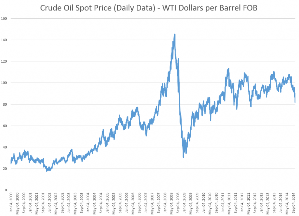
CrudeOilSpotPrice

If speculators can significantly move oil spot prices, there might be “overshooting” on the downside, in the current oil price environment. That is, the spot price of oil might drop more than fundamentals warrant, given that spot prices have dropped significantly in recent weeks and the Saudi’s may not reduce production, as they have in the past.

This issue can be rephrased more colorfully in terms of whether the 2008 oil price spike, shown below, was a “bubble,” driven in part by speculators, or whether, as some economists argue, things can be explained in terms of surging Chinese demand and supply constraints.

James Hamilton’s Causes and Consequences of the Oil Shock of 2007–08, Spring 2009, documents a failure of oil production to increase between 2005-2007, and the exponential growth in Chinese petroleum demand through 2007.

Hamilton, nevertheless, admits “the speed and magnitude of the price collapse leads one to give serious consideration to the alternative hypothesis that this episode represents a speculative price bubble that popped.”

Enter hedge fund manager Michael Masters stage left.

In testimony before the US Senate, Masters blames the 2007-08 oil price spike on speculators, and specifically on commodity index trading funds which held a quarter trillion dollars worth of futures contracts in 2008.

Hamilton characterizes Masters’ position as follows,

A typical strategy is to take a long position in a near-term futures contract, sell it a few weeks before expiry, and use the proceeds to take a long position in a subsequent near-term futures contract. When commodity prices are rising, the sell price should be higher than the buy, and the investor can profit without ever physically taking delivery. As more investment funds sought to take positions in commodity futures contracts for this purpose, so that the number of buys of next contracts always exceeded the number of sells of expiring ones, the effect, Masters argues, was to drive up the futures price, and with it the spot price. This “financialization” of commodities, according to Masters, introduced a speculative bubble in the price of oil.

Where’s the Beef?

If speculators were instrumental in driving up oil prices in 2008, however, where is the inventory build one would expect to accompany such activity? As noted above, oil production 2005-2007 was relatively static.

There are several possible answers.

One is simply that activity in the futures markets involve “paper barrels of oil” and that pricing of real supplies follows signals being generated by the futures markets. This is essentially Masters’ position.

A second, more sophisticated response is that the term structure of the oil futures markets changed, running up to 2008. The sweet spot changed from short term to long term futures, encouraging “ground storage,” rather than immediate extraction and stockpiling of inventories in storage tanks. Short term pricing followed the lead being indicated by longer term oil futures. The MIT researcher Parsons makes this case in a fascinating paper Black Gold & Fool’s Gold: Speculation in the Oil Futures Market.

..successful innovations in the financial industry made it possible for paper oil to be a financial asset in a very complete way. Once that was accomplished, a speculative bubble became possible. Oil is no different from equities or housing in this regard.

A third, more conventional answer is that, in fact, it is possible to show a direct causal link from activity in the oil futures markets to oil inventories, despite the appearances of flat production leading up to 2008.

Where This Leads

The uproar on this issue is related to efforts to increase regulation on the nasty speculators, who are distorting oil and other commodity prices away from values determined by fundamental forces.

While that might be a fine objective, I am more interested in the predictive standpoint.

Well, there is enough here to justify collecting a wide scope of data on production, prices, storage, reserves, and futures markets, and developing predictive models. It’s not clear the result would be most successful short term, or for the longer term. But I suspect forward-looking perspective is possible through predictive analytics in this area.

Top graphic from Evil Speculator.

Video Friday on Steroids

Here is a list of the URL’s for all the YouTube and other videos shown on this blog from January 2014 through May of this year. I encourage you to shop this list, clicking on the links. There’s a lot of good stuff, including several  instructional videos on machine learning and other technical topics, a series on robotics, and several videos on climate and climate change.

January 2014

The Polar Vortex Explained in Two Minutes

https://www.youtube.com/watch?v=5eDTzV6a9F4

NASA – Six Decades of a Warming Earth

https://www.youtube.com/watch?v=gaJJtS_WDmI

“CHASING ICE” captures largest video calving of glacier

https://www.youtube.com/watch?v=hC3VTgIPoGU

Machine Learning and Econometrics

https://www.youtube.com/watch?v=EraG-2p9VuE

Can Crime Prediction Software Stop Criminals?

https://www.youtube.com/watch?v=s1-pbJKA3H8

Analytics 2013 – Day 1

https://www.youtube.com/watch?v=LsyOLBroVx4

The birth of a salesman

https://www.youtube.com/watch?v=pWM1dR_V7uw

Economies Improve

https://www.youtube.com/watch?v=5_DeCMIig_M

Kaggle – Energy Applications for Machine Learning

https://www.youtube.com/watch?v=mZZFXTUz-nI

2014 Outlook with Jan Hatzius

https://www.youtube.com/watch?v=Ggv0oC8L3Tk

Nassim Taleb Lectures at the NSF

https://www.youtube.com/watch?v=omsYJBMoIJU

Vernon Smith – Experimental Markets

https://www.youtube.com/watch?v=Uncl-wRfoK8


Forecast Pro – Quick Tour

https://www.youtube.com/watch?v=s8jMp5qS8v4

February 2014

Stephen Wolfram’s Introduction to the Wolfram Language

https://www.youtube.com/watch?v=_P9HqHVPeik

Tornados

https://www.youtube.com/watch?v=TEGhgsiNFJ4

Econometrics – Quantile Regression

https://www.youtube.com/watch?v=P9lMmEkXuBw

Quantile Regression Example

https://www.youtube.com/watch?v=qrriFC_WGj8

Brooklyn Grange – A New York Growing Season

http://vimeo.com/86266334

Getting in Shape for the Sport of Data Science

https://www.youtube.com/watch?v=kwt6XEh7U3g

Machine Learning – Decision Trees

https://www.youtube.com/watch?v=-dCtJjlEEgM

Machine Learning – Random Forests

https://www.youtube.com/watch?v=3kYujfDgmNk

Machine Learning – Random Forecasts Applications

https://www.youtube.com/watch?v=zFGPjRPwyFw

Malcolm Gladwell on the 10,000 Hour Rule

https://www.youtube.com/watch?v=XS5EsTc_-2Q

Sornette Talk

https://www.youtube.com/watch?v=Eomb_vbgvpk

Head of India Central Bank Interview

https://www.youtube.com/watch?v=BrVzema7pWE

March 2014

David Stockman

https://www.youtube.com/watch?v=DI718wFmReo

Partial Least Squares Regression

https://www.youtube.com/watch?v=WKEGhyFx0Dg

April 2014

Thomas Piketty on Economic Inequality

https://www.youtube.com/watch?v=qp3AaI5bWPQ

Bonobo builds a fire and tastes marshmellows

https://www.youtube.com/watch?v=GQcN7lHSD5Y

Future Technology

https://www.youtube.com/watch?v=JbQeABIoO6A

May 2014

Ray Kurzweil: The Coming Singularity

https://www.youtube.com/watch?v=1uIzS1uCOcE

Paul Root Wolpe: Kurzweil Critique

https://www.youtube.com/watch?v=qRgMTjTMovc

The Future of Robotics and Artificial Intelligence

https://www.youtube.com/watch?v=AY4ajbu_G3k

Car Factory – KIA Sportage Assembly Line

https://www.youtube.com/watch?v=sjAZGUcjrP8

10 Most Popular Applications for Robots

https://www.youtube.com/watch?v=fH4VwTgfyrQ

Predator Drones

https://www.youtube.com/watch?v=nMh8Cjnzen8

The Future of Robotic Warfare

https://www.youtube.com/watch?v=_atffUtxXtk

Bionic Kangaroo

https://www.youtube.com/watch?v=HUxQM0O7LpQ

Ping Pong Playing Robot

https://www.youtube.com/watch?v=tIIJME8-au8

Baxter, the Industrial Robot

https://www.youtube.com/watch?v=ukehzvP9lqg

Bootstrapping

https://www.youtube.com/watch?v=1OC9ul-1PVg

Stylized Facts About Stock Market Volatility

Volatility of stock market returns is more predictable, in several senses, than stock market returns themselves.

Generally, if pt is the price of a stock at time t, stock market returns often are defined as ln(pt)-ln(pt-1). Volatility can be the absolute value of these returns, or as their square. Thus, hourly, daily, monthly or other returns can be positive or negative, while volatility is always positive.

Masset highlights several stylized facts about volatility in a recent paper –

  • Volatility is not constant and tends to cluster through time. Observing a large (small) return today (whatever its sign) is a good precursor of large (small) returns in the coming days.
  • Changes in volatility typically have a very long-lasting impact on its subsequent evolution. We say that volatility has a long memory.
  • The probability of observing an extreme event (either a dramatic downturn or an enthusiastic takeoff) is way larger than what is hypothesized by common data generating processes. The returns distribution has fat tails.
  • Such a shock also has a significant impact on subsequent returns. Like in an earthquake, we typically observe aftershocks during a number of trading days after the main shock has taken place.
  • The amplitude of returns displays an intriguing relation with the returns themselves: when prices go down – volatility increases; when prices go up – volatility decreases but to a lesser extent. This is known as the leverage effect … or the asymmetric volatility phenomenon.
  • Recently, some researchers have noticed that there were also some significant differences in terms of information content among volatility estimates computed at various frequencies. Changes in low-frequency volatility have more impact on subsequent high-frequency volatility than the opposite. This is due to the heterogeneous nature of market participants, some having short-, medium- or long-term investment horizons, but all being influenced by long-term moves on the markets…
  • Furthermore, … the intensity of this relation between long and short time horizons depends on the level of volatility at long horizons: when volatility at a long time horizon is low, this typically leads to low volatility at short horizons too. The reverse is however not always true…

Masset extends and deepens this type of result for bull and bear markets and developed/emerging markets. Generally, emerging markets display higher volatility with some differences in third and higher moments.

A key reference is Rami Cont’s Empirical properties of asset returns: stylized facts and statistical issues which provides this list of features of stock market returns, some of which directly relate to volatility. This is one of the most widely-cited articles in the financial literature:

  1. Absence of autocorrelations: (linear) autocorrelations of asset returns are often insignificant, except for very small intraday time scales (~20 minutes) for which microstructure effects come into play.
  2. Heavy tails: the (unconditional) distribution of returns seems to display a power-law or Pareto-like tail, with a tail index which is finite, higher than two and less than five for most data sets studied. In particular this excludes stable laws with infinite variance and the normal distribution. However the precise form of the tails is difficult to determine.
  3. Gain/loss asymmetry: one observes large drawdowns in stock prices and stock index values but not equally large upward movements.
  4. Aggregational Gaussianity: as one increases the time scale t over which returns are calculated, their distribution looks more and more like a normal distribution. In particular, the shape of the distribution is not the same at different time scales.
  5. Intermittency: returns display, at any time scale, a high degree of variability. This is quantified by the presence of irregular bursts in time series of a wide variety of volatility estimators.
  6. Volatility clustering: different measures of volatility display a positive autocorrelation over several days, which quantifies the fact that high-volatility events tend to cluster in time.
  7. Conditional heavy tails: even after correcting returns for volatility clustering (e.g. via GARCH-type models), the residual time series still exhibit heavy tails. However, the tails are less heavy than in the unconditional distribution of returns.
  8. Slow decay of autocorrelation in absolute returns: the autocorrelation function of absolute returns decays slowly as a function of the time lag, roughly as a power law with an exponent β ∈ [0.2, 0.4]. This is sometimes interpreted as a sign of long-range dependence.
  9. Leverage effect: most measures of volatility of an asset are negatively correlated with the returns of that asset.
  10. Volume/volatility correlation: trading volume is correlated with all measures of volatility.
  11. Asymmetry in time scales: coarse-grained measures of volatility predict fine-scale volatility better than the other way round.

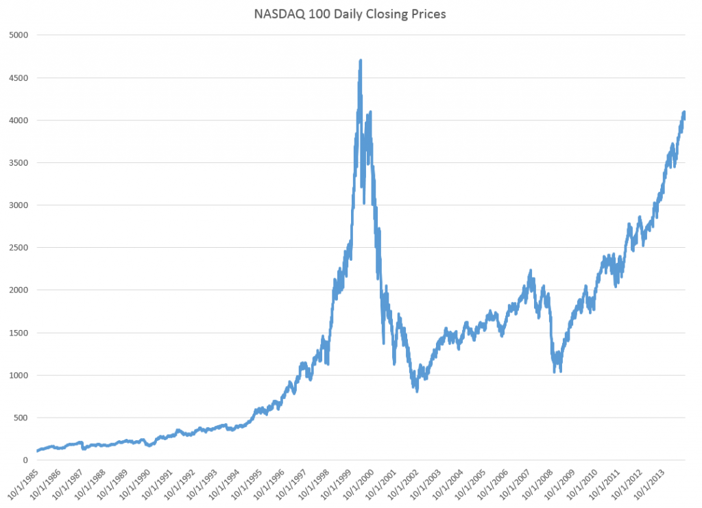
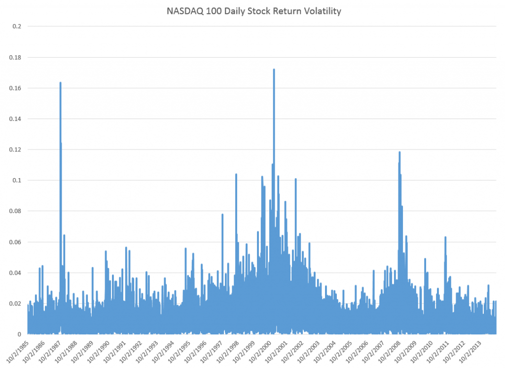
Just to position the discussion, here are graphs of the NASDAQ 100 daily closing prices and the volatility of daily returns, since October 1, 1985.

NASDAQ100new

The volatility here is calculated as the absolute value of the differences of the logarithms of the daily closing prices.

NASDAQ100V

The Holy Grail of Business Forecasting – Forecasting the Next Downturn

What if you could predict the Chicago Fed National Activity Index (CFNAI), interpolated monthly values of the growth of nominal GDP, the Aruoba-Diebold-Scotti (ADS) Business Conditions Index, and the Kansas City Financial Stress Index (KCFSI) three, five, seven, even twelve months into the future? What if your model also predicted turning points in these US indexes, and also similar macroeconomic variables for countries in Asia and the European Union? And what if you could do all this with data on monthly returns on the stock prices of companies in the financial sector?

That’s the claim of Linda Allen, Turan Bali, and Yi Tang in a fascinating 2012 paper Does Systemic Risk in the Financial Sector Predict Future Economic Downturns?

I’m going to refer to these authors as Bali et al, since it appears that Turan Bali, shown below, did some of the ground-breaking research on estimating parametric distributions of extreme losses. Bali also is the corresponding author.

T_bali

Bali et al develop a new macroindex of systemic risk that predicts future real economic downturns which they call CATFIN.

CATFIN is estimated using both value-at-risk (VaR) and expected shortfall (ES) methodologies, each of which are estimated using three approaches: one nonparametric and two different parametric specifications. All data used to construct the CATFIN measure are available at each point in time (monthly, in our analysis), and we utilize an out-of-sample forecasting methodology. We find that all versions of CATFIN are predictive of future real economic downturns as measured by gross domestic product (GDP), industrial production, the unemployment rate, and an index of eighty-five existing monthly economic indicators (the Chicago Fed National Activity Index, CFNAI), as well as other measures of real macroeconomic activity (e.g., NBER recession periods and the Aruoba-Diebold-Scott [ADS] business conditions index maintained by the Philadelphia Fed). Consistent with an extensive body of literature linking the real and financial sectors of the economy, we find that CATFIN forecasts aggregate bank lending activity.

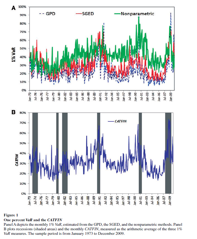
The following graphic illustrates three components of CATFIN and the simple arithmetic average, compared with US recession periods.

CATFIN

Thoughts on the Method

OK, here’s the simple explanation. First, these researchers identify US financial companies based on definitions in Kenneth French’s site at the Tuck School of Business (Dartmouth). There are apparently 500-1000 of these companies for the period 1973-2009. Then, for each month in this period, rates of return of the stock prices of these companies are calculated. Then, three methods are used to estimate 1% value at risk (VaR) – two parametric methods and one nonparametric methods. The nonparametric method is straight-forward –

The nonparametric approach to estimating VaR is based on analysis of the left tail of the empirical return distribution conducted without imposing any restrictions on the moments of the underlying density…. Assuming that we have 900 financial firms in month t , the nonparametric measure of1%VaR is the ninth lowest observation in the cross-section of excess returns. For each month, we determine the one percentile of the cross-section of excess returns on financial firms and obtain an aggregate 1% VaR measure of the financial system for the period 1973–2009.

So far, so good. This gives us the data for the graphic shown above.

In order to make this predictive, the authors write that –

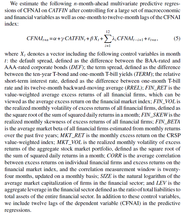
CATFINEQ

Like a lot of leading indicators, the CATFIN predictive setup “over-predicts” to some extent. Thus, there are there are five instances in which a spike in CATFIN is not followed by a recession, thereby providing a false positive signal of future real economic distress. However, the authors note that in many of these cases, predicted macroeconomic declines may have been averted by prompt policy intervention. Their discussion of this is very interesting, and plausible.

What This Means

The implications of this research are fairly profound – indicating, above all, the priority of the finance sector in leading the overall economy today. Certainly, this consistent with the balance sheet recession of 2008-2009, and probably will continue to be relevant going forward – since nothing really has changed and more concentration of ownership in finance has followed 2008-2009.

I do think that Serena Ng’s basic point in a recent review article probably is relevant – that not all recessions are the same. So it may be that this method would not work as well for, say, the period 1945-1970, before financialization of the US and global economies.

The incredibly ornate mathematics of modeling the tails of return distributions are relevant in this context, incidentally, since the nonparametric approach of looking at the empirical distributions month-by-month could be suspect because of “cherry-picking.” So some companies could be included, others excluded to make the numbers come out. This is much difficult in a complex maximum likelihood estimation process for the location parameters of these obscure distributions.

So the question on everybody’s mind is – WHAT DOES THE CATFIN MODEL INDICATE NOW ABOUT THE NEXT FEW MONTHS? Unfortunately, I am unable to answer that, although I have corresponded with some of the authors to inquire whether any research along such lines can be cited.

Bottom line – very impressive research and another example of how important science can get lost in the dance of prestige and names.

Links – mid-September

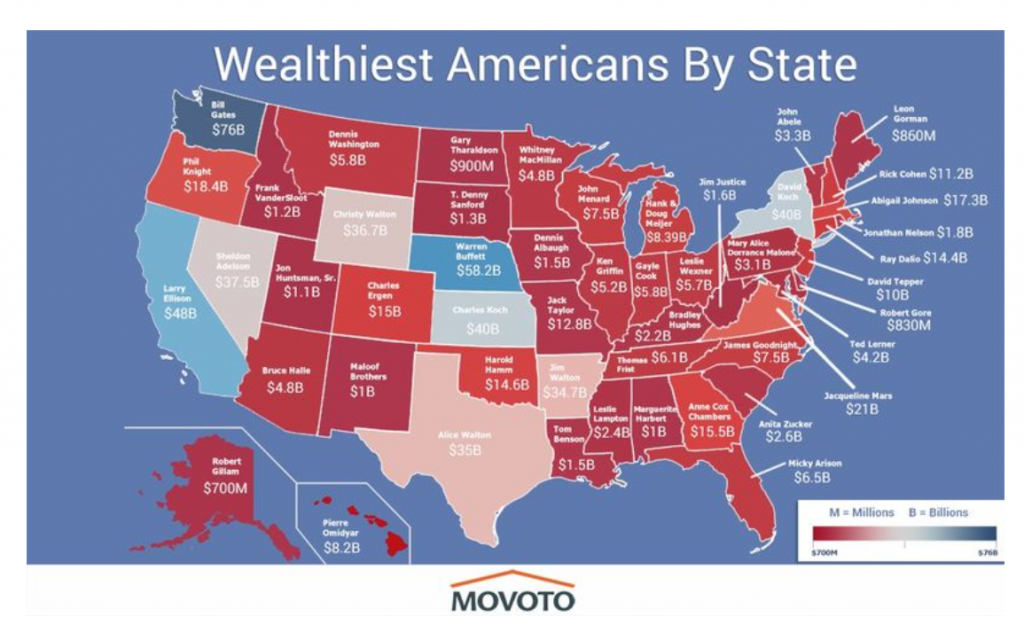
After highlighting billionaires by state, I focus on data analytics and marketing, and then IT in these links. Enjoy!

The Wealthiest Individual In Every State [Map]

wealthyindividuals

Data Analytics and Marketing

A Predictive Analytics Primer

Has your company, for example, developed a customer lifetime value (CLTV) measure? That’s using predictive analytics to determine how much a customer will buy from the company over time. Do you have a “next best offer” or product recommendation capability? That’s an analytical prediction of the product or service that your customer is most likely to buy next. Have you made a forecast of next quarter’s sales? Used digital marketing models to determine what ad to place on what publisher’s site? All of these are forms of predictive analytics.

Making sense of Google Analytics audience data

Earlier this year, Google added Demographics and Interest reports to the Audience section of Google Analytics (GA). Now not only can you see how many people are visiting your site, but how old they are, whether they’re male or female, what their interests are, and what they’re in the market for.

Data Visualization, Big Data, and the Quest for Better Decisions – a Synopsis

Simon uses Netflix as a prime example of a company that gets data and its use “to promote experimentation, discovery, and data-informed decision-making among its people.”….

They know a lot about their customers.

For example, the company knows how many people binge-watched the entire season four of Breaking Bad the day before season five came out (50,000 people). The company therefore can extrapolate viewing patterns for its original content produced to appeal to Breaking Bad fans. Moreover, Netflix markets the same show differently to different customers based on whether their viewing history suggests they like the director or one of the stars….

The crux of their analytics is the visualization of “what each streaming customer watches, when, and on what devices, but also at what points shows are paused and resumed (or not) and even the color schemes of the marketing graphics to which individuals respond.”

How to Market Test a New Idea

Formulate a hypothesis to be tested. Determine specific objectives for the test. Make a prediction, even if it is just a wild guess, as to what should happen. Then execute in a way that enables you to accurately measure your prediction…Then involve a dispassionate outsider in the process, ideally one who has learned through experience how to handle decisions with imperfect information…..Avoid considering an idea in isolation. In the absence of choice, you will almost always be able to develop a compelling argument about why to proceed with an innovation project. So instead of asking whether you should invest in a specific project, ask if you are more excited about investing in Project X versus other alternatives in your innovation portfolio…And finally, ensure there is some kind of constraint forcing a decision.

Information Technology (IT)

5 Reasons why Wireless Charging Never Caught on

Charger Bundling, Limited handsets, Time, Portability, and Standardisation – interesting case study topic for IT

Why Jimmy the Robot Means New Opportunities for IT

While Jimmy was created initially for kids, the platform is actually already evolving to be a training platform for everyone. There are two versions: one at $1,600, which really is more focused on kids, and one at $16,000, for folks like us who need a more industrial-grade solution. The Apple I wasn’t just for kids and neither is Jimmy. Consider at least monitoring this effort, if not embracing it, so when robots go vertical you have the skills to ride this wave and not be hit by it.

jimmy-the-robot

Beyond the Reality Distortion Field: A Sober Look at Apple Pay

.. Apple Pay could potentially kick-start the mobile payment business the way the iPod and iTunes launched mobile music 13 years ago. Once again, Apple is leveraging its powerful brand image to bring disparate companies together all in the name of consumer convenience.

From Dr. 4Ward How To Influence And Persuade (click to enlarge)

influence

CO2 Concentrations Spiral Up, Global Temperature Stabilizes – Was Gibst?

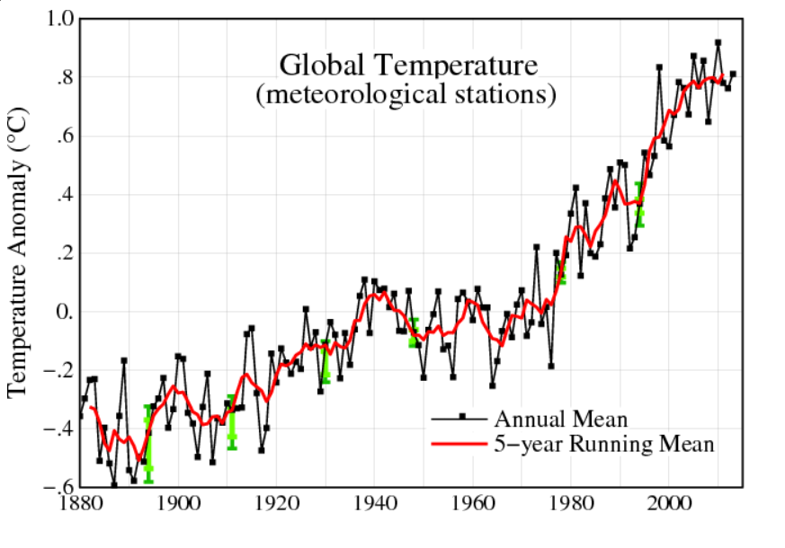
Predicting global temperature is challenging. This is not only because climate and weather are complex, but because carbon dioxide (CO2) concentrations continue to skyrocket, while global temperature has stabilized since around 2000.

Changes in Global Mean Temperature

The NASA Goddard Institute for Space Studies maintains extensive and updated charts on global temperature.

globalmeantempdelta

The chart for changes annual mean global temperature is compiled from weather stations from around the planet.

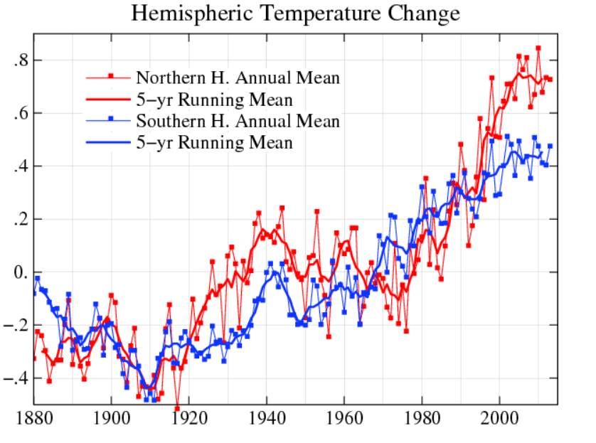
There is also hermispheric variation, with the northern hemisphere showing more increases than the southern hemisphere.

hemi

At the same time, observations of the annual change in mean temperature have stabilized since around 2000, as the five year moving averages show.

Atmospheric Carbon Dioxide Concentrations

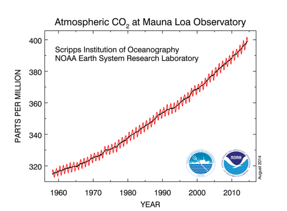
The National Oceanic and Atmospheric Administration (NOAA) maintains measurements of atmospheric carbon dioxide taken in Hawaii at Mauna Loa. These show continual increase since the measurements were first initiated in the late 1950’s.

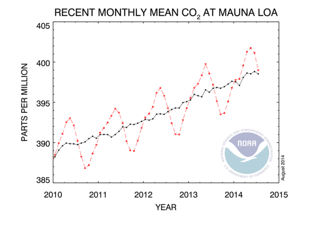
Here’s a chart showing recent monthly measurements, highlighting the consistent seasonal pattern and strong positive trend since 2010.

Maunaloa1

Here’s all the data. The black line in both charts represents the seasonally corrected trend.

Maunaloa2

A Forecasting Problem

This is a big problem for anyone interested in predicting the future trajectory of climate.

So, according to these measurements on Mauna Loa, carbon dioxide concentrations in the atmosphere have been increasing monotonically (with seasonal variation) since 1958, when measurements first began. Yet global temperatures have not increased on a clear trend since around 2000.

I want to comment in detail sometime on the forecasting controversies that have swirled around these types of measurements and their interpretation, but here let me just suggest the outlines of the problem.

So, it’s clear that the relationship between atmospheric CO2 concentrations and global temperature is not linear, or that there are major intervening variables. Cloud cover may increase with higher temperatures, due to more evaporation. The oceans are still warming, so maybe they are absorbing the additional heat. Perhaps there are other complex feedback processes involved.

However, if my reading of the IPCC literature is correct, these suggestions are still anecdotal, since the big systems models seem quite unable to account for this trajectory of temperature – or at least, recent data appear as outliers.

So there you have it. As noted in earlier posts here, global population is forecast to increase by perhaps one billion by 2030. Global output, even given uncertain impacts of coming recessions, may grow to $150 trillion dollars by 2030. Emissions of greenhouse gases, including but not limited to CO2 also will increase – especially given the paralyzing impacts of the current “pause in global warming” on coordinated policy responses. Deforestation is certainly a problem in this context, although we have not here reviewed the prospects.

One thing to note, however, is that the first two charts presented above trace out changes in global mean temperature by year. The actual level of global mean temperature surged through the 1990’s and remains high. That mean that ice caps are melting, and various processes related to higher temperatures are currently underway.

Climate Change by 2030

Is climate change real? Is it predictable? How much warming can we expect by 2020 and then by 2030 in a business as usual scenario? How bad can it get? What about mitigation? Is there any credibility to the loud protestations of the climate change deniers? What about the so-called hockey stick and the exchange of sinister emails?

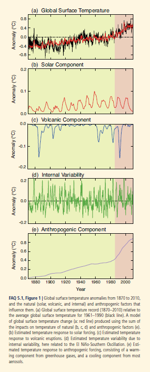
The Fifth Assessment Report of the Intergovernmental Panel on Climate Change (IPCC) addresses some of these questions. Its section The Physical Science Basis, which collates contributions of 250 scientists, contains this interesting graphic (click to enlarge) showing the upward trend in global temperature and the importance of the anthropogenic component, along with contributions from fluctuations in solar intensity and volcanic activity.

IPCCtemp

The Hockey Stick

Paleoclimate studies, also documented in this report, are the basis for the famous (notorious) hockey stick chart of long term global temperatures.

I was surprised to read, in catching up on this controversy, that the climate scientist Michael Mann who originated this chart has been totally vindicated (See The Hockey Stick: The Most Controversial Chart in Science, Explained).

Currently, scientific evidence suggests,

… present-day (2011) concentrations of the atmospheric greenhouse gases (GHGs) carbon dioxide (CO2), methane (CH4) and nitrous oxide (N2O) exceed the range of concentrations recorded in ice cores during the past 800,000 years. Past changes in atmospheric GHG concentrations can be determined with very high confidence1 from polar ice cores. Since AR4 these records have been extended from 650,000 years to 800,000 years ago.

The Drumbeat

In preparation for a September 23 summit, the UN has commissioned videos of weather forecasters supposedly announcing dire droughts, floods, and other weather catastrophes in 2050.

The IPCC also has videos. I include two – one on the physical science basis and the second on mitigation.

IPCC video 2013 –The Physical Science Basis

Climate summit 2014 – Mitigation

I personally am persuaded by the basic physics involved. As global GDP rises, so will energy consumption (although the details of this need to be examined carefully – conservation and change of technology can make big differences). In any case, more carbon dioxide and other similar gases will increase the greenhouse effect, raising global temperatures. It’s a good idea to call this climate change, rather than global warming, however, since volatility of weather patterns is a main result. There will be more climatic extremes, more droughts, but also more precipitation and flooding. Additionally, there could be changes in regional weather and climate patterns which could wreak havoc with the current distribution of population over geographic space. More rapid desertification is likely, and, of course, melting of glacial and polar ice will result in increases in sea level. And, as IPCC reports document, a lot of this is already happening.

There are, however, several problems that offer intellectual grounds for stalling the type of economic sacrifice that probably will be necessary to slow or reduce emissions.

First, there is the complexity of the evidence and argument, an issue flagged by Nate Silver recently. Secondly, there is the problem that, despite increases in greenhouse gas emissions after the turn of the century, there has been some leveling of global temperature increase, according to some metrics. Finally, there is the related problem of whether current climate models predict the recent past, whether they “retrodict.”

I’d like to address these issues or problems in a future post, along with my take on these projections or forecasts for 2020 and 2030.

Links – Labor Day Weekend

Tech

Amazon’s Cloud Is So Pervasive, Even Apple Uses It

Your iCloud storage is apparently on Amazon.

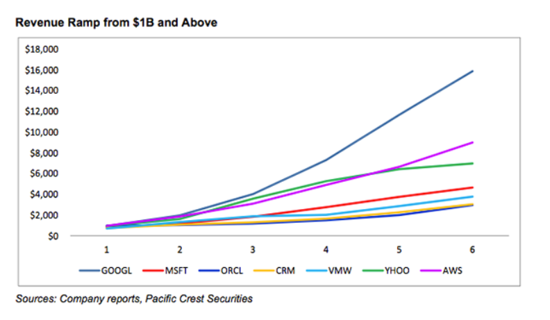
Amazon’s Cloud Is The Fastest Growing Software Business In History

AWS

AWS is Amazon Web Services. The author discounts Google growth, since it is primarily a result of selling advertising. 

How Microsoft and Apple’s Ads Define Their Strategy

Microsoft approaches the market from the top down, while Apple goes after the market from the bottom up.

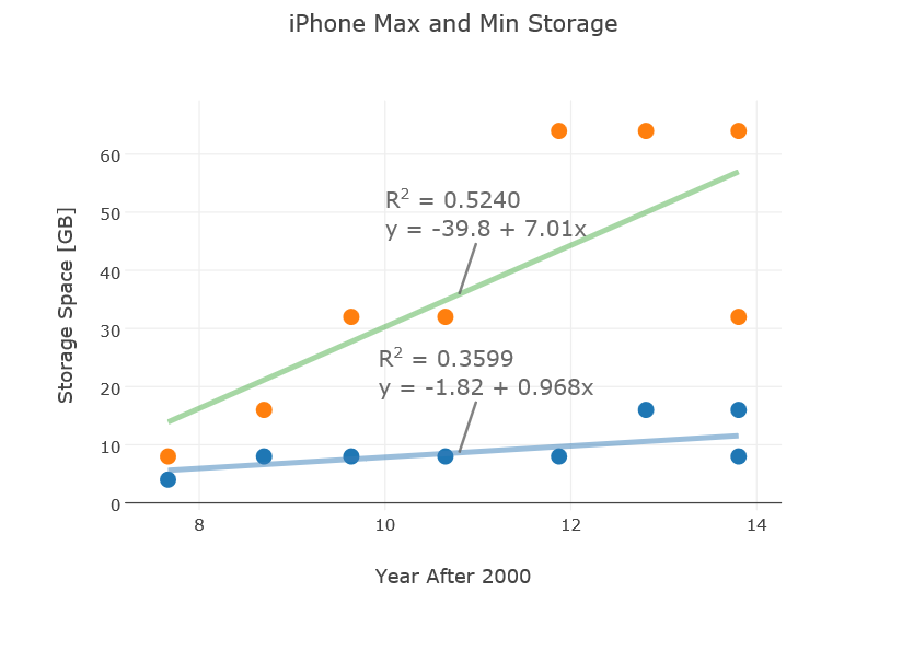
Mathematical Predictions for the iPhone 6

Can you predict features of the iPhone6 scheduled to be released September 6?

iphoneplot

Predictive Analytics

Comparison of statistical software

Good links for R, Matlab, SAS, Stata, and SPSS.

Types and Uses of Predictive Analytics, What they are and Where You Can Put Them to Work

Gartner says that predictive analytics is a mature technology yet only one company in eight is currently utilizing this ability to predict the future of sales, finance, production, and virtually every other area of the enterprise. What is the promise of predictive analytics and what exactly are they [types and uses of predictive analytics]? Good highlighting of main uses of predictive analytics in companies.

The Four Traps of Predictive Analytics

Magical thinking/ Starting at the Top/ Building Cottages, not Factories/ Seeking Purified Data. Good discussion. This short article in the Sloan Management Review is spot on, in my opinion. The way to develop good predictive analytics is to pick an area, indeed, pick the “low-handing fruit.” Develop workable applications, use them, improve them, broaden the scope. The “throw everything including the kitchen sink” approach of some early Big Data deployments is almost bound to fail. Flashy, trendy, but, in the final analysis, using “exhaust data” to come up with obscure customer metrics probably will not cut in the longer run.

Economic Issues

The Secular Stagnation Controversy

– discusses the e-book Secular Stagnation: Facts, Causes and Cures. The blogger Timothy Taylor points out that “secular” here has no relationship to lacking a religious context, but refers to the idea that market economies, or, if you like, capitalist economies, can experience long periods (decade or more) of desultory economic growth. Check the e-book for Larry Summer’s latest take on the secular stagnation hypothesis.

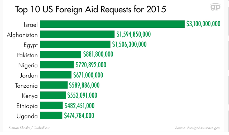
Here’s how much aid the US wants to send foreign countries in 2015, and why (INFOGRAPHIC

foreignaid

Video Friday – Ecommerce Trends

Trends for 2014

Matt made this at the end of 2013, but it hits the mark for what we are seeing this year. It’s only two minutes! Part of a series called ’Two Minute Tuesdays’, but of course we are showing it on a Friday.

But a lot of what you find on ecommerce is US-centric. This leads to the question –

Should We Be Afraid of Alibaba?

Alibaba is bigger than Amazon and eBay combined, leading to an alarmist Bloomberg article earlier this month Alibaba’s IPO May Herald the End of U.S. E-Commerce Dominance

Ecommerce Trends in China

This YouTube video is a test run of a talk given May 2014 in China, and contains some material at the beginning which I consider to be superfluous – biography of the presenter, etc. However, if you get beyond that, there are a lot of key stats presented in the slides and presentation. Valuable.

Will Online Retail Cannibalize Brick-and-mortar Sales?

Online retail or ecommerce is growing at three times the rate of retails sales generally (15 percent compared with 5 percent). And within online sales, mobile ecommerce is rocketing ahead by growth rates on the order of 25 percent per year in the US. Are these faster growing elements complementary to or cannibalizing conventional retail sales?

First, some stores – such as Blockbuster, Movie Gallery, Borders, and stores selling records and CD’s – are clearly casualties of Internet competition.

Other brick-and-mortar operations are following a multi-channel strategy, opening up online sales divisions parallel and in addition to their stores with goods on the shelves.

But the handwriting may be on the wall.

For one thing, in the 2013 holiday season, U.S. retailers saw approximately half the holiday foot traffic they experienced just three years ago.

And some of the foot traffic in brick-and-mortar stores is “showrooming” with practices highlighted in this infographic from Adweek (click to enlarge).

data-bargain-hunting-01-2013

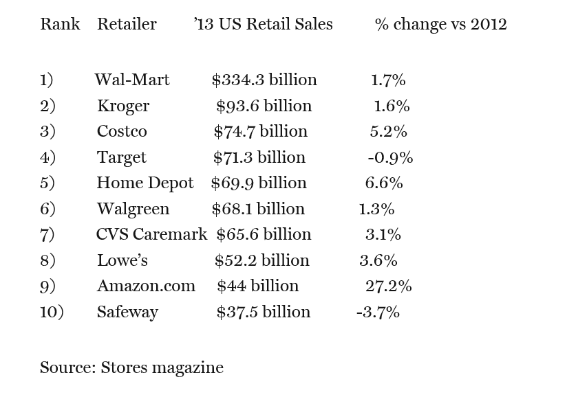
And it’s significant a pure-play ecommerce provider like Amazon has risen to one of the ten largest retailers in the United States, with 2013 sales of $44 billion.

While Amazon is still back in the pack (see Table below), its annual growth rate is unsurpassed.

ranking

Bottom line – the “fulfillment center” may become a growing trend.

People like to see the product, especially if it is a larger ticket item.

Interestingly, Amazon is now opening fulfillment centers in key urban markets. Other formerly brick-and-mortar stores may repurpose some of their floor area to warehousing and fulfillment of customer orders.

Recognize, however, that we’re talking about $3-4 trillion in retail sales in the US, and the game on the ground is likely to change relatively slowly – over five or ten years.